
Looking for a unique and beautiful way to display images in a gallery on your website? If so, we’re sure you’ll love this post. We’re going to show you how to cut off image corners with Text Modules as part of a beautiful design that remains 100% responsive across all screen sizes. This is a great way to add numbered labels to your images while maintaining an awesome design. You’ll be able to download the JSON file of the design example for free as well.
Let’s get to it!
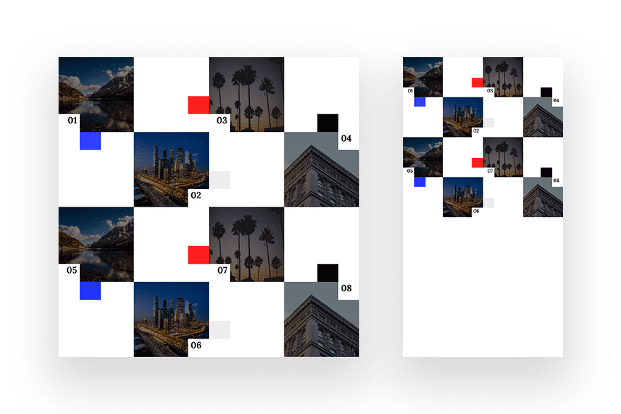
Preview
Before we dive into the tutorial, let’s take a quick look at the outcome across different screen sizes.
Download The Gallery Section Layout for FREE
To lay your hands on the free gallery section layout, you will first need to download it using the button below. To gain access to the download you will need to subscribe to our newsletter by using the form below. As a new subscriber, you will receive even more Divi goodness and a free Divi Layout pack every Monday! If you’re already on the list, simply enter your email address below and click download. You will not be “resubscribed” or receive extra emails.

Subscribe To Our Youtube Channel
Let’s Start Recreating
Add New Section
Spacing
The first thing you will need to do is add a new section to the page you’re working on. Open the section settings and remove all default top and bottom padding.
- Top Padding: 0px
- Bottom Padding: 0px
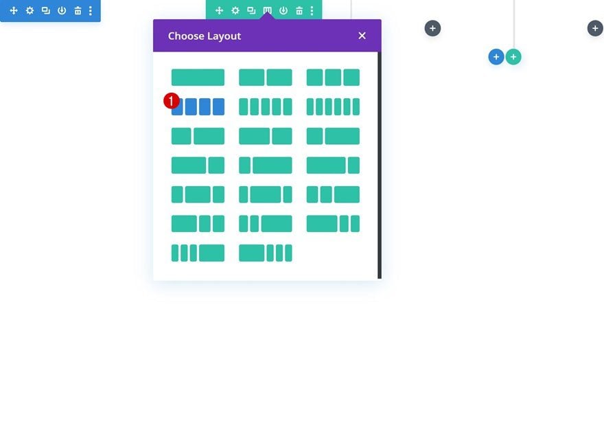
Add New Row
Column Structure
Continue by adding a new row using the following column structure:
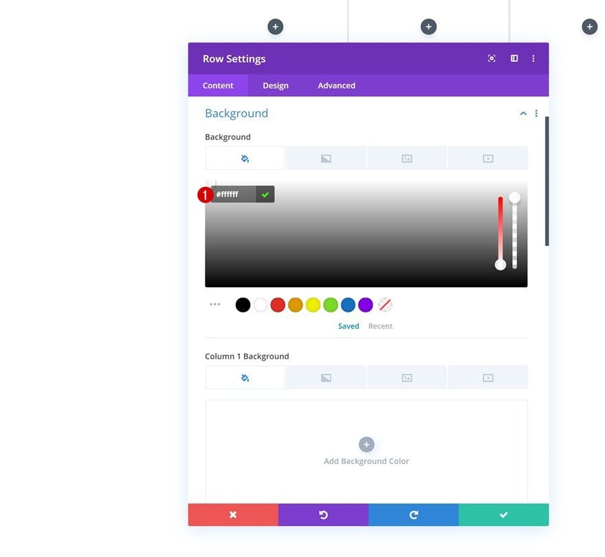
Background Color
Add a white background color next.
- Background Color: #ffffff
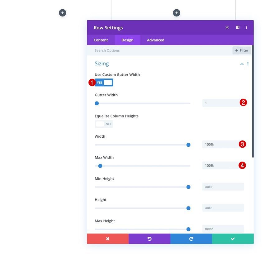
Sizing
Move on to the sizing settings and remove all space between the columns, row and section by applying the following settings:
- Use Custom Gutter Width: Yes
- Gutter Width: 1
- Width: 100%
- Max Width: 100%
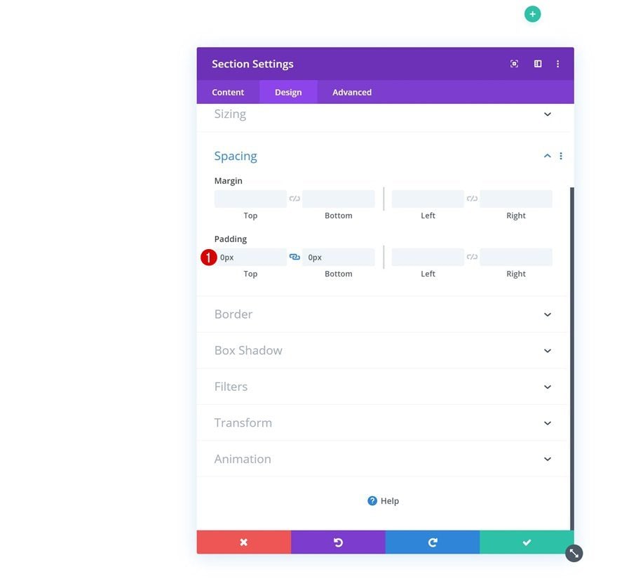
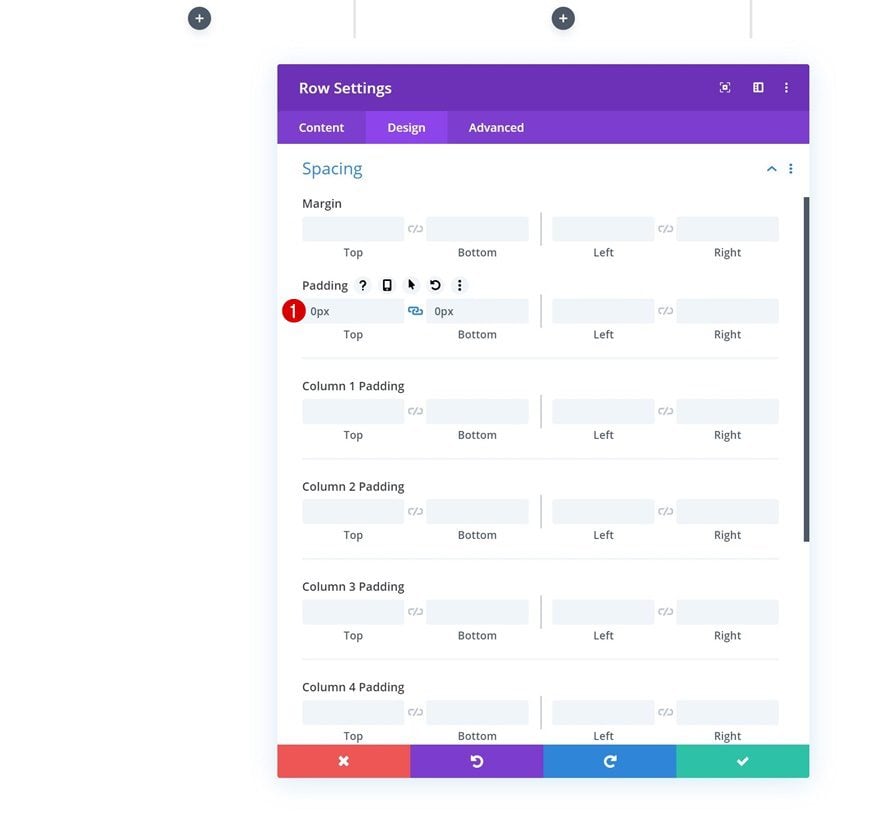
Spacing
Continue by removing all default top and bottom padding.
- Top Padding: 0px
- Bottom Padding: 0px
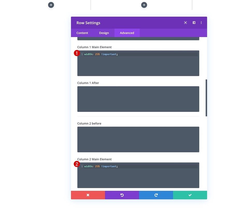
Column 1, 2, 3 & 4 Main Element
Now, to make sure a 4-column structure is kept across all screen sizes, we’re going to make sure each one of the columns keeps their 25% width by adding the following line of CSS code to each column main element individually:
width: 25% !important;
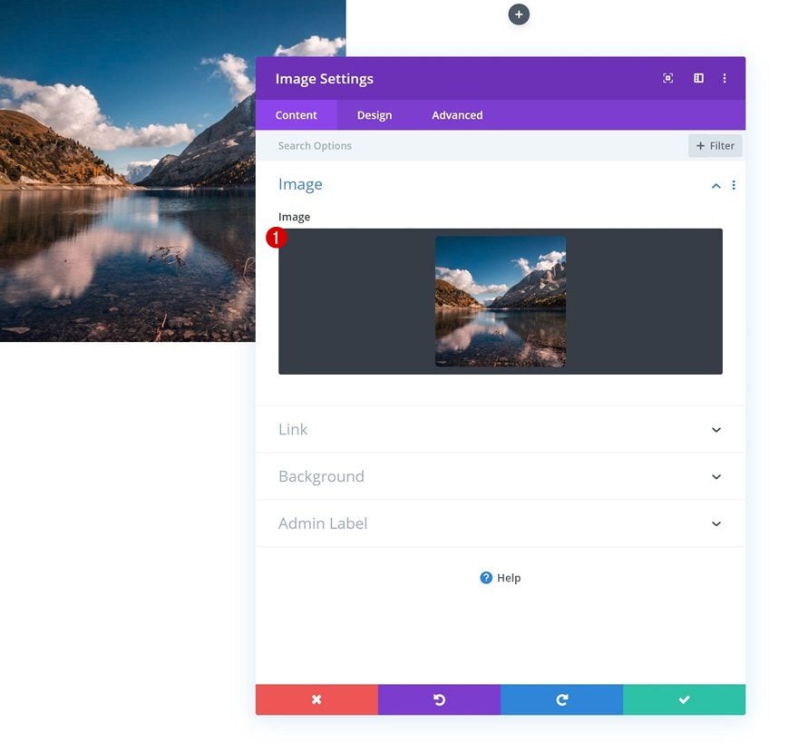
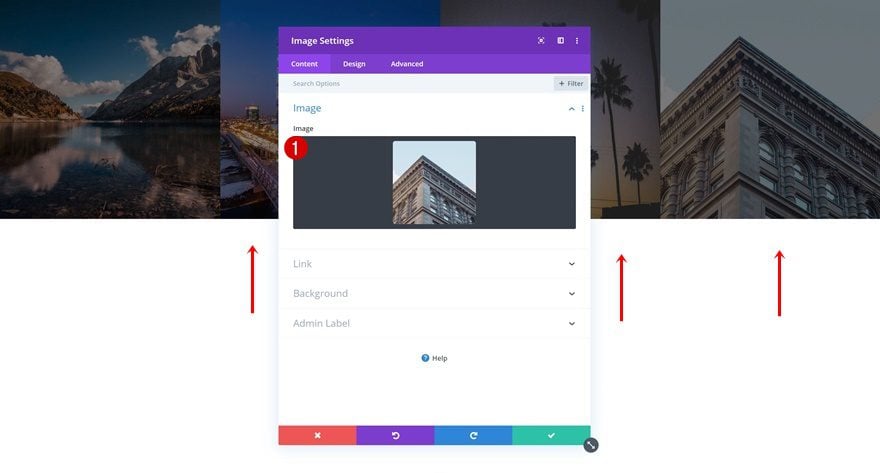
Add Image Module to Column 1
Upload 1:1 Image
Time to start adding modules! Add a new Image Module to the first column and upload a square image of your choice (or use one you can find in the zipped folder you were able to download at the beginning of this post).
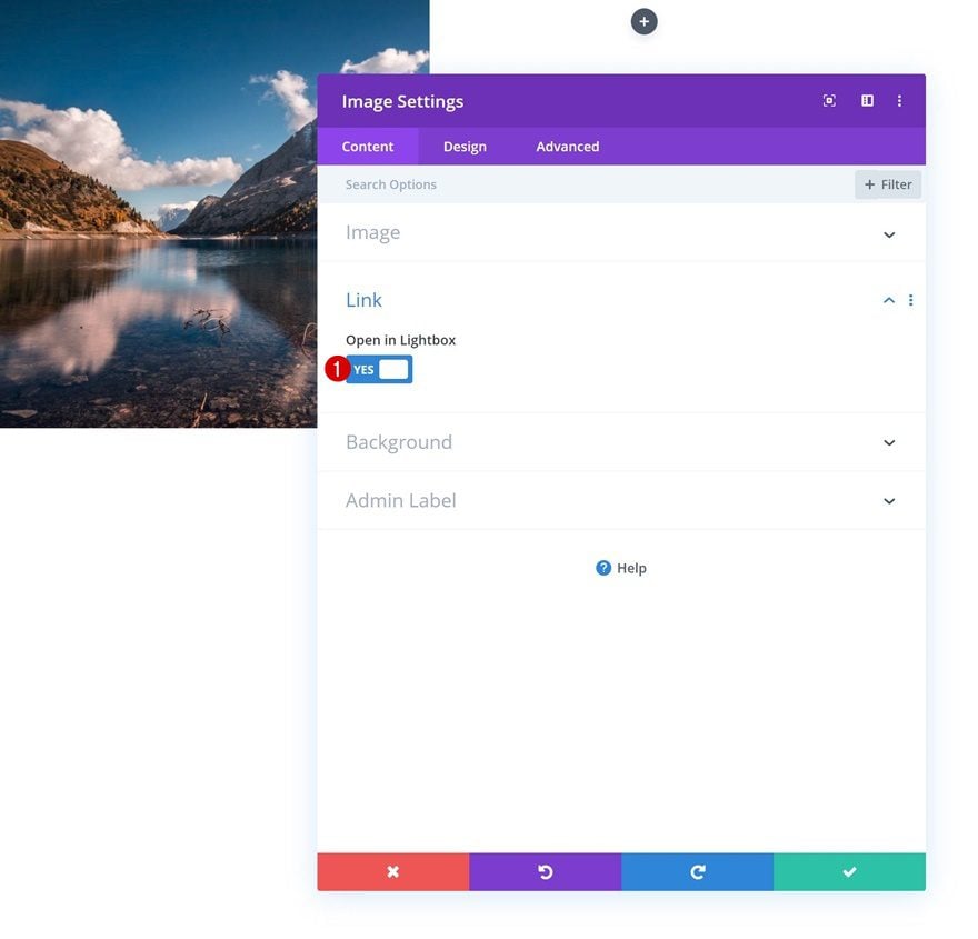
Lightbox
Enable the lightbox option in the link settings next.
- Open in Lightbox: Yes
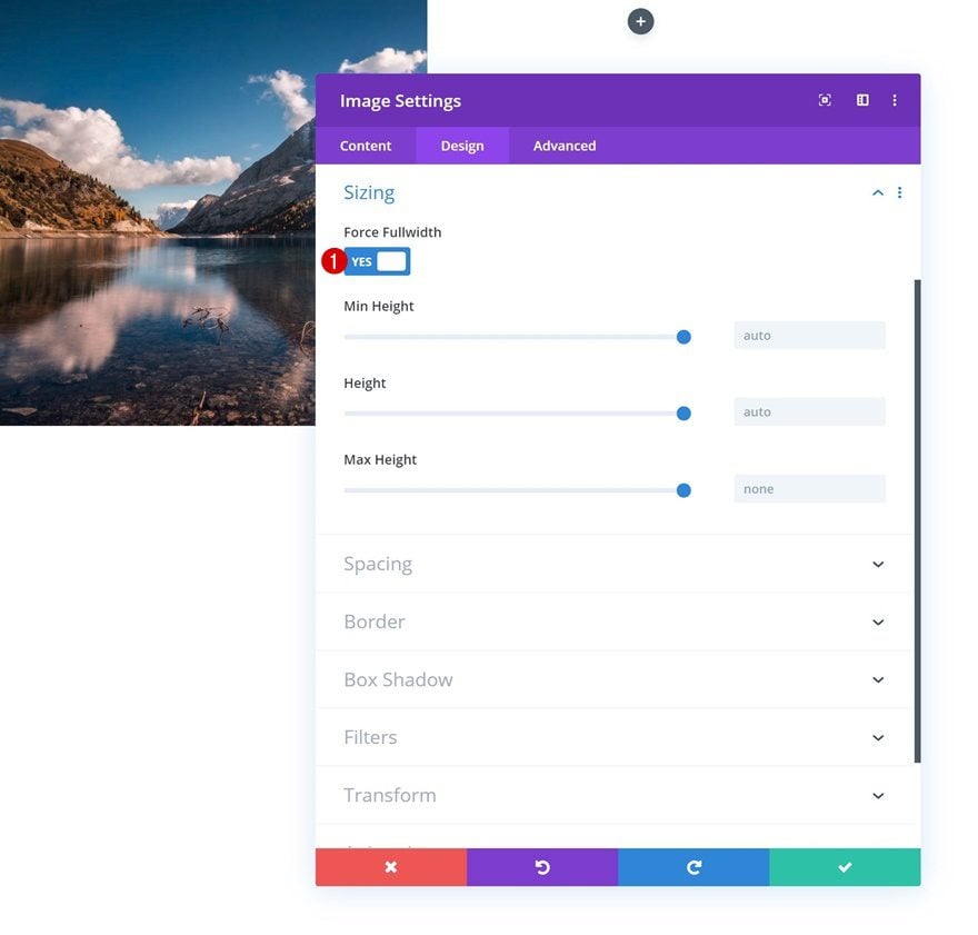
Sizing
To make sure the image remains responsive across all screen sizes, we’re going to enable the ‘Force Fullwidth’ option as well.
- Force Fullwidth: Yes
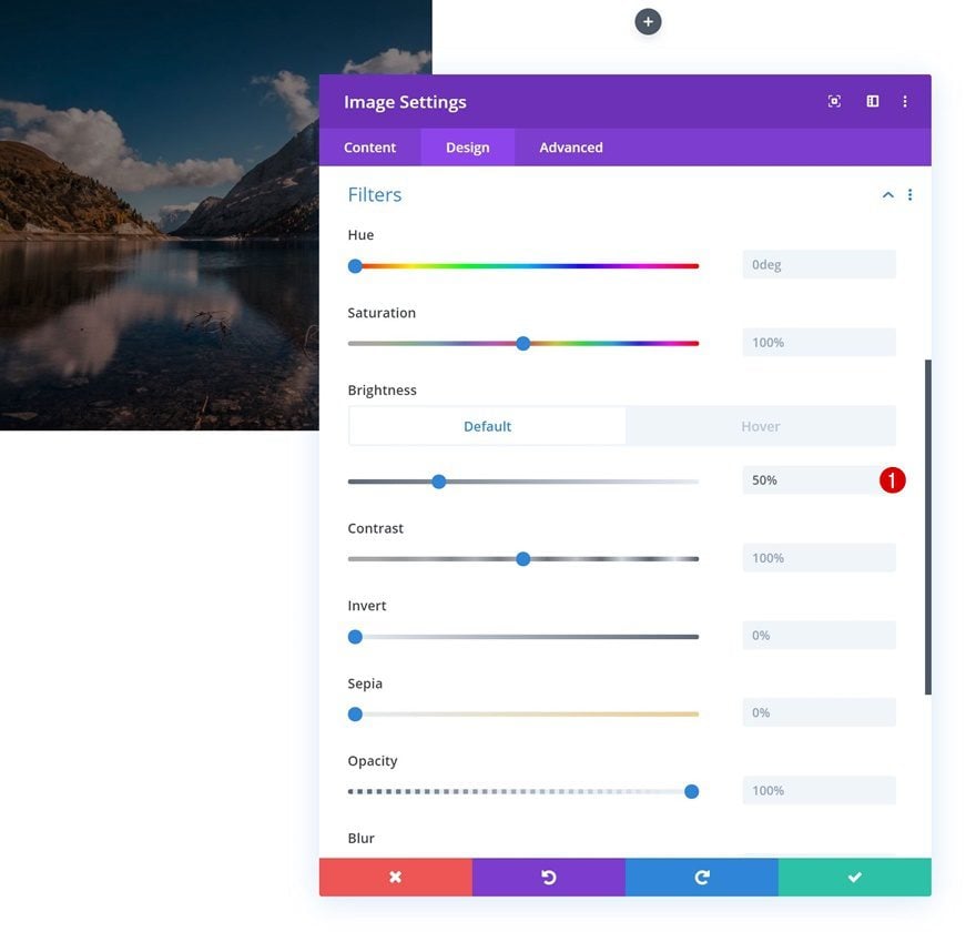
Default Filters
We’re also changing the brightness.
- Brightness: 50%
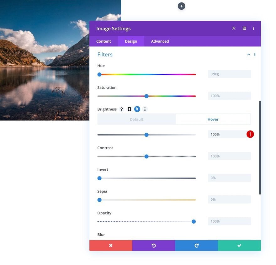
Hover Filters
And we’ll bring it back to ‘100%’ on hover.
- Brightness: 100%
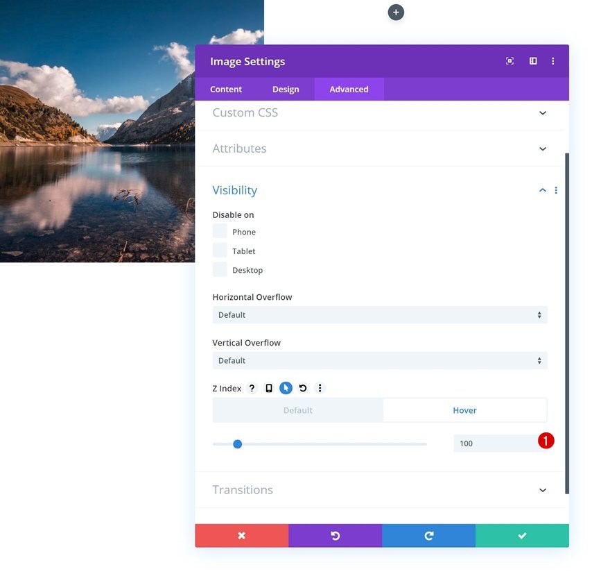
Default Z Index
Move on to the visibility settings and make sure the Z Index remains ‘0’ in its default state.
- Z Index: 0

Hover Z Index
But, on hover, we want it to overlap the numbered label Text Module we’ll add in the upcoming steps. To do that, we’ll increase the hover Z Index value.
- Z Index: 100
Clone Image Module 3 Times & Place in Remaining Columns
Once you’ve completed the Image Module in column 1, you can clone it three times. Place the duplicates in the three remaining columns of the row.
Change Images
Changes the images in the duplicates.
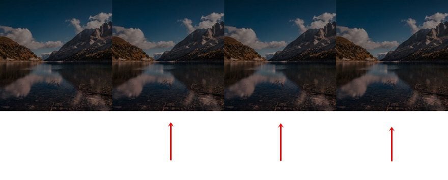
Add Top Margin to Image Module in Column 2
And add a top margin to the Image Module in the second column.
- Top Margin: 24.7vw
Add Text Module Below Image Module #1
Add Content
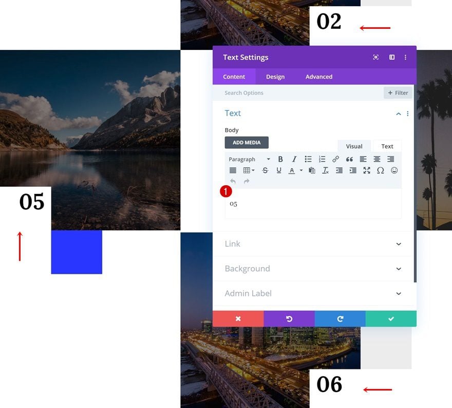
The next module we need in column 1 is a Text Module. Add a number to the content box.
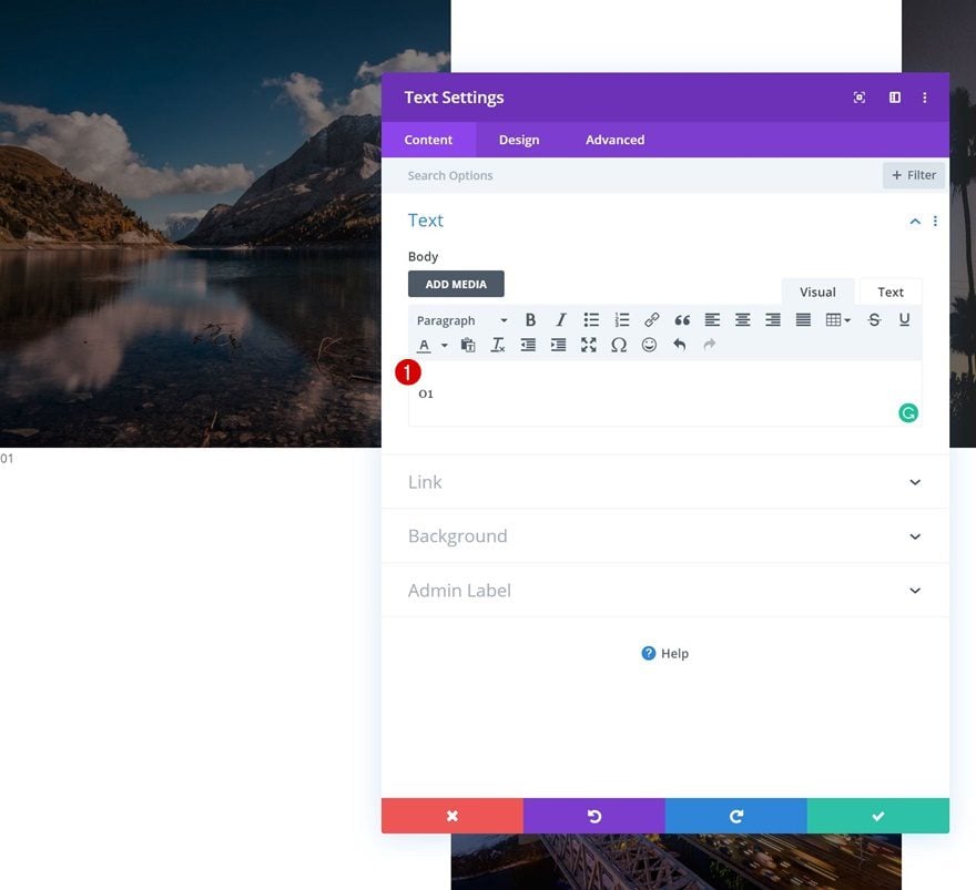
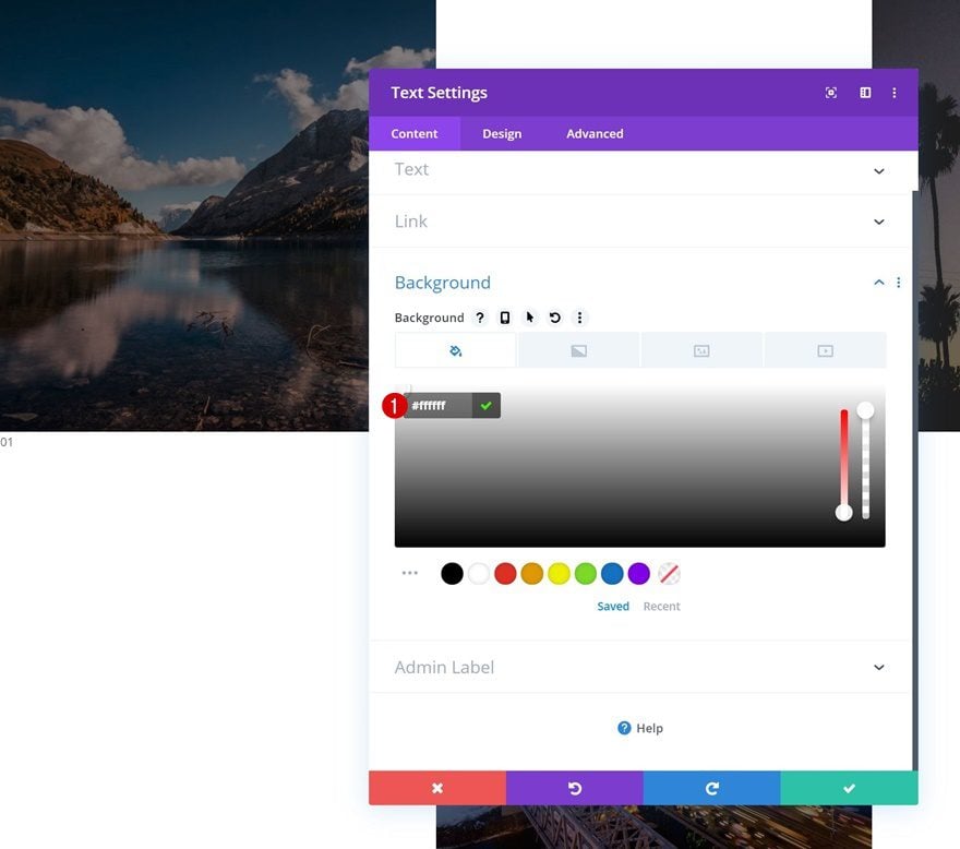
Background Color
Change the background color next. This color needs to match whatever background color you’ve assigned to the row.
- Background Color: #ffffff
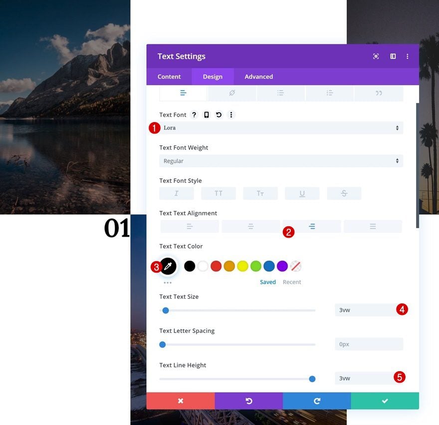
Text Settings
Move on to the design tab and change the text settings.
- Text Font: Lora
- Text Alignment: Right
- Text Color: #000000
- Text Size: 3vw
- Text Line Height: 3vw
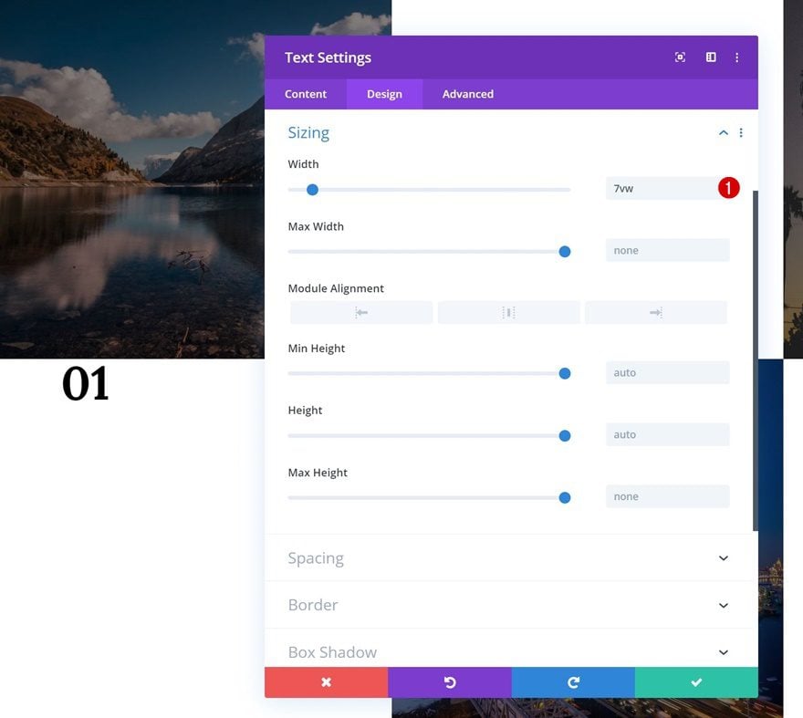
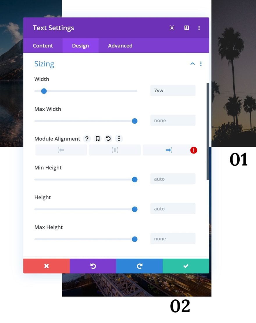
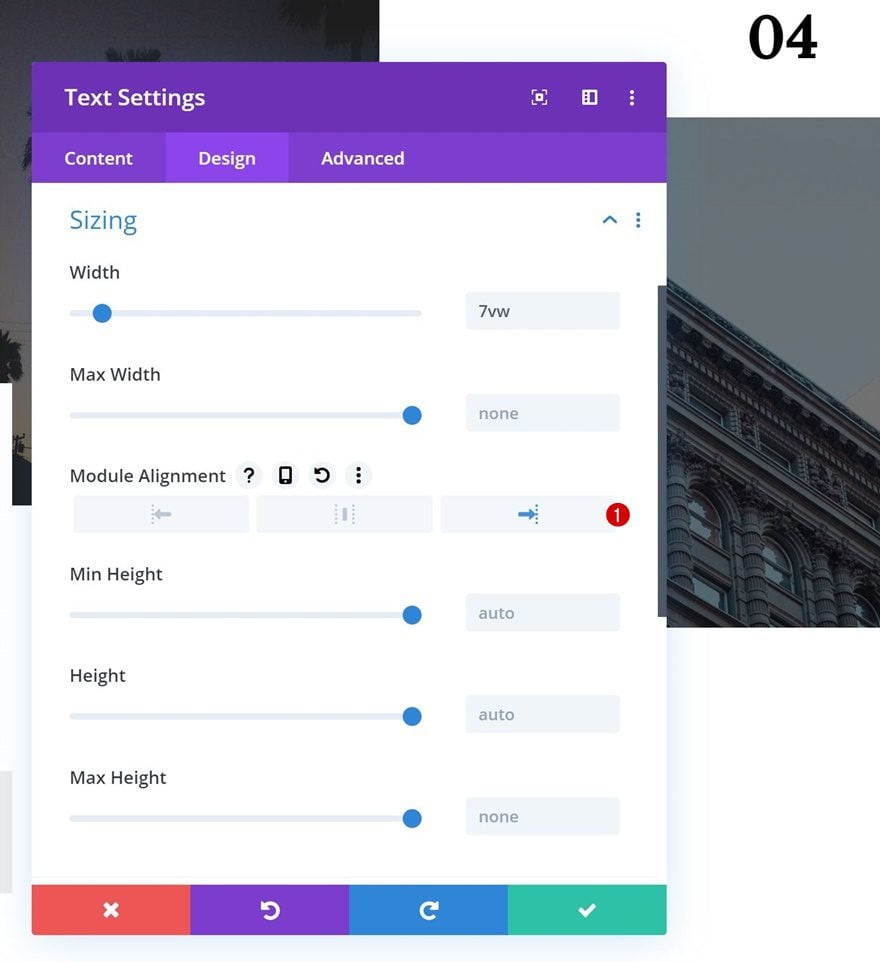
Sizing
We’re also shrinking the width of the module.
- Width: 7vw
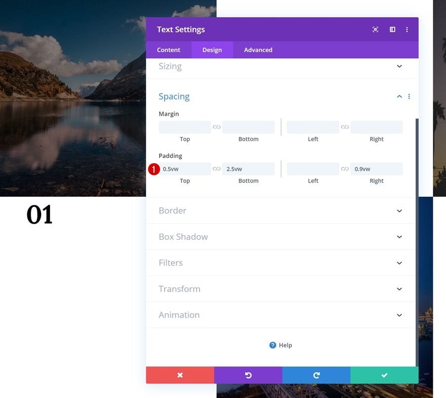
Spacing
Create some space for the module in the spacing settings next.
- Top Padding: 0.5vw
- Bottom Padding: 2.5vw
- Right Padding: 0.9vw
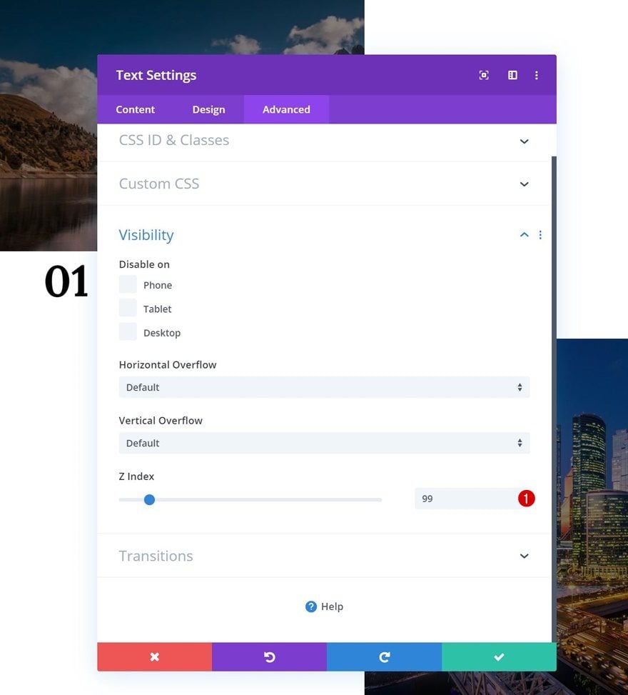
Z Index
And increase the Z Index.
- Z Index: 99
Clone Text Module 3 Times
Once you’ve completed the general steps for the Text Module, you can clone it three times.
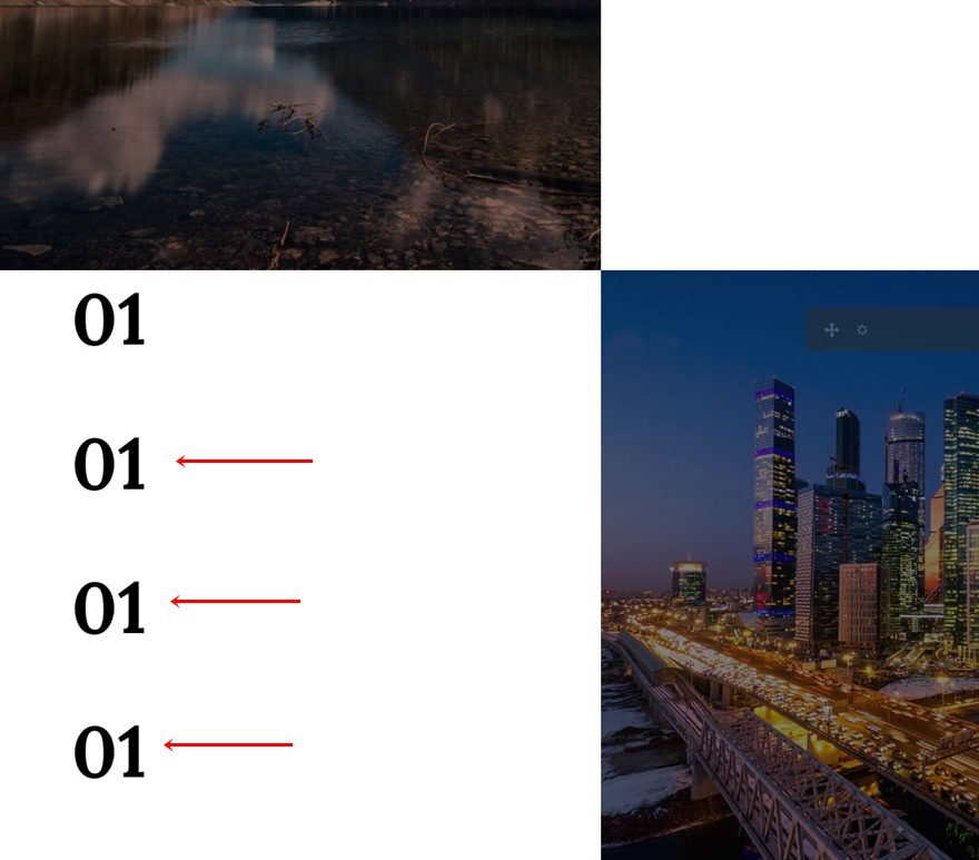
Positioning
Position the duplicates accordingly:
Customize Text Modules
Text Module #1
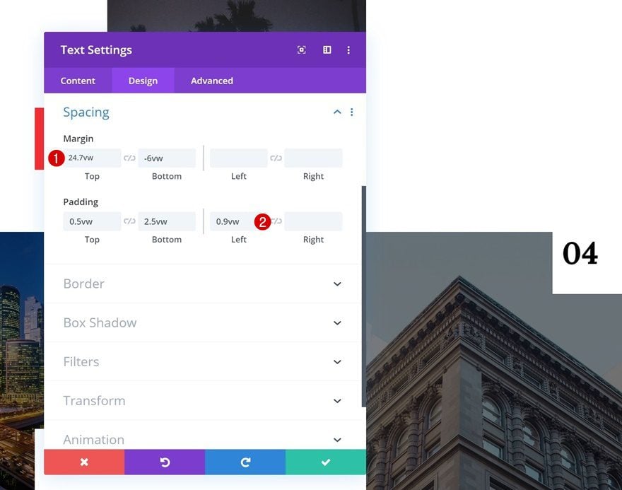
Negative Top Margin
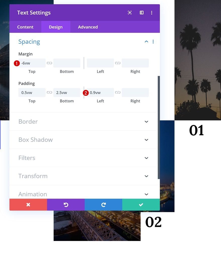
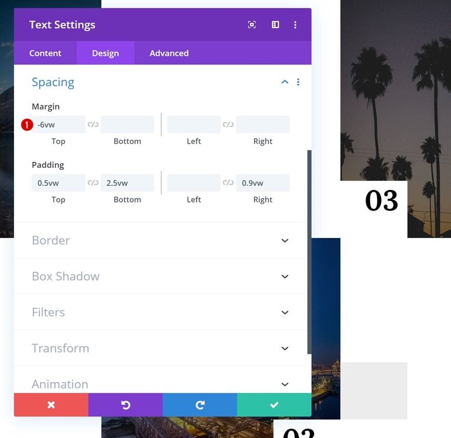
Time to start customizing the different Text Modules according to their position! Open the Text Module in column 1 and add some negative top margin.
- Top Margin: -5.9vw
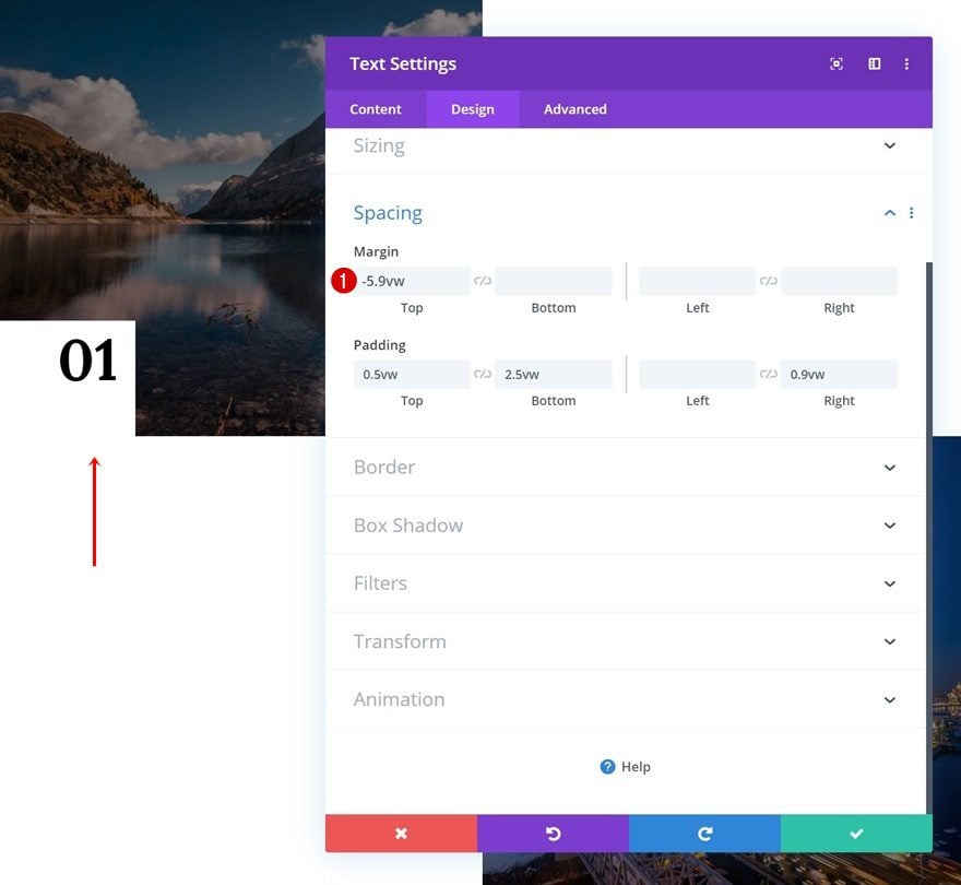
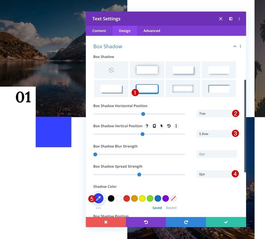
Box Shadow
We’re also adding a box shadow using the following settings:
- Box Shadow Horizontal Position: 7vw
- Box Shadow Vertical Position: 5.9vw
- Box Shadow Spread Strength: 0px
- Shadow Color: rgba(35,50,255,0.94)
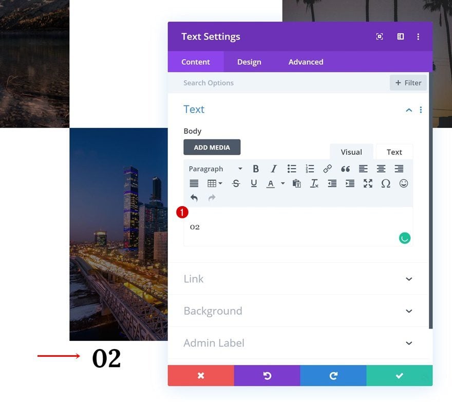
Text Module #2
Change Numbering
Continue by opening the Text Module in the second column and change the number.
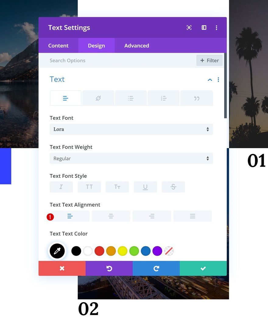
Text Alignment
Modify the text alignment as well.
- Text Alignment: Left
Module Alignment
And change the module alignment in the sizing settings.
- Module Alignment: Right
Spacing
Move on to the spacing settings and add some negative top margin. Add the padding to the left instead of the right side as well.
- Top Margin: -6vw
- Left Padding: 0.9vw
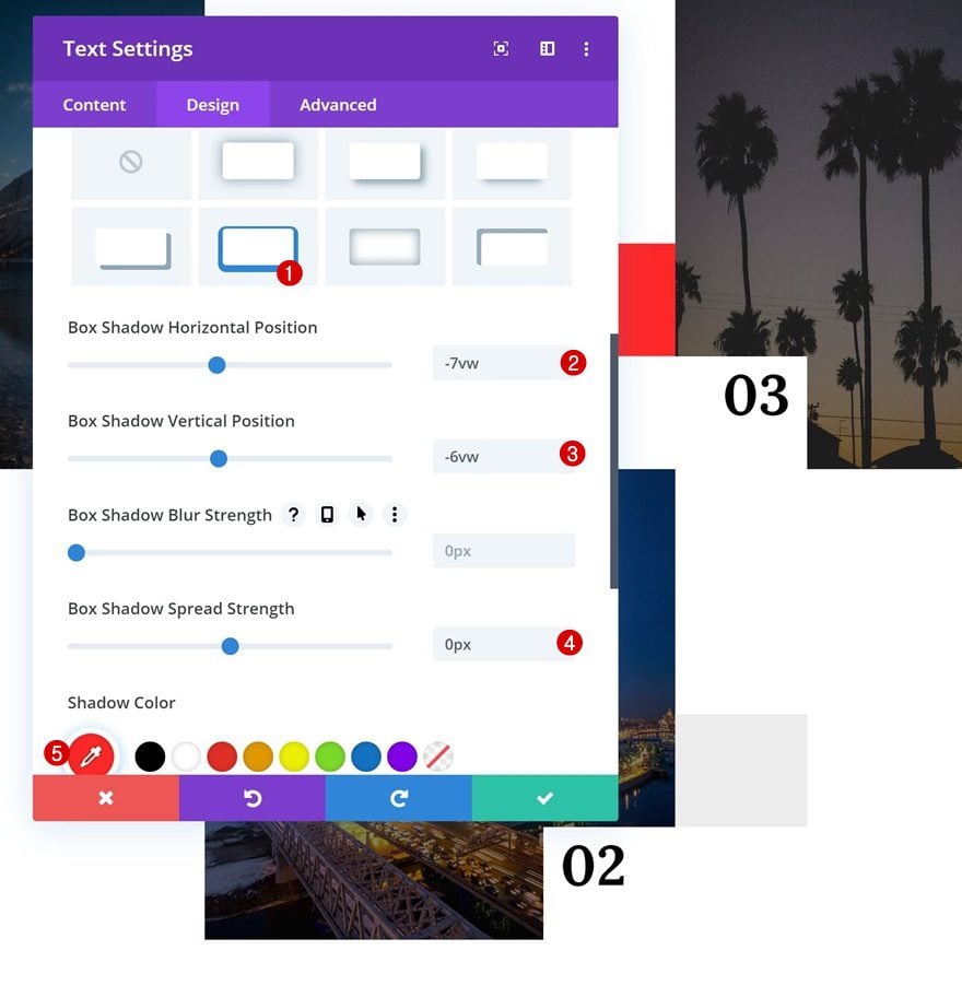
Box Shadow
Complete the Text Module design by adding a box shadow.
- Box Shadow Horizontal Position: 7vw
- Box Shadow Vertical Position: -6vw
- Box Shadow Spread Strength: 0px
- Shadow Color: #ededed
Text Module #3
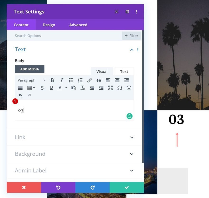
Change Numbering
On to the Text Module in column 3! Change the number in the content box.
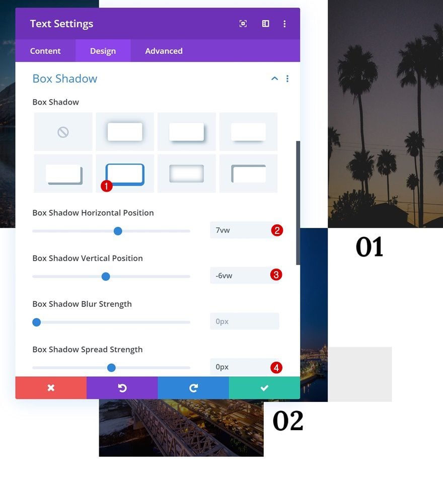
Negative Top Margin
Move on to the design tab and add some negative top margin.
- Top Margin: -6vw
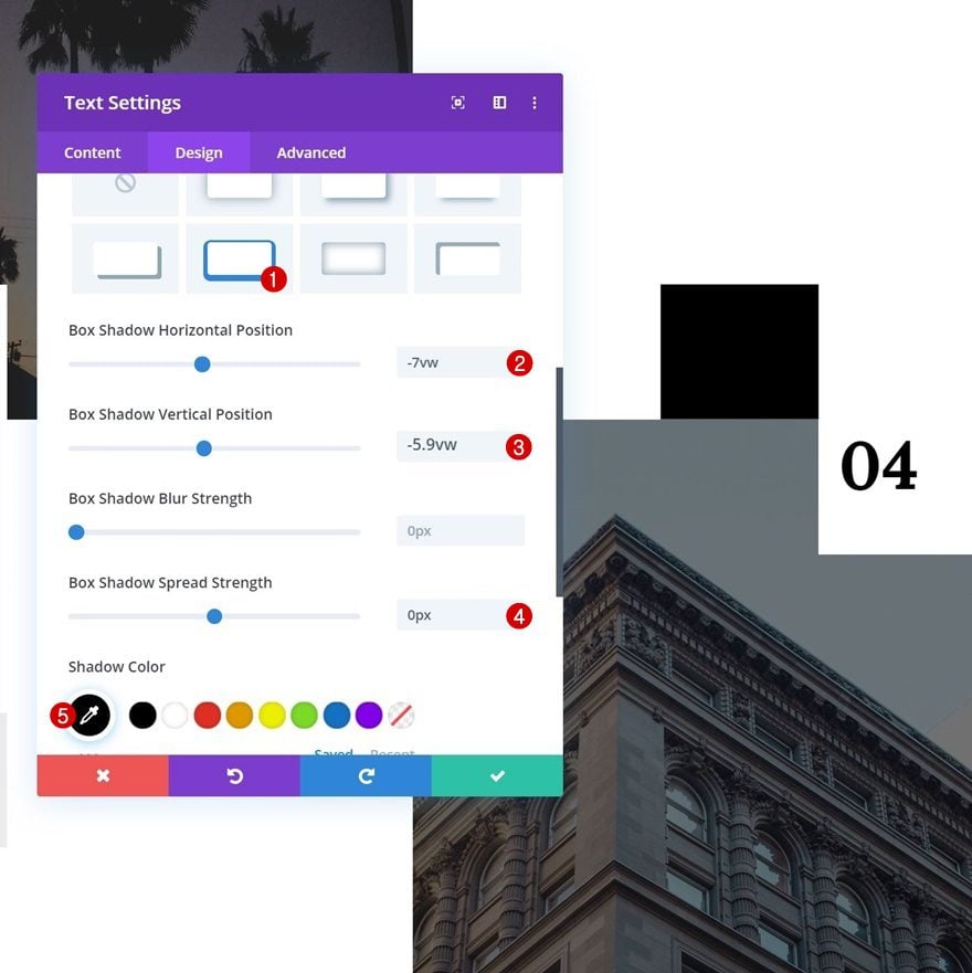
Box Shadow
Use a box shadow as well.
- Box Shadow Horizontal Position: -7vw
- Box Shadow Vertical Position: -6vw
- Box Shadow Spread Strength: 0px
- Shadow Color: #ff2323
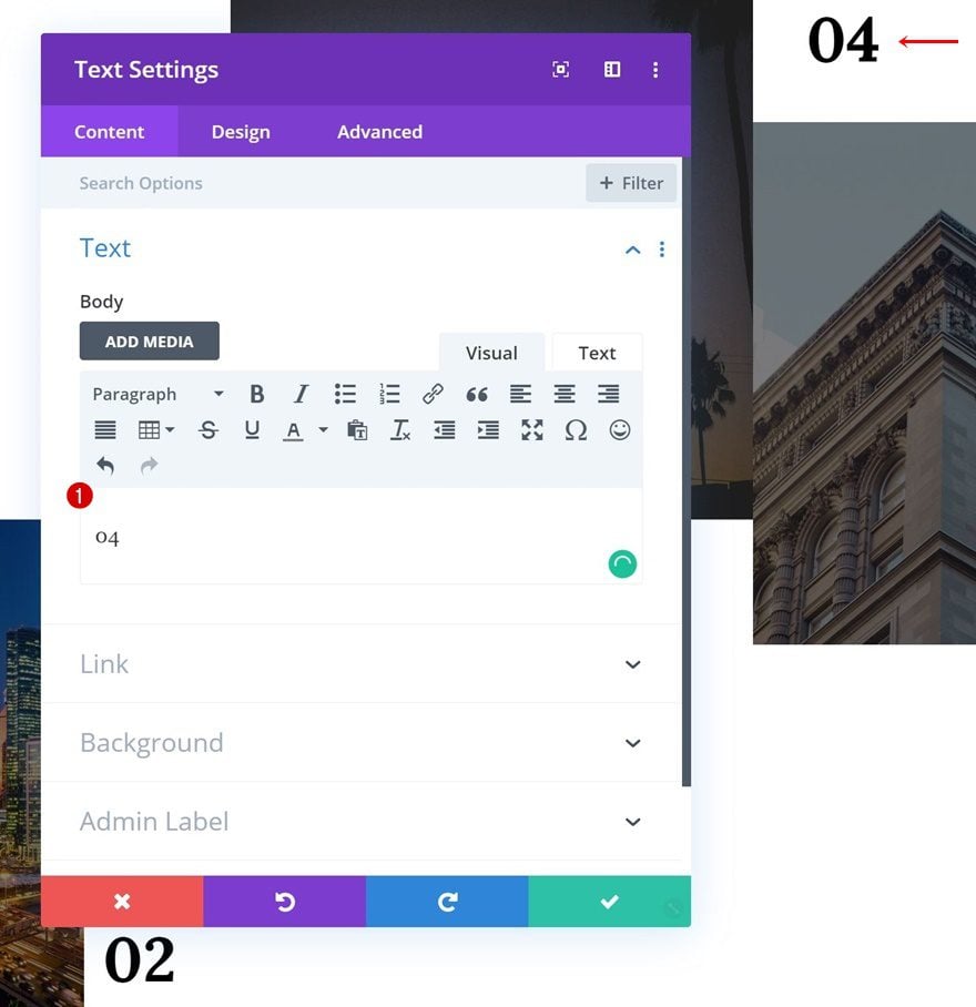
Text Module #4
Change Numbering
On to the next and last Text Module. Change the number here as well.
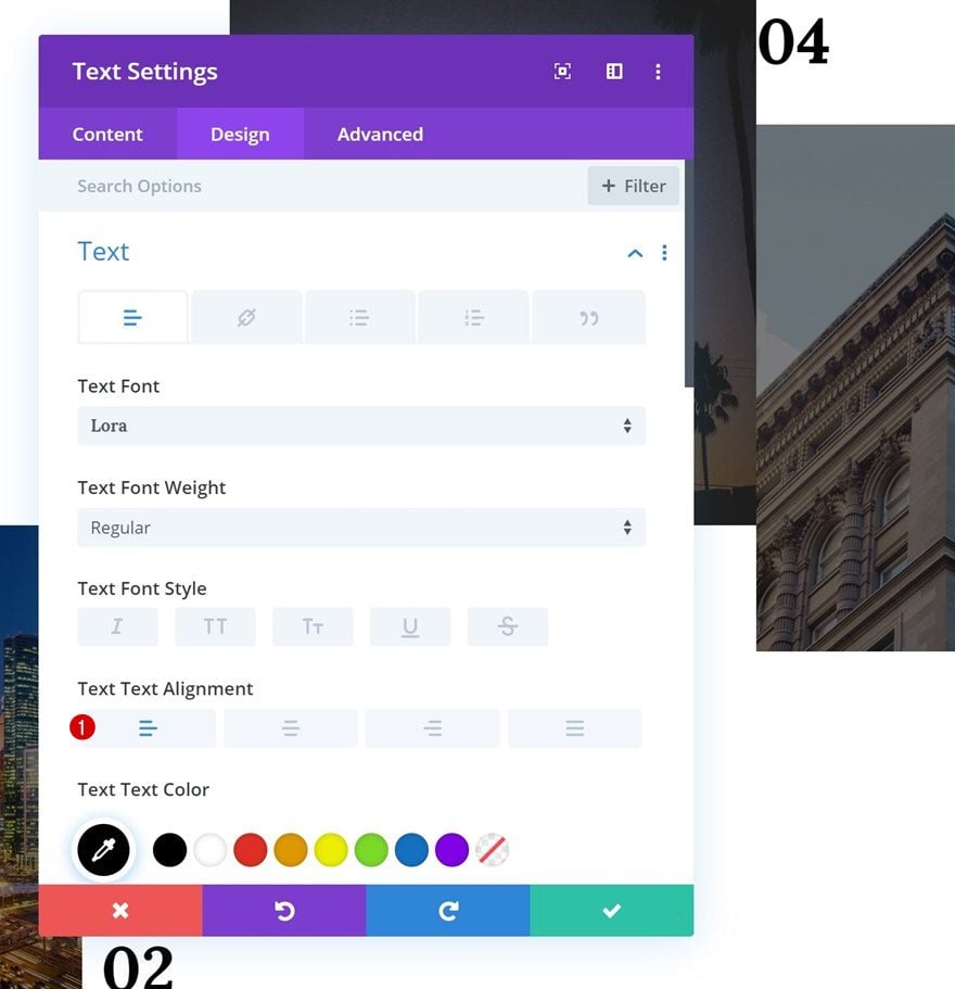
Text Alignment
Then, change the text alignment.
- Text Alignment: Left
Module Alignment
Modify the module alignment in the sizing settings too.
- Module Alignment: Right
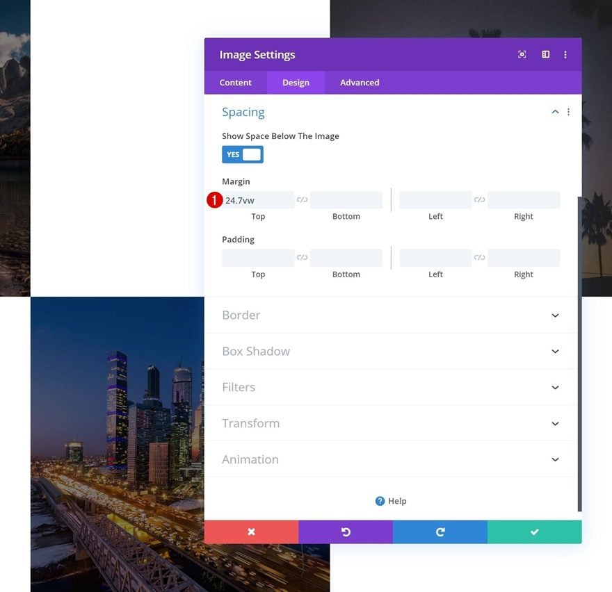
Change Spacing
Modify the spacing settings next.
- Top Margin: 24.7vw
- Bottom Margin: -6vw
- Left Padding: 0.9vw
Box Shadow
And complete the Text Module design by adding a box shadow with the following settings:
- Box Shadow Horizontal Position: -7vw
- Box Shadow Vertical Position: -5.9vw
- Box Shadow Spread Strength: 0px
- Shadow Color: #000000
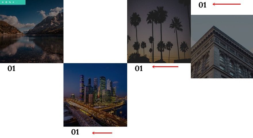
Clone Entire Row
Once you’ve completed the row, you can clone it up to as many times as you want, depending on how many images you want to be displayed.
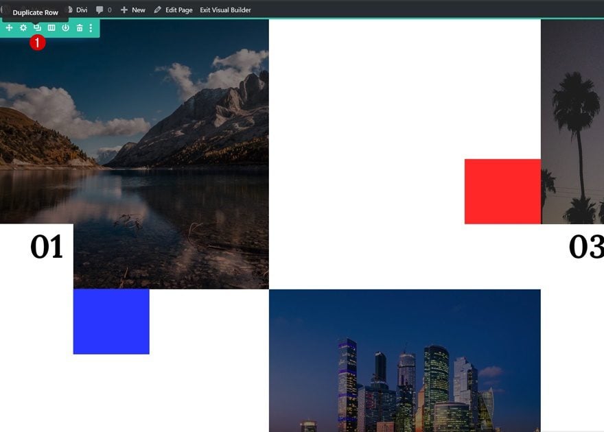
Change Numbering & Images
Make sure you change all the images and numbers and you’re done!
Preview
Now that we’ve gone through all the steps, let’s take a final look at the outcome across different screen sizes.
Final Thoughts
In this post, we’ve shown you how to create a nice-looking gallery with labeled image corners. This is a unique way to showcase your images in an aesthetically-appealing way. You were also able to download the JSON file at the beginning of the tutorial. If you have any questions or suggestions, make sure you leave a comment in the comment section below!
If you’re eager to learn more about Divi and get more Divi freebies, make sure you subscribe to our email newsletter and YouTube channel so you’ll always be one of the first people to know and get benefits from this free content.


Nice post. Very helpfull.
Hii thats a piece of wonderful information I really enjoyed your blogs thanks for telling us how to create gallery grid. I have tried it in my wordpress site and its worked. Keep sharing such a wonderful information
Someone (anyone) described this as “stunning” — ? Must be a proud Mom. This layout may be useful or interesting to some, but stunning — I disagree emphatically. The layout doesn’t present the images well, and the image corners are not aesthetically pleasing at all. It looks like a jumble of missing data that didn’t finish loading.