
By default, as soon as you add gallery images to your WooCommerce products, they’ll appear horizontally below your product’s featured image on the frontend of your product page design. In some specific designs, vertically stacking these woo gallery images might be more convenient, in fullscreen product page designs, for instance. If you’re looking for a quick way to vertically stack woo gallery images inside the product page template you create with Divi’s Theme Builder, you’ll love this tutorial. We’ll show you step by step how to get there. We’ll accompany this approach with and minimal product page template that you’ll be able to download for free as well! This tutorial works best on product pages that use images with a 1:1 ratio.
Let’s get to it.
Preview
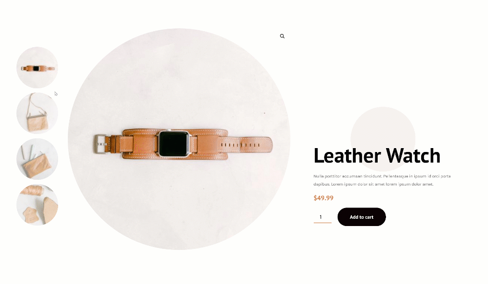
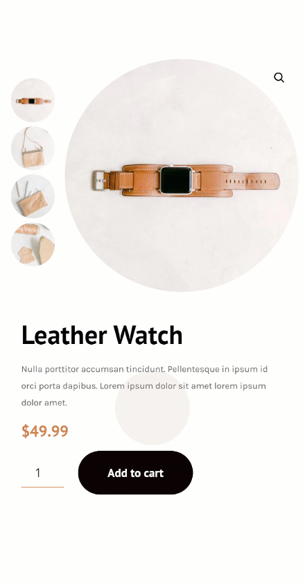
Before we dive into the tutorial, let’s take a quick look at the outcome across different screen sizes.
Desktop
Mobile
Download The Product Page Template for FREE
To lay your hands on the free product page template, you will first need to download it using the button below. To gain access to the download you will need to subscribe to our newsletter by using the form below. As a new subscriber, you will receive even more Divi goodness and a free Divi Layout pack every Monday! If you’re already on the list, simply enter your email address below and click download. You will not be “resubscribed” or receive extra emails.

Build Product Page Template Inside Divi Theme Builder
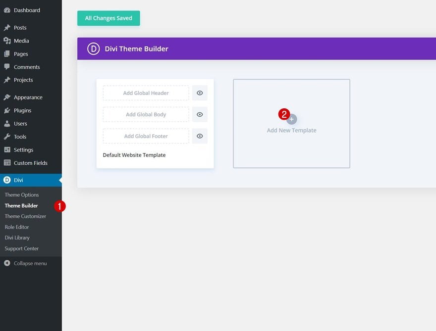
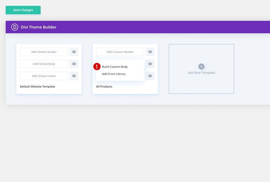
Go to Divi Theme Builder & Add New Template
Start by going to the Divi Theme Builder and click on ‘Add New Template’.
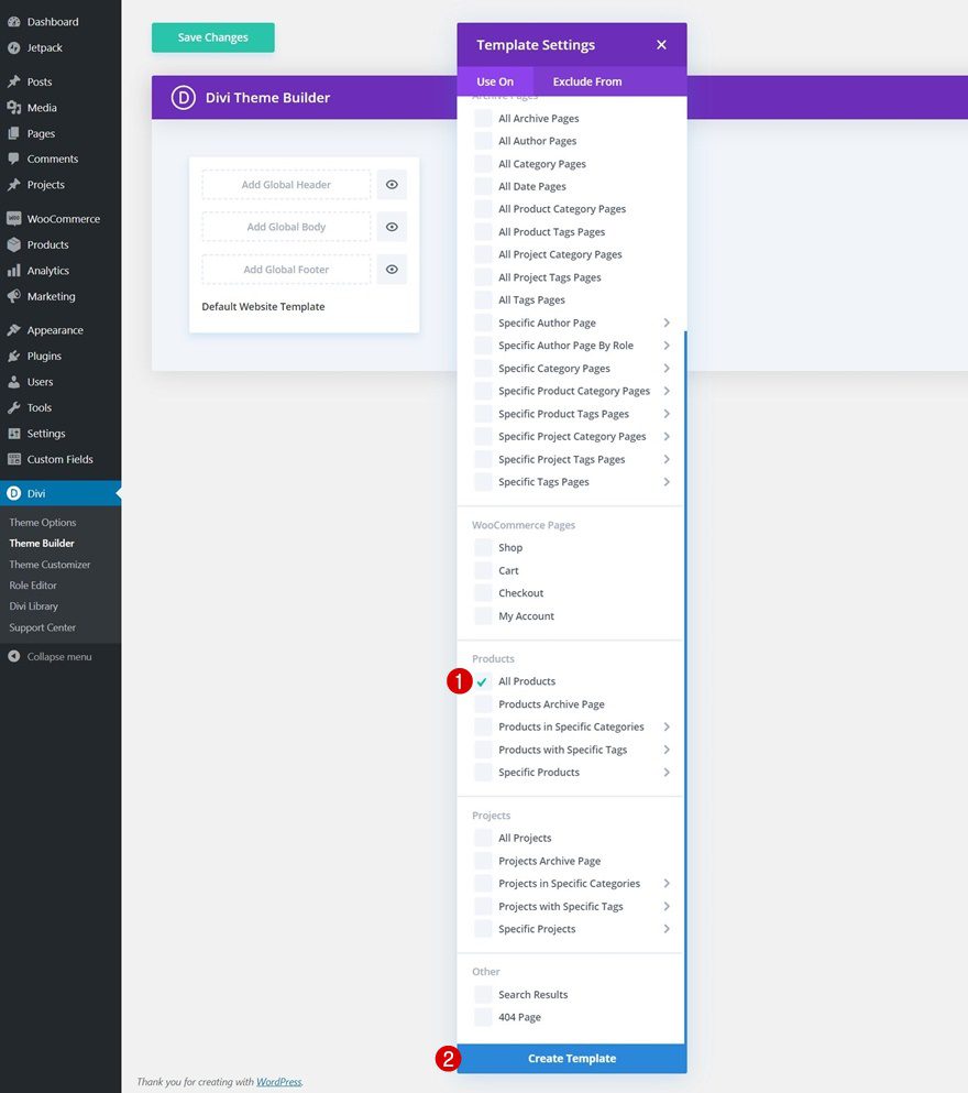
Use Template on All Products
We’ll use this template on all products, but feel free to modify the conditions however you like.
Enter Template’s Body Template Editor
Once you’ve created the template, click on ‘Add Custom Body’ and continue by selecting ‘Build Custom Body’ to be redirected to the template editor.
Start Building Category Page Template Body
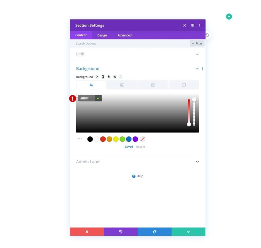
Modify Section #1
Background Color
Inside the template editor, you’ll notice a section. Open that section and add a white background color.
- Background Color: #ffffff
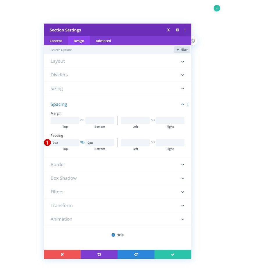
Spacing
Move on to the design tab and remove all default top and bottom padding next.
- Top Padding: 0px
- Bottom Padding: 0px
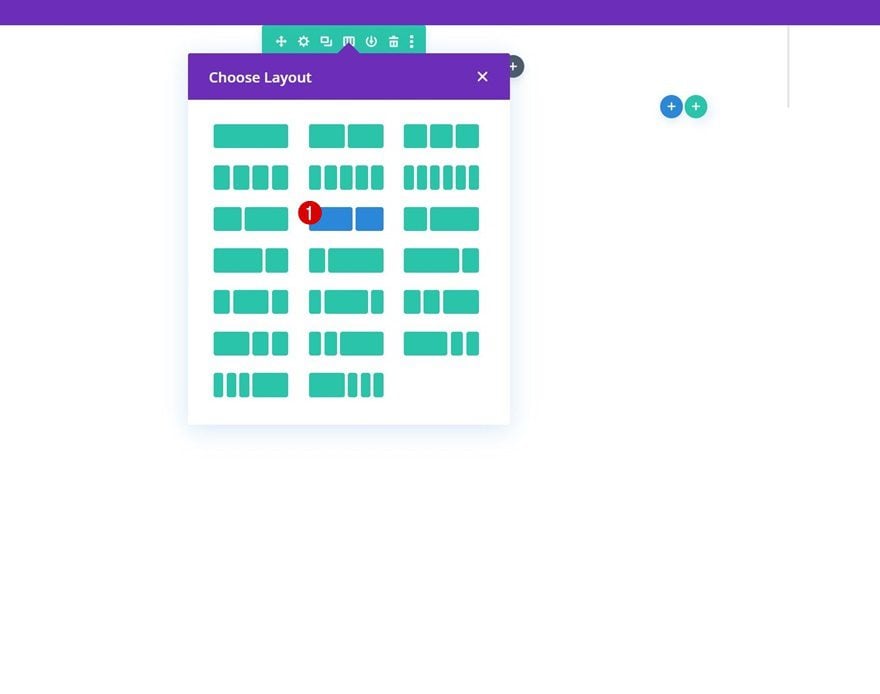
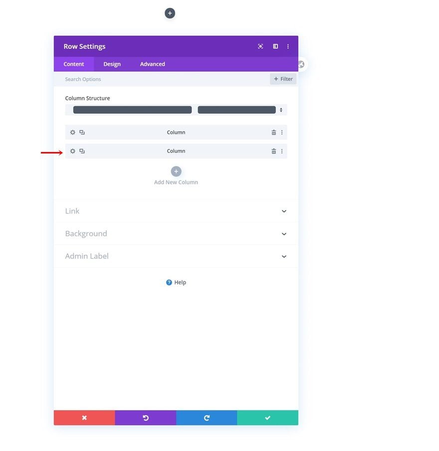
Add New Row
Column Structure
Continue by adding a new row using the following column structure:
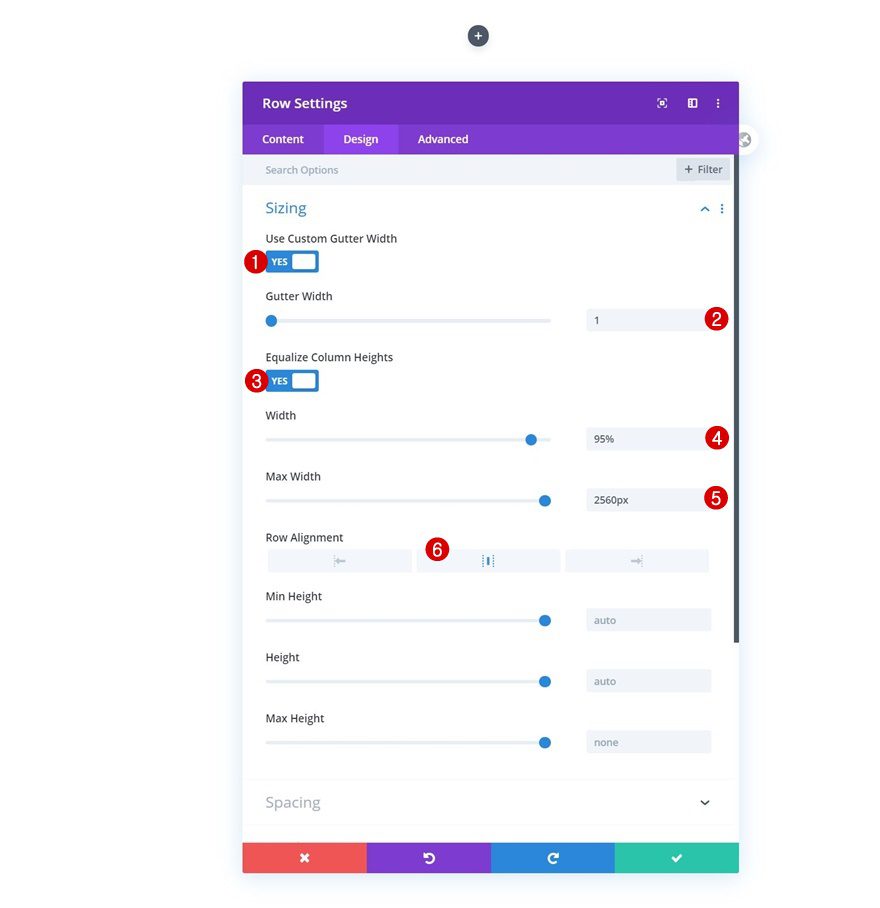
Sizing
Without adding any modules yet, open the row settings, move on to the design tab and change the sizing settings accordingly:
- Use Custom Gutter Width: Yes
- Gutter Width: 1
- Equalize Column Heights: Yes
- Width: 95%
- Max Width: 2560px
- Row Alignment: Center
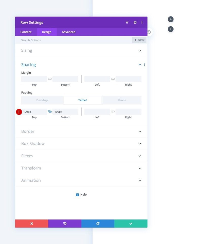
Spacing
We’ll use some custom top and bottom padding on smaller screen sizes too.
- Top Padding: 100px (Tablet & Phone Only)
- Bottom Padding: 100px (Tablet & Phone Only)
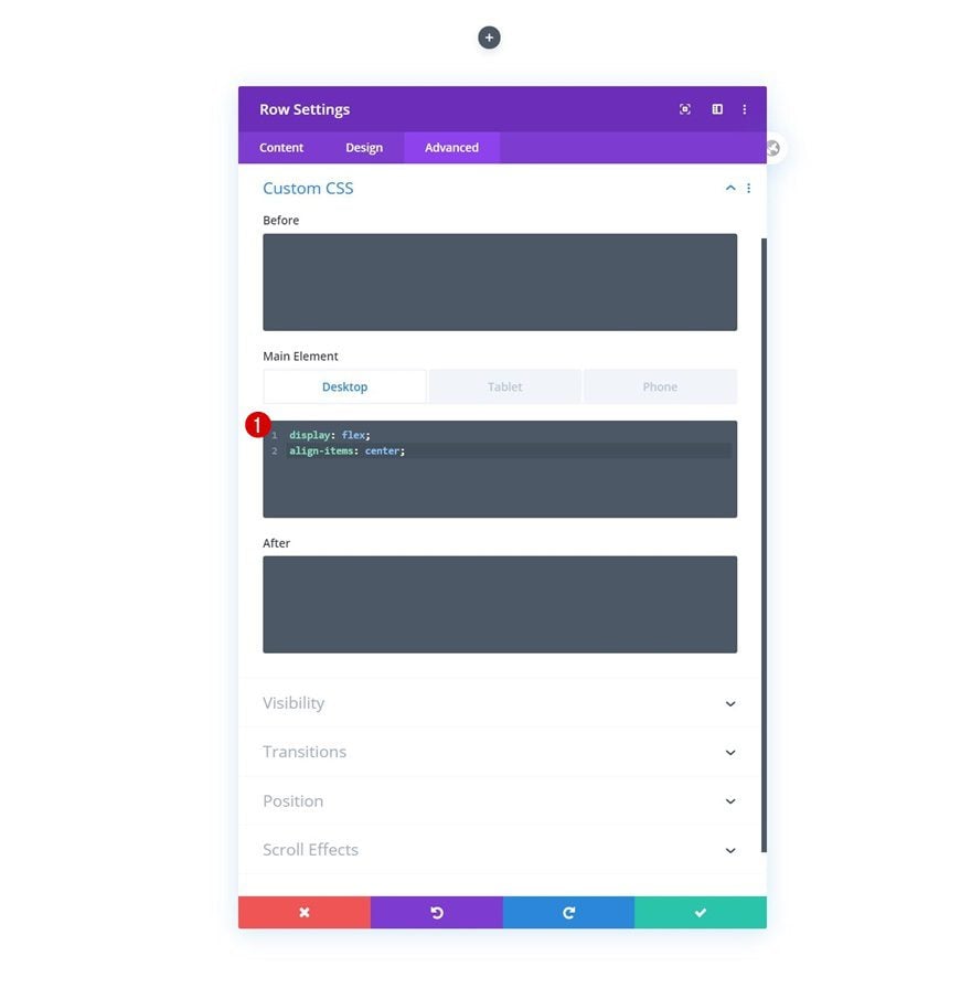
Main Element CSS
To align column content on desktop, we’ll use two lines of CSS Code in the row’s main element. We’ll bring back the display property on tablet and phone.
Desktop:
display: flex;
align-items: center;
Tablet & Phone:
display: block;
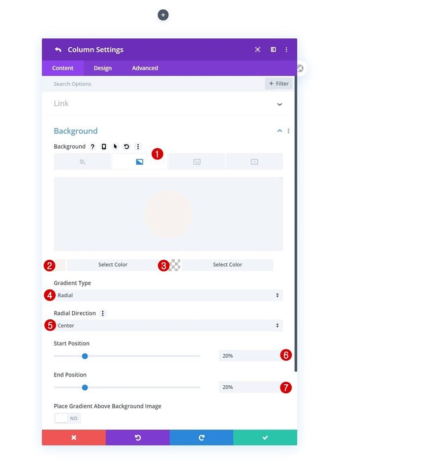
Column 2 Gradient Background
Once the general row settings are done, open the second column’s settings and apply a radial gradient background.
- Color 1: #f7f2ef
- Color 2: rgba(255,255,255,0)
- Gradient Type: Radial
- Radial Direction: Center
- Start Position: 20%
- End Position: 20%
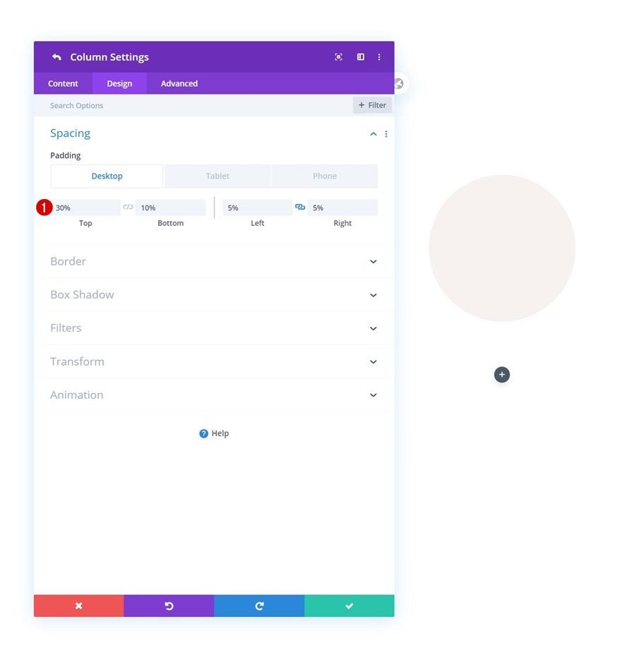
Column 2 Spacing
Move on to the column’s design tab and change the custom padding values across different screen sizes.
- Top Padding: 30% (Desktop), 10% (Tablet & Phone)
- Bottom Padding: 10%
- Left Padding: 5%
- Right Padding: 5%
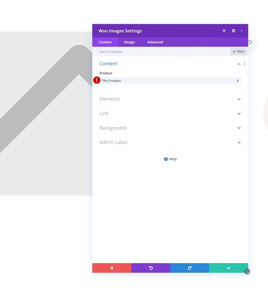
Add Woo Images Module to Column 1
Dynamic Content
Time to add modules! The first module we need in column 1 is a Woo Images Module. This tutorial works best if you’re using a featured image and gallery images with a 1:1 ratio. That way, we’ll be able to turn the images into circles in the upcoming steps. Once you’ve added the Woo Images Module, make sure the dynamic content is set to ‘This Product’.
- Product: This Product
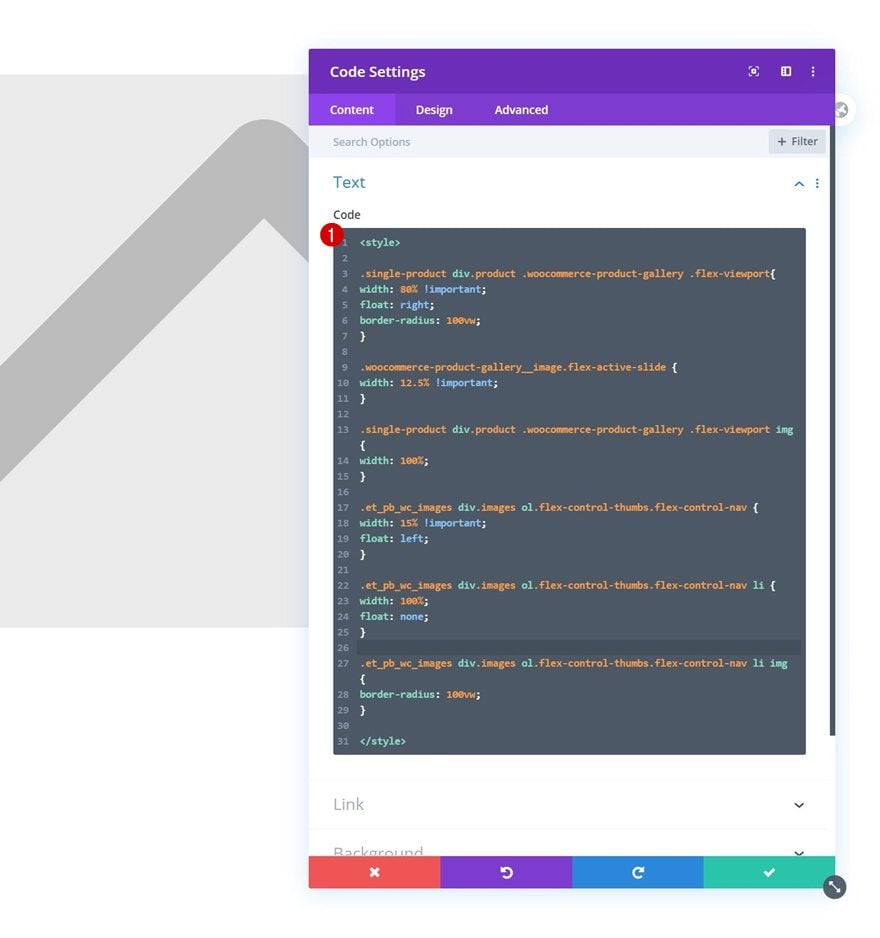
Add Code Module to Column 1
Add CSS Code
Right below the Woo Images Module, we’re going to add a Code Module. The CSS code we insert in this Code Module will help us vertically stack woo gallery images on the left side of our column.
<style>

.single-product div.product .woocommerce-product-gallery .flex-viewport{
width: 80% !important;
float: right;
border-radius: 100vw;
}

.woocommerce-product-gallery__image.flex-active-slide {
width: 12.5% !important;
}

.single-product div.product .woocommerce-product-gallery .flex-viewport img {
width: 100%;
}

.et_pb_wc_images div.images ol.flex-control-thumbs.flex-control-nav {
width: 15% !important;
float: left;
}

.et_pb_wc_images div.images ol.flex-control-thumbs.flex-control-nav li {
width: 100%;
float: none;
}

.et_pb_wc_images div.images ol.flex-control-thumbs.flex-control-nav li img {
border-radius: 100vw;
}

</style>
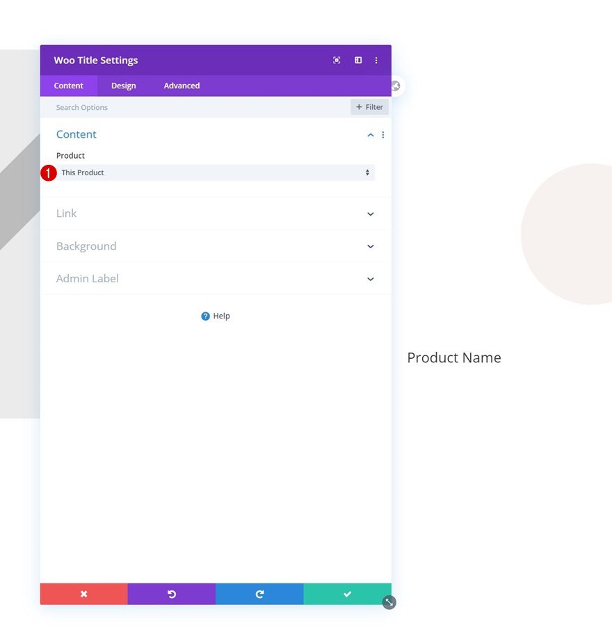
Add Woo Title Module to Column 2
Dynamic Content
On to the next column. There, the first module we need is a Woo Title Module.
- Product: This Product
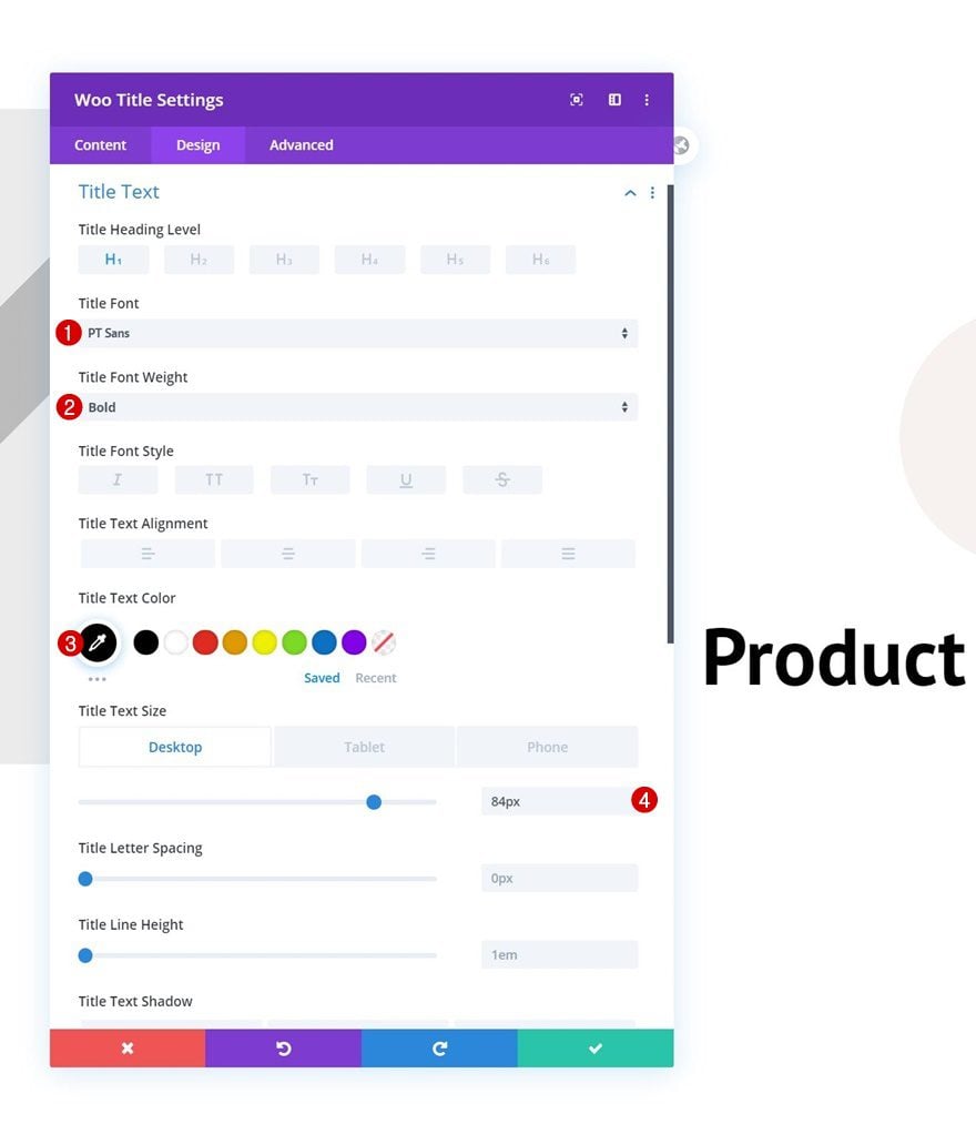
Title Text Settings
Move on to the module’s design tab and change the heading text settings as follows:
- Title Font: PT Sans
- Title Font Weight: Bold
- Title Text Color: #000000
- Title Text Size: 84px (Desktop), 60px (Tablet), 45px (Phone)
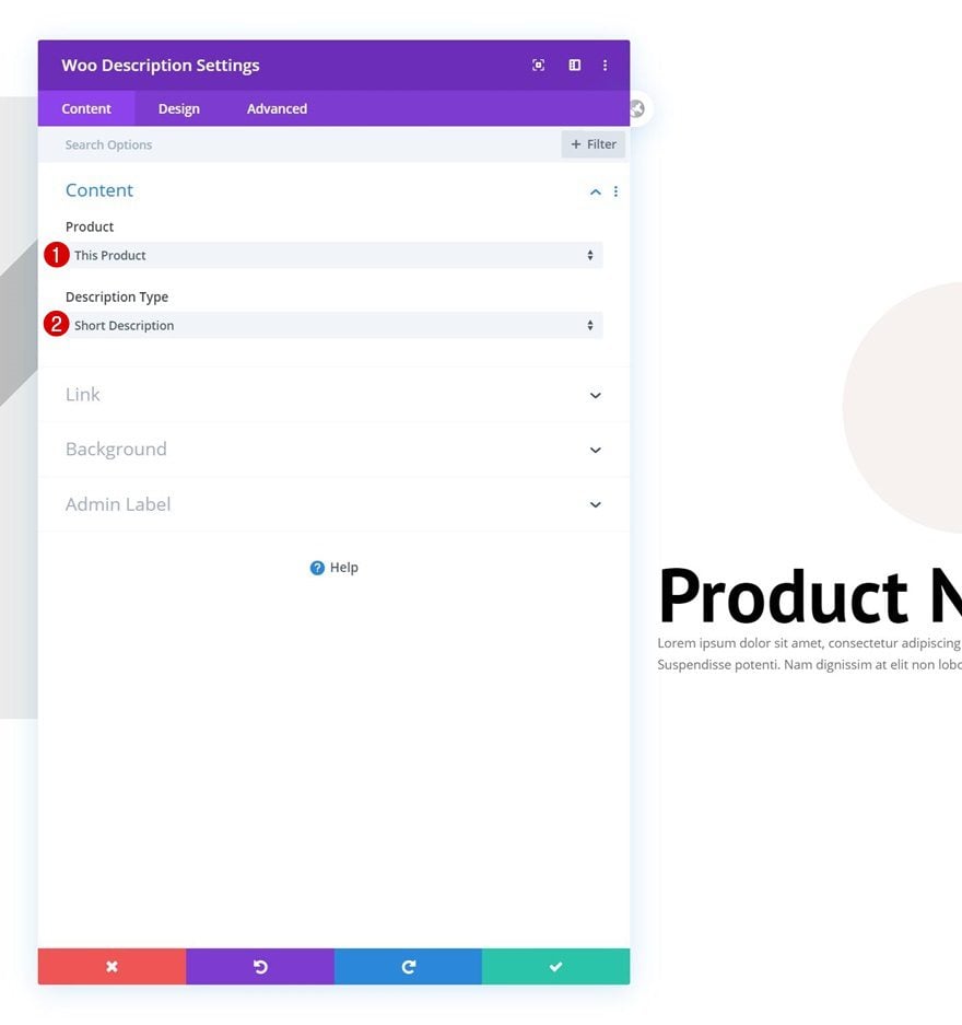
Add Woo Description Module to Column 2
Dynamic Content
On to the next module, which is a Woo Description Module.
- Product: This Product
- Description Type: Short Description
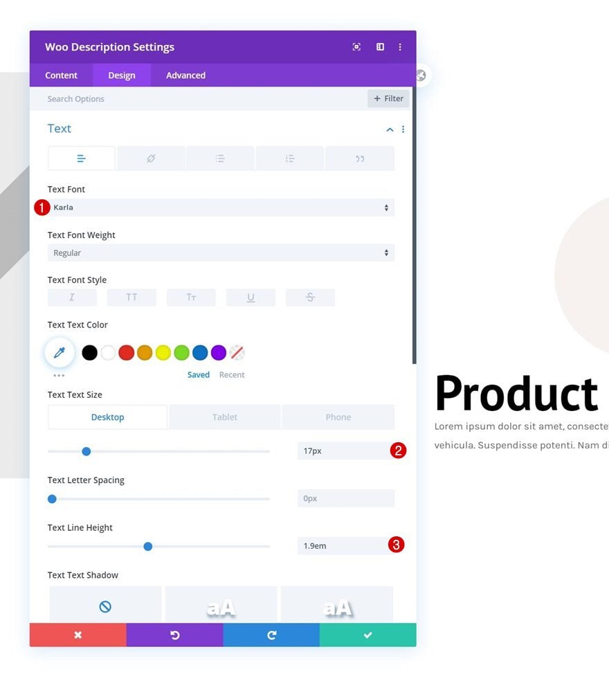
Text Settings
Modify the module’s text settings accordingly:
- Text Font: Karla
- Text Size: 17px (Desktop& Tablet), 15px (Phone)
- Text Line Height: 1.9em
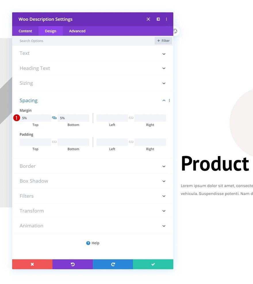
Spacing
Complete the module settings by adding some top and bottom margin.
- Top Margin: 5%
- Bottom Margin: 5%
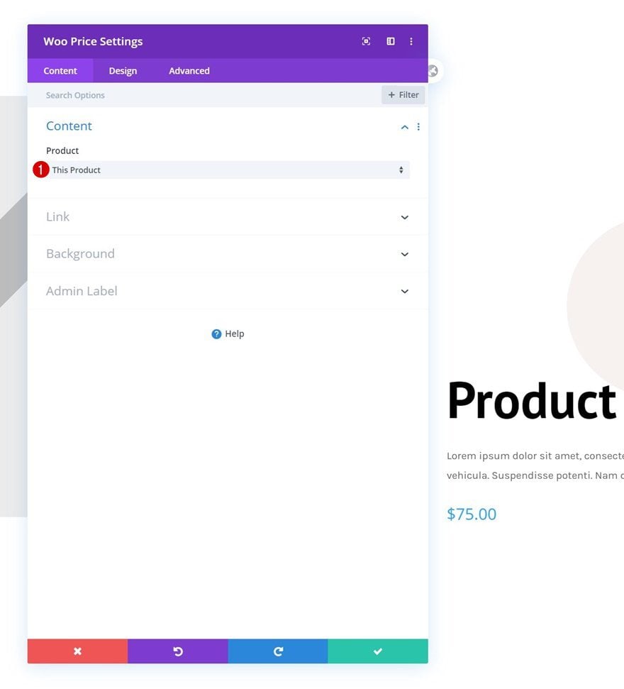
Add Woo Price Module to Column 2
Dynamic Content
Add a Woo Price Module right below the Woo Description Module.
- Product: This Product
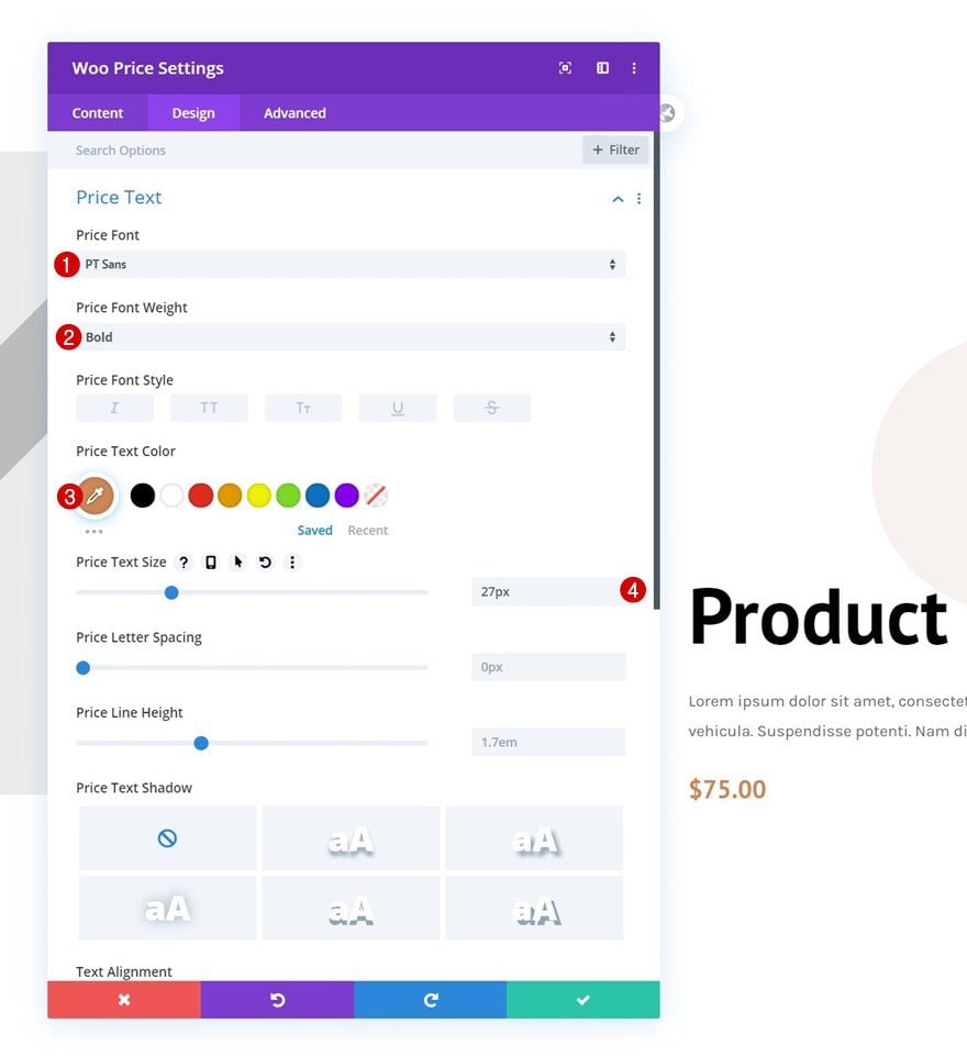
Price Text Settings
Move on to the module’s design tab and modify the price text settings as follows:
- Price Font: PT Sans
- Price Font Weight: Bold
- Price Text Color: #ce8654
- Price Text Size: 27px
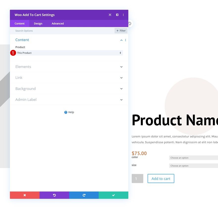
Add Woo Add to Cart Module to Column 2
Dynamic Content
The next and last module we need to complete this tutorial is a Woo Add to Cart Module.
- Product: This Product
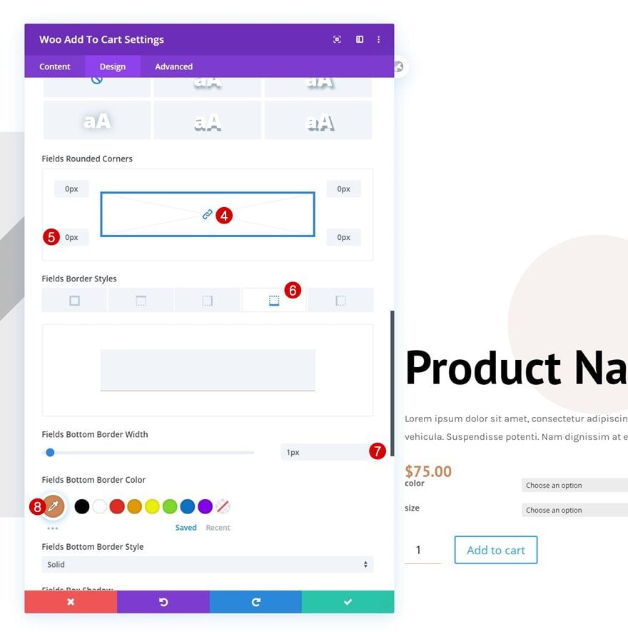
Fields Settings
Move on to the design tab and change the fields settings as follows:
- Fields Background Color: #ffffff
- Fields Text Color: #000000
- Fields Font: Open Sans
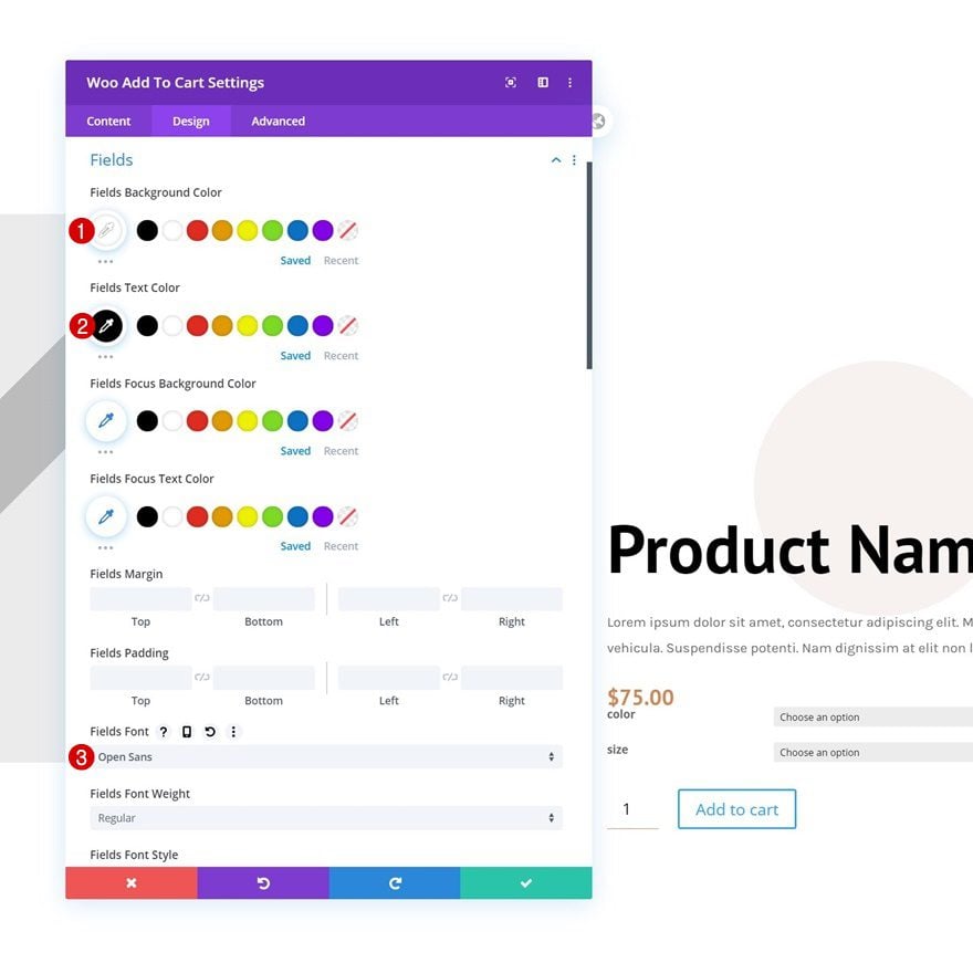
- All Corners: 0px
- Fields Bottom Border Width: 1px
- Fields Bottom Border Color: #ce8654
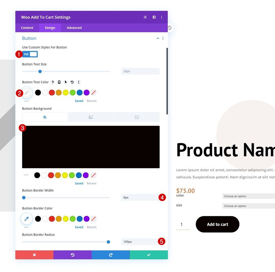
Button Settings
Then, style the button in the button settings.
- Use Custom Styles For Button: Yes
- Button Text Color: #ffffff
- Button Background Color: #0a0201
- Button Border Width: 0px
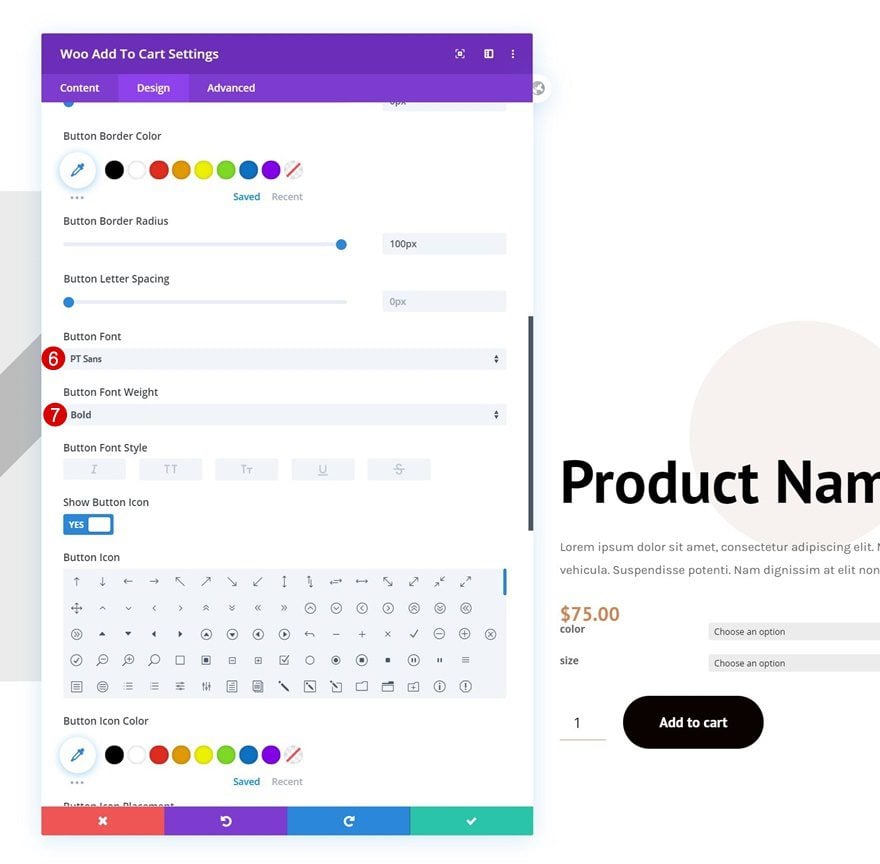
- Button Border Radius: 100px
- Button Font: PT Sans
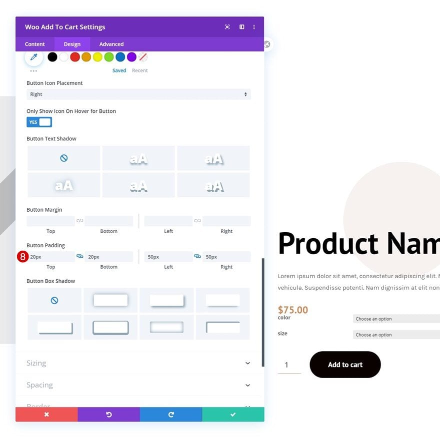
- Button Font Weight: Bold
- Button Top Padding: 20px
- Button Bottom Padding: 20px
- Button Left Padding: 50px
- Button Right Padding: 50px
Spacing
And complete the module settings, and this tutorial, by adding some top margin to the Woo Add to Cart Module. Once you’re done modifying the product page template, make sure you save all Theme Builder changes before viewing the outcome on your product pages!
- Top Margin: 5%
Preview
Now that we’ve gone through all the steps, let’s take a final look at the outcome across different screen sizes.
Desktop
Mobile
Final Thoughts
In this post, we’ve shown you how to get creative with the product pages you build using Divi’s Theme Builder and the WooCommerce modules. More specifically, we’ve shown you how to vertically stack woo gallery images. This approach goes well with a fullscreen product page design, but it can come in handy for any kind of product page template you build. You were able to download the JSON file for free as well! If you have any questions or suggestions, feel free to leave a comment in the comment section below.
If you’re eager to learn more about Divi and get more Divi freebies, make sure you subscribe to our email newsletter and YouTube channel so you’ll always be one of the first people to know and get benefits from this free content.


This wont work for only two gallery images
Remove this : .woocommerce-product-gallery__image.flex-active-slide {
width: 12.5% !important;
}
Deleted the above custom body, now all product pages had disappeared.
Hi
Installed the json, it all works great, but it removes the global custom header.
Any ideas?
Hello,
it really changes the presentation of a product, it’s great!
Thank you
I followed the instructions both step by step and downloaded and imported the template.
However both times I had the images continually stay below and with squared boxes instead of circles and vertically. I have copied the code that you provided separately as well and I do not seem to get it to work. Would be very happy with some support on this.
Thanks for this very helpful snippet!
The Divi Builder should have something to do it without coding!