
Web forms are extremely crucial to the success of your website. This makes sense considering most online businesses depend on forms like email optins and contact forms to make money by building email lists and communicating with potential buyers. And, these days we need to make sure we are designing responsive forms that will look great on all browsers and mobile devices.
In this tutorial, I’m going to show you how to design a responsive contact form using vw and vh length units in Divi. We’ll cover how to size and space input fields and buttons that will adjust according to the width and height of your browser. This will allow you to maximize the visibility of the form on all devices, even for landscape view on mobile phones.
To do this, we’ll be using Divi’s built-in settings which allow you to customize form text, fields and buttons with ease.
Let’s get started.
- 1 Sneak Peek
- 2 Download the Responsive Contact Form Layout for FREE (Includes a Responsive Email Optin Form too!)
- 3 Download For Free
- 4 What You Need to Get Started
- 5 Why use vw and vh length units for responsive design
- 6 Part 1: Designing a Responsive Contact Form in Divi
- 7 Final Touches
- 8 Final Design
- 9 Use the Same Design Settings for Email Optin Forms
- 10 Final Thoughts
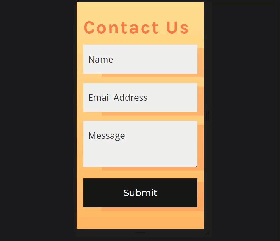
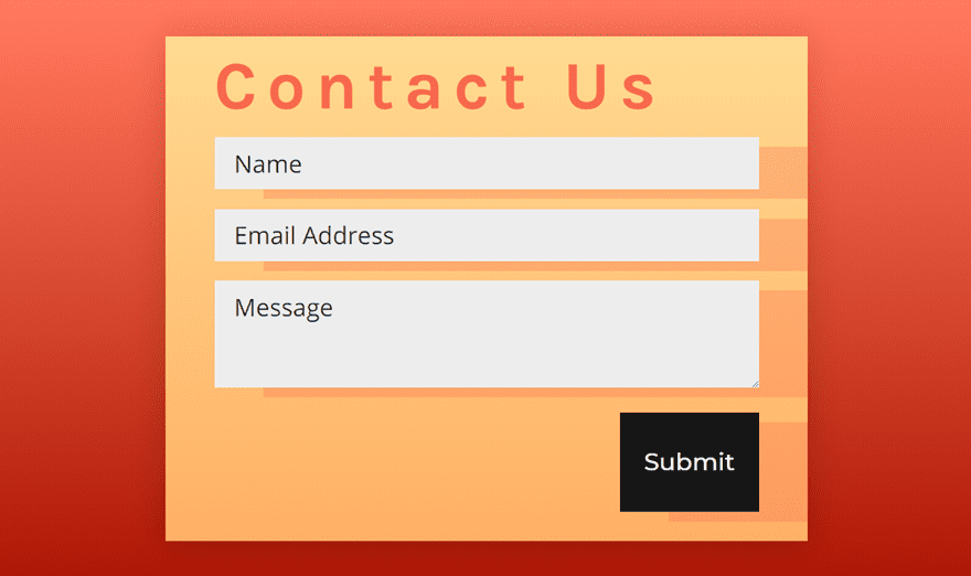
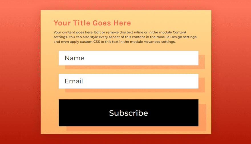
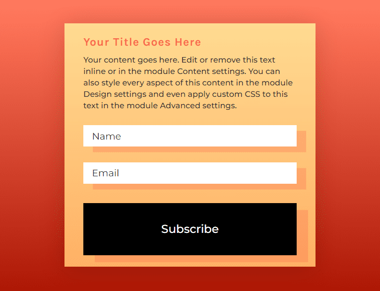
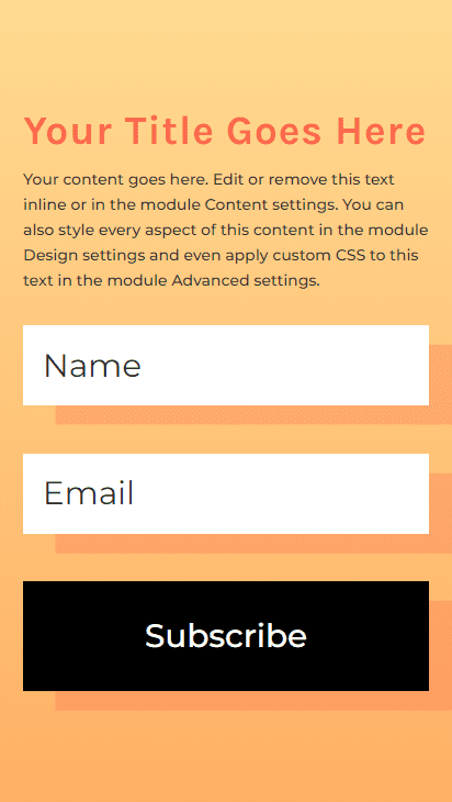
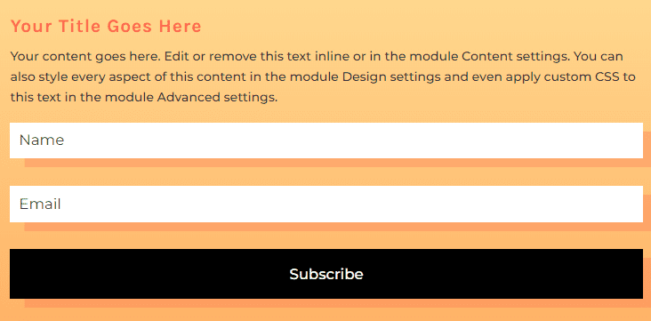
Sneak Peek
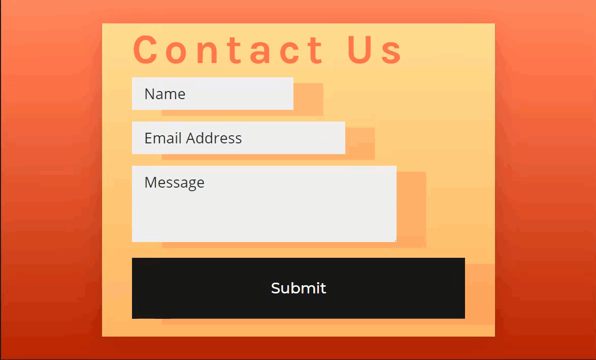
Desktop
Tablet
Phone (portrait)
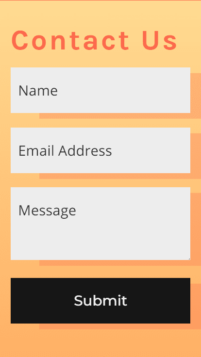
Phone (landscape)
Download the Responsive Contact Form Layout for FREE (Includes a Responsive Email Optin Form too!)
To lay your hands on the designs from this tutorial, you will first need to download it using the button below. To gain access to the download you will need to subscribe to our newsletter by using the form below. As a new subscriber, you will receive even more Divi goodness and a free Divi Layout pack every Monday! If you’re already on the list, simply enter your email address below and click download. You will not be “resubscribed” or receive extra emails.

To import the layout to your page, simply extract the zip file and drag the json file into the Divi Builder.
Let’s get to the tutorial shall we?
What You Need to Get Started
To get started, you will need to have the following setup:
- The Divi Theme installed and active
- A new page created to build from scratch on the front end (visual builder)
- Your Favorite Beverage (optional, unless you haven’t had your coffee yet)
After that, you will have a blank canvas to start building the responsive forms in Divi.
Why use vw and vh length units for responsive design
Length units are those values needed to size and space elements on your webpage. Probably the most common length units used in web design are pixels and percentages. For example, a pixel is a common length unit used to size text, the em length unit is commonly used for line height, and a percentage length unit is commonly used for spacing and sizing elements for responsive design. In fact, the default length unit values for Divi elements (modules, rows, sections) are built using these common length units.
Length units will either be absolute (stay the same size no matter the size of other elements) or relative (change/scale depending on the size of other elements). For example, a pixel is an absolute length unit. So if a body of text has a 16px font size, the text will remain 16px no matter the size of its container. But percentage and em are both relative length units. So a line height that has an em value will adjust as the text size of the element changes. And since percentage is also a relative length unit, a row with a width of 80% is going to be 80% of its container (or section).
The vw and vh length units are also relative length units, but instead of being relative to the elements parent container, it is relative to the actual browser viewport. The viewport width (vw) is relative to the width of the browser and the viewport height (vh) is relative to the height of the browser. Using these length units is one way to keep your design consistent on all browsers because it will scale according to the viewport. This makes the size of each element more predictable and easy to manage without having to worry so much about giving each element a different size on each device or responsive breakpoint. The vh length unit particularly comes in handy for mobile phone displays since it will take into account the height of the phone’s viewport in portrait and landscape view.
This technique works best for designs that depend on large full width displays on desktop that scale will smoothly scale in size as the user adjusts the browser width.
For a more detailed explanation of length units, check out this guide on using length units in Divi.
Part 1: Designing a Responsive Contact Form in Divi
Creating the Section and Row
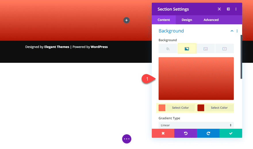
Create a regular section with a one-column row. Before adding any modules, update the section settings as follows:
Background Gradient Left Color: #fd7b5b
Background Gradient right Color: #a92200

Then open the row settings and give it background gradient.
Background Gradient Left Color: #ffdb8b
Background Gradient right Color: #fdb15b
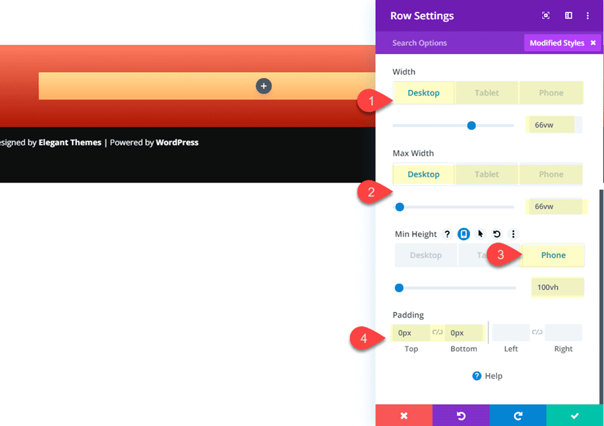
Next, let’s size the row using the vw length unit so that it scales with the browser.
Width: 66vw (desktop), 66vw (tablet), 100% (phone)
Max Width: 66vw (desktop), 66vw (tablet), 100% (phone)
Min Height: 100vh (phone)
Padding: 0px top, 0px bottom
The 66vw value will make sure the row will remain roughly two thirds the width of the browser viewport. The 100vh value on phone display will make sure the row height equals the height of the phone viewport (optional, but a nice touch for an optimal display of the row content area on phones).
Notice that the width of the row is set to 100% (not 100vw). This is because 100vw will not account for the scroll bar width as you scroll down the page. So it is always better to use percentage for fullwidth displays.
Creating the Contact Form
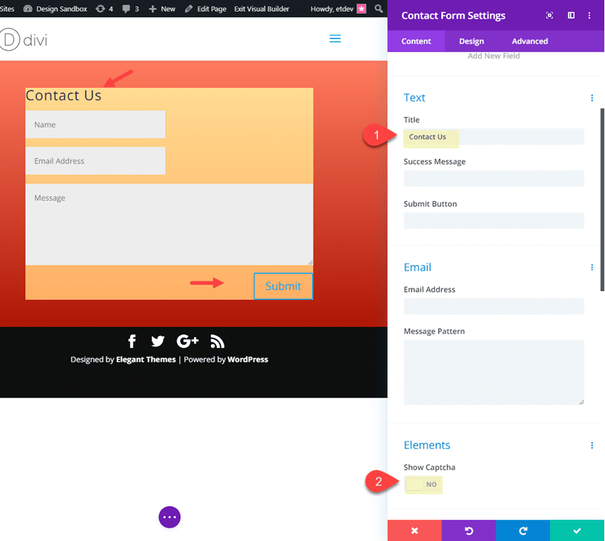
With our row in place, we can now add the Contact Form Module to the row.
Once the contact form is added, update the content as with a title and disable captcha.
Title: Contact Us
Show Captcha: NO
Making Fields Fullwidth
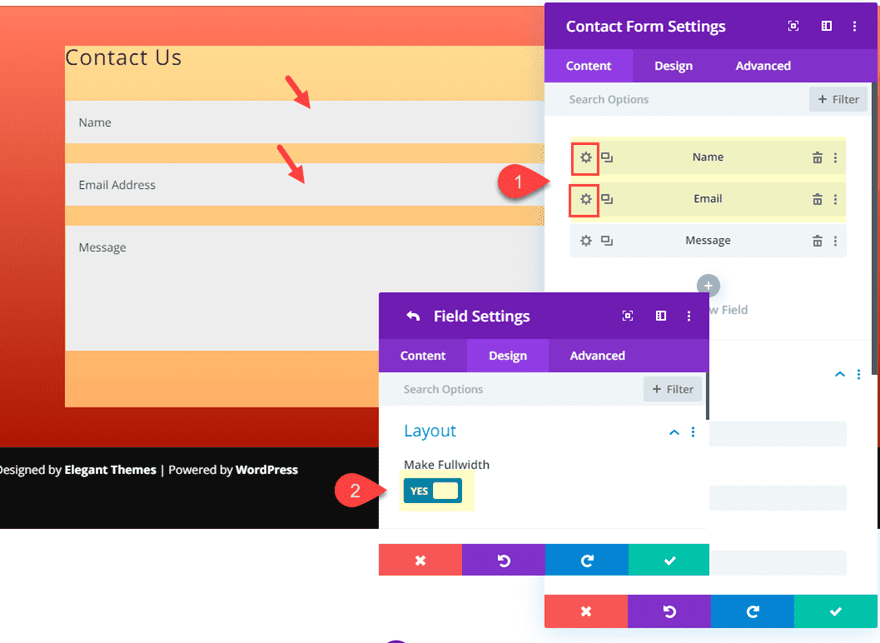
For this design, I’m going to use fullwidth fields. This will allow me to add consistent spacing between the fields (since no floats are being used) and it will allow me to give a custom width to each of the fields for a unique design later on. For now, open the settings for both the name and email fields and set the “Make Fullwidth” option to “YES”.
Optimizing the Fields for Responsive Design
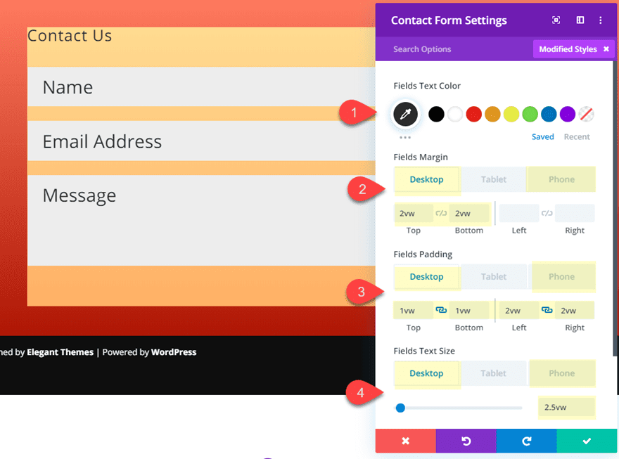
Now go back to the contact form settings. Now we can customize the form fields using vw and vh length units. Update the following:
Field Text Color: #333333
Fields Margin (desktop and tablet): 2vw top, 2vw bottom
Fields Margin (phone): 2vh top, 2vh bottom
Fields Padding (desktop and tablet): 1vw top, 1vw bottom, 2vw left, 2vw right
Fields Padding (phone): 2vh top, 2vh bottom, 2vh left, 2vh right
Fields Text Size: 2.5vw (desktop), 4vh (phone)
Note: Using the 4vh for phone will allow your text size scale with the height of your mobile phone display which will be helpful for viewing the form in landscape phone display (turning the phone sideways). But if you want a more consistent text size, you may want to use a pixel length unit for the field text size on phone display.
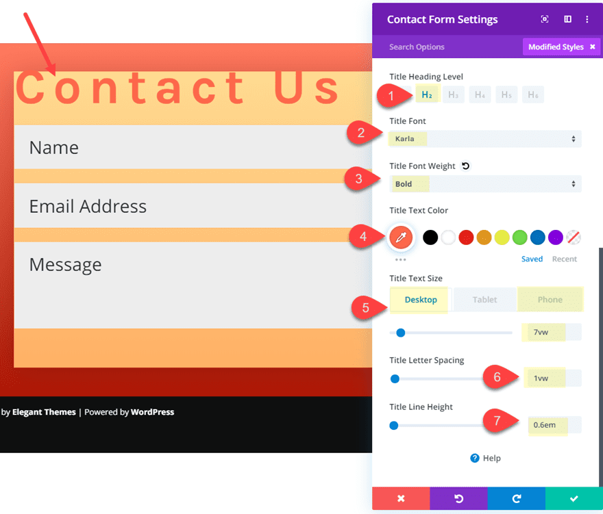
Designing the Title Text
For the title text, customize the following:
Title Heading Level: H2
Title Font: Karla
Title Font Weight: Bold
Title Text Color: #f56845
Title Text Size: 7vw (desktop), 8vh (phone)
Title Letter Spacing: 1vw
Title Line Height: 0.6em
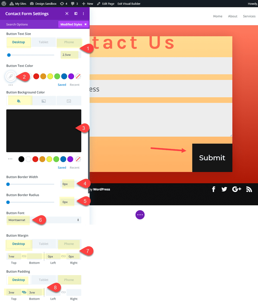
Optimizing the Button for Responsive Design
For the contact form button, we are going to add spacing and text sizing similar to the fields we designed earlier.
Click to use custom button styles and update the following:
Button Text Size: 2.5vw (desktop), 4vh (phone)
Button Text Color: #ffffff
Button Background Color: #333333
Button Border Width: 0px
Button Border Radius: 0px
Button Font: Montserrat
Button Margin (desktop): 1vw top, 0px left, 0px right
Button Margin (phone): 1vh top
Button Padding (desktop): 3vw top, 3vw bottom
Button Padding (phone): 3vh top, 3vh bottom
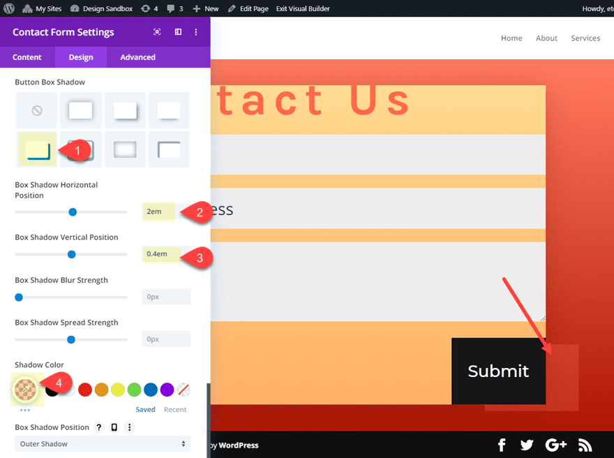
Button Box Shadow: see screenshot
Box Shadow Horizontal Position: 2em
Box Shadow Vertical Position: 0.4em
Shadow Color: rgba(245,104,69,0.29)
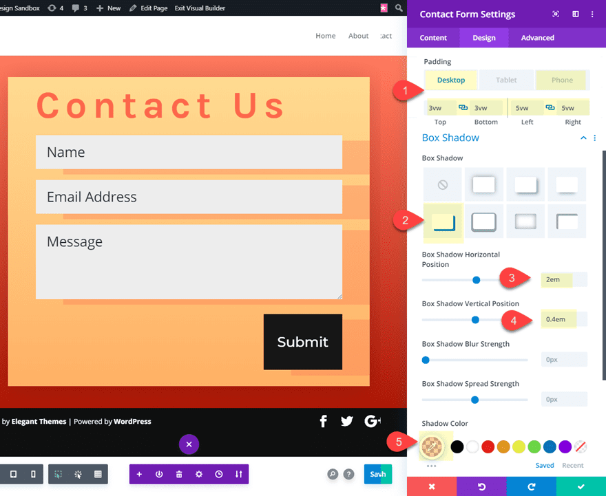
Add Spacing to Contact Form
Next, add some padding the contact form using the vw length unit and a box shadow to the form fields as follows:
Padding (desktop): 3vw top, 3vw bottom, 5vw left, 5vw right
Padding (phone): 5vh top, 5vh bottom, 3vh left, 3vh right
Button Box Shadow: see screenshot
Box Shadow Horizontal Position: 2em
Box Shadow Vertical Position: 0.4em
Shadow Color: rgba(245,104,69,0.29)
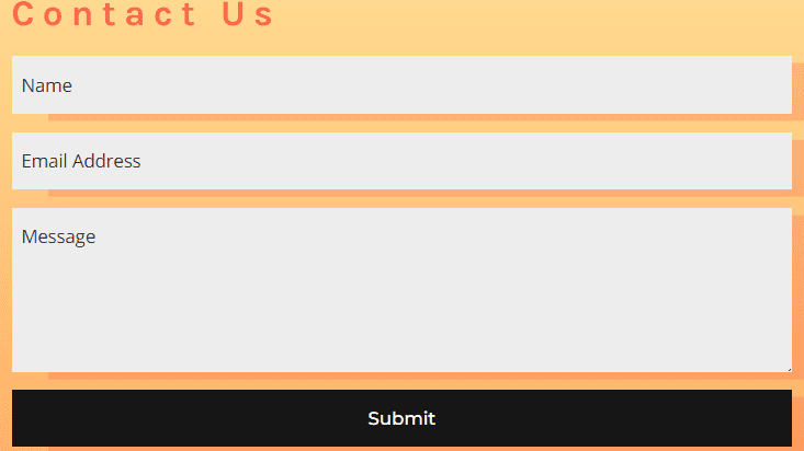
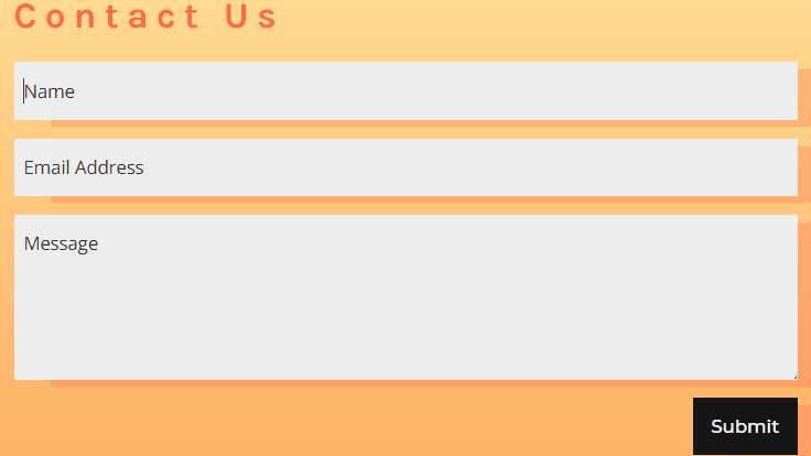
Result So Far
Desktop
Tablet
Phone (portrait)
Phone (landscape)
Final Touches
Adjusting the Widths of the Form Fields
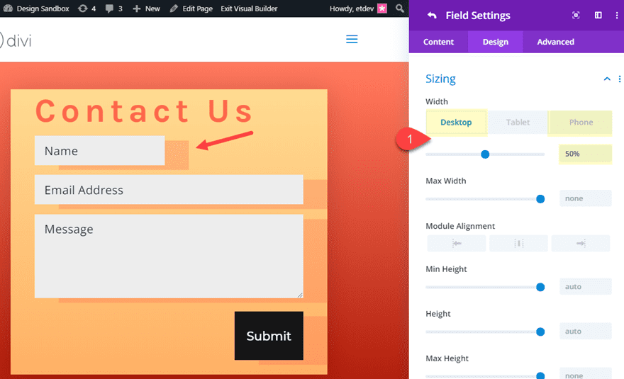
For a unique design option, you can customize the width of each of the fields. Open the name field settings and update the width as follows:
Width: 50% (desktop), 100% (phone)
Then open the email field settings and update the width as follows:
Width: 65% (desktop), 100% (phone)

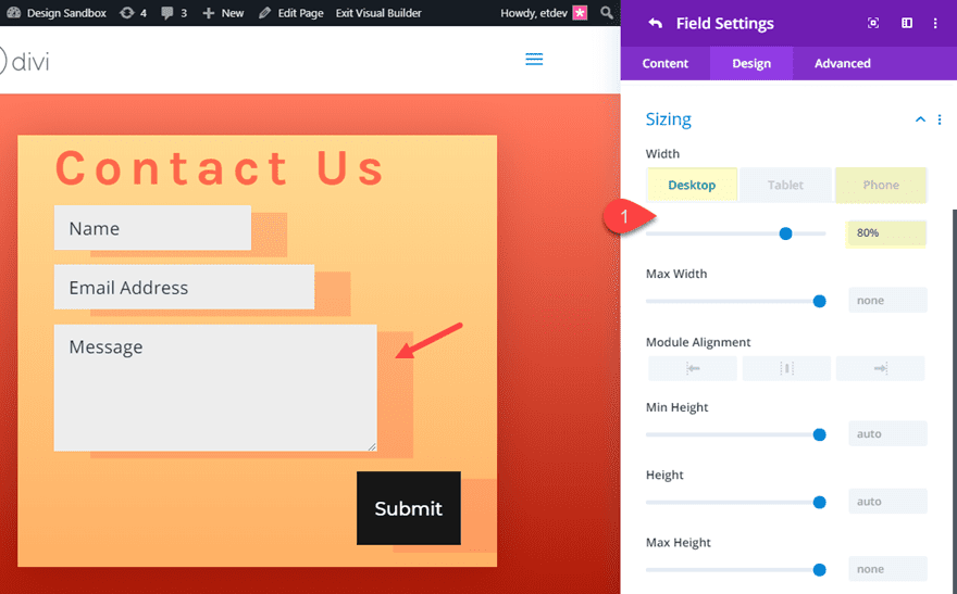
Next, open the message field settings and update the width as follows:
Width: 80% (desktop), 100% (phone)
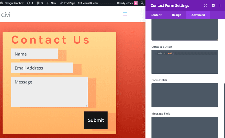
To make the responsive contact form button fullwidth, first we need to add the following custom CSS to the Contact Button input box:
width: 97%;
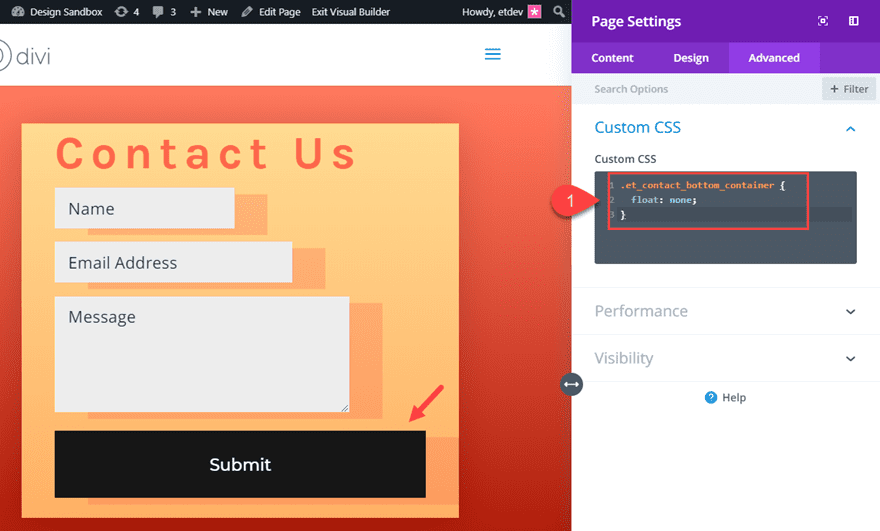
Then open the page settings and add the following custom css:
.et_contact_bottom_container {
  float: none;
}
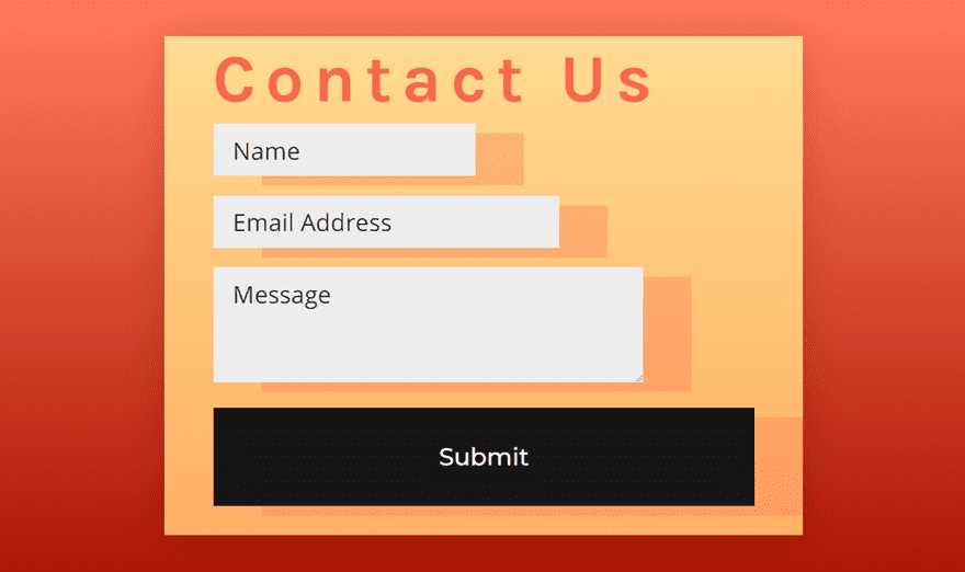
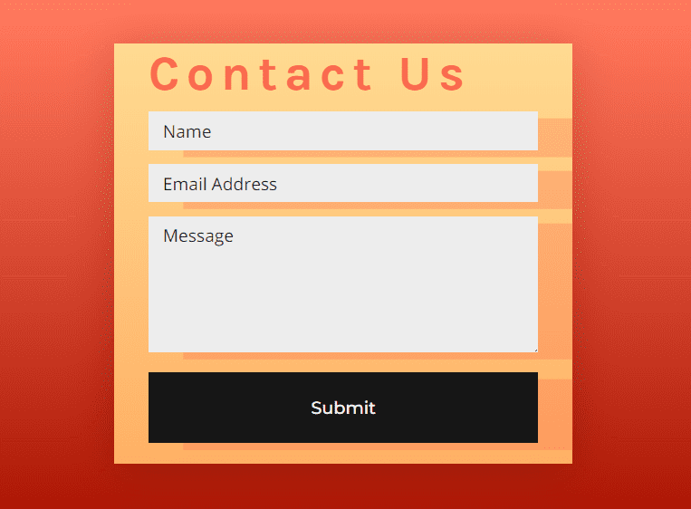
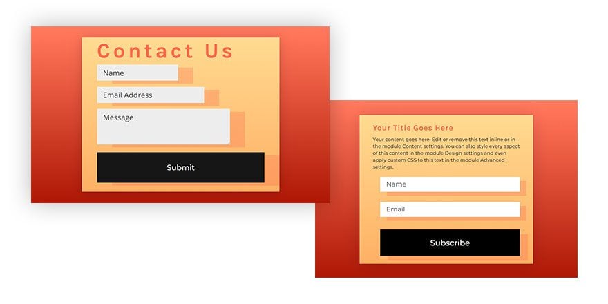
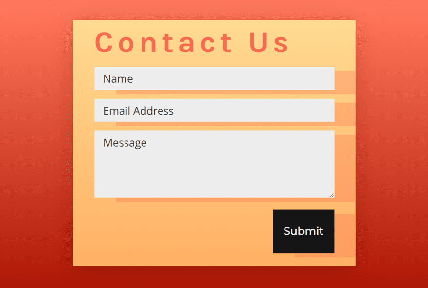
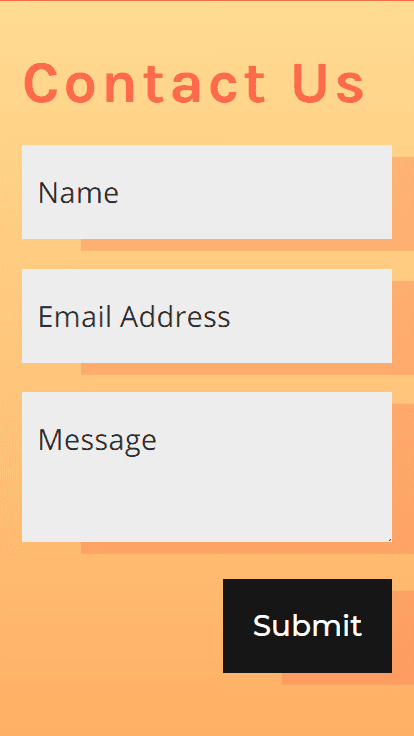
Final Design
Now that we’re done, check out the final result of our responsive form. Notice how the contact form scales when adjusting the width of the browser on desktop and tablet and also how the design adjusts when adjusting the height of the viewport on mobile phone.
Desktop
Tablet
Phone (portrait)
Phone (landscape)
Use the Same Design Settings for Email Optin Forms
You can use the same vw and vh length units to design a responsive email optin form as well. Here is a screenshot of an email optin form design that is included in the free download available in this post.
Desktop
Tablet
Phone (portrait)
Phone (landscape)
Final Thoughts
Using vw and vh length units, we can create a responsive contact form (or any Divi form) that looks great on all browser sizes and mobile devices. The responsive design will scale the form elements smoothly as you adjust the browser width. And, if you use the vh length unit on phone display, you can even optimize the form for portrait and landscape phone display as well.
Don’t forget to check out the free download to get a working example of a responsive contact form and email optin.
Hopefully, this post can give you a few tips on how to create some beautifully responsive forms for your next project.
I look forward to hearing from you in the comments.
Cheers!


Thanks for sharing these divi layouts.
Ahh.
Thanks for sharing complete step by step guide.
Now contact from is looking more attractive and professional.
Thanks.
Awesome and thanks for sharing these divi layouts.
I am facing issue in opening the link. can you provide any solution to it??
Rahul,
Sorry. What link are you referring to?
Thanks for this easy to follow tutorial! I would say that the background shadow looks a bit weird though.
I have made it and it certainly is impressive on mobile devices, which is now the prime mover for web design.
it is also the first time I have used the new Divi Builder that too is fast and impressive. Good work Elegant Themes on both fronts.
Thanks Dellaweb!
There are two ways to download the responsive contact form in this tutorial.
Both options worked perfectly for me.
The first option is near the start of the tutorial instructions, just above the “What You Need to Get Started.”
As long as you make sure to enter your email address to unlock the download in that section, you’ll be good to go.
The second option to receive your free responsive contact form and email optin is to enter your email just above the “What You Need to Get Started” section and then scroll down to the “FINAL THOUGHTS” section and use the link near the bottom of the tutorial.
I hope this helps some people.
Thanks, Jason! YOU DA MAN!
So grateful to have this resource.
Fred,
Thanks and I’m glad you it is helpful.
The Link to download does not work!
Get it here: https://www.elegantthemes.com/blog/wp-content/uploads/2019/06/responsive-form-divi-layout.zip
Download link isn’t working
Looks like its working now. Not for you? Have you tried since he fixed it?
The link for the download is broken.
It should be: https://www.elegantthemes.com/blog/wp-content/uploads/2019/06/responsive-form-divi-layout.zip
Download link did not work? Sent to 404 page?
Sorry about that! I updated the link. Should be working now.