
Welcome to Day 47 of our Divi 100 Marathon. Keep tuning in for 100 days in a row of awesome Divi resources as we count down to the amazing release of Divi 3.0 on the final day of the series!
So far in the Divi 100 Marathon we’ve given away a lot of Divi Layout Packs that are fully populated with royalty free images and sample text. These have proven to be fantastic resources as they go one step further in helping you envision the site that you’d like to create for yourself.
What this does not mean however, is that the wealth of predefined page layouts that Divi already ships with are no longer valuable. In fact, using them to jumpstart your unique design is a great way to learn and grow as a designer because the lack of completely styled layouts leaves a lot of room for you to make creative decisions.
To illustrate how this process might work for you, we’ve dedicated today’s post to something that is part tutorial and part exercise. We’re going to walk you through a design exercise I did this week where I imagined a business, identified three essential web pages for that business, and then used Divi’s predefined layouts to go from starter content to a final product.
If you take note of my process, or even follow along with it, you should have a better idea of how you can use these predefined layouts for yourself in the future.
Let’s get started!
How to Use Divi’s Predefined Layouts to Their Full Potential: 3 Step-by-Step Examples
Subscribe To Our Youtube Channel
First things first, let’s talk about the concept I’ll be working with in today’s post. I’ve decided to create three web pages for an imaginary baker’s website. Based on some preliminary research I found that many bakery websites have these three pages and so I wanted to make sure I knew how to make them.
I also gathered up some screenshots of my favorite versions of these pages from various bakery websites. Something you can do within your niche as well to make sure that you are looking good compared to the competition.
But this should be where the similarities between you and them stops. The next stages of this design exercise are all about going from gathered inspiration to something unique. So let’s start with top level, broad reaching design decisions and then work our way down into the details of each page.
Beginning with our colors!
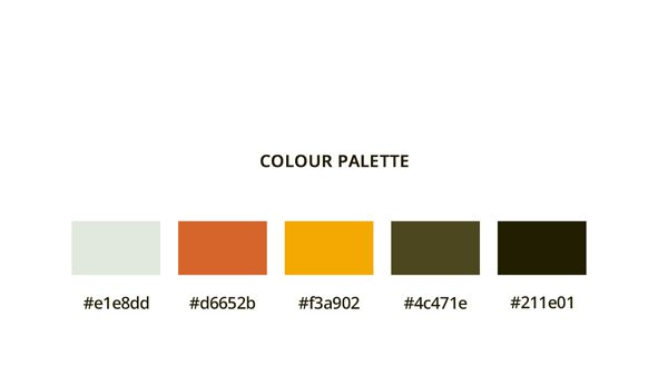
Color Palette
Below is the color palette I used to build the website. It also has the corresponding hex codes.
Theme Customizer Settings
Before we start editing the page, we need to change a few settings in the Theme Customizer.
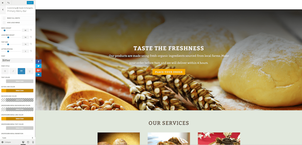
Primary Navigation Setup
Active link color: #F3A902
Background color: transparent
Text color: #FFFFFF
Drop down menu line color: #F3A902
Font: Bitter.
Text size: 16
Letter spacing: 2
Text style: all caps
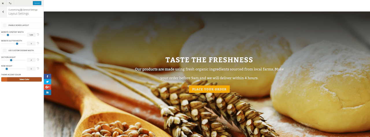
Layout Settings
Website content width:1200
Theme accent color: #D6652B
Typography Settings
Header text color: #D6652B
Body text color: #4C471E
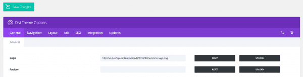
Logo
Go to Divi Theme Options to upload the logo and then save changes.
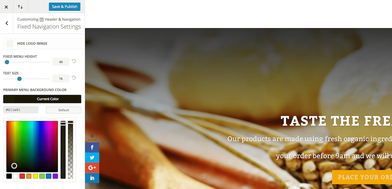
Fixed Navigation Settings
Change the primary menu background color to #311E0 then save and exit.
These are all great examples of a few site-wide changes I would encourage you to make at the start of each Divi website in order to start shaping the unique look and feel of your website. We can now begin to build our essential pages.
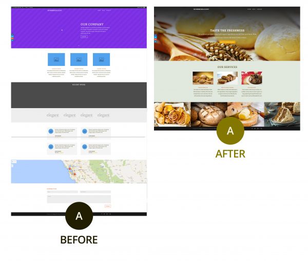
1. Homepage
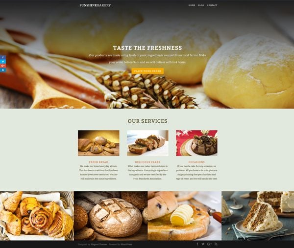
In this section I will walk you through the steps I took to transform the predefined homepage layout into something unique and relevant to my imaginary business. You can follow these same steps, if not the exact actions, when creating pages on your own Divi websites.
Remove Unnecessary Sections
For the design I have in mind we don’t need the full width portfolio, testimonial section, map or contact form. So if you’re following along go ahead and delete those.
Full Width Slider
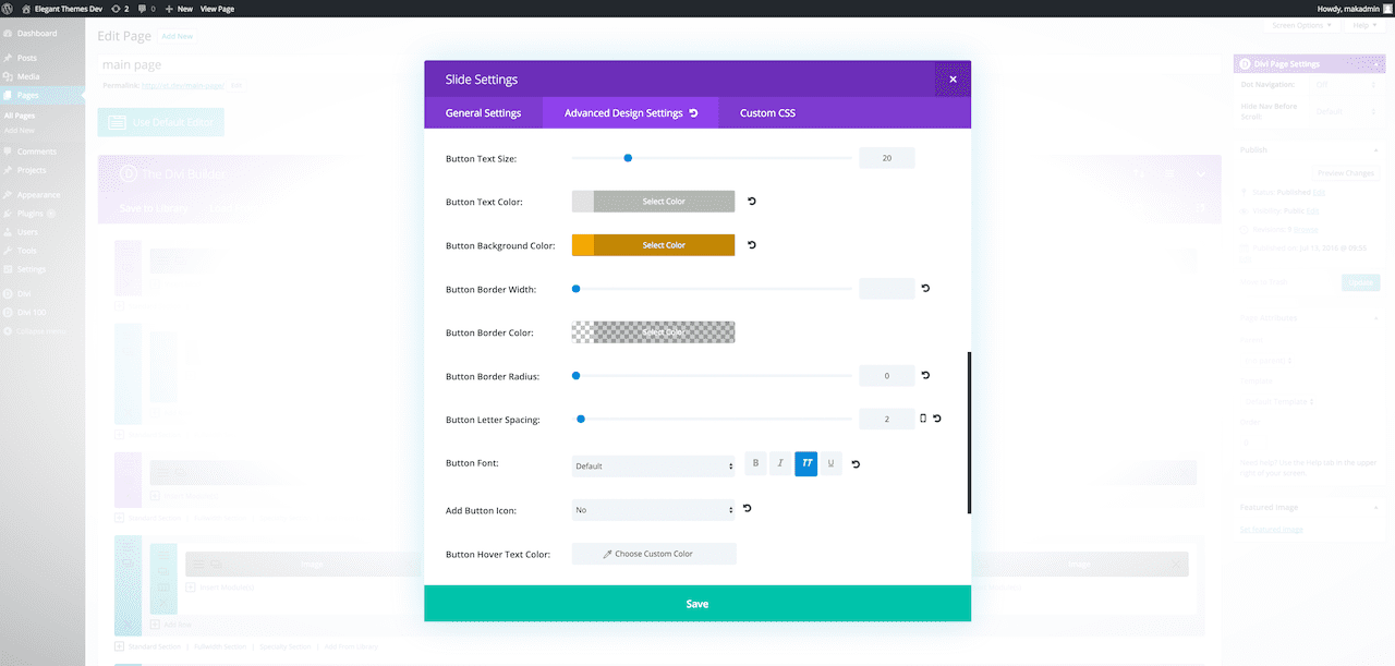
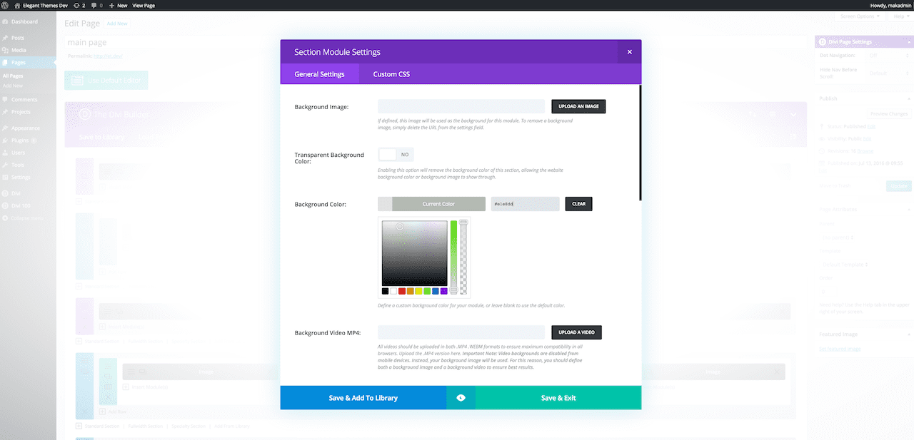
Next, go into the full width slider and click the settings of our company slider. Add a background image and then scroll down to add the description.
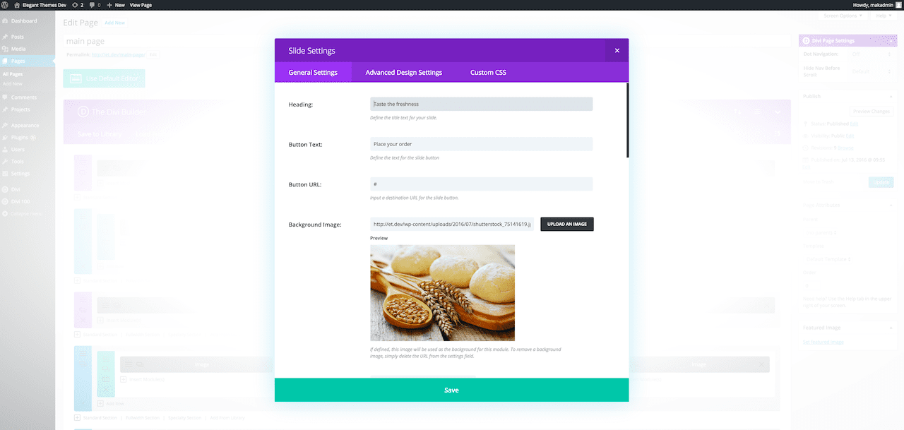
Under general settings, add heading text, change the button text and URL. In the advanced settings, make the header text all caps. Use custom styles for the button and use the following settings in the screenshot.
Second Module
Change the background color to #E1E8DD then save and exit.
Blurb Settings
Change the title and the image, then edit the content and repeat for the other 2 services.
Add Title for the Section
Add a row (one column)
Insert text module
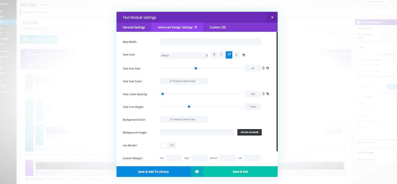
Change the text orientation to centre
In the advanced settings, make the text all caps, change the text size to 44 and letter spacing to 2.
Drag this above the blurbs.
Adjust Row Module Settings For Gallery
Remove custom padding and make the row full width
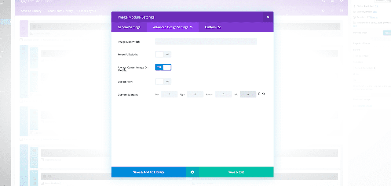
Image Module
In the image module settings, remove the custom margin.
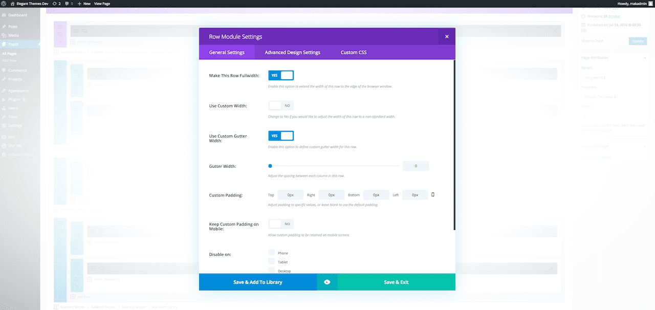
The images have a gap between them like in the example below, so go into the general settings of the row module settings and select ‘Use Custom Gutter Width’ to yes and set the width to 0.
Before & After
As you can see in the image below, I was able to use Divi’s predefined layout as a quick and easy starting point, but add, subtract, and customize to end with something all my own.
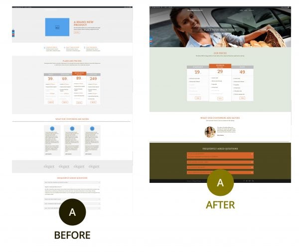
2. Place Your Order Page
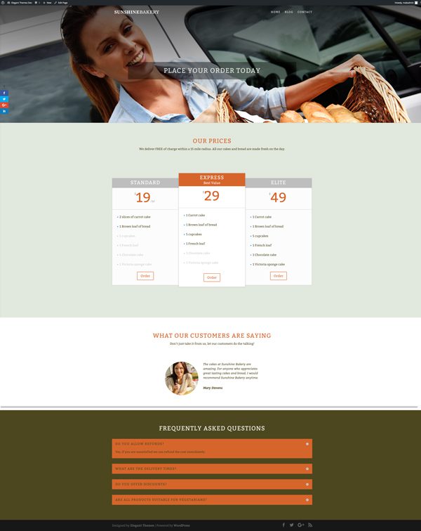
The next page I decided to tackle was an order page. For this page, we will use the Sales Page predefined layout.
Remove Unnecessary Sections
For this page, we don’t need the blurb section, the images or the ‘don’t be shy’ section, so go ahead and delete them.
Full Width Slider
Add an image as the background in the full width slider module settings. To see more of the image, add top and bottom padding in the advanced settings of the full width slider module settings.
Change the header text color to #E1E8DD. The text is quite difficult to read, so to solve this use text overlay in the slide settings.
Testimonial Section
Instead of having three, I chose to have one. Add a row with three columns (one quarter, one half, one quarter) and drag the testimonial module into place. Delete or disable the section with three testimonials.
In the testimonial module, go into the advanced design settings and change the dimensions of the image to the setting below and make the text italicized.
FAQ
Change the background color of the section to #4E471E and in the text module settings change the text color to #E1E8DD
Before & After
Once again, with just a few adjustments and my own content I was able to completely transform a page from predefined layout to something that will work quite well for my business.
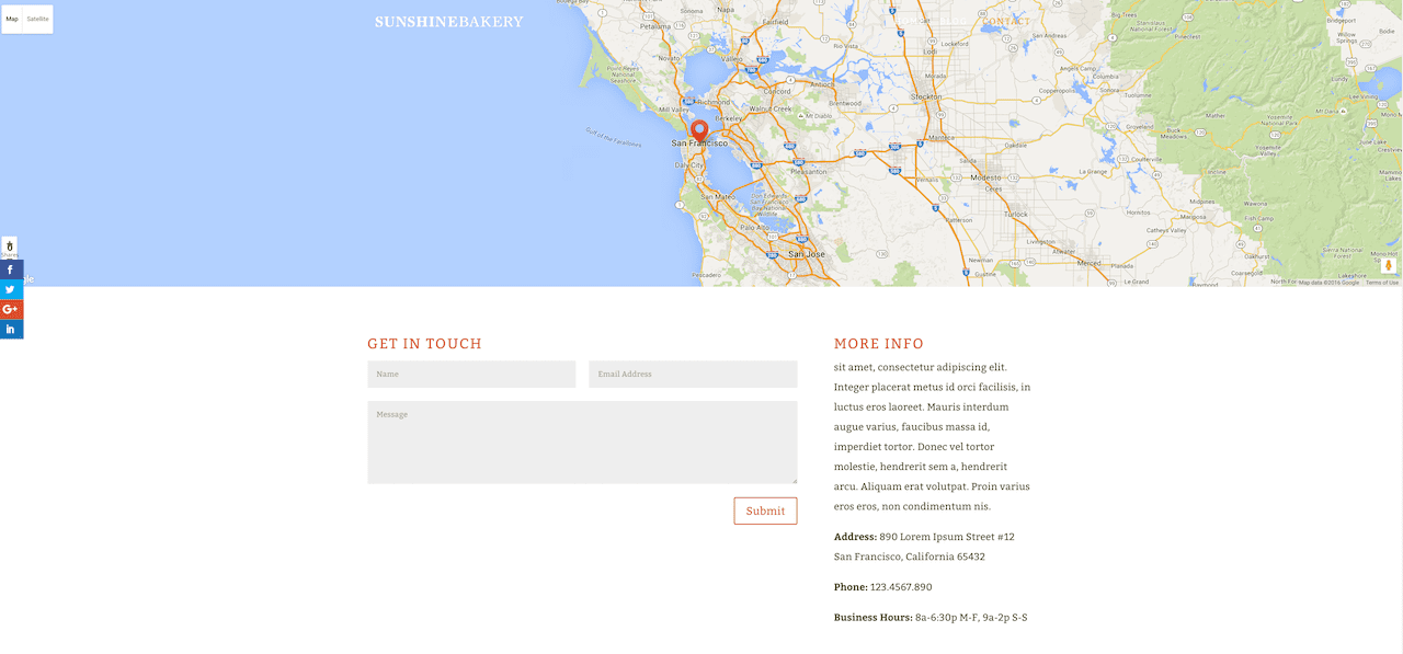
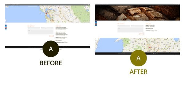
3. Contact Page
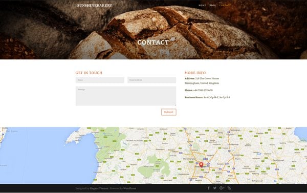
Finally, for the contact page, use the predefined “contact page” layout. As you can see below, the map is on the top, covering the text, so we need to move the map all the way to the bottom of the page.
Add a full width section and insert the full width post titles. Disable everything except the title and center the text.
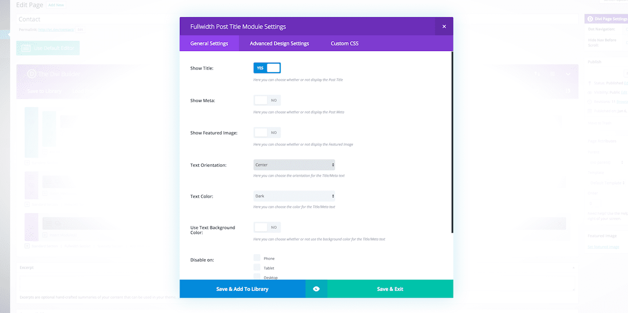
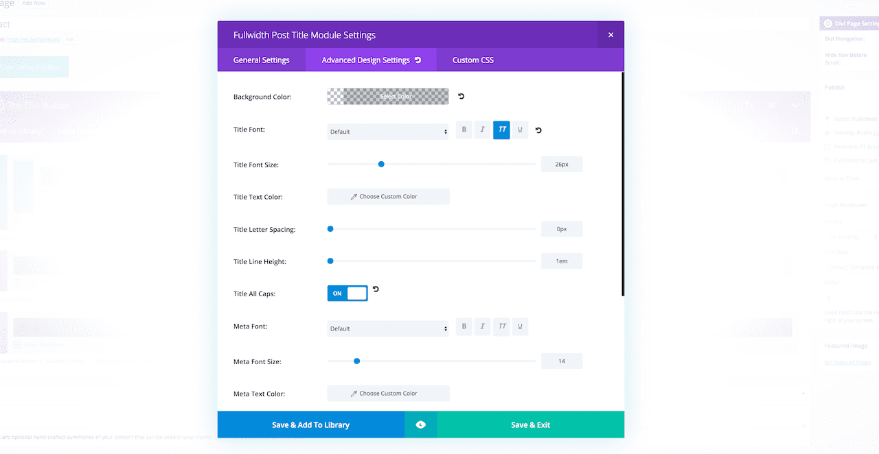
In the advanced settings, the title text should be all caps and then save and exit.
Drag the full width post title to the top. Now add a background image to the section.
Add custom padding to show more of the image. In this example I’ve added 300px to the top and bottom.
In the title settings, change the text size to 48px and make it bold with all caps to make it stand out. Change the color to #E1E8DD and add custom padding to the top.
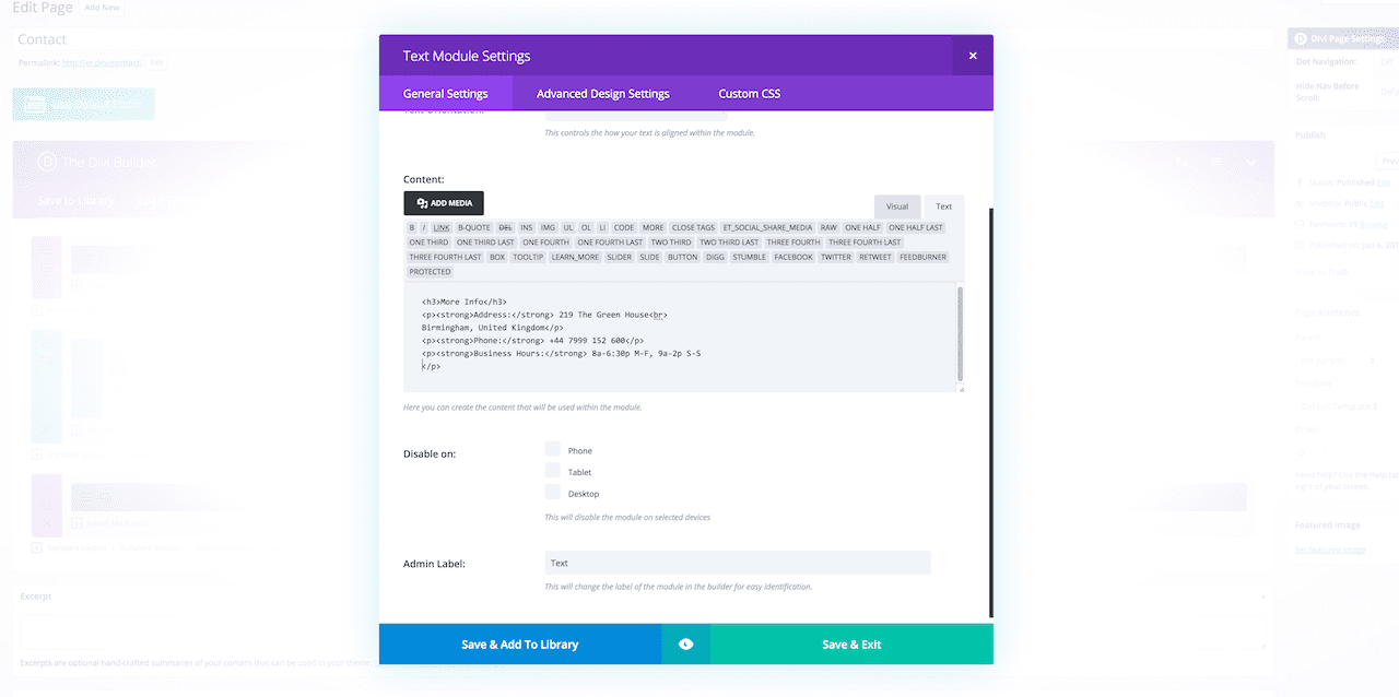
Finally, edit the address information and the map details to your own.
Before & After
This page was a great example of how you will often find all or most of the element to a given page already present in the predefined layout. It’s just a matter of re-arranging them, populating them with your content, and keeping a consistent style to the rest of your website.
Wrapping Up
To quickly review my process, here is how I would recommend getting the most out of Divi’s predefined layouts when creating your own Divi website(s):
- First, gather inspiration. You should know in a general sense, if not specifically, what you’d like each page of your site to look like before sitting down to build it.
- Then, make site-wide changes via the customizer so that you have fewer changes to make on each page to keep things consistent across your site.
- Finally, load the most relevant predefined layout from the Divi Library to kickstart your design. Guided by your inspiration gathering, make the necessary edits to the predefined layout until you have a page that’s all your own.
Thanks for following along everyone! I hope you found this design exercise helpful. If you have any questions for me please leave them in the comments section below.
Also, be sure to subscribe to our email newsletter and YouTube channel so that you never miss a big announcement, useful tip, or Divi freebie!
Divi 100 Day 47
The Countdown To Divi 3.0
This post is part of our Divi 100 marathon. Follow along as we post free Divi resources for 100 days in a row! This 100-day countdown will end with the game-changing release of Divi 3.0, including our brand new visual editor built from the ground up using React. Divi 3.0 will change the way you build websites with the Divi Builder forever!
Let the countdown begin.


I love Divi but one of my major issues is the ways logos are handled. I see in your example there is no logo. And I wonder how a decent size logo could be accommodated in this kind of layout.
Great tutorial… very helpful. Thank you so much 🙂
What’s that Divi 100 menu item on the left in the dashboard?
NO matter what I do, I can only get a slider image to be like 100 x 100 or so… even though I uploaded a huge picture 2500 !!!
Sorry, my reply to your question was put into a response to your previous post
Divi has me flummoxed. I changed the title and blurb but it did not change.
I cannot make the slider full width, even though I selected that.
What am I doing wrong? I thought Divi was supposed to be easy???
This is one thing that has been pointed out to Elegant Themes on numerous occasions and which may hopefully be addressed in future.
There are various ways to get around this. Some of the ways include, use a logo and put a header or slider below the navigation area, insert an image above the header area using Divi Booster a plugin you can buy from Elegant Market Place or use the centered option and CSS. I am sure that others will be able to offer suggestions.
Thank you, this has been most informative.
Please consider doing one in the future for larger sites. I’m currently working on a site with over 80 pages. Especially the navigation is hard to do. Also hard is the selective sync since content and design aren’t fully separated (yet?)
Very good tutorial. In the Contact page on the left side I see the socials buttons like here. How can be added there? Are added direct from the plugin? Thanks!
Thanks. The social icon were added using the Monarch plugin from Elegant Themes.
Great tutorial, thanks!
What’s that Divi 100 menu item on the left in the dashboard?
Great tutorial – Thank you!
Is it possible to include the image dimensions you used for your header images in the show notes. I spend hours fiddling around to get the perfect sizes for some sites!
The homepage and place your order image dimensions are 2000 X 1330 and the image on the contact page is 2000 X 660 pixels. Hope this helps.
Perfect thank you!
Thank you Augustine. It’s amazing what we can do with Divi. I remember the old days of HTML websites and having to do everything from scratch. Nicely put together collection of info here.
Awesome!! Thank you for explaining so well.
Love this tutorial !
It would be great to have a screenshot of all layouts available in the library so we know which one to choose and don’t waste time trying each library layout
Such a good video. I was interested to see a 1200px wide content setting.
a couple of questions:
Are you able to tell us the dimensions you used for the “background” images?
A bit of a leading question I know but will we be better able to put an image above the nav area in Divi 3?
Is there a way to browse the layouts as small screenshots or even wireframes? I’d love to explore the pre-made tools and everything you’ve supplied, but loading each one, and previewing them at full size means a lot of scrolling!
Agree!
How much work went into this tutorial?
Thanks Augustine!
Hey John. About 2 days lol, but it was well worth it.
I’m glad,I found this post.really useful post for me.actually,I’m a newbie wordpress user but this post is easy to understand.i have a question,could you please tell me,Which Home page layout did you start with? thank you so much
I used the “Home Page Company Layout”.
Thanks Mak very useful. I’m about to change my site over to divi and this has been very useful to help me figure out the practical steps of where to start and what to change.
Cheers!
Nigel
Great tutorial!
I’m interested in how you achieved the transparent primary menu.
Am I right and you have to create a slider or (dark) background image for every page and post? If you don’t, you were not able to see the transparent menu with white text color in front of a light background, which is set as default…
And even if you do so and create an image as background for all pages, how do you handle pages that are created automatically, like when clicking on a category link or using the search functionality?
From facebook I visit your blog, your tutorials are really awesome. The way of explanation and step by step part helps a lot to understand properly.
Great work, Augustine – thank you so much 🙂
Which Home page layout did you start with?
I thought I was the only one missing this step and somehow I missed something at the start but after checking over and over, I agree with you Hannah, I’d also like to know which Home page layout Augustine started with.
I started with the “Homepage company layout”.
+1 on “What Homepage layout were you starting with, please, as I don’t see it in my Load From Library?
Best 20 minutes I’ve spent watching a YouTube video ever! I learned more in these 20 mins than I’ve learned spending hours trying to figure out things on my own. Thank you!
True
So good to hear!
Yes this was a great video lesson! I just competed three (days), two hour session trying to customize my Header & Navigation settings. Specifically the Primary Header Bar Vs the Fixed Navigation Settings not to be confused with the Secondary Header Bar. Primary & Fixed are used together, yet the language make them sound entirely different.
I have it all figured out now, but I would like to see some video lessons for the next guy/gal behind me not to go through the trouble I had. 🙂
Awesome!!! Thank you for giving a peek into how you approach using predefined layouts. Nicely done!!!
Thank you
These tutorials have been very informative, but this one excelled – and it was well presented. I learned so much from this – than you!
Thanks for the feedback 🙂
Nice fact’s
THANKS!!!
Nice tutorial 🙂
If I can add my 2 cents: I can’t stress enough how spending the time to define a nice color palette (and choosing the visuals accordingly) makes a difference!
I’m no mathematician, but shouldn’t this be day 47!
Yeah, it should be. I’ve fixed it but because of our caching it may take a little while for the change to show up.
True! And it’s been so good so far don’t we want to miss any 🙂
In fact, we should do the math later after the 100 days and asking all missing items and 5%more :))
Hi guys, shouldnt this post be day 47 instead 48 ? Yesterday it was day 46 🙂
Thanks for new great stuff indeed !
No why did you tell them? Now DIVI 3.0 is one day further away!
Haha joking 🙂
Nice article as always.
Yep! I’m fixing…