
Your header inevitably remains one of your website’s most important elements. It influences your visitors’ navigation process and allows them to find what they’re looking for in a heartbeat. Now, if you’re looking for a way to swap your Divi header on scroll with another one, you’re going to enjoy this post. We’ll show you exactly how to pull it off with Divi’s theme builder, built-in elements and some additional code. We’re also making sure there’s some auto-generated placeholder space for the header at the top of your page. You’ll be able to download the JSON file for free as well!
Let’s get to it.
- 1 Preview
- 2 Download The Swap Divi Header Template for FREE
- 3 Download For Free
- 4 1. Go to Divi Theme Builder & Start Building Global Header
-
5
2. Create Both Headers in the Same Section
- 5.1 Modify Section
- 5.2 Add Row Header #1
- 5.3 Add Image Module to Column 1
- 5.4 Add Menu Module to Column 2
- 5.5 Add Social Media Follow Module to Column 3
- 5.6 Add Row Header #2
- 5.7 Add Image Module to Column 1
- 5.8 Clone Menu Module & Place in Column 2 of Row Header #2
- 5.9 Add Button Module to Column 3
- 6 2. Add CSS Classes
- 7 3. Add JQuery & CSS Code
- 8 4. Save Theme Builder Changes & View Outcome
- 9 Preview
- 10 Final Thoughts
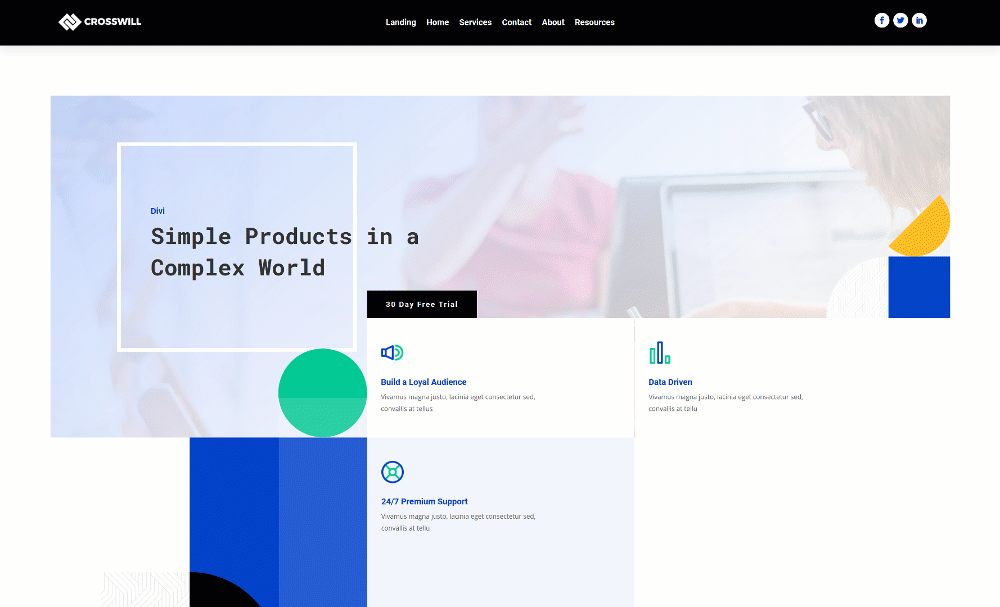
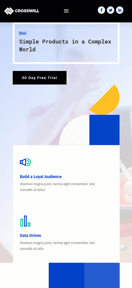
Preview
Before we dive into the tutorial, let’s take a quick look at the outcome across different screen sizes.
Desktop
Mobile
Download The Swap Divi Header Template for FREE
To lay your hands on the free swap Divi header template, you will first need to download it using the button below. To gain access to the download you will need to subscribe to our newsletter by using the form below. As a new subscriber, you will receive even more Divi goodness and a free Divi Layout pack every Monday! If you’re already on the list, simply enter your email address below and click download. You will not be “resubscribed” or receive extra emails.

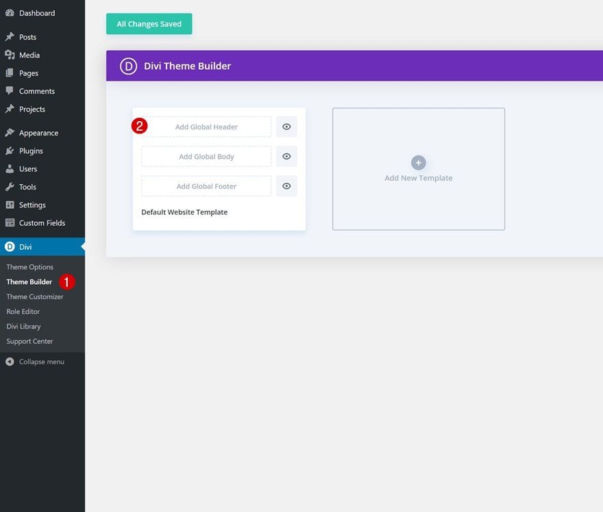
1. Go to Divi Theme Builder & Start Building Global Header
Go to Divi Theme Builder
Start by going to the Divi Theme Builder in the backend of your WordPress website and click on ‘Add Global Header’.
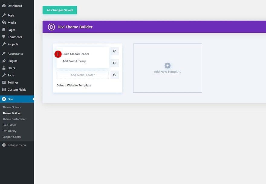
Build Global Header
Then, click on ‘Build Global Header’ to be redirected to the template editor.
2. Create Both Headers in the Same Section
Modify Section
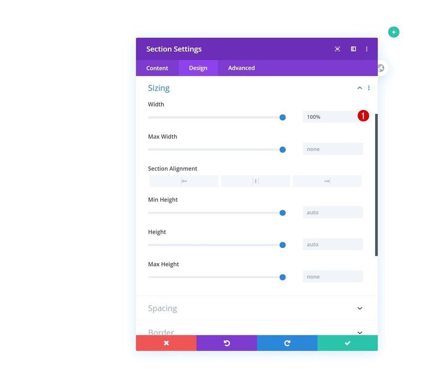
Sizing
Once inside the template editor, you’ll notice a section. Open the section settings and make sure the section width is ‘100%’.
- Width: 100%
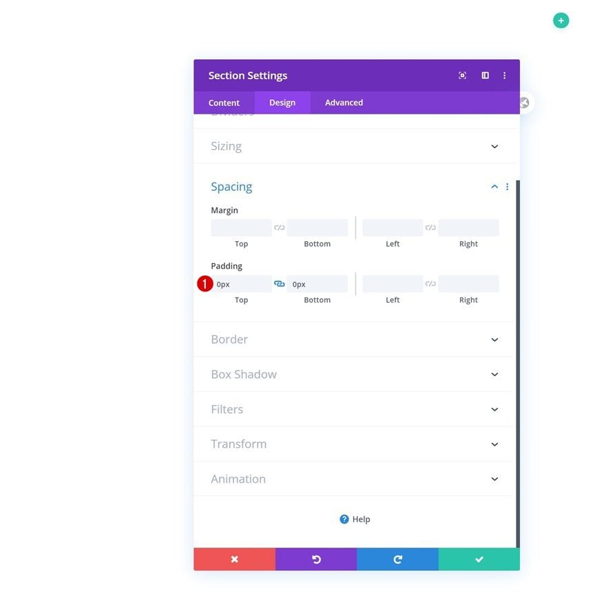
Spacing
Then, go to the spacing settings and remove all default top and bottom padding.
- Top Padding: 0px
- Bottom Padding: 0px
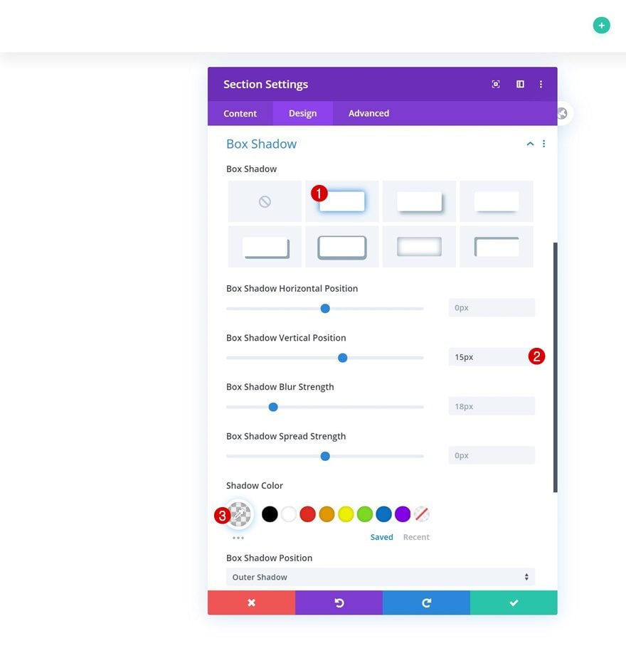
Box Shadow
We’re using a subtle box shadow as well.
- Box Shadow Vertical Position: 15px
- Shadow Color: rgba(0,0,0,0.06)
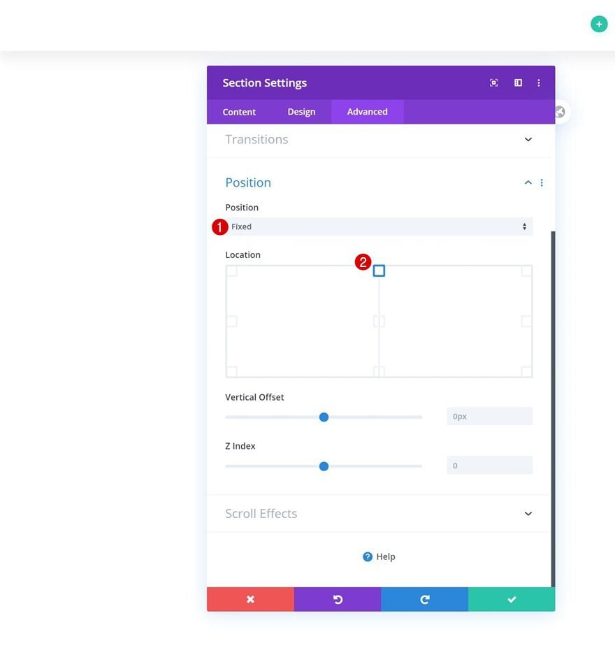
Position
Last but not least, we’ll make the section stick to the top center of our page using the position settings in the advanced tab.
- Position: Fixed
- Location: Top Center
Add Row Header #1
Column Structure
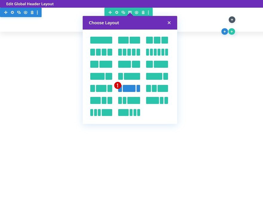
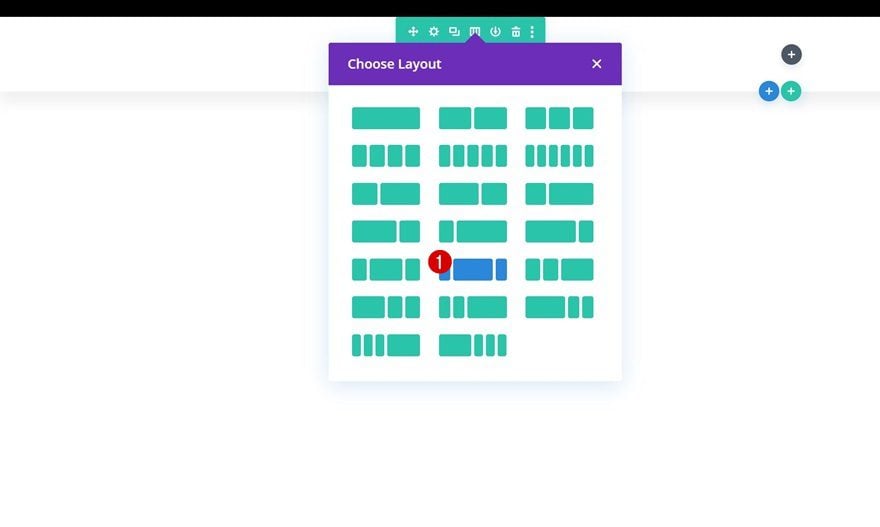
Both headers we’ll create will be part of the same section. We’ll use a separate row for each header. Add the first row header using the following column structure:
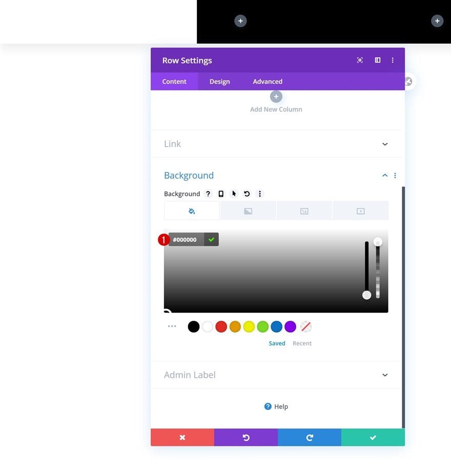
Background Color
Without adding any modules yet, open the row settings and change the background color.
- Background Color: #000000
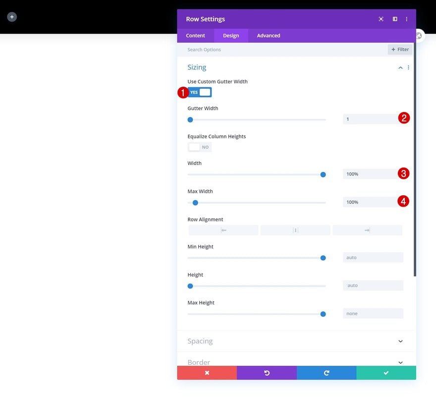
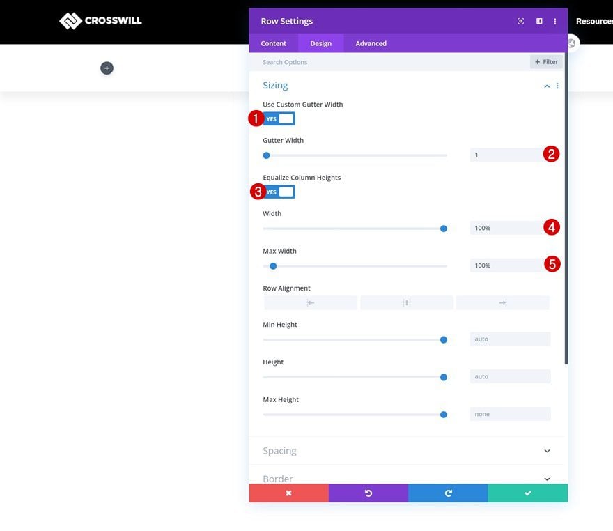
Sizing
Modify the sizing settings as well.
- Use Custom Gutter Width: Yes
- Gutter Width: 1
- Width: 100%
- Max Width: 100%
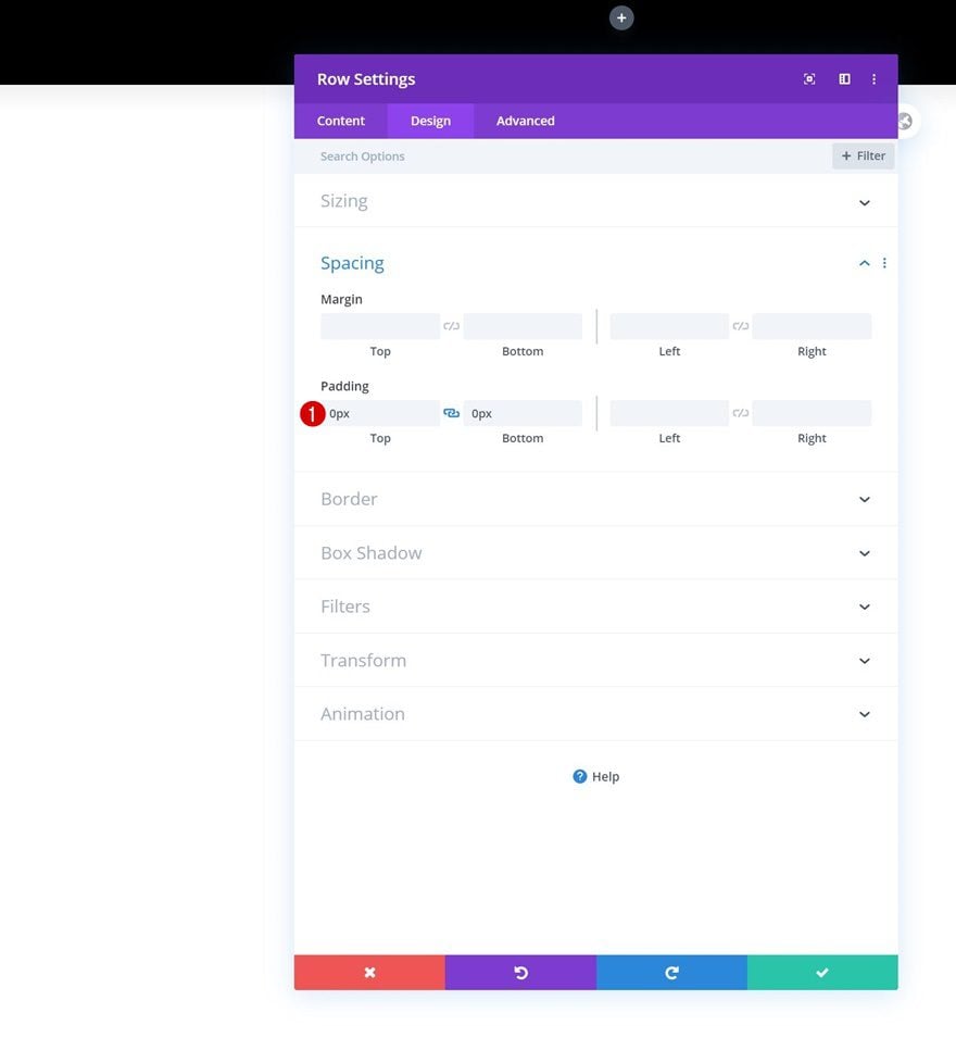
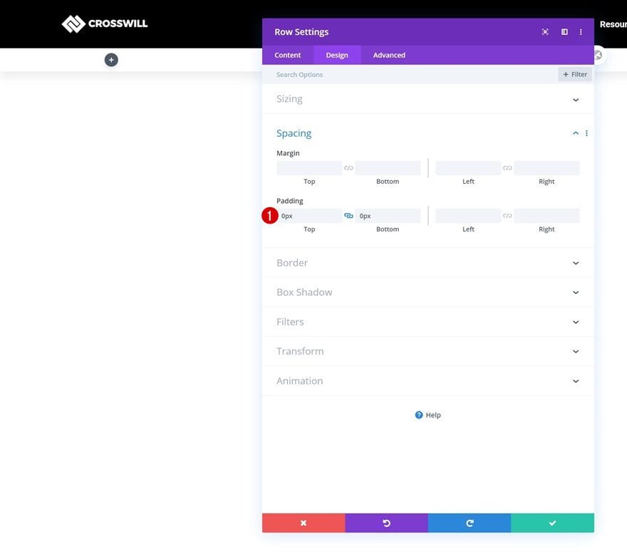
Spacing
Then, go to the spacing settings and remove all default top and bottom padding.
- Top Padding: 0px
- Bottom Padding: 0px
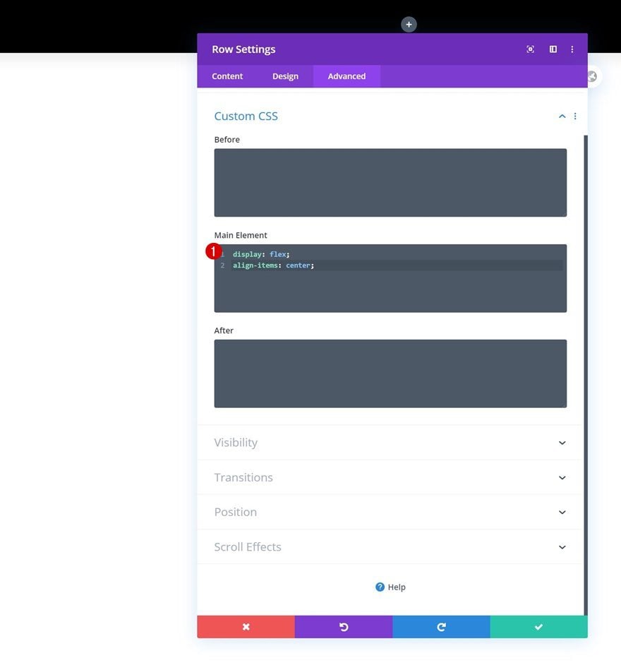
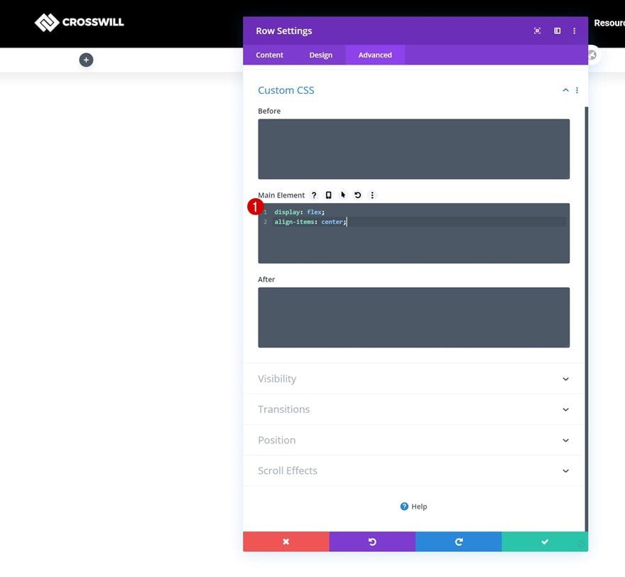
Main Element
Complete the row settings by adding two lines of CSS code to the row’s main element. This CSS code will help us align all column content.
display: flex;
align-items: center;
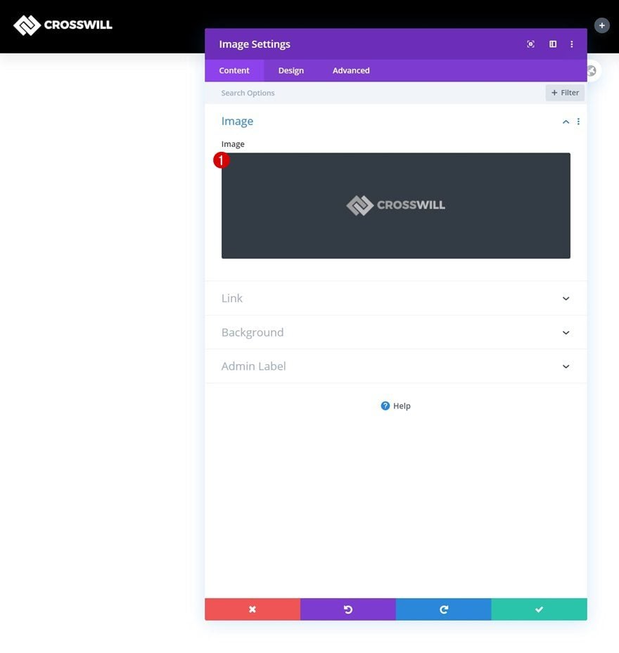
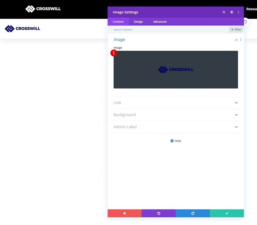
Add Image Module to Column 1
Upload Image
Time to add modules, starting with an Image Module in column 1. Upload a logo of your choice.
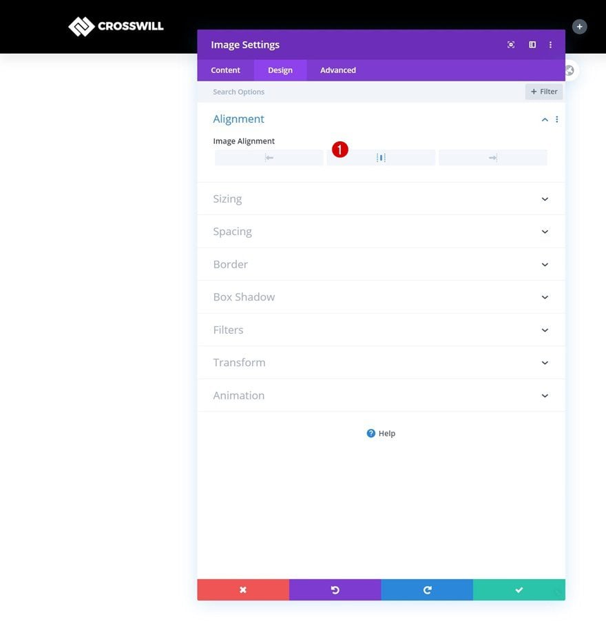
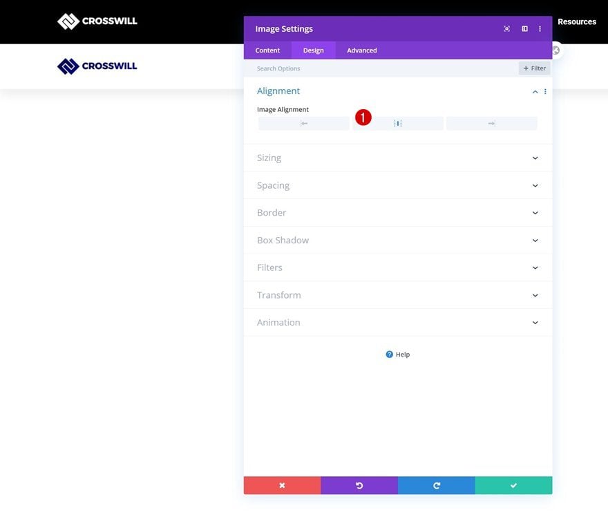
Alignment
Change the module’s alignment next.
- Image Alignment: Center
Select Menu
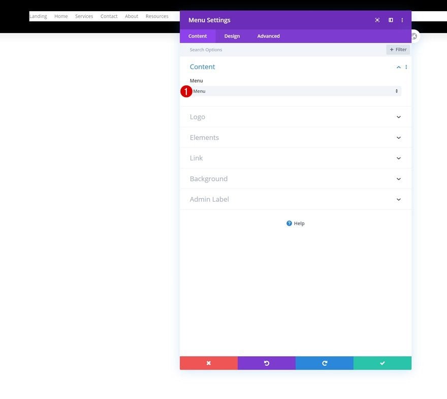
In the second column, the only module we need is a Menu Module. Select a menu of your choice.
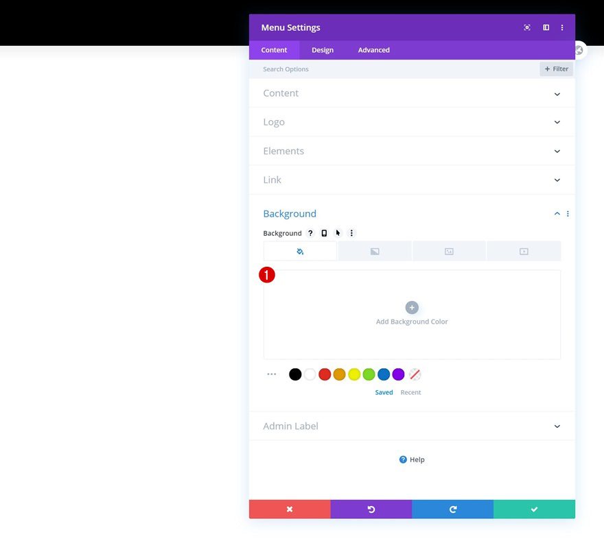
Remove Background Color
Remove the module’s background color next.
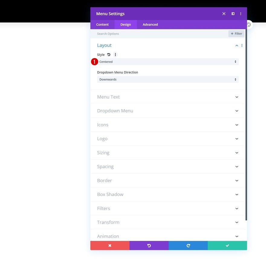
Layout
Move on to the design tab and change the layout accordingly:
- Style: Centered
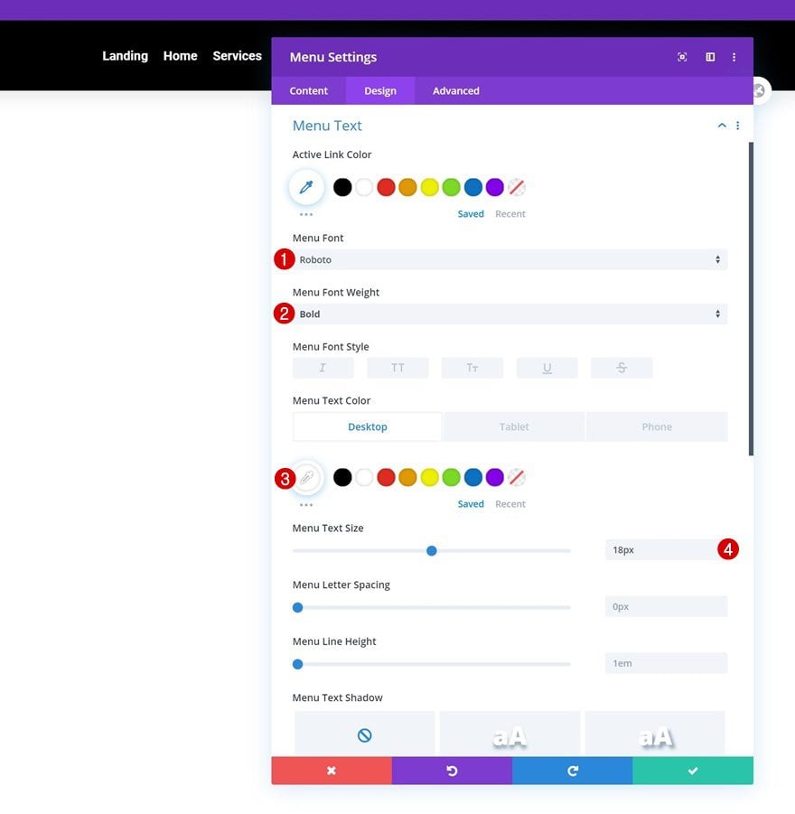
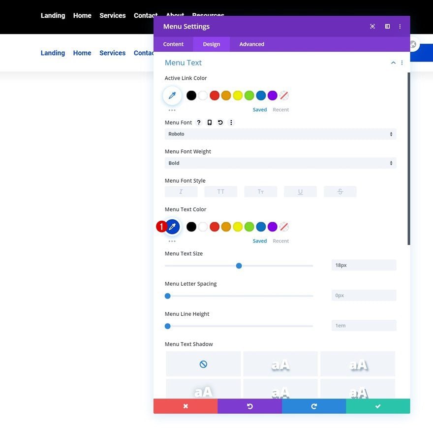
Menu Text Settings
Then, make some changes to the menu text settings.
- Menu Font: Roboto
- Menu Font Weight: Bold
- Menu Text Color: #ffffff (Desktop), #000000 (Tablet & Phone)
- Menu Text Size: 18px
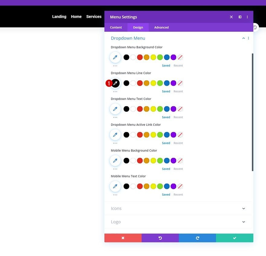
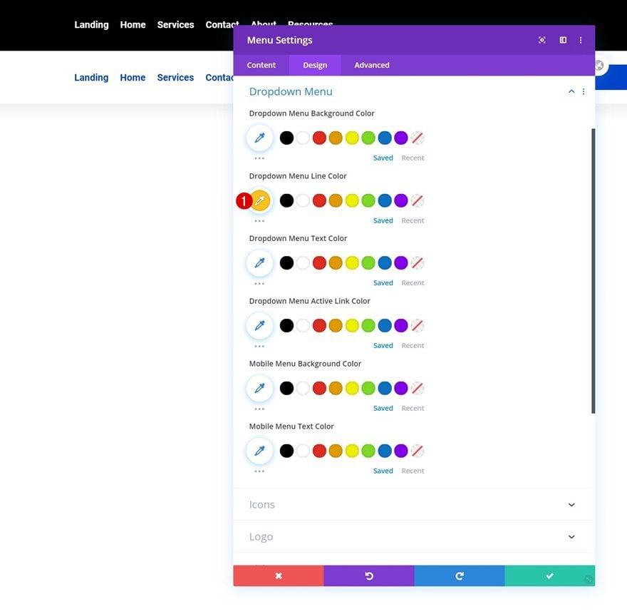
Dropdown Menu Text Settings
Next, we’ll change the dropdown menu line color in the dropdown menu text settings.
- Dropdown Menu Line Color: #000000
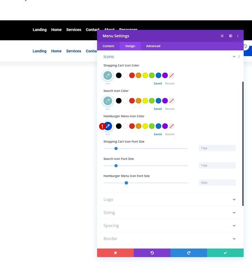
Icons Settings
We’re also changing the hamburger menu icon color.
- Hamburger Menu Icon Color: #ffffff
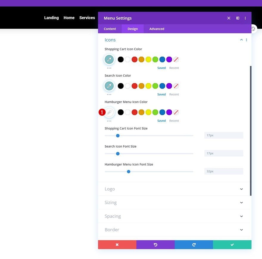
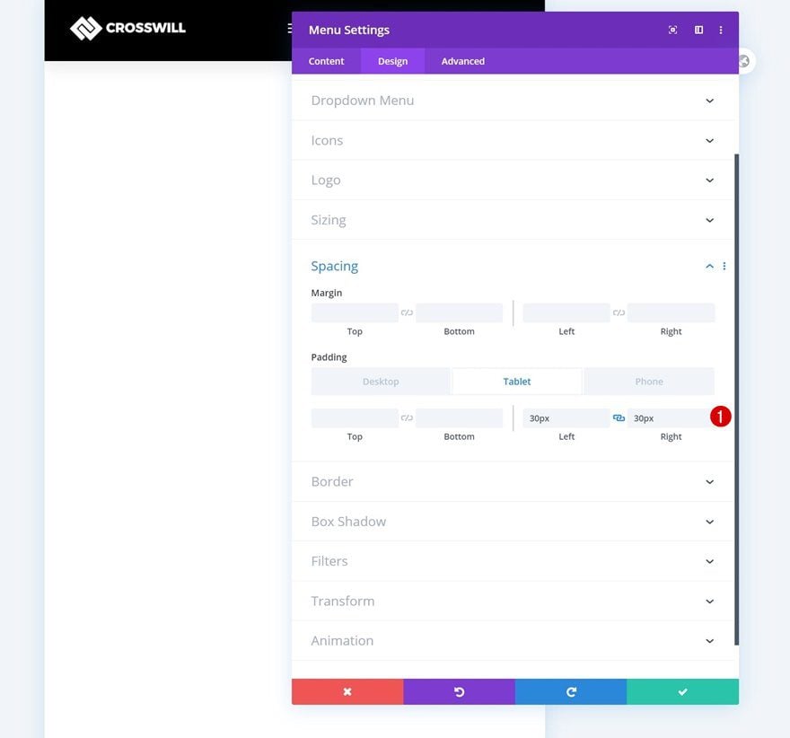
Spacing
Complete the module settings by adding some custom left and right padding on smaller screen sizes.
- Left Padding: 30px (Tablet & Phone Only)
- Right Padding: 30px (Tablet & Phone Only)
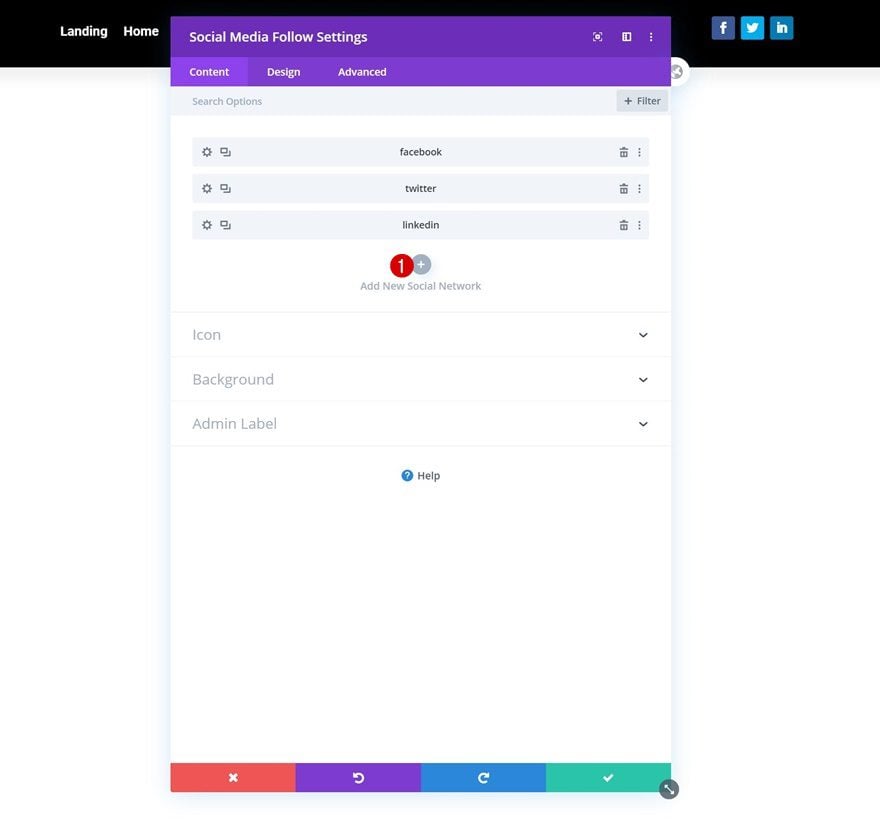
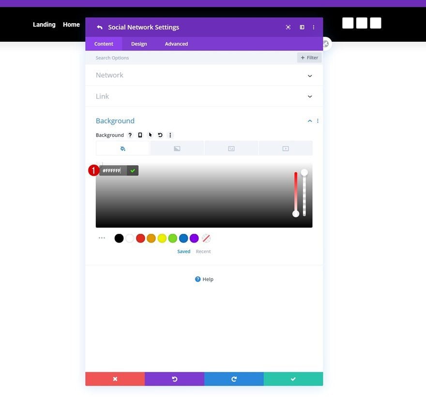
Add Social Networks of Choice
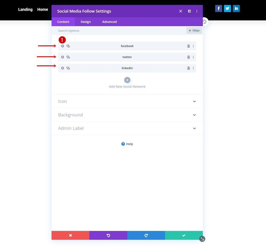
In the last column, the only module we need is a Social Media Follow Module. Add the social networks of your choice.
Individual Social Network Background Color
Then, open each social network individually and change the background color to white.
- Background Color: #FFFFFF
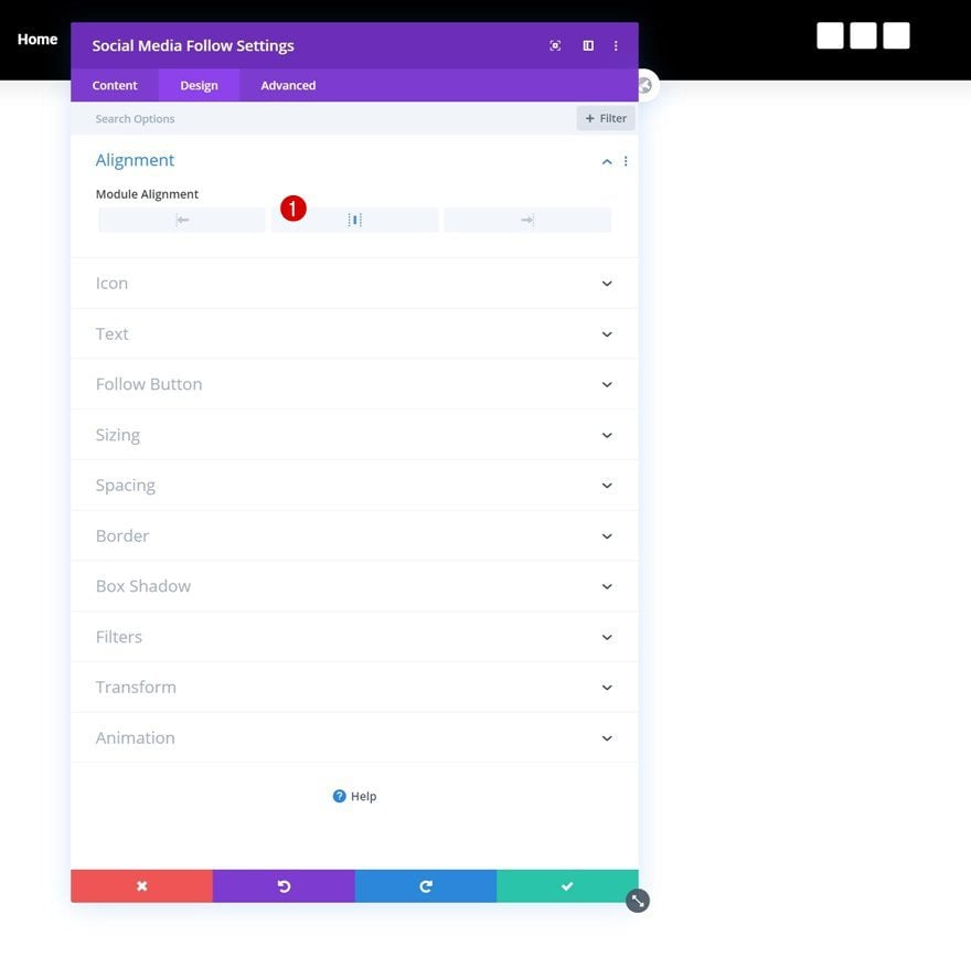
Alignment
Go back to the module’s general settings and change the module alignment.
- Module Alignment: Center
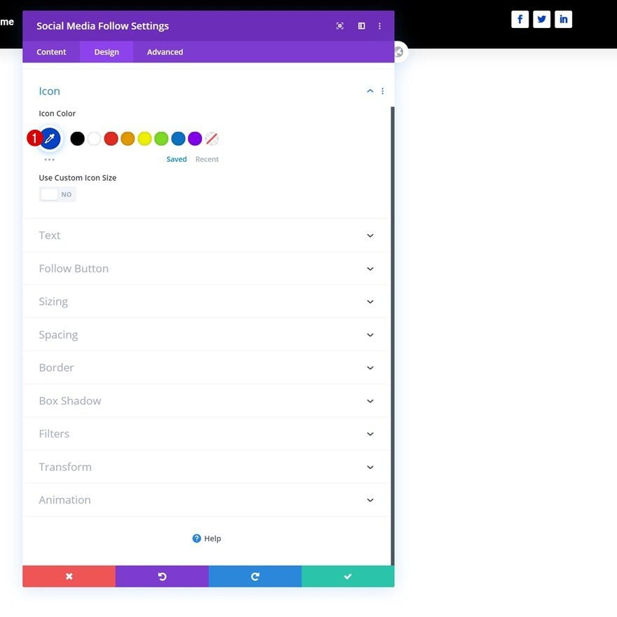
Icon Settings
Modify the icon color too.
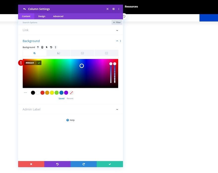
- Icon Color: #0042c9
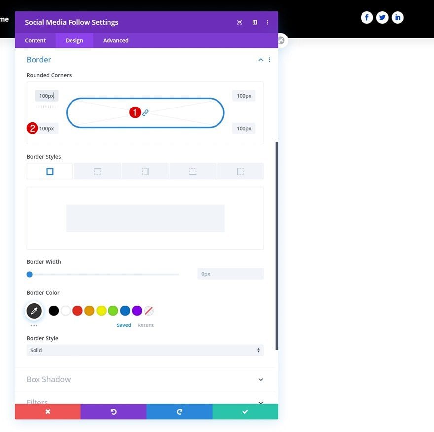
Border
And complete the module settings by adding some border radius.
- All Corners: 100px
Add Row Header #2
Column Structure
On to the second header! Add a new row using the following column structure:
Sizing
Without adding any modules yet, open the row settings and change the sizing settings as follows:
- Use Custom Gutter Width: Yes
- Gutter Width: 1
- Equalize Column Heights: Yes
- Width: 100%
- Max Width: 100%
Spacing
Remove all default top and bottom padding next.
- Top Padding: 0px
- Bottom Padding: 0px
Main Element
Then, align all column content by using two lines of CSS code in the row’s main element.
display: flex;
align-items: center;
Column 3 Background Color
And complete the row settings by opening the column 3 settings and using a background color.
- Background Color: #0042c9
Add Image Module to Column 1
Upload Image
In column 1, the only module we need is an Image Module. Upload a logo of your choice.
Alignment
Change the module’s image alignment next.
- Image Alignment: Center
Clone the Menu Module that was used in the previous row and place the duplicate in the second row’s middle column.
Modify Menu Text Settings
Open the duplicate Menu Module and change the menu text color.
- Menu Text Color: #0042c9
Modify Dropdown Menu Text Settings
Modify the dropdown menu text settings too.
- Dropdown Menu Line Color: #ffc21d
Modify Icon Settings
Complete the Menu Module settings by changing the hamburger menu icon color.
- Hamburger Menu Icon Color: #0042c9
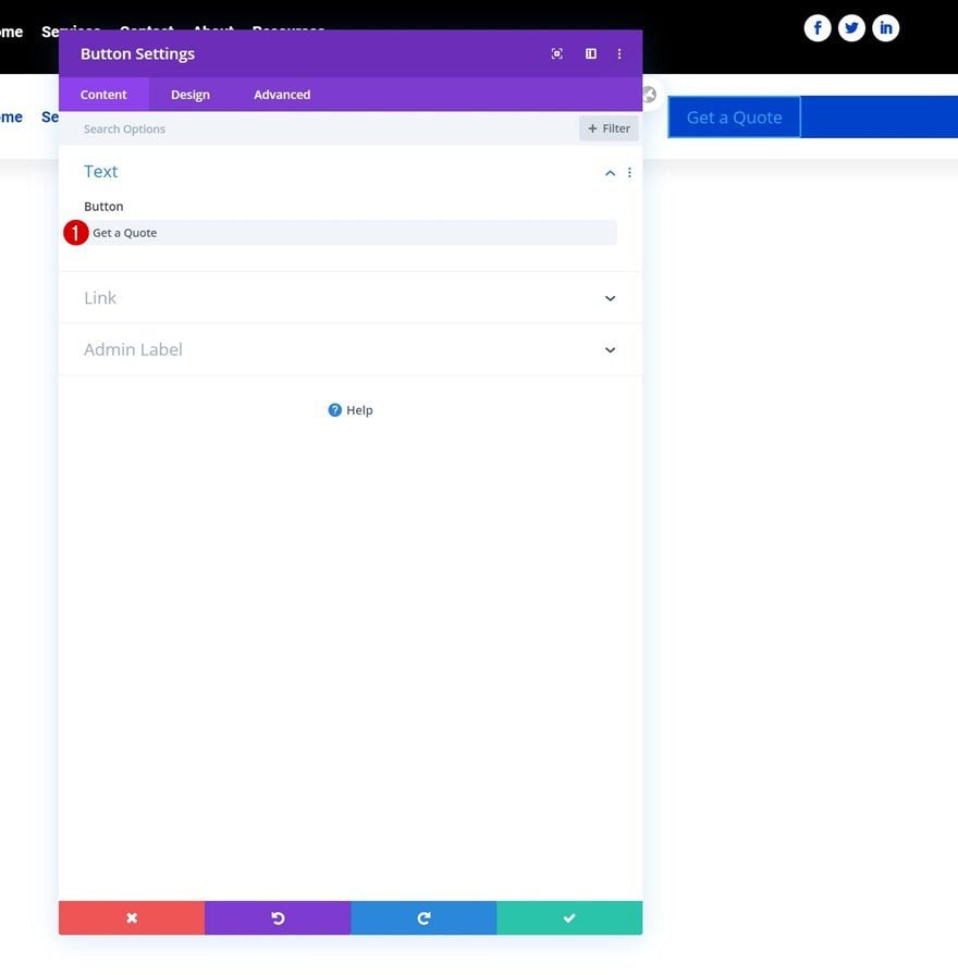
Add Copy
In the row’s last column, the only module we need is a Button Module. Enter some copy of your choice.
Alignment
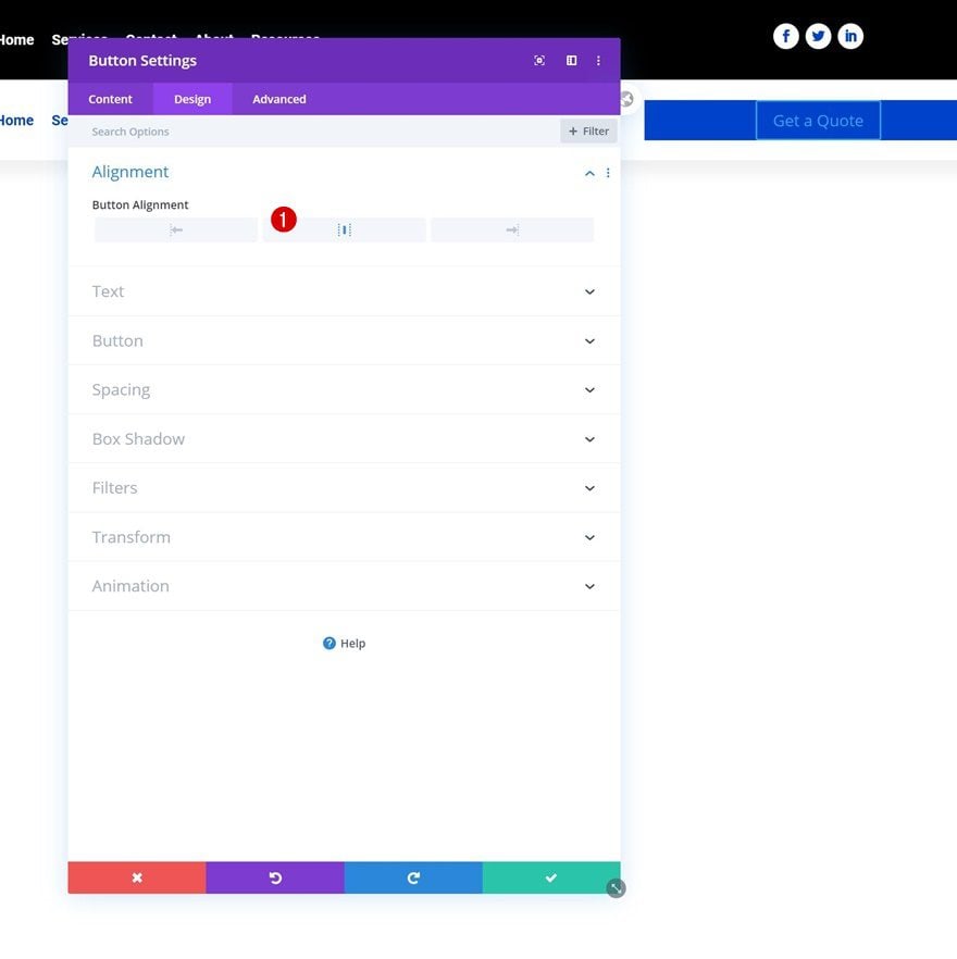
Modify the button alignment next.
- Button Alignment: Center
Button Settings
Then, style the button as follows:
- Use Custom Styles For Button: Yes
- Button Text Size: 20px (Desktop), 18px (Tablet), 15px (Phone)
- Button Text Color: #ffffff
- Button Border Width: 0px
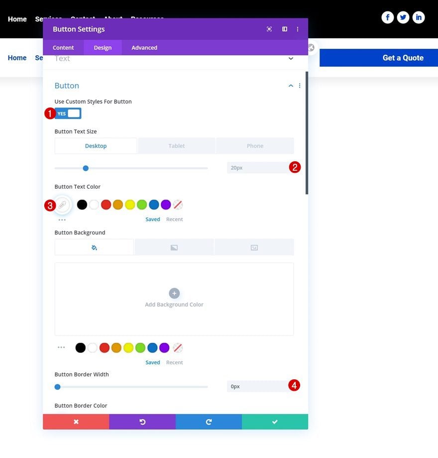
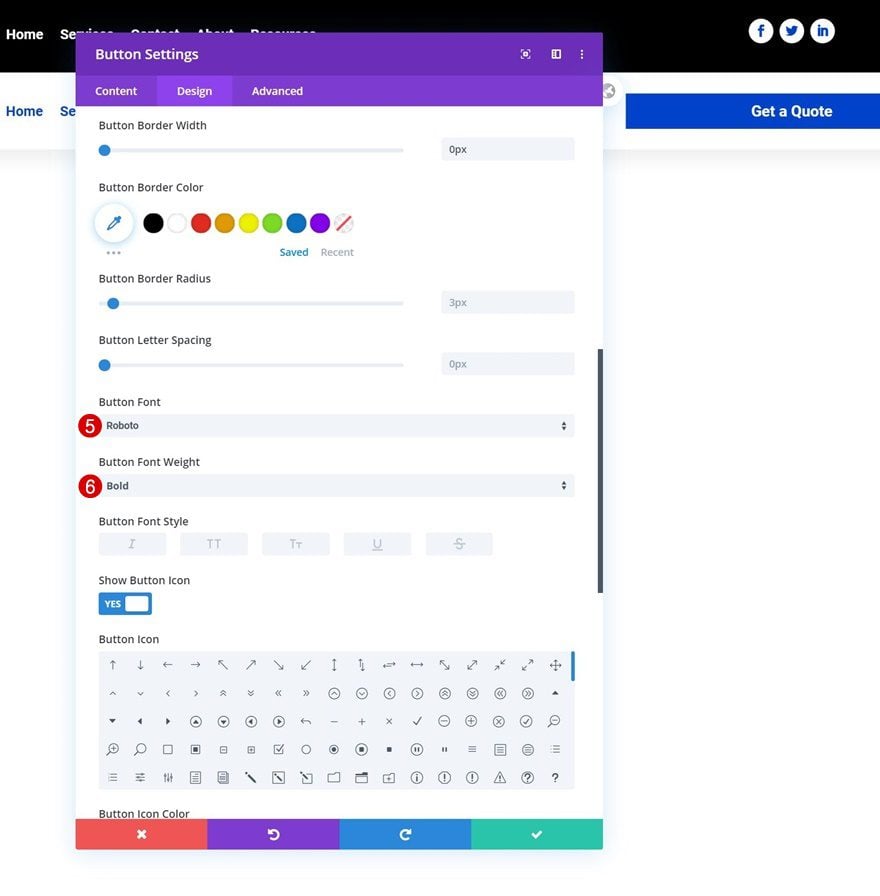
- Button Font: Roboto
- Button Font Weight: Bold
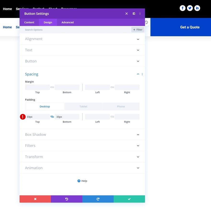
Spacing
And complete the module settings by adding some custom padding across different screen sizes.
- Top Padding: 33px (Desktop), 35px (Tablet), 38px (Phone)
- Bottom Padding: 33px (Desktop), 35px (Tablet), 38px (Phone)
2. Add CSS Classes
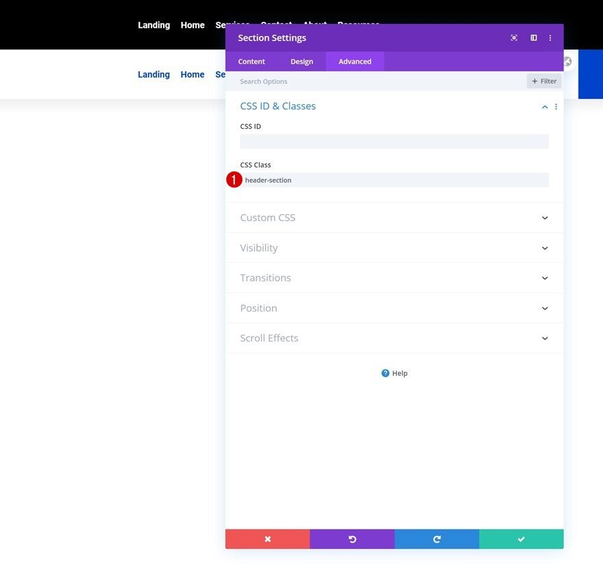
Section
Once you’ve added and styled all modules, it’s time to add the CSS classes which we’ll use inside our JQuery code. First, open the section settings and use the following CSS class:
- CSS Class: header-section
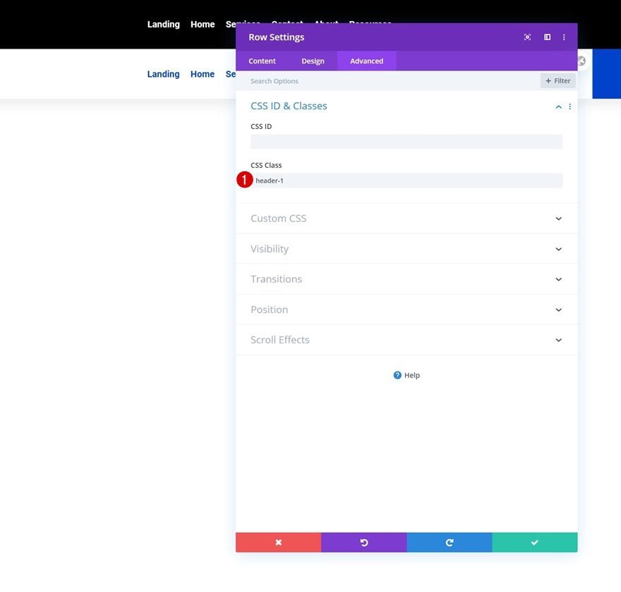
Row Header #1
Then, open the first row header and use the following CSS class:
- CSS Class: header-1
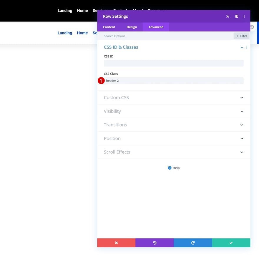
Row Header #2
Open the second row as well. Use the following CSS class for it:
- CSS Class: header-2
3. Add JQuery & CSS Code
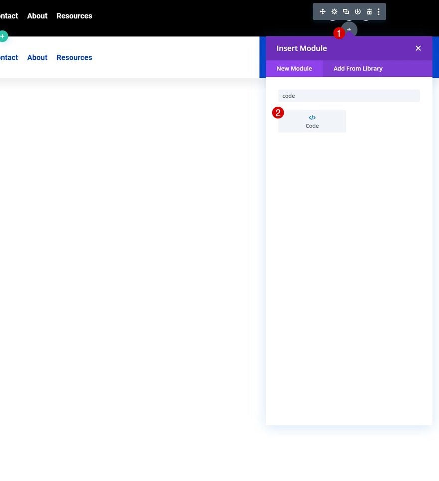
Add Code Module to First Row’s Third Column
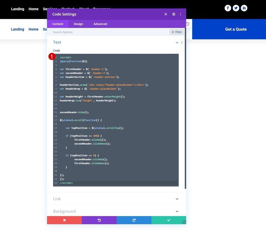
Once all CSS classes are in place, it’s time to add the code. Add a new Code Module wherever you want inside your section. We’re placing it in the first row’s third column.
Then, add the following lines of CSS code between script tags as you can see in the print screen below:
jQuery(function($){

var firstHeader = $('.header-1');
var secondHeader = $('.header-2');
var headerSection = $('.header-section');

headerSection.wrap('<div class="header-placeholder"></div>');
var headerWrap = $('.header-placeholder');

var headerHeight = firstHeader.outerHeight();
headerWrap.css('height', headerHeight);


secondHeader.hide();

$(window).scroll(function() {

    var topPosition = $(window).scrollTop();

    if (topPosition >= 400) {
          firstHeader.slideUp();
          secondHeader.slideDown();
    }

    if (topPosition == 0) {
          secondHeader.slideUp();
          firstHeader.slideDown();
    }

});
});
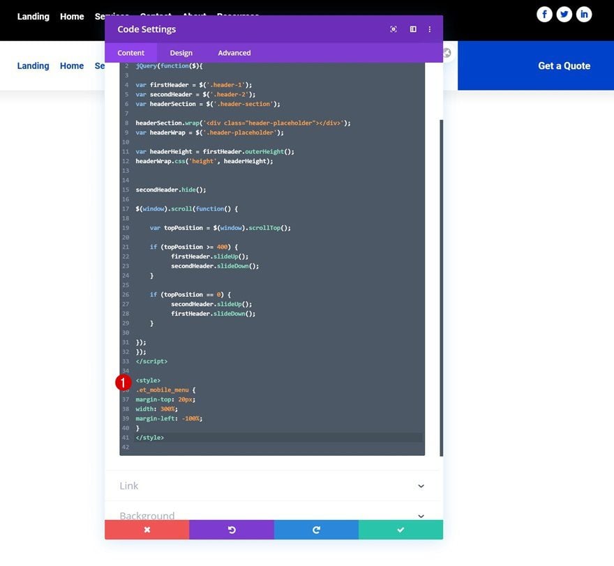
Add the following CSS code between style tags as well:
.et_mobile_menu {
margin-top: 20px;
width: 300%;
margin-left: -100%;
}
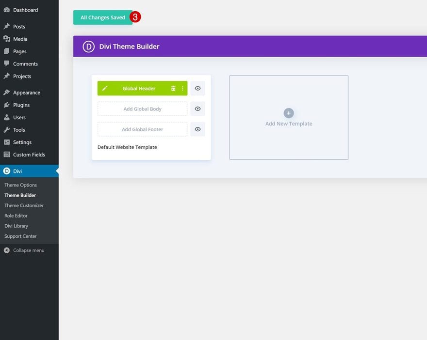
4. Save Theme Builder Changes & View Outcome
At this point, the only thing left to do is save all theme builder changes and view the outcome on your website!
Preview
Now that we’ve gone through all the steps, let’s take a final look at the outcome across different screen sizes.
Desktop
Mobile
Final Thoughts
In this post, we’ve shown you how to swap your Divi header for another one on scroll using Divi’s theme builder, the Divi elements and some additional JQuery and CSS code. We’ve also auto-generated some space at the top of the page container that prevents the fixed header from overlapping the page content. You were able to download the swap Divi header template JSON file for free as well! If you have any questions or suggestions, feel free to leave a comment in the comment section below.
If you’re eager to learn more about Divi and get more Divi freebies, make sure you subscribe to our email newsletter and YouTube channel so you’ll always be one of the first people to know and get benefits from this free content.


Hovering over the images makes them resize on hover. And there’s a white space between the header itself and the feature image of the homepage on preview. Is there any way to fix this?
Do you have a more CLS-friendly version of this menu? It increases a heavy CLS of 0.350 because it technically loads two menus before hiding one of them.
A quick way to optimize CLS is reserving a space to the affected element, it can be done by adding a min-height property to the element or it’s parent. You can refer to this article as a guide:
https://help.elegantthemes.com/en/articles/5120638-how-to-fix-cumulative-layout-shift-cls-in-divi
The problem is that when you touch the hamburger on mobile, the drop-down is completely empty.
I imported the layout from my test site, but I’m unable to replicate the issue on my end: https://prnt.sc/qsD2olnnfGbn
Could you please try the following? Go to Section Settings > Advanced > Visibility, and ensure that both horizontal and vertical overflow settings are set to visible. https://prnt.sc/BhzDoIKdyBSU
my first header has and image under it with a gradient in the background of the row and the code is not putting a space at the top of the page. How do i adjust that?
This is great, but it seems to be super slow and clunky in Safari, but nice and smooth on Chrome. Do you have any suggestions to improve the speed and function in Safari?
Is there a way to make the first header transparent?
Hello.
Thanks for the amazing tutorial.
I had an issue with the first header. Links are not working. They just work when the second headr appears. Can you provide some help?
Best!
Hey, great work. But i have a problem with the header. I imported the json file into the themebuilder and the header works fine on the homepage but it seems that on a woocommerce product page the header falls behind all content when you’re using a divi product layout. When using the standard woocommerce layout it works fine but then the sale button and the product image magnifying glass are seen on top of the header instead of behind it. After some testing it does not seem to be a problem with z-index. I hope you can help.
Greetings, Damian
👍
Good to see you’re enjoying the tutorial, Mike! 🙂
Thanks you for this. I’ve used combinations of different themes for my website and these tutorials are great in order to create something unique about our website
Glad to hear that, Eileen! 🙂
Looks really nice ! Thank you Donjete ! 🙂
Always welcome, Paulina! 🙂
Nice! Great post Donjete!
I’m definitely giving this one a try for one of my website projects. I’m taking some programming courses online. I can’t wait to do and understand these types of customization.
Happy to hear that! Best of luck 🙂