
This post is part 3 of 5 in our mini series titled 5 Creative Ways to Style the Divi Post Slider Module. Stay tuned this week for all five unique examples of Divi’s Post Slider Module, with a tutorial on how to achieve each one!
Today we continue our series on styling the Divi Post Slider module. We’re using model sliders from well-known blogs around the web and attempting to recreate their appearance in Divi. These tutorials allow us to explore the Divi Post Slider module in-depth, pushing it’s flexibility to the limit. In today’s post, our model is the post slider found on the Tesco Living website.
- 1 Today’s Before & After: The Divi Post Slider Module
- 2 The Concept & Inspiration
- 3 Preparing the Design Elements
- 4 Implementing the Design with Divi
- 5 General Settings
- 6 Design Settings
- 7 Custom CSS
- 8 The Final Result
- 9 Tomorrow: How to Style Divi’s Post Slider Module like Facebook Newsroom’s Post Slider
Today’s Before & After: The Divi Post Slider Module
Before

After
The Concept & Inspiration
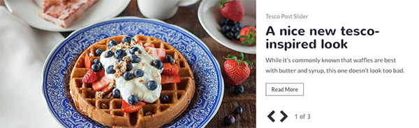
Inspiration for today’s post slider style comes from Tesco, the world’s second largest retailer. Tesco Magazine is one of the UK’s top selling magazines with content focused around food, family, and living. The publication’s website, TescoLiving.com is where we find the post slider for this tutorial.
The concept for Tesco’s post slider is simplicity. A prominent featured image is displayed to the left of the post category, title, and excerpt, while only arrows are displayed for navigation. Slide number and number of slides in the set are also displayed next to the navigation arrows.
Preparing the Design Elements
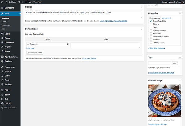
For this slider, you’ll need three posts with featured images with a recommended size of 800px X 500px. Each of your posts must also include a short excerpt of one to two sentences. Notice also that this post slider uses sentence case for the post title. To truly capture this style you’ll need to change your titles accordingly. All of these settings will be found on your “edit post” page. To get there from your dashboard, click on “posts” on the left sidebar menu, and then click the post title.
Next we need to add FontAwesome to your Divi site. Navigate in your WordPress Admin to Divi > Theme Options > Integration > Add code to the < head > of your blog and paste the following snippet there.
<link rel="stylesheet"href="https://maxcdn.bootstrapcdn.com/font-awesome/4.6.3/css/font-awesome.min.css" />
Finish up by clicking the green “Save Changes” button.
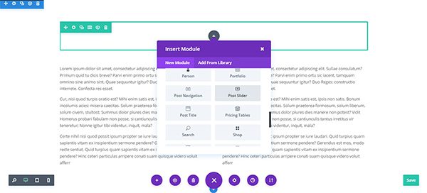
Implementing the Design with Divi
Since the Tesco Living post slider is a full-width slider, you’ll need a single column row with a post slider module on your page. From the Divi Visual Builder, click on the green plus sign to add a row, then select single column, then the Post Slider module.
General Settings
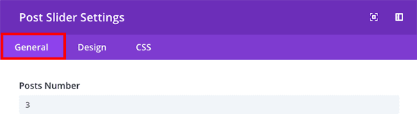
In the General Settings tab of the Post Slider Module, do the following:
- Set the number of posts to your desired number.
- Switch “show controls” to no.
- Change the “Background Color” to #ffffff (white).
- Change the text color from “light” to “dark”.
- Make sure your “Image Placement” is set to Left.
- Change “Use Background Overlay” to no.
- Change “Remove Inner Shadow” to yes.
Design Settings
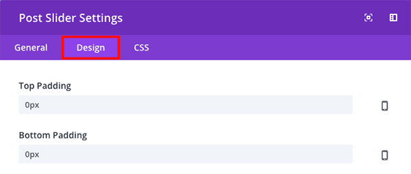
In the Design Settings tab of the Post Slider Module, do the following:
- Set “Top Padding” and “Bottom Padding” to 0px.
- Set the “Header Font” to Nunito; bold.
- Set the “Body Font” to Lato.
- Set the “Body Font Size” to 16px.
- Switch “Use Custom Styles for Button” to yes.
- Set “Button Text Style” to 14px.
- Set the “Button Text Color” to #666666
- Set the “Button Border Width” to 1px.
- Set the “Button Border Radius” to 0px.
- Set the “Button Font” to Lato; bold.
Custom CSS
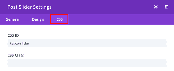
In the Custom CSS tab of the Post Slider Module, add “tesco-slider” to the CSS ID field and then click the green check box to save your settings.
Then, navigate to the page settings by clicking on the bottom controls dock icon followed by the gear icon.

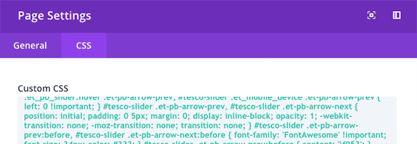
Click on the CSS tab and paste the following code snippet in the custom css panel:
/* TESCO SLIDER - GENERAL */
#tesco-slider .et_pb_slides .et_pb_slide { padding: 0; overflow: hidden; }
#tesco-slider .et_pb_slides .et_pb_container { height: auto !important; padding-bottom: 60px; }

/* TESCO SLIDER - IMAGE */
#tesco-slider .et_pb_slide_image { width: 61.25%; margin: 0 !important; top: 0; }
#tesco-slider .et_pb_slide_image img { max-height: 100% !important; }

/* TESCO SLIDER - DESCRIPTION */
#tesco-slider .et_pb_slide_description { width: 38.75%; display: block; padding: 25px !important; }

/* TESCO SLIDER - TITLE */
#tesco-slider .et_pb_slide_title { margin-top: 40px; }

/* TESCO SLIDER - CATEGORY */
#tesco-slider .post-meta { font-size: 0px !important; position: absolute; top: 25px; }
#tesco-slider .post-meta span { display: none; }
#tesco-slider .post-meta a { font-size: 15px !important; color: #878486 !important; }

/* TESCO SLIDER - NAVIGATION */
#tesco-slider .et-pb-slider-arrows { position: absolute; left: 63.25%; bottom: 10px; z-index: 20; }
#tesco-slider .et-pb-arrow-next, #tesco-slider .et_pb_slider:hover .et-pb-arrow-next, #tesco-slider .et_mobile_device .et-pb-arrow-next { right: 0 !important; }
#tesco-slider .et-pb-arrow-prev, #tesco-slider .et_pb_slider:hover .et-pb-arrow-prev, #tesco-slider .et_mobile_device .et-pb-arrow-prev { left: 0 !important; }
#tesco-slider .et-pb-arrow-prev, #tesco-slider .et-pb-arrow-next { position: initial; padding: 0 5px; margin: 0; display: inline-block; opacity: 1; -webkit-transition: none; -moz-transition: none; transition: none; }
#tesco-slider .et-pb-arrow-prev:before, #tesco-slider .et-pb-arrow-next:before { font-family: 'FontAwesome' !important; font-size: 34px; color: #333; }
#tesco-slider .et-pb-arrow-prev:before { content: 'f053'; }
#tesco-slider .et-pb-arrow-next:before { content: 'f054'; }
#tesco-slider .et-pb-arrow-next:hover, #tesco-slider .et-pb-arrow-prev:hover { opacity: 0.5; }

/* TESCO SLIDER - NNUMBERS */
#tesco-slider .et_pb_slides .et_pb_slide:before { margin-left: 100px; opacity: 0; position: absolute; bottom: 17px; left: 61.25%; }
#tesco-slider .et_pb_slides .et-pb-active-slide:before { opacity: 1; }
#tesco-slider .et_pb_slides .et_pb_slide:nth-child(1)::before { content: '1 of 3'; }
#tesco-slider .et_pb_slides .et_pb_slide:nth-child(2)::before { content: '2 of 3'; }
#tesco-slider .et_pb_slides .et_pb_slide:nth-child(3)::before { content: '3 of 3'; }

/* TESCO SLIDER - RESPONSIVE */
@media only screen and (max-width: 960px) {
    #tesco-slider .et_pb_slides .et_pb_slide .et_pb_slide_image, #tesco-slider .et_pb_slides .et_pb_slide .et_pb_slide_description  { width: 100% !important; text-align: left; display: block; position: initial !important; }
    #tesco-slider .et_pb_slides .et_pb_slide .et_pb_slide_description { padding: 25px 0 0 0 !important; }
    #tesco-slider .et_pb_slide_title { margin-top: 40px !important; }
    #tesco-slider .et-pb-slider-arrows { left: 0; }
    #tesco-slider .et_pb_slides .et_pb_slide:before { margin-left: 0; left: 80px; }
}

/* TESCO SLIDER ANIMATIONS - OPTIONAL */
#tesco-slider .et_pb_slider .et_pb_slide_image,
#tesco-slider .et-pb-active-slide .et_pb_slide_image,
#tesco-slider .et_pb_slide:first-child .et_pb_slide_image img.active {
    -webkit-animation-duration: 0.7s;
    -moz-animation-duration: 0.7s;
    -ms-animation-duration: 0.7s;
    -o-animation-duration: 0.7s;
    animation-duration: 0.7s;
    -webkit-animation-timing-function: ease-in-out;
    -moz-animation-timing-function: ease-in-out;
    -ms-animation-timing-function: ease-in-out;
    -o-animation-timing-function: ease-in-out;
    animation-timing-function: ease-in-out;
    -webkit-animation-delay: 0.9s;
    -moz-animation-delay: 0.9s;
    -ms-animation-delay: 0.9s;
    -o-animation-delay: 0.9s;
    animation-delay: 0.9s;
    -webkit-animation-fill-mode: both;
    -moz-animation-fill-mode: both;
    -ms-animation-fill-mode: both;
    -o-animation-fill-mode: both;
    animation-fill-mode: both;
}

#tesco-slider .et_pb_slider .et_pb_slide_image {
    -webkit-animation-name: fadeBottom;
    -moz-animation-name: fadeBottom;
    -ms-animation-name: fadeBottom;
    -o-animation-name: fadeBottom;
    animation-name: fadeBottom;
}

#tesco-slider .et-pb-active-slide .et_pb_slide_image,
#tesco-slider .et_pb_slide:first-child .et_pb_slide_image img.active {
    -webkit-animation-name: fadeTop;
    -moz-animation-name: fadeTop;
    -ms-animation-name: fadeTop;
    -o-animation-name: fadeTop;
    animation-name: fadeTop;
}
Then click the green button to save your changes.
The Final Result
When all of the settings, snippets, and adjustments above have been made you will still have one more thing to do. With the visual editor’s bottom control dock still expanded, click the “Save Draft” or “Publish” or “Update” button in the right hand corner of your screen. Then, at the top left, in the black admin bar, exit the visual builder. You will be left with a beautiful, Tesco Living inspired post slider.
Tomorrow: How to Style Divi’s Post Slider Module like Facebook Newsroom’s Post Slider
I certainly hope you’re enjoying this mini series as much as I’m enjoying creating it. As we continue to explore new ways to style and use the Divi Post Slider module, we also gain a better understanding of Divi in general.
Don’t forget! We still have two posts left in the mini series “5 Ways to Style & Use Divi’s Post Slider Module.” Tomorrow we will look at the Facebook Newsroom post slider and learn to create an interesting 3D tag element.
Be sure to subscribe to our email newsletter and YouTube channel so that you never miss a big announcement, useful tip, or Divi freebie!


It say part 3 of 5 – is there a part 4 and 5? I can’t find them. Could be I’ve been scrolling so much up and down, I don’t see the woods for the trees…
I am trying this on a fullwidth post title slider module, and I have a large right and left margin. Any help on getting ahold of those margins to remove them so the post will fill the entire module?
I cannot get the navigational icons to display. It’s showing numbers instead of the icon
This is not fixed in this code:
Thanks for the Tutorial. However content: ‘f053’; and ‘f054’ is
#tesco-slider .et-pb-arrow-prev:before { content: ‘\f053’; }
#tesco-slider .et-pb-arrow-next:before { content: ‘\f054’; }
who can help me >
Diedrich
f0f3 and f0f4 are not valid unicode charcters.
Try the following. They are pretty similar to the look in the picture:
#tesco-slider .et-pb-arrow-prev:before { content: ‘\2770’; }
#tesco-slider .et-pb-arrow-next:before { content: ‘\2771’; }
Or…
#tesco-slider .et-pb-arrow-prev:before { content: ‘\276E’; }
#tesco-slider .et-pb-arrow-next:before { content: ‘\276F’; }
Whichever you prefer.
So how would one do this with just a slider, not the post slider? With a photo and text on the right or left side. The text then would need to slide below the photo with in mobile view.
Regards
Kevin
I’ve been waiting for the final two in this series.
You know what I would LOVE to see is how to style the slider like EXTRA’s post slider.
Thank you and looking forward to it!!
Great tutorial, thanks!
Quick question, which CSS controls how the navigation icons behave in mobile widths? In large widths, the arrows “” are beside each other, but in mobile widths, you push the arrows to the edges of the image. “”. Its a very elegant solution and IMO looks the best.
Thanks kindly.
Are the final two posts in this mini series still scheduled for release? And thank you so much for these resources!
I hope someone can help me. I don’t know CSS so depend on “copy paste” instructions. I have followed these instructions multiple times and made the corrections noted by contributors. But I am still having problems with the bottom padding on this slider.
Here is how it should look: https://www.tescoliving.com/
Here is the site I am working on: http://allsufficiencynow.com/blessing/
Any clues? I really want to get this page finished and would like to use the Tesco Slider. Any help will be greatly appreciated.
Thanks in advance.
Fixed thank you Fiverr expert.
Hi Susan. I also have the same problem. Would you be able to let me know how you fixed this?
Many thanks
Felicity
Hi Susan,
I’m having the same issue.
How did you fix this?
Thx
Deb
This is not fixed in above code…
Thanks for the Tutorial. However content: ‘f053’; and ‘f054’ is
#tesco-slider .et-pb-arrow-prev:before { content: ‘\f053’; }
#tesco-slider .et-pb-arrow-next:before { content: ‘\f054’; }
Thank you for supporting us even less able-bodied.
Your blog posts are becoming irrelevant. You ignore your readers questions and comments and the code you supply is often incorrect. I see people constantly asking for a demo of what they will achieve before they decide to take the time to complete your tutorials but your writers don’t respond. You don’t reply to requests for help. The only comments your writers seem to respond to are the ones telling them how awesome something is. In a world where engagement with your subscribers is key Elegant Themes falls short.
Noob Questions:
Could Elegant Themes save this as a library item for us to download and tweak?
It seems that the “Blub” module is close to being able to do this without so much work if there was a setting to make the blurb image (when left positioned) auto scale to full height of the blurb. (Or set image and blurb to same height)
Any thoughts?
How should I modify the divi slide size I do not want it to occupy full screen only hope it is only half as wide
Great to see these kinds of posts on customizing the slider. Only wish here is that this could be done without so much custom additional css. Would be great if the slider could be customized to behave like directly through theme options.
Please the video tutorial! 🙂
A great tutorial. Congratulations.
Thanks for sharing the slider 🙂
It was a beautiful and informative article. Thank you so much.
I am looking for a demo! Anyone who got it working please share!
Am sure gonna try this out thanks alot
Love this one John.
A lot of CSS but I might give this one a try.
Superb lesson! Awesome information.
how about a demo page to see it working?
https://www.tescoliving.com/
I would love to use this slidebar on my blog.Great looking post slidebar ideas.what about slidebar background? is it possible to customize background? Anyways,Thanks for the ticks
Thanks for the Tutorial. However content: ‘f053’; and ‘f054’ is
#tesco-slider .et-pb-arrow-prev:before { content: ‘\f053’; }
#tesco-slider .et-pb-arrow-next:before { content: ‘\f054’; }
And what about the Video tutorial? Provide us with a video tutorial please.
There is an error in CSS.
content: ‘f053’ should be content: ‘\f053’ and idem for content: ‘f054’
thanks for that one! I wouldn’t know how to fix it 🙂
and the video tutorial?
I cannot get the navigational icons to display. It’s showing numbers instead of the icon. Was I supposed to add an awesome font plugin to my site? Was I supposed to modify the code snippet with my specific URL?
Yes this requires FontAwesome integration as described. Also an error in code missing \ in content . See guy40800 post below, he caught the error.
Hi. Do you have a video tutorial for this?
Wow this is fantastic John.
Just prefer tutorials that start off with the end product in mind first and then work to achieve it as against to …This is How To Create A Slider.
Would prefer a video tutorial as well also.
The way Divi works, however, this makes a nice component to put in your library of parts to build with 🙂