

When you’re designing a fixed global header, you might want to shrink the header’s height when your visitors are scrolling. It helps reduce the space the global header takes up in your visitors’ viewport height. In this tutorial, we’ll guide you through that process. We’ll start by building the menu, and then we’ll add some JQuery and CSS code to trigger the effect. You’ll be able to download the JSON file for free as well!
Let’s get to it.
- 1 Preview
- 2 Download The Global Header Template for FREE
- 3 Download For Free
- 4 You have successfully subscribed. Please check your email address to confirm your subscription and get access to free weekly Divi layout packs!
- 5 1. Go to Divi Theme Builder & Add New Template
- 6 2. Start Building Global Header
- 7 3. Save Builder Changes & View Result
- 8 Preview
- 9 Final Thoughts
Preview
Before we dive into the tutorial, let’s take a quick look at the outcome across different screen sizes.
Desktop
Mobile

Download The Global Header Template for FREE
To lay your hands on the free global header template, you will first need to download it using the button below. To gain access to the download you will need to subscribe to our newsletter by using the form below. As a new subscriber, you will receive even more Divi goodness and a free Divi Layout pack every Monday! If you’re already on the list, simply enter your email address below and click download. You will not be “resubscribed” or receive extra emails.

Subscribe To Our Youtube Channel
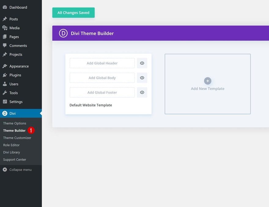
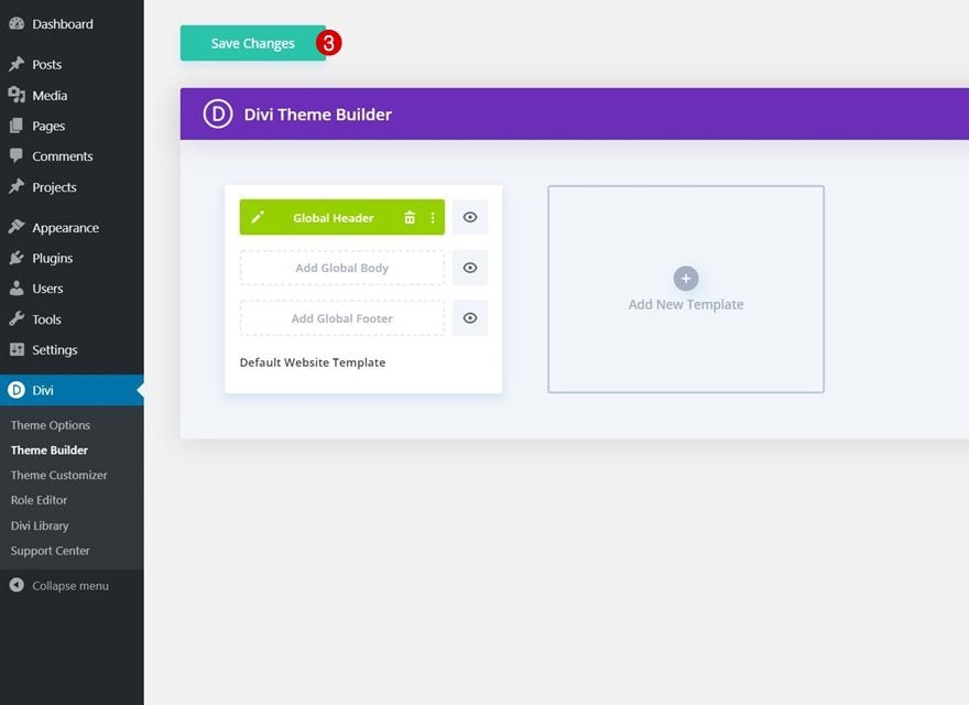
1. Go to Divi Theme Builder & Add New Template
Go to Divi Theme Builder
Start by going to the Divi Theme Builder.
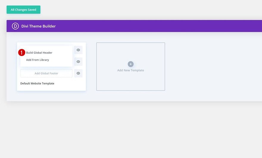
Start Building Global Header
Then, click on ‘Build Global Header’ and select ‘Build Global Header’.
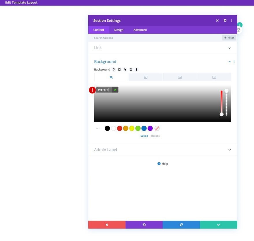
2. Start Building Global Header
Section Settings
Background Color
Once you’re inside the template editor, you’ll notice a section. Open the section and change the background color into white.
- Background Color: #FFFFFF
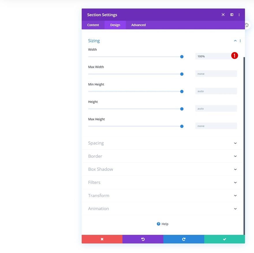
Sizing
Move on to the module’s design tab and change the width.
- Width: 100%
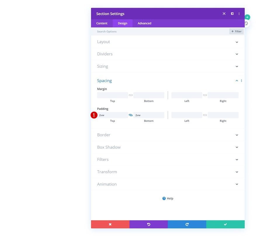
Spacing
Modify the section’s top and bottom padding too.
- Top Padding: 2vw
- Bottom Padding: 2vw
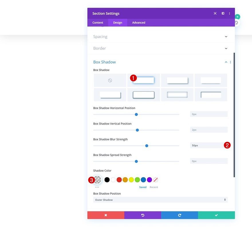
Box Shadow
And separate the page content from the global header by adding a subtle box shadow to the section next.
- Box Shadow Blur Strength: 50px
- Shadow Color: rgba(0,0,0,0.13)
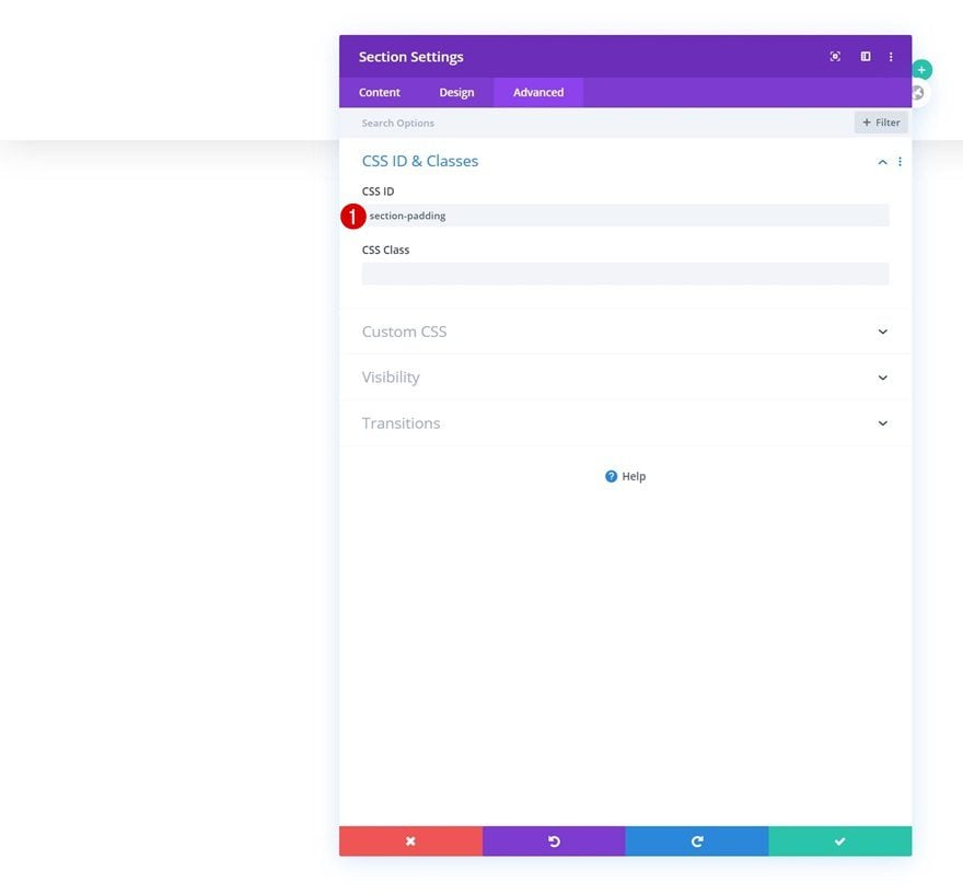
CSS ID
Then, add a CSS ID to the section. Later on the tutorial, we’ll use this CSS ID to create the shrinking global header effect on scroll.
- CSS ID: section-padding
Main Element
Move on to the advanced tab, go to the Custom CSS settings and make the section fixed by adding two lines of CSS code to the section’s main element.
position: fixed;
top: 0;
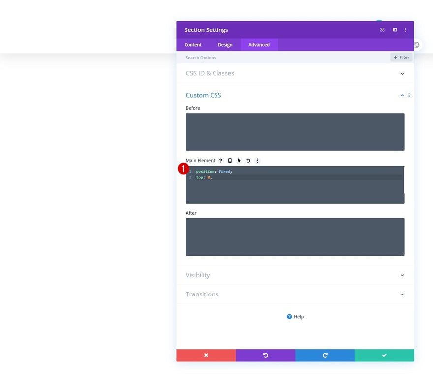
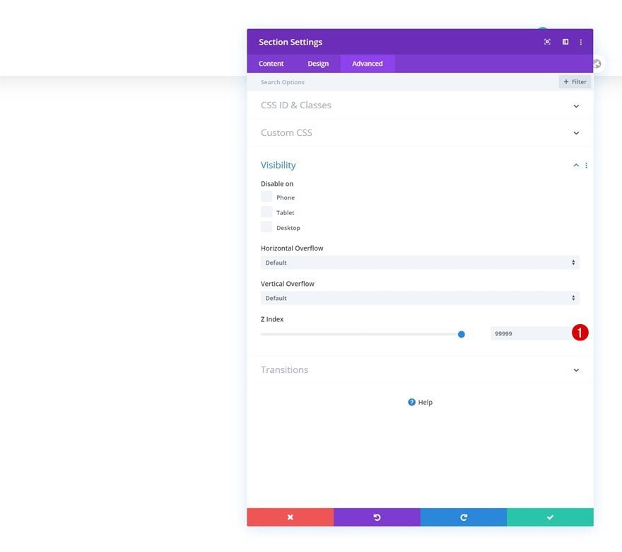
Z Index
To make sure the section remains on top of all page and post content, we’ll increase the section’s z index too.
- Z Index: 99999
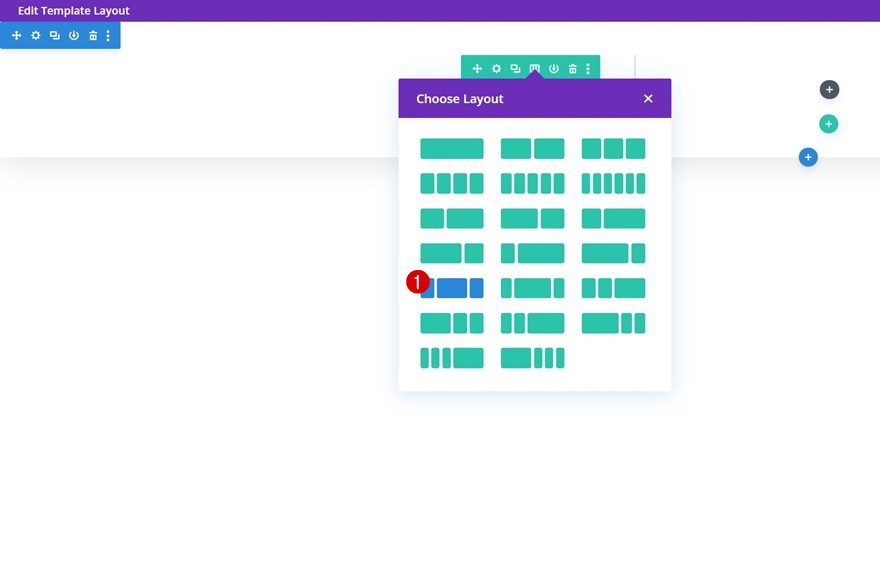
Add New Row
Column Structure
Once you’ve completed the column settings, continue by adding a new row using the following column structure:
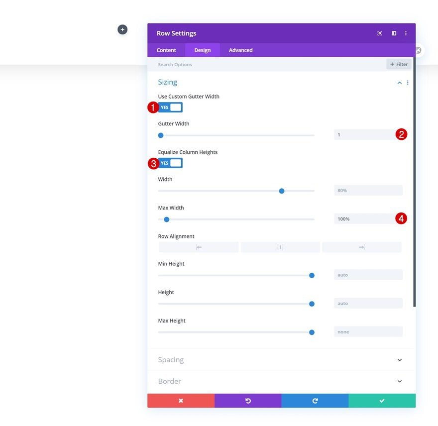
Sizing
Without adding any modules yet, open the row settings and change the sizing accordingly:
- Use Custom Gutter Width: Yes
- Gutter Width: 1
- Equalize Column Heights: Yes
- Max Width: 100%
Spacing
Remove the row’s default top and bottom padding next.
- Top Padding: 0px
- Bottom Padding: 0px
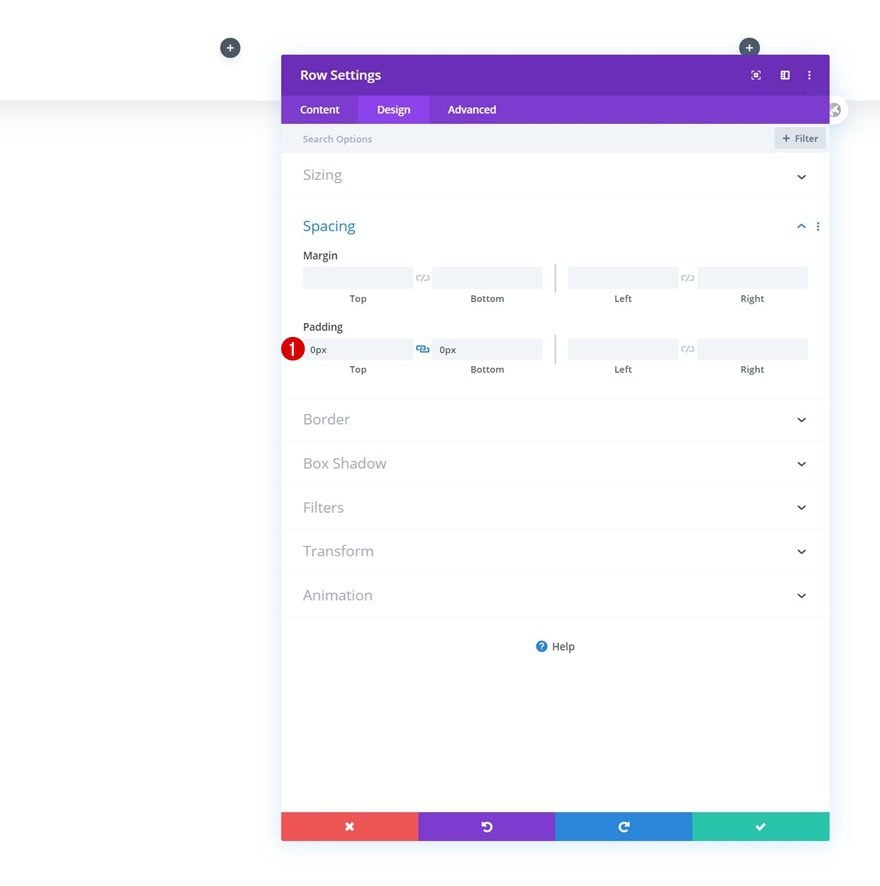
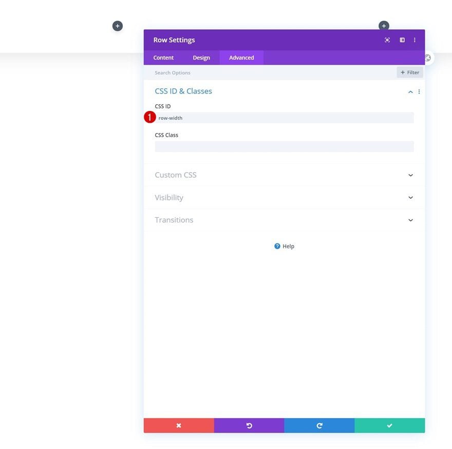
CSS ID
Then, go to the advanced tab and add a CSS ID to the row. We’ll need this CSS ID later on the tutorial to make the shrinking effect work.
- CSS ID: row-width
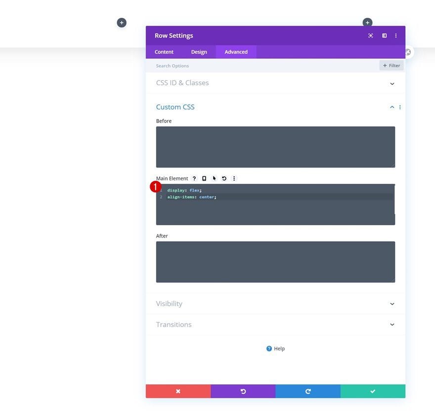
Main Element
Last but not least, to make sure all columns remain next to each other on smaller screen sizes, and to center all column content, we’ll add two lines of CSS code to the row’s main element.
display: flex;
align-items: center;
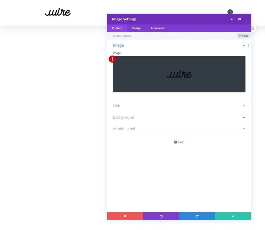
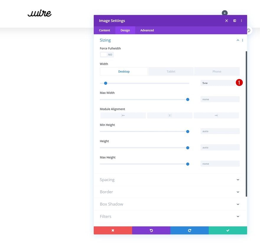
Add Image Module to Column 1
Upload Logo
Time to add modules, starting with an Image Module in column 1. Upload a logo with a transparent background.
Sizing
Modify the module’s width next.
- Width: 5vw (Desktop), 9vw (Tablet), 13vw (Phone)
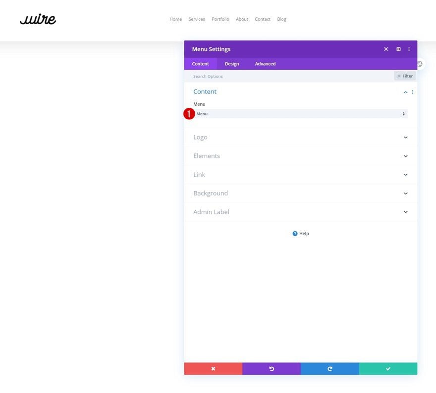
Select Menu
Move on to the second column and insert a Menu Module. Select a menu of your choice.
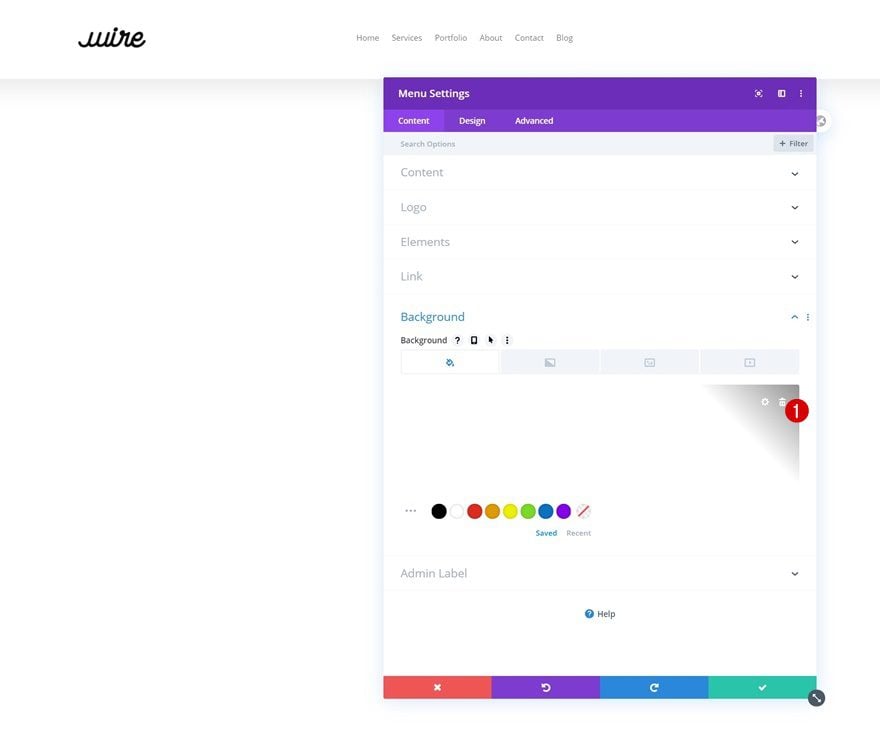
Remove Background Color
Remove the module’s background color next.
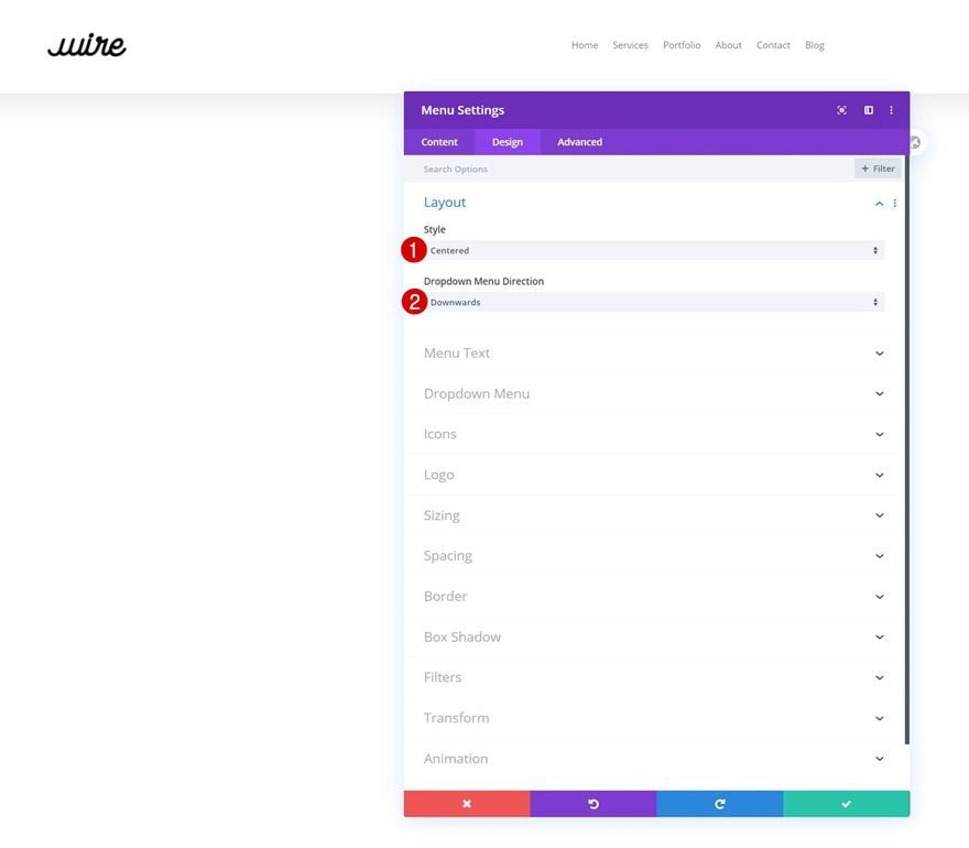
Layout
Move on to the module’s design tab and change the layout too.
- Style: Centered
- Dropdown Menu Direction: Downwards
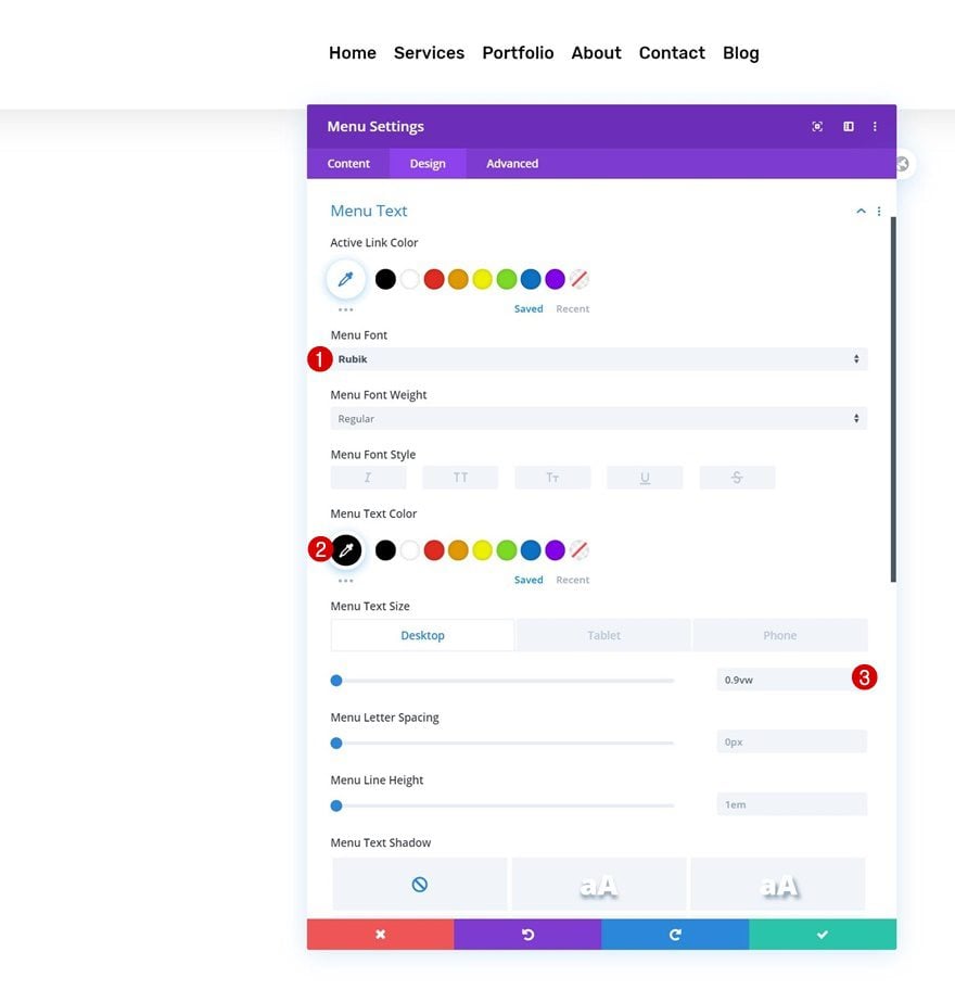
Menu Text
Then, open the menu text settings and make some changes.
- Menu Font: Rubik
- Menu Text Color: #000000
- Menu Text Size: 0.9vw (Desktop), 2vw (Tablet), 3vw (Phone)
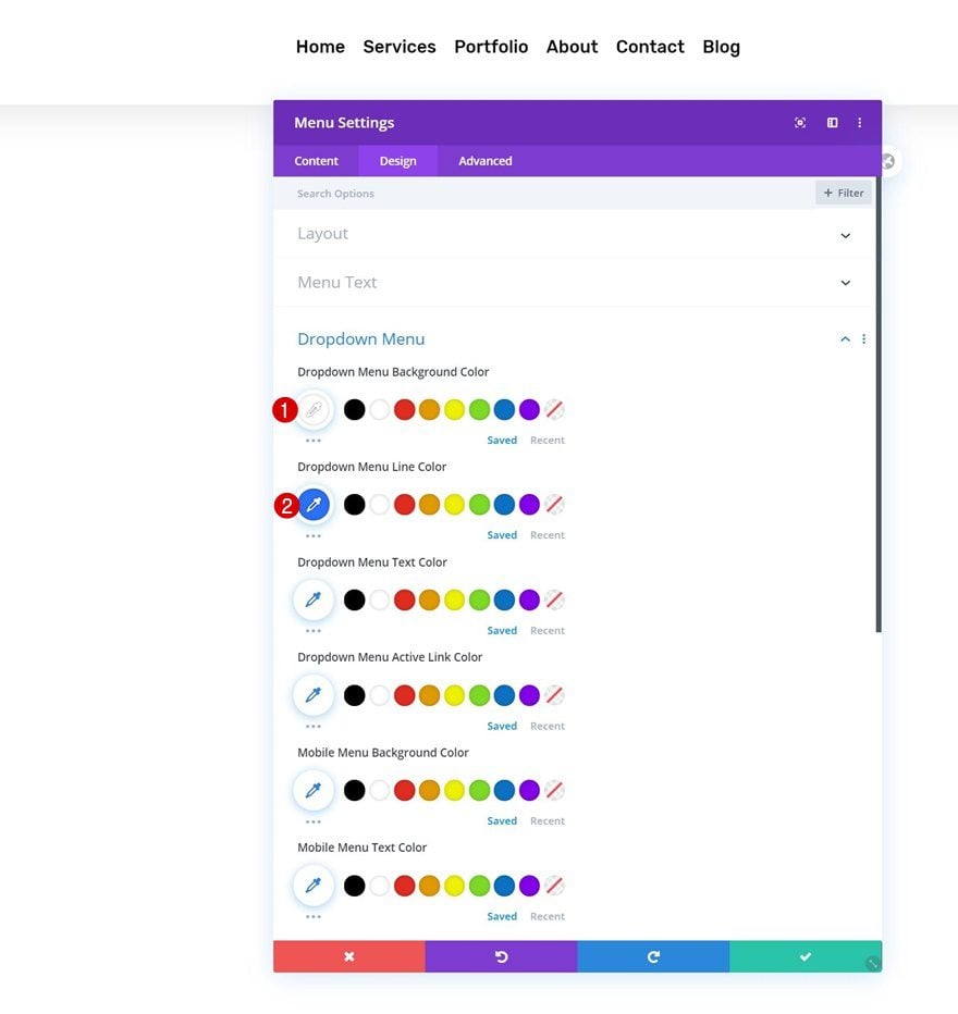
Dropdown Menu
Modify the dropdown menu settings too.
- Dropdown Menu Background Color: #ffffff
- Dropdown Menu Line Color: #2970fa
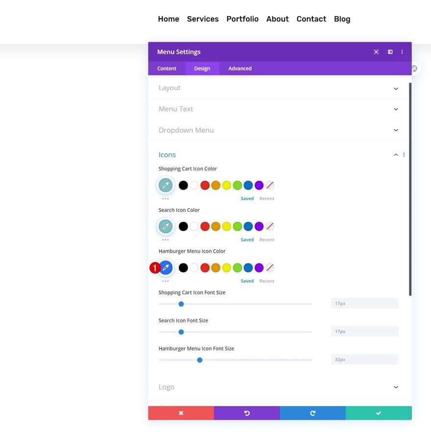
Icons
And complete the module’s settings by changing the hamburger menu icon color in the icons settings.
- Hamburger Menu Icon Color: #2970fa
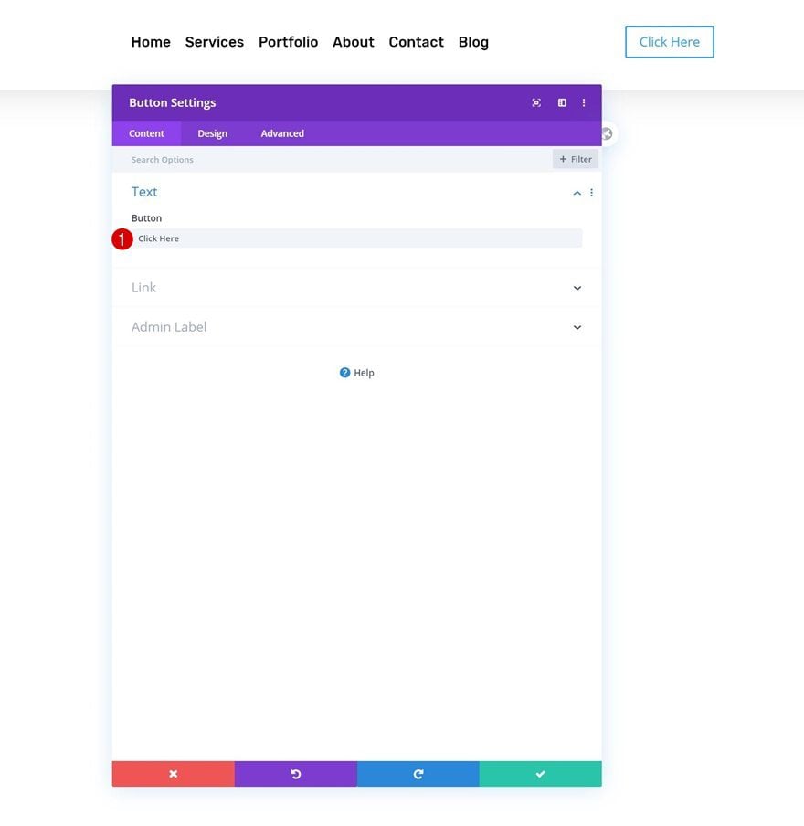
Add Copy
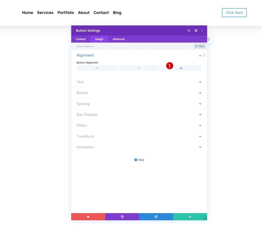
On to the next and last column. Add a Button Module with some copy of your choice.
Alignment
Change the module’s alignment next.
- Button Alignment: Right
Button Settings
Style the button accordingly:
- Use Custom Styles For Button: Yes
- Button Text Size: 0.8vw (Desktop), 1.5vw (Tablet), 2vw (Phone)
- Button Text Color: #ffffff
- Button Background Color: #2970fa
- Button Border Width: 0px
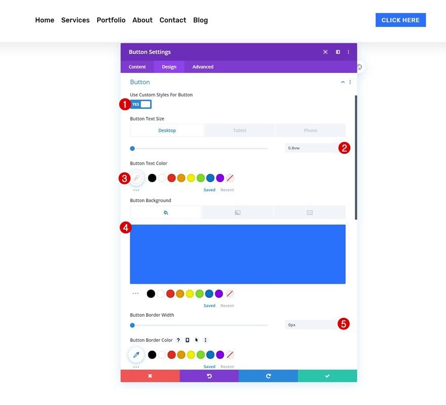
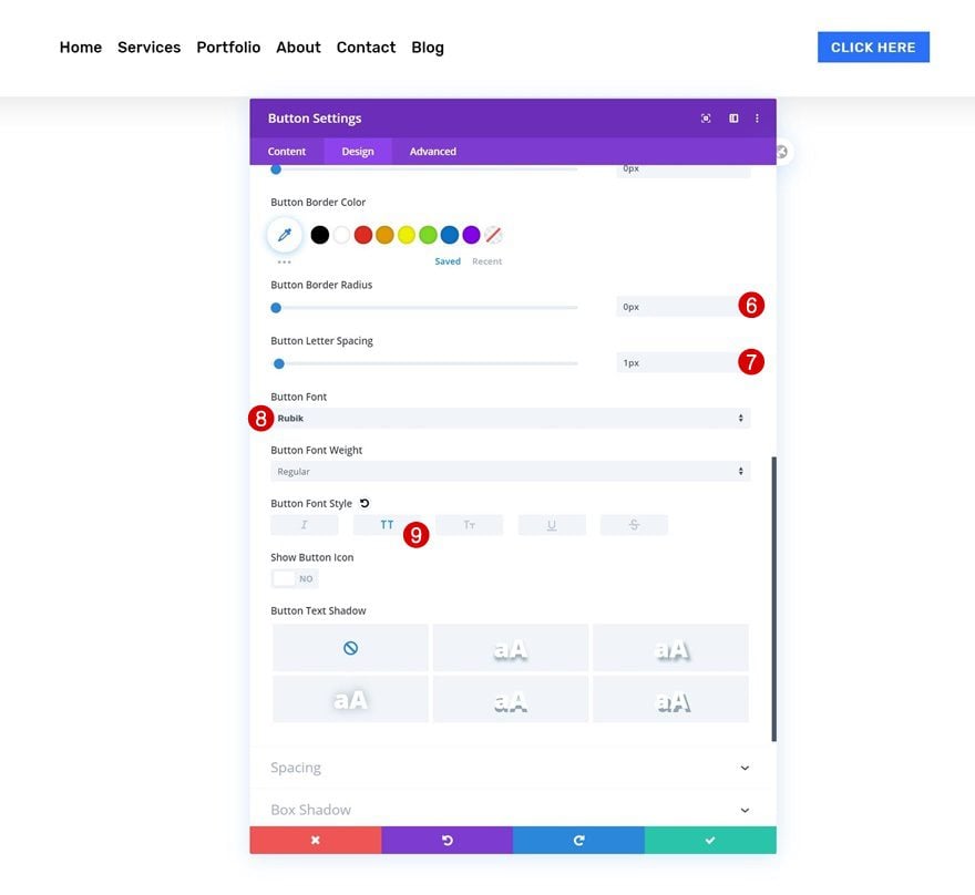
- Button Border Radius: 0px
- Button Letter Spacing: 1px
- Button Font: Rubik
- Button Font Style: Uppercase
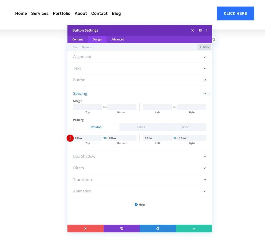
Spacing
And add some custom padding values across different screen sizes.
- Top Padding: 0.8vw (Desktop), 1.8vw (Tablet), 2.5vw (Phone)
- Bottom Padding: 0.8vw (Desktop), 1.8vw (Tablet), 2.5vw (Phone)
- Left Padding: 1.5vw (Desktop), 3vw (Tablet), 4vw (Phone)
- Right Padding: 1.5vw (Desktop), 3vw (Tablet), 4vw (Phone)
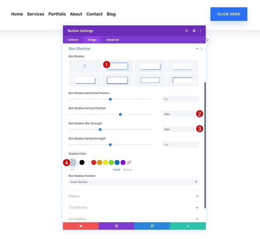
Box Shadow
Complete the module’s settings by adding a subtle box shadow.
- Box Shadow Vertical Position: 20px
- Box Shadow Blur Strength: 30px
- Shadow Color: rgba(41,112,250,0.2)
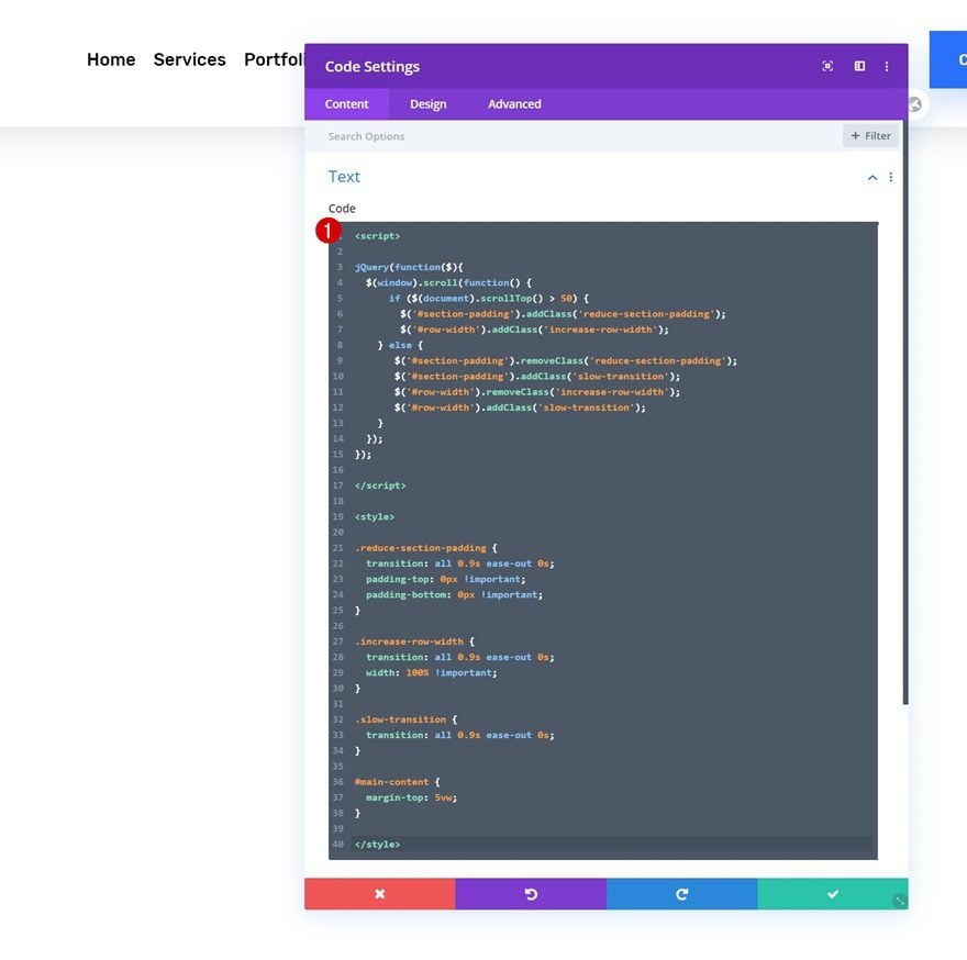
Add Code Module to Column 2
Insert JQuery & CSS Code
The next and last part of this tutorial handles the shrinking effect, using the two CSS IDs we’ve assigned to our section and row. Add a Code Module to column 2 with the following lines of JQuery and CSS code. Make sure you put the JQuery code between script tags and the CSS code between style tags.
jQuery(function($){
  $(window).scroll(function() {
      if ($(document).scrollTop() > 50) {
        $('#section-padding').addClass('reduce-section-padding');
        $('#row-width').addClass('increase-row-width');
    } else {
       $('#section-padding').removeClass('reduce-section-padding');
       $('#section-padding').addClass('slow-transition');
       $('#row-width').removeClass('increase-row-width');
       $('#row-width').addClass('slow-transition');
    }
  });
});
.reduce-section-padding {
transition: all 0.9s ease-out 0s;
padding-top: 0px !important;
padding-bottom: 0px !important;
}

.increase-row-width {
transition: all 0.9s ease-out 0s;
width: 100% !important;
}

.slow-transition {
transition: all 0.9s ease-out 0s;
}

#main-content {
margin-top: 5vw;
}
3. Save Builder Changes & View Result
Once you’ve added the code, you can save all the changes you’ve made to the global header and view the outcome on your website!
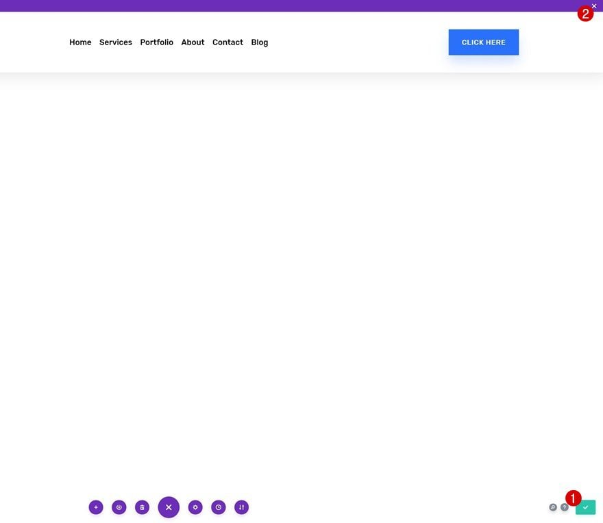
Preview
Now that we’ve gone through all the steps, let’s take a final look at the outcome across different screen sizes.
Desktop
Mobile
Final Thoughts
In this post, we’ve shown you how to create a shrinking global header using Divi’s Theme Builder. Shrinking headers are a great way to save space on your visitor’s viewport height. We’ve recreated the design from scratch and added some custom custom code to trigger the shrinking effect. You were able to download the JSON file for free as well! If you have any questions or suggestions, feel free to leave a comment in the comment section below!
If you’re eager to learn more about Divi and get more Divi freebies, make sure you subscribe to our email newsletter and YouTube channel so you’ll always be one of the first people to know and get benefits from this free content.


Any reason why these customisations can’t be built into the imported package? So many steps
This solution fails on phone and tablet because it’s fixed to top of the page and if you open a menu longer than the phone, the menu gets cut off at the bottom AND the menu will not scroll to get to lower links, because it’s fixed to the top. This solution works on Desktop, but you would have to load another menu that scrolls with the page for phone and tablet. So have an identical version of the menu without the fixed code and load that on Tablet and smaller (Use Visibility in the advanced settings for the section/row/module etc).
Hi, after done all the steps you list it works perfectly but when I click on menu (on mobile) ‘Home’ on drop down menu chrome console will say “Uncaught TypeError: Cannot read property ‘top’ of undefined.” Which means click on ‘Home’ means nothing, it can’t go to ‘Home’ page.
Please tell me what should I do now? I’ve Googled a lot but still have this issue.Thank you in advance!
Hello, thank you for your tutorial, it was very helpfull for me, but I have one question. Do you have any idea how to achieve hidding logo after shrinking effect? Mark
Hi Mark,
As I replied to Daniele above to reduce the width of the logo, you only have to put ‘width: 0%’ in the new line of CSS code to hide it.
I am trying to import this layout but i could not in DIVI library
whos make this.. please see in phone what a joke.. how to fix in phone like full width.
Yep. Fails in phone because it’s fixed to top and if you open a menu longer than the phone, the menu gets cut off at the bottom AND the menu will not scroll to get to lower links. This solution works on Desktop, but you would have to load another version of the menu that scrolls with the page for phone and tablet.
It doesn’t work for me as expected, the navigation on the phone doesn’t show after tap on hamburger menu icon. In debugger its somwhere under and z-index didn’t fix that. I found out now, that when I delete the padding, it works better, but not great.
Whenever I find solution, I’ll write that to all of you.
I found out that the issue is when the rounded borders are made. Trying to find the solution, but that means, its not up to you, for sure!
Just putting this out there:
This doesn’t work for unique designs–and that’s okay! With that being said, my header design is one section with 100% width already, two rows (top row has two columns while the bottom row is one). The Section doesn’t have any margin/padding and both rows have mostly 0 padding–so the CSS code added when jQuery posts the classes in the Section/Row are rather useless in my case.
While this tutorial was made for a simple design, us creative folk need to think outside the box to make a fixed scroll transition work when using the Divi Theme Builder Global Header/Footer option.
Thanks for the directions, it was just what I was looking for 🙂
One question: is it possible to reduce the size of the logo?
Daniele, I was wondering the same and simply added some code for the effect.
First, I named the image ID ‘logo-width’ and insert this code :
In jQuery:
$(‘#logo-width’).addClass(‘reduce-logo-width’);
} else {
$(‘#logo-width’).removeClass(‘reduce-logo-width’);
$(‘#logo-width’).addClass(‘slow-transition’);
And this code in CSS:
.reduce-logo-width {
transition: all 0.4s ease-out 0s;
width: 50% !important;
}
Hello Donjete, sorry for the dumb question but how can I achieve the scroll effect without making a new header? I just want to keep the header I have which I built last year which is now fixed. I should just insert JQuery & CSS Code? Or something else as well? Thanks.
if I get video for this toturial so i will be thankfull
Hi !
Sorry i’m french and my english is very bad ! 🙂
Thanks a lot Donjetë for this tuto.
I have a little issue.
If i change section padding on top and buttom (1vw instead of 2vw) i have a blank space under the menu !?! 🙁
How to have this menu on top and not above (like your tuto “How to Create a Custom Global Header with Divi’s Theme Builder” from October 24, 2019) ?
Nice day ! 🙂
Happy to hear you’re liking the tutorial! 🙂
If you don’t want any space at the top, you can remove the following part of the CSS code:
#main-content {
margin-top: 5vw;
}
Hope that helps! 🙂
Thx a lot Donjetë for your quick answer !
That work, ikt’s exactly that i want to do !
: )
Why would you believe anything this “company” writes? Look at how they advertise their “tech support” which everyone knows doesn’t even exist! Instead of whining and complaining here to the liars themselves…do something useful for all of us and report them to consumer groups and better business bureaus so more folks aren’t victimized by their deceptive and illegal marketing tactics! I’ve just filed two complaints and I now use a real web development tool with amazing support!
What are you even talking about?… I already had several questions and the support was great!
So here we are back to css hacking, LOL…. and for something that used to be part of the header anyway without any coding, now that we have the theme builder we need to css hack the header to do something that used to be default. Sounds weird to me … and also sounds like a step forward and 2 steps back.
You would hope that in a new update this would be a configurable option that does not need this type of extra coding. 😐
The theme builder is the foundation of many great built-in Divi updates to come, updates that’ll make posts like these unnecessary. The dev team is working hard to bring those features to all of you as soon as possible, but in the meantime, we try to make your workflow easier by providing you with tutorials that solve certain problems. 🙂
Thanks Donjete, Yes I guess we should all wait a bit considering the new 4.0 is just getting started! We all love using Divi and looking at the comments in a different light..could be that we love it so much we complain because we want more! ha ha. I complain about the lack of header options (sticky,etc) ..but that is only because I cant code and so love the new Theme Builder! (well basic stuff only). There are ways around everything, but building in Native Divi without the need to add plugins for “Theme Builder” features is my first option. I wouldn’t use any other builder on the market other than Divi, it is amazing, and spending countless hours learning advanced features is fun very rewarding! Thanks for the post, even if I don’t actually use it I still follow the tutorial and learn more about Divi features along the way! :o)
There have been other tutorials out there since 4.0 release fixing the header and offering the same solution. I have to say it is pretty sad that a premium theme does not offer a solid nav solution. You cannot even use svg logos by default. I had to fix that via css as well. And no logo swap after scroll or on smaller screen sizes. I had to fix that with js.
What Divi needs is a solid nav module that supports svg and that offers sticky and fixed positioning as well as logo swaps for scroll and various screen sizes. It’s much easier for the dev team to include those basic features than for developers to hack them in later.
Cheers
I agree totally, this is a function that should be “out of the box”, sure we all need to learn some code for sure like to add content, or have options where you otherwise can’t. But a Sticky fixed (header) menu that shrinks in a “Theme Builder” well you would think this would be included…look at how many people want this feature….
It just seems impossible to get it I guess.
The dev team is working on all those things! In the meantime, we try to provide you with a tutorial that’ll ease your workflow. The theme builder is the foundation of many great features to come.
I think the problem is that they don’t have a real dev team focused on the theme. They should switch to a more sustainable payment model where you pay per year or installation and invest the money in the theme. Other premium themes that do that show much more quality.
I really like the theme builder (which many other themes have been using for a while) and I also like the idea of adding the nav via modules (which I have not seen done before). Also, the whole visual stuff is nice on the front end (especially for the customers) and the theme builder. But nothing is finished. There is not even a loop module for the search results page, so now how are you going to custom style it in the theme builder?
None of this stuff is too hard to do for experienced wp developers. It’s much more basic than the stuff they have already integrated.
Donjete and Elegant Themes,
I am no longer a web designer, but I keep coming back here to see the evolution of Divi. I appreciate the hard work of you all. And I love the time you guys take to help users have a better experience. On the user’s end, I see a lot of people who don’t even know the meaning of gratitude. You guys are doing great. They love to complain about anything. Complaining is ok and sometimes fair, but not all the time. Thanks a lot for every effort!
Thank you Elisandro, that’s really nice to hear! 🙂
Sorry to hear you’re no longer a web designer, we’re still here if you ever change your mind! 😉
How does one import the package without overriding the current theme? If I select import as static, nothing happens…
Nice one! I applied a similar idea to the floating header you did last week where once you scroll down the whole header becomes solid white and the height and logo shrinks a little.
I see where some want these features baked in as Divi is sold on the basis that you don’t need to code. In an ideal world this would be the case. Unfortunately coding every conceivable scenario is impossible. Appreciate how complex engineering the basic functionality of the theme builder has to be to cater for the granularity of where each template can be applied. Users should consider this the first foundational step. There is much much more that needs to be added to make it all work including things like catering for all custom field per custom o post types (Toolset, ACF has got some attention first) and rendering those on a sample post selected by the user within the template. I expect all these issues will be addressed in future updates including more sophisticated configurations for headers but, there will always be a need to roll up your sleeves to achieve that certain Je ne sais quoi.
You get it, Stephen! 🙂
Here is something that I would be inclined to do, though I am not sure if it is problematic from a HTML validation, SEO or performance point of view. Make the above as the Desktop version (hidden on tablet and mobile). Then have another version more suited for tablet and mobile (hidden on desktop) where the drop down for the hamburger menu is 100% wide, one edge of the device to the other?
Perhaps a tutorial on this baring any of the caveats that could be an issue doing it this way?
This never works how its pictured in the example
if ($(document).scrollTop() > $(‘#section-padding’).outerHeight()) {
More flexible.
And for those saying this should be a native function, no it shouldn’t. If you are making websites you should learn how to code, it is not difficult and the code has been provided here anyhow.
i code and this must to be native, not everyone who uses divi is a developer. The idea of Divi is to facilitate things to non developers, that is the base of Elegant Themes
It used to be native, they shouldn’t have removed it.
Also the point of Divi is to avoid using code.
Re: Also the point of Divi is to avoid using code.
No it is not, it is a tool to use for web designers / developers. If you want a system to be able to do everything for you use something like Wix.
If Divi tried to cover everything then it would make it too restrictive. For every single Divi site I have ever built I always use custom coding which is required to achieve exactly what I want, but I suppose it depends on what level of site one creates.
The point of the Theme builder is that it allows for numerous designs for headers and footers etc and it is not realistic to expect Divi to cover every possible variation.
In this particular example the shrinking of the header, the effect is on the section not the menu module so how are you going to make that native. If you want it as before just use the existing standard header.
You can still use the old header with the built-in shrinking effect. The design freedom that comes with the Theme Builder makes effects like this one really specific to the design you’re creating. Our team is working on more built-in menu options, but in the mean time, I hope the tutorial helps! 🙂
Shrink the header is a effect “really specific to the design you’re creating.”? Cmon….
Native, please…
thanks, but i agree, this should be a native divi menu feature
Hello, the drop-down menu from the phone looks very narrow, not like when you use the original Divi drop-down menu, which occupies the width of the screen, any way to make it look like the original, occupying the entire width of the device?
You can remove the ‘display: flex’ in the row’s main element to prevent the columns from showing up next to each other on smaller screen sizes.
But I like the design as it looks, I just want the drop-down menu to be full width, can there be a code?
Lot of steps to make something work that should have been there from the beginning. But ok i’ll take it until it gets better.