
When it comes to animating elements on your page, you’ll most likely want to activate an element’s animation once it enters the viewport. With Divi and its built-in animation settings, as soon as that element has come into view, and has been animated, it will remain static until you reload the entire page. In some cases, you might look for a more consistent approach, where your animation restarts with each viewport entry. Doing this will help you streamline the experience visitors have on your website. In this tutorial, we’ll show you exactly how to do that using Divi, GSAP and ScrollTrigger for GSAP. Once you get the approach, you’ll be able to apply it to any element on your page. You’ll be able to download the JSON file for free as well!
Let’s get to it.
- 1 Preview
- 2 Download The Layout for FREE
- 3 Download For Free
-
4
1. Create Section Design
- 4.1 Add Placeholder Section
- 4.2 Clone Placeholder Section
- 4.3 Add New Section Between Placeholder Sections
- 4.4 Add Row #1
- 4.5 Add Text Module #1 to Column
- 4.6 Add Text Module #2 to Column
- 4.7 Add Row #2
- 4.8 Column 1 Settings
- 4.9 Add Text Module #1 to Column 1
- 4.10 Add Text Module #2 to Column 1
- 4.11 Add Text Module #3 to Column 1
- 4.12 Add Button Module to Column 1
- 4.13 Reuse Column 1
- 5 2. Apply Restart Animation Technique to Design
- 6 Preview
- 7 Final Thoughts
Preview
Before we dive into the tutorial, let’s take a quick look at the outcome across different screen sizes.
Desktop

Mobile

Download The Layout for FREE
To lay your hands on the free layout, you will first need to download it using the button below. To gain access to the download you will need to subscribe to our newsletter by using the form below. As a new subscriber, you will receive even more Divi goodness and a free Divi Layout pack every Monday! If you’re already on the list, simply enter your email address below and click download. You will not be “resubscribed” or receive extra emails.

1. Create Section Design
Add Placeholder Section
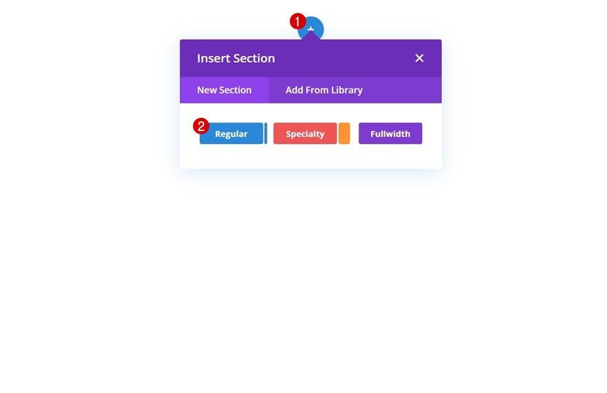
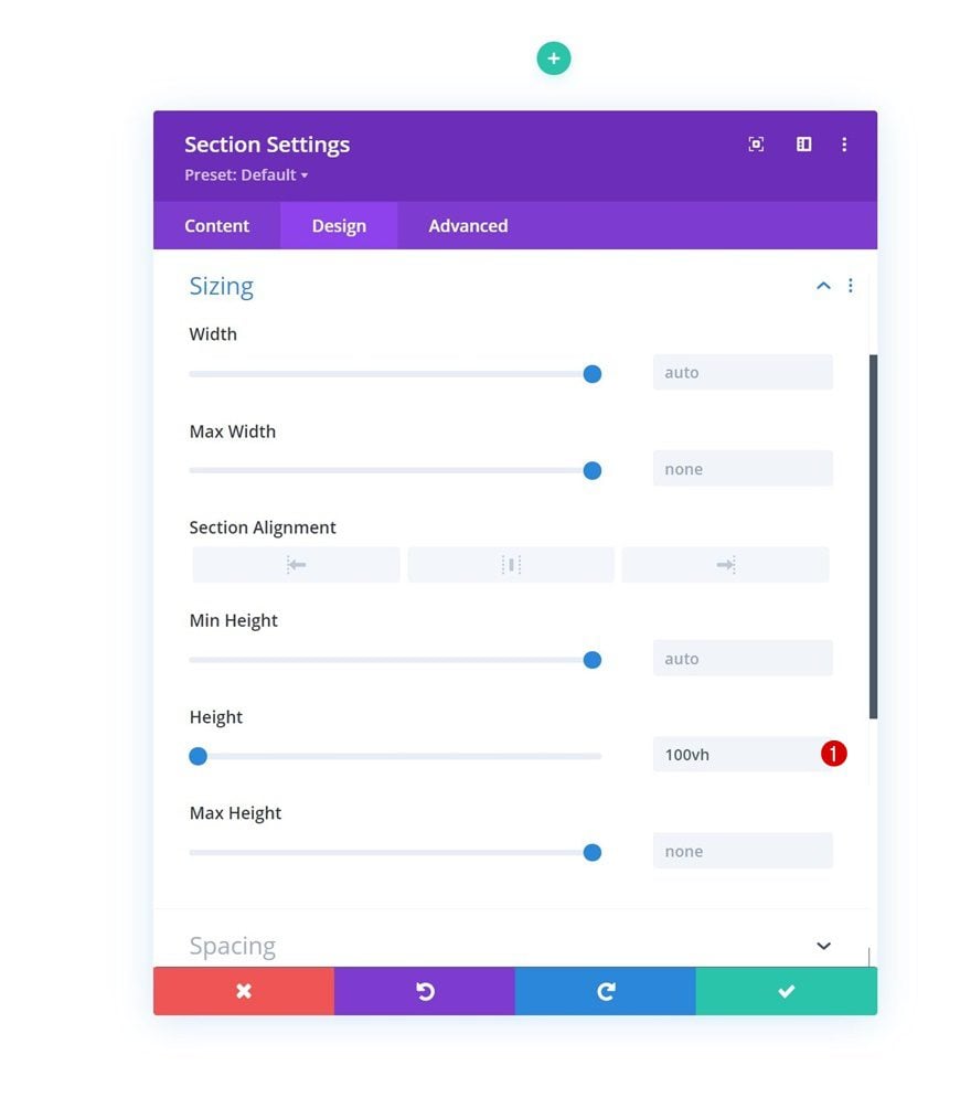
Before we start creating the design, we’ll add two placeholder sections to the page we’re working on. That way, we can see the scroll experience once the design is finished. Alternatively, you can use the design inside a page you have already set up. Add a new regular section.
Sizing
Modify the section’s height as follows:
- Height: 100vh
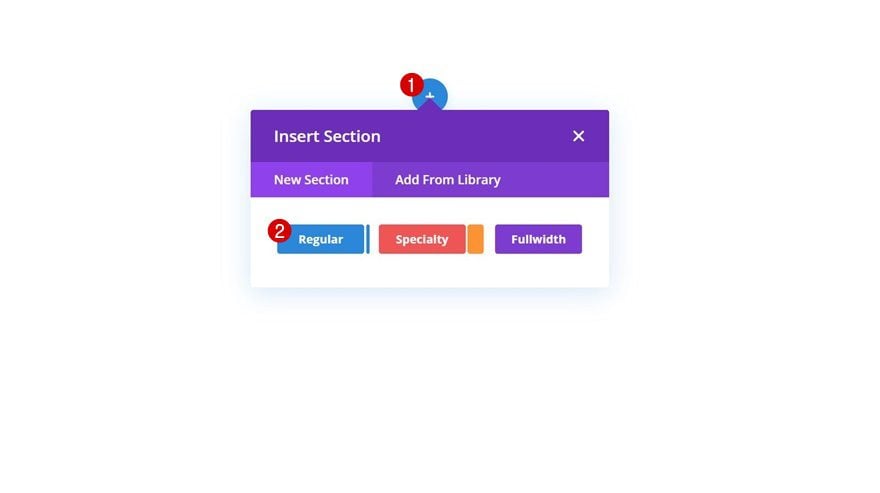
Clone Placeholder Section
Then, clone the section once.

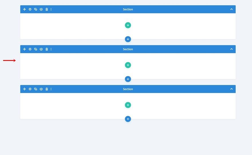
Add New Section Between Placeholder Sections
To create the design you were able to see in the preview of this post, we’ll add a new regular section in between placeholder sections.
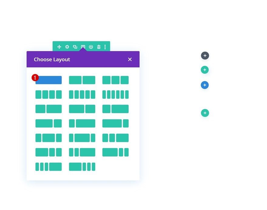
Add Row #1
Column Structure
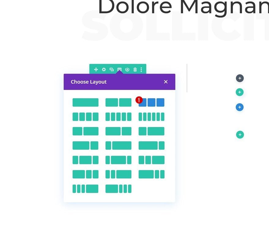
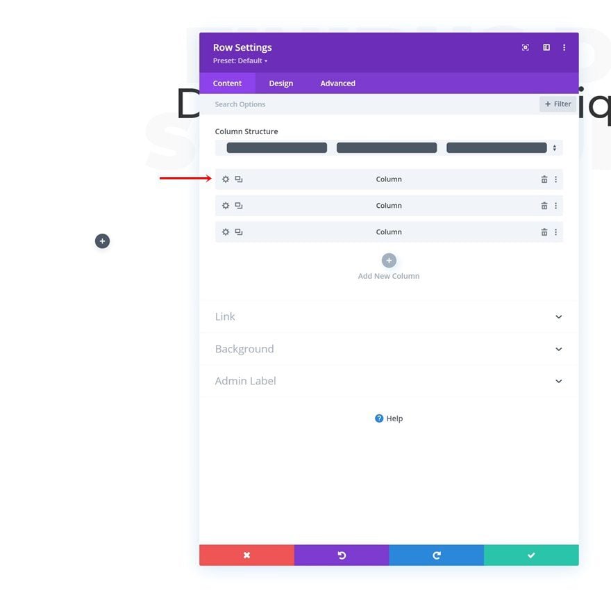
Continue by adding a new row to the section using the following column structure:
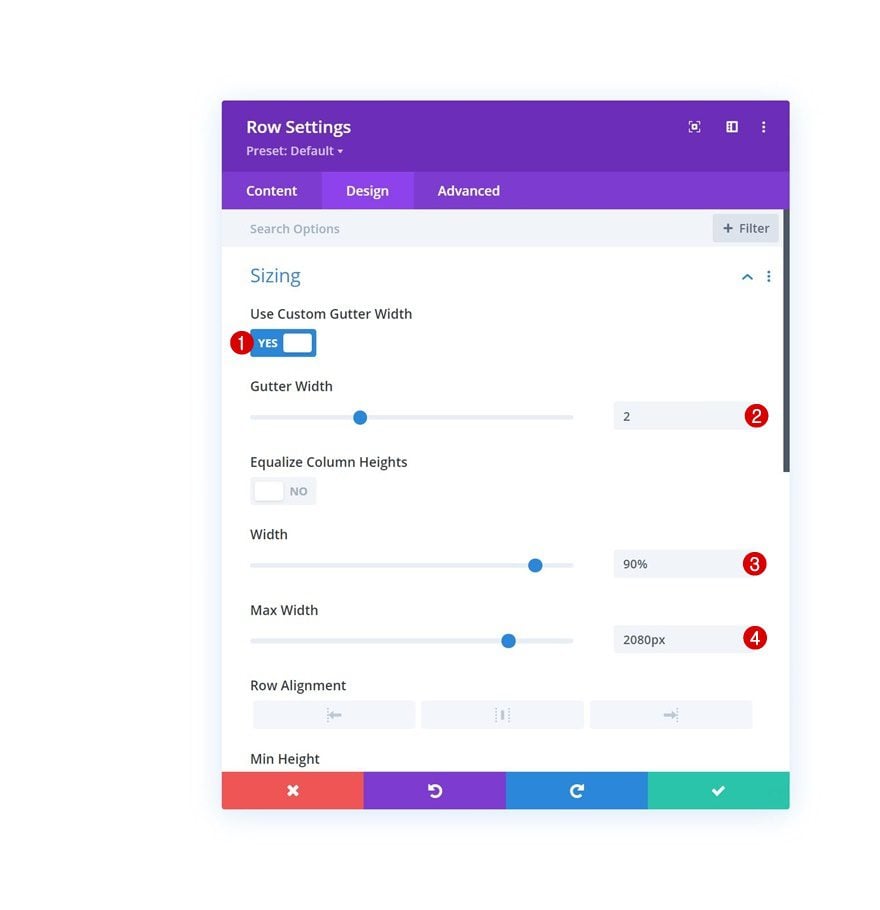
Sizing
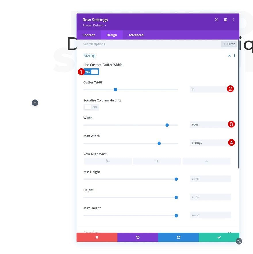
Without adding modules yet, open the row settings, go to the design tab and change the sizing settings as follows:
- Use Custom Gutter Width: Yes
- Gutter width: 2
- Width: 90%
- Max Width: 2080px
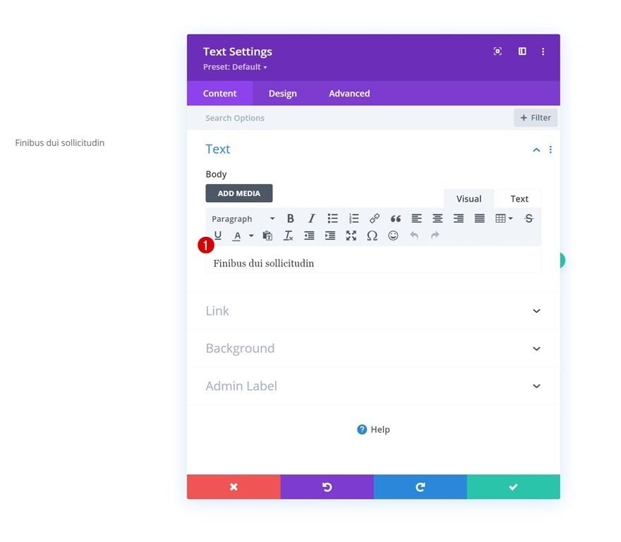
Add Text Module #1 to Column
Add Content
Then, add a first Text Module to the column and include some content of your choice.
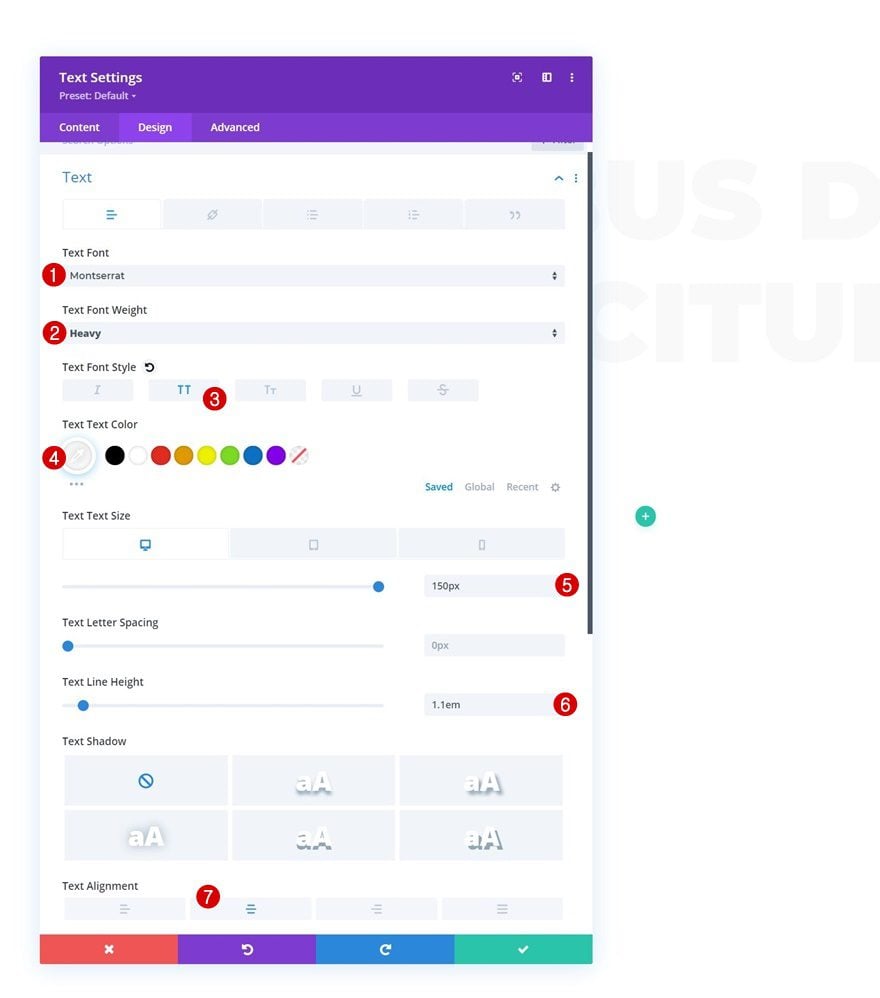
Text Settings
Move on to the module’s design tab and change the text settings accordingly:
- Text Font: Montserrat
- Text Font Weight: Heavy
- Text Font Style: Uppercase
- Text Color: #f9f9f9
- Text Size:
- Desktop: 150px
- Tablet & Phone: 11vw
- Text Line Height: 1.1em
- Text Alignment: Center
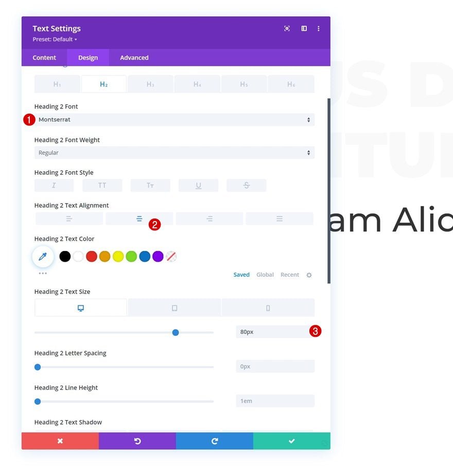
Add Text Module #2 to Column
Add H2 Content
Add another Text Module below the previous one and include some H2 content.
H2 Text Settings
Style the H2 text as follows:
- Heading 2 Font: Montserrat
- Heading 2 Text Alignment: Center
- Heading 2 Text Size:
- Desktop: 80px
- Tablet & Phone: 10vw
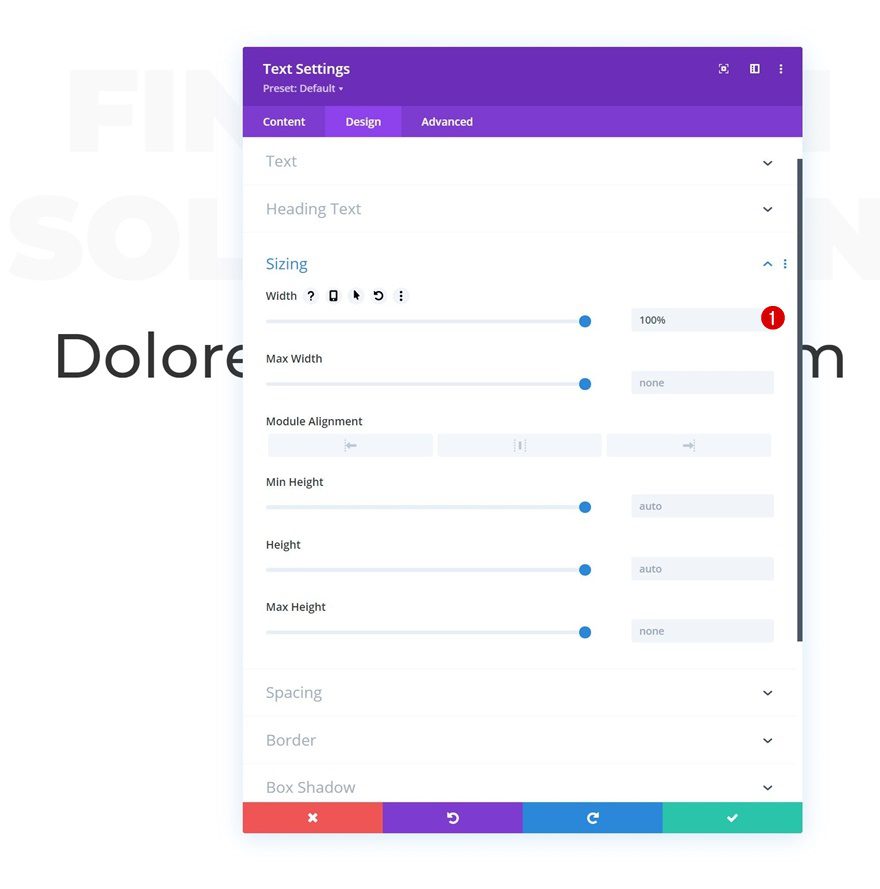
Sizing
Add a width of 100% too.
- Width: 100%
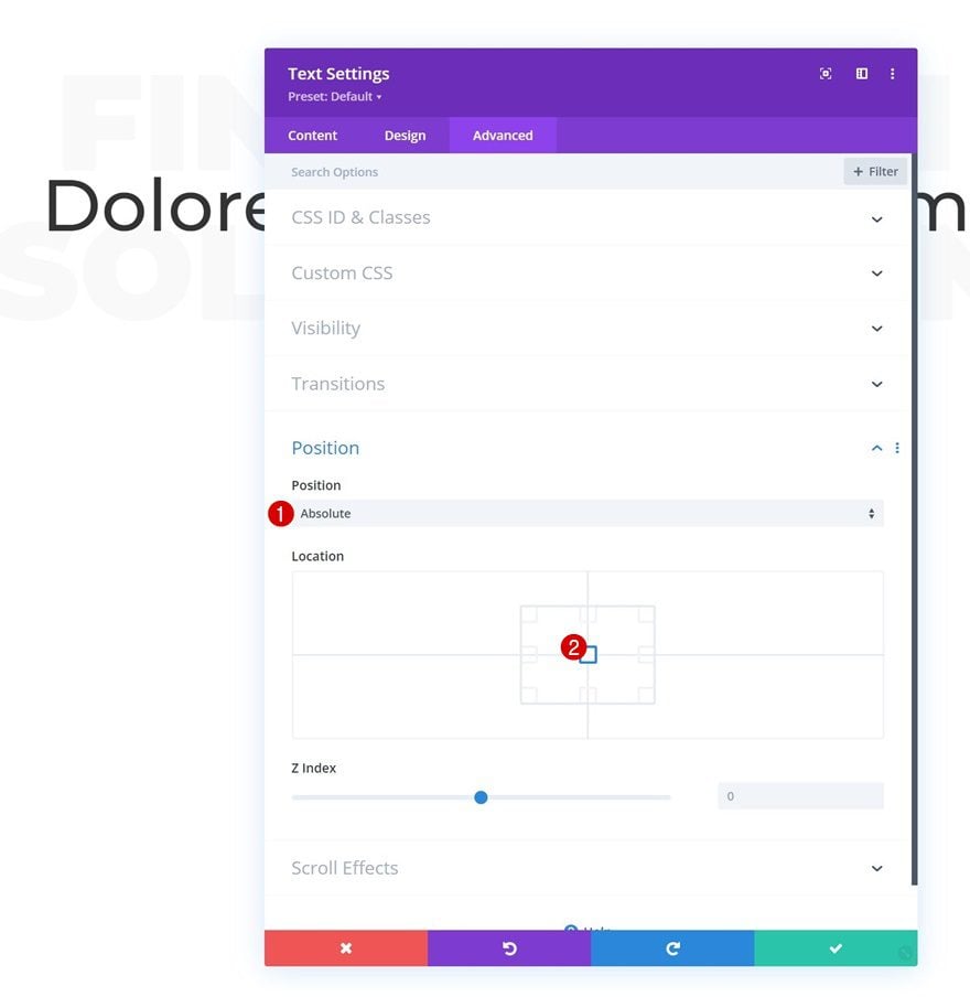
Position
And reposition the entire module in the advanced tab.
- Position: Absolute
- Location: Center
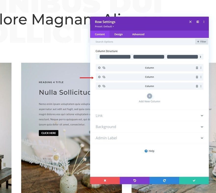
Add Row #2
Column Structure
Add another row below the previous one, using the following column structure:
Sizing
Without adding modules yet, open the row settings and adjust the sizing settings as follows:
- Use Custom Gutter Width: Yes
- Gutter Width: 2
- Width: 90%
- Max Width: 2080px
Column 1 Settings
Then, open the column 1 settings.
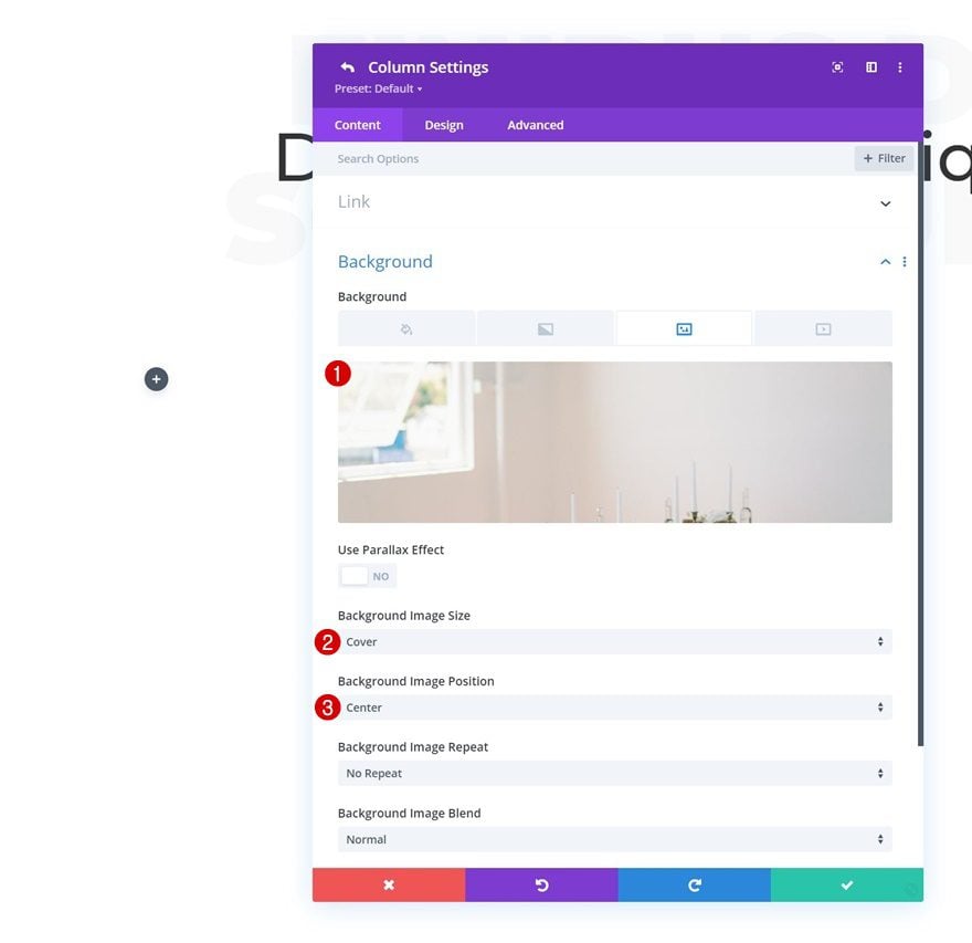
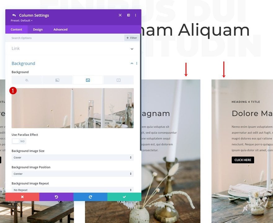
Background Image
Upload a background image of your choice.
- Background Image Size: Cover
- Background Image Position: Center
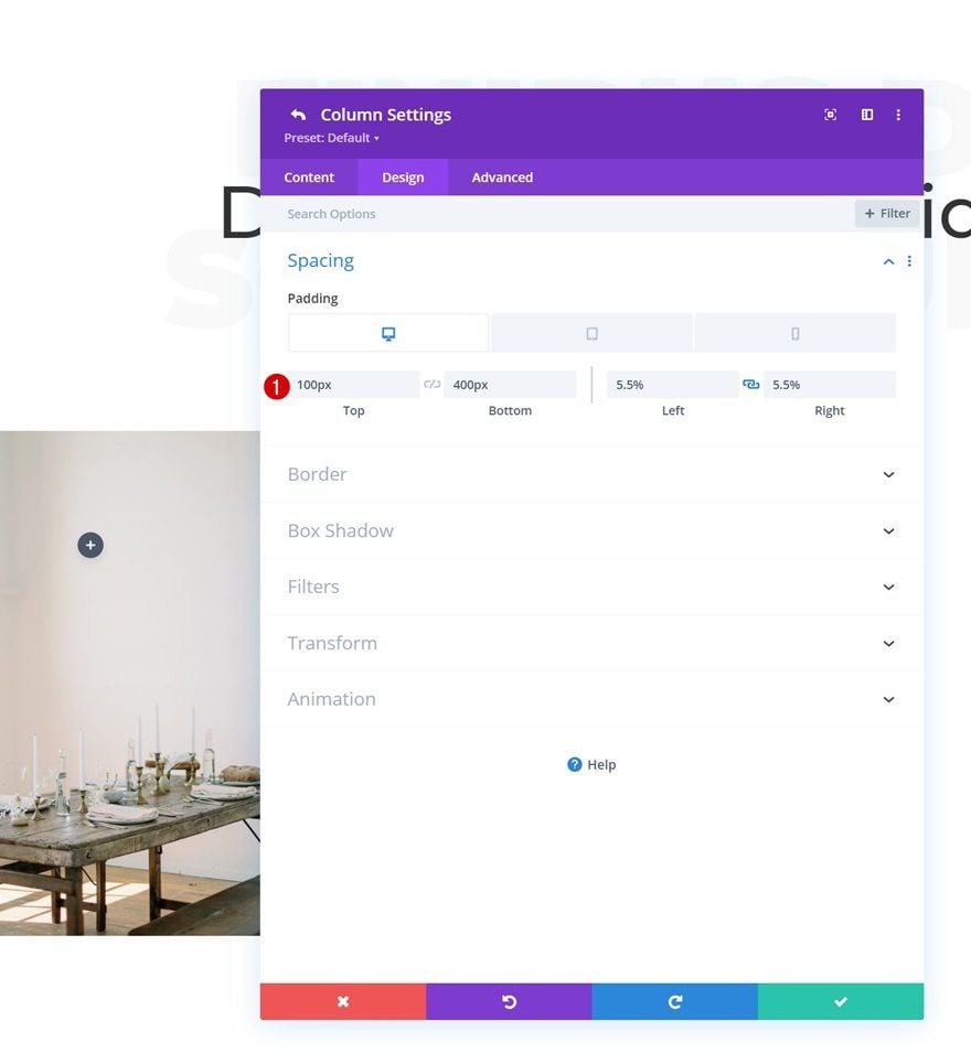
Spacing
Modify the column’s spacing settings next.
- Top Padding: 100px
- Bottom Padding:
- Desktop: 400px
- Tablet & Phone: 200px
- Left Padding: 5.5%
- Right Padding: 5.5%
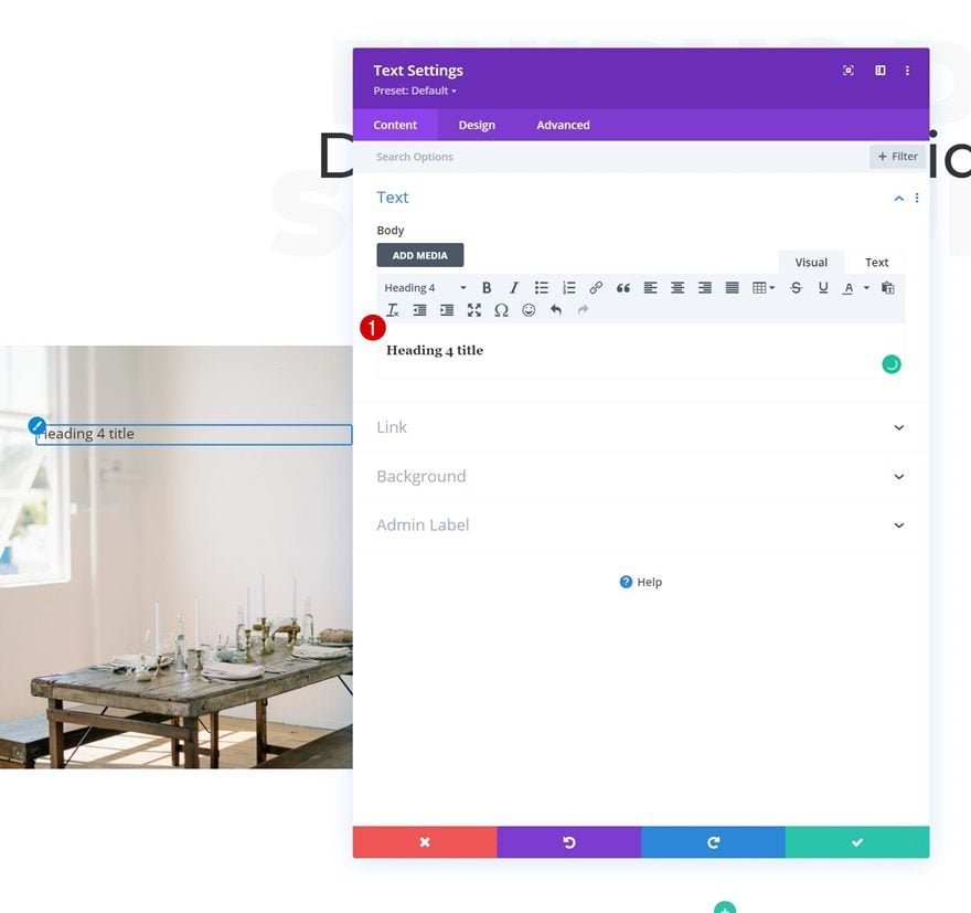
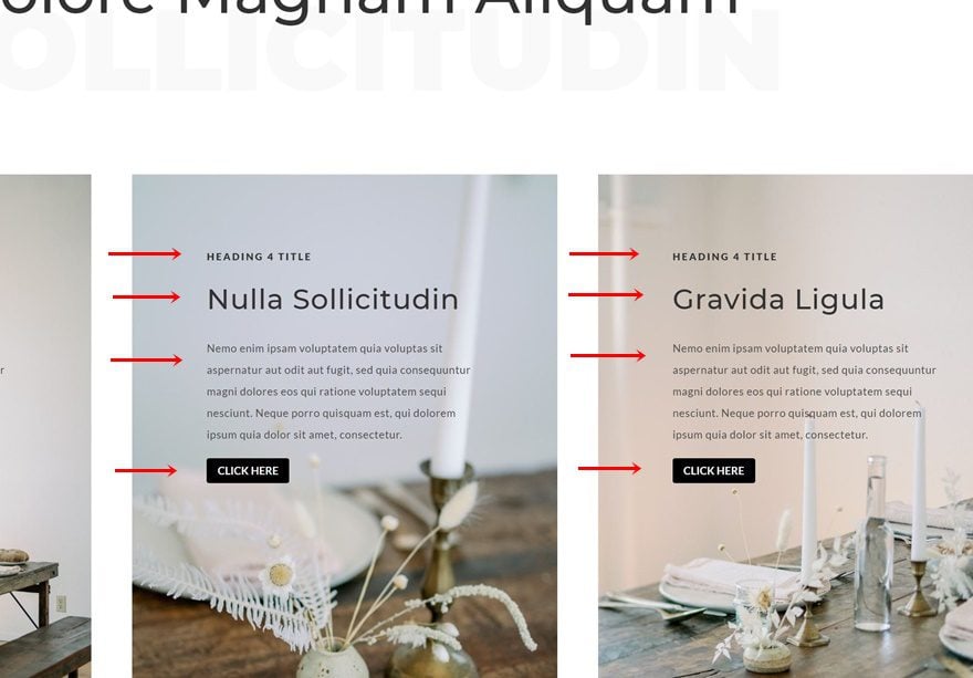
Add Text Module #1 to Column 1
Add H4 Content
Then, add a Text Module to column 1 with some H4 content.
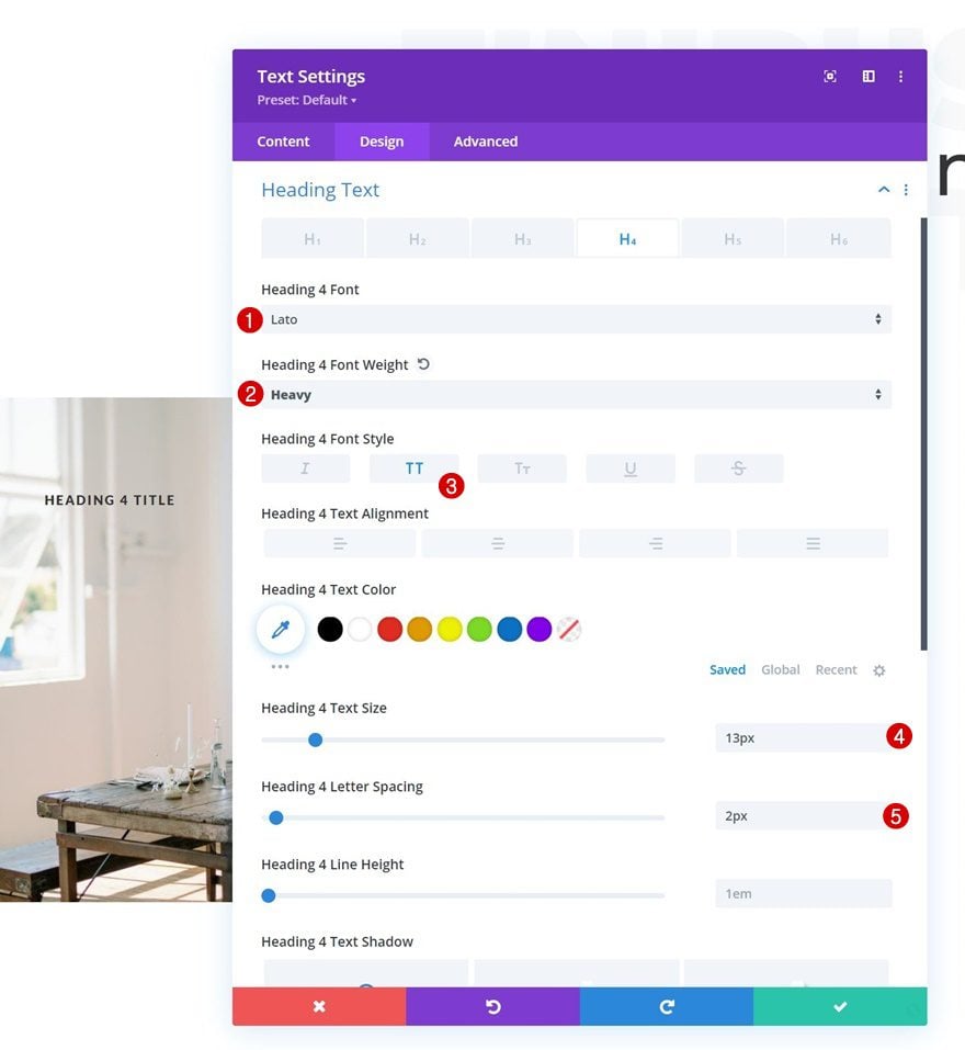
H4 Text Settings
Style the H4 text accordingly:
- Heading 4 Font: Lato
- Heading 4 Font Weight: Heavy
- Heading 4 Font Style: Uppercase
- Heading 4 Text Size: 13px
- Heading 4 Letter Spacing: 2px
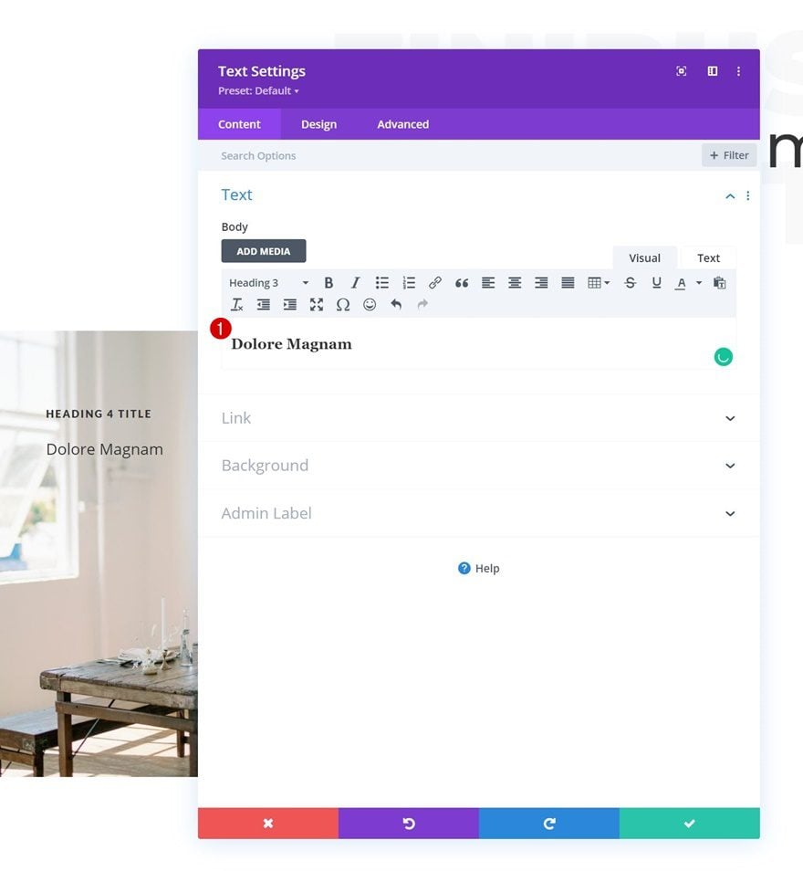
Add Text Module #2 to Column 1
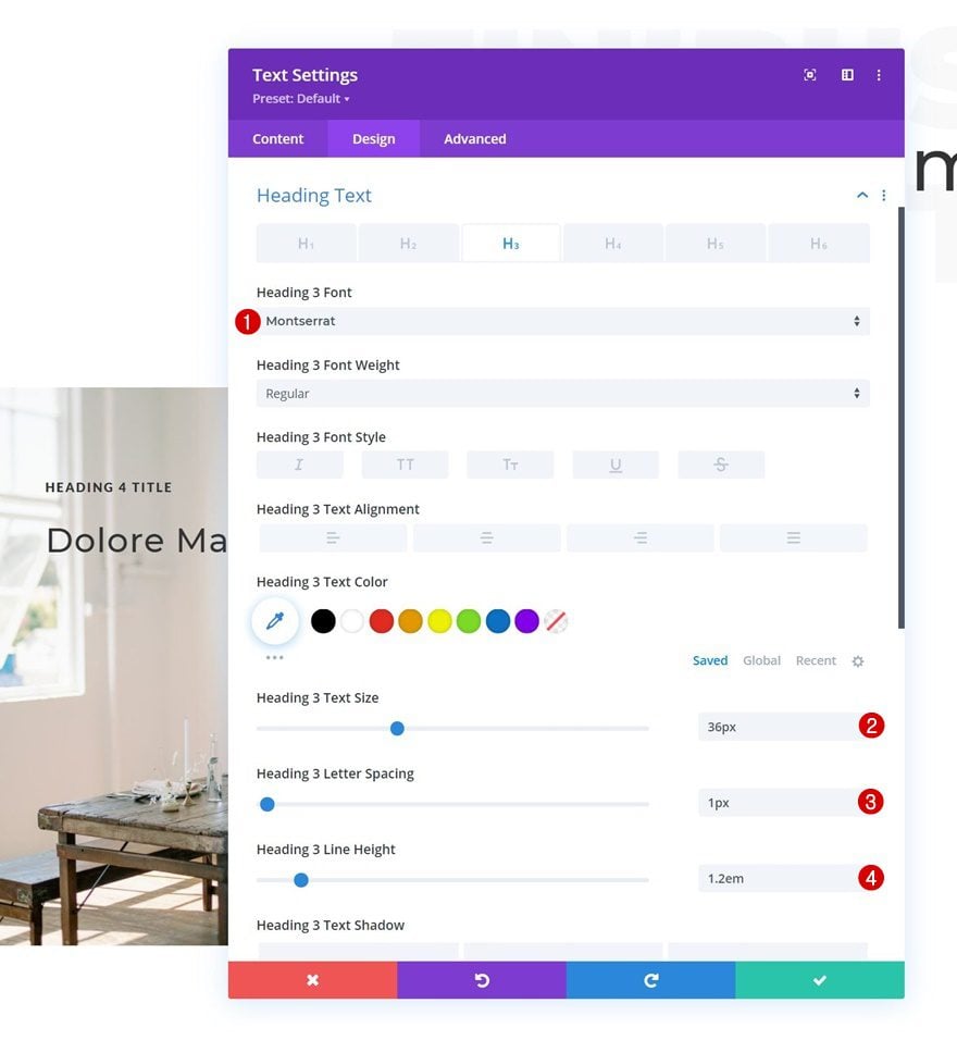
Add H3 Content
Add another Text Module below the previous one, using some H3 content.
H3 Text Settings
Change the H3 text settings accordingly:
- Heading 3 Font: Montserrat
- Heading 3 Text Size: 36px
- Heading 3 Letter Spacing: 1px
- Heading 3 Line Height: 1.2em
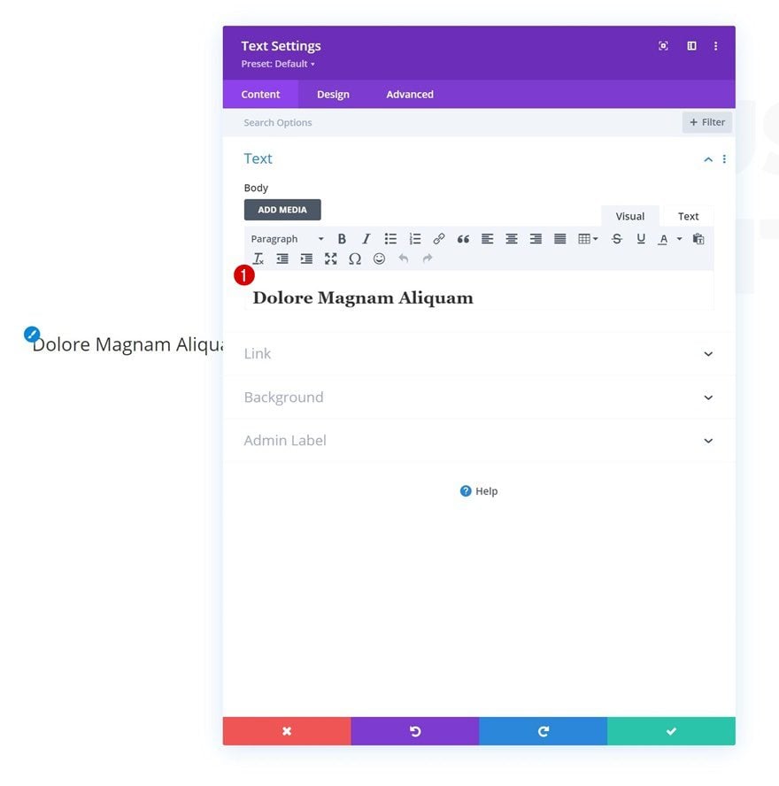
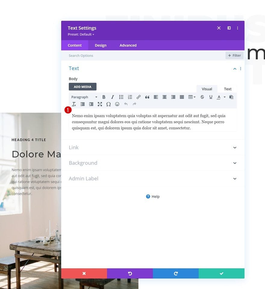
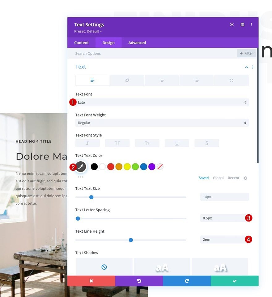
Add Text Module #3 to Column 1
Add Description Content
Add the last Text Module containing some description content of your choice.
Text Settings
Change the module’s text settings as follows:
- Text Font: Lato
- Text Color: #4c4c4c
- Text Letter Spacing: 0.5px
- Text Line Height: 2em
Add Copy
The last module we need in this column is a Button Module. Add some copy of your choice.
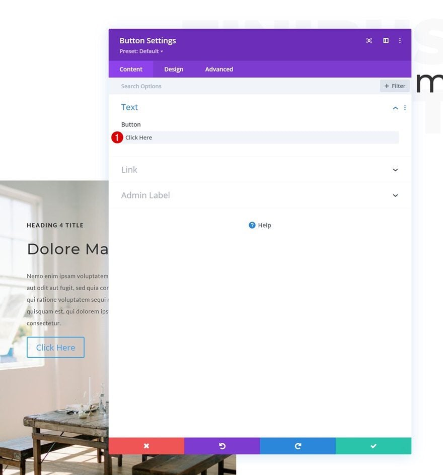
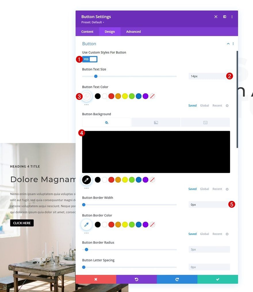
Button Settings
Style the button in the design tab.
- Use Custom Styles For Button: Yes
- Button Text Size: 14px
- Button Text Color: #ffffff
- Button Background Color: #000000
- Button Border Width: 0px
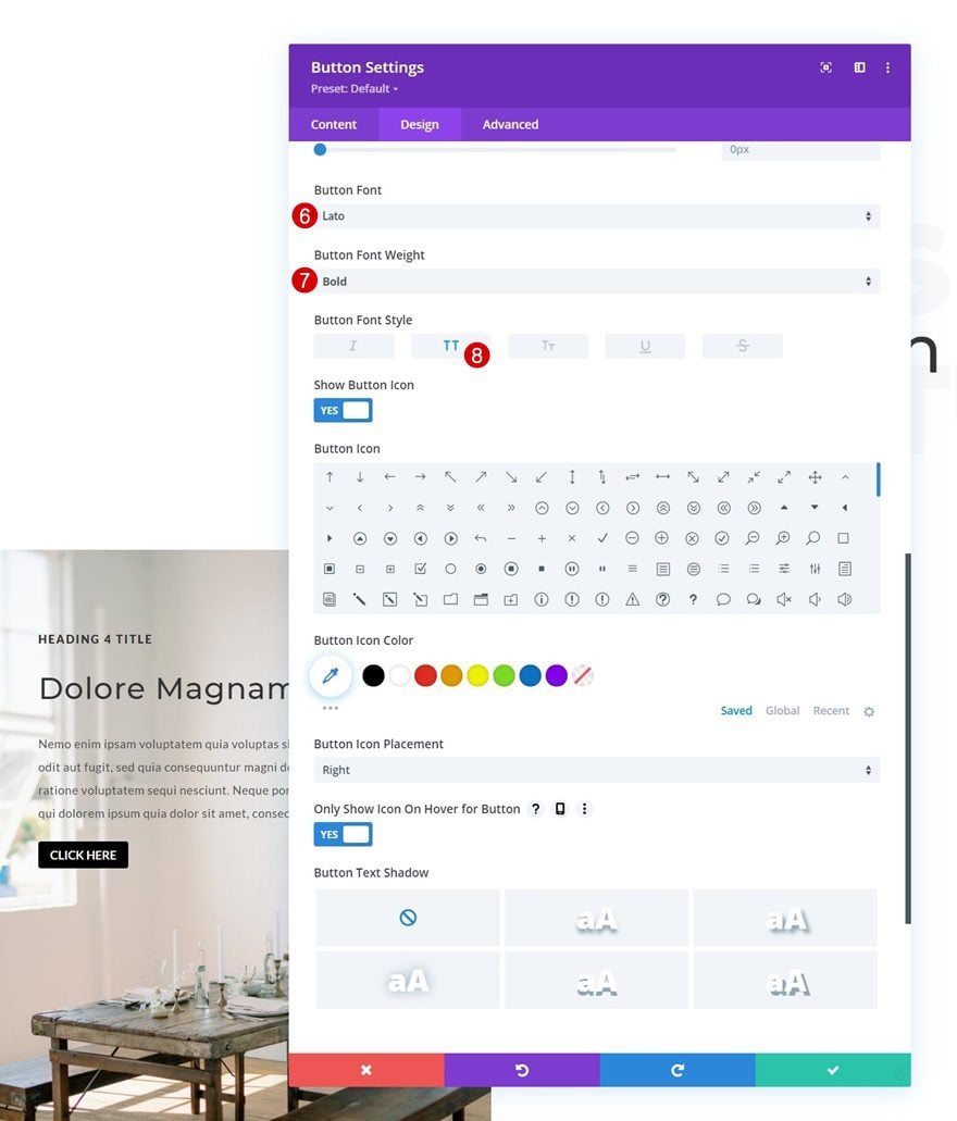
- Button Font: Lato
- Button Font Weight: Bold
- Button Font Style: Uppercase
Reuse Column 1
Delete Column 2 & 3
Once you’ve completed column 1, and all modules inside it, you can delete the two remaining columns of the row.
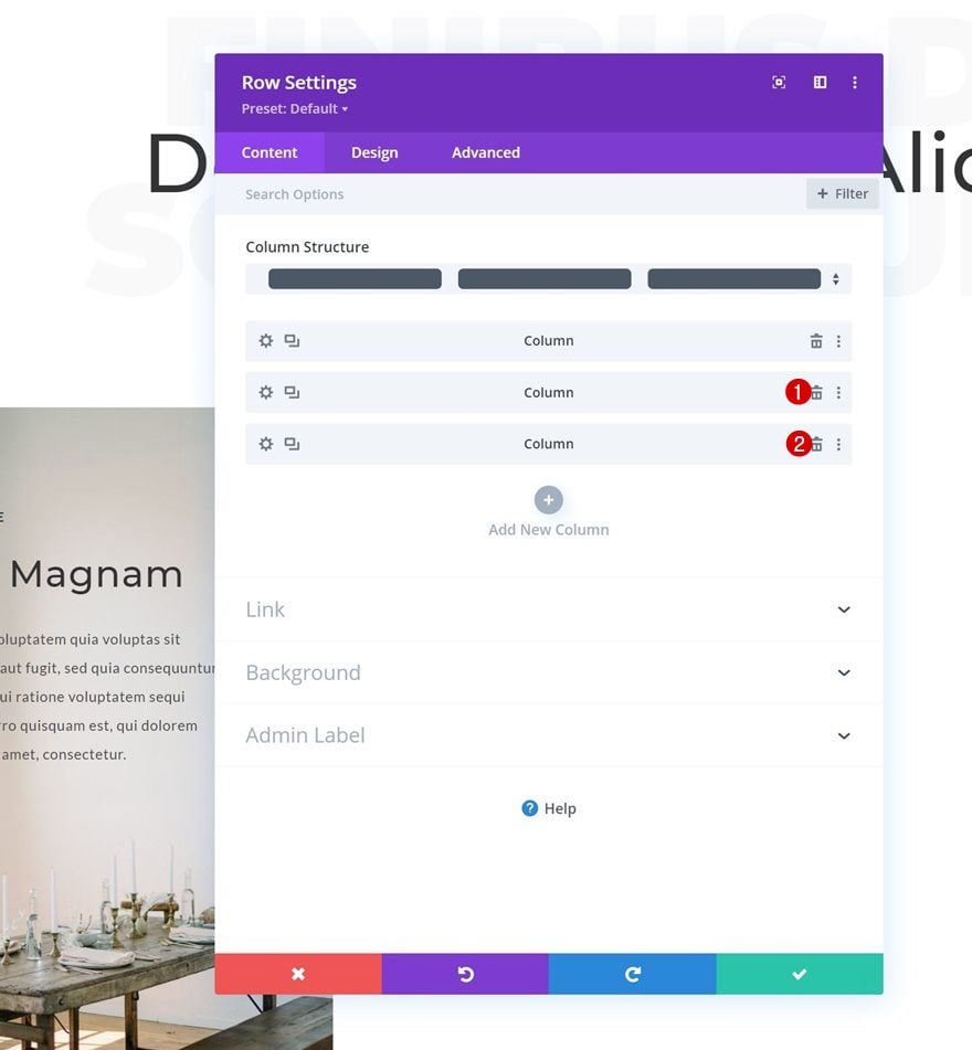
Clone Column 1 Twice
And reuse column 1 by cloning it twice.
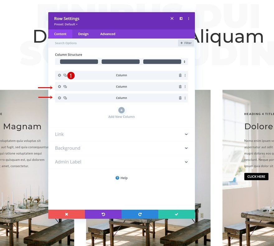
Change Duplicate Column Background Images
Make sure you change the background image of each duplicate column.
Change Content in Duplicate Columns
Along with the module content.
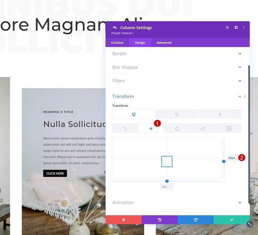
Add Transform Translate to Column 2 Settings
Then, open the column 2 settings and go to the design tab. Once there, add some transform translate values across different screen sizes to complete the design.
- Left:
- Desktop: 50px
- Tablet & Phone: 0px
2. Apply Restart Animation Technique to Design
Add CSS Class to Row #2
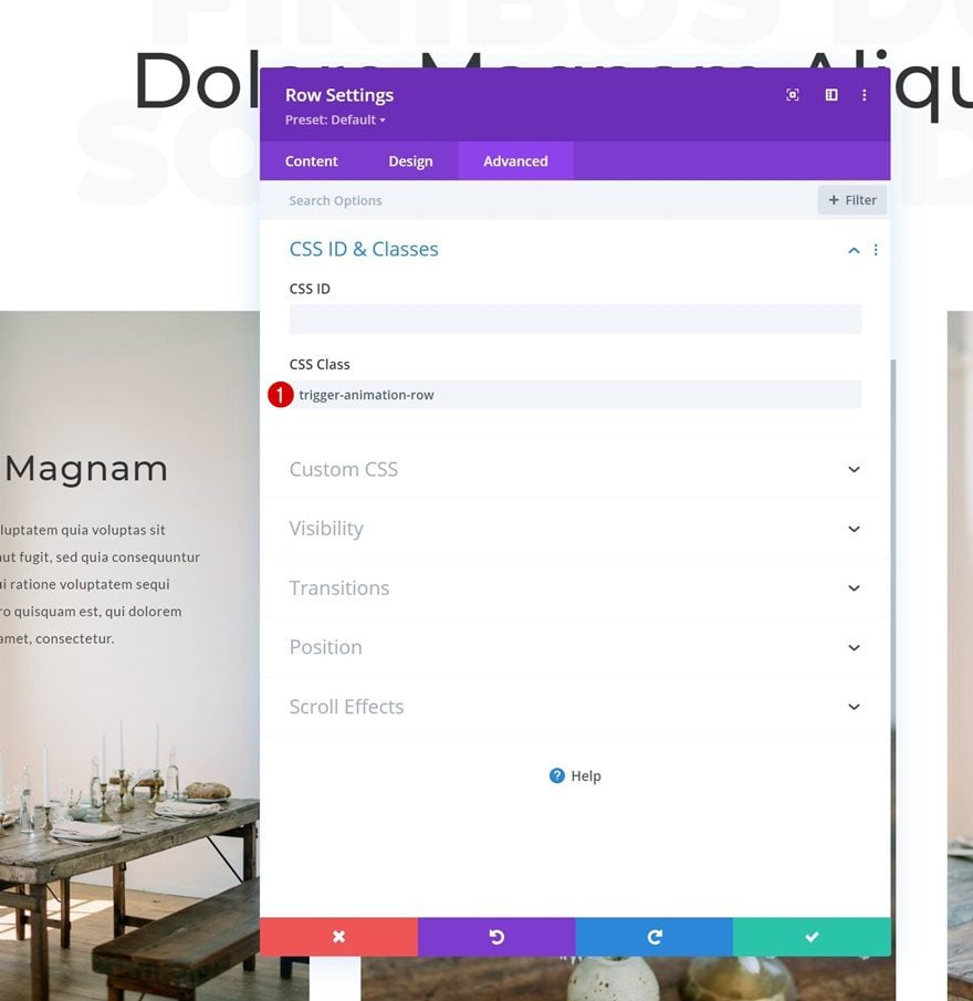
Now that our design is in place, we can focus on the restart animation technique. We’re going to target multiple modules at once for this. First, open the second row’s settings and apply the following CSS class:
- CSS Class: trigger-animation-row
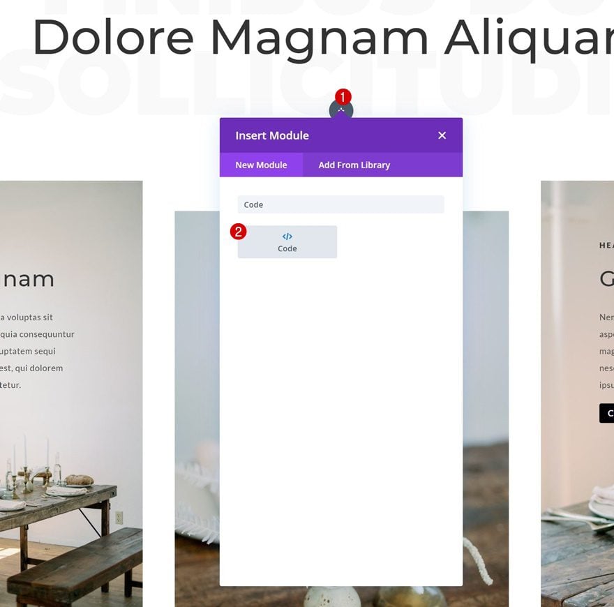
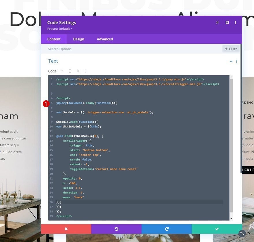
Add Code Module to Row #1
The CSS class we’ve added in the previous step of this tutorial will help us target all modules inside this row at once. To create the restart animation, we’re using some JQuery code, the GSAP JavaScript library and the ScrollTrigger library for GSAP. To add this code, we’ll insert a new Code Module below the second Text Module in row #1.
Add GSAP & ScrollTrigger Libraries
Make sure you add the GSAP and ScrollTrigger libraries inside new script tags.
- https://cdnjs.cloudflare.com/ajax/libs/gsap/3.5.1/gsap.min.js
- https://cdnjs.cloudflare.com/ajax/libs/gsap/3.5.1/ScrollTrigger.min.js
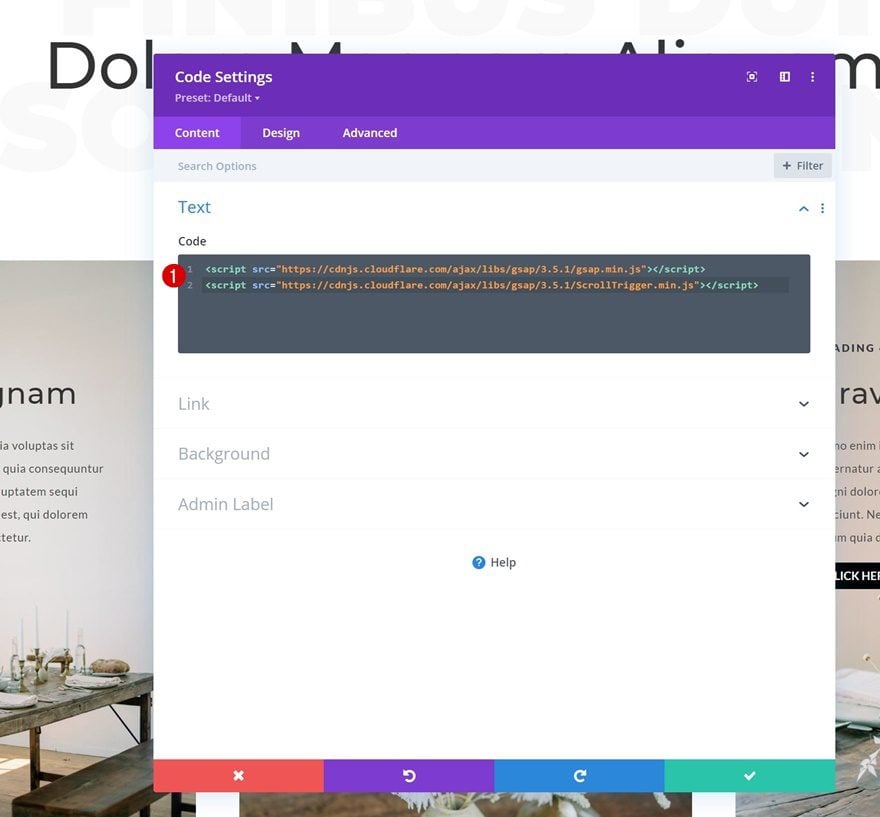
Then, add new script tags below the library script tags.
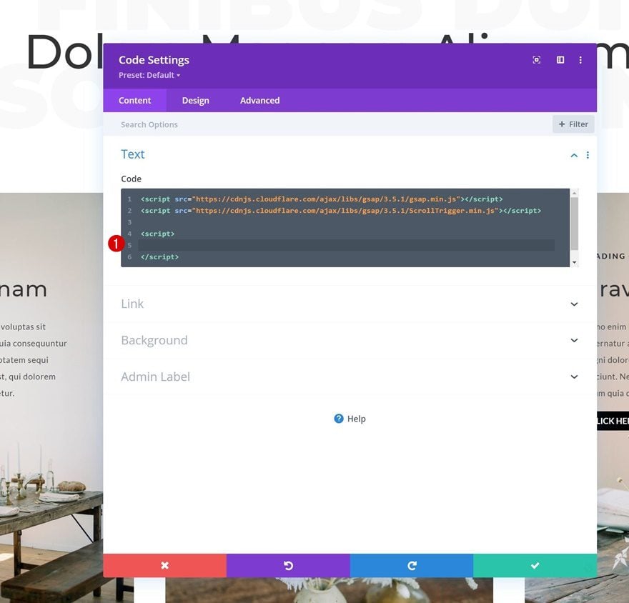
Add GSAP + ScrollTrigger Function
Inside the new script tags, we’ll copy paste the following lines of JQuery code:
jQuery(document).ready(function($){

var $module = $('.trigger-animation-row .et_pb_module');

$module.each(function(){
var $thisModule = $(this);

gsap.from($thisModule[0], {
scrollTrigger: {
trigger: this,
start: "bottom bottom",
end: "center top",
scrub: false,
repeat: -1,
toggleActions:'restart none none reset'
},
opacity: 0,
x: -100,
scale: 1.1,
duration: 2,
ease: "back"
});
});
});
This code will target all row modules at once and will restart the animation as soon as a visitor enters the viewport again. The animation, in this case, is pretty straightforward and minimal. However, with GSAP and ScrollTrigger, you can create any kind of animation you want, so it’s definitely worth looking into!
Preview
Now that we’ve gone through all the steps, let’s take a final look at the outcome across different screen sizes.
Desktop
Mobile
Final Thoughts
In this post, we’ve shown you how to restart an animation as soon as the element enters the viewport. This approach helps you create a consistent experience, no matter how your visitors scroll. You were able to download the JSON file for free as well! If you have any questions or suggestions, feel free to leave a comment in the comment section below.
If you’re eager to learn more about Divi and get more Divi freebies, make sure you subscribe to our email newsletter and YouTube channel so you’ll always be one of the first people to know and get benefits from this free content.


Just went through this and it worked lovely, thanks. I made the animations a touch more subtle but that was just for my own preference. Thanks ET 😉
I had to eliminate all those bloody animations to fix my score with Google. There are two big penalties that come with some Divi features. 1. Google penalizes content that is different in desktop and mobile. For the sake of speed, I had created a few different sections for mobile to speed loading. Big mistake. 2. Content layout shift now matters a lot. Eliminating animations fixed it. I now get a 98 score on GTMetrix. So…..be careful with the dancing baloney.
Could anyone advise the best way to set this up for use accross multiple pages?
I’m assuming a child theme with customizations to functions.php and a custom JS file with the animations?