The primary menu bar makes navigating for visitors seamless. Apart from the default primary menu bar we’re used to in WordPress, you’ve probably come across the Fullwidth Menu Module that Divi offers as well. Usually, it is used to display other menus on your website that are different from the primary menu you have at the top of each page.
But you can also easily use the Fullwidth Menu Module to replace your primary menu bar. This gives you the freedom of placing the menu wherever you want on the page without dealing with a duplicate menu at the top of your page. You can also use Divi’s built-in options to style the menu the way you want to, meaning you can create stunning results using the border and divider options, for instance.
In this tutorial, we’ll show you how to replace your primary menu bar with the Fullwidth Menu Module using Divi’s Carpenter Layout Pack. This is part of our ongoing Divi design initiative. You can choose whether you want to make this method apply to all pages or just a few of them. Let’s get to it!
Preview
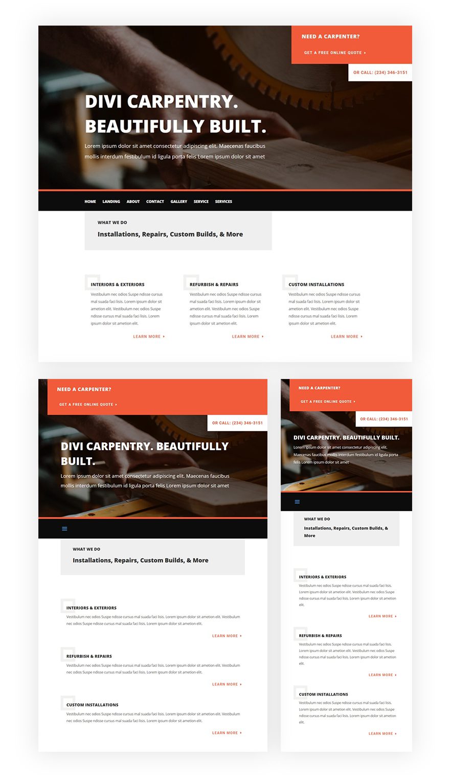
Before we dive into the use case tutorial, let’s take a quick look at the end result on different screen sizes.
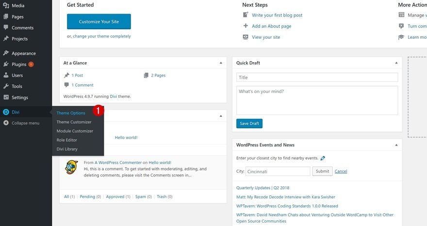
Go to Divi’s Theme Options
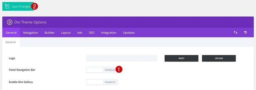
The first thing we’ll need to do is disable the fixed navigation option in Divi’s theme options. We’re doing this to get rid of the primary menu space at the top of our page. To do that, go to your WordPress Dashboard > Divi > Theme Options.
Open the general tab and disable the Fixed Navigation Bar option.
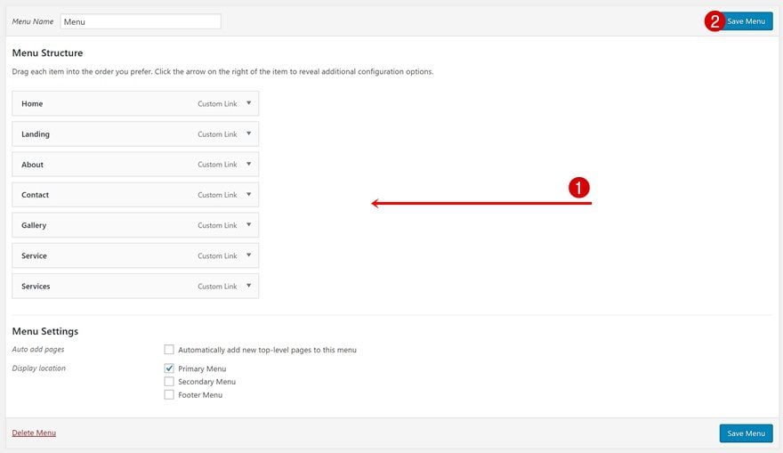
The next thing we’re going to do is create our primary menu. We’ll use this primary menu for both the default Primary Menu Bar at the top and the Fullwidth Menu Module. To add your menu, go to your WordPress Dashboard > Appearance > Menus.
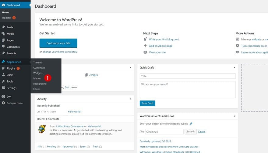
Add a new menu, give your menu a name and make it your Primary Menu.

Last but not least, add all of your pages and save your menu.
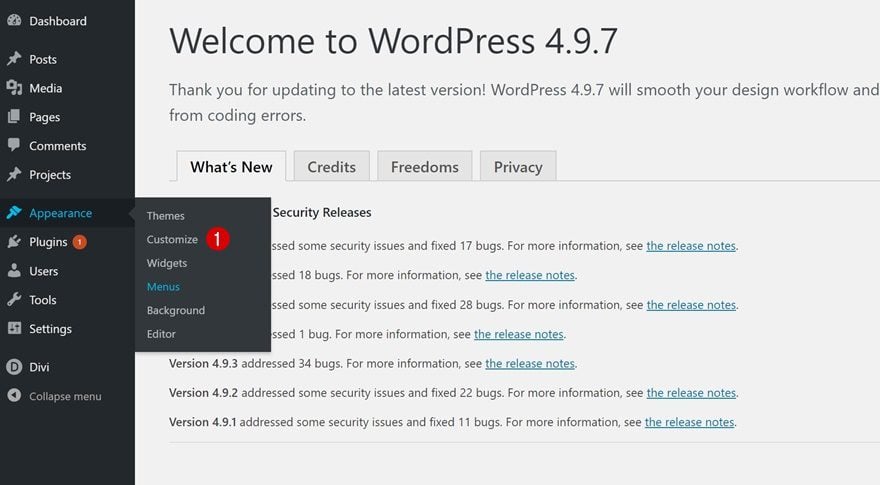
Go to Theme Customizer
Depending on if you want to hide the default primary menu bar on all pages or not, you might want to style the default Primary Menu Bar first. You only need to do this if you’re planning on using it on some pages. If you want to remove the Primary Menu Bar everywhere, you can skip this step.
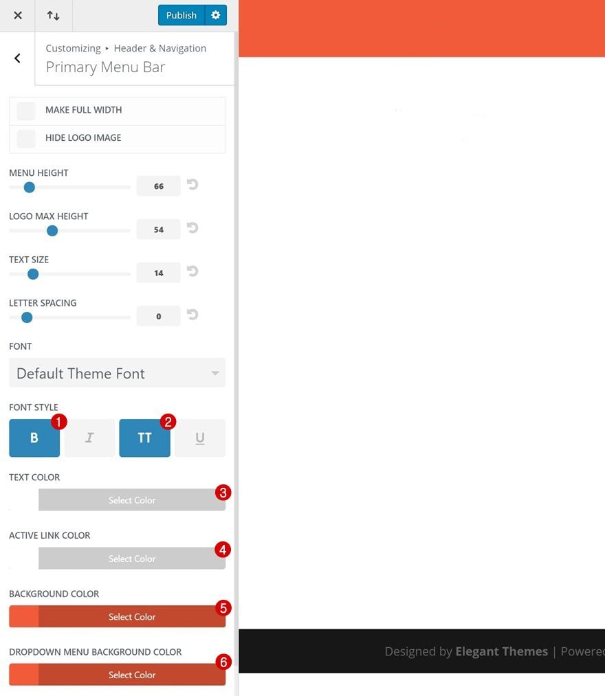
To match the layout pack, we’ve applied the following changes:
- Font Style: Bold & Uppercase
- Text Color: #FFFFFF
- Active Link Color: #FFFFFF
- Background Color: #f25b3a
- Dropdown Menu Background Color: #f25b3a
One Page
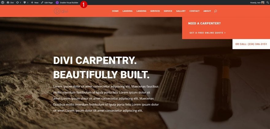
Go to Page of Choice & Enable Visual Builder
To hide the Primary Menu Bar at the top of our pages, we’ll need to use a little amount of CSS code. Note that it’s important to have disabled the Fixed Navigation Bar option (one of the previous steps). Otherwise, the space that is taken up by the Primary Menu Bar will be white and not completely gone. If you’re going to hide the Primary Menu Bar on one page, in particular, go to that page and enable the Visual Builder.
Open Page Settings
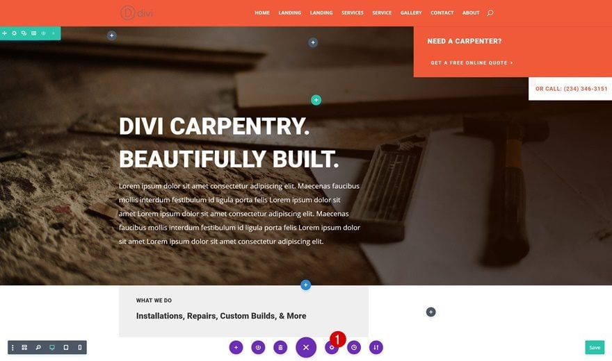
Open the page settings next by clicking on the following icon at the bottom of your page:
Add CSS Code
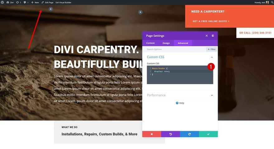
Switch over to the Advanced tab and add the following CSS code to the Custom CSS box:
#main-header {
display: none;
}
Entire Website
Go to Divi’s Theme Options
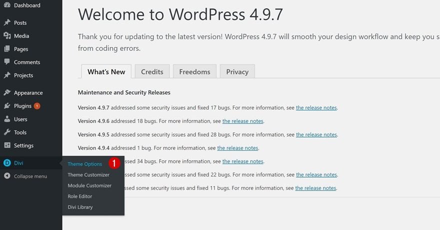
If you want to get rid of the Primary Menu Bar on your entire website, you can do that as well. You don’t have to add the code to each page manually. Instead, you can just go to your WordPress Dashboard > Divi > Theme Options.
Add CSS Code
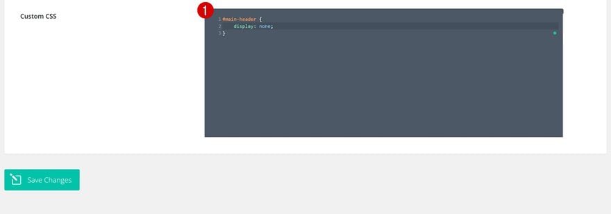
Continue by scrolling down until you come across the Custom CSS box and add the same CSS code there:
#main-header {
display: none;
}
Open Landing Page with Visual Builder
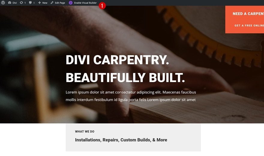
Now that we hid the Primary Menu Bar, we can start adding the Fullwidth Menu Module to our page. To do that, go to your landing page, for instance, and enable the Visual Builder.
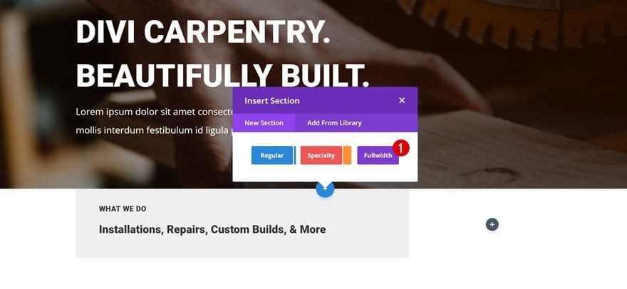
Add Fullwidth Section
Continue by adding a Fullwidth section right below your hero section.
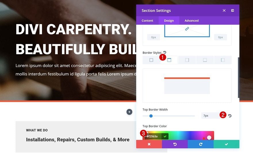
Top Border
You can use all Divi’s built-in options to create the exact design you want. We’re going to keep it pretty clean. The only thing we’ll add to our section options is a top border:
- Top Border Width: 7px
- Top Border Color: #f25b3a
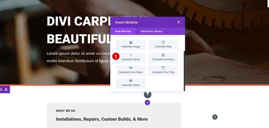
Next, add the Fullwidth Menu Module to your section.
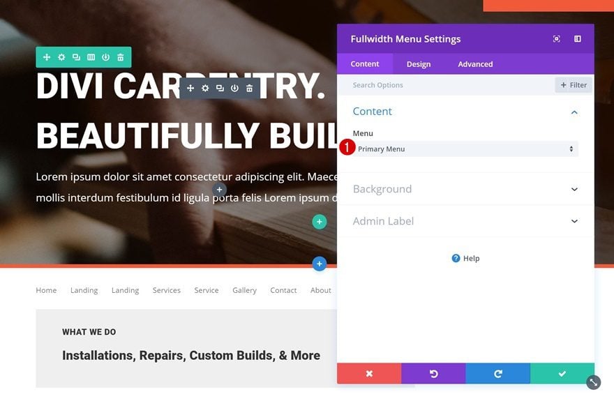
Select Primary Menu
Select your primary menu as the menu you want to show up.
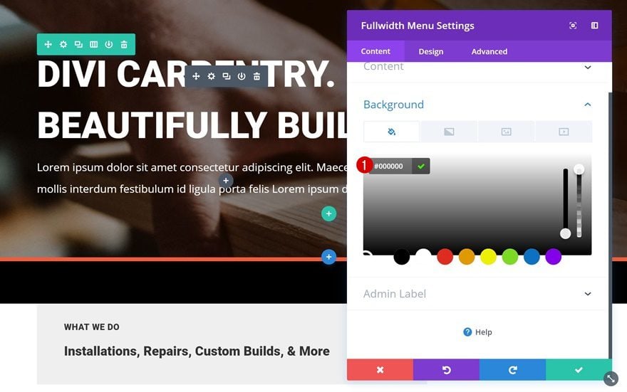
Background Color
Continue by giving your module a black background color.
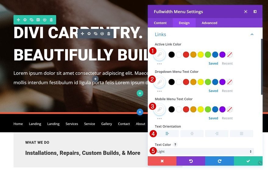
Links Settings
Then, open the Links settings and apply the following changes:
- Active Link Color: #FFFFFF
- Dropdown Menu Text Color: #FFFFFF
- Mobile Menu Text Color: #FFFFFF
- Text Orientation: Left
- Text Color: Light
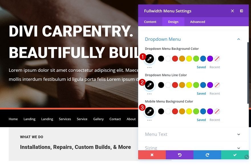
Dropdown Menu Settings
Change the Dropdown Menu settings next:
- Dropdown Menu Background Color: #000000
- Dropdown Menu Line Color: #000000
- Mobile Menu Background Color: #000000
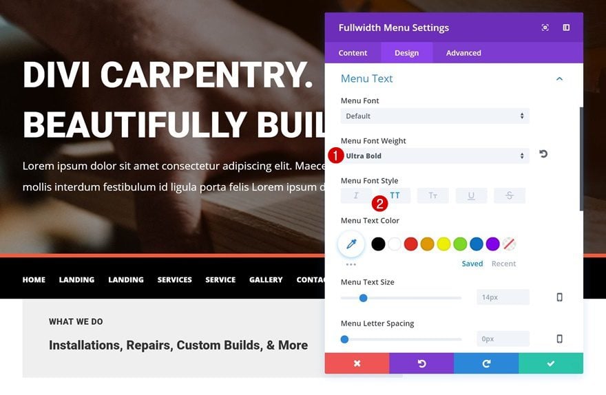
Menu Text Settings
Lastly, we’re going to make the text settings match the layout pack:
- Menu Font Weight: Ultra Bold
- Menu Font Style: Uppercase
Make Fullwidth Section Global & Use on Other Pages as Well
Save as Global Section
We’re done creating our new primary menu! If you’re planning on using it on other pages as well, go ahead and add it to your Divi Library as a global item.
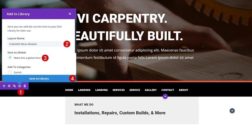
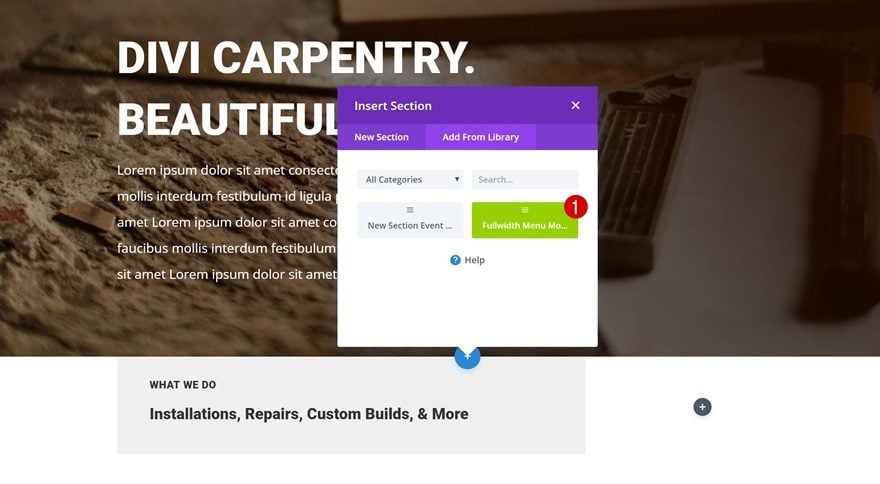
You can now easily add this Fullwidth Menu to other pages. You can choose its position and you’re free to play around with the built-in design options that come along with it!
Preview
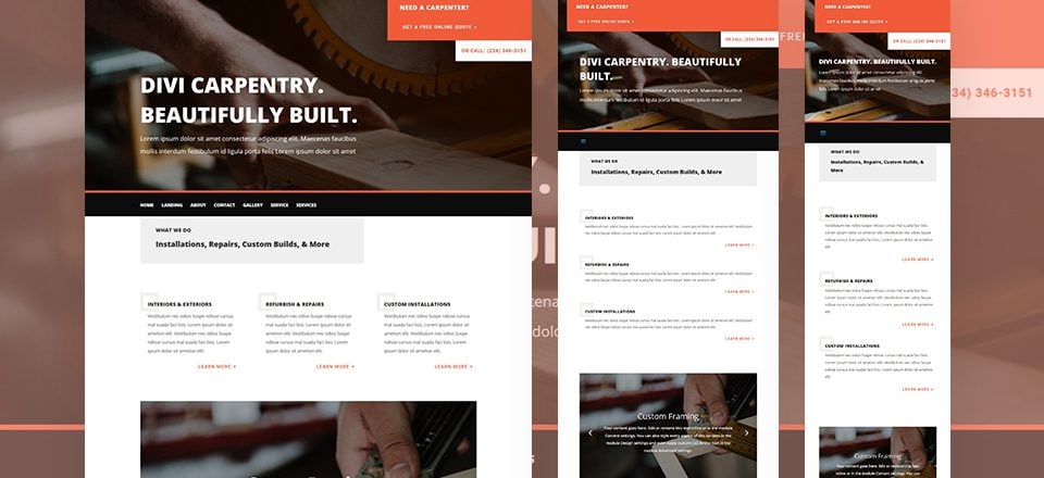
Now that we’ve gone through all steps, let’s take a final look at the result on different screen sizes.

Final Thoughts
In this use case blog post, we’ve shown you how to replace the Primary Menu Bar at the top of your pages with the Fullwidth Menu Module. Applying this method gives you the freedom of being able to place your menu wherever you want on your page. On top of that, you can also use Divi’s built-in options to style it. If you have any questions or suggestions, make sure you leave a comment in the comment section below.



Hi. thank you for this tutorial. It was very helpful. I do have a question though.. is it possible to divide the main menu into sub-menus that can be added individually to fullwidth menu modules and then placed one under the other on the first page (so, displayed only on the landing page and not on subsequent pages on the site).
Hello Donjete,
Could you help me with this issue?
I would like to make the main-menu bar in my home page in Divi appear with a delay of say 7 seconds after my home page fully loads…
Would you please send me a css code for this to work it around?
Thank you.
Thank you so much for this amazing tutorial! I was able to followed through the steps and created mine. However, I notice that the image and menu does NOT stay fixed at the top when scrolling down the page. Is there away to do that so users do not have to scroll back up to the top to get to the menu? Thanks for your time and suggestion.
You can do the header you want but in the Woocoomerce file pages can not be put.
If anyone know how to do it please tell me…
You can add the shortcode of the module on header.php:
What’s the simplest way to use the menu module on post pages?
In fact there’s another way to do that. If blank template is selected it doesn’t show header neither footer, and you can just change everything you want. About the logo, instead of using fullwith module, use a regular module three columns select row fullwith and in the right you insert the logo and in the left one the menu.
I’m not sure if menu can be selected in regular section, but you can move the module between both sections. I did it in two webs, and then save it as global before inserting in rest of pages.
With Mmhm I had a lot of incompatibilities.
That’s it!
this module is the same since beginning. I’m missing the logo option. Would be great if menu could also be a “standalone” module not just fullwidth.
Mmmm this looks interesting! I may have to give this a go as the styling on the Divi menu is slightly restricted I find.
Wait. You can use DIVI hooks and inject this above content on every page right? I think that’s a better solution than manually post it to every page.
Does it work in the wordpress generic pages like Category, Search, Archive, Blog (entries) etc… ? Also, how can I add the logo, any custom option to include it in the fullwidth menu ?
Awesome tutorial – thanks for taking the time to show us this. Highly appreciated 🙂
Helpful
Very Informative
Hmmm. I feel that every time a How To uses “display:none” in the instructions, it is a hack rather than an actual solution.
The lack of customisation of the header is the major limitation of the Divi theme. Anything more than a dozen page brochure site and the lack of a dynamic templates system makes a site almost unmanageable.
I love Divi, but the mess I have got myself into on some large site, I am not how I will ever get out of.
Can this CSS code be used to hide the main menu bar in the Extra Theme? I’ve been trying to search for ways to create a “Blank Page” option in Extra so I can make that theme more versatile for my blog.
You can add custom css with wis code.
#main-header .container {
display :none;
}
Thank you for the tutorial. Live demo is really important to us users.
Is there any way to make it a fixed menu when scrolling?
Also, are there any css tricks to change hover styles etc the same way we can do with the main divi menu?
It would be really cool if there was an easy way to do a real site-wide header so we could drop the menu below a hero image and not need to add it to every page. But, this is a cool trick for simple sites and I’ve used it a couple times.
There is with the Divi hooks, but it requires a little coding.
I really wish…this module was updated :/
majorly missing…
logo and title options
same options for menu bar as customizer
I think you can add section and row with single image that you give your logo before menu section.
Doing it this way allows you to have full divi customization and placement, but you need to add it to every.single.page. I found the Mhmm allows divi builder use and it replaces the top nav – don’t know if you can place it elsewhere, but it is super simple and done once. This is a great trick to use, especially if you apply it to a saved layout and use that layout on new pages.
Thanks for the tutorial!!!
Thanks! Incredible tips we get from you guys. Two things:
1) How the menu behaves once the user scrolls down? Is it sticky?
2) Demo site?
Thanks!!
Great tip! It’s very annoying when you can’t place a primary menu wherever you want (and in the past it’s been something that have pushed my clients to buy a wordpress theme or another)
Cool!
Is there a live demo somewhere? I’d like to see how the responsive menu behaves.
I’ve discovered this post on facebook. This is the live link: https://youtu.be/716IOn8mUCg
no demo site ?
Cool, I am using the same trick for some of my clients.
WoW !! Amazing !! Please more examples for personalize the menu. Just now, I have more that 25 websites with divi and all they look same header 🙂
I hope in a future update the menu gets its own DIVI builder.
me too!!, Im waiting for it since i joined the Elegant Themes family 🙁
Agree as well! Hoping to see some more flexibility with the mobile menu soon 🙂
I agree 🙂
I’d nearly settle for a menu module that was not full width (plan “B” after your suggestion).