
The Call to Action Module is a native Divi module that helps direct your website viewers to make the right decision on your site. Mobile responsiveness is crucial to making your website accessible to more people. With Divi, it is possible to customize many aspects of both native and third-party modules. Customizing elements such as design, spacing, and responsiveness are some benefits of using Divi to build your next website. In this blog post, we’ll be taking inspiration from the free Divi Charter Boat Layout Pack and walk through creating a responsive Call to Action Module.
How to Create a Responsive Call to Action Module
Before we begin, we need to install the landing page layout of the Divi Charter Boat Layout Pack. For this tutorial, we will start with a brand new page on our Divi website. Let’s begin!
Installing the Page Template
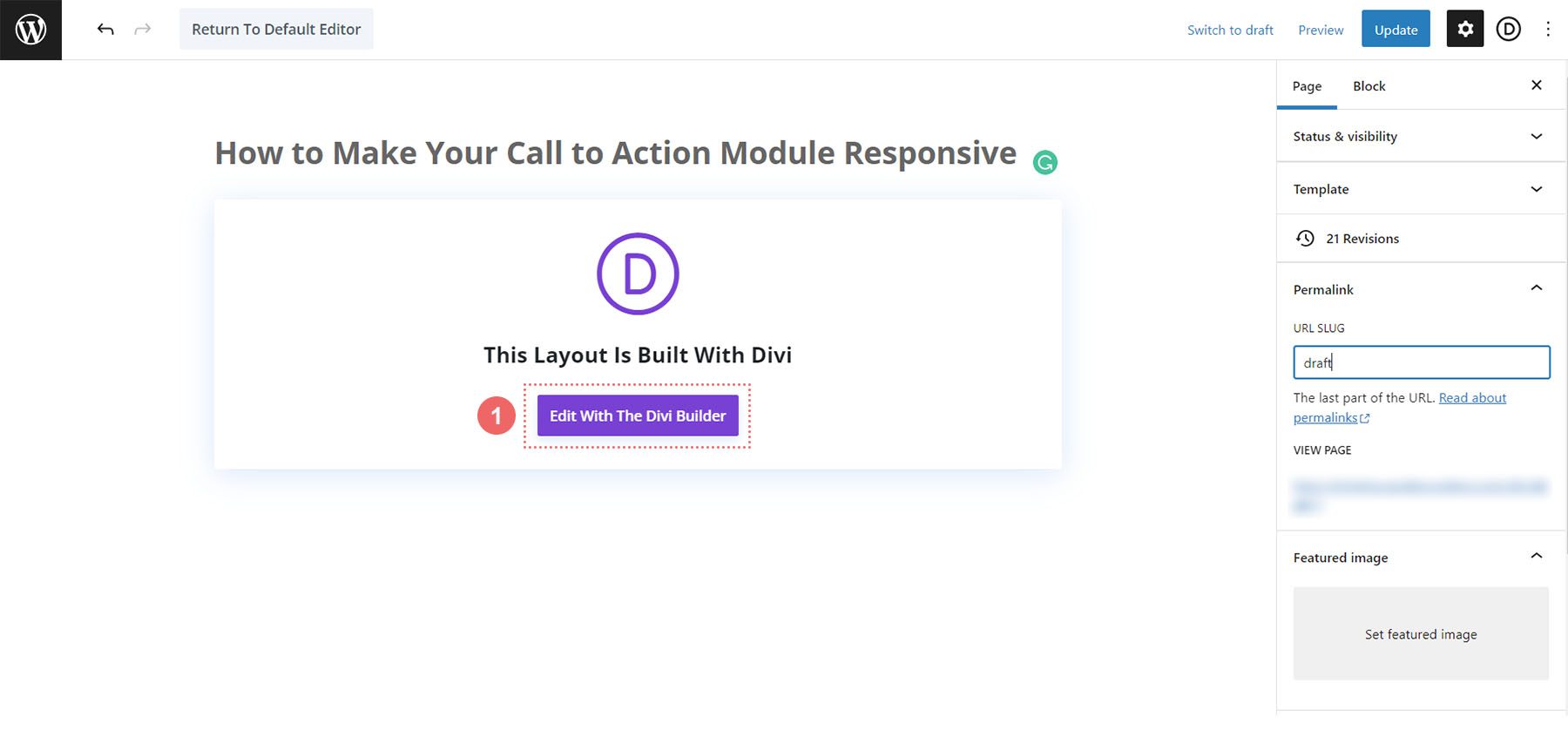
After creating our new page, we activate the Divi Builder by clicking on the purple Edit with the Divi Builder button in the center of our page.
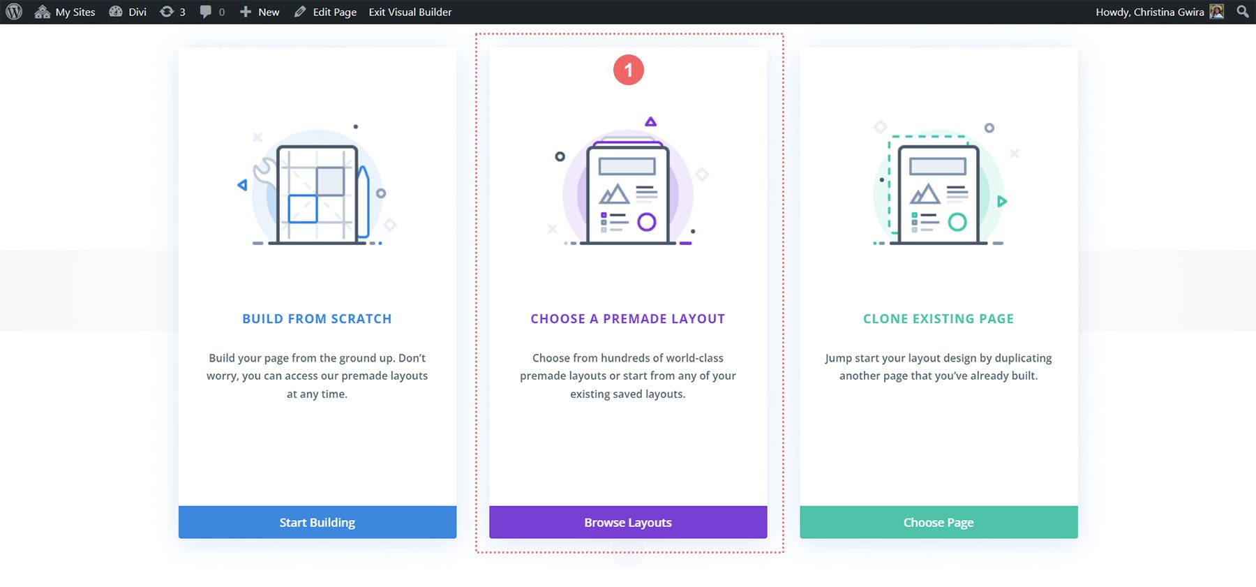
With the Divi Builder activated, we’re presented with the following page. Select the middle option, Choose a Premade Option to access the Premade Layouts that come with Divi.
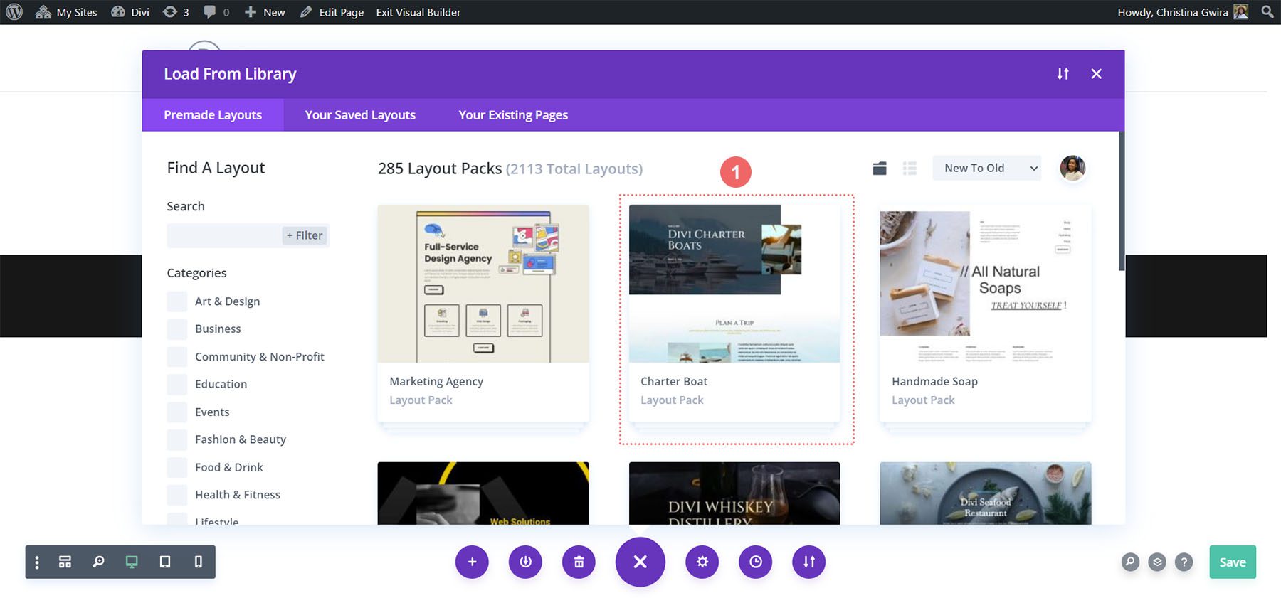
Next, we will select the Charter Boat layout from the layout library.
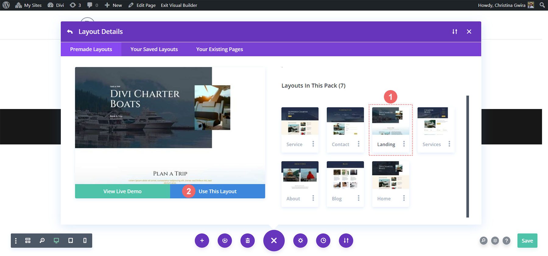
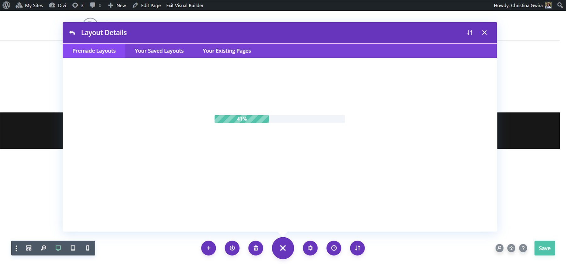
Then, we will select the landing page layout. At the bottom of the thumbnail for the layout, select the blue Use This Layout to load this layout into your Divi Builder.
As the layout loads, you’ll see a progress bar.
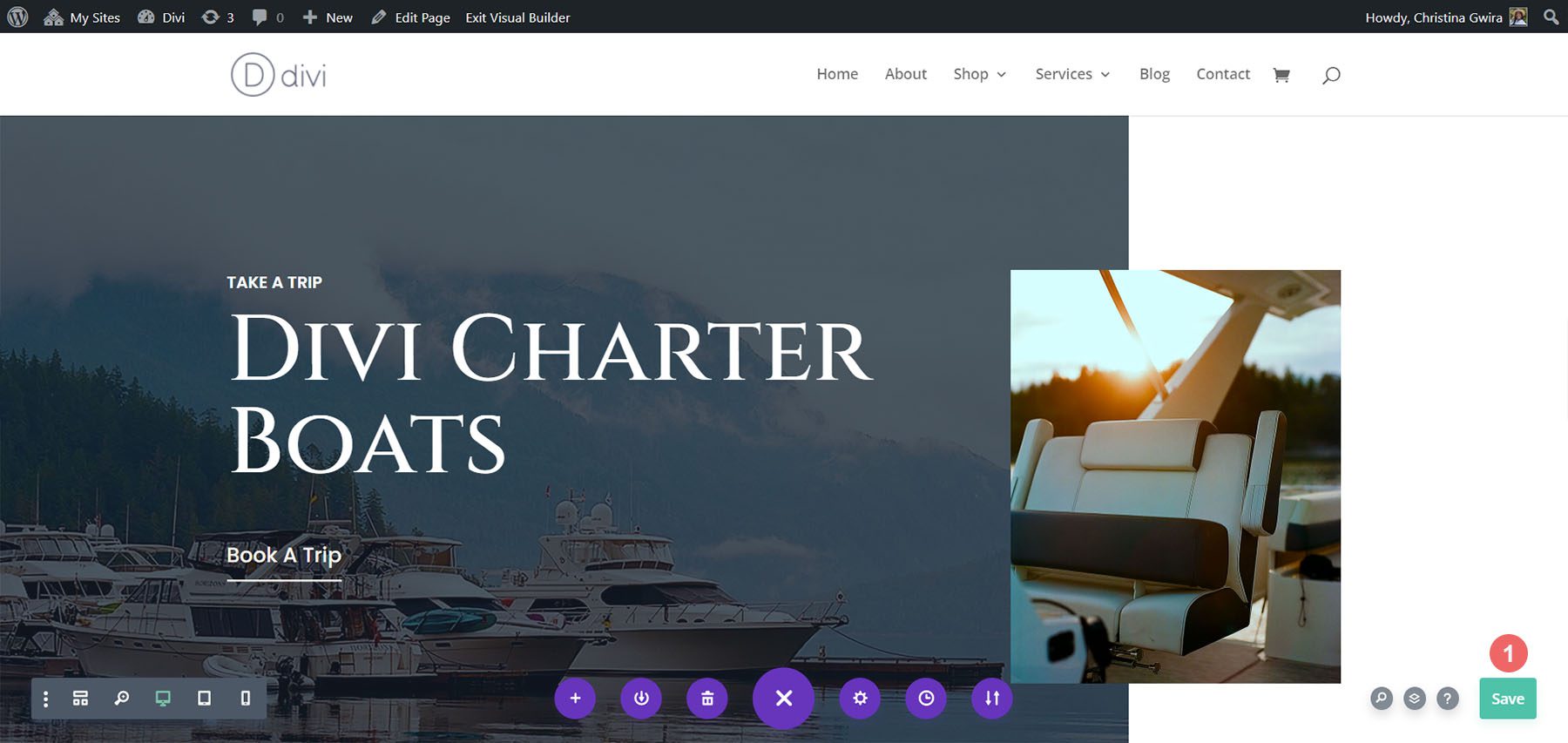
Once the layout has loaded, save your layout, and let’s get down to business!
Adding the Call to Action Module
We will be creating our responsive Call to Action Module in the following section of the layout:

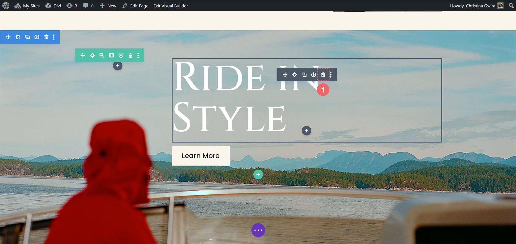
Our responsive Call to Action Module will replace the text and button module in this section. To begin, let’s delete these modules. Hover over each module and select the trash icon to delete each module.
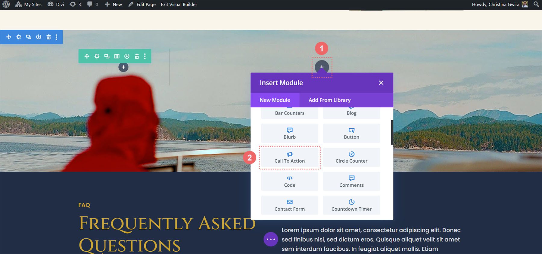
Once those modules are removed, we can begin to make our Call to Action responsive. To begin, we click the gray plus icon to see the library of Divi modules. Next, we click on the Call to Action module.
Styling the Call to Action Module
With our Call to Action Module in place, we can now start styling it.
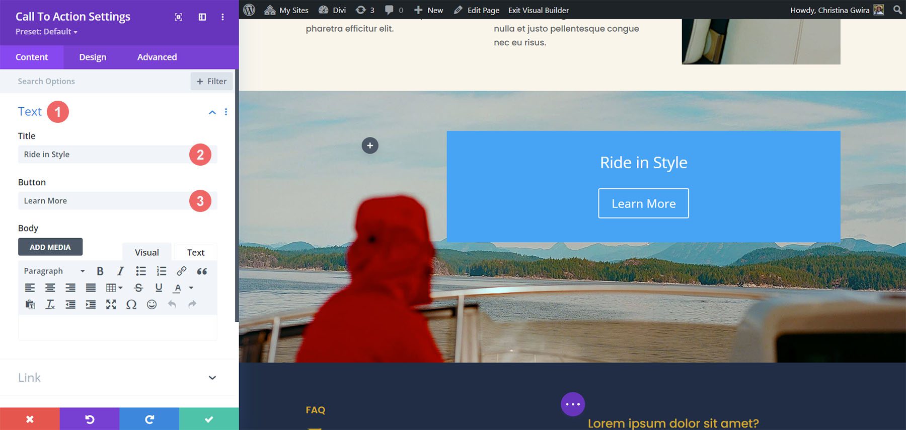
Add Content & URL
First, we add our content for the module. In the Text tab, add your call to action title, button, and body text if necessary. We won’t add body text as we recreating the previous section.
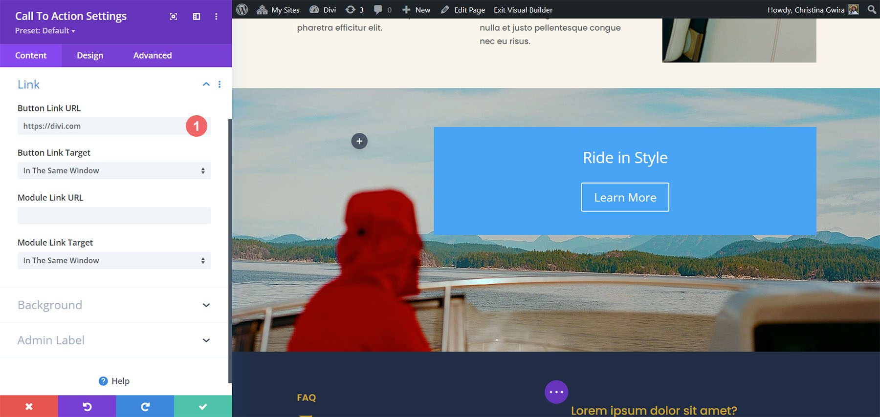
Add Button Link URL
Next, scroll down to the Link tab. Add the URL for the page to which you’d like to link your Call to Action Module button.
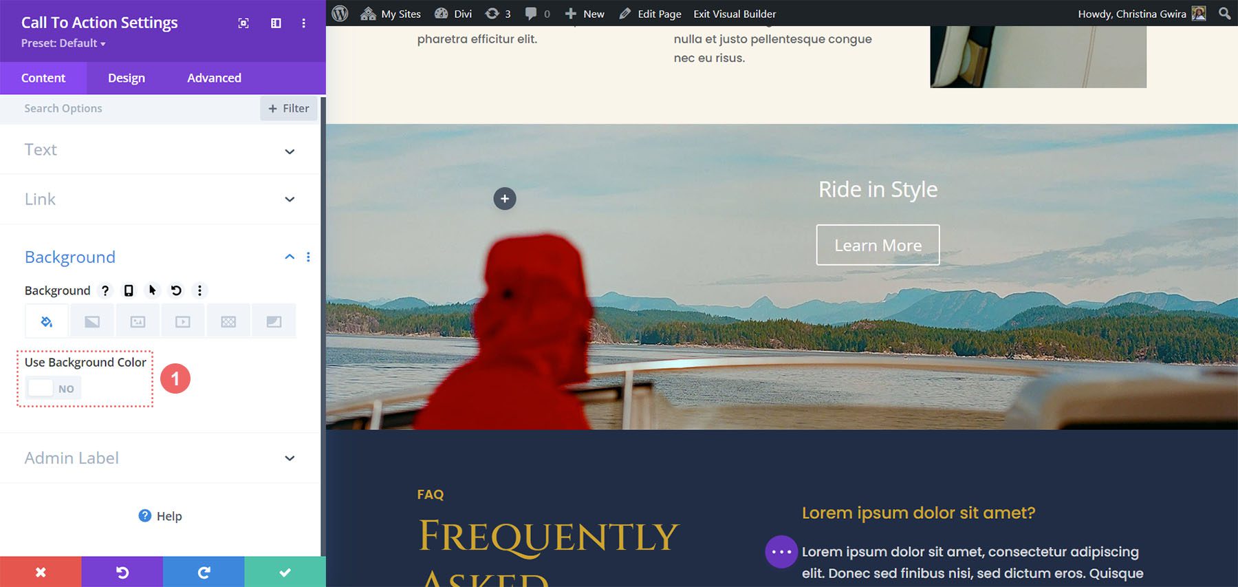
Remove Background Color
Next, scroll down to the Background tab. Uncheck the Use Background Color toggle.
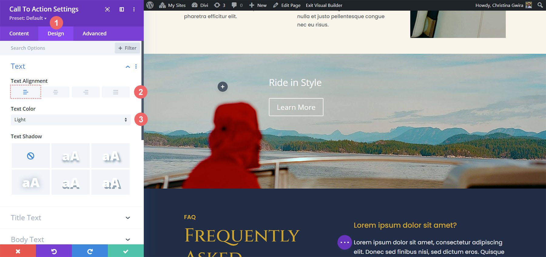
Styling Text
Once we have added our content and removed our background color, we can now move to the Design tab. Click on the Text tab, set the alignment to Right, and set the Text Color to Light.
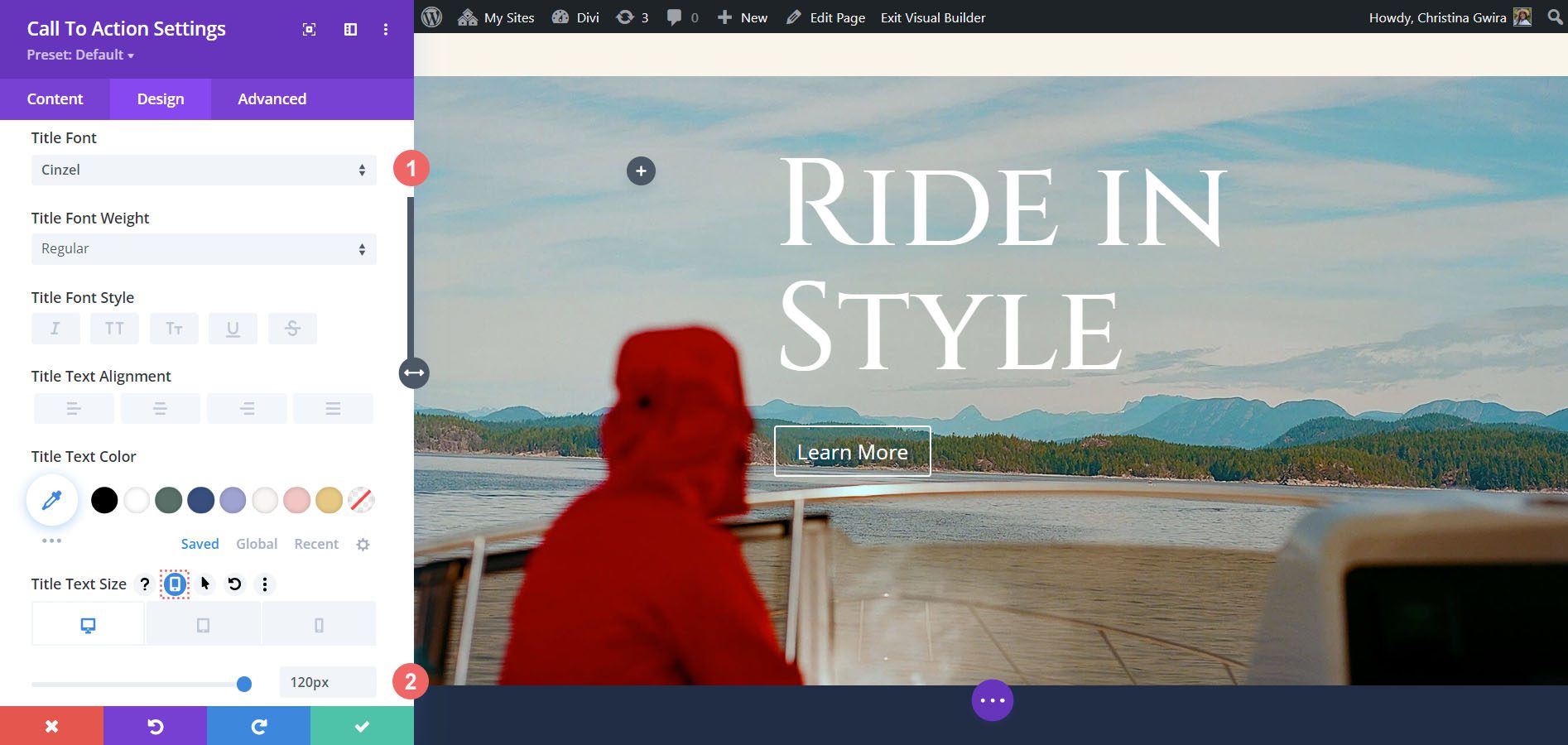
Style Title Text
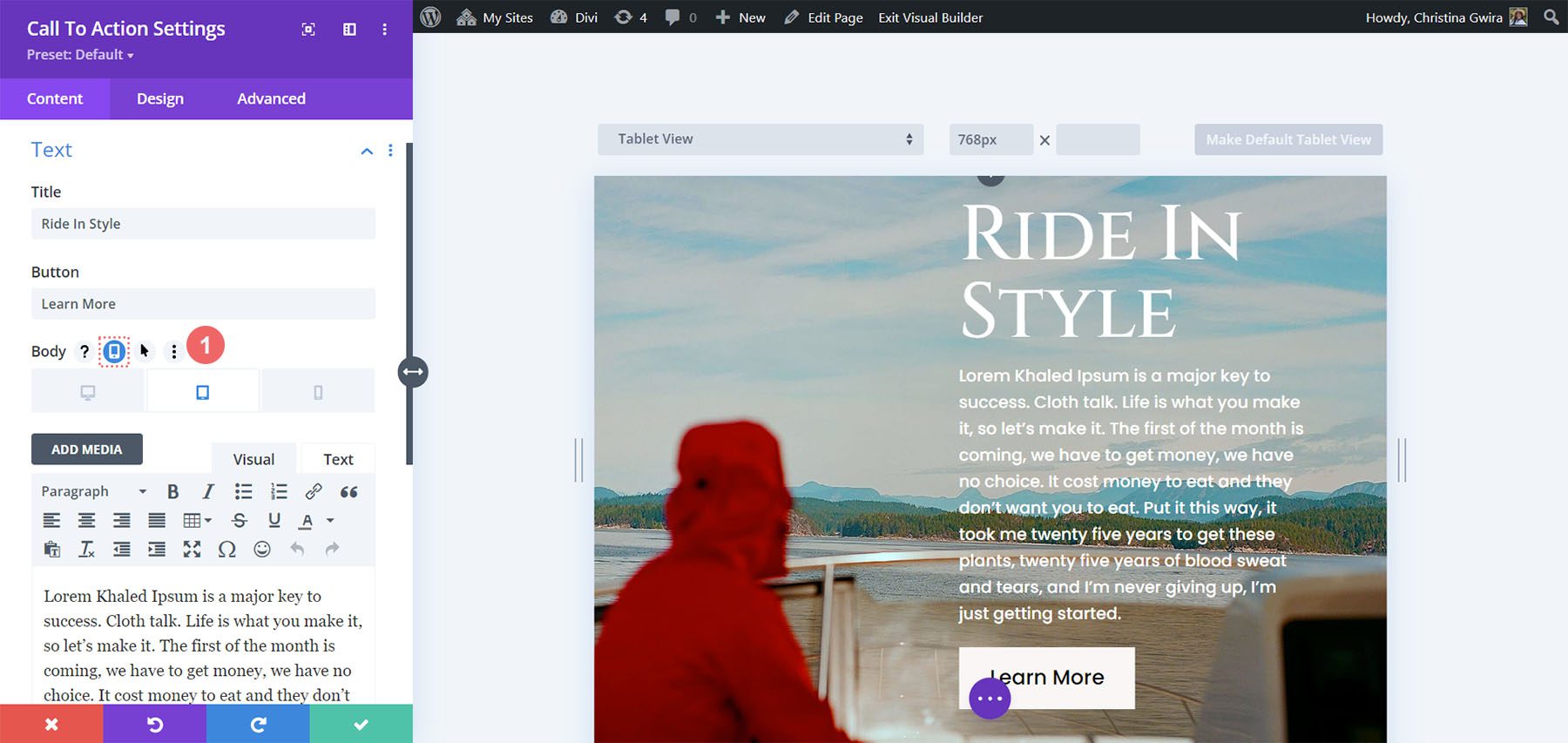
Next, scroll down to the Title Text tab. We begin to make our responsive Call to Action Module by using and activating the responsive settings for the Title Text Size. We do this by hovering over the option title and clicking on the mobile icon that appears. This will open the settings for you to enter your choice for desktop, tablet, and mobile options.
Use the following settings to style the Title text of the module to match the styling of the layout pack.
Title Text Settings:
- Title Font: Cinzel
- Title Text Size:
- Desktop: 120px
- Tablet: 75px
- Mobile: 48px
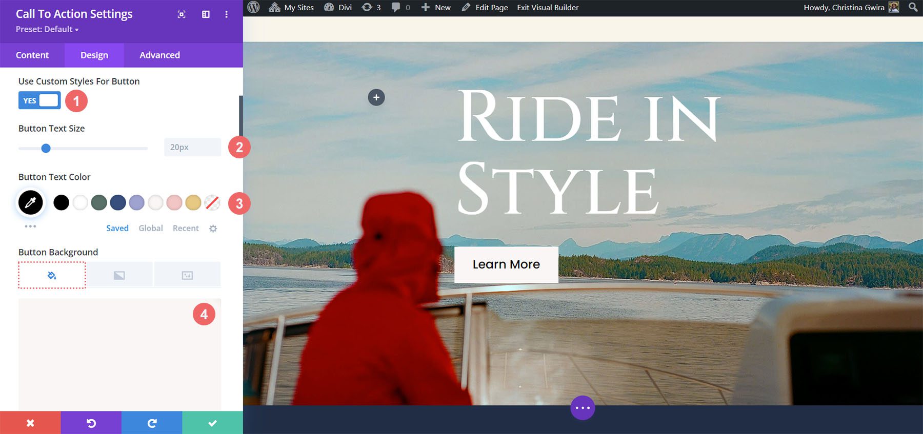
Design the Call to Action Button
With our Title Text styled, we will now scroll down to the Button tab to begin adding our styles to the button of the Call to Action Module. First, click on the Use Custom Styles for Button. Then, we begin to style our button with the following settings.
Button Design Settings:
- Use Custom Styles for Button: Yes
- Button Text Color: #000000
- Button Background Color: #f9f6f5
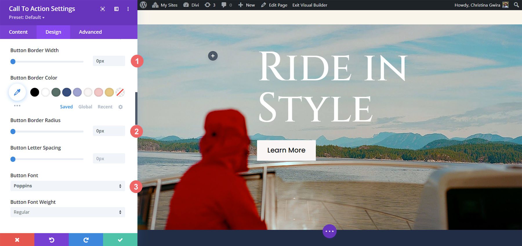
We continue to scroll down through the Button settings and use the following settings to add additional styling to the button.
Button Settings:
- Button Border Width: 0px
- Button Border Radius: 0px
- Button Font: Poppins
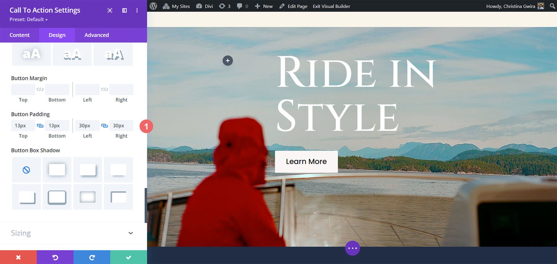
Our final style setting for our button will be to add padding all around.
Button Settings:
- Top and Bottom Padding: 13px
- Left and Right Padding: 30px
Making the Call to Action Module Responsive
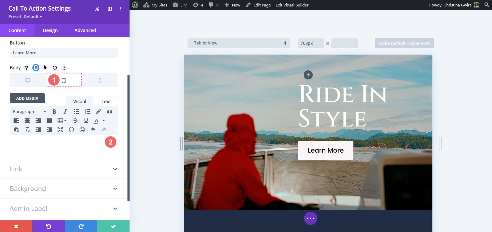
Now that we have made the style edits to the module, we can now focus on making the section – and module – truly responsive. To begin, we scroll down to the Sizing tab. We will activate the mobile responsive options for the Max Width option. We will then use the following settings for the desktop, tablet, and mobile.
Max Width Setting:
- Desktop: 100%
- Tablet: 55%
- Mobile: 65%
We also set the Module Alignment to Right across desktop, mobile, and tablet.
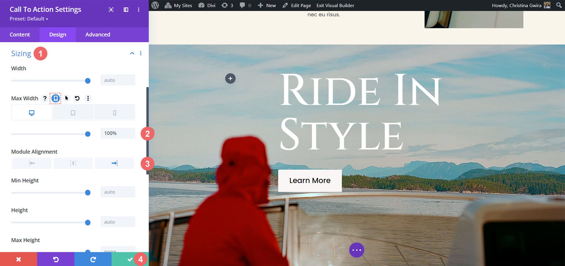
With all these settings in place, save your settings by clicking on the green checkmark icon at the bottom of the module settings modal box.
Making the Call to Action Module Responsive with Body Text
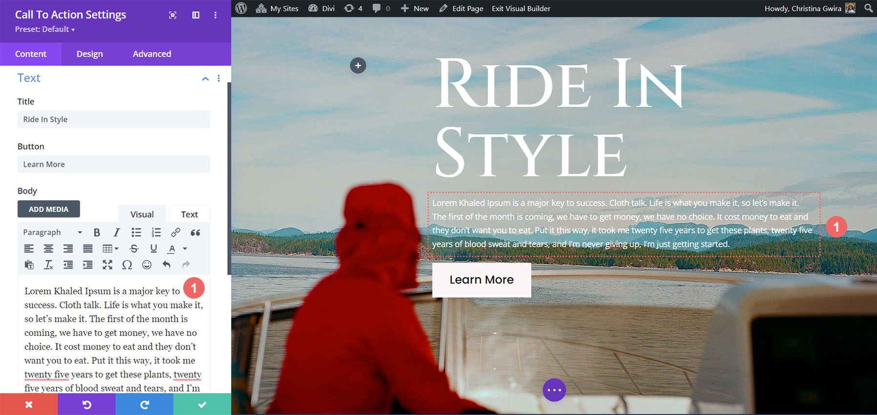
Let’s look at how we can further expand the responsiveness of the Divi Call to Action Module by adding body text.
Adding Body Text
To begin, let’s add some body text to the module.
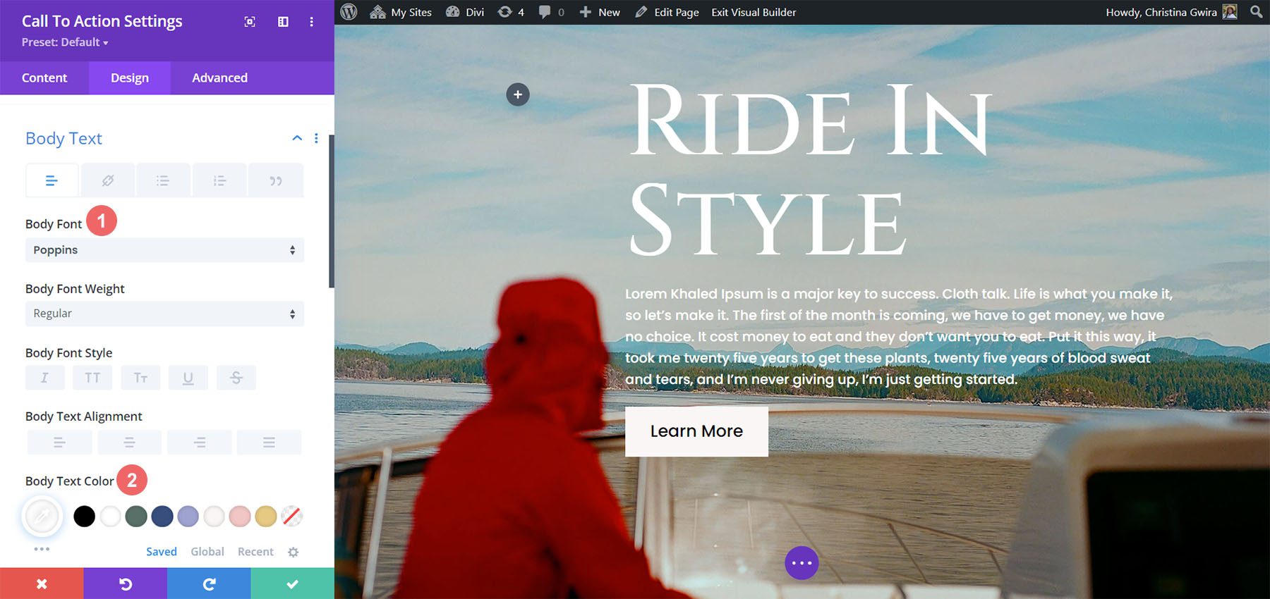
Style Body Text
After we’ve added our body text, let’s begin styling it. First, we move to the Design tab. Next, we click the Body Text tab. After, we use the following settings:
Body Text Settings:
- Body Font: Poppins
- Body Text Color: #ffffff
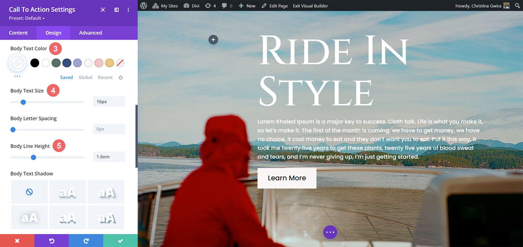
Body Text Settings:
- Body Size: 16px
- Body Line Height: 1.6em
Make Body Text Responsive
Let’s look at what our work looks like on mobile with the body text.
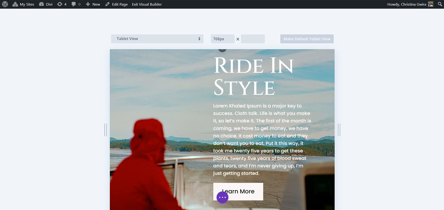
Let’s hide the Body Text on mobile to make the view more balanced. To do this, we navigate to the Content tab within the Call to Action Module. Then, you hover over the Body title. Rest your mouse there, and click on the cellphone icon. This will activate the mobile responsive settings for the body text.
We want the tablet and mobile view to hide the body text. We click on the tablet icon and remove the body text to do this. We do the same for the mobile.
We want to keep the full body text within the desktop view.
Change Background for Tablet and Mobile
Let’s take this a step further and modify the background for the mobile view. To do this, we will use an alternative background for mobile on the section. To begin, we enter the section settings. Scrolling down, we click on the Background tab. As we did for the Body Text, we hover over the Background title and click on the mobile icon. We now click on the mobile icon to attach another background image for the mobile view. Afterwards, we click on the Add Background Image icon.
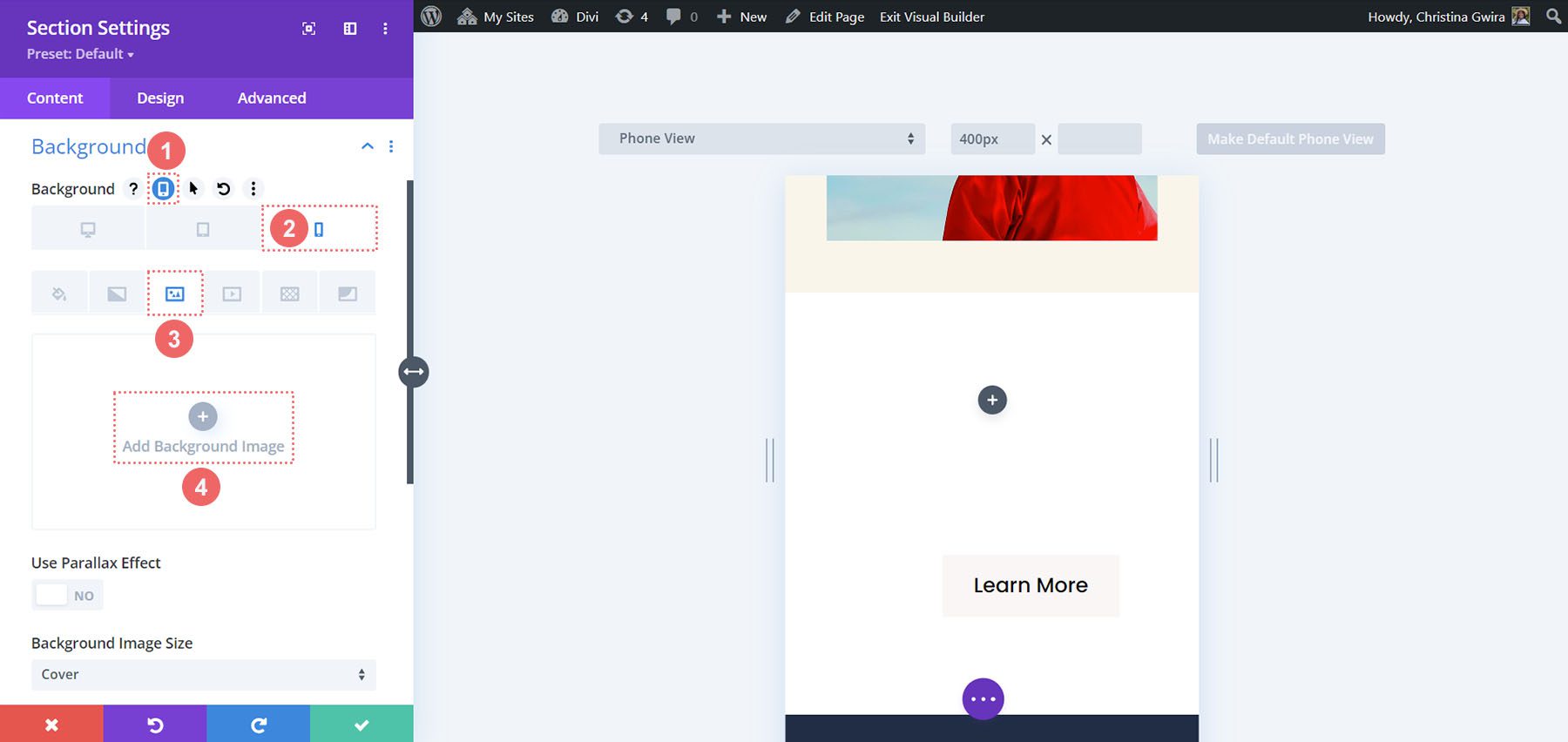
We select an image from the layout pack that works better for mobile than the photo prior.
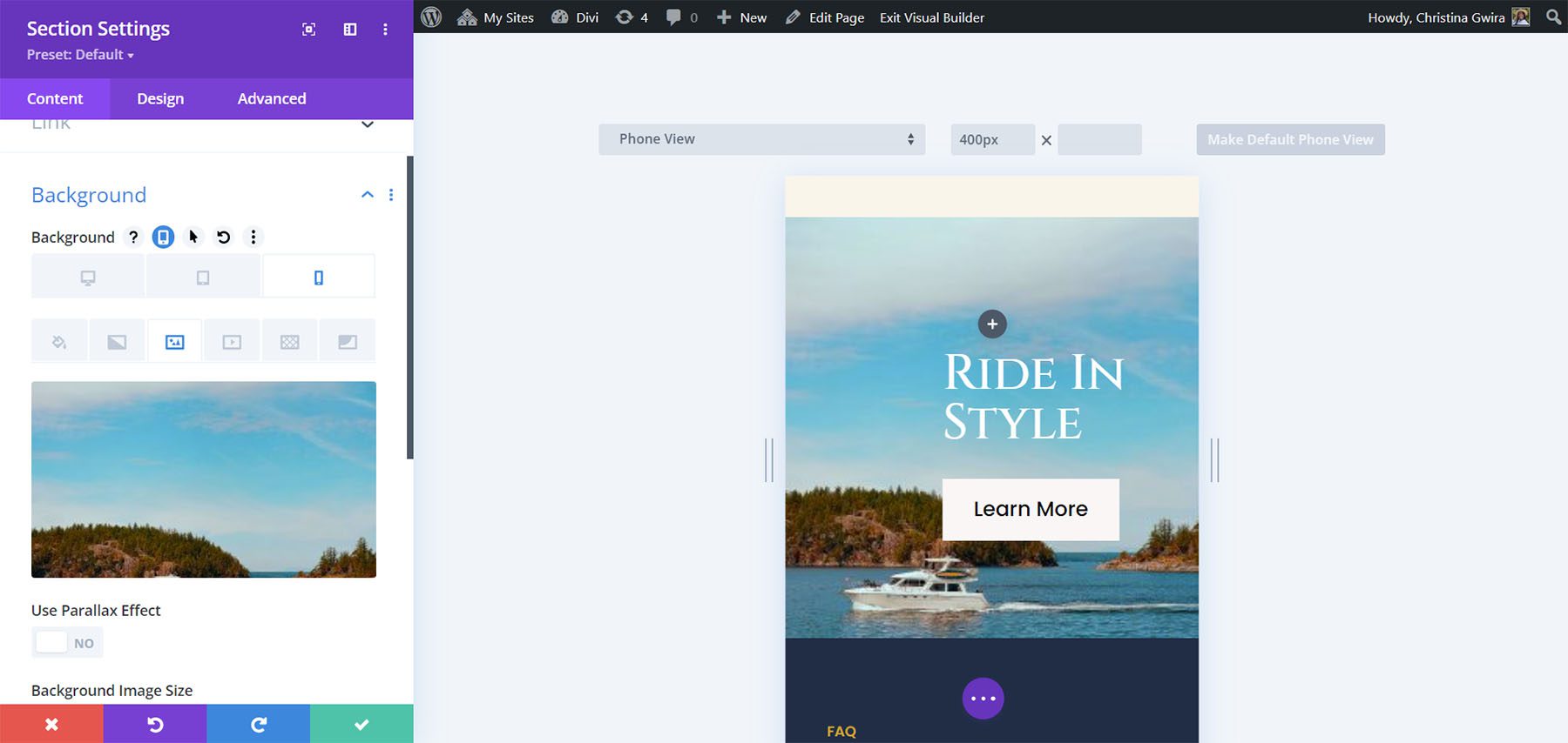
With this change, we can clearly see the Call to Action on mobile.
In Conclusion
As with all native Divi modules, you can customize many options. From color to spacing, padding to mobile responsiveness, Divi brings you the power to be able to make your website beautiful and accessible to a variety of users of your website. If you’re looking for ideas for your next web design project, you can use Divi Layouts to inspire you. Having responsiveness as part of your website allows people to enjoy your site on mobile, tablet, or desktop. Try this tutorial out today and show us what you come up with in the comments section below.


Leave A Reply