
Fullwidth featured images look great on any blog post. Fortunately, they’re easy to add using the Divi Theme Builder. There are multiple ways to add them, so you can choose the method that works the best for your needs. In this article, we’ll see four ways to add a fullwidth image to the blog post template.
- 1 Preview
- 2 About Blog Post Templates
- 3 Upload Your Blog Post Template
-
4
Add a Fullwidth Image to the Blog Post Template
- 4.1 Add a Fullwidth Image to the Blog Post Template with a Dynamic Section Background
- 4.2 Add a Fullwidth Image to the Blog Post Template with the Post Title Module
- 4.3 Add a Fullwidth Image to the Blog Post Template with a Separate Image in its Own Row
- 4.4 Add a Dynamic Fullwidth Image with a Text Module
- 5 Results
- 6 Ending Thoughts
Preview
Dynamic Section Background Desktop
Dynamic Section Background Phone
Post Title Module Desktop
Post Title Module Phone
Separate Image Desktop

Separate Image Phone
Fullwidth Image with a Text Module Desktop
Fullwidth Image with a Text Module Phone
About Blog Post Templates

First, you’ll need to create or upload a blog post template. The blog post template provides the design that the content will use when it’s displayed on the front end. You can get free blog post templates for many of the Divi layouts by searching the Elegant Theme blog for “free blog post template”. Download the template file and unzip it.
When you upload the blog post template to the Divi Theme Builder, you will not have to assign it. This is done automatically. If you’re building the template from scratch, you’ll have to assign it to the posts manually in the template settings.
For my examples, I’m using the free Blog Post Template for Divi’s Home Care Layout Pack. This template already includes a featured image. We’ll see how it works and see other ways we can add it.
Upload Your Blog Post Template
To upload your unzipped blog template JSON file, go to Divi > Theme Builder in the WordPress dashboard. Select Portability in the upper right corner and select the Import tab in the modal that opens. Navigate to your unzipped file and select it. Click Import Divi Theme Builder Templates and wait for the import to finish. Click Save Changes. The template is automatically assigned to All Posts.
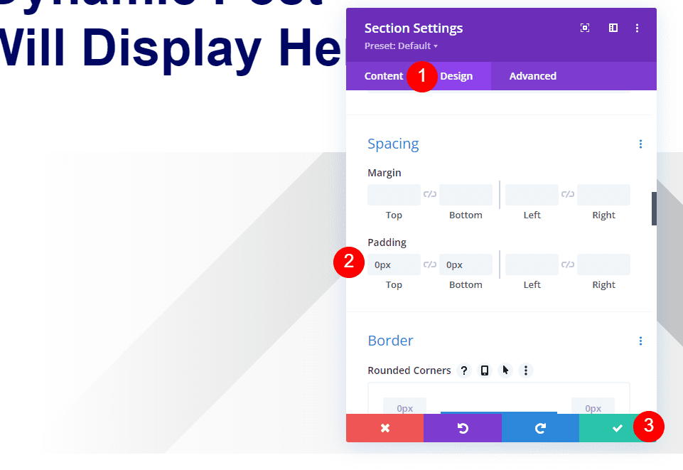
Add a Fullwidth Image to the Blog Post Template
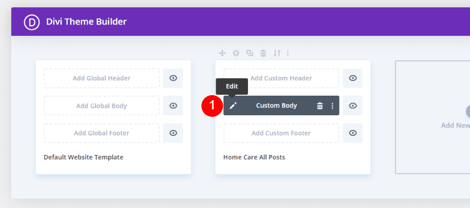
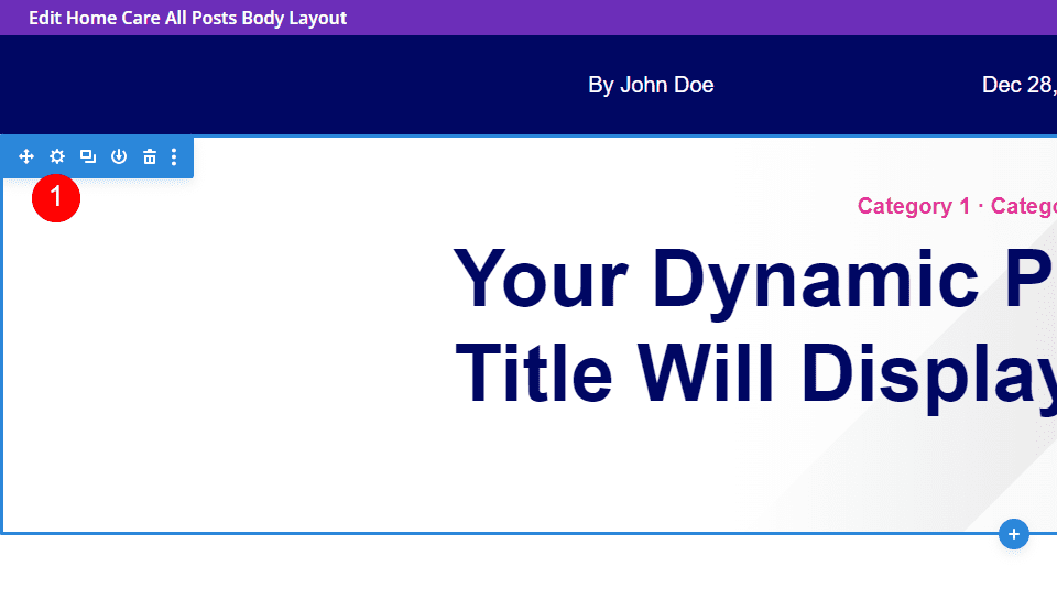
Click the edit icon to open the template.
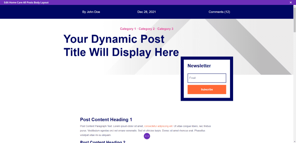
This template displays the meta at the top of the screen followed by the categories, post title, a newsletter signup form, the body of the content, comments, and a CTA.
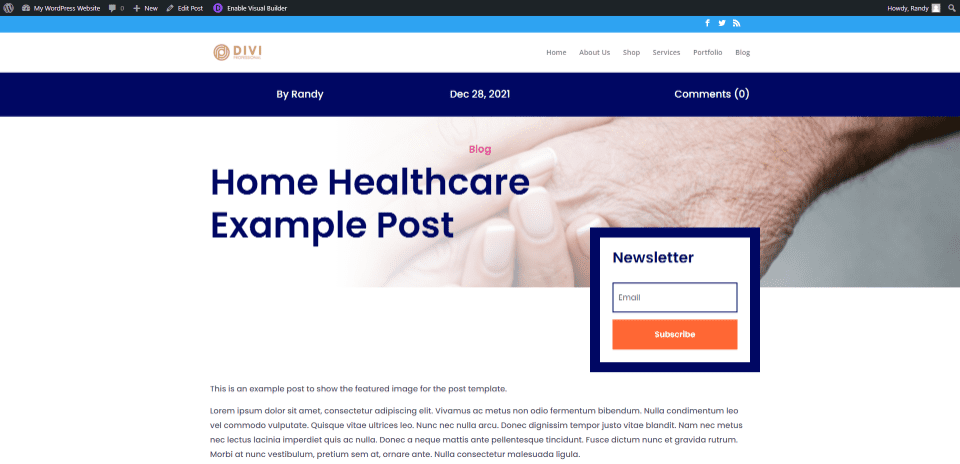
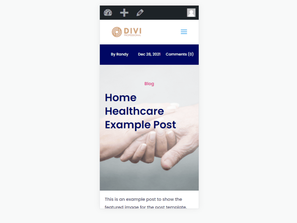
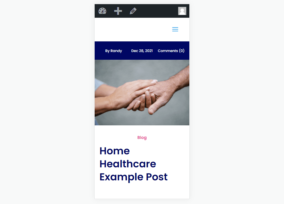
Add a Fullwidth Image to the Blog Post Template with a Dynamic Section Background
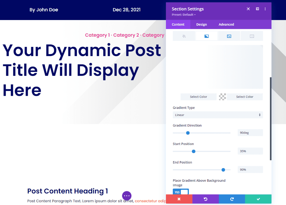
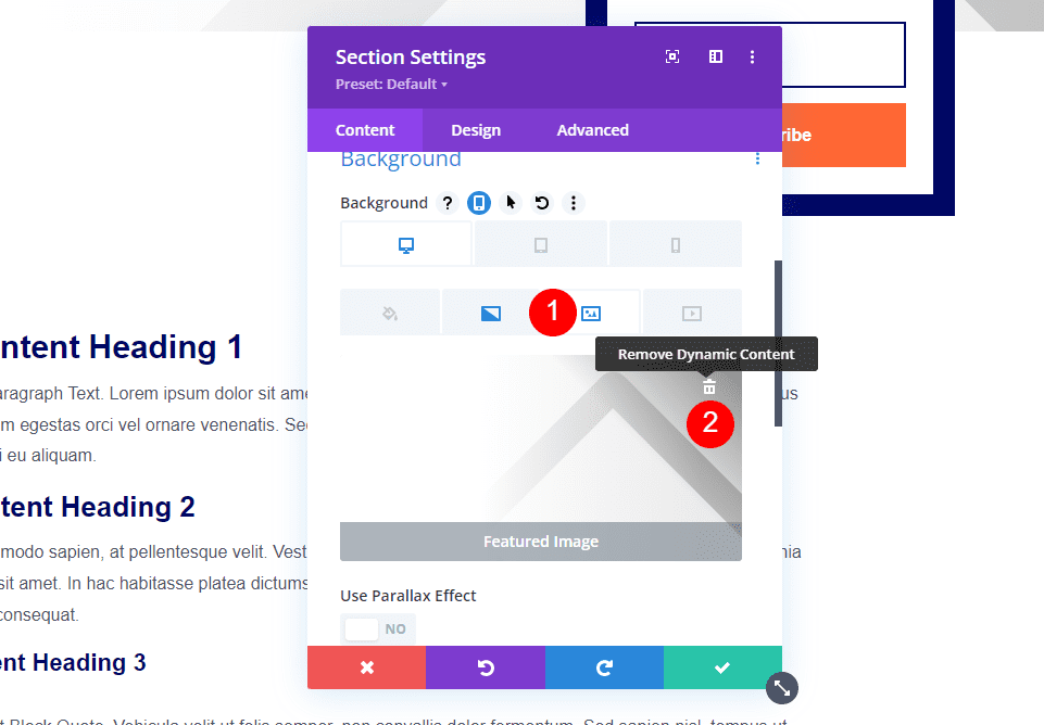
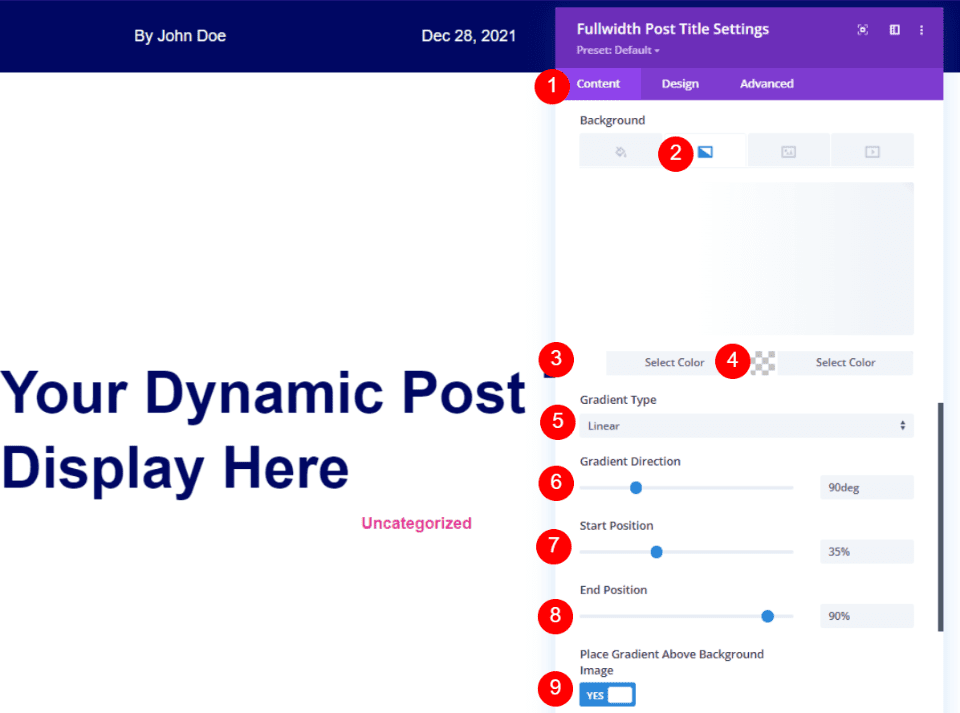
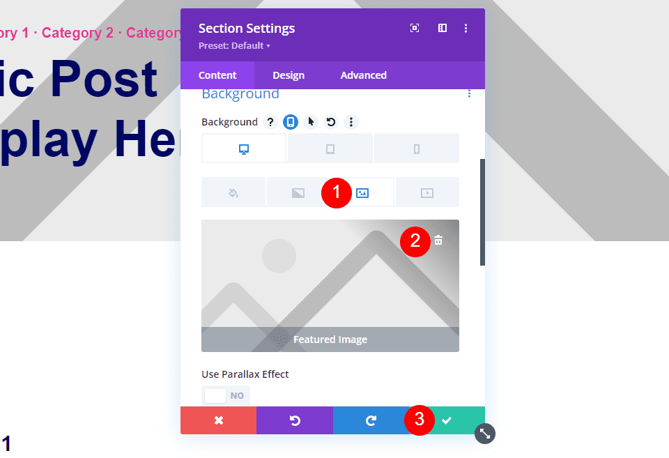
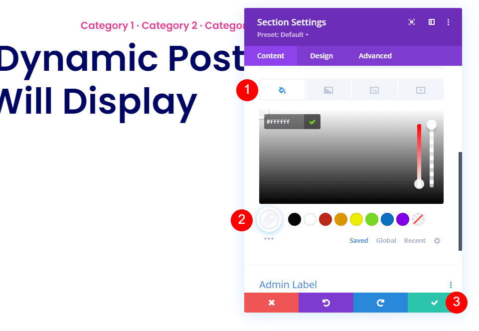
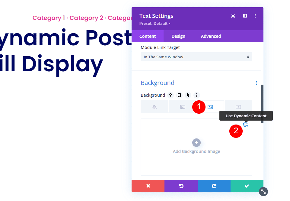
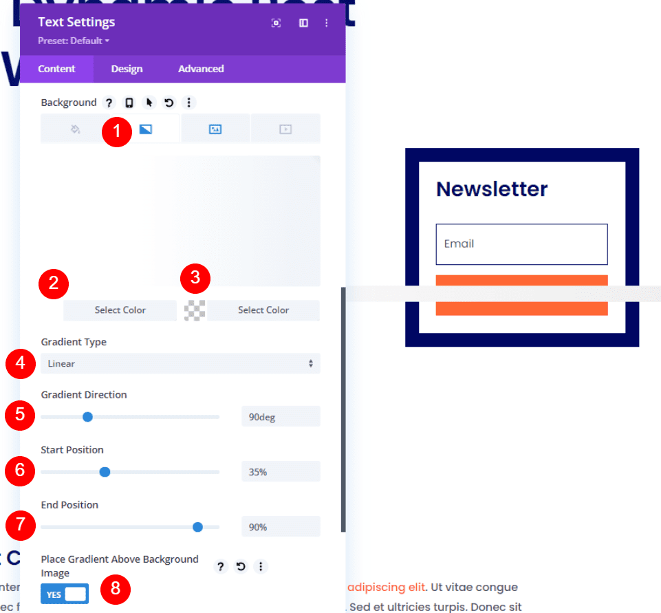
First, let’s look at the method this template uses. The featured image is selected Dynamically in the Section’s Background. It includes a white linear gradient with a direction of 90deg, a starting position of 35%, an end position of 90%, and it’s placed over the background image.
- First color: #ffffff
- Second color: rgba(0,0,0,0)
- Gradient Type: Linear
- Gradient Direction: 90deg
- Start Position: 35% (45% for Tablet)
- End position: 90%
- Place Gradient Above Background Image: Yes
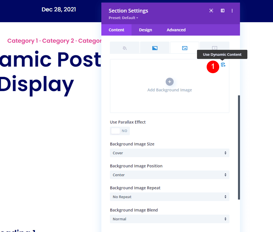
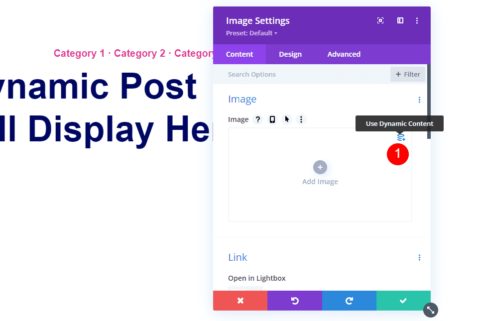
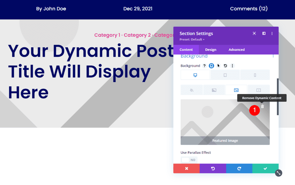
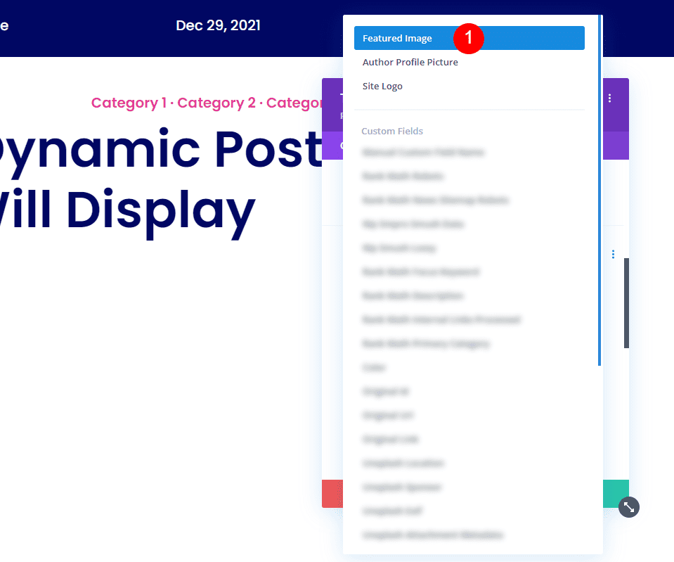
Select Image and click Use Dynamic Content.
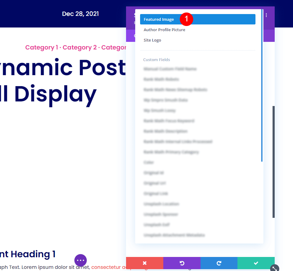
Select Featured Image at the top of the list. Save and exit. The featured image will now appear behind the content in that section.
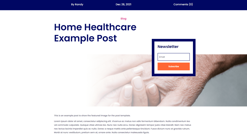
Add a Fullwidth Image to the Blog Post Template with the Post Title Module
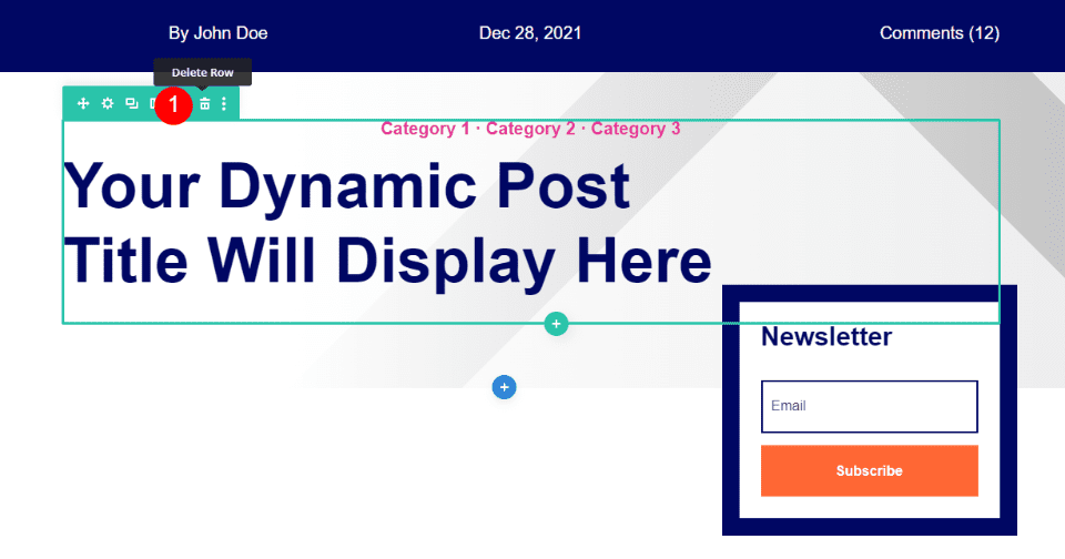
First, delete the row with the category and post title text. These are text modules. We’ll replace them with a post title module.
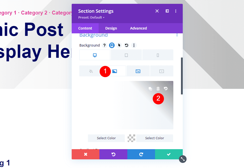
You’ll have a section with the background image and an optin module. Open the Section’s settings.
Scroll to the Background options, select the Gradient and delete it.
Select Image and delete it.
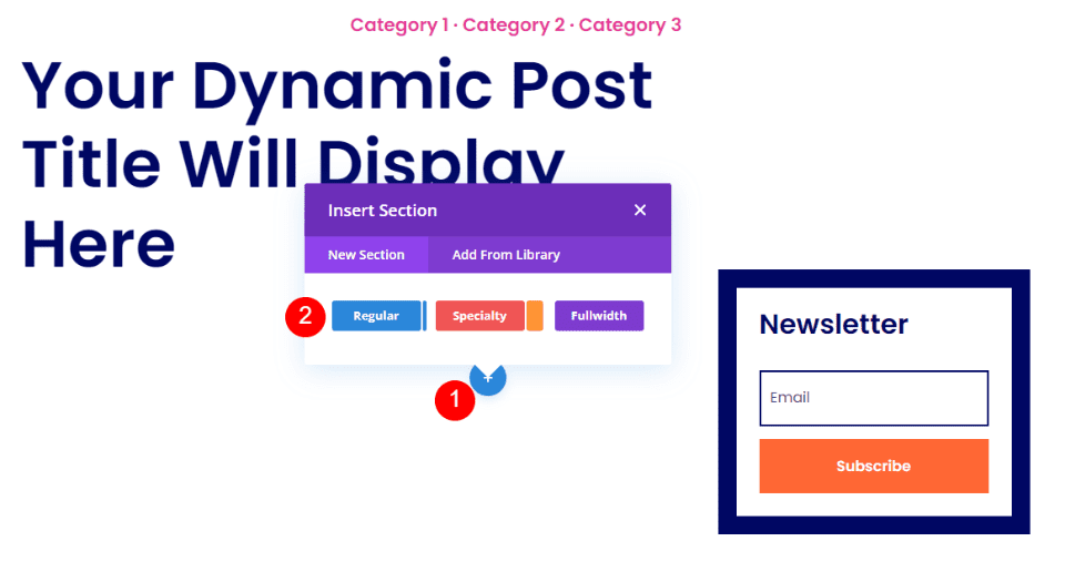
Fullwidth Section
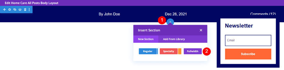
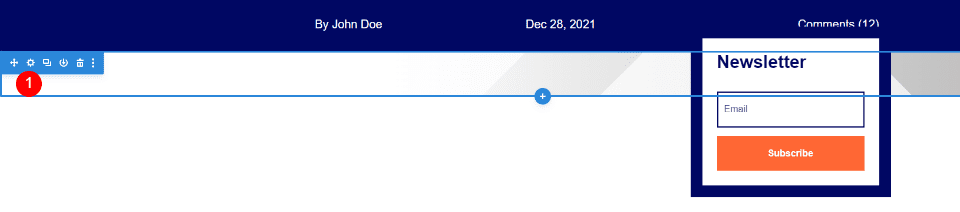
Hover over the top section and click the blue icon to add a new section. Select Fullwidth.
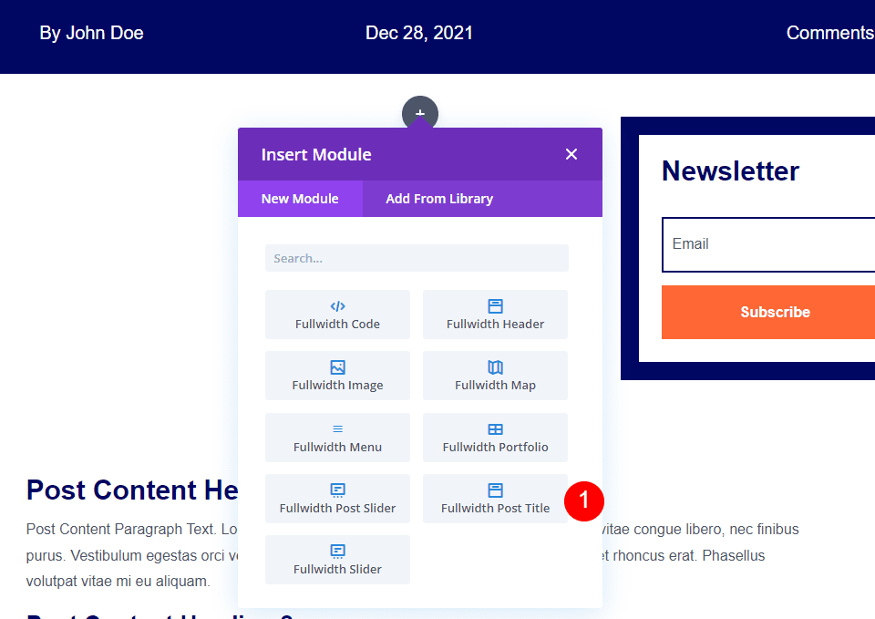
When the module modal opens, select the Fullwidth Post Title module.
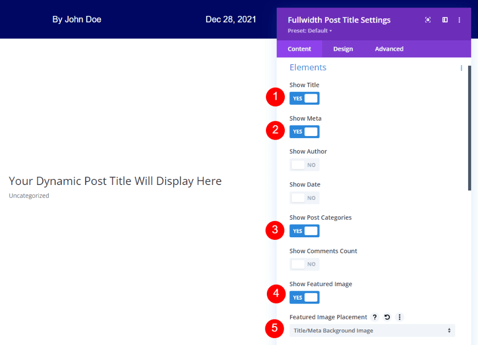
Select to show the title, meta, post categories, and featured image. Uncheck author, date, and comments count. For the Featured Image Placement, select Title/Meta Background Image.
- Show Title
- Show Meta
- enable Show Post Categories
- Show Featured Image
- Featured Image Placement: Title/Meta Background Image
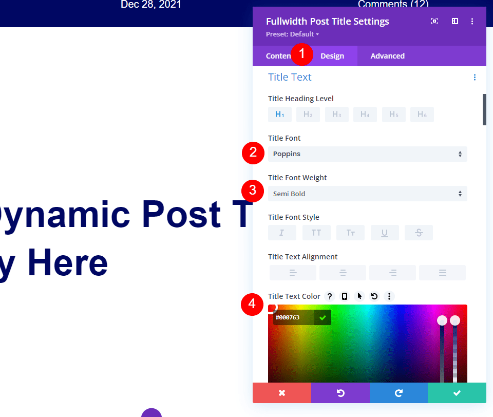
Open the Design tab and scroll to Title Text. Select Poppins for the font, semi bold for the weight, and change the text color to #000763.
- Font: Poppins
- Font Weight: Semi Bold
- Color: #000763
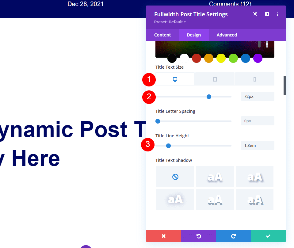
Set the Text Size to 72px for the desktop. Select the tablet icon and select 40px. Select the phone icon and set it to 34px. Set the Line Height to 1.3em.
- Text Size: 72px (tablet 40px, phone 34px)
- Line Height: 1.2em
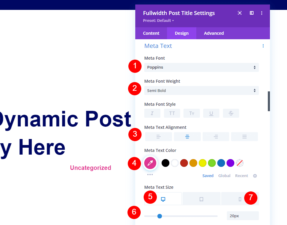
Scroll to Meta Text and choose Poppins for the font, semi bold for the weight, alignment to Center, and change the text color to # e53796. Set the Text Size to 20px for the desktop. Select the phone icon and select 14px.
- Font: Poppins
- Font Weight: Semi Bold
- Color: #e53796
- Text Size: 20px (phone 14px)
- Alignment: Center
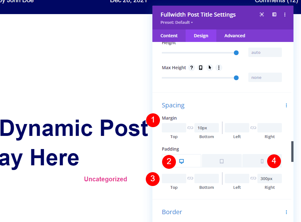
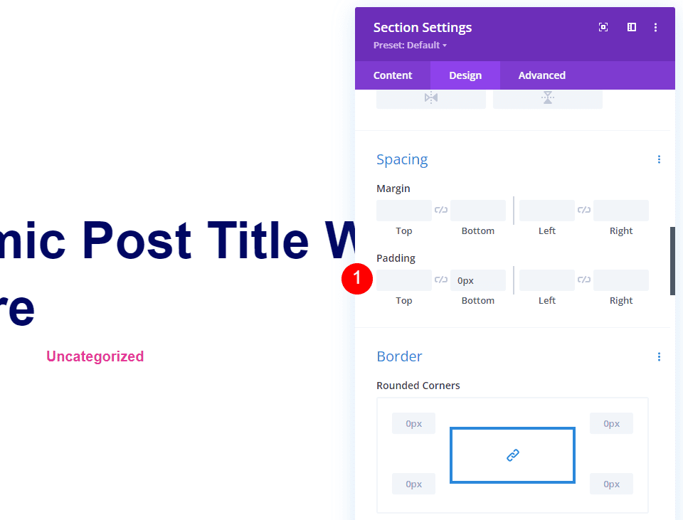
Scroll down to Spacing and set the Bottom Margin to 10px. Set the Right Padding to 300px for Desktop and 0px for Phone.
- Margin: Bottom 10px
- Padding: Right 300px (Phone 0px)
Add the Gradient
If you want it to have the same gradient as the original, open the Content tab, scroll down to Background. Choose Gradient and set the first color to #ffffff and the second color to rgba(0,0,0,0). Choose Linear for the type. Set the direction to 90deg, start position to 35%, and the end Position to 90%.
- First color: #ffffff
- Second color: rgba(0,0,0,0)
- Gradient Type: Linear
- Gradient Direction: 90deg
- Start Position: 35%
- End position: 90%
- Place Gradient Above Background Image: Yes
Go to the Design tab, scroll to Spacing, and set the Bottom Padding to 0px. Save your settings and close the builder.
- Bottom Padding: 0px
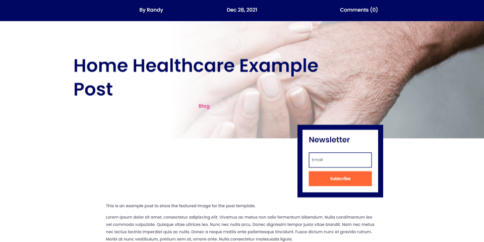
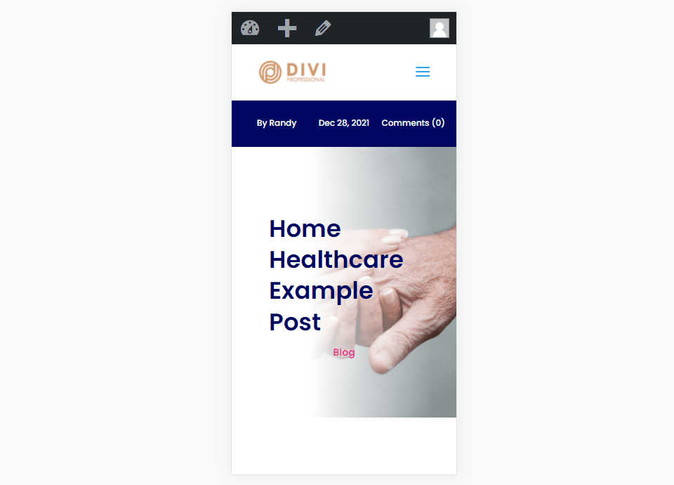
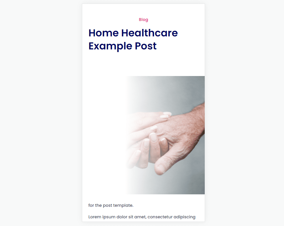
Add a Fullwidth Image to the Blog Post Template with a Separate Image in its Own Row
Open the settings for the Section with the post title and categories.
Scroll to Background. Select Gradient and delete it.
Select Image and delete it. Close the settings.
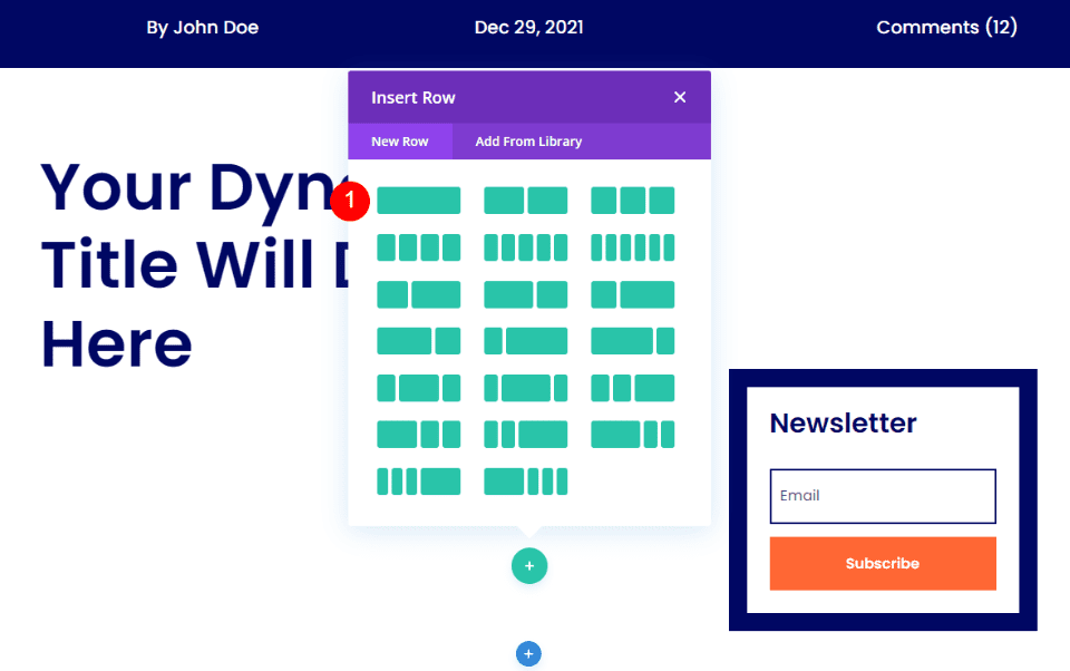
Add a New Row
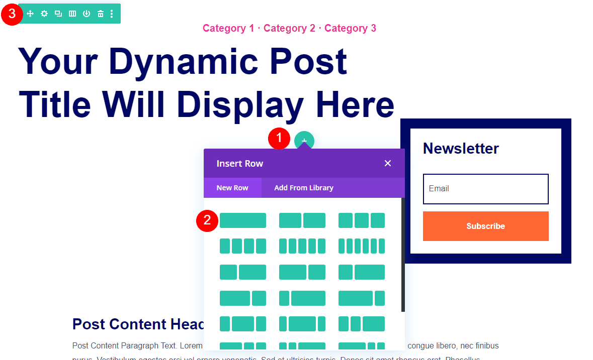
Hover over the Row with the title and click to add a new row. Add a single column row and drag the row above the row with the title.
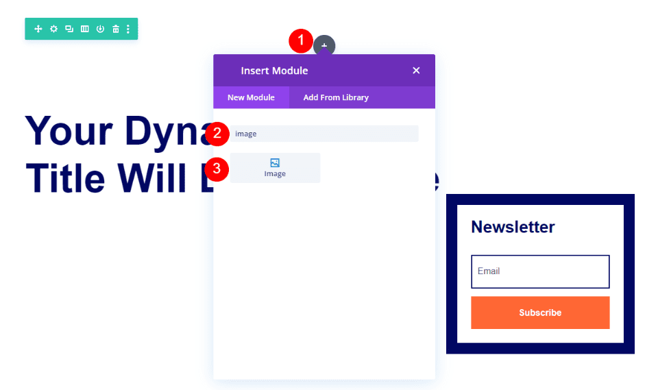
Hover over the new row and click the gray icon to add a new module. Search for Image and add it to the row.
Delete the placeholder image.
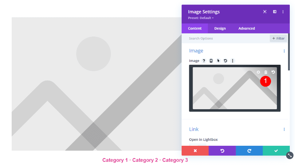
Select to Use Dynamic Content.
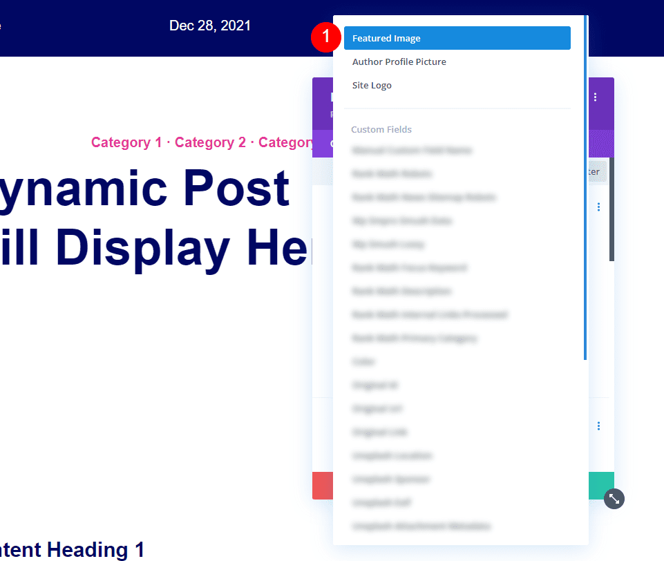
Next, select Featured Image from the list.
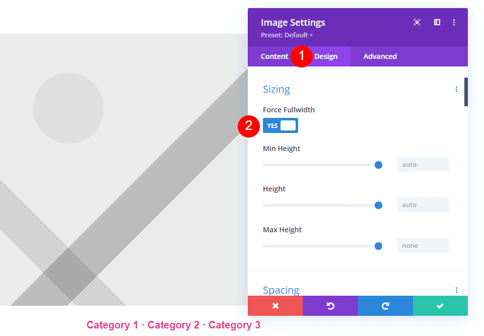
Select the Design tab and scroll to Sizing. Enable Force Fullwidth.
- Force Fullwidth: Yes
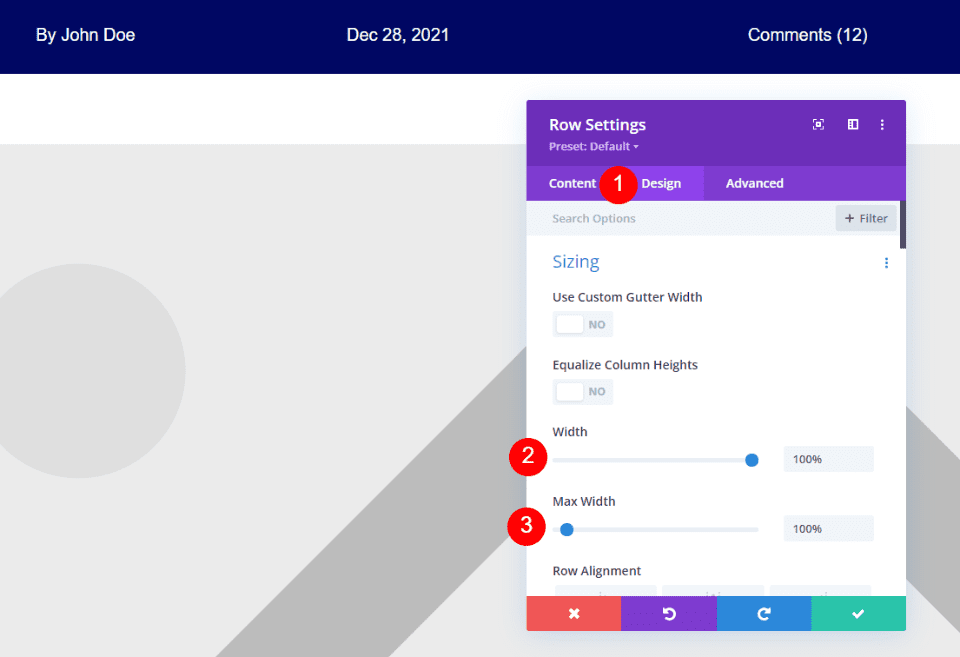
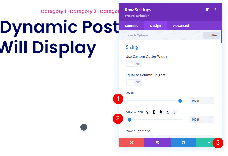
Open the Row settings and select the Design tab. Set both the Width and Max Width to 100%.
- Width: 100%
- Max Width: 100%
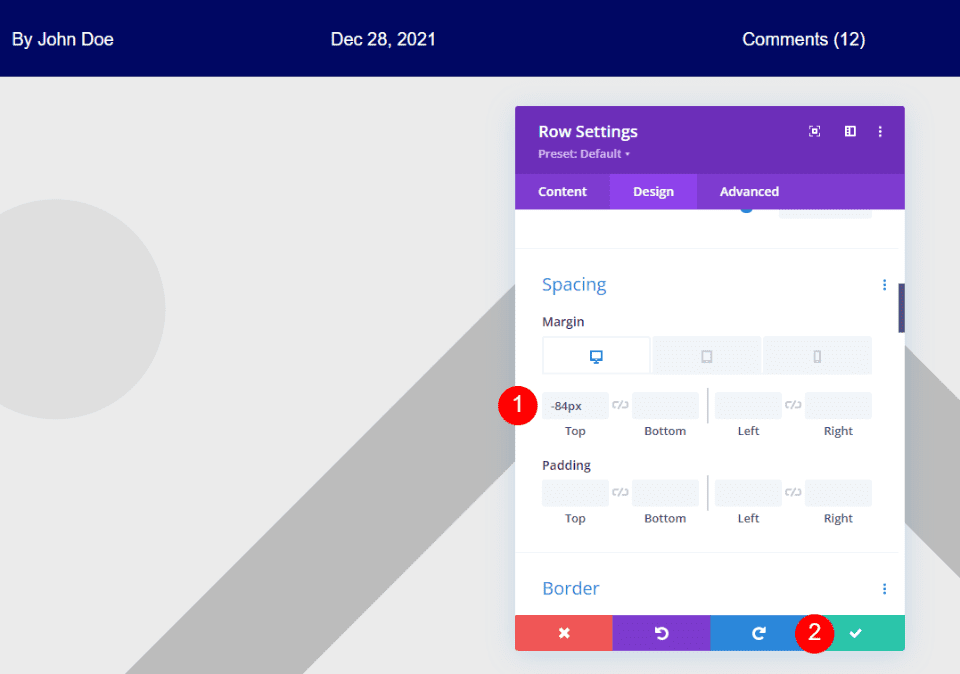
Scroll down to Spacing and add -84px to the Top Margin. Save your work and close the builder.
- Margin Top: -84
Add a Dynamic Fullwidth Image with a Text Module
First, open the settings for the Section that includes the post details and remove the gradient and dynamic image from the Section’s background.
Next, set the Section’s background to white and close the settings.
- Background: #ffffff
Hover over the section and click the blue icon to add a regular section under it.
Add a New Row
Add a single column row.
Open the Row settings and add 100% for the Width and Max Width under Sizing. Close the Row settings.
- Width: 100%
- Max Width: 100%
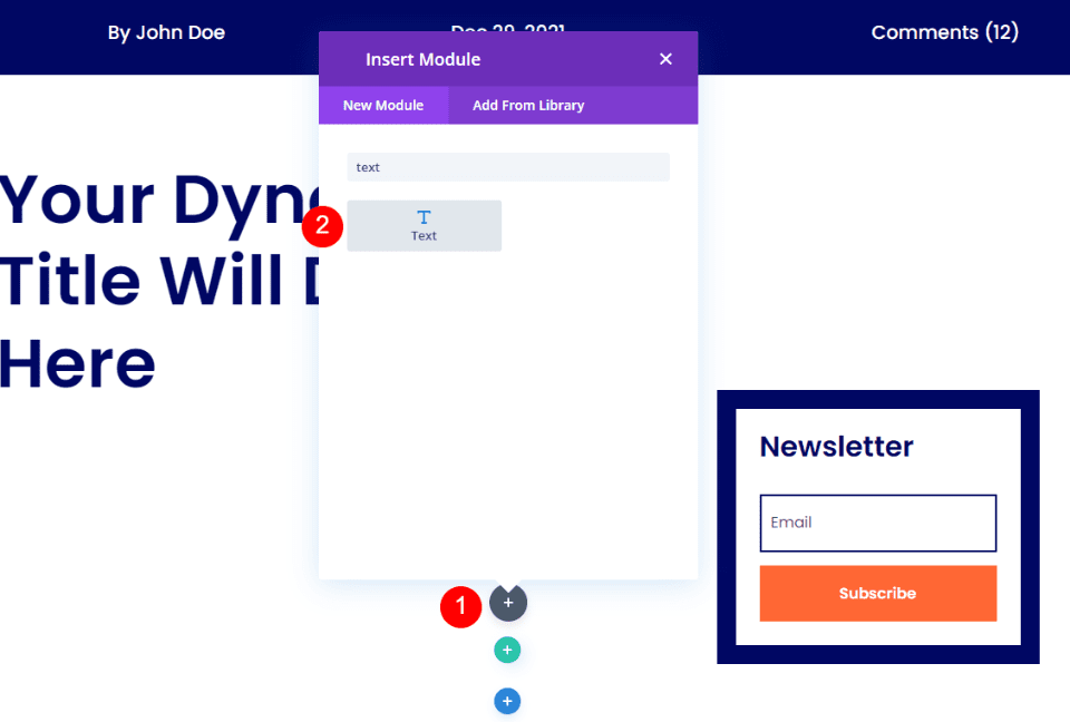
Next, add a Text module to the Row.
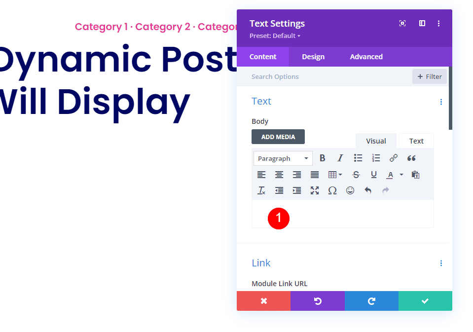
In the Text module settings, delete the dummy content in the body text editor.
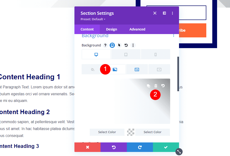
Scroll down to the Background settings, choose the Image tab, and select Use Dynamic Content.
Select Featured Image from the list.
Select the Gradient tab and choose white for the first color and white with no opacity for the second color. Keep Linear for the Type and set the Direction to 90deg, Start Position to 35%, and End Position to 90%. Check to place the gradient above the background.
- First color: #ffffff
- Second color: rgba(0,0,0,0)
- Type: Linear
- Direction: 90deg
- Start Position: 35%
- End Position: 90%
- Place Gradient Above Background Image: Yes
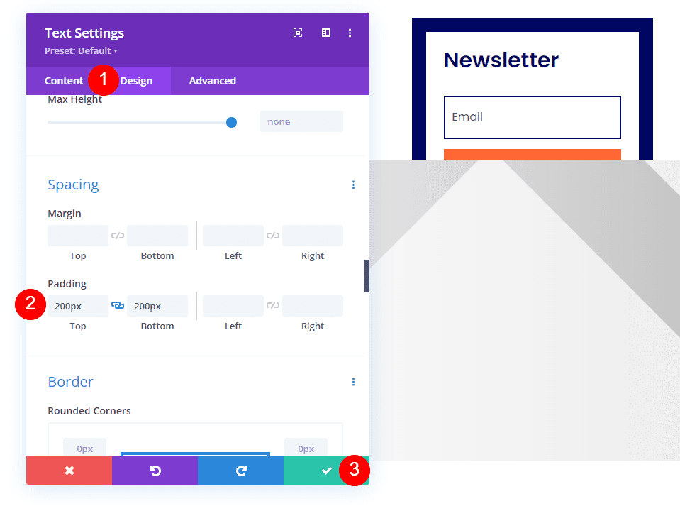
Select the Design tab and scroll to Spacing. Add 200px for the Top and Bottom Padding. Close the module’s settings.
- Padding: 200px (Top, Bottom)
Open the settings for the Section with the newsletter optin. We’ll make adjustments so that the newsletter appears above the featured image.
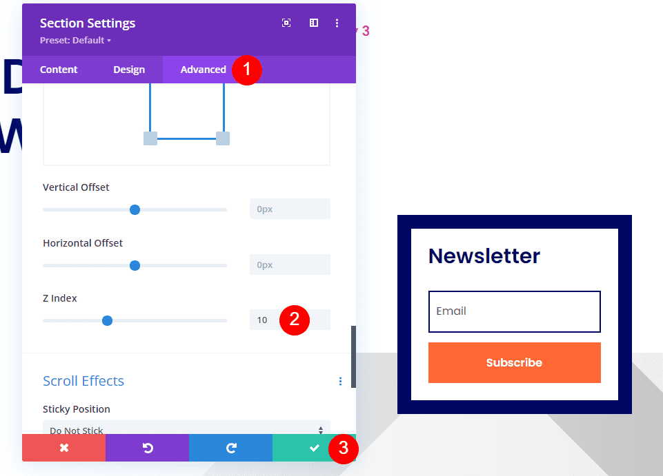
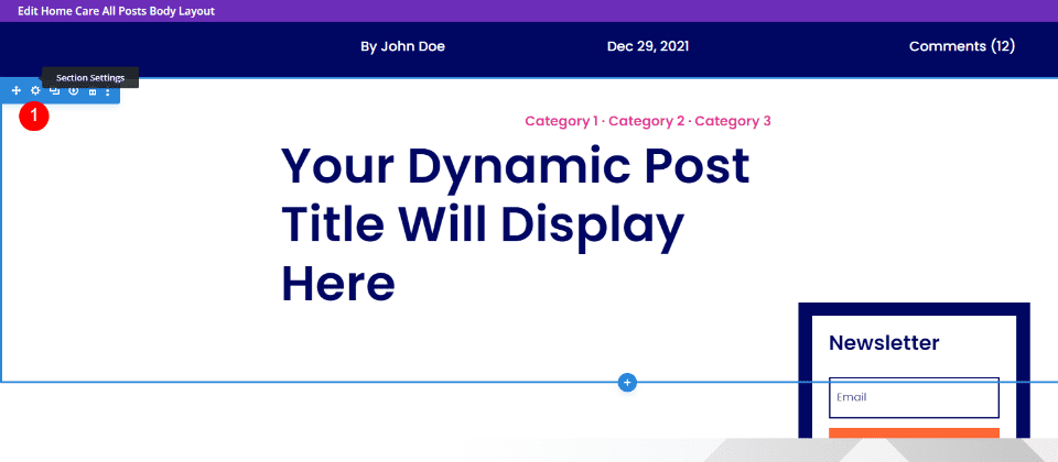
We’ll have to set the Z Index higher than the second section. Go to the Advanced tab and scroll down to Position. Set the Z Index to 10. Close the settings.
- Z Index: 10
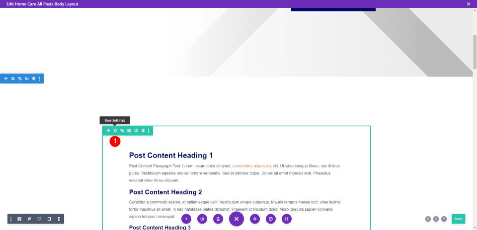
Next, we need to reduce the space between the featured image and blog post content. Open the Row’s settings that contain the blog post content.
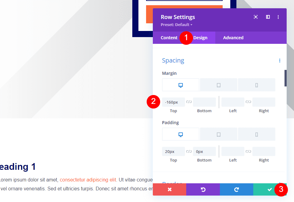
Select the Design tab, scroll to Spacing, and add -160px to the Top Margin. Close the settings.
- Margin, Top: -160px
Open the settings for the Section with the Text module and add 0px padding for the top and bottom. Close the settings and save your work.
- Padding: 0px (Top, Bottom)
Results
Dynamic Section Background Desktop
Dynamic Section Background Phone
Post Title Module Desktop
Post Title Module Phone
Separate Image Desktop
Separate Image Phone
Fullwidth Image with a Text Module Desktop
Fullwidth Image with a Text Module Phone
Ending Thoughts
That’s our look at four methods to add a fullwidth image to the blog post template. Each of the methods is easy to use and modify. This gives you several choices, so you can use the method that works best for you.
We want to hear from you. Do you use any of these methods to add a fullwidth image to your blog post template? Let us know in the comments.


Leave A Reply