
Responsive web design is a necessity these days. There are over 8 billion mobile devices active in the world today. And, with the growing rate of smartphones and tablets at an all time high, it’s possible some visitors may never see your site on a desktop, at least not at first. That’s why making a first impression on mobile is crucial and demands our attention.
Thankfully, the Divi Theme is responsive and uses a combination of fluid grid layouts and media queries that work well on all devices. Since the release of Divi 2.6, Divi has Responsive Editing Controls within the Theme Customizer and Divi Builder that allow you to easily view and adjust certain style elements based on desktops, tablets, and smartphones.
Although Divi does most of the heavy lifting for you, there may come a time when tweaks need to be made to your responsive design for certain screen sizes. That is why it is important to familiarize yourself with Divi’s responsive breakpoints – the points where the layout of your site changes to fit a certain screen size.
Today I’m going help you locate Divi’s responsive breakpoints and show you how to use media queries in your CSS to fine tune your design. I’ll even give you a list of Divi’s media queries you can use as a reference for future changes. But first, let’s take a look at Divi’s Responsive Editing Controls.
Using the Divi Builder Responsive Editing Controls
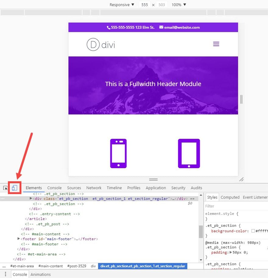
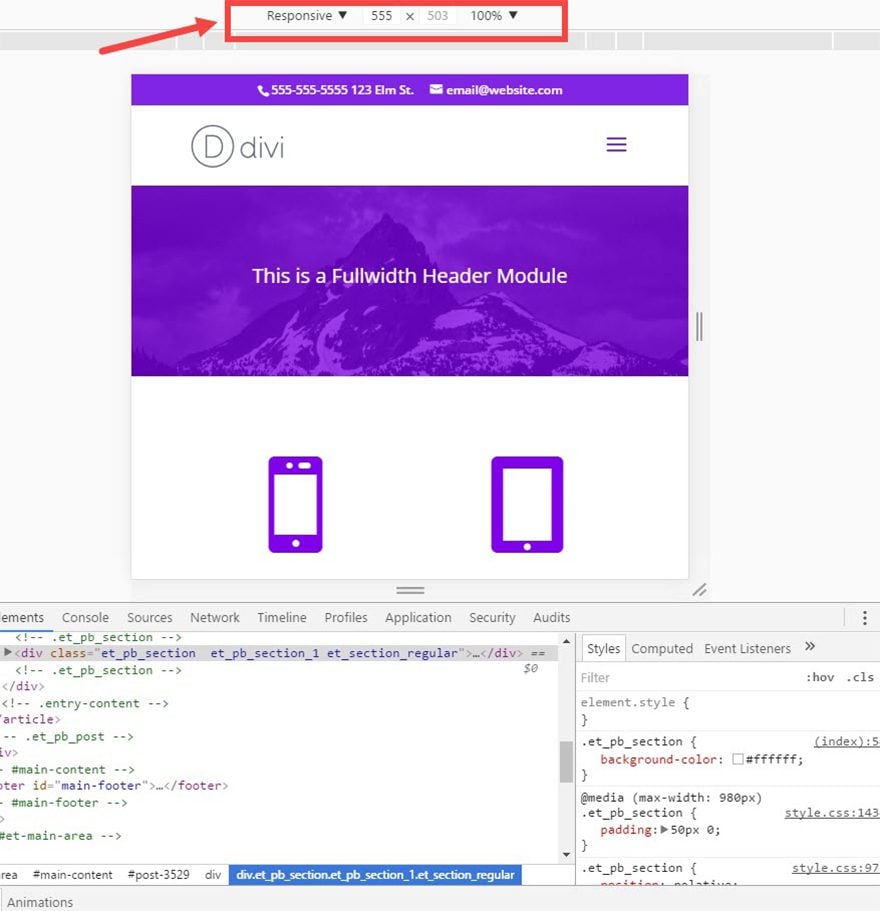
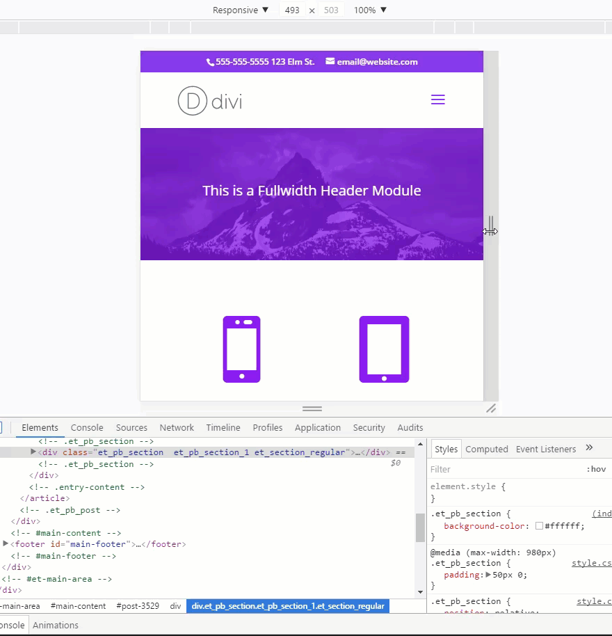
If you haven’t taken advantage of Divi’s Responsive Editing Controls, this is a great place to start. Divi has made it easy for you to view how your site renders on the three main devices (desktop, tablet, and phone).
You can view them from within the Theme Customizer which is helpful when making design changes to the theme. Simply click on the device icons at the bottom of the Theme Customizer sidebar.
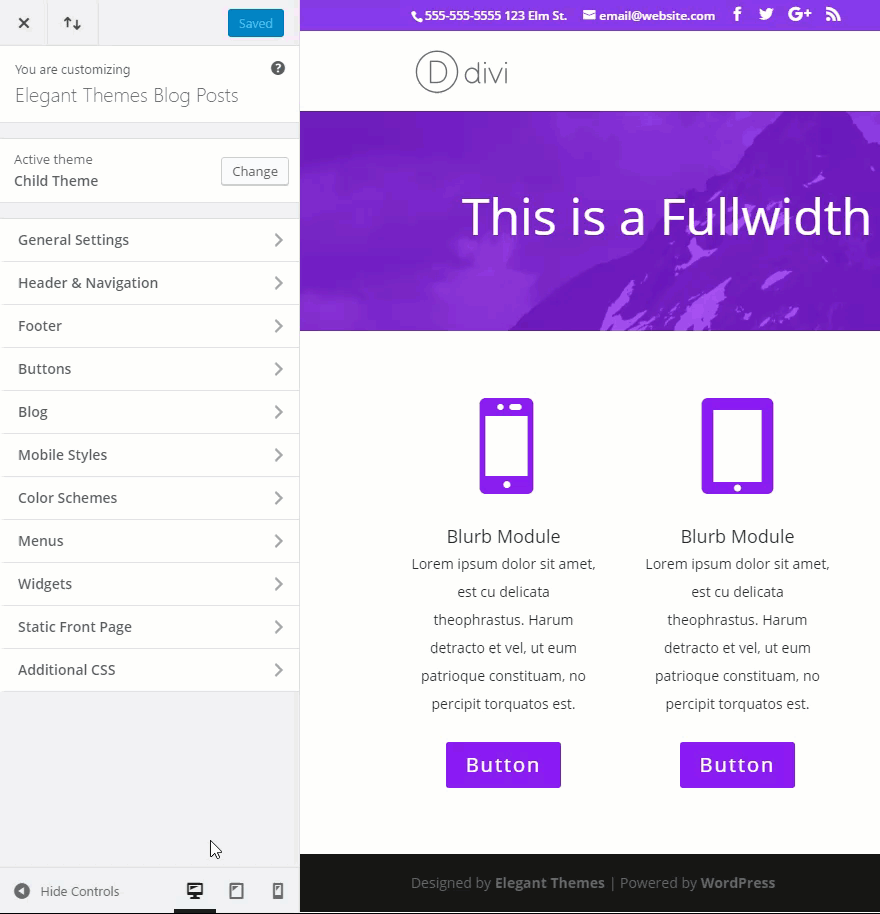
You can also view how each module renders on each device from within the Divi builder. When viewing the settings of any module, simply click the eye icon and click the different devices to view the content on each screen size.
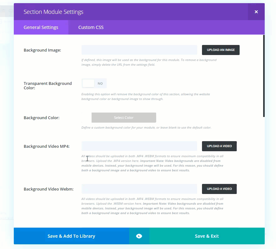
You can even tweak certain design settings for each of these devices. For example, let’s say you want to change how a blurb module heading font size is displayed on each device. To do this you would open Blurb Module Settings and, under the Advanced Design Settings, change the Header Font Size. You will notice a small phone icon that pops up. Click on the phone icon to adjust the same header font size for each device.

Pretty simply right? This is a convenient option for basic responsive design tweaks. But sometimes you need more advanced edits to Divi’s breakpoints. For that, you should look at Divi’s media queries for a deeper understanding.
Divi’s Built-In Media Queries
Media Queries are basically a way to compartmentalize CSS by media type. In this case the media type will be set to “all” (meaning suitable for all devices). The other media types are print, screen, and voice. In CSS, the media type is usually followed by a media feature which in this case will be the device width. After the media type and features are set, you can include a set of nested CSS within brackets that will only be applied for that Media Query.
Look at the following example media query:
@media all and (max-width: 980px) {
h1 {
font-size: 30px;
}
}
Notice “all” defines the media type and “(max-width: 980px)” is the media feature that specifies the width of the device to which the bracketed CSS should be applied. In this example, the h1 font size will be 30px only on a screen that is 980px or below.
The general ranges of width for each device are as follows:
Large Desktop: 1405px and above
Standard Desktop: between 1100px and 1405px
Laptops and Large Tablets: between 980px and 1100px
Tablets: between 768px and 980px
Smartphones and small Tablets: between 320px and 768px;
Smartphones: between 320px and 480px;
Here is a list of the main media queries used in the Divi Theme. You can use this as a helpful template for your custom CSS.
/*** Responsive Styles Large Desktop And Above ***/
@media all and (min-width: 1405px) {

}

/*** Responsive Styles Standard Desktop Only ***/
@media all and (min-width: 1100px) and (max-width: 1405px) {

}

/*** Responsive Styles Tablet And Below ***/
@media all and (max-width: 980px) {

}

/*** Responsive Styles Tablet Only ***/
@media all and (min-width: 768px) and (max-width: 980px) {

}

/*** Responsive Styles Smartphone Only ***/
@media all and (max-width: 767px) {

}

/*** Responsive Styles Smartphone Portrait ***/
@media all and (max-width: 479px) {

}
Fine Tuning Your Designs with Media Queries
You can use Divi’s built-in media queries to add custom CSS targeted for each device. I suggest using the Theme Customizer for this. It allows you to add your Custom CSS to your theme and see the results for each device in real time all in one place.
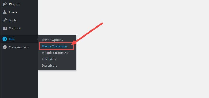
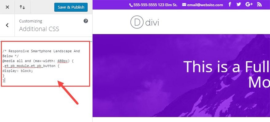
From your WordPress Dashboard, go to Divi → Theme Customizer.
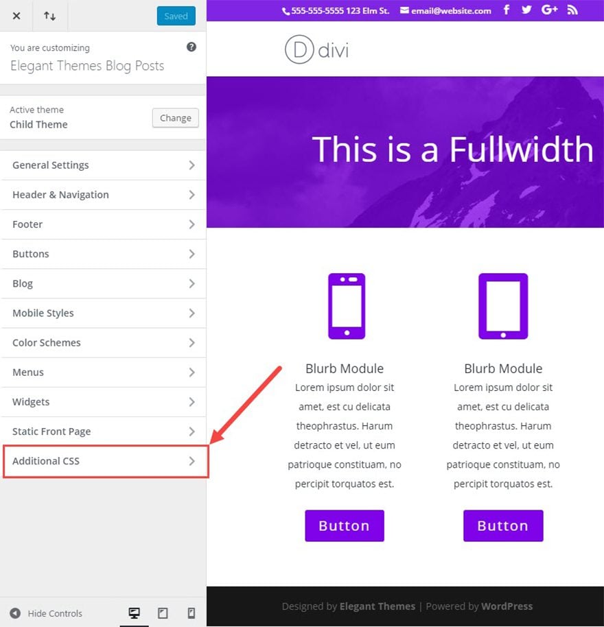
Then select Additional CSS at the bottom of the sidebar.
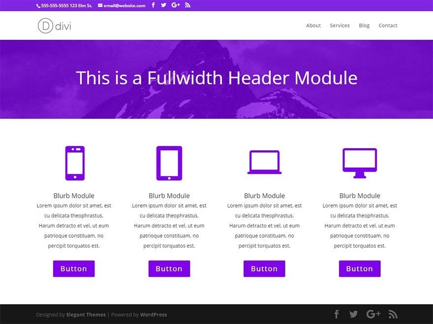
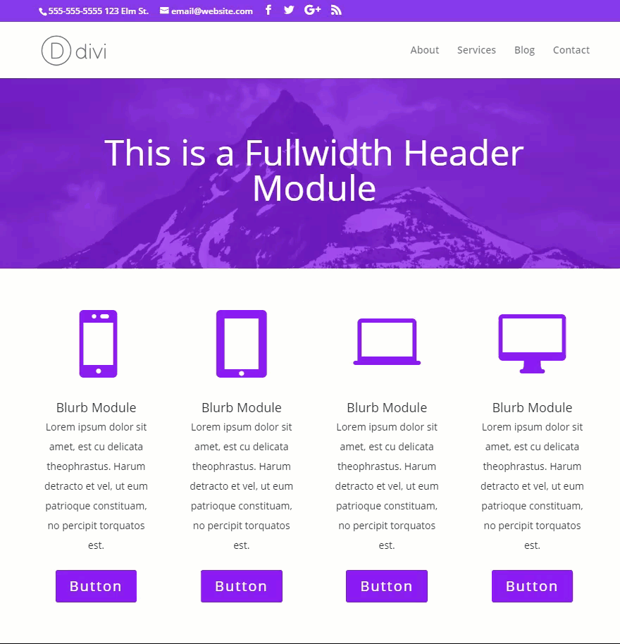
For this example, I have a mock page built with a header and four blurb modules with a button module under each.
Let’s say you want to increase the width of the buttons only on smartphones. To do that copy the following media query that targets smartphones:
@media all and (max-width: 480px) {

}
Then add the CSS you want for that new button style inside the brackets of my media query like this:
@media all and (max-width: 480px) {
.et_pb_module.et_pb_button {
display: block;
}
}
Then paste the media query inside the Additional CSS text box.
Now you can toggle between device views by clicking on the device icons at the bottom of the Theme Customizer sidebar to see the changes.
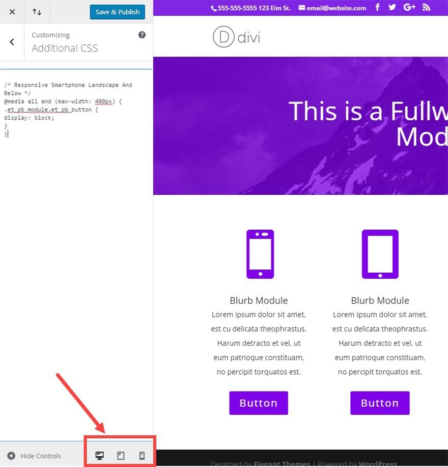
Notice the change of the button width on the smartphone device view.
Targeting more specific widths using browser developer tools.
For certain designs, Divi’s built in breakpoints aren’t specific enough. Sometimes you need to add your own custom breakpoints and Media Queries. For example, you may find that your header needs an adjustment right at the 1000px width instead of waiting for it to break at Divi’s 980px width. To make these kind of adjustments, you can use your browser’s developer tools to pinpoint those breakpoints.
If you are using Chrome, they have tool that will allow you to test responsive and device-specific viewports. To access the tool, right click on the screen and select inspect element from the drop down menu that appears. Click the small Device Toolbar icon.
Then use the menu at the top to change the device view or set a custom width.
You can even drag the size of the screen to pinpoint any problems you need to address along with the exact width you need to target.
Once you have pinpointed the breakpoint, create a media query for your custom CSS change. For example if you need to change your h1 font size to 30px between 780px and 1000px, you would create the following media query and add it to your custom CSS:
@media all and (min-width: 780px) and (max-width: 1000px) {
h1 {
font-size: 30px;
}
}
That’s it!
Final Thoughts
Most of what you need for a responsive website is already built in to Divi. Depending on your site design, however, you may need to add more custom CSS to Divi’s breakpoints using Divi’s built-in media queries. And if that’s not enough, you can always find the breakpoints you need using browser developer tools as well.
There are many tools out there. Firefox has a responsive design mode you can use. If you use Safari, they have a new Responsive Design Mode as well.
I look forward to hearing from you in the comments!


Awesome information. We’ll use it in our new web design for smartphones.
Thanks for this – great stuff.
Is it possible to add this to an individual module – I have ONE CTA module on a page and I need it’s heading (which I believe is h2) to change size at a few different breakpoints. Not quite sure if this solution will work or where I would put it in the modules custom css. I tried adding:
@media all and (min-width: 980px) and (max-width: 1180px) {
h2 {
font-size: 12px;
}
}
as a test under “main element” and under “promo title” with no luck but don’t want to put it under divi’s custom css and have it apply to everything on the site.
Hi David,
In the CTA module custom CCS area, give the CLASS ID FIELD a name like specialcss. Then in the divi options css field place :
@media all and (min-width: 980px) and (max-width: 1180px) {
.specialcss h2 {
font-size: 12px;
}
}
This will only apply the css code to that particular CTA module.
I hope this helps.
Cheers
Thanks for a great article.
Can I make a request to Elegant Themes for the addition of a Landscape Tablet option in the divi responsive settings, rather than the Tablet option that we have now which only affects the Portrait mode. This would be SO useful as many people (if not most?) hold their tablet (ipads in particular) in landscape mode.
Thanks again.
I cannot see the icon on the Blurb Module detail under advanced design settings?
Here is link for the image I see
https://jamesstrauss.com/wp-content/uploads/2017/03/Blurb.png
Thank you?
Hello I need help, I use thema divi and my menu has no background because I have an image on each page, but in the mobile I would like to appear with a background since at the moment of seeing it in the mobile you can not read the letter, there is some code Css for this? I hope you can help me
Another thing because I do not have the update in advanced desing settings to configure the size on Desktop, tablet and smartphone?
I already update my subject but it still does not appear
mi sitio aun esta en proceso
Leonor,
This kind of request is best handled by our support team here in our members area: https://www.elegantthemes.com/forum/
Please open a ticket and they will get you what you need.
Thanks
Thanks for this post, Jason. One of the biggest improvements in Divi for me would be, to have an option, to set the breakpoint, on which the horizontal nav changes to the hamburger menu. This way you could set up your regular horizontal nav, and then scale down the with of the page, until the horizontal nav reaches the logo on the left. It would be so easy, if one could set this width in Pixels in a theme options field and the nav would never get on to lines and breaking all the layout…
But good article anyway :).
Great idea, Christoph. Thanks for the suggestion. This is somewhat of a pain when you are trying to list a lot of menu items up there. when I’m face with this problem, I normally resort to shortening the names of the menu items, shrinking the font on smaller screensizes, and displaying the hamburger nav at greater breakpoint.
Thanks Jason for the tutorial
Very useful!
Thank you Jason for the informative post, much appreciated!
The list of main media queries is great and will be very useful on future sites. Thanks!
I have needed this post forever!! Thank you so much for sharing such thorough and clear information… I am so grateful!
You are very welcome, Claire. Enjoy!
Thanks for this article. I have always found the CSS queries elsewhere, but it’s nice to get them straight from the source.
The post I’ve been waiting for! Great help here.
We’re having some issues getting our menu to render nicely, mostly because of the number of menu parents we need…what would you recommend for us?
Either we need ours to break the menu onto two lines nicely, or cut to hamburger sooner – preferably the former!
Levi,
If it were me I would cut to the hamburger sooner. Are you using the default menu layout for you nav? Have you considered using the centered nav with the logo at the top of your menu? This would give you more room. But may throw the style off.
Thanks
Thanks for the GREAT post Jason!!! Very helpful information and a long overdue and needed easy to understand explanation of how the media breakpoints work in Divi.
One question though. Why is it better to put the custom css in the additional css section in the customizer versus say the child themes css or the divi options panel. If you use the child theme’s style.css, can you still see the changes in real time in the customizer? I never understood why there are so many places to put in custom css in divi.
Thanks again…
Shawn
Thanks for the feedback, Shawn!
See my comment above for best practices.
Also, I believe the custom CSS areas in Divi are for those who aren’t comfortable editing the style.css file and some users do not use a child theme so using the custom css areas will allow them to keep their styling when updating Divi.
Hi! Who knows why do we have the “Additional CSS” tab in both theme customizer and module customizer?
The Additional CSS in the Theme Customiser was introduced in WordPress 4.7 as an easy way to modify the Theme’s CSS without resorting to a Child Theme.
Although of course a Child Theme is still best practice…
Yes. I agree. It is always best practice to keep all CSS in one place. My suggestion would be to use the Custom CSS areas in Divi while building and then copy and paste everything in your child theme style.css file when you are ready to go live.
yeah, but why is it duplicated to the module customizer as well?
And in the Divi options Custom CSS section on the general tab as well.I agree with ProWP, child theme stylesheet 😉
I would suggest because the theme customiser adds the CSS to the theme whereas the module customiser adds the CSS only to the module you are applying it to.
Navigate to theme customizer and you will “Additional CSS” that was added since WP 4.7 but module customizer have the same “Additional CSS” tab and I’m wondering why ET duplicated this tab…
There are times where you don’t want your entire site bogged down by CSS that is specific to only one page or module. That’s the advantage of having custom CSS for just a module.