
Showcasing work experience and skills online is a great way to set yourself apart as a freelancer. With Divi, you can create a unique timeline to display your work history in a way that is both clean and professional. And, by getting a little creative with Divi’s circle counter module, you can also add an animated infographic to highlight your skills.
In this tutorial, I’m going to show you how you can use the Divi Builder to design a standout work experience and skills section for your website. See how Divi can replace a whole separate plugin for creating timelines.
Let’s get started.
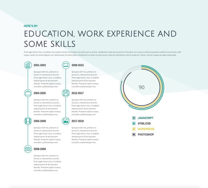
Sneak Peek
Here is a preview of what we will be creating in this tutorial.

Create Your Title Section
The create your title section, add a one-column row with a text module.
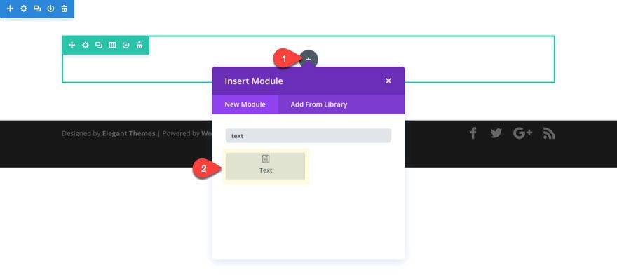
For the content of the text module, enter the following html:
<h2>Here's my</h2>
<h3>Education, Work Experience and Some Skills</h3>
<p>Proin eget tortor risus. Curabitur non nulla sit amet nisl tempus convallis quis ac lectus. Vestibulum ante ipsum primis in faucibus orci luctus et ultrices posuere cubilia Curae; Donec velit neque, auctor sit amet aliquam vel, ullamcorper sit amet ligula. Vestibulum ac diam sit amet quam vehicula elementum sed sit amet dui. Donec rutrum congue leo eget malesuada.</p>
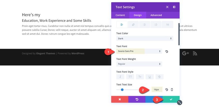
Update the design tab setting for your text module as follows:
Text Font: Source Sans Pro
Text Text Size: 16px
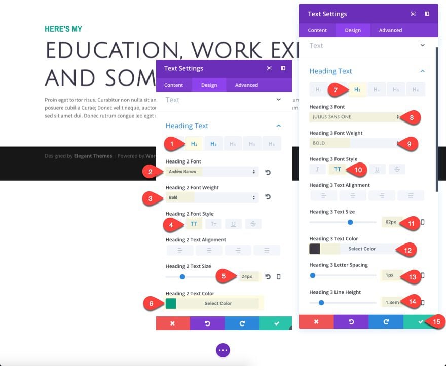
Since we have both an h2 and an h3 header in our content, we need to design both of them.
Heading 2 Font: Archivo Narrow
Heading 2 Font Weight: Bold
Heading 2 font Style: TT
Heading 2 Text Size: 24px
Heading 2 Text color: #06a08c
Heading 3 Font: Julius Sans One
Heading 3 Font Weight: Bold
Heading 3 Font Style: TT
Heading 3 Text Size: 62px
Heading 3 Text Color: #3d394b
Update Row Settings
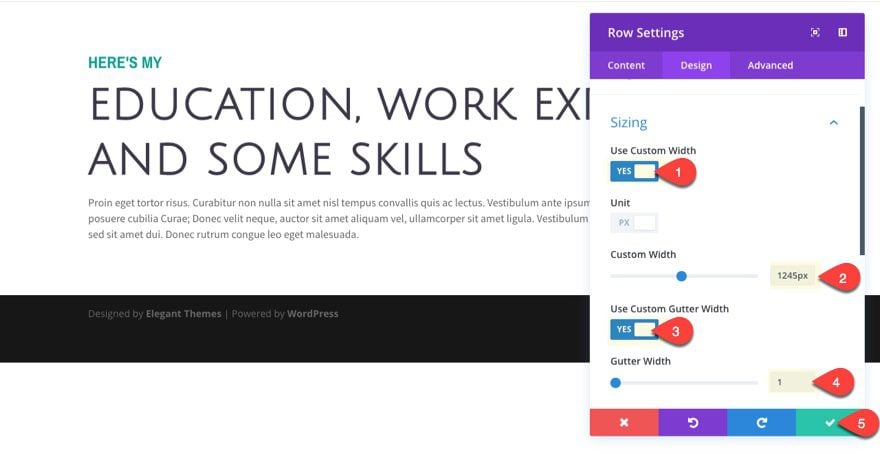
Now that you have finished entering the content for the title of the section, update the row settings to give it a little more spacing as follows:
Use Custom Width: YES
Custom Width: 1245px
Use Custom Gutter Width: YES
Gutter Width: 1
Create Your Work Experience Timeline
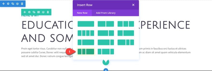
To create your work experience timeline, add a new row with a one-fourth one-fourth one-half column layout.
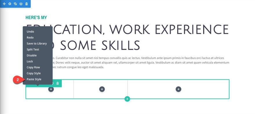
Before you add your first module, we need to match the style of the above row with our new row. To do this, use the right click options to copy the style of the first row above and paste the style to the row you just added.
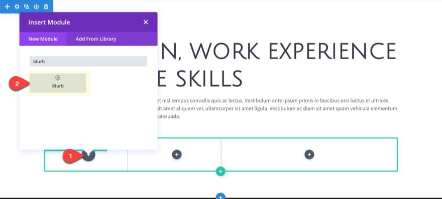
In the first column, add a blurb module.
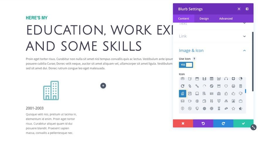
Then update the blurb module settings as follows:
Title: 2001-2003
Content: Quisque velit nisi, pretium ut lacinia in, elementum id enim. Proin eget tortor risus. Curabitur aliquet quam id dui posuere blandit. Praesent sapien massa, convallis a pellentesque nec.
Use Icon: YES
Icon: select an icon
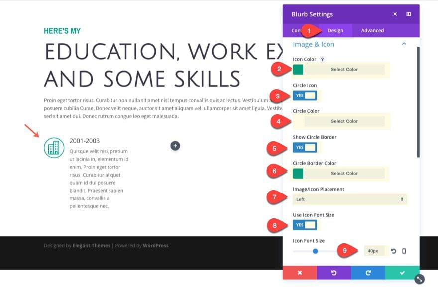
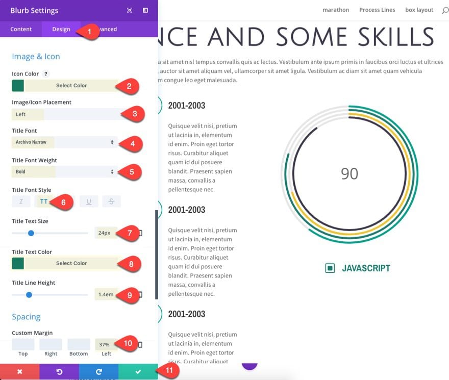
Under the design tab settings, update the options for the icon design as follows:
Icon color: #06a08c
Circle Icon: YES
Circle color: #ffffff
Show Circle Border: YES
Circle Border Color: #06a08c
Image/Icon Placement: Left
Use Icon Font Size: YES
Icon Font Size: 40px
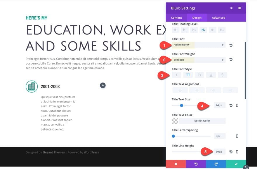
Now update the title and body text design options as follows:
Title Font: Archivo Narrow
Title Font Weight: Semi Bold
Title Font Style: TT
Title Text Size: 24px
Title Line Height: 60px
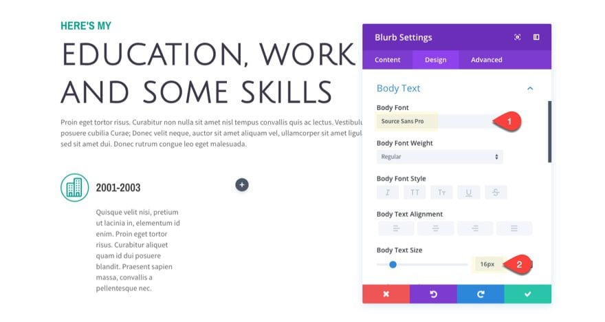
Update the body text settings as follows:
Body Font: Source Sans Pro
Body Text Size: 16px
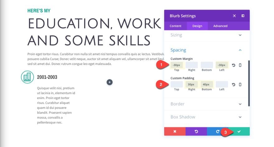
Now let’s position our blurb module so that it will overlap the left border line we will create later on for our row. Update the following:
Custom Margin: -30px Top, -30px Left
Custom Padding: 30px Right, 40px Bottom
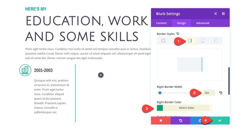
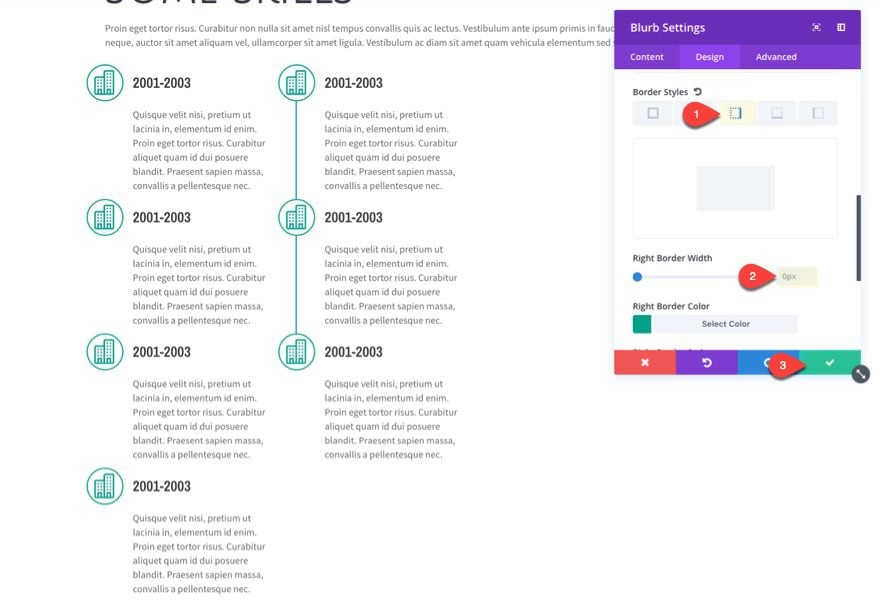
We need to create a right border line to use for the continuing timeline on the second column. To do this we are going to create a right border on this blurb module. Update the following:
Border Styles: right border
Right Border Width: 2px
Right Border Color: #06a08c
Now we are ready to duplicate our blurb module to create our additional timeline content. Duplicate the blurb module three times to create a total of 4 blurb module in the first column.
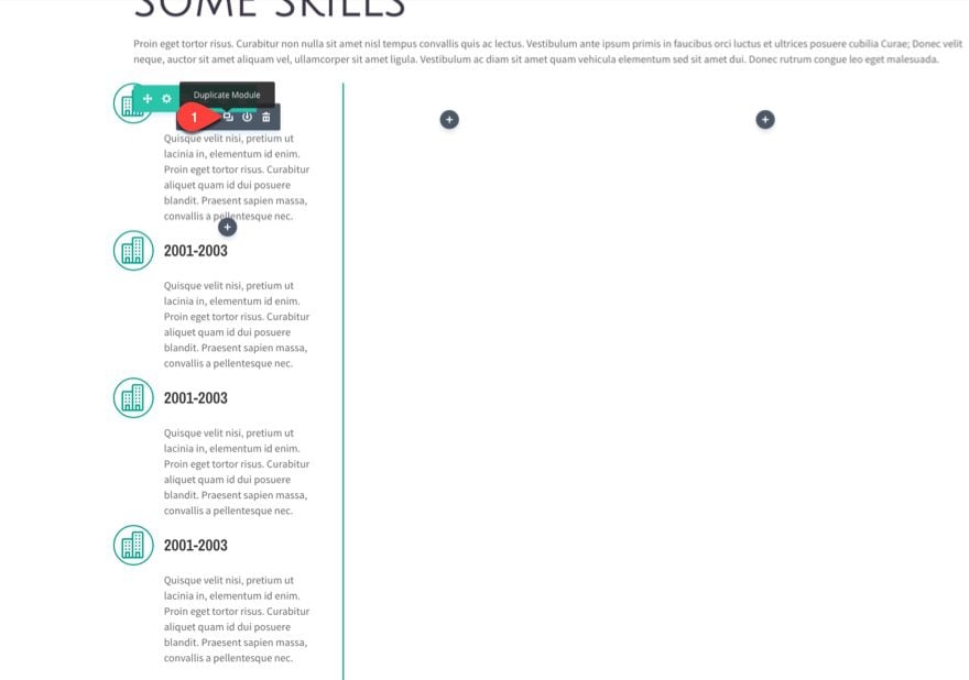
Next copy the same blurb module and paste it into the second column. Then take out the right border for the blurb module now sitting in the second column.
Now duplicate that blurb module twice to create a total of three blurb module in the second column.
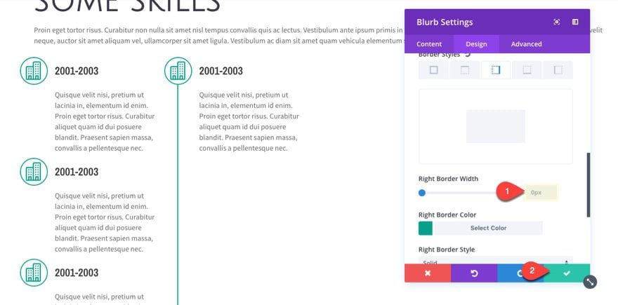
We need to get rid of the extra line space below the second column blurbs by taking out the right border of the last two blurbs in the first column. To do that update the last two blurb modules in the first column with the following:
Right Border Width: 0px
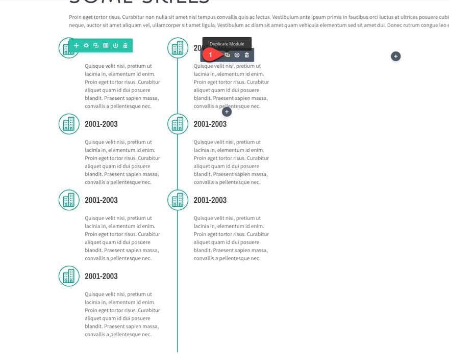
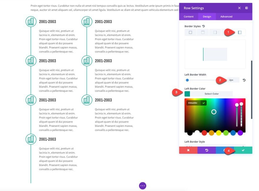
Now we need to add the left border to our row in order to attach the blurb icons in the first row. To do that, update the row settings as follows:
Border Styles: Left Border
Left Border Width: 2px
Left Border Color: #06a08c
Now update the row spacing a little.
Custom Padding: 28px Top, 0px Bottom
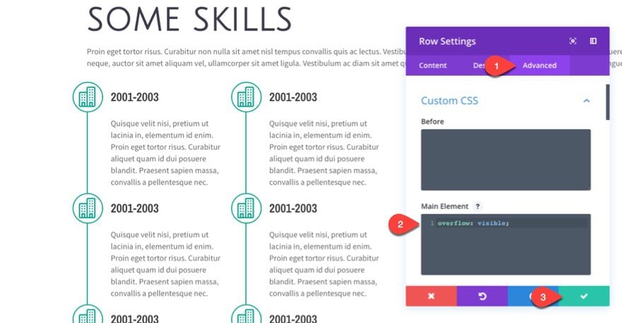
Since our icons are extending past the left border of our row, we need to add a single line of custom css to make sure the rest of the icon is visible. To do this, go to the advanced tab of the row settings and enter the following under the main element box:
overflow: visible;
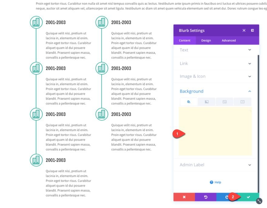
In order to hide the left over border line next to the last blurb in the first column, we need to give that blurb module a white background color. This works because the blurb module is already moved over to the left with with a -30px left margin.
Overlap Circle Counter Modules to Create a Skills Infographic
Instead of spacing out 4 different circle counter modules to illustrate your levels of skill on a page, you can create different sizes of each circle counter and overlap them to create one single infographic. With the built in animation, it really makes for an impressive illustration.
Add Your First Circle Counter Module
To do this, first, we must create our first of four circle counter modules. Let’s add our first one to the far right column of our row next to our timeline.
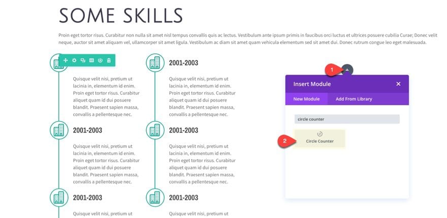
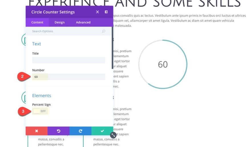
Since we are going to be layering our circle counter module with others, we don’t want this first one to actually show the number value. But we do want to set a number value in order to display the animated color bar. Update the Circle counter settings as follows:
Number: 60
Percent Sign: OFF
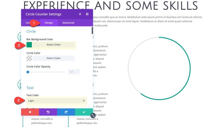
Under the design tab…
Bar Background color: #06a08c
Text Color: Light (this will hide our text on the white background)
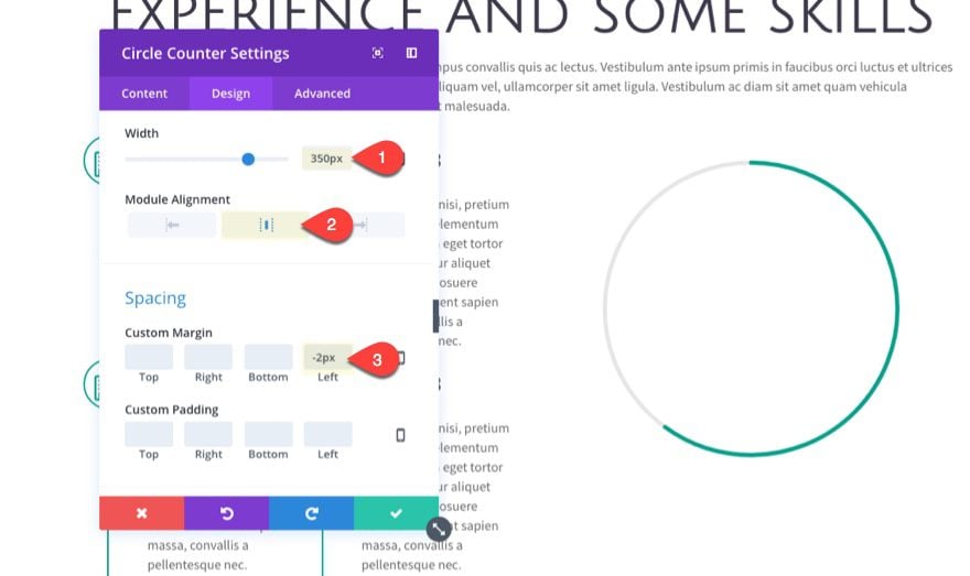
Width: 350px
Module Alignment: Center
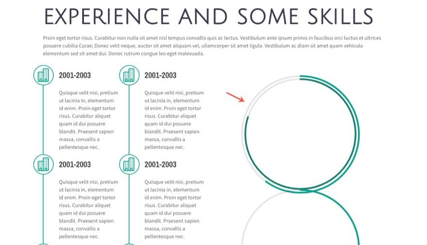
The Width of 350px will gradually decrease with each circle module we add on top of the previous one to complete the infographic design.
Custom Margin: -2px Left (this is to hide the green left border that will show next to the circle module on mobile)
Since we are going to be doing a some overlapping of modules, deploy the wireframe view to complete the next three circle modules. Then duplicate the circle module three times so that you have a total of four circle counter modules in the far right column of the row.
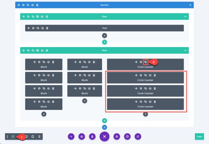
Now we need to update the design and place the three duplicated circle counter modules to complete the rest of the illustration.
Design and Place the Second Circle Counter
Update the settings for the second circle counter (the one under the original) with the following:
Number: 80
Bar Background Color: #187d6f
Width: 330px
Notice I decrease the width of the circle counter by 20px from the first one. That way it will fit nicely in the middle of the larger circle. Now we need to bring our circle counter up with a negative margin.
Custom Margin: -338px Top
Now save your settings and take a preview of your page. You should see the circle fits inside the other.
Continue this process with the next two circle counters.
Design and Place the Third Circle Counter
For the third circle counter, update the following settings:
Number: 70
Bar Background Color: #eec42d
Width: 310px
Notice I descreased the width of the circle again by 20px. This is to make sure the spacing between the overlapping circles are an even distance apart.
Custom Margin: -318px Top
Notice the custom margin is also decreased by 20px to account for the proper vertical spacing between overlapping circles.
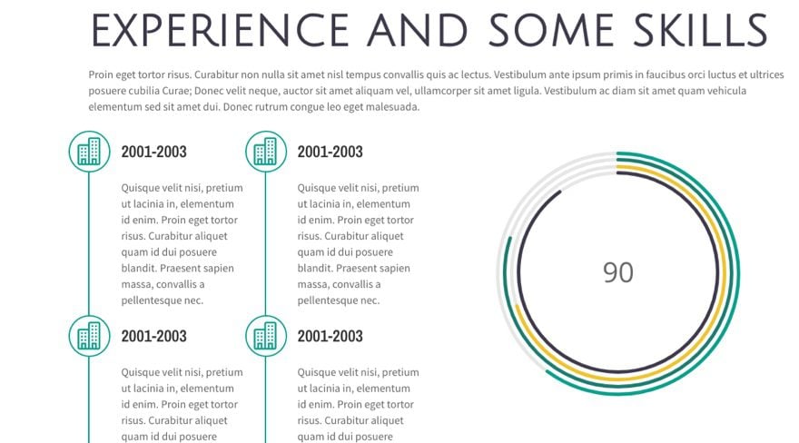
Design and Place the Fourth Circle Counter
For the fourth circle counter, update the following settings:
Number: 90
Bar Background Color: #3d394b
You may want to include the number in the middle of your circle counters at this point. If so you can simply update the text color to dark.
Text Color: dark
Actually, you can choose to display any one of the number values from your four circle counters this way. Just make sure you only choose one to have a dark text color so that you don’t have to numbers overlapping.
Width: 290px
Custom Margin: -298px Top, 80px Bottom
For this last circle module, not only is it necessary to bring it up with a negative margin, but we also want to add some positive margin below to make up for the negative space created. This will make sure the next module you put under the circle modules will have proper spacing.
Now check out the result.
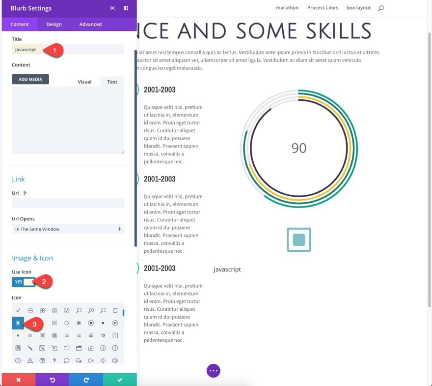
List your Skills with a Colored Labels that Corresponds to your Circle Counter Colors
The final step is to create a color key to help understand what skills correspond to each bar color within each of the circle counters.
A great way to create custom list items is to use the blurb module. Before you toggle out of the wireframe view, add a new blurb module under your Circle counters in the right column. Then toggle the desktop view to complete the rest of the tutorial.
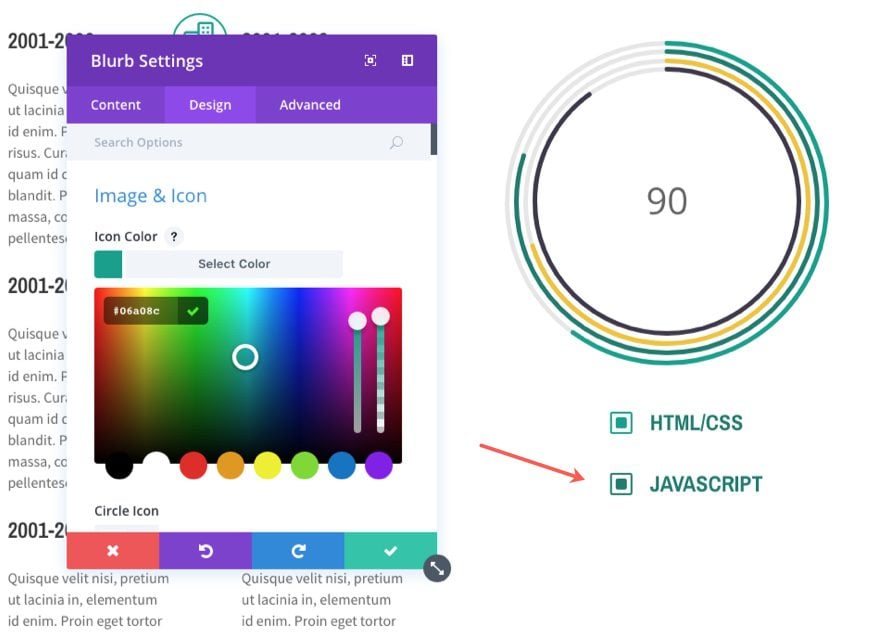
Update the blurb module settings as follows:
Title: Javascript
Use Icon: YES
Icon: select the square icon
Under the Design tab…
Icon Color: #187d6f
Image/Icon Placement: Left
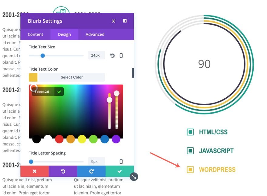
Title Font: Archivo Narrow
Title Font Weight: Bold
Title Font Style: TT
Title Text Size: 24px
Title Text Color: #187d6f
Title Line Height: 1.4em
Notice that I matched the title color with the icon color, and that same color corresponds with the color of one of the circle counters above.
Tip: I used the Title line height to vertically center my title so that it lines up with the icon to the left. Keep this in mind when doing this in the future.
Custom Margin: 37% Left
Giving my blurb a left margin allows you to position it under the circle counters.
Add the Second Colored Label
To create the second colored label, duplicate the one you just created and update the following:
Title: HTML/CSS
Icon Color: #06a08c
Title Text Color: #06a08c
Add the Third Colored Label
To create the third label, duplicate the one you just created and update the following:
Title: WordPress
Icon Color: #eec42d
Title Text Color: #eec42d
Add the Fourth Colored Label
To create the fourth label, duplicate the one you just created and update the following:
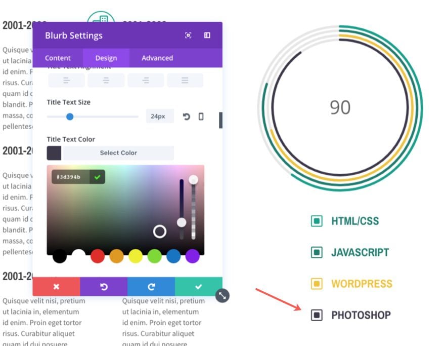
Title: WordPress
Icon Color: #3d394b
Title Text Color: #3d394b
Save your changes.
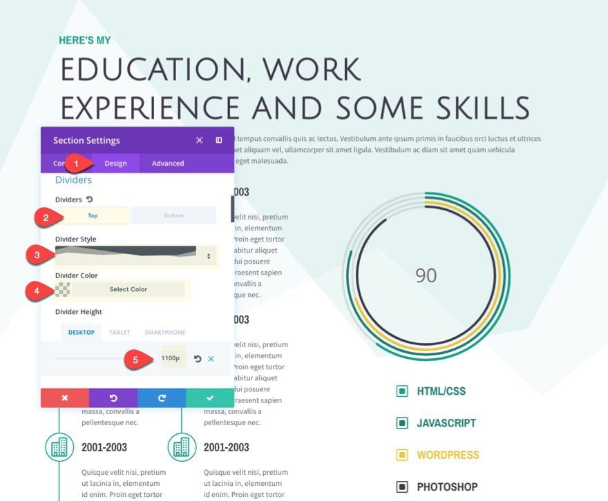
Add a Divider to your Section
As a final touch, go back to your section settings and add a divider to add some background texture as follows:
Divider: Top
Divider Style: see screenshot
Divider Color: rgba(6,160,140,0.08)
Divider Height: 1100px
That’s it.
Here is the final result.
Wrapping up
Once your design is complete, all you need to do is go back and update your icons, content, skills, etc. to suit your needs and you are all set. If you need to replace the icons with your own icons/images, feel free. Just make sure they are 40px by 40px to fit with this layout.
I hope this work experience section will help you standout as a freelancer. And I imagine this layout would work well for other use cases. For example, you could use this timeline layout to show your company history on an about page.
I look forward to hearing from you in the comments.
Cheers!


Instead of a time line I’d like to use this as a sequence of steps. For instance Phase 1, Phase 2, Phase 3, etc.
Is there a way to add some arrows pointing down to the line towards the next step? For instance halfway between each step?
Great idea not really responsive though.
Fantastic tutorial, I have discovered lots of useful functions for other pages.
Great stuff! Misread some lines so it took me a while but I got it working on my new site (building offline, sorry) only the blue line has a strange behaviour when I click tablet in VB-mode. It’s suddenly left from the icons. This doesn’t happen when I view the page and resize my browser.
Also in mobile (VB)mode it shows the blue line as it should be but it disappears on resizing the browser when I view the page.
Thanks!
Thanks for creating this tutorial. Once I had followed each step and created the layout and learned the tips and tricks, it inspired me up update my site following the tutorial layout.
I really love all the things I learned, and I think my site looks really cool now.
This is really great but make sure is responsive please before posting
Awesome, as are all the other how to tutorials. Thank you!!
The fullwidth section that starts off this layout has 156 characters, thats letters plus spaces, per line. 156 is MORE THAN TWICE as many as than what is commonly considered an acceptable line length for good reading and comprehension; that is, 75. On the web, it’s true, you can usually go up to 90. The length of the replies here, on my monitor at least, is 106 characters; a little long, but okay. But your full-width text box is simply off the charts.
Why is this a problem? Why isn’t line length simply a matter of “design choice”?
Reading is a function of the brain. About 9 inches wide at arm’s length is a good rule of thumb for effective reading. Your brain will tell you can read a line that length easily, without getting lost each time your eyes return from the end of one line to the beginning of the next line.
People look at long lines of words and their brain tells them “I don’t want to read that” and so they decide to go find something easier to read. There are exceptions; if they HAVE to read the copy or if they have made a decision that they are GOING to read it no matter what.
But when reading is a choice, then the brain looks at overly long lines and tells you to move on to something easier to handle.
So, as a long-time book designer and creator of printed materials, I follow print rules fairly closely when I translate to online typesetting. And that’s because I don’t want to do something based simply on a feeling or a design decision that will negatively impact those people who have a choice about whether they will read my words or not. Design is more than making something look good. It’s making it easily accessible to people and creating good decisions made quickly and subconsciously by their brains.
I would hope you and the other designers would seriously consider effective line length when you create layouts. And for those of you, like me, who are using someone else’s design choices, keep all of this in mind.
Or don’t. Your choice.
Thanks Randy. This is a good reminder.
Very useful comment, Randy. I’ll keep it in mind from now on. Thank you very much.
I love the “how to” posts. I had no idea a lot of the examples could be achieved via the divi builder settings.
JSON files included in the post would be such a nice addition.
Great tutorial! I know that took a lot of work to put together. Much appreciated!
This is pretty fantastic. Excellent tutorial. Thanks for sharing.
Hello everyone, first of all, congratulations for the excellent tutorial. I just did the layout following step by step, it looked beautiful, but in the same mobile I making the adjustments did not work. I believe that for the mobile will require some CSS.
So mobile this is realy horrible.
To fix this problem you should not use a border right at the left blurb!
Use the Advanced row settings and add a border to the secound Collumn like that:
border-left: 2px solid red;
padding-left: 30px;
I used this to make the left border of Column 1 too.
To make it responsive you just need to fix the icons to the left site. Add a custom class to all blurbs. I used “custom-blrub” as class name.
@media (max-width: 1079px ) {
.custom-blrub .et_pb_blurb_content { margin-left: 0 !important; }
}
You maby need to change a few numbers but it works realy good.
Thanks for the good base work!
I solved my problem.
I have a problem. My module from the second column doesn`t align to my line from the first column. What can I do? Thanks. Good job!
I solved mu problem. Good job!
You probable use other Collums.
Change the Margin Left of the right Blurb.
This really needs responsive settings also discussed. I just did this layout and it looks … not good .. on mobile. Just be advised you that if you’re going to use this layout – look at mobile too.
Sal,
Thanks for pointing out this oversight. I posted a quick fix in a response to Dalton above.
Nice Work!
One point to add:
If I use a title thats a little bit longer, a line hight of 60px is not looking very good.
Changing the padding will not help because it moves the whole blurb. Do I need to give every title a different padding with a custom class?
Great tutorial Jason. Definitely going to do to see what it’s like on mobile. Love all the new clever ways of using existing elements to achieve such a nice effect.
Wow, what a good idea, a json file would be indeed great!
Fantastic tutorial! I’d like to see this in its responsive view. Is there a live preview where I visit it on my mobile device?
Dalton,
Sorry no live preview. After a final check, I realize that the circles are a bit too large for mobile view. To fix this you will need to add the width for all circle counters to 250px on tablet. Then decrease the negative margin by 100px for circle counters 2-4 on tablet as well.
And if you want to hide the borders on mobile, you can add this custom css to your page settings…
@media (max-width: 980px) {
  .et_pb_row {
    border-left: none;
  }
  .et_pb_blurb {
    border-right: none;
  }

}
Thanks.
“width for all circle counters to 250px on tablet. Then decrease the negative margin by 100px for circle counters 2-4 on tablet as well.” would need to take off 100px for each width on tablet, so would be 250, 230, 210, 190px width…
Looks great desktop and tablet, but not on mobile. The typography, blurb borders, circles, and custom blurb listing spacing needs fixing.
However I really like how it looks on desktop!
This is really very nice!
Thanks so much.
I really wish you make it downloadable as a JSON file.
I’d like the DL as well.
Thanks for detailed work, Is there any json file that we can use to save time 🙂
I would love a JSON to speed things up, I tend to learn better by taking something apart instead of building.
Stop being so lazy and wanting a json file. Do the work, follow along, learn the skills. If you can’t achieve this on your own, please uninstall.
It’s called being efficient. Everybody can follow this tutorial along, it’s not really a case of learning new skills… I don’t care about this design but if I was interested, I sure wish there was some sort of fastest way to test it for real.
I am also interested in if there would exist a json file to make this process much faster since the layout and functionality of this excellent Work Experience/CV.
I really hope so, it would be highly appreciated.
Now that does look nice.