
Footer drawers are useful additions to any website because they store additional content that is easily accessed by users. Footer drawers are containers of web content (like a Divi section) that can be toggled open and closed by the click of a button or on hover. It is like having a little hiding place for premium content.
In this tutorial, we are going to design a floating footer drawer in Divi. We will add the footer drawer to the Global Footer Area of the website template so that the footer drawer is accessible site-wide along with the regular footer content.
With the process we are going to use, any Divi section (and its content) can be converted into a footer drawer in minutes.
Let’s get started!
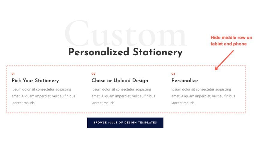
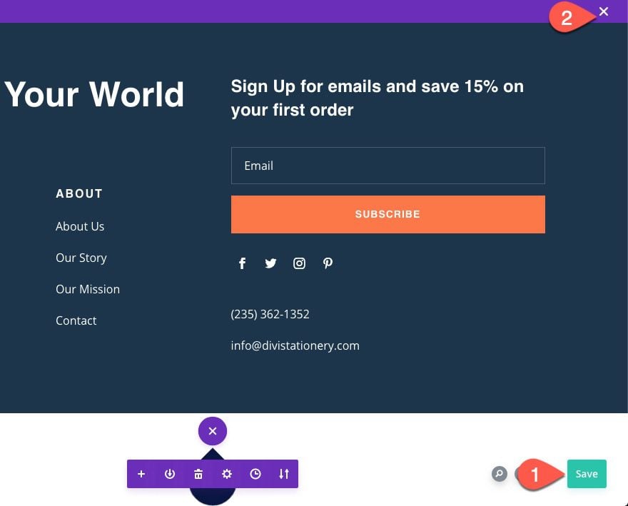
Sneak Peek
Here is a quick look at the fixed footer drawer we will build in this tutorial.
Download the Layout for FREE
To lay your hands on the designs from this tutorial, you will first need to download it using the button below. To gain access to the download you will need to subscribe to our newsletter by using the form below. As a new subscriber, you will receive even more Divi goodness and a free Divi Layout pack every Monday! If you’re already on the list, simply enter your email address below and click download. You will not be “resubscribed” or receive extra emails.

WARNING!: Adding this template will override the default website template (if you have one) on your Divi site. We suggest adding this to a test site so that you don’t mess anything up on a live site.
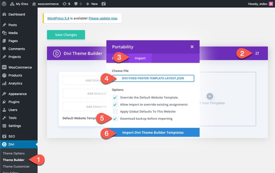
To import the fixed footer drawer template to your own website, unzip the download zip file to access the JSON file.
Then go the WordPress Dashboard and navigate to Divi > Theme Builder.
Then click the portability icon at the top right of the page.
Inside the portability popup, choose the JSON file you just unzipped and select the option “Download backup before importing”, just in case you had something in the default website template previously that you didn’t want to override.
Then click the Import button.
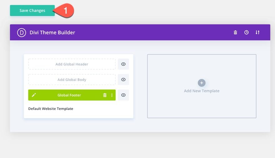
Lastly, save the Theme Builder changes and view a live page to see the fixed footer bar.
Now, let’s get to the tutorial, shall we?
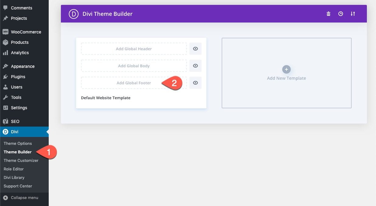
Divi’s Theme Builder allows you to replace the default footer with a new one by updating the Default Website Template.
To create a global footer, go to the WordPress Dashboard and navigate to Divi > Theme Builder. Then click the “Add Global Footer” space inside the Default Website Template.
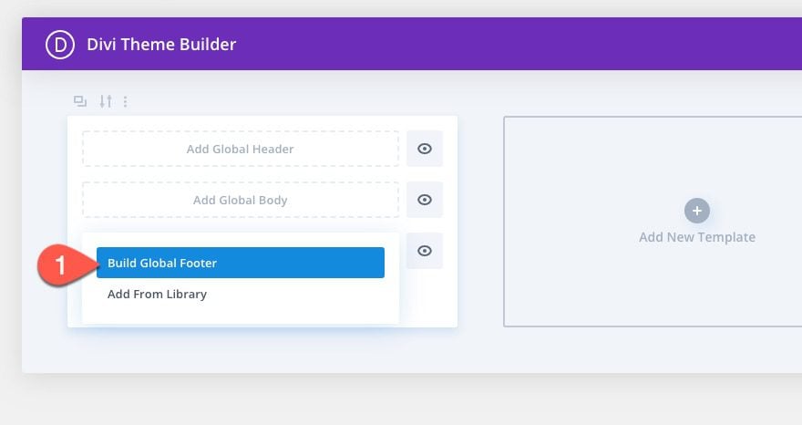
Then select the option “Build Global Footer” from the dropdown.
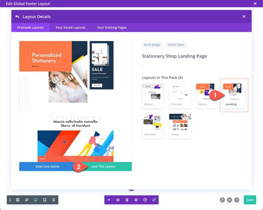
This will deploy the Template Layout Editor where you will immediately be prompted with the three choices for how you want to start building. Select the option to “Choose a Premade Layout”.
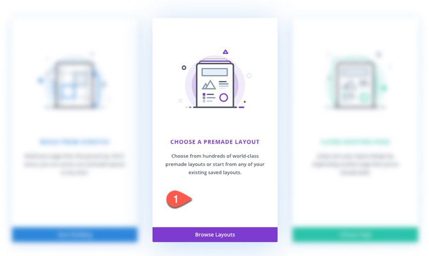
From the Load From Library popup, find the Stationery Shop Landing Page layout. Then click “Use This Layout”.
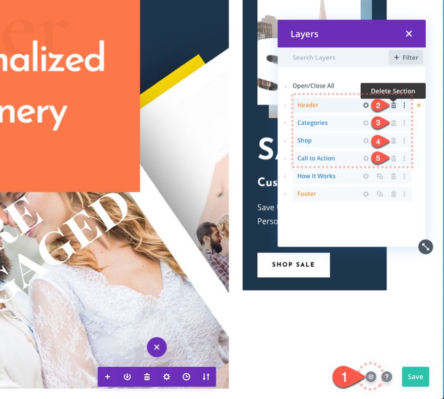
Delete Unwanted Content from Premade Layout
Once the layout is loaded into the editor, deploy the Layers popup box by clicking the layers icon from the settings menu. Then delete all the sections in the layout except the last two.
Move and Label the Two Sections
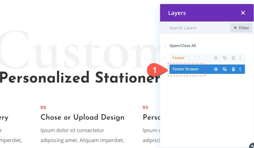
Once the sections are deleted, you should have two sections, one labeled “Footer” and the other labeled “How it Works”. Move the “Footer” section to the top of the layout.
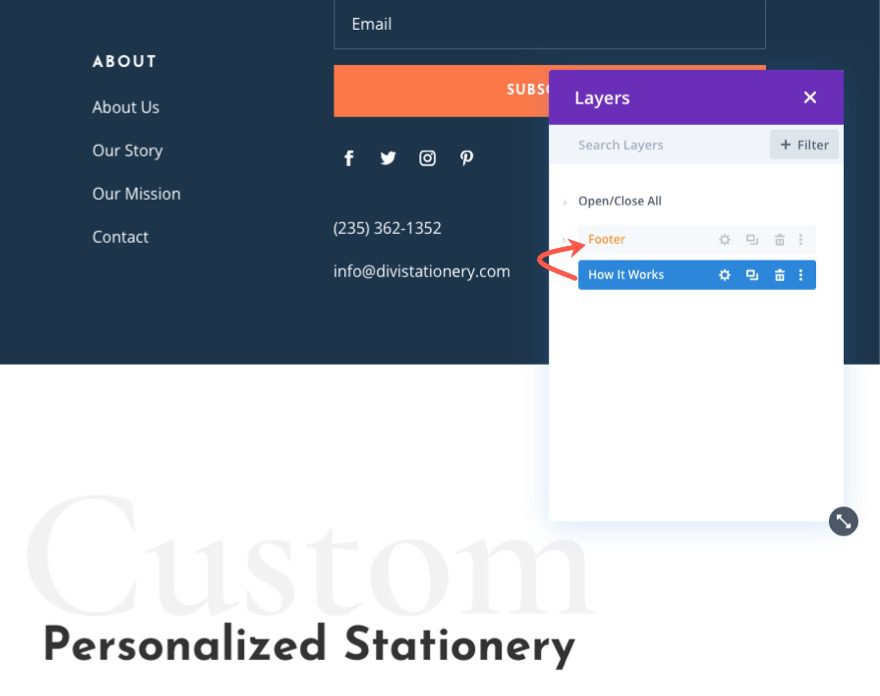
Change the Label of the bottom section to “Footer Drawer”. This will be the section we will use as our footer drawer content.
Now that we have designated one of the sections as our footer and the other as the footer drawer, we are ready to start creating our fixed footer drawer. Let’s start with creating the blurb icon we will use to toggle the footer drawer.
Add New Row
Inside the bottom “Footer Drawer” section, add a new one-column row.
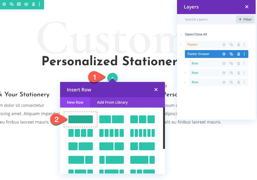
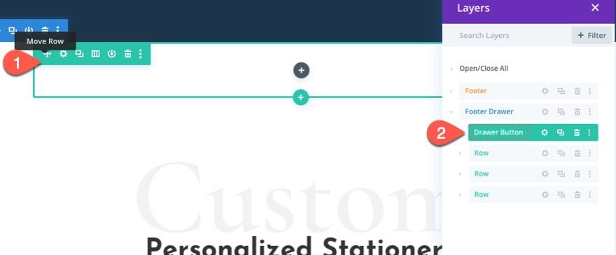
Label the new row “Drawer Button” because this is the row that will contain the button used to toggle the drawer open and closed. Then move the row to the top of the section.
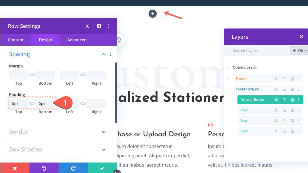
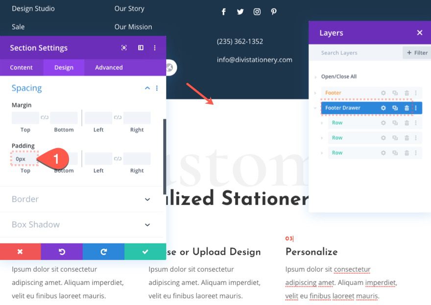
Row Padding
Before we add a module, open the row settings and update the padding as follows:
- Padding: 0px top, 0px bottom
Section Padding
Then open the settings for the “Footer Drawer” section and update the padding as follows:
To create the clickable button that toggles the footer drawer, we are going to use a blurb module with an icon. And, we are going to give it a unique water drop shape by combining the square shape of the blurb module container with the circle icon.
Here’s how to do it.
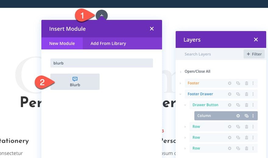
Add Blurb Module
Add a blurb module to the “Drawer Button” row at the top of the section.
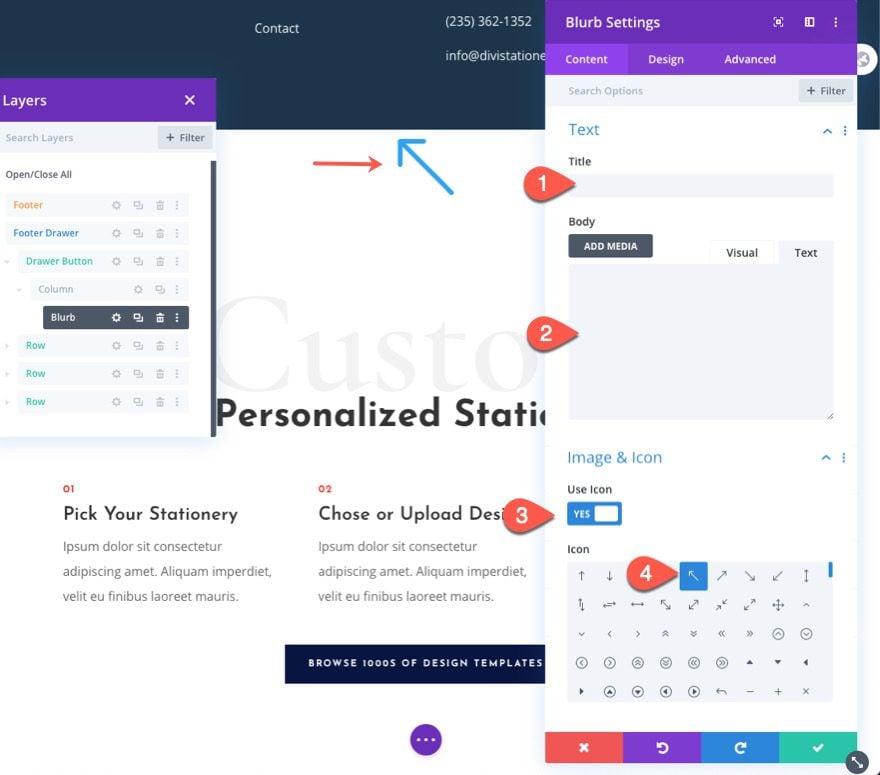
Blurb Content/Icon
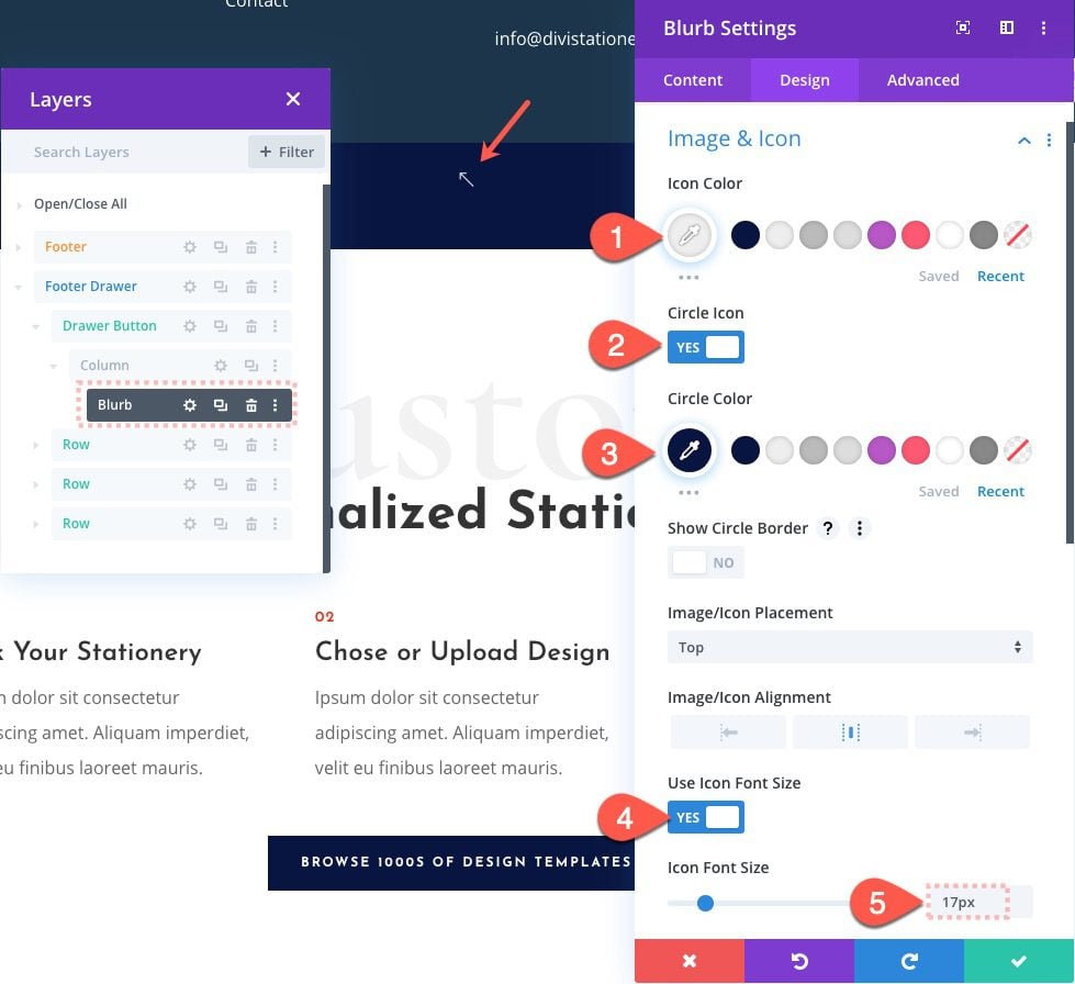
Then delete the default Title and Body content and select the arrow icon that is pointing to the top left corner (see screenshot). We are using the partially rotated icon because we are going to rotate it later on.
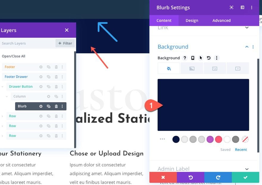
Blurb Design
Next, give the blurb a background as follows:
- Background Color: #081540
Then update the design settings as follows:
- Icon Color: #eeeeee
- Circle Icon: YES
- Circle Color: #081540
- Use Icon Font Size: YES
- Icon Font Size: 17px
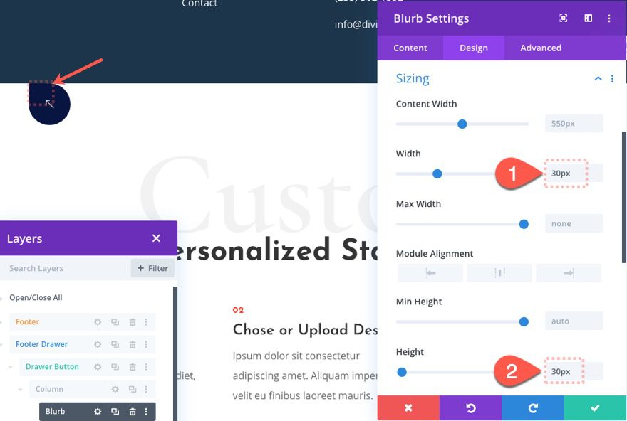
Blurb Size
Now give the module a height and a width as follows:
- Width: 30px
- Height: 30px
This will cause the circle icon to overflow the blurb container to create the water drop shape.
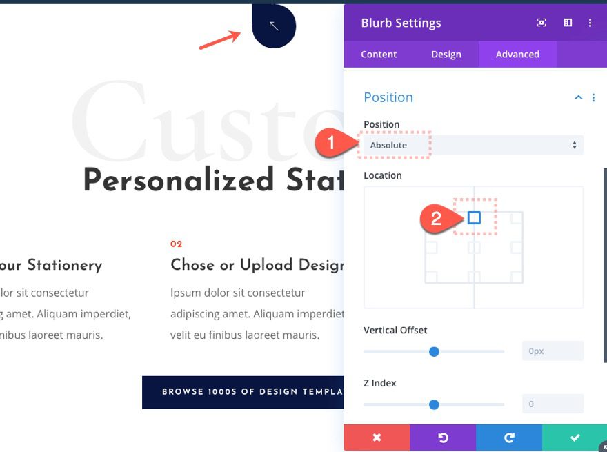
Blurb Position
Next, give the blurb an absolute position at the top center of the section.
- Position: Absolute
- Location: Top Center
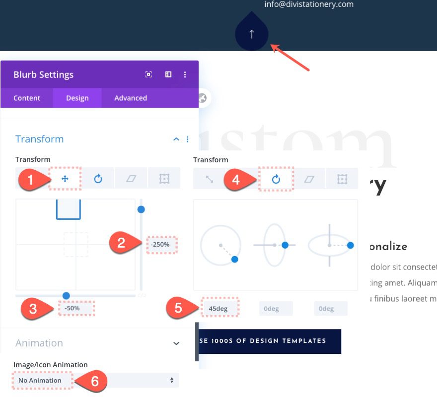
Blurb Transform Settings
Now we can use the transform options to rotate the blurb/icon upright and position it just above the section container. Now when we hide the section below the browser window, the icon will remain visible/clickable.
Update the following:
- Transform Translate X Axis: -50%
- Transform Translate Y Axis: -250%
- Transform Rotate Z Axis: -45deg
Then take out the default icon animation:
- Image/Icon Animation: No Animation
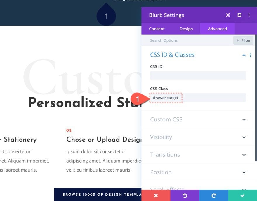
We are going to use JQuery to toggle the drawer, so we need to target the blurb/icon as the clickable element with a CSS class we will later use in the code. Add the following CSS Class:
- CSS Class: drawer-target
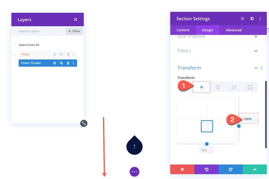
Now we are going to hide the “Footer Drawer” section using the transform translate option. Open the section settings and update the following:
- Transform Translate Y Axis: 100%
The beauty of using transform translate here is that the percentage values are based on the actual size of the element. So 100% on the Y axis will be directly relative to the height of the section (nomatter what it is at any give moment). In other words, the element will be moved downward the exact distance as its own height.
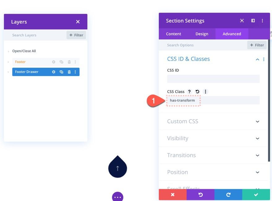
In order to bring the “Footer Drawer” back into view, we are going to need to reverse the transform translate that we just added to the section. To do this we will need to target the element with a CSS Class and turn off the transform translate when clicking the icon (bring the full section back to its original position).
Add CSS Class to Footer Drawer Section
Under the advanced tab, add the following CSS Class:
- CSS Class: has-transform
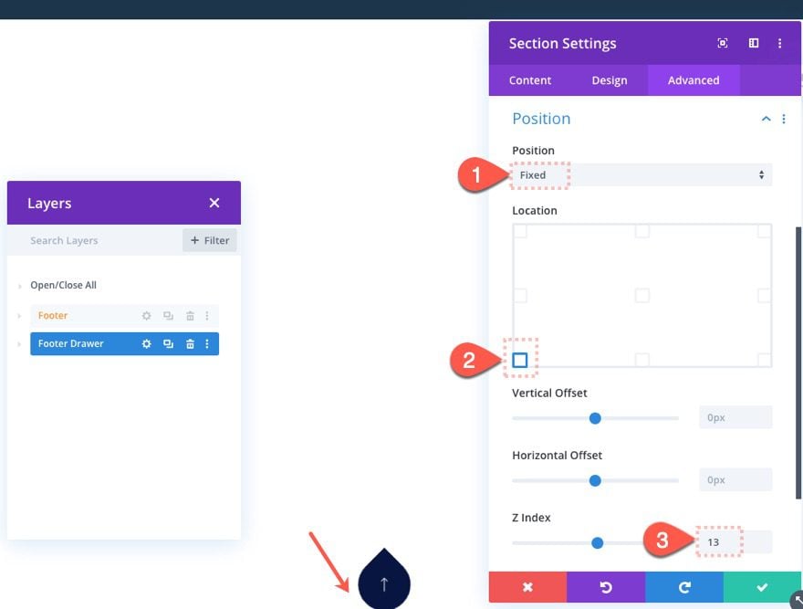
Footer Drawer Section Fixed Position
For the last step, we need to make the footer drawer fixed so that it (along with the icon) floats at the bottom of the browser window.
Update the position of the “Footer Drawer” section as follows:
- Positon: Fixed
- Location: Bottom Left
- Z Index: 13
Disabling Content for Mobile
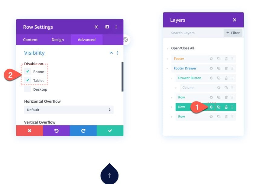
Because you will have a limited amount of footer drawer content that will fit on tablet and phone (because of the limited height of the screens), you will need to disable/hide the non-essential elements from being displayed. In this example, we are going to hide the middle row of the section layout.
Open the settings for the second to last row in the “Footer Drawer” section. Under the advanced tab, update the visibility option to disable the row on phone and tablet.
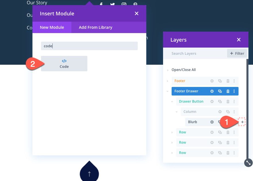
Adding the Custom Code
To add the click and toggle functionality to the footer drawer, we need to add some custom CSS and JQuery to the page. To do this, create a new code module below the blurb module used for the button.
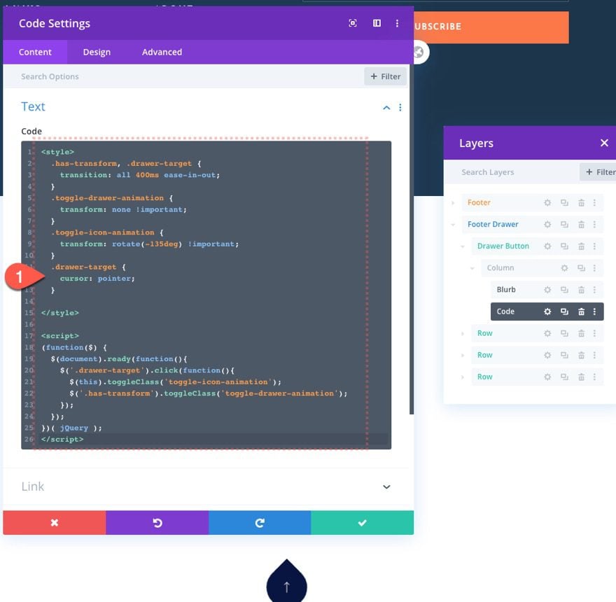
Then paste the following code into the code box:
<style>
  .has-transform, .drawer-target {
    transition: all 400ms ease-in-out;
  }
  .toggle-drawer-animation {
    transform: none !important;
  }
  .toggle-icon-animation {
    transform: rotate(-135deg) !important;
  }
  .drawer-target {
    cursor: pointer;
  }
</style>
<script>
(function($) {
  $(document).ready(function(){
    $('.drawer-target').click(function(){
      $(this).toggleClass('toggle-icon-animation');
      $('.has-transform').toggleClass('toggle-drawer-animation');
    });
  });
})( jQuery );
</script>
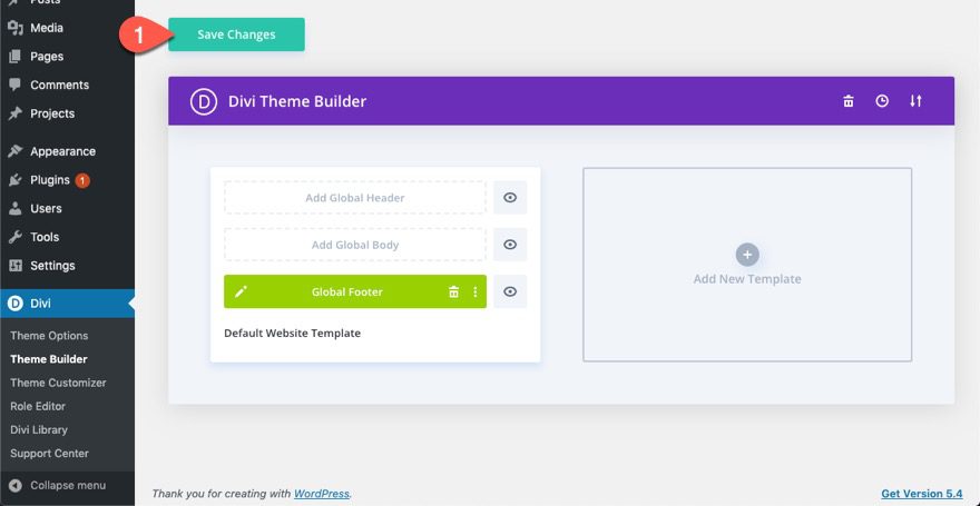
Save Changes
Don’t forget to save the layout before exiting the editor.
Save the Changes on the Theme Builder as well.
Final Result
Now we can go to any of the pages on your website to see the final result.
And here it is on mobile.
Notice how the Global Footer is also in the right spot at the bottom of the page as well as the fixed footer drawer.

Final Thoughts
Hopefully, the floating footer drawer will help you promote content in a fun and accessible fashion. Like any drawer, you can fill it with just about anything you can think of.
I look forward to hearing from you in the comments.
Cheers!


Bought Divi Theme about 6 months ago, Amazing theme working unmarked with amazing Features
It works well but I loose the button under my menu bar, tried it on a few designs and it does the same on them all. Any ideas why this would be please?
might be an issue with z index. Try increasing the z index of the button module or the row that holds the button module so that it stays above the other elements.
Hey, Divi themes are something everyone should try out.Works flawlessly and have many features.
Thanks for the comment, Nik.
Thanks for this helpful information! I have read this blog and get your all point you have to describe perfectly
You’re welcome, Muhammad. Glad it was helpful.
Hi Jason
You are an incredible divi designer. It’s awesome. Now I can make anything floating. It could be header top left & right. Thanks man.
Exactly! Thanks, Rajib.
I recently purchased the Divi theme and this theme contains awesome features! and for one of my client, I need to know about how I can design a floating footer drawer in Divi theme. And by reading this article it helps me a lot.
Thanks again 🙂
Helpful and Informative.
I like Divi Themes as I am able to satisfy my clients by its elegant design.
Thanks for sharing your hearted information.
Hi! This is something I will definitely try out! Nice work! Is it possible to style the open/close symbol? I would like to change it to a circle with a + sign when the drawer is closed and to a – sign when the drawer is open.
Thanks, Michael. Yes, you can style the symbol easily using Divi’s built-in options. For example, you can set the height and the width of the blurb module to the same size as the circle icon. Then take out the blurb background color. This should give you a basic circle icon. Then you can choose the plus icon instead of the arrow and rotate it 45deg on click to become an “X”. Not exactly what you want but it makes sense. If you want a “-” symbol you would need to change it with custom CSS. I hope that helps. check out this post for a similar concept… https://www.elegantthemes.com/blog/divi-resources/how-to-add-a-closeable-slide-in-call-to-action-to-any-corner-of-your-page-template-in-divi.
Hi Jason,
Thanks for sharing, never used Divi Themes before but will try footing footer design in my next web design project.
Appreciate you time and effort to create such a detailed post.
I am a huge fan of Divi Themes, it just worked flawlessly and very easy to design and setup.
Now, I will try to create a good floating footer design after reading this guide.
Thanks a ton for sharing a wonderful and informative post with us..
Wow, thanks for the support, Prerma! I appreciate the comment and I’m glad you found it helpful.