
It is always fun to get creative with Divi and its transform options. They allow you to create some amazing “outside the box” designs. And in this tutorial, we are going to transform some Divi blurbs into a beautiful segmented circular menu that expands and collapses on click. The trick to creating the segmented areas (like a pie chart) is to use transform skew in a pretty unique way. The inspiration for this idea came from this tutorial and I have to say it was extremely fun to build with Divi.
Let’s get started.
- 1 Sneak Peek
- 2 Download the Segmented Circular Menu Divi Layout for FREE
- 3 Download For Free
- 4 What You Need to Get Started
-
5
Creating A Segmented Circular Menu Using Divi Blurbs
- 5.1 Creating the Row for the Menu Items
- 5.2 Creating the Blurbs for the Menu
- 5.3 Creating the Rest of the Blurbs
- 5.4 Creating the Menu Button
- 5.5 Positioning the Circular Menu Row
- 5.6 Adding the External Custom CSS to Page Settings
- 5.7 Adding the jQuery with a Code Module
- 5.8 Final Result
- 5.9 Adjusting the Size of the Circular Menu
- 6 Final Thoughts
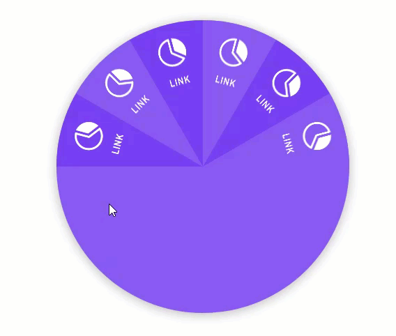
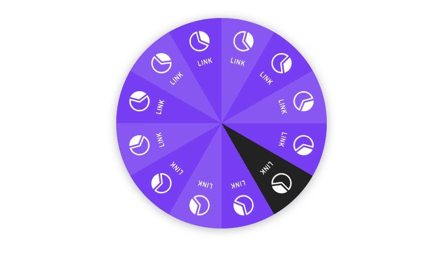
Sneak Peek
Here is a peak at the segmented circular menu we will build in this tutorial.
To lay your hands on the menu design from this tutorial, you will first need to download it using the button below. To gain access to the download you will need to subscribe to our newsletter by using the form below. As a new subscriber, you will receive even more Divi goodness and a free Divi Layout pack every Monday! If you’re already on the list, simply enter your email address below and click download. You will not be “resubscribed” or receive extra emails.

To import the layout to your page, simply extract the zip file and drag the json file into the Divi Builder.
Let’s get to the tutorial shall we?
What You Need to Get Started
To get started, you will need to do the following:
- If you haven’t yet, install and activate the Divi Theme installed (or the Divi Builder Plugin if not using the Divi Theme).
- Create a new page in WordPress and use the Divi Builder to edit the page on the front end (visual builder).
After that, you will have a blank canvas to start designing in Divi.
This design will use a combination of built-in Divi settings and external code. We will utilize the visual builder to create most of the design of our menu. Then we will deploy the wireframe view mode to get to those hard to reach settings once the elements become positioned absolutely. We’ll start with creating the circular menu which consists of multiple blurbs in a row. Then we will design an addition blurb in a separate section to serve as the overlapping menu button.
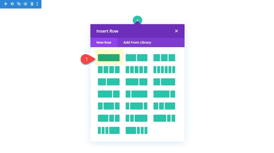
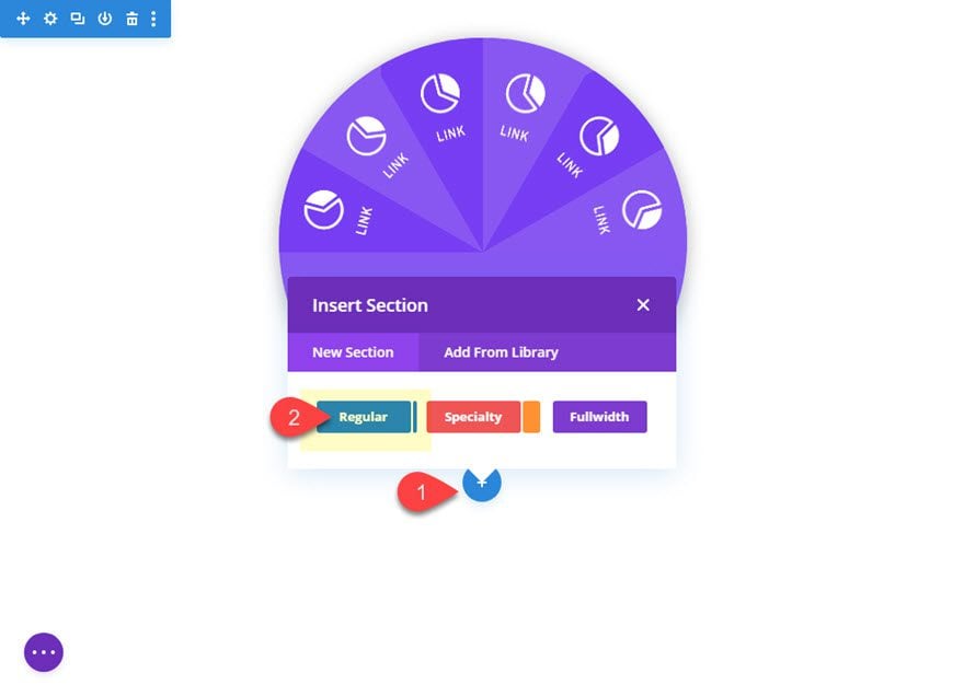
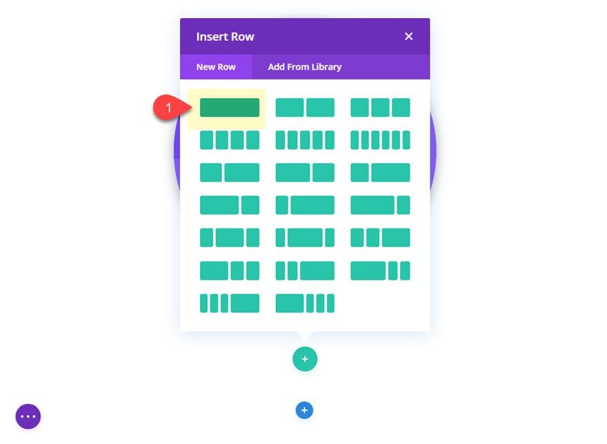
In the default regular section, add a one-column row.
Styling the Row
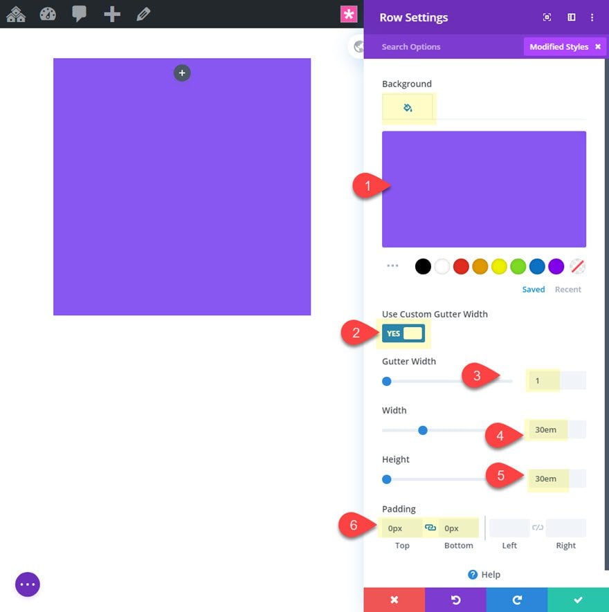
Before adding a module, let’s style the row to get our circular shape and background color. Open the row settings and update the following:
- Background Color: #8857f2
- Use Custom Gutter Width: YES
- Gutter Width: 1
- Width: 30em
- Height: 30em
- Padding: 0px top, 0px bottom
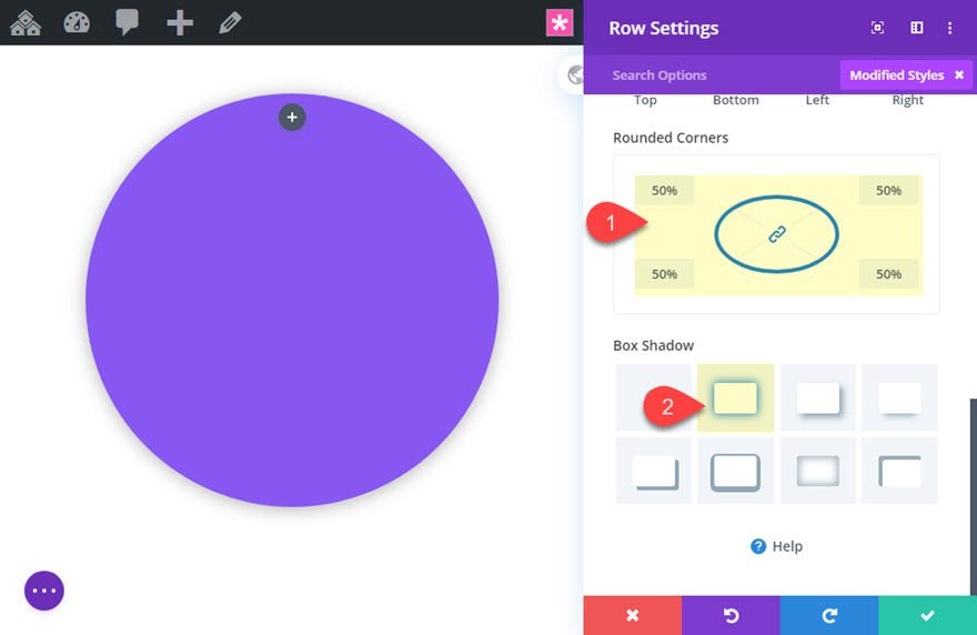
Then add the rounded corners and the box shadow.
Rounded Corners: 50%
Box Shadow: see screenshot
We will be coming back to add some more customizations to the row, but for now we can start adding our blurbs.
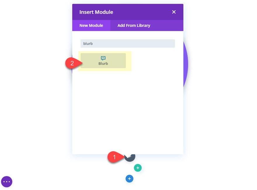
Add a new blurb to the one column row inside the circular row.
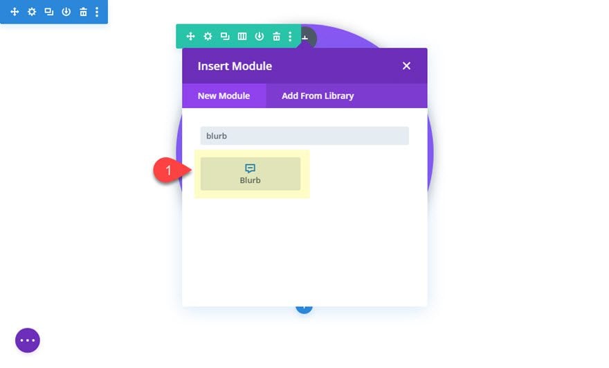
Styling Blurb #1
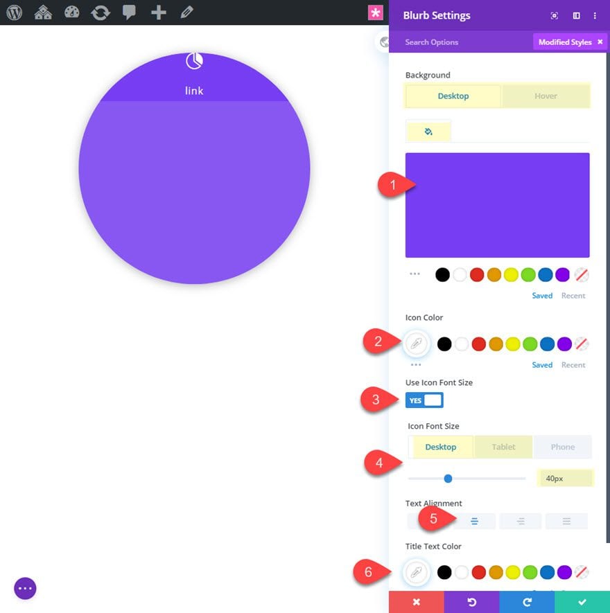
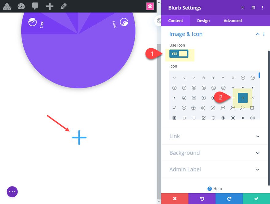
Update the content for the first blurb to include a title and an icon.
- Title: link
- Use Icon: YES
- Icon: see screenshot
After that, update the design settings as follows:
- Background Color: #773ef2
- Background Color (hover): #222222
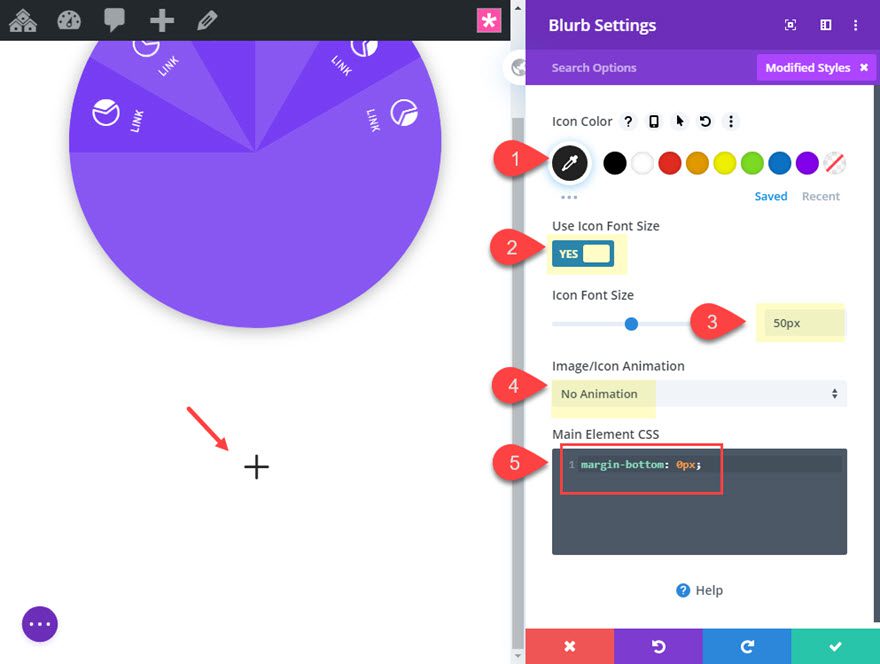
- Icon Color: #ffffff
- Icon Font Size: 40px (desktop), 30px (tablet)
- Text Alignment: center
Then update the title text style as follows:
- Title Font: Archivo Narrow
- Title Font Style: TT
- Title Text Color: #ffffff
- Title Text Size: 14px (desktop), 12px (tablet)
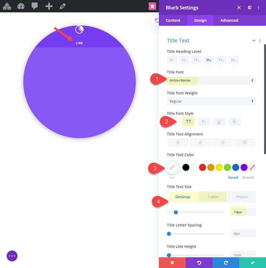
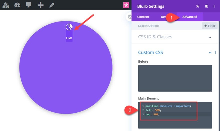
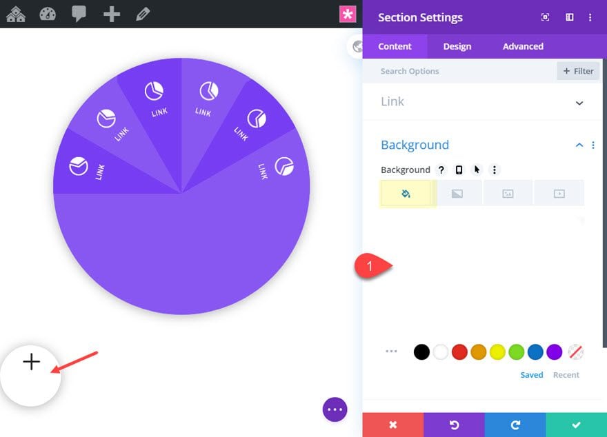
Next, we need to position the blurb using some custom CSS. Go to the advanced tab and add the following custom CSS to the Main Element:
position:absolute !important;
left: 50%;
top: 50%;
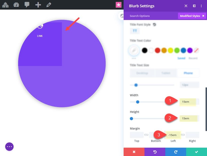
Now go back to the design tab and update the size and spacing of the blurb as follows:
- Width: 15em
- Height: 15em
- Margin: -15em Left
This puts the blurb’s bottom right corner directly in the center of the circle.
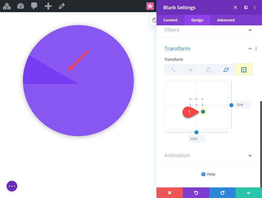
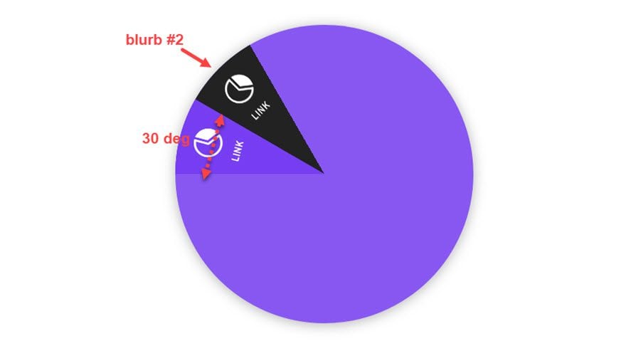
Creating the Segment Using Transform Options
In order to turn the blurb into a segment of a circle, we are going to skew and rotate the blurb. To do this, update the following transform options:
- Transform Skew X Axis: 60deg
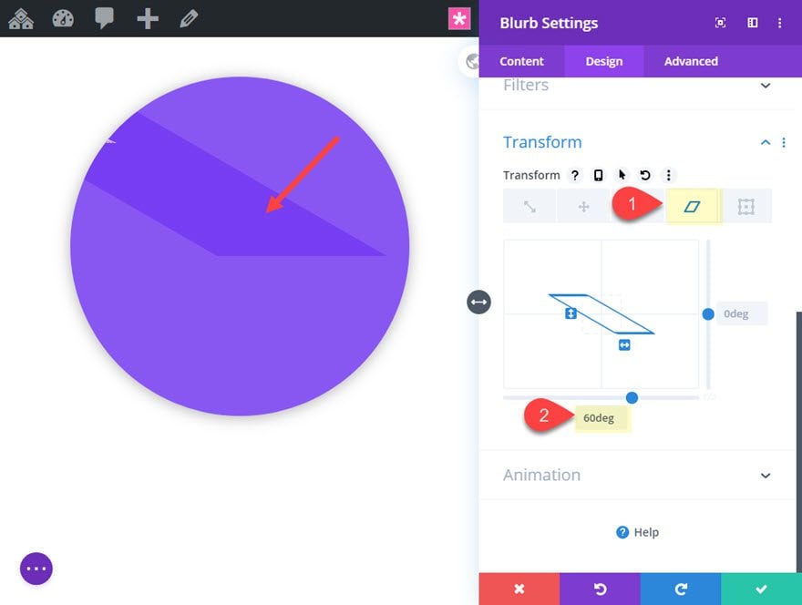
- Transform Origin: 100% 100% (bottom right)
Since our blurb’s bottom right corner is directly in the center of the circle, we want the transform origin also set to the bottom right. This will make sure the tip of the skewed blurb is at the center of the circle, making the segment.
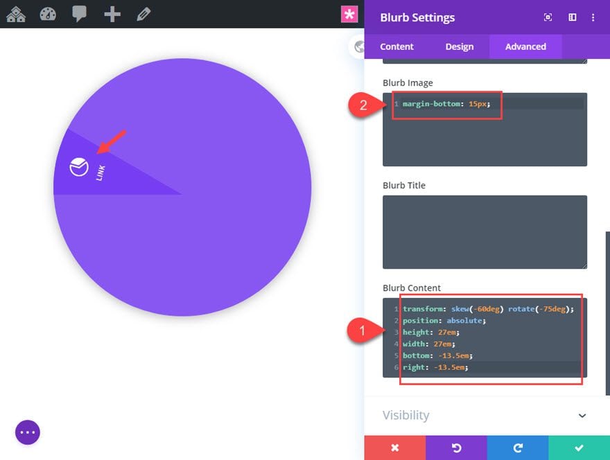
Unskewing the Blurb Content
Really all we want to skew is the shape of the blurb to create the segment shape, not the content inside (ie. the icon and the text). But since this isn’t possible, all we need to do is add a transform property the blurb content that reverses the skew effect so that it appears normal. To do this, go to the advanced tab and add the following custom CSS:
Blurb Content CSS:
transform: skew(-60deg) rotate(-75deg);
position: absolute;
height: 27em;
width: 27em;
bottom: -13.5em;
right: -13.5em;
Then reduce the margin between the icon and the title text by adding the following CSS for the Blurb Image:
Blurb Image CSS
margin-bottom: 15px;
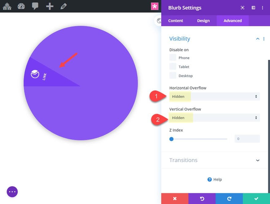
And now, because the blurb content space is extending beyond the blurb (even though you can’t see it), we need to hide the overflow as follows:
- Horizontal Overflow: hidden
- Vertical Overflow: hidden
If we don’t add this, we will have unwanted hover space.
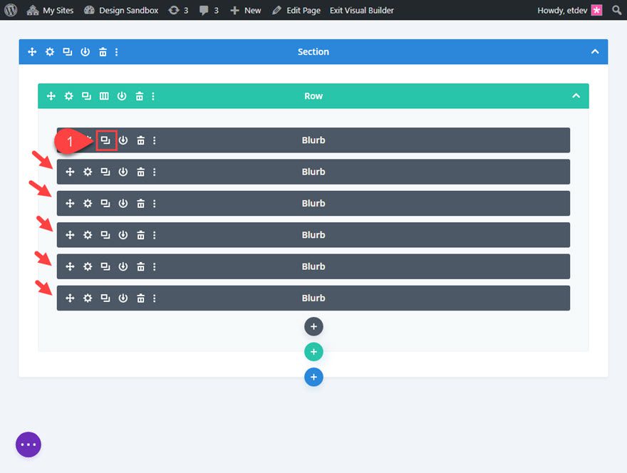
Creating the Rest of the Blurbs
To create the rest of the blurbs, deploy the wireframe view mode and duplicate the existing blurb 5 times so that you have a total of 6 identical blurbs.
Rotate Blurb #2
Then open the settings for blurb #2 and rotate the module as follows:
- Transform Rotate Z axis: 30deg
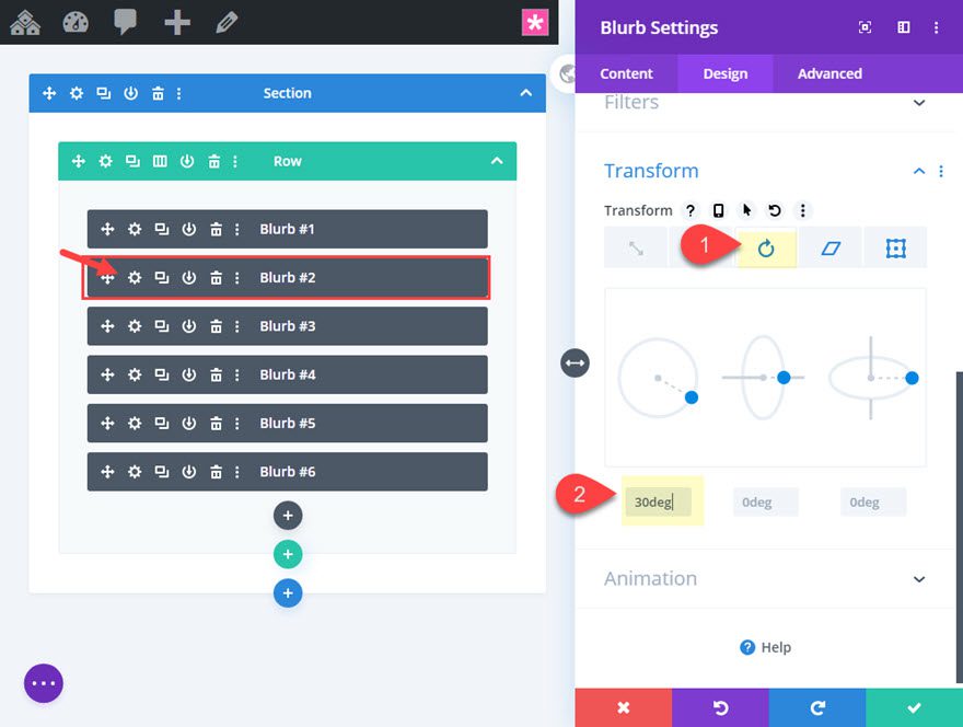
This will rotate blurb #2 clockwise from the center point of the circle.
Then we can continue to rotate the rest of the blurbs in 30 degree increments to create a half circle of segments.
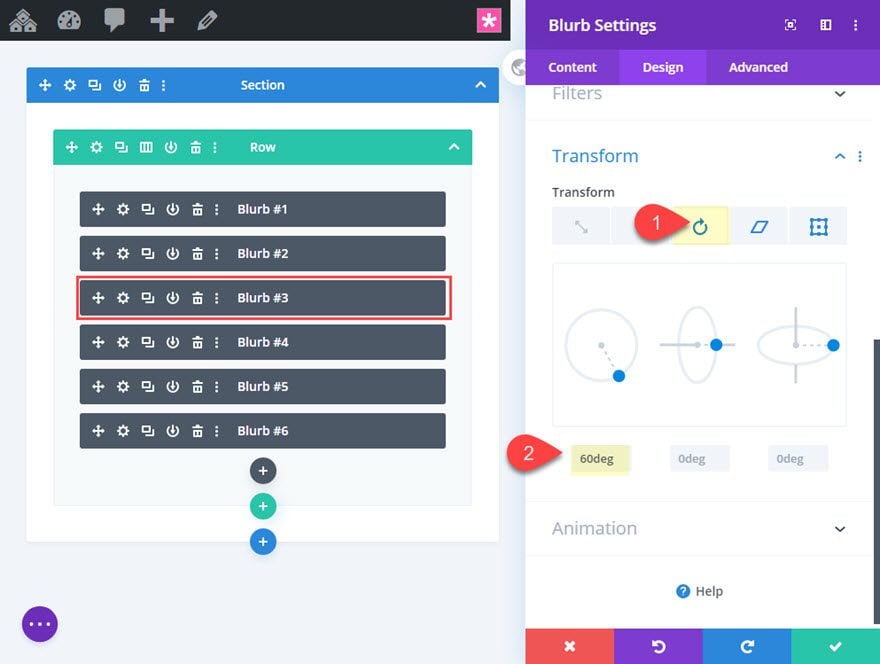
Rotate Blurb #3
Open the settings for blurb #3 and update the following:
- Transform Rotate Z axis: 60deg
Rotate Blurb #4
Open the settings for blurb #4 and update the following:
- Transform Rotate Z axis: 90deg

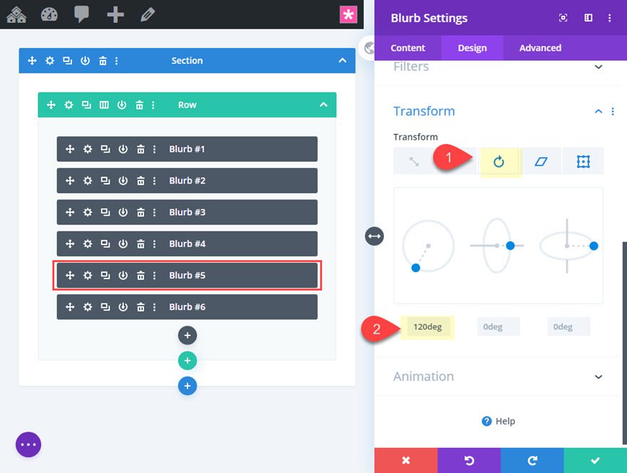
Rotate Blurb #5
Open the settings for blurb #5 and update the following:
- Transform Rotate Z axis: 120deg
Rotate Blurb #6
Open the settings for blurb #6 and update the following:
- Transform Rotate Z axis: 150deg

Here is the result so far.
To create the menu button, we are going to shrink the size of an entire section and then use a blurb icon for the button design.
To do this, first add a new regular section under the current section.
Then add a one-column row to the section.
Creating the Blurb Icon for the button
Then add a blurb module to the row.
Delete the default title and body content and use an icon as follows:
- Use Icon: YES
- Icon: Plus symbol (see screenshot)
Continue to update the settings as follows:
- Icon Color: #222222
- Use Icon Font Size: YES
- Icon Font Size: 50px
- Image/Icon Animation: No Animation
Then add the following custom CSS to the Main Element to get rid of the default margin under the icon.
Main Element CSS
margin-bottom: 0px;
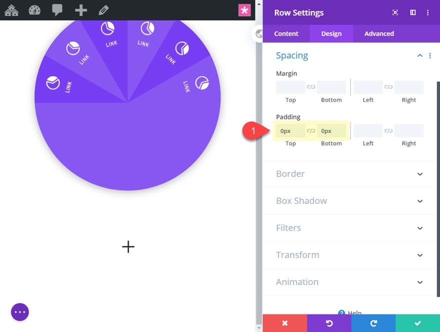
Row Padding
Next, take out the default padding of the row.
- Padding: 0px top, 0px bottom
Section Settings
To finish the button, we are going to shape our section into a circle.
Open the section settings and update the following:
- Width: 100px
- Height: 100px
- Padding: 0px top, 0px bottom
- Rounded Corners: 50%
- Box Shadow: see screenshot
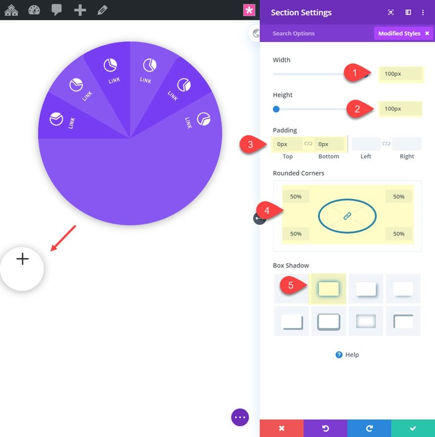
Then give it a white background.
- Background Color: #ffffff
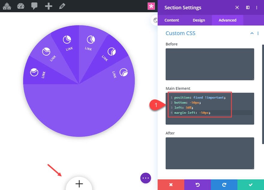
Under the advanced tab, add the following custom CSS to the Main Element to position the button as fixed at the bottom of the window.
position: fixed !important;
bottom: -50px;
left: 50%;
margin-left: -50px;
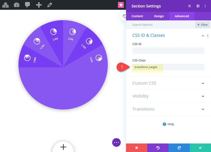
We also need to add a CSS Class that can be targeting with our jQuery. Add the following:
- CSS Class: transform_target
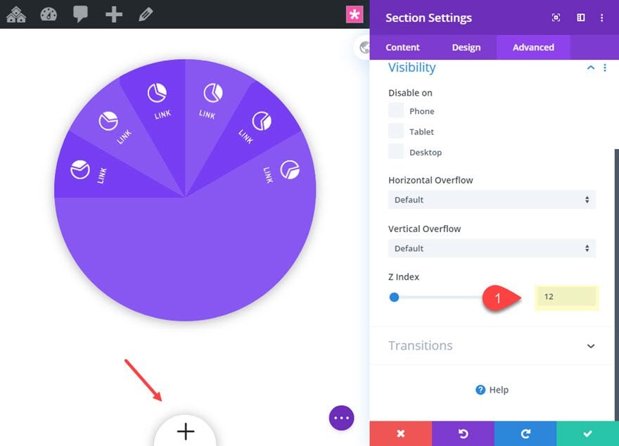
Then update the Z Index so that the button stays above the rest of the content on the page.
- Z Index: 12
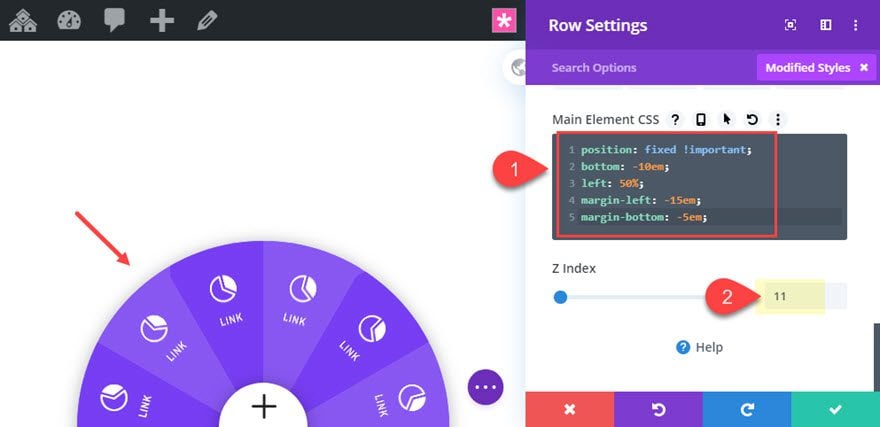
Now that the menu button is in place, we need to position the row containing our segmented circular menu so that it is also fixed and centered at the bottom of the page with only the top half of the circle visible.
To do this open the row settings for the row containing the menu blurbs and add the following Custom CSS:
Main Element CSS
position: fixed !important;
bottom: -10em;
left: 50%;
margin-left: -15em;
margin-bottom: -5em;
The update the z index as follows:
- Z Index: 11
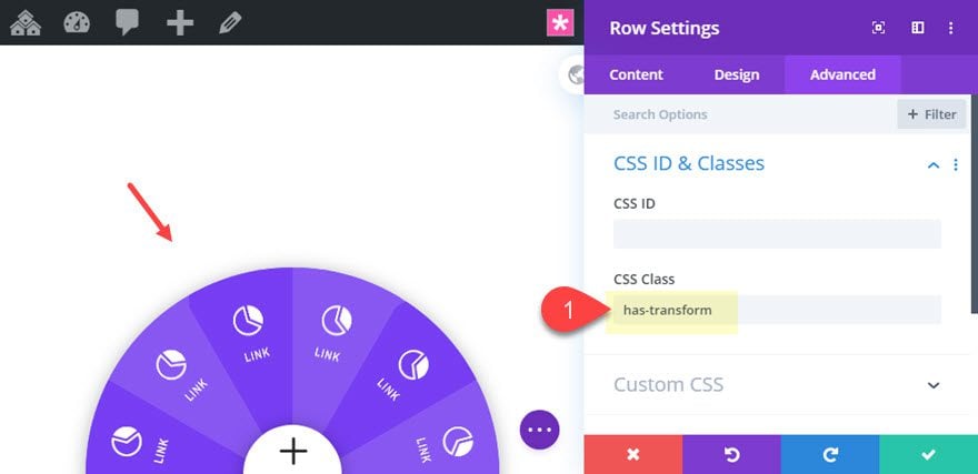
Next add the following CSS Class.
- CSS Class: has-transform
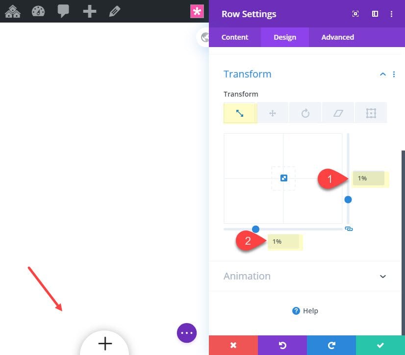
Finally, we need to completely scale down (or shrink) the circular menu using transform scale. This will allow us to toggle the effect on and off with jQuery which will expand and collapse the menu on click.
Update the following:
- Transform Scale: 1%
With our segmented circular menu and menu button in place, all that is left to do is add the custom CSS and jQuery to complete the functionality of the button.
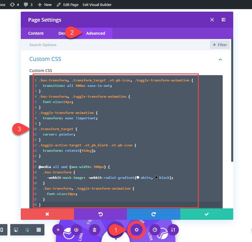
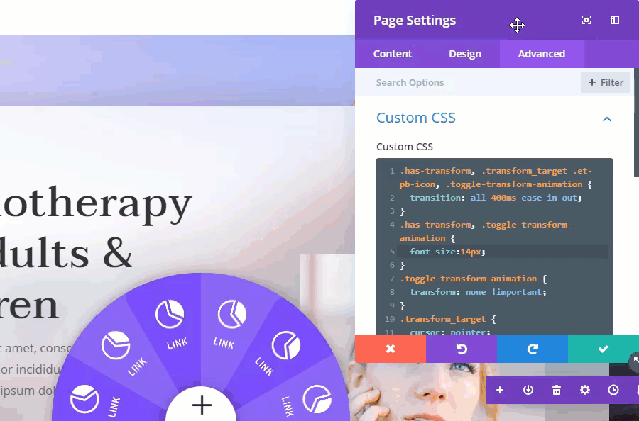
Adding the External Custom CSS to Page Settings
Open the page settings from the menu at the bottom of the visual builder and add the following Custom CSS under the advanced tab:
.has-transform, .transform_target .et-pb-icon, .toggle-transform-animation {
  transition: all 400ms ease-in-out;
}
.has-transform, .toggle-transform-animation {
  font-size:14px;
}
.toggle-transform-animation {
  transform: none !important;
}
.transform_target {
  cursor: pointer;
}
.toggle-active-target .et_pb_blurb .et-pb-icon {
  transform: rotateZ(45deg);
}

@media all and (max-width: 980px) {
  .has-transform {
    -webkit-mask-image: -webkit-radial-gradient(white, black);
  }
  .has-transform, .toggle-transform-animation {
    font-size:10px;
  }
}
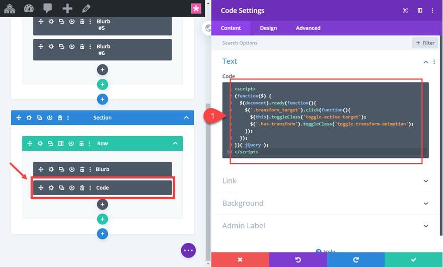
Adding the jQuery with a Code Module
Next, deploy the wireframe view mode and add a code module under the menu button blurb.
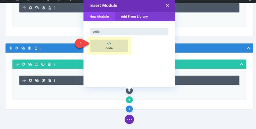
Then add the following code to the module.
<script>
(function($) {
  $(document).ready(function(){
    $('.transform_target').click(function(){
      $(this).toggleClass('toggle-active-target');
      $('.has-transform').toggleClass('toggle-transform-animation');
    });
  });
})( jQuery );
</script>
Final Result
Now let’s view the final result on a live page.
The menu will work well with your current page or with any of our premade layouts which you can add by clicking the plus icon from the settings menu.
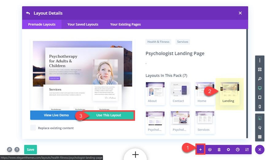
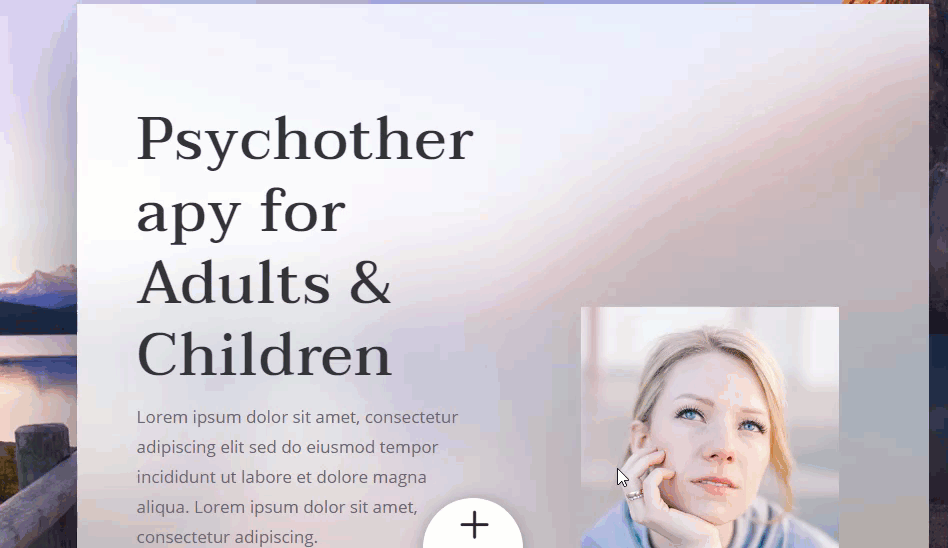
Here is what it looks on our psychologist landing page layout.
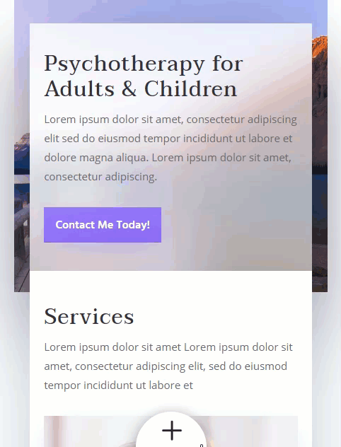
And here it is on mobile.
The segmented circular menu is built using em length units which are relative to the size of the parent body font. This makes it easy to increase and decrease the size of the menu. To change the size of the font, simply change the font-size property for the has-transforrm class that targets the row in the custom CSS we added to page settings.
Final Thoughts
In this tutorial, we covered how to create a segmented circular menu in Divi by getting creative with Divi’s transform options. We also used some custom CSS for things like fixed positioning and “un”skewing the blurb content for the menu items. The jQuery allows us to turn the transform scale property on and off to create the expanding and collapsing effect of the menu when clicking the menu button.
Overall, I think you will find a lot of inspiration from this post. Feel free to expand on this concept to create more designs. For example, you could continue to add blurbs and rotate them in 30 degree increments to create an entire circle with segmented menu links.
Or you could even create an interactive pie chart!
Here is a circular icon menu you may like as well.
I look forward to hearing from you in the comments.
Cheers!


Thanks a lot, this is great! How can i change it to 5 Sections?
You can remove one of the Blurb by using the Wireframe view using this button usually found at the bottom left: https://prnt.sc/3Bk5xQT9FxSI
You can then adjust the the z-axis Rotation of the Blurbs to position them correctly inside the circle by going to each of the Blurb Module Settings > Design > Transform > Rotate: https://prnt.sc/tTWpUZohHvbT
Hi Jason, thanks for this amazing menu!
do you think I can add woocommerce category on it (replace “link” on your picture) ?
thanks again
Hi Roger,
Very nice… Have a suggestion though…
Because this menu is by design to be obscure, you might want to reveal the icons after a idle time, once a day.
KUDOS!
Hi Jason,
Thank you for this menu.
I’ve implemented the json file on my page and it works nice.
But I noticed that the bottom bar is partially hidden by the “+” icon and it’s not possible to read text behind it.
Do you know a way to force the bottom bar to be visible? Or another workaround, like the “+” icon stops before the bottom bar?
Regards,
Can you add this to a new divi layout, this is adding value stuff!
Thanks
Karl
Karl,
Yes you sure can. I mention it under Final Result above. Might be easier to upload the json with the menu first. Then add the premade layout pack to the page.
Hope that helps.
that’s a eye catching stuff! now a days need moving parts in webdesign to catch attention!thank you very much!guess will made easy to share idea.
Joseph,
Great! Glad you liked it. Thanks for the comment.
I updated the z index but the button stays partially behind the menu when you click on it.
Roger,
You updated the z index on the section that contains the button to 12? That should work. Also check what you have for the z index of the row containing the segments/blurbs. That row should have a z index of 11.
Yes, the section containing the button is set at 12 and the row with the blurb segments is set at 11.
I can see the button when it is clicked (when it’s an “X”) but I still see the blurb segments inside of it.
Did you add a white background color to the section that contains the button?
When I gave the section a white background a white square showed up as well as the button.
What worked was when I gave the button blurb itself a white background.
Thanks, Jason, for your continual replies to help me with this!
Hello,
Still a good idea to have original menus.
Thank you for sharing
Bruno,
Yes of course. I agree. This would work as a secondary menu as well. Thanks
This is great! How difficult would this be to move to the top Right corner instead of the bottom?
Casey,
You can do this for sure. It is a matter of rotating the segments/blurbs. Then change the absolute position of the row (top: -10em; right: -10em). Since it is in the corner you may be limited to only three links/segments that are visible.
Hop that helps.