
A circular icon menu is an elegant solution for adding a simple menu to your Divi site. This style of menu is intuitive and works really well as a fixed menu for your mobile devices. Today, we will show how to create a circular icon menu in Divi in a way that really highlights the powerful design capabilities of the Divi Builder. And we’ll provide an easy JavaScript snippet to open and close the menu on click.
Let’s get started
- 1 Sneak Peek
- 2 Download the Circle Icon Menu Layout for FREE
- 3 Download For Free
- 4 What You Need to Get Started
-
5
Part 1
- 5.1 Creating the Menu Icons with Blurb Modules
- 5.2 Stacking the Blurbs in the Same Absolute Position
- 5.3 Positioning the Menu Icons Using Transform Translate
- 5.4 Position Blurb #2
- 5.5 Position Blurb #3
- 5.6 Position Blurb #4
- 5.7 Position Blurb #5
- 5.8 Adding custom CSS Classes to the Blurbs
- 5.9 Adding the External CSS and JavaScript with a Code Module
- 5.10 Adding Menu Item URLs
- 5.11 Making the Menu Button Sticky (or fixed)
- 6 Final Design
- 7 How to Adjust the Menu Size and Spacing with Ease
- 8 Final Thoughts
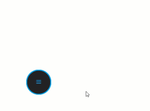
Sneak Peek
Here is a quick peek at the circular icon menu we will build.
To lay your hands on the design from this tutorial, you will first need to download it using the button below. To gain access to the download you will need to subscribe to our newsletter by using the form below. As a new subscriber, you will receive even more Divi goodness and a free Divi Layout pack every Monday! If you’re already on the list, simply enter your email address below and click download. You will not be “resubscribed” or receive extra emails.

To import the layout to your page, simply extract the zip file and drag the json file into the Divi Builder.
Let’s get to the tutorial shall we?
What You Need to Get Started
To get started, you will need to do the following:
- If you haven’t yet, install and activate the Divi Theme installed (or the Divi Builder Plugin if not using the Divi Theme).
- Create a new page in WordPress and enable the Divi Builder to edit the page on the front end (visual builder).
For this tutorial, we will be using Divi’s built-in icons from the blurb module, so no need for any external assets.
After that, you will have a blank canvas to start designing in Divi.
Part 1
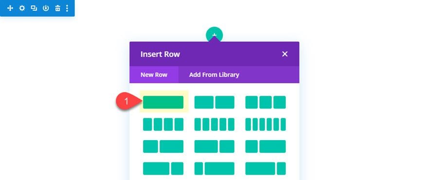
Once the Divi Builder is enabled to edit the page on the front end, add a one column row to the default regular section.
Then open the row settings and add the following padding:
Padding: 300px top
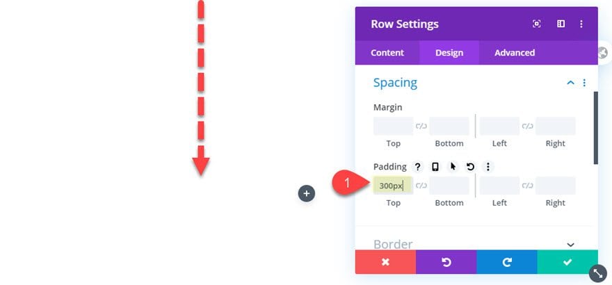
This is simply to provide some space for the circular menu items to pop out on click.
Blurb #1
After the row padding is in place, add a blurb module to the column. This will be the first of 5 total blurbs we will add to make up our circular icon menu. We’ll refer to this one as blurb #1.
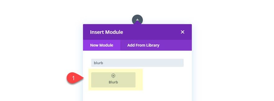
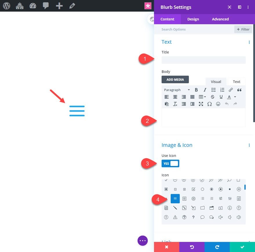
Then update the blurb content by taking out the title and body text. Then add an icon to the blurb as follows.
Use Icon: Yes
Icon: see screenshot
Next, we are going to update the design settings as follows:
Icon Color: #29a1f2
Circle Icon: YES
Circle Color: #222222
Show Circle Border: YES
Circle Border Color: #29a1f2
Use Icon Font Size: YES
Icon Font Size: 25px
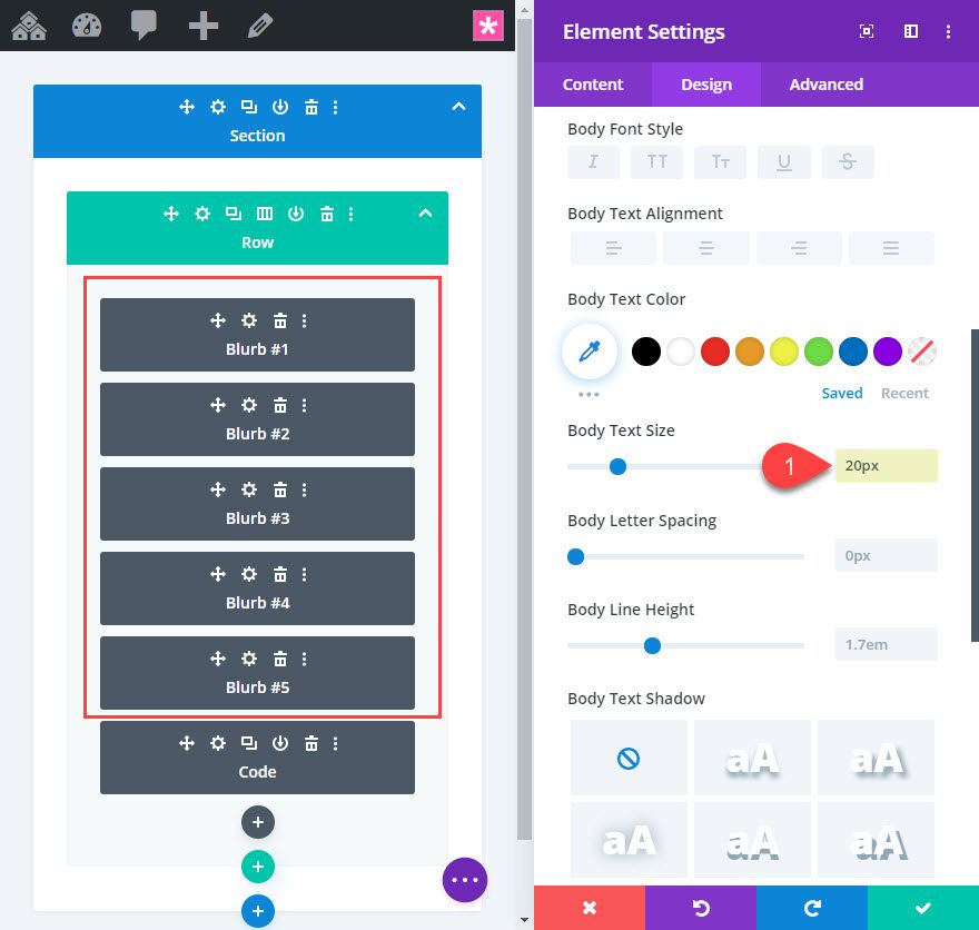
Body Text Size: 20px
Margin: 0px
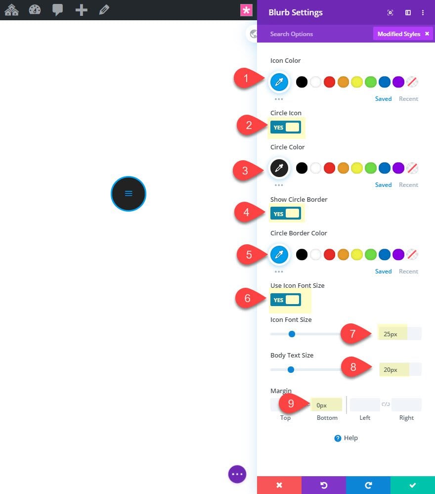
In addition to styling the circular icon, we also added a body text size. There is no body text, but this will come in handy later whenever we use the em length unit (which is relative to the parent body text size) to space out our menu items/blurbs using transform translate. More on this later.
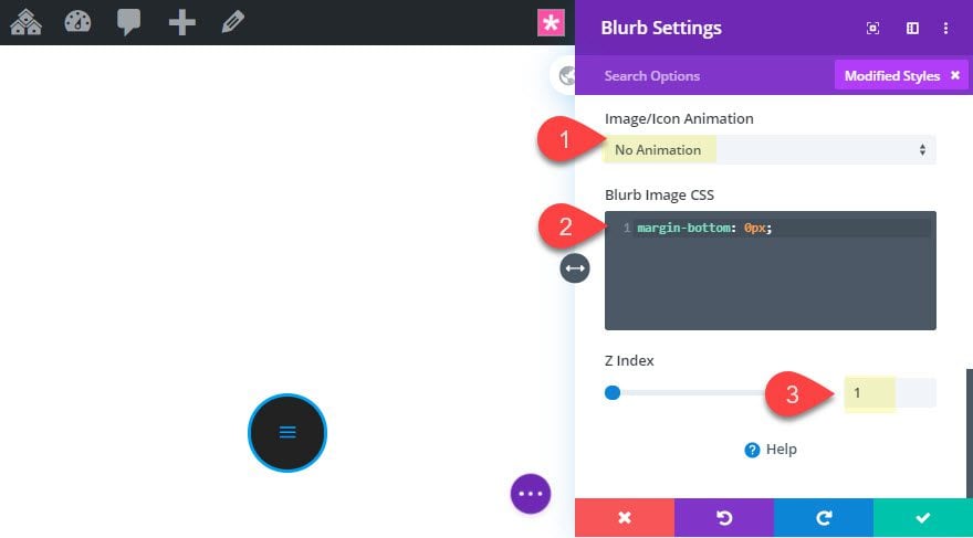
After that, take out the default image/icon animation.
Image/Icon Animation: No Animation
Then set the Z Index for this module to 1 so that it will sit above the others that will eventually sit behind it.
Z Index: 1
And finally, take out the default bottom margin under the icon by adding the following custom CSS to the Blurb Image.
margin-bottom: 0px;
Blurb #2
To create the second blurb, simply duplicate blurb #1.
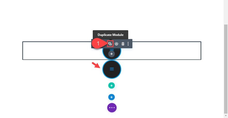
Then open the settings for the new blurb (blurb #2) and change the icon and set the Z Index back to the default (0).
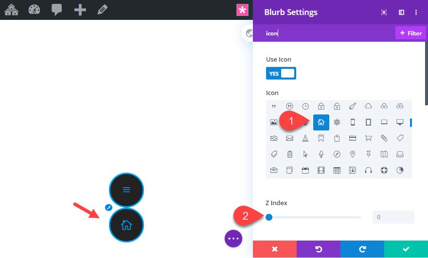
After that, let’s shrink the icon using transform scale as follows:
Transform Scale: 70%
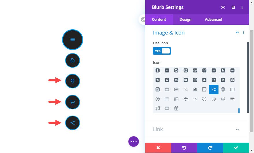
Creating Blurbs #3, #4, and #5
The next three blurbs can be creating by duplicating blurb #2 and updating the icon for each.
Stacking the Blurbs in the Same Absolute Position
The default state of our menu will have all blurbs in an absolute position with the four menu item blurbs stacked behind the main hamburger menu icon blurb. To get our blurbs in the same absolute position, use the multiselect feature (hold ctrl/cmd and click each one) to select all five blurb modules. Then open the settings for one of the selected blurbs to update the element settings for all 5 at the same time.
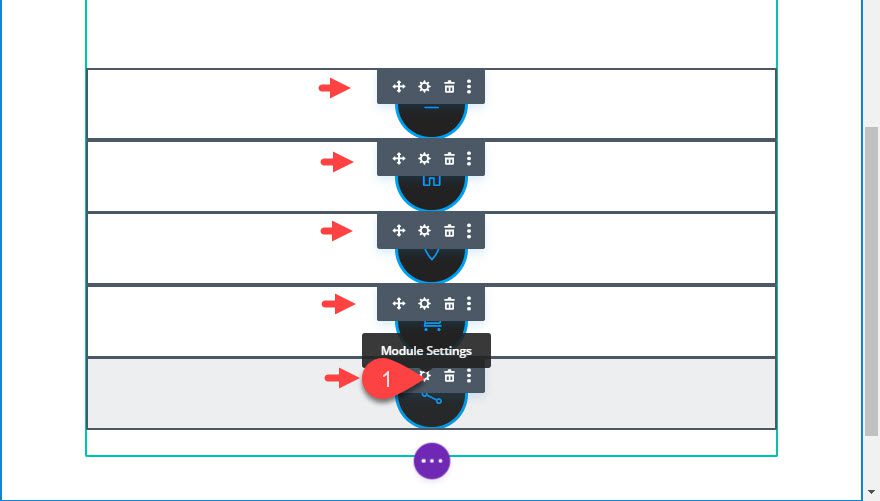
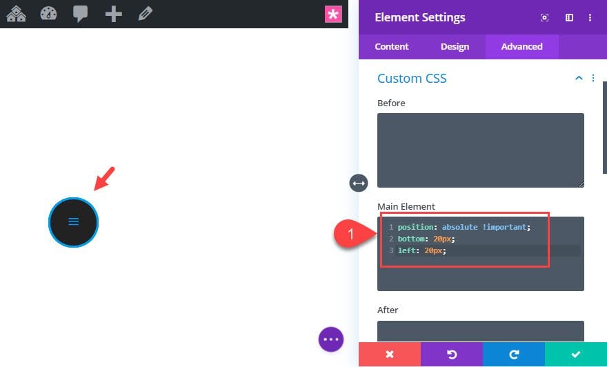
Then add the following custom CSS to the main element:
position: absolute !important;
bottom: 20px;
left: 20px;
This positions the blurbs in the bottom left of the row.
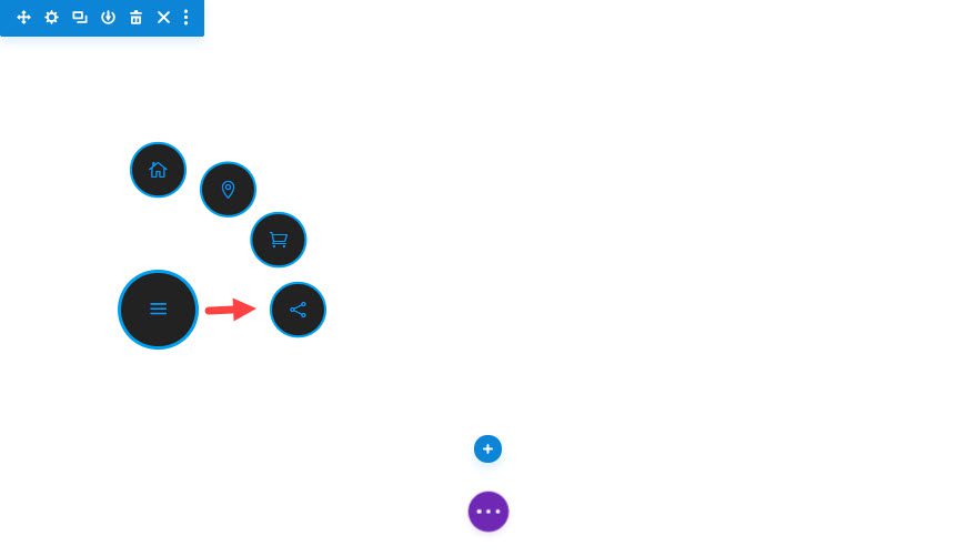
Once all the blurbs are positioned for the default state, we can start positioning the menu items for the click state (where they will end up after clicking the main menu button). To do this we can use the transform translate property within the Divi builder. There is no click state available in the Divi builder (like hover) since this is something handled by JavaScript. So we are going to position our menu items where we want them to be on click now. Then we will use Javascript to toggle that position on and off when clicking the main menu button.
We want to keep blurb #1 in place because it is the main menu button. However, we do want to move blurb #2, #3, #4 and #5. And since our blurbs are now stacked in the visual builder, let’s deploy wireframe mode to update the positions for each blurb.
Position Blurb #2
Open the settings for blurb #2 and update the following:
Transform Translate Y axis: -10em
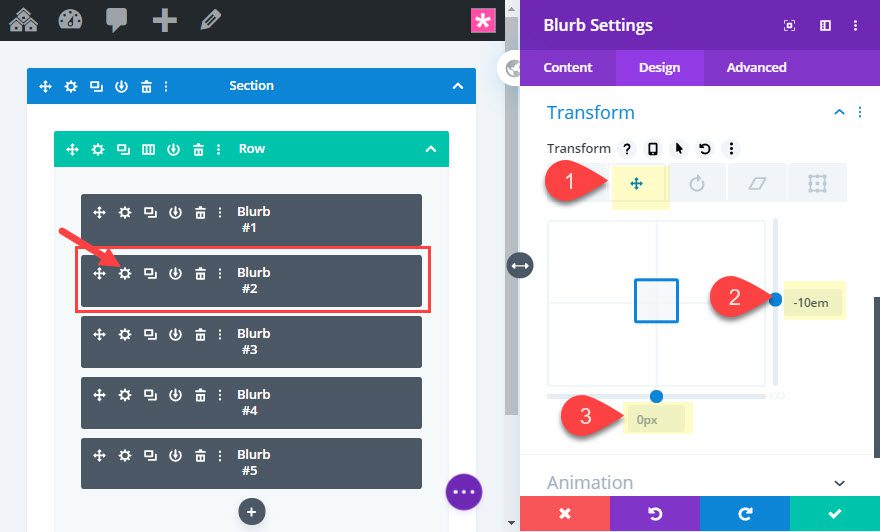
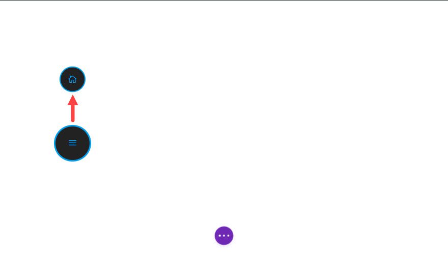
Here is the new position of blurb #2.
Position Blurb #3
Open the settings for blurb #3 and update the following:
Transform Translate Y axis: -8.6em
Transform Translate X axis: 5em
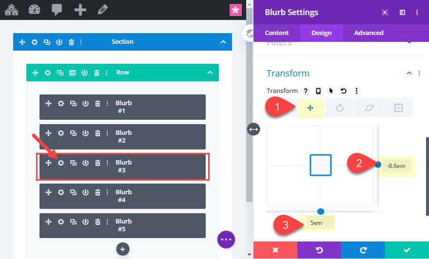
Here is the new position of blurb #3.
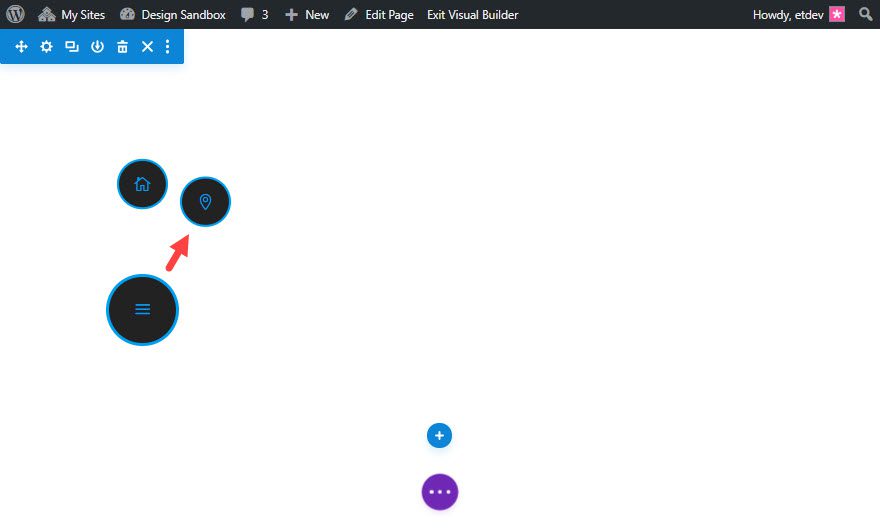
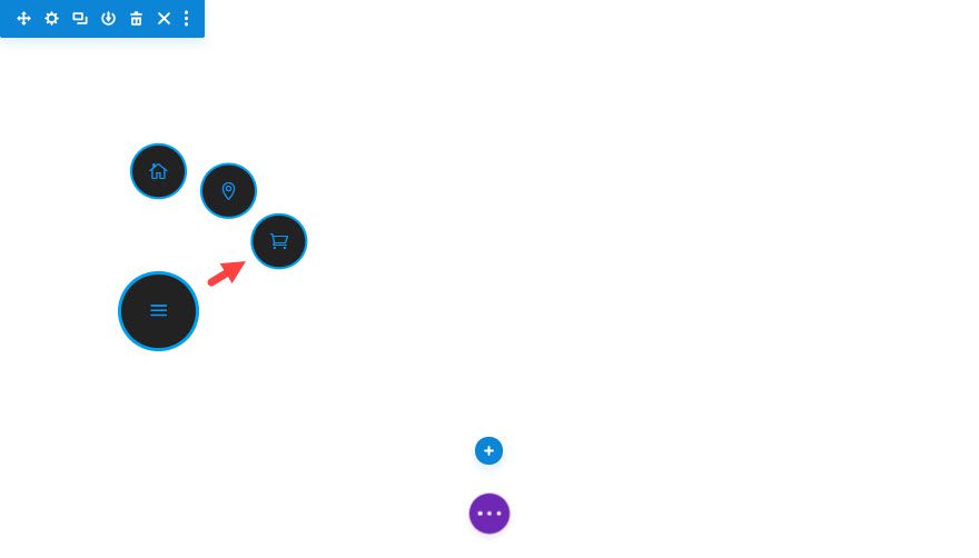
Position Blurb #4
Open the settings for blurb #4 and update the following:
Transform Translate Y axis: -5em
Transform Translate X axis: 8.6em
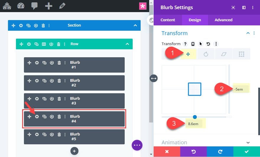
Here is the new position of blurb #4.
Position Blurb #5
Open the settings for blurb #5 and update the following:
Transform Translate Y axis: 0px
Transform Translate X axis: 10em
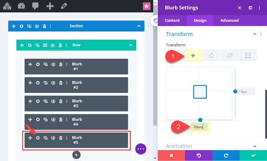
Here is the new position of blurb #5.
Adding custom CSS Classes to the Blurbs
In order for our JavaScript to work properly, we need to add some CSS classes that will serve as selectors for additional styling and functionality.
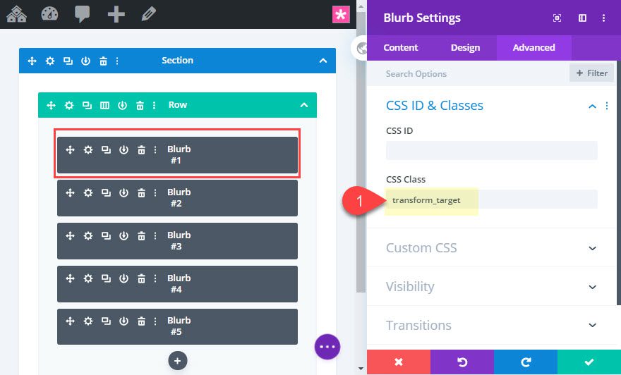
Add CSS Class to Blurb #1
In wireframe view mode, open the settings for blurb #1 and add the following CSS Class:
CSS Class: transform_target
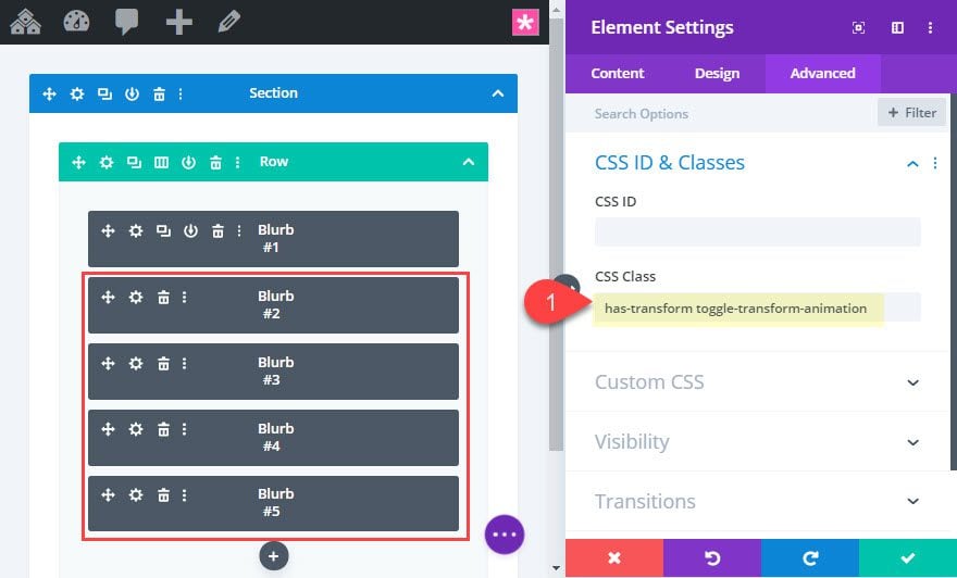
Add CSS Classes to Blurbs #2, #3, #4, and #5
The other four blurbs will all share the same CSS classes, so we can use the multiselect feature to select Blurb #2, #3, #4, and #5 and update the CSS Class for all four as follows:
CSS Class: has-transform toggle-transform-animation
Notice there are two css classes separated by a space.
Adding the External CSS and JavaScript with a Code Module
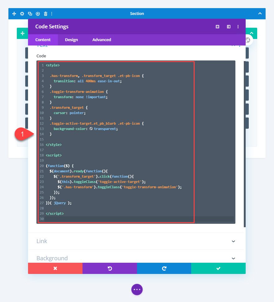
Once our CSS Classes have been added to the blurbs, we are ready to add our code to the page using a code module. To do this, add a code module under blurb #5.
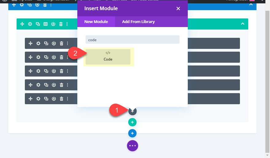
Then paste the following code into the code module:
<style>
  .has-transform, .transform_target .et-pb-icon {
    transition: all 400ms ease-in-out;
  }
  .toggle-transform-animation {
    transform: none !important;
  }
  .transform_target {
    cursor: pointer;
  }
  .toggle-active-target.et_pb_blurb .et-pb-icon {
    background-color: transparent;
  }
</style>
This is the external CSS used to in combination with the jQuery code.
<script>
(function($) {
  $(document).ready(function(){
    $('.transform_target').click(function(){
      $(this).toggleClass('toggle-active-target');
      $('.has-transform').toggleClass('toggle-transform-animation');
    });
  });
})( jQuery );
</script>
And this is the JavaScript need to get the circular icon menu items to extend out when clicking the menu button.
Make sure you keep the style tag wrapped around the CSS and the script tag wrapped around the JavaScript/jQuery.
Check the final result of the functionality on the live page.
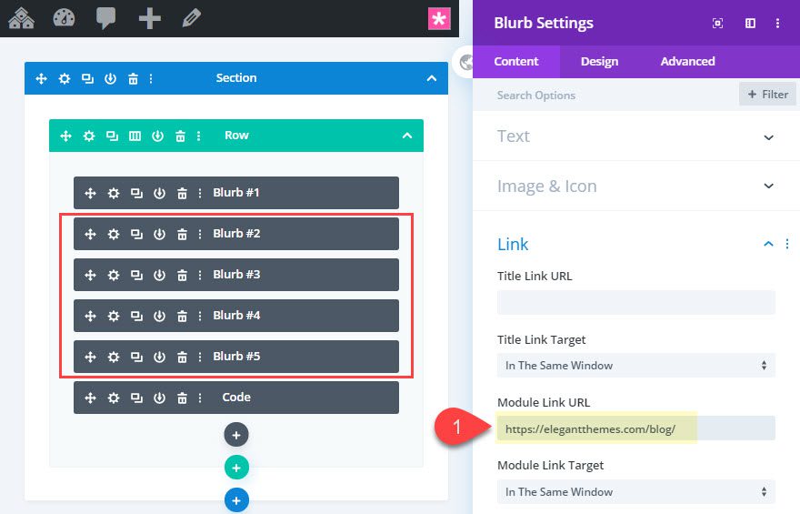
Since this is a menu, the four menu items will need links/URLs. In order to add the URLs needed for each menu item, open the blurb module settings for each of the 4 menu items and add a Module link URL.
Because this menu is small and intuitive for mobile device, you may want to make the menu sticky so that it remains fixed at the bottom left of the browser.
To do this, select all five blurbs using the multiselect feature and then update the custom CSS in the Main Element by replacing the position value “absolute” with “fixed”.
position: fixed !important;
bottom: 20px;
left: 20px;
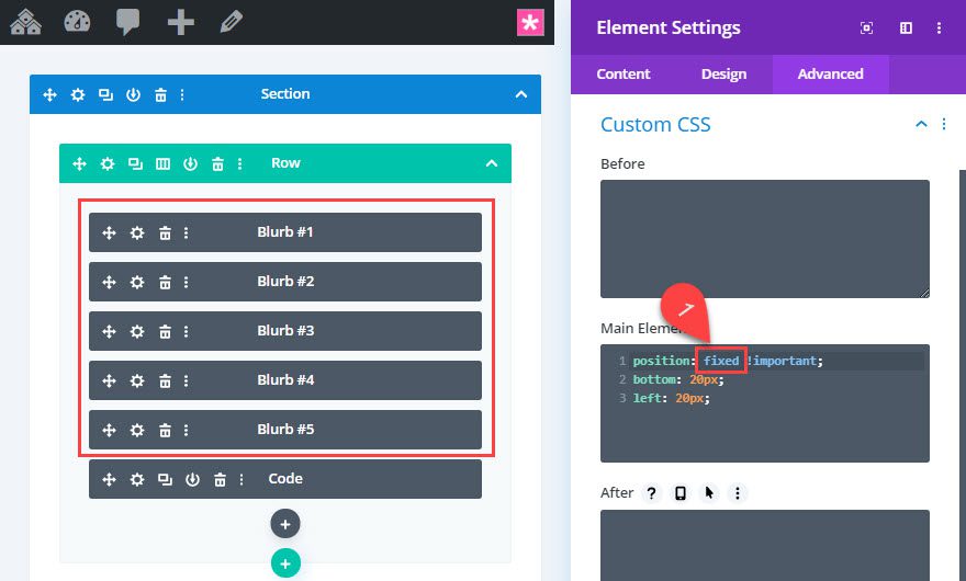
Now the menu will remain fixed at the bottom left of the browser window.
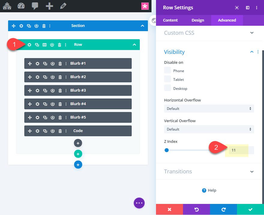
To make sure the menu sits above the other content on the page, update the z index for the row as follows:
Z Index: 11
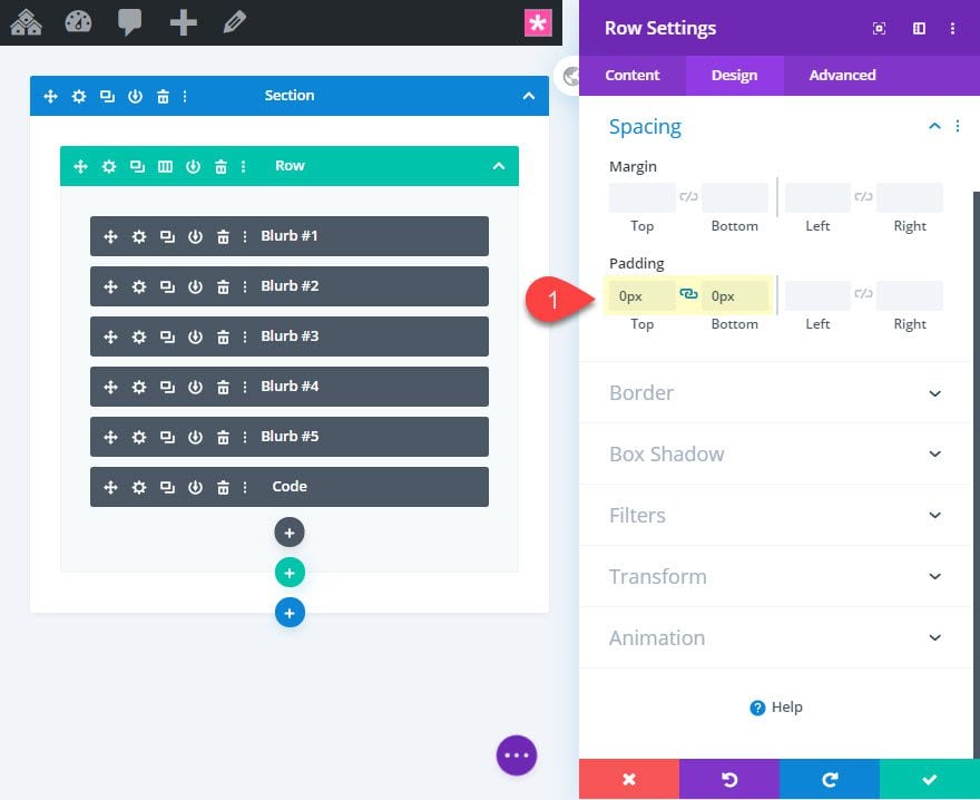
Then take out the padding of the row:
Padding: 0px top, 0px bottom
Final Design
Here is the final design of the fixed circular icon with a premade layout.
And here it is on mobile.
As mentioned earlier, the menu was designed using the em length unit for the positioning of the menu item on the x and y axis (using transform translate). The em length unit is relative to the size of the parent body text size. Therefore, since each of our blurb modules have the same body text size of 20px, we can use multiselect to change the body text for all the blurbs at once.
This will increase or decrease the spacing between the menu items as needed.
And you can do the same for the Icon font size as well. Simply use multiselect to adjust the size of the icon font for all the menu items at once.
Final Thoughts
Who knew adding a fixed circular icon menu to a page could this simple with Divi. It is the perfect type of menu for mobile as well! Sure, there are a few custom code snippets needed, but the fact that you can design and position the click state of the menu items using the visual builder is pretty cool stuff. Don’t forget to explore different colors, sizes, and hover designs that can easily make the menu match your own website.
I look forward to hearing from you in the comments.
Cheers!


Great post, is there perhaps a way to make the hamburger icon change to an X when “open”?
Hi. This may be a REALLY stupid question, but is there a way to add this to all pages, or can it only be used by adding the layout to each and every page?
Many thank
Thanks for this tutorial.
Is it possible to close automaticly the menu when we click on a buton ?
Maybe a dumb question; but when I want to add this to an existing layout, is it possible? And how?
Should I download it, I can make a new page with it. But it is not clear to me how I should use it on an
existing already made page. Please let me know THX!
This is very nice thank you so much for your great work.
Thanks you for the tutorial, is very good.
I have a issue with this tutorial.
When I scroll and I have photos in my web site then the circle icon menu goes under the pictures.
Thanks for the tutorial, very good and very clear.
just a question.
If I want to use my own images, what parameters should I change?
I tried but it is not aligned
Enrique,
Great! Glad you liked it.
I would make sure the images are 56px by 56px. That should do it. Then add a border radius (rounded corners) of 50% all around to make them circular.
Not sure if i’m doing sometnig wrong. My menu stays open. I have done the downloaded one, and from scratch. Its seems I missing s step somewhere to close and open the icons
Same here, its stuck in “open” posish 🙂
As a 2nd menu, and for mobile use, where do I input data to get it to stick 1/3 on the right hand side vertically? Would be nifty since it might cludder up for safari-users (buttons down center already) and most people are using their right thumb to navigate up and down.
If I have 5 menu items, instead of 4, what would the em values be in the transform tool? Math is hard haha.
Marion,
Basically, you can do 10 cos(deg) and 10 sin(deg) since the radius is 10em. For this example, you can use the following:
menu item one ( 0 , -10em)
menu item two ( 3.83em , -9.24em )
menu item three ( 7.07em , -7.07em )
menu item four ( 9.24em , -3.83em )
menu item five ( 10em , 0 )
Eye-ball it. As a designer, that’s what I do all the time.
I also have my menu positioned in the top right corner.
Much obliged such a great amount for another moving model. It appears to all go fine likewise making some little changes. Be that as it may, the enormous open/close catch in the lower left corner, appears not to remain on top for me.
Thomas,
hmm… not sure what you are referring to. Are you saying the hamburger icon (main menu button) isn’t remaining on top?
Hi Jason
This is pretty cool to be honest, i just have two questions.
1: Would you recommend this as a main menu? if so how would it look if you added more blurb, will they get smaller to fit the space?
2: If you are using a normal menu for the homepage could you use this design for other pages of the siteas the menu, like a follow up menu for the other pages left to be seen?
Hope that make sense.
Apart from that this is a very cool look for a menu i have to say moment i looked at it i thought wow that cool i like that simple but creative and non invasive.
Well done.
Jay
Jay,
1. I personally wouldn’t use it as a replacement for the main menu. But you can definitely add more blurb (menu items). You would just need to reposition them using the transform options.
2. Yes, this would be a perfect secondary menu.
Thanks!
Thanks
Hi Jason,
A few extra touches. First, I had to put the Hamburger menu module at the bottom as all other blurbs in my build were on top. You could also solve that with a higher z index.
I also added fade in to the row as on load the javascript takes a split second to click in.
Stephen,
Yes. That makes sense. I added a higher z index to the hamburger blurb so that it stayed above the rest. Great idea to add the fade to the row for smoother loading. Thanks!
Thank you Jason, you are my rockstar ! 🙂
You’re welcome. Glad you liked it!
Very nice! I love Divi and that it is possible to have so many customized possibilities.
If I want this top right or top center instead of bottom left, can I just change the positioning values and use the same json script?
Yes. Exactly.
Looks great.. but how well does it do on mobile ?
I am not using your theme but I can use it with the help of Divi Builder Plugin. Right ?
Yep. You sure can.
Hi Jason,
Thanks so much for another inspiring example. It seems to all go fine also making some small adjustments. However, the big open/close button in the lower left corner, seems not to stay on top for me. Any idea why? I downloaded your layout and added the the section to an existing page of mine. I tried to play with the z-index but without success. Thanks again, keep up the good work!
Jason. (Yes, I know, cool name, huh!)
I’m not sure. I would make sure to add “z-index: 1” to the hamburger icon blurb. And also increase the z-index of the row above 11. Also, there is a transparent background that was added to the hamburger icon blurb on click. That may be what you are seeing. Hope that helps.
I like this one! I think I will use it on my page with the several services. Visitor and click easy to a specific service op the page. Thanks!!
Awesome!
Beautiful! but sincerly i think something like this must be used like “FAB”.
So, main button need to be at right and must have shadow… my opinion.
So very great tutorial!
Thanks, Paolo.
At the right we often have the chat and also the “back to top” button. It will be busy there…
Where can I download?
Josh, you can download the .json file at the beginning of the post above. Just enter your email and click download.
There where you can read “Download the Layout for FREE” 🙂