
If you enjoy building websites with user interaction in mind, you’re going to love this Divi design tutorial. Today, we’ll show you how to create a seamless hover grid. The design is initially plain and clean. As soon as someone hovers one of the items, the background image is revealed and the module styles change along with it. This results in a beautiful hover experience. In this tutorial, we’ll guide you step by step through the creation process. You’ll be able to download the layout’s JSON file for free as well!
Let’s get to it.
Preview
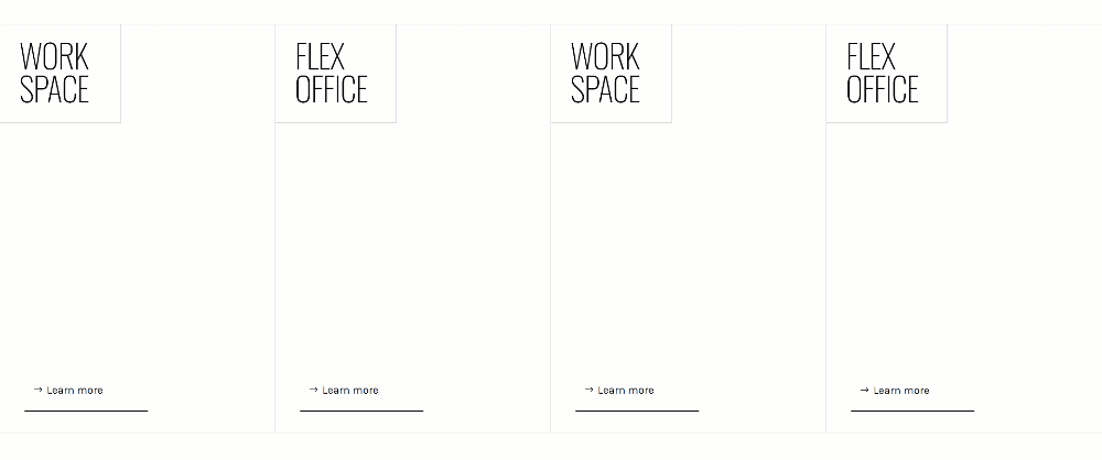
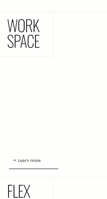
Before we dive into the tutorial, let’s take a quick look at the outcome across different screen sizes.
Desktop
Mobile
Download The Layout for FREE
To lay your hands on the free layout, you will first need to download them using the button below. To gain access to the download you will need to subscribe to our newsletter by using the form below. As a new subscriber, you will receive even more Divi goodness and a free Divi Layout pack every Monday! If you’re already on the list, simply enter your email address below and click download. You will not be “resubscribed” or receive extra emails.

Let’s Start Recreating!
Add New Section
Background Color
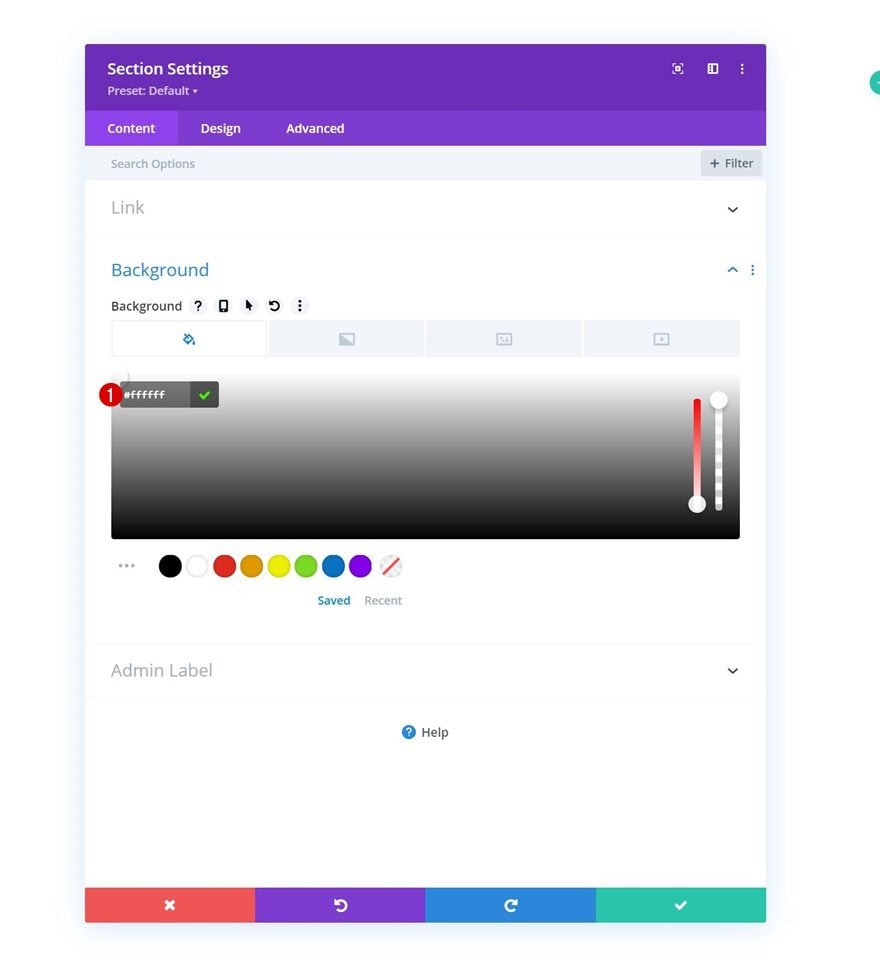
Start by adding a new section to the page you’re working on. Open the section settings and apply a white background color.
- Background Color: #ffffff
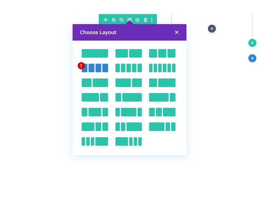
Add Row #1
Column Structure
Continue by adding a new row using the following column structure:
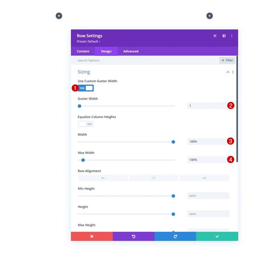
Sizing
Without adding modules yet, open the row settings and modify the sizing settings as follows:
- Use Custom Gutter Width: Yes
- Gutter Width: 1
- Width: 100%
- Max Width: 100%
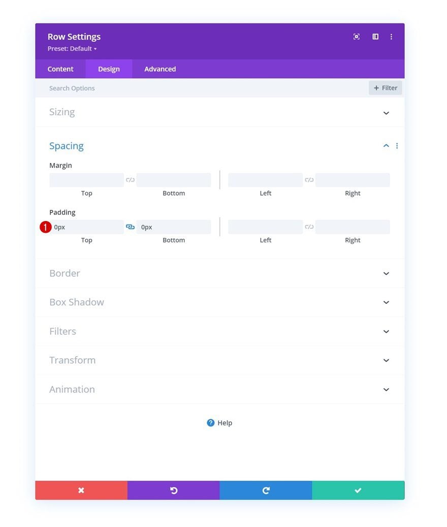
Spacing
Remove all default top and bottom padding next.
- Top Padding: 0px
- Bottom Padding: 0px
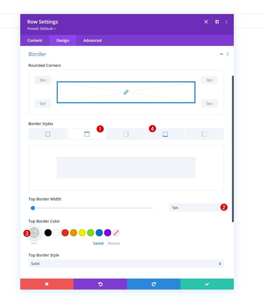
Border
And include a top and bottom border.
- Top & Bottom Border Width: 1px
- Top & Bottom Border Color: #d3d3d3
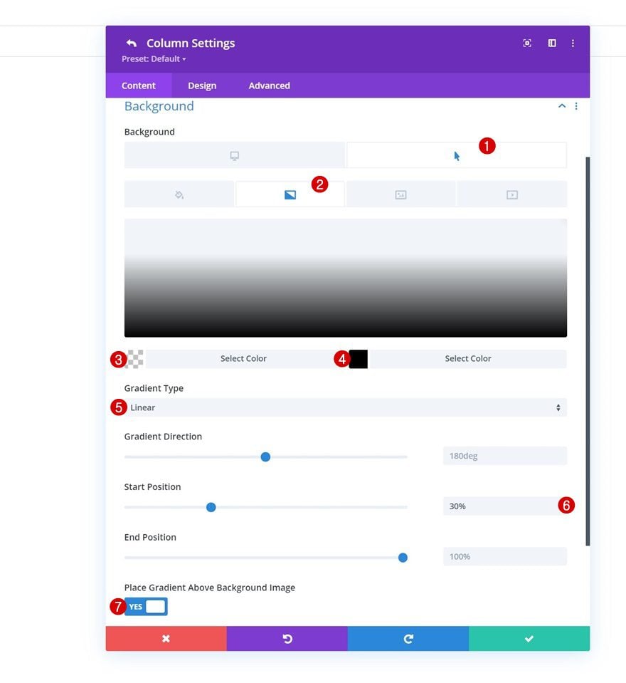
Column 1 Settings
Hover Gradient Background
Up next, we have the column 1 settings. Apply a gradient background on hover.
- Color 1: rgba(255,255,255,0)
- Color 2: #000000
- Gradient Type: Linear
- Start Position: 30%
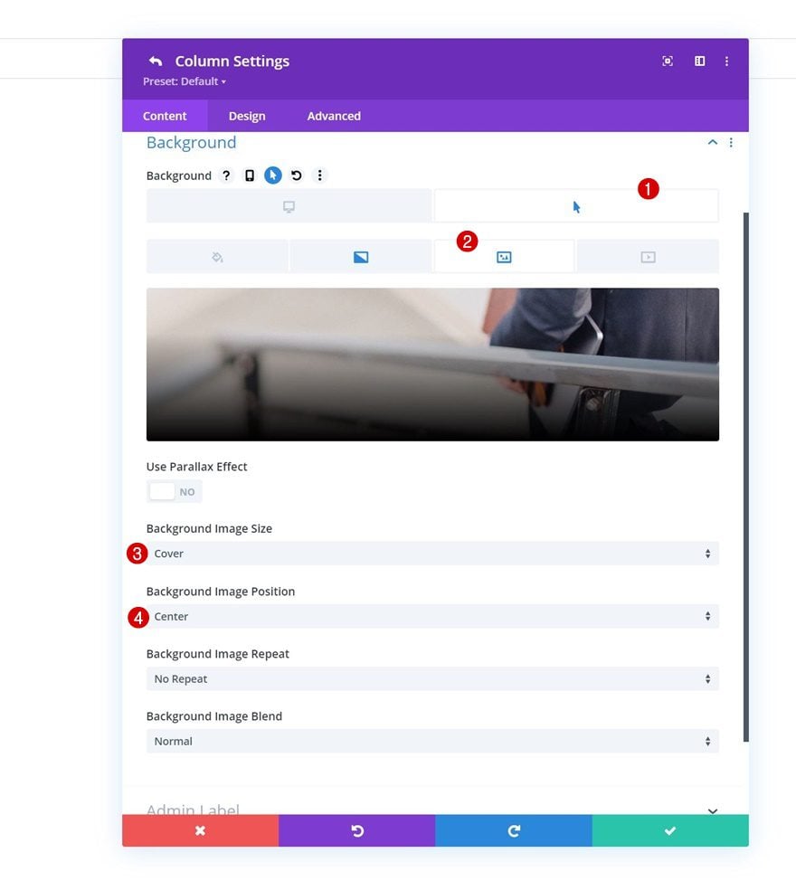
Hover Background Image
Upload a background image on hover too.
- Background Image Size: Cover
- Background Image Position: Center
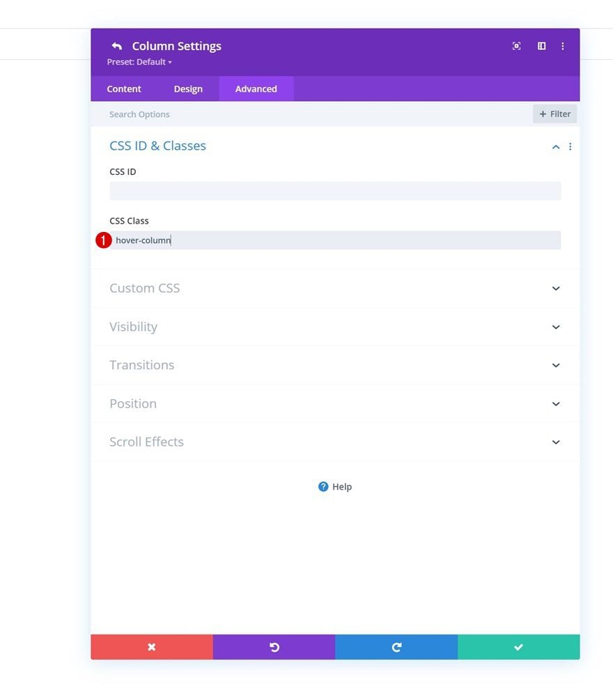
CSS Class
And complete the column settings by assigning the following CSS class in the advanced tab:
- CSS Class: hover-column
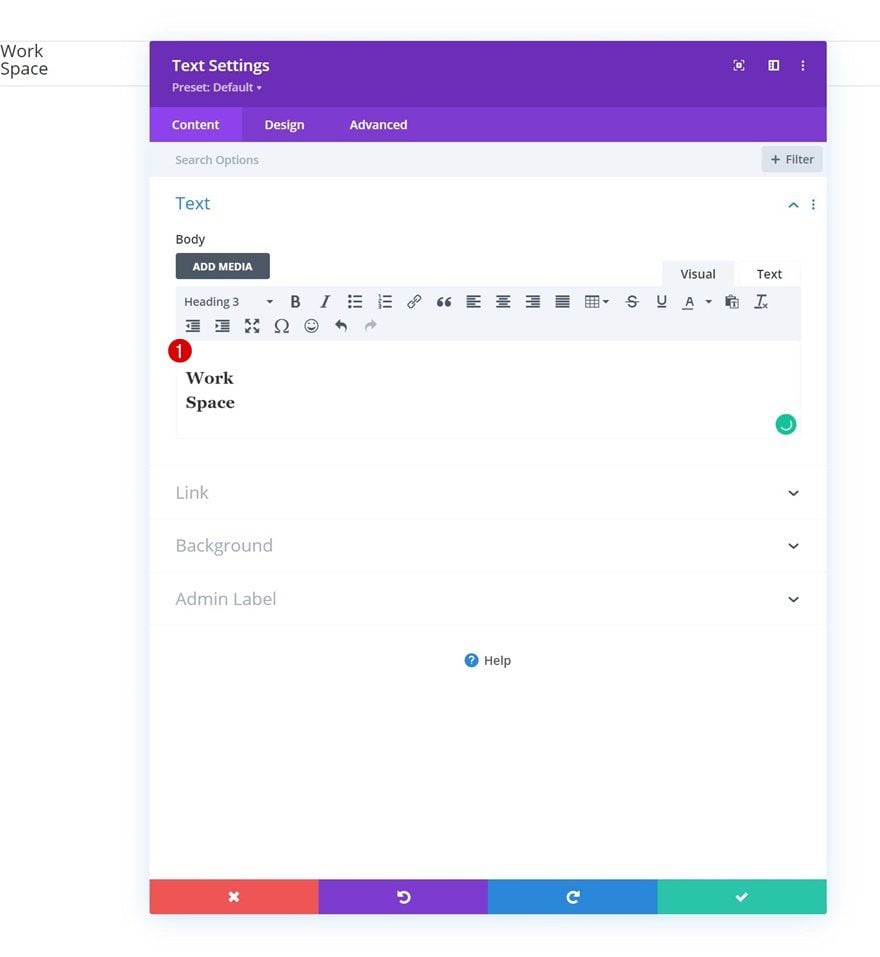
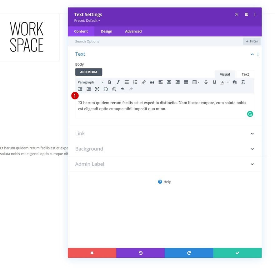
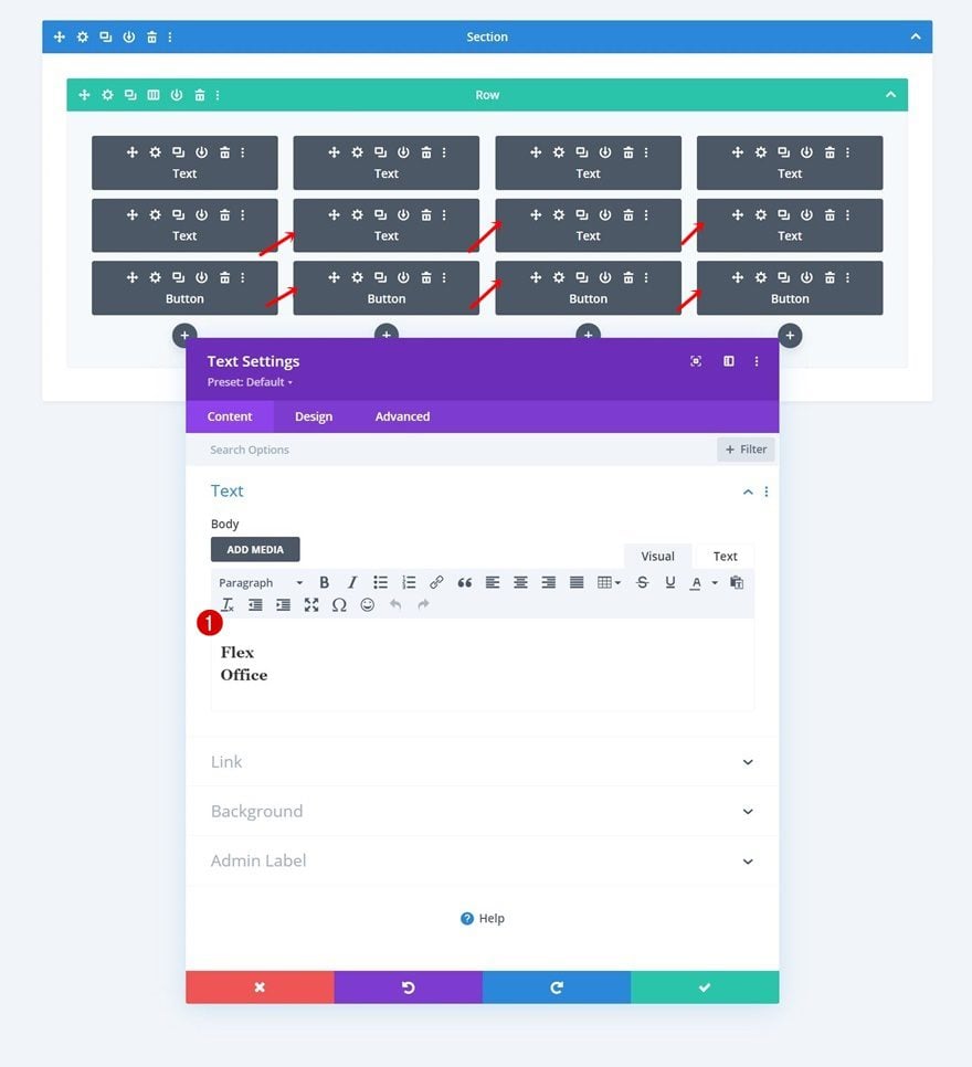
Add Text Module #1 to Column 1
Add H3 Content
Time to add modules, starting with a first Text Module in column 1. Use some H3 content of your choice.
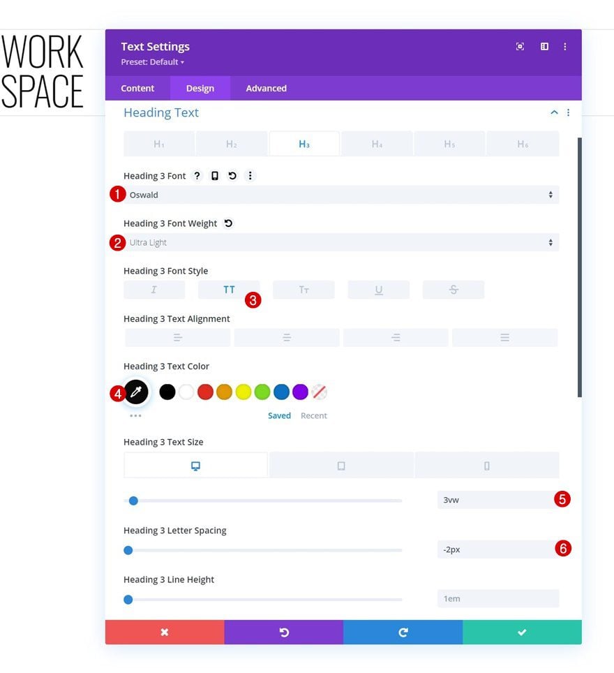
H3 Text Settings
Move on to the module’s design tab and change the H3 text settings as follows:
- Heading 3 Font: Oswald
- Heading 3 Font Weight: Ultra Light
- Heading 3 Font Style: Uppercase
- Heading 3 Text Color: #0a0a0a
- Heading 3 Text Size:
- Desktop: 3vw
- Tablet: 7vw
- Phone: 14vw
- Heading 3 Letter Spacing: -2px
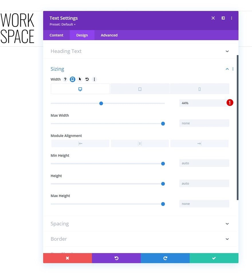
Sizing
Modify the width across different screen sizes in the sizing settings.
- Width:
- Desktop: 44%
- Tablet: 48%
- Phone: 50%
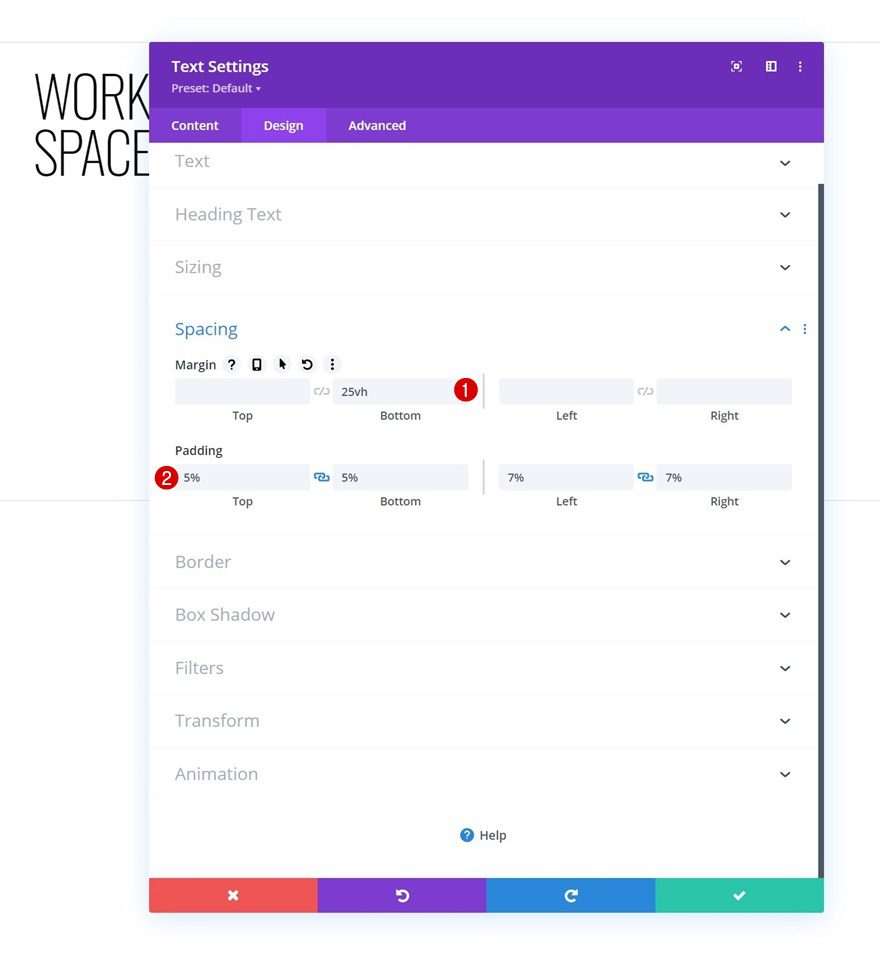
Spacing
We’re using some custom margin and padding values too.
- Bottom Margin: 25vh
- Top Padding: 5%
- Bottom Padding: 5%
- Left Padding: 7%
- Right Padding: 7%
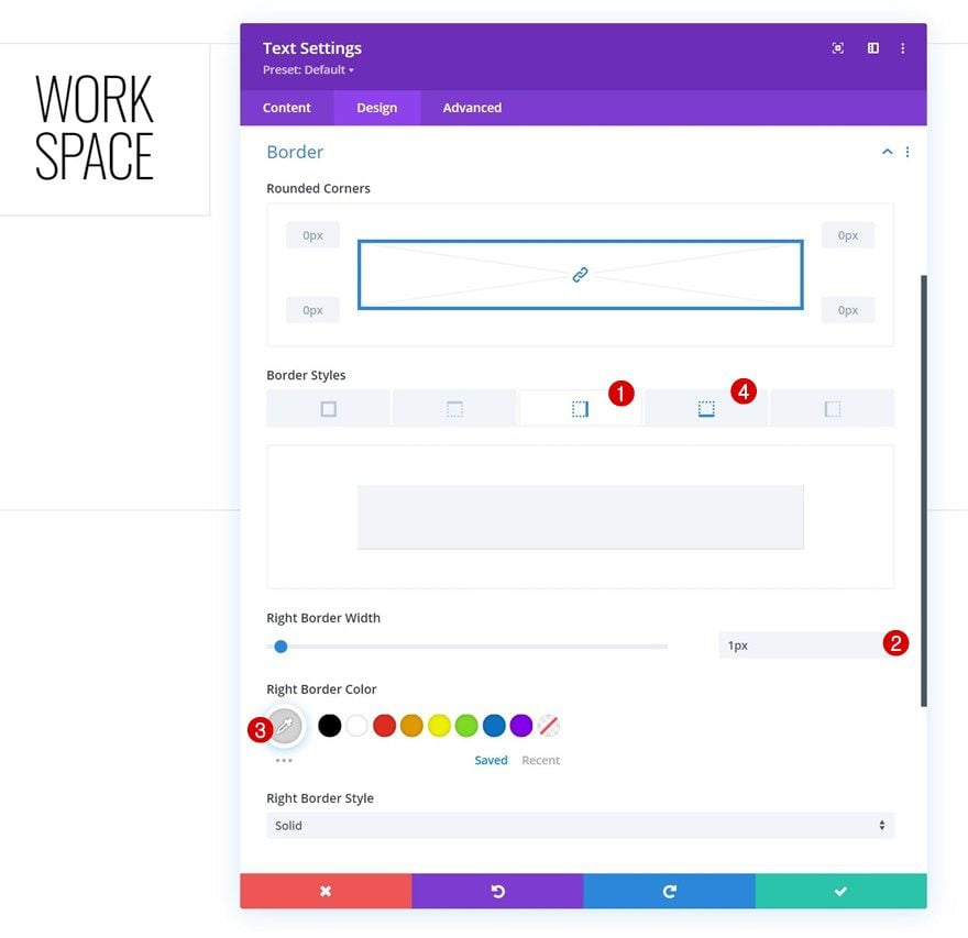
Border
Next, we’ll add some right and bottom borders.
- Right & Bottom Border Width: 1px
- Right & Bottom Border Width: 1px
- Right & Bottom Border Color: #d3d3d3
CSS Class
And we’ll complete the module settings by assigning the following CSS class to the Text Module:
- CSS Class: hover-title

Add Text Module #2 to Column 2
Add Content
Add another Text Module right below the previous one with some description content of your choice.
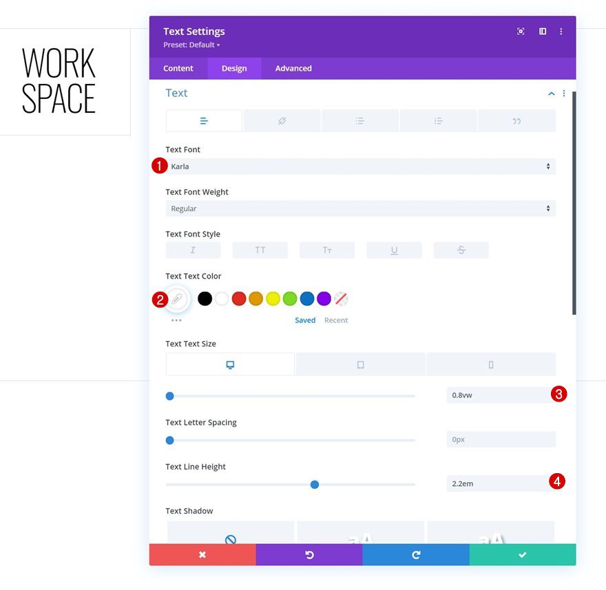
Text Settings
Move on to the module’s design tab and change the text settings accordingly:
- Text Font: Karla
- Text Color: #ffffff
- Text Size:
- Desktop: 0.8vw
- Tablet: 2vw
- Phone: 3.6vw
- Text Line Height: 2.2em
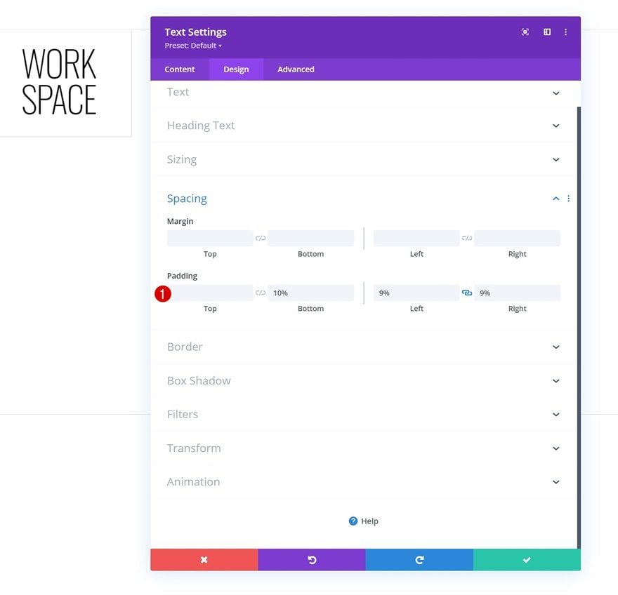
Spacing
Apply some custom padding values too.
- Bottom Padding: 10%
- Left Padding: 9%
- Right Padding: 9%
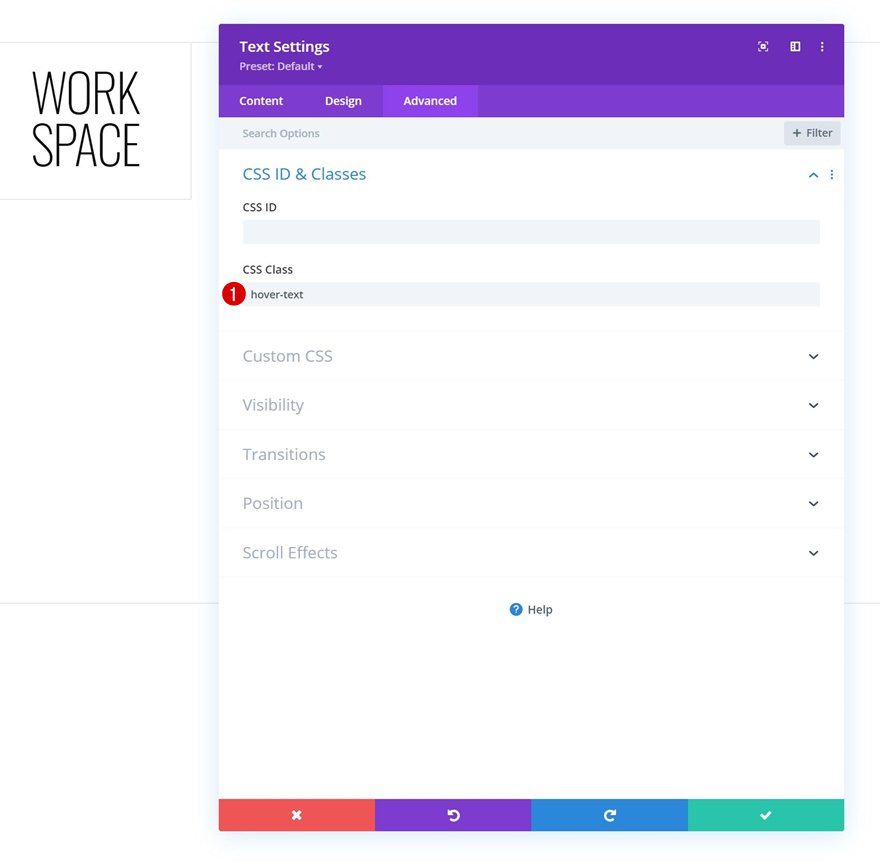
CSS Class
And complete the module settings by using the following CSS class for the module:
- CSS Class: hover-text
Add Copy
The next and last module we need is a Button Module. Add some copy of your choice.
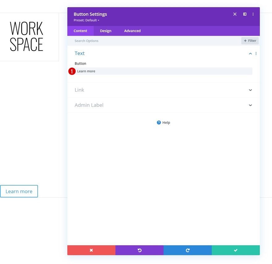
Button Settings
Modify the module’s button settings as follows:
- Use Custom Styles For Button: Yes
- Button Text Size:
- Desktop: 1vw
- Tablet: 2.5vw
- Phone: 4vw
- Button Border Width: 0px
- Button Border Radius: 0px
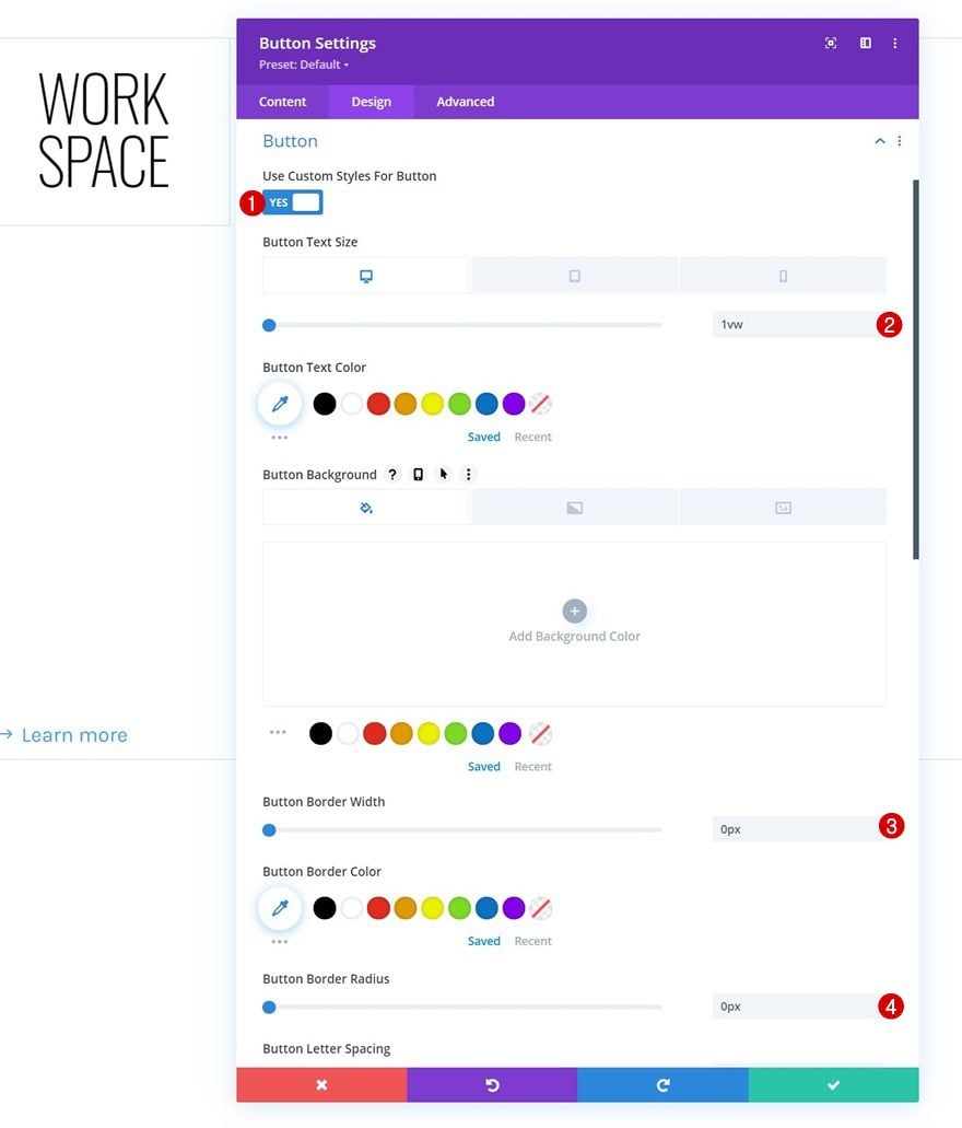
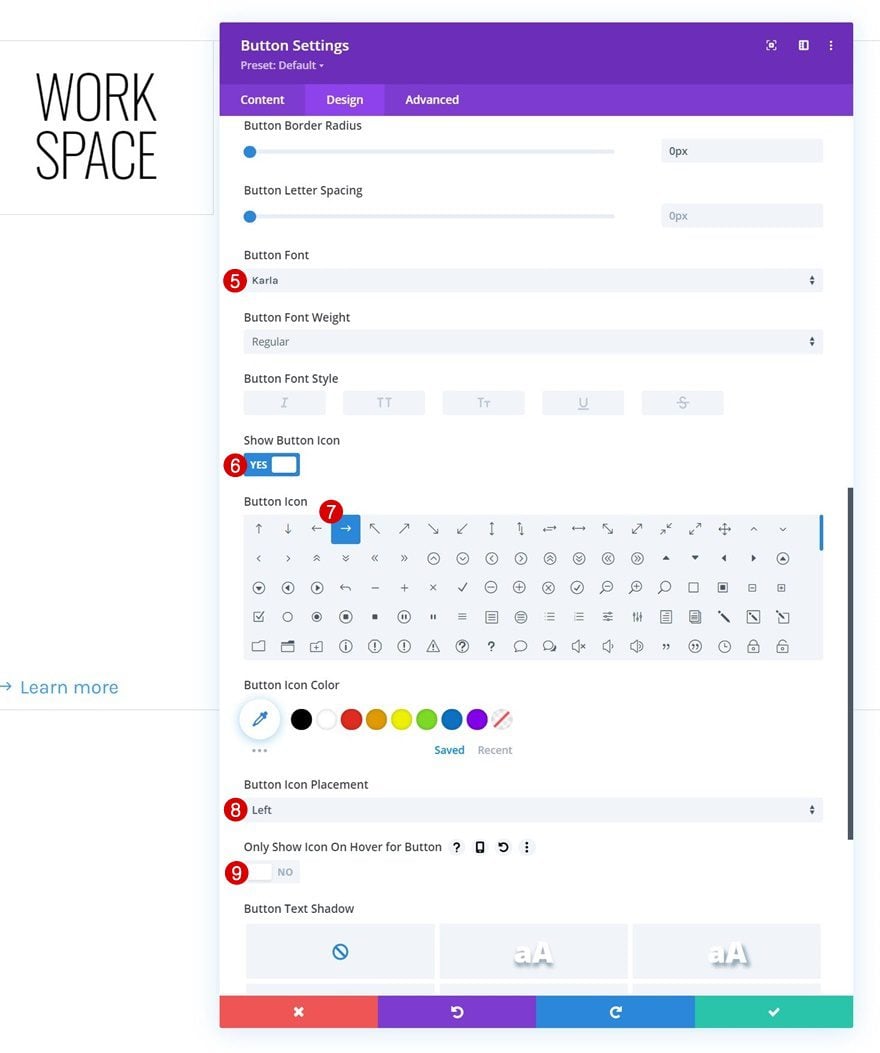
- Button Font: Karla
- Show Button Icon: Yes
- Button Icon Placement: Left
- Only Show Icon On Hover for Button: No
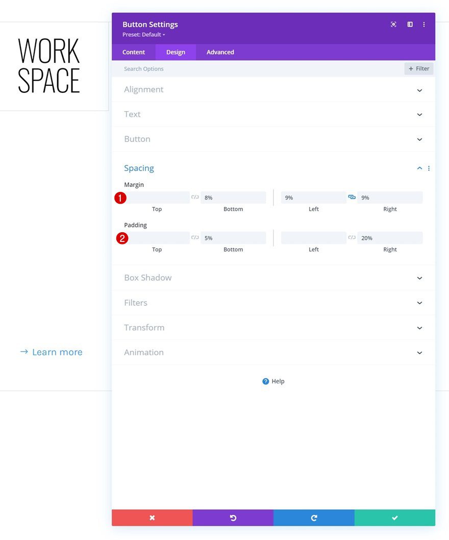
Spacing
Add some custom spacing values too.
- Bottom Margin: 8%
- Left Margin: 9%
- Right Margin: 9%
- Bottom Padding: 5%
- Right Padding: 20%
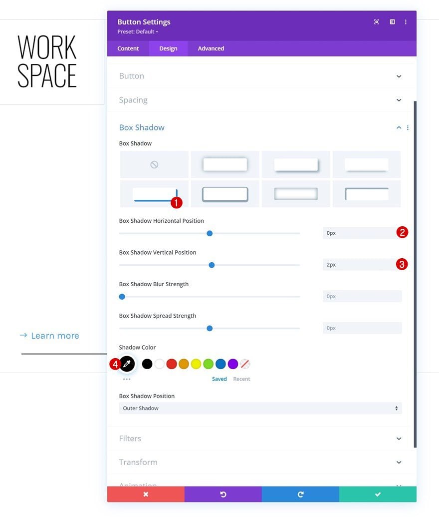
Box Shadow
Then, apply a box shadow.
- Box Shadow Horizontal Position: 0px
- Box Shadow Vertical Position: 2px
- Shadow Color: #000000
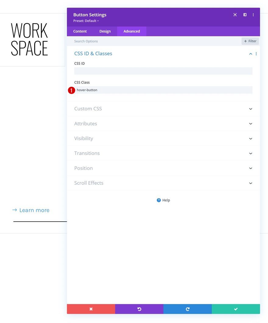
CSS Class
And complete the module settings by assigning the following CSS class to the button:
- CSS Class: hover-button
Reuse Column 1
Delete Columns 2, 3 & 4
Now that we’ve built the first column, we can reuse it. The first thing we’ll do is remove the empty columns in our row.
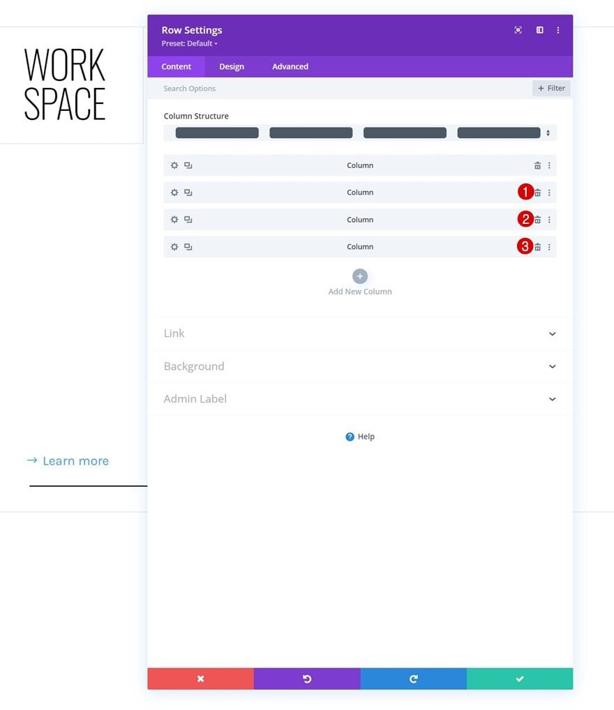
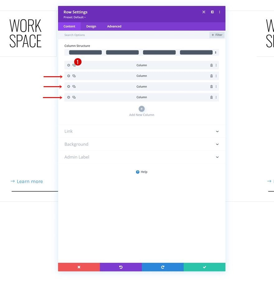
Clone Column 1 Three Times
We’ll reuse column 1 by cloning it three times.
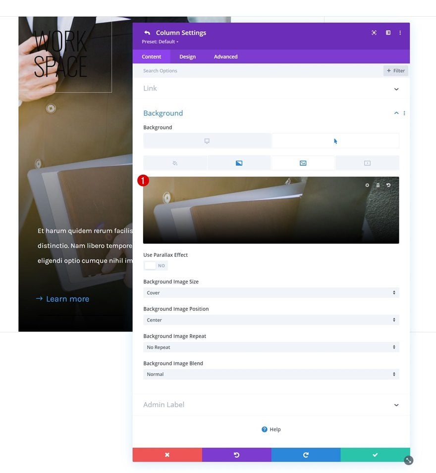
Change Duplicate Column Hover Background Images
Change the duplicate column background images in each duplicate column.
Change Duplicate Content
Along with the module content in each duplicate column.
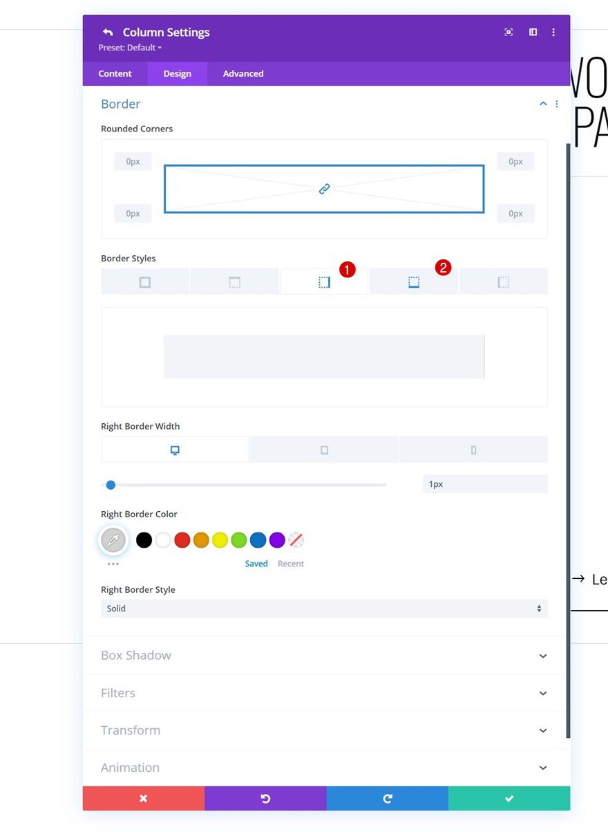
Unique Column Borders
Column 1
We’ll need to apply some unique border settings to each column, starting with column 1.
- Right Border Width:
- Desktop: 1px
- Tablet: 1px
- Phone: 0px
- Right Border Color: #d3d3d3
- Bottom Border Width:
- Desktop: 0px
- Tablet: 1px
- Phone: 1px
- Bottom Border Color: #d3d3d3
Column 2
Next, we have column 2.
- Right Border Width:
- Desktop: 1px
- Tablet: 0px
- Phone: 0px
- Right Border Color: #d3d3d3
- Bottom Border Width:
- Desktop: 0px
- Tablet: 1px
- Phone: 1px
- Bottom Border Color: #d3d3d3
Column 3
And we’ll use the following border settings for column 3:
- Right Border Width:
- Desktop: 1px
- Tablet: 1px
- Phone: 0px
- Right Border Color: #d3d3d3
- Bottom Border Width:
- Desktop: 0px
- Tablet: 0px
- Phone: 1px
- Bottom Border Color: #d3d3d3
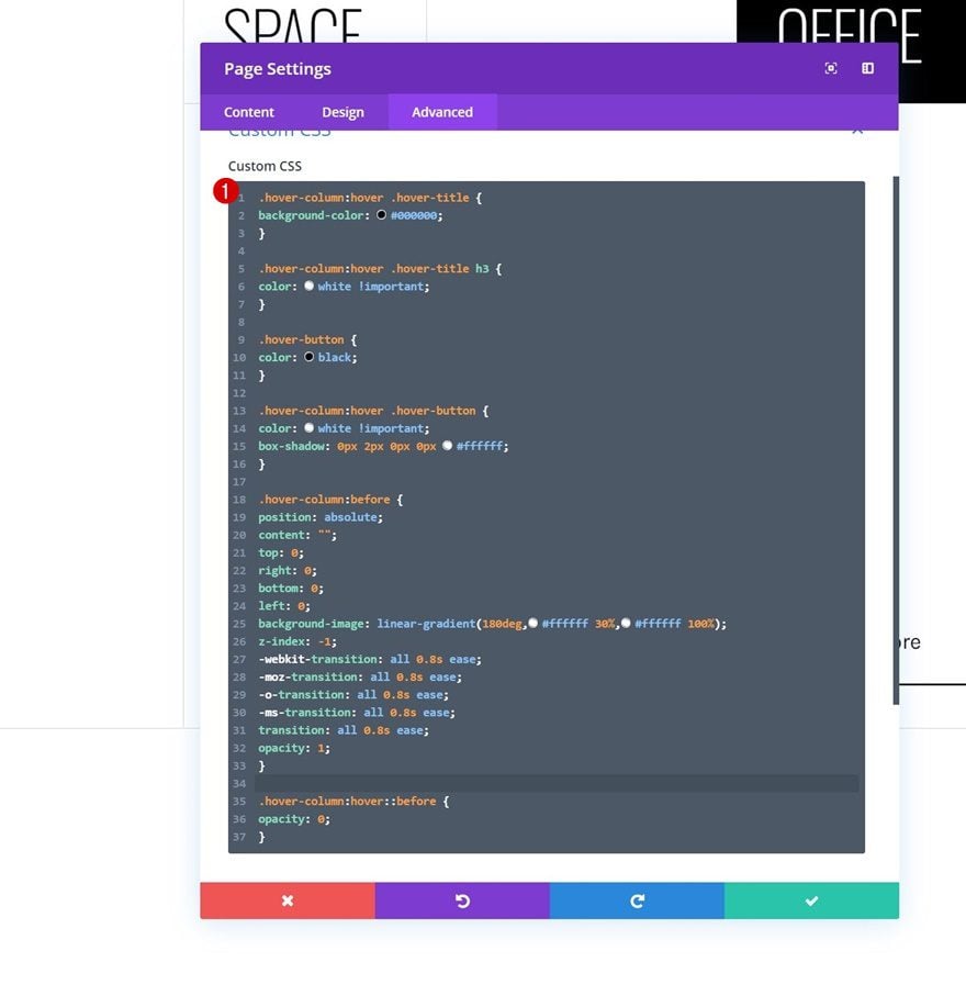
Add Custom CSS Code to Page Settings
Open Page Settings
Now that we’ve got the entire design in place, the only thing left to do is add some custom CSS code to help trigger hover effects on child elements (the modules). To do that, open the page settings.
Add CSS Code
And copy paste the following lines of CSS code:
.hover-column:hover .hover-title {
background-color: #000000;
}

.hover-column:hover .hover-title h3 {
color: white !important;
}

.hover-button {
color: black;
}

.hover-column:hover .hover-button {
color: white !important;
box-shadow: 0px 2px 0px 0px #ffffff;
}

.hover-column:before {
position: absolute;
content: "";
top: 0;
right: 0;
bottom: 0;
left: 0;
background-image: linear-gradient(180deg,#ffffff 30%,#ffffff 100%);
z-index: -1;
-webkit-transition: all 0.8s ease;
-moz-transition: all 0.8s ease;
-o-transition: all 0.8s ease;
-ms-transition: all 0.8s ease;
transition: all 0.8s ease;
opacity: 1;
}

.hover-column:hover::before {
opacity: 0;
}
Preview
Now that we’ve gone through all the steps, let’s take a final look at the outcome across different screen sizes.
Desktop
Mobile
Final Thoughts
In this post, we’ve shown you how to create a beautiful hover design. More specifically, we’ve created a column grid that starts of plain and clean. As soon as visitors hover a particular item in the grid, the background image is revealed and the module styles change. You were able to download the JSON file for free as well! If you have any questions, feel free to leave a comment in the comment section below.
If you’re eager to learn more about Divi and get more Divi freebies, make sure you subscribe to our email newsletter and YouTube channel so you’ll always be one of the first people to know and get benefits from this free content.


Thanks a lot. Although I am not keen on showing the extra info on a hover. I was looking for a solution like this to use it in a slightly different way.
Thank you for the post… I am looking for the contrary…still image with text on hover on Divi… where can I see some article about it ?
Amazing post. Thanks for sharing. One point to mention though is to correct the mistyping of “column2” in the first half of the post. For example, “Add Text Module #2 to Column 2” >>> should be “Add Text Module #2 to Column 1” and “Add Button Module to Column 2” should be “Add Button Module to Column 1”. I know that readers will understand but just in case and avoid confusion. Again, thanks for this great post Keep it up..
Great patience and so is the outcome! keep it up
The Lies! I have almost a year trying to make work the 2 columns, 3 sections… can be done? (1 section in 1 column & 2 sections in the next column)