
Creating a responsive table can be a challenge, especially if you have a table with a lot of columns. A great way to solve this problem is to add horizontal scroll capability to the table. A table with horizontal scroll solves two main problems. First, it allows the designer to keep the spacing necessary for the table content (really narrow columns will cause the content to smush together too much). And second, it allows the user to view the easy-to-read table content on mobile devices.
In this tutorial, we are going to show you how to user Divi to build a completely custom table with horizontal scroll. We’ll show you how to add the horizontal scroll functionality to the columns that overflow the table container. Plus, we’ll even add some horizontal scroll buttons to the table to boost the UX. All this without a plugin!
Let’s get started.
Sneak Peek
Here is a quick look at the responsive table with horizontal scroll we’ll build in this tutorial.
Download the Layout for FREE
To lay your hands on the designs from this tutorial, you will first need to download it using the button below. To gain access to the download you will need to subscribe to our newsletter by using the form below. As a new subscriber, you will receive even more Divi goodness and a free Divi Layout pack every Monday! If you’re already on the list, simply enter your email address below and click download. You will not be “resubscribed” or receive extra emails.

To import the section layout to your Divi Library, navigate to the Divi Library.
Click the Import button.
In the portability popup, select the import tab and choose the download file from your computer.
Then click the import button.

Once done, the section layout will be available in the Divi Builder.
Let’s get to the tutorial, shall we?
What You Need to Get Started

To get started, you will need to do the following:
- If you haven’t yet, install and activate the Divi Theme.
- Create a new page in WordPress and use the Divi Builder to edit the page on the front end (visual builder).
- Choose the option “Build From Scratch”.
After that, you will have a blank canvas to start designing in Divi.
Building a Responsive Table with Horizontal Scroll
Part 1: Building the Table Columns
For this table design, we are going to create our table columns using rows. To do this we will be using the flex property (custom CSS) to align the rows horizontally like columns.
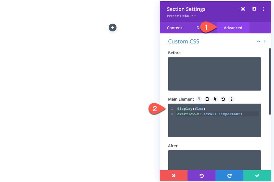
Update Section Settings
Before adding a row, open the section settings of the default regular section and add the following custom CSS to the Main Element:
display:flex;
overflow-y:scroll !important;
This will force the horizontal overflow of the section to have a scroll functionality as well as give us the flex property needed to organize our rows horizontally instead of vertically.
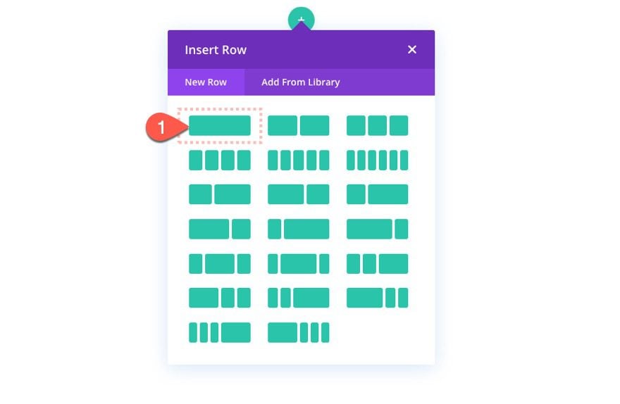
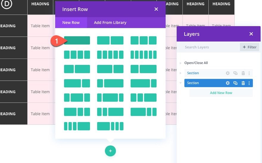
Add Row
Now that the section CSS is in place, create a one-column row within the section.
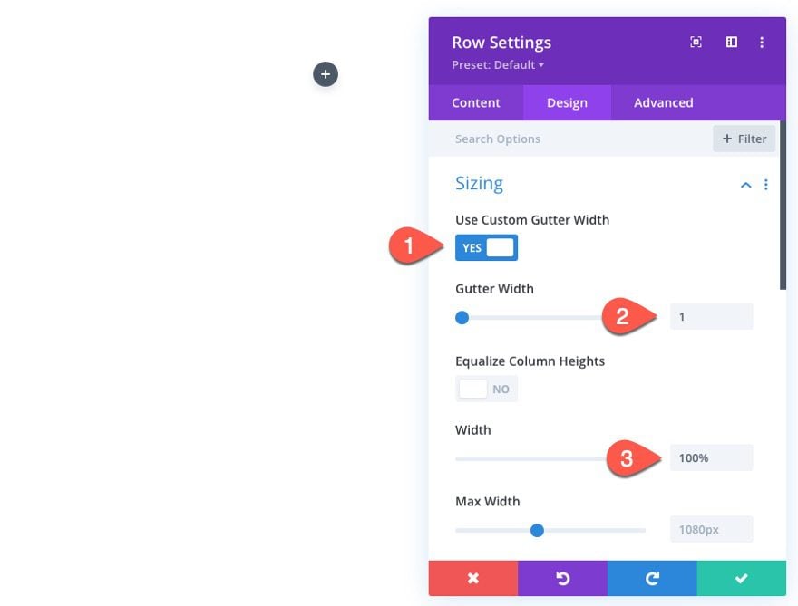
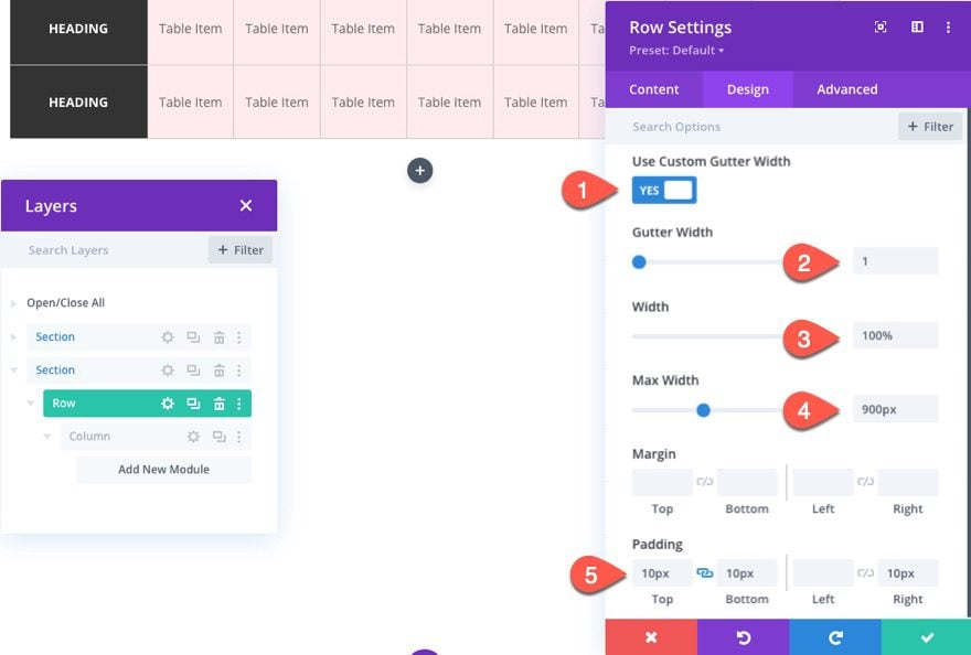
Row Settings
Open the row settings and update the following:
- Gutter Width: 1
- Width: 100%
This will make sure our table columns don’t have any extra margin between the text modules we will be adding for our table items.
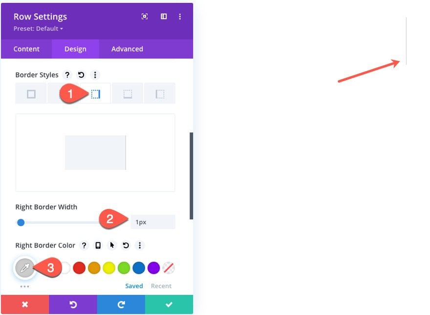
Then give the row a right border as follows:
- Right Border Width: 1px
- Right Border Color: #cccccc
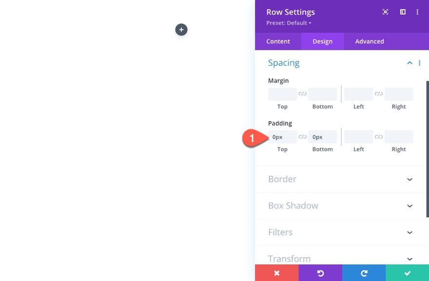
Then update the padding:
- Padding: 0px top, 0px bottom
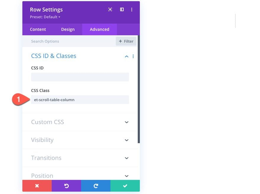
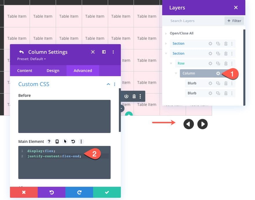
Under the advanced tab, give the row a custom CSS Class as follows:
- CSS Class: et-scroll-table-column
We’ll need this for the custom code later on.
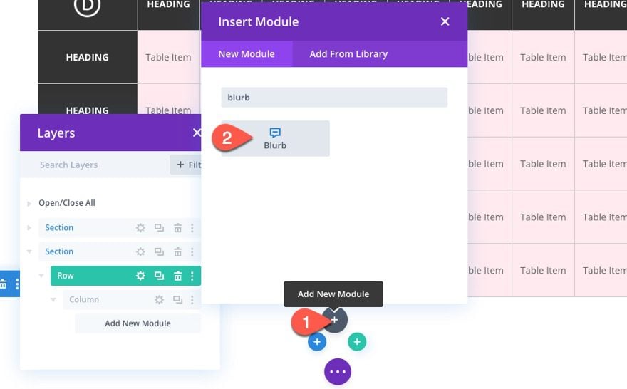
Creating Table Items with Text Modules
To create the table items within each row (or table column), we are going to use text modules.
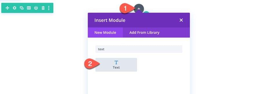
Add Text Module
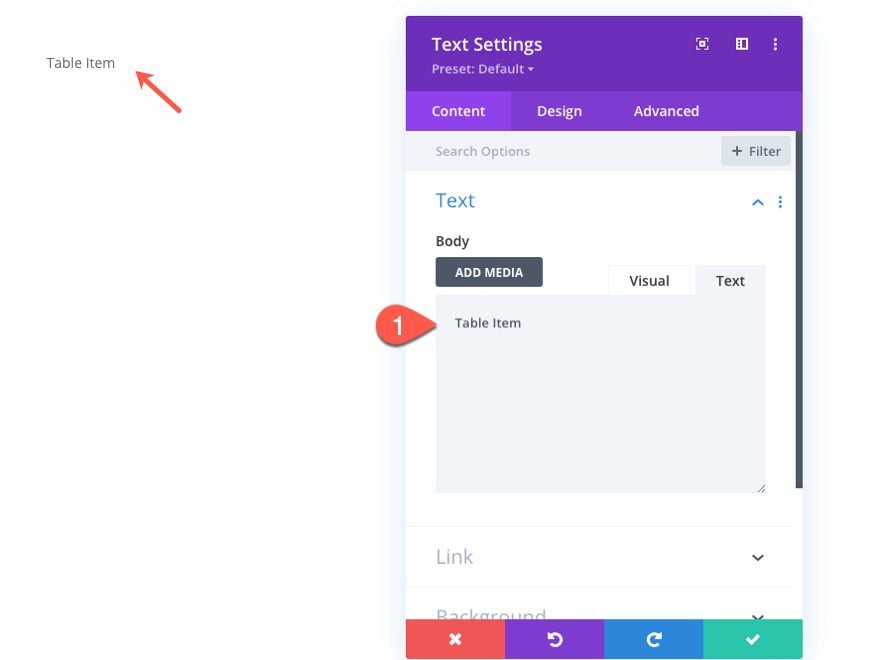
Text Content
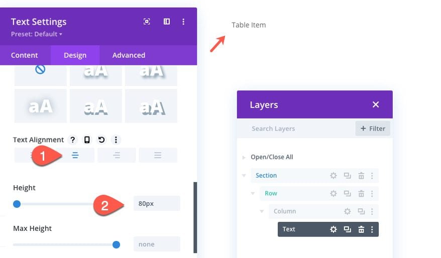
Next, add the text “Table Item” to the body content of the text module.
Text Design
Under the design tab, update the following:
- Text Alignment: center
- Height: 80px
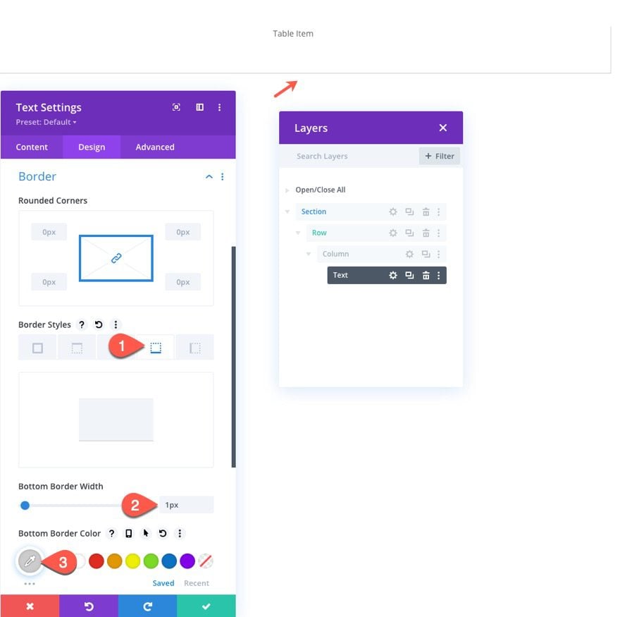
- Right Border Width: 1px
- Bottom Border Color: #cccccc
This border will match the right border of the row.
Text CSS
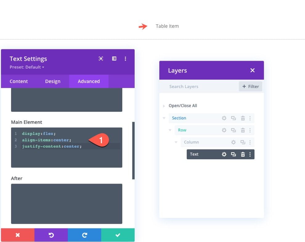
To make sure the text within the module stays vertically and horizontally centered, add the following CSS to the Main Element under the advanced tab:
display:flex;
align-items:center;
justify-content: center;
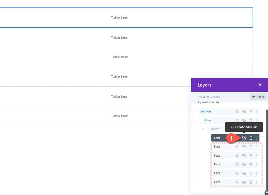
Duplicate Text Module for More Table Items
Now that our first table item has been created, duplicate the text module (as many times as needed) to create additional table items within the row.
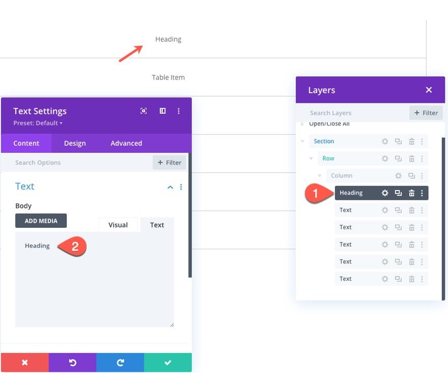
Creating the Heading of the Table Column
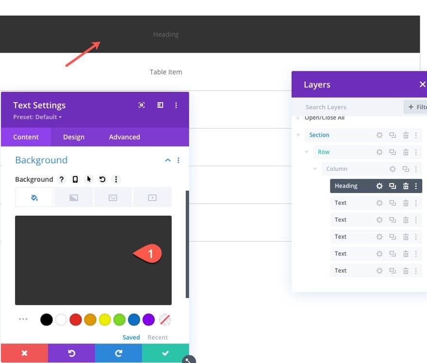
We need to turn the very top text module into the Heading of the table column. To do that, open the settings of the top text module, update the label in the Layers view to “Heading”, and add the text “Heading” with the body content.
Then update the background color.
- Background: #333333
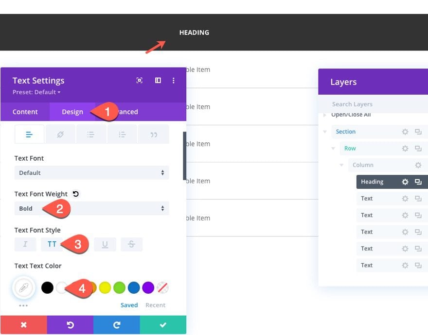
And update the design of the text as follows:
- Text Font Weight: Bold
- Text Font Style: TT
- Text Text Color: #ffffff
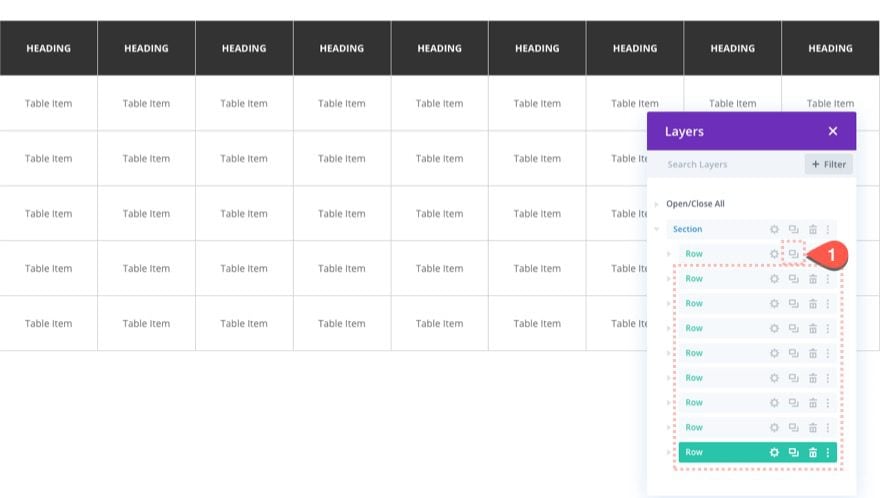
Duplicate the Row for More Table Columns
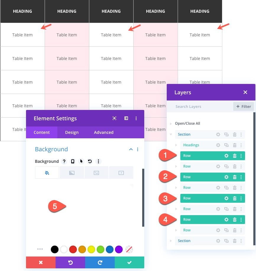
Now that the first row is complete, we can duplicate the row to create as many table columns as needed for the table. For this design, we are going to duplicate the row eight times to create a total of nine rows.
Part 2: Designing the Sticky Table Column with Vertical Headings
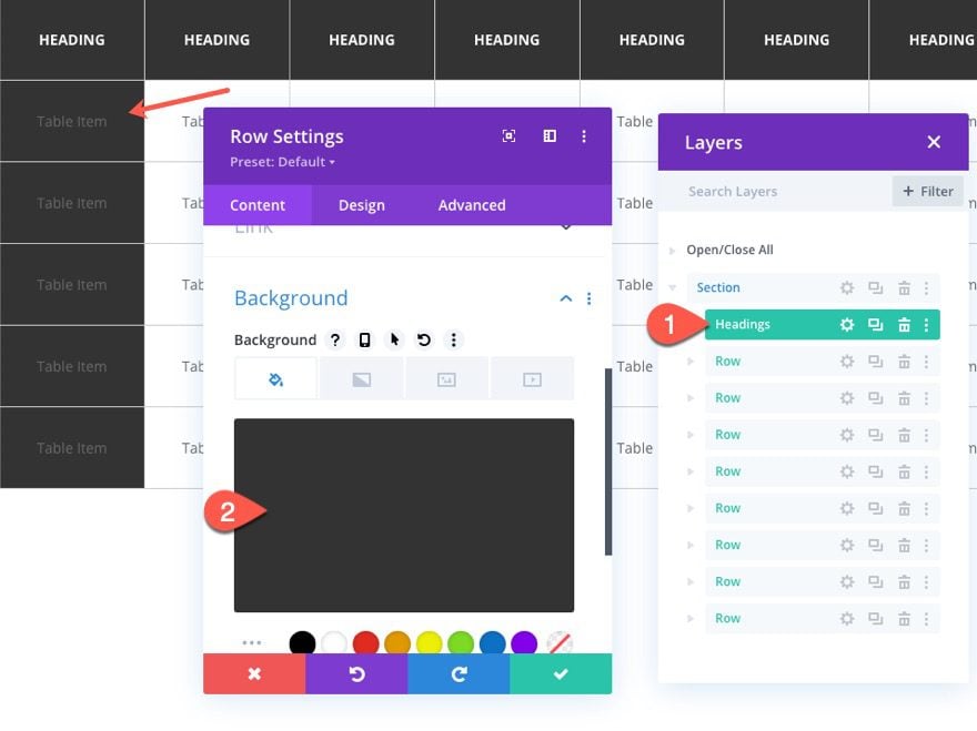
The row on the far left (or first row) will serve as the vertical headings for our table. First, we need to update the row background and each of the text modules so that they have the same design as the headings at the top of each column. Then, we are going to make the entire row sticky so that it stays in place as the user scrolls horizontally to view hidden table columns.
Update Row Background
To do this, open the settings for the first row and update the background color:
- Background Color: #333333
Update Text Modules
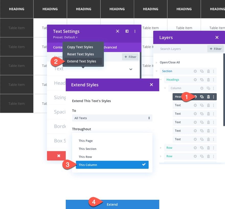
Then, open the settings for the top text module containing the Heading. Right-click on the text option group and select Extend Text Styles. In the Extend Styles popup, choose to extend the text’s styles to All Texts throughout This Column. Then click the Extend button.
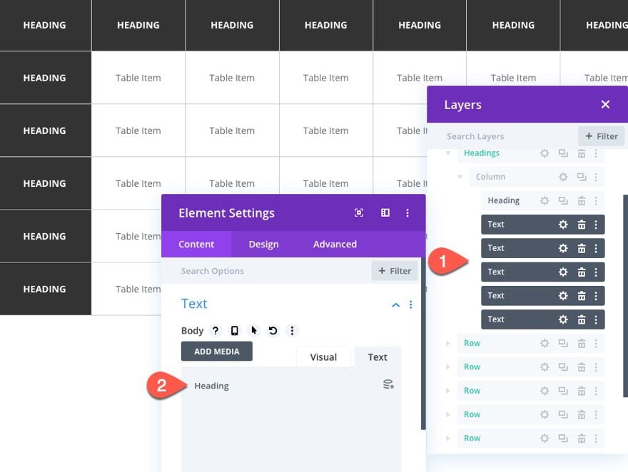
Then multi-select all of the text modules within the row (hold ctrl (or cmd) and click each one) and update the body content with the text “Heading”.
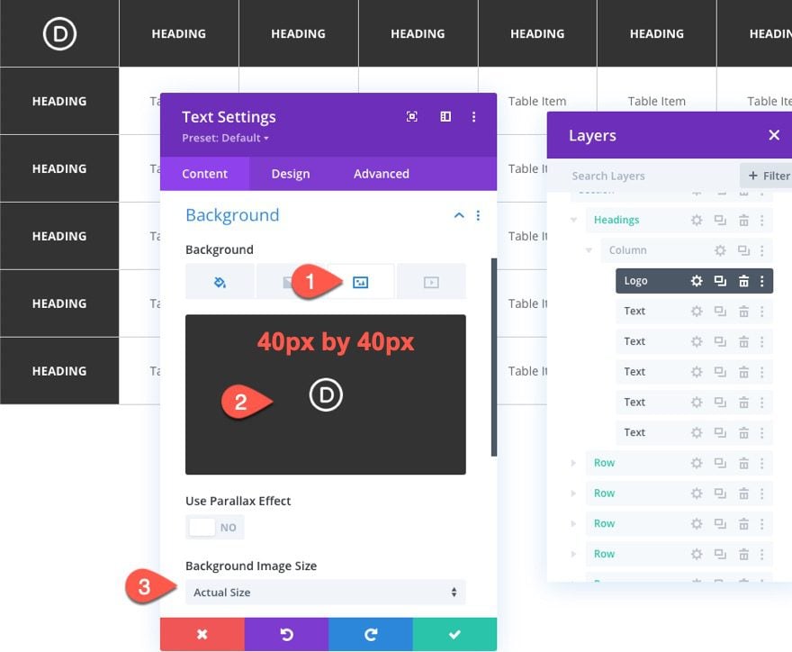
Add Logo
Since we don’t need the very top heading in this column, we are going to add a logo to the table.
Open the settings for the very top text module in the first row.
Then delete the body text.
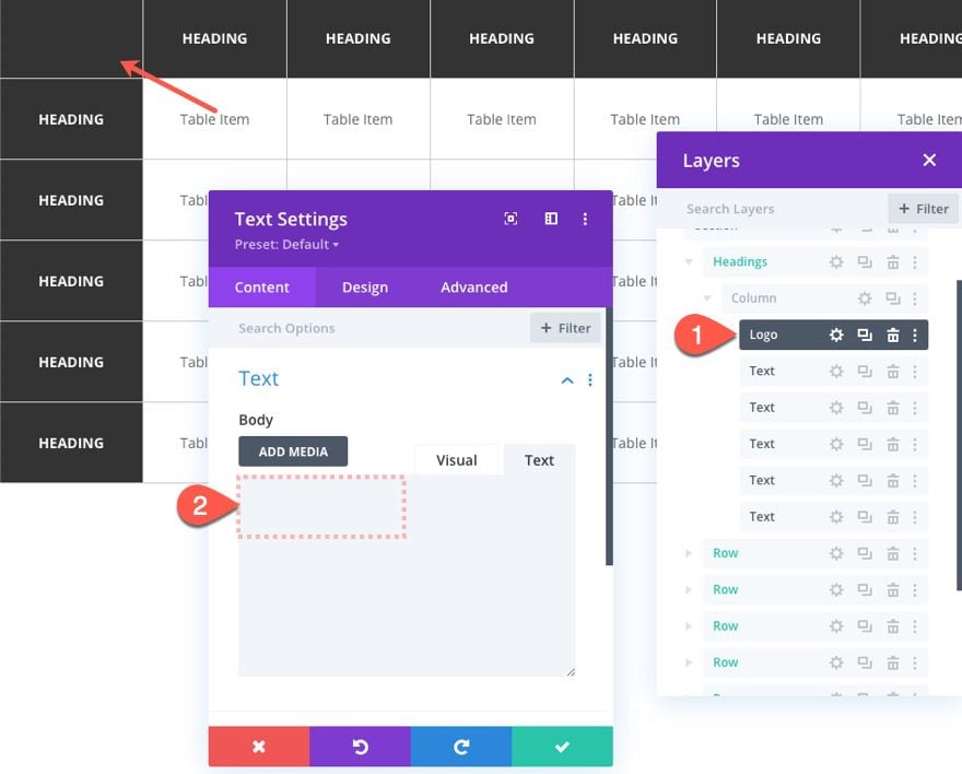
Then add the logo (make sure it is about 40px by 40px) as a background image. Make sure the background image size is set to “Actual Size”.
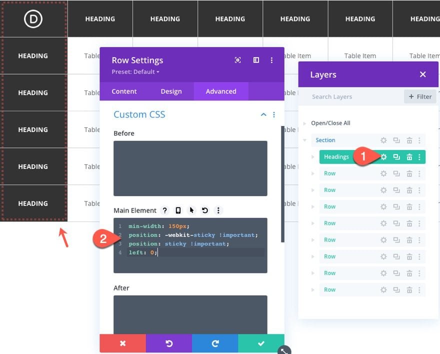
Making the Vertical Headings Row Sticky
To make the row sticky, add the following Custom CSS to the Main Element:
min-width: 150px;
position: -webkit-sticky !important;
position: sticky !important;
left: 0;
(You can ignore any of the code errors that will show by using the sticky property.)
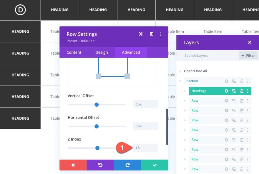
To make sure the sticky row stays visible above the other rows, update the Z Index:
- Z Index: 13
Part 3: Updating the Section of the Table
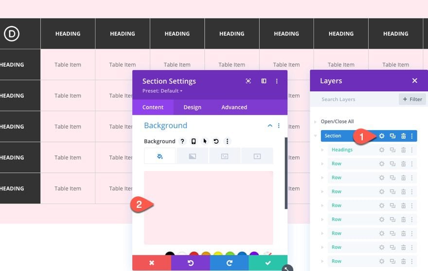
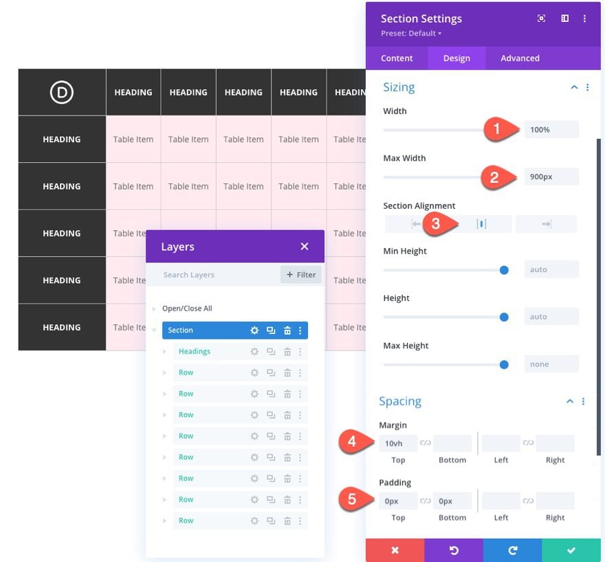
Now that the table elements are all in place, we can update the section (the table container) with a specific size and overflow.
Open the section settings and add a background color:
- Background Color: #ffeaef
Then update the size and spacing as follows:
- Width: 100%
- Max Width: 900px
- Margin: 10vh top
- Padding: 0px top, 0px bottom
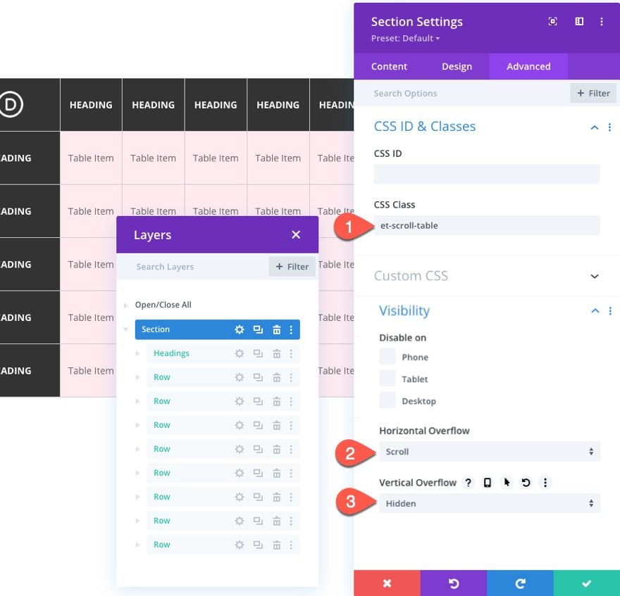
Then add the following CSS Class:
- CSS Class: et-scroll-table
And update the overflow:
- Horizontal Overflow: Scroll
- Vertical Overflow: Hidden
(Note: we already have “overflow:scroll” added to the section as custom CSS so that the scroll functionality will be in effect on the visual builder as well.)
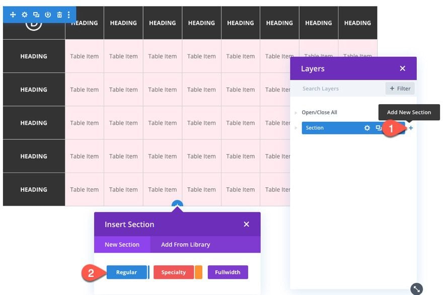
Because the horizontal scroll functionality is readily apparent on desktop, we are going to add horizontal scroll buttons for better UX.
Add Section
To do this, create a new regular section.
Open the section settings and take out the default padding:
- Padding: 0px top, 0px bottom
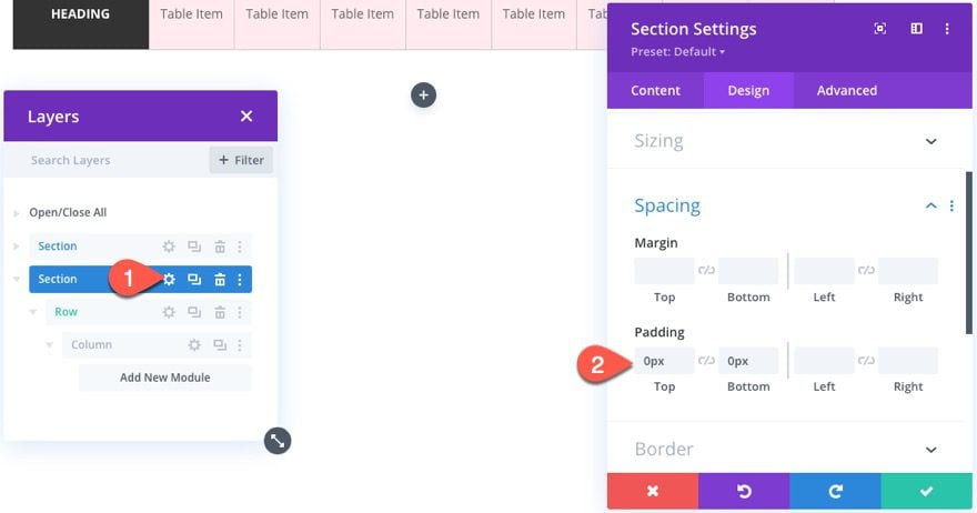
Add Row
Give the section a one-column row.
And update the row settings as follows:
- Gutter Width: 1
- Width: 100%
- Max Width: 900px
- Padding: 10px top, 10px bottom, 10px right
Create the Left Scroll Button
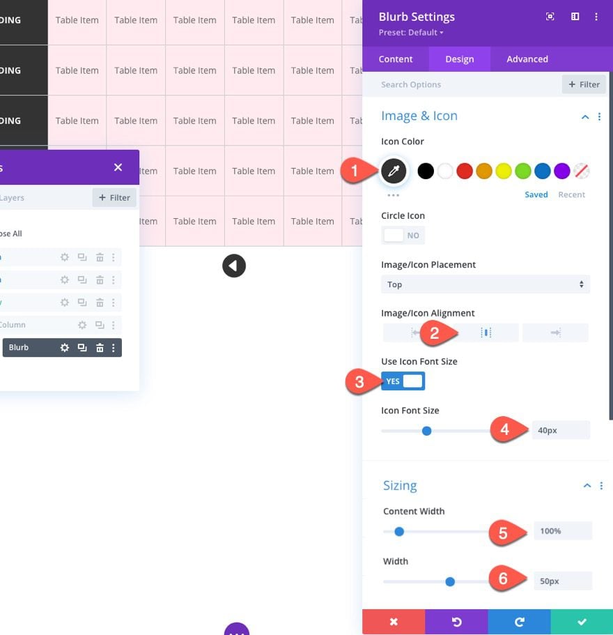
To create the left scroll button, add a blurb module to the column/row.
Take out the default title and body content, and add a left arrow icon.
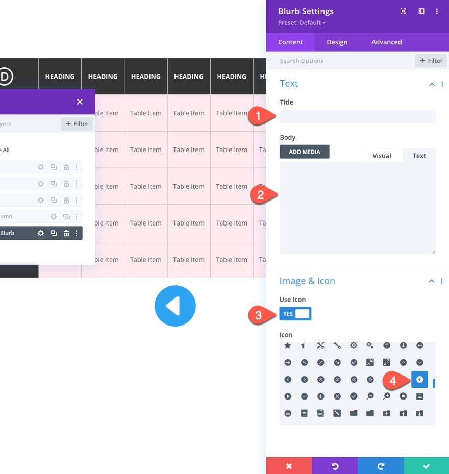
Under the design tab, update the following:
- Icon Color: #333333
- Image/Icon Alignment: center
- Use Icon Font Size: YES
- Icon Font Size: 40px
- Content Width: 100%
- Width: 50px
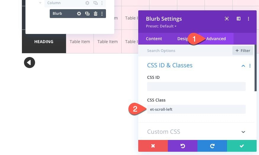
Then give the blurb a CSS Class:
- CSS Class: et-scroll-left
This is necessary to add the scroll on click functionality to the blurb/button with our code later on.
Create the Right Scroll Button
To create the right scroll button, duplicate the blurb, and update the icon with a right arrow.
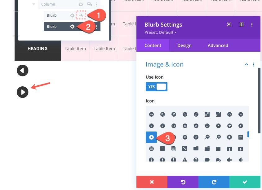
Then update the CSS Class:
- CSS Class: et-scroll-right
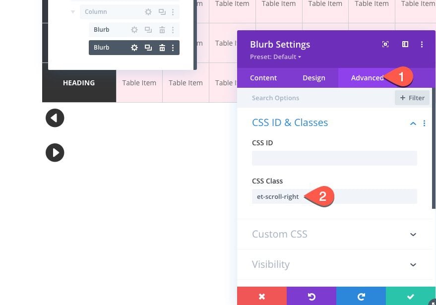
To align the button horizontally, open the setting for the column, and add the following custom CSS:
display:flex;
justify-content:flex-end;
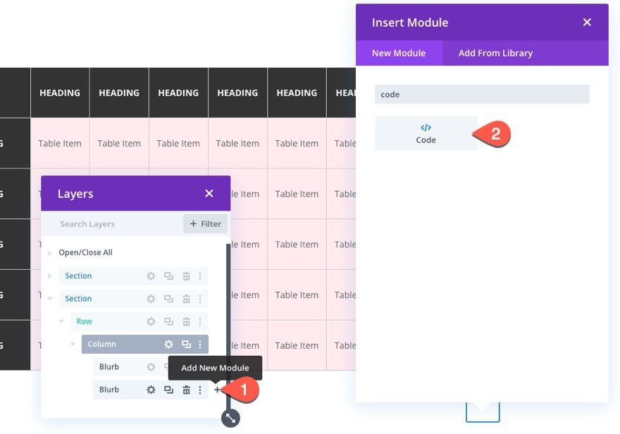
Part 5: Adding the Custom Code
For the final part of this tutorial, we need to add the CSS needed to set a min-width for the rows (which are actually our table columns) and the JS code needed to add the scroll functionality to the buttons.
To add the code, add a code module under the second blurb.
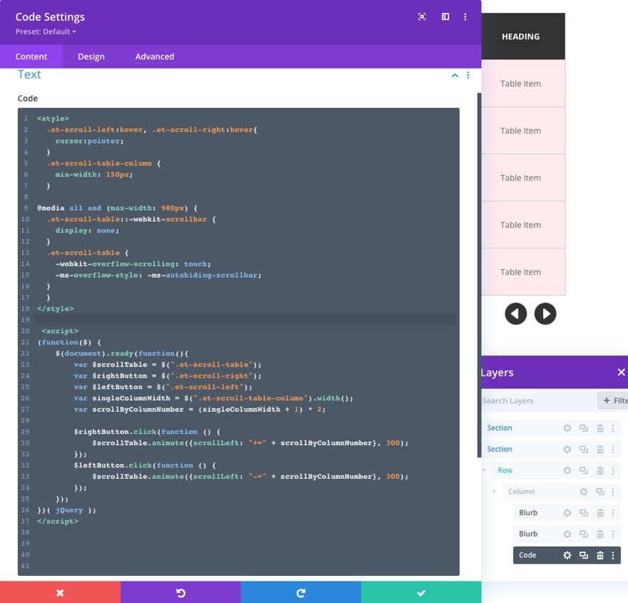
In the code box, paste the following CSS making sure to wrap the code in the necessary style tags.
.et-scroll-left:hover, .et-scroll-right:hover{
cursor:pointer;
}
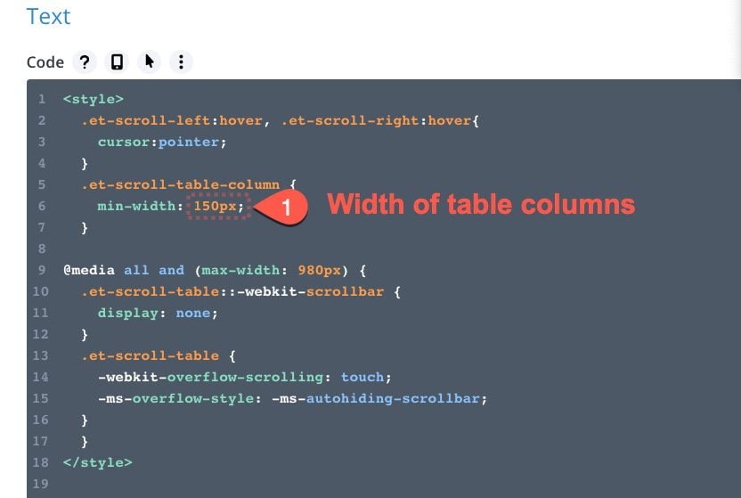
.et-scroll-table-column {
min-width: 150px;
}
@media all and (max-width: 980px) {
.et-scroll-table::-webkit-scrollbar {
display: none;
}
.et-scroll-table {
-webkit-overflow-scrolling: touch;
-ms-overflow-style: -ms-autohiding-scrollbar;
}
}
Under the CSS code, paste the following jQuery making sure to wrap the code with the necessary script tags.
(function($) {
$(document).ready(function(){
var $scrollTable = $(".et-scroll-table");
var $rightButton = $(".et-scroll-right");
var $leftButton = $(".et-scroll-left");
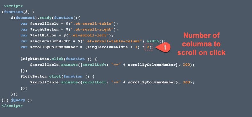
var singleColumnWidth = $(".et-scroll-table-column").width();
var scrollByColumnNumber = (singleColumnWidth + 1) * 2;
$rightButton.click(function () {
$scrollTable.animate({scrollLeft: "+=" + scrollByColumnNumber}, 300);
});
$leftButton.click(function () {
$scrollTable.animate({scrollLeft: "-=" + scrollByColumnNumber}, 300);
});
});
})( jQuery );
Updating the Column Width
If you want to update the min-width of each of the table columns, you can change the value of the min-width in the CSS.
Updating the Number of Columns on Scroll
Currently, clicking the buttons will scroll horizontally (left or right) a distance equal to two column widths. To change the number of columns on scroll, update the far right number (currently the number 2) in the value of the variable scrollByColumnNumber.
Adding Alternating Column Colors
Right now the section background color is determining the color of all the table columns (or rows). If you want to create alternating colors for those columns, use multi-select to select every other row and add a white background color to each of them.
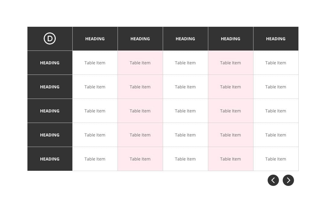
Final Result
Now check out the final result!
Here is the final design of the table on desktop.
And here is the horizontal scroll functionality on desktop and mobile.
Final Thoughts
No matter how far we come in the world of web design, tables always seem to have their place. They continue to provide a valuable solution to organizing content in a way that users understand. This table with a horizontal scroll should come in handy for a wide range of use cases. And, perhaps the best part, you can update the table content (via Divi’s built-in inline editor) and style the table in countless creative ways using the visual builder.
For more info on creating responsive tables in WordPress, check out our post on How to Create Responsive Tables in WordPress. We also compiled a list of the best table plugins for WordPress that you shouldn’t miss out on.
I look forward to hearing from you in the comments.
Cheers!


It looked great until I put the table on the product page. I can’t change the color under the table. On the single product page, only the background of the section can be changed. Any ideas on how to change the color under the table on the product page? Thanks
Thanks again for this great tutorial! I made the table and replaced the text blocks with toggle blocks, but when we open a toggle everything is vertically shifted. Do you have an idea how to solve my problem?
Could you share the URL of the page where you set this up?
Great tutorial Jason. Thanks. If the content inserted into the table item is multiples lines long, is it possible to make the row height flexible so that it expands with content?
Thanks, Nas. Unfortunately, not the way it is currently built. Best to use the extend styles option to update the height of all the text modules if you want to adjust the height.
Jason, more thanks from your fans!
Really needed solution.
Sincerely,
Igor
Awesome!
wow! so excited to try this out. I’ve wasted days (as a non coder!) trying to work out how to get tables working well across different devices. and gave up. this looks to be the answer. thanks for a really valuable tutorial!
That’s great to hear. Glad it helped, Yvonne.
Thanks for providing such a useful information through this article all information is very helpful to me
You are very welcome.
Wow Jason… That’s an amazing tutorial! It’s maybe worth mentioning too that there’s a responsive table module available on the new Divi Marketplace that will allow you to do that (and a while lot more), natively in the Visual Builder. Full disclosure, it’s a module that I make. 🙂 It’s called Divi-Modules – Table Maker. Here’s a link: https://www.elegantthemes.com/marketplace/table-maker/
Thanks, David. Looks like a great plugin!