This post is part 3 of 5 in our miniseries How to Create an Elegant Wedding Website with Divi. In this series, we’ll guide you through the most important parts of creating a wedding website for yourself or a client with Divi.
In the first two parts of our miniseries, we showed you how to create an elegant wedding announcement page and a gallery page with Divi. This third part is going to be dedicated to creating a gift list page within your wedding website.
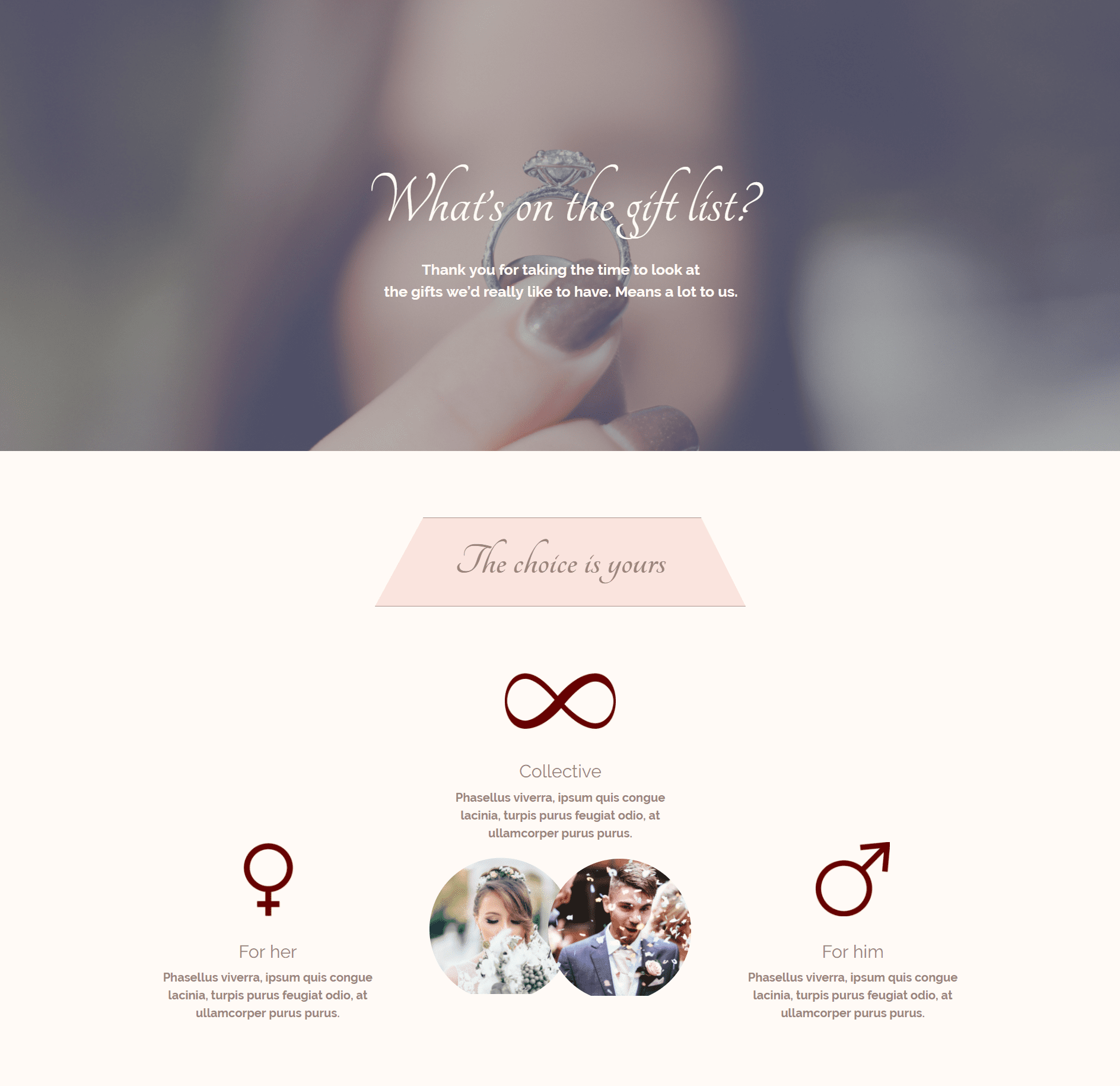
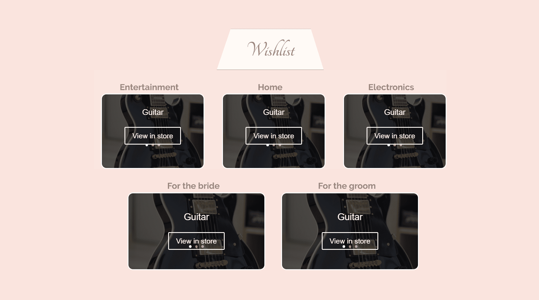
We’ll show you step by step how you can create the following layout with the Visual Builder of Divi:
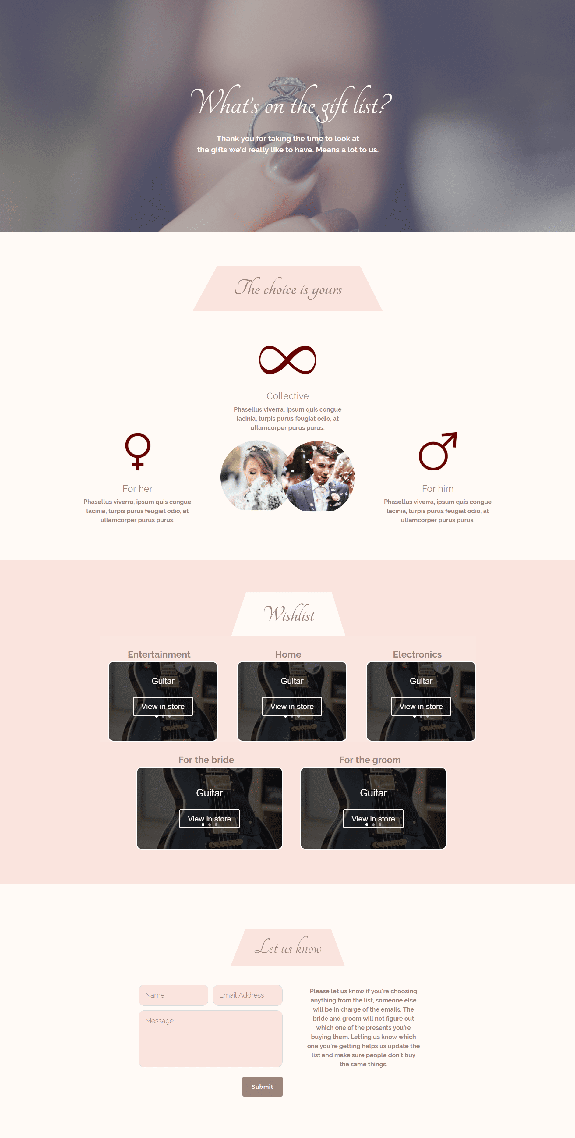
The layout has five sections and each of them contributes its own value to the whole. Let’s dive into the first one!
The Hero Section
The hero section is really simplistic but that’s exactly what we’re looking for in this miniseries; simplicity and elegance. We’re using the same color palette as in the two previous wedding tutorials so if you’re following along you can easily add this page to the wedding website you’ve already started creating.
Get started
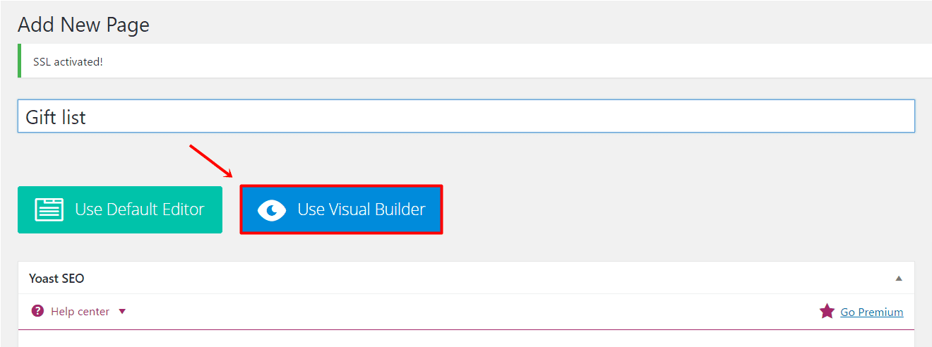
Start by adding a new page to your WordPress website and giving it a name. Activate the Divi Builder after that and move over to the Visual Builder right away.
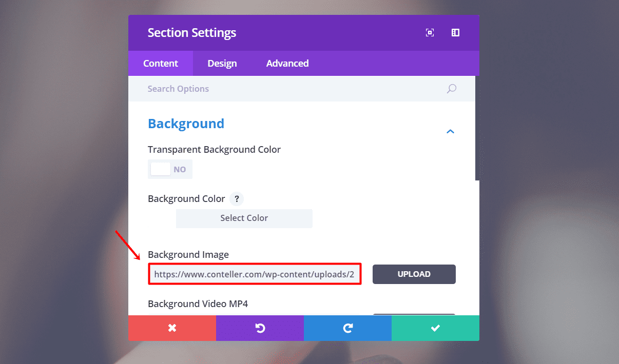
Add a new section to the page you’ve just created. Open the section settings and change the background image in the Background subcategory of the Content tab. In this example, we took a symmetrical image for the background of the section to give that extra effect.
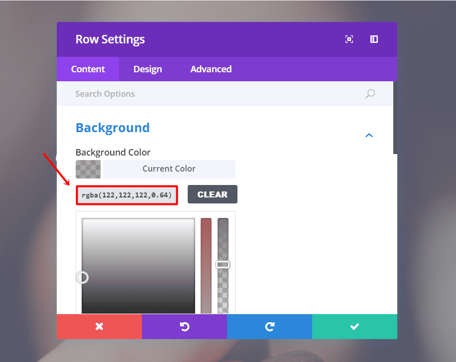
Continue by adding a fullwidth row to the section. Open the settings of the row and change the Background Color to ‘rgba(122,122,122,0.56)’ within the Background subcategory of the Content tab.
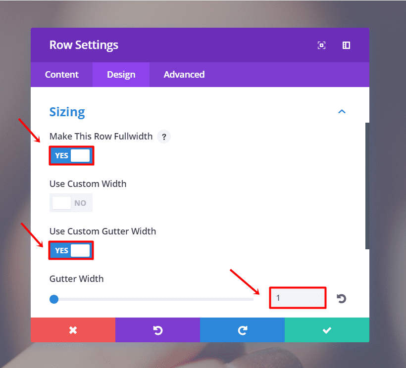
Moving on, go to the Design tab. Open the Sizing subcategory, make the row fullwidth and enter ‘1’ for Gutter Width.
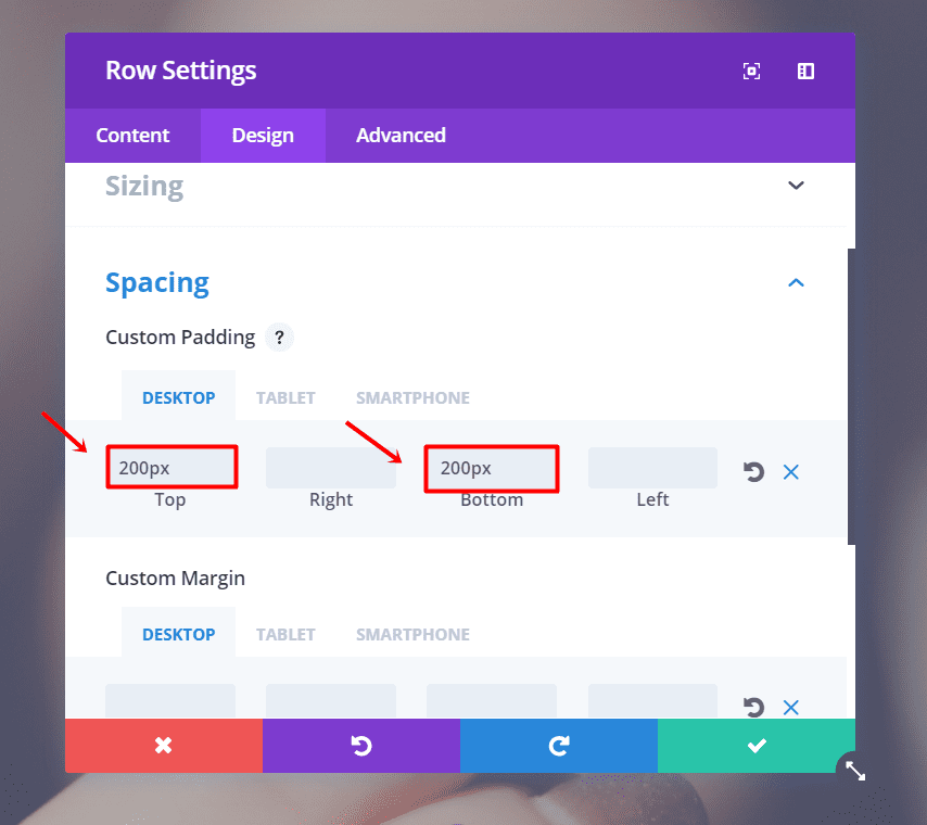
Scroll down and open the Spacing subcategory. We’ll need to add ‘200px’ to the top and bottom padding for desktops and ‘150px’ to the top and bottom padding for tablets and phones.
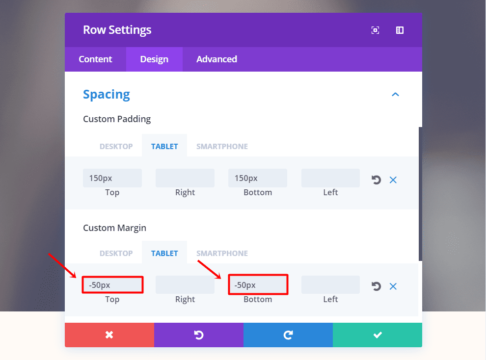
In that same subcategory, add ‘-50px’ to the top and bottom margin for tablets and phones.
First Text Module
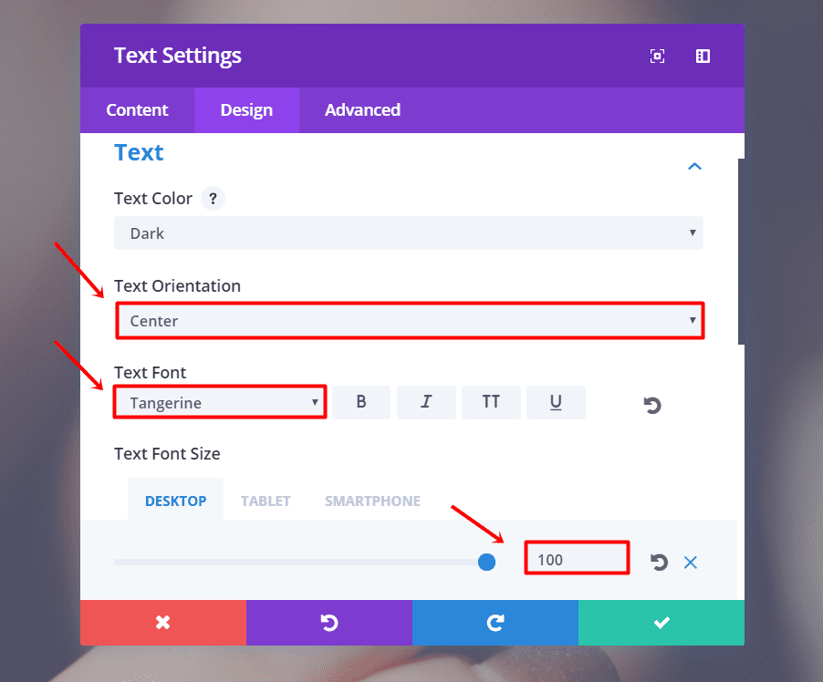
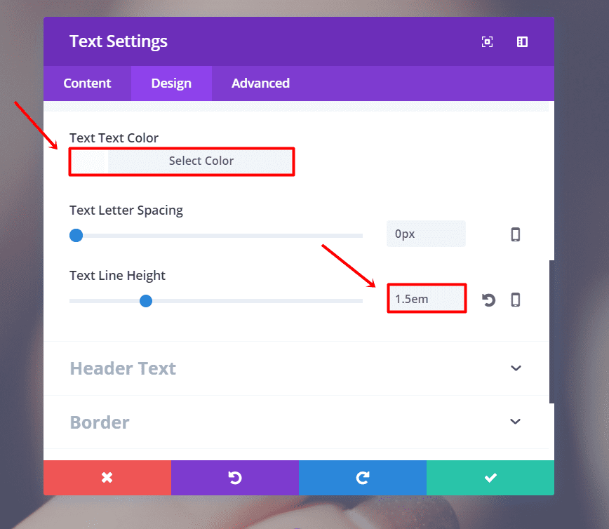
Moving on, add a new Text Module to the row. Add your text within the Text subcategory of the Content tab. After that, go to the Design tab and make the following changes to the Text subcategory:
- Text Orientation: Center
- Text Font: Tangerine
- Text Font Size: 100 (Desktop & Tablet), 68 (Phone)
- Text Color: #fffaf6
- Text Line Height: 1.5em
Second Text Module
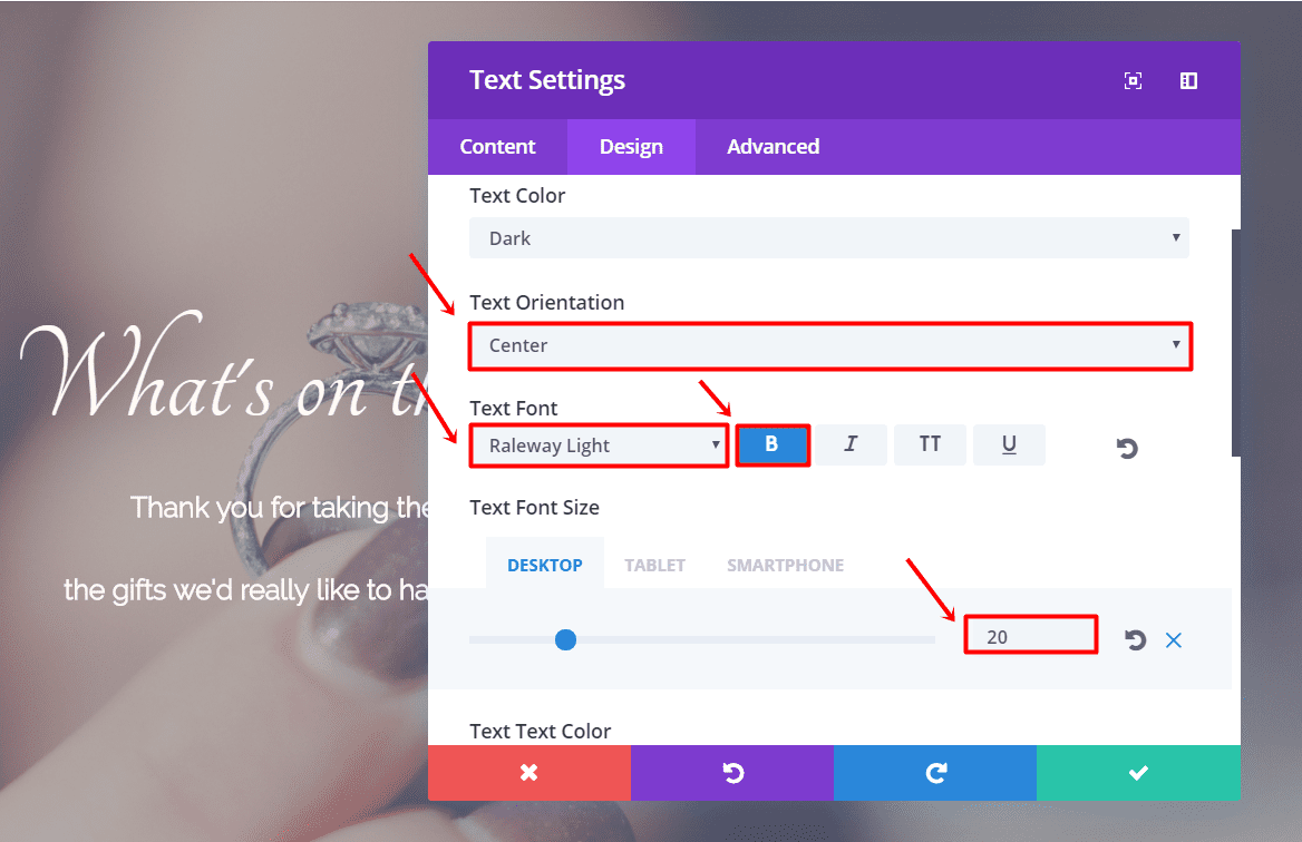
Create another text module right under it. Go to the Content tab and enter your text in the Text subcategory. Next, go to the Design tab and make the following changes to the Text subcategory:
- Text Orientation: Center
- Text Font: Raleway Light
- Text Font Style: Bold
- Text font Size: 20px (Desktop), 14px (Tablet & Phone)
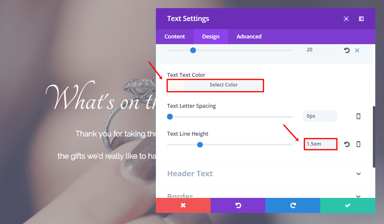
- Text Color: #fffaf6
- Text Line Height: 1.5em
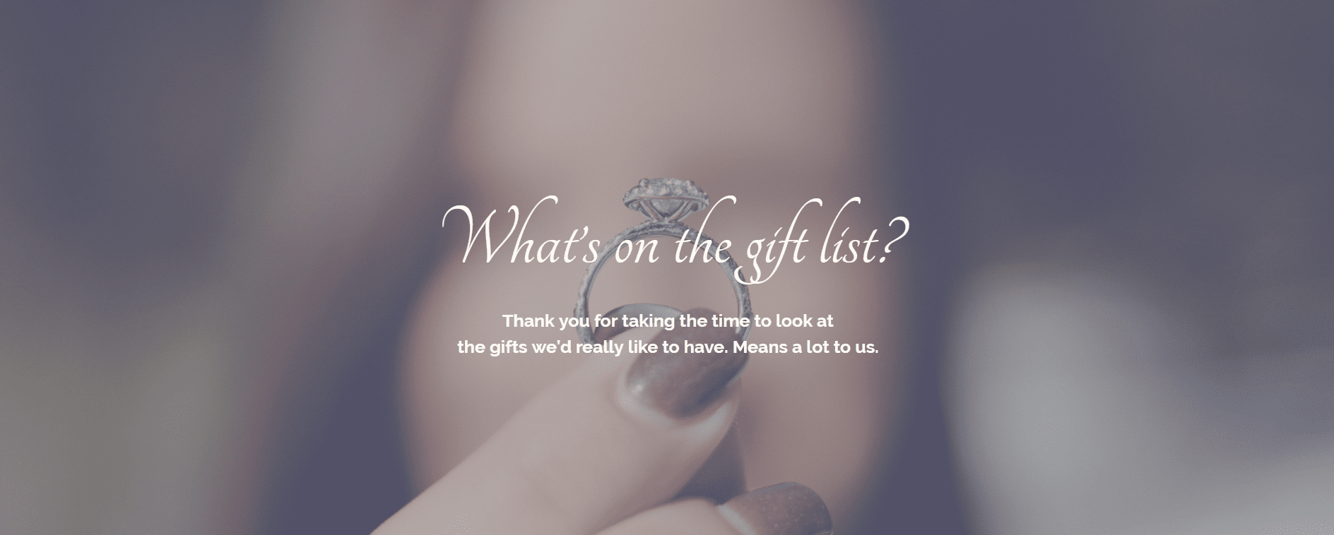
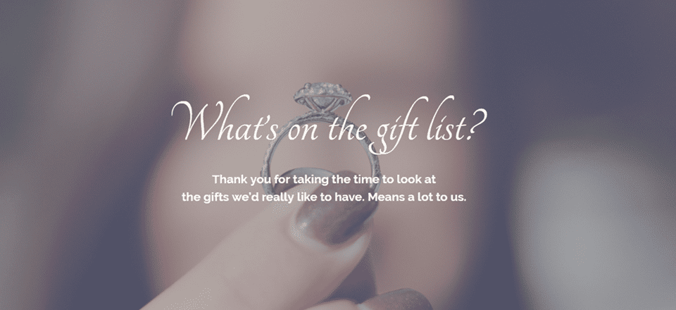
Your header should be looking like this so far:
The Introduction Section
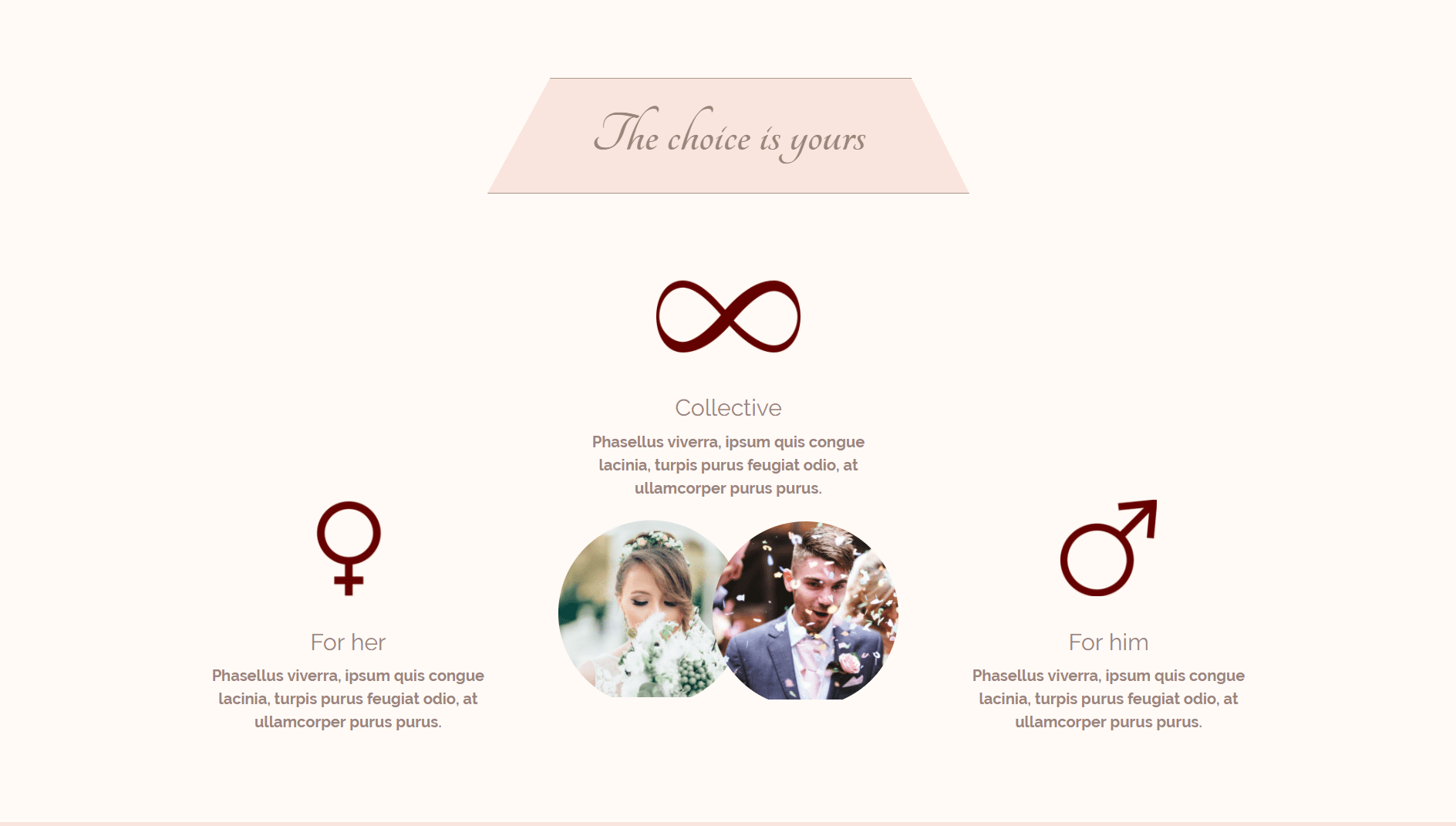
In this layout, we want to give people a choice. They can choose whether they want to buy something for the bride, groom or for both.
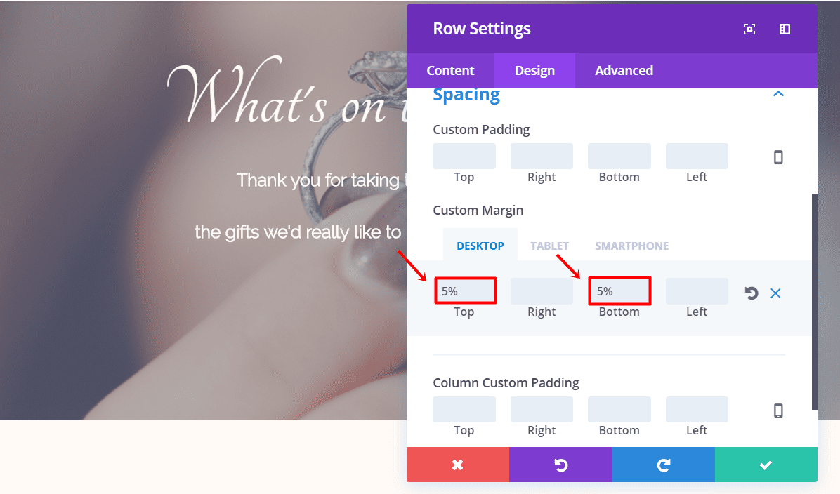
Start by creating a new section and add a row with one column. Change the background color to ‘#fffaf6’ within the Background subcategory of the Content tab. After that, open the row settings and go to the Design tab. Add ‘5%’ to the top and bottom margin for desktops only.
Section Title
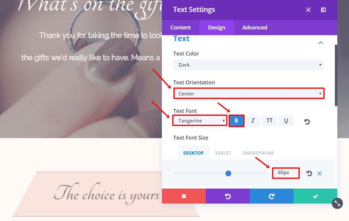
In this row. the only thing we’ll have to add is a Text Module. Type down the title you want to appear in the Text subcategory of the Content tab. Move on to the Design tab and make the following changes to the Text subcategory:
- Text Orientation: Center
- Text Font: Tangerine
- Text Font Style: Bold
- Text font Size: 60px (Desktop), 50px (Tablet & Phone)
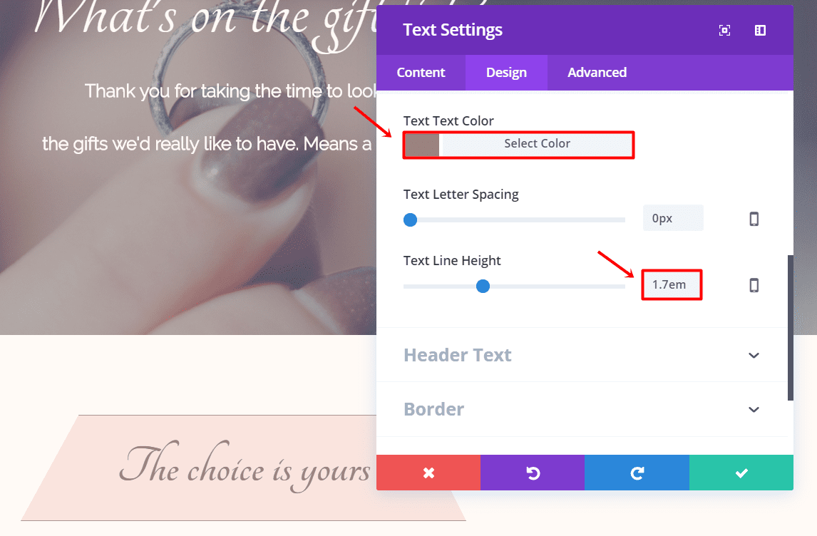
- Text Color: #9b857b
- Text Line Height: 1.7em
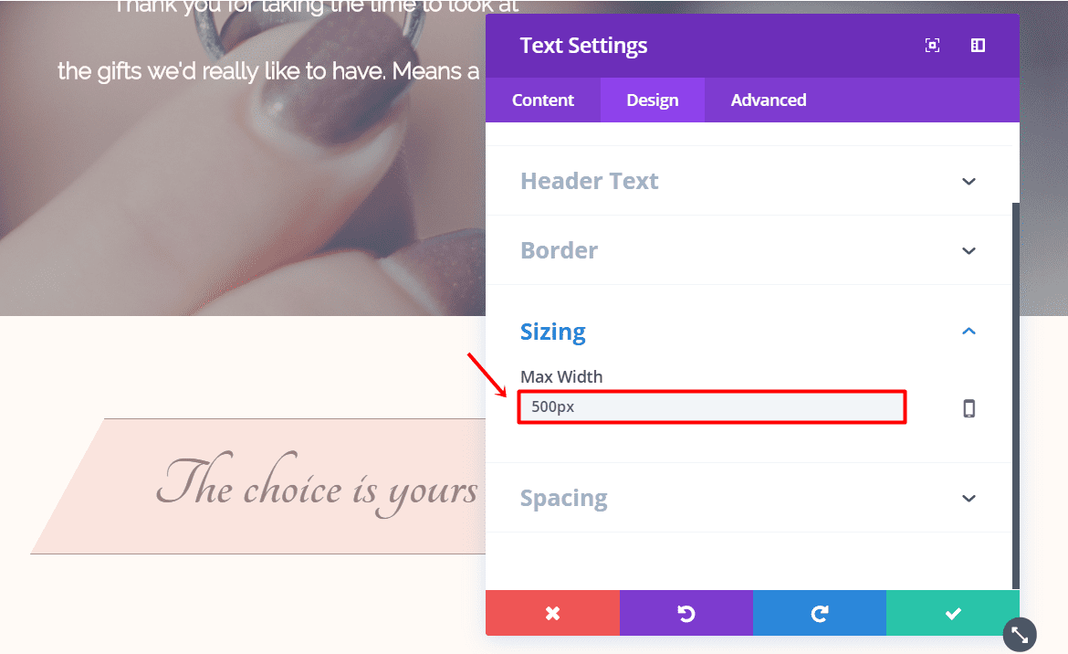
Now, open the Sizing subcategory and change the Max Width to ‘500px’.
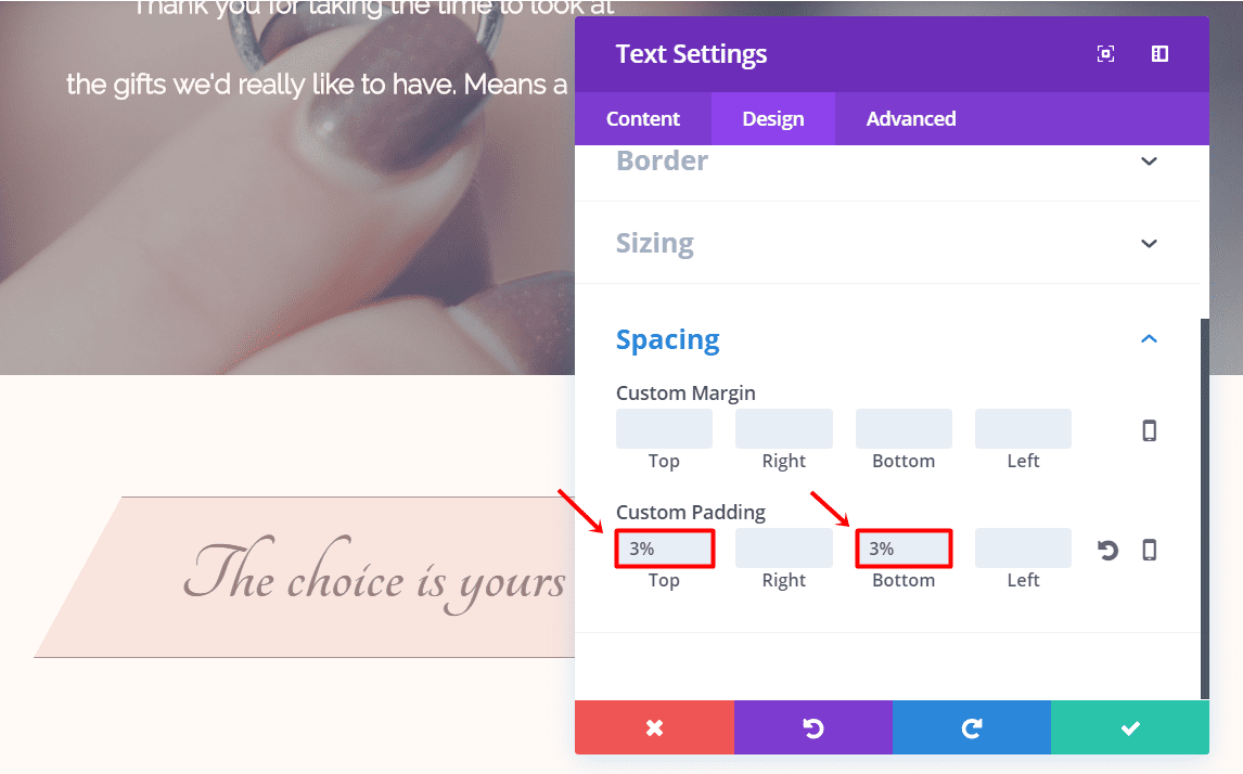
Continue by opening the Spacing subcategory in the same tab and add ‘3%’ to the top and bottom padding.
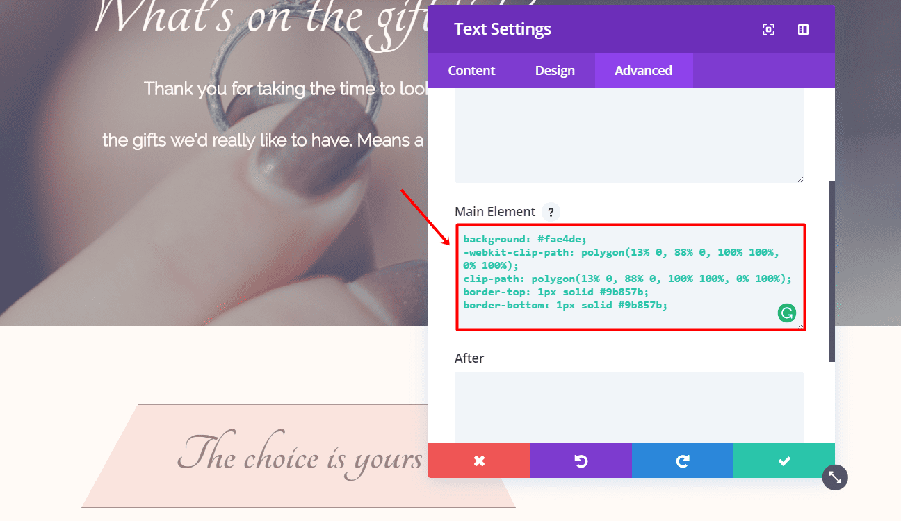
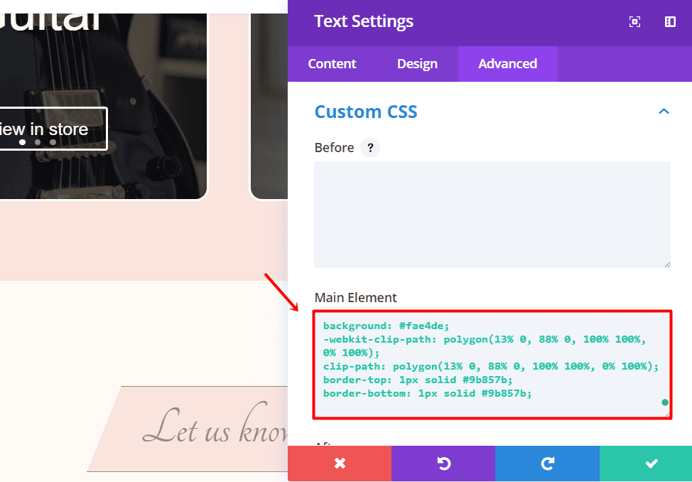
Next, go to the Advanced tab and add the following code to the Main Element in the Custom CSS subcategory:
background: #fae4de;
-webkit-clip-path: polygon(13% 0, 88% 0, 100% 100%, 0% 100%);
clip-path: polygon(13% 0, 88% 0, 100% 100%, 0% 100%);
border-top: 1px solid #9b857b;
border-bottom: 1px solid #9b857b;
Now, add another row with one column to the same section. We don’t need to change anything in the settings of this row.
Image Module
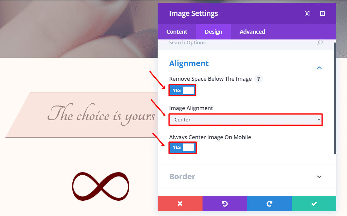
Add an Image Module to the row and upload the image in the Image subcategory of the Content tab. Then, go the Design tab, remove space below image, select ‘Center’ for the Image Alignment and always center the image on mobile.
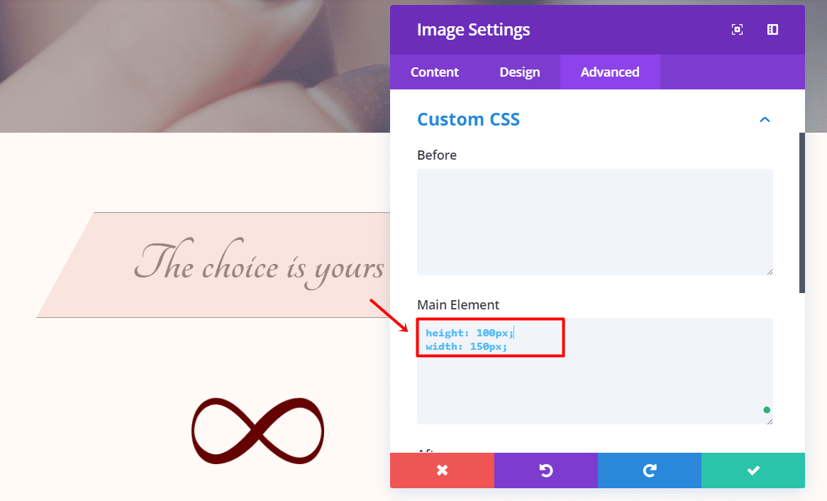
Next, go to the Advanced tab and add the following code to the Main Element field within the Custom CSS subcategory:
height: 100px;
width: 150px;
First Text Module
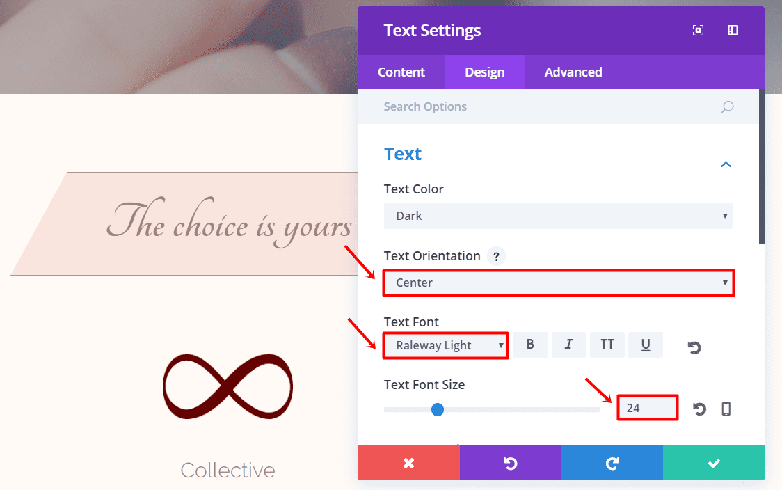
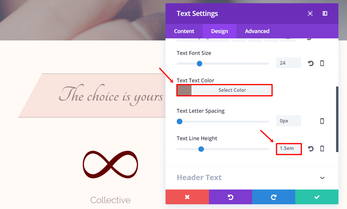
Under the Image Module, add the first Text Module of the section. Enter the text in the textbox within the Text subcategory of the Content tab and move on to the Design tab. Within the Text subcategory, make the following adjustments:
- Text Orientation: Center
- Text Font: Raleway Light
- Text font Size: 24px
- Text Color: #9b857b
- Text Line Height: 1.5em
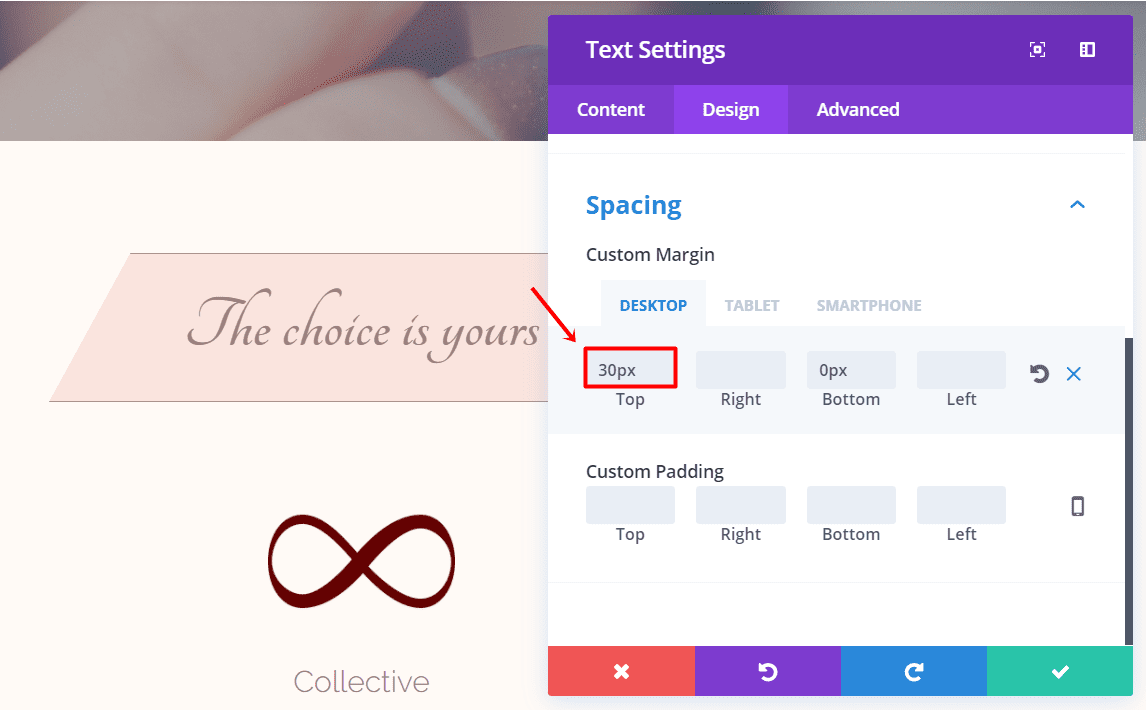
Scroll down the same tab and add ’30px’ to the top margin within the Spacing subcategory.
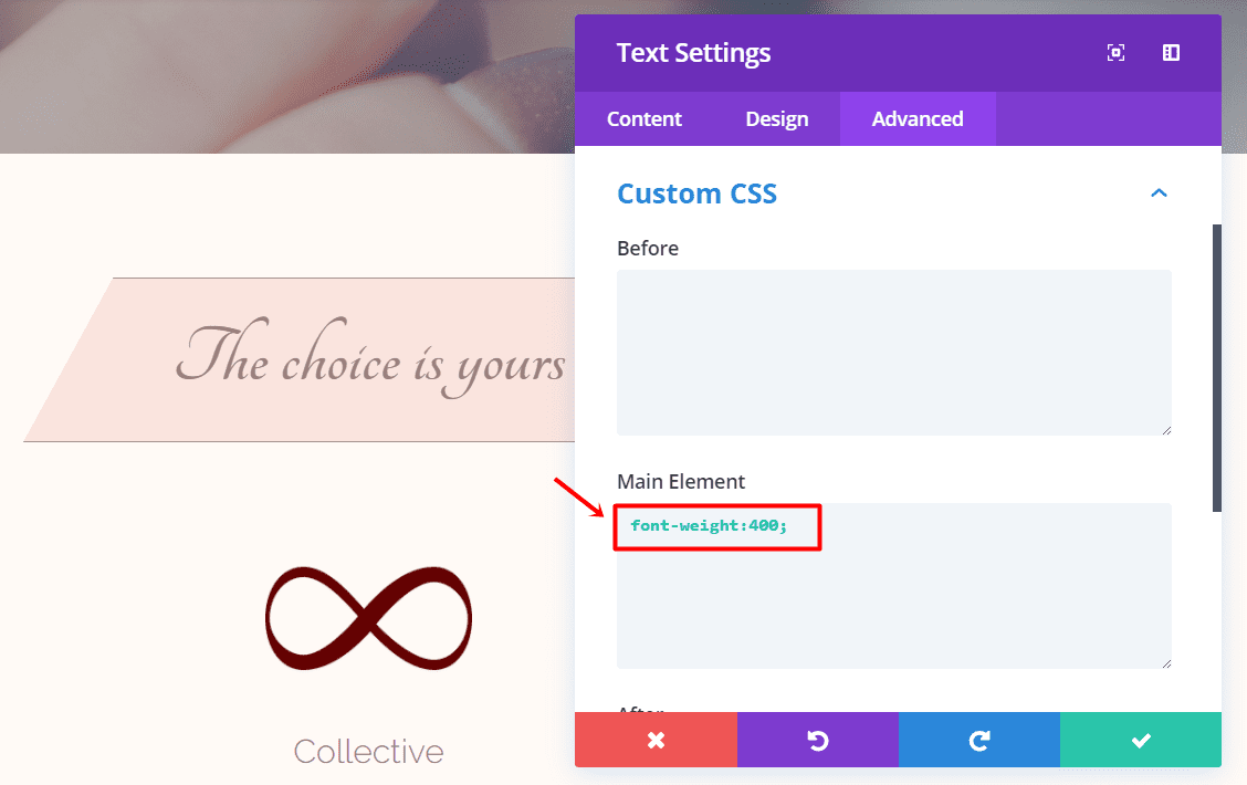
Last but not least, go to the Advanced tab of that same Text Module and add the following code to the Main Element within the Custom CSS subcategory:
font-weight:400;
Second Text Module
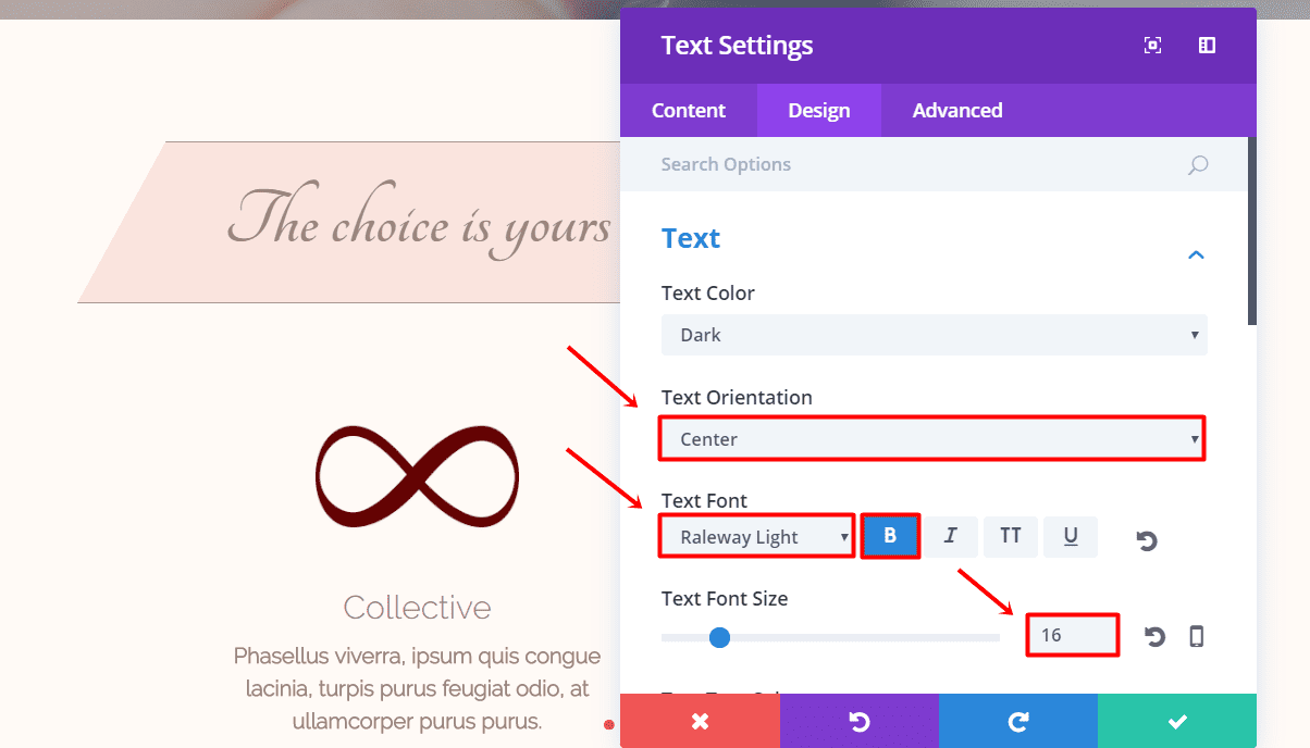
Add another Text Module to the section and type down the text in the text box within the Text subcategory of the Content tab. Then, move on to the Design tab and make the following modifications:
- Text Orientation: Center
- Text Font: Raleway Light
- Text Font Style: Bold
- Text font Size: 16px
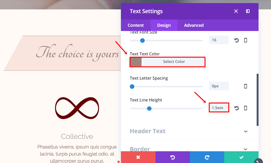
- Text Color: #9b857b
- Text Line Height: 1.5em
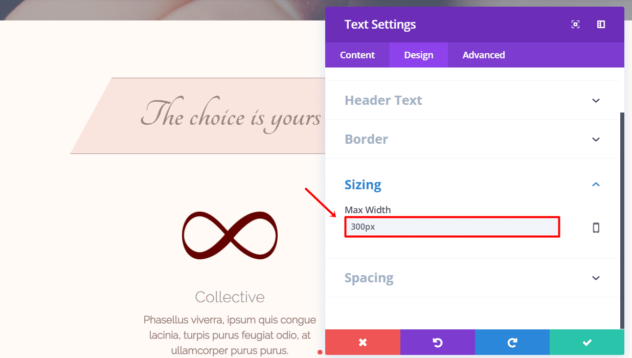
Scroll down the same tab and change the Max Width to ‘300px’ within the Sizing subcategory. Change the top margin to ‘5%’ in the Spacing subcategory as well.
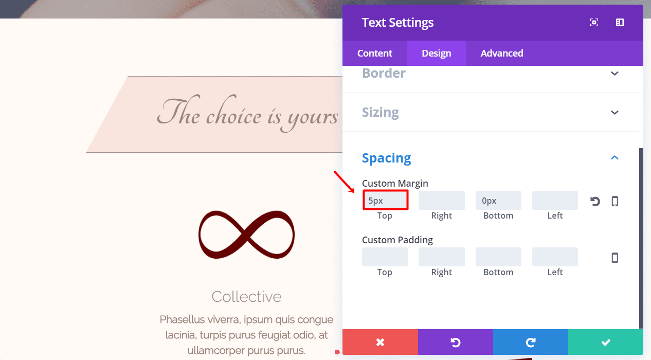
Next, go to the Advanced tab and add the following code to the Main Element within the Custom CSS subcategory:
font-weight: 300;
Clone Image Module & Text Modules
Add another row, but this time with three columns, to the same section.
The first column and the last column of the row need the same modules like the previous row; an Image Module and two Text Modules. These modules need to have the same settings as the ones we’ve created before, so the only thing we’re going to do is clone them. After having cloned each module two times put them in the left and right column of the new row and change the image and text.
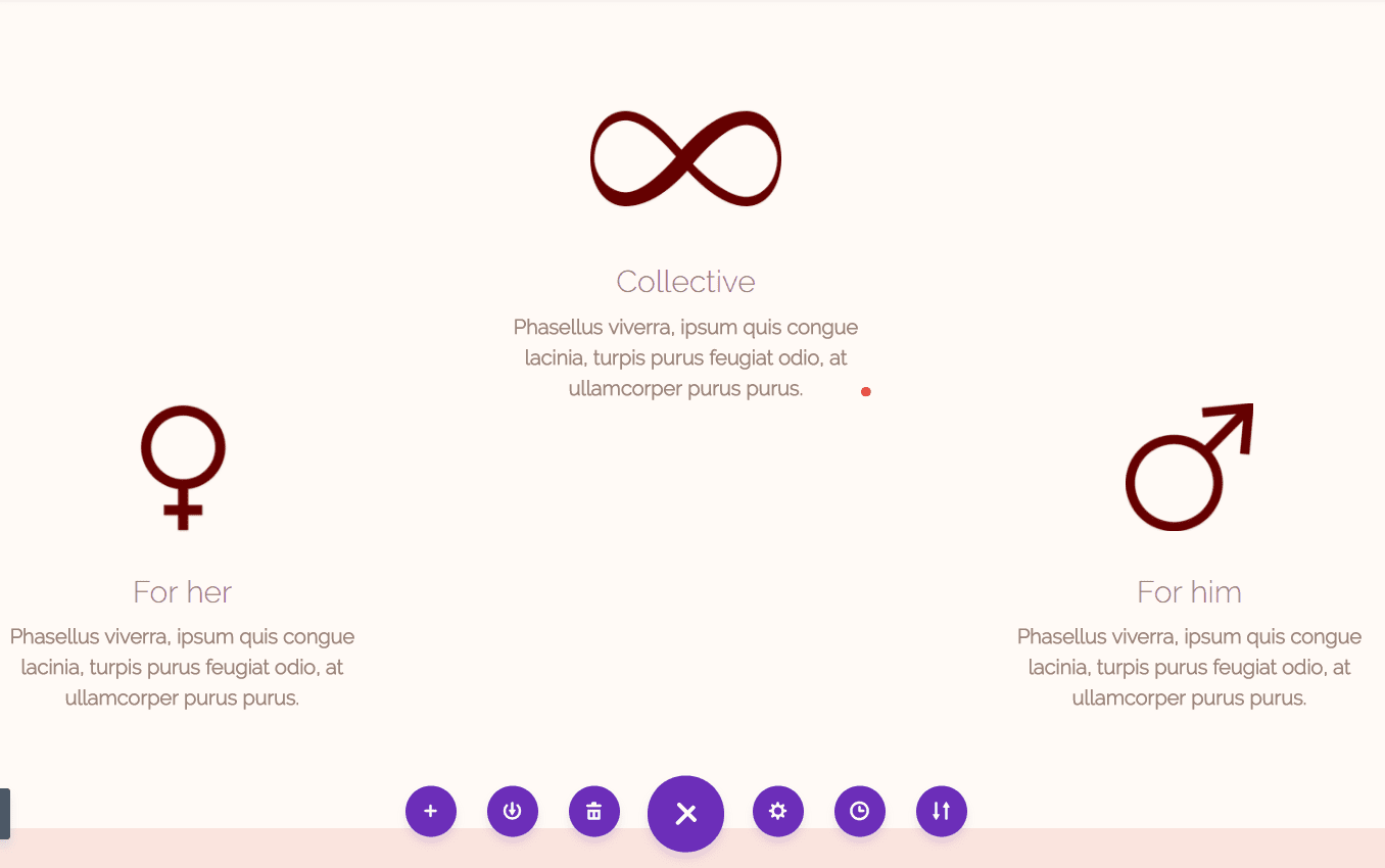
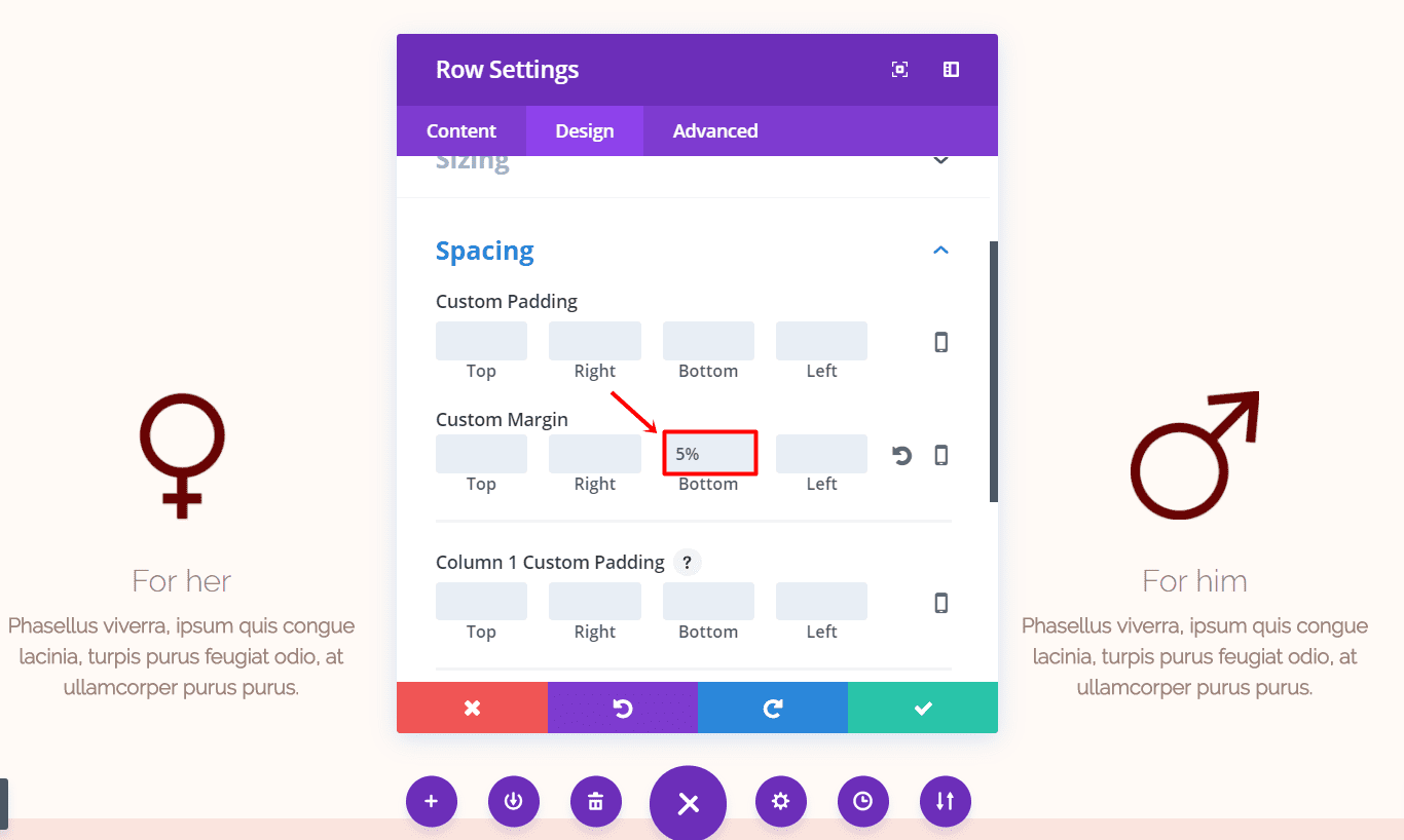
Next, go to the Design tab of the row and add ‘5%’ to the bottom margin within the Spacing subcategory.
Bride’s Image Module
Now, add an Image Module to the second column of the row. Upload the image and go to the Design tab. Make sure you put the Image Alignment to ‘Left’ and activate the ‘Always Center Image on Mobile’ option within the Alignment subcategory.
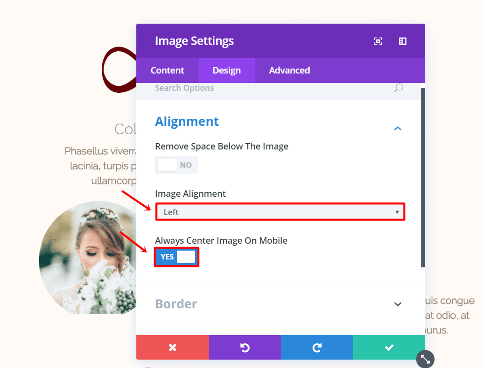
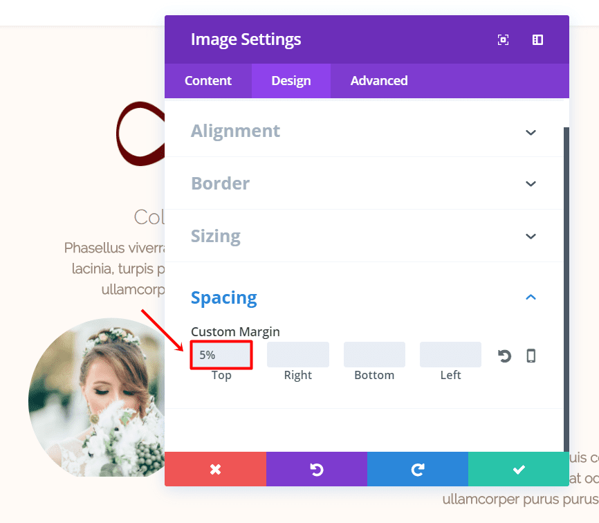
Scroll down the same tab and add ‘5%’ to the top margin within the Spacing subcategory.
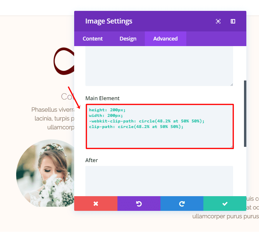
Then, go to the Advanced tab and add the following code to the Main Element within the Custom CSS subcategory:
height: 200px;
width: 200px;
-webkit-clip-path: circle(48.2% at 50% 50%);
clip-path: circle(48.2% at 50% 50%);
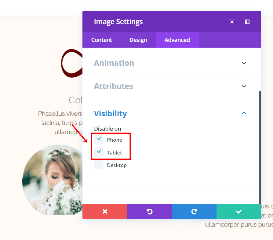
Lastly, disable the Image Module on phones and tablets.
Groom’s Image Module
Clone the previous Image Module and place it in the same column as the previous one. Change the uploaded image and move on to the Design tab. Open the Alignment subcategory and change the Image Alignment to ‘Right’.

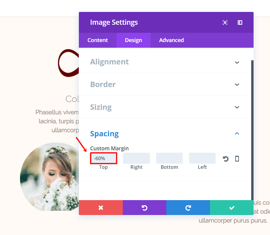
Furthermore, adjust the Top Margin to ‘-60%’ within the Spacing subcategory.
We can now move over to the gift list section of the layout. Your layout should be looking like this so far:
Wishlist/Gift list
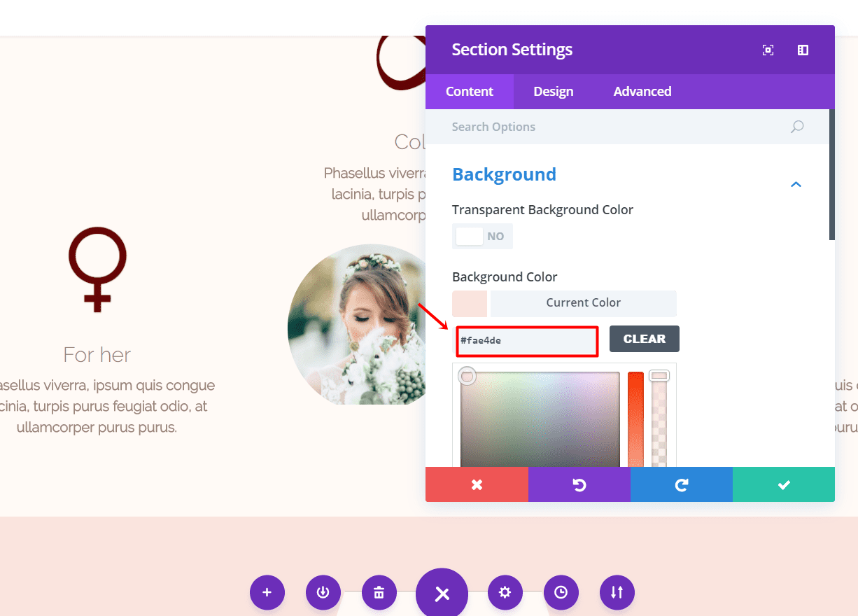
Add a new standard section and change the background color to ‘#fae4de’ in the Background subcategory of the Content tab.
Text Module: Title
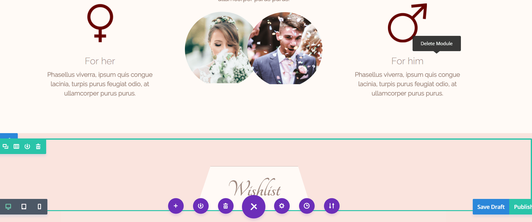
Add a fullwidth row to the section and make it fullwidth. Afterwards, clone the Text Module we made in the second section and place it in this Row Module.Change the text in the text posts and change the background color to ‘#fffaf6’ in the Main Element field within the Custom CSS subcategory of the Advanced tab.
Gift list/Wishlist: Using The Slider Module
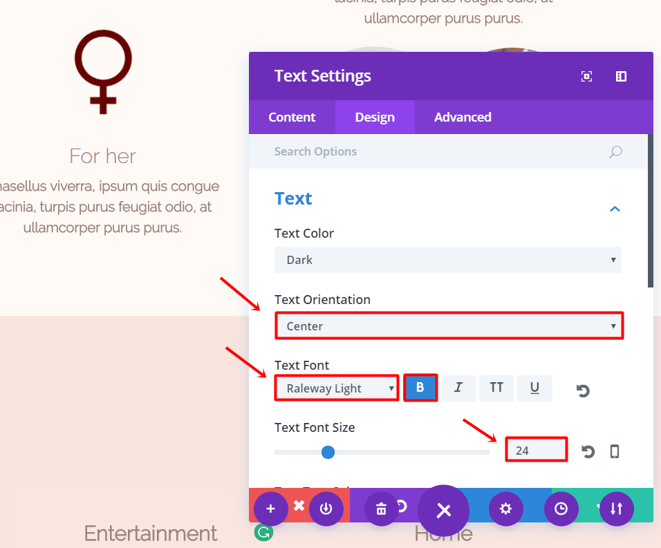
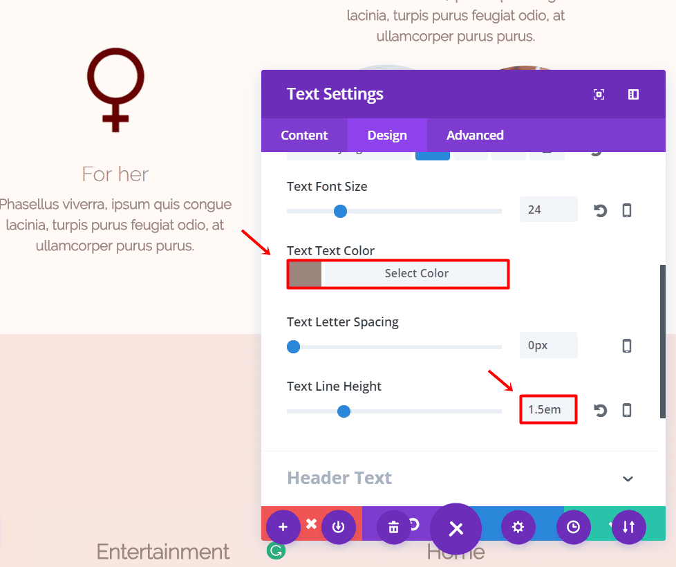
Add a new row with 3 columns to the section and change the Custom Width ‘65%’ within the Sizing subcategory of the Design tab. Continue by adding a Text Module to the first row and make the following adjustments to the Text subcategory of the Design tab:
- Text Orientation: Center
- Text Font: Raleway Light
- Text Font Style: Bold
- Text Font Size: 24px
- Text Color: #9b857b
- Text Line Height: 1.5em
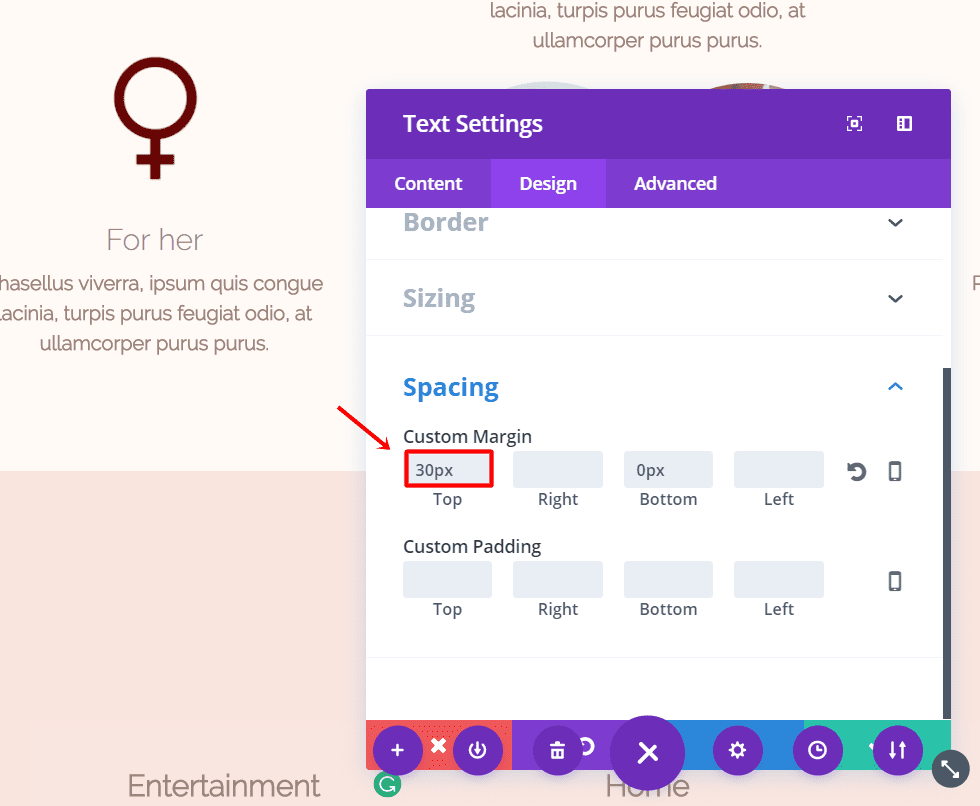
Scroll down the same tab and add ’30px’ to the top margin within the Spacing subcategory.
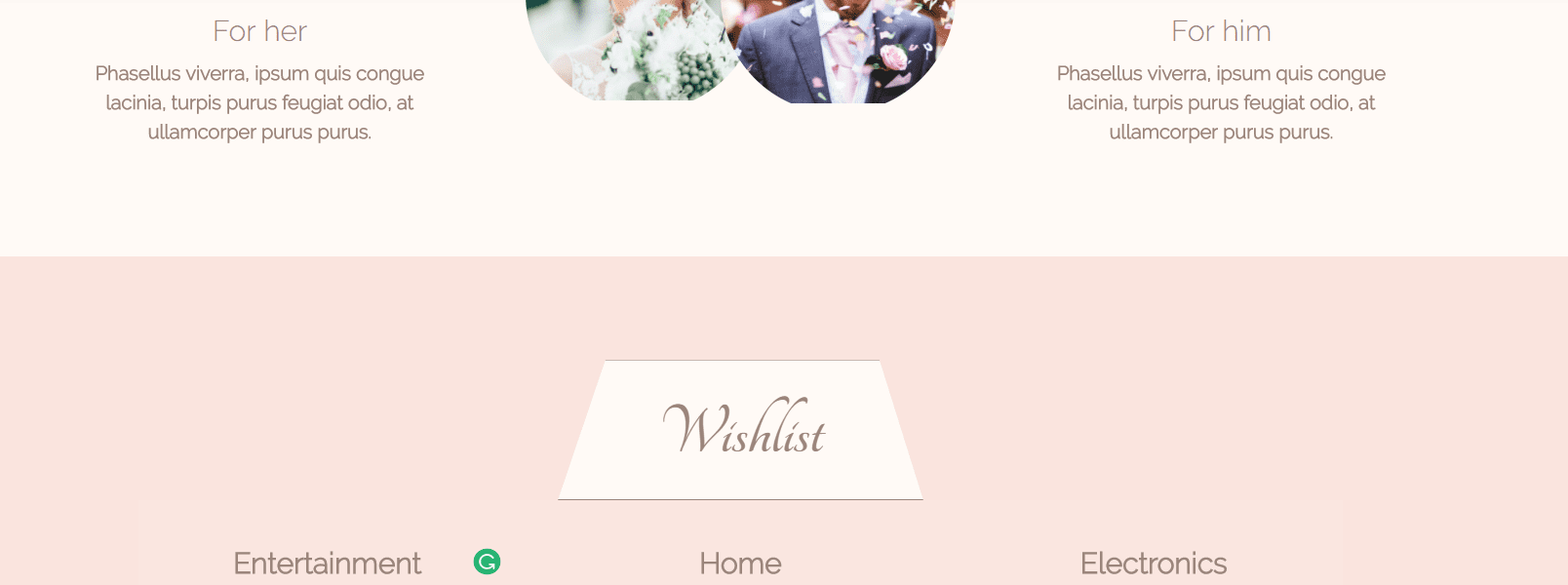
Now, clone the Text Module two times and put one in each column.
Next, add a Slider Module. Go to the Advanced tab of the slider and add the following code to the Main Element within the Custom CSS subcategory:
border: 2px solid #FFFFFF;
border-radius: 15px;
margin-left: 20px;
Moving on, add a new slide. Within the slide, upload a background image of one the items you’d like to place on the gift list within the Background subcategory of the Content tab. Next, enter the name of the item and button text within the Text subcategory of that same tab. Change the URL in the Link subcategory as well. Add as many slides as you need within one category and repeat the same thing.
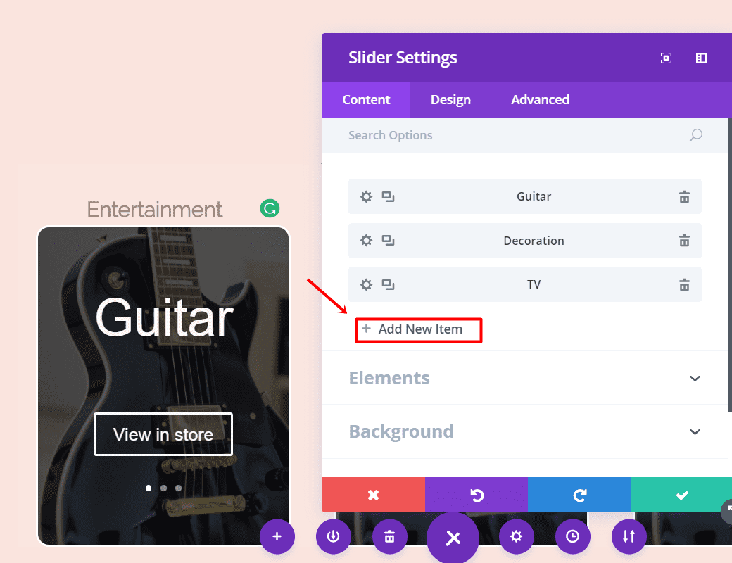
Continue by adding a new row, but now with only 2 columns.
Change the Custom Width to ‘55%’ within the Sizing subcategory of the Design tab and change the bottom margin to ‘5%’ within the Spacing subcategory.
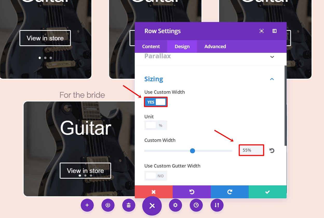
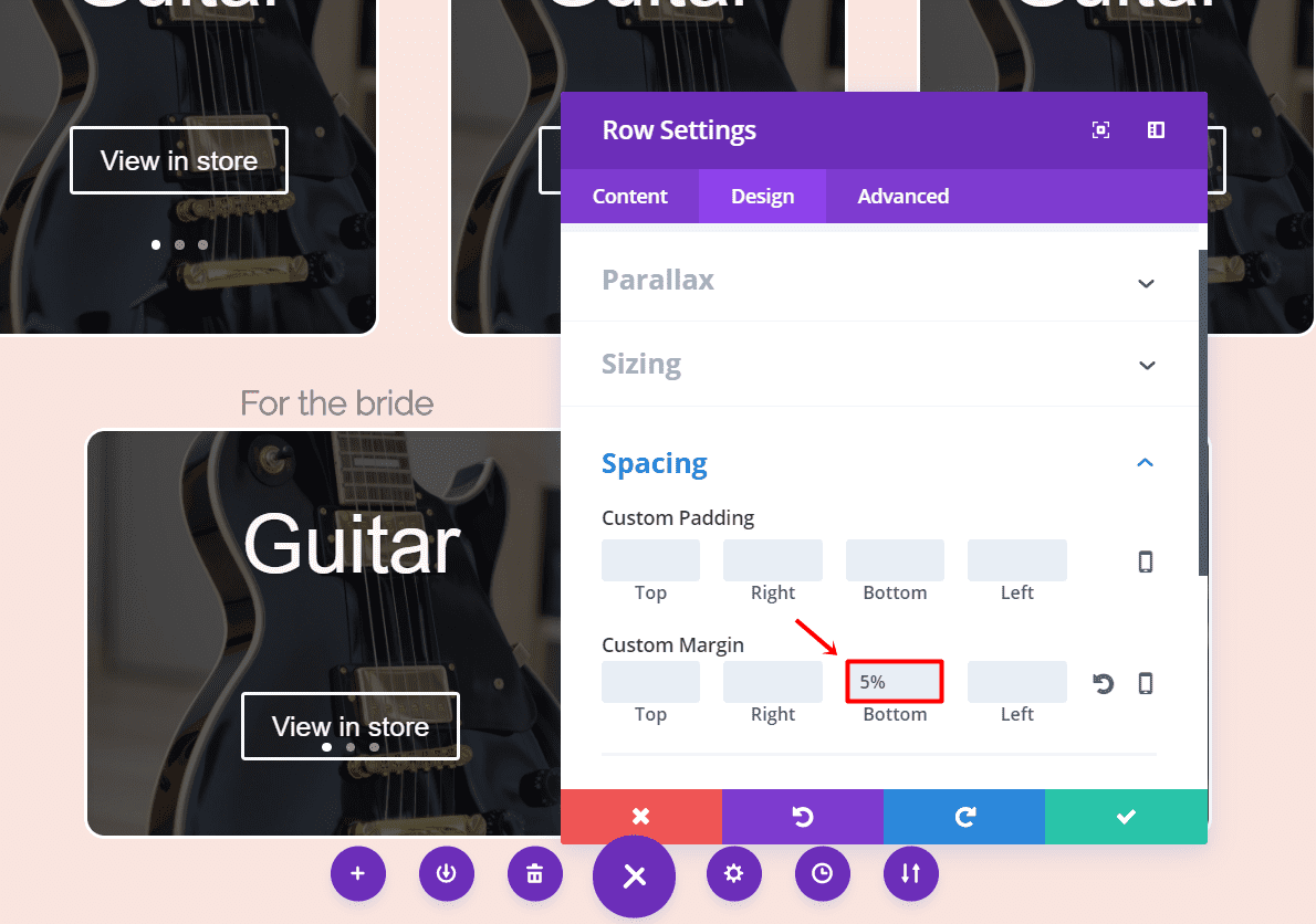
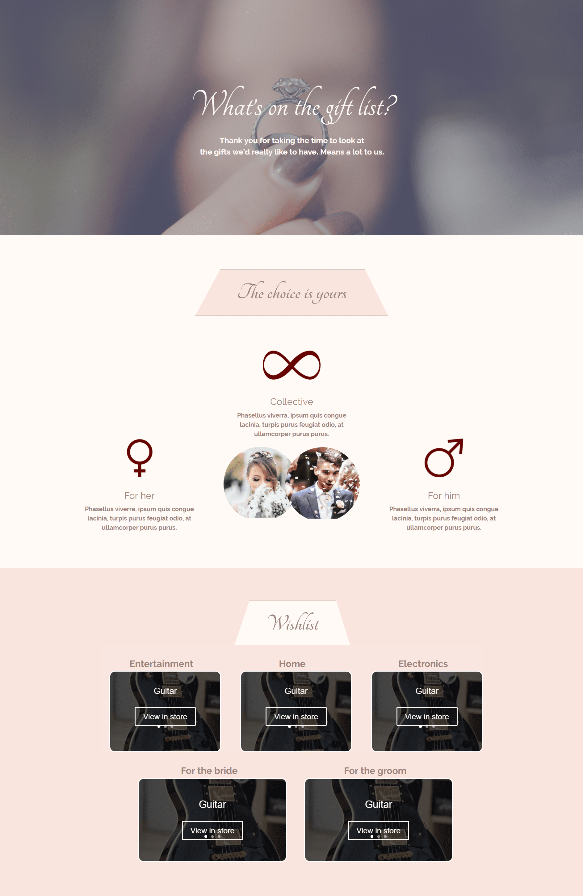
The Text Module and Slider Module we created in the previous Row Module have the same settings as we need in all the other Text Modules and Sliders. Go ahead and clone both four times and place them in the remaining columns of each Row Module.
Your layout should be looking like this now:
The Contact Form (Desktop)
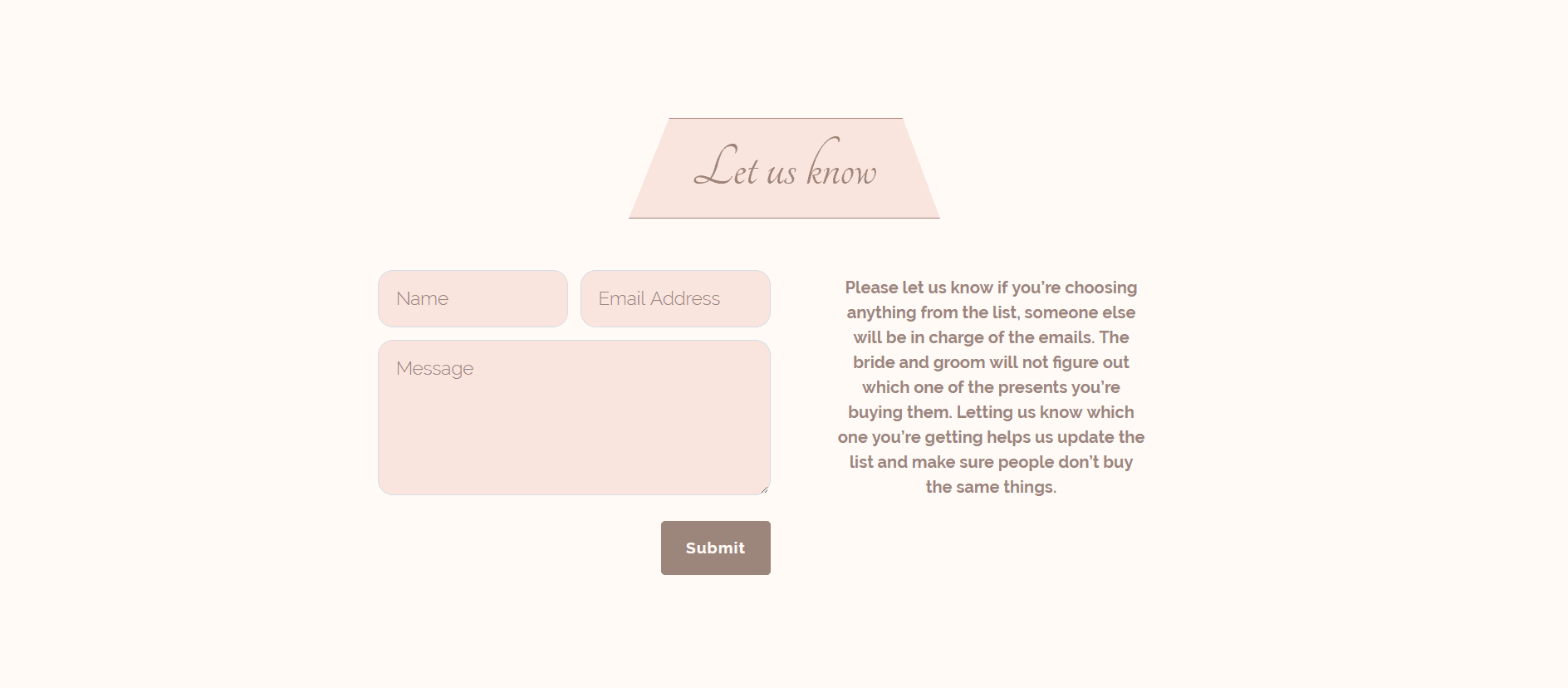
The purpose of the Contact Form in the layout is to allow people to pass on which gift they’re buying for the couple. As soon as a gift gets taken, it can be replaced with another one on the website. By doing that, it becomes less likely that two guests bring the same gift along.
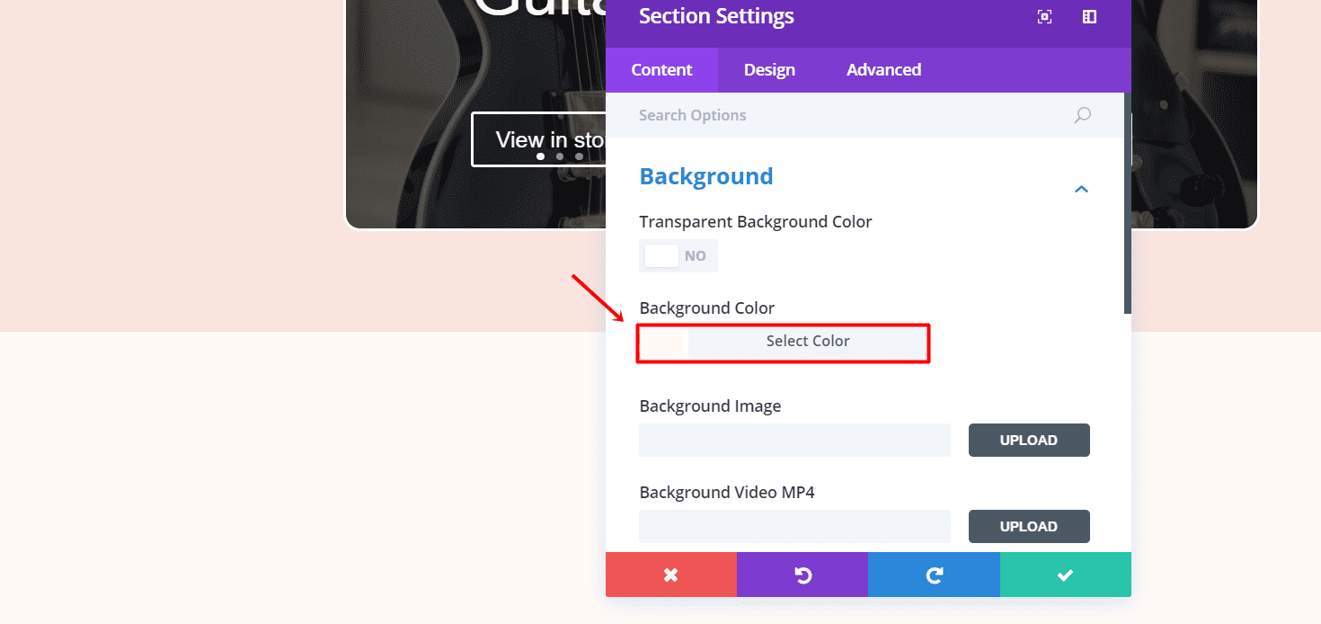
Create a new standard section and change the background color to #fffaf6 in the Background subcategory of the Content tab.
First Row
The row we need in this section is the same as in the other sections. Just clone the previously used Row Module with the Text Module in it and place it within the section. The only thing you’ll have to do is make some modifications to the Text Module settings. Change the text and background color in the Main Element to #fae4de.
Second Row
Now, add a row with two columns and hide the row on tablets and phones within the Visibility subcategory of the Advanced tab. Put a Contact Form Module in the first column and make the following changes to the different subcategory of the Design tab.
Form Field Text:
- Form Field Font: Raleway Light
- Form Field Font Size: 18px
- Form Field Text Color: #9b857b
- Form Field Line Height: 1.7em
Border:
- Input Border Radius: 15
- Use Border: Yes
- Border Color: #d7dce1
- Border Width: 1px
- Border Style: Solid
Button:
- Button Text Size: 15
- Button Text Size: 15
- Button Text Color: #fffaf6
- Button Background Color: #9b857b
- Button Border Width: 9
- Button Border Color: #9b857b
- Button Border Radius: 4
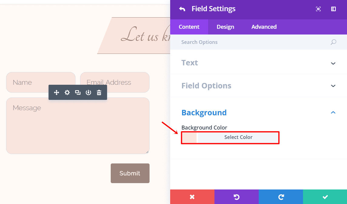
In the Content tab of the Contact Form Module, you can now add three fields; Name, Email and Message.
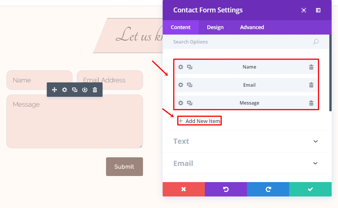
Manually change the background color of each field to #fae4de.
Last but not least, we’re going to add a Text Module to the second column to inform your guests about the process. Go to the Design tab and make the following changes to the Text category:
- Text Orientation: Center
- Text Font: Raleway Light
- Tet Font Style: Bold
- Text Font Size: 16
- Text Color: #9b857b
- Letter Line Height: 1.5em
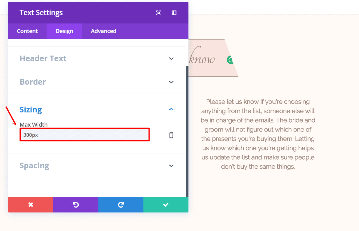
Scroll down the same tab and add ‘300 px’ to the Max Width within the Sizing subcategory.
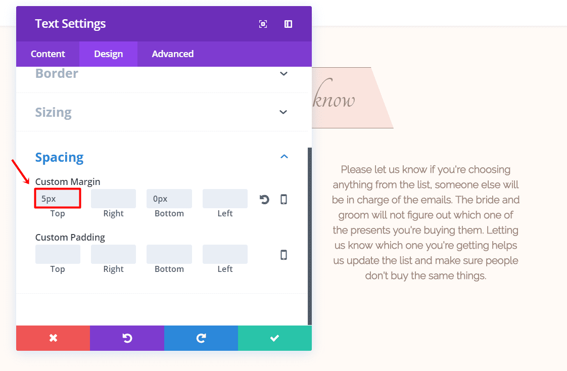
Lastly, type down ‘5px’ in the top margin within the Spacing subcategory.
The Contact Form (Tablet & Phone)
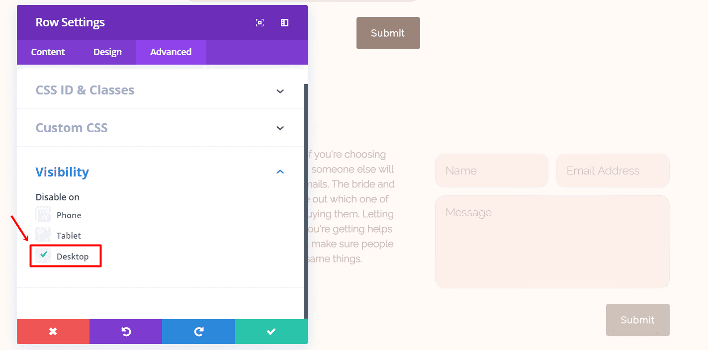
Clone the previously made row and just make the Contact Form Module and Text Module switch places (and columns). Go to the Advanced tab and hide the row for desktops.
Your layout should now, and finally, look like this:

Next Up
In the fourth part of this miniseries, we’re going to show you how to create an online guest book for your wedding with Divi and auto testimonials. If you have any comments on this tutorial, or if you have any requests for future tutorials; make sure you leave a comment in the comment section of this blog post so we can get back at you!
Be sure to subscribe to our email newsletter and YouTube channel so that you never miss a big announcement, useful tip, or Divi freebie!




Why the background images do not look with the update of divi?
Only visible if I am in enable visual builder, when I leave the image disappears
please help
Because the background images do not look with the update of divi?
Please help
Really like these step by step website building example tutorials. Learn so much from them on future design ideas/inspiration for future websites I may be building. Thanks!
These are great tutorials but I still don’t understand why you don’t supply a demo so we can see if we like the result before we start.
Simple… because every blog needs content. And they need to show these step by step, for more content.
Plus, it provides value to the existing customers who would like to learn how to do it themselves.
For the rest of us lazy folks… yes, where’s the demo? Haha! But I’m pretty sure it’ll pop up eventually somewhere.
yes , why no demo????
A (non functional) demo can be found above or here:
https://cdn.elegantthemes.com/blog/wp-content/uploads/2017/04/Gift-list-layout2.png
As for a Functional demo – meh, I get the gist of what Donjete is trying to accomplish and it’s Looking Good 🙂