
Ever tried to create a family tree for your website, but didn’t exactly know how to approach it? Well, in today’s Divi tutorial, we’re going to show you exactly how to do that. On top of creating the family tree, we’re also making sure it remains responsive across all screen sizes. Once you’re done creating the family tree, you’ll always be able to modify the images, text and design according to your own preference and make it ready to go live! Want to get started with this family tree design right away? You’ll be able to download the JSON file for free and add it to any website you’re creating!
Let’s get to it.
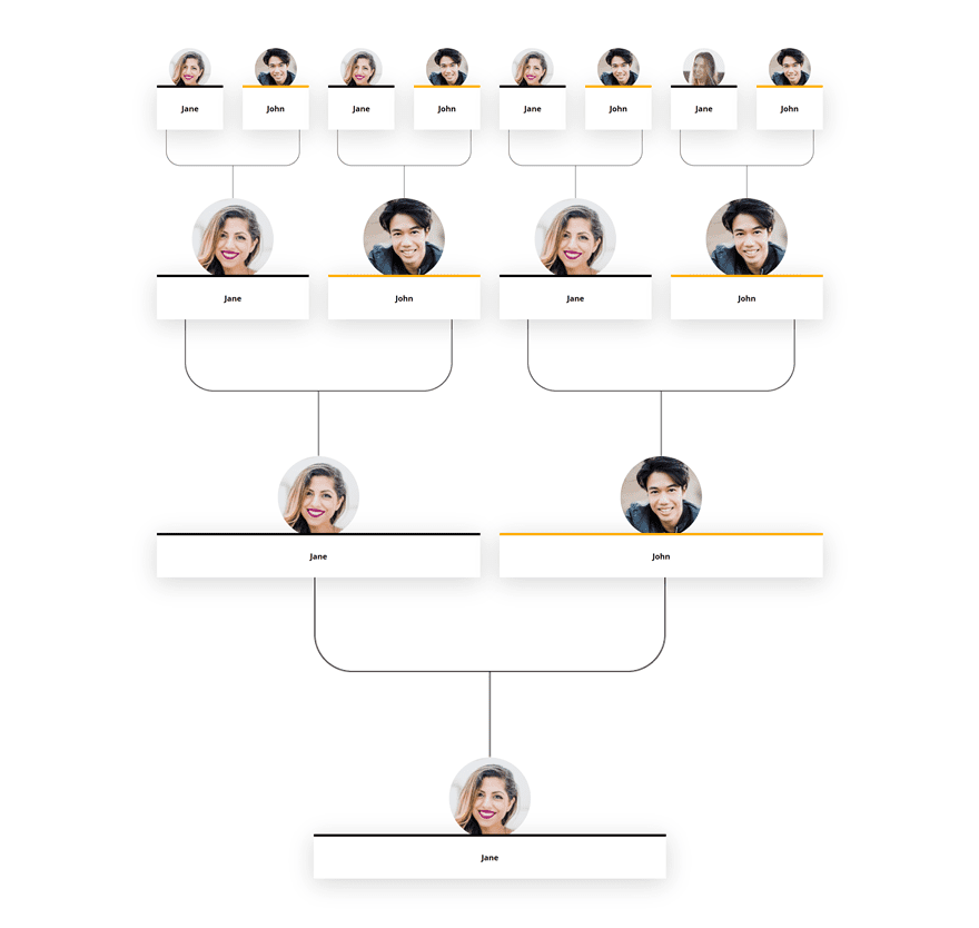
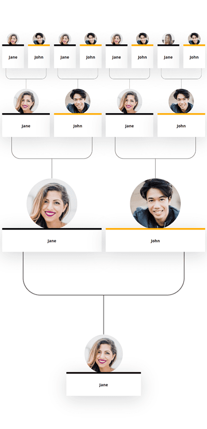
Preview
Before we dive into the tutorial, let’s take a quick look at the outcome across different screen sizes.
Desktop
Mobile
Download the Family Tree Layout for FREE
To lay your hands on the free family tree layout, you will first need to download it using the button below. To gain access to the download you will need to subscribe to our newsletter by using the form below. As a new subscriber, you will receive even more Divi goodness and a free Divi Layout pack every Monday! If you’re already on the list, simply enter your email address below and click download. You will not be “resubscribed” or receive extra emails.

Subscribe To Our Youtube Channel
Positioning Family Members
Add New Section
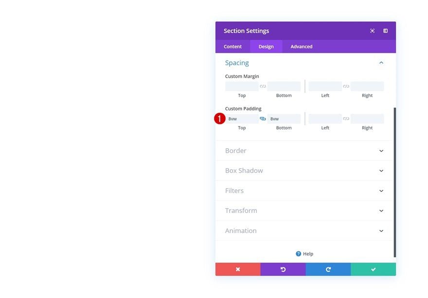
Spacing
Let’s start creating! The first thing we need to do is add a new regular section to the page we’re working on. Open the section settings and add some custom top and bottom padding using viewport width.
- Top Padding: 8vw
- Bottom Padding: 8vw
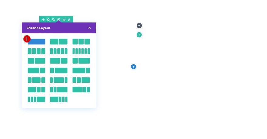
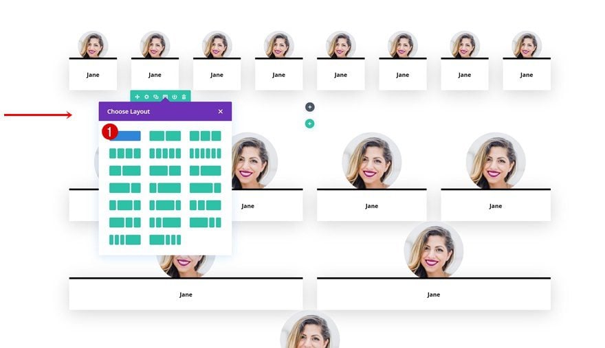
Add Row #1
Column Structure
Continue by adding the first row to your section using the following column structure:
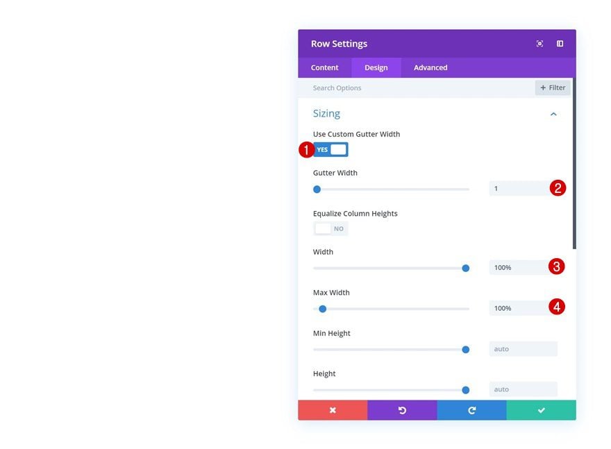
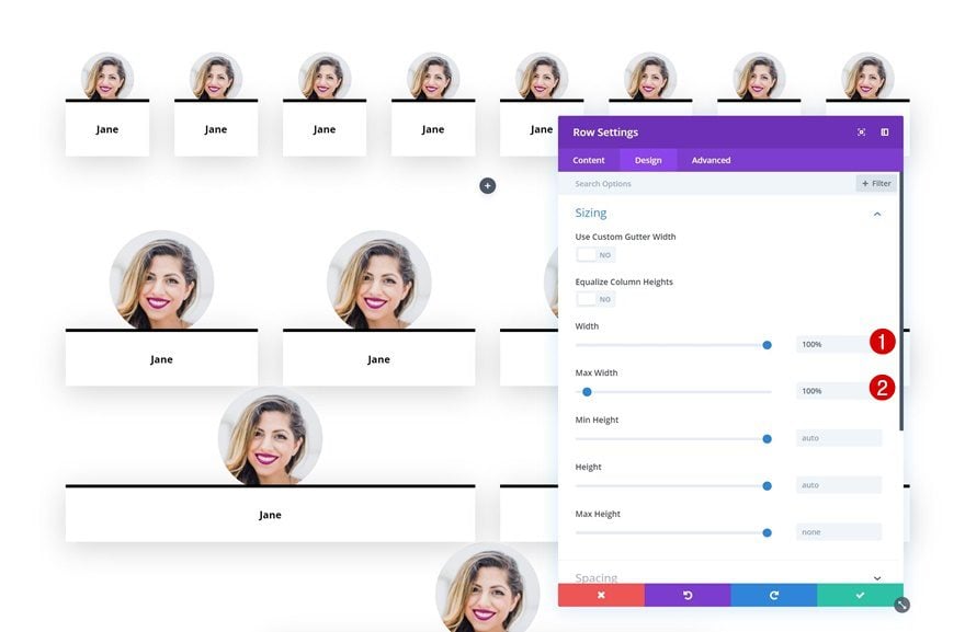
Sizing
Without adding any modules yet, open the row settings and allow the row to take up the entire width of the section and screen.
- Use Custom Gutter Width: Yes
- Gutter Width: 1
- Width: 100%
- Max Width: 100%
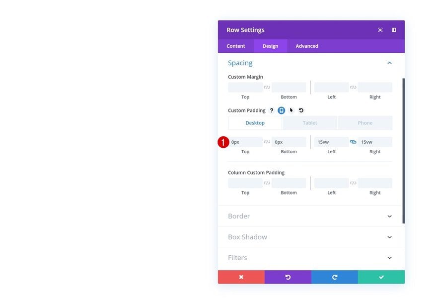
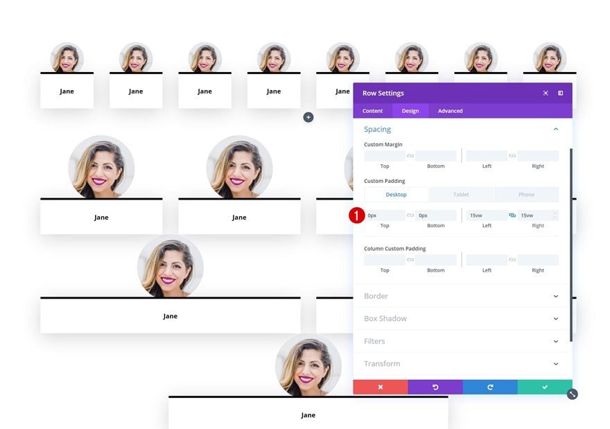
Spacing
To add whitespace to the left and the right side of the row on desktop, we’ll add some custom left and right padding using the viewport width unit.
- Top Padding: 0px
- Bottom Padding: 0px
- Left Padding: 15vw (Desktop), 0vw (Tablet & Phone)
- Right Padding: 15vw (Desktop), 0vw (Tablet & Phone)
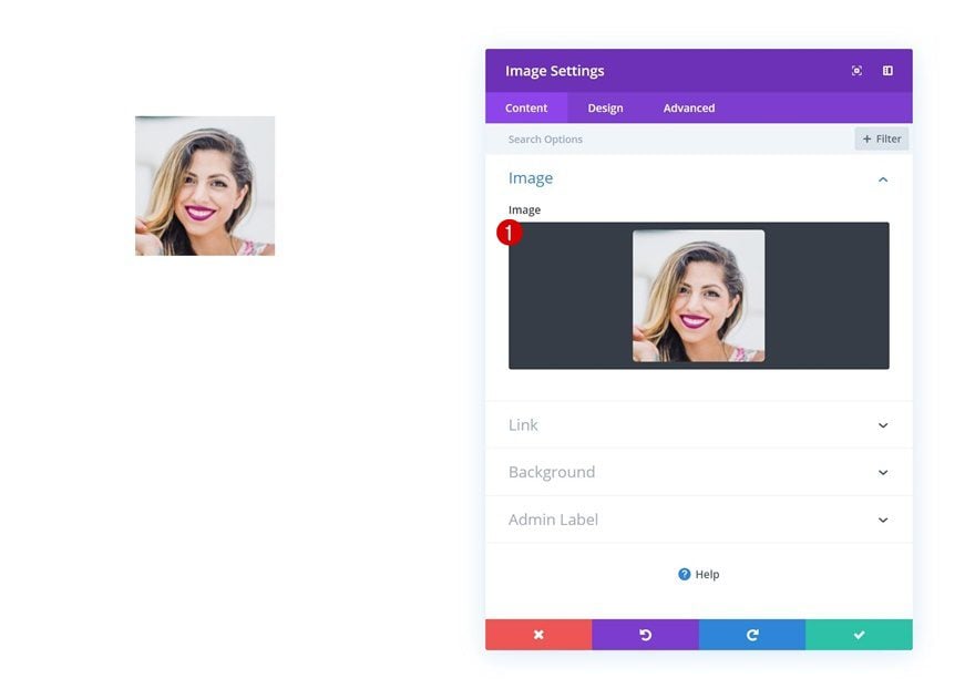
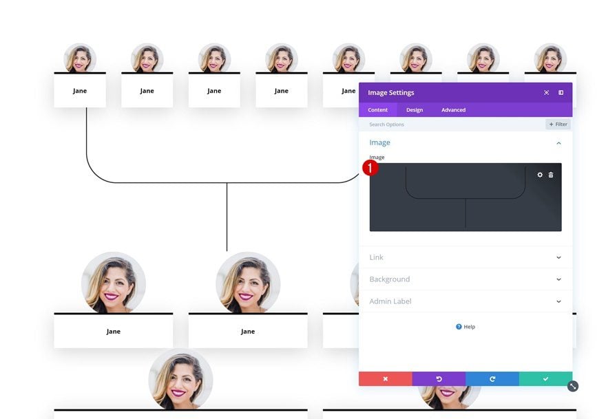
Add Image Module to Column
Upload Image
Time to start adding modules! The first one we need is an Image Module. Upload an image with a width and height of ‘180px’.
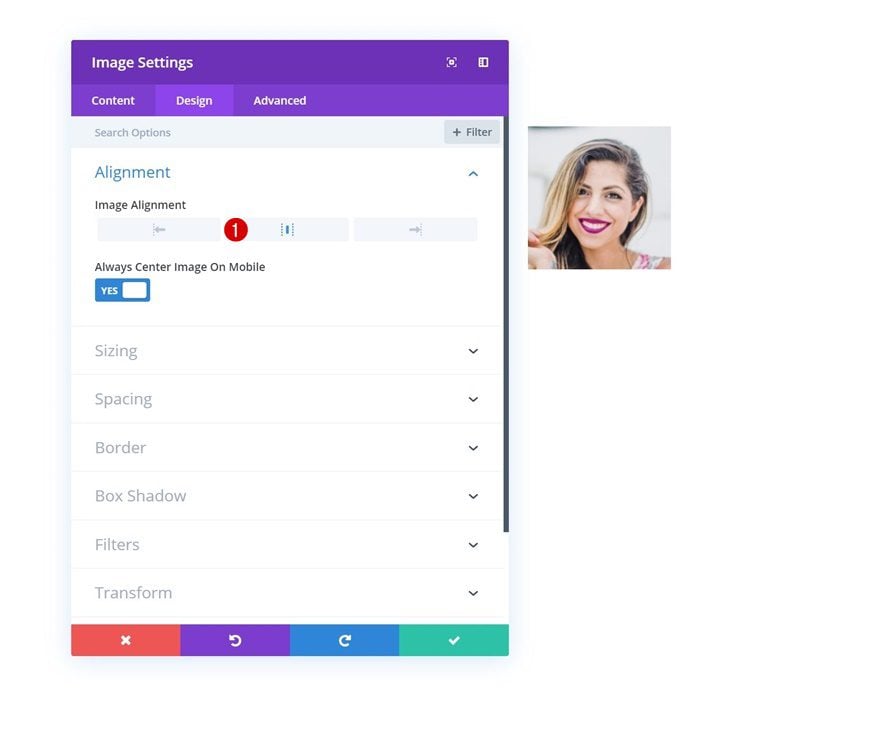
Alignment
Then, go to the design tab and change the image alignment.
- Image Alignment: Center
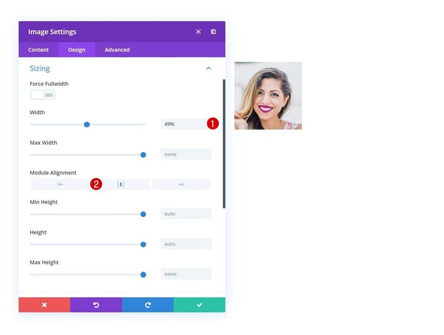
Sizing
Modify the sizing settings next.
- Width: 49%
- Module Alignment: Center
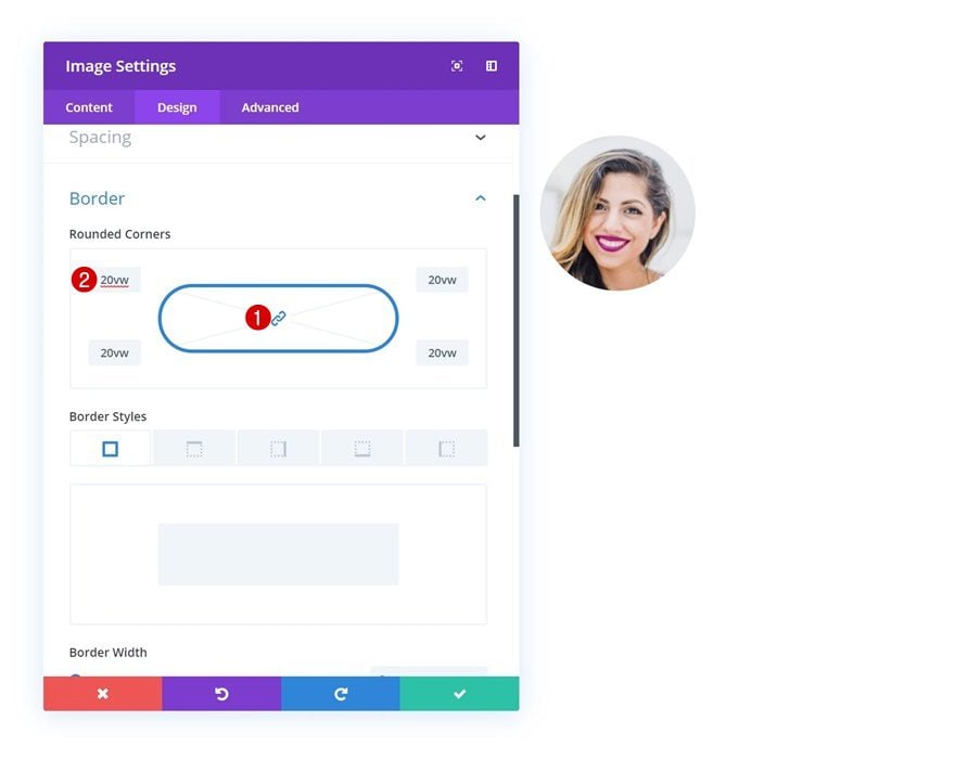
Border
And turn the image into a circle by adding a high value to each one of the corners in the border settings. We’re using ’20vw’ but you can use any high number you want.
Add Text Module to Column
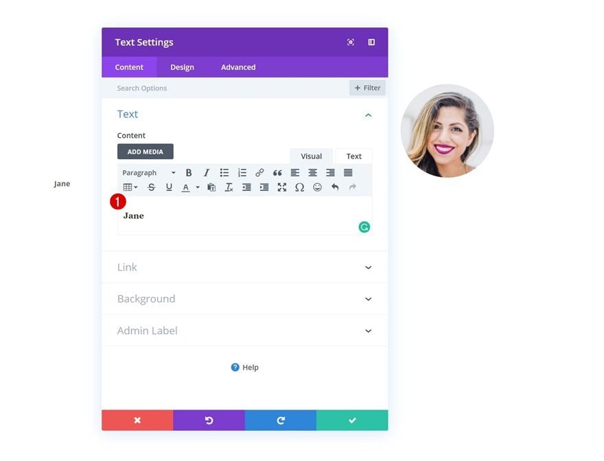
Add Content
On to the next module, which is a Text Module. Add the family member’s name here.
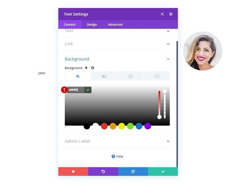
Background Color
Then, go to the background settings and change the background color into white.
- Background Color: #ffffff
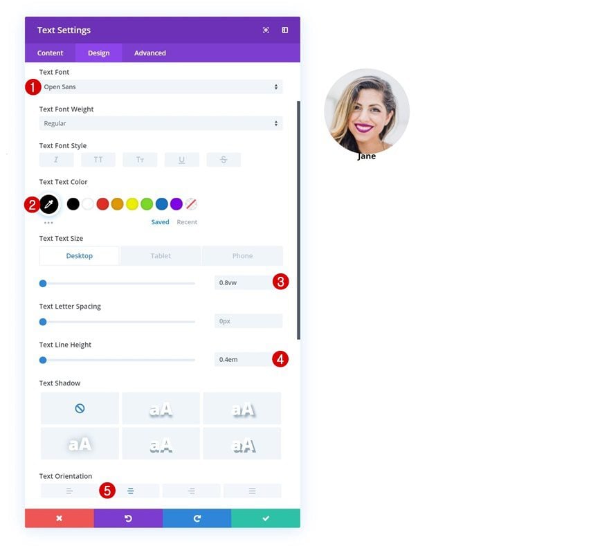
Text Settings
Modify the text settings next. If you want to create another look and feel for the family tree, feel free to play around with these settings.
- Text Font: Open Sans
- Text Color: #000000
- Text Size: 0.8vw (Desktop), 1.2vw (Tablet), 1.9vw (Phone)
- Text Line Height: 0.4em
- Text Orientation: Center
Spacing
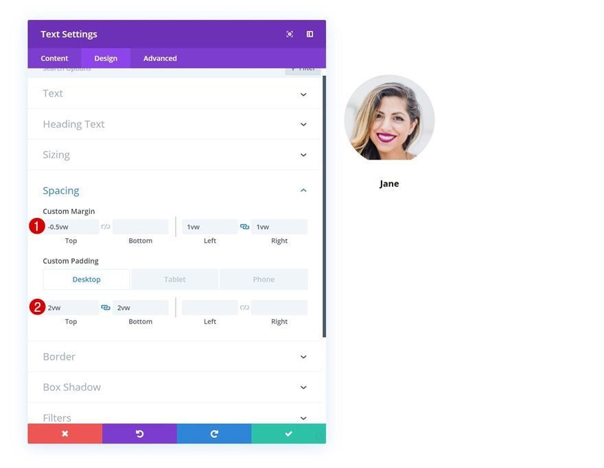
Move on to the spacing settings and add some custom margin and padding values. These values will help us shape the Text Module and make it slightly overlap the Image Module.
- Top Margin: -0.5vw
- Left Margin: 1vw
- Right Margin: 1vw
- Top Padding: 2vw (Desktop), 4vw (Tablet), 5vw (Phone)
- Bottom Padding: 2vw (Desktop), 4vw (Tablet), 5vw (Phone)
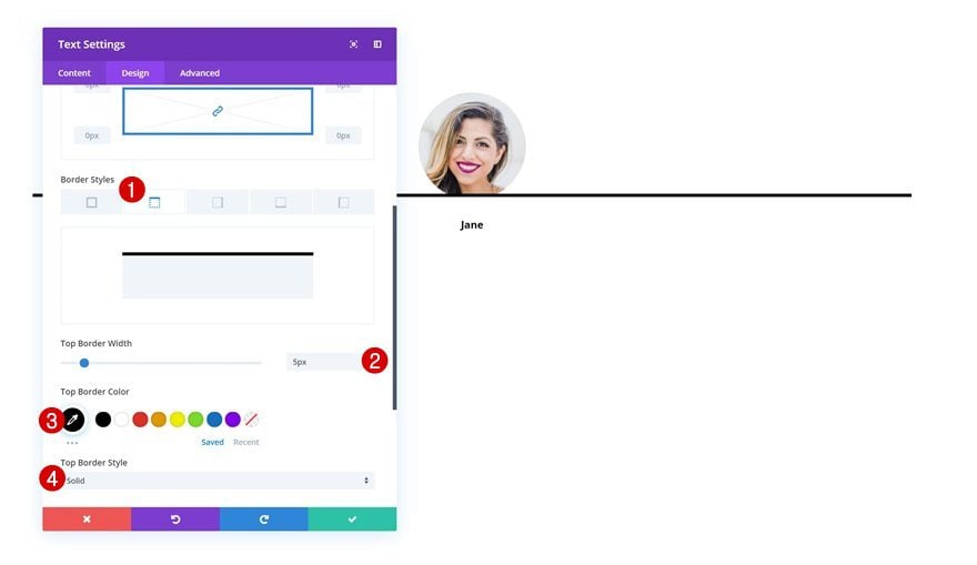
Border
Move on to the border settings and add a top border as well.
- Top Border Width: 5px
- Top Border Color: #000000
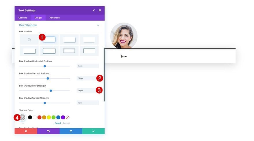
Box Shadow
Along with a Box Shadow to create depth on the page.
- Box Shadow Vertical Position: 10px
- Box Shadow Blur Strength: 50px
- Shadow Color: rgba(0,0,0,0.17)
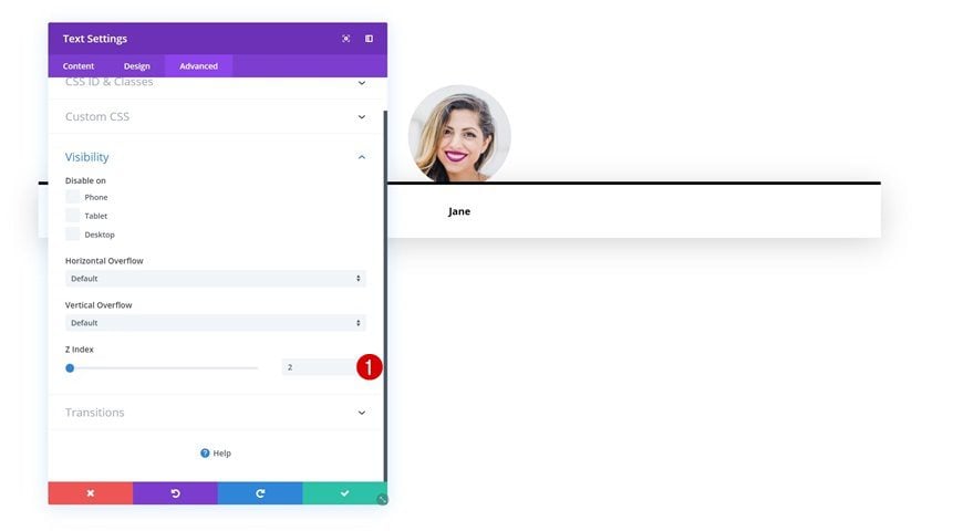
Z Index
To make sure the Text Module remains on top of the Image Module, we’ll increase the Z index in the visibility settings of the Text Module.
- Z index: 2
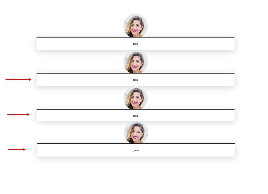
Clone Row Three Times
Once you’re done creating the first row and modifying all the modules in it, you can go ahead and clone the row three times. This will help us save time in the upcoming steps of the tutorial. Each one of these rows will be used to create a different level in the family tree.
Customize Row #1
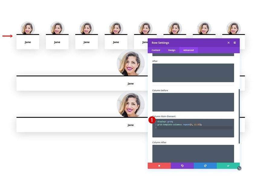
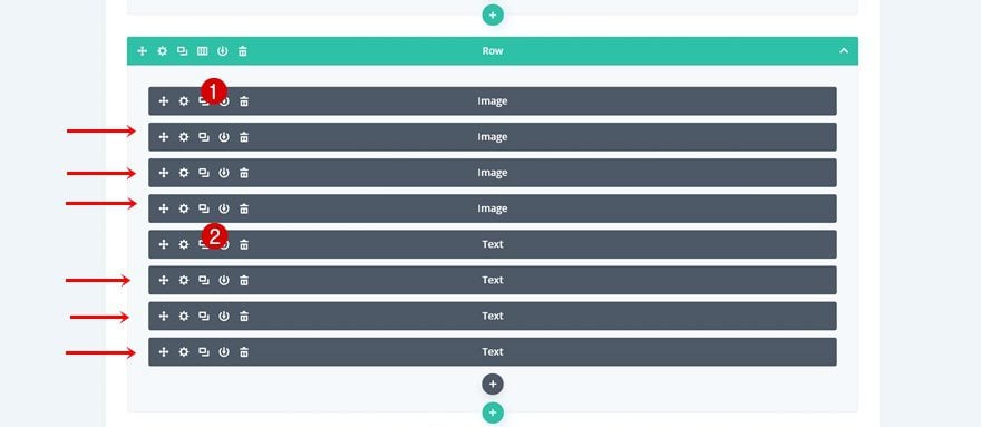
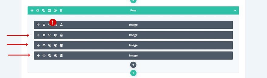
Clone Both Modules 7 Times
Let’s start customizing the first level of the family tree! Switch over to wireframe mode and clone the two modules in your row 7 times. Once you’re done, the backend of your row should look like this:
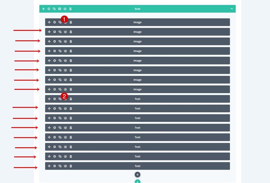
Column Main Element CSS
We’re turning the entire column into a grid. In total, there should be 16 modules in your column. We’re going to place these 16 modules into 8 grid columns. This means that each one of the 8 grid columns will contain 2 modules; one Image Module and one Text Module. Open the row settings of the first row and add the following lines of CSS code to the column main element:
display: grid;
grid-template-columns: repeat(8, 12.5%);
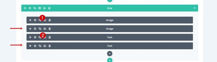
Customize Row #2
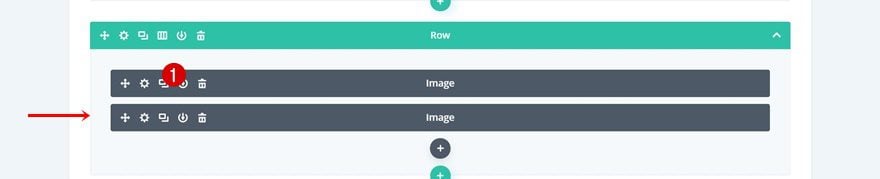
Clone Both Modules 3 Times
On to the second row! Here, we’re going to clone both modules 3 times.
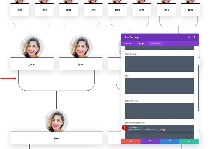
Column Main Element
We’re turning the column into a grid with 4 grid columns by adding the following lines of CSS code to the column main element of the row:
display: grid;
grid-template-columns: repeat(4, 25%);
The reason why we’re using this approach, instead of just choosing an existing row column structure with 4 columns, is that we want everything to remain 100% responsive on smaller screen sizes.
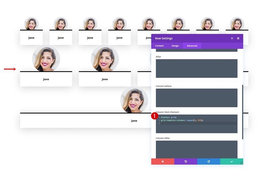
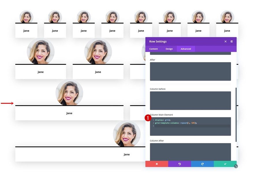
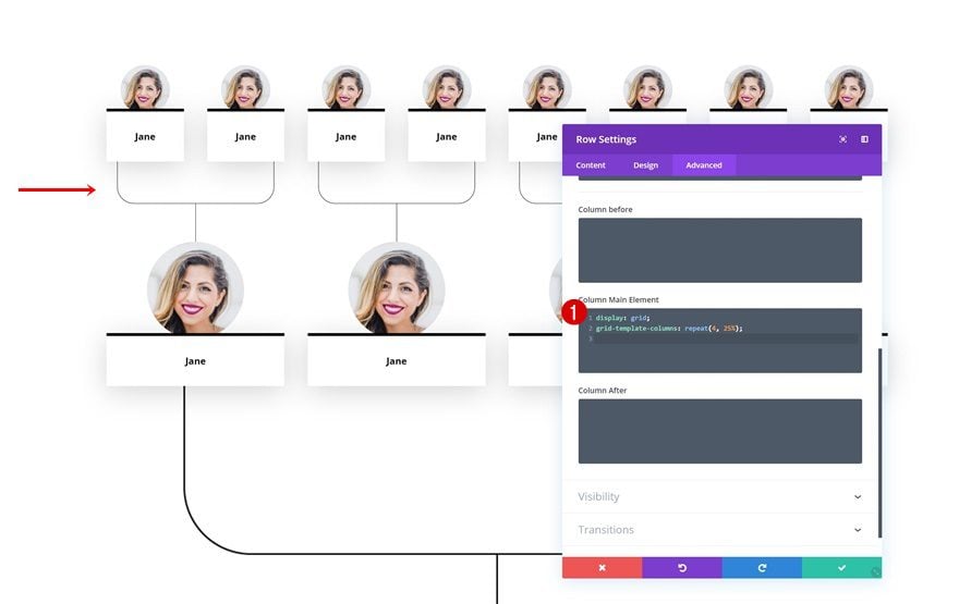
Customize Row #3
Clone Both Modules
On to the third row! Clone each the modules once.
Column Main Element
Then, add the following lines of CSS code to the column main element:
display: grid;
grid-template-columns: repeat(2, 50%);
Customize Row #4
Row Spacing
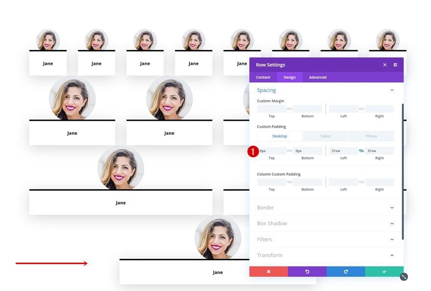
On to the next and last row! Here, the only thing we need to do is modify the row padding values.
- Top Padding: 0px
- Bottom Padding: 0px
- Left Padding: 31vw
- Right Padding: 31vw
Connecting Family Members Using Image Modules
Add Row #1
Column Structure
Now that we have lined up all the family members, we can start connecting them! To do that, add a new row in between the first and second row.
Sizing
Without adding any modules yet, open the row settings and change the sizing values.
- Width: 100%
- Max Width: 100%
Spacing
Go to the spacing settings next and add some custom padding values.
- Top Padding: 0px
- Bottom Padding: 0px
- Left Padding: 15vw (Desktop), 0vw (Tablet & Phone)
- Right Padding: 15vw (Desktop), 0vw (Tablet & Phone)
Add Image Module to Column
Upload Illustration
Then, add an Image Module and upload the illustration which you can find in the folder you’ve downloaded at the beginning of this post.
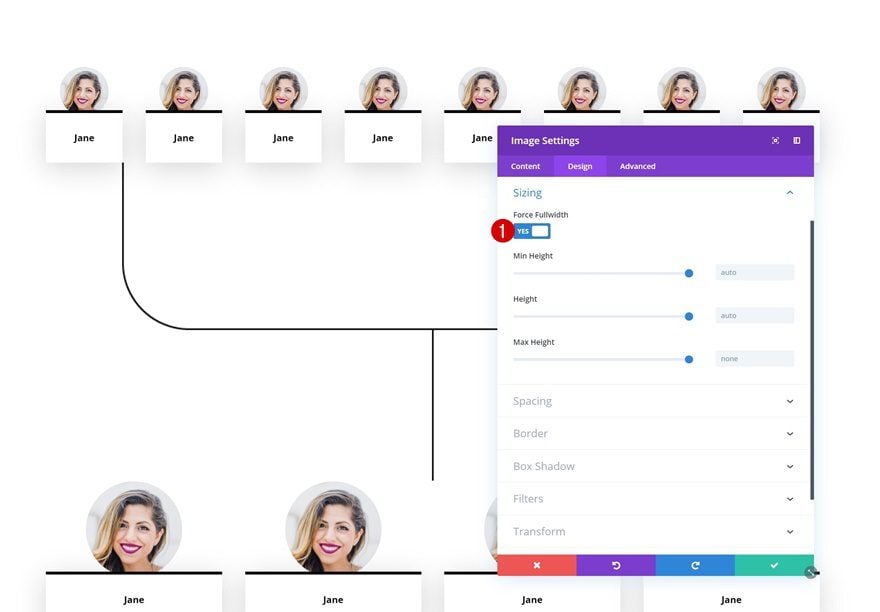
Sizing
Go to the sizing settings of the Image Module and enable the ‘Force Fullwidth’ option.
- Force Fullwidth: Yes
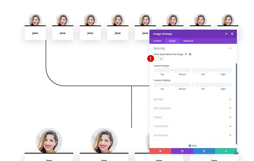
Spacing
Make sure you disable the ‘Show Space Below the Image’ option in the spacing settings.
- Show Space Below The Image: No
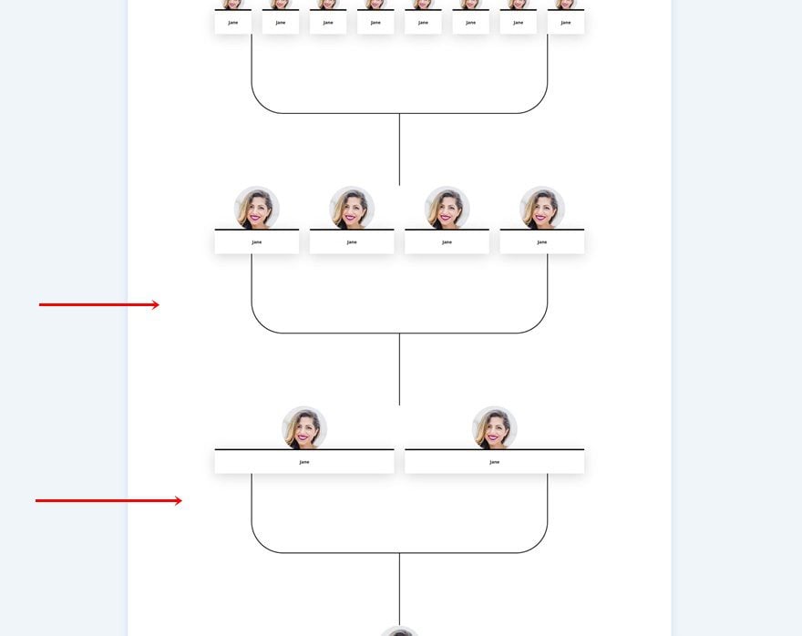
Clone Row Twice & Change Their Position
Once you’re done modifying the row and the Image Module in it, go ahead and clone it twice. Place the duplicates accordingly:
Customize Row #1
Clone Image Module Three Times
Go back to the first row and clone the module 3 times.
Column Main Element
Place these Image Modules in a grid with 4 grid columns by adding the following lines of CSS code to the column main element of the row:
display: grid;
grid-template-columns: repeat(4, 25%);
Customize Row #2
Clone Image Module
Move on to the second row and clone the Image Module once.
Column Main Element
Place both modules in a grid with two grid columns by adding the following lines of CSS code to the column main element of the row:
display: grid;
grid-template-columns: repeat(2, 50%);
Customize Row #3
Change Spacing
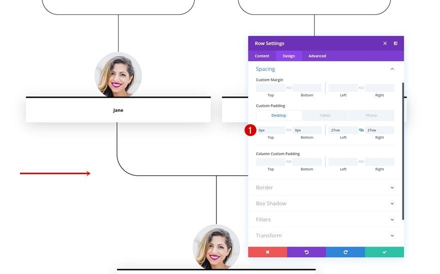
On to the next and last duplicate. Here, the only thing you’ll need to do is change the custom padding values and you’re done!
- Top Padding: 0px
- Bottom Padding: 0px
- Left Padding: 27vw
- Right Padding: 27vw
Preview
Now that we’ve gone through all the steps, let’s take a final look at the outcome across different screen sizes.
Desktop
Mobile
Final Thoughts
In this post, we’ve shown you how to create a modern family tree with Divi! The family tree we’ve recreated looks great across all screen sizes. At the beginning of this tutorial, you were also able to download the JSON file for free and get started with it right away. If you have any question or suggestions, make sure you leave a comment in the comment section below!


Nice work! I would like to see more Divi layout themes for genealogy. TY
Hi,
Is there a way to invert this and have the first generation at the top? Thanks.
This is something very different.
Very interisting and you can use for organizational chart
Hey Mate! Thanks for posting such great information and you are doing great work.
thanks very much! very worth trying….. I was looking for a nice solution to make familytrees
thanks very much! very worth trying…..
Thank you, Donjete. It looks great! I miss live demos.
What is your site
Your are making Divi an amazing With these tutorials.
Is there a way to have it as pre-made layout in in pre-made template ?
if so it will be Amazing!! Always Divi !!
this is a very nice design theme compared to my theme i’m using flatsome
Thanks for beatiful layout and post. I.m going to try and do it.
Hi, Donjete,
I think this one definitely deserves a video!!!
Yes, Pablo I agree, This definitely deserves a video.