

For those already familiar with building websites in Divi, creating custom grid layouts is a core aspect of the Divi Builder. Simply create a row and choose from multiple built-in column layouts for that row. Once the column layout is in place, we simply add the content/modules we want inside each column. But, what if we wanted an additional grid layout for those modules?
In this tutorial, we are going to explore how to expand upon Divi’s grid layouts by creating CSS grid layouts for Divi modules within a single column. The CSS Grid property (along with CSS Flex) is a popular way to create predictable and responsive grid layouts for content with just a few lines of CSS. With it, we can organize all the modules in a column into a fully responsive grid. Think of it as an additional grid layout for modules that you can add to any Divi column. But one of the best things about this technique is that each adjacent module will have the same height and width without all the hassle of trying to do this using custom padding or height values on each module.
Perhaps it is best that we just jump in and show you how this works.
Let’s get started!
- 1 Sneak Peek
- 2 Download the Layout for FREE
- 3 Download For Free
- 4 You have successfully subscribed. Please check your email address to confirm your subscription and get access to free weekly Divi layout packs!
- 5 What You Need to Get Started
- 6 Creating a Custom CSS Grid Layout For Divi Modules
- 7 Final Result
- 8 Example Using Different Modules and Designs
- 9 Final Thoughts
Sneak Peek
Here is a quick look at the design we’ll build in this tutorial.
And here is a peek at the same technique using different modules and designs from the Fitness Gym Layout Pack.
Download the Layout for FREE
To lay your hands on the designs from this tutorial, you will first need to download it using the button below. To gain access to the download you will need to subscribe to our newsletter by using the form below. As a new subscriber, you will receive even more Divi goodness and a free Divi Layout pack every Monday! If you’re already on the list, simply enter your email address below and click download. You will not be “resubscribed” or receive extra emails.

To import the section layout to your Divi Library, navigate to the Divi Library.
Click the Import button.
In the portability popup, select the import tab and choose the download file from your computer.
Then click the import button.

Once done, the section layout will be available in the Divi Builder.
Let’s get to the tutorial, shall we?
What You Need to Get Started

To get started, you will need to do the following:
- If you haven’t yet, install and activate the Divi Theme.
- Create a new page in WordPress and use the Divi Builder to edit the page on the front end (visual builder).
- Choose the option “Build From Scratch”.
After that, you will have a blank canvas to start designing in Divi.
Creating a Custom CSS Grid Layout For Divi Modules
Part 1: Adding The Modules to a Divi Column
Before we organize our modules into a grid layout, let’s first add all the modules we want to use to our column.
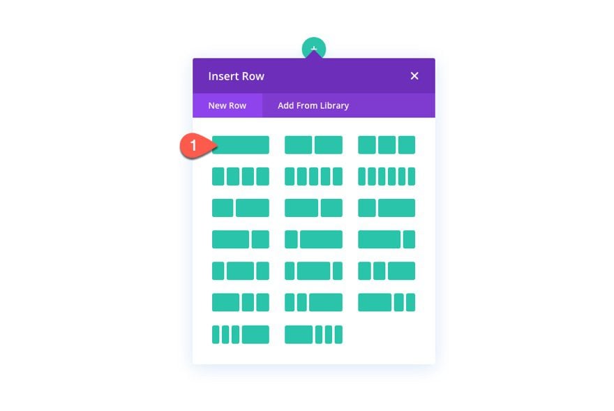
To start, create a new one-column row to the default regular section in the Divi Builder.
Creating the Modules
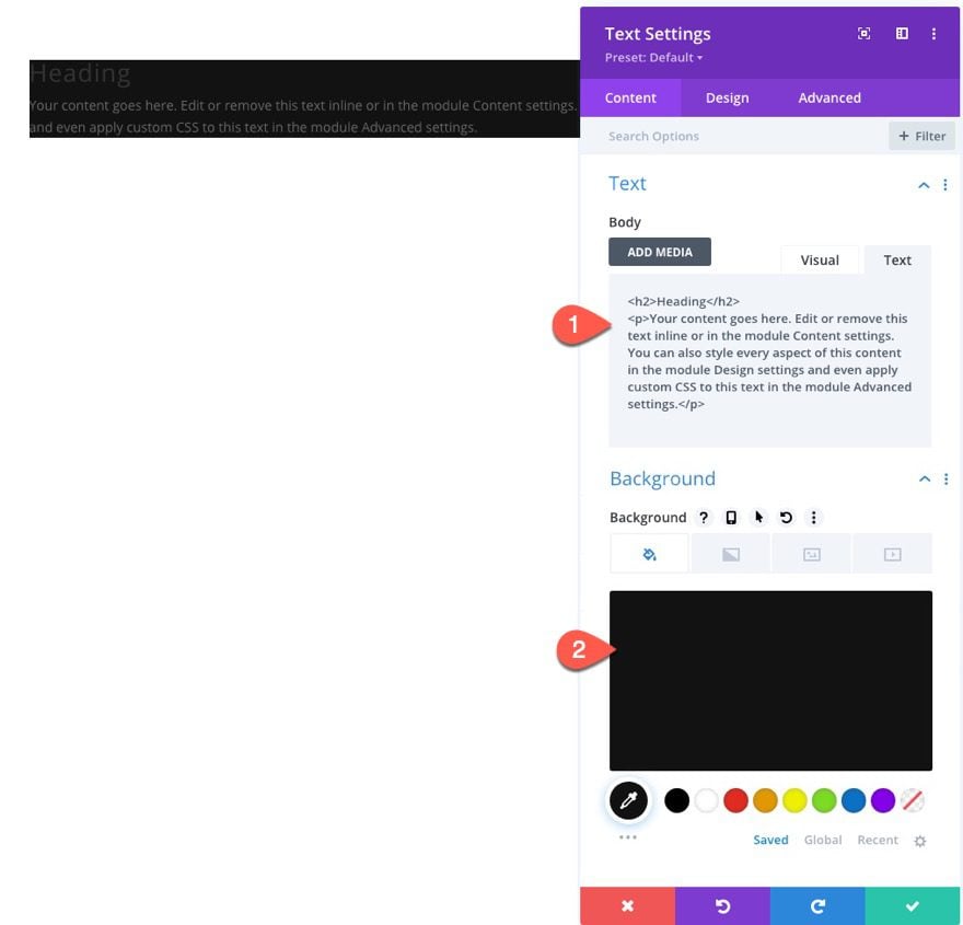
Inside the column of the row, add a new text module. Then update the content settings of the module as follows:
- Add an H2 heading above the paragraph text of the default body content
- Background Color: #333333
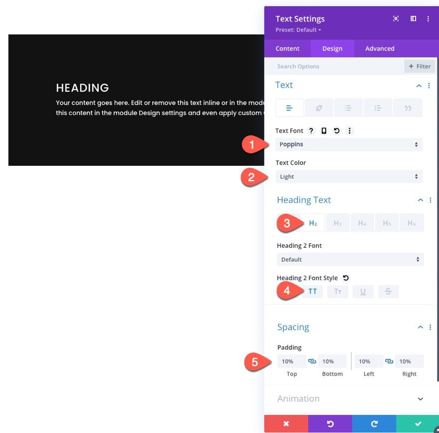
Then update the design settings as follows:
- Text Font: Poppins
- Text Color: Light
- Select the H2 tab under Heading Text
- Heading 2 Font Style: TT
- Padding: 10% top, 10% bottom, 10% left 10% right
NOTE: For simplicity, we are going to stick with using multiple text modules with various background colors to show a distinction between each module. But, as I’ll explain later, you can use any combination of modules you want (blurb modules, call to action modules, contact form modules, etc.).
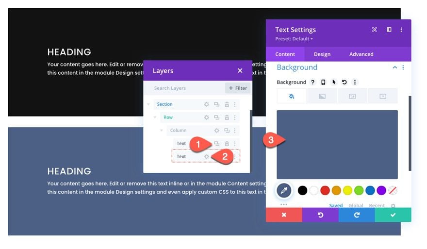
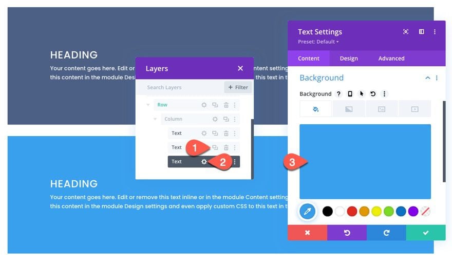
Open the layers view (optional) and create the next text module as follows:
- Duplicate the text module.
- Open the text settings for the duplicate module.
- Update the Background Color
- Background Color: #4c6085
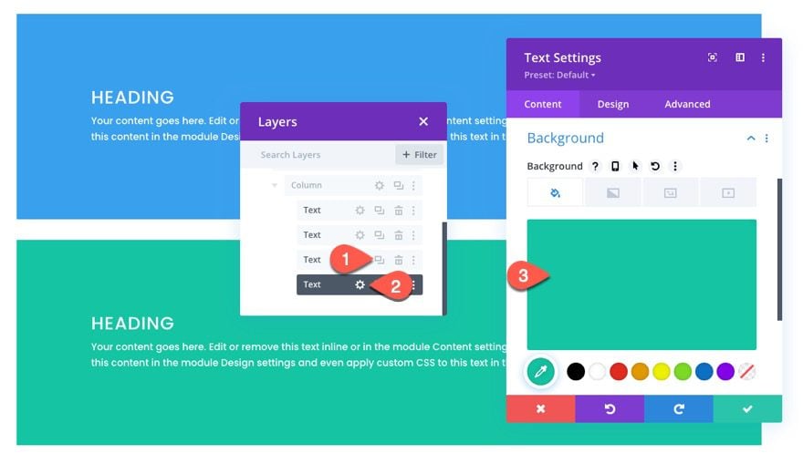
Repeat this process to create the third text module as follows:
- Duplicate the previous text module.
- Open the text settings for the duplicate module.
- Update the Background Color
- Background Color: #39a0ed
Repeat this process one more time to create the fourth text module as follows:
- Duplicate the previous text module.
- Open the text settings for the duplicate module.
- Update the Background Color
- Background Color: #13c4a3
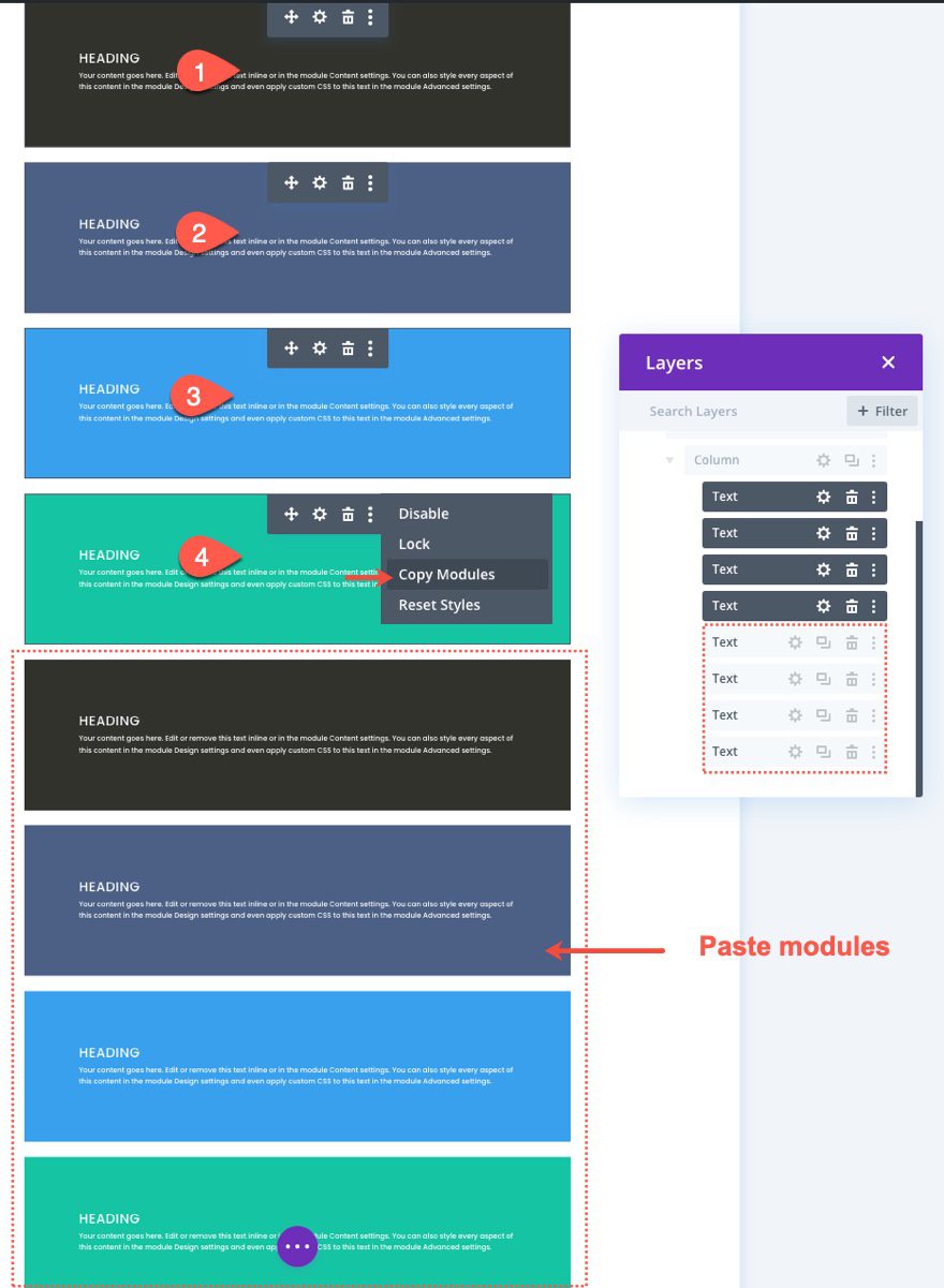
To create the next four modules, use the multiselect feature to select all four modules. Then copy and paste the modules in the same column to create a total of eight text modules.
Part 2: Creating the CSS Grid Layout for the Modules
Now that our modules are in place, we are ready to create our CSS Grid for those modules.
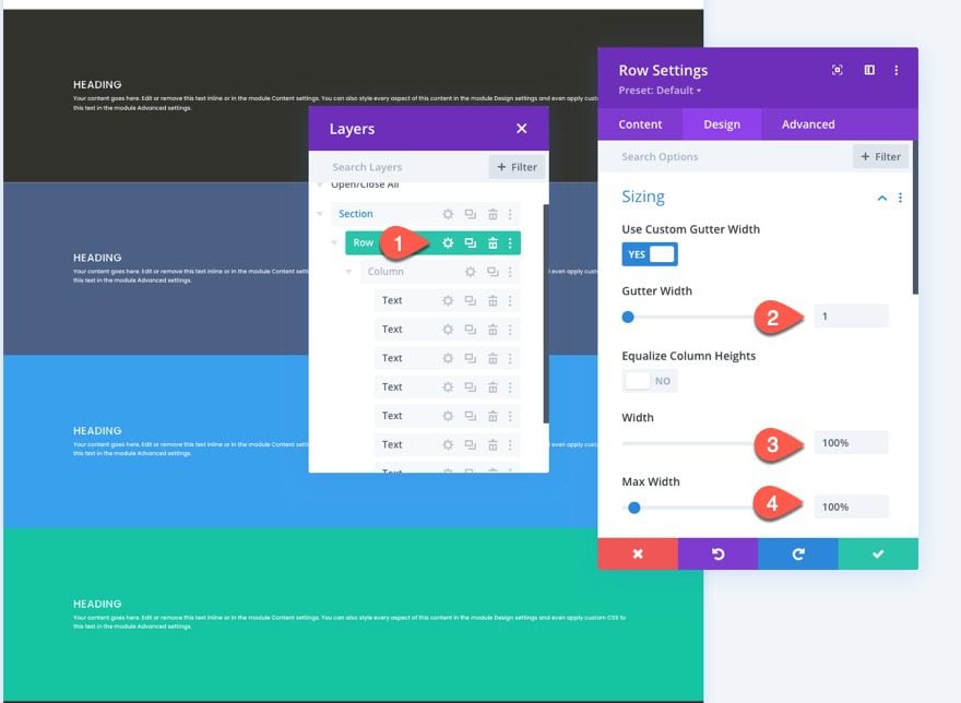
Row Settings
For this example, we are using a one-column layout so that we can display our module grid in a full-width layout. So we will need to update the row settings to make sure the row spans the full width of the page. We also need to take out the default gutter width so that no additional margins are added to our modules.
Open the row settings and update the following:
- Gutter Width: 1
- Width: 100%
- Max-width: 100%
Adding CSS Grid to the Column to Build the Grid Layout for the Modules
This is the key step in the tutorial that creates the layout for the modules using the CSS Grid property.
To do this, we are going to add three lines of CSS to the Column that will determine the layout of our modules.
Open the column settings and, under the advanced tab, paste the following CSS inside the Main Element:
display:grid;
grid-template-columns: 25% 25% 25% 25%;
grid-auto-rows: auto;
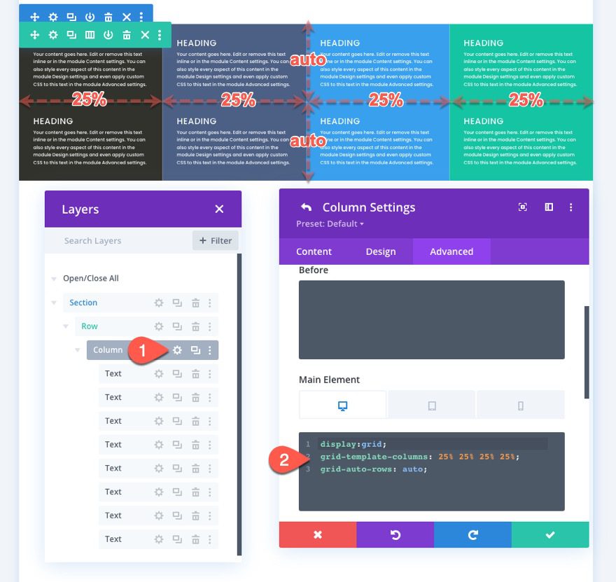
The first line of CSS lays out the content (or modules) according to the CSS grid module.
display:grid
The second line of CSS defines the column template of the grid. In this case, the grid will have four columns that are each 25% in width (see screenshot above).
grid-template-columns: 25% 25% 25% 25%
The third line of CSS specifies that rows will be auto-generated as needed with a size (or height) set to auto. This means the height of each row will be determined by the vertical height of the content (or modules) within the row (see screenshot above).
grid-auto-rows: auto
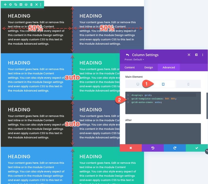
Adjust Grid Layout on Mobile
We will also need to adjust the grid layout on mobile devices as needed.
To do this we simply need to add additional CSS to each tablet an mobile that changes the number of columns and the width of each column.
In this example, we are going to change the grid layout for the modules on tablet to be two columns that are each 50% in width.
Open the responsive options and select tablet tab under the main element and paste the following CSS:
 display:grid;
grid-template-columns: 50% 50%;
grid-auto-rows: auto;
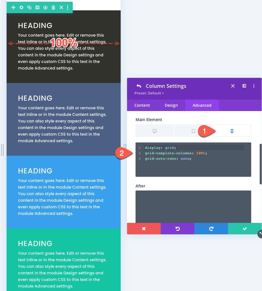
For phone display, we want a single-column layout. To create this, paste the following CSS under the Phone tab Main Element:
 display:grid;
grid-template-columns: 100%;
grid-auto-rows: auto;
Part 3: Making Changes to the Grid Items (or Modules)
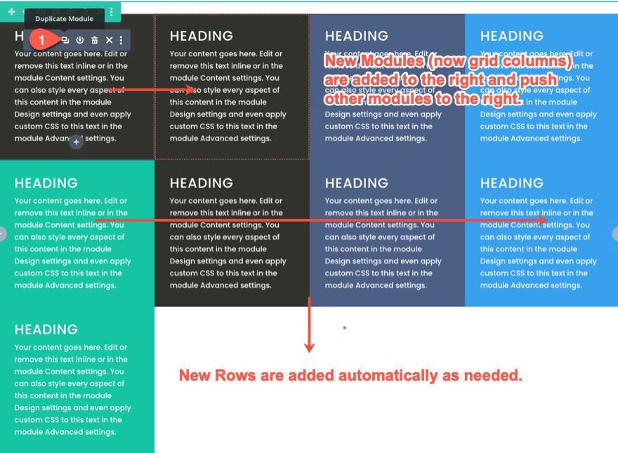
Adding a New Module to the Grid and How it Reacts
Now that each module is inside the CSS grid, adding a new module will push the other modules to the right and create new rows automatically as needed.
Since we need one more module for this layout anyway, duplicate the first text module to see how the other modules adjust within the grid.
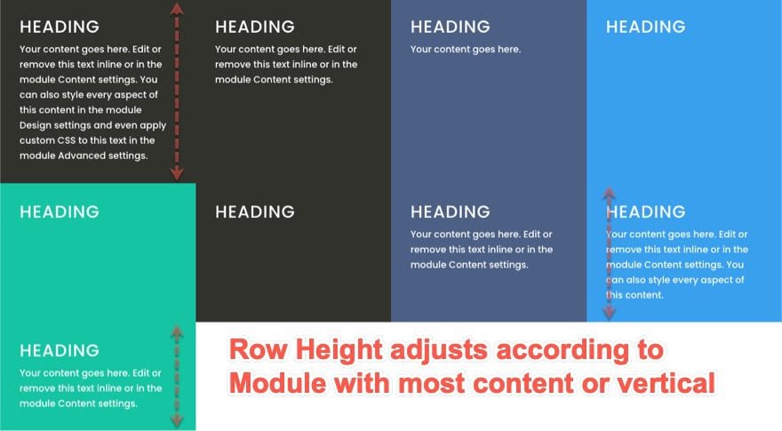
How Grid Responds to Modules with Different Amounts of Content
Right now, all the text modules have the same amount of content so it is hard to see how the grid layout handles modules with varying amounts of content. To see how this works, change the amount of paragraph text within each module. Notice that the modules will remain the same height as the module with most content in the same row. And the row height will also be determined by the module with the most content (or vertical height).
Changing the Position of Modules (or grid items)
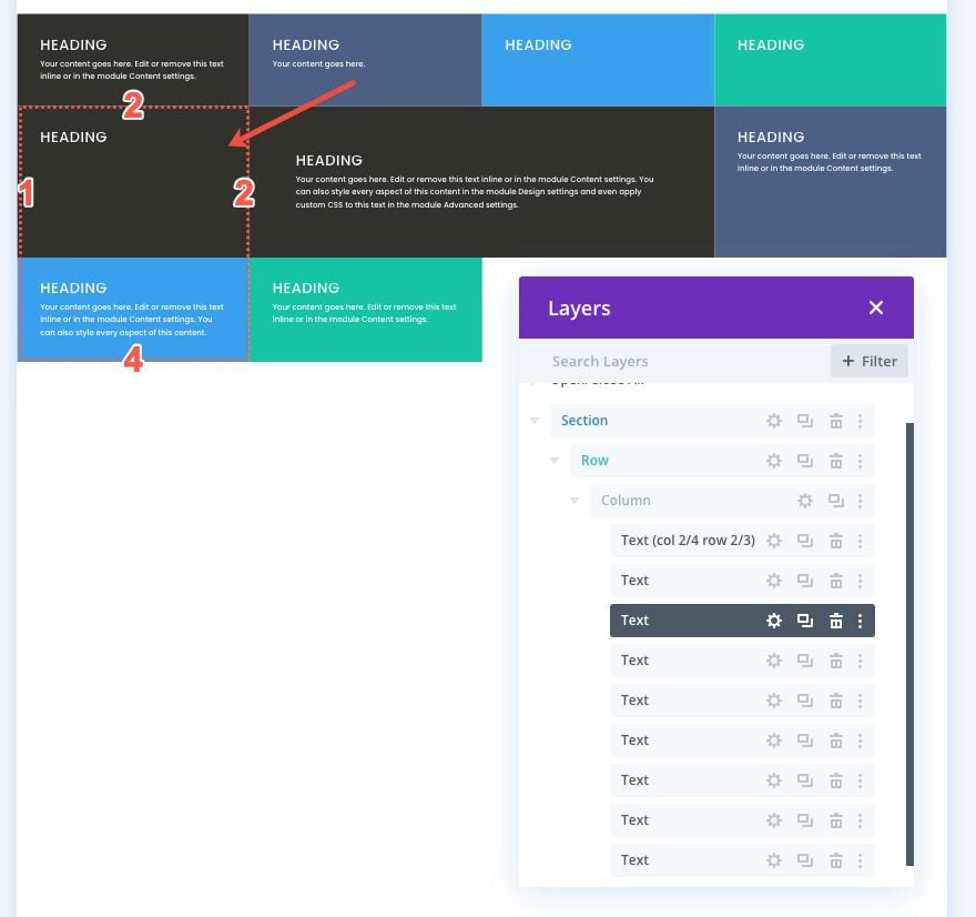
CSS Grid items can be positioned using the built-in line numbering system of the grid module. Each line on the grid represents a number. For the columns, the line numbers start at 1 and continue horizontally. Each line number sits at the beginning and end of each column. So, for our four-column structure, the line number begins at 1 on the left of the first column and ends at 5 on the right side of the fourth column. And, since we have three rows, the line numbers for rows start at 1 at the top of the first row and continue to 4 at the bottom of the third row.
To change the position of a module (or grid item) in CSS Grid, we can set define where we want a certain module to be placed in the grid. This will override the default placement of the module in the grid.
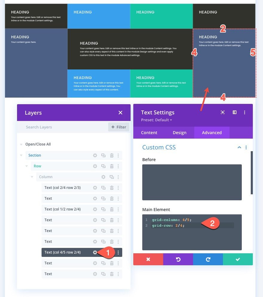
For this example, we are going to move the first text module to a different position. To do this we need to add two lines of CSS to the module.
Open the settings for the first text module and paste the following custom CSS to the main element:
grid-column: 2/4;
grid-row: 2/3;
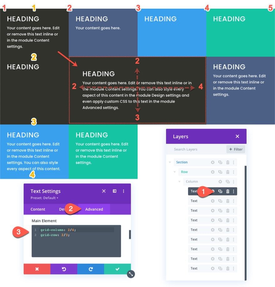
The first line of CSS defines the position of the module (or grid item) horizontally by telling the module to start on column line 2 and end on column line 4.
grid-column: 2/4
The second line of CSS defines the position of the module (or grid item) vertically by telling the module to start on row line 2 and end on row line 3.
grid-row: 2/3
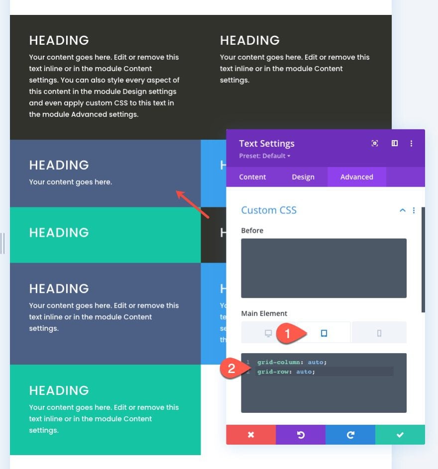
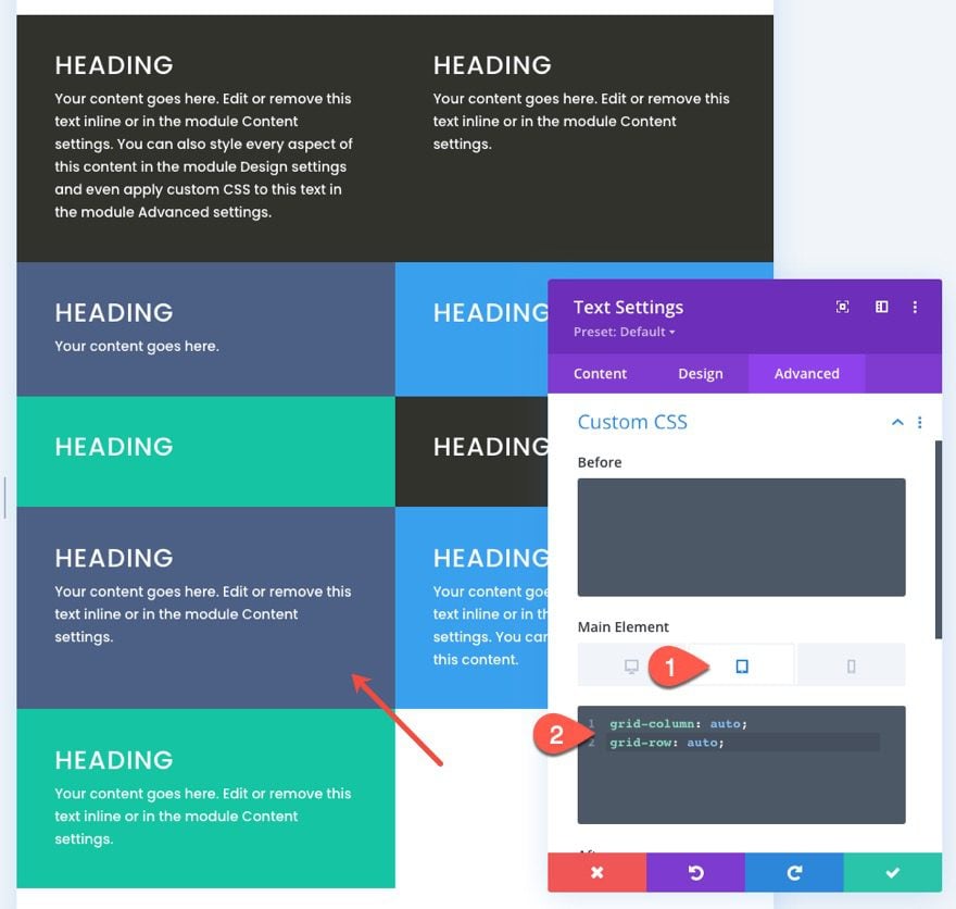
For tablet and phone display, we want to bring the module back to the original location. This is helpful for keeping your main header at the top of the page.
To do this, select the tablet tab under the responsive option for the main element and paste the following CSS:
grid-column: auto;
grid-row: auto;
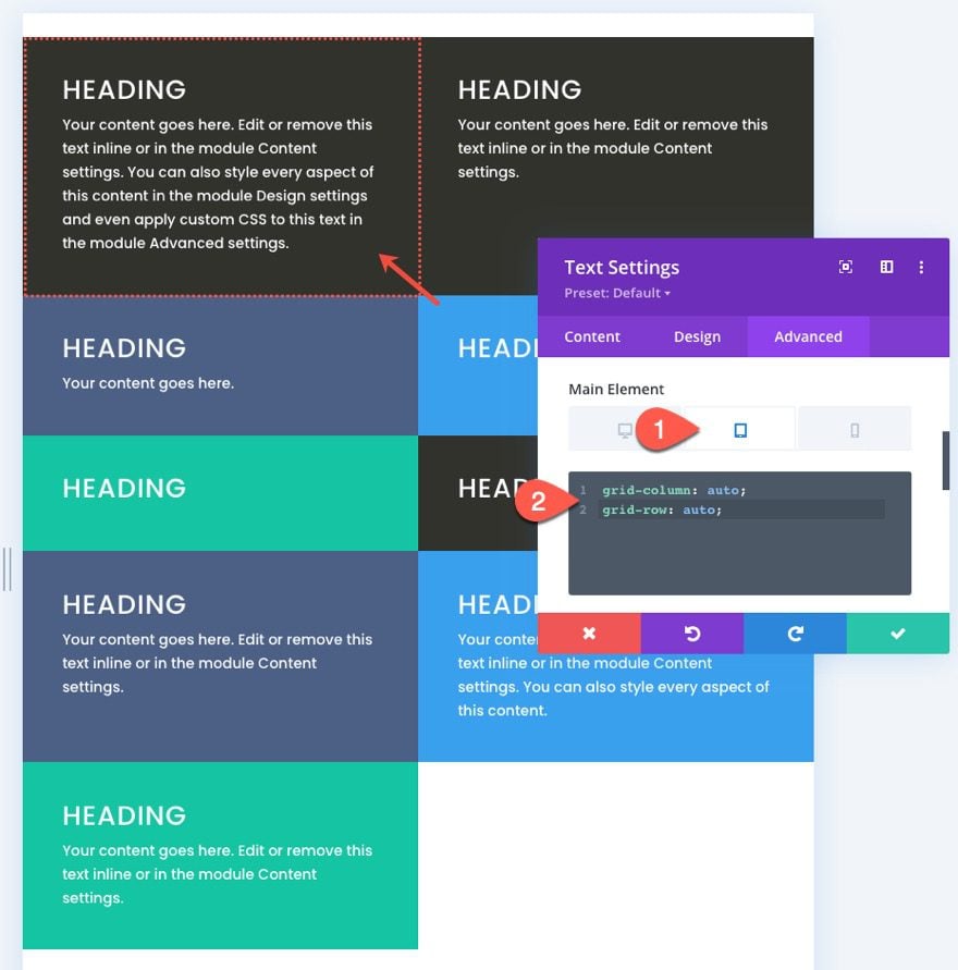
Now the position of the module will go back to the original (automatic) flow of the grid items.
Let’s go ahead and position a few more modules (or grid items) using this method.
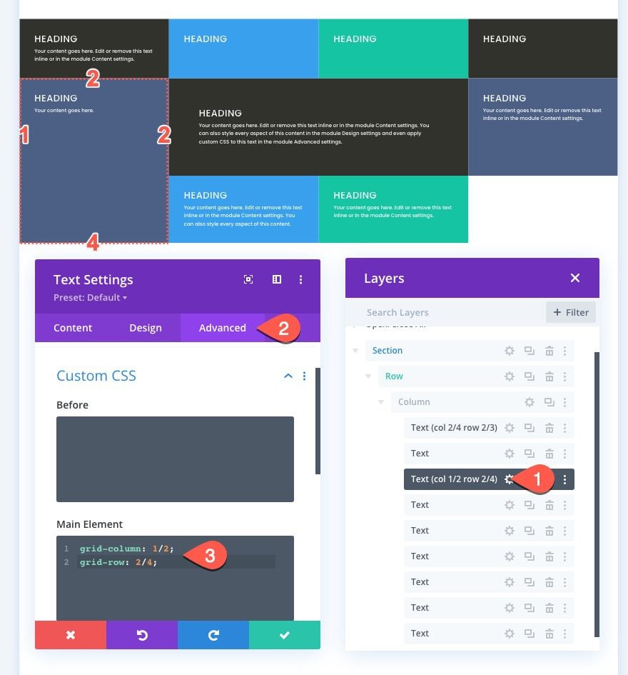
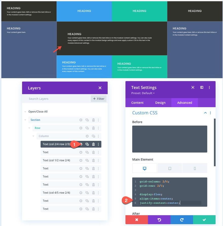
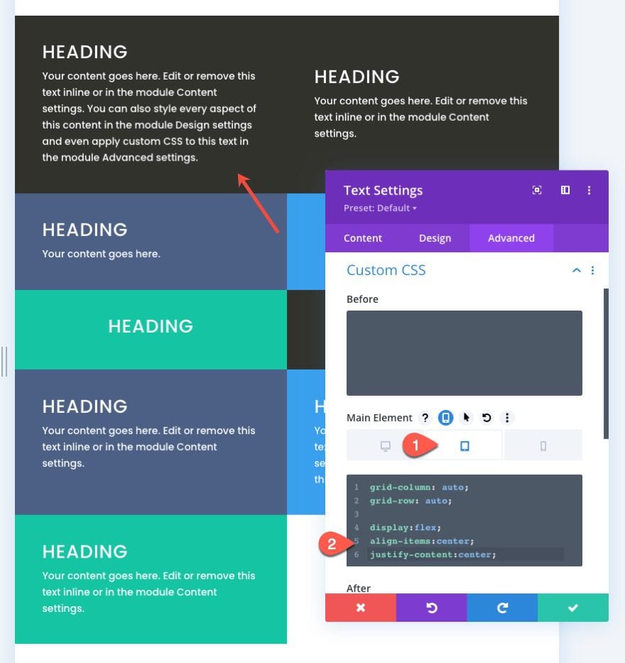
We are going to position the third text module (now in the second column of the top row) at a new set location within the grid. This new position will start at column line 1 and end on column line 2 and also start at row line 2 and end on row line 4.
To do this, open the settings for the third text module and paste the following custom CSS to the main element:
grid-column: 1/2;
grid-row: 2/4;
Now we can change, the position back to on mobile by adding the following CSS for tablet:
grid-column: auto;
grid-row: auto;
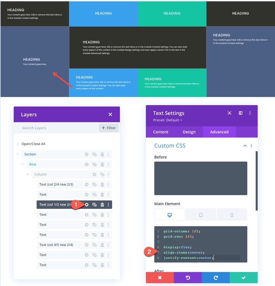
For our final custom module grid placement, we are going to position the seventh text module (now in the last column of the second row) at a new set location within the grid. This new position will start at column line 4 and end on column line 5 and also start at row line 2 and end on row line 4.
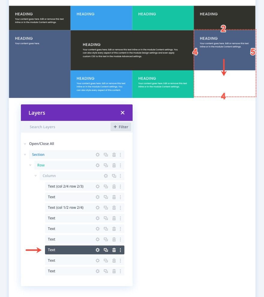
To do this, open the settings for the seventh text module and paste the following custom CSS to the main element:
grid-column: 4/5;
grid-row: 2/4;
Then paste the following CSS for tablet display as we did for the previous modules.
grid-column: auto;
grid-row: auto;
Aligning Module (or Grid Item) Content to Center
We could stop there, but we would miss out on a helpful way to align (or center) our module content vertically. Having module (or grid item) content vertically centered is a convenient feature of a grid layout because it makes everything more symmetrical and aesthetically pleasing.
To do this, we can add a snippet of CSS that uses the flex CSS property to align and justify the content to the center. We need to add this snippet to each of the modules. To do this we can use multiselect to select all the modules (or grid items) that don’t already have custom CSS to the main element (we don’t want to override those modules with custom positions). Then open the element settings by opening the settings for one of the selected modules. Under the Advanced tab, paste the following CSS tot he Main Element:
display:flex;
flex-direction:column;
align-items:center;
justify-content:center;
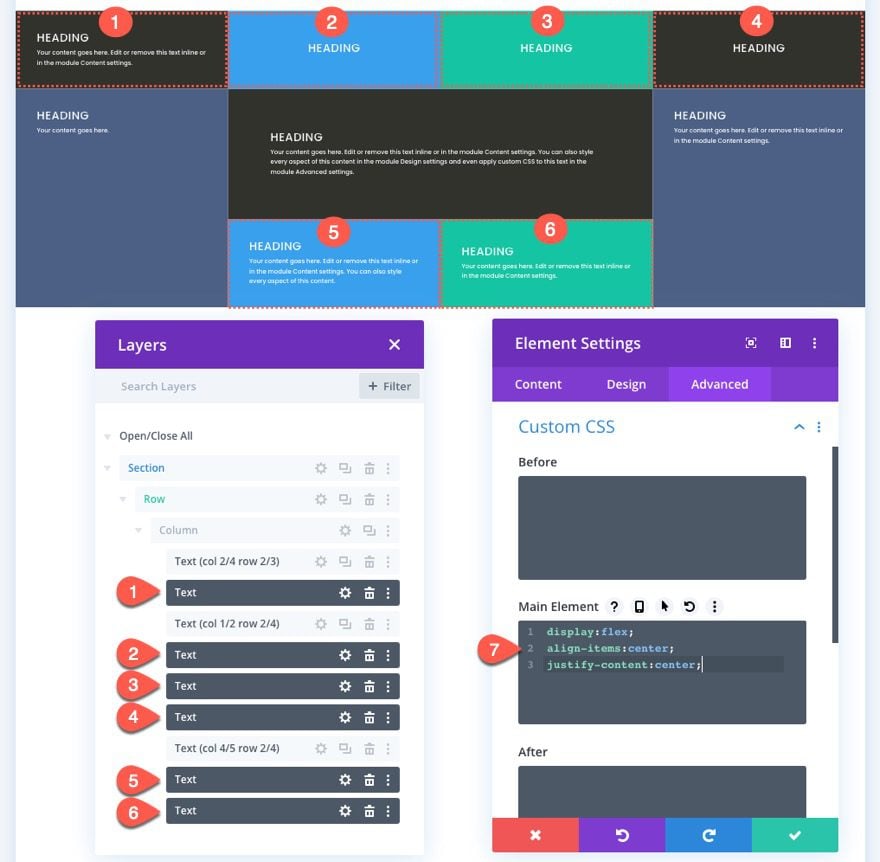
Now we can go back to our other three modules (module #1, #3, and #7) individually and add the same snippet of CSS in addition to the CSS that was used to give the module a custom position on the grid. Make sure to add the CSS snippet under the existing CSS for both desktop and tablet.
Add CSS to First Text Module
Add CSS to Third Text Module
Add CSS to Seventh Text Module
Final Result
Here is the final result of our custom CSS grid layout for our text modules.
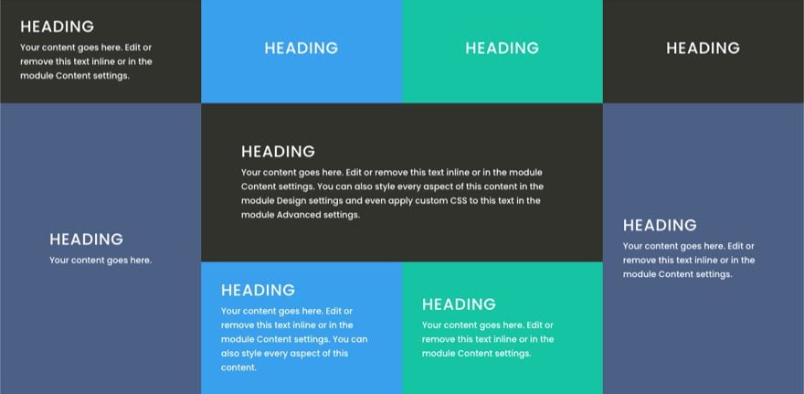
Notice how the modules (or grid items) adjust smoothly on different browser widths for a nice responsive design.
Example Using Different Modules and Designs
It is hard to see the full potential of using CSS grid to create module layouts using only text modules. So I thought I would show you a design I created by applying the same steps in this tutorial using different modules and design elements from our Fitness Gym Layout Pack.
Here it is…

I’ve also included this layout along with the text module layout with the free download featured at the beginning of this post.
Feel free to take it for a spin!
Final Thoughts
In this tutorial, we showed you how to create a CSS grid layout for Divi modules. Although the process does rely on some custom CSS, it’s surprisingly not that much, considering the powerful results it can have. It is nice to be able to control the layout of all your modules at the column level when needed for more unique Divi layouts. For more info on CSS grid, you should check out this complete guide to consider more possibilities.
I look forward to hearing from you in the comments.
Cheers!


I am trying to do this with using rows as the cells and the section as the grid parent. The rows can be placed in a grid but I cannot get a row to span more than one cell. Would love a solution to this. Thanks.
You can try using the grid-row and grid-column properties to make your rows extend to other grid areas, you can refer to this article: https://www.w3schools.com/css/css_grid_item.asp
You can add the grid-row and grid-column properties in your Row Settings > Advanced > Custom CSS > Module Element > Main Element panel: https://prnt.sc/urhfTPWQn6wg
thanks for the tutorial. It would be interesting to have images instead of text to understand how they react to grid changes. how can I keep the original ratio etc
It will be best if you add Images with the same aspect ratios if possible so they will fit perfectly on the Grid. for example you added 16:9 images. If you want to add taller Images, it will be best to add images that’s double the height of your other image’s aspect ratio, for example, taller images needs an aspect ratio of 16:19, if you need more wider images, you can set it to 32:9.
Once you have the images, you can then grid-row and grid-column properties to make the images extend to the other grid areas: https://www.w3schools.com/css/css_grid_item.asp
Hi Jason, since this was posted in 2021 I wonder if today you would have an update of your response to Peter’s comments on 4/3/21. Do you, by any chance?
This grid looks absolutely amazing and is very useful!
Thanks so much for sharing this with us, I really like learning about all the options in Divi this way.
Glad it was useful, Diana. Thanks for the support!
Hi Jason
You always provided good information about web development. I read your multiple posts.
Thank you for the article.
You’re welcome, Anil!
Hi Jason,
I am currently working on somthing similar, but with blog posts as content.
I want a homepage with a rectangle on it with 3 columns of equal height and width, each consisting 2, 3 0r 4 blogposts.
I was wondering it this is possible at all – because the blog posts show excerpts of course, which vary in lenght, and the titles vary too.
When I came across this, I thought it might be useable for my goal. But you seem to have static content, where I have dynamic content (the blog posts will be different each quarter as it is for a digital magazine).
Peter,
You would need to target the blog posts articles that are being generated by the blog module with some custom css to do what you are asking. Haven’t tried it, but you may be able to introduce the grid css layout for the blog module structure.
Hey Jason,
I’ve been integrating flex and grids with Divi for some time now. Your method is different than how I’ve been, and in many ways, more tightly integrated than my mixup.
Mixing the two method should get me a structure that will be better documented such that anyone Divi proficient can figure out where I came from, and where I’m trying to get to.
Thank you Jason, for this and all the other articles you publish.
Exactly! I love to use CSS Grid and Flex or a combination of the two when it makes the most sense. 🙂
Awesome tutorial! Knew a little about CSS grid previously, but not of ways to use it within Divi. Going to start using this in future projects for sure!
Great to hear, Ryan. Hope it helps!
This is a very helpful tutorial. Understanding clearly the mechanics of these CSS grid’s tricks will save a lot of time ! Thank you
Great tutorial, but here’s a question:
About: Aligning Module (or Grid Item) Content to Center
When you do this, I do not see anything aligned to the center, except for the word ‘Heading’ at the 2,3,4 blocks.
Why is that? It seems the other content of all blocks is not centered ?
Maarten,
Chris is correct. The content of the module (or child divs that make up the module) will be vertically centered. However, this is different from text-align: center which may be what you are referring to. The reason the text in the the 2,3,4 with the word “Heading” blocks are horizontally centered is that the width of the inner text div containing the content hasn’t had enough horizontal content to span the full width of the module. So the inner text div that holds the content of the text module will be both vertically and horizontally centered, but the text-align option will still need to be set to center if you want the centered text within the inner text div. Hope that makes sense.
The content of the module is then vertically centered.
Thanks for posting useful information. Your Blog helps to clarify a few terms for me as well as giving.
Great to hear!
A very good article on “how to create a css grid layout for divi modules”. The approach is very practical and language is very simple. Honestly it adds to my previous knowledge. Please Continue this good work.
Awesome! Thanks, Omer.
Hi,
I works properly while in Divi Viaul Builder, but when I exit Visual Builder I can see only the first module in full with mode.
Any idea about which is causing this error?
Thank you in advance!
Mariano,
Not sure. When you say “exit the Visual Builder”, are you viewing the live version of the page or the backend/wireframe view?
Yihaa, thank you Jason, another masterpiece from you! 🙂
You are very welcome, Johannes. I really do think this is a helpful technique that can be used in addition to the current column layouts in Divi.
This is possibly the most important article you wrote. It saves a lot of time now that you explained the mechanics.
Now let’s implement this to the standard module position controls 🙂
Thank you!
Thanks, Riza. I agree that this will save a lot of time in web design if you understand the basics of CSS grid. It is just so easy to get everything aligned!
definitely a +1 : )