
If you’re looking for a way to create smooth animations with Divi and its built-in scroll effects, you’re going to love this post. We’ll show you how to combine scroll snapping with Divi’s built-in motion effects to create full height sections that you can scroll between in one go. We’ll start by creating the first section. We will, then, reuse that section throughout our page design. To enable the scroll snapping, we’ll use CSS scroll snap properties which we’ll assign to our page’s sections, HTML, header and footer. You’ll be able to download the page’s JSON file for free as well!
Let’s get to it.
Preview
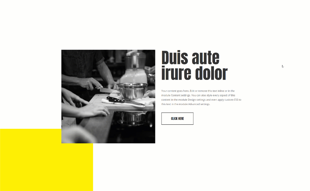
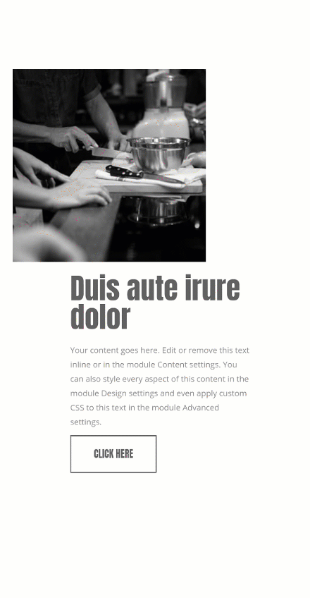
Before we dive into the tutorial, let’s take a quick look at the outcome across different screen sizes.
Desktop
Mobile
Download The Smooth Animations Layout for FREE
To lay your hands on the free smooth animations layout you will first need to download it using the button below. To gain access to the download you will need to subscribe to our newsletter by using the form below. As a new subscriber, you will receive even more Divi goodness and a free Divi Layout pack every Monday! If you’re already on the list, simply enter your email address below and click download. You will not be “resubscribed” or receive extra emails.

Subscribe To Our Youtube Channel
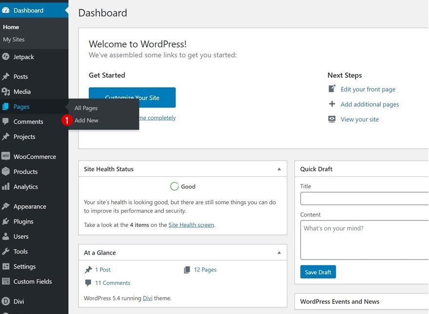
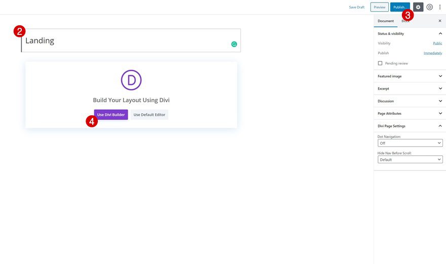
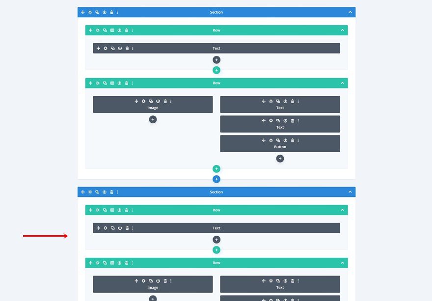
1. Create New Page & Start Designing First Section
Add New Page & Switch Over to Visual Builder
Start by adding a new page. Enter the page’s title, publish the page and switch over to Visual Builder.
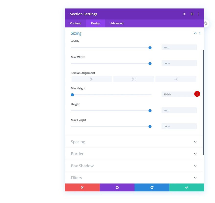
Section Settings
Sizing
Once inside the new page, open the section that’s already there and change the sizing settings.
- Min Height: 100vh
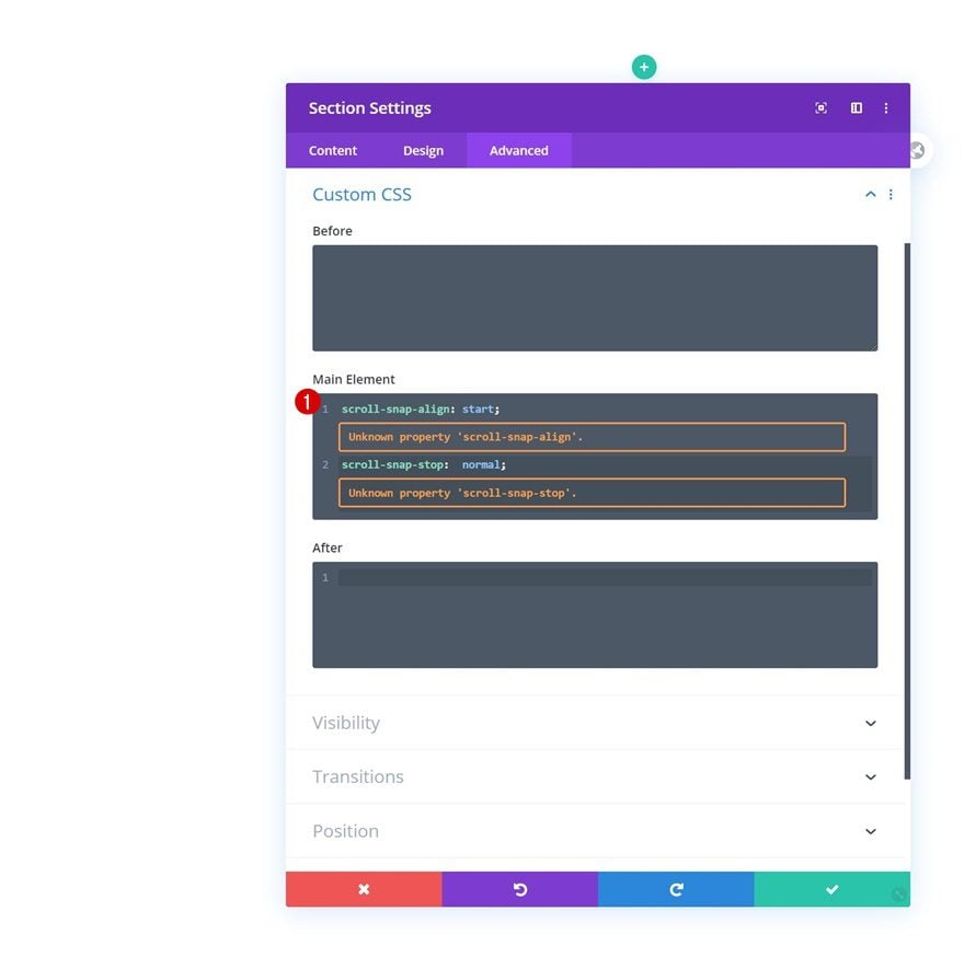
Main Element
We’re adding two lines of CSS code to the section as well. These lines of CSS code will help us turn the section into a snapping point for the scroll snapping.
scroll-snap-align: start;
scroll-snap-stop: normal;
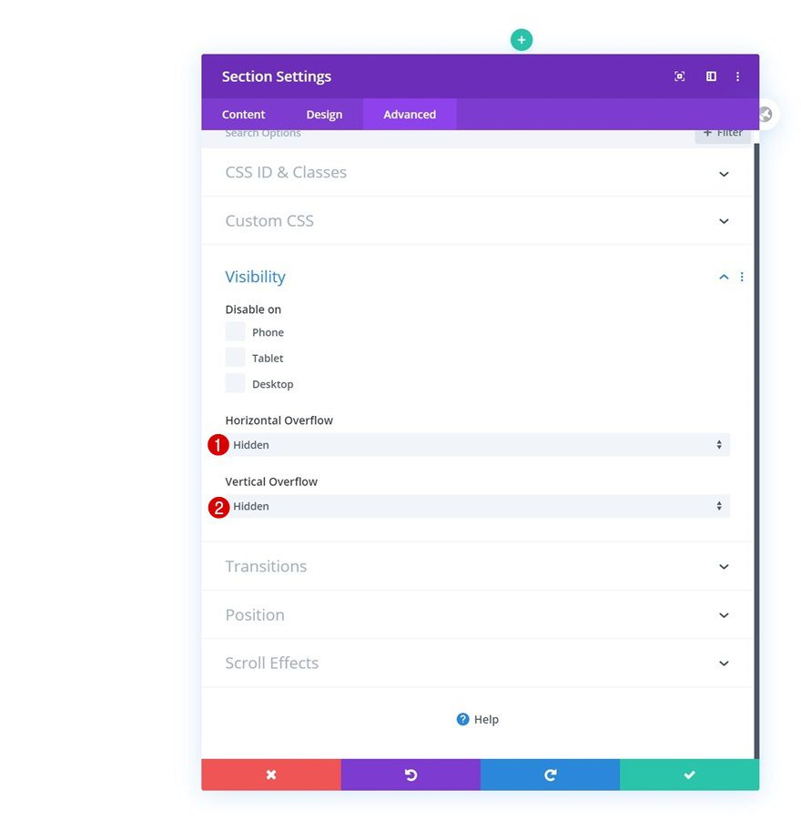
Visibility
To make sure nothing exceeds the section container, we’ll hide the section’s overflows.
- Horizontal Overflow: Hidden
- Vertical Overflow: Hidden
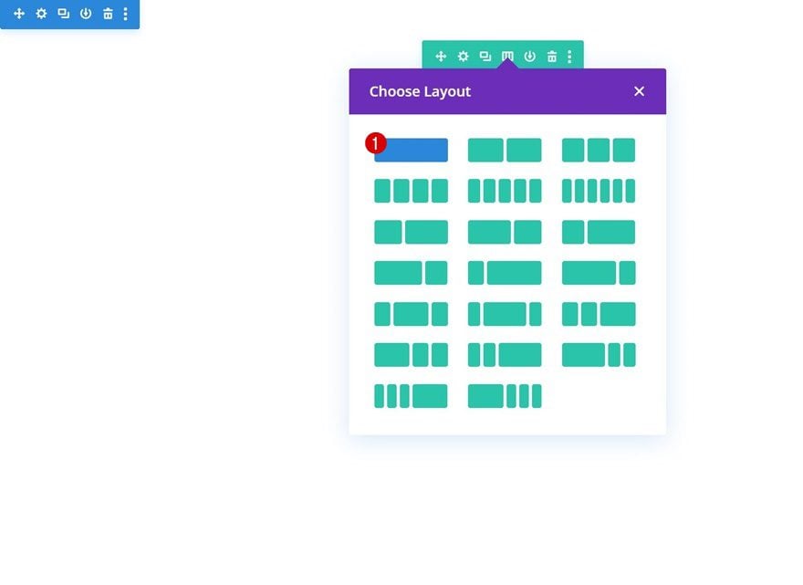
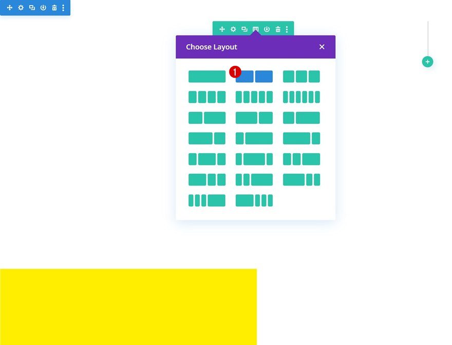
Add Row #1
Column Structure
Continue by adding a new row to the section using the following column structure:
Sizing
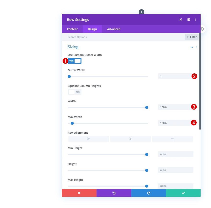
Without adding any modules yet, open the row settings and modify the sizing as follows:
- Use Custom Gutter Width: Yes
- Gutter Width: 1
- Width: 100%
- Max Width: 100%
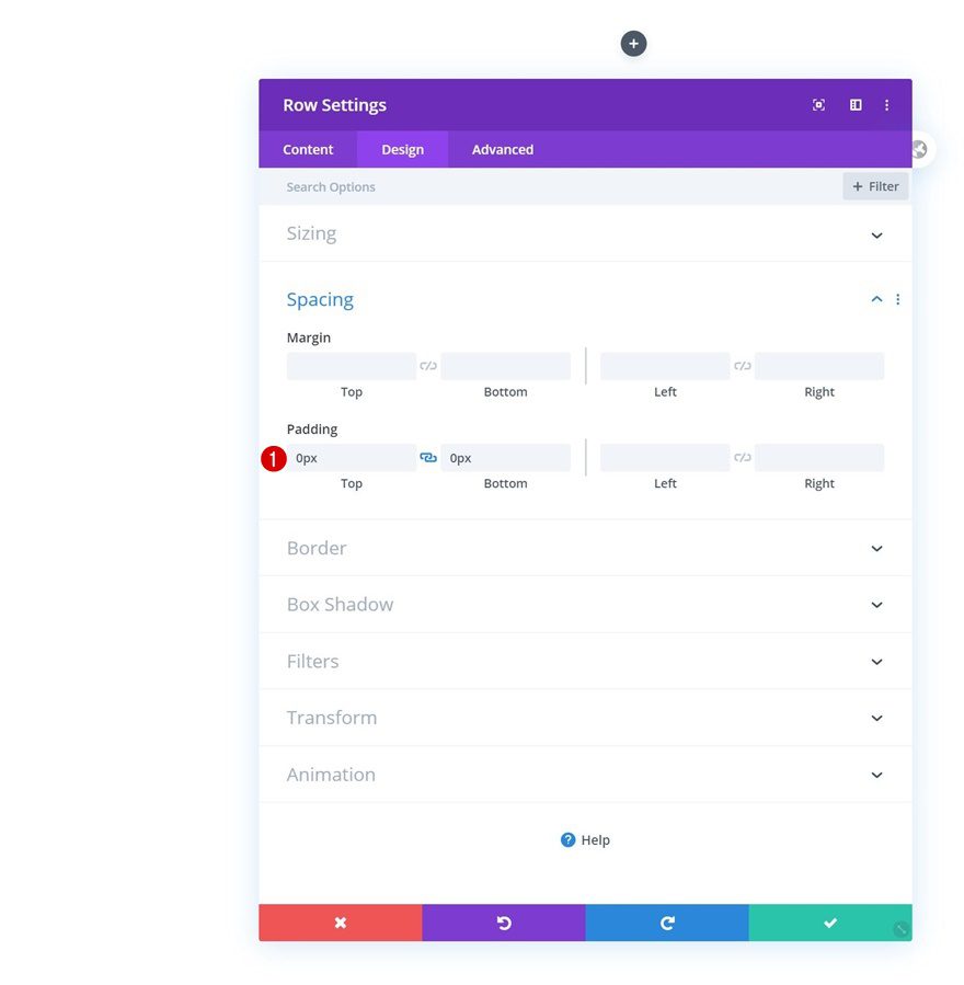
Spacing
We’re removing the section’s default top and bottom padding as well.
- Top Padding: 0px
- Bottom Padding: 0px
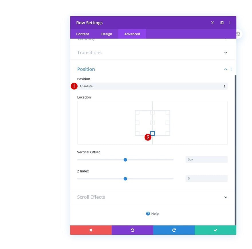
Position
And we’ll reposition the row accordingly:
- Position: Absolute
- Location: Bottom Center
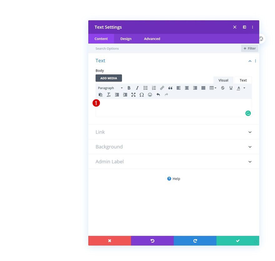
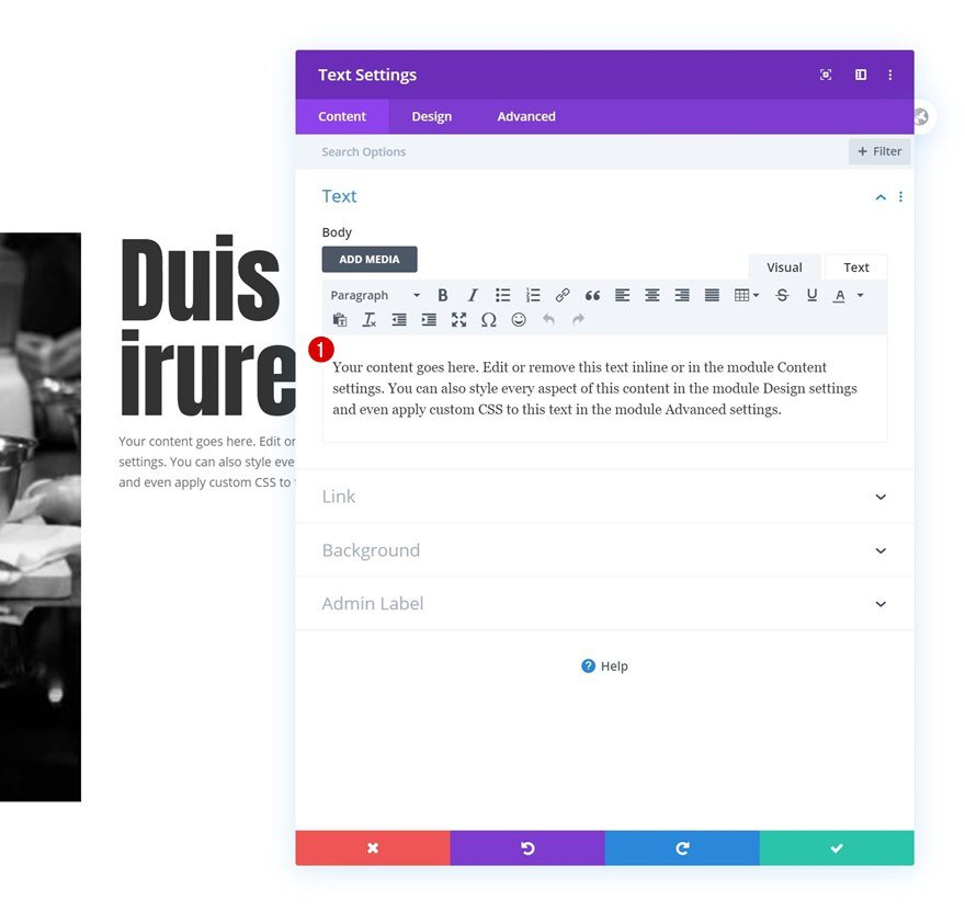
Add Text Module to Column
Leave Content Box Empty
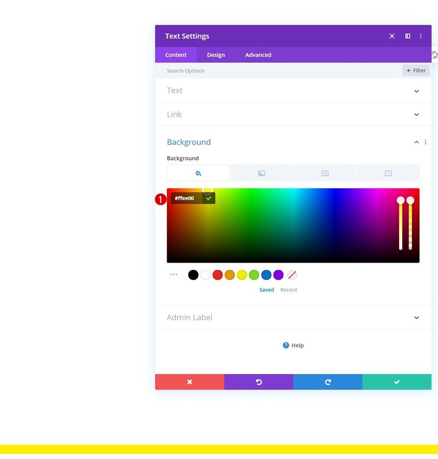
The only module we need in this row is a Text Module. Make sure you leave the module’s content box empty.
Background Color
Then, change the background color.
- Background Color: #ffee00
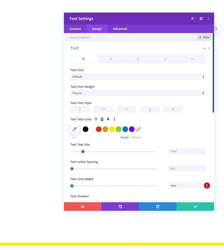
Text Settings
We’ll remove the module’s text line height too.
- Text Line Height: 1em
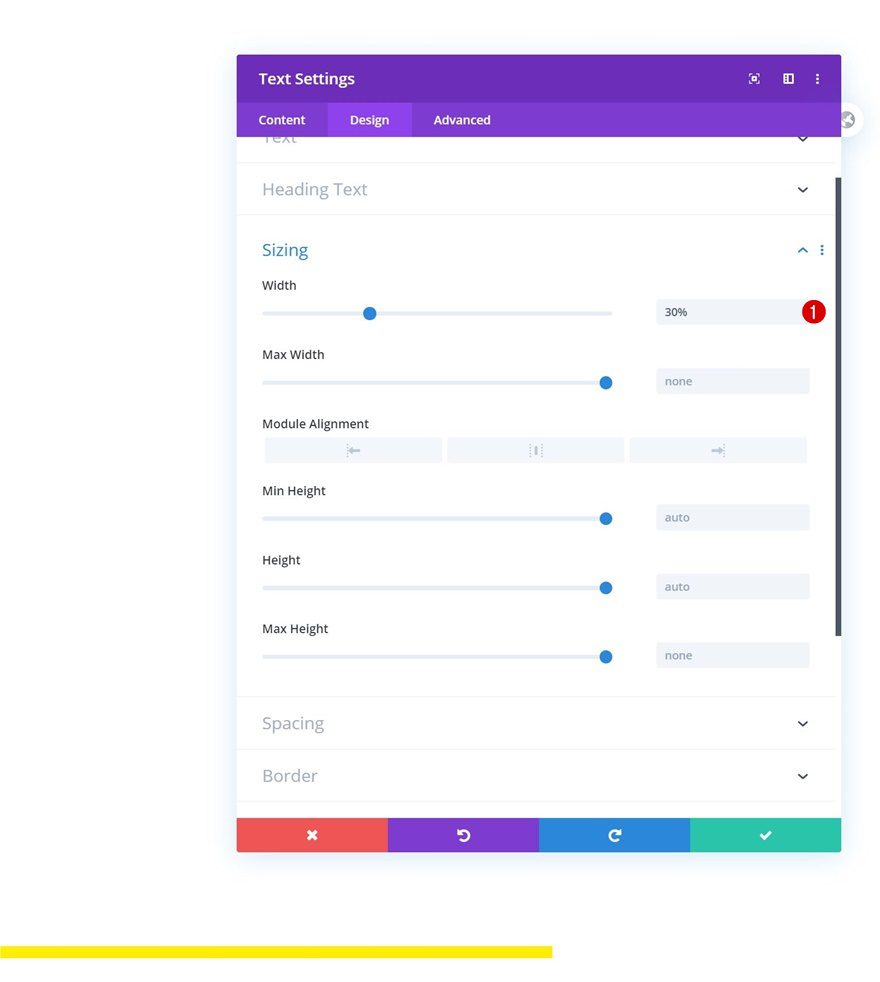
Sizing
Then, we’ll go to the sizing settings and change the width.
- Width: 30%
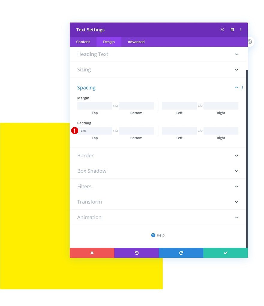
Spacing
We’ll turn the module into a square by adding some top padding as well.
- Top Padding: 30%
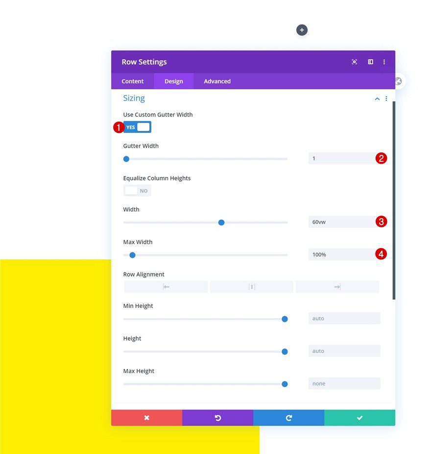
Add Row #2
Column Structure
On to the next row. Use the following column structure:
Sizing
Without adding any modules yet, open the row settings and change the sizing settings in the design tab:
- Use Custom Gutter Width: Yes
- Gutter Width: 1
- Width: 60vw
- Max Width: 100%
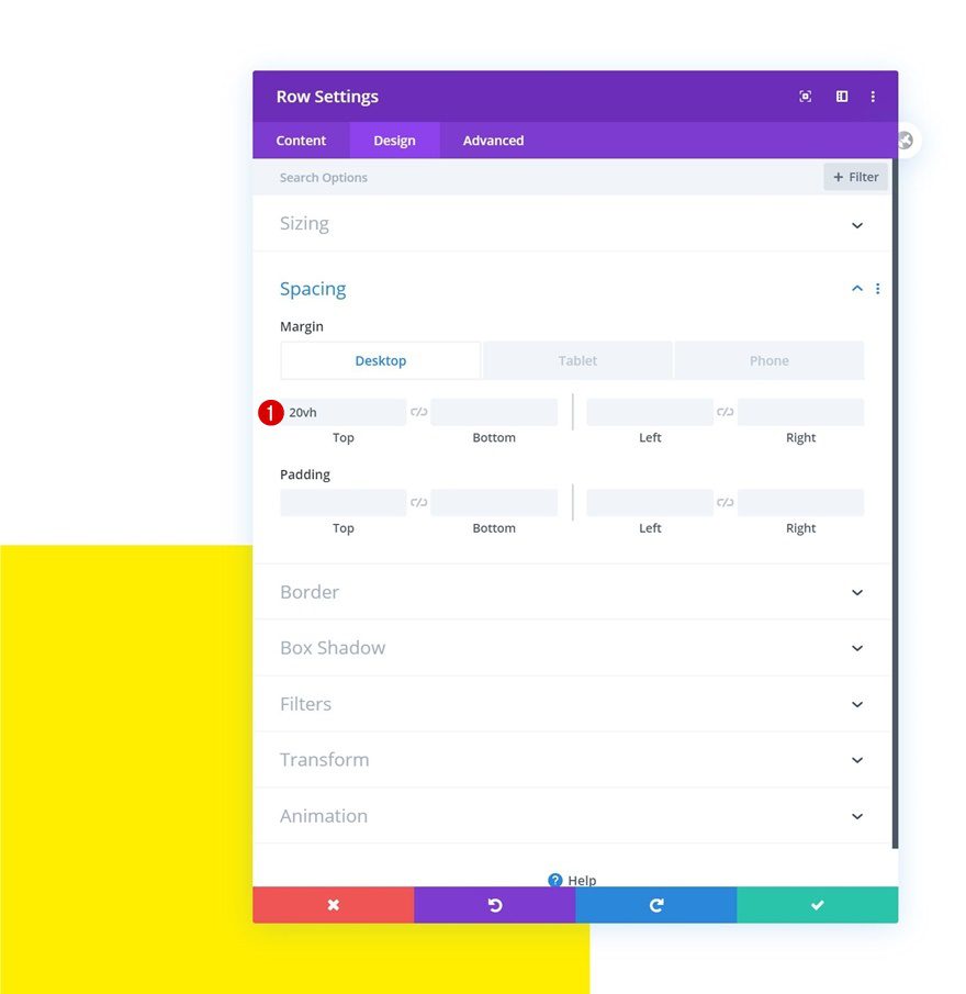
Spacing
Add some custom top margin across different screen sizes next.
- Top Margin: 20vh (Desktop), 5vw (Tablet & Phone)
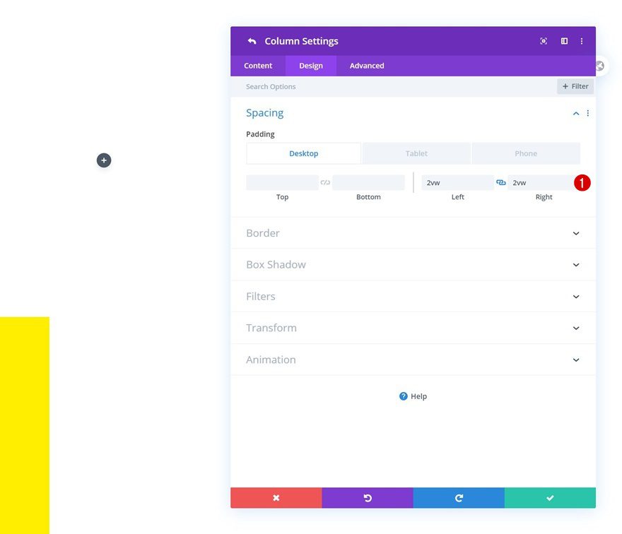
Column 2 Spacing
Then, we’ll open the column 2 settings and add some custom padding values.
- Top Padding: 2vh (Tablet & Phone)
- Left Padding: 2vw
- Right Padding: 2vw
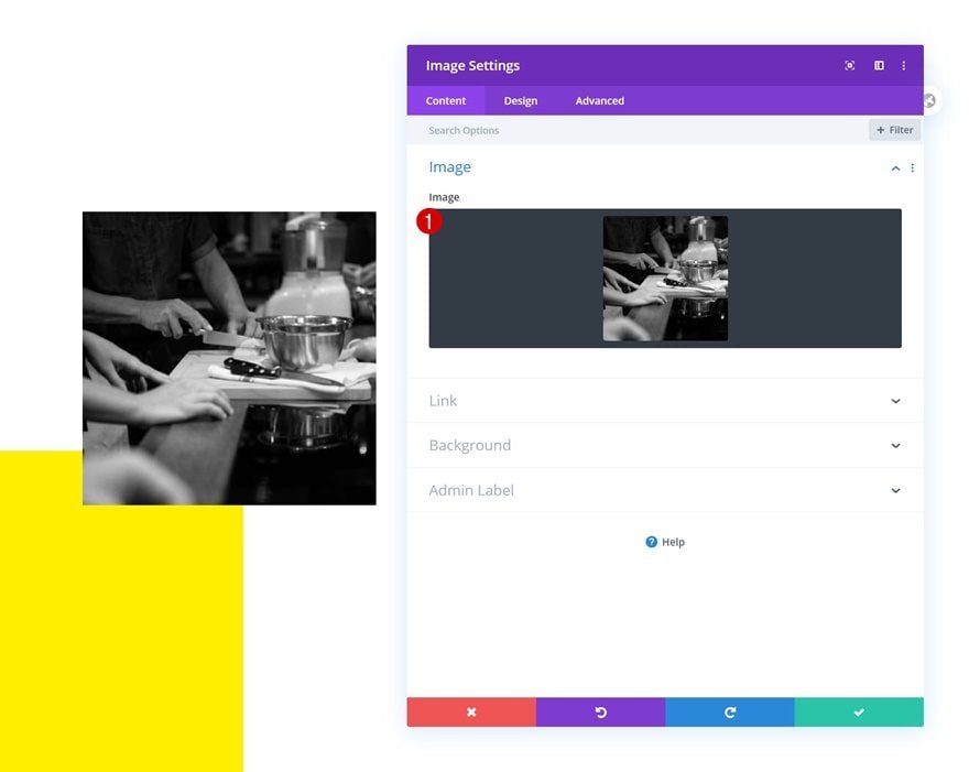
Add Image Module to Column 1
Upload Image
Time to add modules, add an Image Module to column 1 and upload an image of your choice.
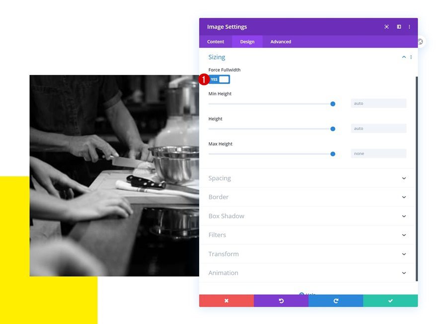
Sizing
We’ll force fullwidth on the module next.
- Force Fullwidth: Yes
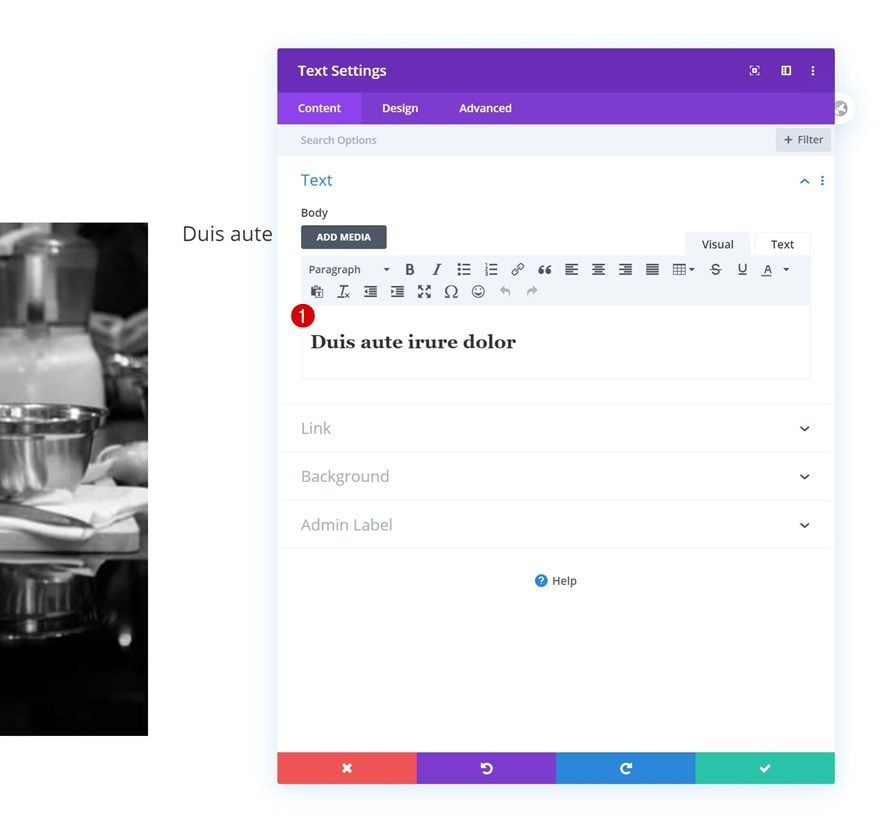
Add Text Module #1 to Column 2
Add H2 Content
In the second column, the first module we need is a Text Module with some H2 content.
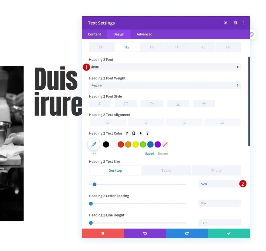
H2 Text Settings
Move on to the module’s design tab and change the H2 text settings as follows:
- Heading 2 Font: Anton
- Heading 2 Text Size: 5vw (Desktop), 7vw (Tablet), 9vw (Phone)
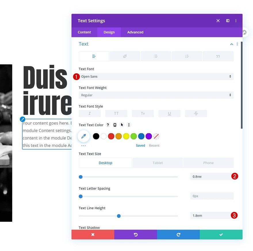
Add Text Module #2 to Column 2
Add Content
Add another Text Module right below right below the previous one and insert some description content of your choice.
Text Settings
Change the module’s text settings as follows:
- Text Font: Open Sans
- Text Size: 0.8vw (Desktop), 2vw (Tablet), 2.5vw (Phone)
- Text Line Height: 1.8em
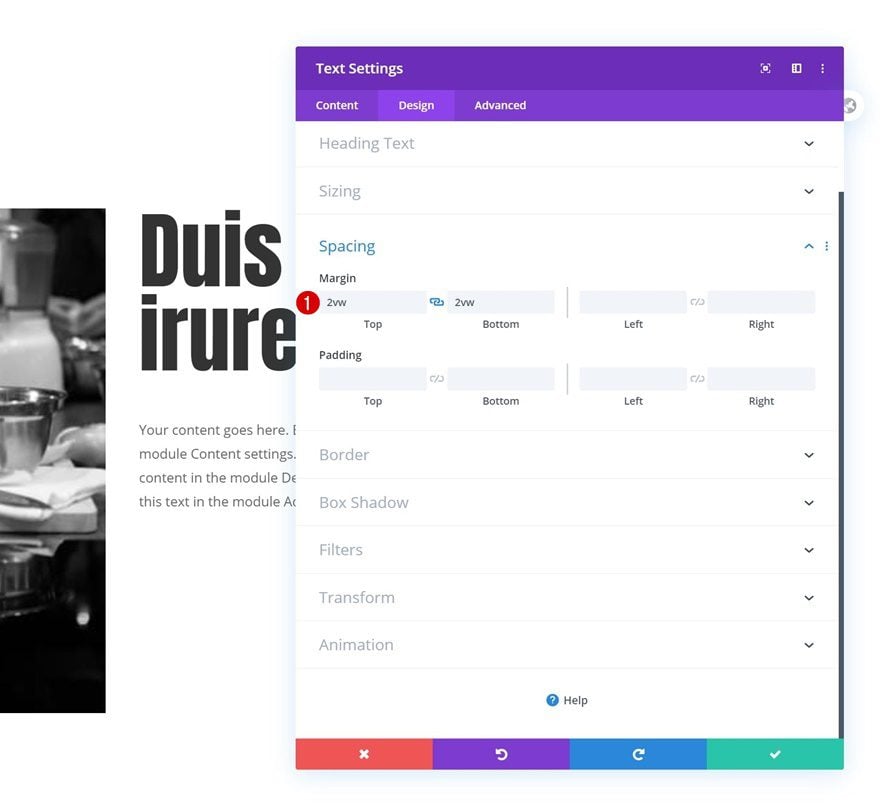
Spacing
And add some custom top and bottom margin to the spacing settings.
- Top Margin: 2vw
- Bottom Margin: 2vw
Add Copy
The next and last module we need in this column is a Button Module. Add some copy of your choice.
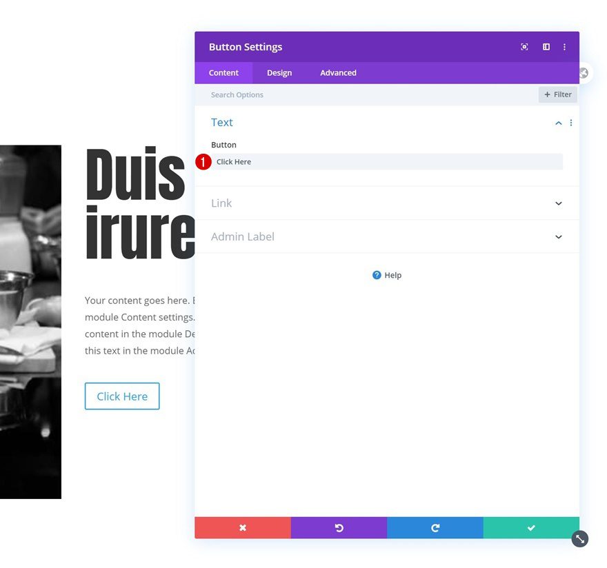
Button Settings
Style the button accordingly:
- Use Custom Styles For Button: Yes
- Button Text Size: 1vw (Desktop), 2vw (Tablet), 3vw (Phone)
- Button Text Color: #333333
- Buton Border Color: #333333
- Button Border Radius: 1px
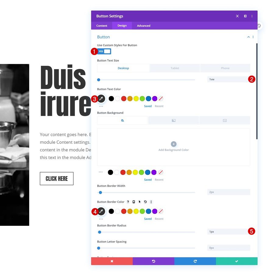
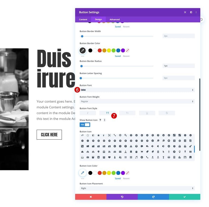
- Button Font: Anton
- Button Font Style: Uppercase
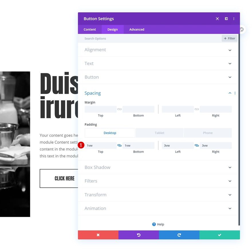
Spacing
And complete the module settings by adding some custom padding values across different screen sizes.
- Top Padding: 1vw (Desktop), 2vw (Tablet), 3vw (Phone)
- Bottom Padding: 1vw (Desktop), 2vw (Tablet), 3vw (Phone)
- Left Padding: 3vw (Desktop), 5vw (Tablet), 7vw (Phone)
- Right Padding: 3vw (Desktop), 5vw (Tablet), 7vw (Phone)
2. Add Scroll Effects to Different Elements
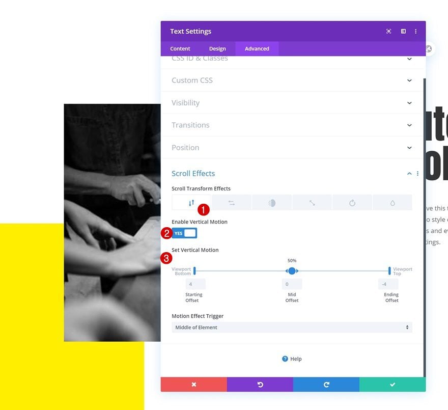
Text Module in Row #1
Vertical Motion
Once all elements are in place, it’s time to add the scroll effects. Open the Text Module in your first row and use some vertical motion.
- Enable Vertical Motion: Yes
- Starting Offset: 4
- Mid Offset: 0
- Ending Offset: -4
- Motion Effect Trigger: Middle of Element
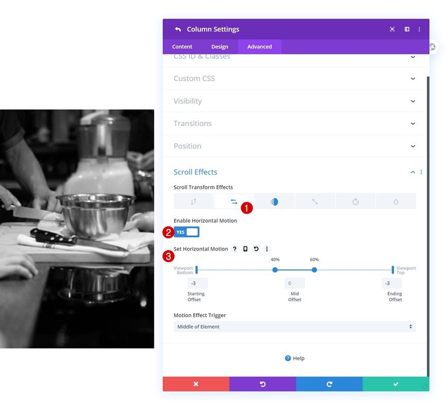
Row #2
Column 1
Horizontal Motion
Then, open the first column of your second row and add some horizontal motion.
- Enable Horizontal Motion: Yes
- Starting Offset: -3
- Mid Offset: 0 (from 40% to 60%)
- Ending Offset: -3
- Motion Effect Trigger: Middle of Element
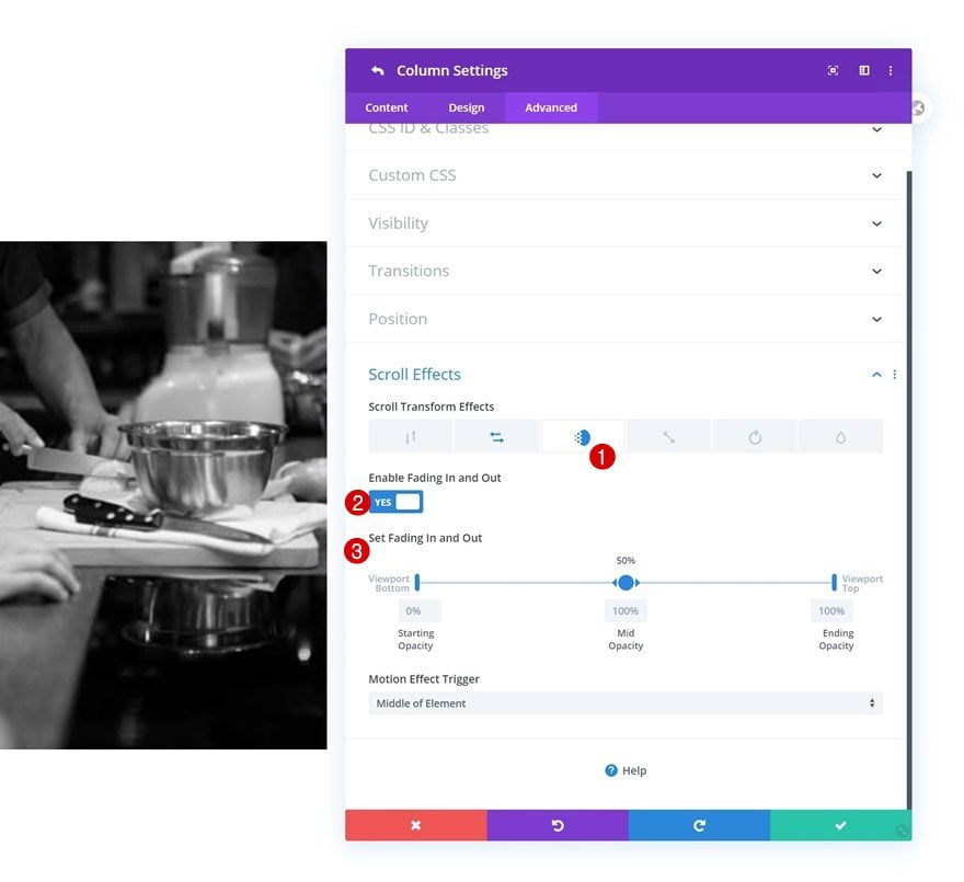
Fading In and Out
We’re applying a fading in and out effect to that same column too.
- Enable Fading In and Out: Yes
- Starting Opacity: 0%
- Mid Opacity: 100%
- Ending Opacity: 100%
- Motion Effect Trigger: Middle of Element
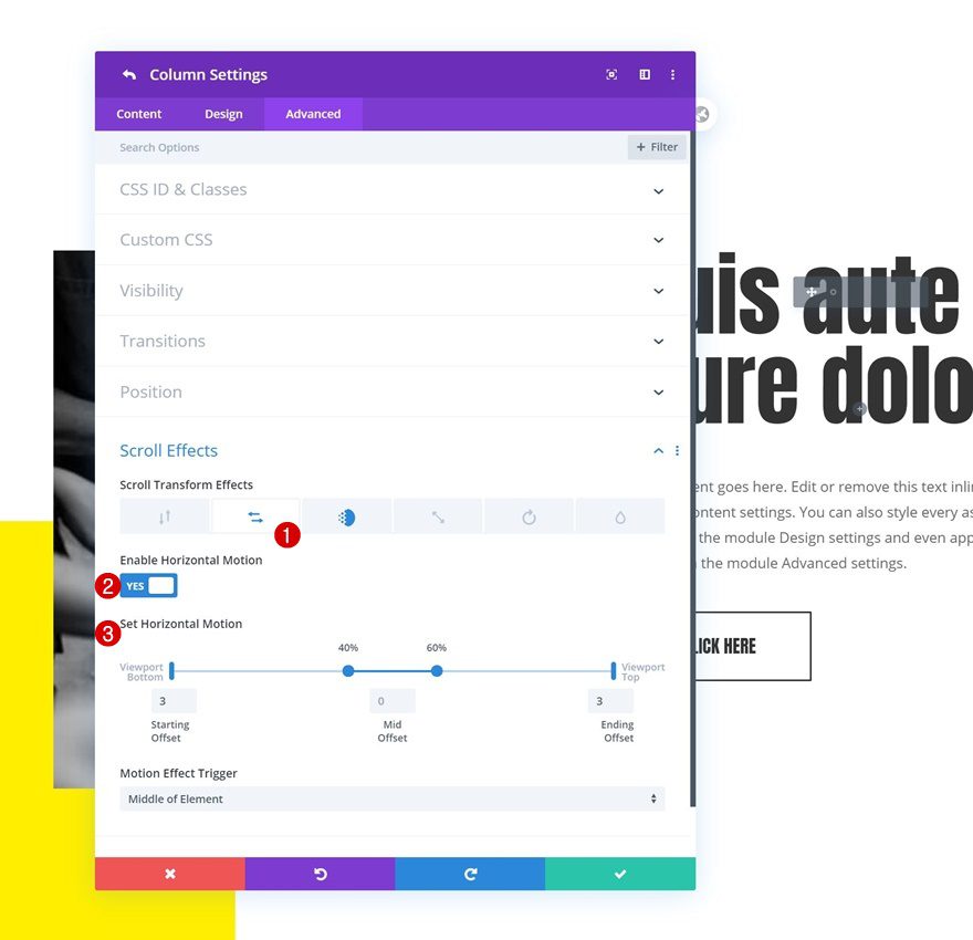
Column 2
Horizontal Motion
Then, we’ll open the second column’s settings and apply the following horizontal motion settings:
- Enable Horizontal Motion: Yes
- Starting Offset: 3
- Mid Offset: 0 (from 40% to 60%)
- Ending Offset: 3
- Motion Effect Trigger: Middle of Element
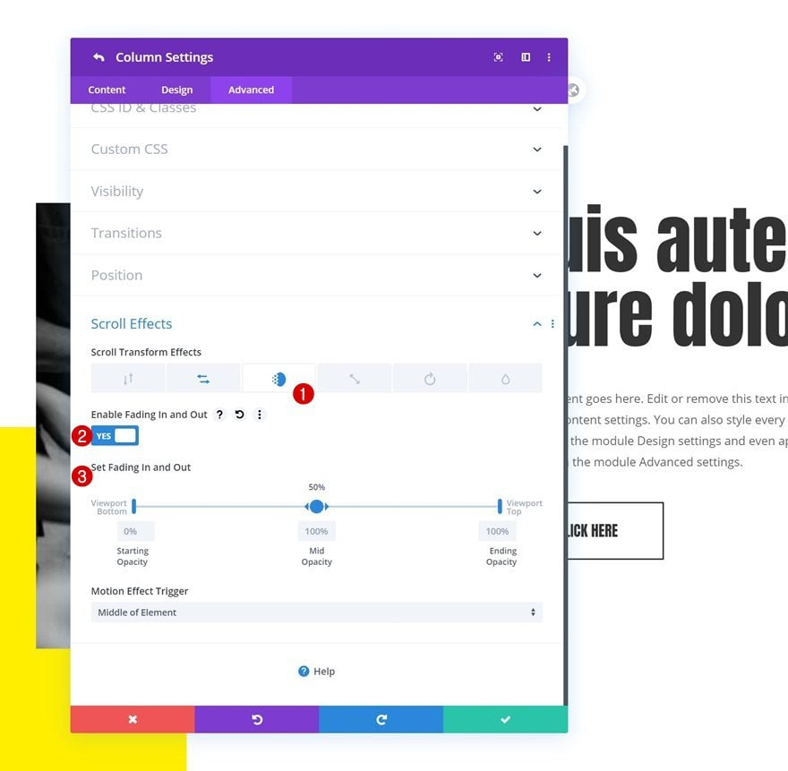
Fading In and Out
Along with a fading in and out effect.
- Enable Fading In and Out: Yes
- Starting Opacity: 0%
- Mid Opacity: 100%
- Ending Opacity: 100%
- Motion Effect Trigger: Middle of Element
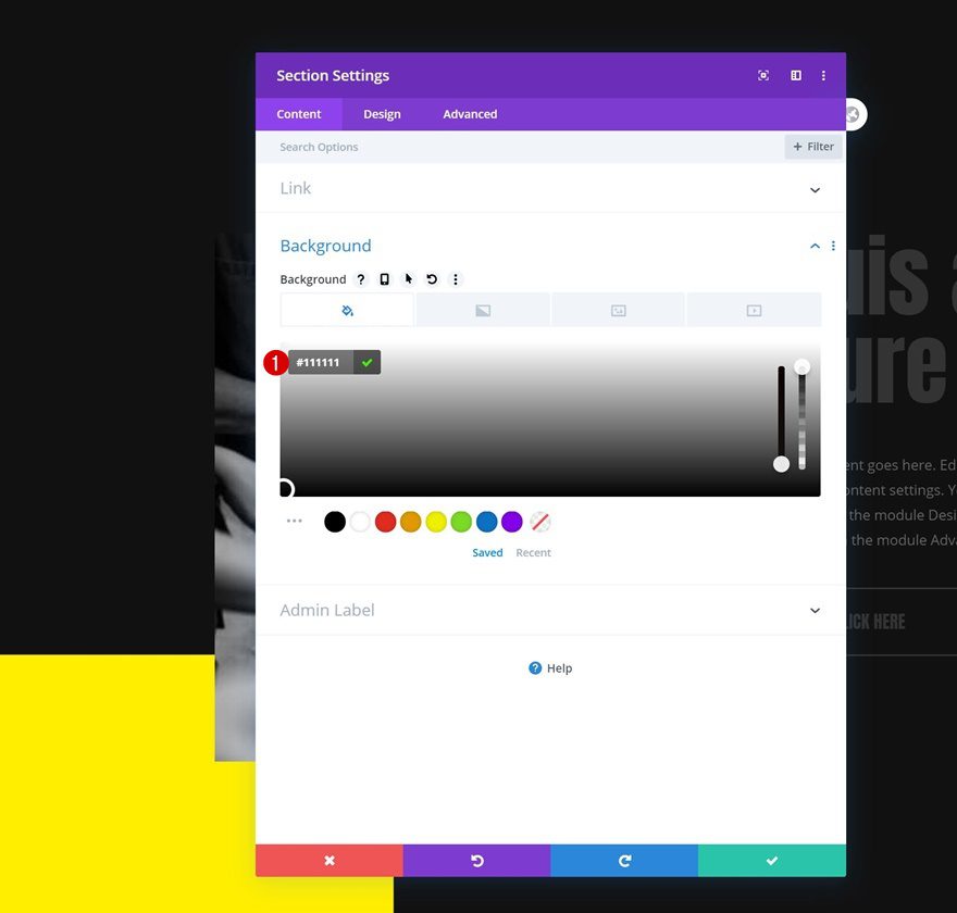
4. Reuse First Section
Clone Section Four Times
Once you’ve completed the first section and its scroll effects, you can clone it up to as many times as you want.
Change Background Colors of Every Other Section
We’ll change the background color of every other section.
- Background Color: #111111
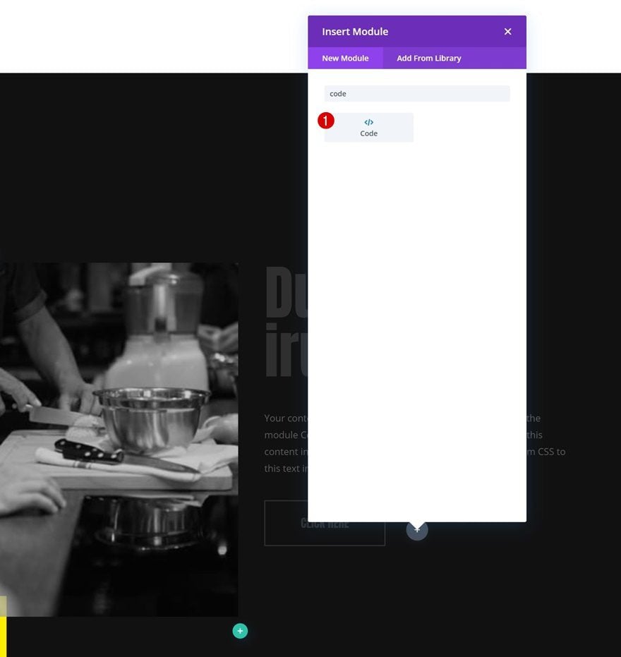
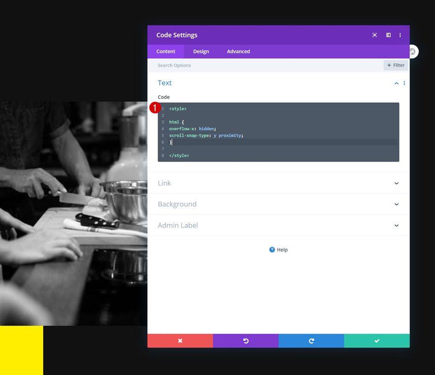
5. Add CSS Code to Enable Scroll Snapping on Page’s HTML
Add Code Module to Last Section on Page
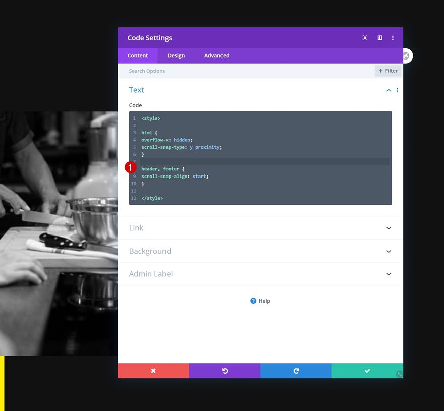
Now, to enable the scroll snapping on our page’s HTML, we’ll add a Code Module anywhere to the last section on our page.
Insert HTML CSS Code
These lines of CSS code will help us apply the scroll snapping to our page’s HTML:
<style>

html {
overflow-x: hidden;
scroll-snap-type: y proximity;
}

</style>
We’ll make sure our header and footer are scroll snapping points as well (just as our sections are) by adding the following lines of CSS code too:
header, footer {
scroll-snap-align: start;
}
Preview
Now that we’ve gone through all the steps, let’s take a final look at the outcome across different screen sizes.
Desktop
Mobile
Final Thoughts
In this post, we’ve shown you how to create smooth animations by combining scroll snapping with Divi’s built-in motion effects. This is a great way to enable scroll effects with one single scroll. Scroll snapping helps visitors effortlessly scroll through different parts of your website. We’ve combined this with a full height section design. You were able to download the JSON file for free as well! If you have any questions or suggestions, feel free to leave a comment in the comment section below.
If you’re eager to learn more about Divi and get more Divi freebies, make sure you subscribe to our email newsletter and YouTube channel so you’ll always be one of the first people to know and get benefits from this free content.


Would have loved to get this to work but it just doesn’t. It makes it impossible to scroll past the full width slider at the top.
Thanks anyway. It might work if it’s the only thing on the page? But doesn’t seem to play nicely with other modules.
Scroll snapping! Perfect animation timing. Thanks, ET.
Happy you’re enjoying the tutorial, Kirb! 🙂
Hi. I love this! But…am having an issue.
I cannot get the scroll snap to snap to the 2 middle sections. It just wants to skip them and only allows for the top and bottom one to be seen! Please let me know if there is a fix for this!
Seems like the mandatory scroll snap type CSS property doesn’t work well with mousewheels, I’ve changed it to proximity in the post and in the JSON file so that should help! 🙂
Donjete, please help! I already wrote about this yesterday but my comment hasn’t been approved (yet?). I’m not giving up this easily 🙂 Neither “mandatory” nor “proximity” does the trick. The first makes the page skip a section when scrolling and the second only snaps when the users scrolls about 1/4 of the screen hight to the section edge. How doesn’t this bother anyone?
Hi everyone,… still not working as it should. With “proximity”, I have to scroll (touch or mouse wheel) really close to the next screen. Between 25% on either side the snap doesn’t happen. How can I up this to 49%? Mandatory setting is no good because it skips a screen.
Same here, too bad…
it will work fine, just logged out the WordPress and refresh the page
same here too
I am also having the same issue.
Has anyone resolved this?
Hello Donjete,
Thanks for providing such a great informative article.. I was searching about how to give animated effects to my WordPress website and suddenly land on your blog.. i have got the solution now.. thanks for helping us..
Regards,
Ovais Mirza
Happy you liked it!