
Eventually, in the world of web design, coders and non-coders alike will look to add more advanced customizations and functionality to their Divi websites. Usually, this involves using Javascript/JQuery to change the style of elements on the page for different reasons. You may want to make a contact form appear when clicking a button. Or you may want to change an image when hovering over a link.
In this tutorial, we are going to show you how to change the style of multiple elements on hover or click in Divi. First, we’ll take advantage of Divi’s built-in design options to design a section layout. Then we’ll introduce a simple snippet of jQuery that you can use in combination with custom CSS to adjust the style of any element in that section when hovering or clicking a button. This may sound complicated (especially for beginners) but you may be surprised at just how simple it is to accomplish.
Let’s get started!
- 1 Sneak Peek
- 2 Download the Layout for FREE
- 3 Download For Free
- 4 What You Need to Get Started
- 5 Part 1: Designing the Section Layout
- 6 Part 2: Adding CSS Classes to the Elements
- 7 Part 3: Add Custom Code to Change Styles on Hover or Click
- 8 Final Result (Hover)
- 9 Changing Styles on Click Instead of Hover
- 10 Final Thoughts
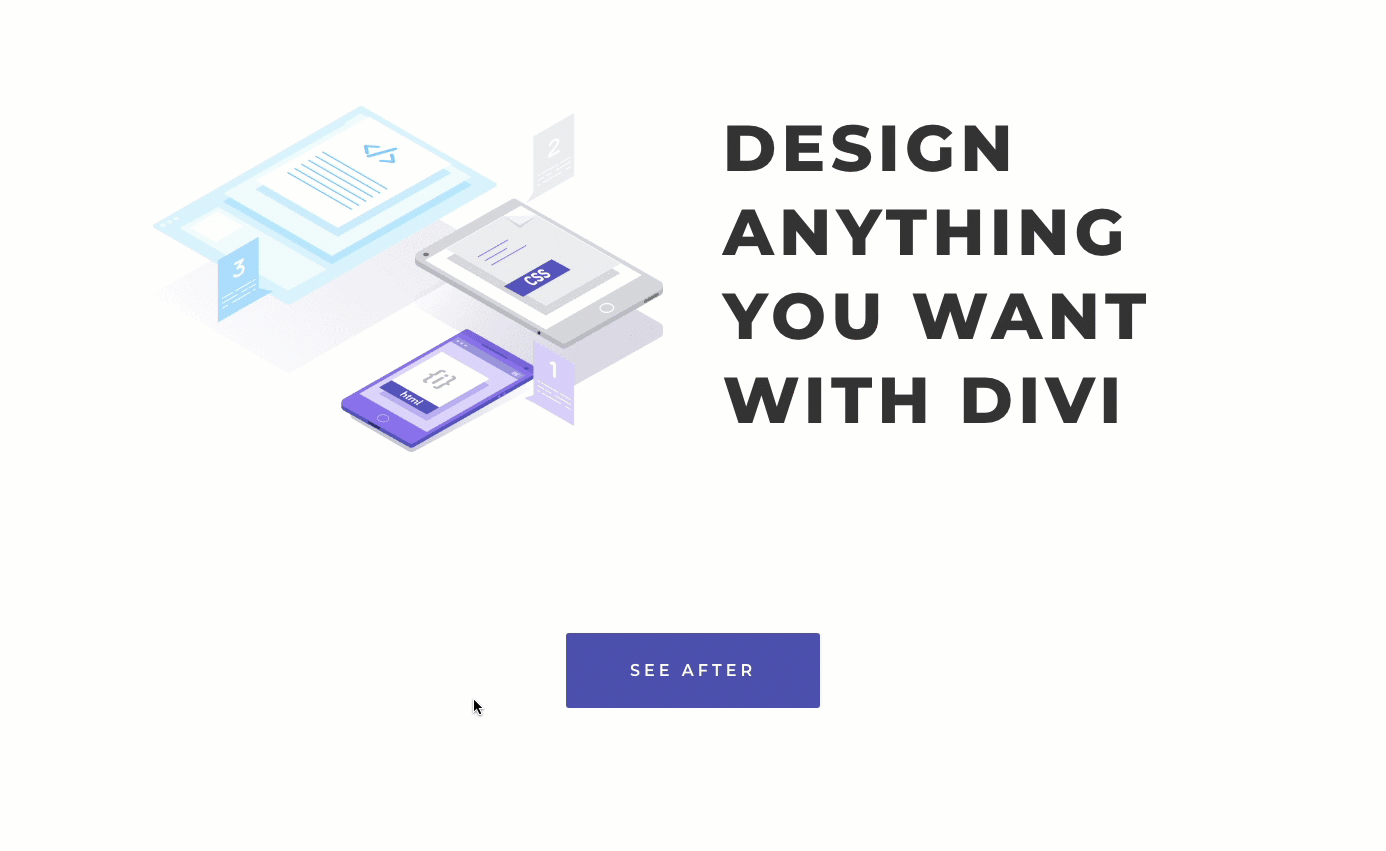
Sneak Peek
Here is a quick look at the design we’ll build in this tutorial.
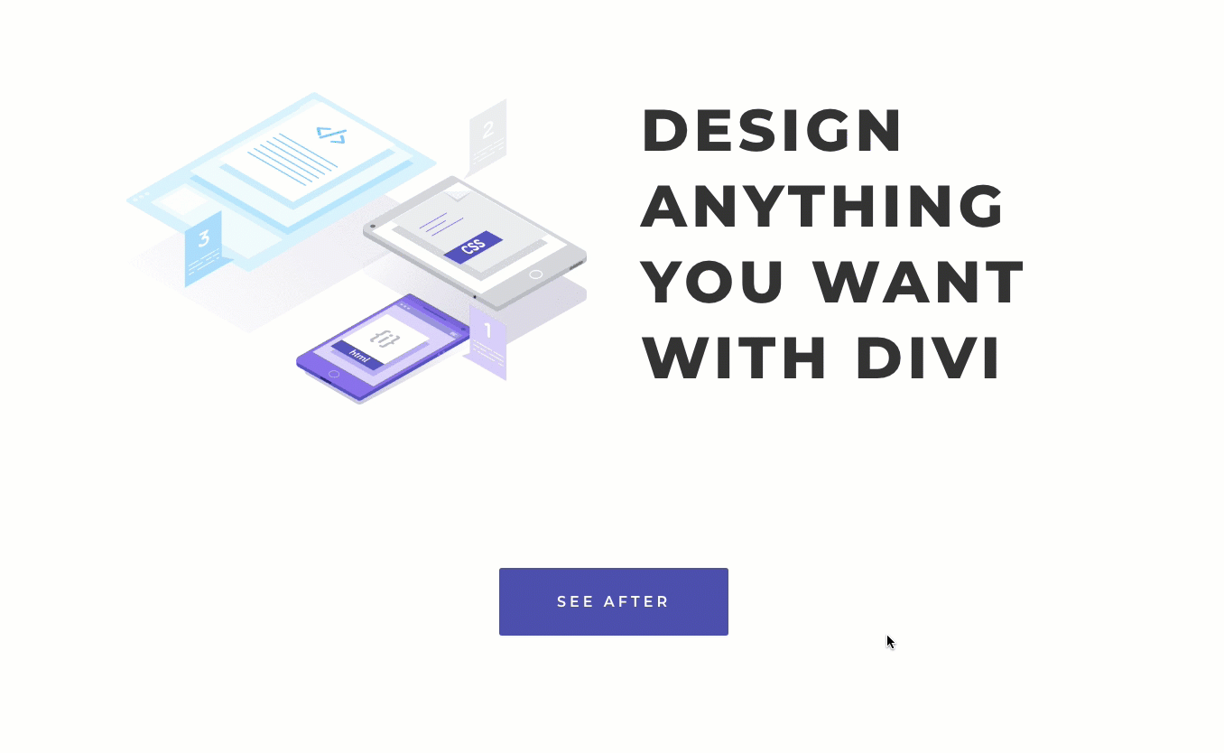
Here is the section layout design being changed when hovering over the button.
And here is the same section layout design being changed with clicking the button. Notice the button text also changes on click.
Download the Layout for FREE
To lay your hands on the designs from this tutorial, you will first need to download it using the button below. To gain access to the download you will need to subscribe to our newsletter by using the form below. As a new subscriber, you will receive even more Divi goodness and a free Divi Layout pack every Monday! If you’re already on the list, simply enter your email address below and click download. You will not be “resubscribed” or receive extra emails.

To import the section layout to your Divi Library, navigate to the Divi Library.
Click the Import button.
In the portability popup, select the import tab and choose the download file from your computer.
Then click the import button.

Once done, the section layout will be available in the Divi Builder.
Let’s get to the tutorial, shall we?
What You Need to Get Started

To get started, you will need to do the following:
- If you haven’t yet, install and activate the Divi Theme.
- Create a new page in WordPress and use the Divi Builder to edit the page on the front end (visual builder).
- Choose the option “Build From Scratch”.
After that, you will have a blank canvas to start designing in Divi.
Part 1: Designing the Section Layout
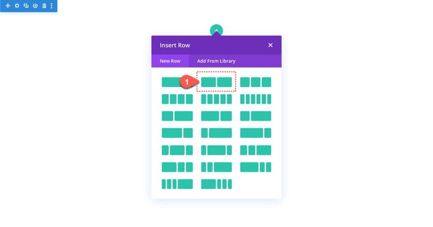
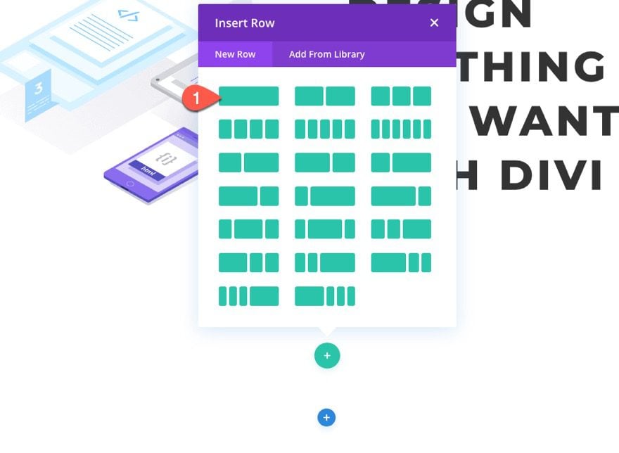
To get started, create a new two-column row.
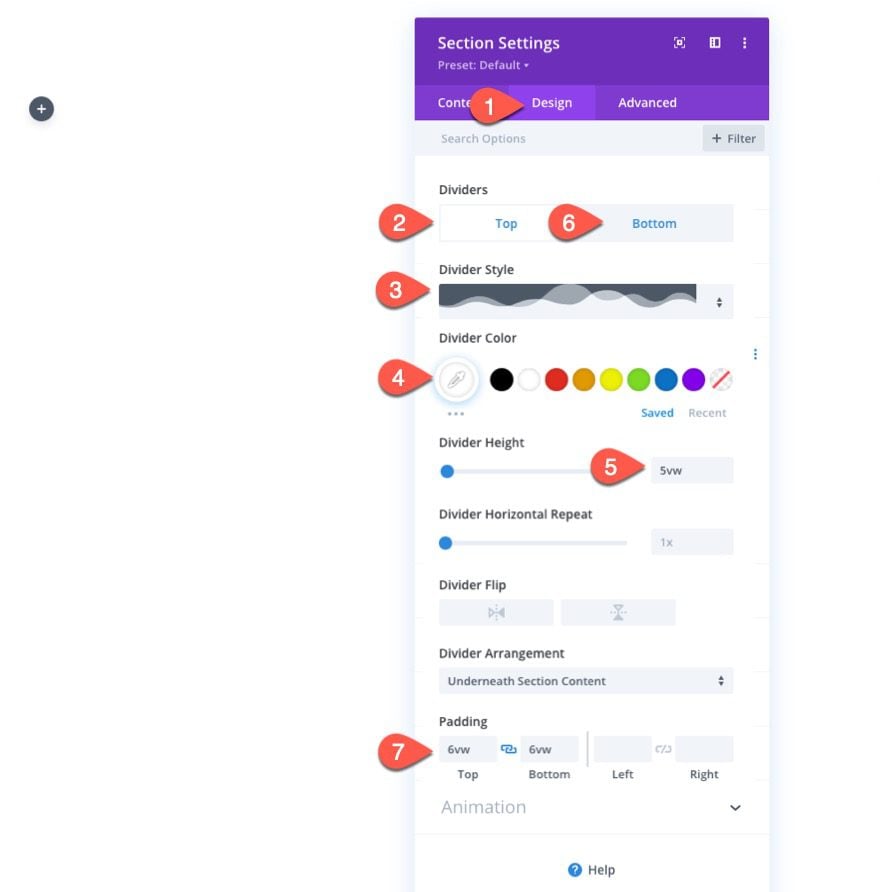
Section Settings
Before adding any modules, open the settings for the section, and update the following:
- Background Color: #ffffff
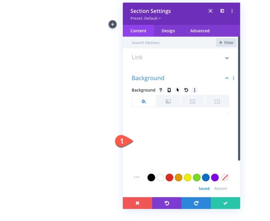
- Top Divider Style: see screenshot
- Top Divider Color: #ffffff
- Top Divider Height: 5vw
- Bottom Divider Style: same
- Bottom Divider Color: #ffffff
- Bottom Divider Height: 5vw
- Padding: 6vw top, 6vw bottom
Before Image
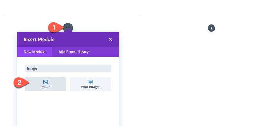
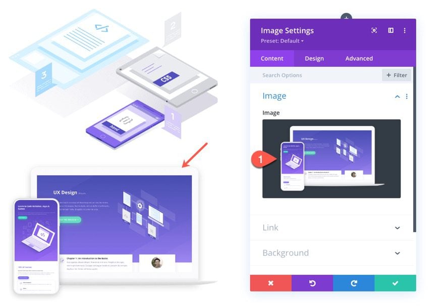
In the left column of the two-column row, add a new image module.
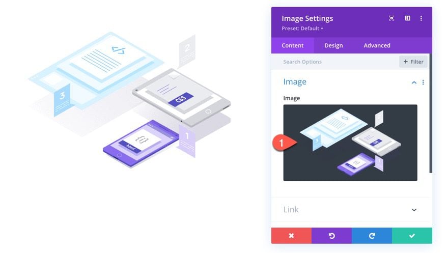
Then upload the image you want to showcase. For this tutorial, we are using an image from the Learning Management (LMS) Layout Pack which is roughly 800px by 550px.
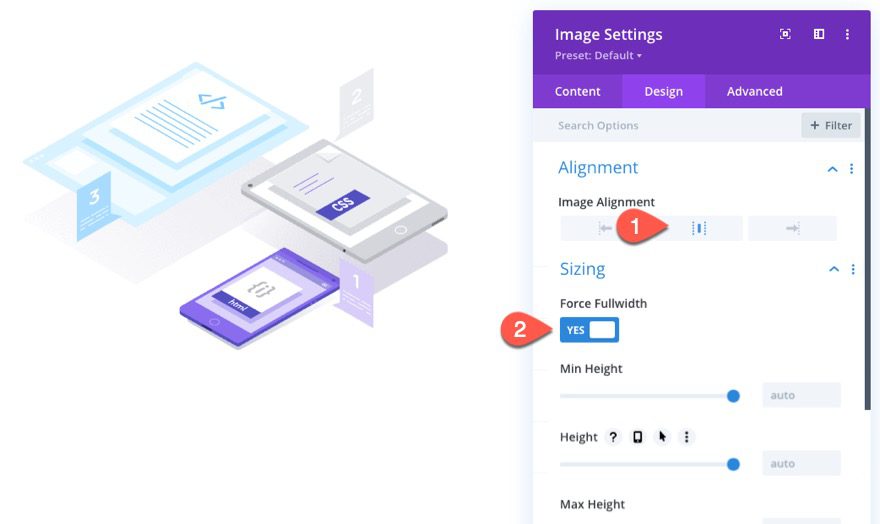
Under the design tab, update the alignment and enable the force fullwidth option.
- Image Alignment: center
- Force Fullwidth: YES
After Image
Next, we are going to create another image that we will show when we hover/click on a button.
To create the image, duplicate the previous image module.
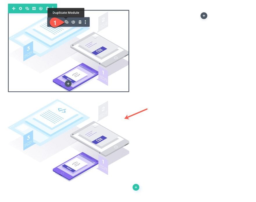
Then upload a new image. The image should be the same size as the other image since it will be replacing the other image on hover/click.
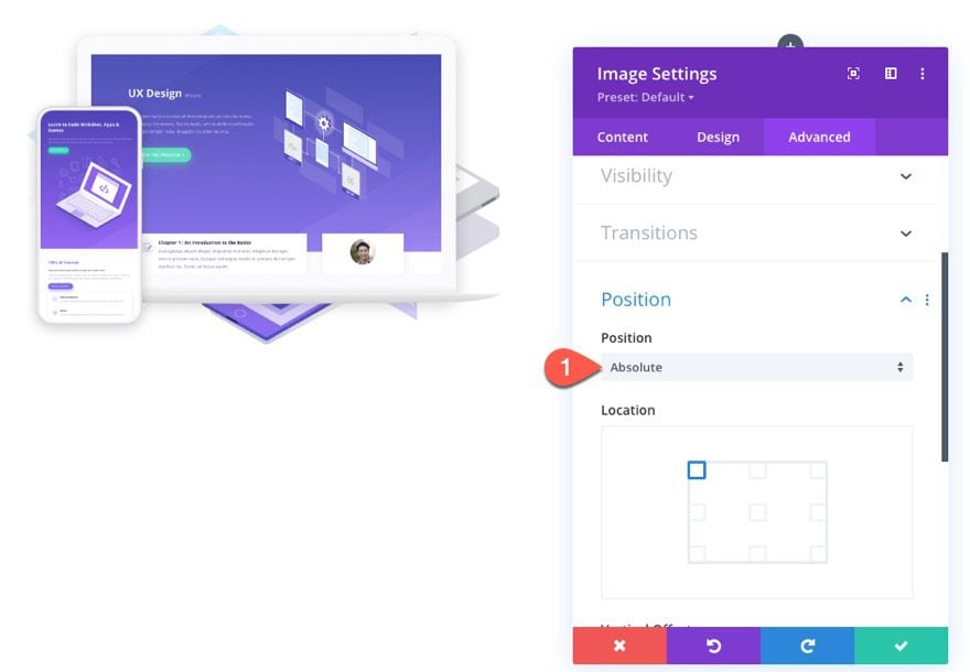
For this image, we are going to give it an absolute position. This will cause the image to sit directly above the other image without taking up actual space on the page.
- Position: Absolute
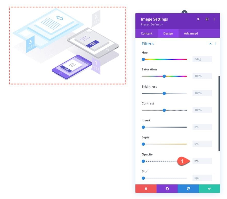
Under the Design tab, change the opacity under the filter options so that the image is completely invisible.
- Opacity: 0%
Add Text Heading
In the right column, add a new text module.
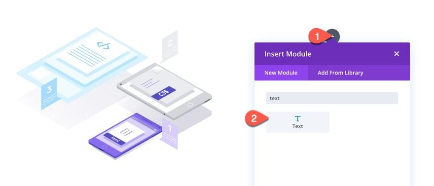
Then paste the following HTML into the body content area:
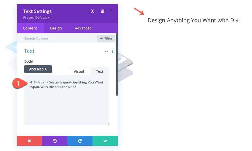
<h3><span>Design</span> Anything You Want <span>with Divi</span></h3>
Notice that some of the words in the text are wrapped with span tags. This is so we can target and style those words later on with some custom CSS.
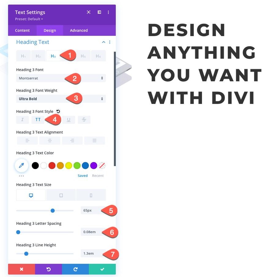
Under the design tab, update H3 style options as follows:
- Heading 3 Font: Montserrat
- Heading 3 Font Weight: Ultra Bold
- Heading 3 Font Style: TT
- Heading 3 Text Size: 65px (desktop and tablet), 40px (phone)
- Heading 3 Letter Spacing: 0.8em
- Heading 3 Line Height: 1.3em
That takes care of the section layout that holds the design elements we will change when hovering/clicking a button. In this next section, we are going to add the button we will use to initiate the style changes.
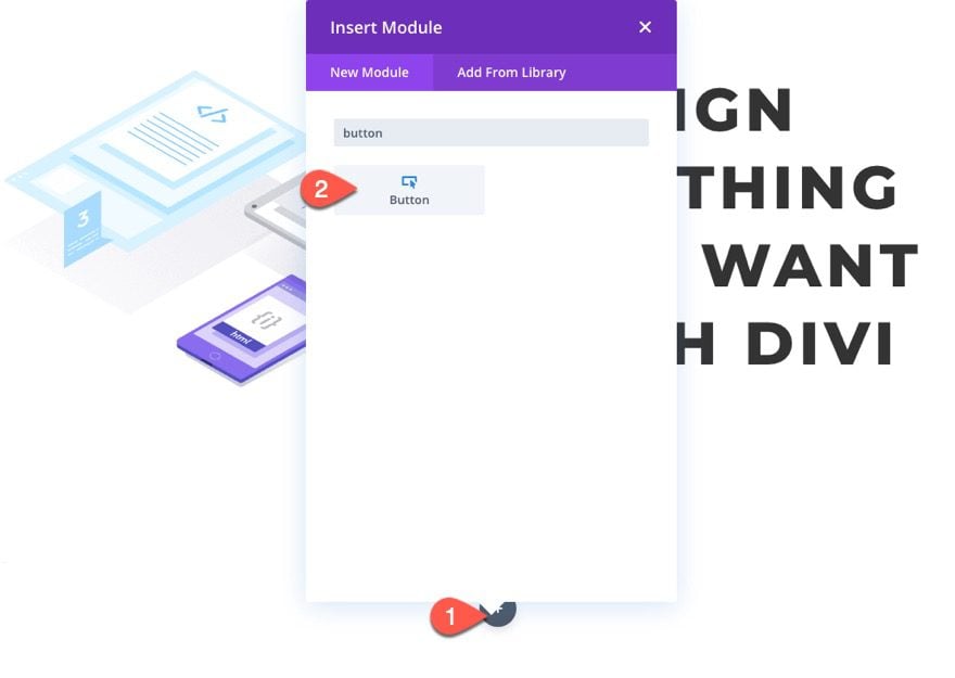
Create a new regular section below the current section.
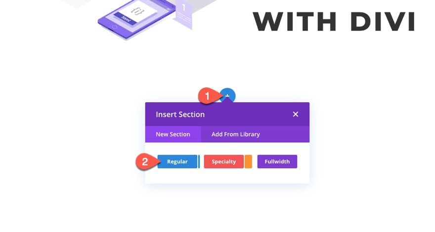
Then add a one-column row to the section.
In the column, add a new button module.
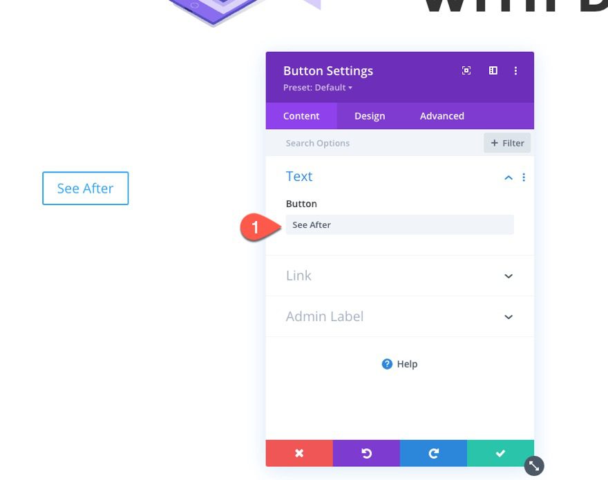
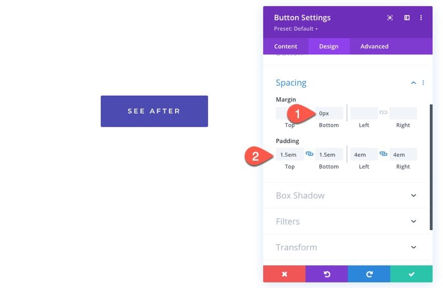
Change the button text to read “See After”.
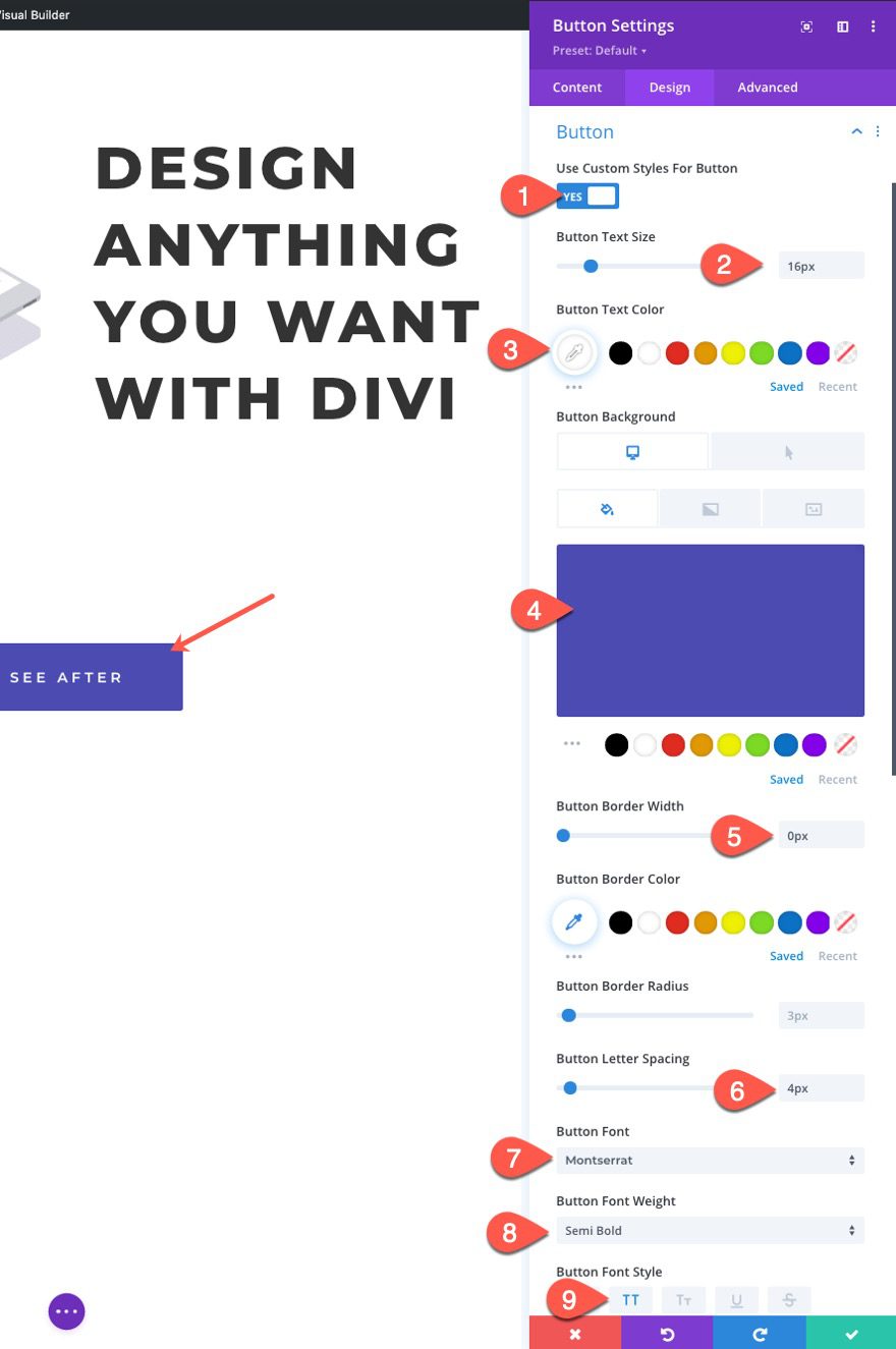
Jump over to the design tab and update the design of the button as follows:
- Use Custom Styles for Button: YES
- Button Text Size: 16px
- Button Text Color: #ffffff
- Button Background: #4b4baf
- Button Background (hover): #67ddc1
- Button Border Width: 0px
- Button Letter Spacing: 4px
- Button Font: Montserrat
- Button Font Weight: Semi Bold
- Button Font Style: TT
Part 2: Adding CSS Classes to the Elements
Now that our design is in place, we are going to accomplish the rest of the design changes using custom Code (CSS and JQuery). But before we start adding our custom code, we need to add CSS Classes to all the elements we wish to change when hovering/clicking the button.
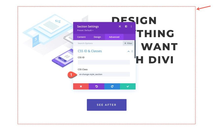
Add CSS Class to Section
To add a CSS Class to the section, open the section settings, and click the advanced tab. Then enter the following CSS Class:
- CSS Class: et-change-style_section
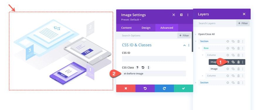
Add CSS Class to Images
Next, open the settings for the first image in the left column and add the following CSS Class:
- CSS Class: et-before-image
This will be the image that is shown “before” the button hover/click.
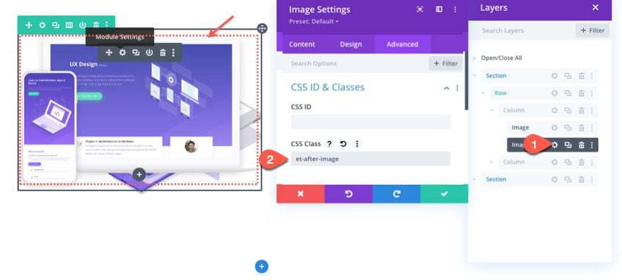
Using the layers modal, open the settings for the second image (the one being hidden with the opacity filter) and add the following CSS Class:
- CSS Class: et-after-image
This will be the image that is shown “after” the button hover/click.
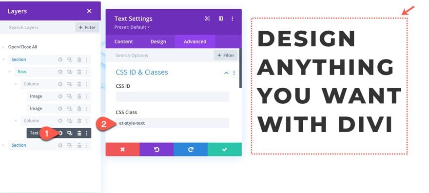
Add CSS Class to Text
Next, add the following CSS Class to the Text Module in the right column:
- CSS Class: et-style-text
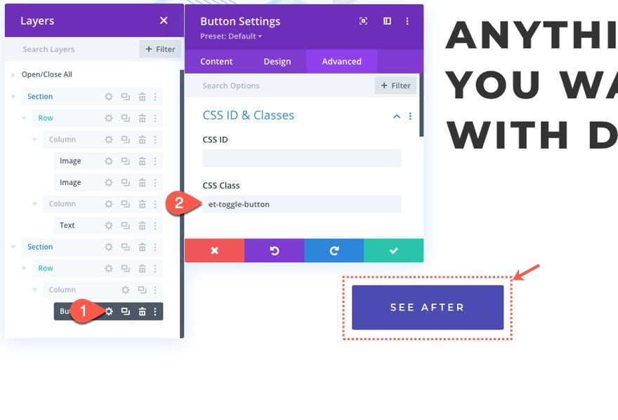
Lastly, add a custom CSS Class the button in the bottom section as follows:
- CSS Class: et-toggle-button
We need this class to target the button for hover/click functionality in the code later on.
Part 3: Add Custom Code to Change Styles on Hover or Click
Now that all of our CSS Classes are in place, we can now add the code necessary to change the style of all those elements when hovering/clicking the button.
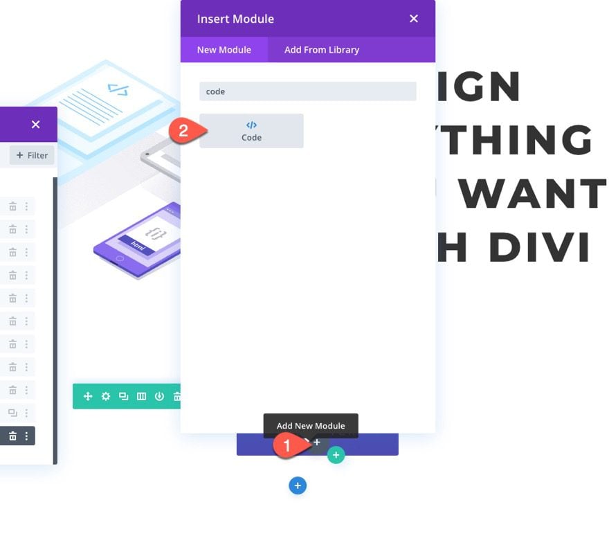
Add Code Module
To add the code, add a code module under the button in the bottom section.
Paste jQuery Code
Then paste the following JQuery. Making sure to wrap the code in script tags because we are adding the code to an HTML document (not a JS file).
(function($) {
    $(document).ready(function(){
        $('.et-toggle-button').hover(function(){
            $('.et-change-style_section').toggleClass('et-change-style_active');
            var $this = $(this);
            $this.toggleClass('et-toggle-button_active');
        });
    });
})( jQuery );
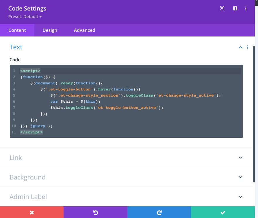
If you take a look at the code, you should recognize the CSS Classes we added to the button and the section.
The Button Class (“.et-toggle-button”) is being used to target the element that will initiate a function on hover.
On hover, the function will find the element with the section class “.et-change-style_section” and toggle/add a new class (“.et-change-style-active”) when the cursor is hovering over the button.
The button is also being targeted (via “$this”) in order to toggle a new class (“.et-toggle-button_active”) in the hover state.
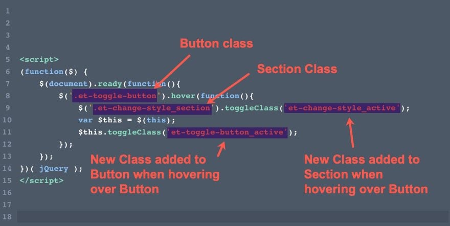
The key to changing the styles of these elements on hover is adding/toggling these additional new CSS Classes to the section and button.
For example, once the section with the class “.et-change-style_section” is given that additional class (“.et-change-style_active”), we can use Custom CSS to change the style of the section originally given to it via the built-in Divi options.
Changing the Style of Elements with Custom CSS
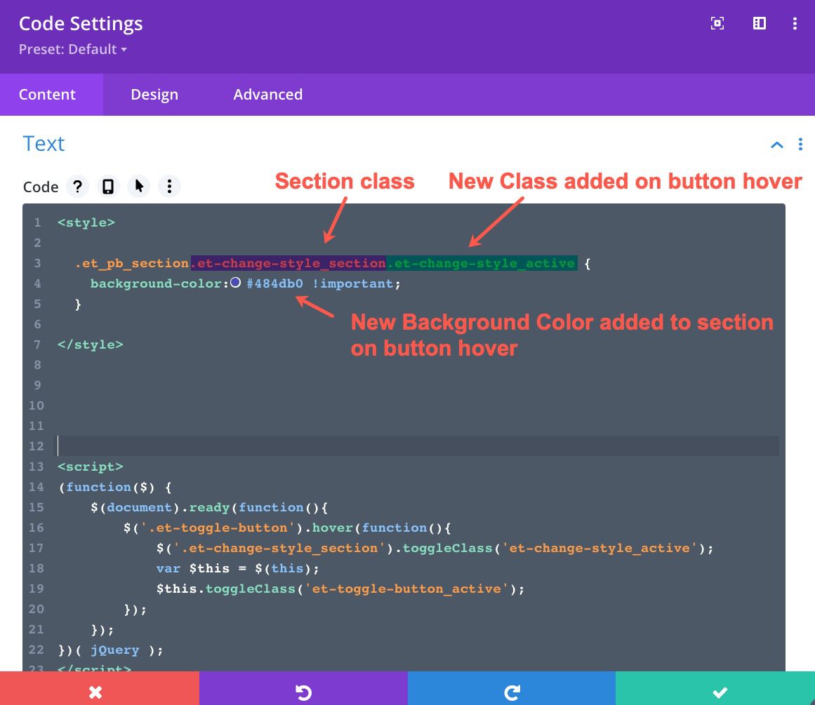
Open the code module and paste the following Custom CSS above the JQuery Script, making sure to wrap it in the necessary Style tags.
 .et_pb_section.et-change-style_section.et-change-style_active {
   background-color:#484db0 !important;
 }
Notice that the initial section class is combined with the new class as the selector. The CSS that follows will only apply to the section when that new class is attached. When it isn’t attached, the original design will be displayed. In this example, the background color of the section will change when hovering over the button.
Next, paste in the following additional CSS inside the style tags.
  .et-change-style_active .et-after-image {
    filter: opacity(100%);
  }
  .et-change-style_active .et-before-image {
    filter: opacity(0%);
  }
Because the parent section is given a class on hover, you can target the child elements of the section (like the images) using that same CSS class. But because it is a class in a parent container/section, the CSS Class should precede the class of the element you are seeking to change. In this example, the CSS Class (“.et-change-style_active”) given to the parent section comes before the class given the child images (“.et-after-image” and “.et-before-image”).
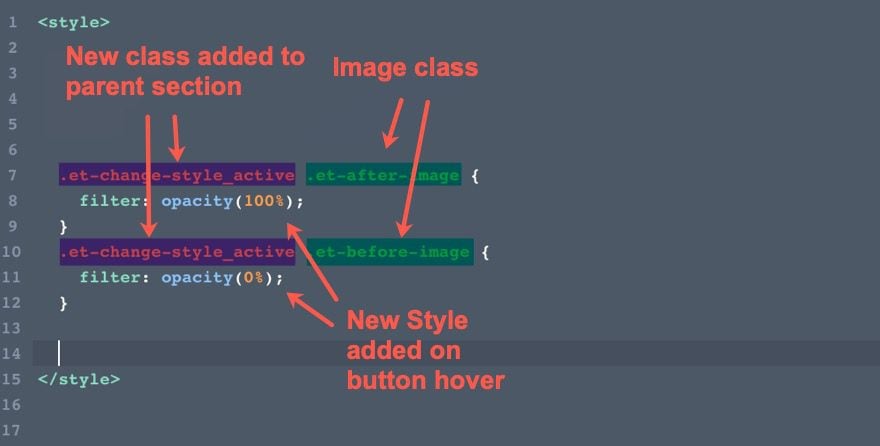
The CSS for the after image will show the image on button hover. And the CSS for the before image will hide the image on button hover. The result is that the initial image is changed to a new one on button hover.
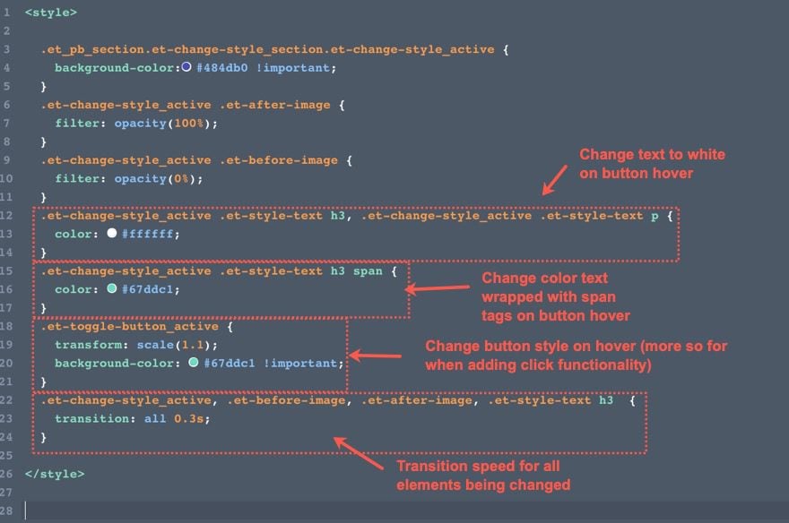
Next paste in the rest of the CSS inside the style tags:
  .et-change-style_active .et-style-text h3, .et-change-style_active .et-style-text p {
    color: #ffffff;
  }
  .et-change-style_active .et-style-text h3 span {
    color: #67ddc1;
  }
  .et-toggle-button_active {
    transform: scale(1.1);
    background-color: #67ddc1 !important;
  }
  .et-change-style_active, .et-before-image, .et-after-image, .et-style-text h3  {
    transition: all 0.3s;
  }
These CSS snippets are using the same concept to change the style of the element when the section (or button) has the new class.
Final Result (Hover)
Once the code has been added, save the changes, and open the page to view the result. Notice how the elements we targeted are being changed when hovering over the button.
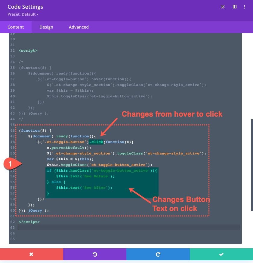
Changing Styles on Click Instead of Hover
If you want to change the style of those same elements when clicking the button (rather than hovering), all you need to do is make a few changes to the JQuery. Most of the code will stay the same. The main difference is that the “hover” method is replaced with “click”. And we’ve added a helpful snippet of code that changes the text of the button on click.
To add the click functionality, replace the current JQuery with the following (again, make sure it is wrapped in the script tags):
(function($) {
    $(document).ready(function(){
        $('.et-toggle-button').click(function(e){
            e.preventDefault();
            $('.et-change-style_section').toggleClass('et-change-style_active');
            var $this = $(this);
            $this.toggleClass('et-toggle-button_active');
            if ($this.hasClass('et-toggle-button_active')){
                $this.text('See Before');
            } else {
                $this.text('See After');
            }
        });
    });
})( jQuery );
Here is the final result.
Final Thoughts
Being able to target and change the style of multiple elements on a page when hovering or clicking on something is a helpful skill in web design. You can use this technique for a variety of use cases (before and afters, CTAs, etc…) Sure, it helps to know a little CSS and JS/JQuery. But, as you have seen in this tutorial, you don’t need to know a tone of code to get some surprising results!
I look forward to hearing from you in the comments.
Cheers!


Doesn’t work if a woocommerce module is in the same page, do you have any solution?
What would the jquery look like if i had 7 buttons each with its own image?
I love this post as em a blogger I like to comment on this.
WOW ! Great
Really amazing
thanks for us .
i appreciate its post
thanking for sharing with community….
Hi Jason Champagne,
Nice article its really very helpful for us you cover almost all the main points also you clear my all doubts so thanks to one again. Keep Sharing such kind of information
Regards
Sofia Smith
Great! And we will definitely try! 🙂
Really amazing information in this tutorial.
Thanks for sharing with us.
You are very welcome, Nayan!
thanks for this tutorial. Possibly moving from the realm of complete ‘non-coder’ to being able to understand what is needed, where, and differences between scripts and styles. Thanks for this step by step instruction!
We’ve all been there, yvonne! 🙂 Really glad it was helpful.
yeah, we need tutorials like these. One with seamless page loading would be great. I think tutorials like these keep advanced guys hooked in Divi.
Great idea, Orestis. I appreciate the feedback/suggestion.