
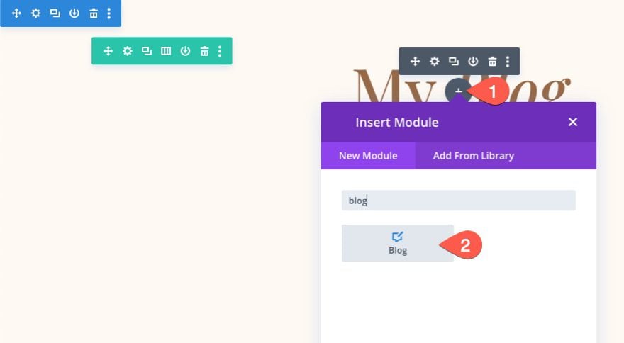
Divi’s blog module can display blog posts in either a fullwidth or grid layout. If you choose the grid layout, the maximum amount of columns you can have is three. In this tutorial, we are going to explore combining the power of CSS Grid with the Divi Blog module to create any number of columns you want. With just a few snippets of CSS, your blog will transform into a beautiful multi-column grid layout. Plus, the columns will be fluidly responsive with all browser sizes, so no need to worry about updating those media queries or responsive settings. After the CSS Grid magic, you’ll still have the built-in blog module settings to design the blog visually without any more custom CSS. So, if you are looking for more columns for your Divi blog, this will do the trick and more.
- 1 Sneak Peek
- 2 Download the Layout for FREE
- 3 Download For Free
-
4
How to Change the Number of Columns in the Divi Blog Module Using CSS Grid
- 4.1 Why CSS Grid?
- 4.2 Setting up a Blog Module with a Fullwidth Layout
- 4.3 Adding the Custom CSS Class to the Blog Module
- 4.4 Creating the Multi-column Layout with CSS Grid
- 4.5 Style the Blog Post Card (or Grid Item)
- 4.6 Removing Pagination from the Grid
- 4.7 Bonus Tip: Adjust the Size of All Featured Images (or Thumbnails)
- 5 Final Result
- 6 Final Thoughts
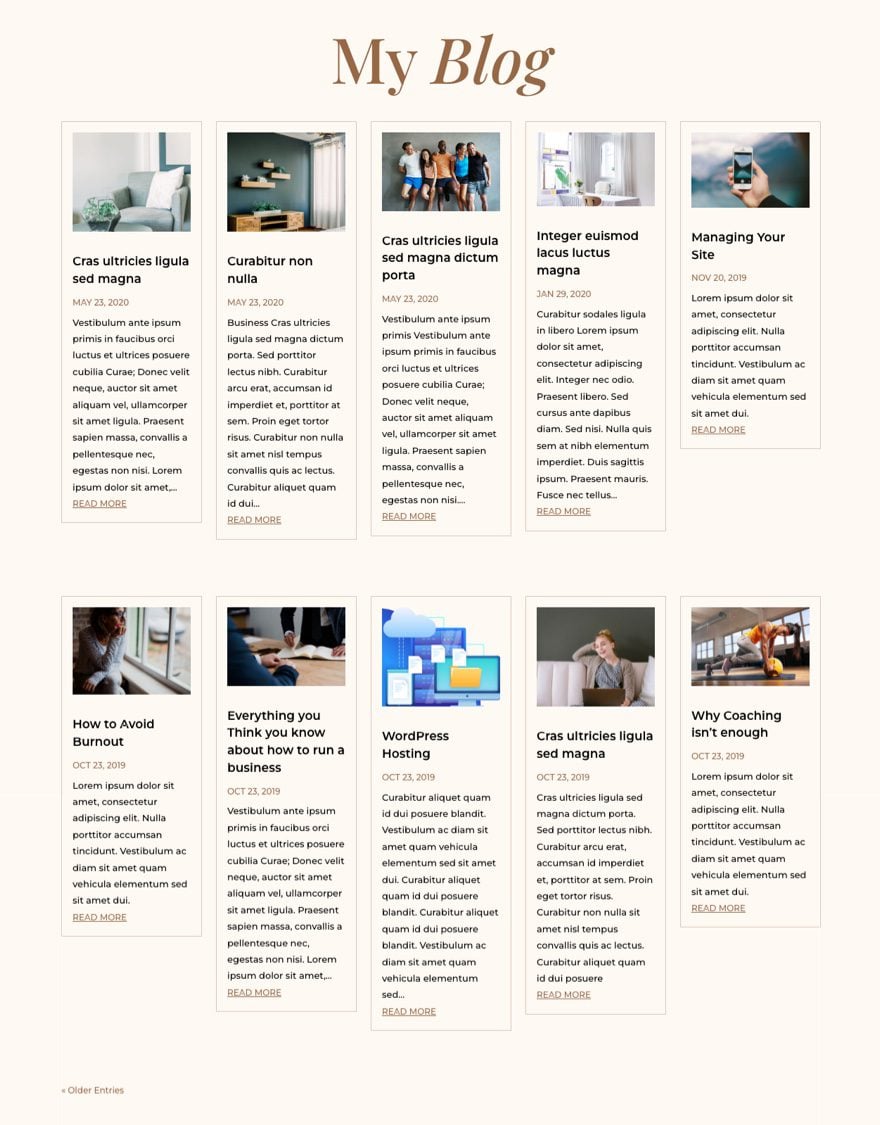
Sneak Peek
Here is a quick look at the design we’ll build in this tutorial.
And here is a codepen demonstrating the CSS Grid Layout we will be adding to the blog module.
Download the Layout for FREE
To lay your hands on the blog module design from this tutorial, you will first need to download it using the button below. To gain access to the download you will need to subscribe to our newsletter by using the form below. As a new subscriber, you will receive even more Divi goodness and a free Divi Layout pack every Monday! If you’re already on the list, simply enter your email address below and click download. You will not be “resubscribed” or receive extra emails.

Subscribe To Our Youtube Channel
To import the section layout to your Divi Library, navigate to the Divi Library.
Click the Import button.
In the portability popup, select the import tab and choose the download file from your computer.
Then click the import button.

Once done, the section layout will be available in the Divi Builder.
Let’s get to the tutorial, shall we?
How to Change the Number of Columns in the Divi Blog Module Using CSS Grid
Why CSS Grid?
There are a lot of ways to make column layouts for the blog module using CSS. But for this instance, it makes the most sense to use CSS Grid. The CSS Grid property is a popular way to create predictable and responsive grid layouts for content with just a few lines of CSS. With it, we can organize all the blog module cards into a fully responsive grid. In short, it offers a simple and complete solution for adding any column layout you want for your Divi blog. In fact, we’ve also used it to build a grid layout for Divi modules.
Now, let’s turn our attention to the blog module.
Setting up a Blog Module with a Fullwidth Layout
The Divi Blog Module can be used to add a blog anywhere on your website. That makes it really easy to build a blog page in Divi. All you need to do is add a blog module to the page using the Divi Builder.
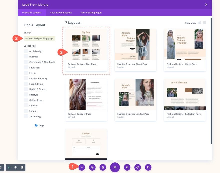
For this tutorial, we are going to use a premade blog page template from one of our free layout packs that already has a blog module with some basic styling. To load the premade blog page layout to your page, open the settings menu at the bottom and open the Add from Library popup. From there, search and find the Fashion Design Blog Page layout and load it to the page.
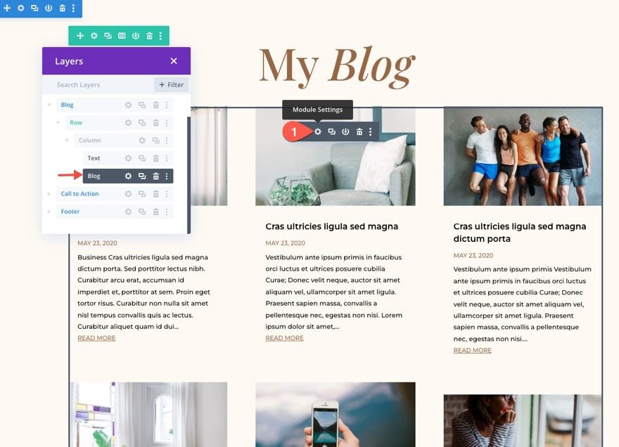
Once the layout is loaded, find the blog module used to display the blog posts and open the blog module settings.
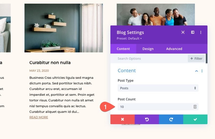
Set Post Count
In the blog settings, update the content to limit the post count to 10. (This is mainly for aesthetic reasons because our grid will eventually include two rows of five blog posts on desktop.)
- Post Count: 10
Select Fullwidth Layout
Since we are going to be creating the column layout for our blog using CSS Grid, we need the make sure the blog module layout is fullwidth (not grid). This will ensure the blog posts are stacked vertically in their normal order of the document/page.
To change the layout of the blog module, open the blog module settings and, under the design tab, open the Layout dropdown menu and select Fullwidth.
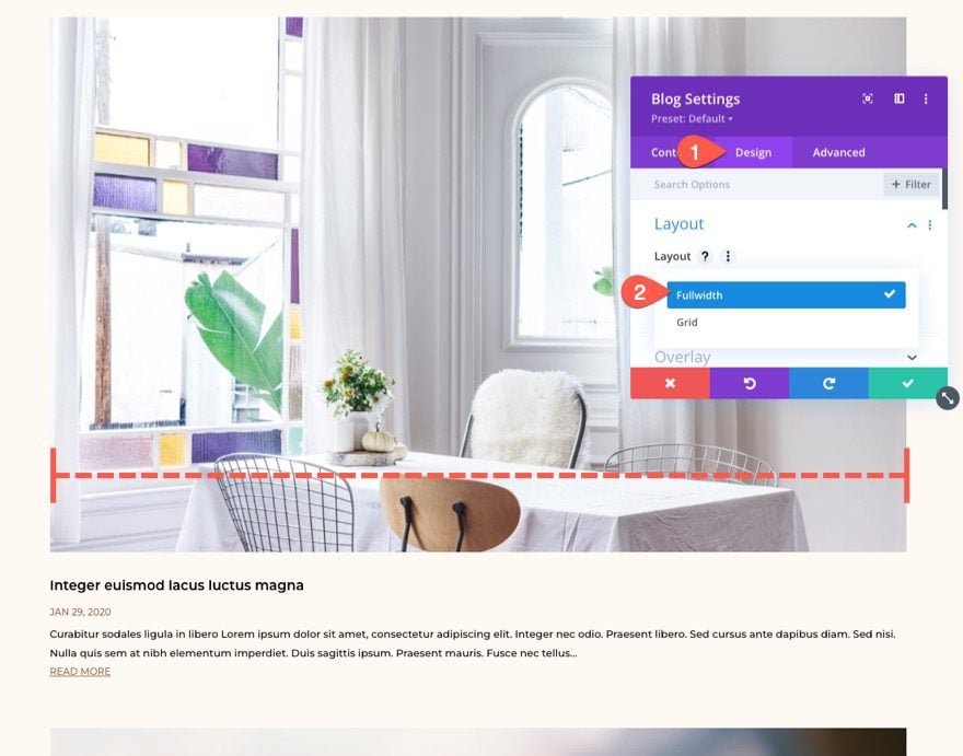
Now each blog post should span the full width of the column (or parent container).
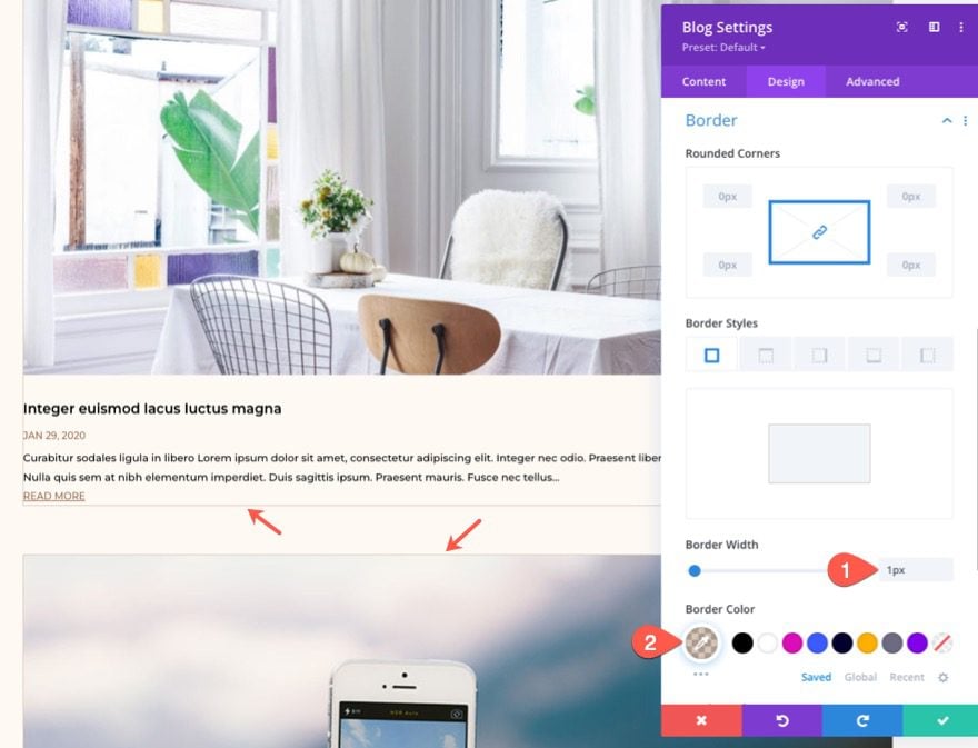
Just for kicks, let’s add a border to the blog posts so that we can get a better idea of what our grid layout will look like when we add our CSS. Update the border options as follows:
- Border Width: 1px
- Border Color: rgba(150,104,70,0.35)
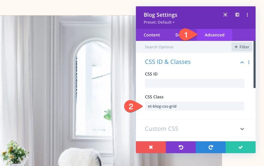
Adding the Custom CSS Class to the Blog Module
In order to effeciently target this particular blog module (an no other) with our CSS, we need to give our module a custom CSS Class. Under the advanced tab, add the following CSS Class:
- CSS Class: et-blog-css-grid
Creating the Multi-column Layout with CSS Grid
Now that our blog module is set up with a fullwidth layout, we are ready to add our custom CSS. For now, we are going to use a code module to add the CSS to the page. But, when we’re done, you can always move the CSS to your preferred location (like the Custom CSS in Theme Options or your child theme‘s style.css).
Add a new code module under the blog module.
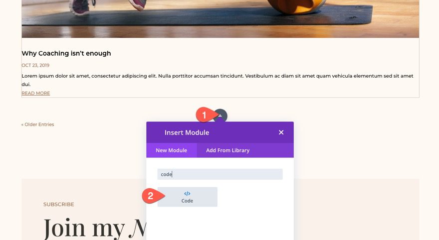
In the code input box, add the necessary style tags needed to wrap any CSS code added to a page.
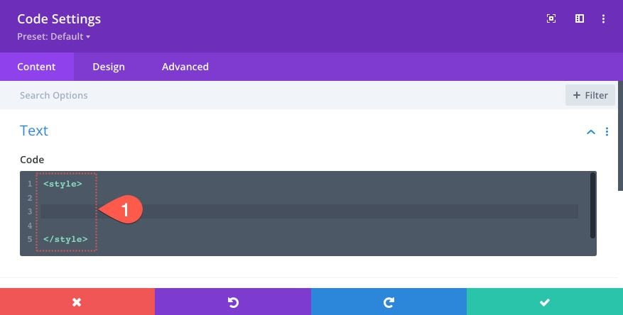
Inside the style tags, paste the following snippet of CSS:
.et-blog-css-grid > div {
  display: grid;
  grid-template-columns: repeat(auto-fill, minmax(200px, 1fr));
  gap: 20px;
}
The first line of CSS lays out the content (or modules) according to the CSS grid module.
display:grid;
The second line of CSS defines the column template of the grid.
grid-template-columns: repeat(auto-fill, minmax(200px, 1fr));
The third line determines the gap spacing between the grid items (like gutter width).
gap: 20px;
How the CSS Grid Columns Work
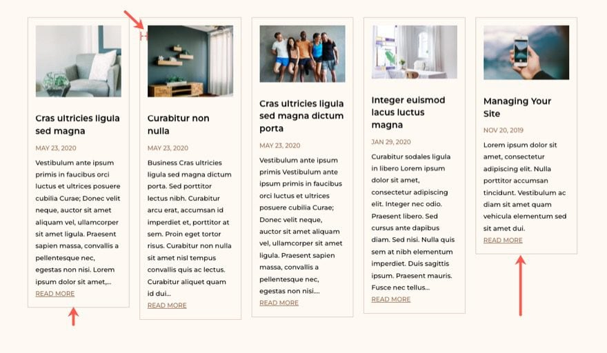
In this case, the grid will add columns repeatedly as needed to fill up the remaining space of the grid container. Each column will have a min-width of 200px and a max-width of 1fr (which is exactly the same as auto). This means that when the parent container (the Divi Row/Column) is at its max-width of 1080px, the grid will have 5 columns. Each column will have a width of 200px (the minimum width) which equals 1000px. Add the 4 grid gaps of 20px and you get a total of 1080px. Once the viewport squeezes the grid below the 1080px, the magic of the CSS Grid takes over and fills each available space with blog posts until they get to 200px width. New rows will be created automatically as they become needed by default.
To get more columns you can either change the 200px minmax value to something smaller, or increase the max-width of the Divi row to something larger than 1080px.
Here is a codepen demonstrating the CSS Grid Layout functionality we added here.
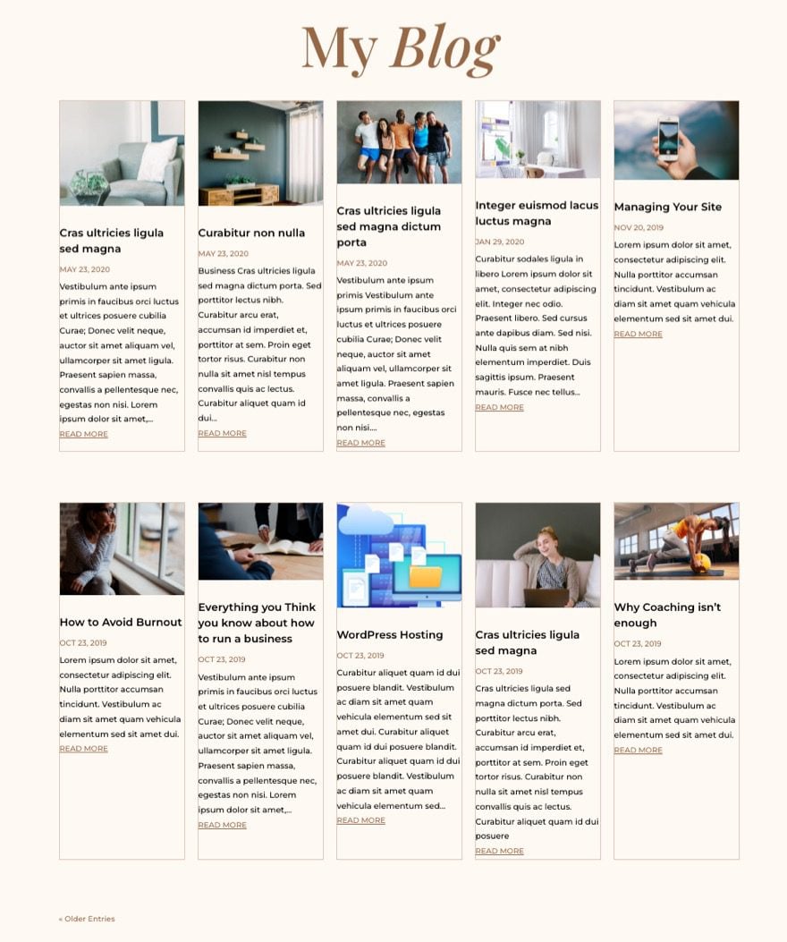
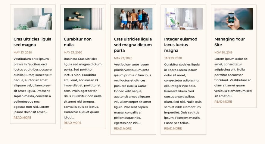
At this point, the five-column responsive grid is ready to go. In fact, you don’t plan on using pagination or borders for your blog posts, you can stop right here.
Here is the result so far.
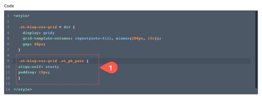
Style the Blog Post Card (or Grid Item)
Next, we can add a few lines of CSS that target the grid items (or blog post cards) so that they are aligned to the top of each row and have a little padding.
.et-blog-css-grid .et_pb_post {
  align-self: start;
  padding: 15px;
}
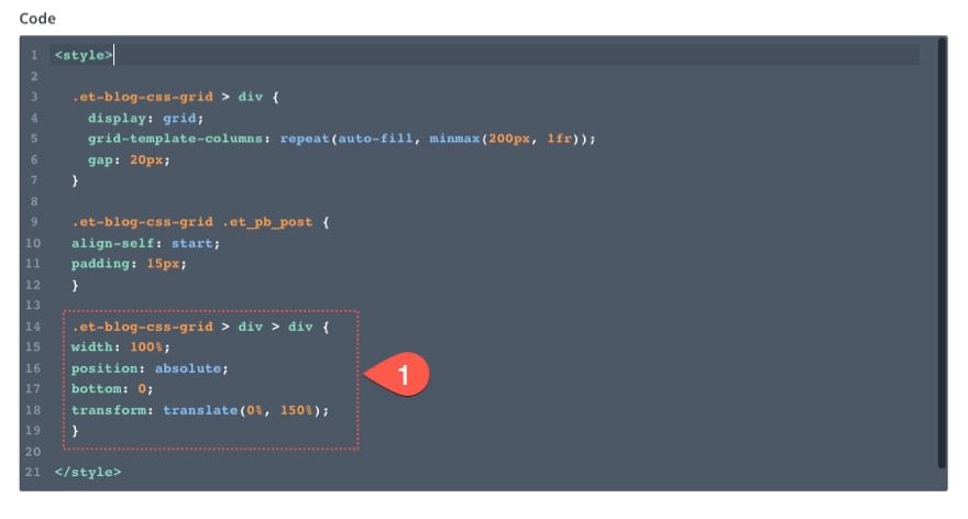
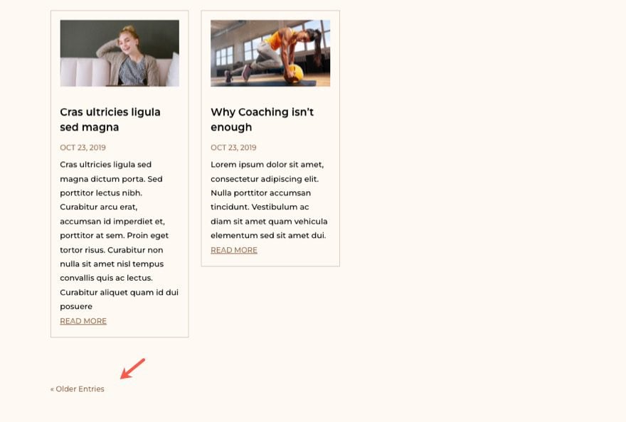
Removing Pagination from the Grid
Currently, if you have pagination active on the blog module, it will be treated as the last grid item in the CSS grid. To remove the pagination out of the grid altogether, we can give it an absolute position and place it directly under the blog module. To do this, add the following CSS:
.et-blog-css-grid > div > div {
  width: 100%;
  position: absolute;
  bottom: 0;
  transform: translate(0%, 150%);
}
Now the pagination links are safely outside of the grid so that it doesn’t get moved around on different viewport widths.
Let’s check out the result so far!
Bonus Tip: Adjust the Size of All Featured Images (or Thumbnails)
At this point, you may notice the height inconsistency of the featured images on each blog post card. If you want to make them all the same height, you can use additional CSS to do that as well.
.et-blog-css-grid .entry-featured-image-url {
  padding-top: 56.25%;
}
.et-blog-css-grid .entry-featured-image-url img {
  position: absolute;
  height: 100%;
  width: 100%;
  top: 0;
  object-fit: cover;
}
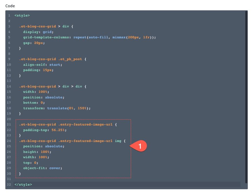
The first snippet targets the featured image container and adds a percentage of padding that basically adjusts the height of the image container. But the first snippet doesn’t work until we position the featured image so that it fits perfectly centered within the image container. To do this we give the image an absolute position and use “object-fit:cover” to make the image span the full width and height of the container.
With 56.25% top padding, we should get a 16:9 aspect ratio for all our images.
Feel free to adjust the padding on the image container to get the aspect ratio you want for your image.
Final Result
Here is another look at the entire CSS we added to the code module with some comments.
/* create css grid column template */
.et-blog-css-grid > div {
  display: grid;
  grid-template-columns: repeat(auto-fill, minmax(200px, 1fr));
  gap: 20px;
}
/* style css grid item or blog post */
.et-blog-css-grid .et_pb_post {
  align-self: start;
  padding: 15px;
}

/* remove pagination from blog module grid with absolute position */
.et-blog-css-grid > div > div {
  width: 100%;
  position: absolute;
  bottom: 0;
  transform: translate(0%, 150%);
}

/* Resize Featured Image Thumbnails */
.et-blog-css-grid .entry-featured-image-url {
  padding-top: 56.25%;
}
.et-blog-css-grid .entry-featured-image-url img {
  position: absolute;
  height: 100%;
  width: 100%;
  top: 0;
  object-fit: cover;
}
And here is a final look at our blog module with our new columns and grid layout.
Final Thoughts
It always surprises me what can be accomplished with just a few lines of CSS using CSS Grid. In this case, we were able to restructure the entire Divi blog module into a fluid five-column layout. The best part is that you don’t have to worry about using media queries! Hopefully, this saves you time and gives you more options to build beautiful blog pages.
I look forward to hearing from you in the comments.
Cheers!


This doesn’t seem to be working anymore, my blog’s just staying in a single column. Any suggestions? Does it need an update or am I just doing it wrong 🙂
Hey, Lorraine! To the best of knowledge the customization is still applicable, so we advise reaching to our Support Team for assistance in the matter. Thanks!
How would you get the blogs more masonry like when using the grid option instead of full width? In yours, they all start at the same height on each row, but I want to have them look like the blog grid option.
Surely this should be built in without needing any code?
Hi,
Thanks a lot for this tuto, it’s really great as 3 columns are not always ok…
But I’d like to add a couple more customization and I can’t find the solution myself…
I’d like to have a different colour for the background of my page than the background of the articles. And I’d like to add a shadow as well.
If I change the background or the shadow of the blog module, unfortunately, it applies on the entire grid and not on the articles one by one…
Do you think it’s possible to correct that ? Have you got an idea for making this possible ?
Thanks a lot !
Add this to your CSS Code for a different background color (Change to your preferred color:
.et_pb_post{
background-color: #7baed4;
}
For a different color and shadow, use the following and change the shadow options as required:
.et_pb_post{
background-color: #7baed4;
box-shadow: 0 4px 8px 0 rgba(0, 0, 0, 0.2), 0 6px 20px 0 rgba(0, 0, 0, 0.19);
}
Is there a way to edit this so that it is 4 columns instead of 5?
The customizer/Advanced CSS seems to think that ‘gap’ is not a valid declaration. I check the box to ‘save anyway’ and it worked, but this seems like a bug in the Customizer.
This is awesome! Great tips
Excellent solution!
Would there be a way to make each card the same height (given the difference in the amount of copy)?
Gary,
Good question. Yes. If you look in the article under the title “Style the Blog Post Card (or Grid Item)” you will see that I added CSS to the cards to align them starting at the top (“align-self:start;”). You can take that out and your cards will all have equal height. Hope that helps.
This is a much needed enhancement to the Blog module that pretty much every Divi user can use to cure the 3 column only layout limitation.
Unfortunately, this is a complex solution for a problem that should have been implemented in the module settings from day one. The Blog module can be used for all kinds of content and not just blog posts, such as manually rolled events posts, products, video-embed posts, or whatever you like and each need can use different Blog grid columns based on numerous factors. Just 3 cols is rarely the right number.
I emphatically vote for Divi devs building out a simple number slider from 2 to 6 (even 8 could be useful in rare situations) columns in the Blog module settings (while still remaining responsive to progressively fewer columns on smaller screen breakpoints).
This really should be built into the module itself. I understand this creates the opportunity for an upsell but just charging more upfront for something this basic would be greatly appreciated.
Clifford,
Thanks for the feedback. Much appreciated.
Helpful tutorial!
Couple of typos — I believe where you refer to script tags, you mean style, and I think there’s a word missing from the sentence that includes ‘ position the featured image using so that’
Thanks!
Thanks for that, Joe. I’ll get that updated.