
Divi is adding even more features to your tool belt. The native Group Carousel Module has recently been released and comes standard with every Divi 5 website. It allows you to make a completely customized carousel for testimonials, products, feature cards, videos, and more.
In a previous tutorial, we showed you how to create a testimonial carousel, and this post we’ll focus on making a media-rich Video Carousel. Follow along to learn how. The video carousel JSON file is also available for download at the end of the post. Let’s get to it!
The Makings Of A Video Carousel
A video carousel is a row that horizontally slides through cards. Each slide is a Group inside the Carousel Module. Each Group can hold a Heading Module, a Video Module, or any arrangement of elements you wish. Because you are using a Group, you can add whatever you want and arrange it however you like. You aren’t locked into a specific set of elements or layouts you can use because you have all the power of Divi at each layer of a carousel.
With the parent Carousel Module, you control arrows and dot navigation, autoplay, looping, and a center snap. The Visual Builder shows everything in its place, so there’s literally no guesswork.
How To Build A Video Carousel In Divi
In this tutorial, we’ll create a video carousel with multiple slides. It’ll feature a nice blurred effect on non-focused Groups.
The Easy Groundwork
Before you create your video carousel, I find it helpful to figure out which videos you’ll be using. It will even be helpful to have the video thumbnail images handy. To make it easier up front, you can also use placeholder images with a 16:9 image ratio.
First, decide on your video source. You can upload videos to YouTube and Vimeo, or a self-hosted option of WebM or MP4s works, too.
From there, all that is left to do is actually build your video carousel.
Building The Video Carousel
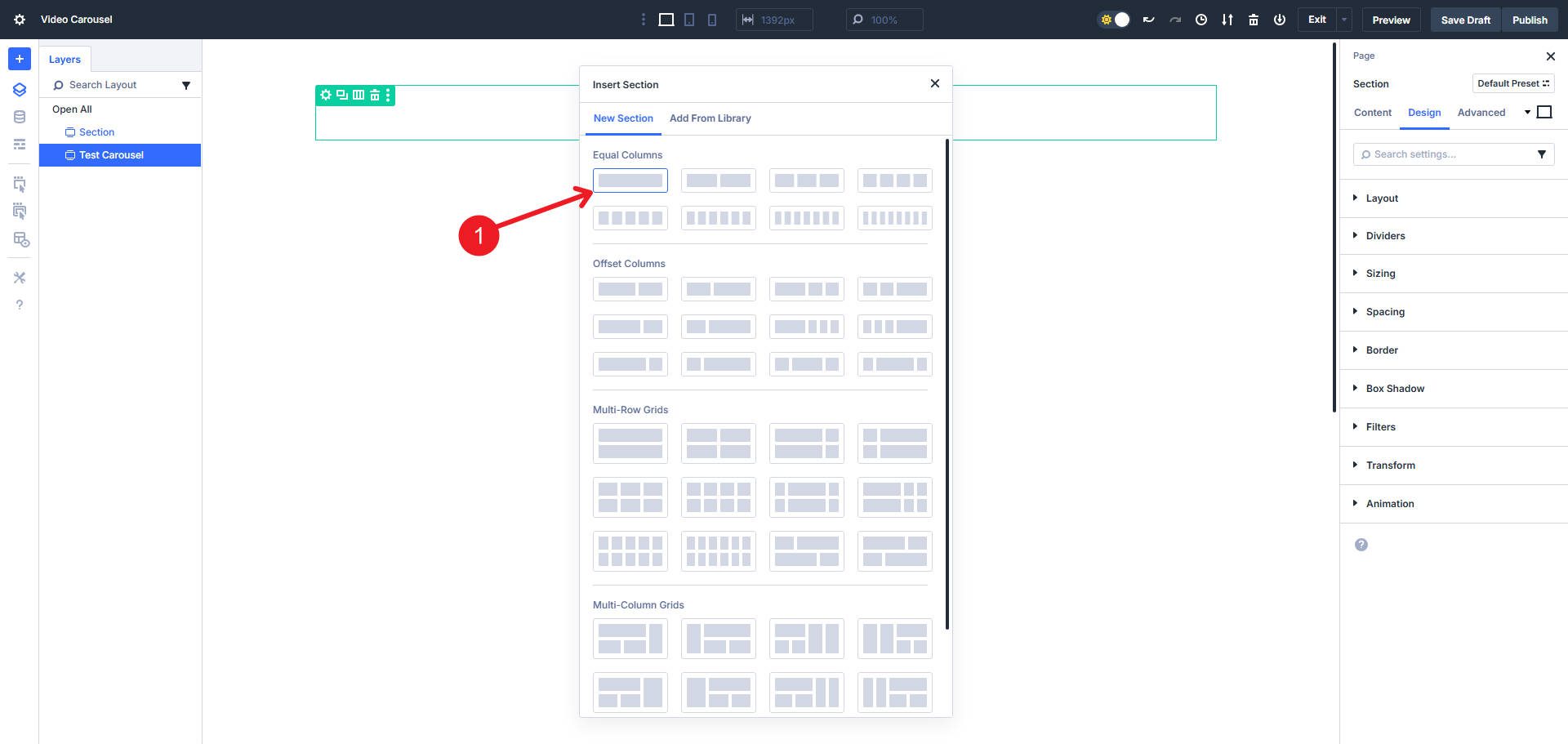
Add a regular section to the page. Choose a single row/column layout
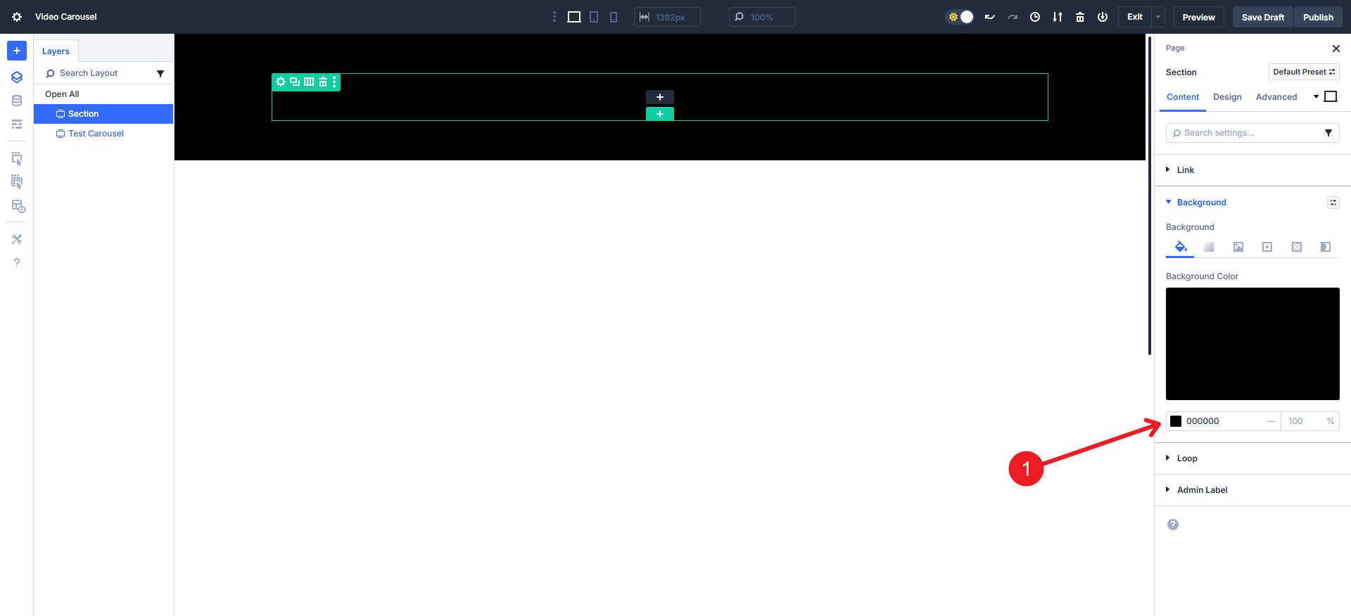
Then give it a black Background with #000000 or your Design Variable.
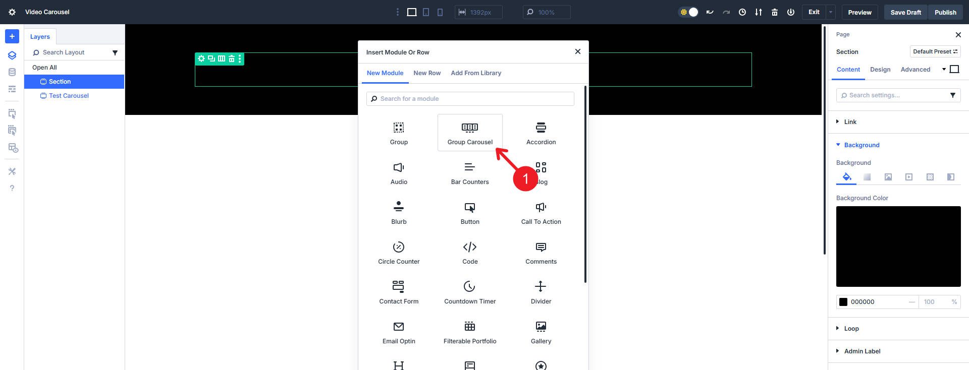
Insert the Carousel Module into the Row.
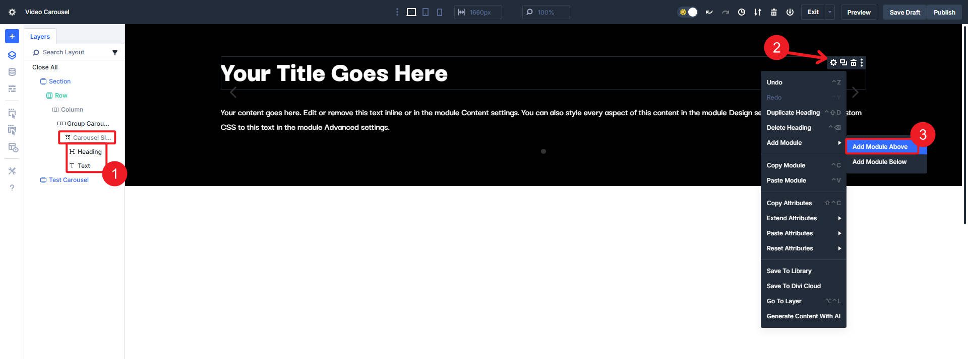
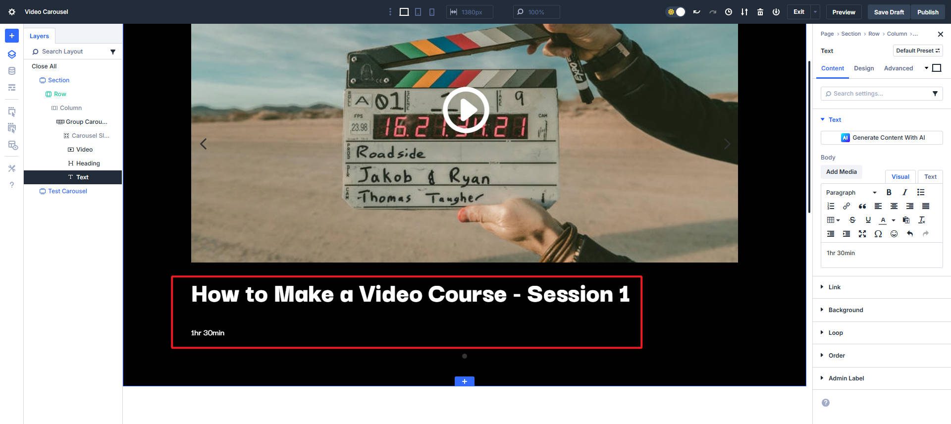
From here, you do not add “video slides” but rather build the video card/slide yourself. The Carousel Module comes with one Slide/Group inside it by default. We’ll use that to start, add a Video Module, a Heading Module, and a Text Module.
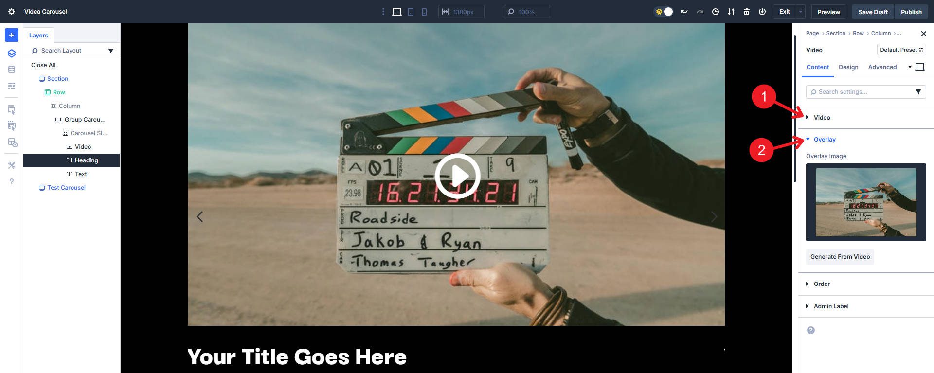
In the Video Module, paste the URL or choose your media file. Then set the overlay image to show visitors before they click the play button.
You can add placeholder content to each of the other modules at this point.
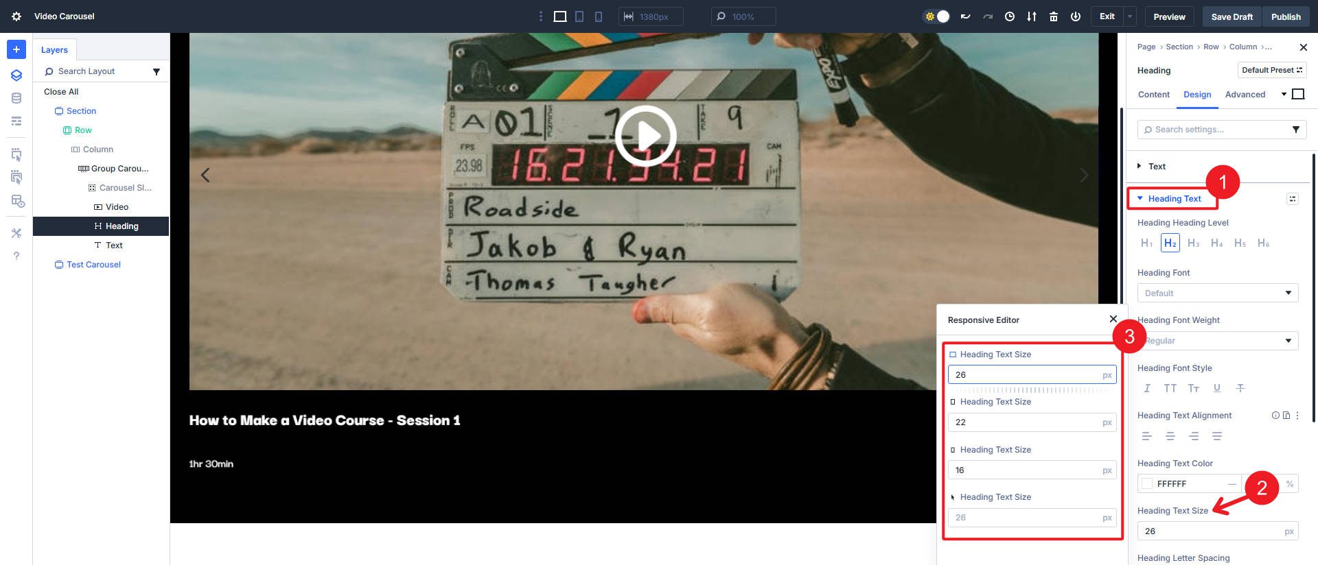
At this point, I will set my heading text sizes for three breakpoints. You can use clamp(), but here’s how to set multiple breakpoint sizes in one view.
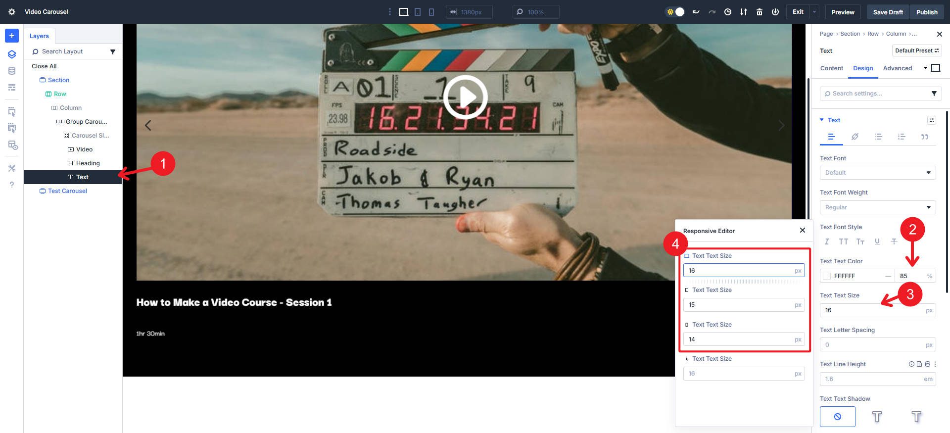
I will also change the text size in the Text Module and the text color to #ffffff and 85% transparency for a little intrigue.
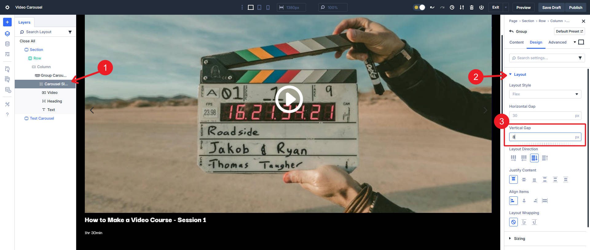
Set the Vertical Gap inside the group to 8px to tighten up the three modules. You can also use the responsive editor here.
At this point, we have the structure needed for a carousel with the content of one card situated.
Carousel Settings To Make It Come Together
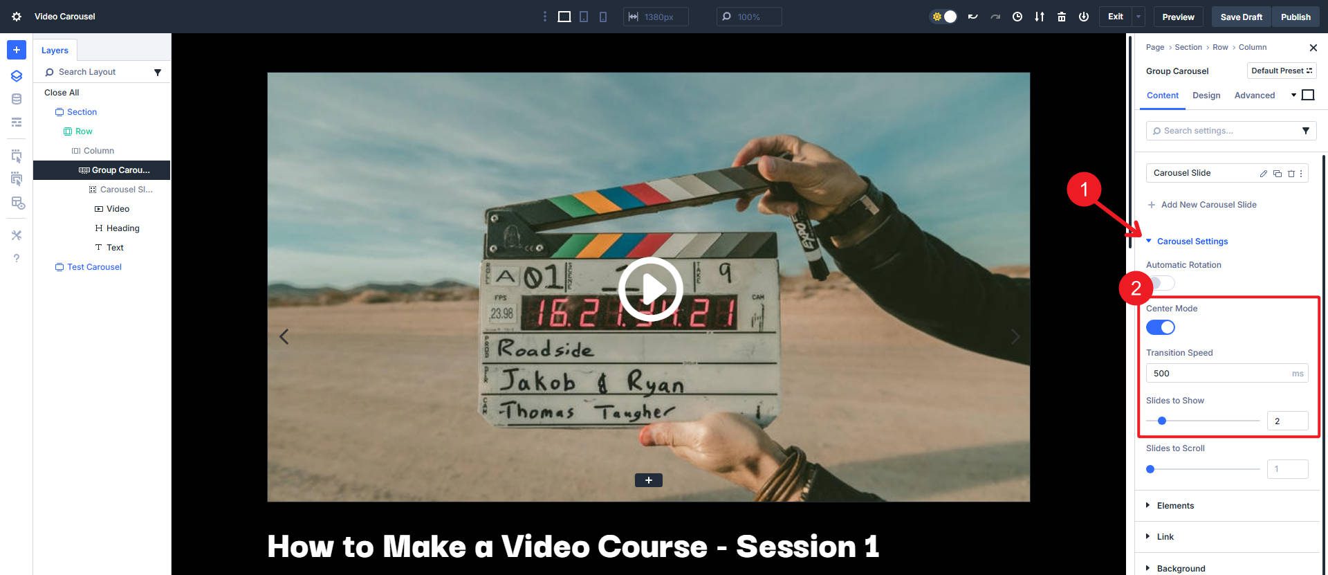
Open the Carousel settings. Set the number of Groups that show on Desktop, Tablet, and Phone. Two or three on desktop is common, and one on mobile is a safe bet. In this example, I use two “Slides to Show” on all breakpoints, so setting it at Desktop will cascade to all others.
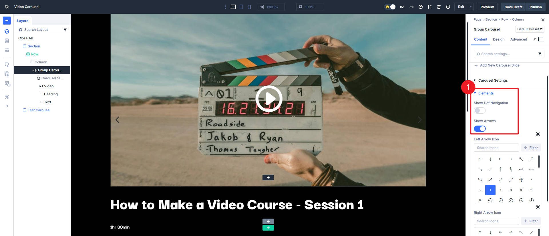
Turn on arrows for control and turn off pagination dots if you like. At least one of these options is good for helping users navigate between slides independently. They are especially important if you have the auto-play setting turned off. If autoplay is on, use “pause on hover” for better usability.
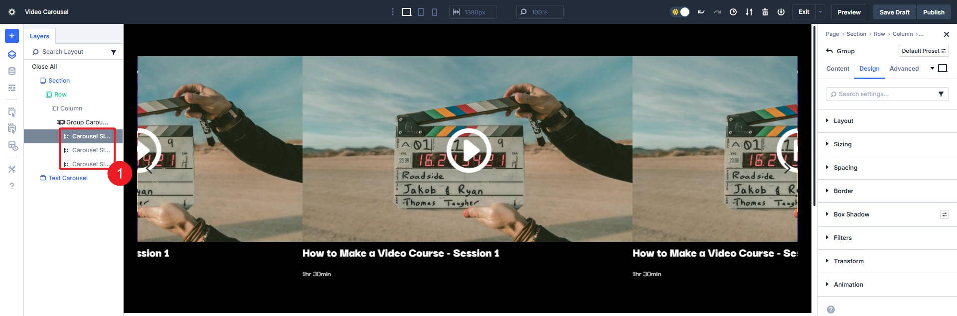
At this point, let’s duplicate our main Slide twice. This will show us how the Carousel Module currently handles multiple slides. Later, you can choose to delete these in favor of creating a loop on your first carousel slide.
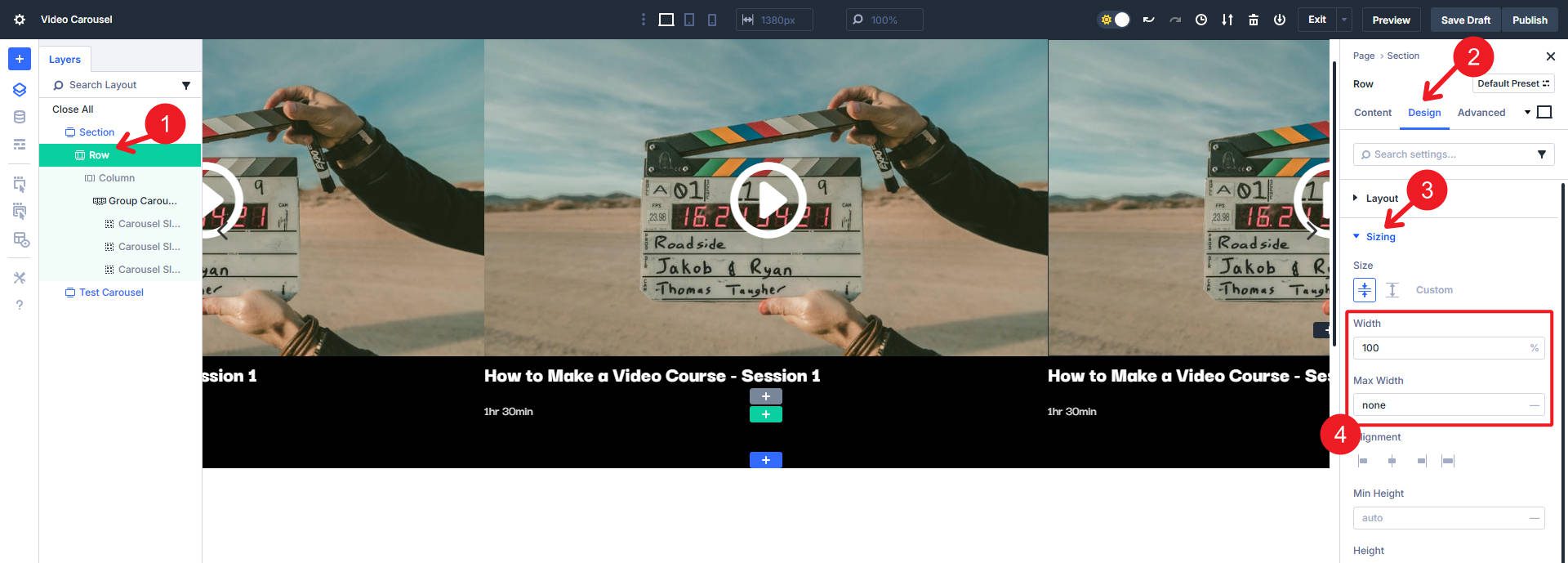
Now to give the carousel some room. Go to row settings and set the width to 100% with no max width.
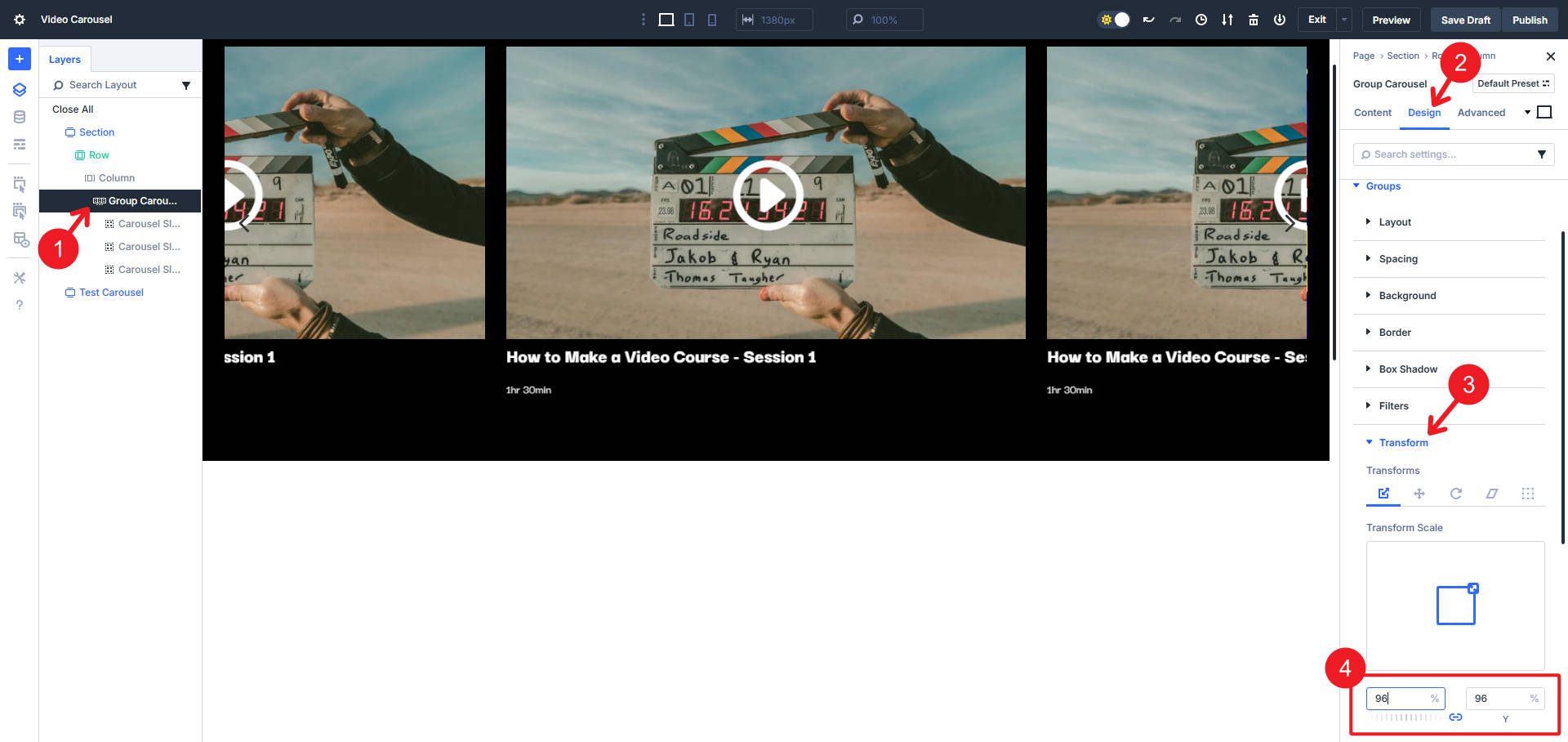
Inside the Carousel Module, set a transform on the Groups (not the active Group) and use a Transform Scale of 96% to create a little separation (you can also experiment with a margin here).
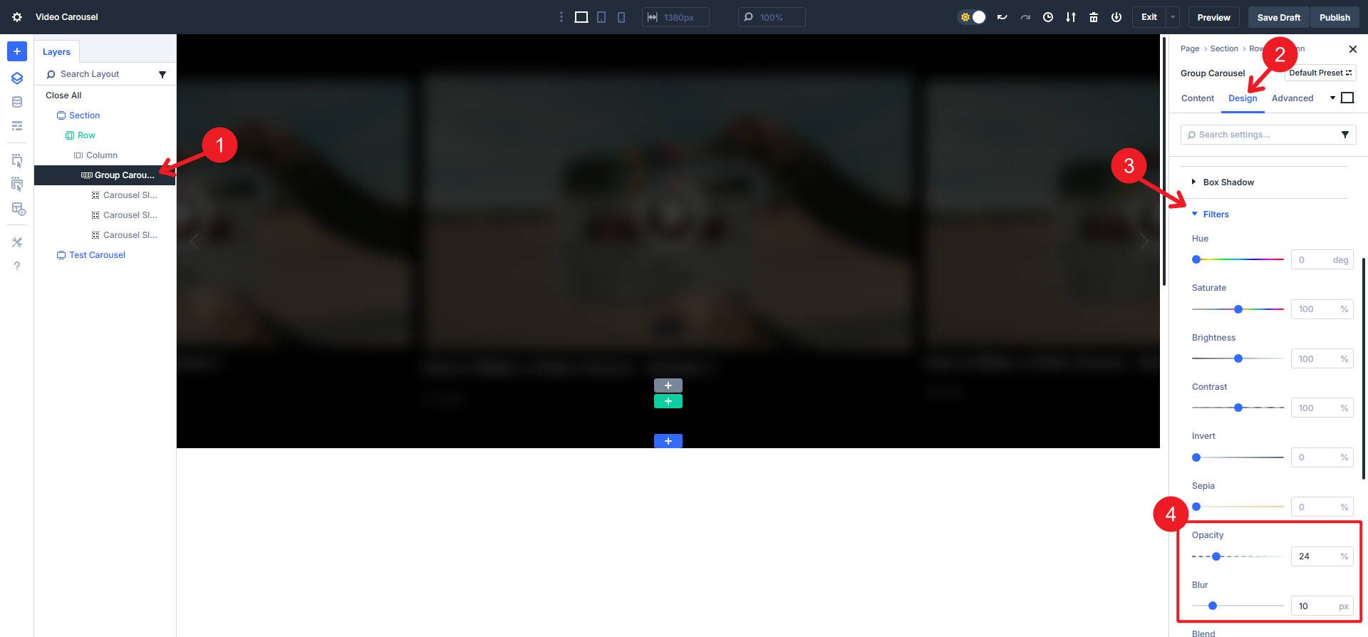
We will apply two filters in that same “Groups” tab. Set them to Opacity 24% and Blur 10px. Now you see it coming into shape!
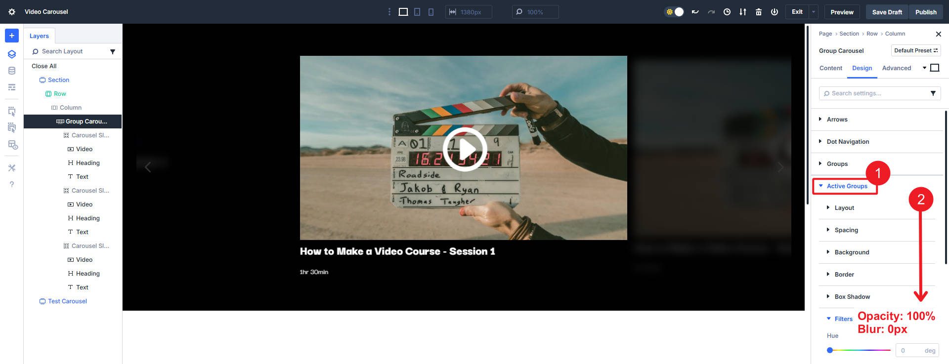
Now go to the “Active Group” tab and make certain that opacity is set to 100% and blur is 0px. This will make the Active Group (in the center) not blurred and fully visible.
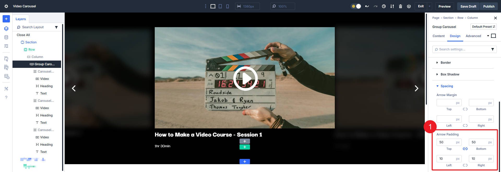
Now, we can tackle the navigation arrows. Set them to white and Arrow Position Inside.
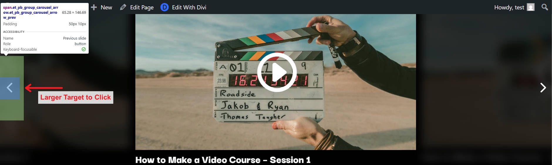
These arrows are rather small targets to tap or click on. We can expand the area around these navigation arrows so that if they are clicked, they won’t play a video but will navigate to other slides. We can set teh padding on all sides to make a larger target.
The Dev Tools show that this clickable target is now bigger and easier for users to use.
Now go to the Advanced tab, and under Visibility, set the Horizontal and Vertical Overflows to Hidden.
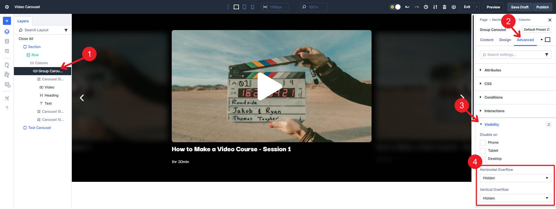
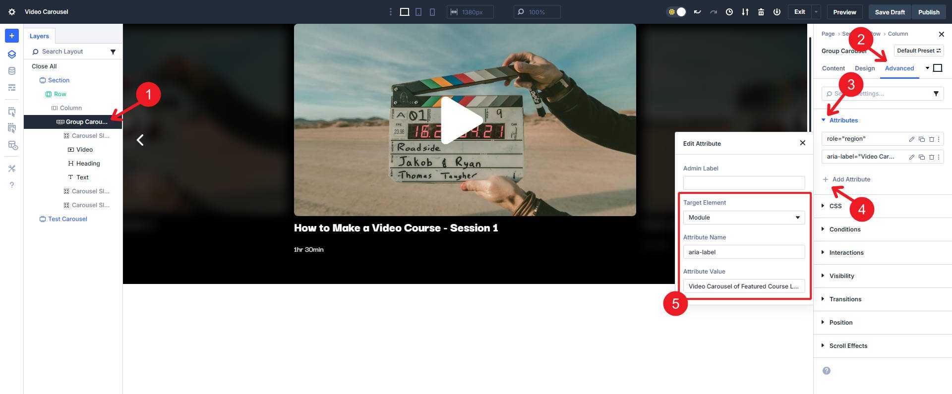
Now, we can focus on a couple of Accessibility improvements for our Carousel. Divi’s Carousel Module already adds role=”button”, tabindex=”0″, and an aria-label to our navigation arrows (one less thing for us to do!). Divi also adds the aria-hidden=”true” attribute on all inactive slides so screen readers can only see the active slide (which will change if they use either navigation setting). But we can add a couple of optional attributes to make the whole thing more apparent to those who use assistive technologies.
- Target Element: Module, Attribute Name: “role”, and Attribute Value: “region”
- Target Element: Module, Attribute Name: “aria-label”, and Attribute Value: “Video Carousel of Featured Course Lessons” or whatever makes sense for your video carousel
We can make changes to improve the appearance of the video cards. If you want, you can start by changing the default Play icon on your main Video Module. We’ll extend styles in a moment so you only need to work on your main video.
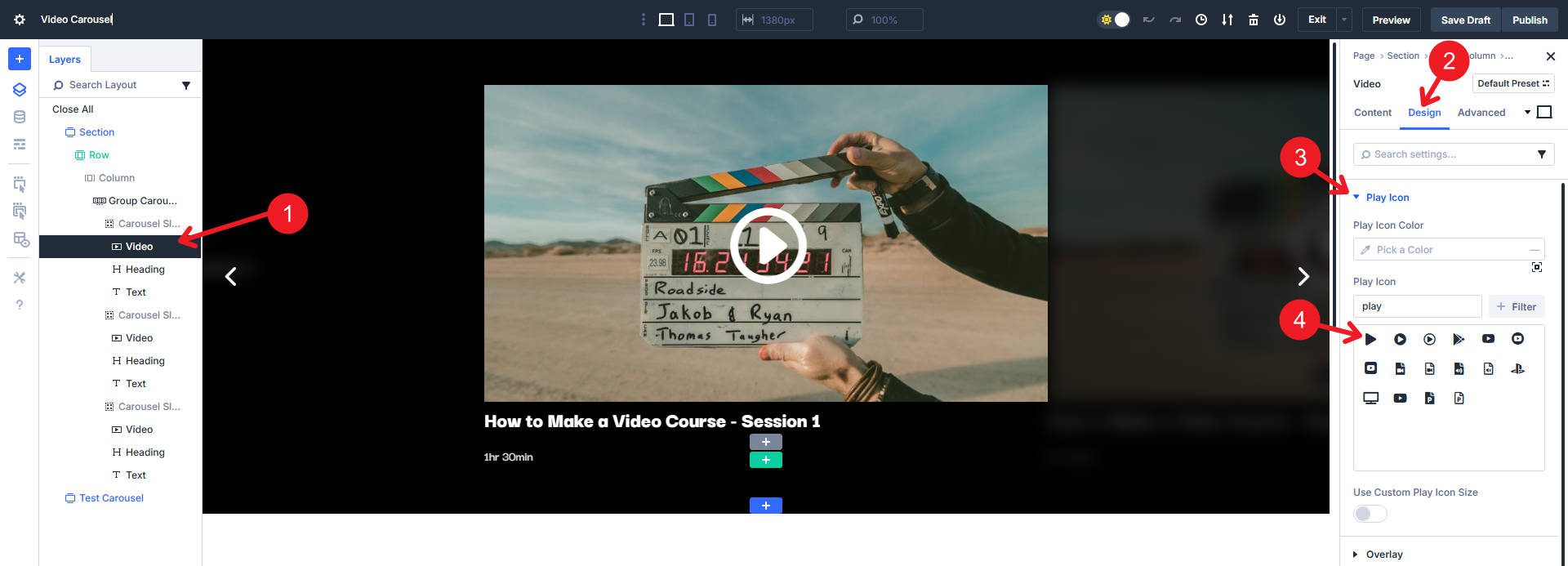
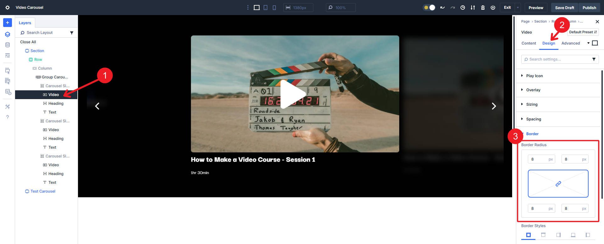
We can also add a subtle border radius if we like. Below, I added an 8px border radius on all corners.
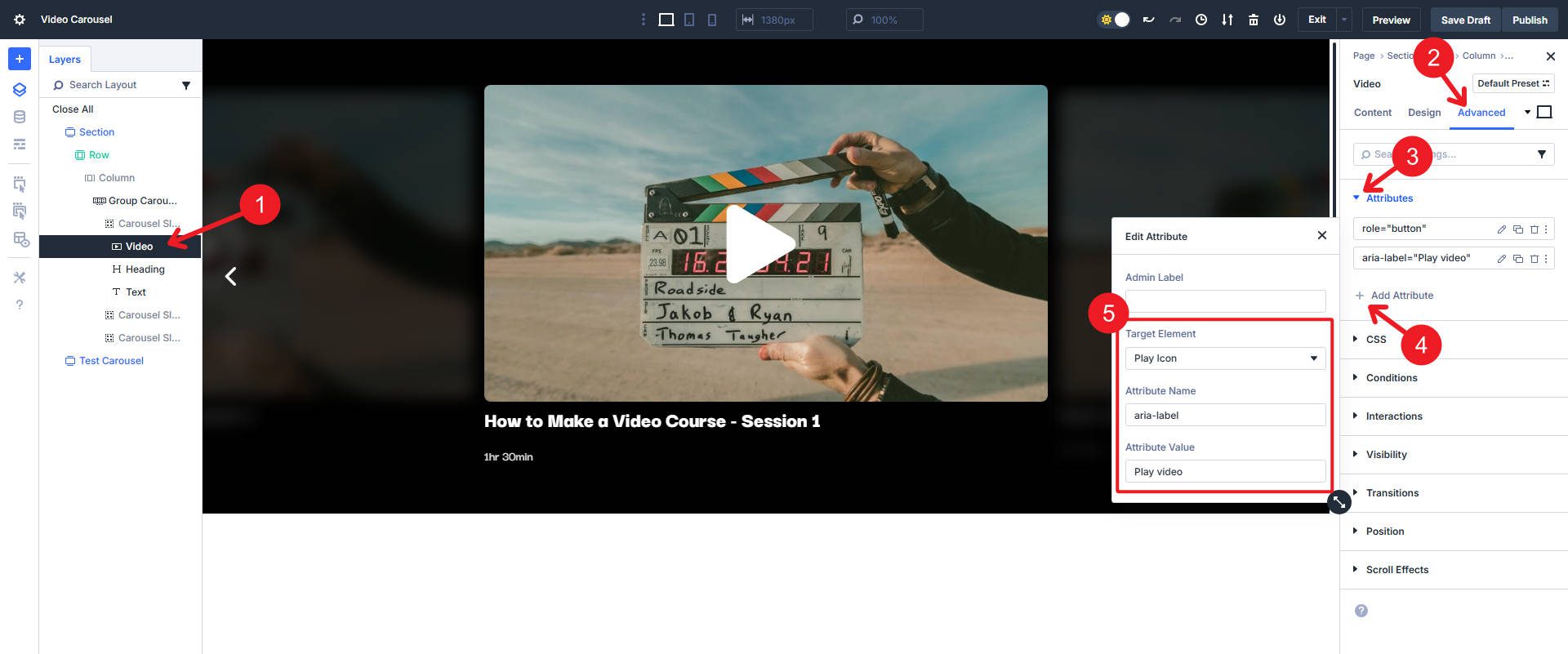
We can make the video module a bit more Accessible by adding two Custom Attributes.
- Target Element: Play Icon, Attribute Name: “role”, and Attribute Value: “button”
- Target Element: Play, Attribute Name: “aria-label”, and Attribute Value: “Play Video”
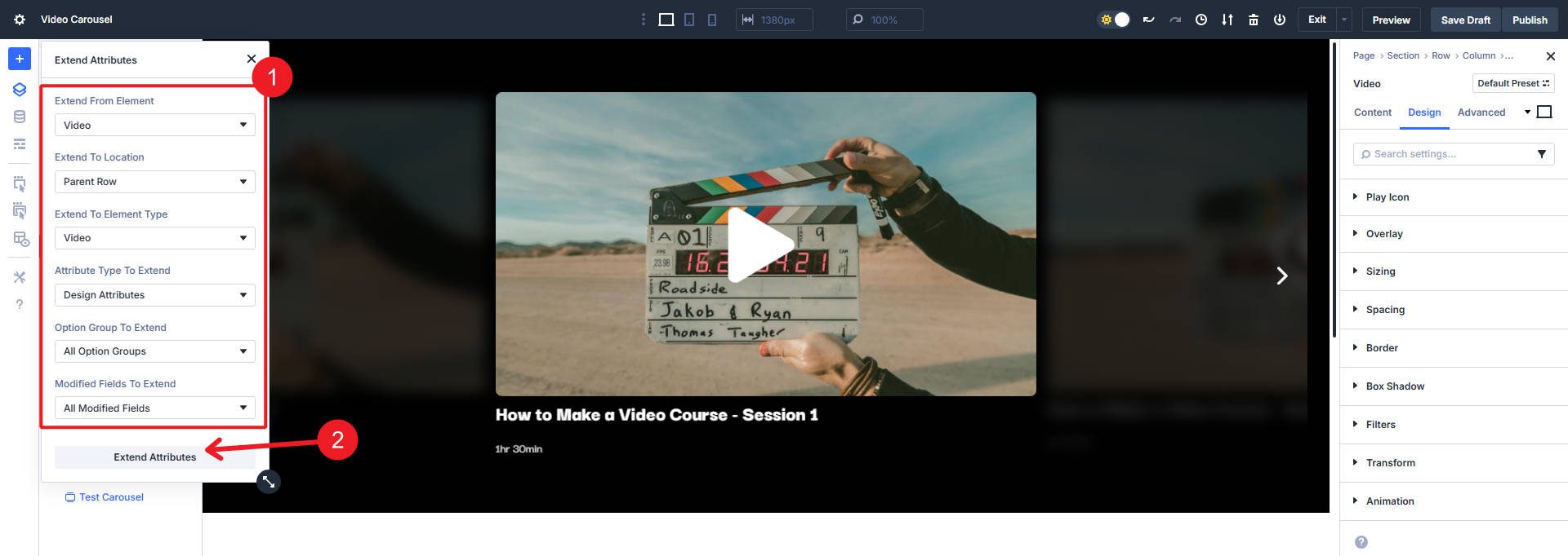
Now, since we’ve made some changes that we’d like to have on the other video modules (in other slides), we can Extend Attributes to clean things up in a jiff. Right-click the Video Module on the Layer view and select “Extend Video Design Attributes.”
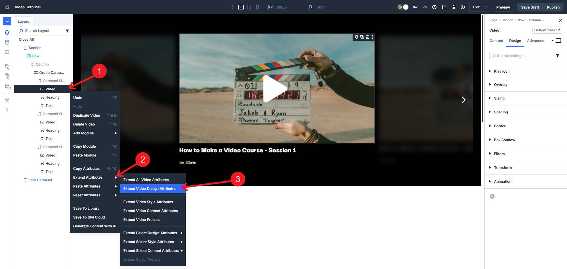
For this, I extend from our main Video Module to other Video Element types in the same Parent Row.
From here, you can duplicate your slide as many times as you have videos to show. Make sure to update the content on each slide and change the video.
You can download the video carousel in this post below. Once you upload the section layout to your Divi Library, you’ll be able to access it on any page you build.

Try Building Video Carousels In Divi 5 Today
Divi is getting better and better. It’s faster, has a better and more powerful UI, and includes new features and modules. The Carousel Module is just one of the many new things in Divi.
If you haven’t experienced the new Divi for yourself, try it on a new website build, a staging site for your current Divi website, or the Divi 5 demo site. Now is the perfect time to start using it and learning about all its new features.
If you want the bigger picture about the Carousel Module and its many uses, read our dedicated post on it. It also covers the new Lottie and Icon List modules.


Leave A Reply