
Divi 5 is our most exciting iteration yet. It includes modern CSS Grid and Flexbox layouts. It uses tokenized values via Design Variables. It also allows you to cascade related styles with Element and Option Group Presets.
The Divi 5 Design System, available exclusively during this Cyber Monday sale, provides a production-ready framework that demonstrates these capabilities through hundreds of presets, designed section layouts, and a structured variable system.
Building a page with the Design System allows you to assemble pre-built components that already incorporate Design Variables and Presets. This is like Wireframing with easy editing access to Design Variables and Presets, so you can make the system your own as you go along.
This post walks through building an About page using Design System components, then demonstrates how to customize the design through preset modifications and variable adjustments. If you are still struggling to use Divi 5 effectively, this system offers a hands-on approach to learning from best practices.
Installing The Design System Layouts
Before building pages, import the Design System files into your Divi installation. The system is a ZIP file containing multiple JSON files that integrate with Divi’s native import systems. Once you download them from the Member’s area under Perks, you can unzip them.
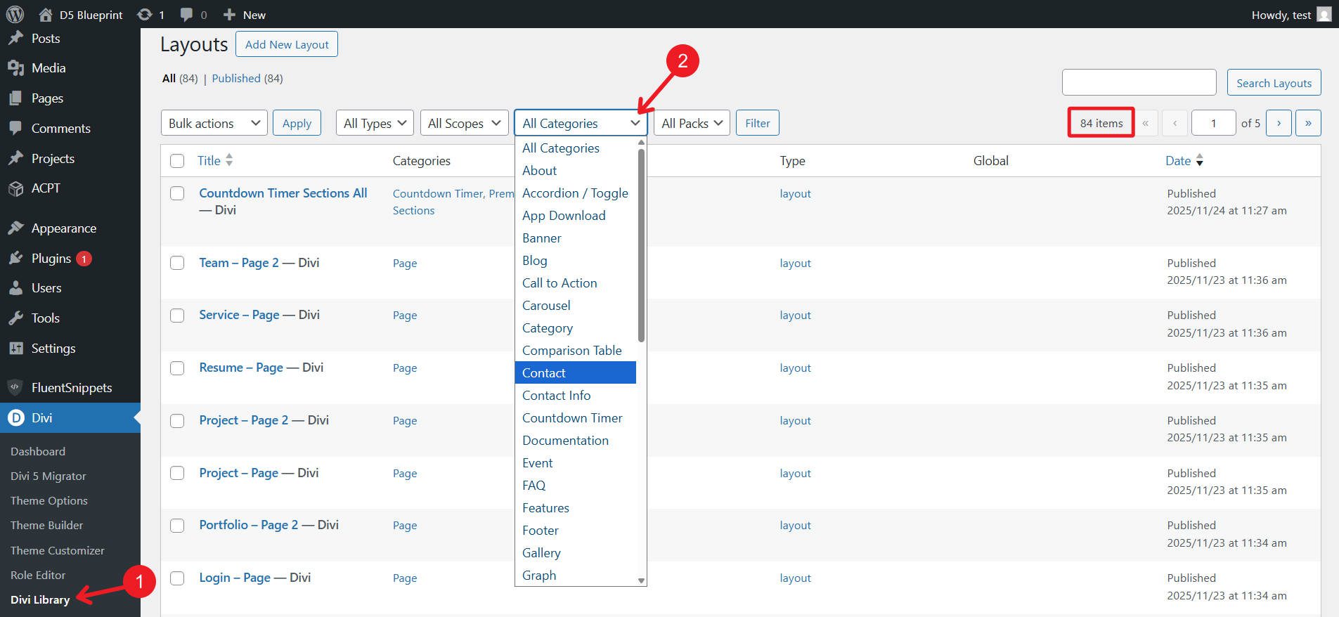
Navigate to Divi > Divi Library > Import & Export in your WordPress dashboard. Import these files in this order:
- Presets: Upload “Black-Friday-2025_Divi-5-Freebie_Presets.json” with the “Import Presets” checkbox enabled. These presets form the foundation for all layouts in the system.
- Section Layouts: Import either “Black-Friday-2025_Divi-5-Freebie_All-Sections_Layouts.json” for layout groups (all timeline sections are imported as a single page with various timeline sections, for instance), or import individual sections found in the “Individual Sections” folder (this takes longer). The grouped version imports 40 category-organized layouts, while the individual version imports 430 standalone sections.
- Page Layouts: Upload “Black-Friday-2025_Divi-5-Freebie_Pages.json” to add complete page templates that are built with section combinations.
These imports populate your Divi Library with categorized layouts that you can pop directly into the Visual Builder’s ‘Add Saved Layout’ interface.
Creating Your About Page Foundation
There are two approaches you can take with the design system. First, you can import one of our full-page builds. For an about us page, you can choose the Page Layout “About” or “About 2.” Alternatively, you can build a page by bringing in individual section layouts and mixing and matching them yourself (this is easiest if you import the sections individually, rather than in the grouped format).
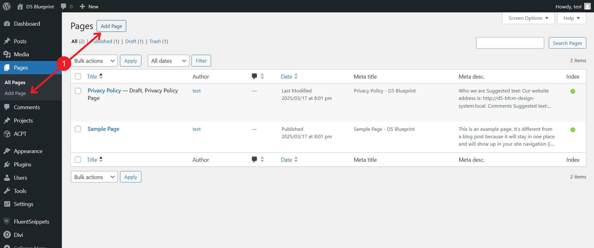
Create A New Page
Create a new page in WordPress and launch the Visual Builder.
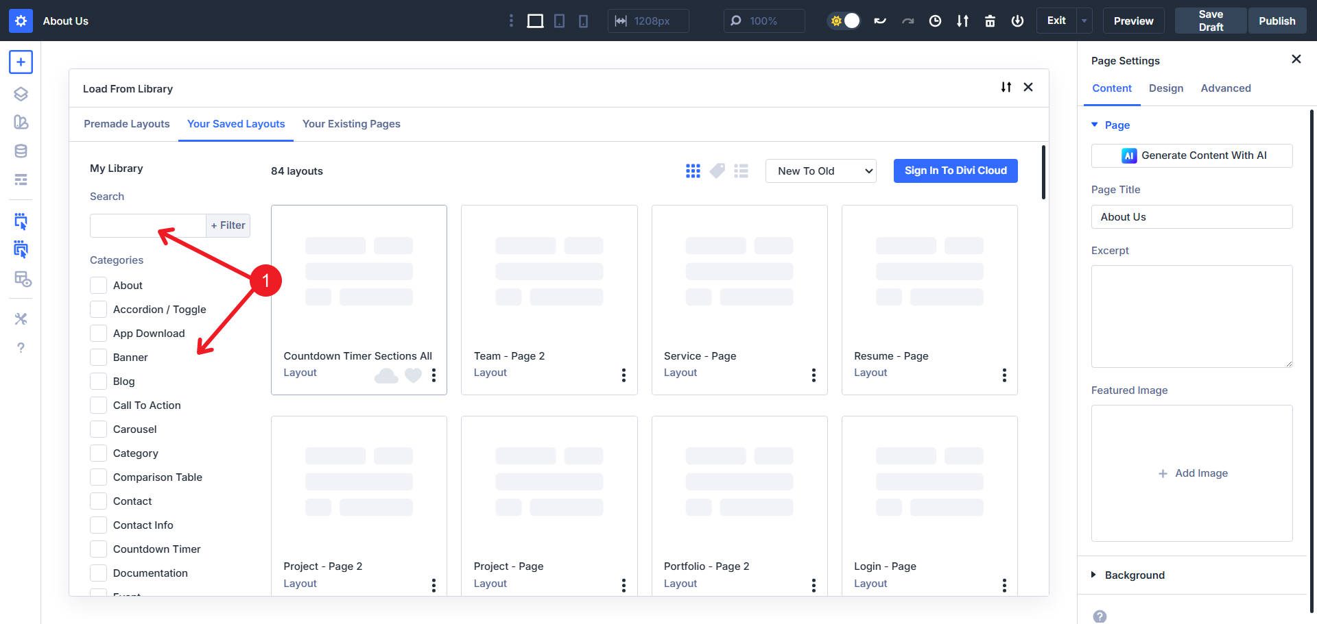
Click the + icon in the persistent left sidebar to access the Insert Layout dialog. Select Saved Layout to open the Load From Library panel.
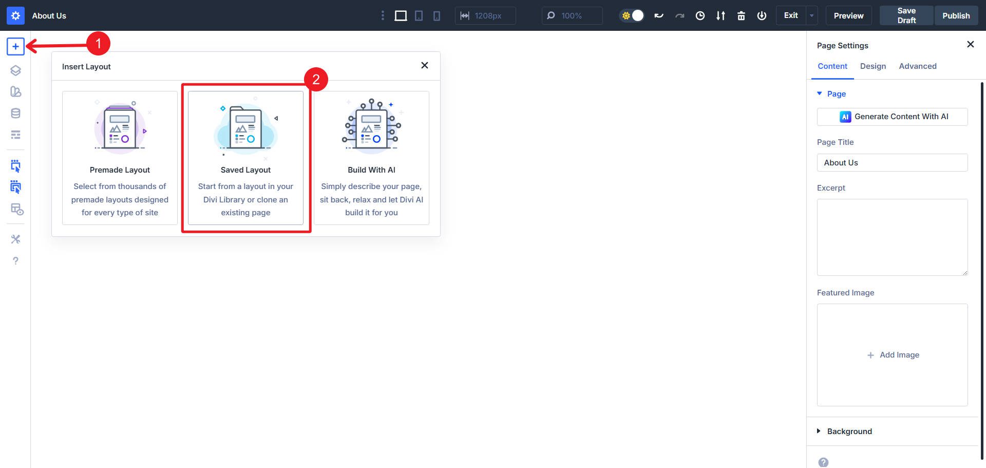
The “Your Saved Layouts” tab displays all imported Design System sections, organized by category.
For an About page, relevant categories include:
- Hero (for opening sections)
- Text & Image (for company story content)
- Team (for staff introductions)
- CTA (for conversion actions)
We imported the sections as pages, so when we load a Hero Section from the library, we are actually loading all the Hero sections. This is convenient because it allows you to scroll through them, select the one you want, and delete the others.
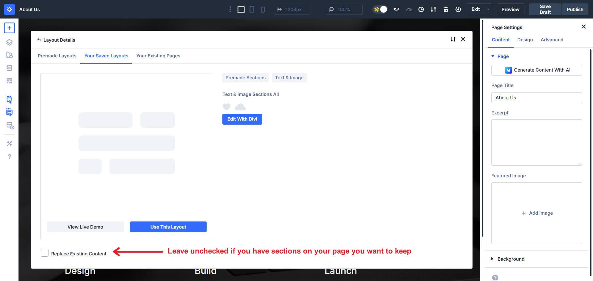
Now load the other sections that you want to use on your About Us page. Don’t Replace Existing Content when loading subsequent layouts onto your page. Otherwise, you will remove previously added sections.
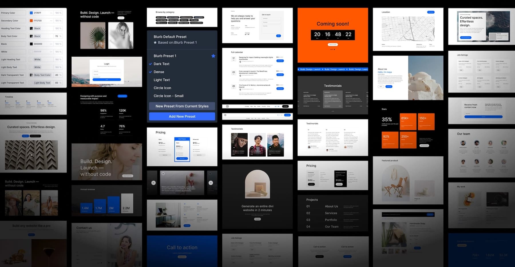
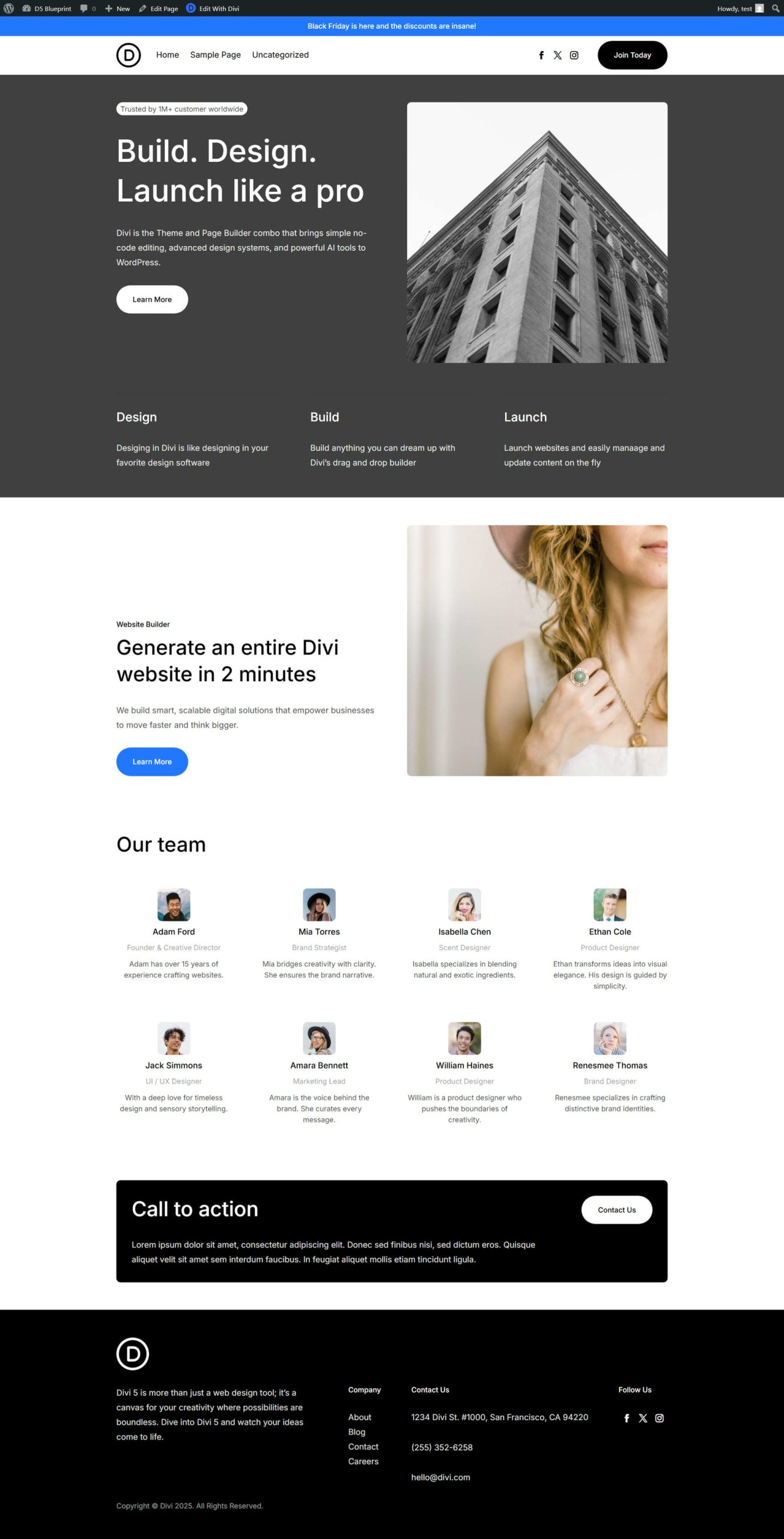
Once complete, you’ll have a wireframe of your page and be ready to begin making adjustments. Here’s how ours turned out from simply importing layouts from the Design System.
Update Content (Optional)
If you build websites from a ‘content-first’ approach, it would be beneficial to revise the text of headings and body paragraphs, as well as incorporate real images into the layout. Click any module on the page to open its settings in the right sidebar contextual panel.
- Text Updates: Click the headlines or paragraphs to access the Content tab. Replace placeholder text with your content while preserving the existing formatting and preset applications.
- Image Replacements: Click image modules to open their settings. In the Content tab, upload your images or select from the media library. The Design System applies Option Group Presets to images for consistent border-radius, box-shadow, and spacing values.
- Button Modifications: Click button modules to update link destinations and button text.
Now comes the real power of starting off with a Design System like this.
Preparing To Customize The Design System
Before making changes to the Design System, it is beneficial to know the direction you are taking. Gather your brand assets and establish basic design choices that you will use as you modify the system to your needs. This preparation prevents spinning your wheels.
- Brand Colors: Establish a primary brand color, a secondary color, and a neutral palette, if applicable. If possible, note which colors serve which purposes (CTAs, backgrounds, accents).
- Typography Selections: Choose your heading font and body font.
- Spacing Scale: Decide whether you’ll use fixed spacing values or fluid spacing. Divi 5 supports advanced CSS units, including clamp() for responsive spacing that automatically adjusts between minimum and maximum values across viewport sizes. Use a typography generator to nail those down.
This preparation enables you to make confident, systematic changes rather than continually tinker. If you don’t have these, of course, you can still experiment as you go along.
Understanding Design Variables In The Design System
Design Variables provide the deepest customization layer, allowing site-wide design updates through single-value changes. These Design Variables are used throughout the site in numerous Presets. So this is the first place you want to start editing.
Click the Design Variable Manager icon in the persistent left sidebar. The manager displays variables organized by type: Colors, Typography, Spacing, and others.
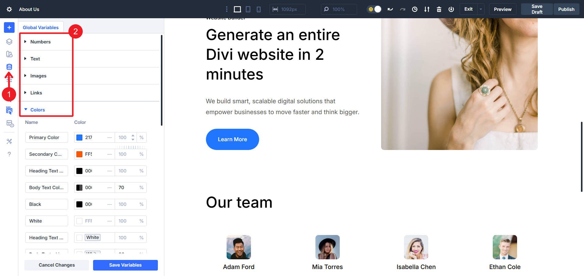
Colors
Expand the Colors section to view all color variables. The Design System includes:
- Primary and secondary brand colors
- Text color variables
- Situational colors (borders, backgrounds, drop shadows)
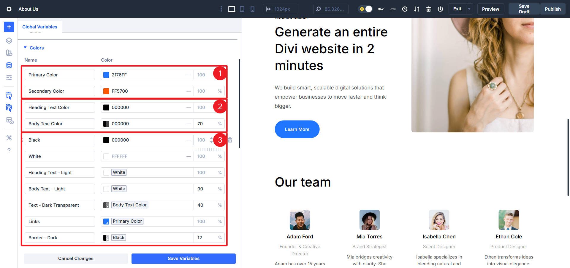
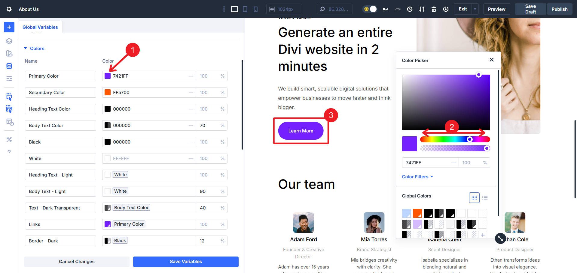
Click any color variable to open the color picker. Modify the color value and observe real-time updates across all presets and modules referencing that variable. For example, changing the “Primary Color” updates all primary buttons, links, accent elements, and decorative components that use that color variable.
Beyond Primary/Secondary and Heading/Body text color, you may have to use the Inspector to see exactly which variables different modules are using. The Inspector is a point-and-click tool that shows all the edited styles (including those that use Design Variables and those that are applied via Presets).
Using it makes it very quick to find Design Variables that are used on the page and module you are working on. Once you know which ones contribute to a design, you can then go to the Design Variable Manager and make your edits there.
Typography
Expand the Typography section to access font family and font size variables. Modify the heading font variable to update all headlines across your page simultaneously.
Thanks to Divi’s Global Font system, your entire site will be updated with your new font choices instantly.
Numbers & Sizes
The Spacing section contains variables controlling padding, margin, and gap values. Modify these variables to ensure consistent spacing across all layouts. The Design System uses spacing scales (e.g., “Spacing – Small”, “Spacing – Medium”, “Spacing – Large”) that maintain proportional relationships when adjusted. It also has various situational numbers added (for border radius, button padding, line height, and others).
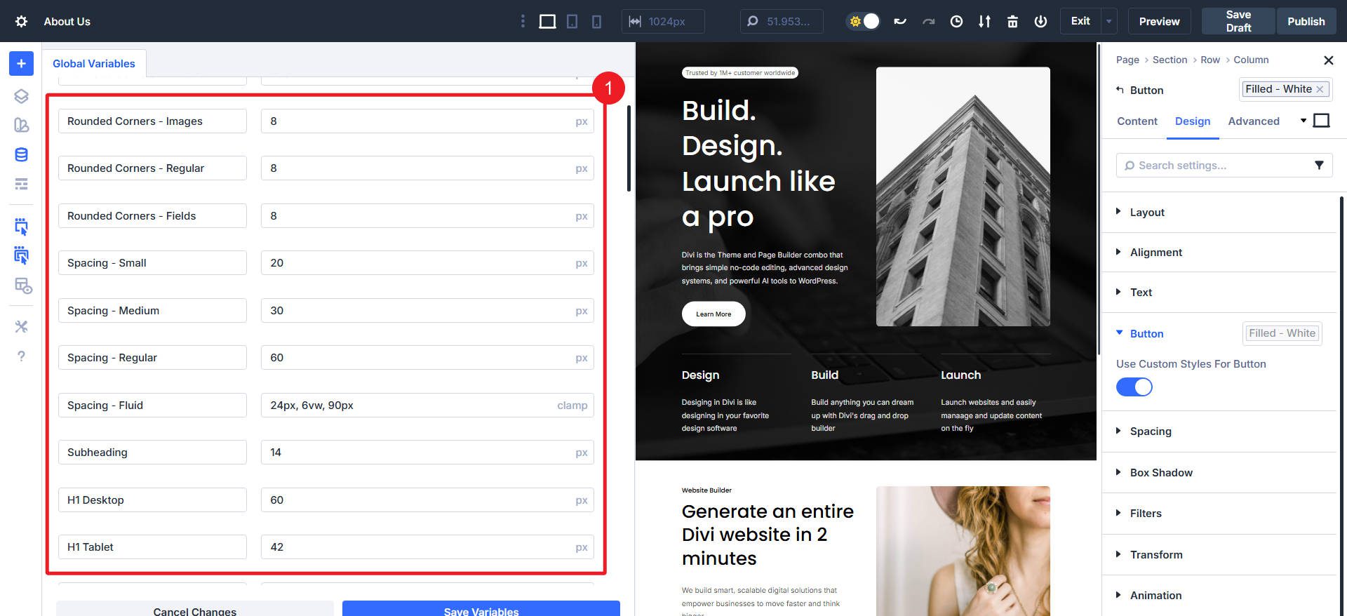
It also uses px values for all heading levels and body text sizes for three breakpoints (mobile, tablet, desktop). If you wanted to simplify this, you can edit the first instance of these to use clamp() functions and rely less on the Breakpoint system for typography.
How Presets Work In The Design System
The Design System’s preset architecture operates at two levels: Element Presets and Option Group Presets. Understanding where these appear in the interface prepares you for systematic customization.
Element Presets: Click any module and locate the preset chip at the top of the settings panel. This chip displays the current Element Preset name (e.g., “Primary Button” or “Heading – Large”). Element Presets contain complete module configurations, including some content settings, design properties, and advanced options.
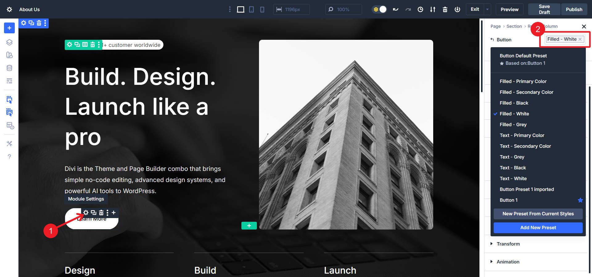
Element Presets are found in the top-right corner, and there may be multiple defined by the Design System
Option Group Presets: If it uses OG Presets, you will see the Preset chip on the right-hand side, next to an Option Group label. Some Modules may have Element and OG Presets (or Element Presets built with Nested Option Group Presets).
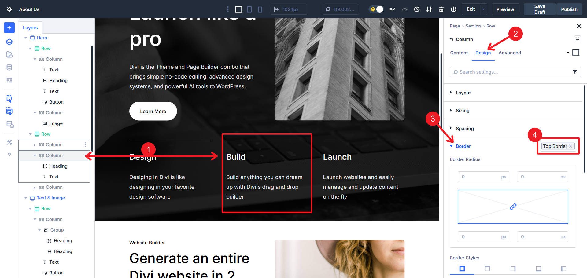
This column has a border applied via an Option Group Preset. This OG Preset is usable on any module or container!
Stacked Presets: Some modules apply multiple Option Group Presets to different option groups simultaneously. A hero section might stack “Background – Dark”, “Spacing – Hero”, and “Text – Light” presets to create a complete aesthetic from component parts.
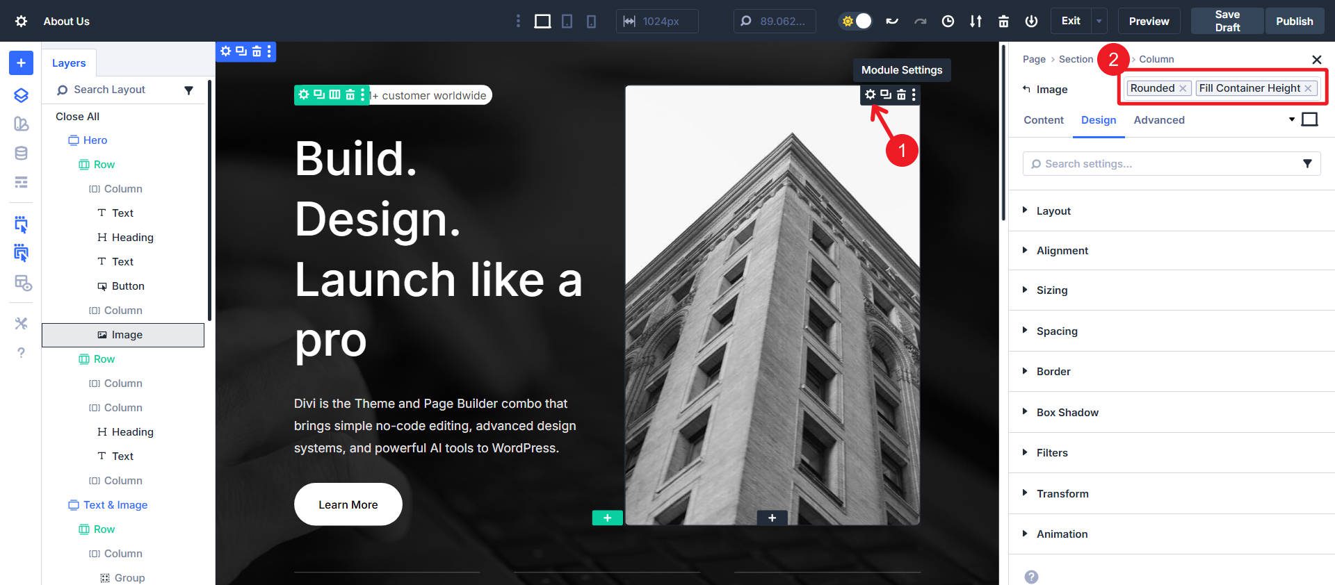
This Image uses Stacked Presets, one to add rounded corners and one to add a certain height
Get The Divi 5 Design System Before It’s Gone!
The Divi 5 Design System is available exclusively during the Cyber Monday sale. Any qualifying purchase made during the promotional period provides access to this framework.
- 🎉 Get Divi Pro for 80% Off — The ultimate Divi bundle! Includes access to Divi 5, Divi AI, Divi Cloud, Divi VIP, Divi Teams, Divi Dash, the full suite of DonDivi plugins, and a $50 Divi Marketplace credit. Lifetime and yearly options available — all future Divi 5 updates included.
- 🎉 Repackage Your Membership for Up to 80% Off — Existing members can repackage their existing subscriptions into a Divi Pro bundle to reduce subscription costs and unlock more features. Unlock Divi AI, Cloud, Teams, VIP Support, DonDivi, and a free $50 marketplace credit while reducing your existing subscription cost by up to 80%.
- 🎉 Get Divi AI for 70% Off — Divi AI designs, writes, and codes directly in Divi. Generate layouts, content, and images instantly.
- 🎉 Get Divi Cloud for 44% Off — Save and reuse your layouts anywhere. Cloud-sync your entire Divi Library for faster client delivery.
- 🎉 Get Divi Teams for 44% Off — Collaborate easily with shared access, roles, and permissions — perfect for agencies.
- 🎉 Get Divi VIP for 44% Off — Enjoy 24/7 priority support with 30-minute response times and 10% off all Marketplace products.
- 🎉 Save 70% on Cyber Monday Marketplace Bundles — Get curated collections of Divi modules, child themes, marketing tools, ecommerce features, and blog upgrades in five Cyber Monday-only Divi 5-ready bundles to level up your workflow.
After completing a qualifying purchase, download the Design System through the Perks section in your Elegant Themes Members’ Area.
The Design System represents months of development work, establishing patterns for Divi 5’s complete feature set. Access is available for purchase during this limited promotional window; after Cyber Monday, the Design System will no longer be available.


Leave A Reply