
Sticky sidebars for your product pages can be useful for boosting both user experience and revenue. It is a great way to keep essential product info, that important Add to Cart button, and/or other promotional offers in view as the user scrolls through the product page.
In this tutorial, we are going to show you how to build a custom sidebar with sticky columns for your Divi product page template. With this unique layout, you can float a column of content in the sidebar area at any (or every) section of the page. This allows you to target the user with new information in the sidebar based on which section the user is viewing at the time. Pretty cool stuff!
Let’s get started!
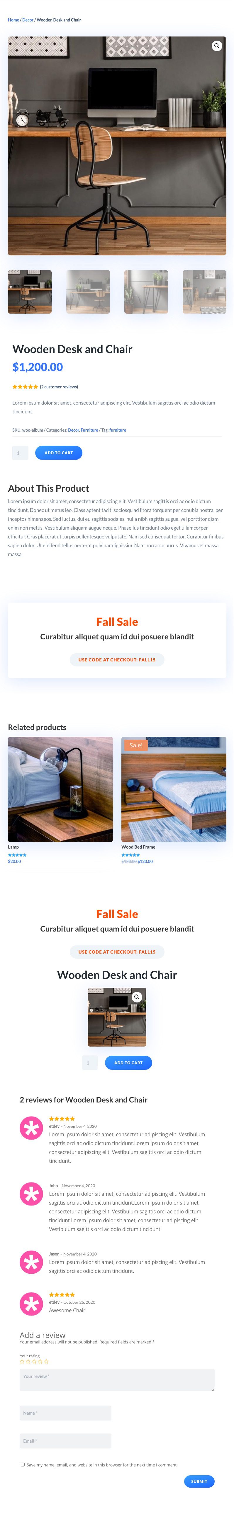
Sneak Peek
Here is a quick look at the design we’ll build in this tutorial.
Download the Layout for FREE
To lay your hands on the designs from this tutorial, you will first need to download it using the button below. To gain access to the download you will need to subscribe to our newsletter by using the form below. As a new subscriber, you will receive even more Divi goodness and a free Divi Layout pack every Monday! If you’re already on the list, simply enter your email address below and click download. You will not be “resubscribed” or receive extra emails.

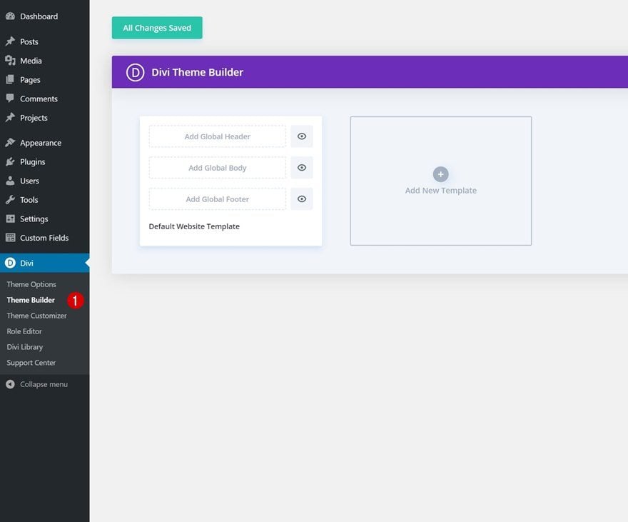
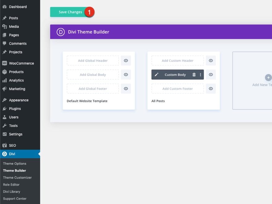
How to Upload The Template
Go to Divi Theme Builder
To upload the template, navigate to the Divi Theme Builder in the backend of your WordPress website.
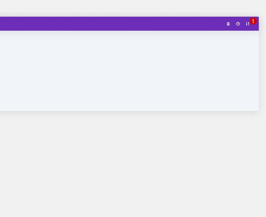
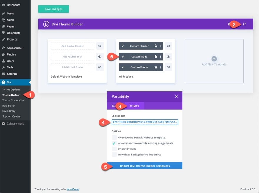
Upload Website Template
Then, in the top right corner, you’ll see an icon with two arrows. Click on the icon.
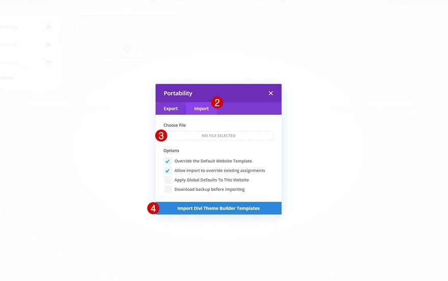
Navigate to the import tab, upload the JSON file which you were able to download in this post, and click on ‘Import Divi Theme Builder Templates‘.
Save Divi Theme Builder Changes
Once you’ve uploaded the file, you’ll notice a new template with a new body area that has been assigned to All Posts. Save the Divi Theme Builder changes as soon as you want the template to be activated.
Let’s get to the tutorial so we can learn to build this thing from scratch, shall we?
Uploading the Theme Builder Pack 2 Product Page Template
To get started, we are going to get a jumpstart on the design by adding one of our premade product page templates. To import the template the Theme Builder, you will need to do the following:
- Navigate to the Divi Theme Builder
- Click the portability icon at the top right of the page.
- Select the Import tab in the Portability popup.
- Download and Import the Divi Divi Theme Builder 2 Product Template File. Once you download the pack here, unzip the file and you will find the “divi-theme-builder-pack-5-product-page-template.json” file you will need to import.
- Click the Import Button
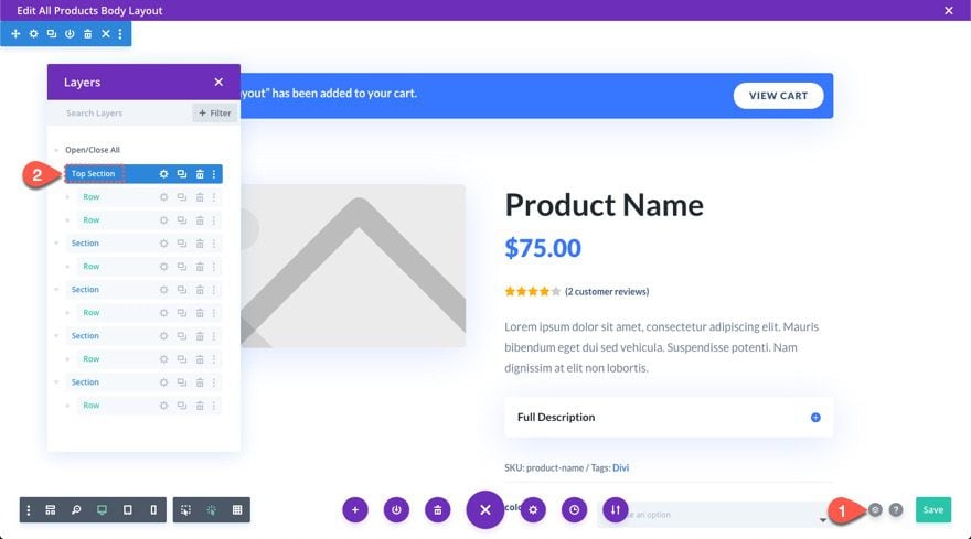
- Once the template has been imported, click the edit icon on the template’s custom body area to edit the template layout.
Modifying the Template Layout
The premade layout we are using doesn’t include space for a sidebar. So, we will need to make some adjustments to the rows to include space for our sticky sidebar columns. This layout will include two sticky columns, each with a sticky limit set to the section it is in. We will be limiting the layout to include only three sections. This will give us more space for our sidebar sticky columns to float while the user scrolls through the page. The first sticky sidebar will float inside the top section and the second sticky column will float inside the bottom section. The middle section will simply include a CTA.
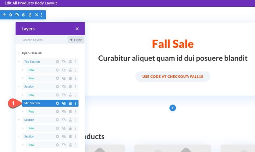
Labeling the Sections we Will Use
To start, open the layers view modal and update the label of the top section. Just name it “Top Section”.
Then add the label “Mid Section” to the third section on the layout.
Lastly, add the label “Bottom Section” to the fourth section of the current layout.
Moving Content/Rows into the Sections
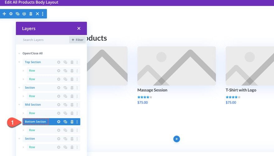
Now that we have our sections labeled, we need to make sure we move the rows of content we need into those three sections we are going to keep.
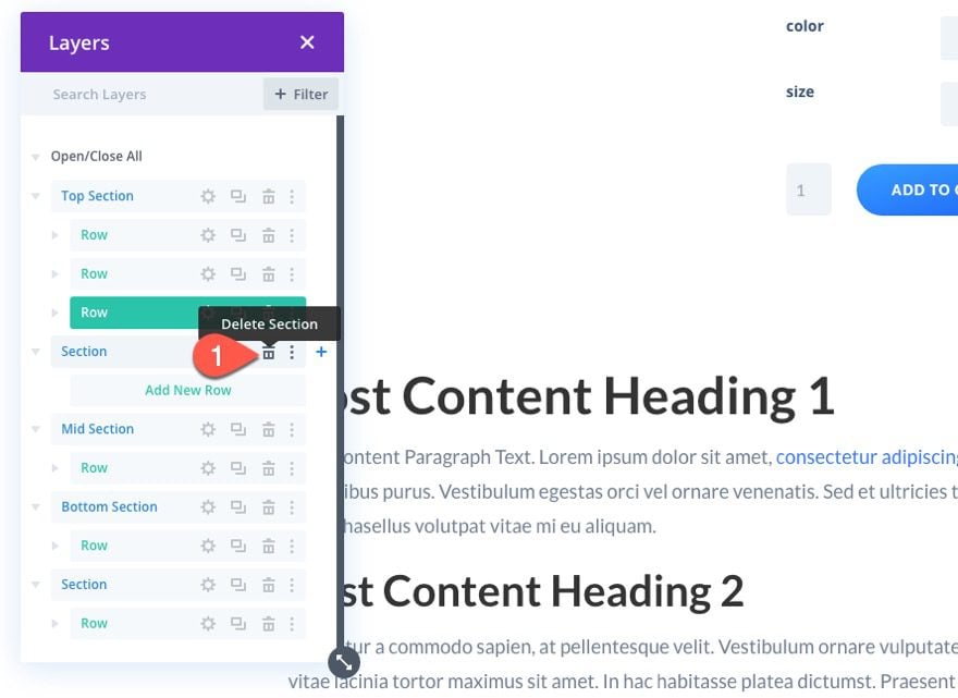
To start, use the layers view to drag the row in the second section into the bottom of the “Top Section”.
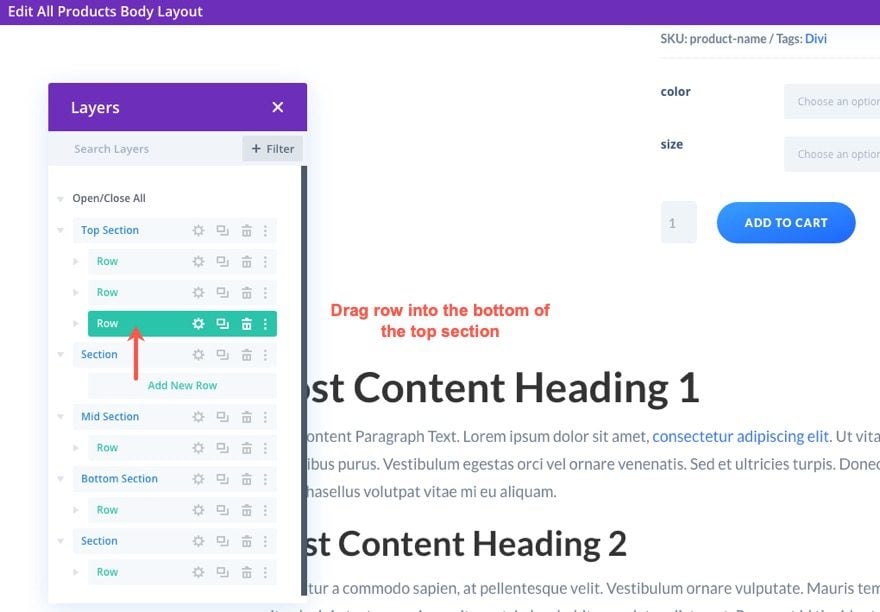
Then delete the empty section.
Next, drag the row of the fourth section into the bottom of the “Bottom Section”.
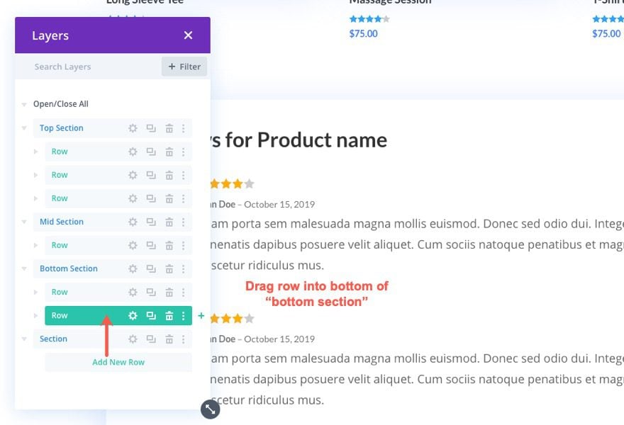
Then delete that empty section.
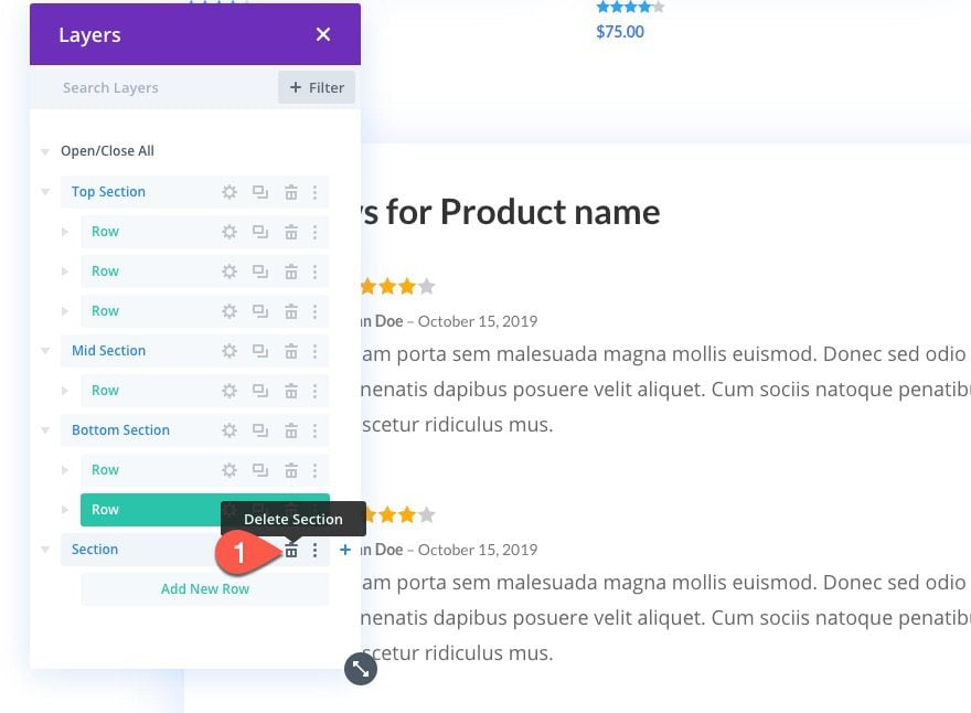
Now you should have only three sections (“Top Section”, “Mid Section”, and “Bottom Section”), each filled with rows of content.
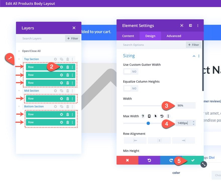
Updating the Size of the Rows
Since we are adding a sidebar area with this layout, we need to widen the rows a bit.
In the layers modal, multi-select all of the rows in the entire layout.
Then click the edit icon on one of them to bring up the element settings that will style all of them at the same time.
Under the design tab, update the following:
- Width: 90%
- Max Width: 1400px
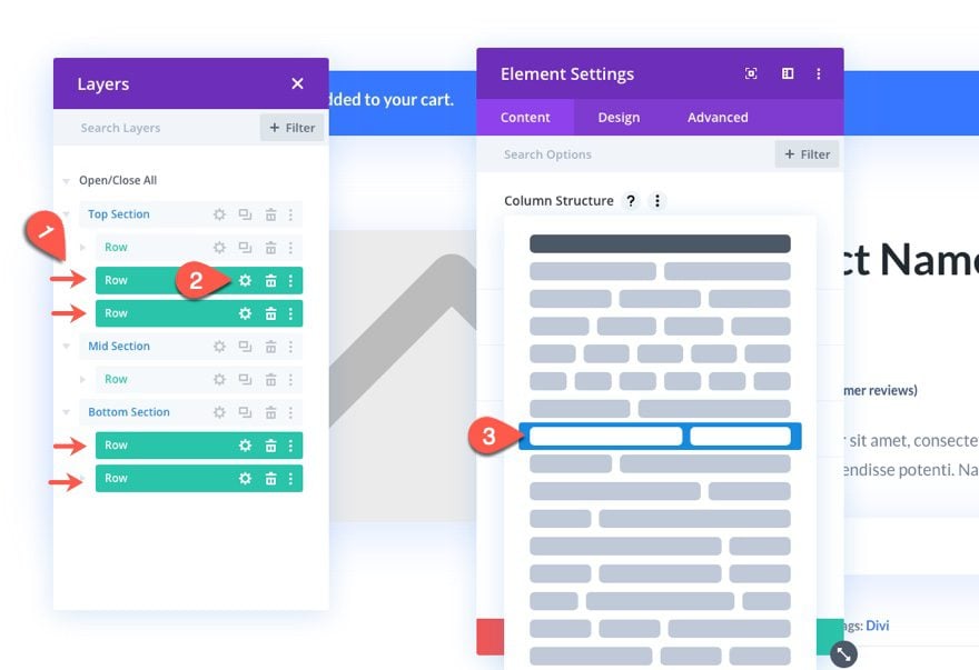
Updating the Column Structure of the Rows
Traditionally, a sidebar is built inside a single column on the right side of a section. However, for this design, we are going to can create multiple two-column rows within a section with the right column of each row dedicated to the sticky column area. Then we can fill the content of the right column of the top row of the section and make that one column sticky. Then it will float over the empty right columns of the rows below it before stopping at the end of the section when the user scrolls down the page.
To create the column structures of the rows, multi-select the bottom two rows in the top section and the two rows in the bottom section.
Then open the element settings and choose the three-fifths two-fifths column structure.
Two More Layout Adjustments
Now that our rows are set with the right column structure, let’s make a few more changes to the layout.
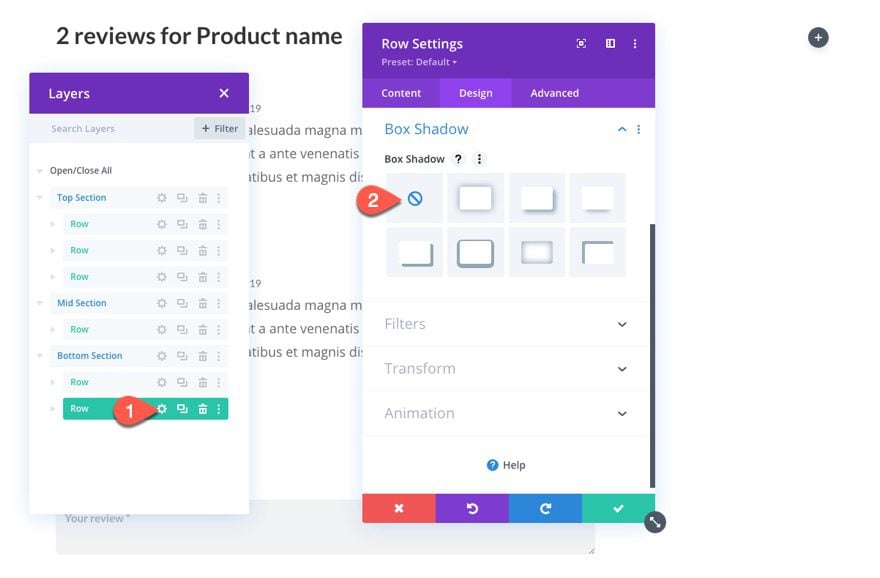
Open the row settings for the bottom row of the bottom section and take out the box-shadow being used.
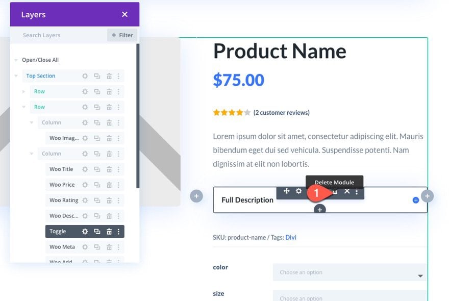
Then go to the right column of row 2 of the top section and delete the toggle module (we won’t have room for that in our sticky column).
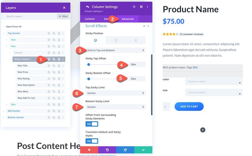
We will make our first sticky column using the existing column content that contains the product info in the top section.
Open the settings for column 2 in the second row of the top section and update the following.
- Sticky Position: Stick to Top and Bottom (desktop), Do not stick (tablet)
- Sticky Top Offset: 20px
- Sticky Bottom Offset: 20px
- Top Sticky Limit: Section
- Bottom Sticky Limit: Section
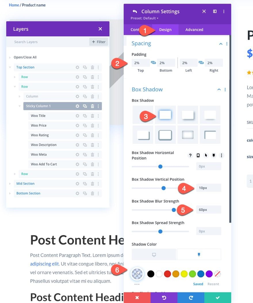
Under the design tab, update the following:
- Padding: 2% top, 2% bottom, 2% left, 2% right
- Box Shadow: see screenshot
- Box Shadow Vertical Position: 10px
- Box Shadow Blur Strength: 60px
- Shadow Color: transparent (desktop), rgba(103,151,255,0.24) (sticky)
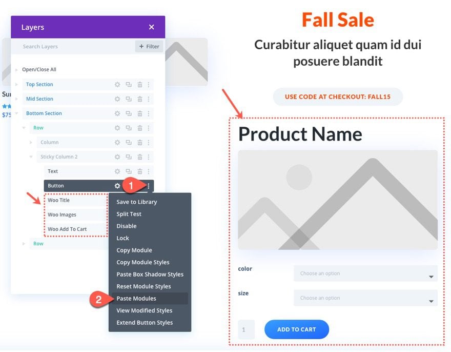
The next stick column will be located on the right column or the top row in the bottom section. For this sticky column, we are going to fill it with a custom promo deal, a product image, and an Add to Cart button.
First, copy the text module and button module within the middle row and paste them into the new sticky column (located in column 2 of row 1 of the Bottom Section).
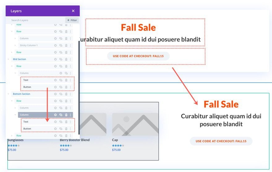
Next, go up to the top section and use multi-select to copy Woo Title Module, the Woo Images Module, and the Woo Add to Cart module.
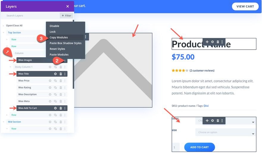
Then paste the three modules under the existing content in our second sticky column.
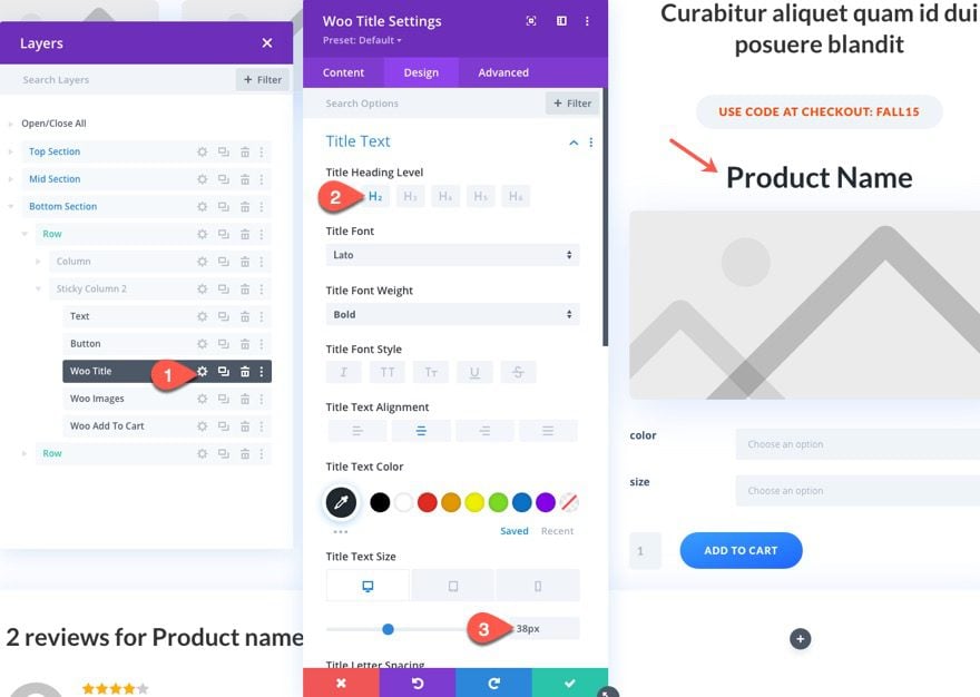
Adjusting the Sticky Column Modules
Open the settings of the Woo Title and update the following:
- Title Heading Level: H2
- Title Text Alignment:center
- Title Text Size: 38px (desktop)
Next, open the setting of the Woo Images module and update the following:
- Show Gallery Images: OFF
- Show Sale Badge: OFF
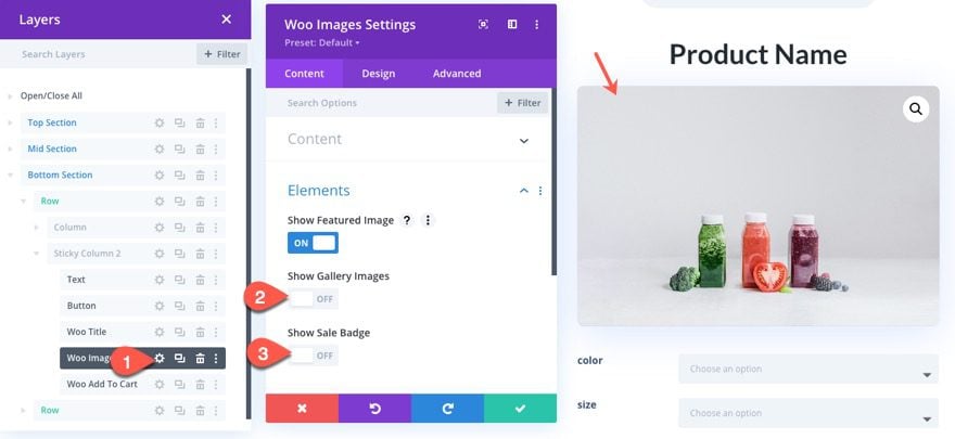
Under the advanced tab, add the following custom CSS to the Main Element:
max-width: 200px;
margin: 0 auto;
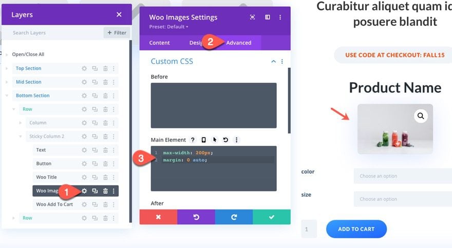
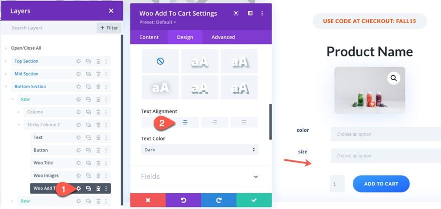
Lastly, open the Woo Add to Cart settings and center the text alignment.
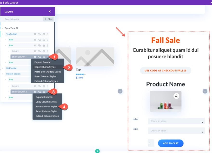
To make the column sticky, copy the column styles of the first sticky column we created in the top section, and then paste those styles into the new stick column.
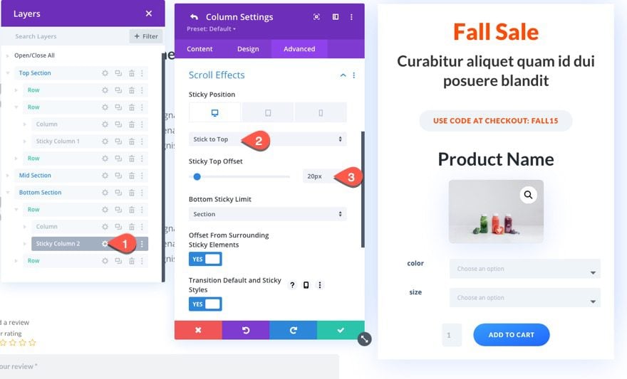
Once the styles have been updated, we need to adjust the sticky position of the second sticky column as follows:
- Sticky Position: Stick to Top (desktop)
- Sticky Top Offset: 20px
That’s it! We’re all done here.
Final Result
To check the final result, open an existing product on your website.
NOTE: This layout assumes you have a significant amount of text in the product description area on the backend. Without much content to fill the product content of the page, you won’t be able to see the sticky effect engage for very long, if ever. The same goes for the bottom section with the comments. It helps to have some comments added to see the effect.
And here is the design on mobile. The tablet and phone display doesn’t have any active sticky columns since this would cover up the content on the page as you scroll.
Final Thoughts
Adding a sidebar to your product page template using sticky columns could be a great addition to any site looking to improve the user experience and boost the buying process by keeping important CTA’s in view at all times. It is worth noting however that with this design, there are limitations to the amount of content you can include in the column. Because it is sticky, the content shouldn’t extend beyond the browsers viewport height or it will remain hidden while in the stuck state. But, you can always bring that extra content in with another sticky column at another section of the page.
I hope all of that made sense. If not, I’m happy to answer your questions.
I look forward to hearing from you in the comments.
Cheers!


Finally, Divi has brought out what I was looking for.
I was trying to do this task by using third party plugin, but those plugins never worked with Divi.
I had also tried to find a solution with the helpdesk but no success.
Now I can use this template.
Hey Jason, great work.
Is there a way to create a side bar on selected pages, that does not float, but is part of the page layout. Using columns maybe?
I was really confused for many days, but after reading this guide, Now I am really able to make a custom sidebar with sticky columns. Thanks for sharing man.