
Although sidebars have been around for a long time, they’re still frequently used around the web. They help show different elements that are connected to the post, such as recommended posts and email optin forms, without neglecting the main focus, which is the actual post content. Now, with Divi’s Theme Builder out there, there are tons of ways to create your blog post template. In this tutorial, we’ll show you how to add a two-sided sidebar to your post template. You’ll be able to download the JSON file for free as well!
Let’s get to it.
- 1 Preview
- 2 Download The Blog Post Template for FREE
- 3 Download For Free
- 4 1. Go to Divi Theme Builder & Add New Template
-
5
2. Start Building the Blog Post Body
- 5.1 Add New Section
- 5.2 Add New Row
- 5.3 Column 2
- 5.4 Add Image Module to Column 2
- 5.5 Add Post Title Module to Column 2
- 5.6 Add Post Content Module to Column 2
- 5.7 Add Code Module to Column 2
- 5.8 Add Email Optin Module to Column 3
- 5.9 Add Social Media Follow Module to Column 3
- 5.10 Add Blog Module to Column 1
- 5.11 Clone Blog Module & Place Duplicate in Column 3
- 6 3. Save All Theme Builder Changes & Preview Result
- 7 Preview
- 8 Final Thoughts
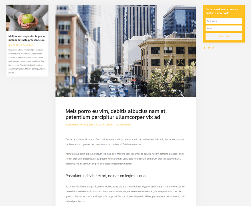
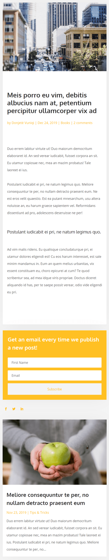
Preview
Before we dive into the tutorial, let’s take a quick look at the outcome across different screen sizes.
Desktop
Mobile
Subscribe To Our Youtube Channel
Download The Blog Post Template for FREE
To lay your hands on the free blog post template, you will first need to download it using the button below. To gain access to the download you will need to subscribe to our newsletter by using the form below. As a new subscriber, you will receive even more Divi goodness and a free Divi Layout pack every Monday! If you’re already on the list, simply enter your email address below and click download. You will not be “resubscribed” or receive extra emails.

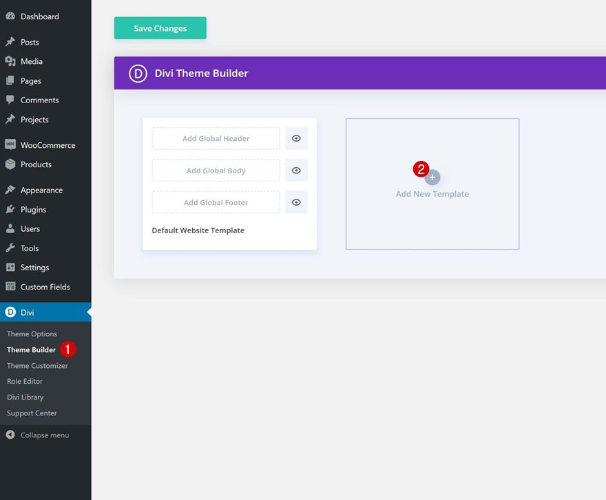
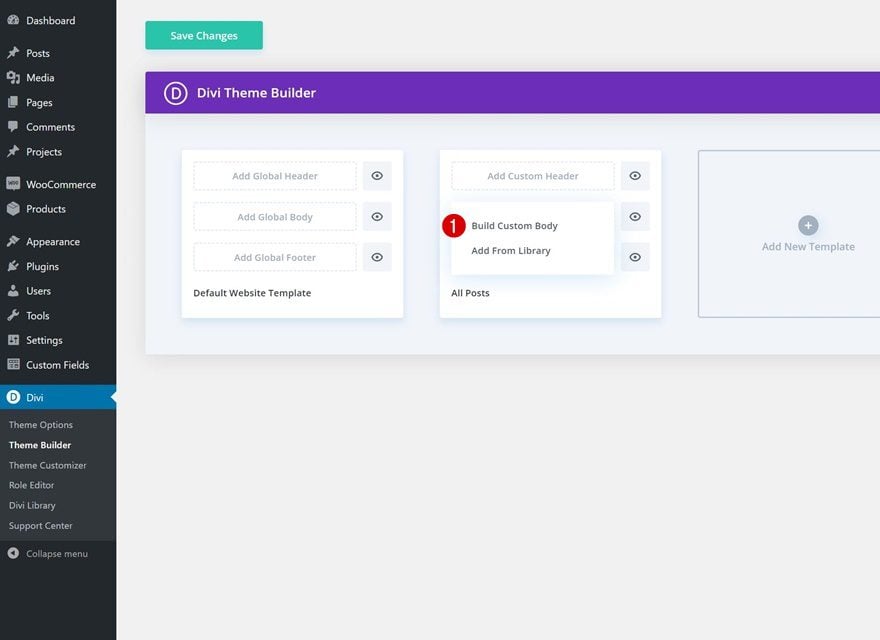
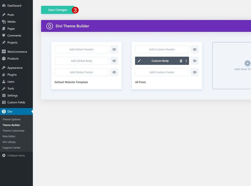
1. Go to Divi Theme Builder & Add New Template
Go to Divi Theme Builder & Add New Template
Start by going to your Divi Theme Builder. Once there, add a new template.
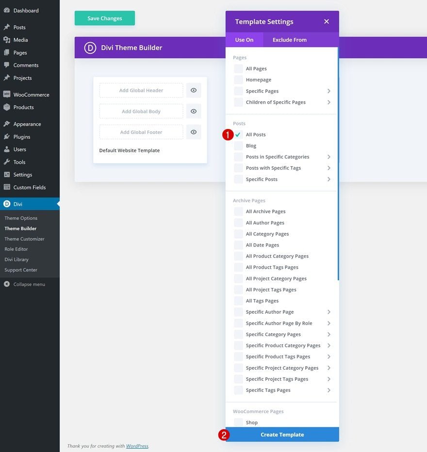
Use Template on All Posts
We’re using this new template on all posts.
- Use On: All Posts
Start Building Template Body
Well, then, start building the template body.
2. Start Building the Blog Post Body
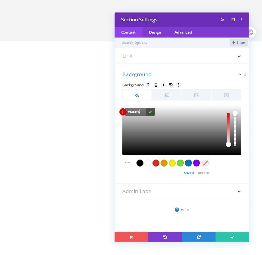
Add New Section
Background Color
Once inside the Divi Theme Builder, you’ll notice a section. Open that section and change the background color.
- Background Color: #f4f4f4
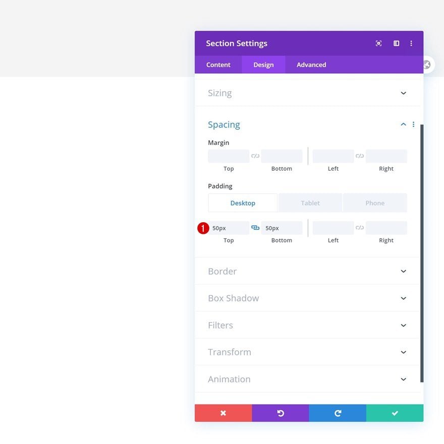
Spacing
Modify the section’s spacing values across different screen sizes as well.
- Top Padding: 50px (Desktop), 20px (Tablet), 10px (Phone)
- Bottom Padding: 50px (Desktop), 20px (Tablet), 10px (Phone)
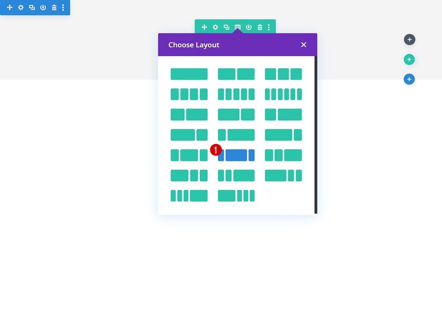
Add New Row
Column Structure
Continue by adding a new row using the following column structure:
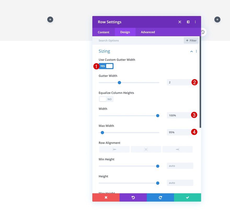
Sizing
Without adding any modules yet, open the row settings and modify the sizing settings accordingly:
- Use Custom Gutter Width: Yes
- Gutter Width: 2
- Width: 100%
- Max Width: 95%
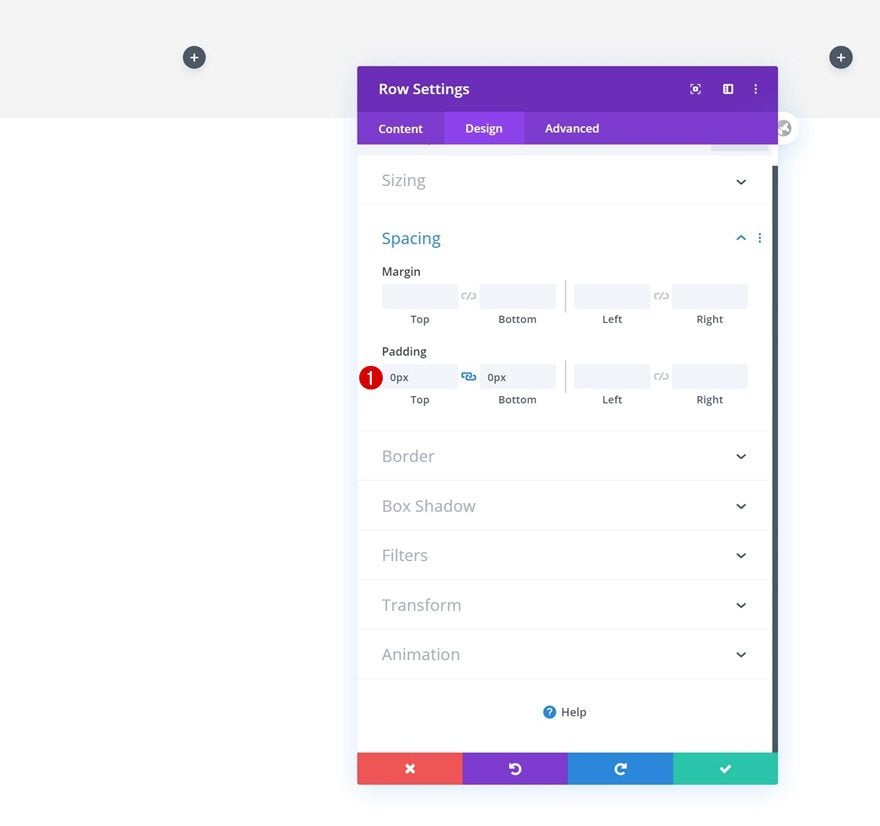
Spacing
Remove all default top and bottom padding next.
- Top Padding: 0px
- Bottom Padding: 0px
Column 2
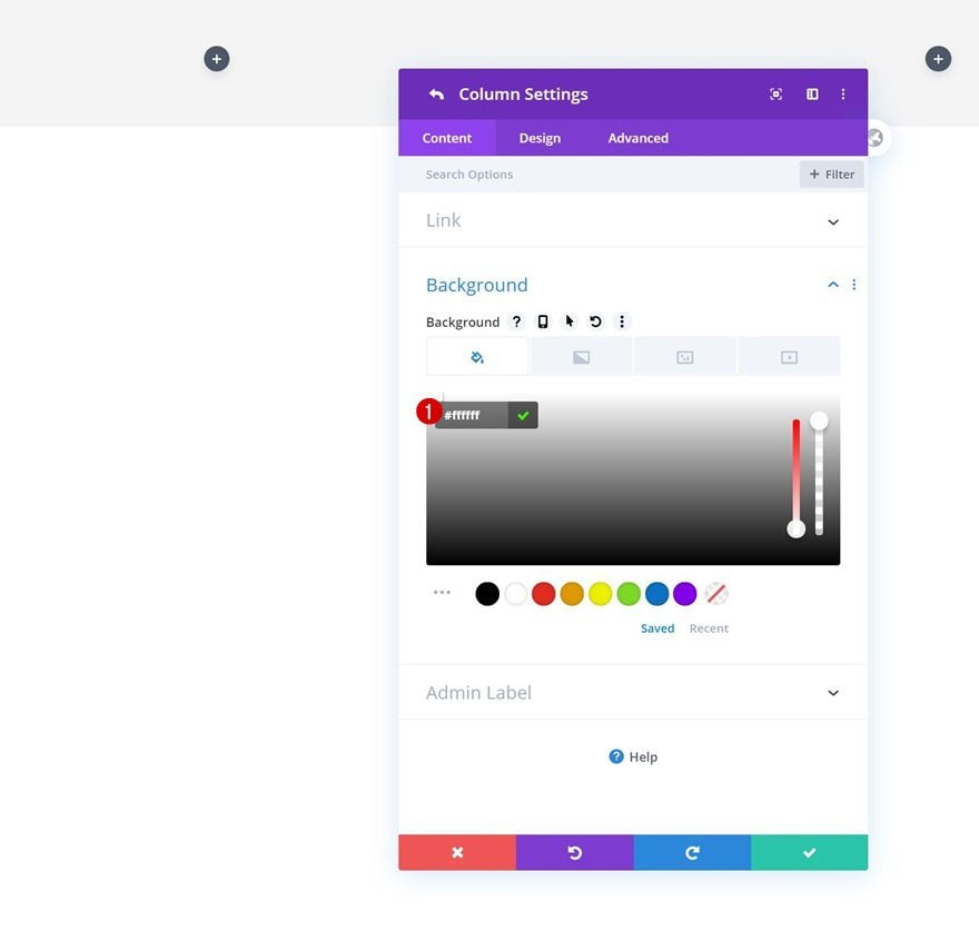
Background Color
Then, open the column 2 settings and change the background color into white.
- Background Color: #ffffff
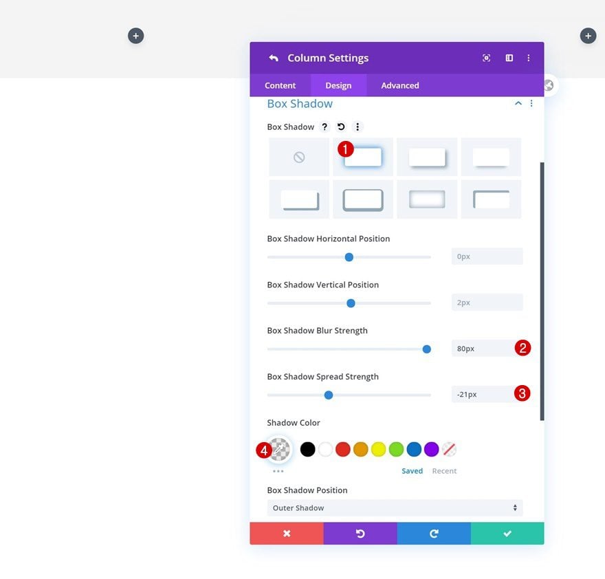
Box Shadow
Add a box shadow to the column as well.
- Box Shadow Blur Strength: 80px
- Box Shadow Spread Strength: -21px
- Shadow Color: rgba(0,0,0,0.08)
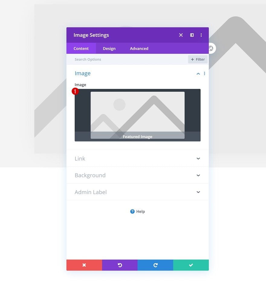
Add Image Module to Column 2
Dynamic Content
Time to start adding modules! In the second column, we’ll place all modules relevant to the blog post itself, starting with an Image Module. Use the featured image dynamic content.
- Image: Featured Image
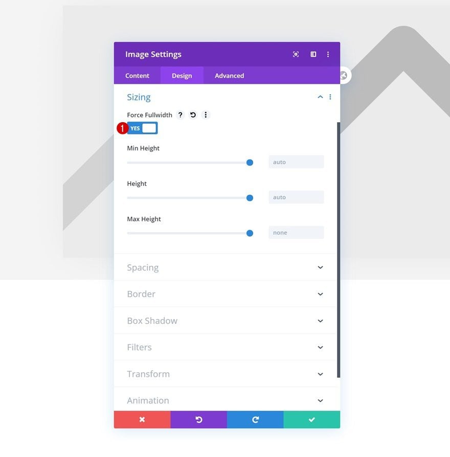
Sizing
Then, move on to the module’s design tab and force fullwidth on the Image Module.
- Force Fullwidth: Yes
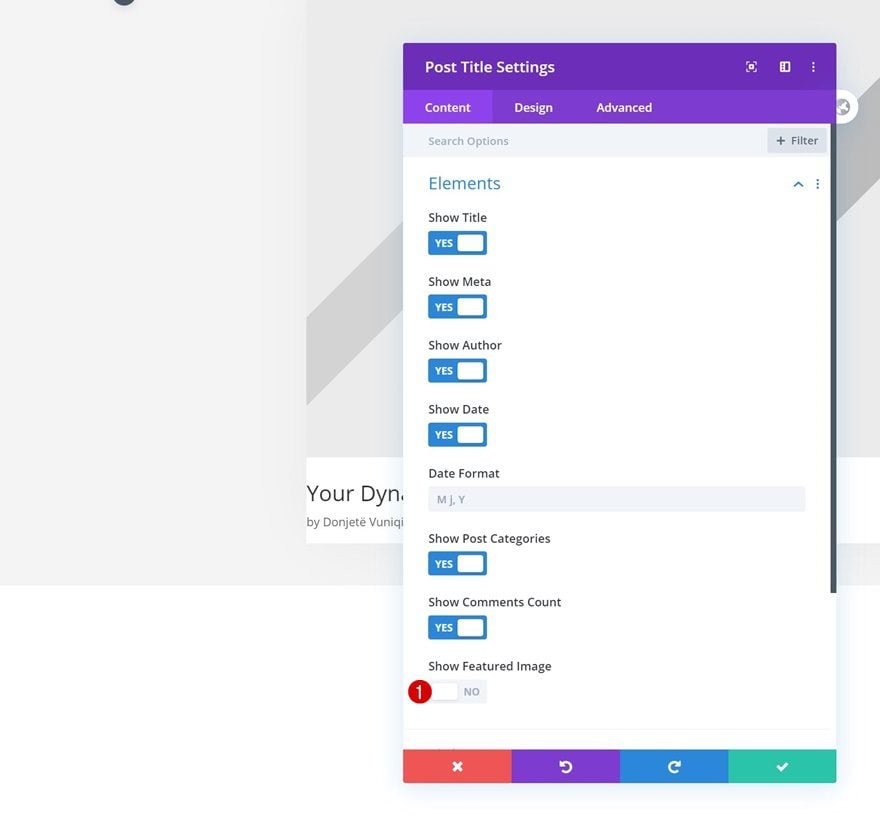
Add Post Title Module to Column 2
Elements
On to the second module, which is the Post Title Module. Disable the featured image in the elements settings.
- Show Featured Image: No
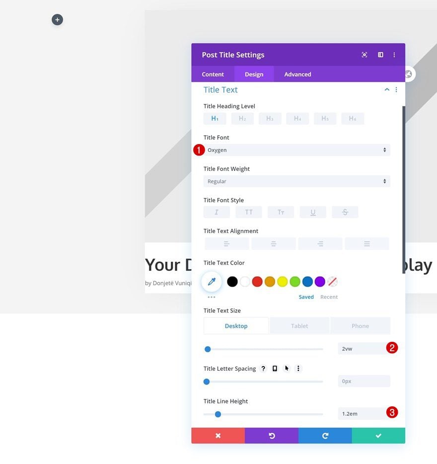
Title Text Settings
Move on to the module’s design tab and change the title text settings accordingly:
- Title Font: Oxygen
- Title Text Size: 2vw (Desktop), 4vw (Tablet), 6vw (Phone)
- Title Line Height: 1.2em
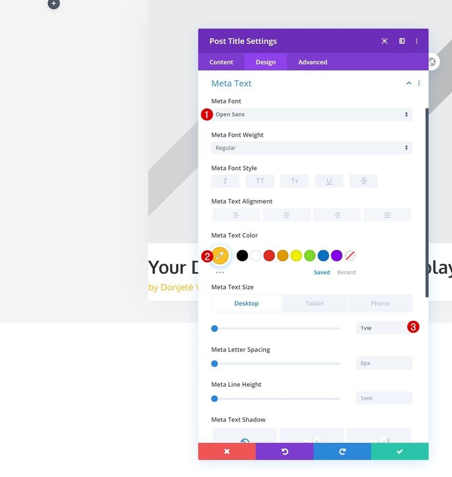
Meta Text Settings
Make some changes to the meta text settings next.
- Meta Font: Open Sans
- Meta Text Color: #ffc023
- Meta Text Size: 1vw (Desktop), 2vw (Tablet), 3vw (Phone)
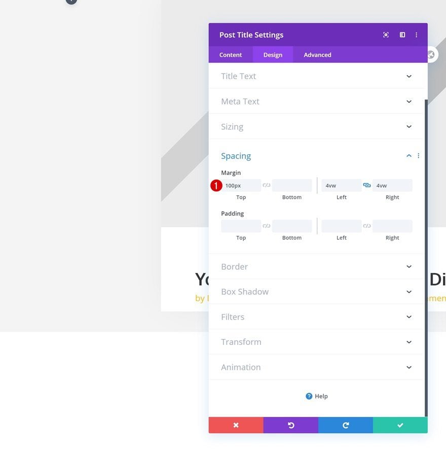
Spacing
Modify the spacing values too.
- Top Margin: 100px
- Left Margin: 4vw
- Right Margin: 4vw
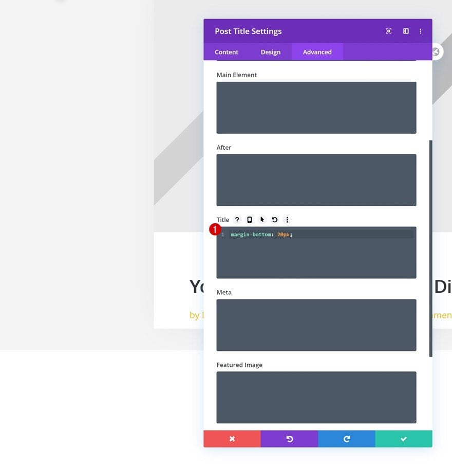
Title CSS
And complete the module’s settings by adding some bottom margin to the title’s CSS element in the advanced tab.
margin-bottom: 20px;
Add Post Content Module to Column 2
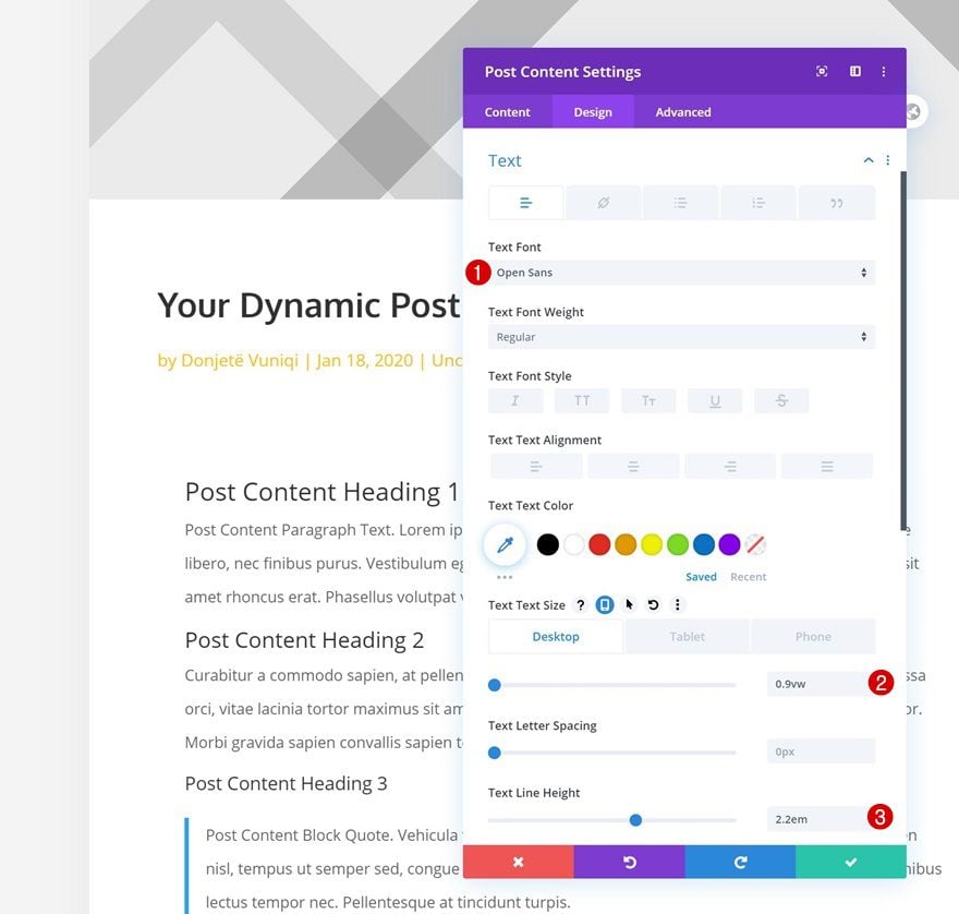
Text Settings
On to the next module, which is the Post Content Module that contains all your dynamic blog post content. Change the module’s text settings accordingly:
- Text Font: Open Sans
- Text Size: 0.9vw (Desktop), 1.8vw (Tablet), 3vw (Phone)
- Text Line Height: 2.2em
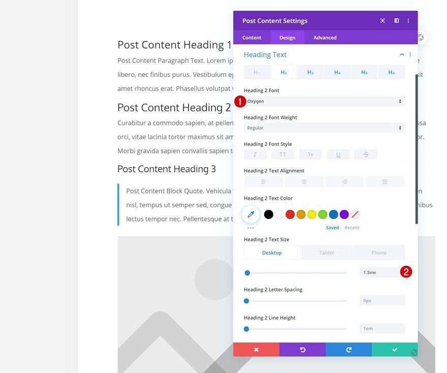
Heading Text Settings
Then, make some changes to the heading text settings as well.
- Heading Font: Oxygen
- H2 Text Size: 1.5vw (Desktop), 3vw (Tablet), 4vw (Phone)
- H3, H4, H5 & H6 Text Size: 1.3vw (Desktop), 2.5vw (Tablet), 3.5vw (Phone)
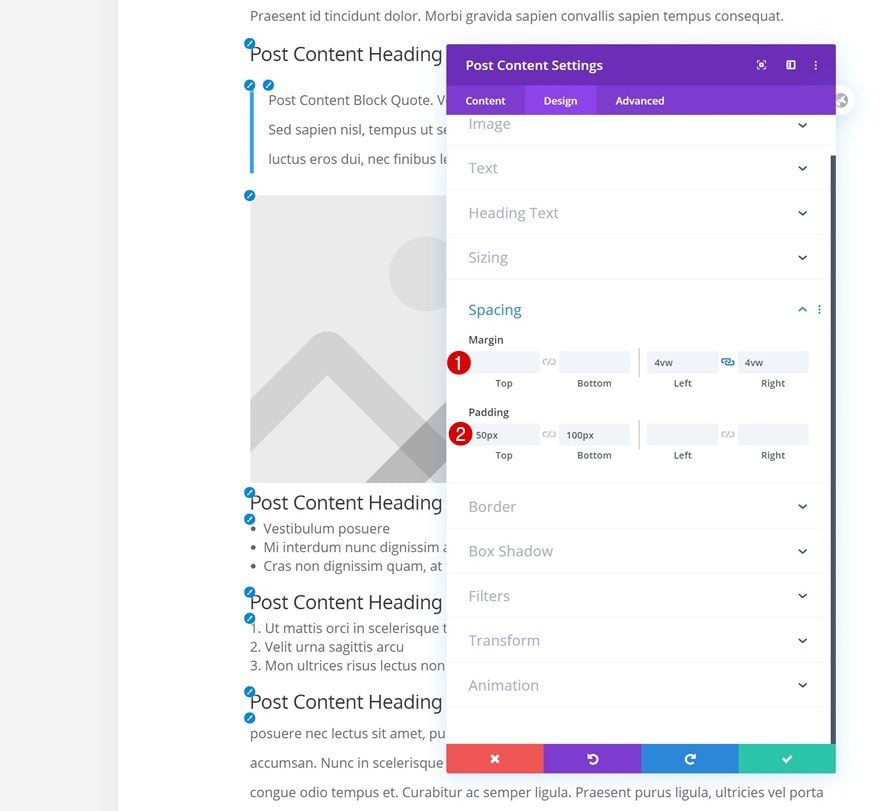
Spacing
We’re using some custom margin and padding values too.
- Left Margin: 4vw
- Right Margin: 4vw
- Top Padding: 50px
- Bottom Padding: 100px
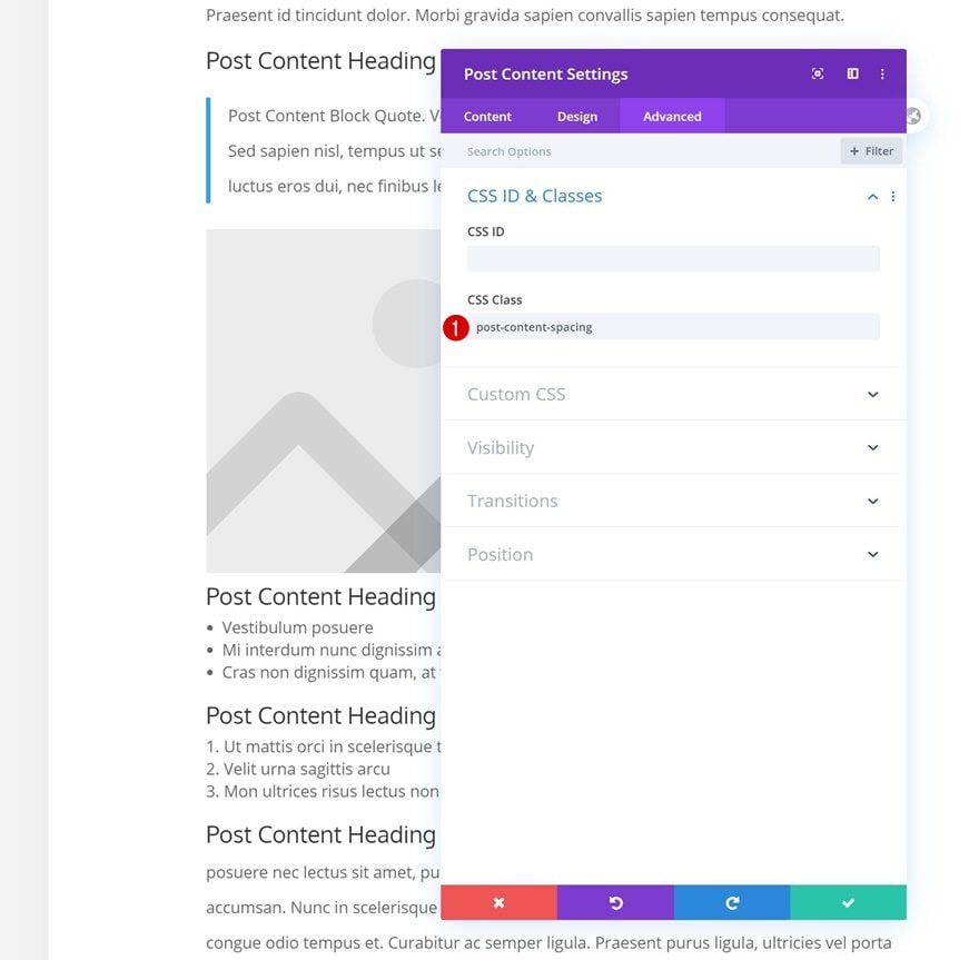
CSS Class
Complete the module’s settings by adding a CSS class. In the next part of this tutorial, we’ll use this CSS class to add some spacing to the titles and paragraphs.
- post-content-spacing
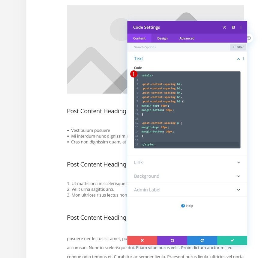
Add Code Module to Column 2
Insert CSS Code
As mentioned in the previous step of this post, we’ll use some custom CSS to add space between headings and paragraphs. For this, we’ll use a Code Module in column 2. Insert the following lines of CSS code:
<style>

.post-content-spacing h2,
.post-content-spacing h3,
.post-content-spacing h4,
.post-content-spacing h5,
.post-content-spacing h6 {
margin-top: 50px;
margin-bottom: 50px;
}

.post-content-spacing p {
margin-top: 20px;
margin-bottom: 20px;
}

</style>
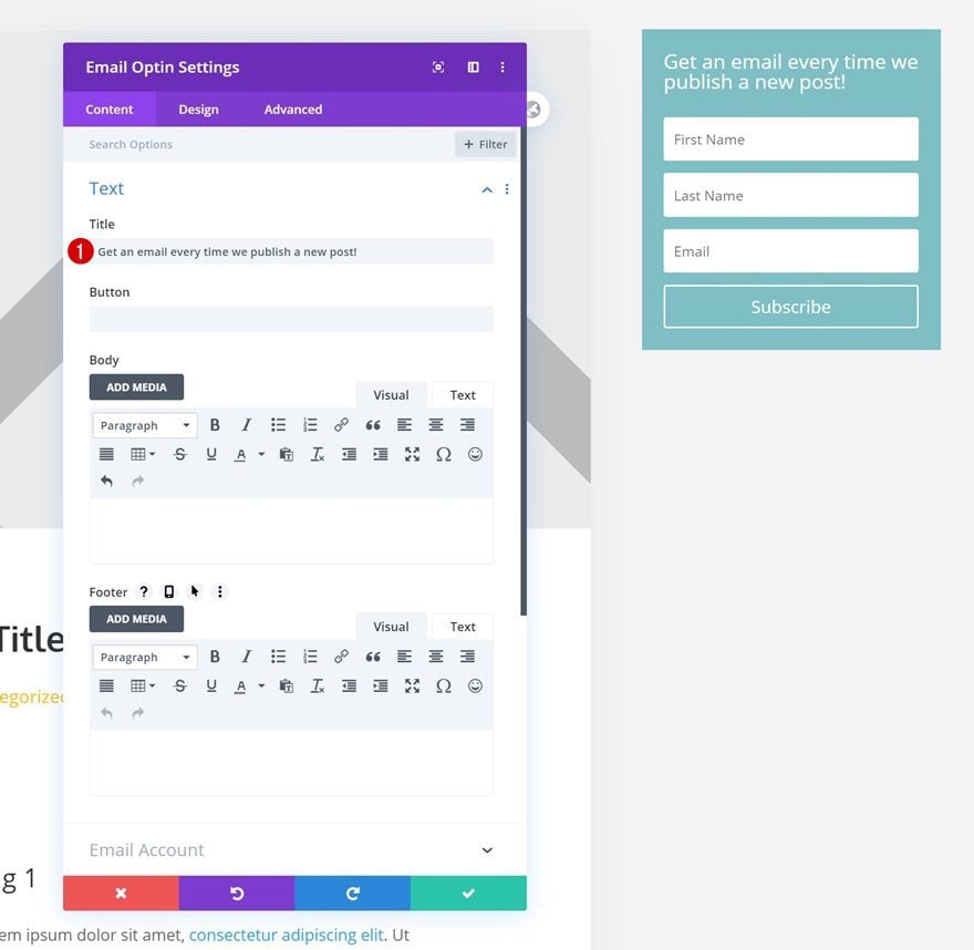
Add Email Optin Module to Column 3
Add Content
Time to start adding the sidebar elements! You can add any module you want. We’ll start with an Email Optin Module in column 3. Use some copy of your choice.
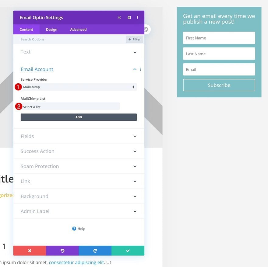
Email Account
Continue by linking an email account to the module.
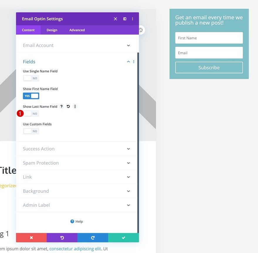
Fields
Then, disable the last name field in the fields settings.
- Show Last Name Field: No
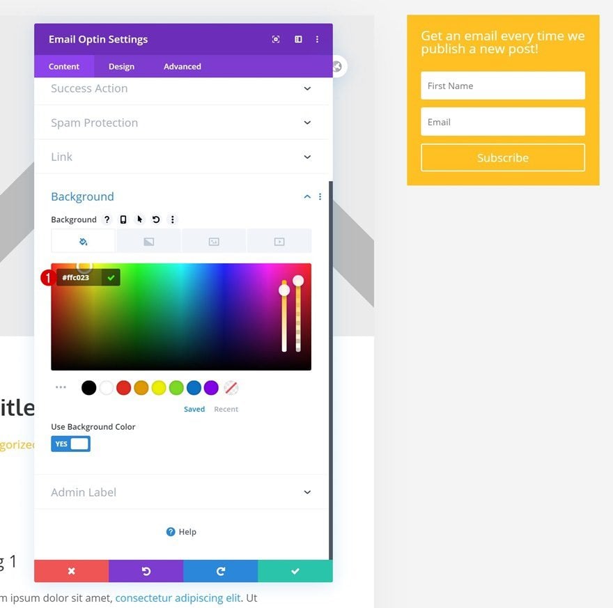
Background Color
Change the background color accordingly:
- Background Color: #ffc023
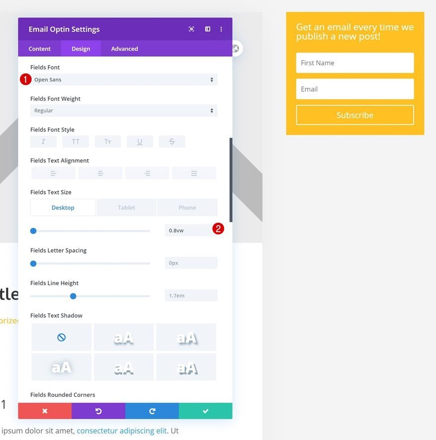
Fields Settings
Move on to the module’s design tab and modify the fields settings as follows:
- Fields Font: Open Sans
- Fields Text Size: 0.8vw (Desktop), 1.8vw (Tablet), 3vw (Phone)
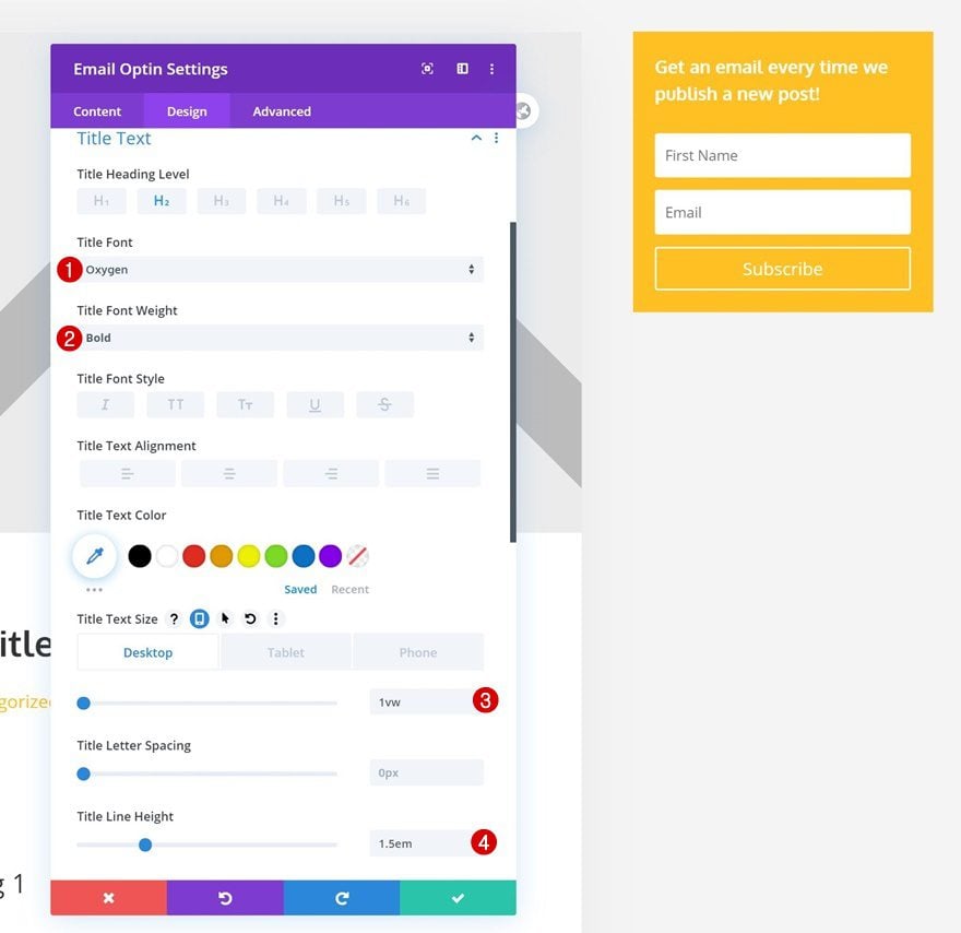
Title Text Settings
Make some changes to the title text settings too.
- Title Font: Oxygen
- Title Font Weight: Bold
- Title Text Size: 1vw (Desktop), 3vw (Tablet), 5vw (Phone)
- Title Line Height: 1.5em
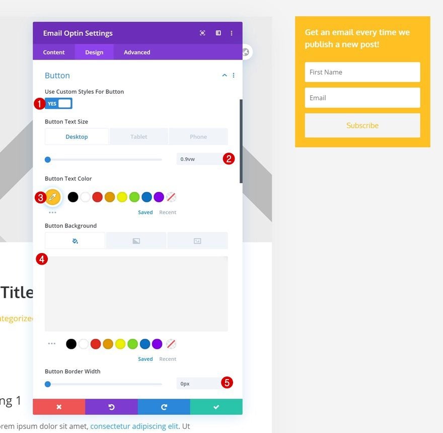
Button Settings
Continue by styling the button.
- Use Custom Styles For Button: Yes
- Button Text Size: 0.9vw (Desktop), 1.8vw (Tablet), 3vw (Phone)
- Button Text Color: #ffc023
- Button Background Color: #f4f4f4
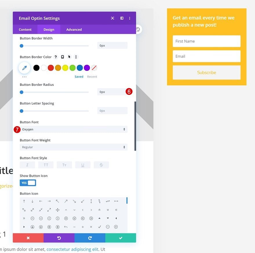
- Button Border Width: 0px
- Button Border Radius: 0px
- Button Font: Oxygen
- Button Top Padding: 15px
- Button Bottom Padding: 15px
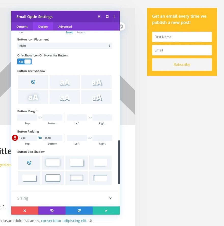
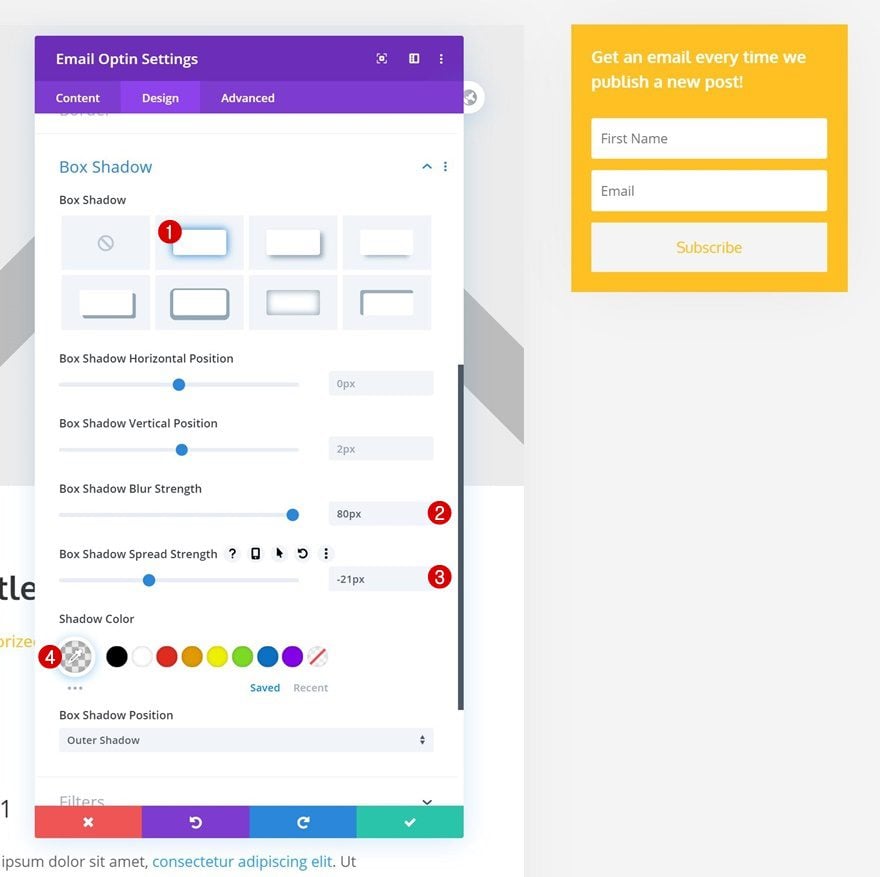
Box Shadow
And complete the module settings by adding a subtle box shadow.
- Box Shadow Blur Strength: 80px
- Box Shadow Spread Strength: -21px
- Shadow Color: rgba(0,0,0,0.08)
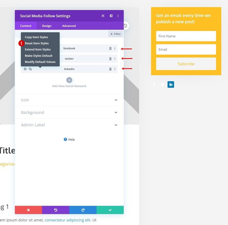
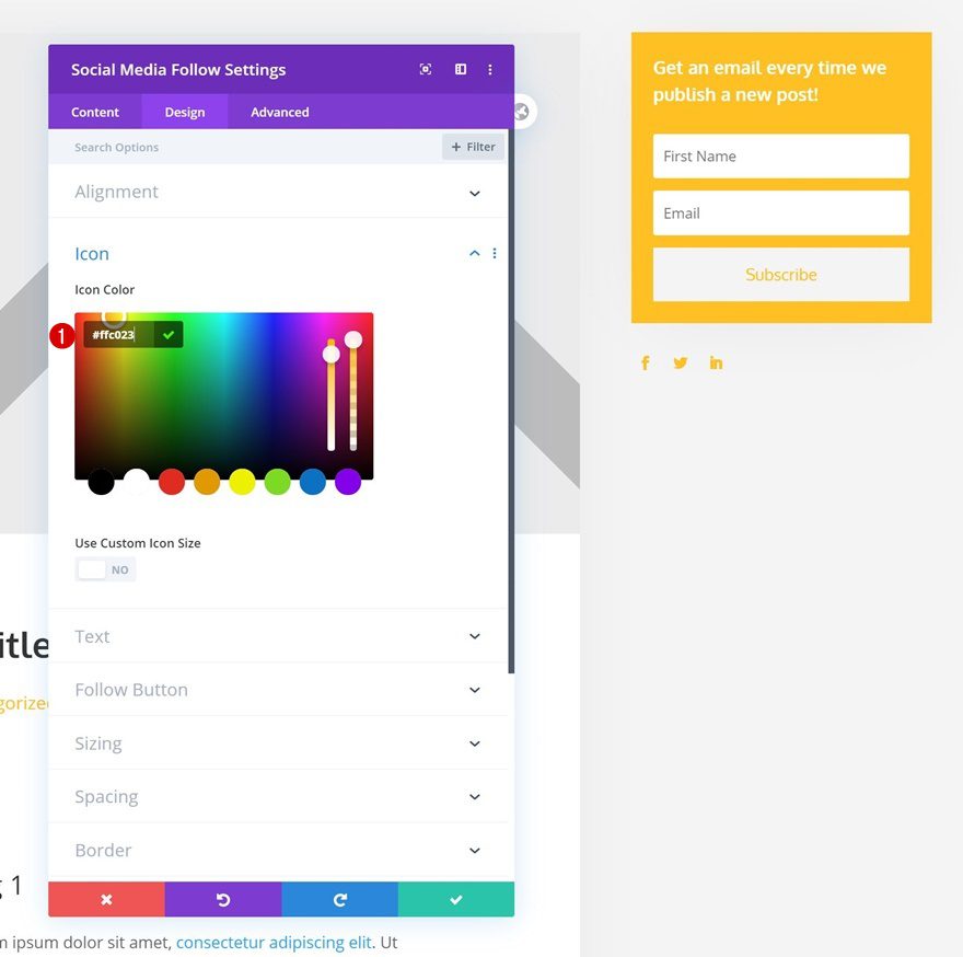
Add Social Networks of Choice
The next module we need in column 3 is a Social Media Follow Module. Add some social networks of your choice.
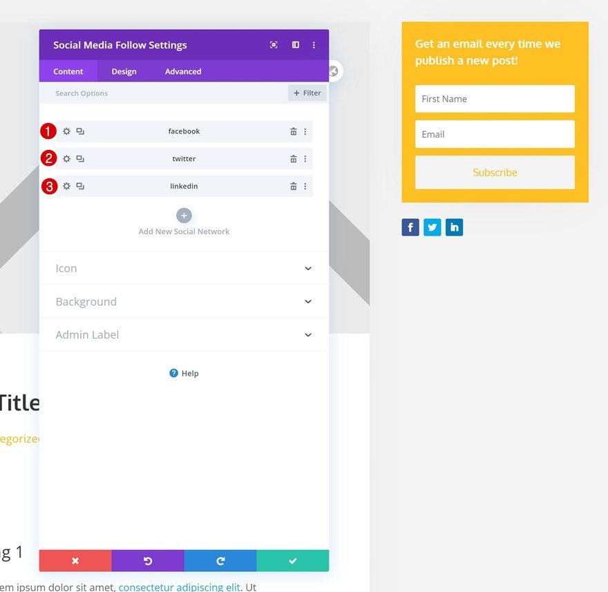
Reset Social Network Styles Individually
Continue by resetting the item styles for each social network individually.
Icon Settings
Then, go back to the general module settings and change the icon color.
- Icon Color: #ffc023
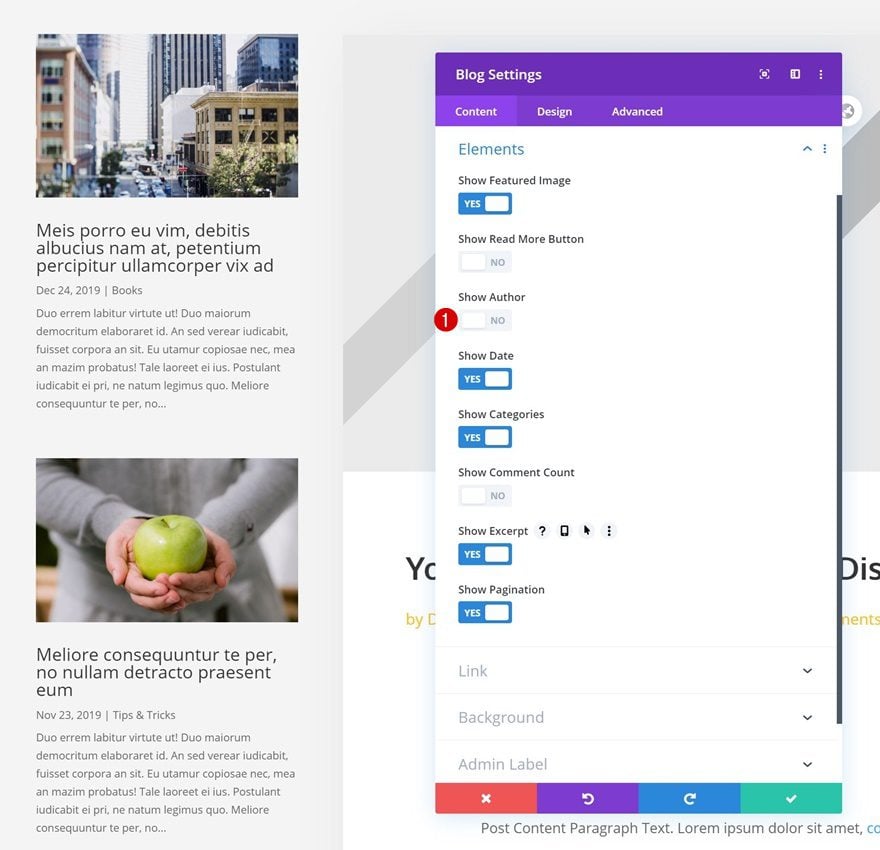
Add Blog Module to Column 1
Elements
In column 1, the only module we’re adding is a Blog Module. Disable the author in the elements settings.
- Show Author: No
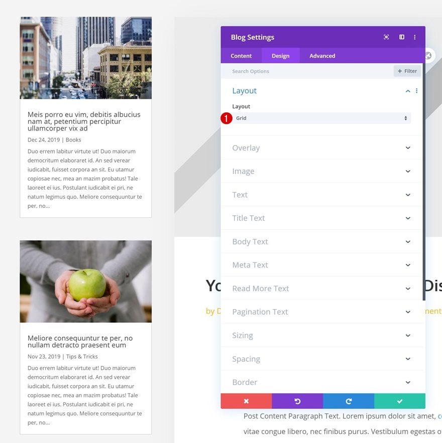
Layout
Then, move on to the module’s design tab and change the layout.
- Layout: Grid
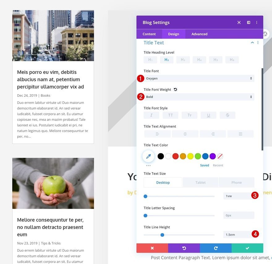
Title Text Settings
Modify the title text settings next.
- Title Font: Oxygen
- Title Font Weight: Bold
- Title Text Size: 1vw (Desktop), 3vw (Tablet), 5vw (Phone)
- Title Line Height: 1.5em
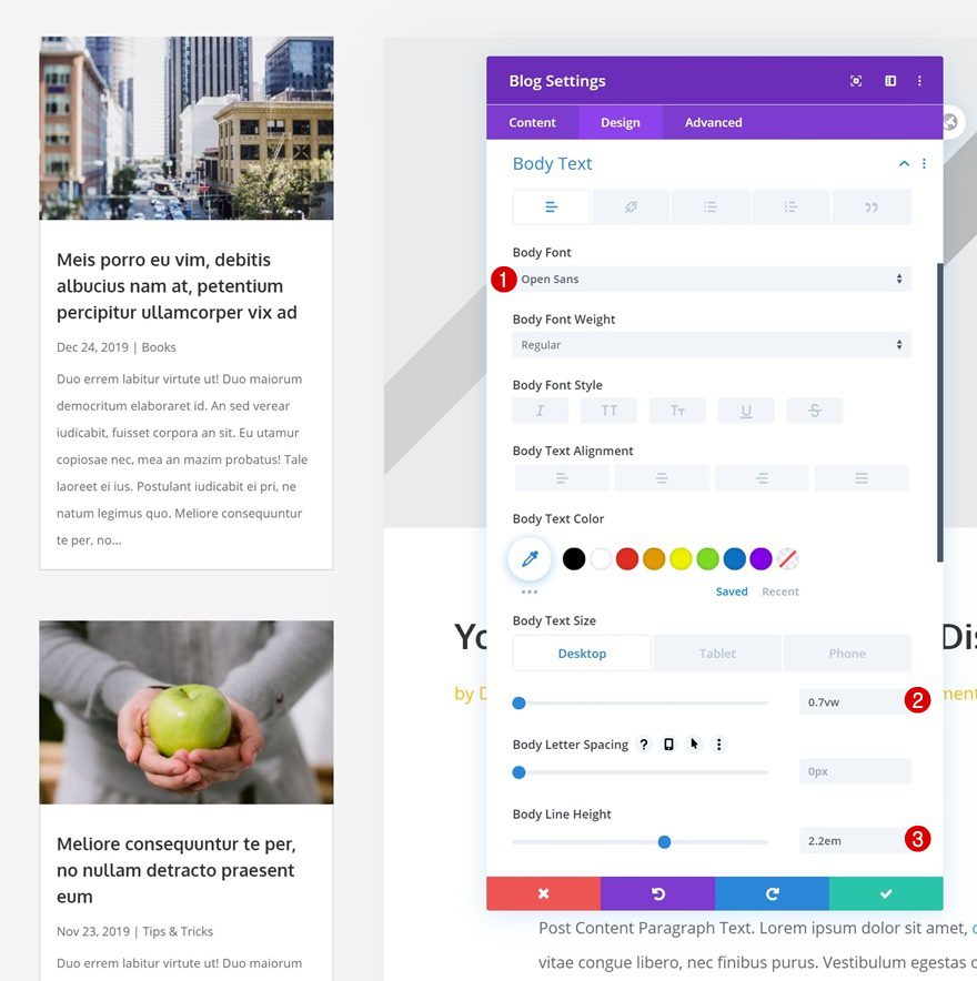
Body Text Settings
Make some changes to the body text settings too.
- Body Font: Open Sans
- Body Text Size: 0.7vw (Desktop), 1.8vw (Tablet), 3vw (Phone)
- Body Line Height: 2.2em
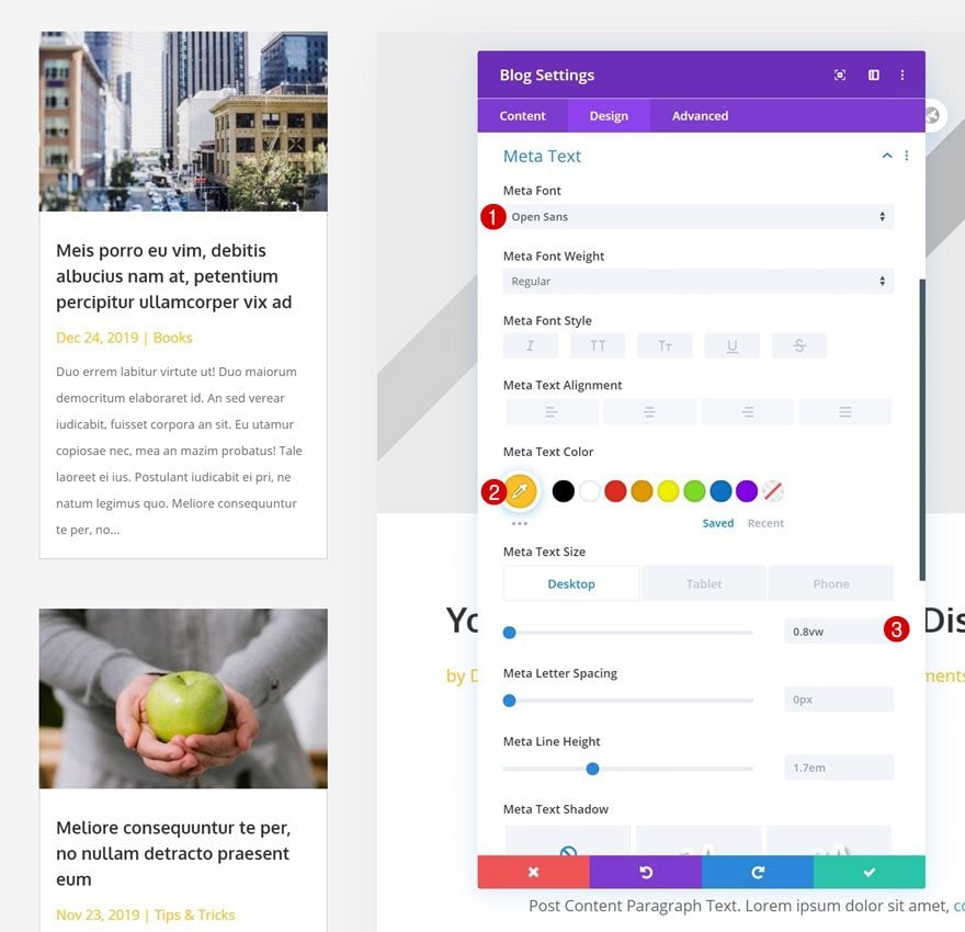
Meta Text Settings
Next, style the meta text settings accordingly:
- Meta Font: Open Sans
- Meta Text Color: #ffc023
- Meta Text Size: 0.8vw (Desktop), 1.8vw (Tablet), 3vw (Phone)
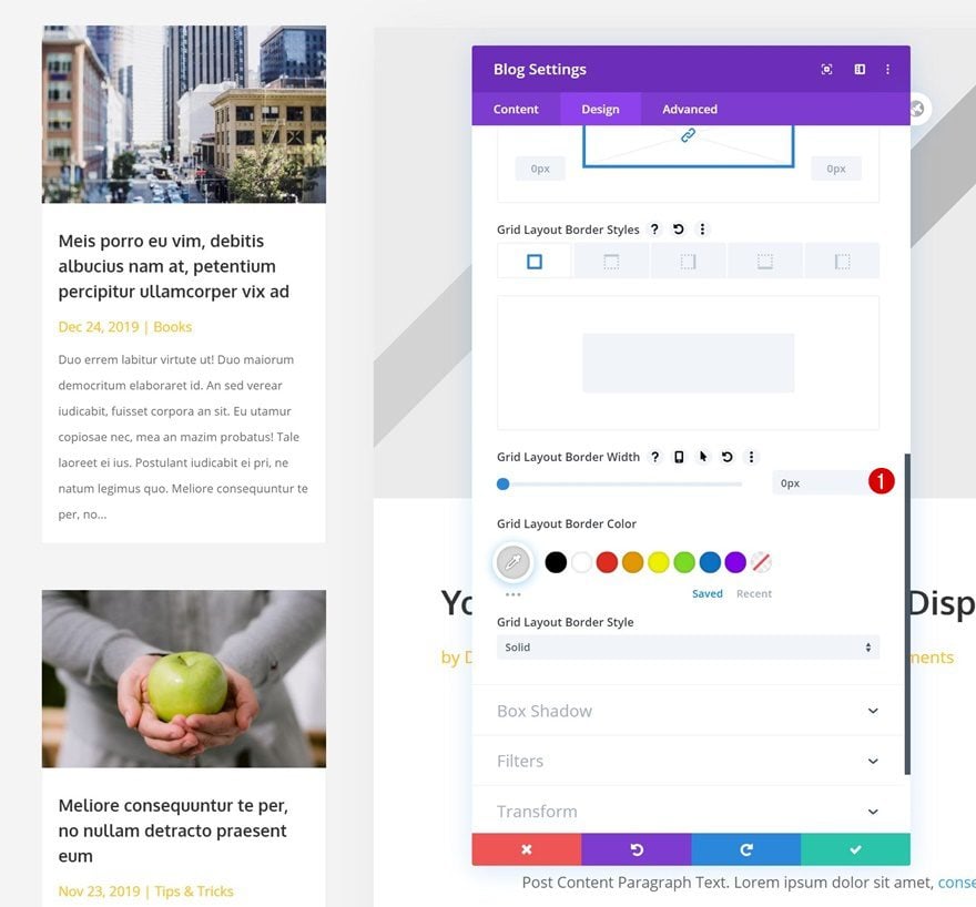
Border
Remove the module’s default border too.
- Grid Layout Border Width: 0px
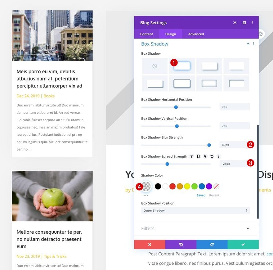
Box Shadow
And use a subtle box shadow.
- Box Shadow Blur Strength: 80px
- Box Shadow Spread Strength: -21px
- Shadow Color: rgba(0,0,0,0.08)
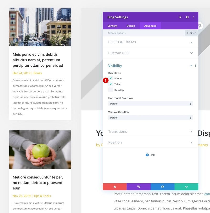
Visibility
Now, we want the Blog Module to show up when in column 1 when someone’s viewing the post on desktop. On smaller screen sizes, however, we want the post content to come first. That’s why we’ll hide the entire module on tablet and phone.
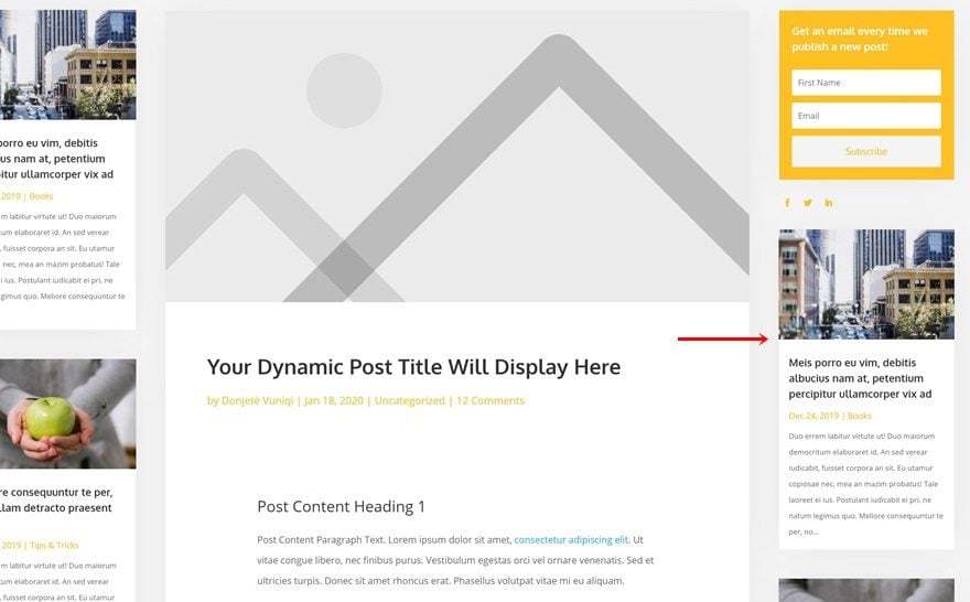
Clone Blog Module & Place Duplicate in Column 3
We will, then, clone the Blog Module and place the duplicate in the third column.
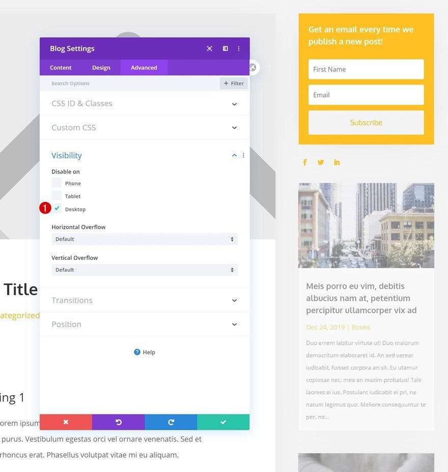
Change Visibility
We want this module to appear in column 3 on smaller devices only, that’s why we’ll hide the entire module on desktop.
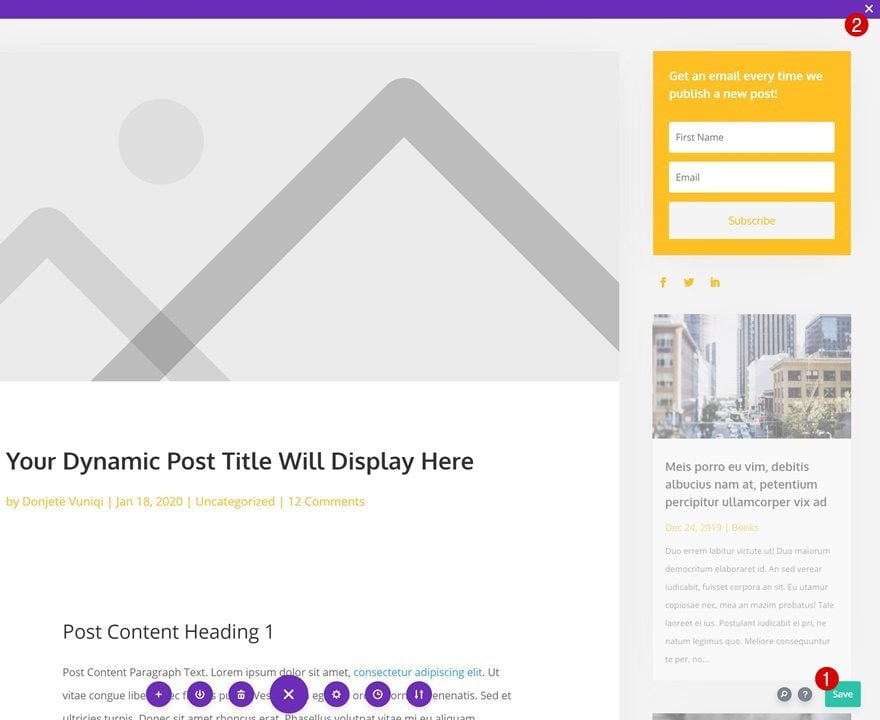
3. Save All Theme Builder Changes & Preview Result
Once you’ve completed the blog post template (make sure you add a Comment Module too!), you can save all Theme Builder changes and view the outcome on your website!
Preview
Now that we’ve gone through all the steps, let’s take a final look at the outcome across different screen sizes.
Desktop
Mobile
Final Thoughts
In this post, we’ve shown you how to add a two-sided sidebar to your blog post template using Divi’s Theme Builder. More so, we’ve shared the layout’s JSON file for free so you can keep it close by in case you need it for any future projects! If you have any questions, feel free to leave a comment in the comment section below.
If you’re eager to learn more about Divi and get more Divi freebies, make sure you subscribe to our email newsletter and YouTube channel so you’ll always be one of the first people to know and get benefits from this free content.


Email Optin doesn’t work (doesn’t send). I am using the same config from on other pages, which always worked. Why?
This file should not be imported in this context
I don’t think that most of the users like to interact with Two-Sided Sidebar Blog Post.
I don’t think that the users like to interact with Two-Sided Sidebar Blog Post.
What is the purpose of JSON file?
You can either follow along with all the steps listed in this blog post, to recreate the layout by yourself or simply import the JSON file in your Divi Builder for a quicker setup.
Where is the JSON file? I don’t see it.
Also, What is best way to add some ad slots on either side of the layout and make sure they show up on both desktop computers and mobile devices?
Only for wordpress? Or it’s supports blogger also?
Why do you set Left and Right padding 4vw to the Title module but not the Post Content module?