
Your page’s hero section deserves all the attention it can get. There are endless ways to style your hero section, depending on what your website is about and how your target audience behaves. For some websites, it can come in handy to place multiple column CTA cards without creating an overwhelming experience. A great way to approach it is by creating column swipe CTA cards. In today’s Divi tutorial, we’ll show you how to create a stunning design from scratch that tackles this technique. You’ll be able to download the JSON file for free as well!
Let’s get to it.
- 1 Preview
- 2 Download The Hero Sections for FREE
- 3 Download For Free
-
4
Let’s Start Recreating!
- 4.1 Add New Section
- 4.2 Add Row #1
- 4.3 Column Settings
- 4.4 Add Text Module #1 to Column 1
- 4.5 Add Text Module #2 to Column 1
- 4.6 Add Button Module to Column 1
- 4.7 Add Divider Module to Column 1
- 4.8 Add Text Module #3 to Column 1
- 4.9 Clone Column up to 5 Times & Reuse for Other CTAs
- 4.10 Add Row #2
- 4.11 Add Text Module #1 to Column 1
- 4.12 Add Text Module #2 to Column 1
- 4.13 Add Button Module to Column 1
- 5 Preview
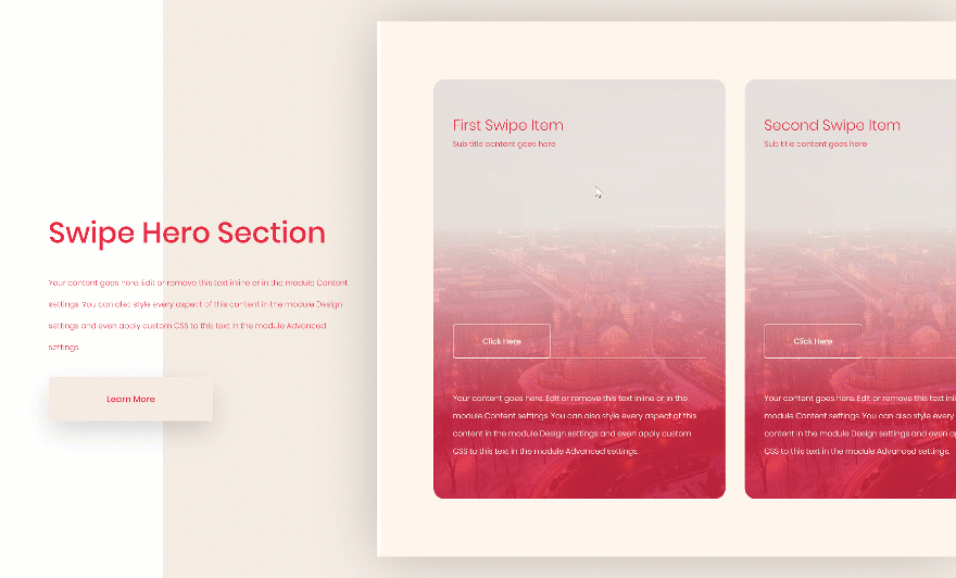
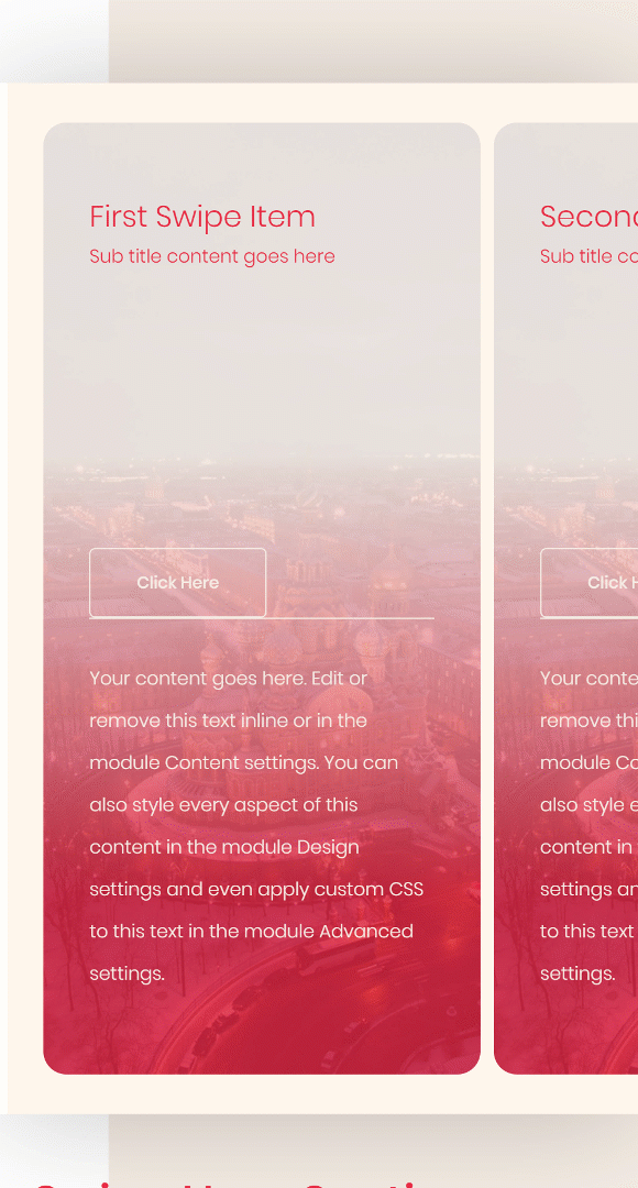
Preview
Before we dive into the tutorial, let’s take a quick look at the outcome across different screen sizes.
Desktop
Mobile
Download The Hero Sections for FREE
To lay your hands on the free hero sections, you will first need to download them using the button below. To gain access to the download you will need to subscribe to our newsletter by using the form below. As a new subscriber, you will receive even more Divi goodness and a free Divi Layout pack every Monday! If you’re already on the list, simply enter your email address below and click download. You will not be “resubscribed” or receive extra emails.

Subscribe To Our Youtube Channel
Let’s Start Recreating!
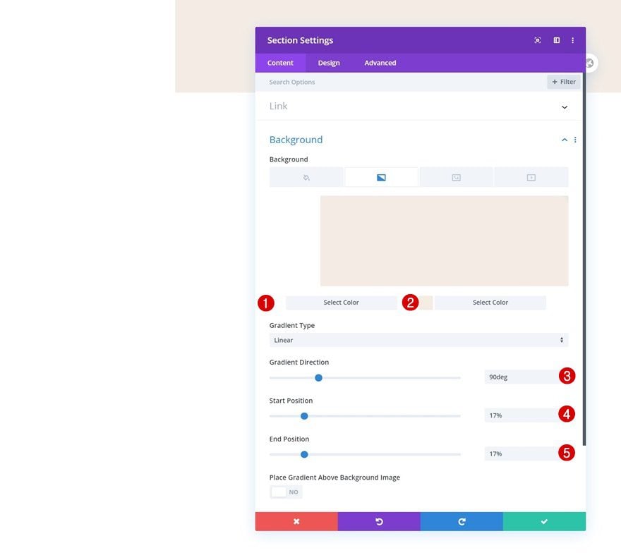
Add New Section
Gradient Background
Add a new section to the page you’re working on, open the section settings and insert a gradient background.
- Color 1: #ffffff
- Color 2: #f5ede5
- Gradient Direction: 90deg
- Start Position: 17%
- End Position: 17%
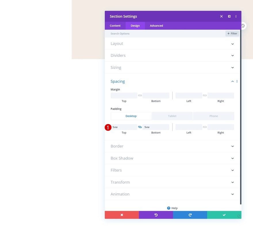
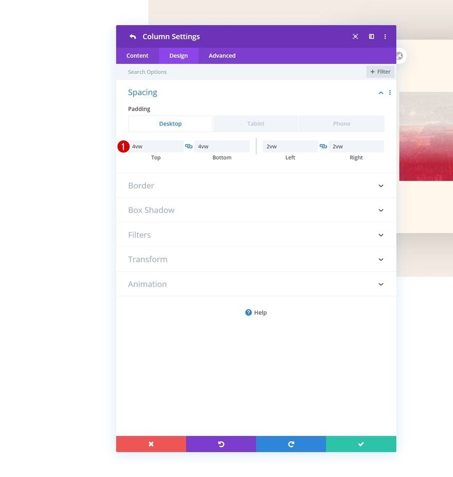
Spacing
Move on to the design tab and add some custom top and bottom padding across different screen sizes.
- Top Padding: 5vw (Desktop), 10vw (Tablet), 13vw (Phone)
- Bottom Padding: 5vw (Desktop), 10vw (Tablet), 13vw (Phone)
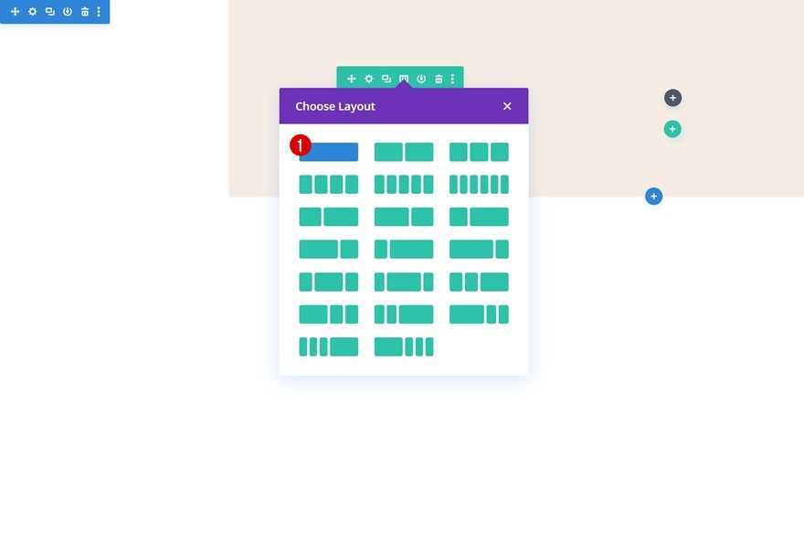
Add Row #1
Column Structure
Continue by adding a new row using the following column structure:
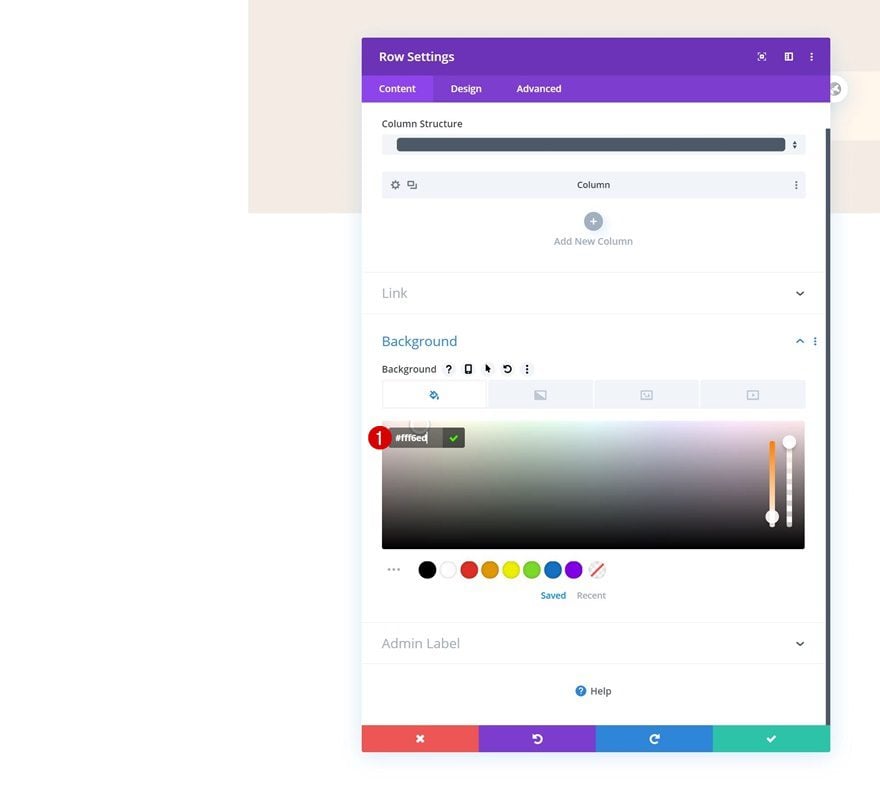
Background Color
Without adding any modules yet, open the row settings and change the background color.
- Background Color: #fff6ed
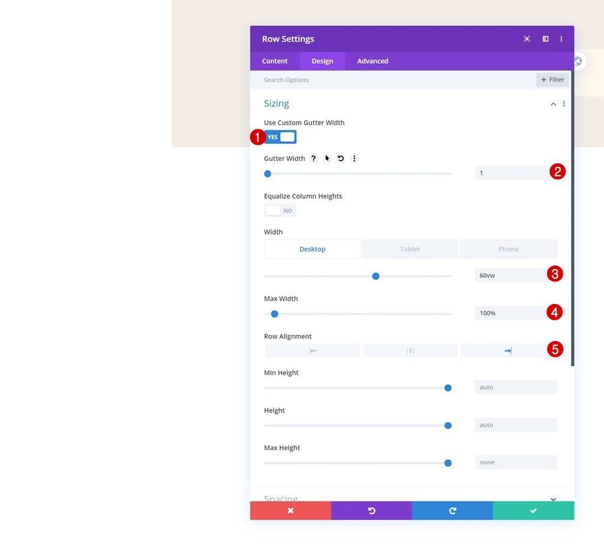
Sizing
Move on to the design tab and change the sizing settings of the row as well.
- Use Custom Gutter Width: Yes
- Gutter Width: 1
- Width: 60vw (Desktop), 100% (Tablet & Phone)
- Max Width: 100%
- Row Alignment: Right
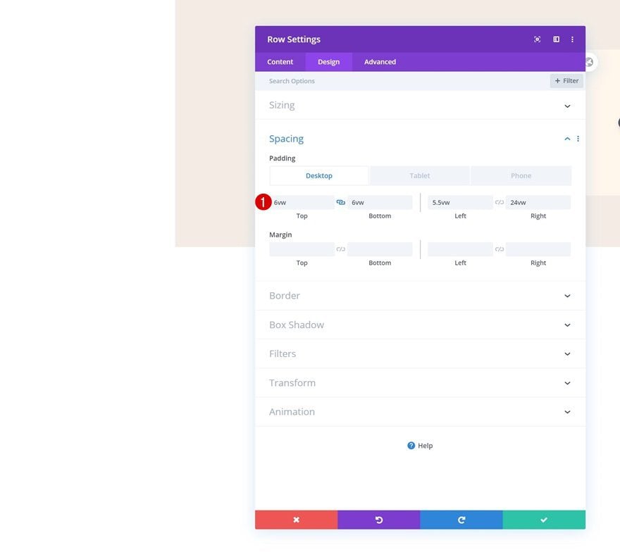
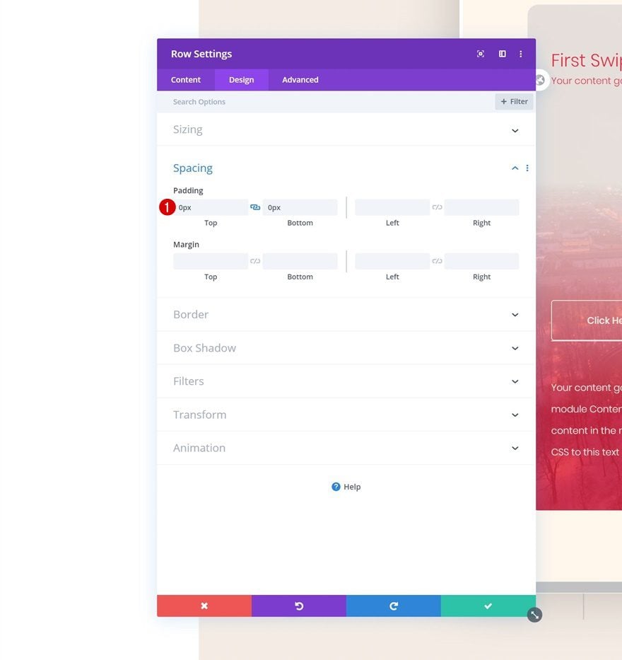
Spacing
We’re also adding some custom padding values to the spacing settings.
- Top Padding: 6vw
- Bottom Padding: 6vw
- Left Padding: 5.5vw
- Right Padding: 24vw
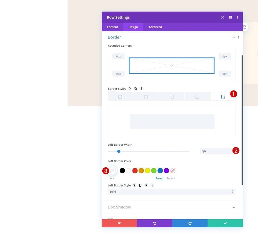
Border
Go to the border settings next and add a left border using the following settings:
- Left Border Width: 6px
- Left Border Color: #FFFFFF
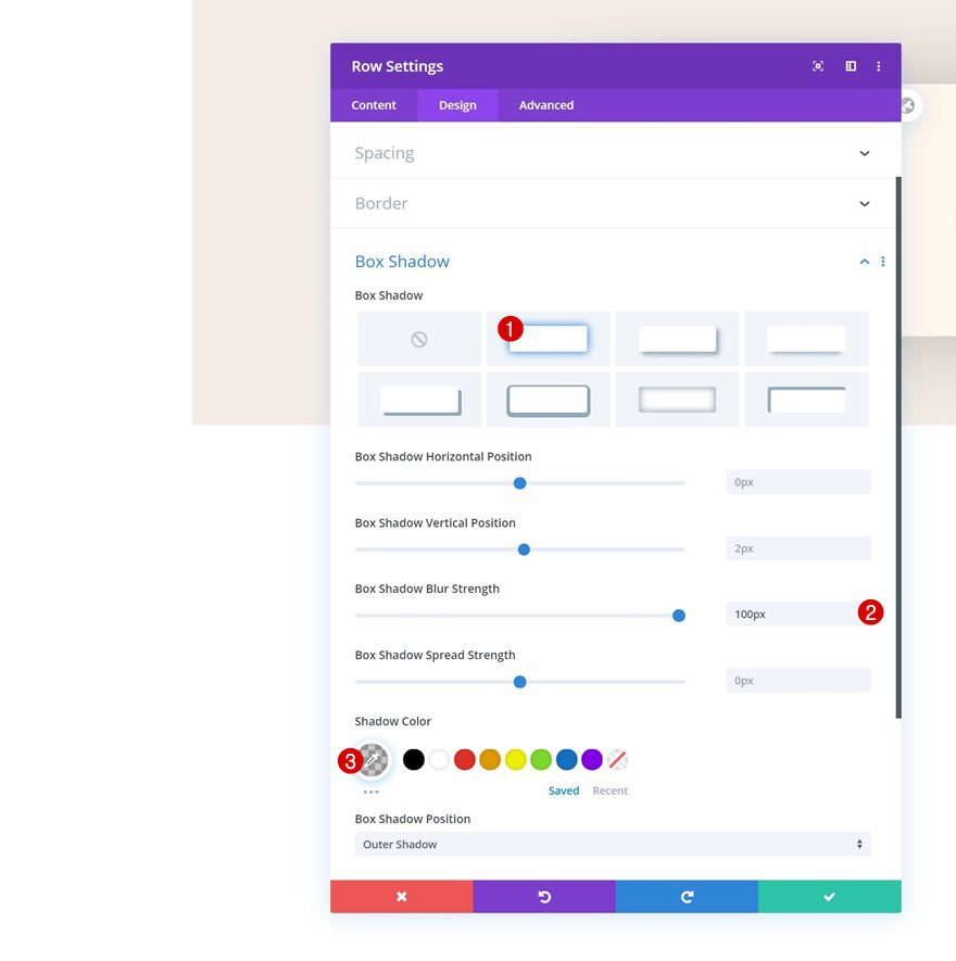
Box Shadow
Add a subtle box shadow to create depth in the hero section.
- Box Shadow Blur Strength: 100px
- Shadow Color: rgba(0,0,0,0.22)
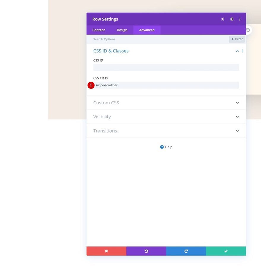
CSS Class
And use a CSS class in the advanced tab. Later on this post, we’ll use this CSS class to hide the scrollbar.
- CSS Class: swipe-scrollbar
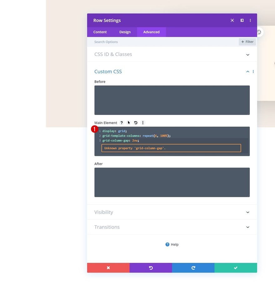
Main Element
To create a horizontal scroll/swipe, we’ll need to place the columns horizontally. We’ll do that by adding some custom CSS code in the main element of the row.
display: grid;
grid-template-columns: repeat(6, 100%);
grid-column-gap: 2vw;
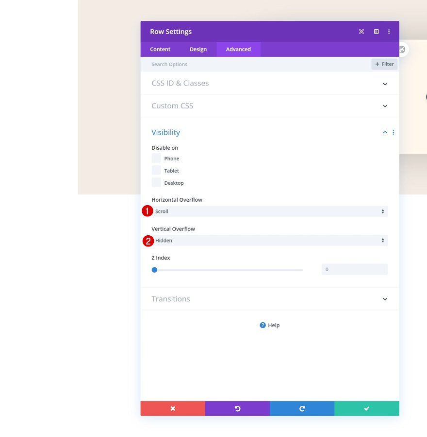
Overflows
Move on to the visibility settings and change the overflows of the row.
- Horizontal Overflow: Scroll
- Vertical Overflow: Hidden
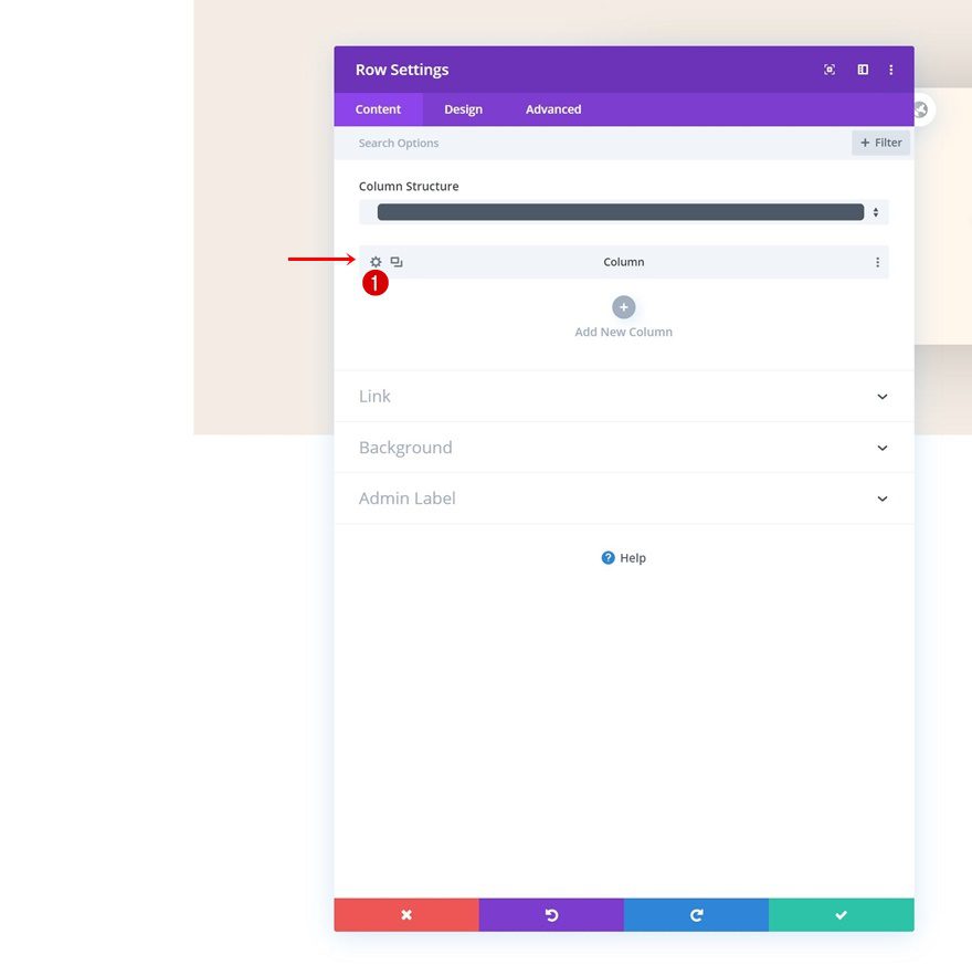
Column Settings
Once you’ve completed the row settings, you can open the first column’s settings.
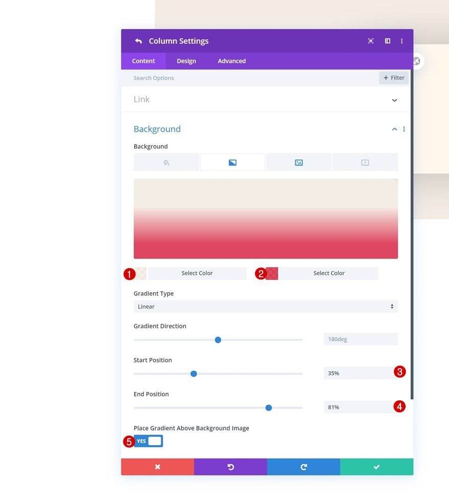
Gradient Background
Add a gradient background.
- Color 1: rgba(245,237,229,0.91)
- Color 2: rgba(219,34,65,0.84)
- Start Position: 35%
- End Position: 81%
- Place Gradient Above Background Image: Yes
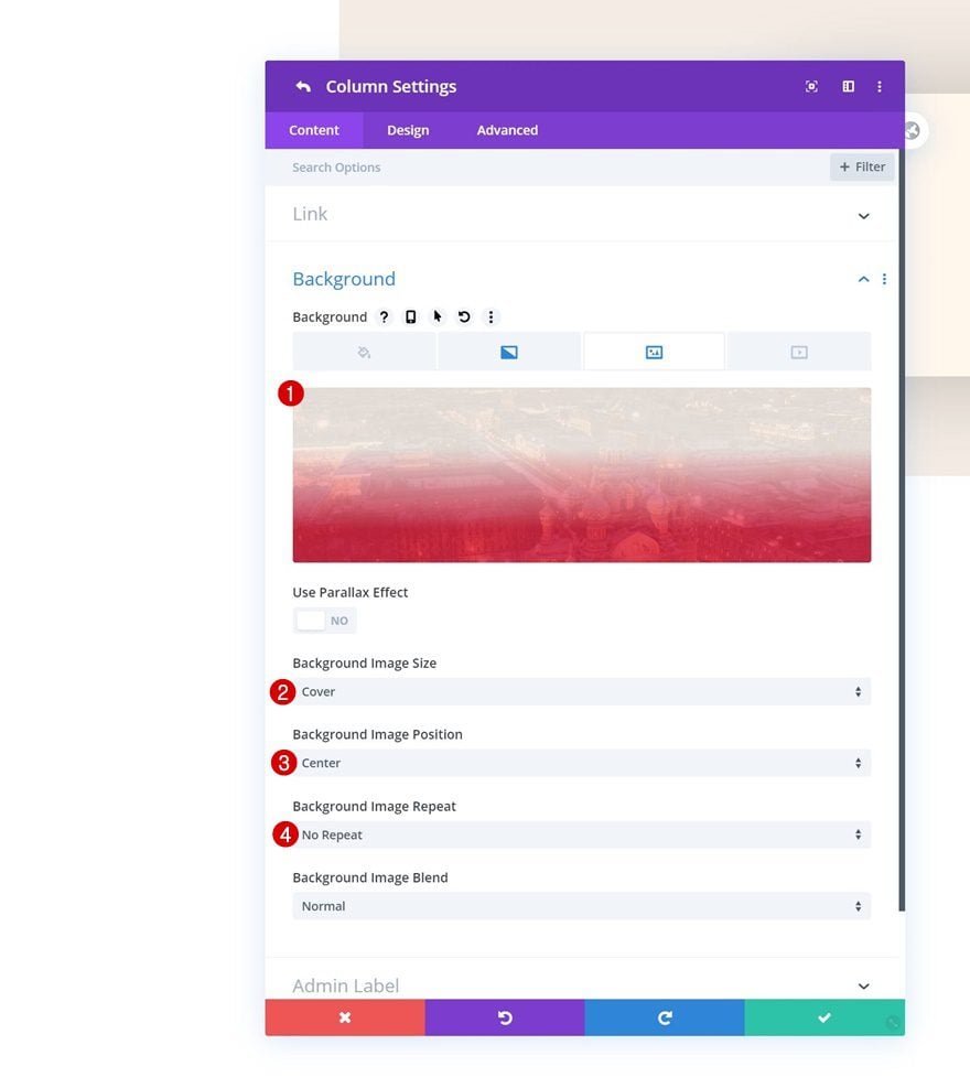
Background Image
Along with a background image.
- Background Image Size: Cover
- Background Image Position: Center
- Background Image Repeat: No Repeat
Spacing
Move on to the design tab and add some custom padding values across different screen sizes.
- Top Padding: 4vw (Desktop), 10vw (Tablet), 12vw (Phone)
- Bottom Padding: 4vw (Desktop), 10vw (Tablet), 12vw (Phone)
- Left Padding: 2vw (Desktop), 5vw (Tablet), 7vw (Phone)
- Right Padding: 2vw (Desktop), 5vw (Tablet), 7vw (Phone)
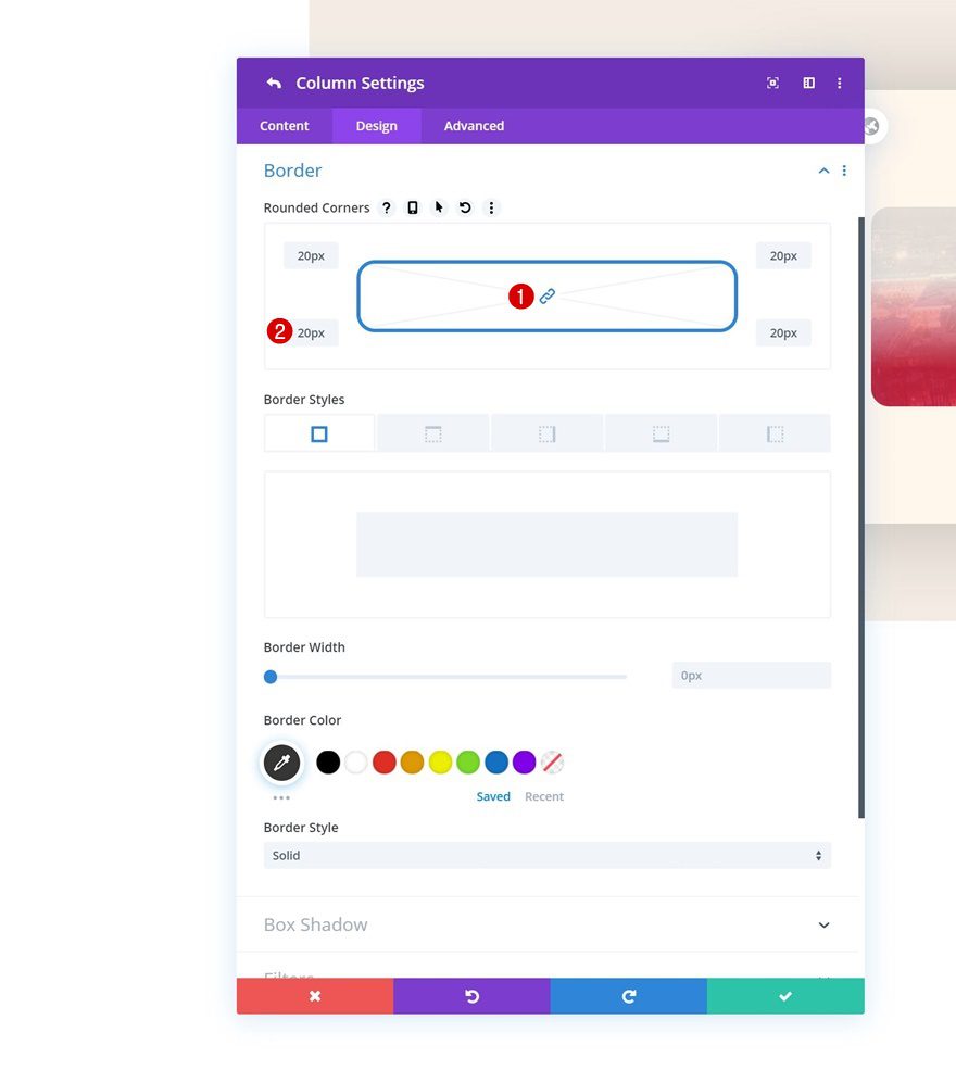
Border
Continue by adding ’20px’ border radius to each one of the corners in the border settings.
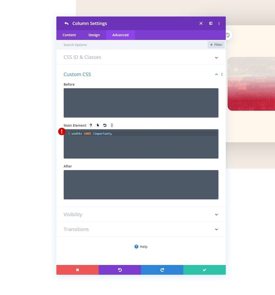
Main Element
Another important part in making this work is adding one single line of CSS code to the main element of the column.
width: 100% !important;
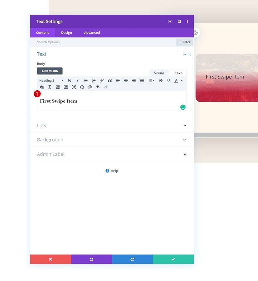
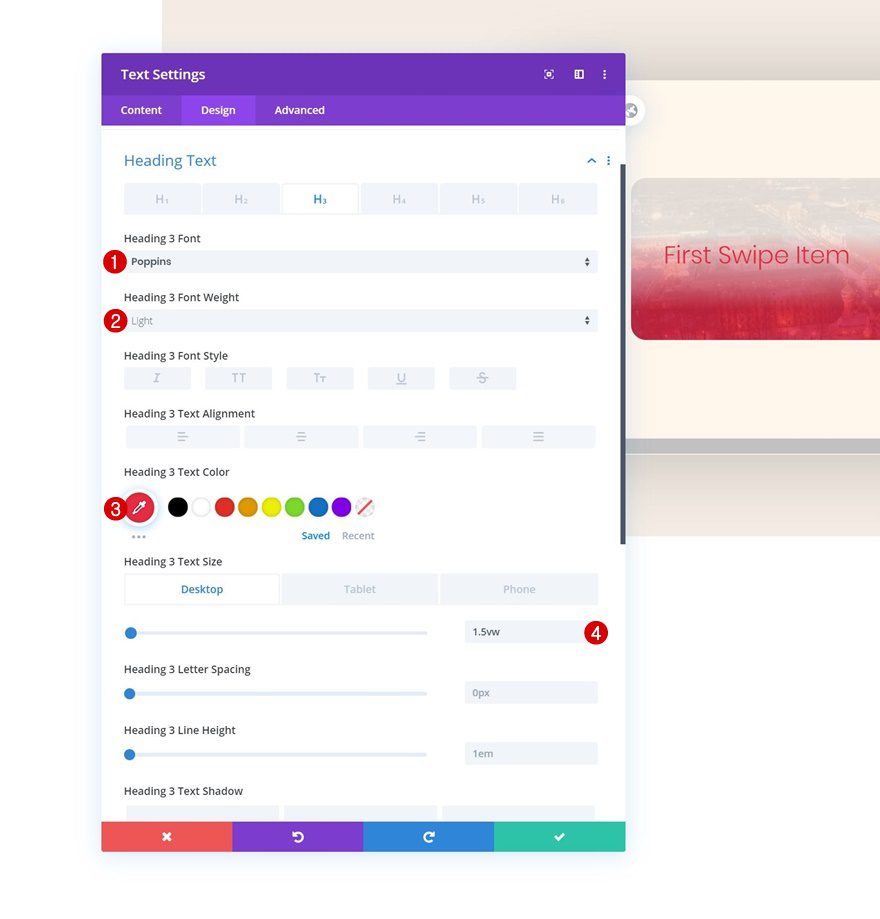
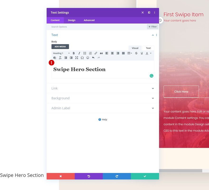
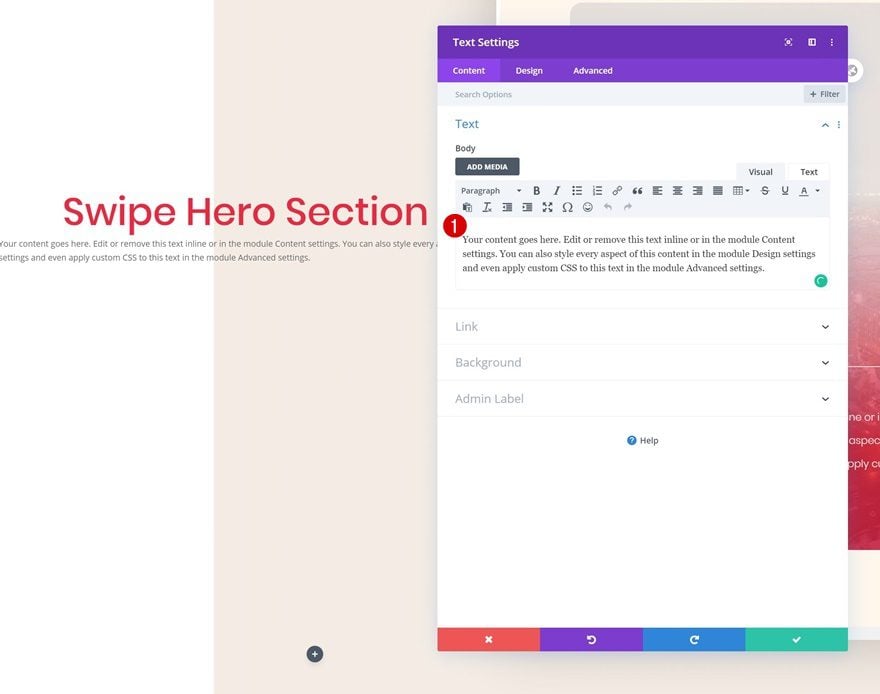
Add Text Module #1 to Column 1
Add H3 Content
Time to start adding modules! You can add as many modules as you want and style them to your own preference. If you, however, want to recreate the exact same example that was shared in the preview of this post, start with a Text Module and insert some H3 content.
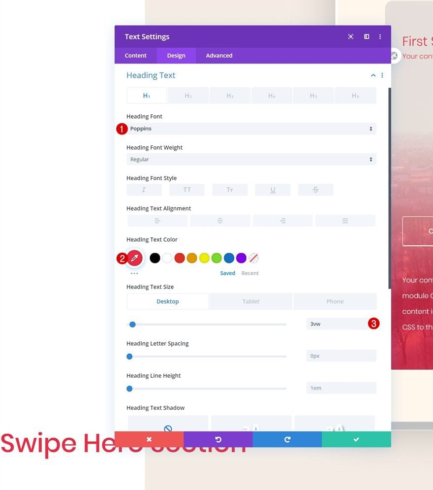
H3 Text Settings
Move on to the design tab and change the H3 text settings accordingly:
- Heading 3 Font: Poppins
- Heading 3 Font Weight: Light
- Heading 3 Text Color: #e92640
- Heading 3 Text Size: 1.5vw (Desktop), 3.5vw (Tablet), 4.5vw (Phone)
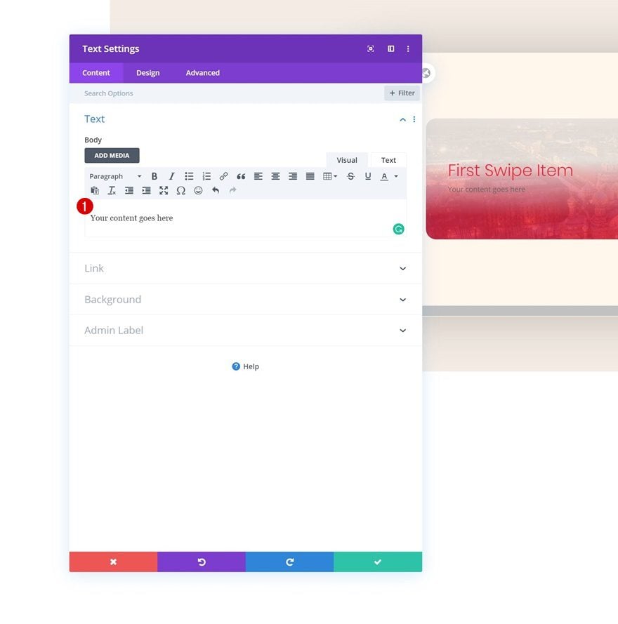
Add Text Module #2 to Column 1
Add Content
The next module we need is another Text Module. Enter some paragraph content of your choice.
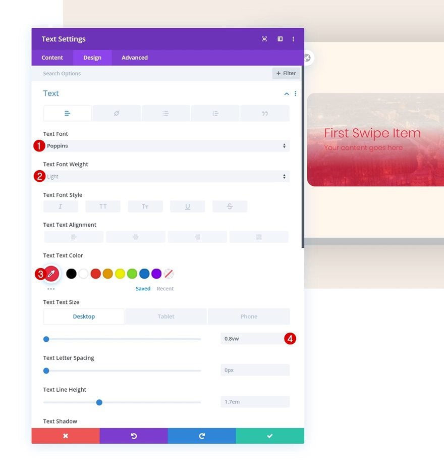
Text Settings
Go to the text settings next and make some changes.
- Text Font: Poppins
- Text Font Weight: Light
- Text Color: #e92640
- Text Size: 0.8vw (Desktop), 1.9vw (Tablet), 2.8vw (Phone)
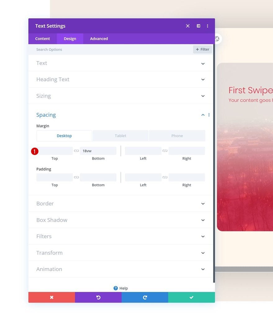
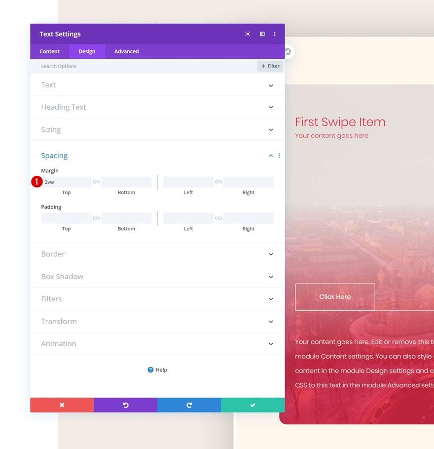
Spacing
We’re also adding some bottom margin to create space in our column swipe card.
- Bottom Margin: 18vw (Desktop), 30vw (Tablet), 42vw (Phone)
Add Copy
On to the next module, which is a Button Module. Enter some copy of your choice.
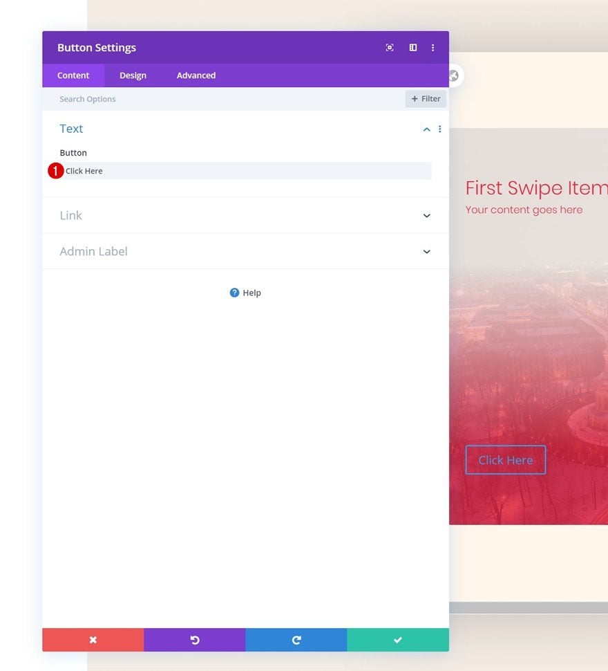
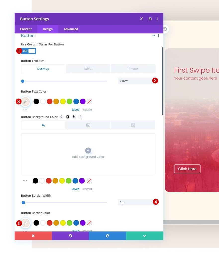
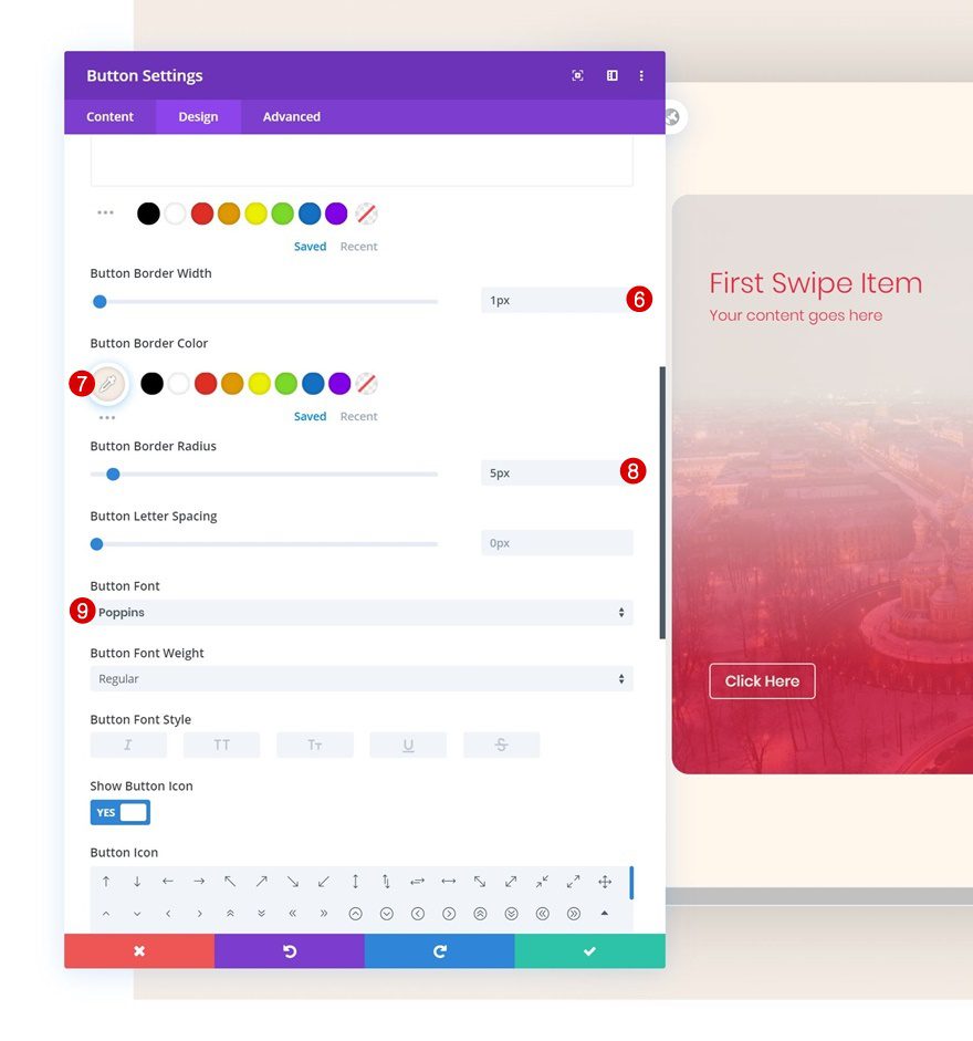
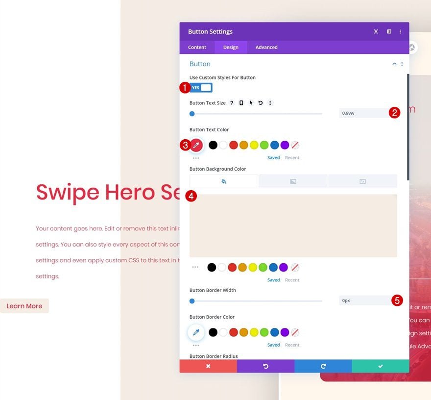
Button Settings
Move on to the design tab and change the button settings accordingly:
- Use Custom Styles For Button: Yes
- Button Text Size: 0.8vw (Desktop), 1.8vw (Tablet), 2.5vw (Phone)
- Button Text Color: #f5ede5
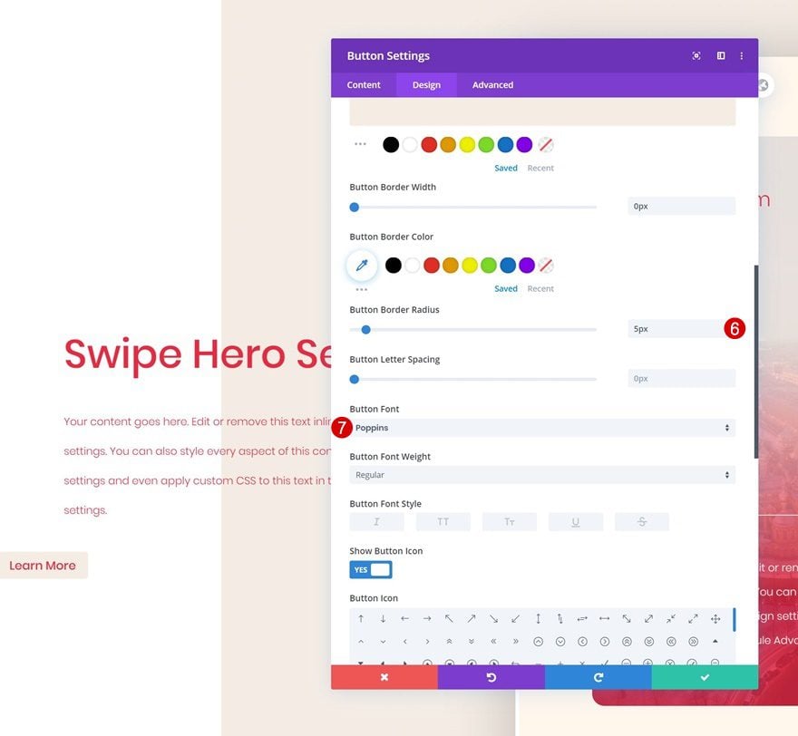
- Button Border Width: 1px
- Button Border Color: #f5ede5
- Button Border Radius: 5px
- Button Font: Poppins
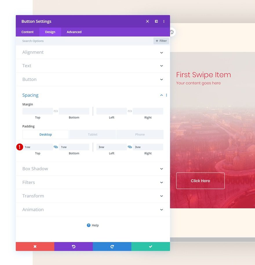
Spacing
Increase the size of the button by adding some custom padding values across different screen sizes.
- Top Padding: 1vw (Desktop), 2vw (Tablet), 3vw (Phone)
- Bottom Padding: 1vw (Desktop), 2vw (Tablet), 3vw (Phone)
- Left Padding: 3vw (Desktop), 5vw (Tablet), 7vw (Phone)
- Right Padding: 3vw (Desktop), 5vw (Tablet), 7vw (Phone)
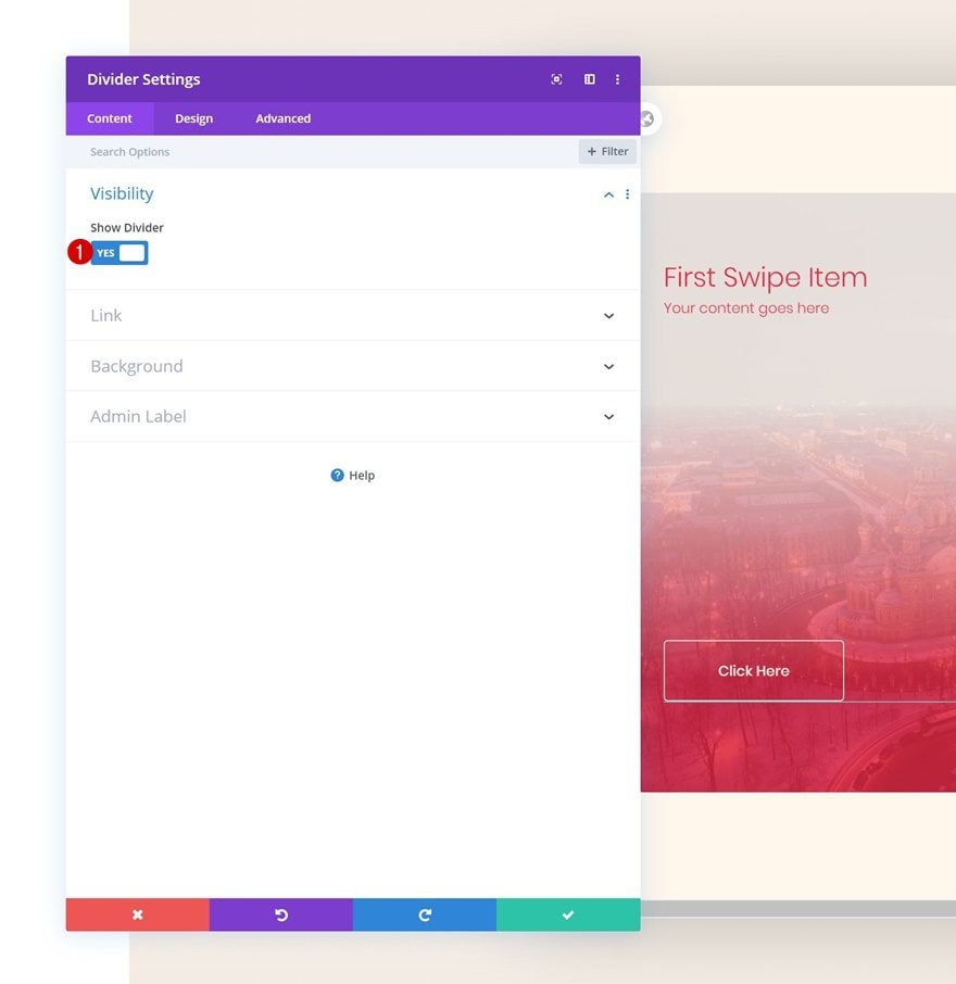
Add Divider Module to Column 1
Visibility
The next module we need is a Divider Module. Make sure the ‘Show Divider’ option is enabled.
- Show Divider: Yes
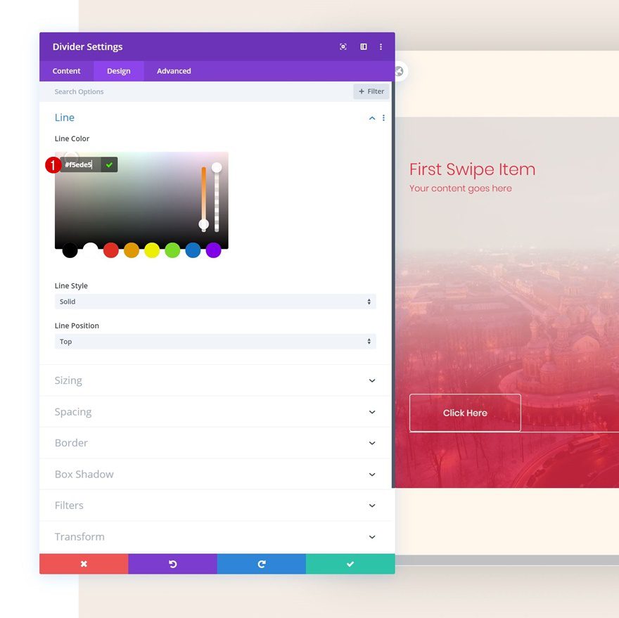
Line
Move on to the design tab and change the line color.
- Line Color: #f5ede5
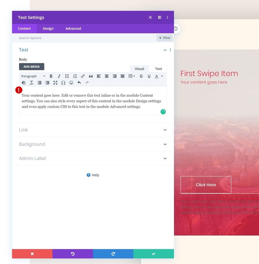
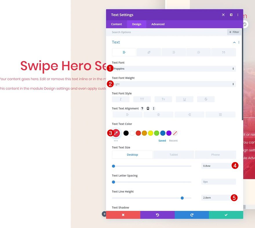
Add Text Module #3 to Column 1
Add Content
The next and last module we need in this column is another Text Module. Enter some paragraph content of your choice.
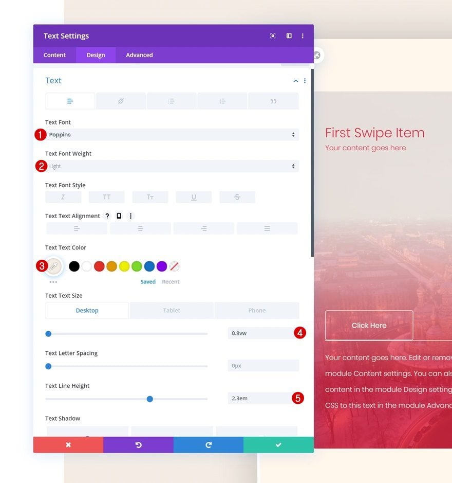
Text Settings
Move on to the design tab and change the text settings accordingly:
- Text Font: Poppins
- Text Font Weight: Light
- Text Color: #f5ede5
- Text Size: 0.8vw (Desktop), 1.9vw (Tablet), 2.8vw (Phone)
- Text Line Height: 2.3em
Spacing
Add some top margin as well.
- Top Margin: 2vw
Clone Column up to 5 Times & Reuse for Other CTAs
Once you’ve completed the first column and all the modules in it, you can clone the entire column up to 5 times, depending on how many column swipe CTA cards you want to display. Make sure you change all the copy for each column duplicate along with the button links.
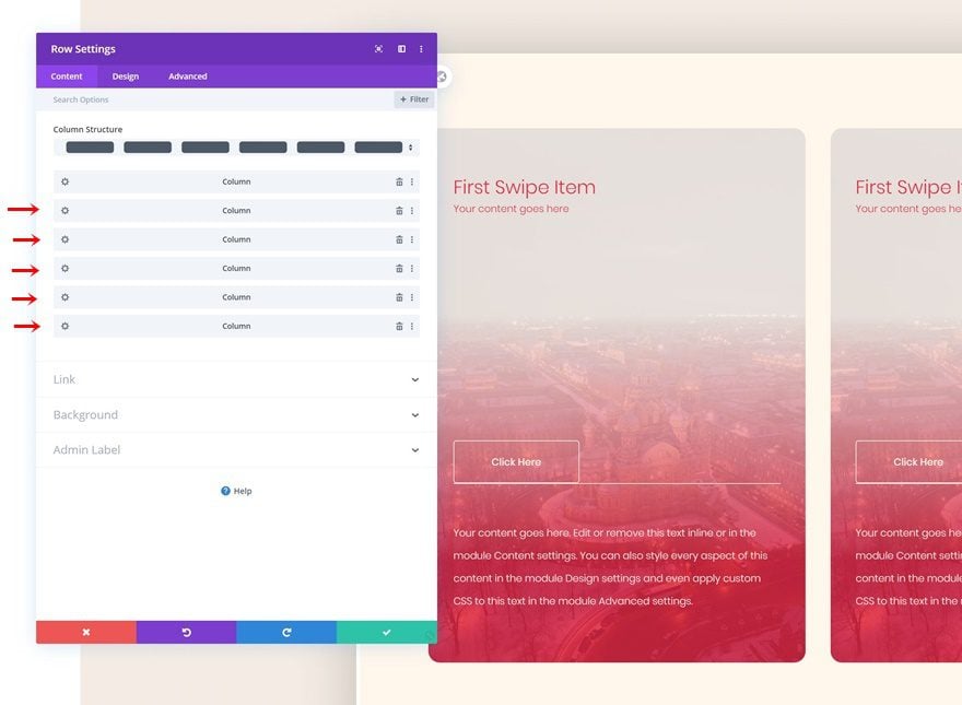
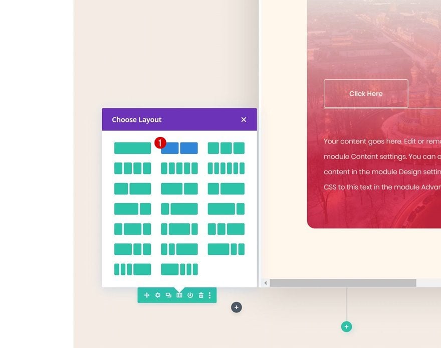
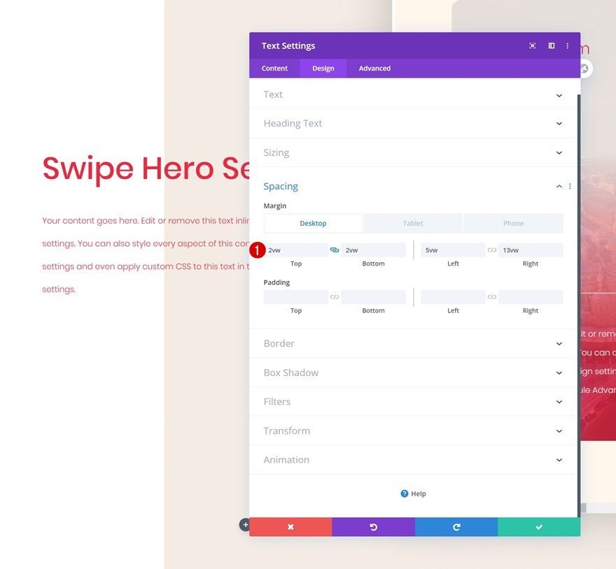
Add Row #2
Column Structure
On to the second row! We’ll use this row to create an overlap with the previous one. Choose the following column structure:
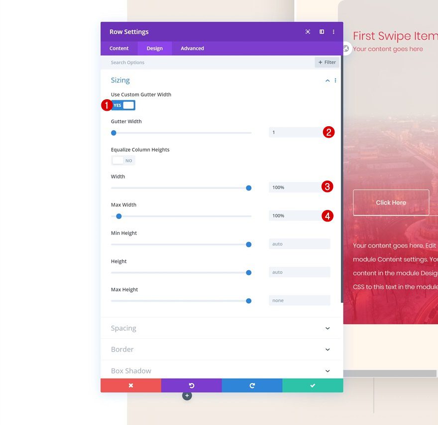
Sizing
Without adding any modules yet, open the row settings and adjust the sizing settings accordingly:
- Use Custom Gutter Width: Yes
- Gutter Width: 1
- Width: 100%
- Max Width: 100%
Spacing
Later on the post, we’ll add the modules we need and create a negative top overlap to make it seem like the modules are part of the first row. This means we don’t need the second row to take up any space in our design at all. That’s why we’re removing all default top and bottom row padding.
- Top Padding: 0px
- Bottom Padding: 0px
Add Text Module #1 to Column 1
Add H1 Content
Time to start adding modules! Start with a first Text Module and enter some H1 content of your choice.
H1 Text Settings
Move on to the design tab and change the H1 text settings accordingly:
- Heading Font: Poppins
- Heading Text Color: #e92741
- Heading Text Size: 3vw (Desktop), 5vw (Tablet), 7vw (Phone)
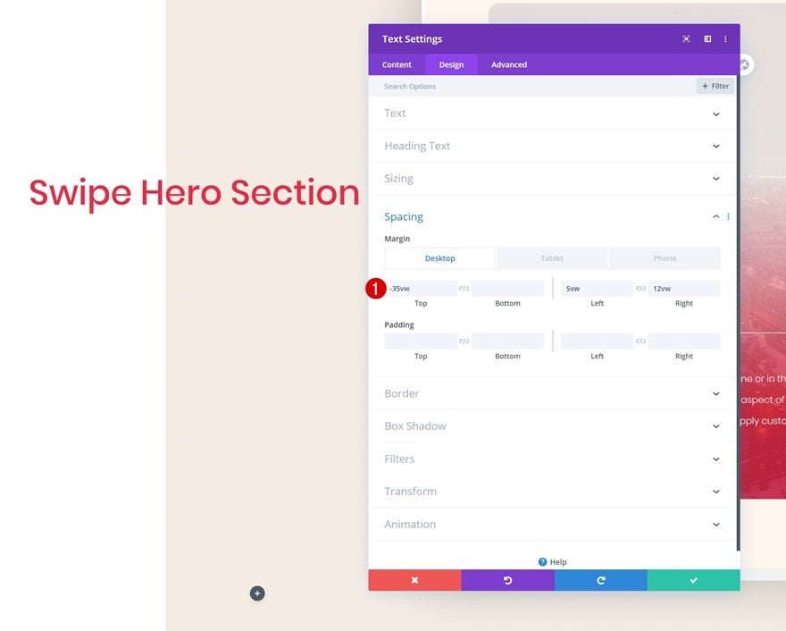
Spacing
Add some margin values next.
- Top Margin: -35vw (Desktop), 7vw (Tablet), 10vw (Phone)
- Left Margin: 5vw
- Right Margin: 12vw
Add Text Module #2 to Column 1
Add Content
The second module we need is another Text Module. Enter some paragraph content of your choice.
Text Settings
Go to the design tab and change the text settings accordingly:
- Text Font: Poppins
- Text Font Weight: Light
- Text Color: #e92741
- Text Size: 0.8vw (Desktop), 1.9vw (Tablet), 2.8vw (Phone)
- Text Line Height: 2.8em
Spacing
We’re adding some custom margin values to the Text Module as well.
- Top Margin: 2vw (Desktop), 7vw (Tablet), 10vw (Phone)
- Bottom Margin: 2vw (Desktop), 7vw (Tablet), 10vw (Phone)
- Left Margin: 5vw
- Right Margin: 13vw (Desktop), 5vw (Tablet & Phone)
Add Copy
The next module we need is a Button Module. Enter some copy of your choice.
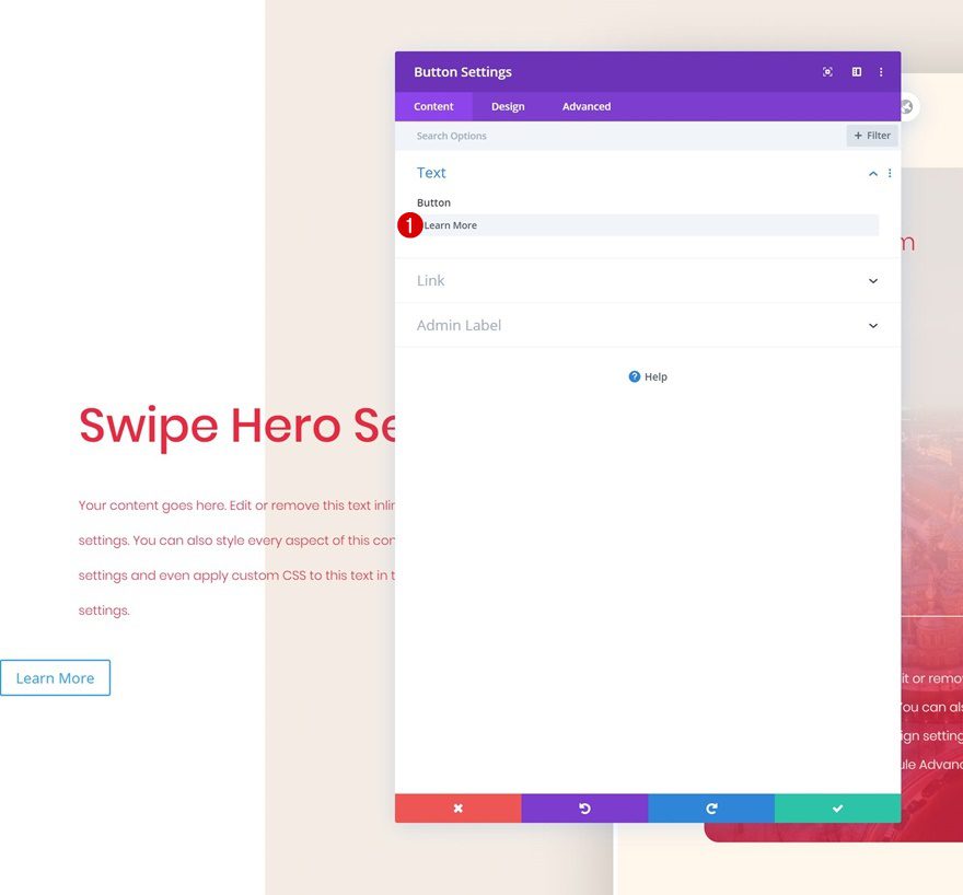
Button Settings
Then, go to the design tab and style the button.
- Use Custom Styles For Button: Yes
- Button Text Size: 0.9vw
- Button Text Color: #e92741
- Button Background Color: #f5ede5
- Button Border Width: 0px
- Button Border Radius: 5px
- Button Font: Poppins
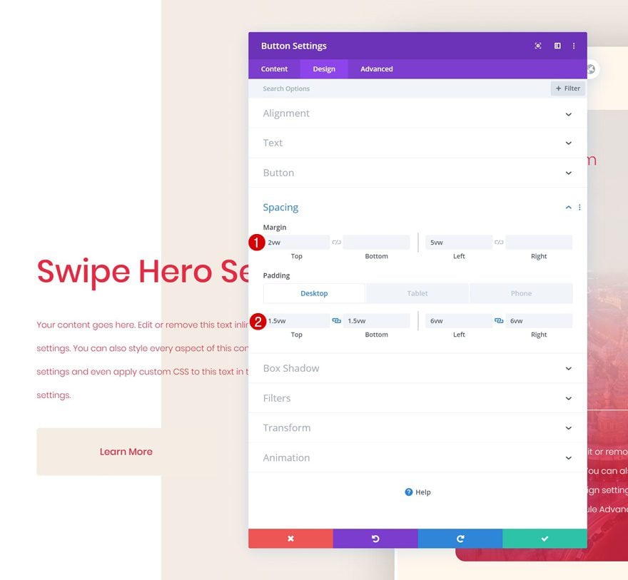
Spacing
We’re also increasing the size of the button by adding some custom spacing values.
- Top Margin: 2vw
- Left Margin: 5vw
- Top Padding: 1.5vw (Desktop), 2.5vw (Tablet), 3vw (Phone)
- Bottom Padding: 1.5vw (Desktop), 2.5vw (Tablet), 3vw (Phone)
- Left Padding: 6vw (Desktop), 9vw (Tablet), 15vw (Phone)
- Right Padding: 6vw (Desktop), 9vw (Tablet), 15vw (Phone)
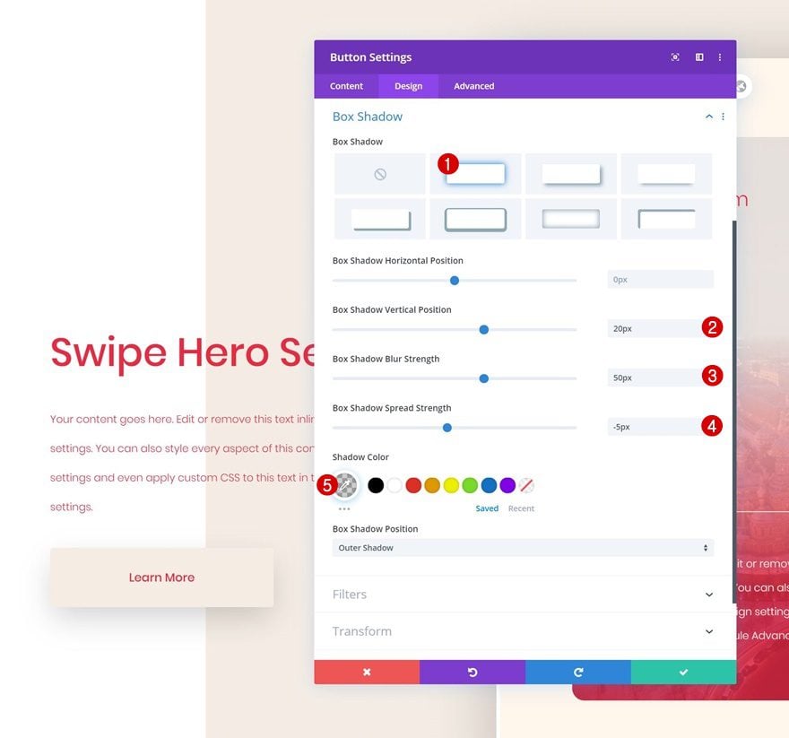
Box Shadow
Finish the Button Module design by adding a subtle box shadow.
- Box Shadow Vertical Position: 20px
- Box Shadow Blur Strength: 50px
- Box Shadow Spread Strength: -5px
- Shadow Color: rgba(0,0,0,0.19)
Preview
Now that we’ve gone through all the steps, let’s take a final look at the outcome across different screen sizes.
Desktop
Mobile
Final Thoughts
In this post, we’ve shared a beautiful column swipe hero section for free and we’ve also shown you how to recreate it from scratch. This is a great way to showcase multiple CTA cards in your hero section without having a design that looks too overwhelming. We hope you’ve enjoyed this tutorial and if you have any questions or suggestions, make sure you leave them in the comment section below!
If you’re eager to learn more about Divi and get more Divi freebies, make sure you subscribe to our email newsletter and YouTube channel so you’ll always be one of the first people to know and get benefits from this free content.


Hi! This is a great tutorial, thank you!!
I’ve implemented it on my website, but like some people mentioned, the only way users can scroll to see the other cards is by using the touchpad on PCs. Is it possible to remove the scrollbar and instead add left and right arrows for the user to move between cards (kind of like a slider)? Or maybe allow the user to drag the cards left/right using their cursor? Is there any way to remove the scrollbar completely to allow for any of these other options I mentioned? 🙂
Thanks again for the awesome tutorial!
This is simply gorgeous. Bravo, Donjete!
I’ve downloaded the json file and uploaded to the library… but it is not showing up anywhere to be used. so unfortunate, as I’d have love to have used it on a current project.
If you’re using the latest Divi version, there’s a small JSON bug going on that’ll be fixed very soon. In the meantime, you can go to your Divi Library, upload the JSON file, click on the JSON’s ‘edit’ option inside the Divi Library and resave the layout to your library by giving it another name. Once you create a new page, the library item with a new name will show up in ‘Your Saved Layouts’. Or, you can quickly roll back to the previous Divi version in the ‘Updates’ tab of your Divi Theme Options and upload the layout.
Amazing design. I just downloaded and implemented on my client’s website and he gave me 5 stars on the order and the best he tipped me. Thanks a lot for the design.
Great to hear! Happy you’ve enjoyed the download/tutorial! 🙂
Hello
Great design. For the desktop scroll problem, adding scroll button might resolve the issue and make it more comprehensible for the website user.
Just an idea ^^
Good day.
Happy you like the design! I’ve updated the JSON file in this post (removed the code module so the scrollbar shows up and people on PCs can use it).
Hello
Yes i saw it. But i think i will try to implement scroll button for pc. The design is very original but not every user will understand that they need to swipe to see the rest of the text. If i’m able to do it i will send you the code ( of course if you are interest)
Hi Keberin
Good idea! Do you finally did the code to implement scroll button for pc. ?
This is a great way to showcase multiple CTA cards in hero section without having a design . I enjoyed this tutorial .please could you explain in more details how to fix the bug for swaping please.
I’ve updated the JSON file in this post. If you’re still working on the old JSON, you can just delete the code module which allows the scrollbar to show up. Happy you like the tutorial and design! 🙂
I posted a comment something like 4 days ago on this post making a big compliment to Donjete and thanking for the work. It wasn’t published. And then, I look around and see some comments of people complaining or things like that. I don’t really know what I am doing wrong. It is not the first time it happens. My comments stay for moderation as every comment, but sometimes, never get published. Really, even compliments get blocked.
Some comments get published without pending approval, unfortunately, we don’t get a say in what akismet clears right away or puts as a pending comment first. We most definitely appreciate your comments, although sometimes it takes a little while for us to go through the pending comments and accept them. Hope that clears things up and I’m happy to see you’re enjoying the tutorials! 🙂
Nice. Thanks a lot, Donjete! 🙂
Hello, I did download twice on 2 test website but the json dont work for me no swipe ?
the design is great thanks
Hey Marc, I’ve updated the JSON file or you can just delete the code module that’s included in the old JSON. That’ll allow the scrollbar to show up so people on PCs can use that instead. Happy you like the design! 🙂
Love the concept of this but I downloaded the json file and even went through the steps to confirm everything was in place. Can’t seem to get this to scroll on desktop. I’m only able to see the title and first 2 swipe modules.
Hey Rebecca, happy you like it! The only way to scroll on desktop is by using a touchpad, so I can see that becoming difficult for PCs. I would recommend leaving out the code module entirely or styling the column’s scrollbar using that class: .swipe-scrollbar::-webkit-scrollbar
Dear Donjete, could you explain in more details how to fix the bug for swaping please.
Regards
I’ve updated the JSON file in this post (deleted the code module), so now the scrollbar shows up. This allows people on a PC to use the scrollbar instead of swiping. If you’re using the old JSON file, you can just delete the code module or use the CSS class to style the scrollbar as you please. Hope that helps! 🙂
Wait!
Did you just say the json file doesn’t work on PC?
IF that’s the case, why not flag the entire tip with that up front?
And then deal with the details to modify the json file should one be so unfortunate to be on Pc?
Just saying.
I created it the tutorial on my laptop (touchpad) where it did work and unfortunately it didn’t cross my mind before I read Rebecca’s comment. Although the change that needs to be made is minimal (just delete the code module), I’ll happily update the JSON file 🙂
thanks for sharing very impressive article its very helpful to us
You’re welcome! 🙂
Hi Donjëte!
This looks amazing! I’ve installed the premade layout but cant get it to move on scroll, nor on click nor on both on desktop. On mobile is just fine… i’ve looked in to it but all css is in place so i dont get why its not working?
Hey Lotje, I’ve only recently noticed that it’s not possible to scroll on a PC (laptop and smaller devices work) without a scrollbar, so you’ll have to delete the code module or style the scrollbar using the CSS class in the code module. I’ve updated the JSON file in this post (the code module has been removed). Hope that helps and happy you like it! 🙂
For a newbie this is mind-blowing many thanks
Always nice to hear. Glad you’ve enjoyed the tutorial, Peter! 🙂
I knew it was you, Donjete! Awesome job again! Thanks a lot for the download as well!
Thanks Elisandro, happy you like it! Thanks for leaving a comment! 🙂
So what I wonder is this. There are only 5 comments here. How many people downloaded the json file?
Thanks for the article and download 🙂
You’re welcome, Noz! 🙂
Hello,
Thank you for this tutorial and sharing the file.
All parameters are easily adjustable to many configurations, it’s perfect.
Happy you like it, Bruno! 🙂
This is very cool. Thanks!
Happy you like it, Britt! 🙂