Are you looking for an easy way to display your Instagram and Twitter posts on your website? Divi Social Plus is a plugin that adds 5 new social media modules to the Divi Builder. With this plugin, you can connect your Instagram and Twitter accounts to display fully customizable social media feeds and carousels. The plugin also comes with a social media share module that can also be fully customized and added to your layouts. In this plugin highlight, we’ll take a look at Divi Social Plus to help you decide if it’s the right social media plugin for you.
Let’s get started!
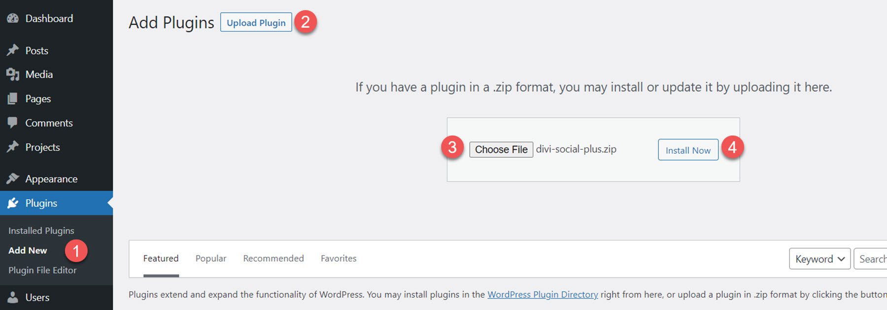
To install Divi Social Plus, navigate to the Plugin page in the WordPress dashboard and click Add New. Click Choose File and select the .ZIP plugin file, then click Install Now.
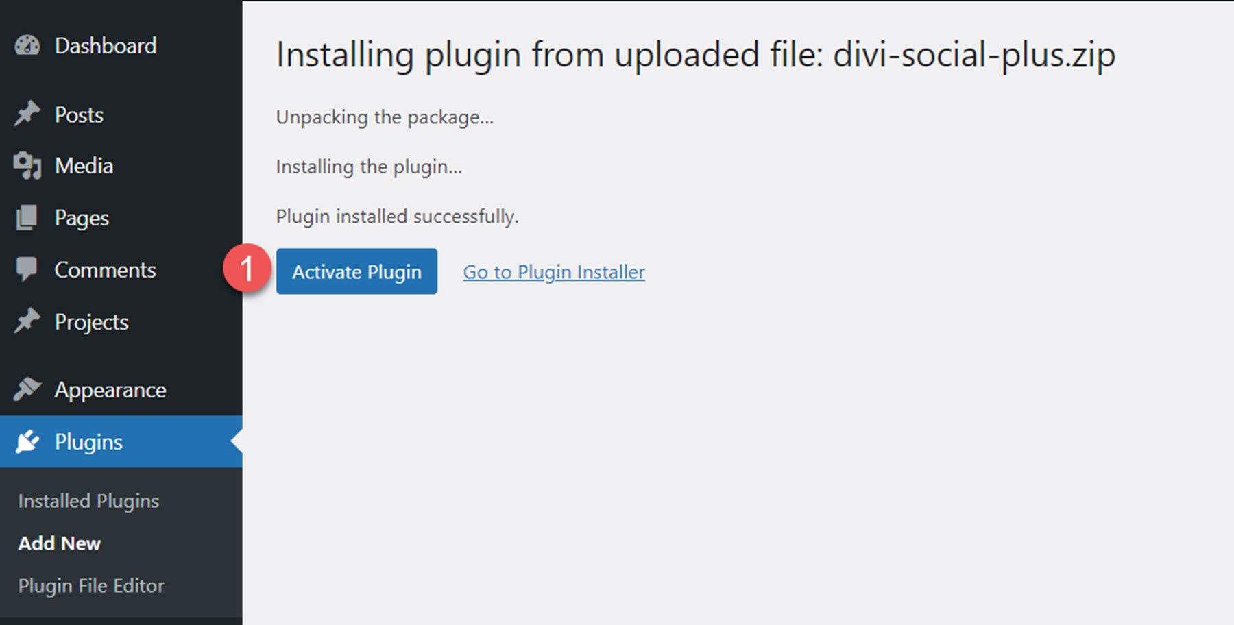
Once the plugin is installed, click activate.
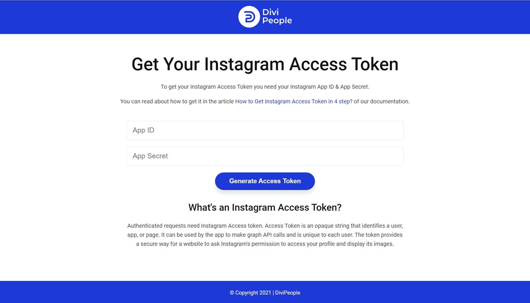
Get Instagram Access Token
In order to connect an account and display images with the Instagram modules, you need to generate an Instagram Access Token. The plugin author has some documentation you can follow to set up everything and get the App ID and App Secret you need to generate the Instagram Access Token.
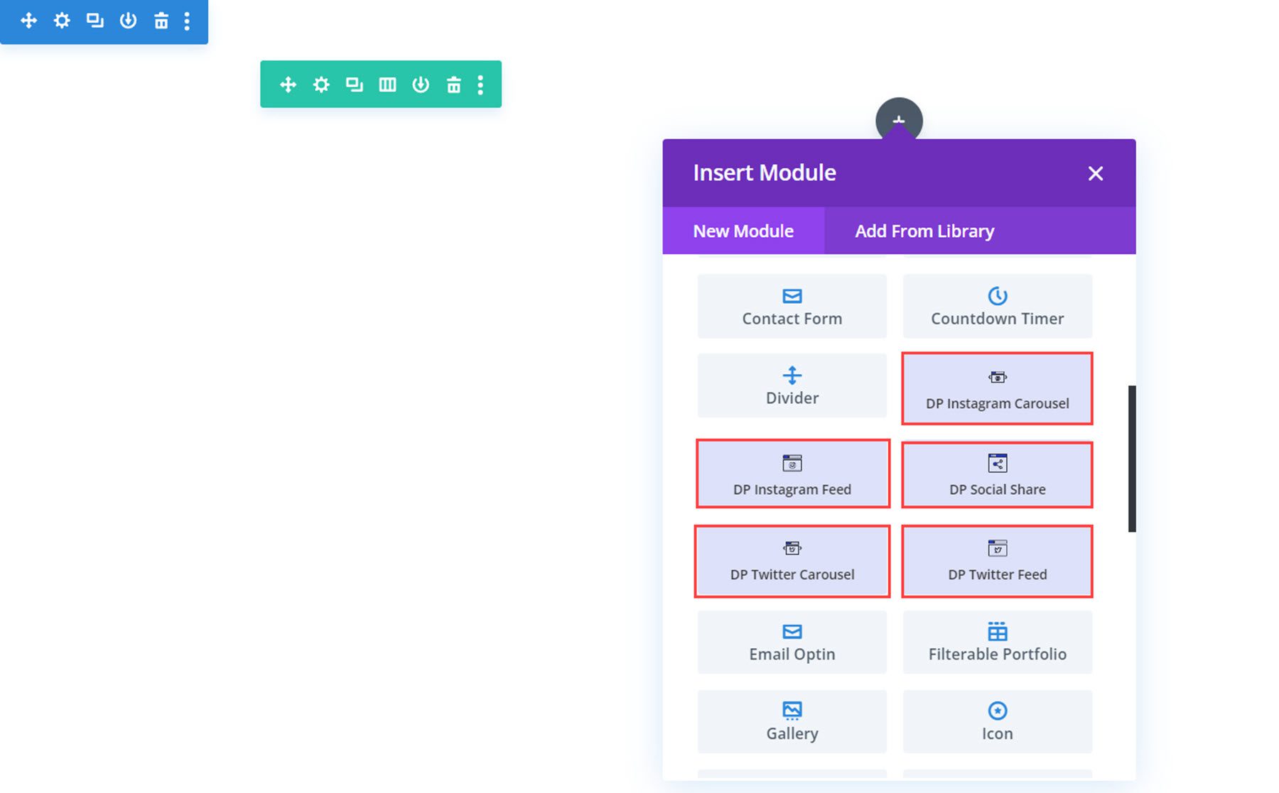
The plugin adds 5 new social media modules to the Divi Builder: Instagram Feed, Instagram Carousel, Social Share, Twitter Feed, and Twitter Carousel. Let’s take a look at each module.
Instagram Feed
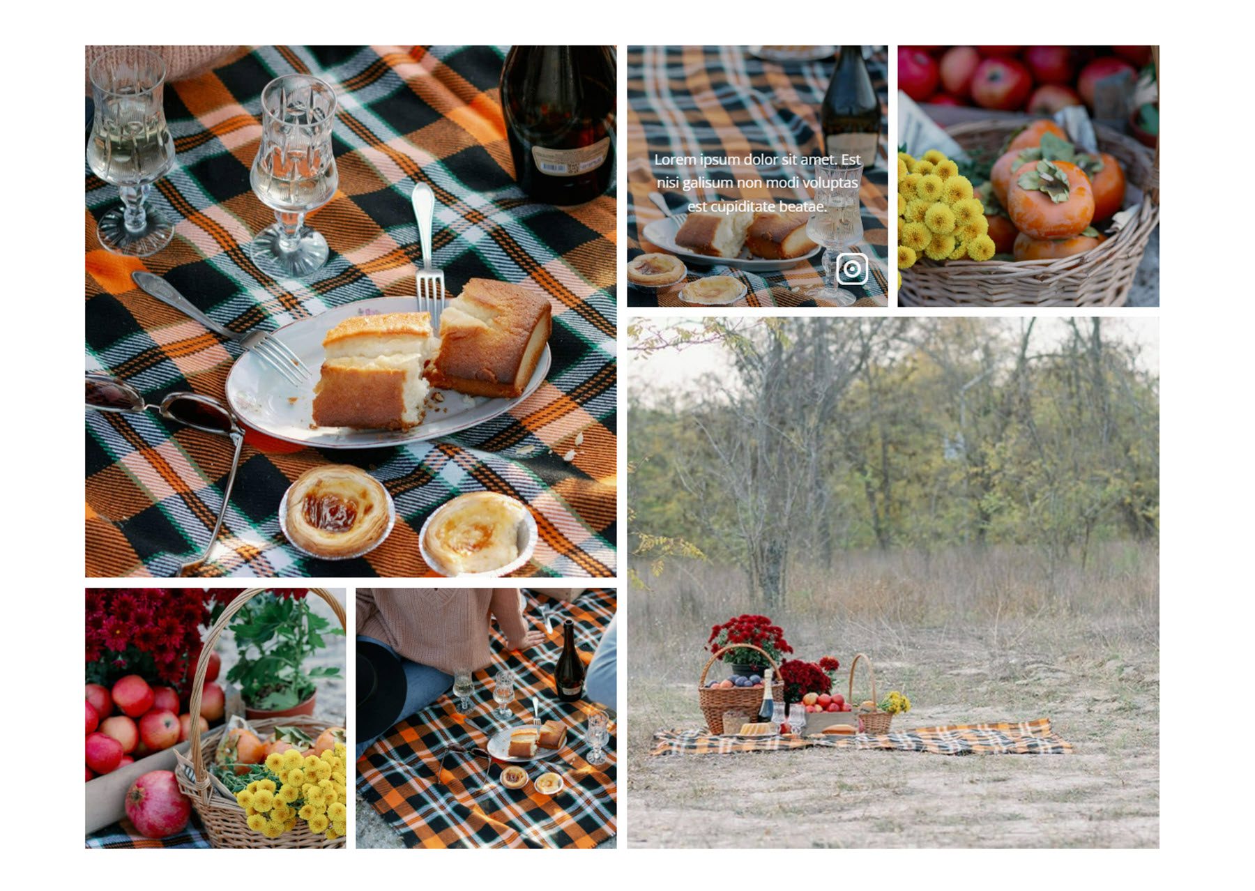
With this module, you can display your Instagram posts in a feed anywhere on your website. Let’s take a look at the settings.
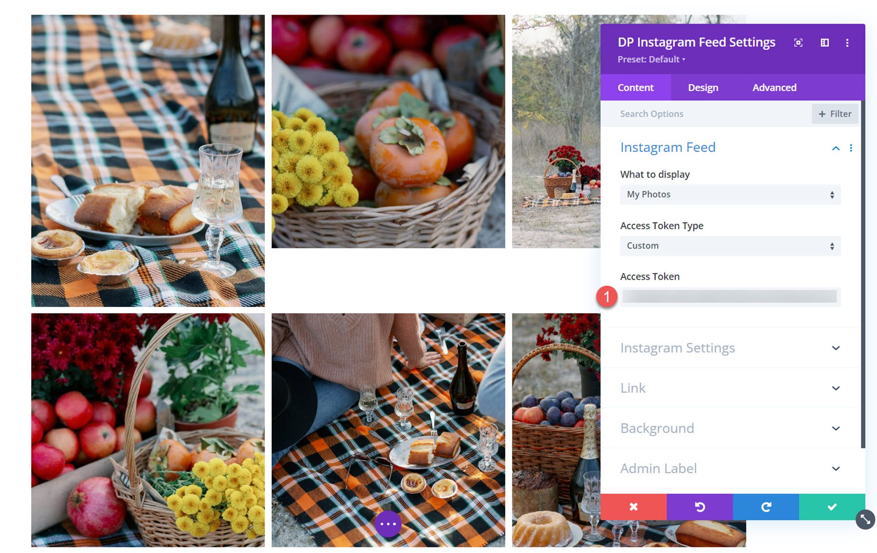
Content Settings
Under the Instagram Feed settings, you can add your generated Access Token. Once added, your Instagram photos will appear in the Visual Builder and on your website.
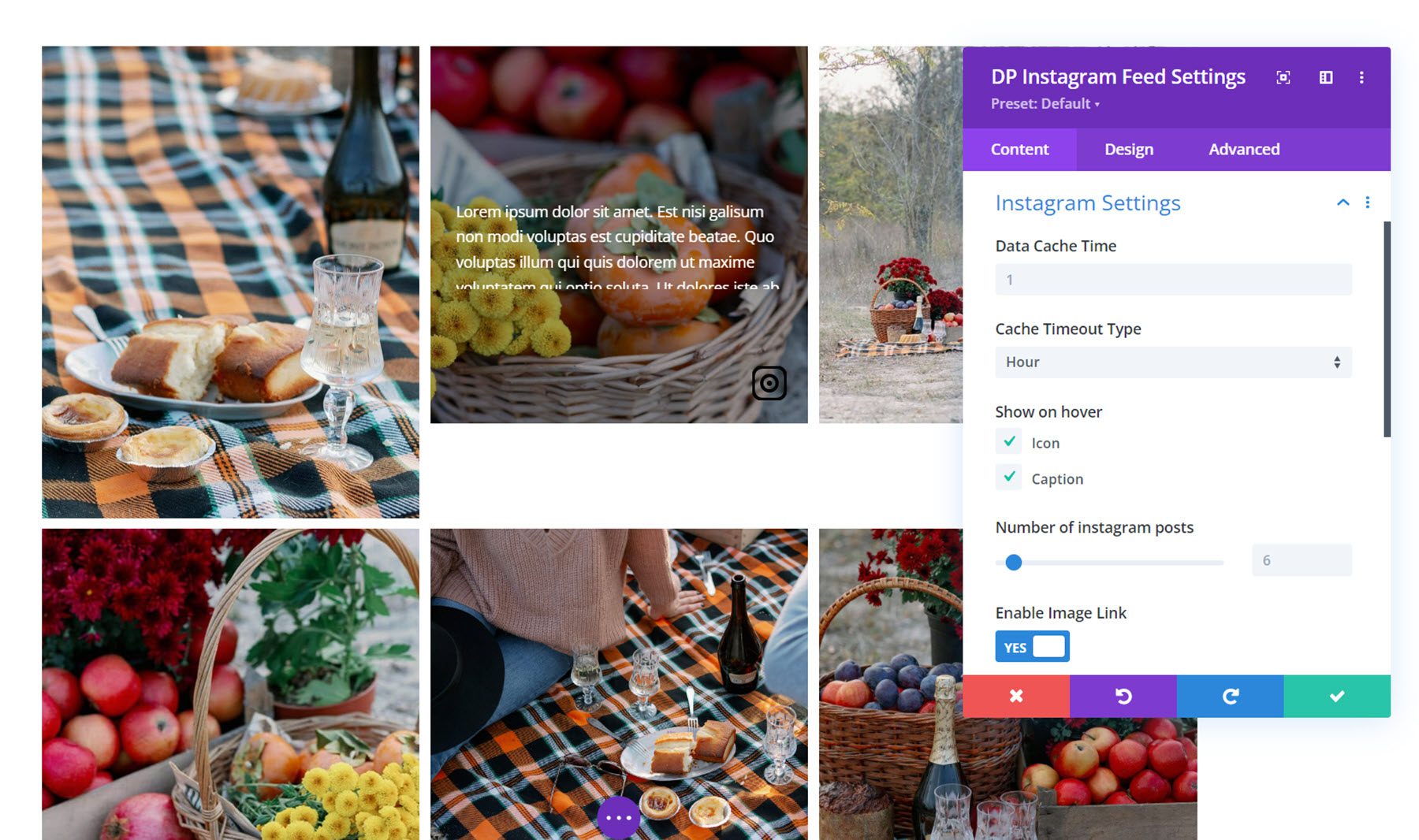
Instagram Settings
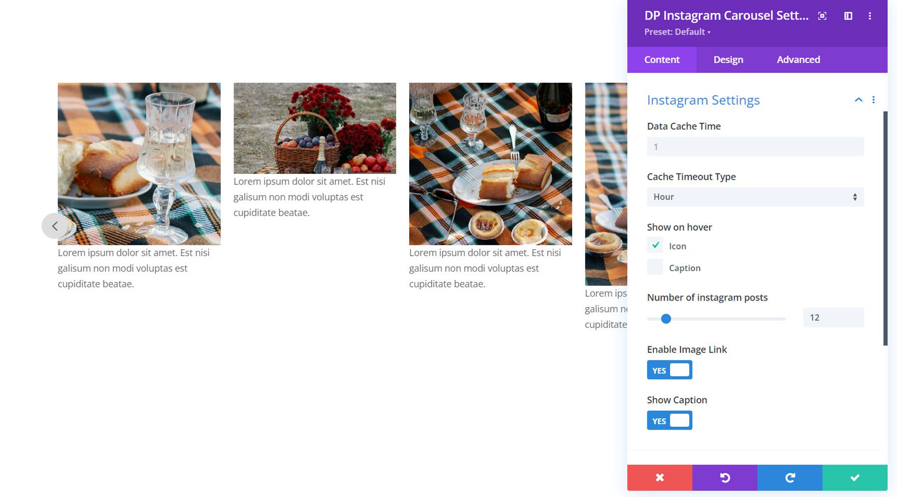
In the Instagram Settings section, you can set the data cache time and cache timeout time. You can also choose to show the icon and caption on hover and set the number of Instagram posts to display.
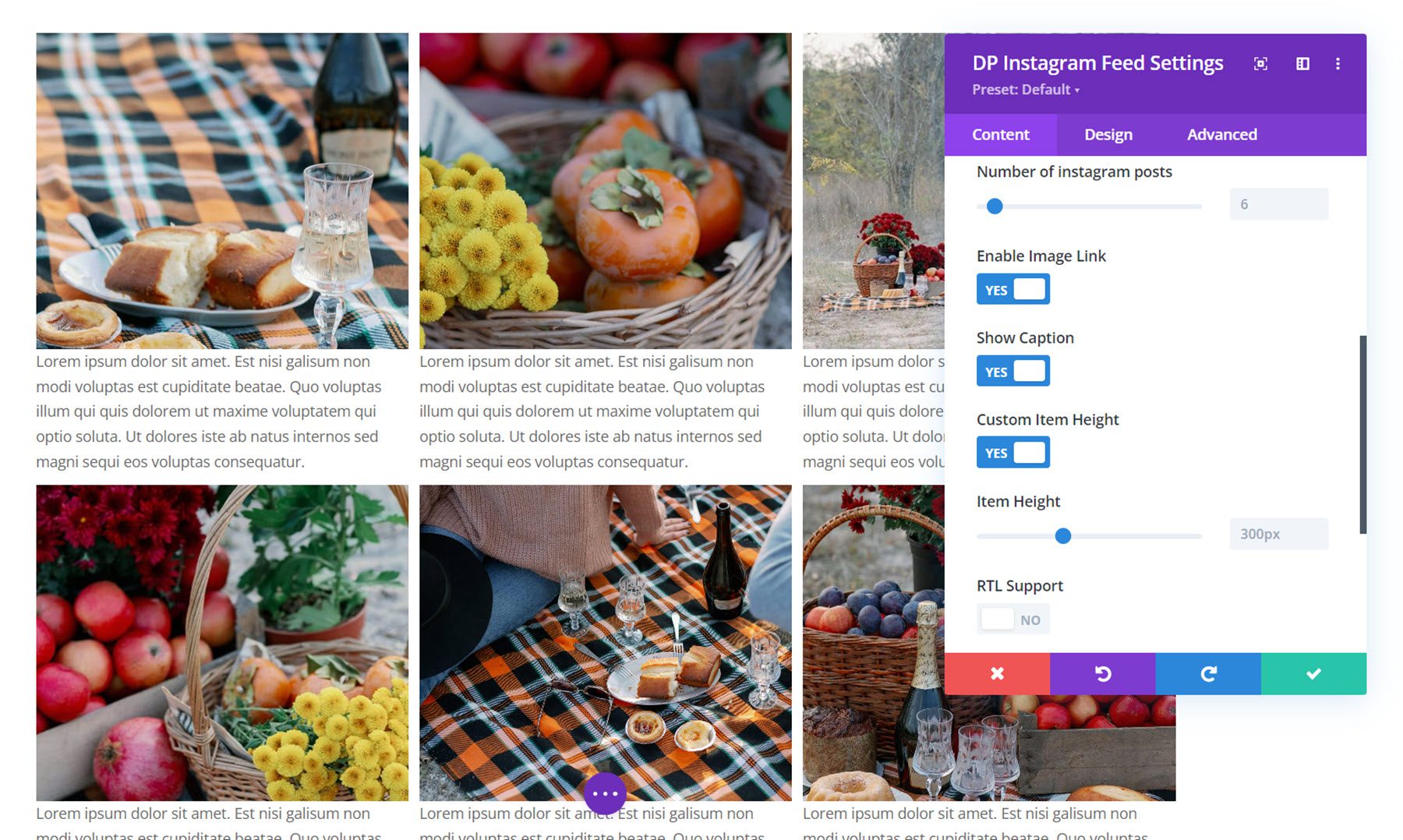
Additionally, you can enable the image link, show the post caption, set a custom item height, and enable RTL support.
Other Content Settings
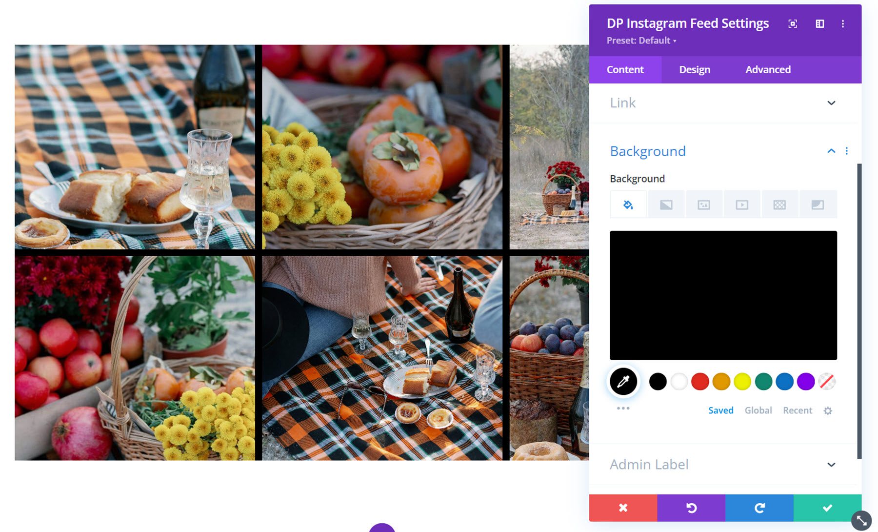
You can also set a link, background color, and admin label in the content tab settings.
Design Settings
Let’s take a look at the design settings.
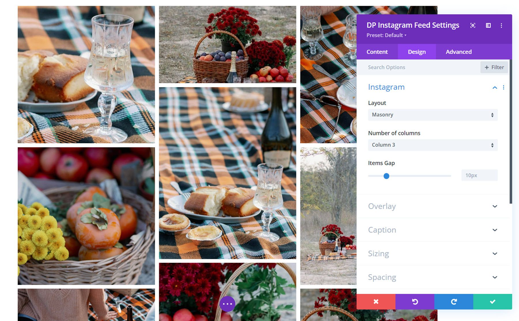
Under the Instagram tab, you can select the layout, the number of columns, and the gap between items. In addition to the grid layout pictured above, you can also choose the masonry layout or the highlight layout. This is the masonry layout.
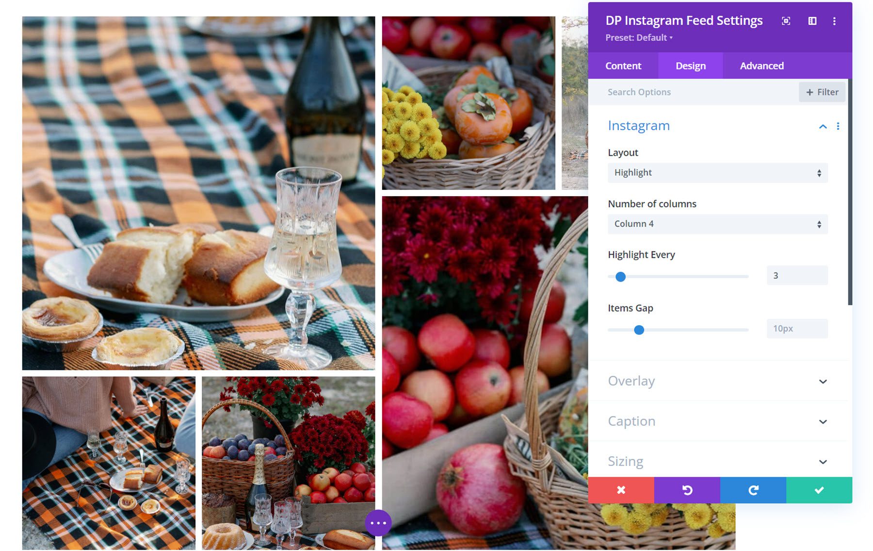
This is the highlight layout. When this layout is selected, you can choose to highlight every few images, making them appear larger in the grid.
Overlay
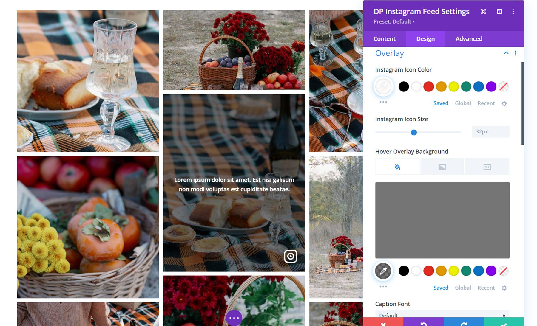
In the overlay settings, you can set the Instagram icon color and icon size, the overlay background color, and fully customize the caption text styles.
Caption
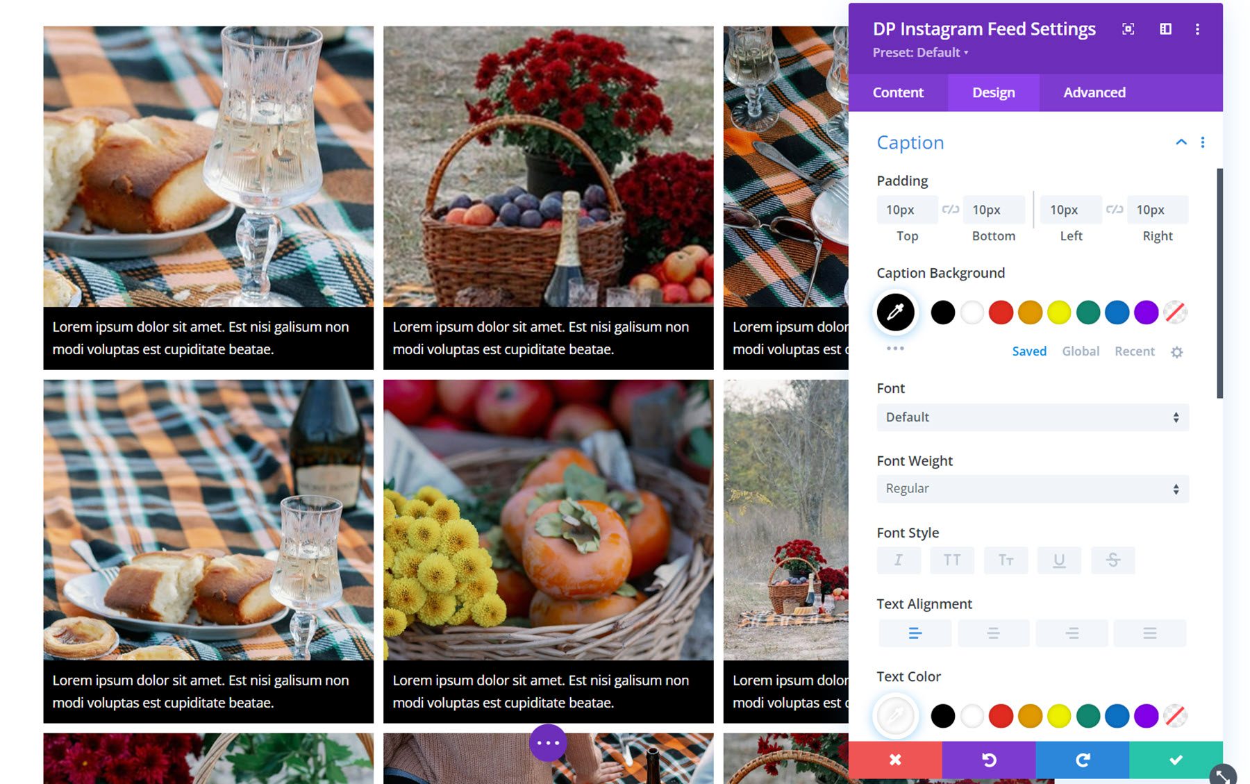
Here you can change the styling of the caption, if enabled. You can set the padding and caption background, and customize the caption text styles.
Other Design Settings
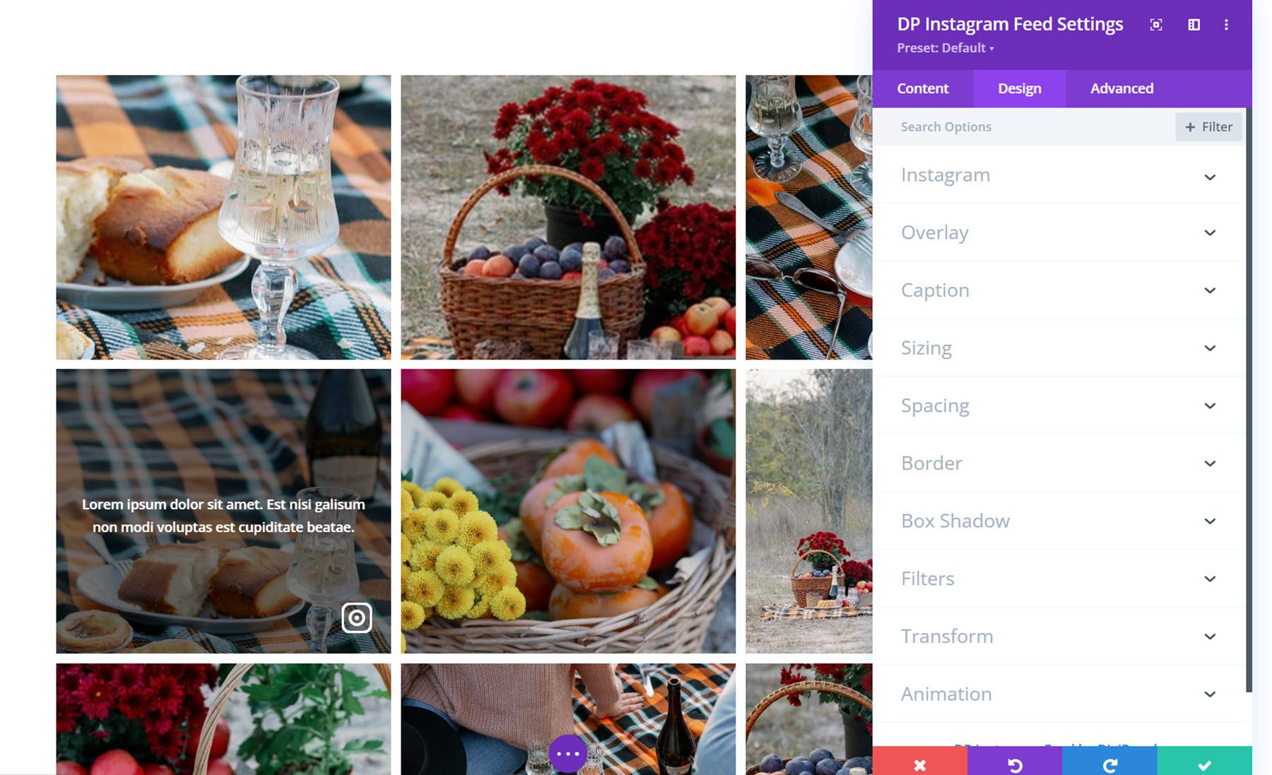
In addition to these unique design settings, you can also customize the sizing, spacing, border, box shadow, filters, transform, and animation options for the Instagram feed module.
Instagram Carousel
With the Instagram carousel module, you can showcase Instagram photos on your website in an engaging carousel format. Let’s take a closer look.
Content Settings
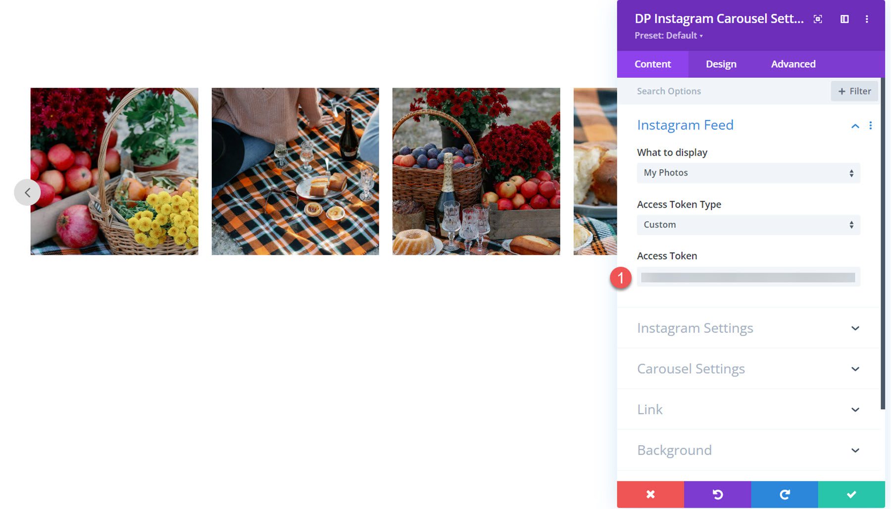
First, you need to add the Access Token you generated to the field in the Instagram Feed settings. Then your images will appear in the carousel.
Instagram Settings
Here you can set the data cache time and cache timeout type, show or hide the icon and caption on hover, set the number of Instagram posts to show, enable the image link, and show or hide the caption below the image.
Carousel Settings
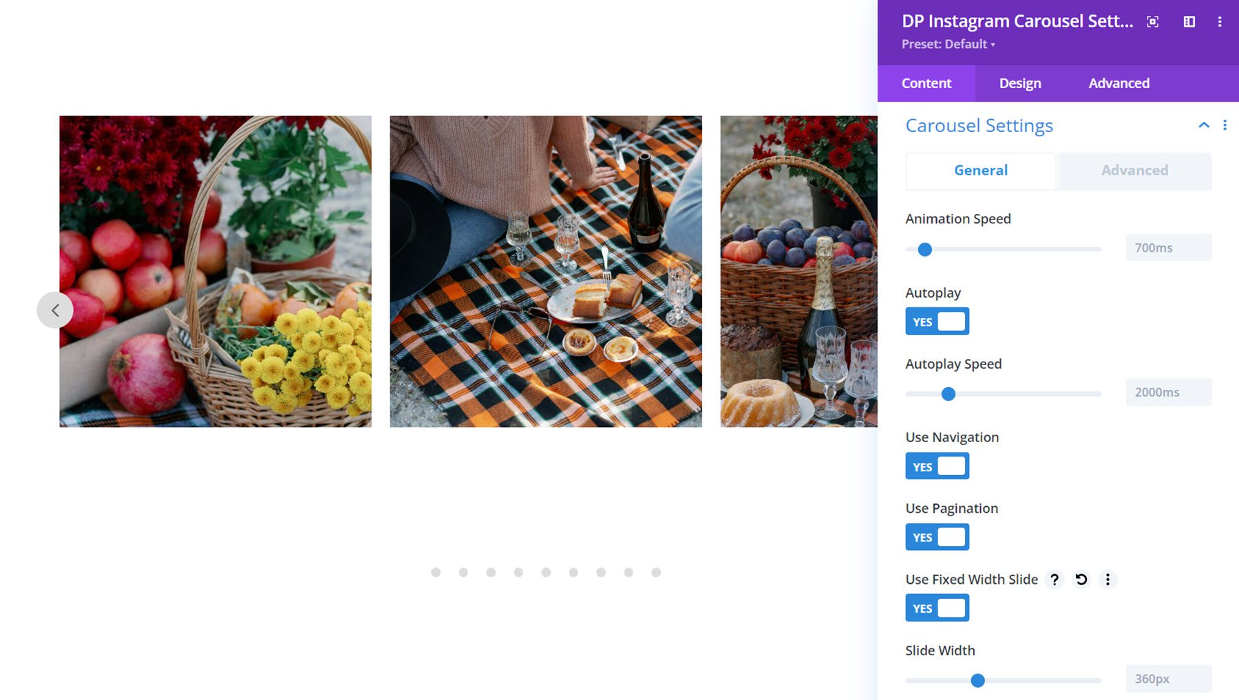
There are two tabs in the carousel settings – general and advanced. First, let’s take a look at the general tab. Here you can set the animation speed, enable autoplay and set the autoplay speed, enable navigation, and enable pagination. You can also enable fixed width slide and set a width for each image.
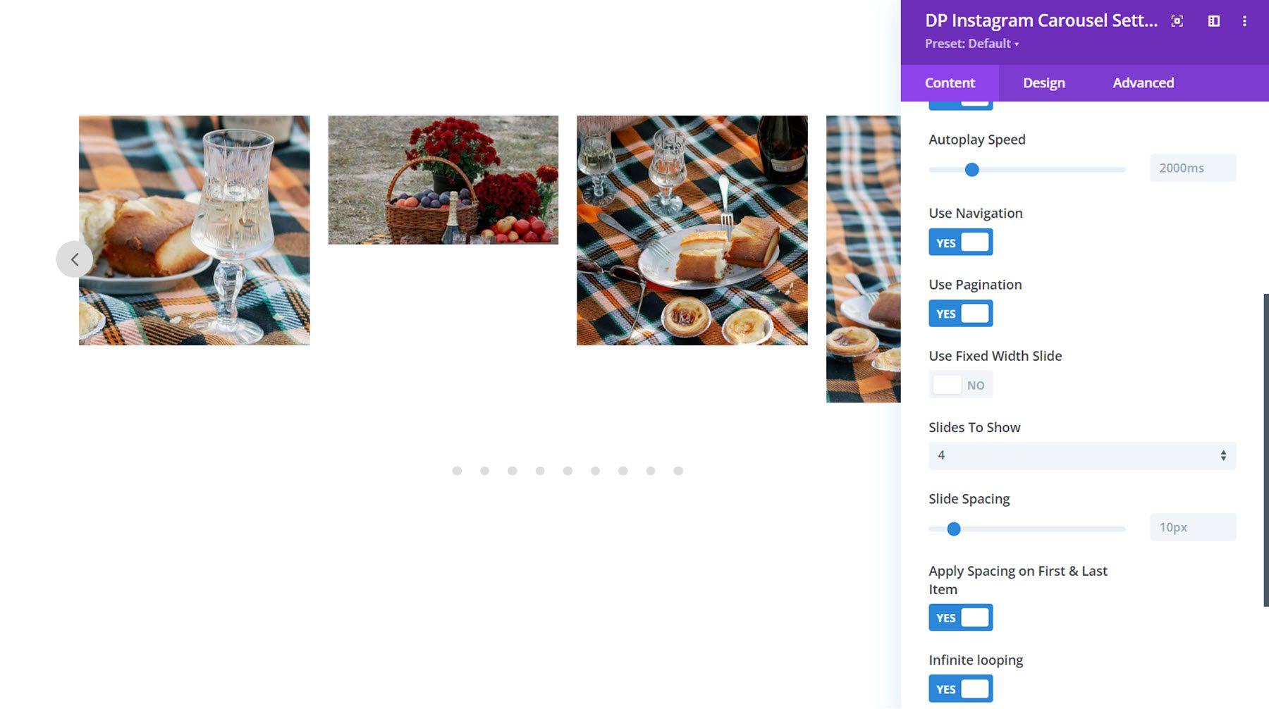
If fixed width slide is not enabled, you can specify the number of slides to show. In this section, you can also set the spacing between slides, choose whether to apply spacing on the first and last item, and enable infinite looping.
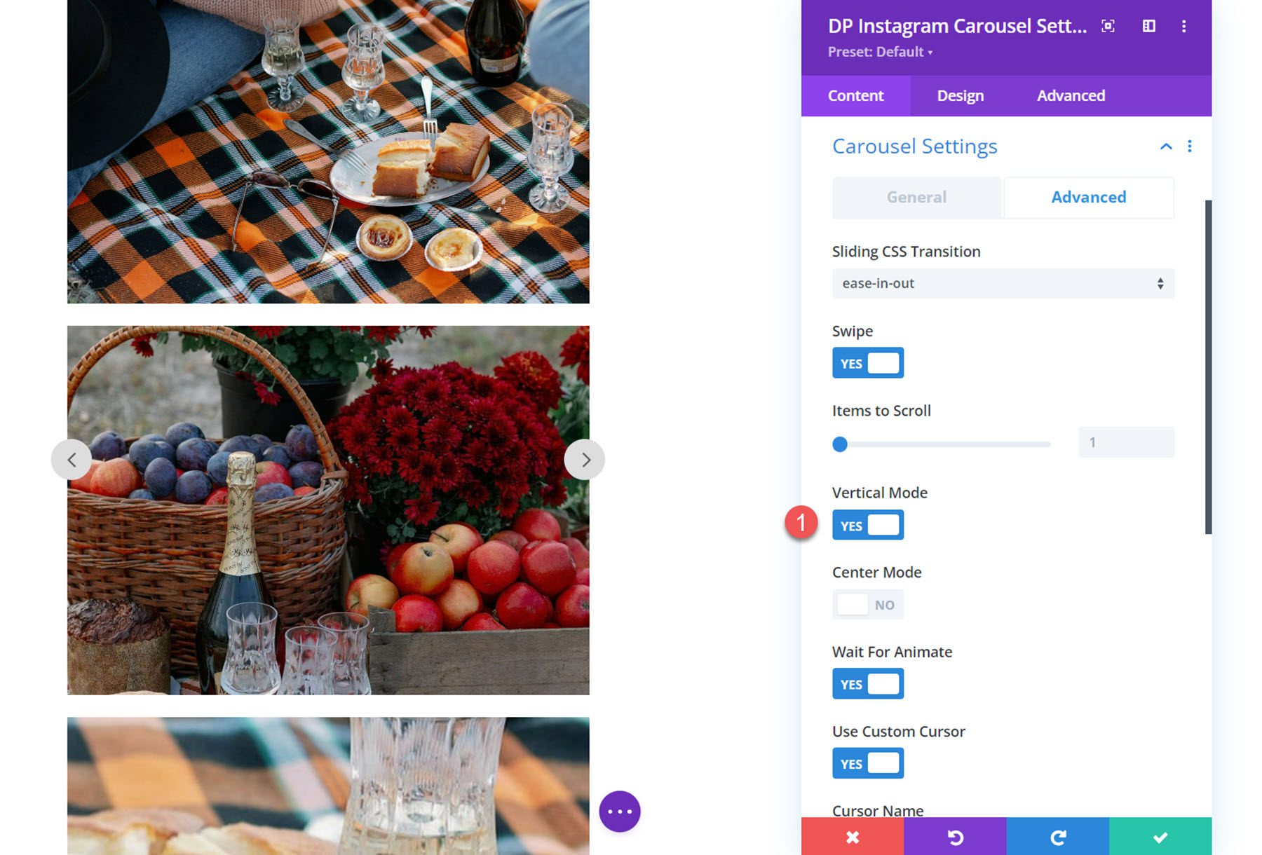
In the advanced tab of the carousel settings, you can set the sliding CSS transition type. You can choose from linear, ease-in, or ease-in-out. You can also enable swipe navigation and set the number of items to scroll. Here, you can also enable vertical mode to display your Instagram photos in a vertical carousel.
You can also enable center mode for the carousel. With this mode enabled, you can select from classic or highlighted. Here is what the highlighted center mode layout looks like, it features the center image larger than the surrounding images.
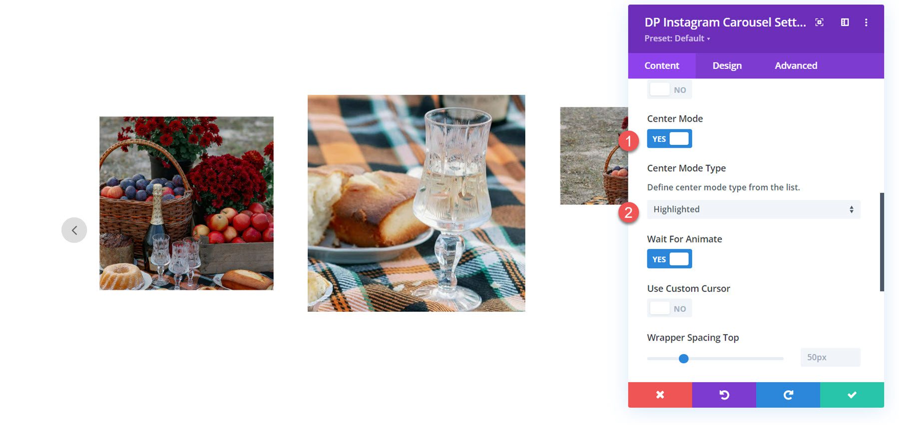
Also in this section, you can enable the wait for animate setting, which ignores requests to advance the slide during animation, and you can enable a custom cursor that appears over the slider.
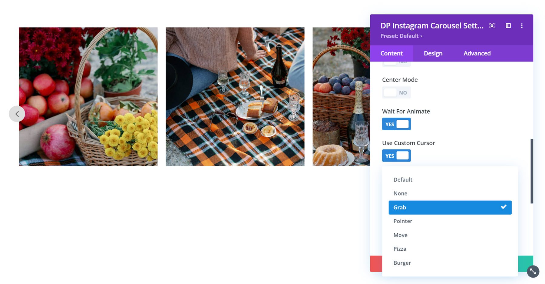
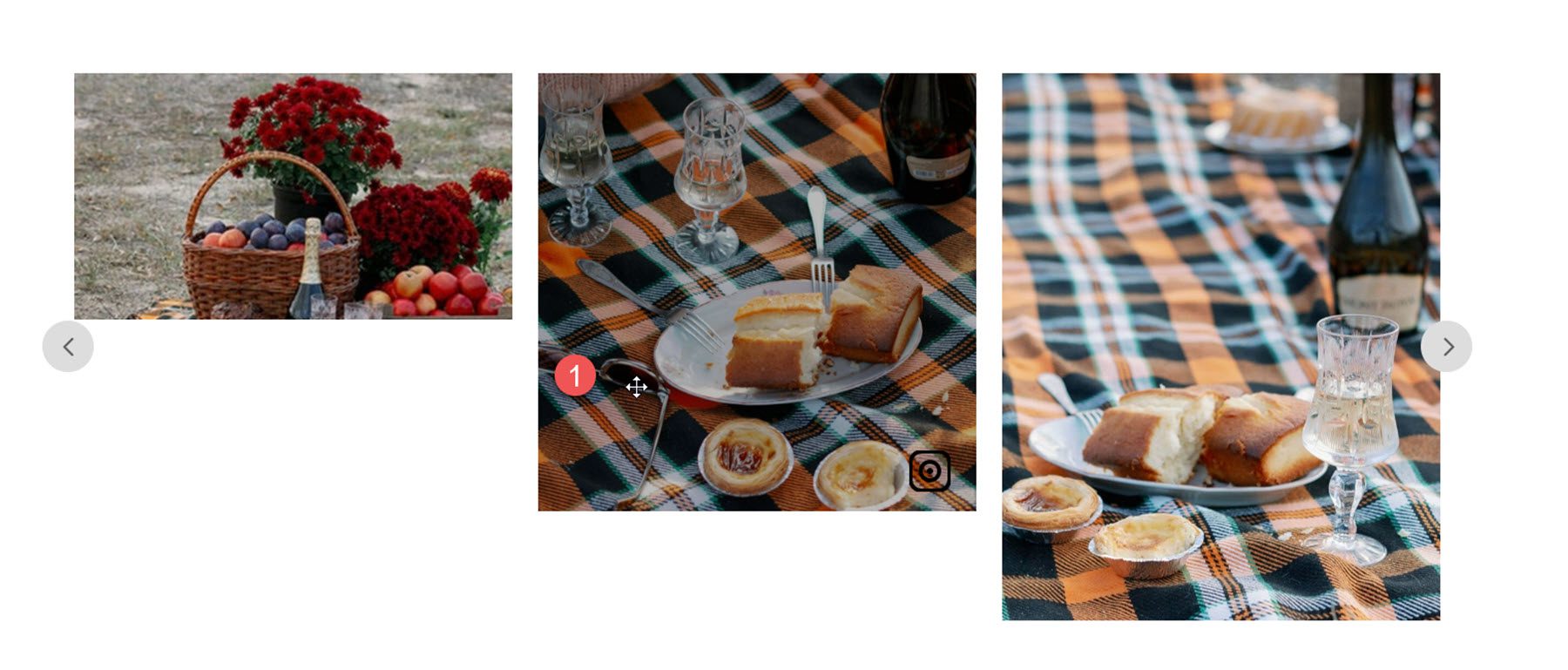
Here is the grab cursor style.
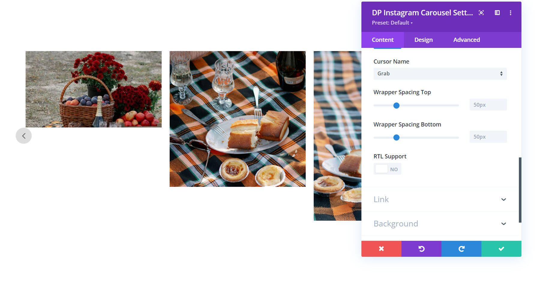
Finally, you can adjust the top and bottom wrapper spacing and enable RTL support.
Other Content Settings
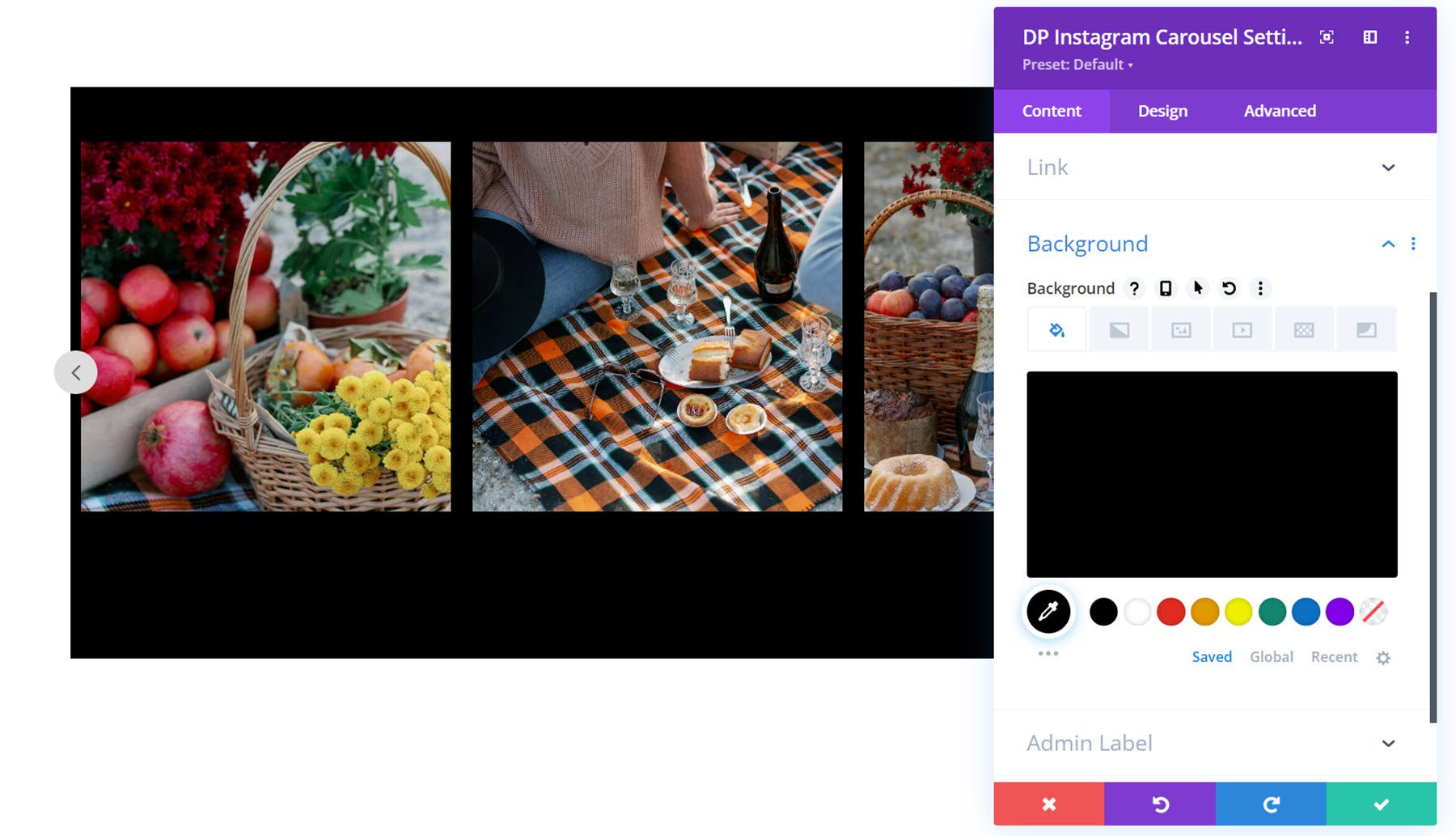
You can also customize the module link, background styles, and admin label within the content tab.
Design Settings
Many of the design settings for the Instagram Carousel module are similar to the settings for the Instagram Feed module. Let’s take a look.
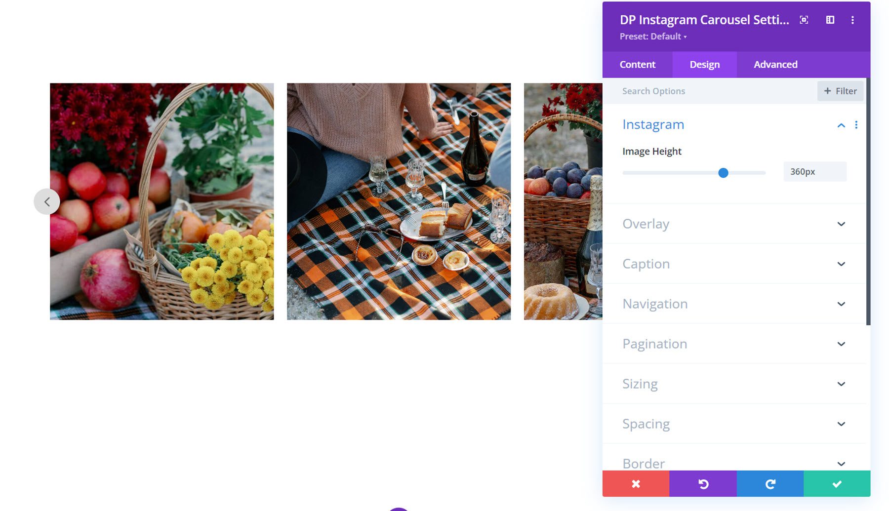
In this section, you can set the image height.
Overlay
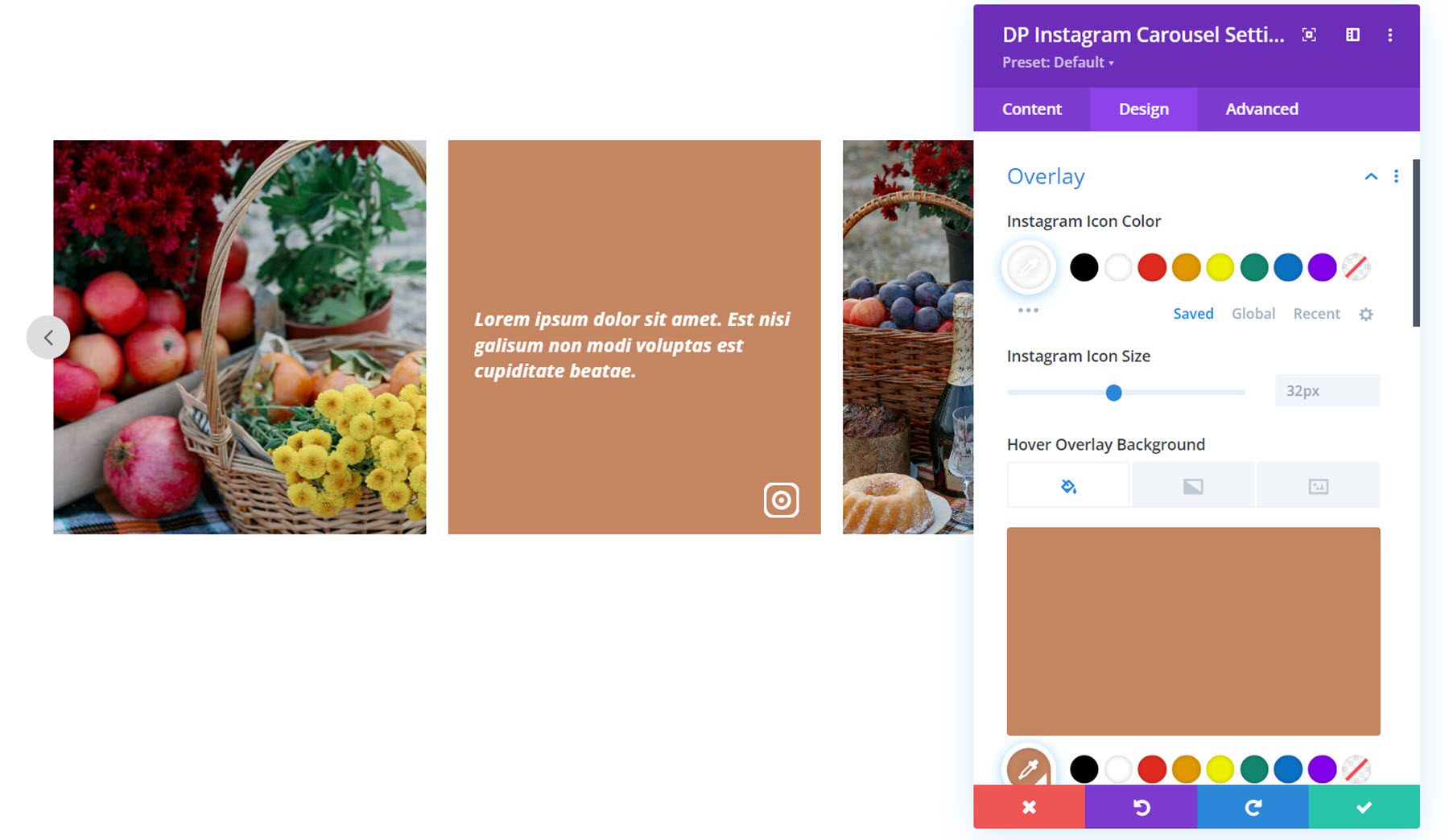
In the overlay section, you can customize the Instagram icon color and icon size, as well as the overlay background color and caption font styles. Here I have set a solid overlay color that appears on hover.
Caption
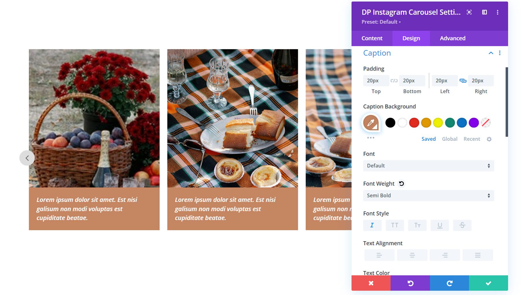
Here is where you can customize the styling of the caption shown below the image, if enabled. You can set the padding, caption background, and font styles.
Navigation
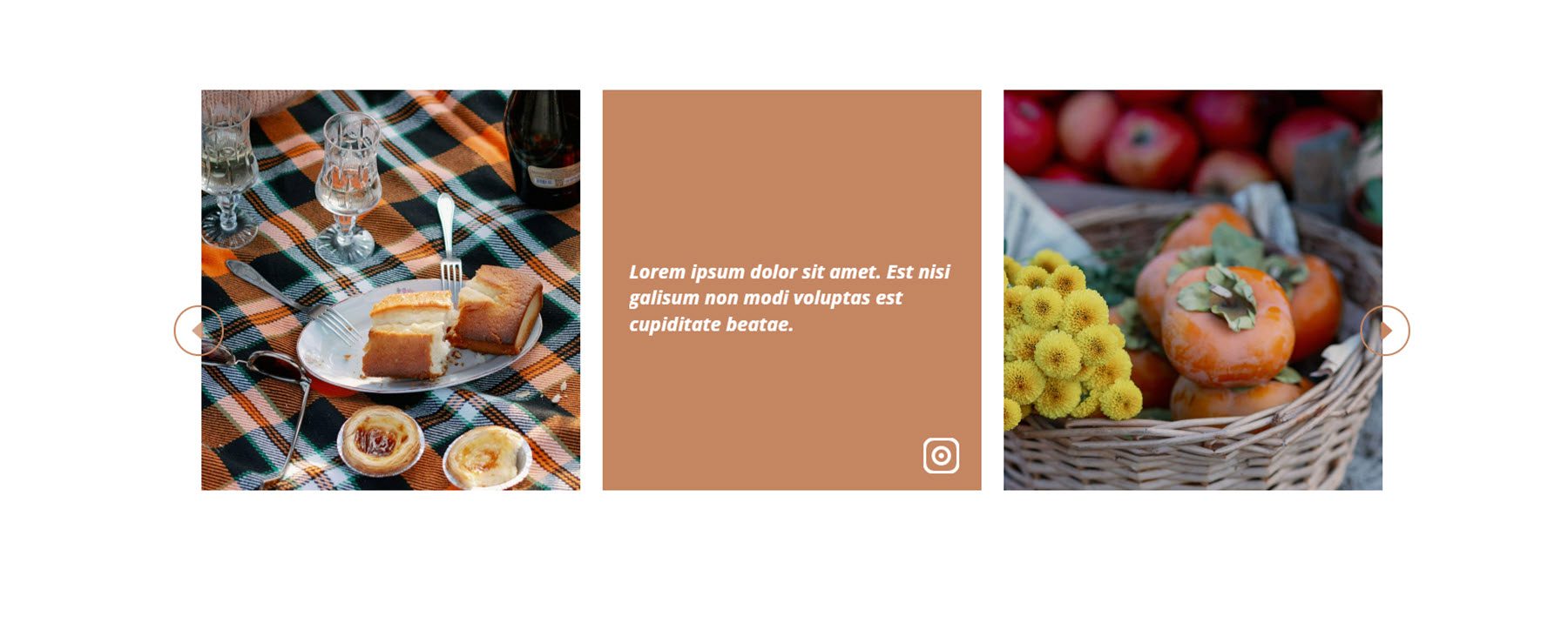
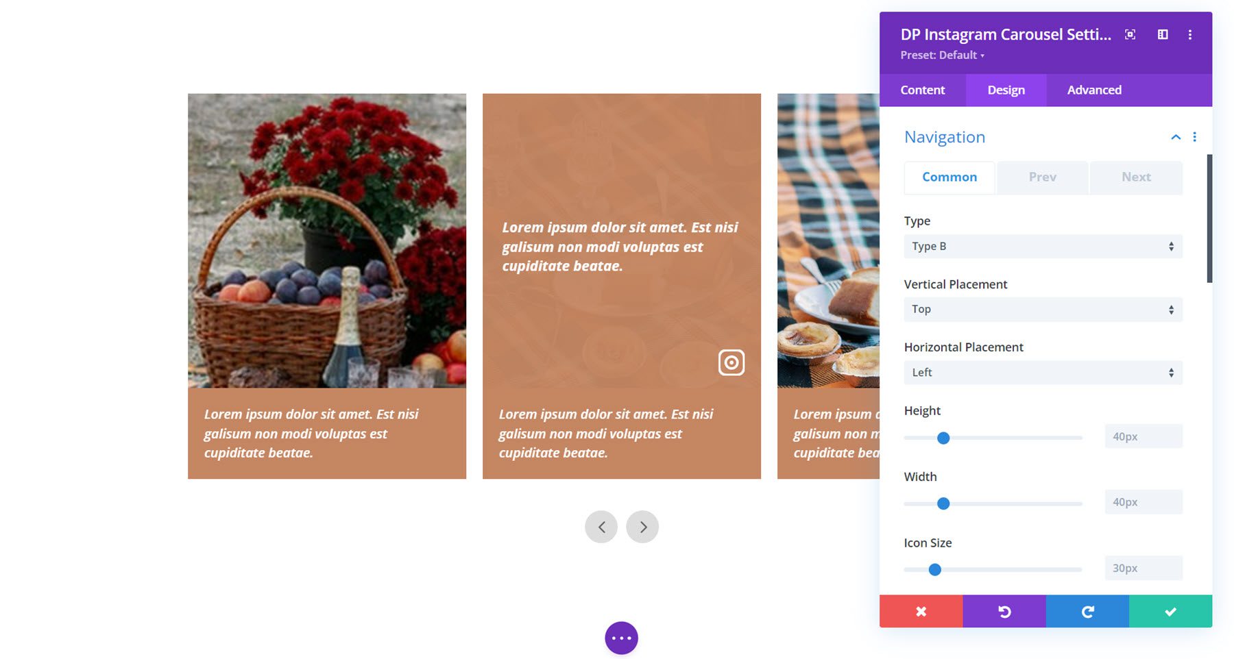
There are three tabs of settings in the navigation section: Common, Prev, and Next. First, let’s take a look at the common tab. Here you can choose from navigation types A or B. Type A features an arrow on either side of the carousel. Type B features both arrows closer together, as pictured here. You can adjust the vertical and horizontal placement, the height and width, and icon size.
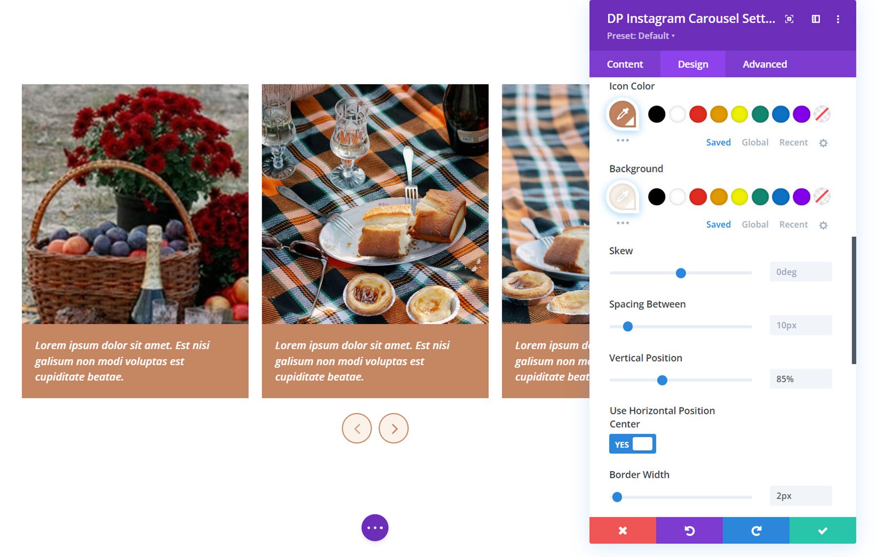
In this section, you can also set the icon color and background, skew the icons, adjust the spacing between icons, set the vertical position, enable horizontal position center, and adjust the border.
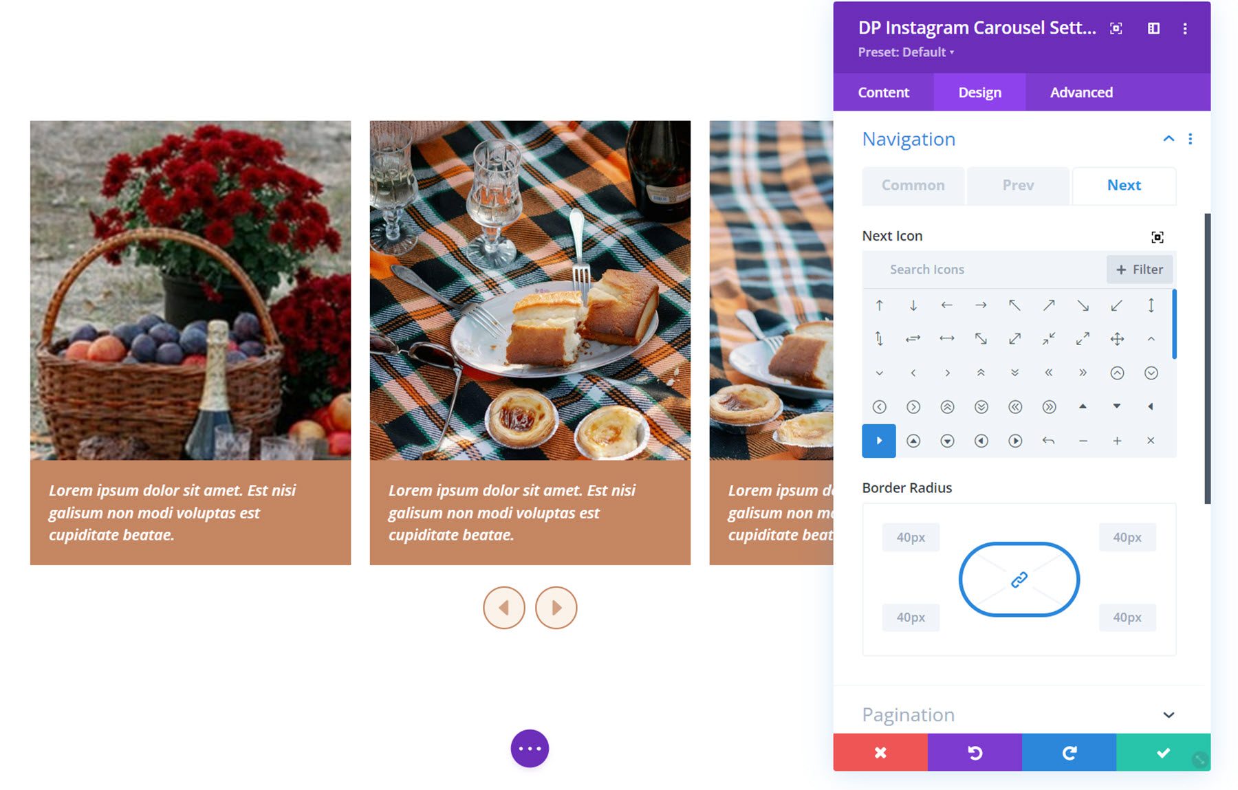
In the prev and next tabs, you can set the navigation icons and set the border radius.
Pagination
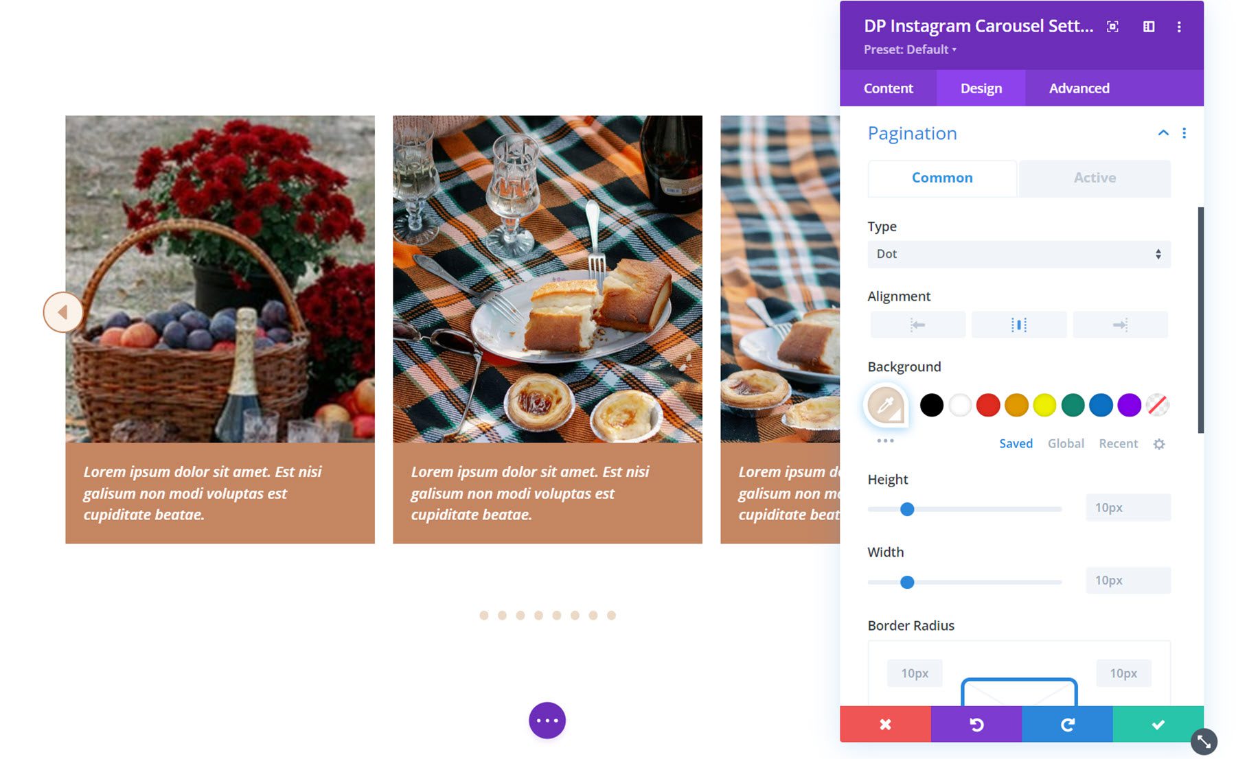
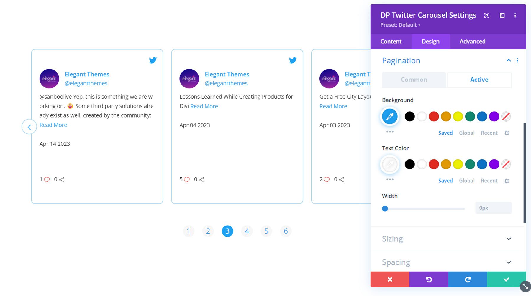
In the pagination settings you can select from the dot type or number type of navigation. You can also select the alignment, the pagination background color, height and width, border width, vertical position, and spacing. Under the active tab you can set the active pagination background, text color, and width.
Other Design Settings
Also in the design tab you can customize the sizing, spacing, border, box shadow, filters, transform, and animation options.
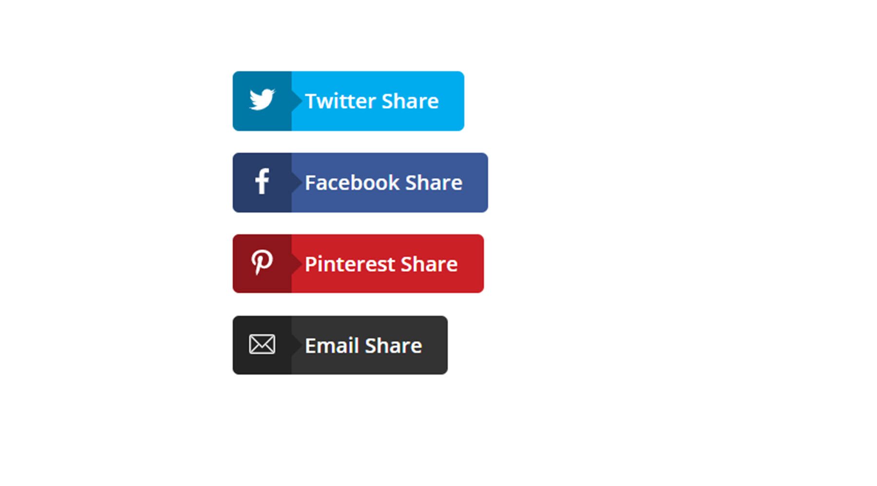
The social share module adds a social network share button to your page. Each social share item is added to the module individually under the content tab.
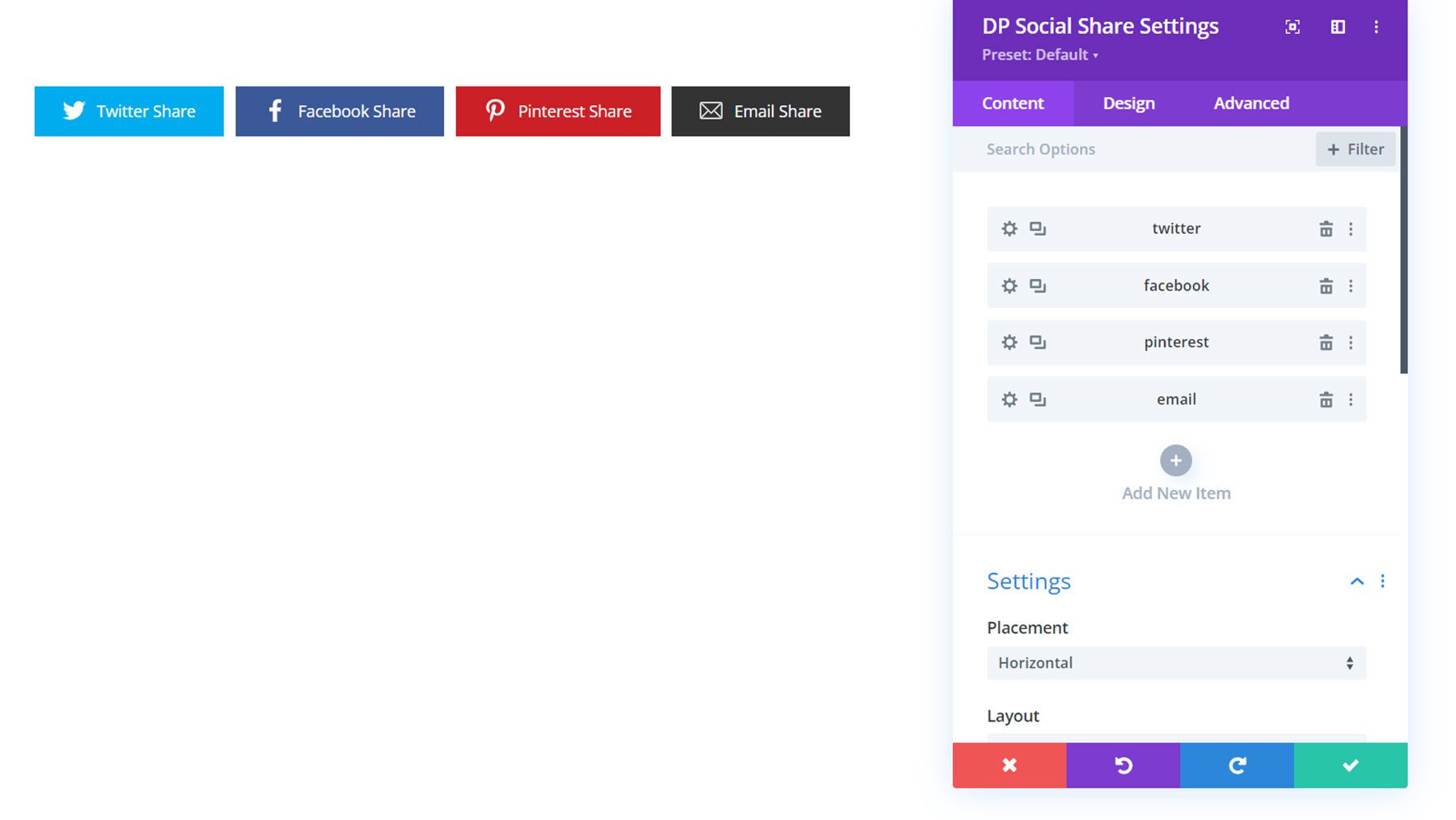
Sharing Item Settings
Each individual sharing item can be added under the Content tab and has its own settings page.
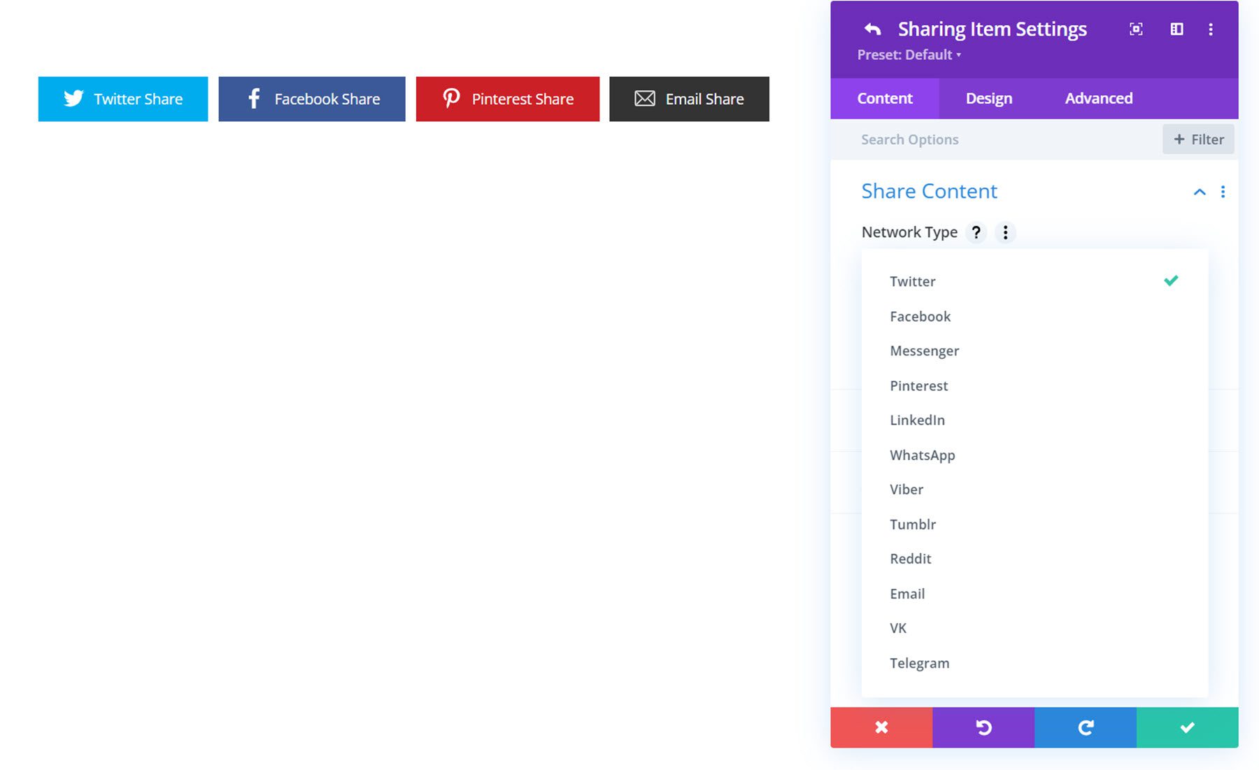
Under the content tab of the settings window for the sharing item you can set the network type, specify the share text, change the background, and set the admin label. You can choose to display buttons for Twitter, Facebook, Messenger, Pinterest, LinkedIn, WhatsApp, Viber, Tumblr, Reddit, Email, VK, and Telegram.
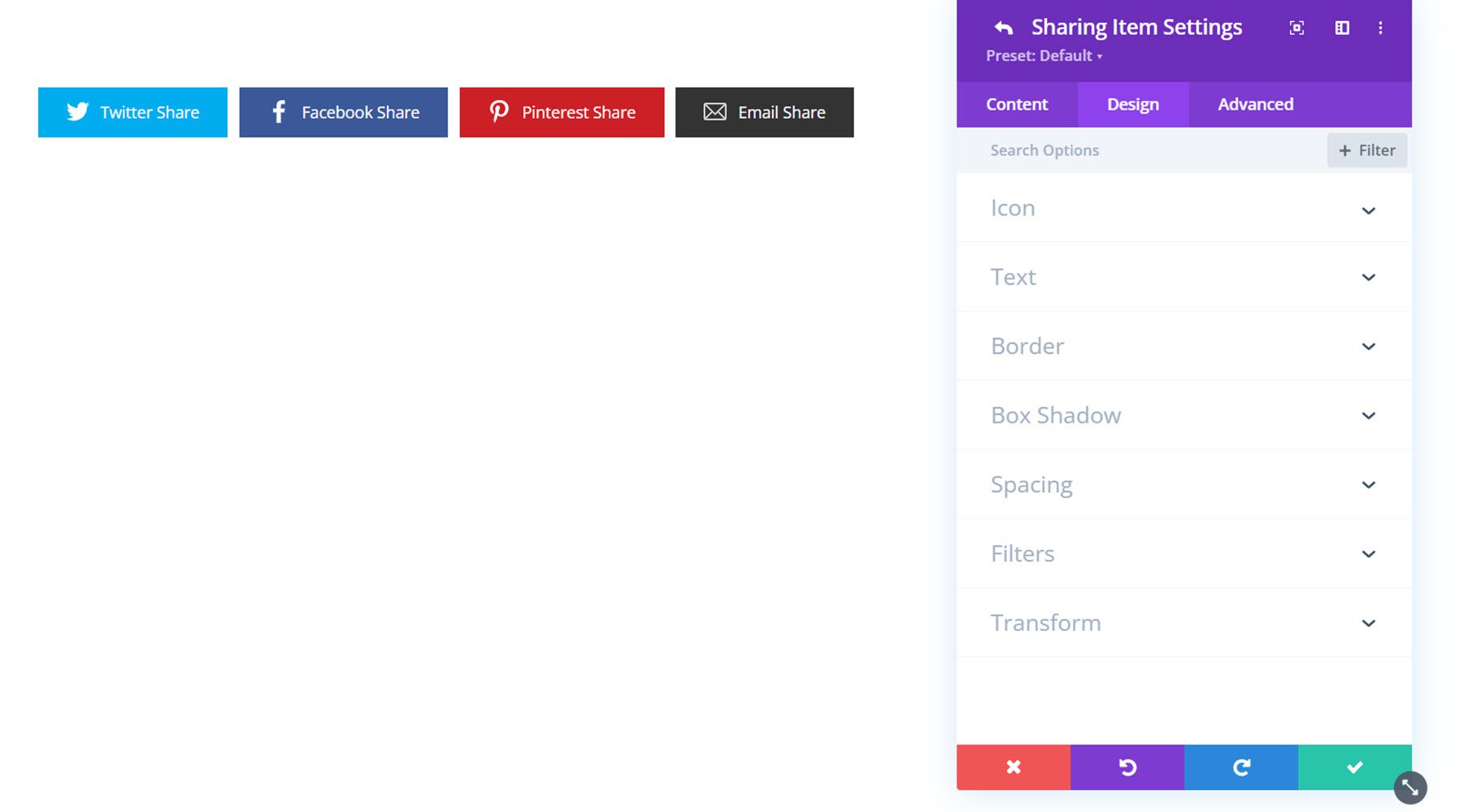
Under the design tab you can customize the icon, text, border, box shadow, spacing, filters, and transform styles.
Content Settings
Now let’s take a look at the settings in the content tab of the social share module. Most settings are under the settings section, aside from the background styles and admin label.
Under the settings section you can choose from a horizontal or vertical placement. Here is the vertical layout.
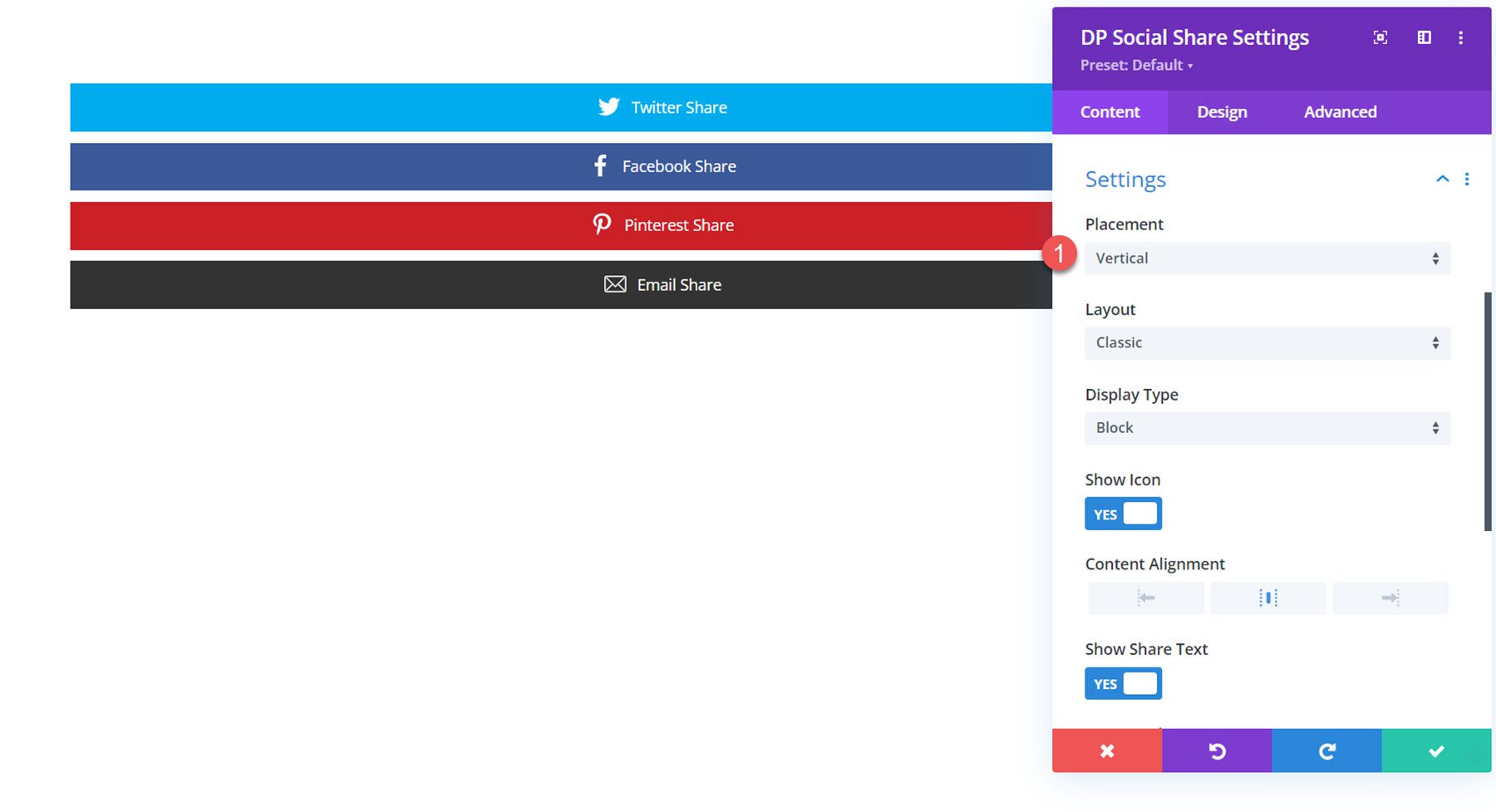
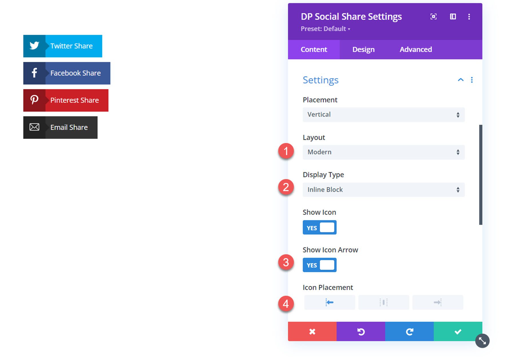
You can also choose from the classic layout (pictured above) or the modern layout, pictured here. With the display type option you can choose from the block layout, which spans the length of your block, or an inline block layout like this. If the modern layout is selected, you can also show an icon arrow and change the icon placement.
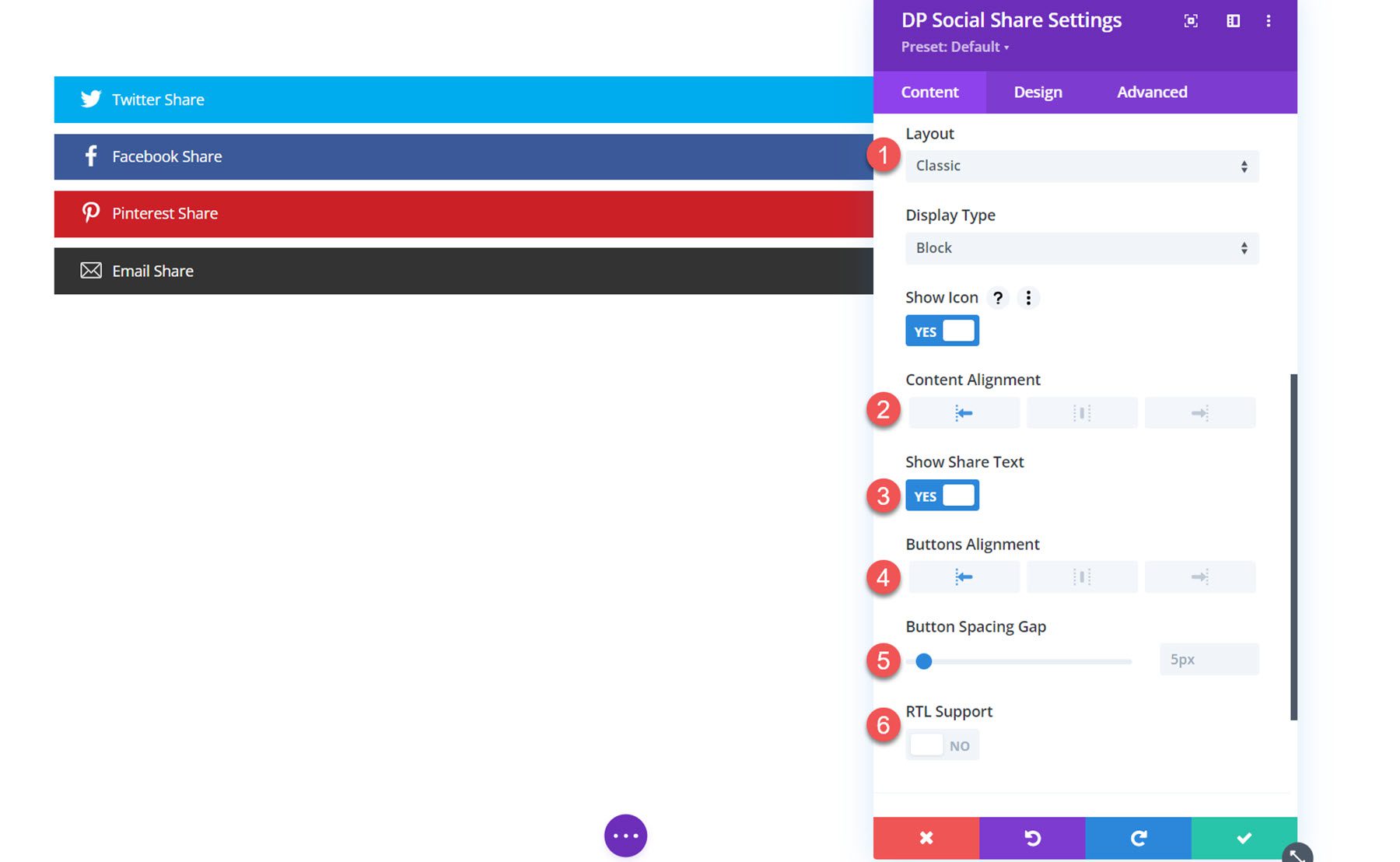
If the classic layout is selected you can set the content alignment. You can also show or enable the share text, set the button alignment, the button spacing gap, and enable RTL support.
Design Settings
In the design tab, you can customize the design of all social share buttons.
General
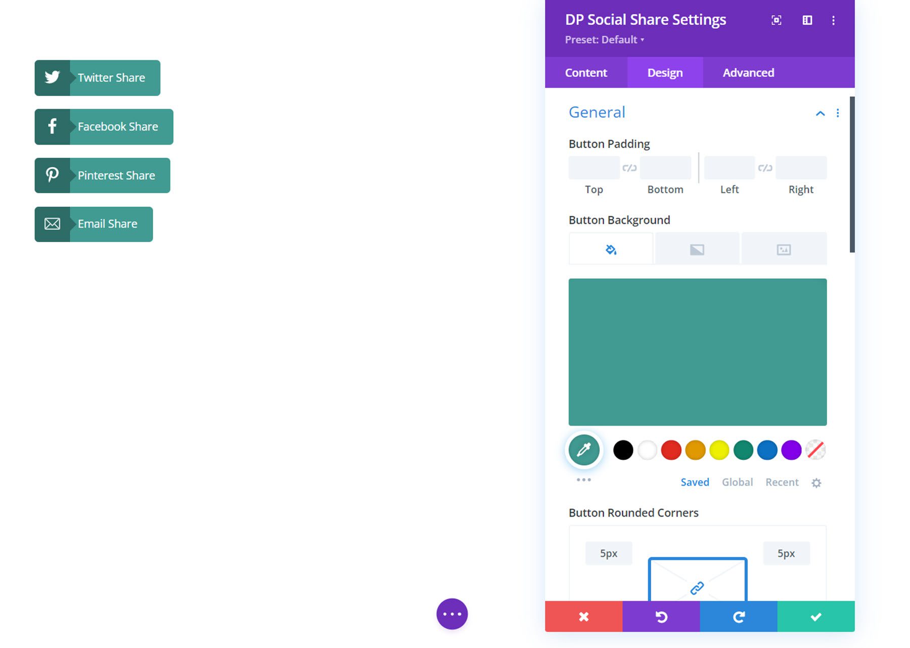
Here you can set the button padding, button background, and button border styles.
Icon
In the icon settings, you can change the icon spacing gap, arrow color, icon color, size, wrapper height and width, background color, padding, rounded corners, and border styles.
![]()
Text
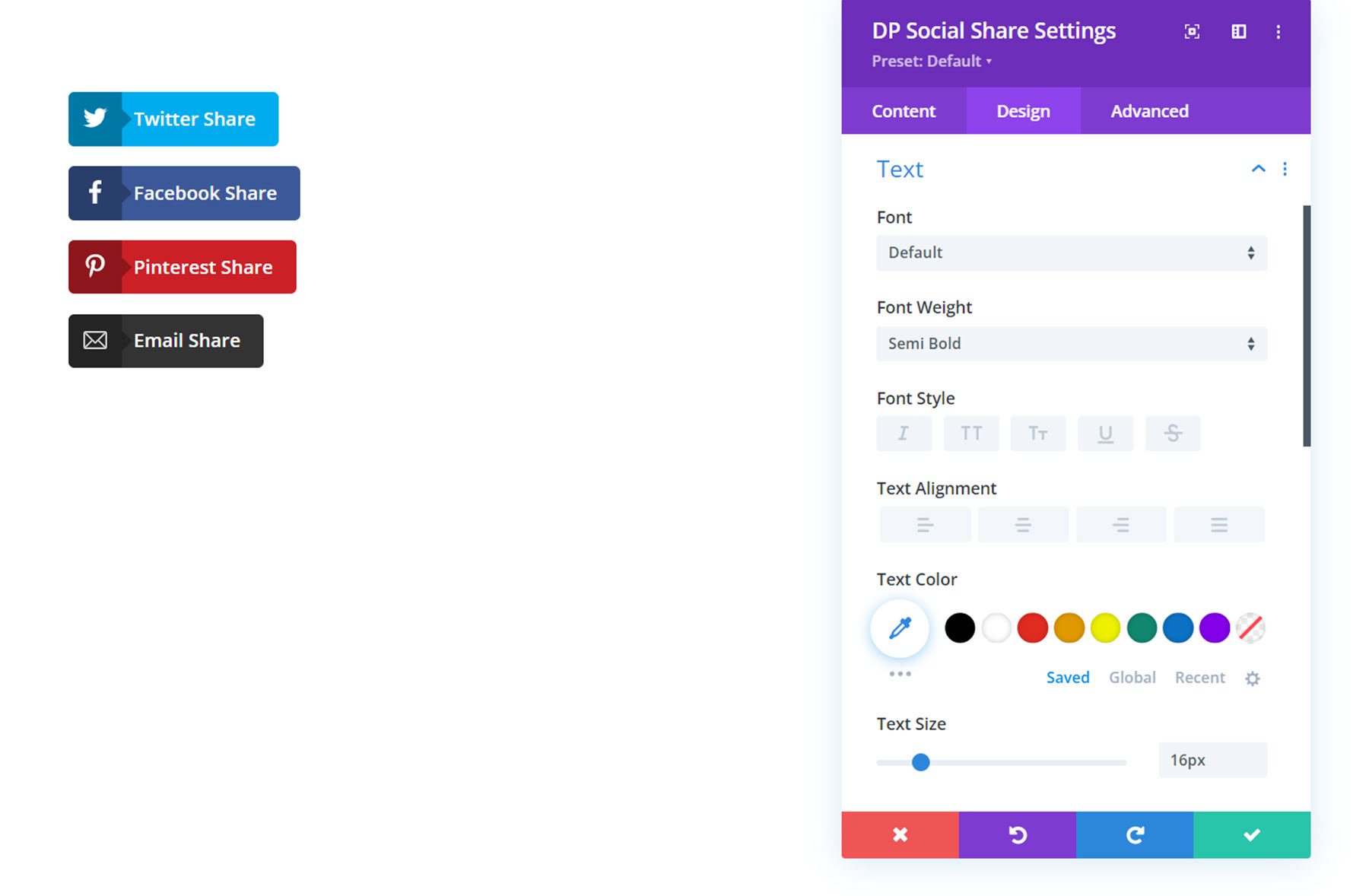
In the text settings, you can style the button text.
Other Design Settings
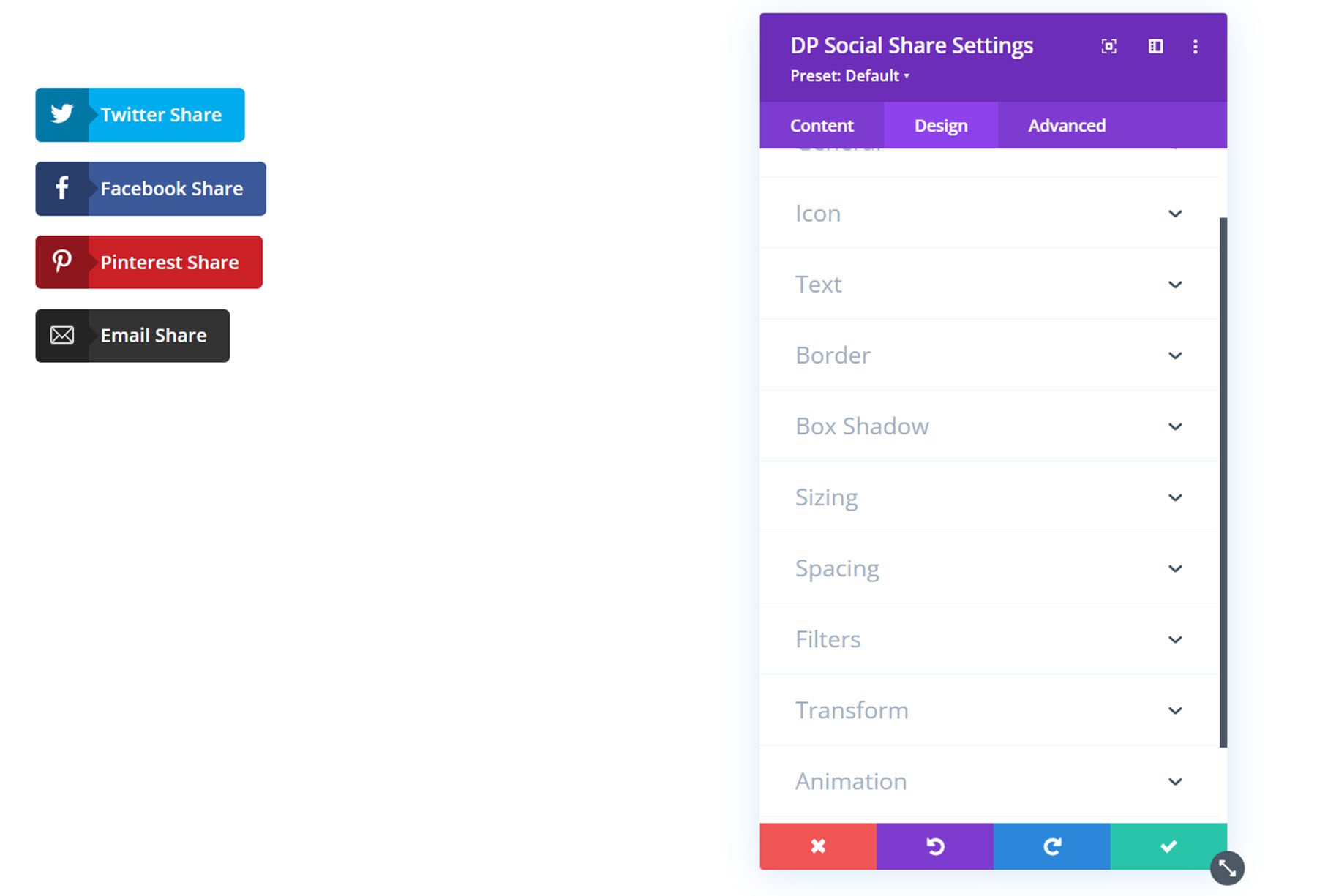
Also in the design tab, you can customize the border, box shadow, sizing, spacing, filters, transform, and animation styles for the social share buttons.
Twitter Feed
With this module, you can add a Twitter feed to your website layout. Let’s take a closer look at the settings.
Content Settings
Twitter Feed
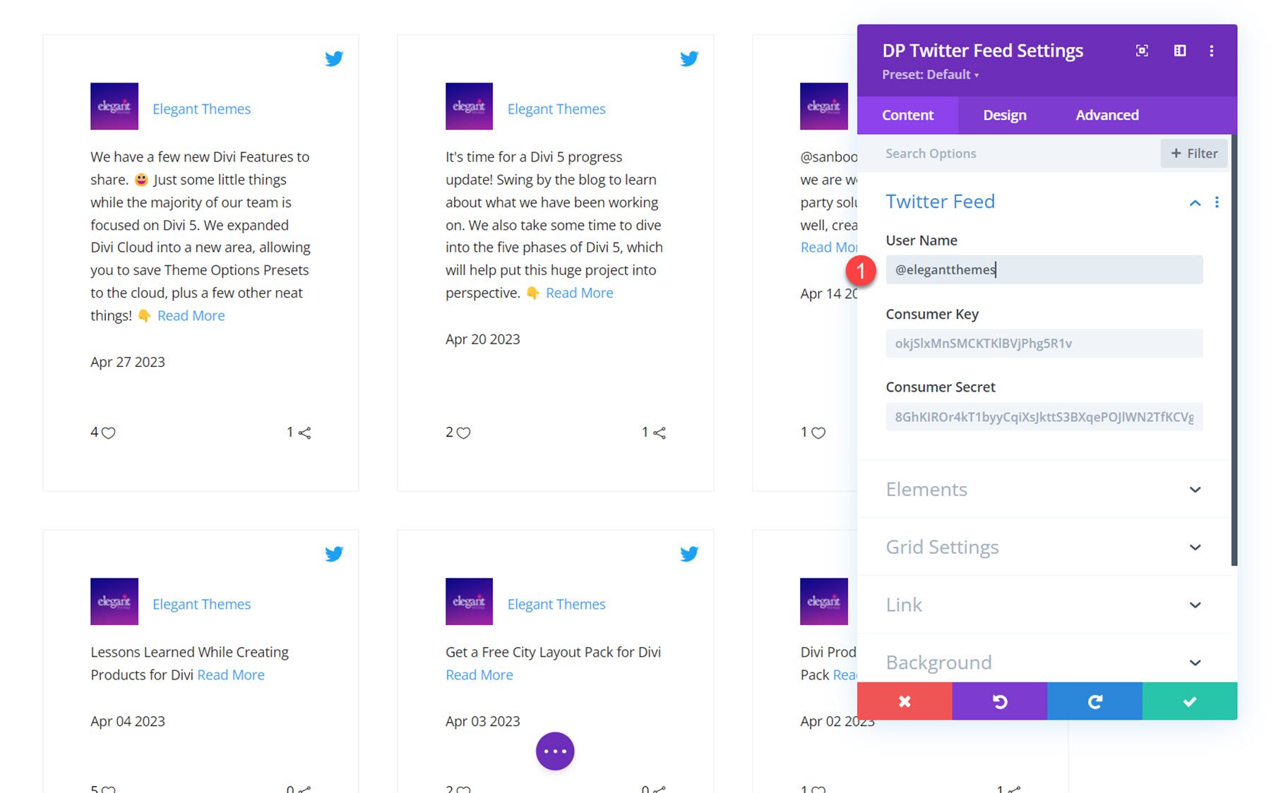
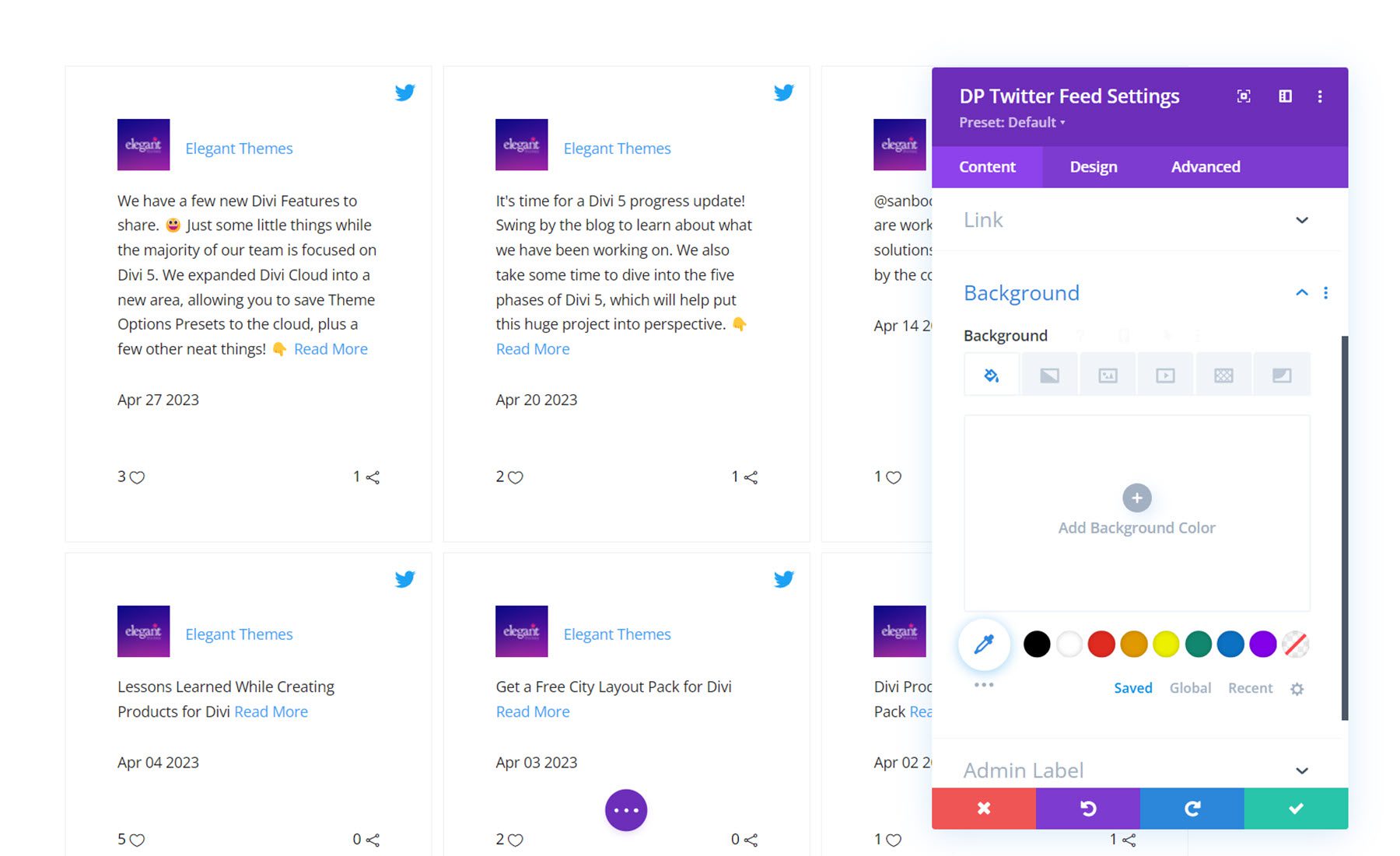
Under the Twitter Feed options, add the username for the Twitter account you would like to display Tweets from.
Elements
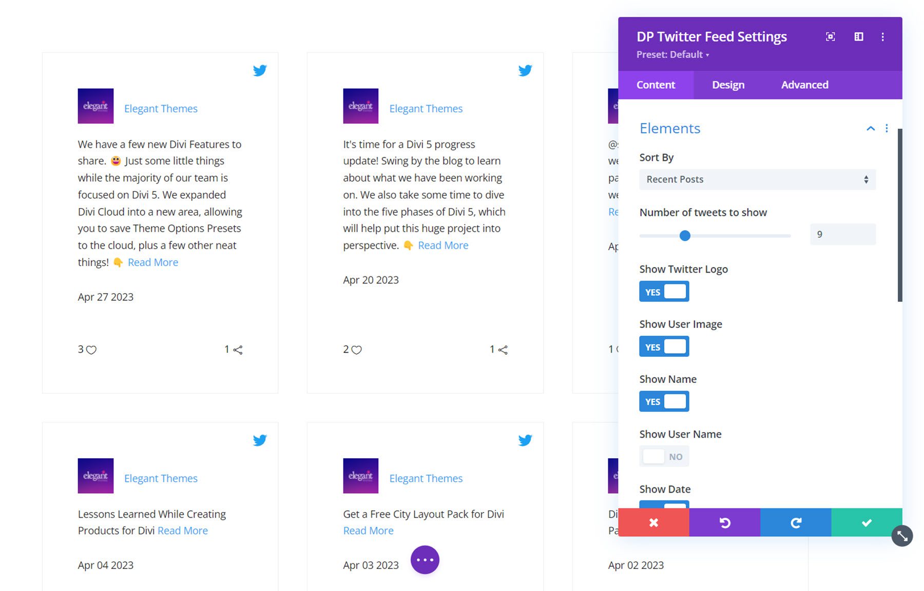
Here you can set how the feed is sorted: by recent posts, old posts, favorites, or retweets. You can also set the number of Tweets to show, and enable or disable the following elements: Twitter logo, user image, name, user name, date, favorite, retweet, and read more. You can also change the read more text.
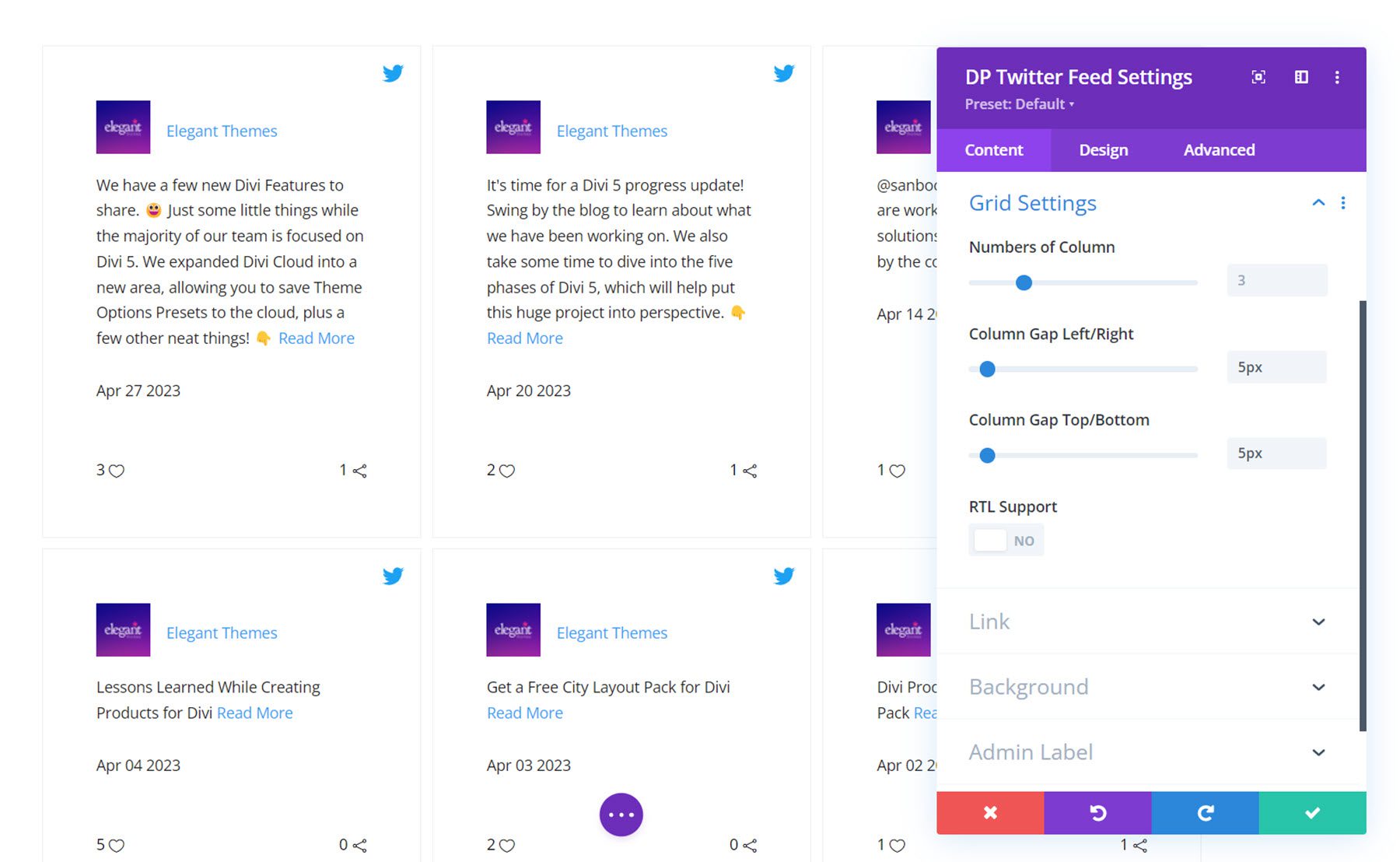
Grid Settings
In the grid settings, you can set the number of columns, change the column gaps, and enable RTL support.
Other Content Settings
In addition to these options, you can also set the module link, background, and admin label in the content tab.
Design Settings
In the design tab, you can customize how the Twitter feed looks.
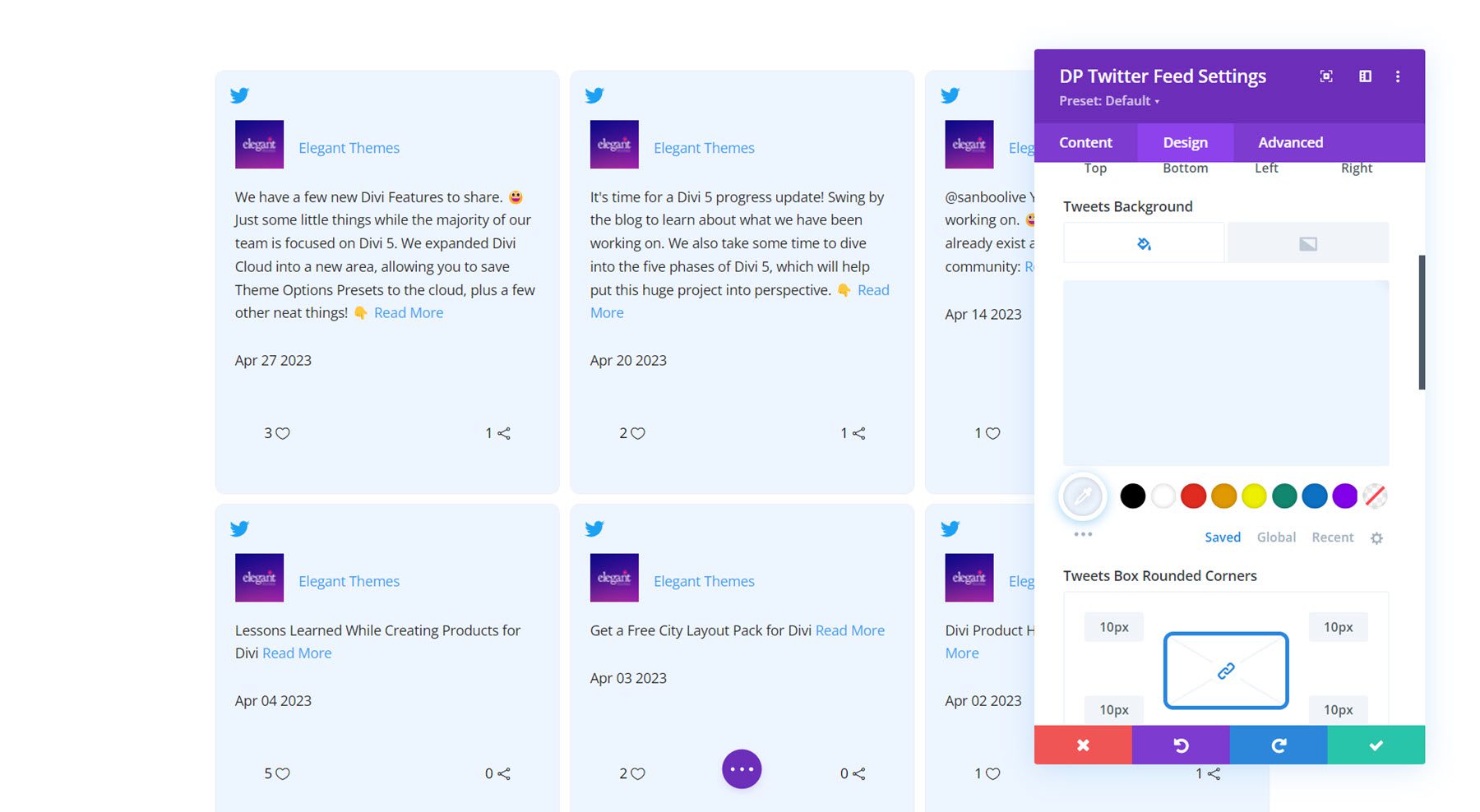
Tweets Box
Here, you can set the Tweet box alignment, Twitter icon alignment, padding, background, and border styles.
User Avatar
In the user avatar settings you can change the profile image size, set the avatar spacing, add rounded corners, and modify the border styles.
![]()
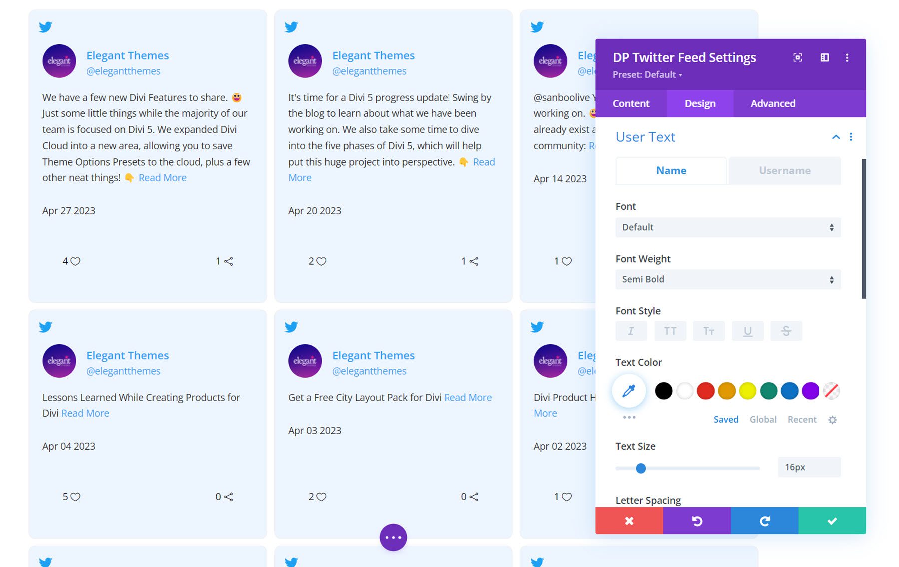
User Text
The user text settings are separated by the Name tab and the Username tab, so you can set different styles for each.
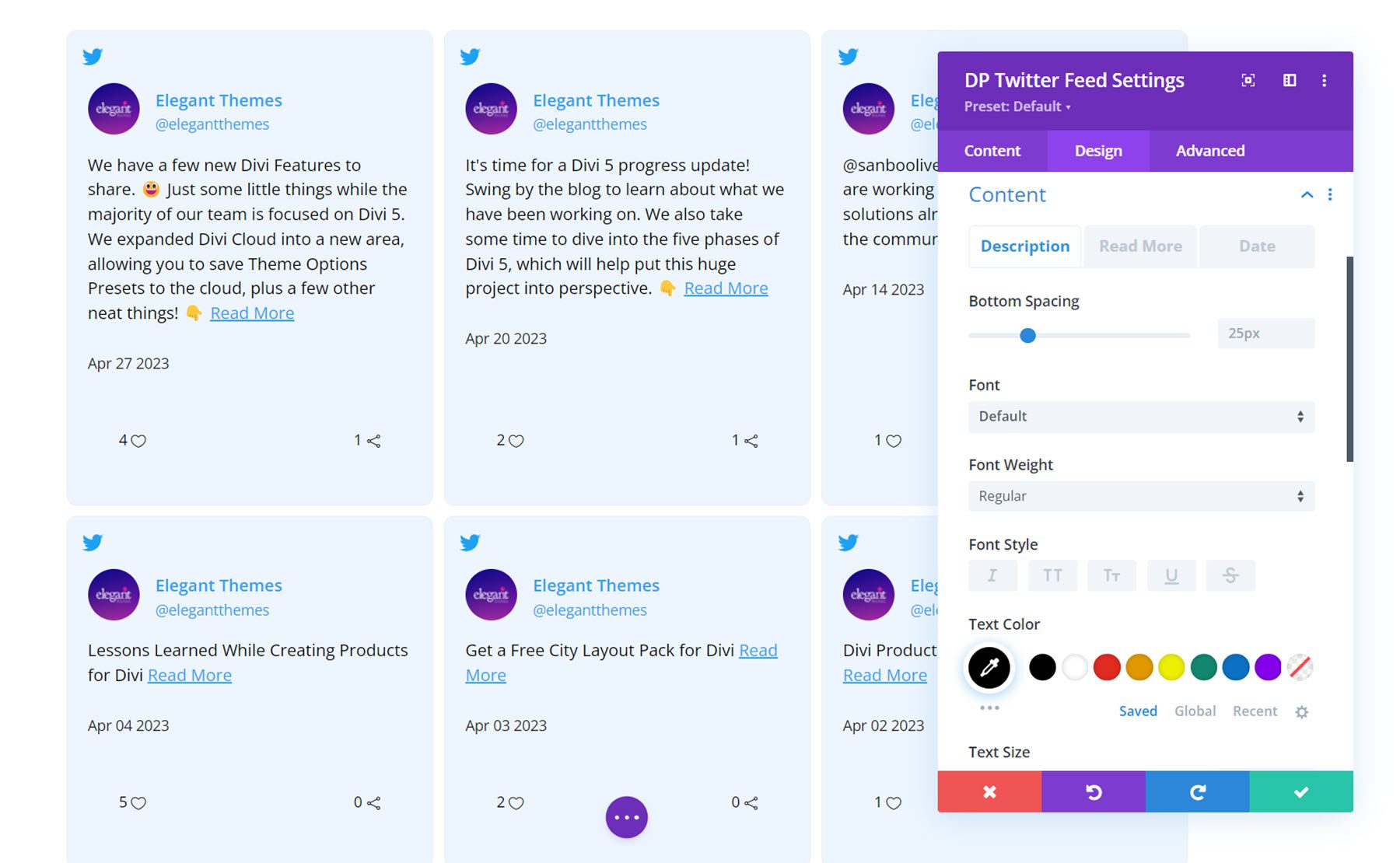
Content
This is where you can customize the styling of the Tweet content. These options are also separated into three tabs for different styling: Description, Read More, and Date. You can customize the font styles and colors for each of these elements. You can also adjust the bottom spacing in the description settings.
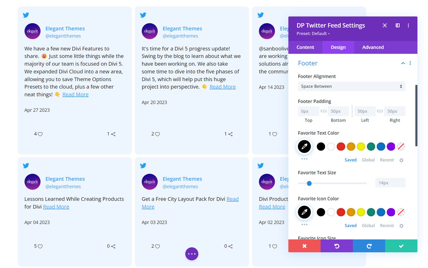
Footer
Here you can set the footer alignment and padding as well as the text and icon colors and sizes for the favorite and retweet indicators.
Other Design Settings
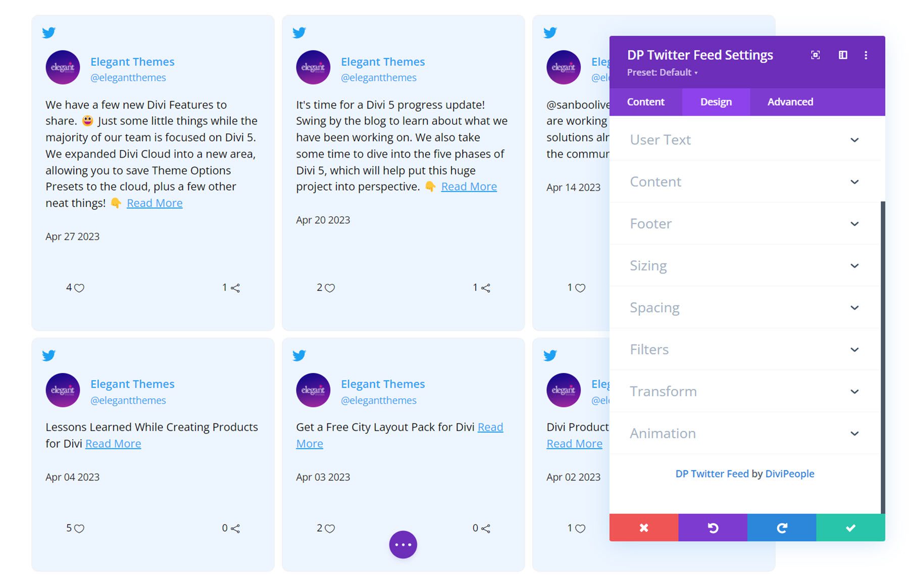
Additionally, you can customize the sizing, spacing, filters, transform, and animation styles for the Twitter feed module.
Twitter Carousel
This module allows you to add a carousel of Tweets to your website.
Content Settings
Twitter Feed
Here you can add the username for the Twitter account you would like to display Tweets from.

Twitter Settings
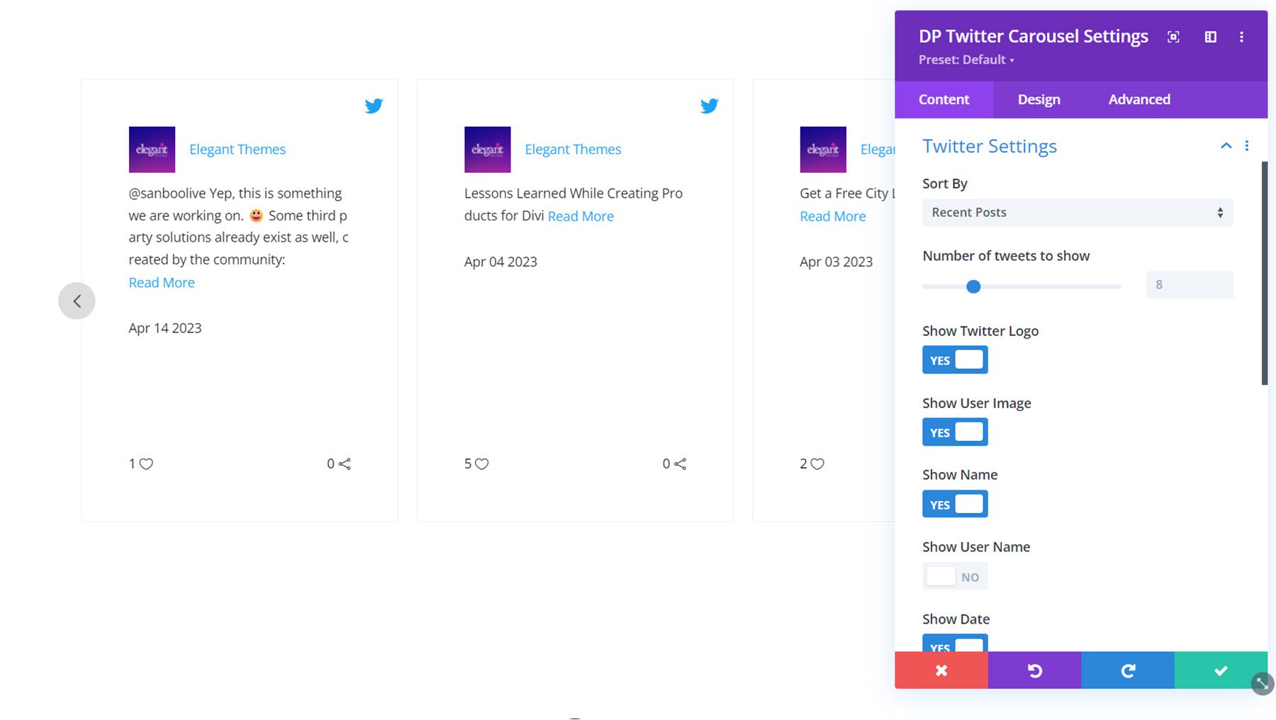
Under the Twitter settings, you can select the sort type, the number of Tweets to show, and enable or disable the following: Twitter logo, user image, name, user name, date, favorite, retweet, and read more. You can customize the read more text here as well.
Carousel Settings
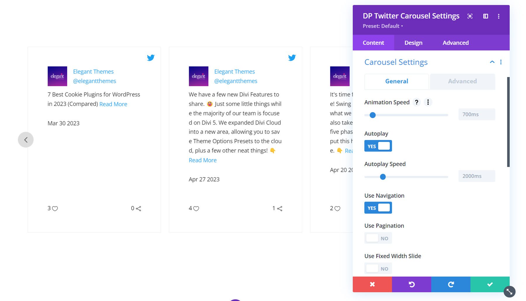
In the general tab you can set the animation speed, enable autoplay, set the autoplay speed, enable pagination, enable fixed width slides, select the number of slides to show, adjust the slide spacing, apply spacing on the first and last item, enable infinite looping, and equalize column heights.
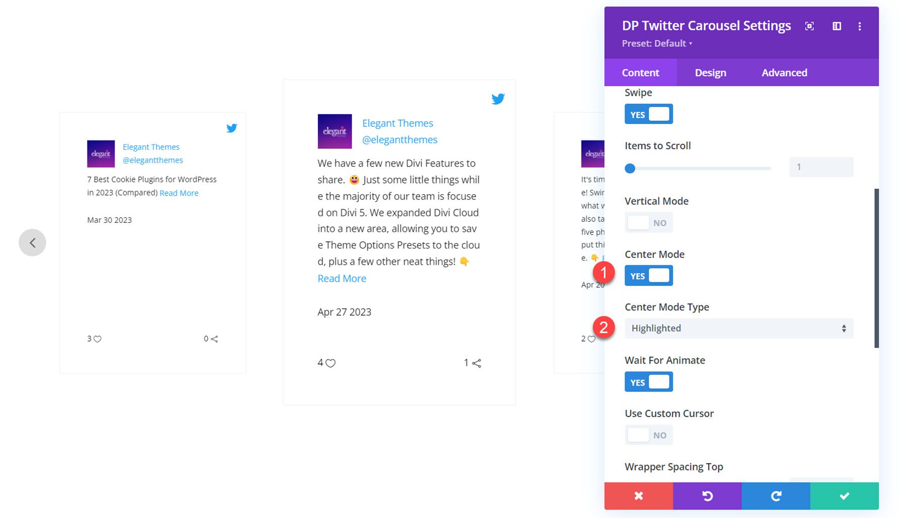
In the advanced tab, you can select the CSS transition type, enable swipe, set the number of items to scroll, enable vertical mode, enable center mode, wait for animate, enable custom cursor, adjust the wrapper spacing, and enable RTL support.
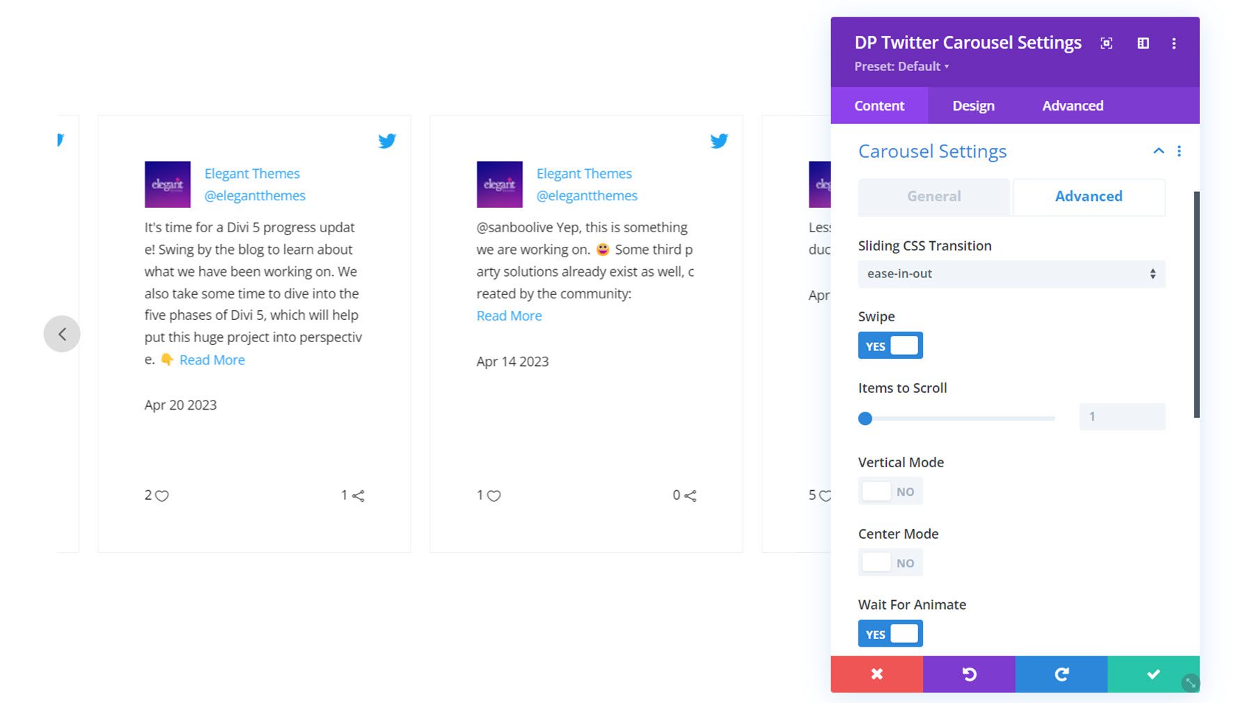
Here is the carousel with center mode enabled and the highlight layout type selected.
Other Content Settings
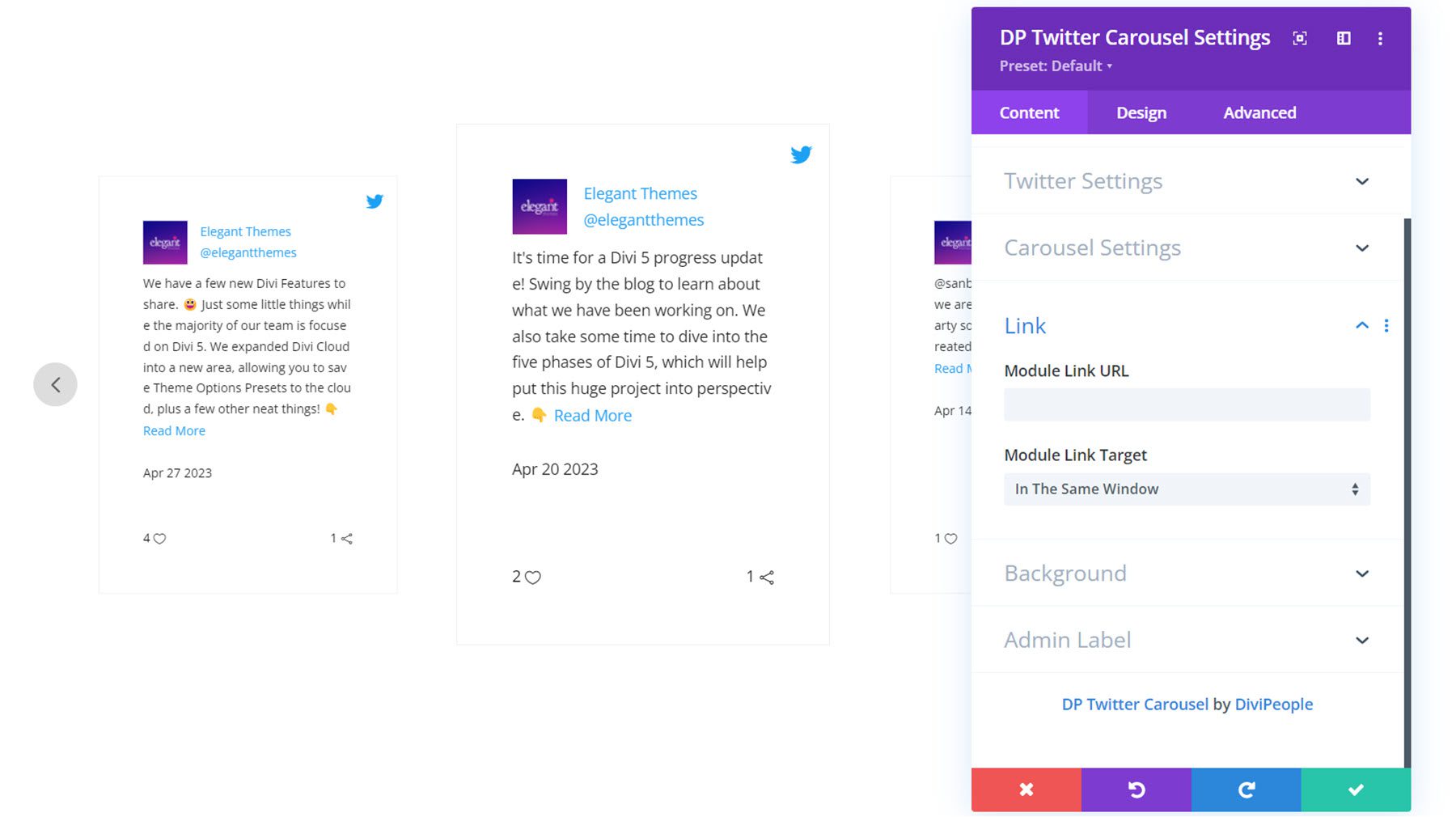
You can also set a module link, change the background styles, and set an admin label in the content tab.
Design Settings
In the design tab, you can completely customize the styling of the Twitter carousel. Let’s take a closer look.
Tweets Box
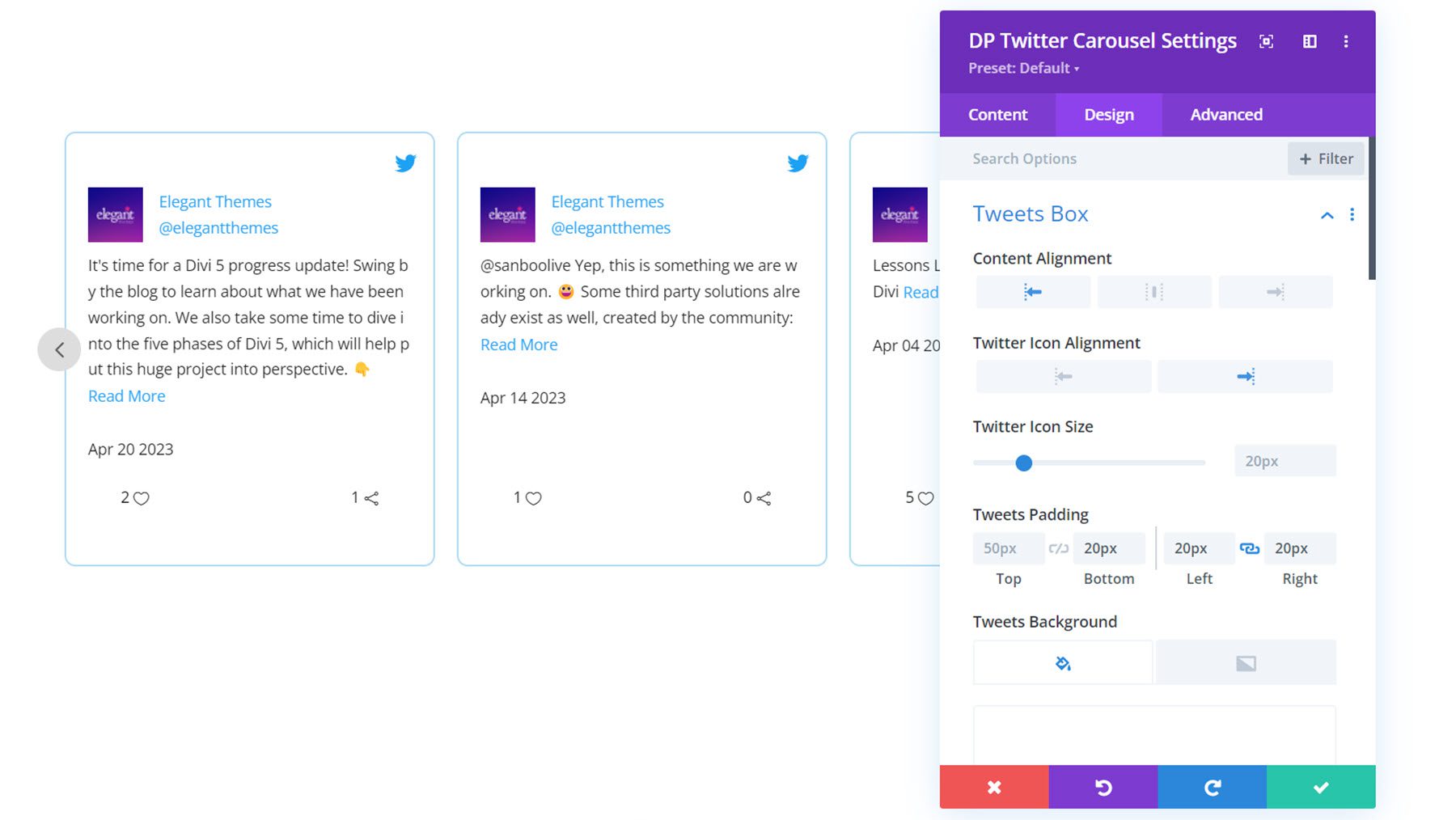
Here you can set the content alignment, Twitter icon alignment, Twitter icon size, padding, background, and border styles for each Tweet.
User Avatar
In the user avatar settings you can set the profile image size, avatar spacing, rounded corners, and border styles.
![]()
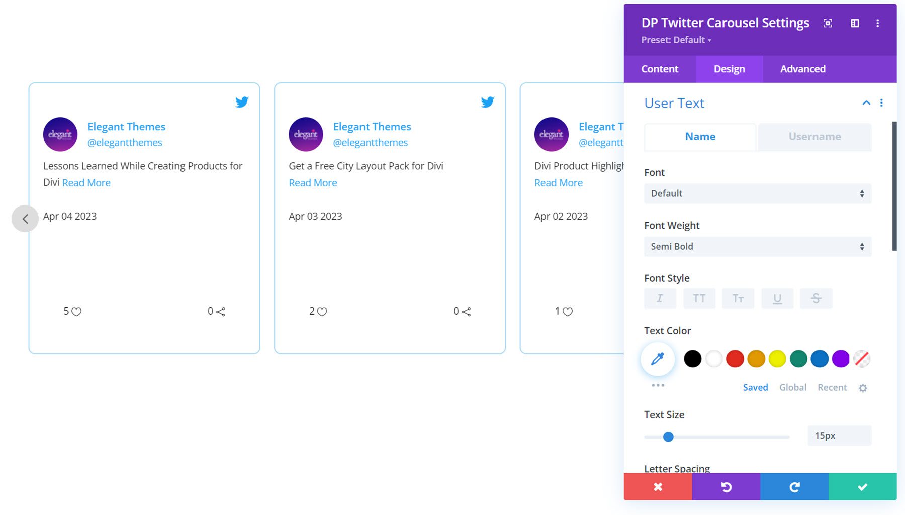
User Text
In the user text settings, you can customize the font styles for the name and username.
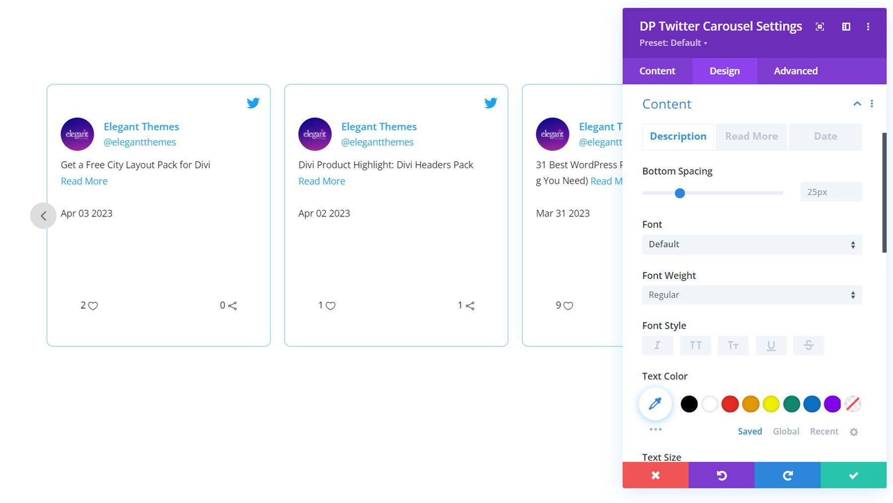
Content
Here you can customize the font styles for the Tweet content, the read more link, and the date.
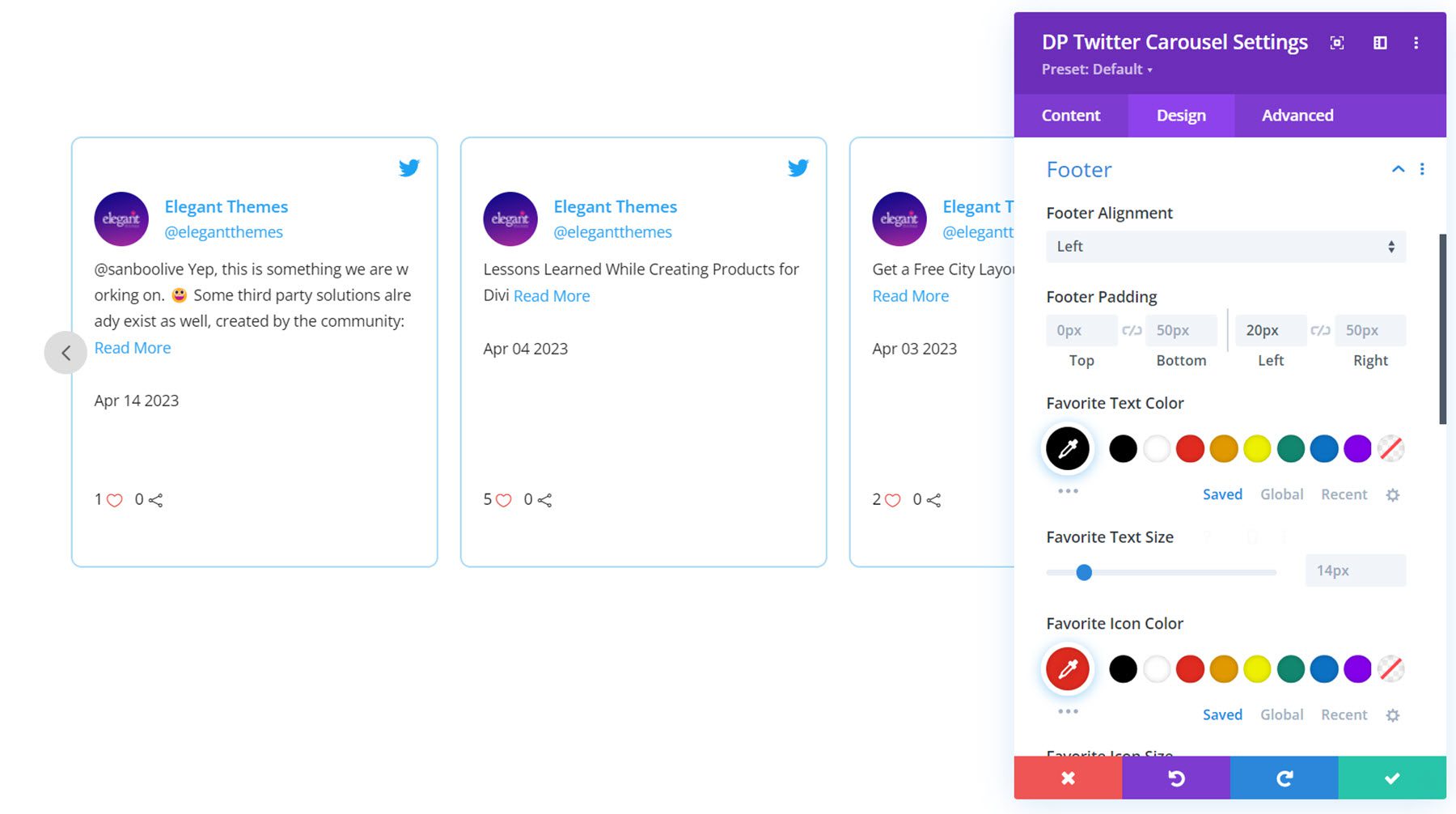
Footer
In the footer settings, you can set footer alignment and padding. You can also customize the text and icon colors and sizes for the favorite and retweet indicators.
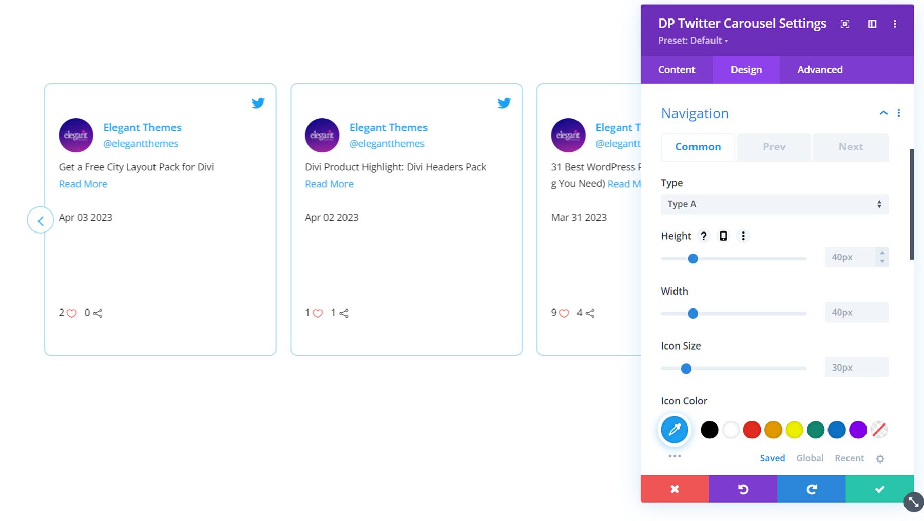
Navigation
You can enable two types of navigation: Type A and Type B. This is type A, with the navigation on each side of the carousel module. Here you can also set the height and width of the navigation icons, set the icon size, color, and background, enable a skew effect, set the vertical and horizontal position, and set the border styles. In the Prev and Next tabs, you can set the icons and border radius for each button.
Pagination
In the pagination settings, you can choose between number or dot style navigation. This is the number navigation style. You can customize the alignment, text color, text size, background, height, width, border radius, vertical position, and spacing.
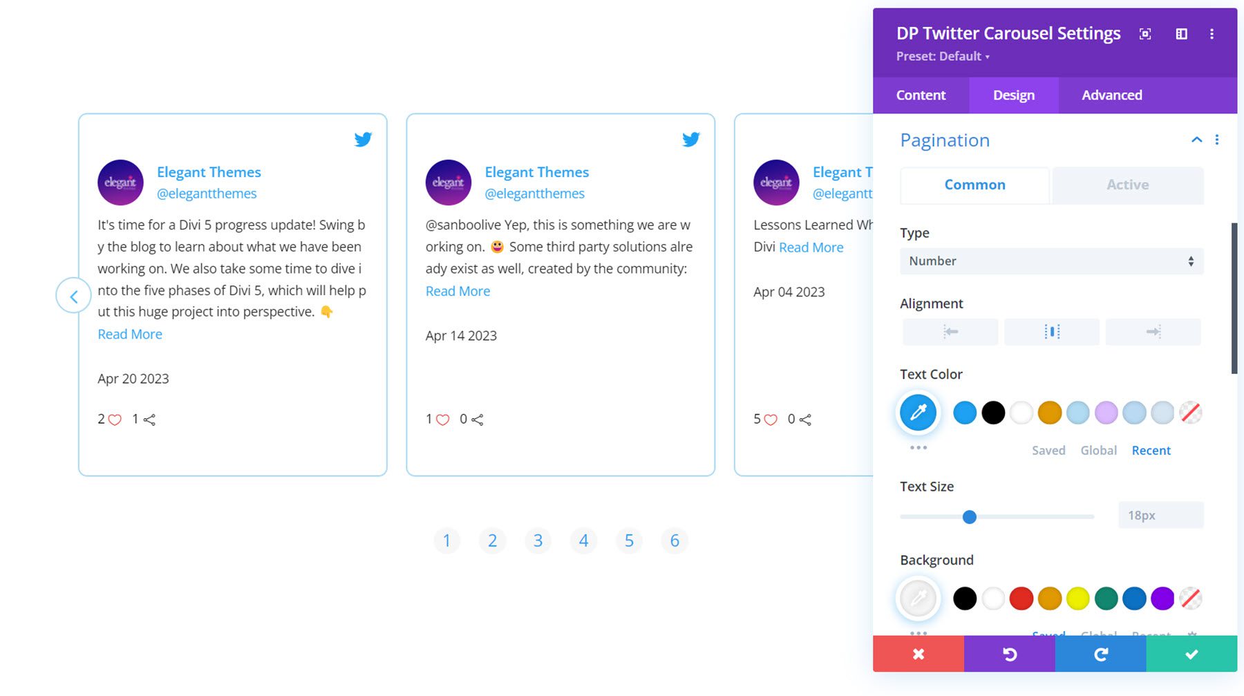
In the active tab, you can set the styles for the active pagination item.
Other Design Settings
You can also customize the sizing, spacing, filters, transform, and animation options in the design tab.
Divi Social Plus is available in the Divi Marketplace. It costs $49 for unlimited website usage and 1 year of support and updates. The price also includes a 30-day money-back guarantee.
Final Thoughts
Divi Social Plus adds five new social media modules to the Divi Builder, allowing you to integrate your social media content on your website. With Divi Social Plus, you can add Instagram and Twitter feeds and carousels as well as social sharing buttons to your website. Each module comes with many different configuration options and design settings that allow you to have full control over the design of the social media modules. If you’re looking for a way to integrate a social media feed on your Divi website, this plugin may be a great solution for you.
We would love to hear from you! Have you tried Divi Social Plus? Let us know what you think about it in the comments!



Nice features, unfortunally this plugin (Insta) doen’t work properly. With the authorization problem it isn’t a service less plugin for agencies. Also the Google review plugin doesn’t work (more then over 4 months…) no follow up. Love the work from Divipeople and bought their plugins but the have to level up…
That’s a bummer. Have you tried reaching out to Divi Social Plus support? You can do that by submitting a ticket here: https://www.elegantthemes.com/marketplace/divi-social-plus/support/tickets/1