

Clear, well-organized navigation helps visitors understand a website and move through it with confidence. That becomes especially important on content-heavy sites, where documentation, categories, account pages, products, or other nested content need a structure that remains easy to scan.
Divi Essential by Divi Next expands the Divi toolkit with a large collection of specialized modules, extensions, and layouts built directly into the Visual Builder.
One of its modules, Divi Vertical Menu, gives you a dedicated way to create vertical menus, accordion navigation, collapsible sidebars, flyouts, and mobile drawers while keeping the entire workflow visual. The module is compatible with both Divi 4 and Divi 5, making it useful for existing websites as well as new Divi 5 builds.
In this product highlight, we’ll take a closer look at Divi Essential, explore the Vertical Menu module’s key features, and build an expandable vertical navigation menu from start to finish.
- 1 Overview Of Divi Essential
- 2 Introducing The Divi Vertical Menu Module
- 3 Key Features And Settings
-
4
How To Build A Vertical Menu With Divi Essential
- 4.1 1. Add The Vertical Menu Module
- 4.2 2. Choose The Menu Source
- 4.3 3. Select The Layout
- 4.4 4. Configure The Submenu Behavior
- 4.5 5. Add Icons, Badges, And Carets
- 4.6 6. Configure The Mobile Experience
- 4.7 7. Add An ARIA Label
- 4.8 8. Style The Menu Items
- 4.9 9. Style The Icons, Badges, And Carets
- 4.10 10. Style The Submenus
- 4.11 11. Fine-Tune The Animation
- 4.12 12. Finish The Menu Container
- 4.13 The Result
- 5 Who Is The Vertical Menu Module For?
- 6 Build Smarter Navigation With Divi Essential
Overview Of Divi Essential
Divi Essential is an all-in-one toolkit that extends the Visual Builder with modules, site-wide extensions, and ready-made design layouts. It is built to work inside the familiar Visual Builder workflow and is fully compatible with Divi 4 and Divi 5.
The collection includes more than 109 Divi modules, 28+ extensions, 720+ section layouts, 40+ starter templates, and 8 pre-built websites. Together, these tools give freelancers, agencies, and site owners a large set of building blocks for content, animation, navigation, forms, and more, without leaving Divi.
New modules and extensions continue to expand the collection, including the Divi Vertical Menu module we’ll focus on later in this post.
109+ Modules
Divi Essential adds more than 109 modules that sit alongside Divi’s native modules in the Visual Builder. The collection covers everyday content needs, motion and interactive effects, carousels, team and social layouts, form styling, and navigation tools such as the Vertical Menu. You can enable all or only the modules you need, which helps keep the site lean while still giving you a much wider range of design options. Everything is built to feel native inside Divi and works with both Divi 4 and Divi 5.
28+ Extensions
Beyond individual modules, Divi Essential includes 28+ extensions that add functionality across your entire website. These tools enhance menus, interactions, visual effects, and workflow site-wide rather than living as a single-page module. Examples include an animated gradient, preloader animation, advanced popup builder, card, cursor, and particle effects, text animations, video backgrounds, and utilities such as live copy paste, cache clearing, and more. The result is a set of tools you can layer onto existing Divi pages without stacking extra plugins.
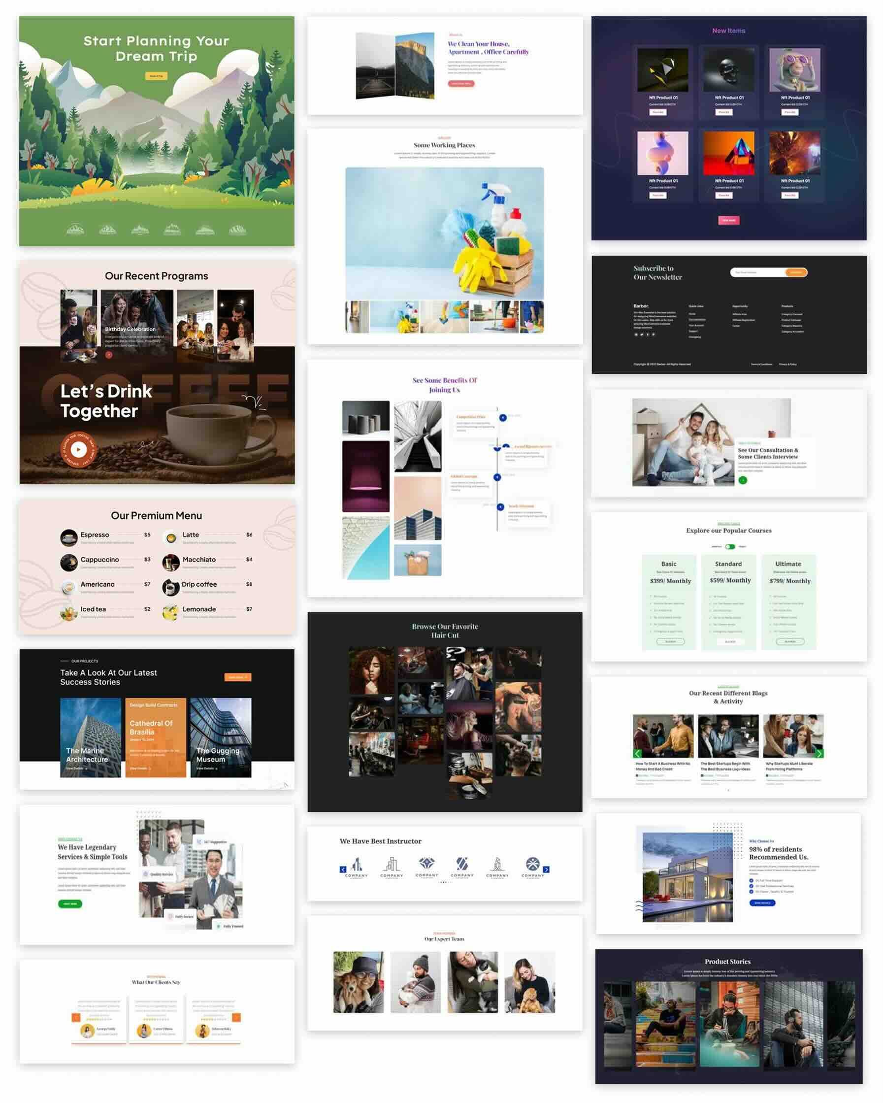
720+ Section Layouts
Divi Essential comes with more than 720 pre-built section layouts. These sections cover common page areas from heroes, features, testimonials, pricing, CTAs, galleries, and more, so you can build polished pages faster instead of starting every section from scratch. Each layout remains fully editable inside the Builder and is designed to work with the plugin’s modules.
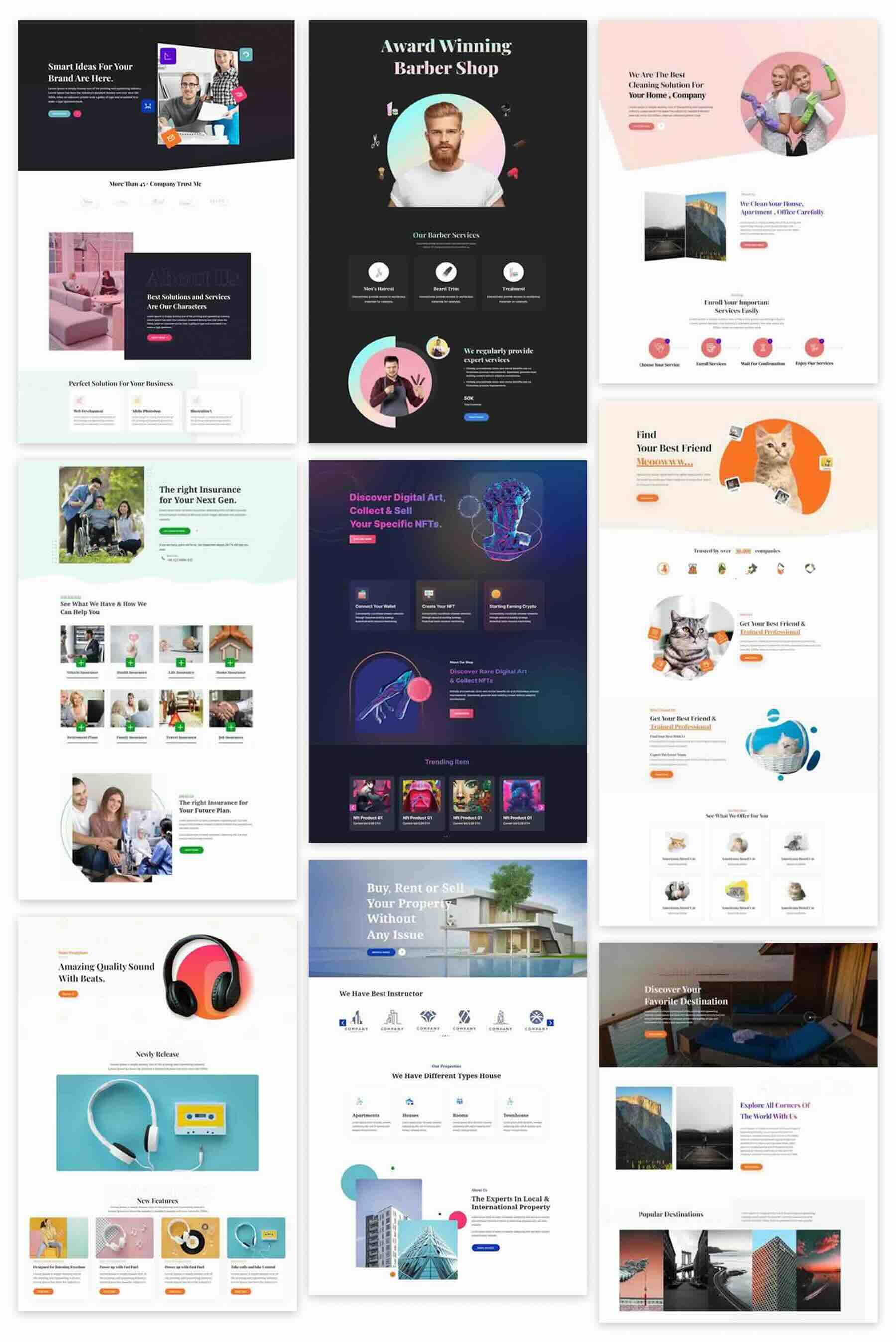
40+ Starter Templates
In addition to individual sections, Divi Essential includes 40+ starter templates and 8+ full pre-built websites. These give you solid, industry-ready foundations you can import, brand, and refine. They’re especially useful when you need a complete structure quickly for a client, prototyping,, or sites that rely on clear navigations and organized content. Everything stays editable inside Divi, and new templates continue to be added over time.
Among the newer additions to this growing toolkit is the Divi Vertical Menu module. It brings dedicated vertical navigation options directly into the Visual Builder, giving Divi users a more flexible way to organize complex or content-heavy sites. In the sections below, let’s take a close look at what the module offers and how to build with it.
The Divi Vertical Menu module is built for creating vertical navigation directly inside Divi. You can use it for sidebar menus, expandable category lists, account navigation, dashboards, documentation menus, flyouts, collapsible sidebars, and responsive drawers.
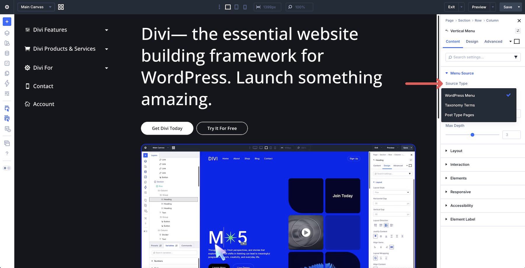
One of its strengths is the variety of menu sources it supports. You can generate navigation from WordPress menus, taxonomy terms, or post type pages, then control how many nested levels appear.
The module includes four layout types:
- Classic List
- Accordion
- Collapsible Sidebar
- Flyout
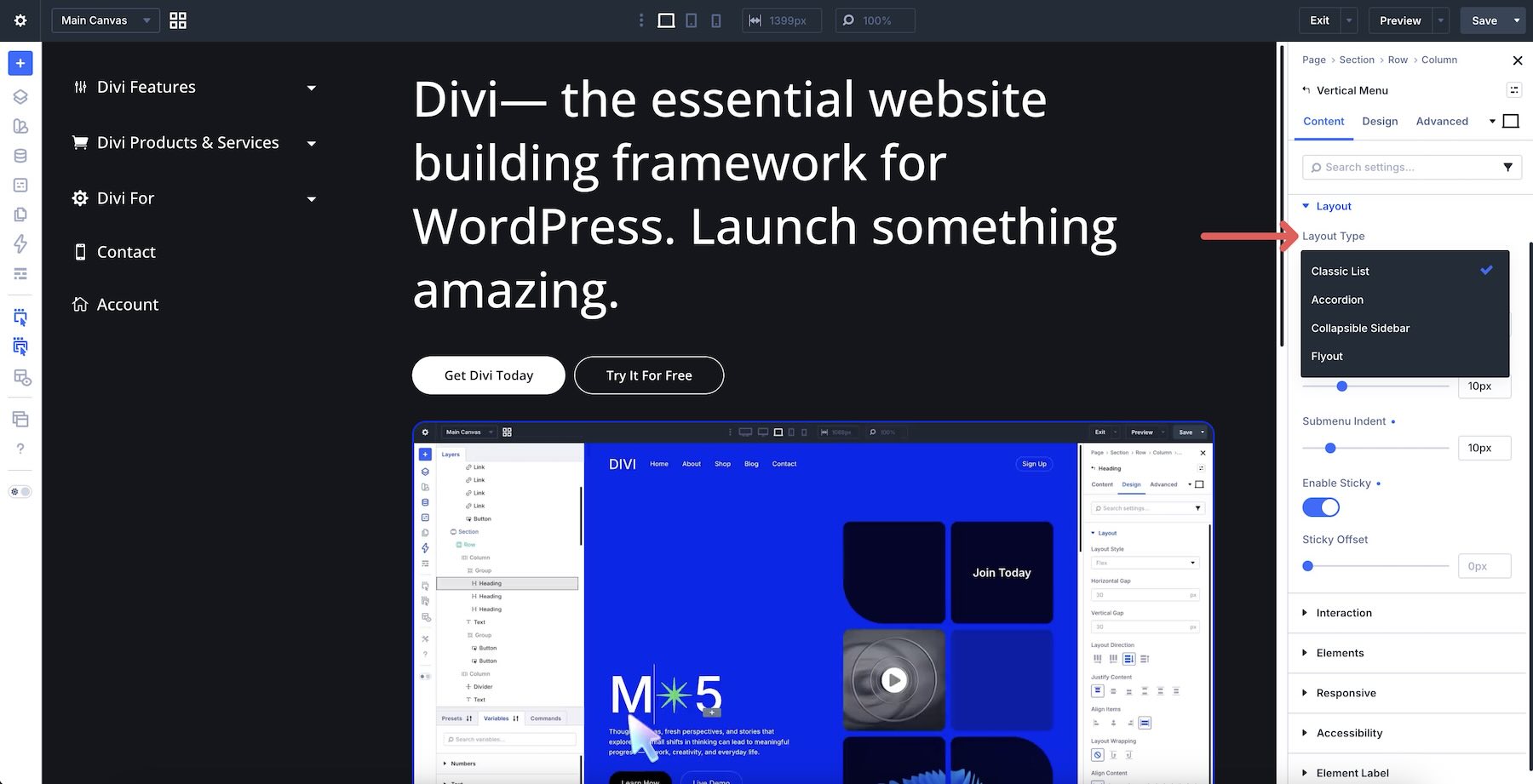
Each layout gives the same navigation a different presentation, making it easier to match the menu to the type of website you are building. Submenu behavior can be customized as well. Depending on the layout, you can open nested items on click or hover and decide whether one or several submenu groups can remain expanded.
Default states, icons, badges, and submenu carets provide additional ways to make the hierarchy clear.
The module also includes dedicated responsive controls. The mobile layout can inherit the desktop version, switch to an Accordion, or become an off-canvas drawer. You can define the breakpoint, drawer side, hamburger label, external trigger, and other responsive behavior from the same module.
Styling is similarly flexible. Menu items, submenus, icons, badges, carets, backgrounds, interaction states, and the off-canvas drawer can all be customized to match the rest of the site.
Key Features And Settings
Once the Vertical Menu module is added to a page or Theme Builder template, its settings are organized into the familiar Divi interface. Here are the controls that make the biggest difference.
The Menu Source settings determine what content generates the navigation. Available source types include WordPress menus, taxonomy terms, and post type pages. The Max Depth setting controls how many levels of nested navigation appear.
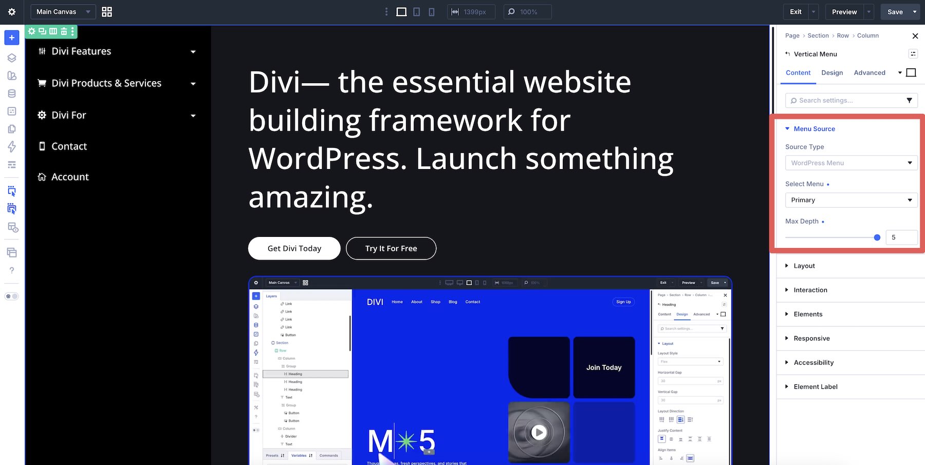
That flexibility lets the same module work with very different types of websites. A simple sidebar might only need one nested level, while a documentation structure can expose a deeper hierarchy.
Four Layout Types
The module offers four ways to present the navigation.
- Classic List displays the links in a straightforward vertical stack. It works well for simple sidebars and secondary navigation.
- Accordion lets visitors expand and collapse sections, keeping larger menus more compact.
- Collapsible Sidebar can condense the navigation into a smaller state, making it a natural fit for dashboard-style interfaces.
- Flyout keeps the main menu narrow while revealing nested navigation in an adjacent panel.
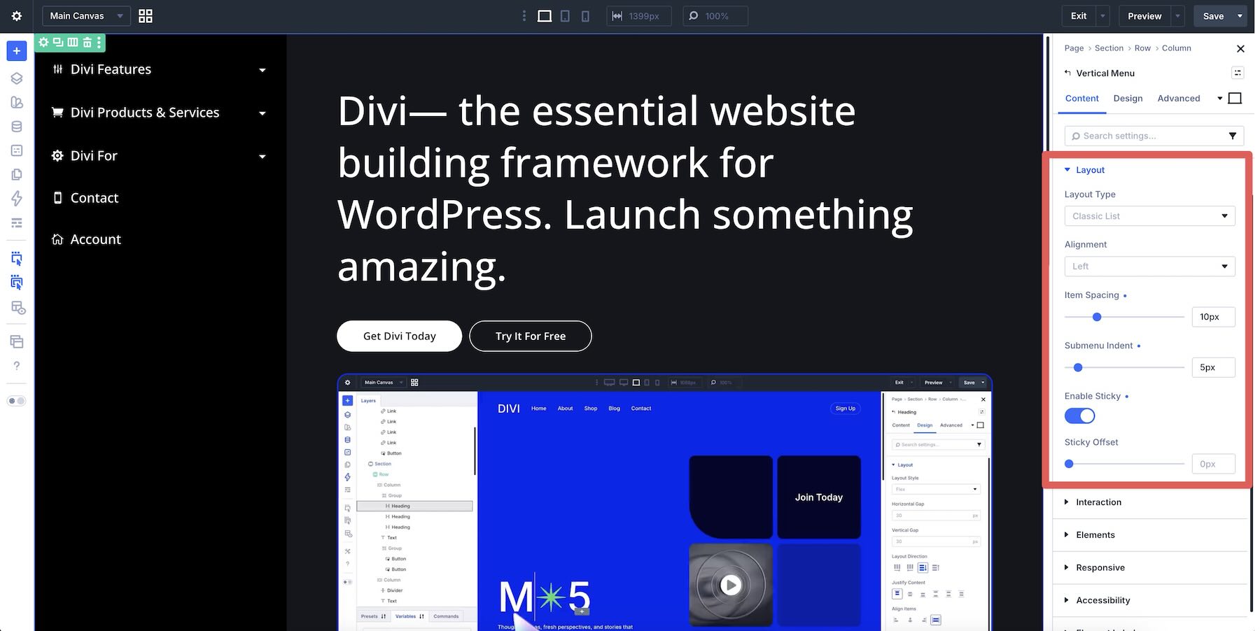
The Layout group also includes options for Alignment, Item Spacing, Submenu Indent, and Sticky behavior.
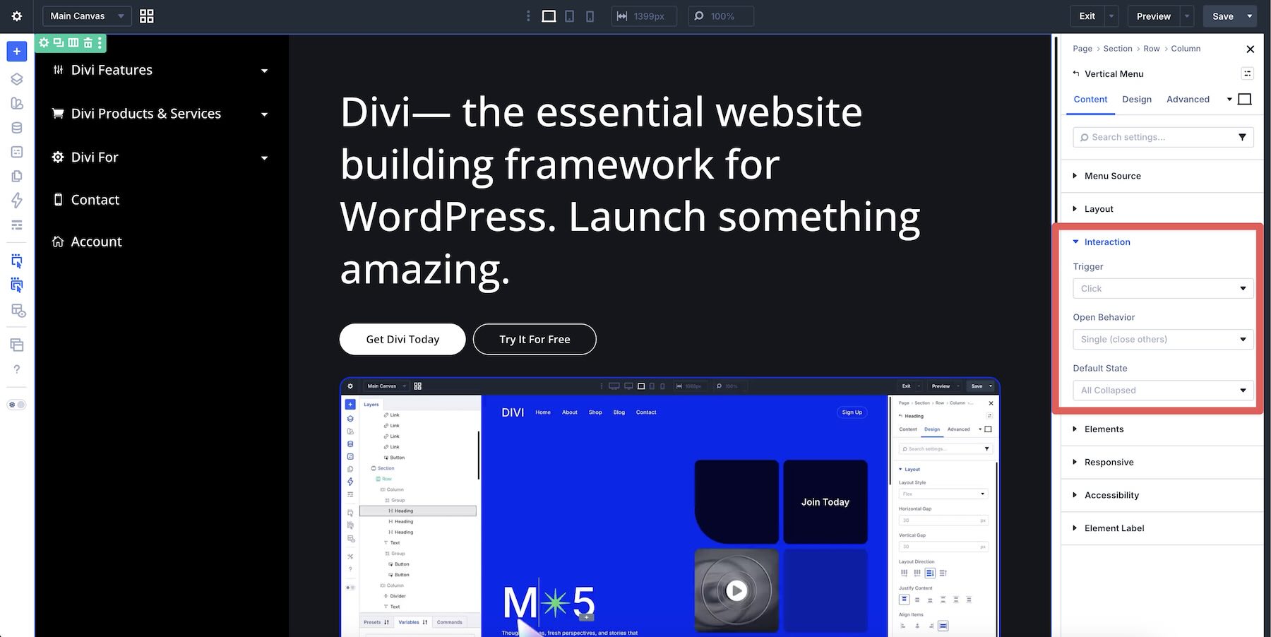
The module gives you control over how nested navigation responds. Depending on the chosen layout, the submenu Trigger can use Click or Hover. The Open Behavior can keep one submenu open at a time or allow several sections to remain expanded.
You can also define the starting Default State, including collapsed, expanded, or first-open configurations.
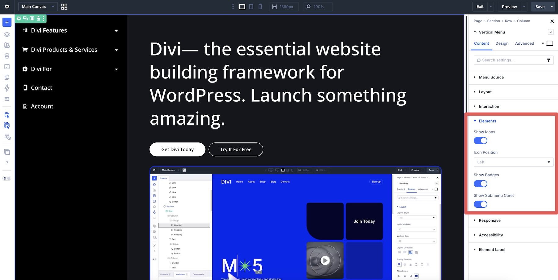
The Elements group provides additional visual cues. Enable icons to make top-level destinations easier to identify, badges to highlight selected items, and submenu carets to communicate which links contain additional navigation.
Responsive And Accessibility Options
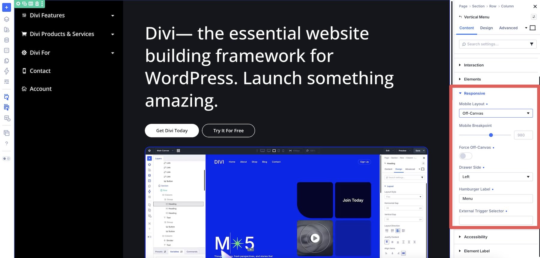
The module includes a dedicated responsive workflow so the menu can adapt to smaller screens. Set the Mobile Layout to inherit the desktop version, switch to an Accordion, or use an off-canvas drawer.
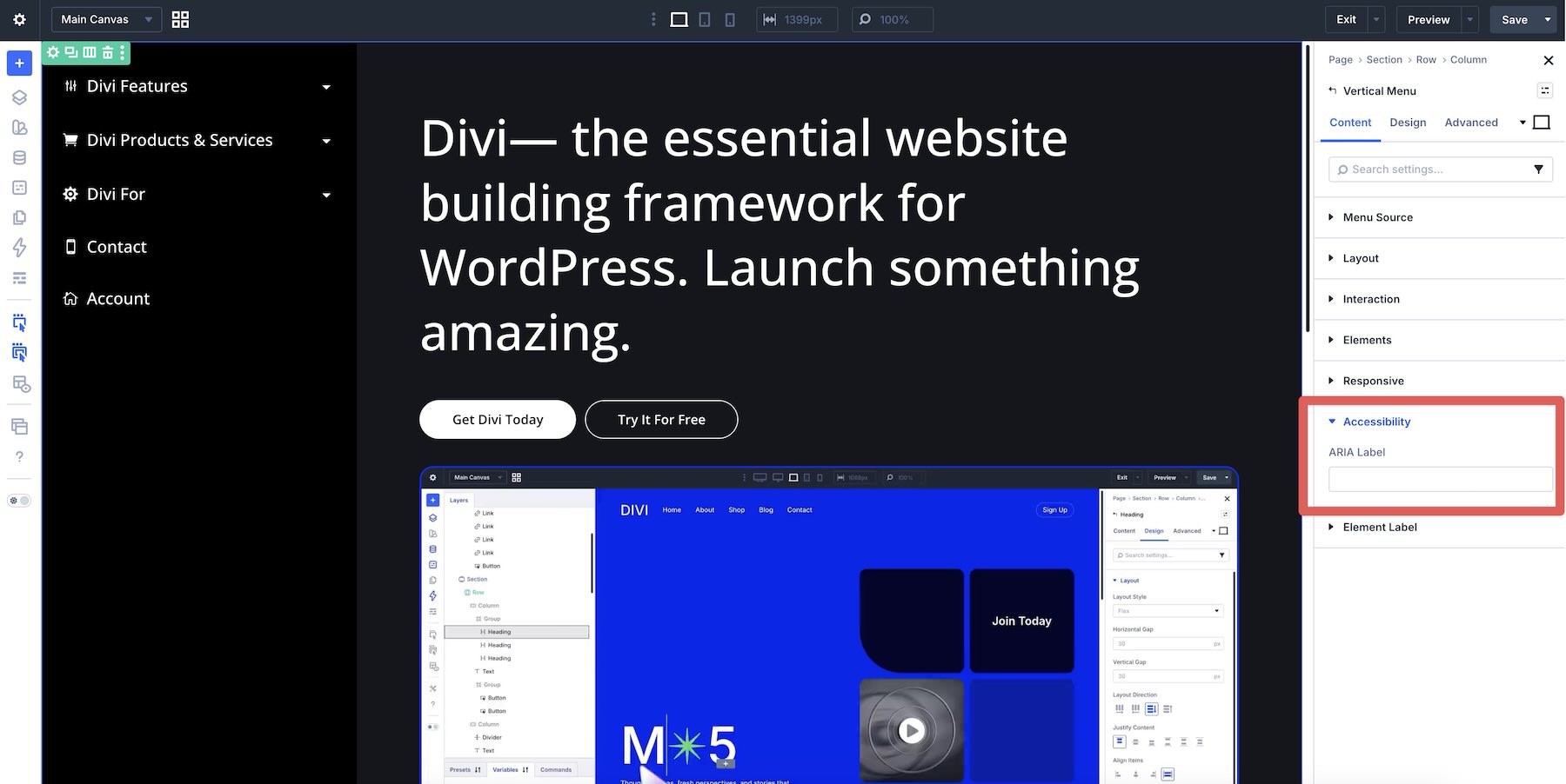
The Accessibility group also includes an ARIA Label field, allowing you to provide an accessible name for the navigation where appropriate.
As with any navigation system, test the finished menu with keyboard controls and across the relevant breakpoints to make sure expandable states, focus indicators, labels, and drawers remain clear.
Detailed Styling Controls
The Vertical Menu module gives you individual design controls for the major parts of the navigation. These groups include familiar controls for typography, colors, spacing, sizing, backgrounds, borders, shadows, and other visual details.
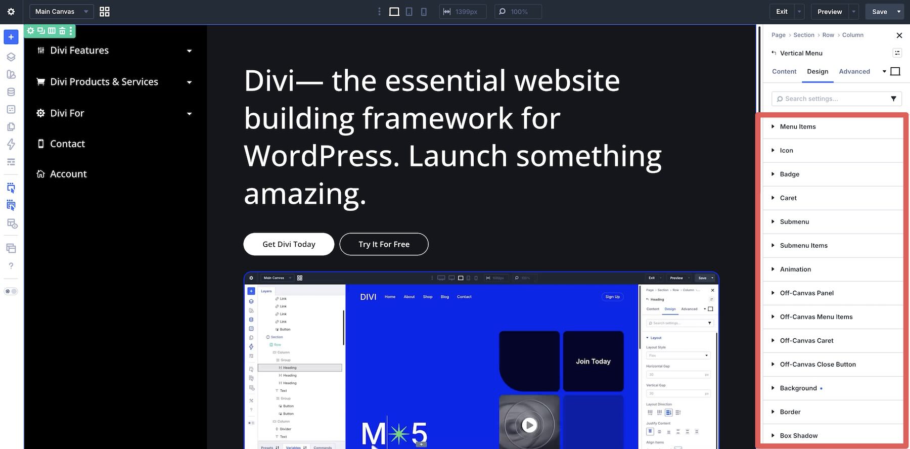
Everything remains editable and previewable directly inside the Visual Builder.
Now let’s put those controls to work. For this example, we’ll create an expandable sidebar menu with nested pages, icons, responsive behavior, and clear active states. Before opening the Visual Builder, make sure Divi Essential is installed and activated.
If you plan to use a WordPress menu as the source, create that menu under Appearance > Menus. Add the pages you need, arrange the parent and child relationships, and configure the menu-specific icon options you want to use.
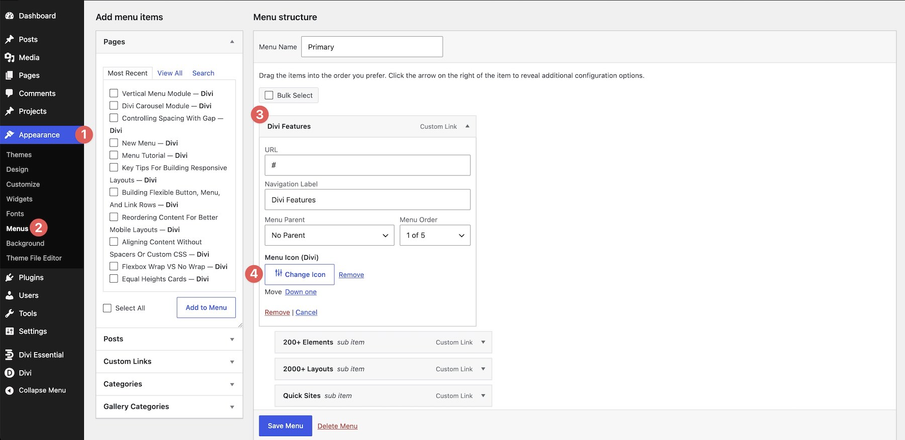
Open the page or Theme Builder template where the navigation should appear. Add a Section and Row if needed, then click Add Module. Open the Divi Essential collection and choose Vertical Menu.
The menu appears directly on the canvas, ready to configure.
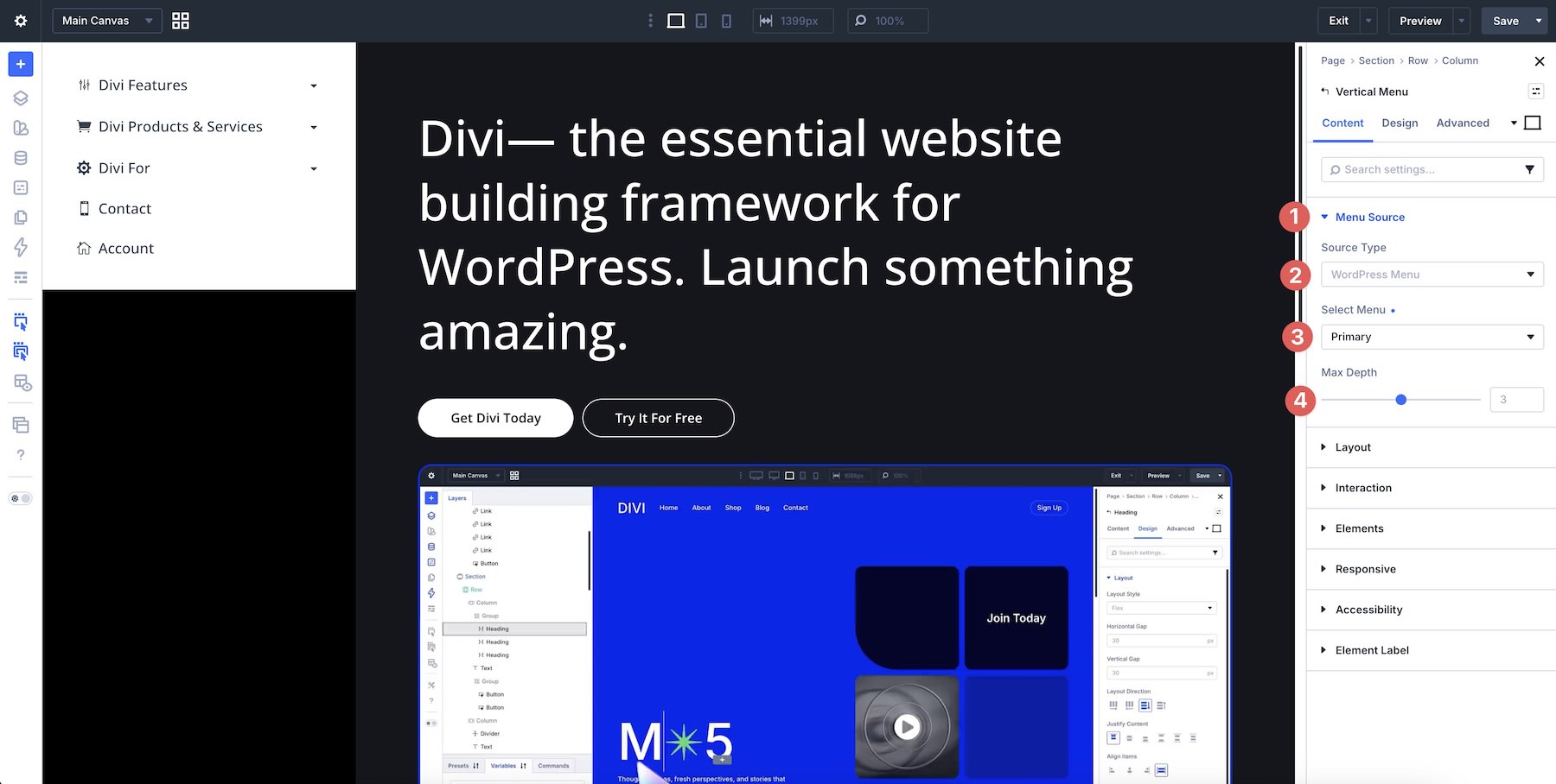
Open the Menu Source group in the Content tab. For this example, choose WordPress Menu as the Source Type, then select the menu you created earlier.
You can use one of the other source types when the navigation should be generated from taxonomy terms or post type pages instead. Set Max Depth based on how much of the hierarchy you want to expose.
3. Select The Layout
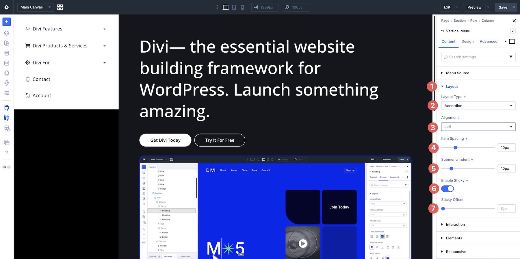
Open the Layout group. For a straightforward vertical menu, choose Classic List. For navigation with several expandable sections, choose Accordion.
We’ll use Accordion for this example so visitors can reveal nested links as they move through the menu. Adjust Alignment, Item Spacing, Submenu Indent, and Sticky behavior from the same group as needed.
Next, choose how nested navigation should behave. For layouts that support both options, the Trigger can be set to Click or Hover. Accordion and Collapsible Sidebar layouts use Click-based expansion.
Use Open Behavior to decide whether several sections can remain expanded or whether opening a new group closes the previous one.
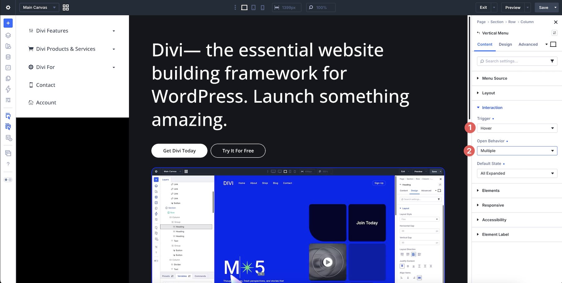
Then choose the initial Default State. Depending on the structure, you can begin with everything collapsed, everything expanded, or the first section already open.
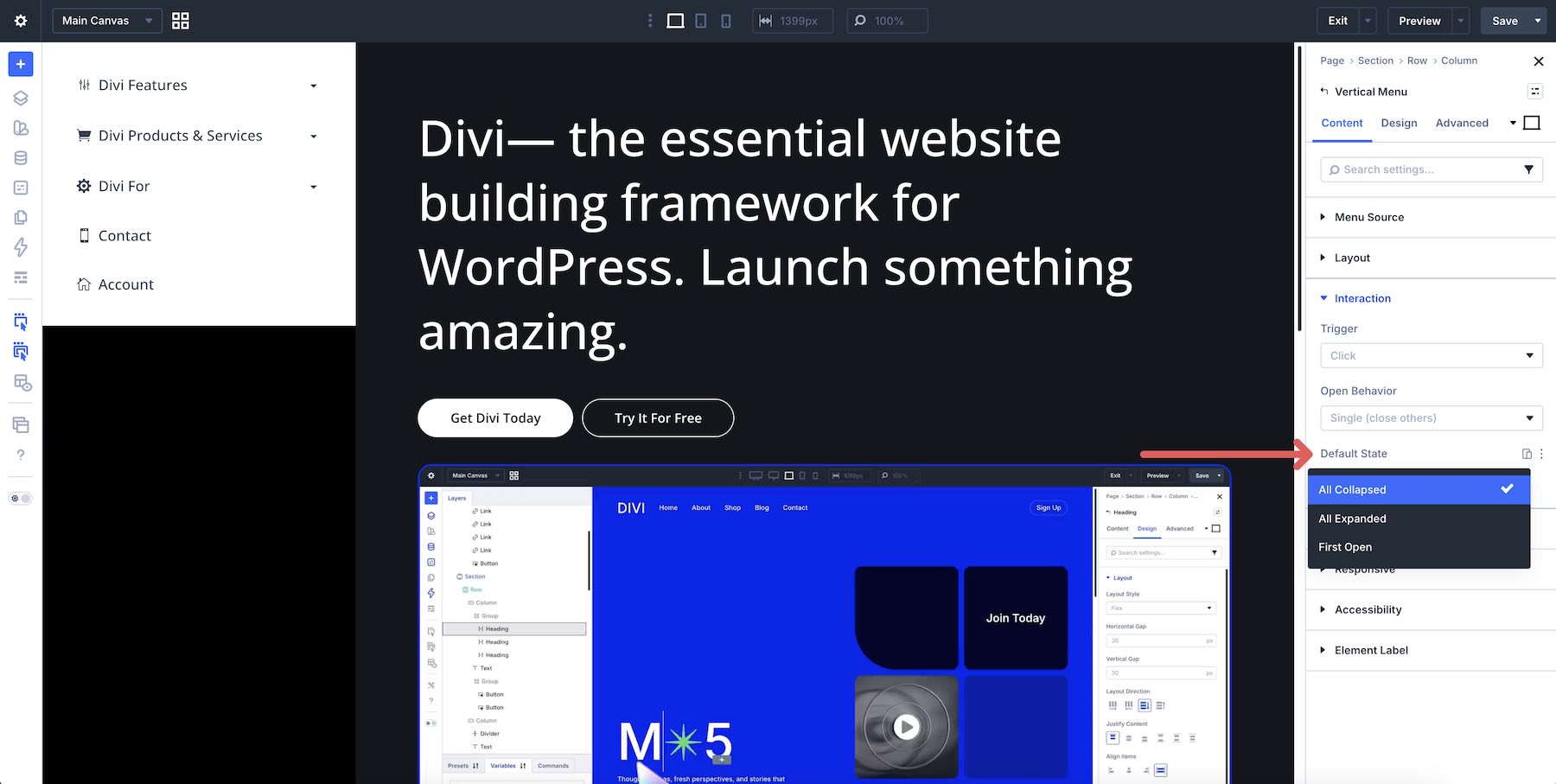
5. Add Icons, Badges, And Carets
Open the Elements group to add visual cues. Enable Show Icons and choose their position if your navigation uses icons. You can also enable Show Badges for specific menu items and Show Submenu Caret for expandable parent links.
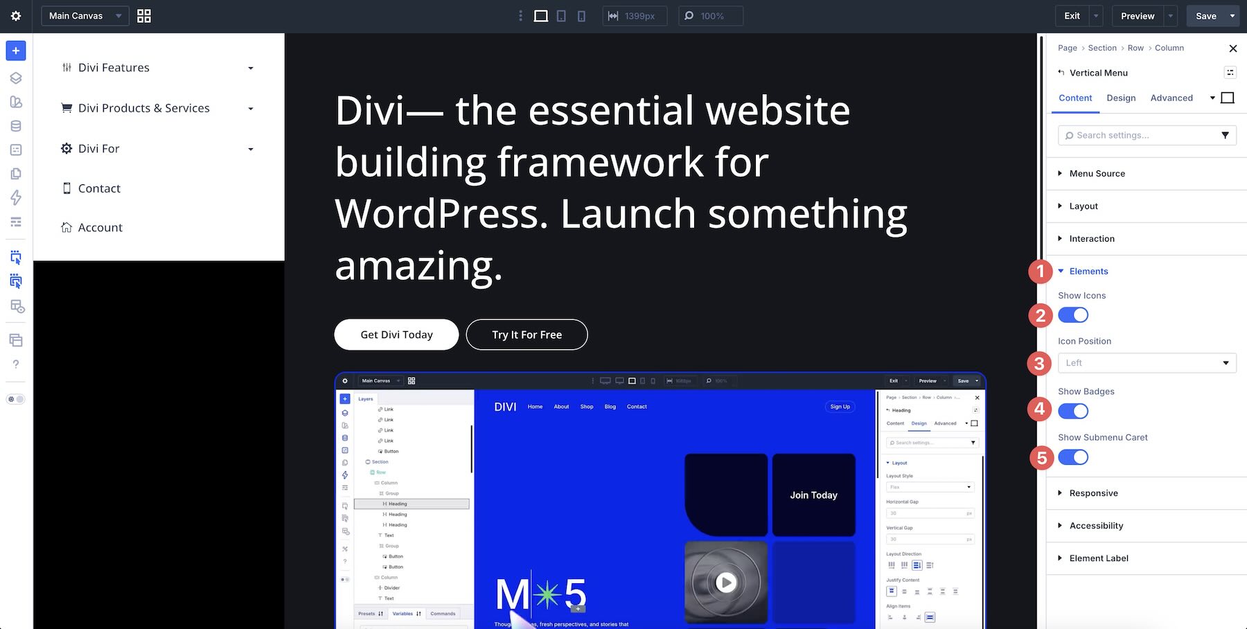
Use these elements to reinforce the hierarchy rather than decorate every item equally. Carets are especially useful for making expandable menu items immediately recognizable.
6. Configure The Mobile Experience
Open the Responsive group. Choose how the vertical menu should adapt at smaller widths. You can inherit the desktop layout, switch to an Accordion, or use an off-canvas drawer.
For this example, we’ll use the off-canvas option so the navigation can stay available without occupying the main content area on smaller screens. Set the Mobile Breakpoint, choose the Drawer Side, customize the Hamburger Label, and configure any external trigger settings the design requires.
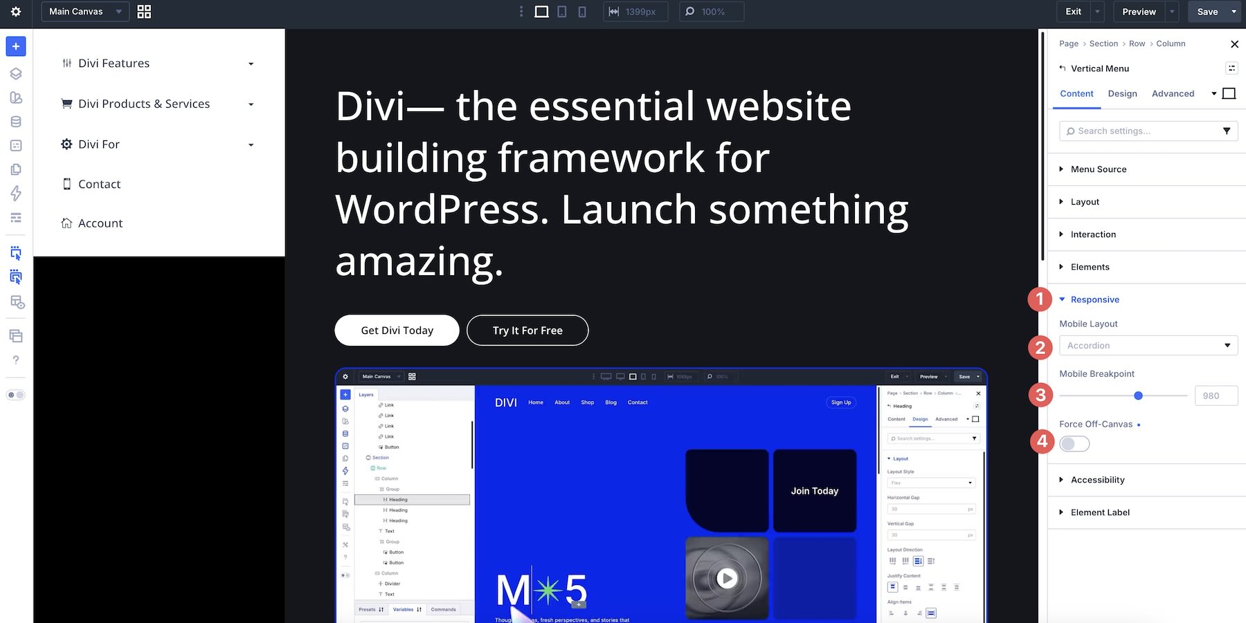
7. Add An ARIA Label
Open the Accessibility group and enter an ARIA Label when the navigation needs an accessible name. For example, a documentation sidebar could use Documentation Navigation, while an account area could use Account Navigation.
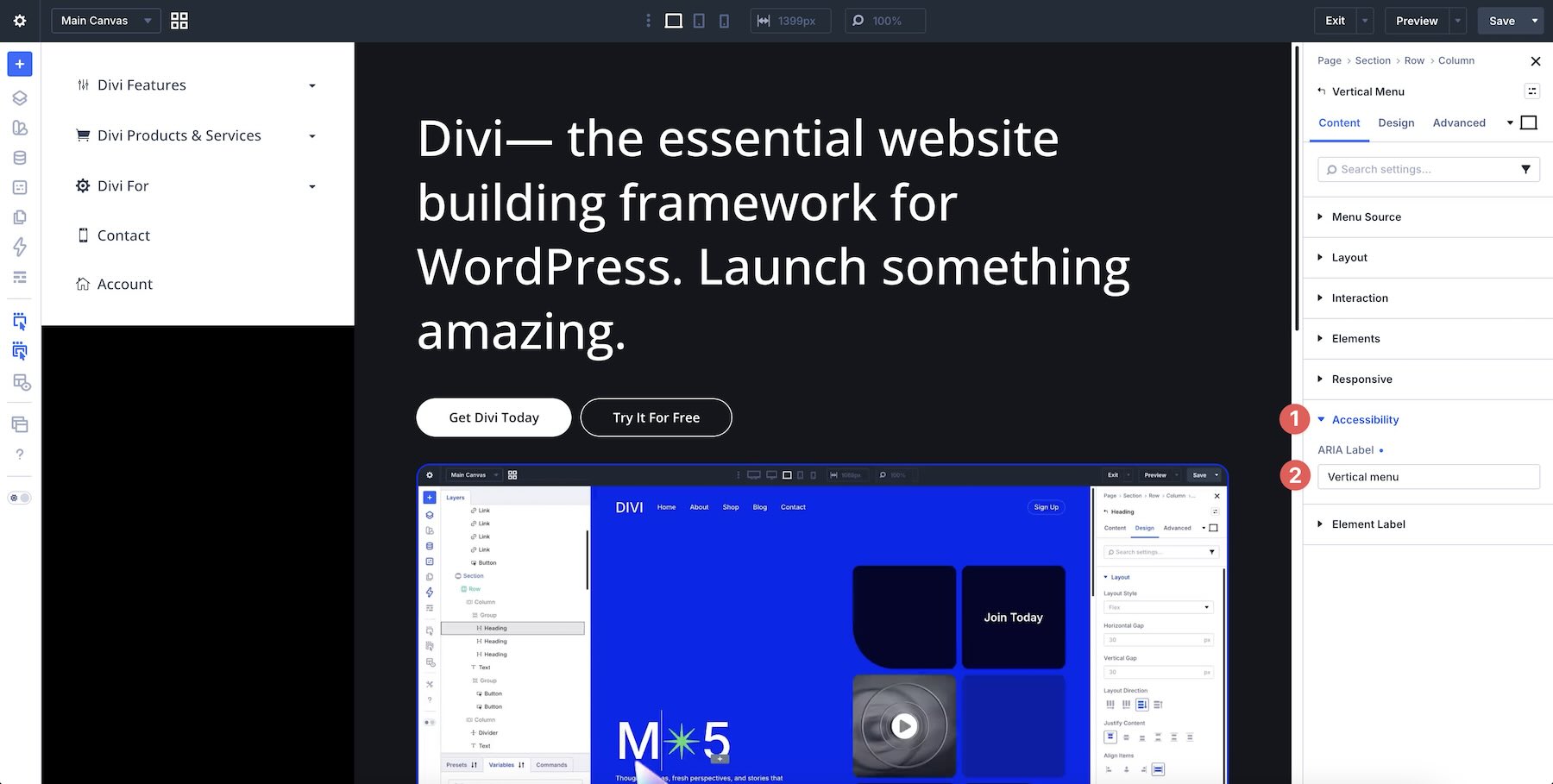
Once the menu is complete, test the navigation with a keyboard and on the relevant device sizes to make sure the complete interaction remains clear.
Switch to the Design tab and open the Menu Items group. Use the typography controls to set the font, weight, size, color, line height, and any supported variable font settings.
Use the Spacing controls to adjust the margin and padding around each item.
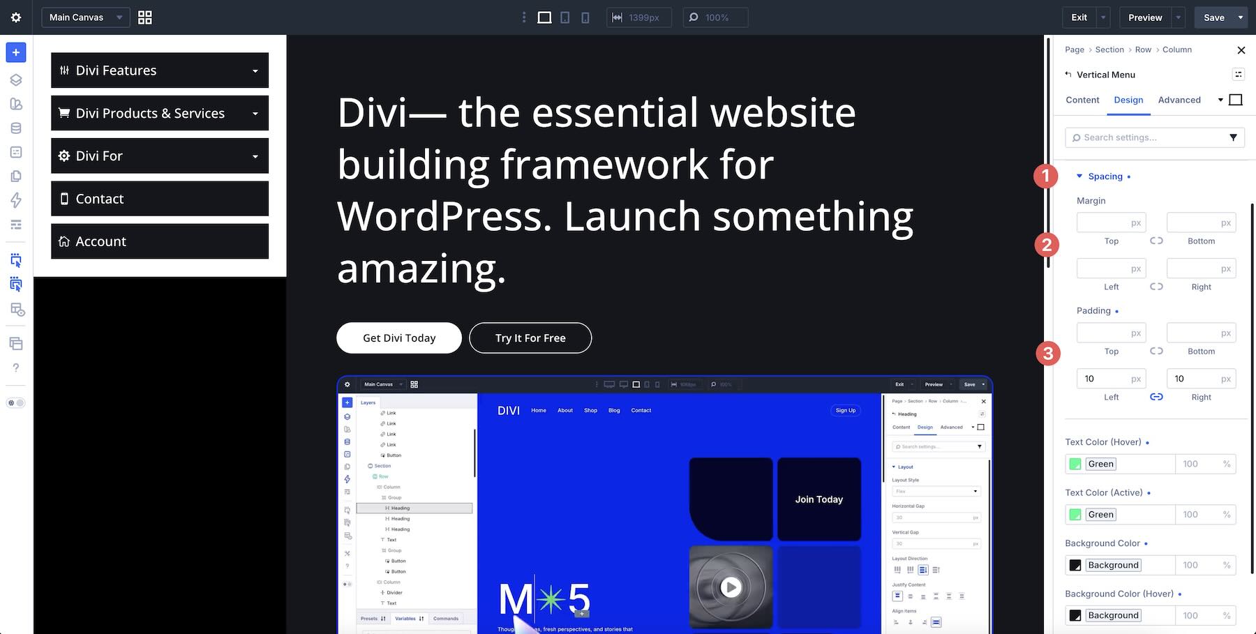
Then style the different interaction states. The module includes controls for regular, hover, and active text and background colors, giving visitors clear feedback as they move through the navigation.
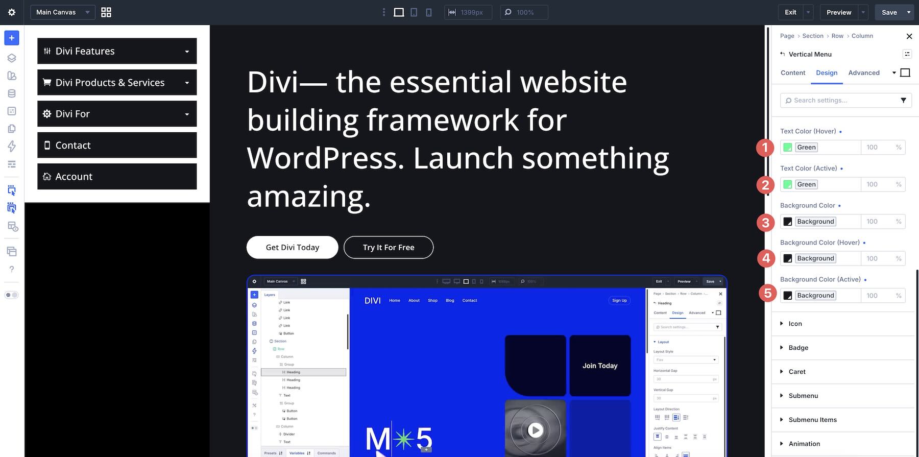
Active states are particularly helpful in longer navigation structures because they make the visitor’s current location immediately visible.
9. Style The Icons, Badges, And Carets
Open the Icon, Badge, and Caret groups. Adjust their size, color, padding, background, border radius, and other available design settings.
Keep each cue tied to a clear purpose. Icons can make top-level categories easier to identify, badges can highlight important destinations, and carets communicate expandable structure.
Open the Submenu group to style the nested container. Set its background, spacing, border, and box shadow.
Then use the Submenu Items group to control the nested links themselves. Set their typography, spacing, item gap, normal text color, hover state, active state, and background colors.
A slight difference in indentation, size, color, or background helps distinguish the submenu hierarchy from the parent navigation.
11. Fine-Tune The Animation
Open the Animation settings to control how expandable elements move. Use Expand Duration to control the timing and choose the easing style of your choice.
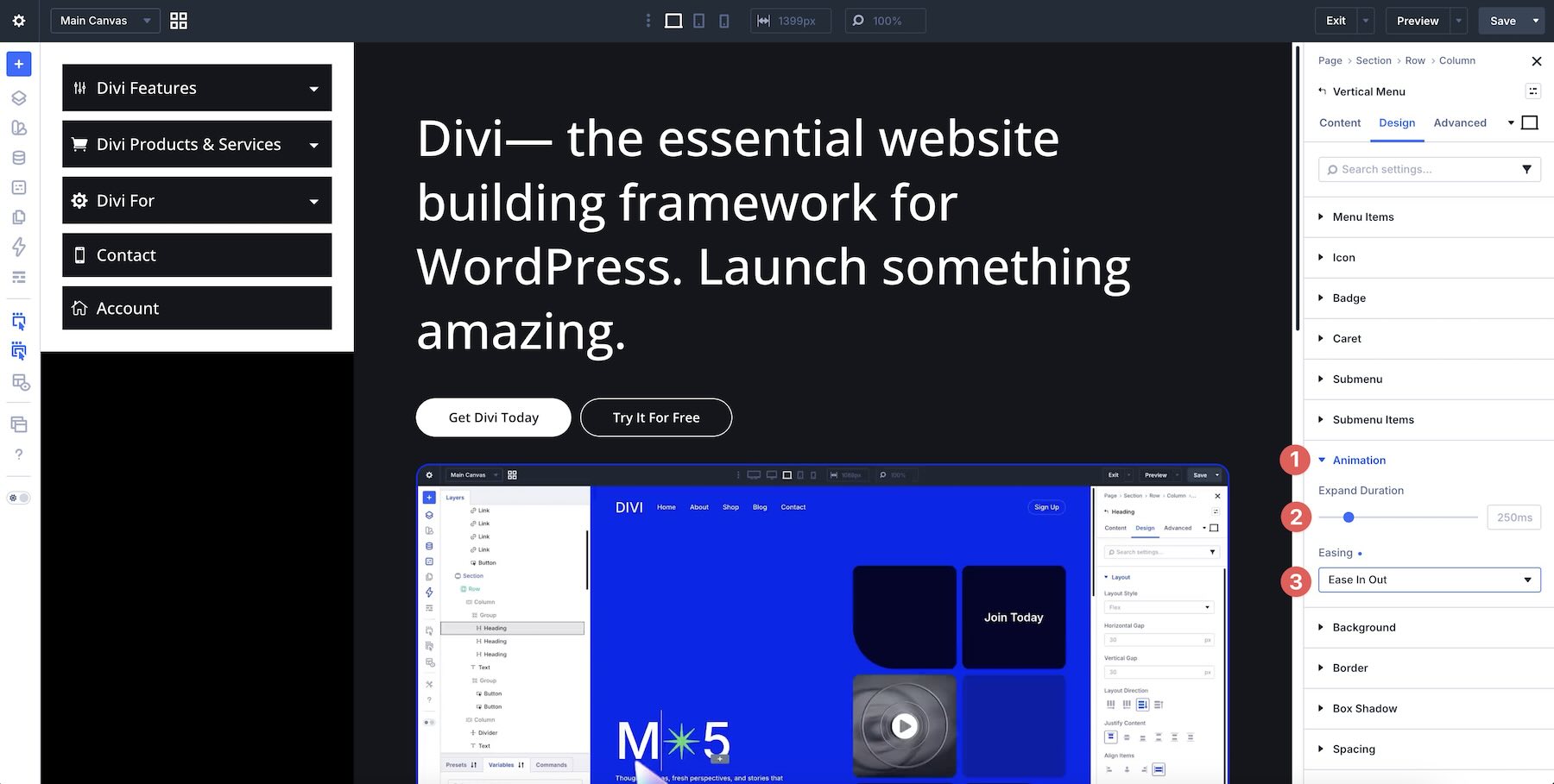
Keep navigation animations responsive enough that the interface reacts immediately while still giving the expansion a polished transition.
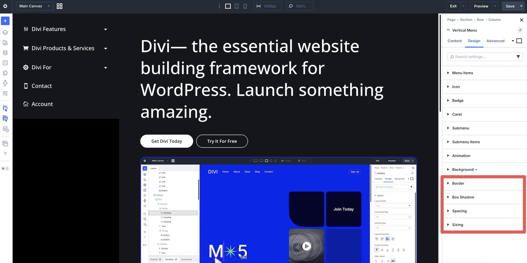
Finally, style the overall container. Use the Background group to create a distinct navigation surface when the design calls for one.
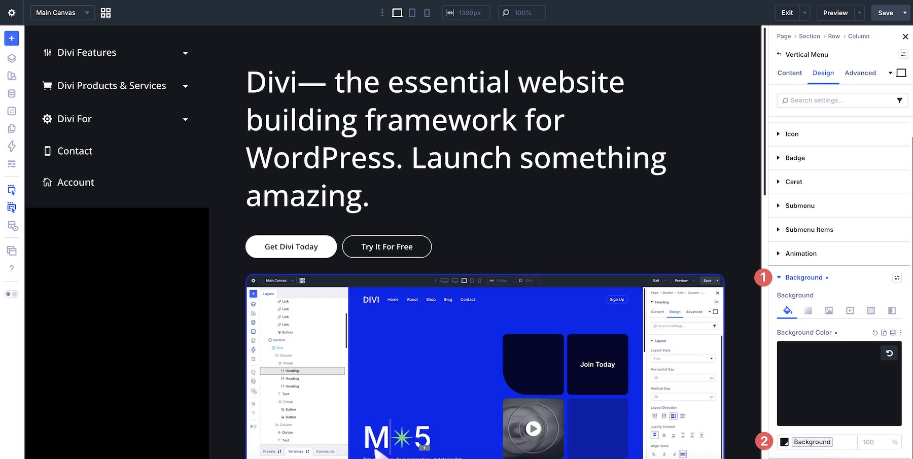
Additional Border, Box Shadow, Spacing, and Sizing groups help refine the overall shape and placement.
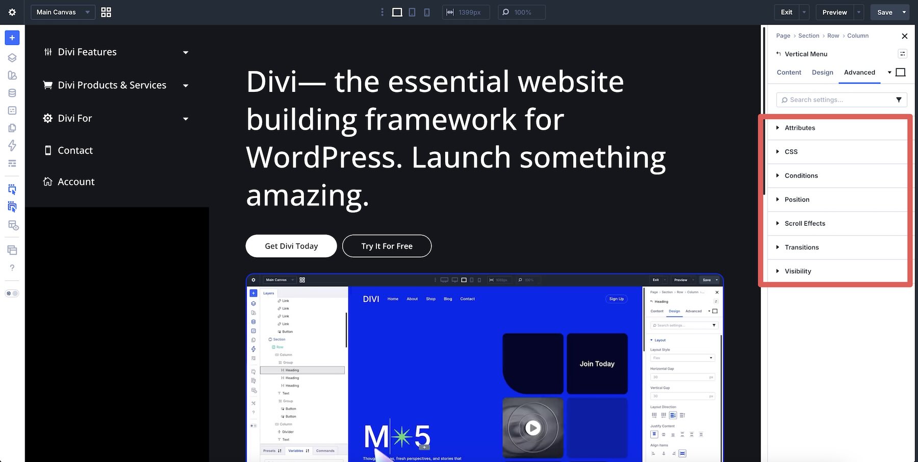
The module also includes Divi’s familiar Advanced tab, giving you access to settings such as Attributes, Custom CSS, Conditions, Position, Scroll Effects, Transitions, and Visibility.
The Result
With the settings in place, the result is a structured vertical navigation system with clear parent and child relationships, expandable sections, responsive behavior, active states, and styling that fits the rest of the website.
The same module can then be adapted for category navigation, knowledge bases, documentation, membership areas, dashboards, store categories, or any other layout where vertical navigation suits the content.
The Vertical Menu module can fit a wide range of Divi projects.
- Agencies and freelancers can use it to create repeatable navigation patterns for different client requirements.
- Documentation and knowledge base sites can use expandable menus to organize larger information hierarchies.
- Membership sites and dashboards can use the Collapsible Sidebar layout to keep account navigation accessible while preserving space for the main content.
- Bloggers and publishers can use menu or taxonomy sources to organize categories and sections.
- WooCommerce stores can create vertical category structures that make larger catalogs easier to browse.
And when the navigation needs to change shape across devices, the module’s Accordion and off-canvas options give you a responsive workflow inside the same set of settings.
The Divi Vertical Menu module gives you a focused way to create structured vertical navigation while staying inside the Divi 5 Visual Builder. Choose where the menu content comes from, control its depth, switch between Classic List, Accordion, Collapsible Sidebar, and Flyout layouts, configure submenu behavior, add visual cues, define the mobile experience, and style each part of the navigation from one module.
As part of Divi Essential, the Vertical Menu module joins a collection of more than 109 modules, 28 extensions, 720 section layouts, 40 starter templates, and 8 pre-built websites. Divi Essential is compatible with both Divi 4 and Divi 5, so the same toolkit can support existing sites and new Divi 5 projects. The Unlimited license is regularly listed at $79 and includes unlimited website usage, one year of support and updates, and a 30-day money-back guarantee. Marketplace promotions may reduce the current purchase price.
For Divi users who regularly build sidebars, dashboards, documentation menus, category navigation, or responsive drawers, the Vertical Menu module adds a polished and highly configurable navigation workflow to the Divi toolkit.










Leave A Reply