

Divi MadMenu is a header and menu creation plugin that expands the possibilities of your Divi headers and menus. Divi MadMenu comes with a horizontal menu module and a vertical menu module. You can fully customize every aspect of your menu with extensive design options, allowing you to create unique menu layouts. Divi MadMenu also adds some great functionality to the menu such as the ability to create custom popups, add buttons that change depending on the user authentication state, add WooCommerce-connected cart icons, and more.
In this plugin highlight we’ll take a close look at all the features you get with Divi MadMenu and help you decide if it’s the right plugin for you.
Let’s get started!
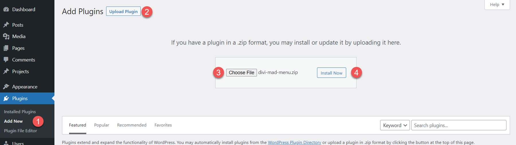
Divi MadMenu comes as a .ZIP plugin file. To install the plugin, open the plugin page in your WordPress dashboard and click Add New. Click Choose File and select the plugin file from your computer, then click Install Now. Once the plugin is installed, activate the plugin.
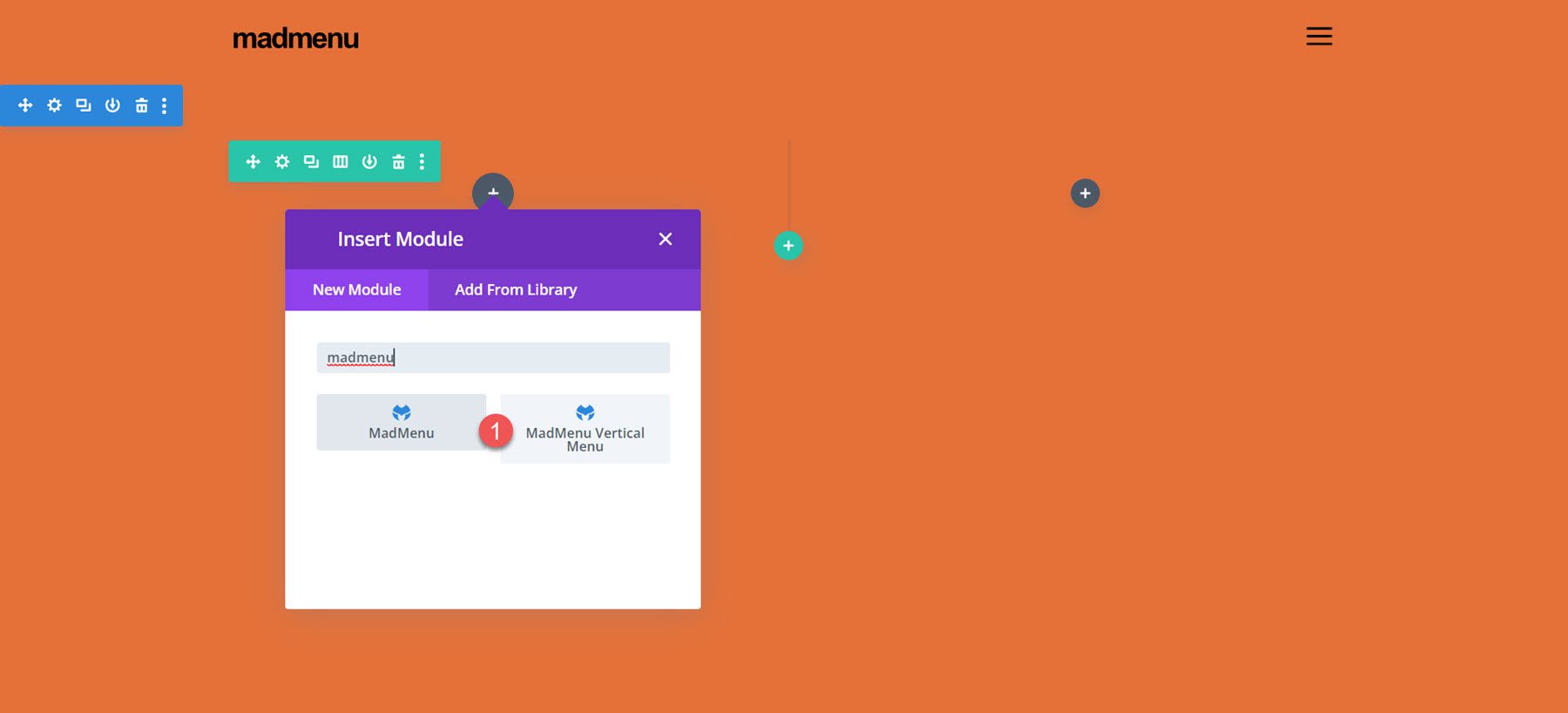
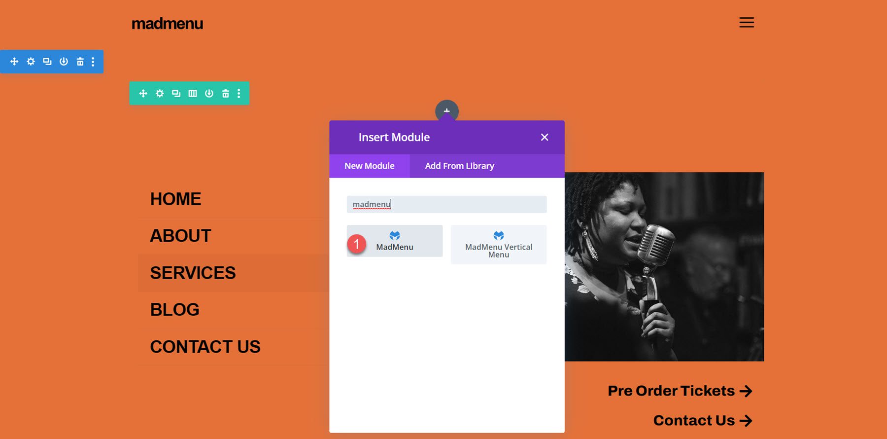
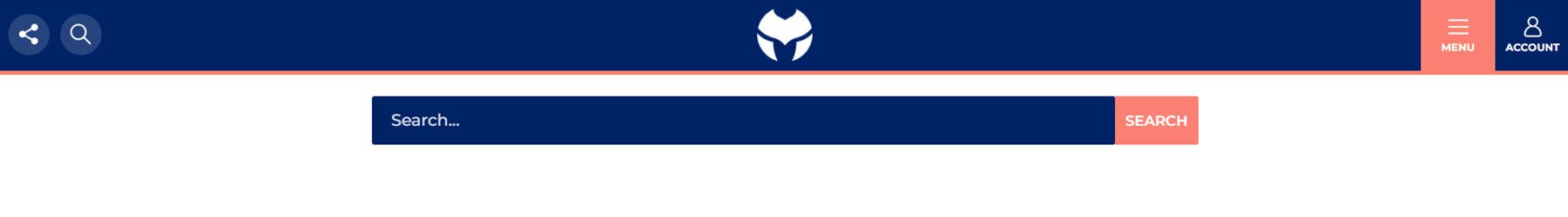
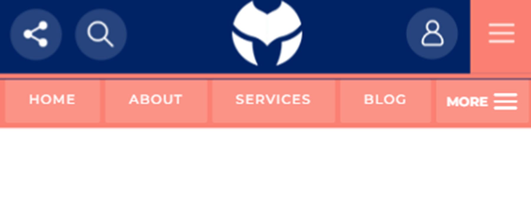
The plugin adds two new modules to the Divi Builder: MadMenu and MadMenu Vertical Menu. You can add these modules to your page or to your site header through the Divi Theme Builder.
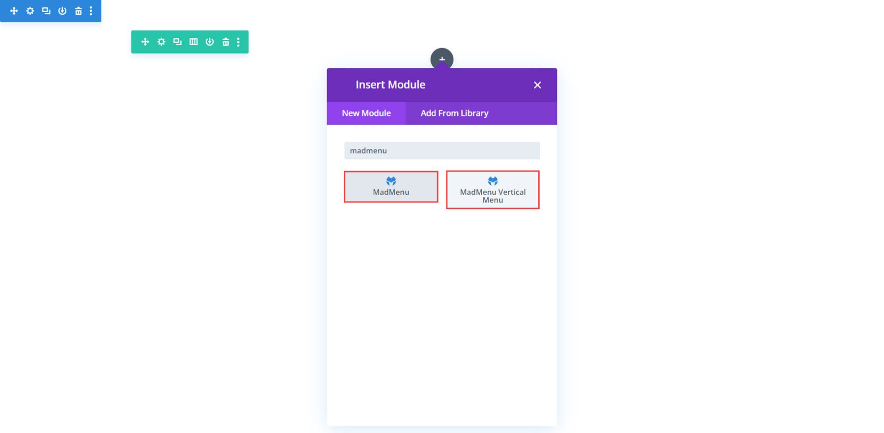
The MadMenu module adds a horizontal menu module to your page. For this example, I’m using Demo Layout 1 which comes with the plugin. Let’s take a closer look at the MadMenu module settings.
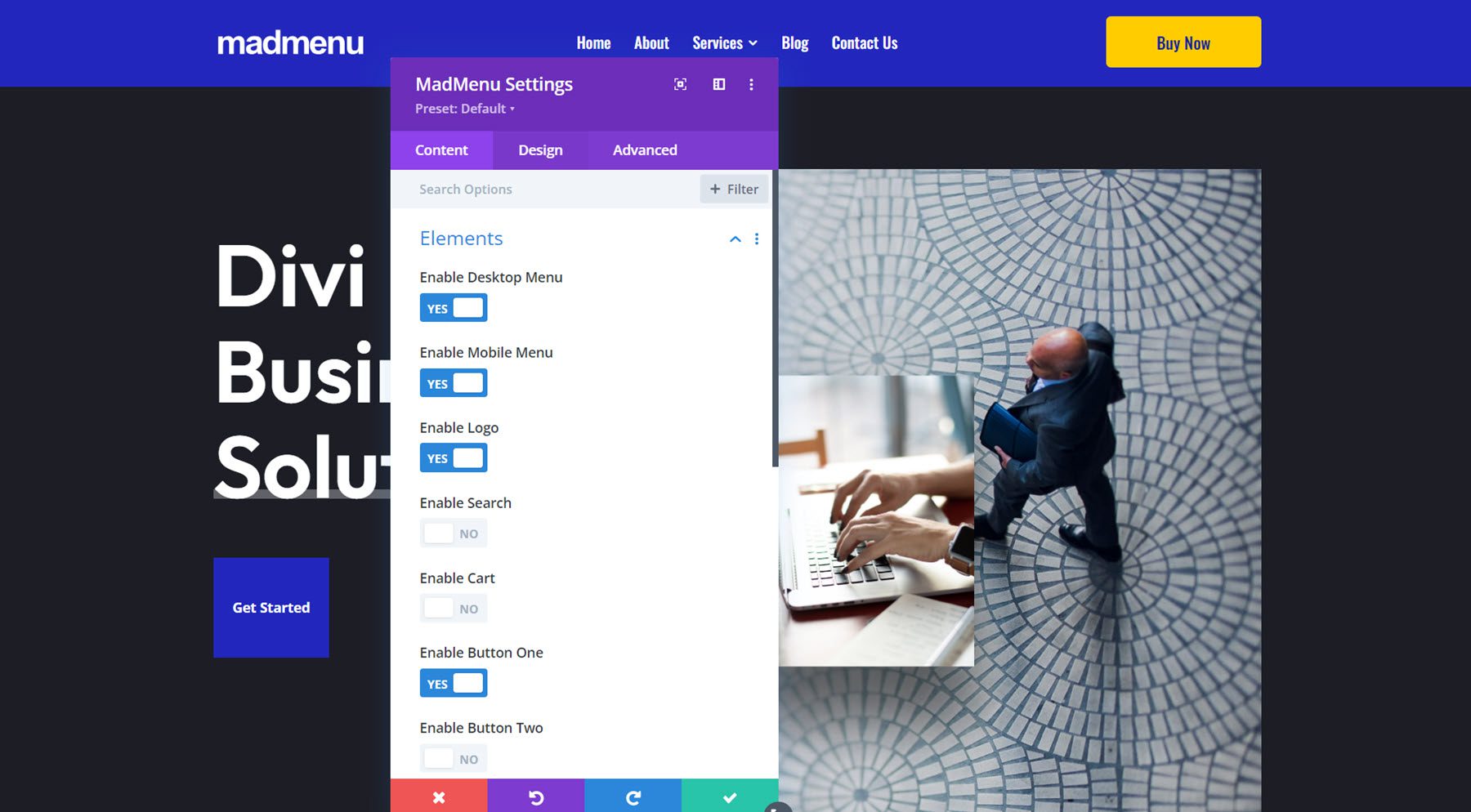
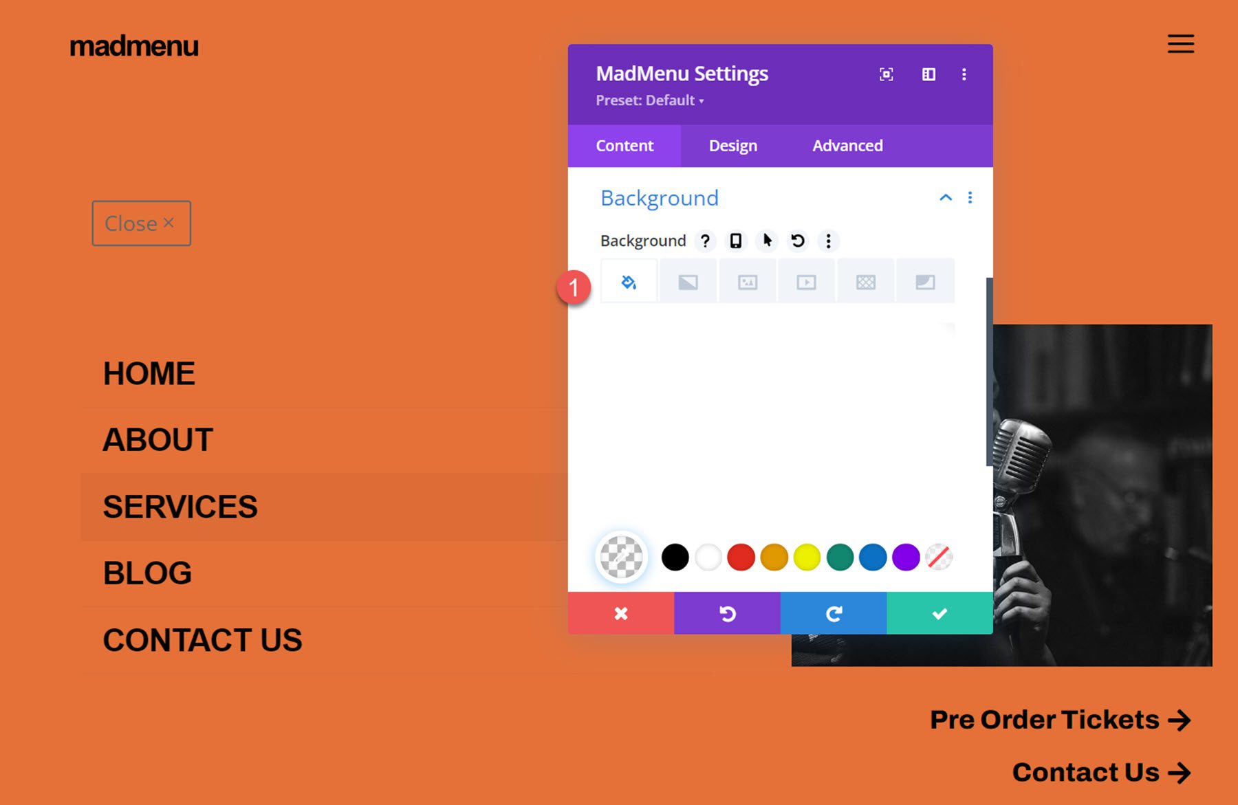
The content tab of the MadMenu settings is where you can control the general menu elements and functions.
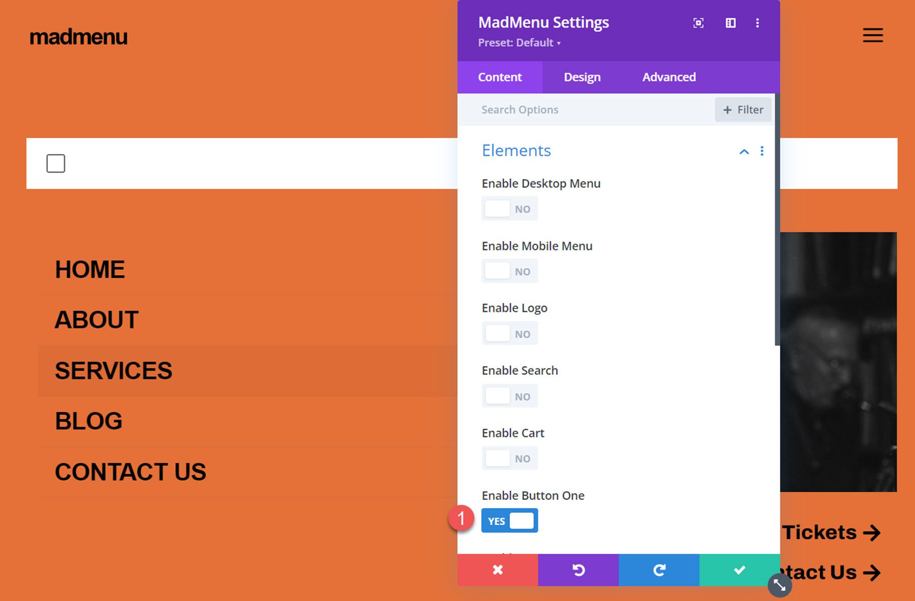
Elements
Here you can choose to enable or disable the desktop and mobile menus, and you can enable menu elements such as the logo, search, cart, button one, and button two. Each of these elements can be customized with specific settings below in the content tab and in the design tab.
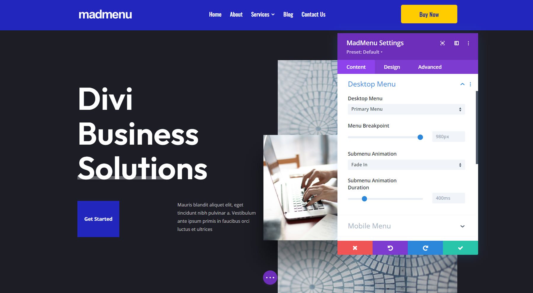
Desktop Menu
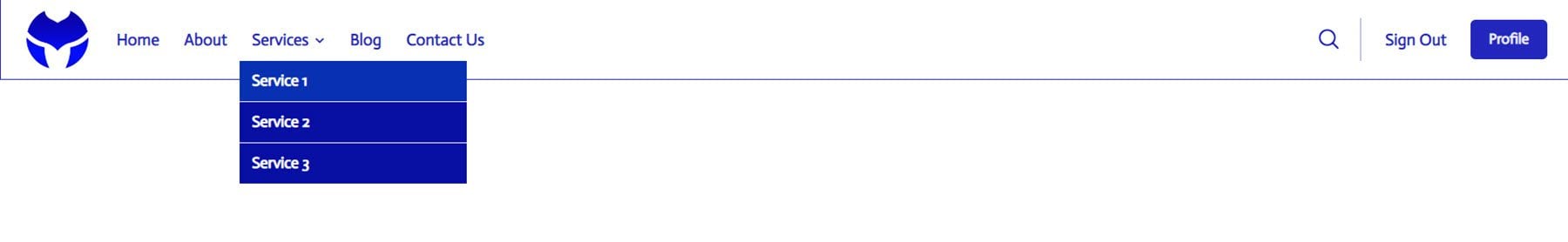
Here you can choose the menu to display on desktop devices, set the breakpoint where the desktop menu will start showing, choose the submenu animation style, and set the animation duration. The desktop menu can be changed with responsive options, so you can set different menus to appear on different screen sizes.
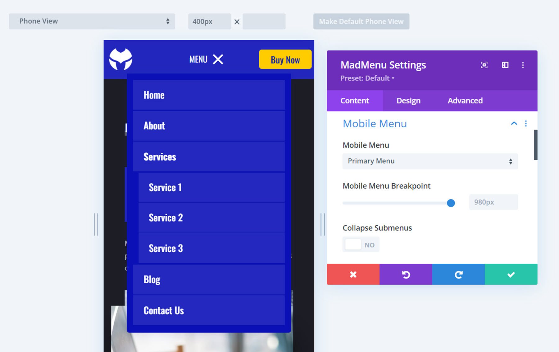
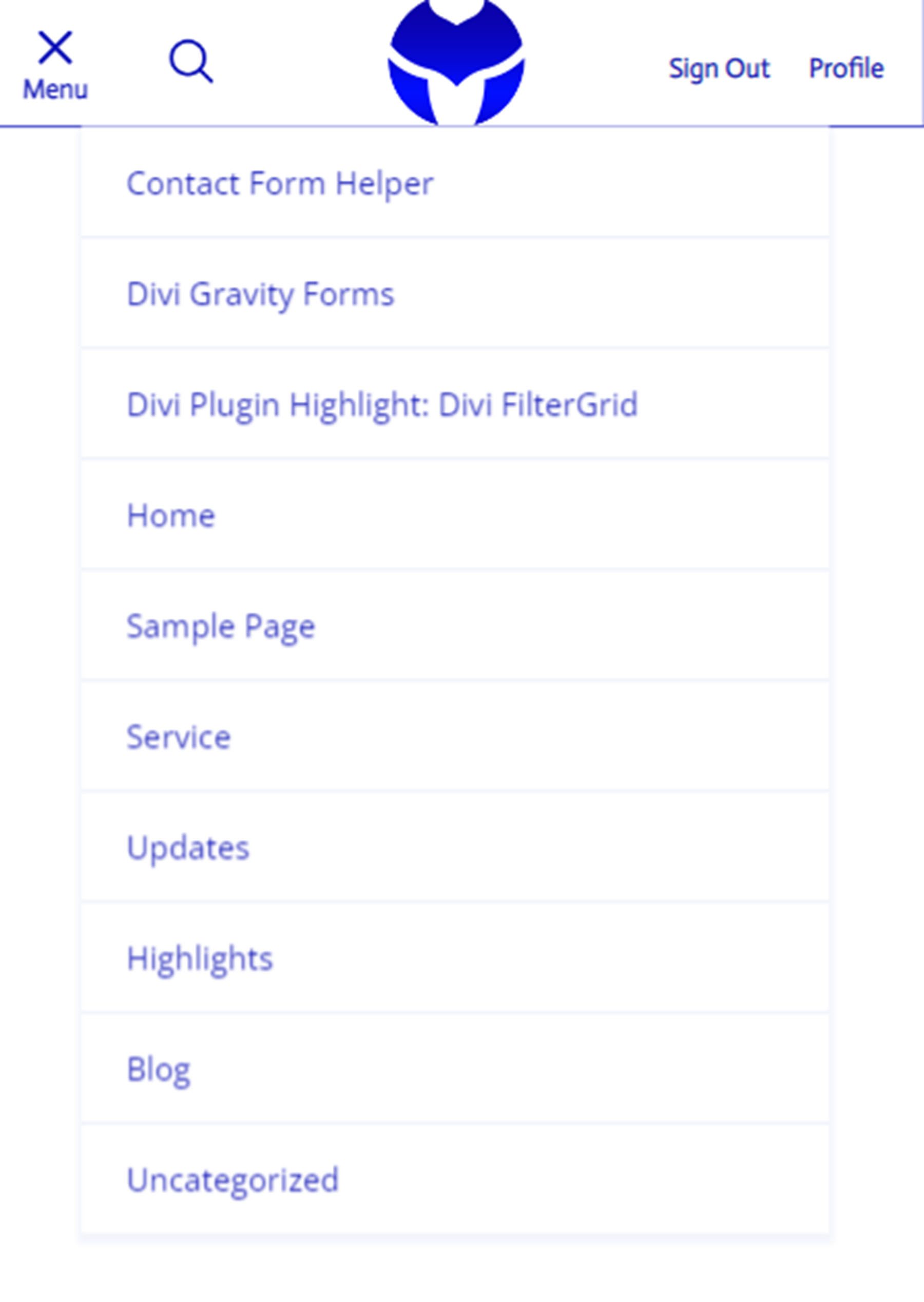
Mobile Menu
The mobile menu settings allow you to select the displayed menu, set the mobile menu breakpoint, and choose between collapsed or expanded submenus. Just like the desktop menu option, you can use responsive styles to display different menus on different screen sizes.
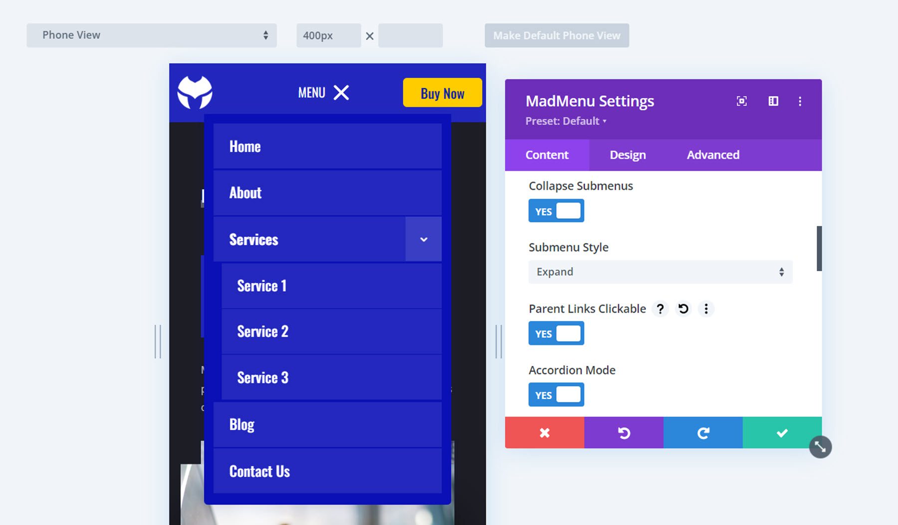
Mobile Submenu Styles
If you select collapsed submenus, you can select from 3 different reveal styles – expand, slide right, and slide left. You can also choose if parent item links are clickable. The expand style reveals submenu items vertically. You can choose to enable accordion mode, which only allows one open submenu at a time and will collapse all other opened submenus of the same level.
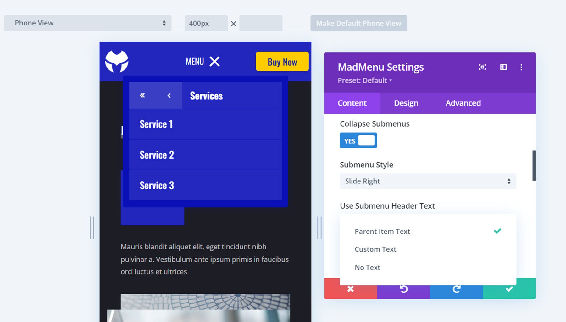
The slide right or slide left reveal style keeps your menu compact as the submenu items slide in from left or right, and replace the main menu. At the top of the menu, you can find a button to go back one level and a button to go back to the main menu. You can choose between displaying the parent item text, custom text, or no text in the submenu header.
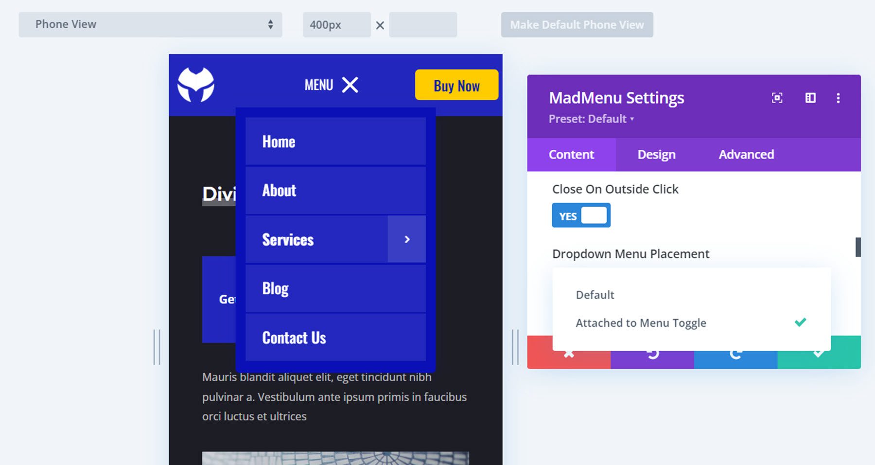
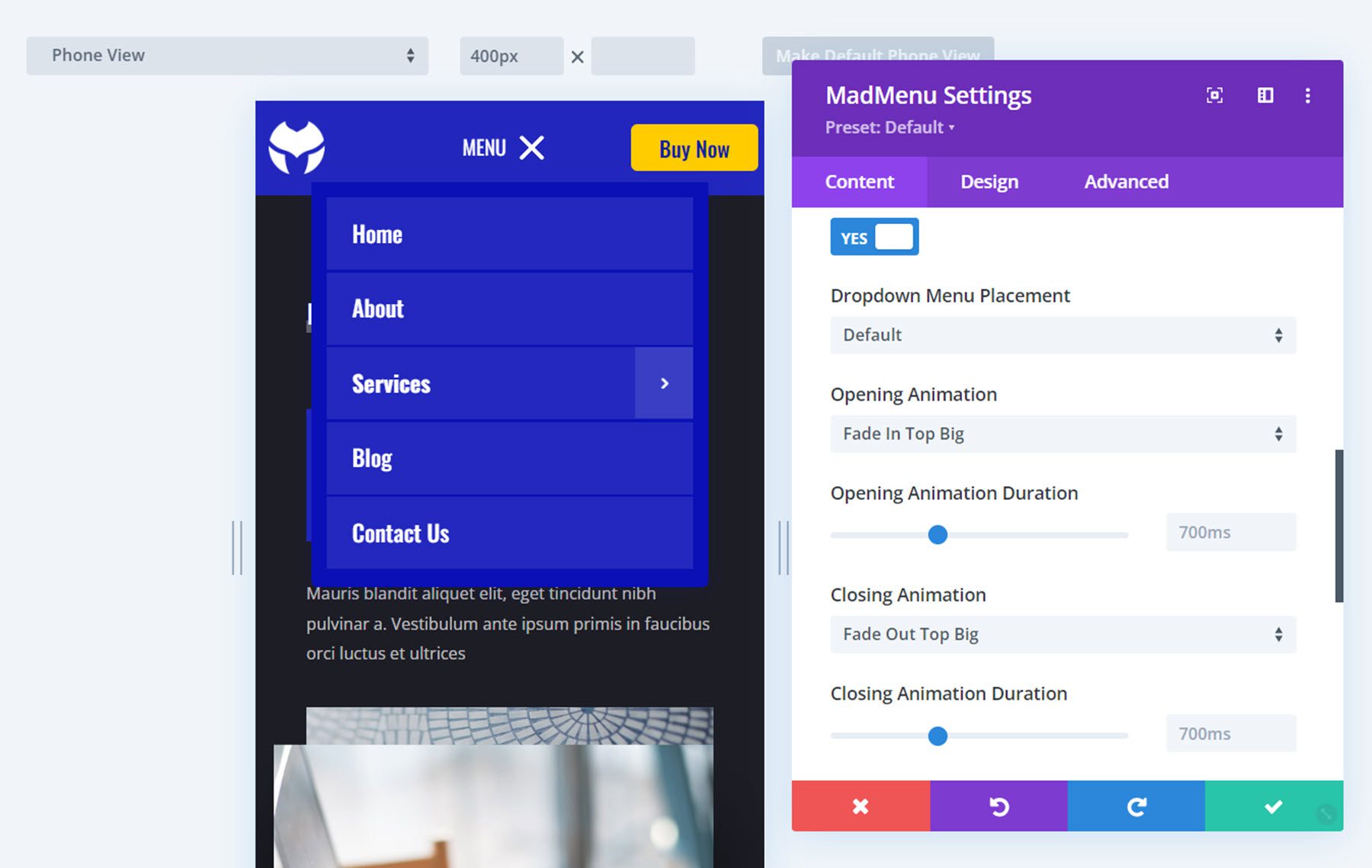
Mobile Menu Options
Continuing with the mobile menu options, you can enable close on outside click, which closes the menu when the user clicks outside of the menu section as opposed to having to click the menu button at the top to close. The default dropdown menu placement option makes the dropdown menu and the mobile menu toggle independent from each other. The dropdown menu will be aligned with the main module container. The Attached to Menu Toggle option “attaches” the dropdown menu to the menu toggle. If the menu toggle order is changed, the dropdown menu placement will also change, aligned with the toggle.
Mobile Menu Animations
If you’re looking for a plethora of menu animation options, MadMenu has you covered. There are 20 different opening animation options to choose from and you can change the animation duration.
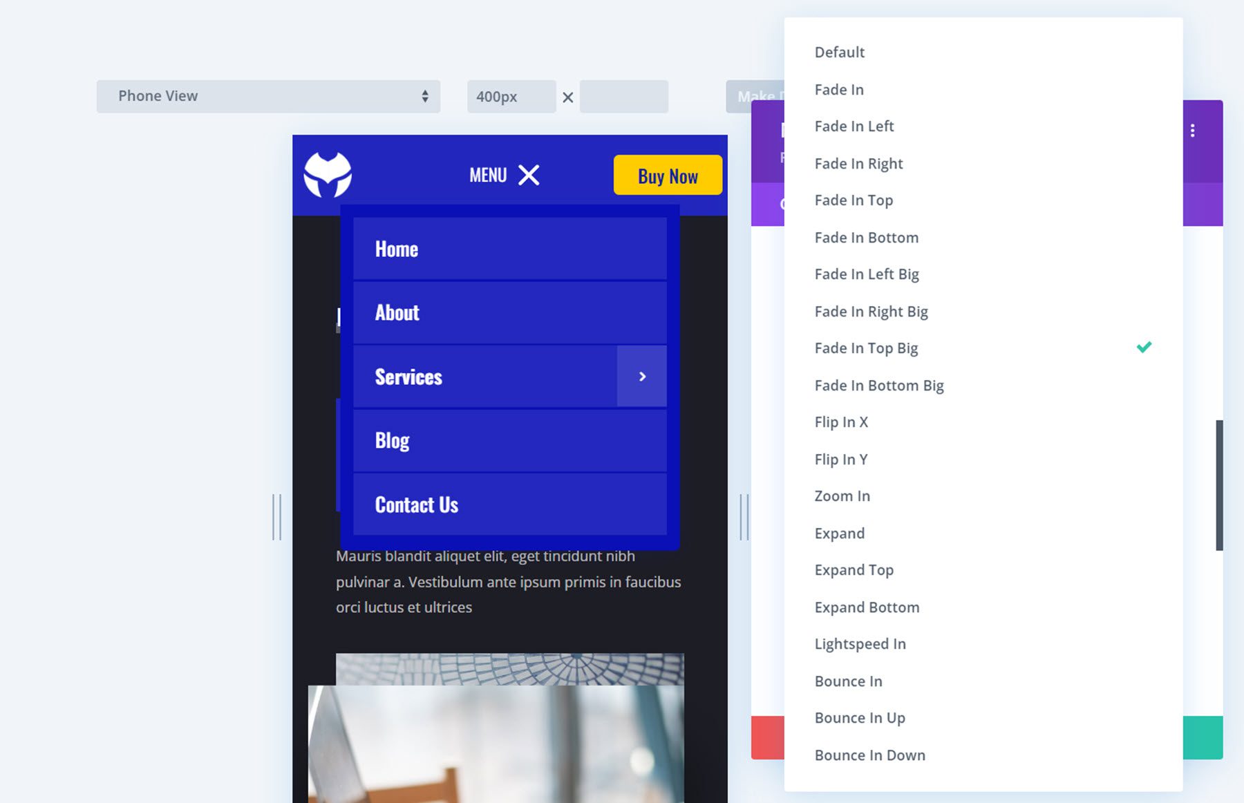
There are 20 closing animation options that correspond with the opening animations and you can change the duration of the animation.
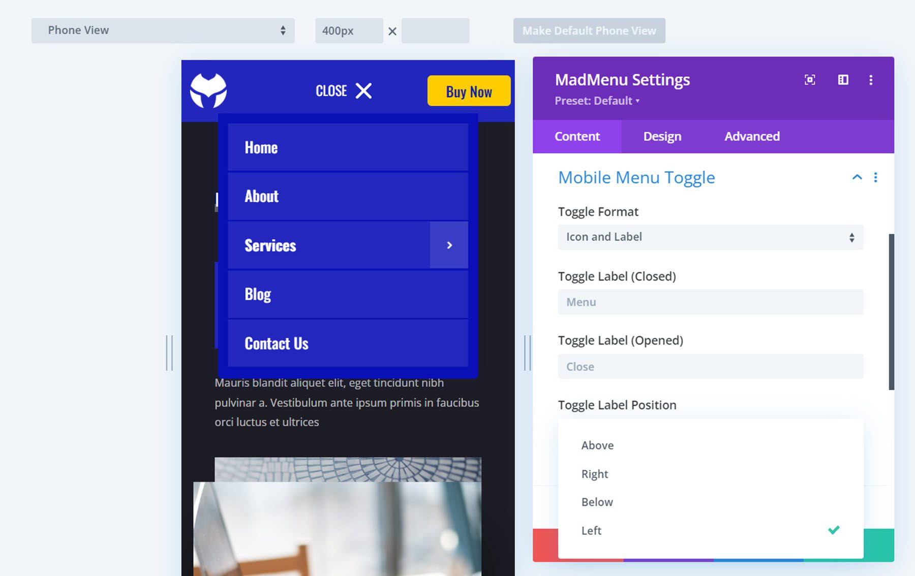
Mobile Menu Toggle
Here you can change the appearance of the menu toggle that appears in the mobile header. You can select between the icon and label format, just the icon, or just the label. You can also change the toggle label that appears in the closed and open states, as you can see pictured here. The toggle label can also be customized in the hover state, leading to many interesting design possibilities. The toggle label position setting allows you to put the label above, below, on the right, or on the left side of the icon.
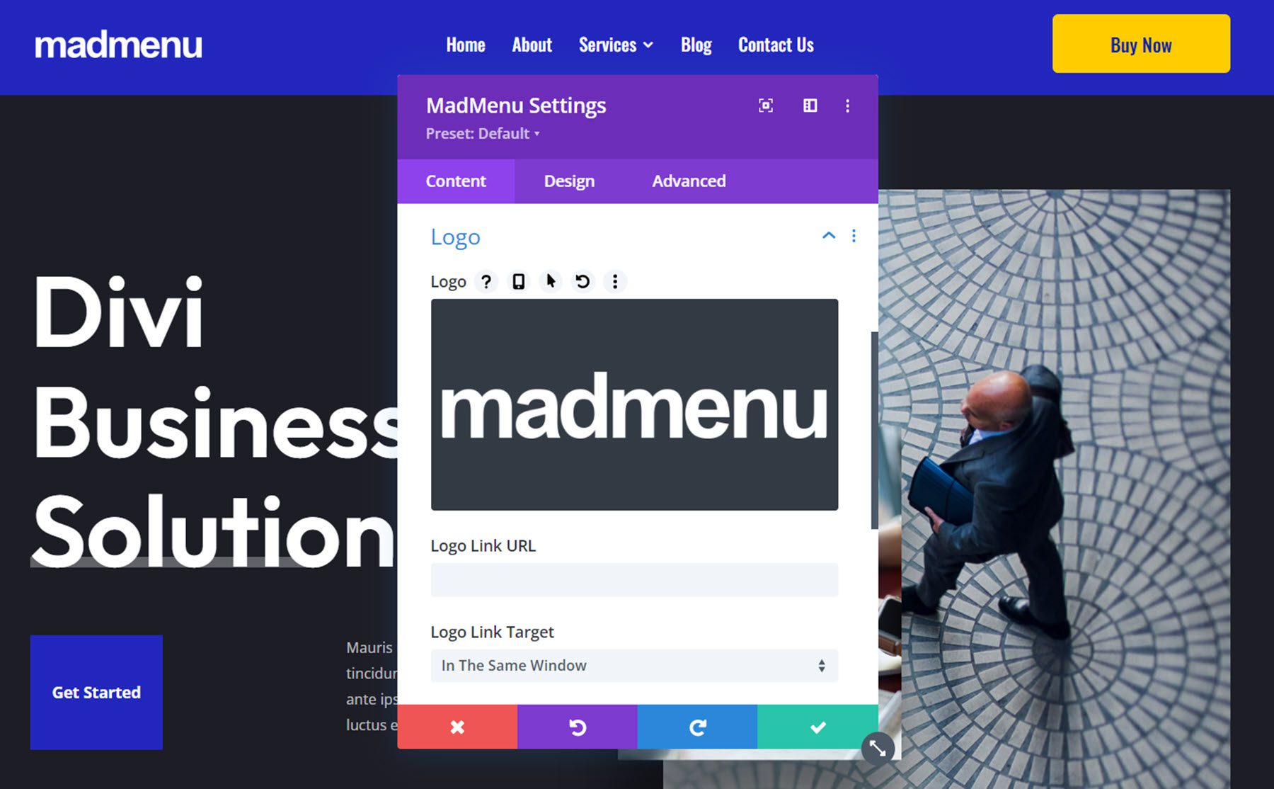
Logo
Here you can upload your logo to add to the menu. The logo can be customized with hover effects and can be changed for tablet and mobile views. You can also add a logo link URL and change the logo link target.
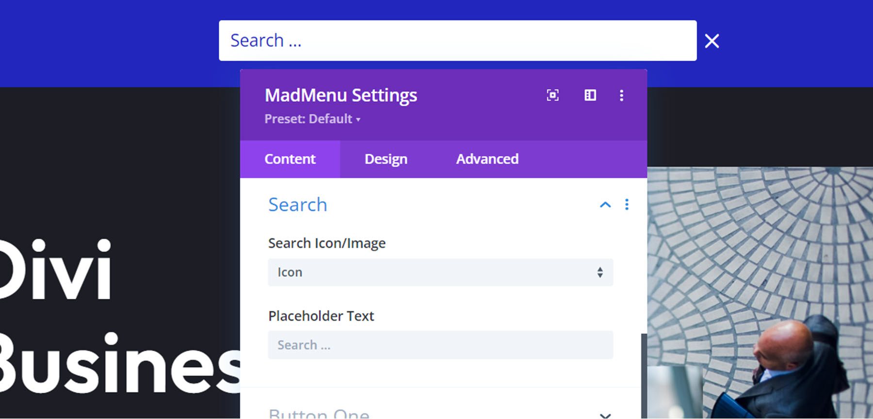
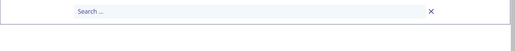
Search
In the search settings, you can choose between the search icon or your own image. Here I’ve customized the search element in the design tab to match the demo 1 header layout I’m using here.
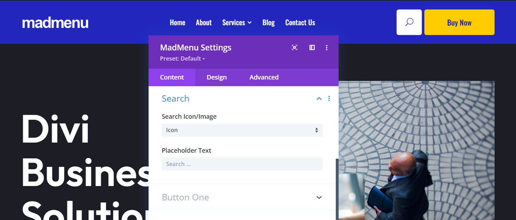
You can also change the placeholder text that appears when you click on the search icon.
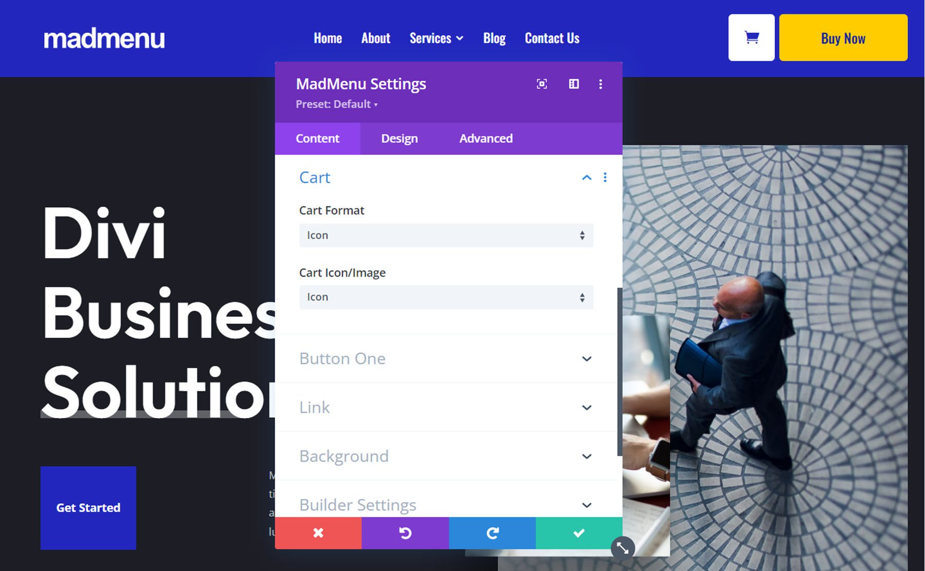
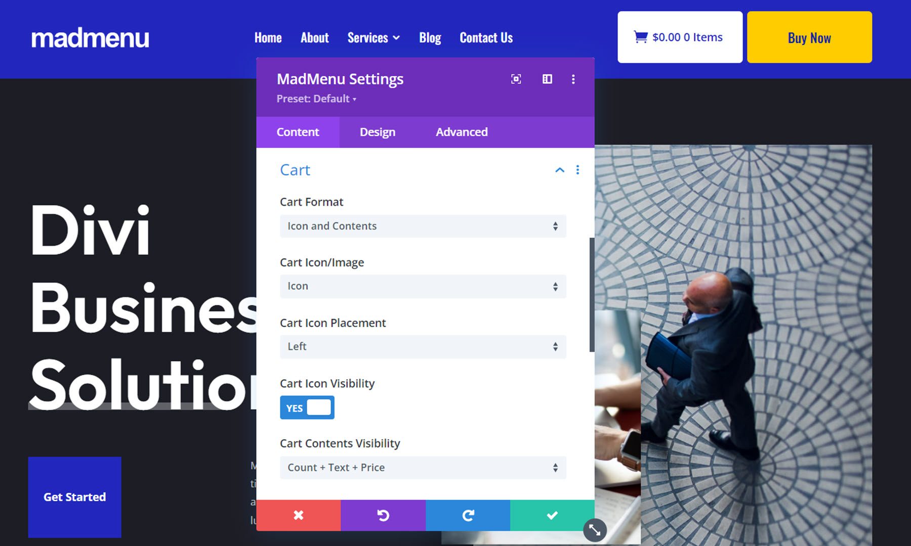
Cart
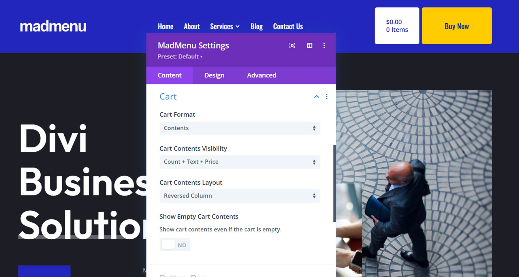
The cart element is compatible with WooCommerce. You can choose between displaying the cart icon, the cart contents, or the icon and contents.
When the cart content option is selected, you can change what cart contents are shown. Here I’ve selected the Count + Text + Price option. You can also change the cart content layout and show or hide empty cart contents.
With the icon displayed, you can also switch between an icon and an image, change the icon placement, and enable or disable the icon.
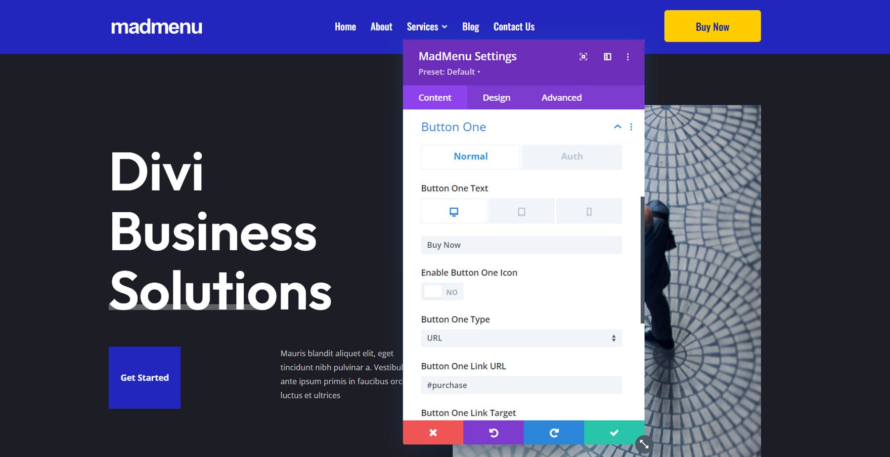
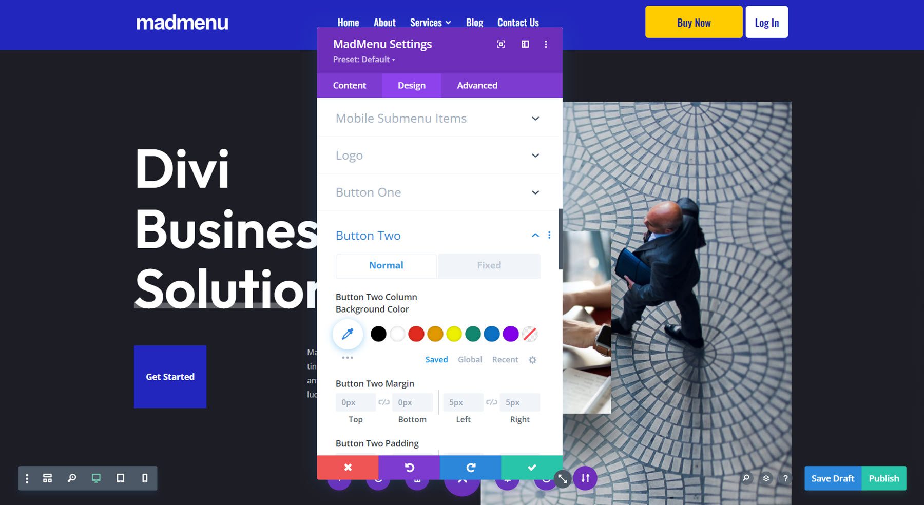
Button One and Button Two
Divi MadMenu comes with two buttons that add powerful functionality to your menu. From the content tab, you can change the button text, enable the button icon, and change the type between URL and popup.
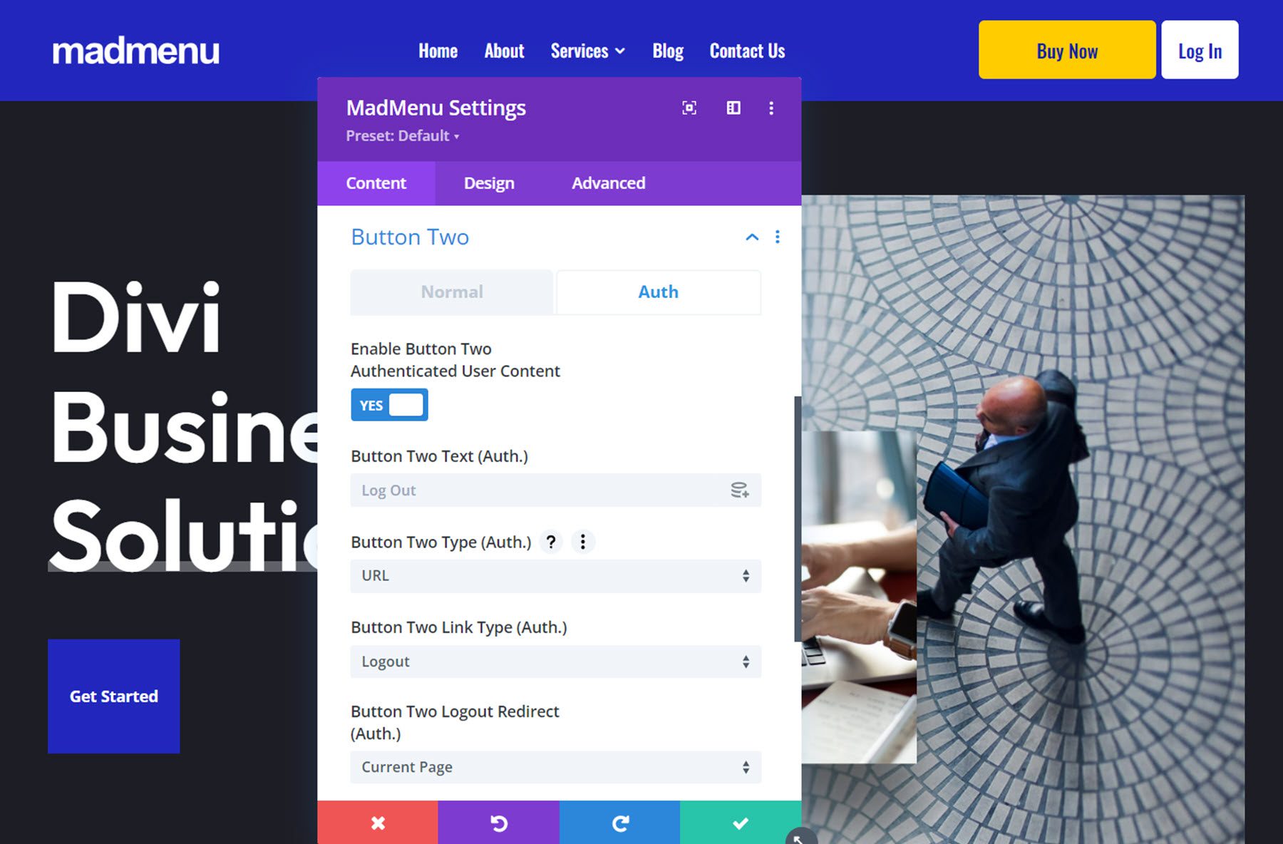
Authenticated User Content Button
Under the Auth tab, you can enable authenticated user content. This allows you to display different content in the header button depending on whether the user is logged in or out of your site. Enabling authenticated user content also allows you to change and set up a functional Login/Logout button.
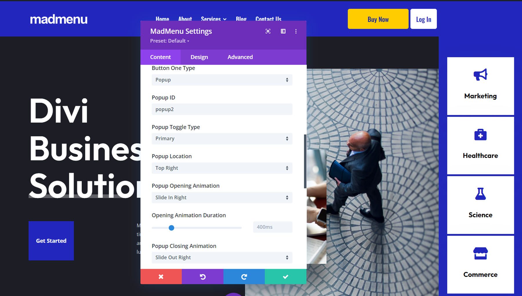
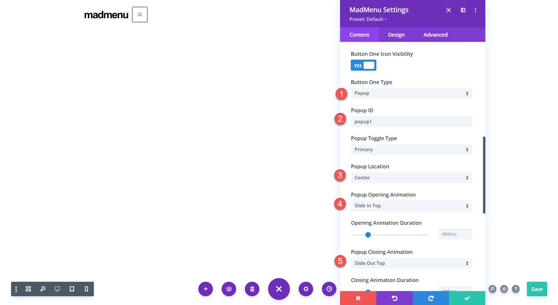
Popup Button
The popup button type allows you to create slide-in menus, full-screen menus, fly-in contact forms, and all sorts of unique popups that display when the button is clicked. This opens up all sorts of possibilities for your menu design. Here is an example of a slide-in popup with some service items displayed in blurbs. Because the popups are created with regular Divi sections, you can add any module you want and have complete control over the design of your popup. Within the buttons settings, you can change the button pop ID, change the toggle type between primary and secondary, change the popup location, and adjust the opening and closing animations for the popup. You can also add a popup close button, add a popup overlay, enable the close on outside click function, and adjust the popup Z index.
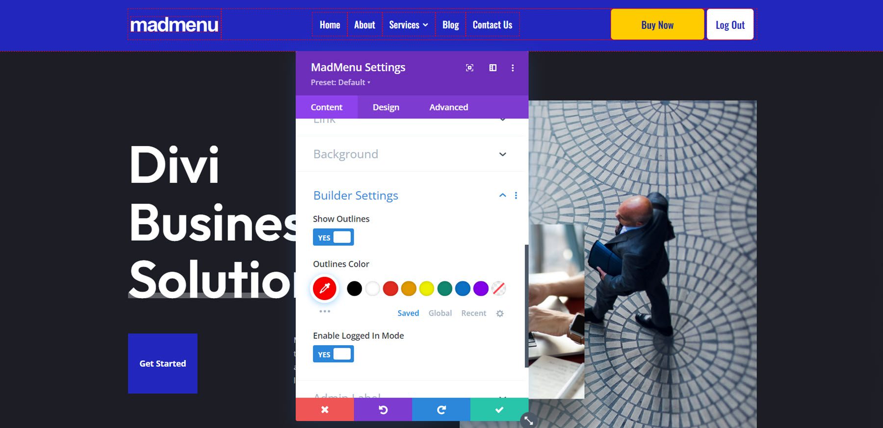
Builder Settings
The MadMenu module also comes with some settings to change how the Builder functions. You can show outlines and change the outline color, allowing you to see and adjust the layout. The outlines are only shown in the Visual Builder. You can also enable logged-in mode, which will show authenticated button content in the Visual Builder.
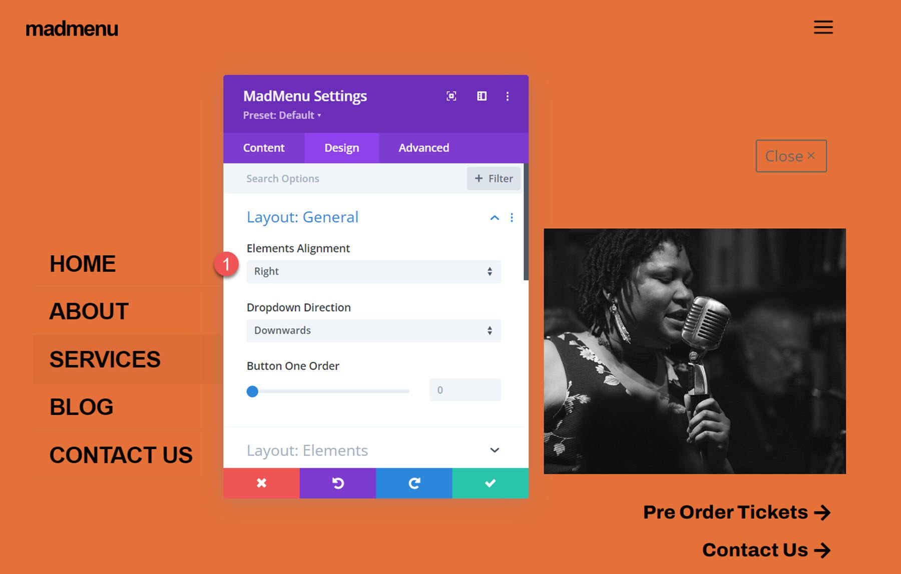
The design tab is full of customization possibilities for every aspect of your MadMenu.
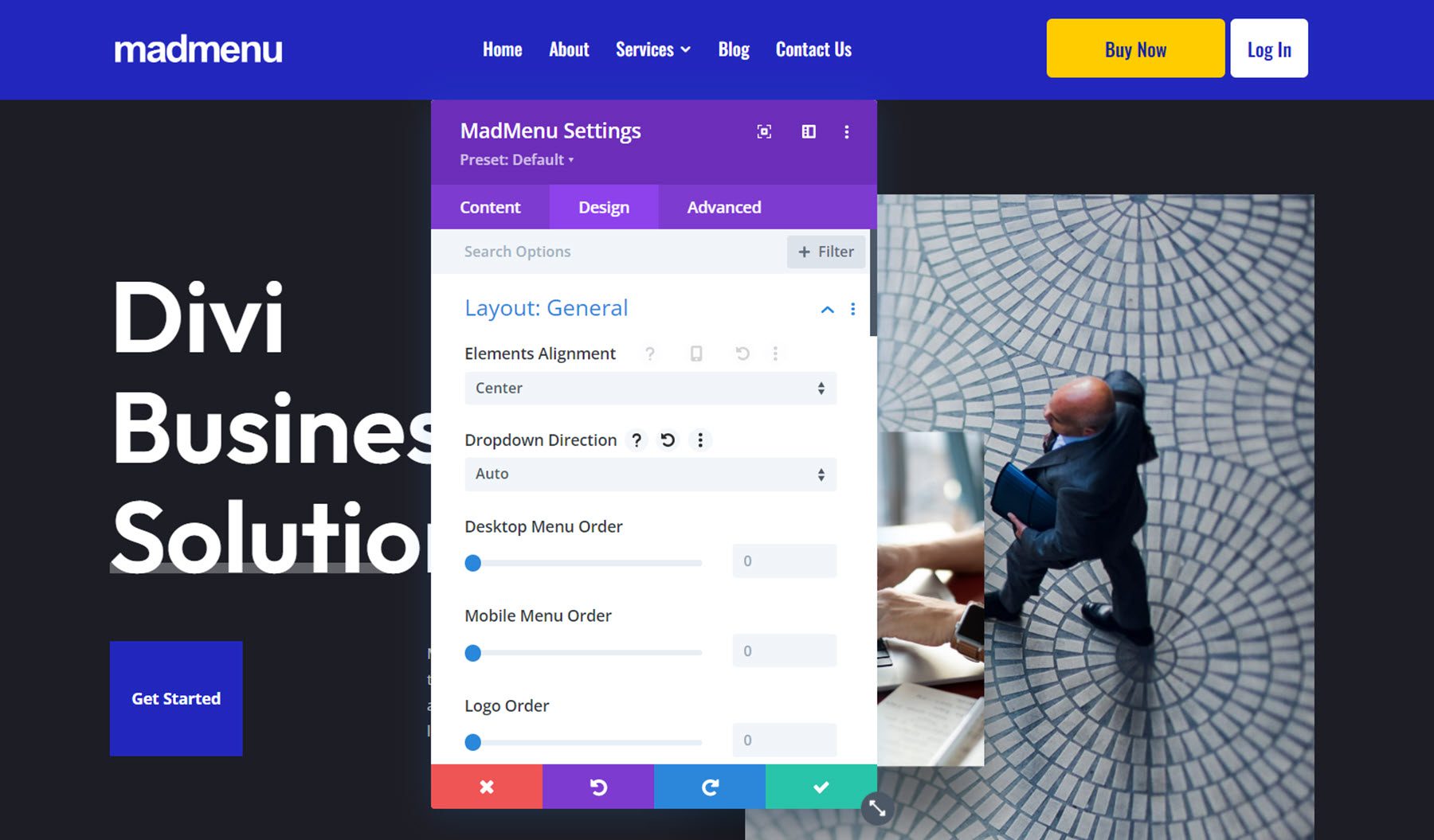
Layout: General
Here you can change the basic layout of the menu. You can change the element’s alignment, the dropdown direction, and reorder the menu items.
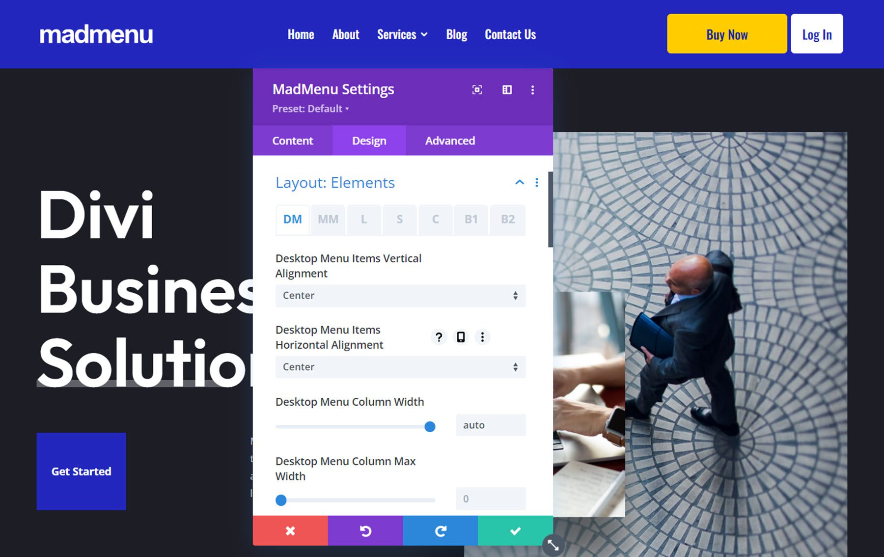
Layout: Elements
The layout: elements section is where you can change the layout of the individual elements in the menu. You can change the vertical and horizontal alignment, the column width, and the column max width for the desktop menu, mobile menu, logo, search, cart, and button elements.
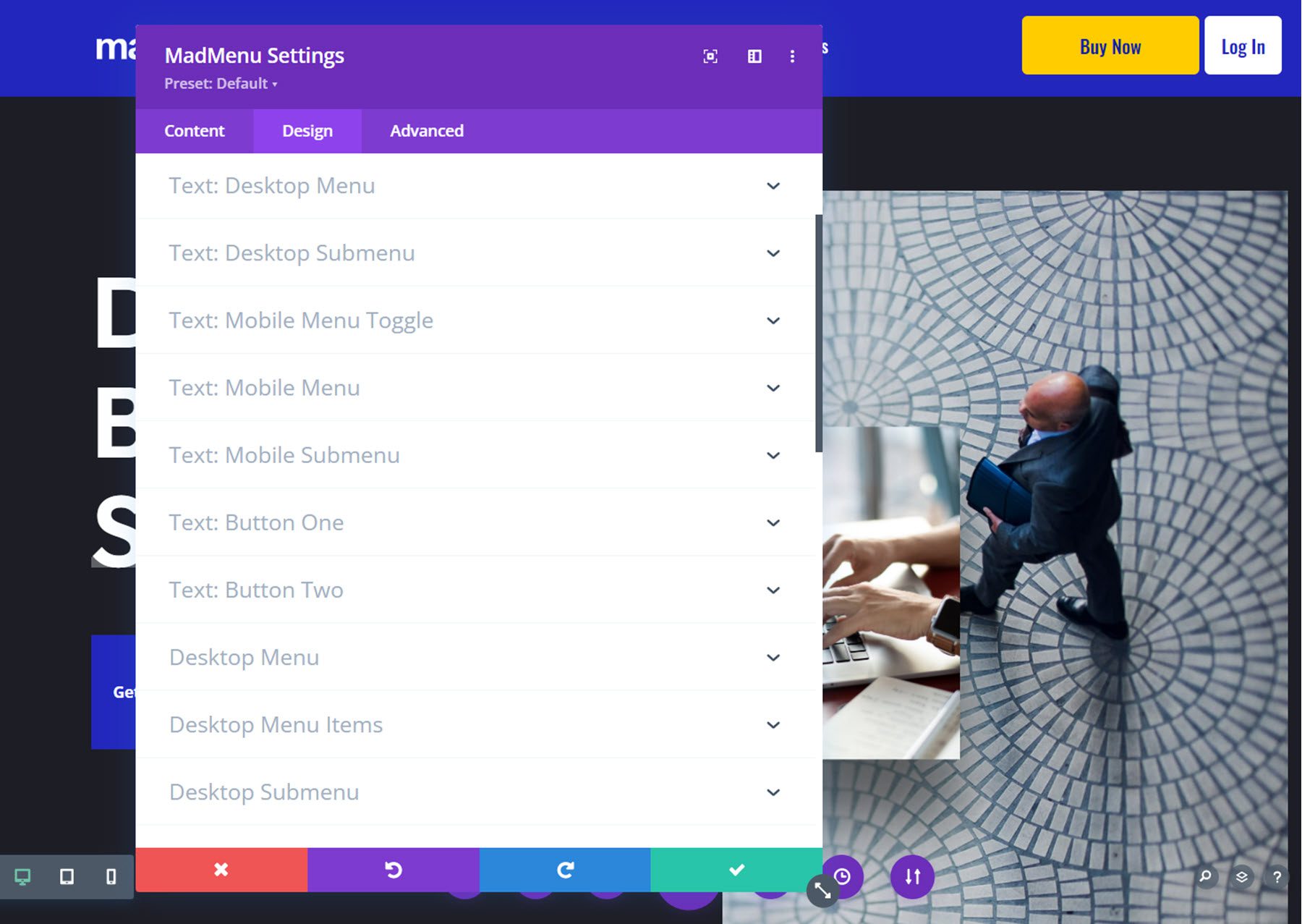
Style Options
The rest of the design tab is full of options to customize every single element on your menu. You can set up a different design for the normal and fixed menu, and of course, many of the design settings are further customizable with hover and responsive design settings.
With this level of customizability available for the menu section, you can easily create just about any type of menu you would like to, all without having to touch any custom code.
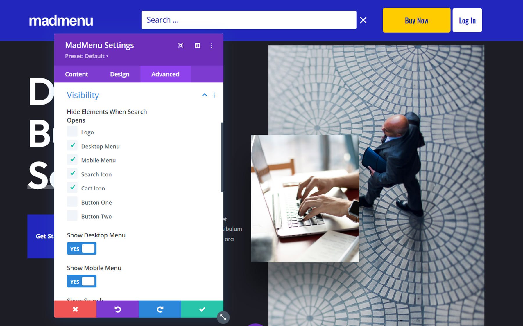
The Advanced tab features many of the typical advanced options, but there are a couple of new settings for the MadMenu module.
Visibility
In the visibility settings, you can control what elements are visible or hidden when the search is opened. Additionally, you can choose to hide the different menu elements here.
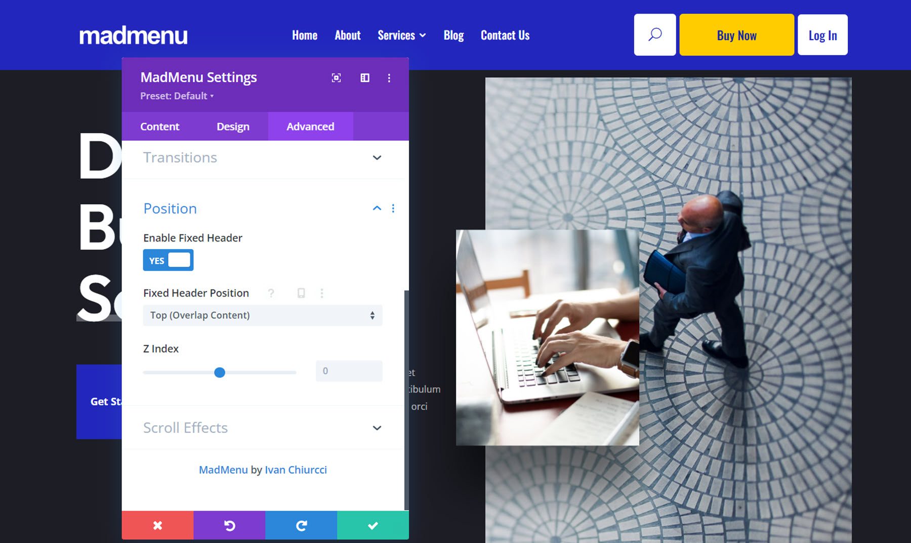
Position
Here you can enable the fixed header and change the fixed header position. When the fixed header is enabled, you can use the fixed tab in all of the design settings to create a unique design for when the header is fixed.
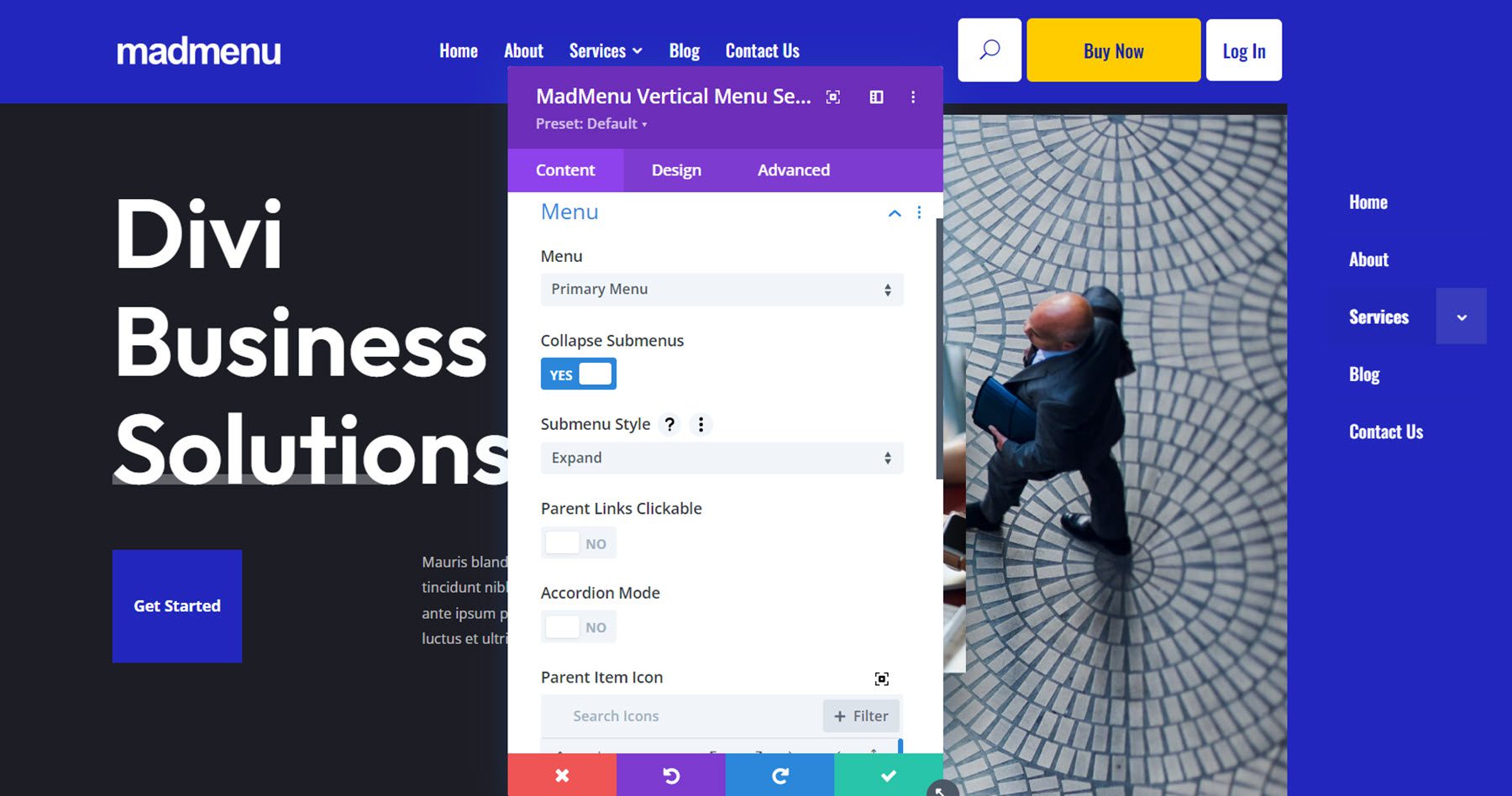
The vertical menu module allows you to add vertical navigation to your page, header, or footer. For this example, I’m adding the MadMenu vertical menu module to the popup I created earlier that is enabled by clicking Button 1 in the header. The vertical menu module does not include logo, cart, search, or button elements, however, you can use the menu module along with other Divi modules to create a layout with many different elements.
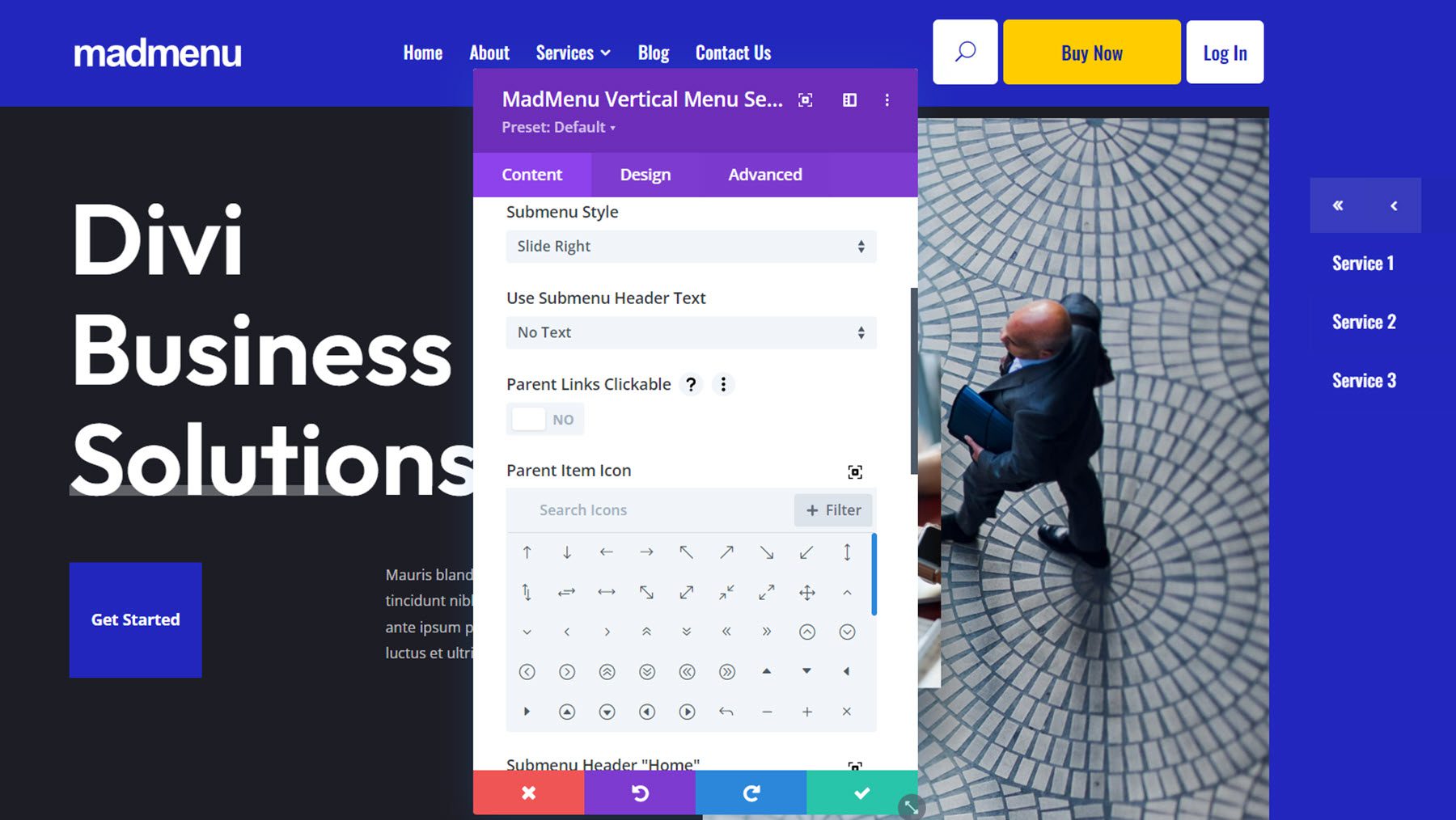
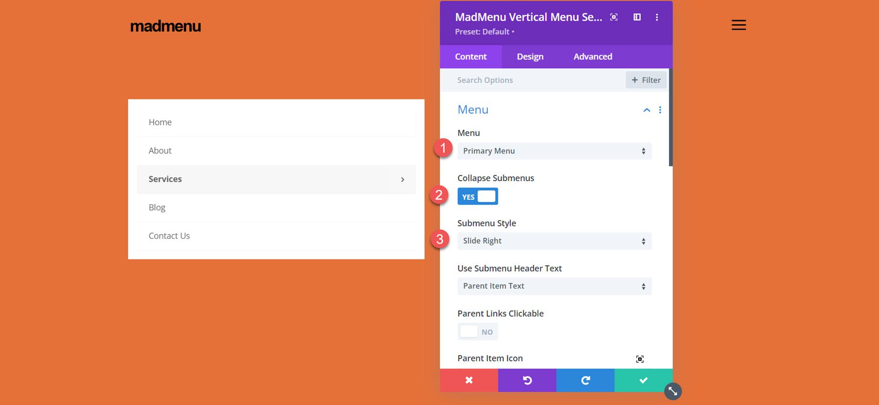
In the menu section, you can select the menu that is shown and choose to collapse or expand submenus. When collapse submenus is selected, you can choose a submenu style and choose if parent links are clickable, just like the regular MadMenu module. With the Expanded style selected, you can enable accordion mode, change the parent item icon, and animate the parent item icon.
With either of the slide styles selected you can change the submenu header text, the parent item icon, the submenu header “home” icon, and the submenu header “back” icon.
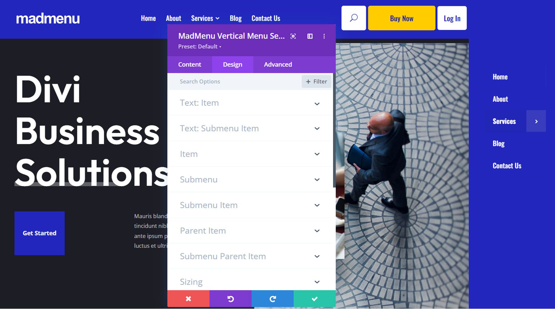
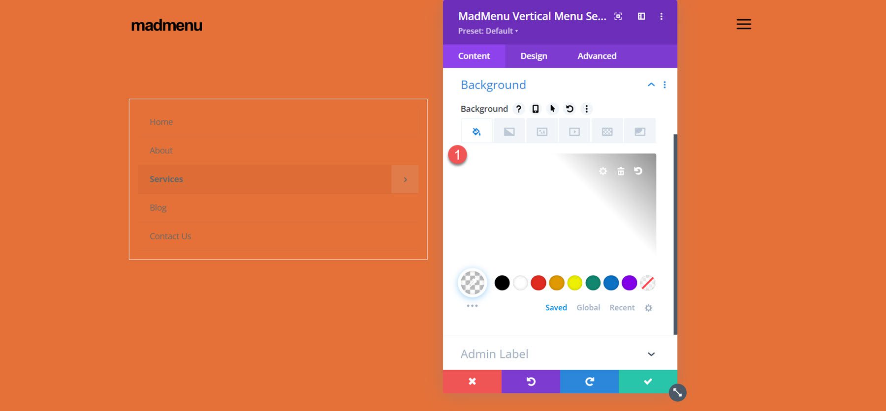
Of course, the vertical MadMenu is just as customizable as the horizontal menu. You have full control over the look of the menu with lots of options to change each element. Many of the settings have hover and mobile styles enabled, giving you even more flexibility with your design.
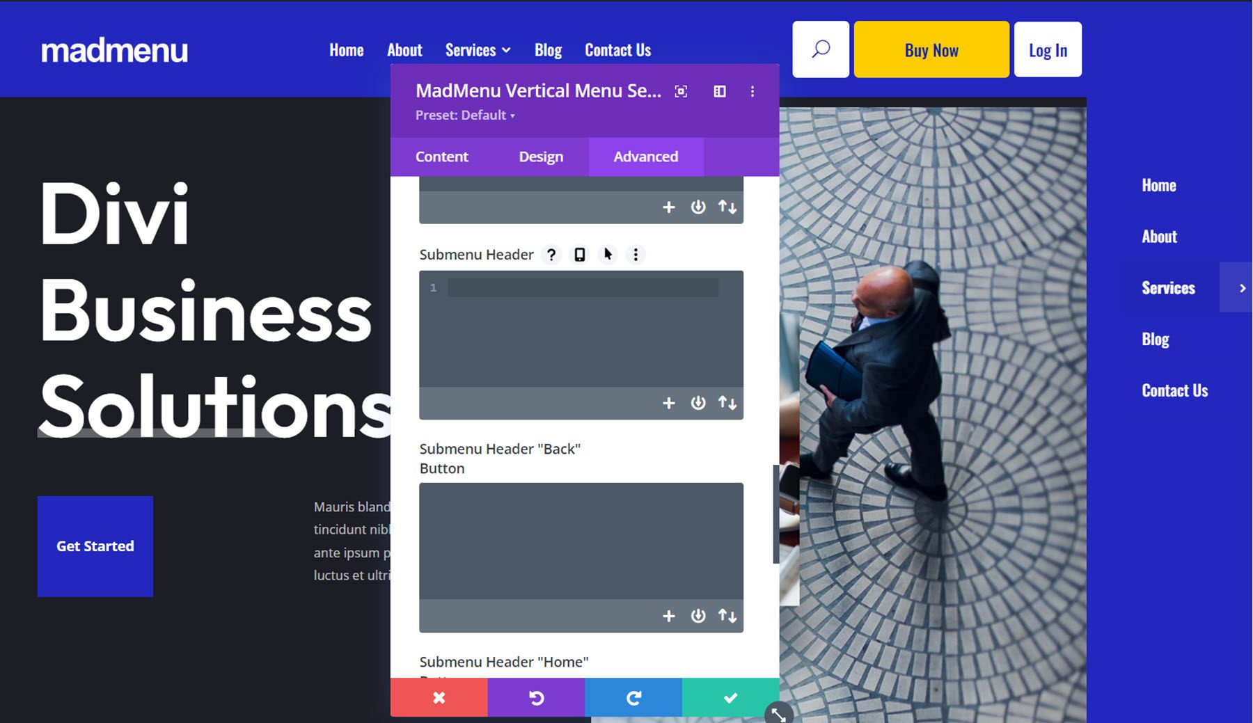
The advanced section has most of the standard advanced options you would expect in a Divi module. MadMenu makes it easy to add Custom CSS by adding sections that target specific menu elements, making it that much easier to customize your menu styles.
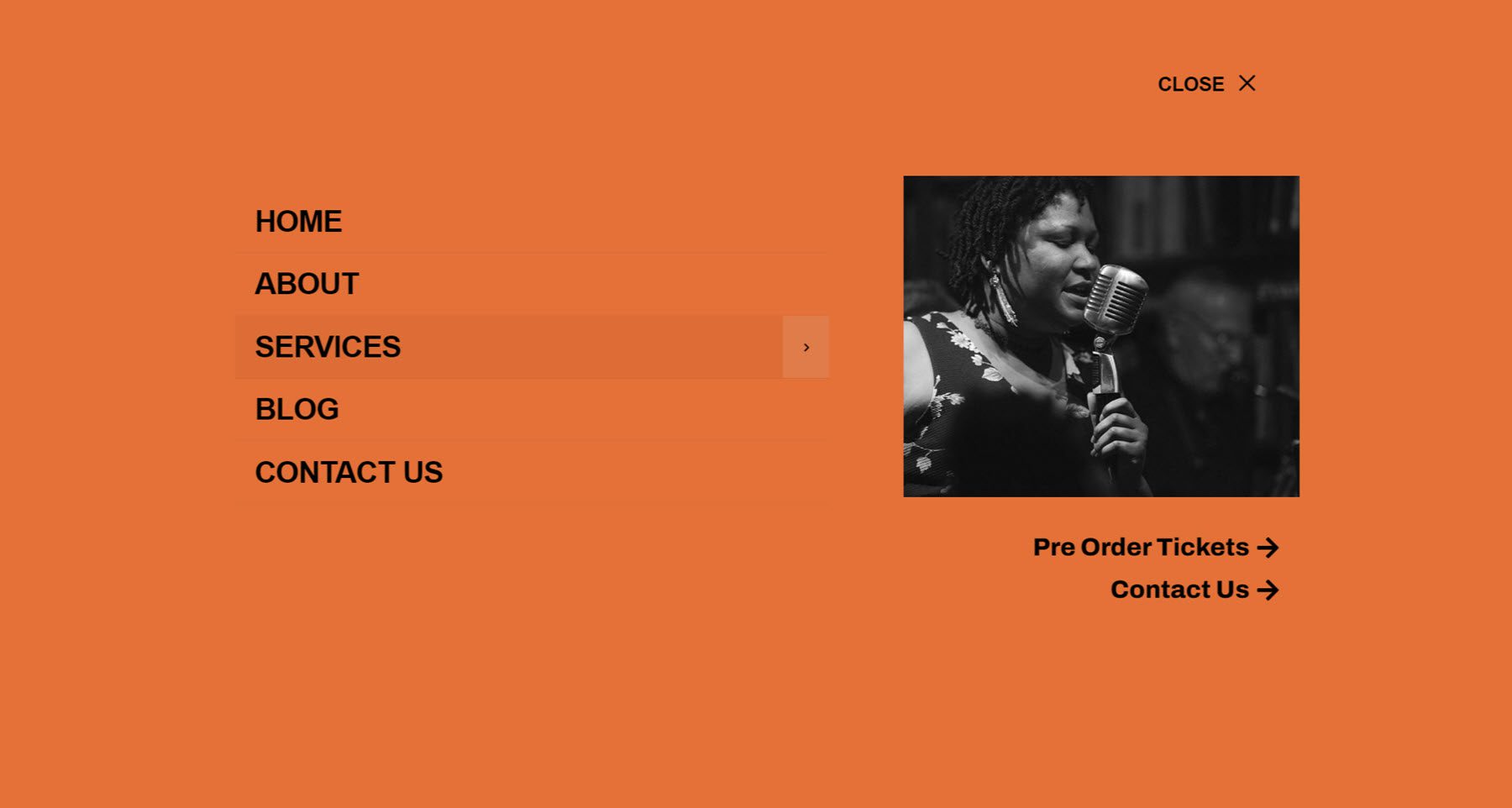
Now that we’ve taken a look at the MadMenu modules and customization options, let’s build our own menu section. Here is a preview of what we’ll design. It’s a minimal-style header with a logo and hamburger menu button.
When the menu icon is clicked, a fullwidth menu section is revealed.
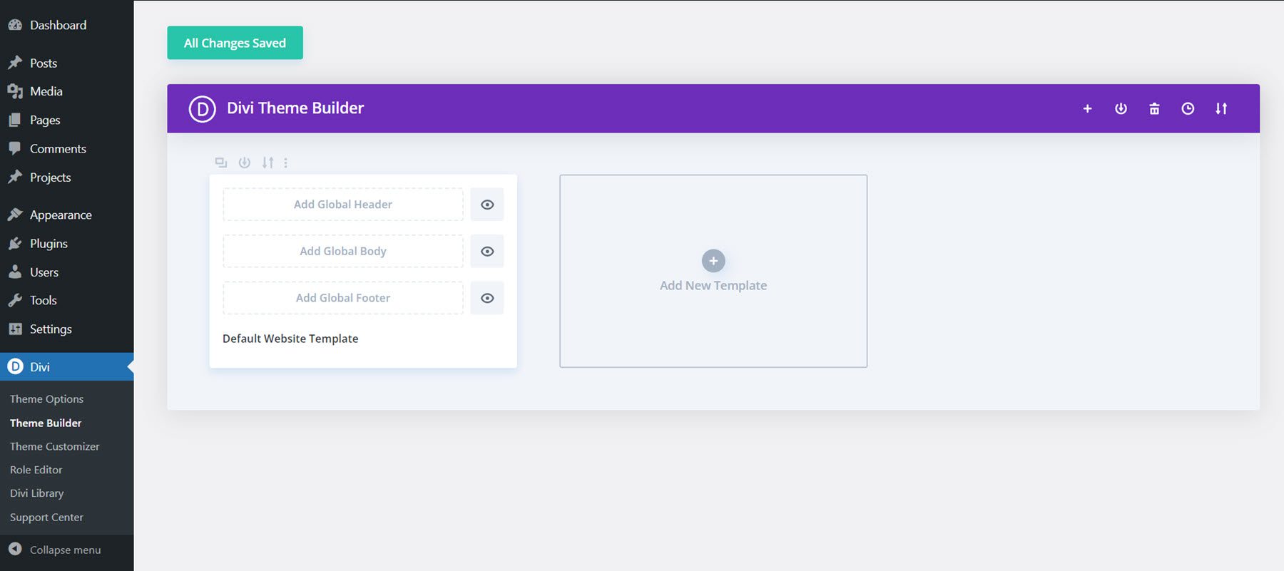
To get started, open the Divi Theme Builder and add a new header.
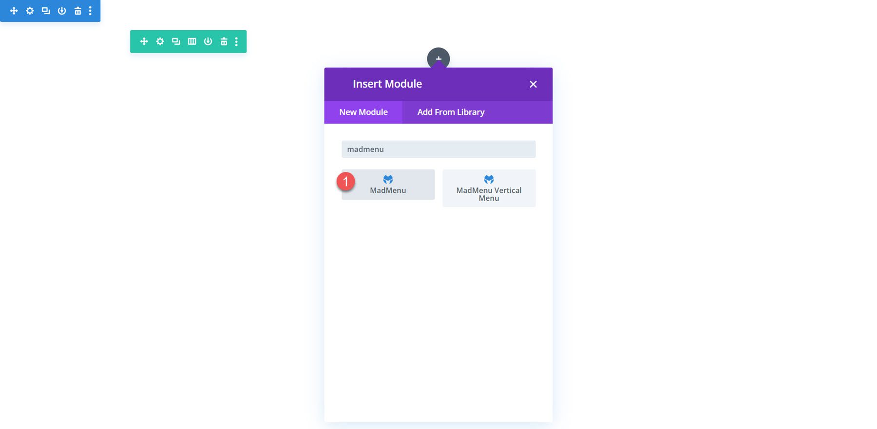
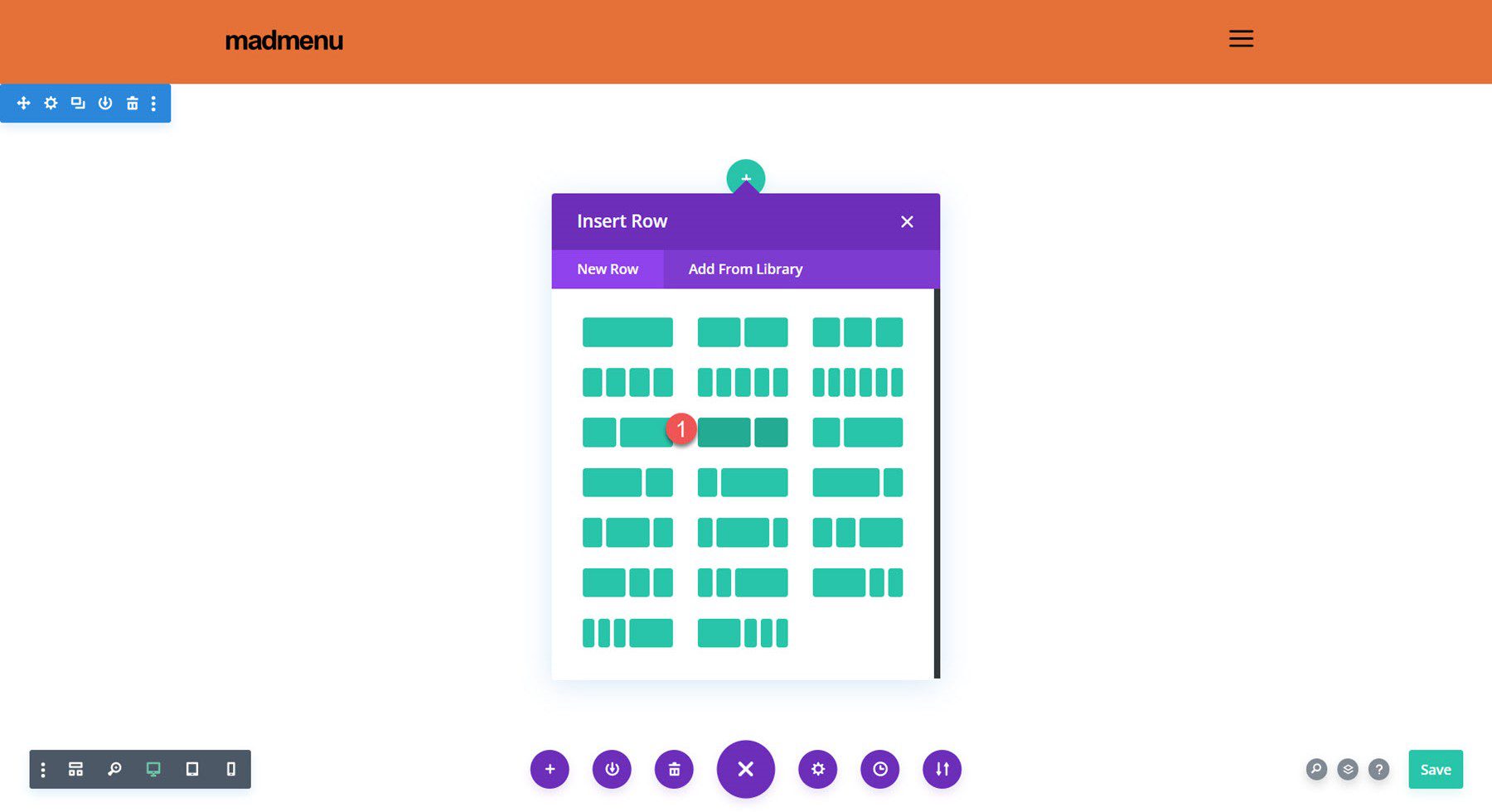
Add a row with a single column to the header section and add the MadMenu module.
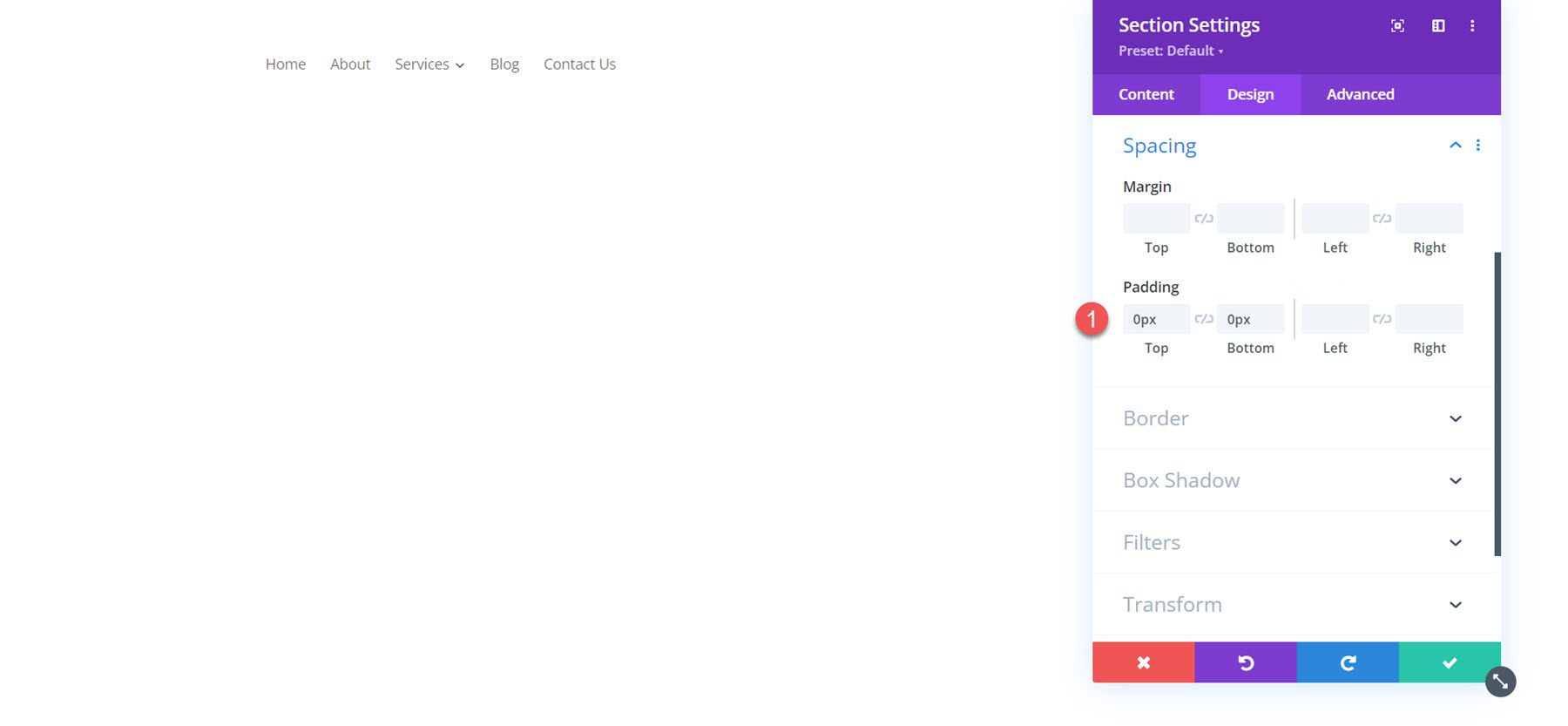
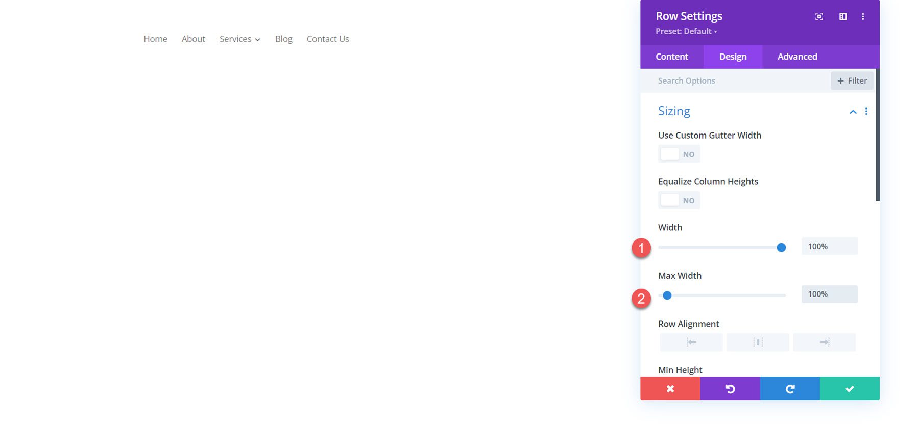
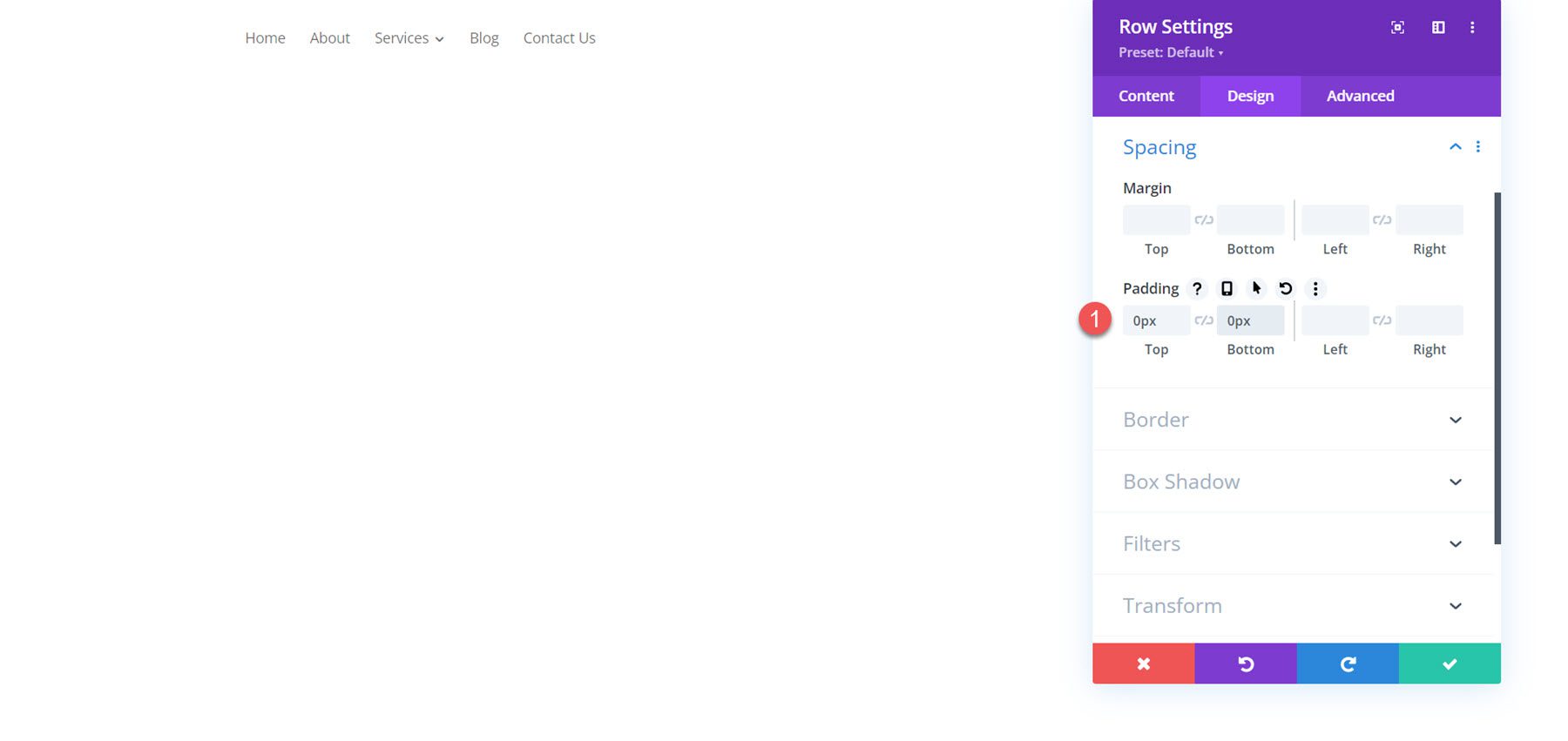
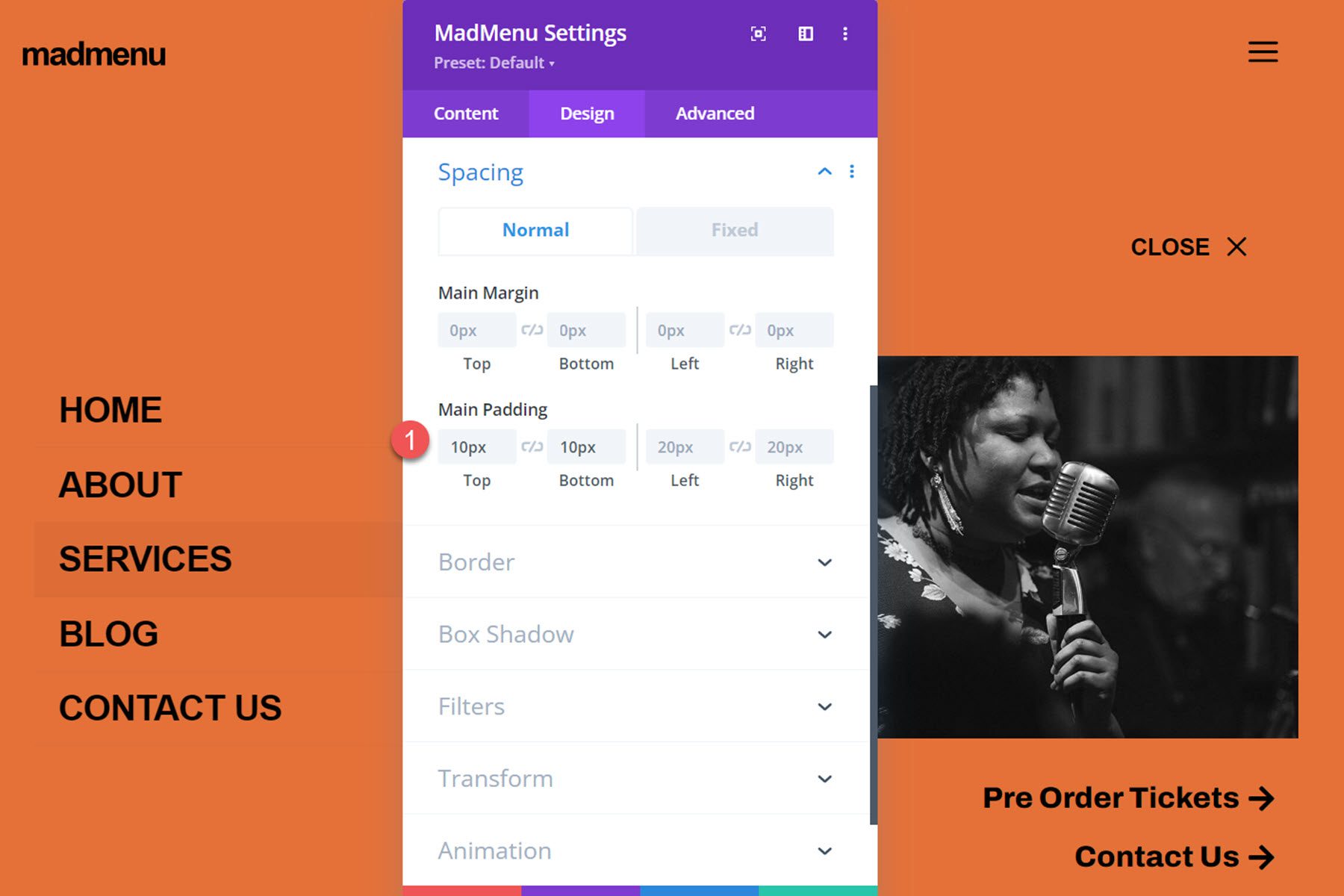
Because we want the menu to take up the full width of the page, we’ll need to adjust the section and row spacing settings.
First, set the section top and bottom padding to 0.
Next, set the row width and max width to 100%.
Finally, set the row top and bottom padding to 0.
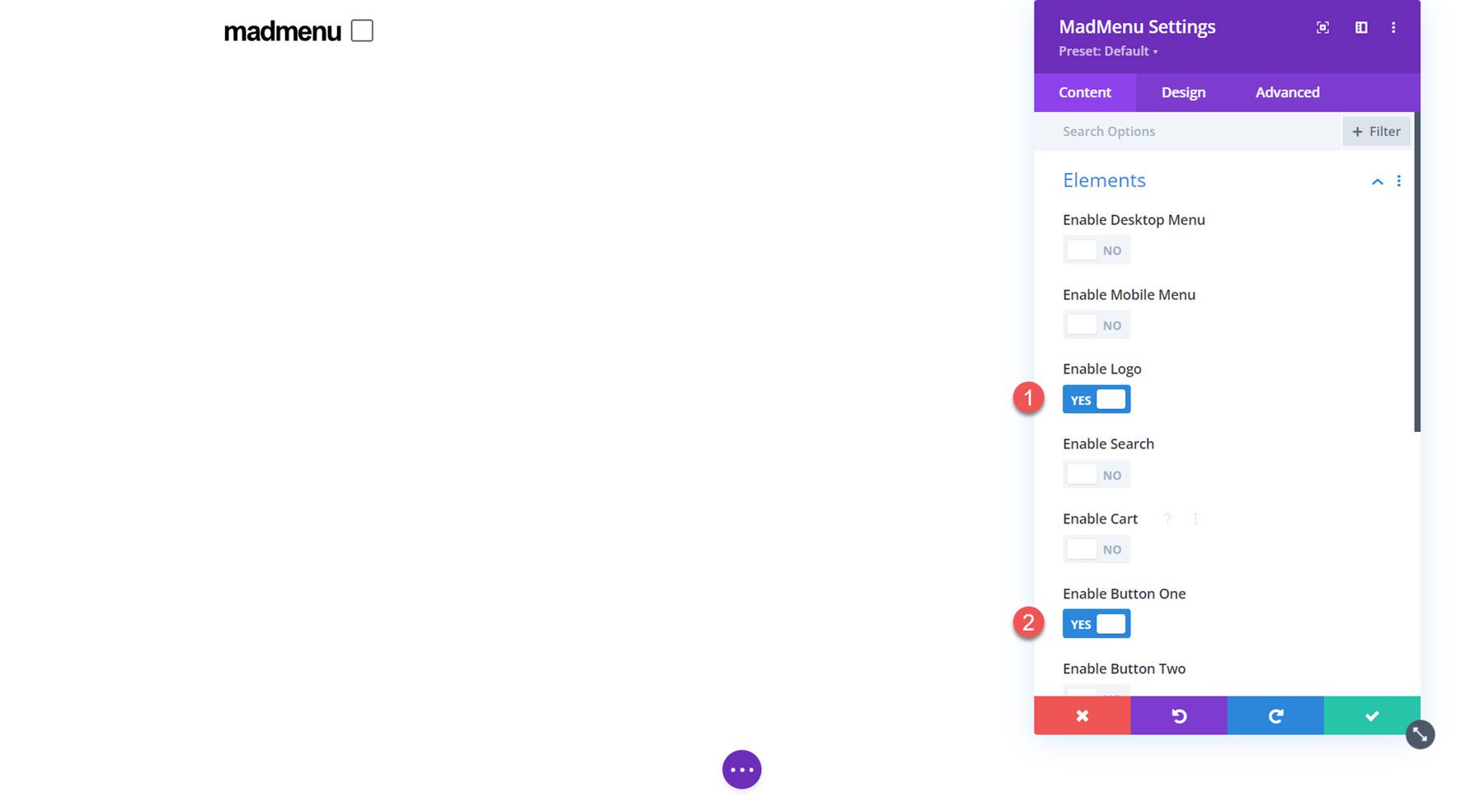
Now that our row and section settings are set, we can move on to the MadMenu module settings. Under elements, enable the logo and button one.
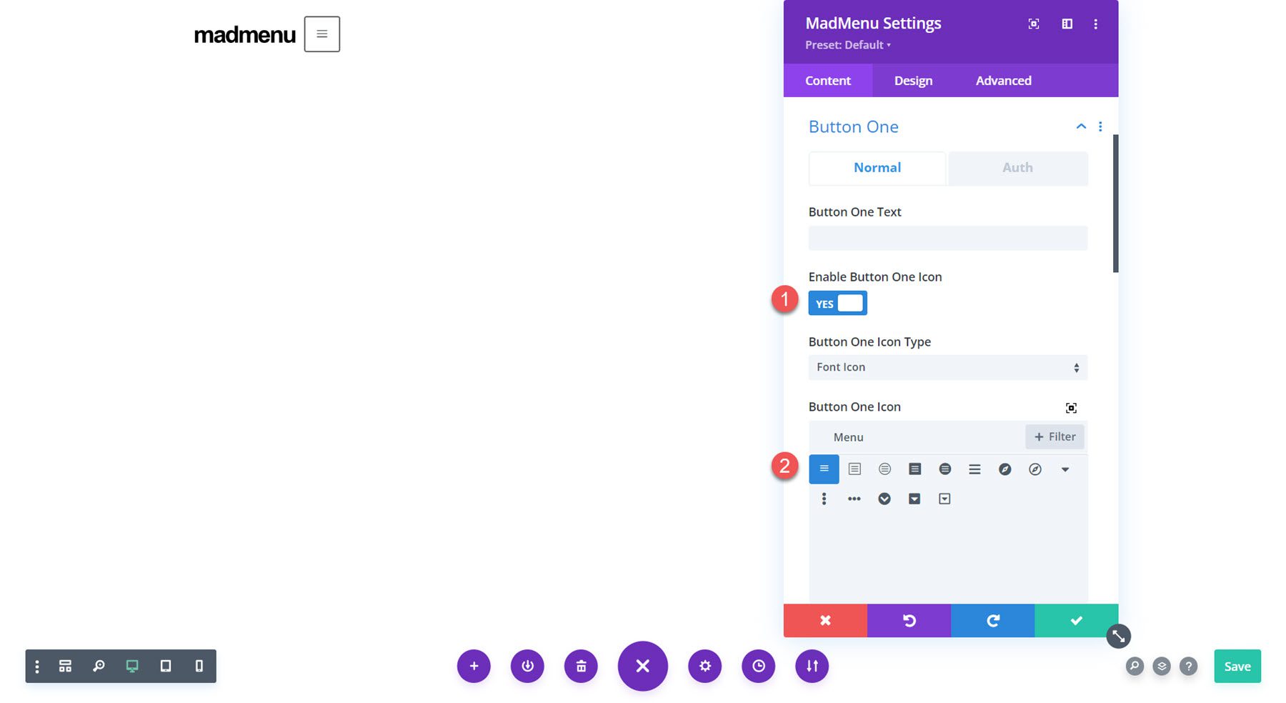
Button one is going to be our menu toggle. In the button settings, change the icon to the three-line menu icon.
Change the following button options to enable the popup functionality.
- Button one type: Popup
- Popup ID: popup1 (you can set this to whatever you want, it just needs to be the same as the ID you set later in the popup section.
- Popup Location: Center
- Popup Opening Animation: Slide In Top
- Popup Closing Animation: Slide Out Top
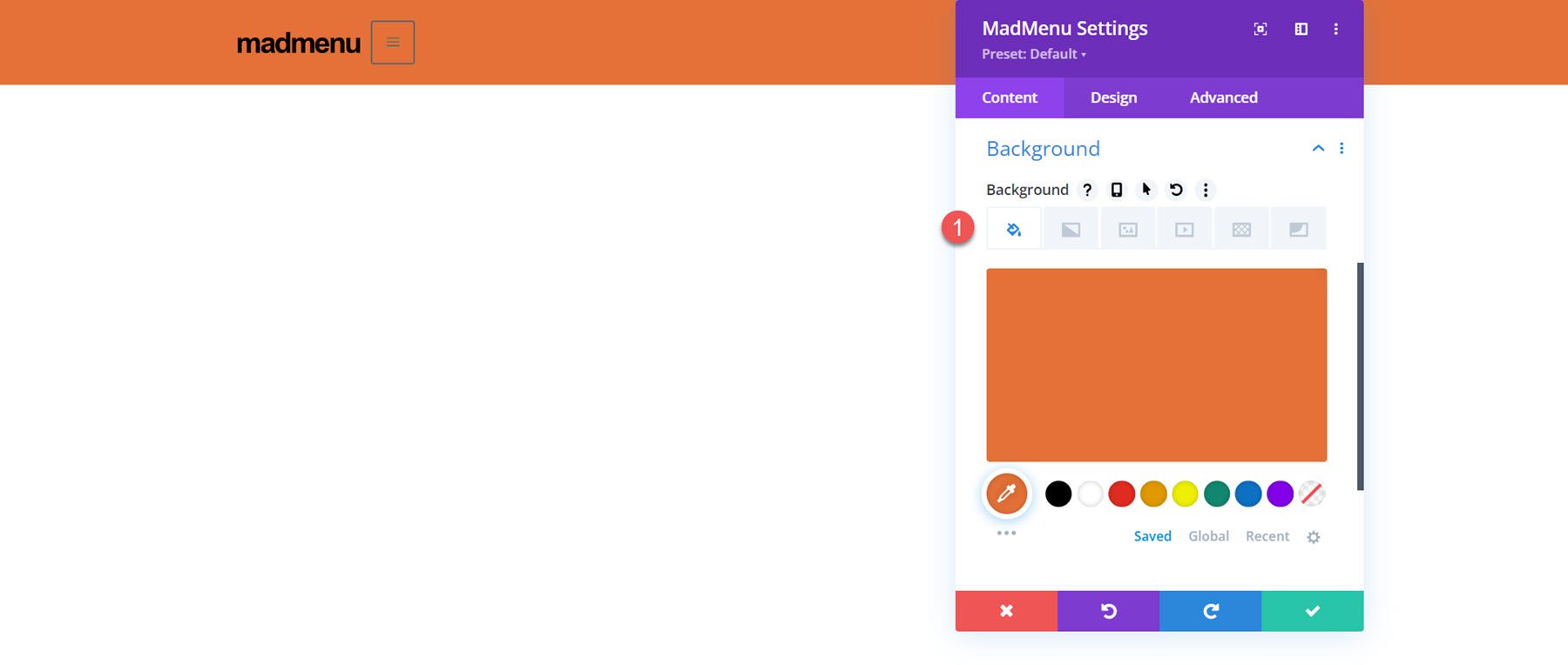
Finally, change the background color to #E47138.
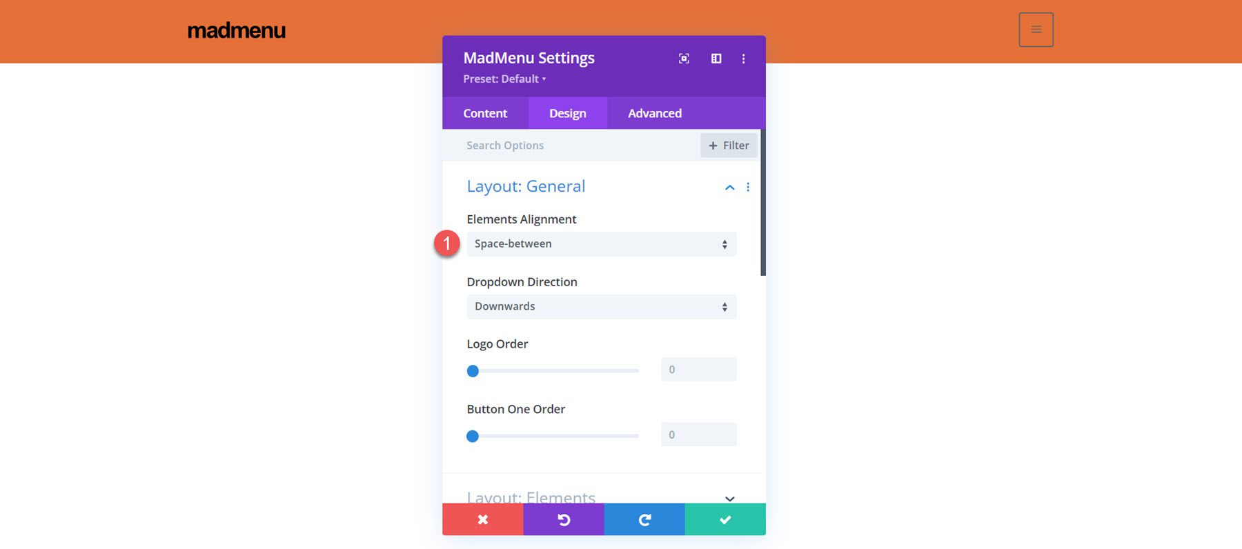
Now let’s move over to the design tab. In the general layout settings, set the element’s alignment.
- Elements Alignment: Space-Between
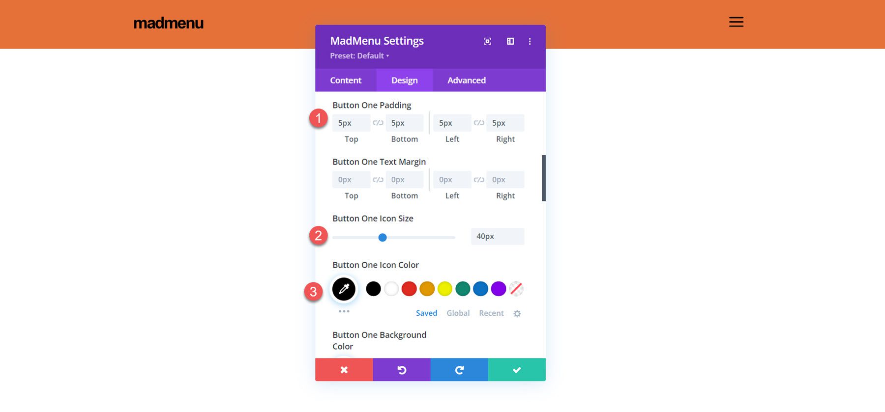
Next, open up the button one settings and customize the styles.
- Button One Padding: 5px, 5px, 5px, 5px
- Button One Icon Size: 40px
- Button One Icon Color: #000000
- Button One Border Width: 0px
To create the fullscreen popup section, first, add a regular section to the header.
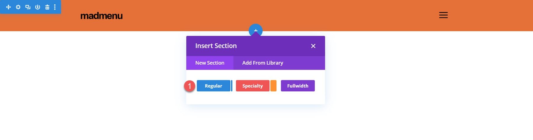
Add a row with two columns.
Set the section background color to #E47138
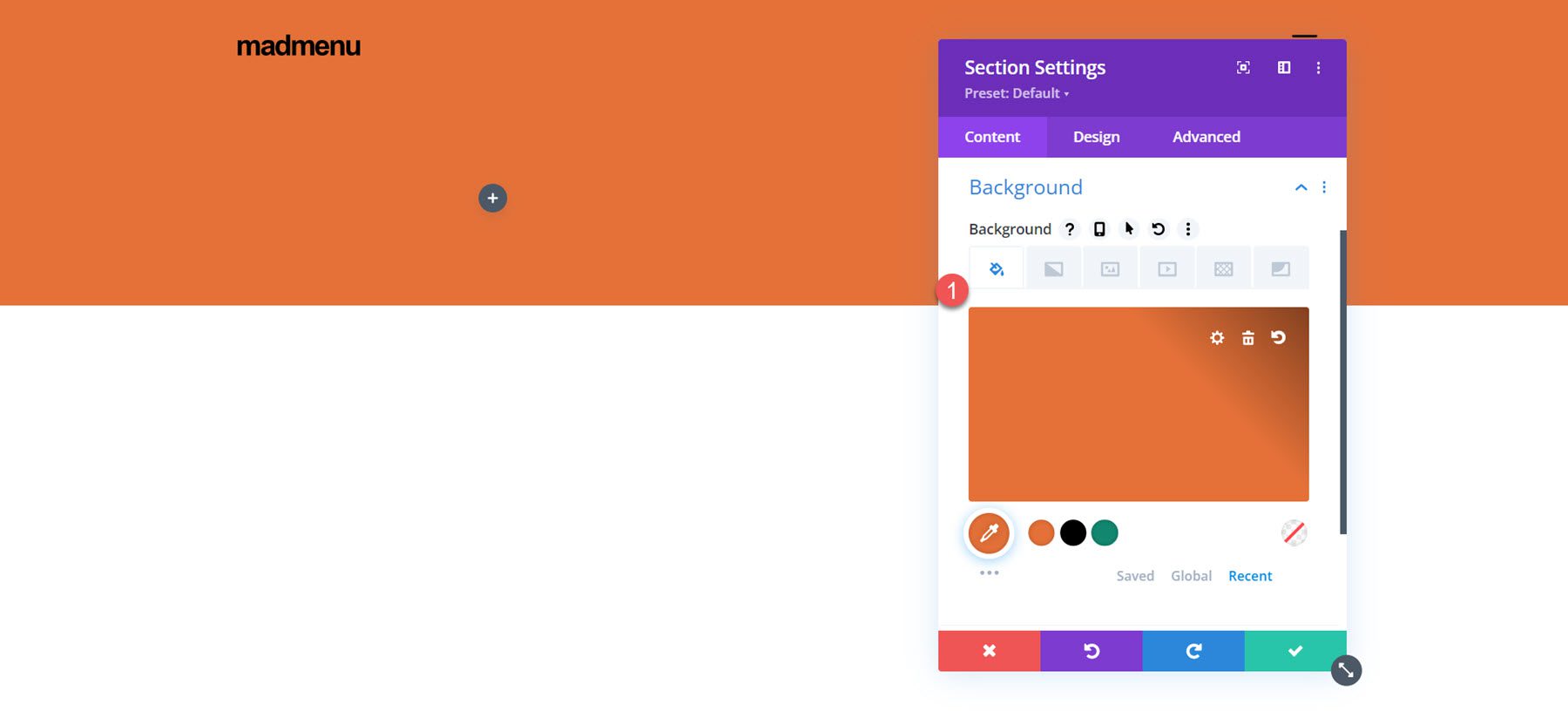
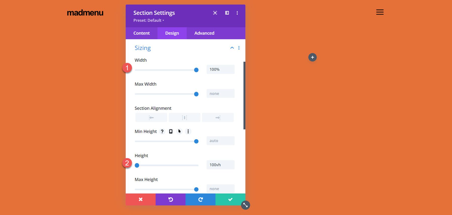
In the section sizing settings, set the width to 100% and the height to 100vh to make the section fullscreen.
Vertical MadMenu Module
In the left column, add the Vertical MadMenu module.
In the menu settings, select your menu, enable collapsed submenus, and set the submenu style to slide right.
Next, change the menu background to transparent.
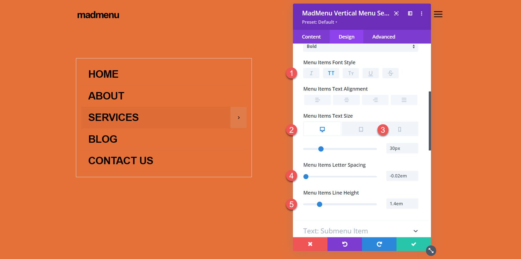
Move over to the design tab and modify the text item styles as follows:
- Menu Items Text Color: #000000
- Menu Items Text Font: Ariel
- Menu Items Font Weight: Bold
- Menu Items Font Style: TT (Capitalized)
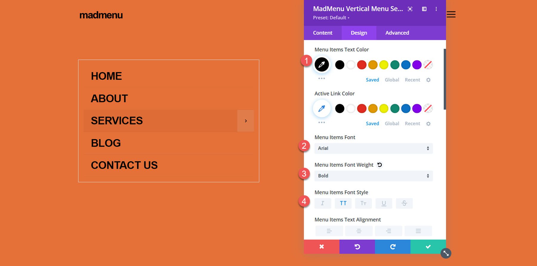
- Menu Items Font Size Desktop: 30px
- Menu Items Font Size Mobile: 25px
- Menu Items Letter Spacing: -0.02em
- Menu Items Line Height: 1.4em
In the spacing settings, set the mobile top, bottom, and left padding to 0.
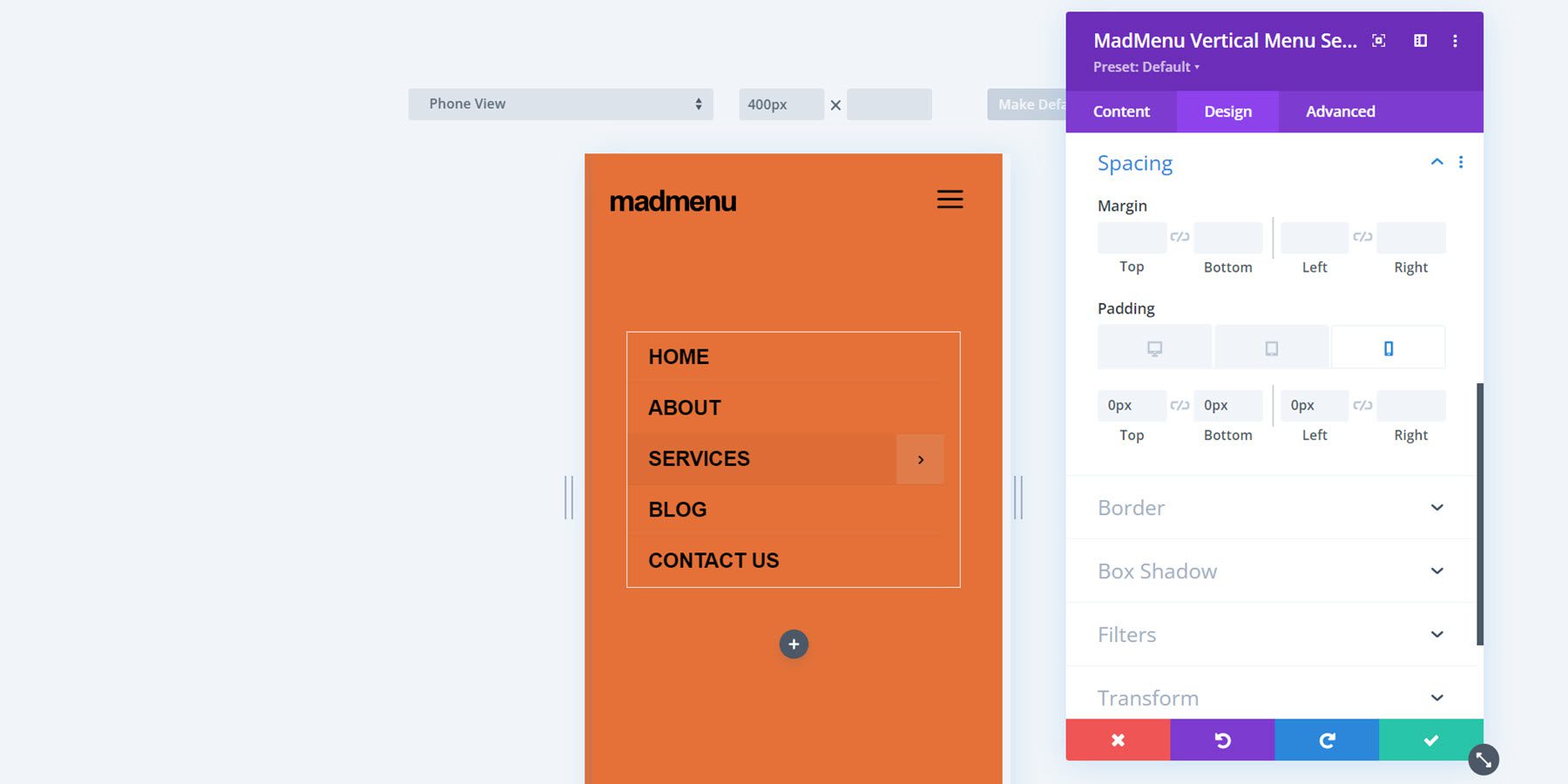
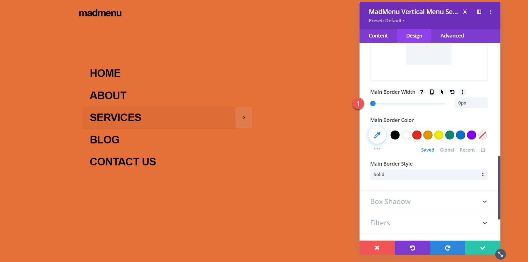
Next, set the border width to 0 to remove the border around the menu.
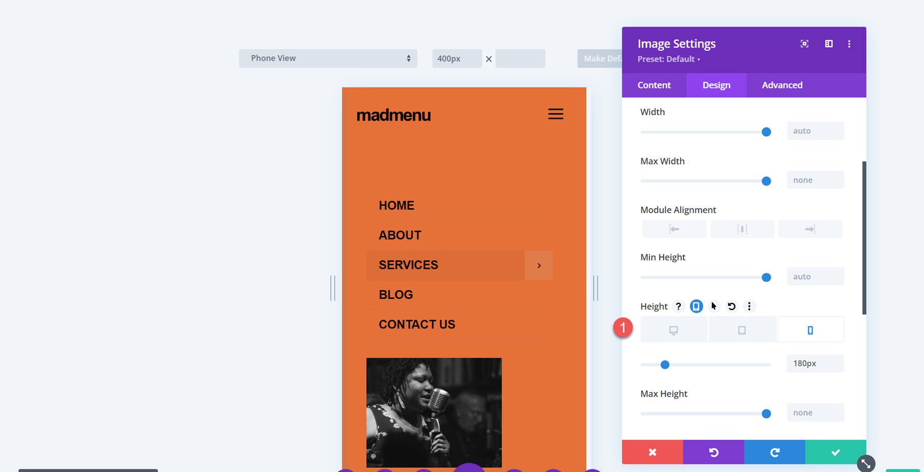
Column 2 Contents
Add an image to the right column. Set the mobile height to 180px.
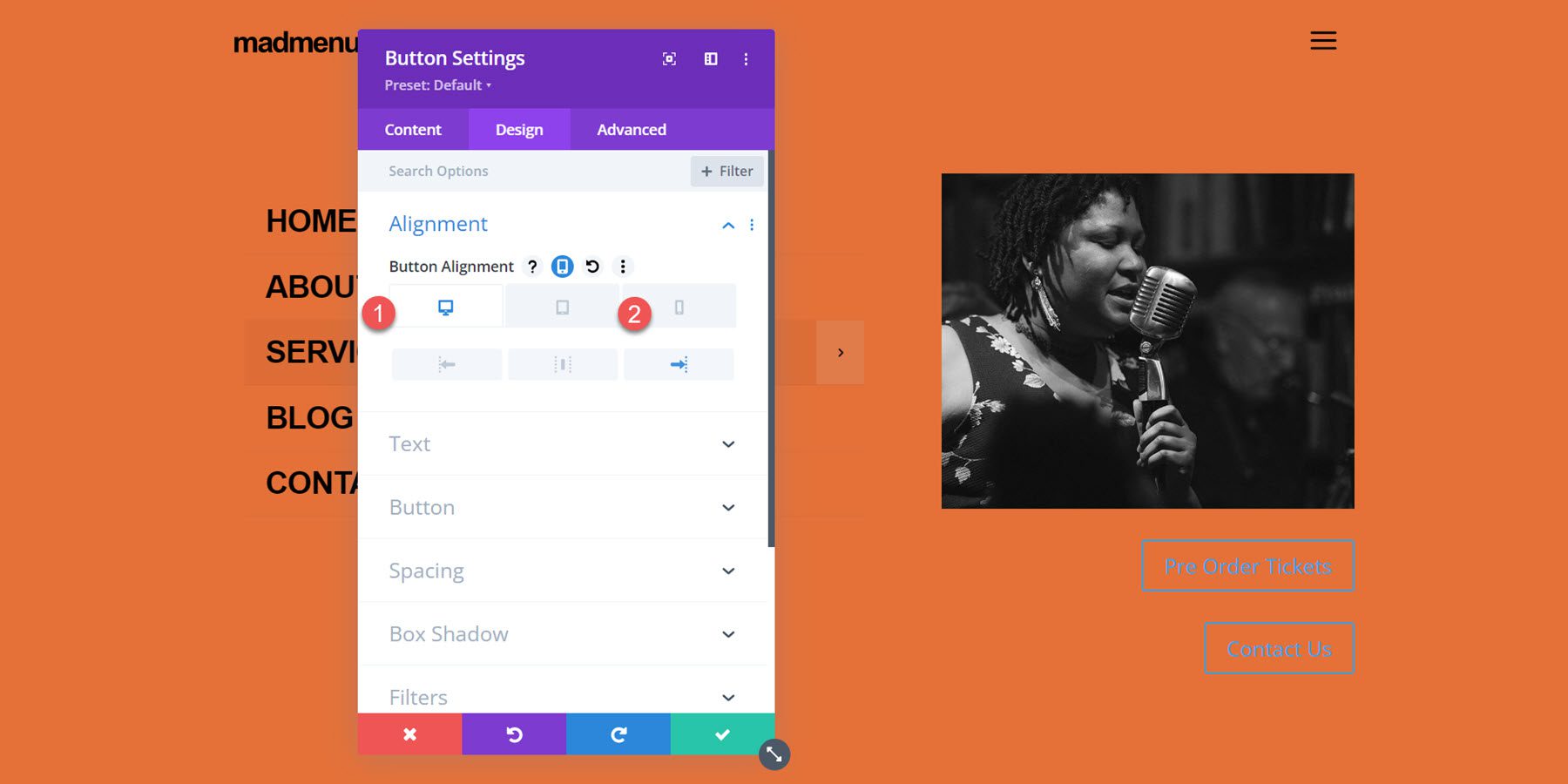
Next, add two buttons below the image. Set the button alignment for desktop and mobile.
- Button alignment desktop: right
- Button alignment mobile: left
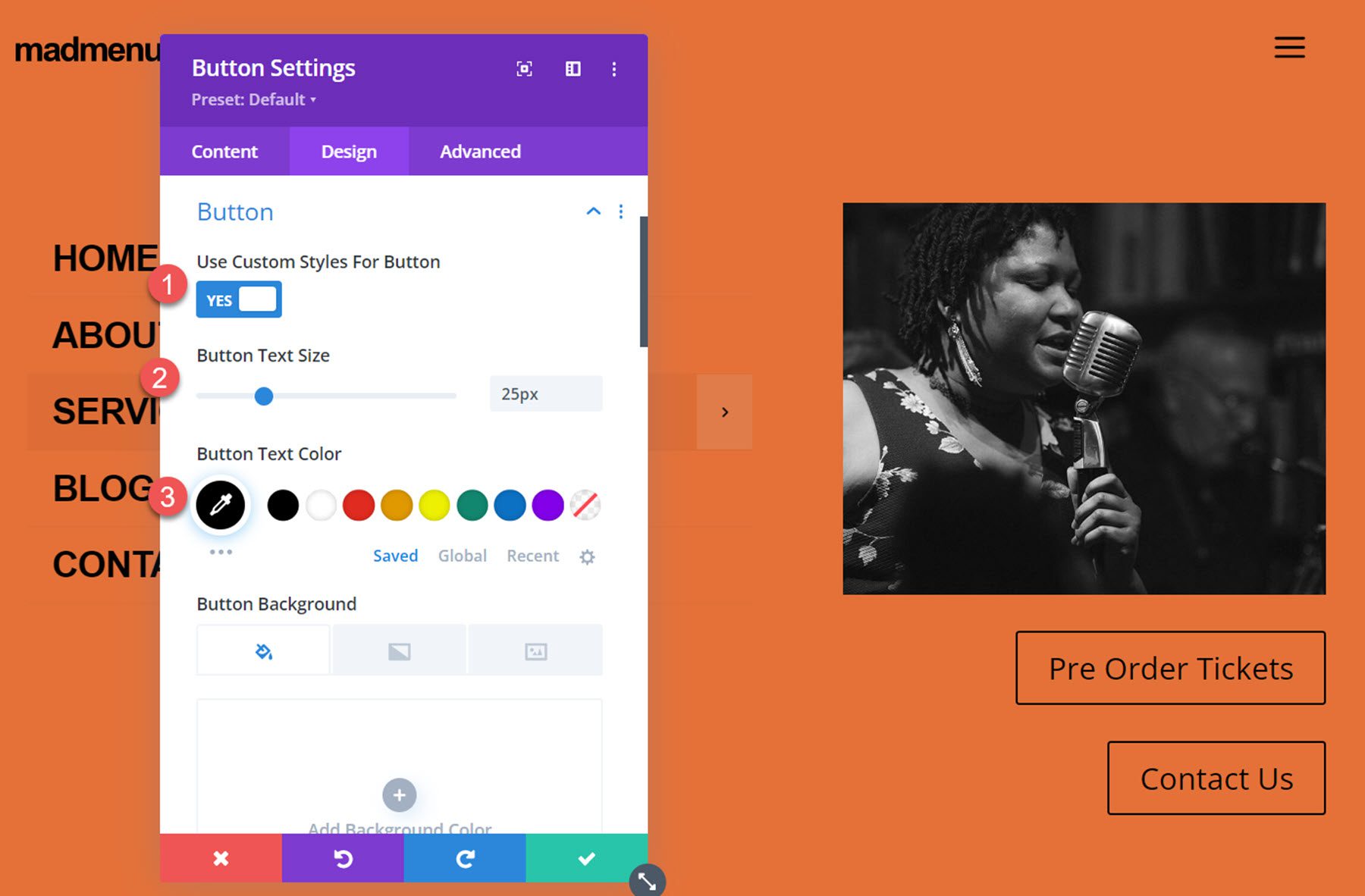
Next, customize button styles:
- Button Text Size: 25px
- Button Text Color: #000000
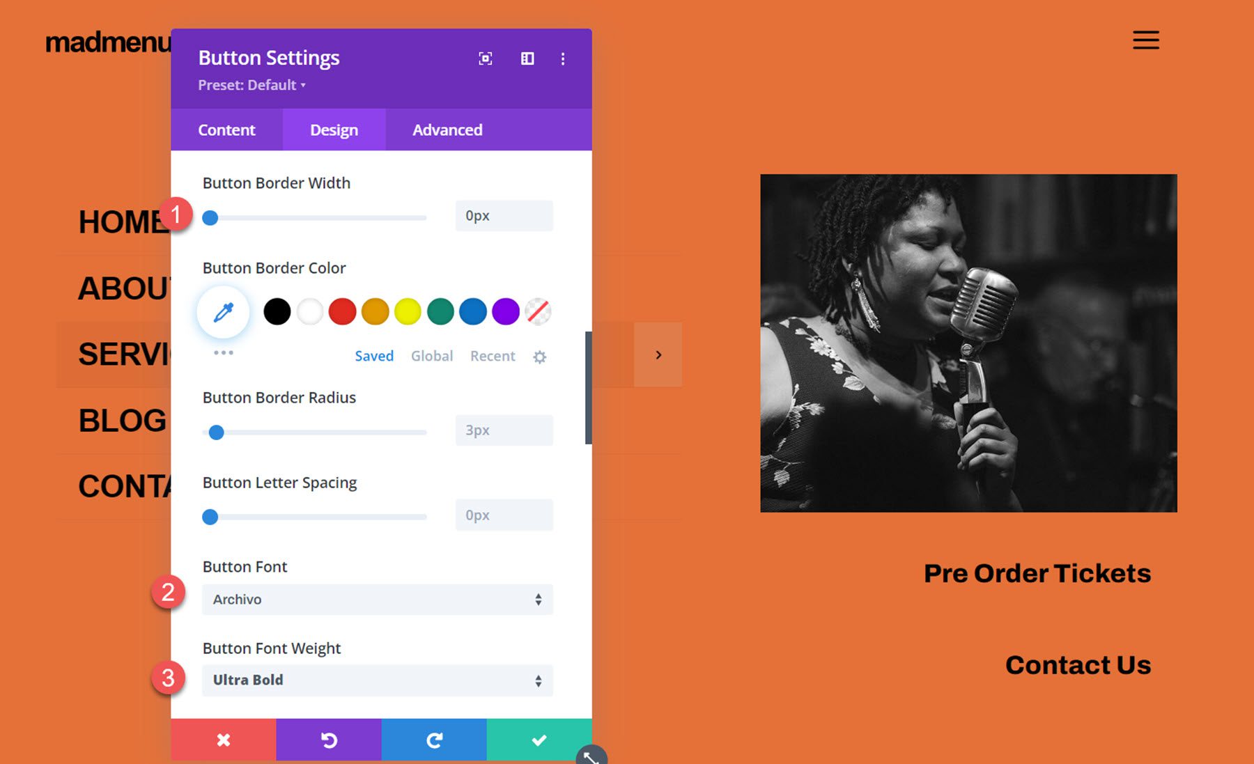
- Button Border Width: 0px
- Button Text Font: Archivo
- Button Font Weight: Ultra Bold
- Button Icon: Arrow
- Disable only show button on hover
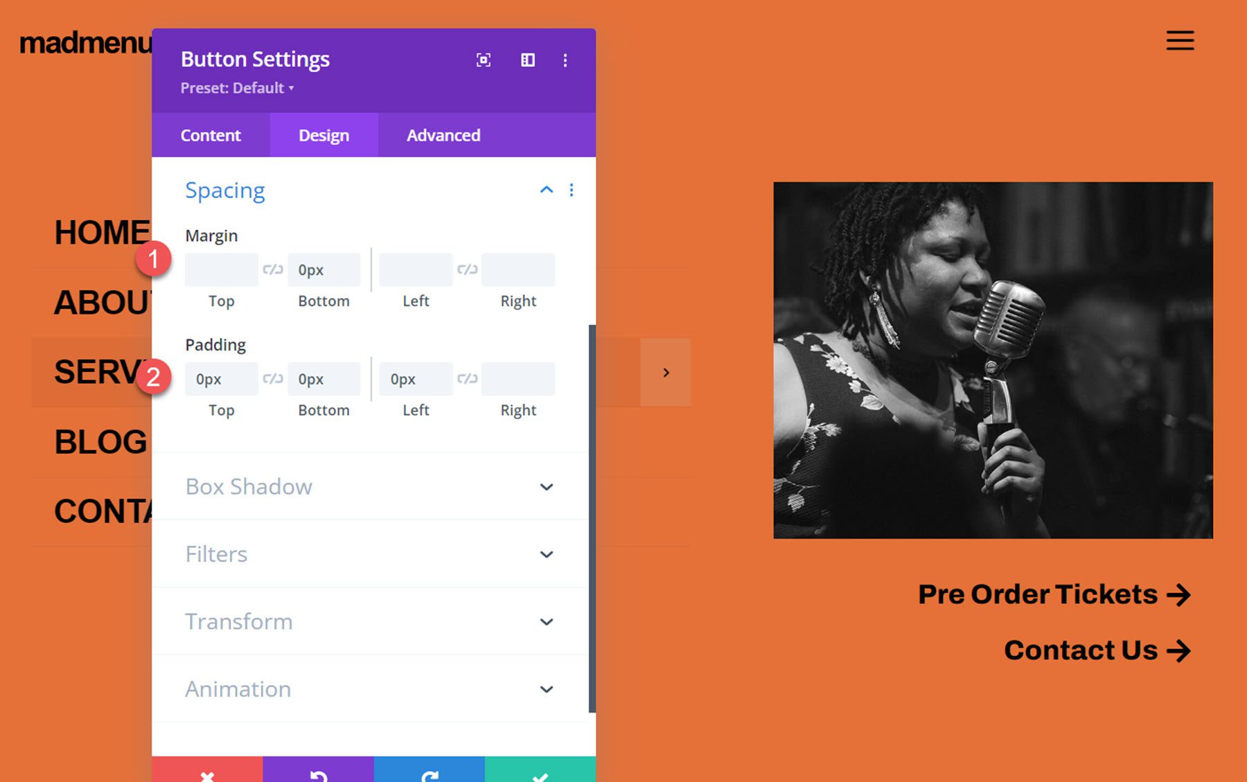
Finally, set the button spacing:
- Button Margin Bottom: 0px
- Button Padding Top Bottom, and Left: 0px
Close Popup Button
The final element we need to add to our popup is a close button. You can enable the default close button in the MadMenu settings, or you can add another MadMenu module with a button that functions as a close button so that you can fully customize the styling. That’s what we’ll do for this tutorial. Start by adding a new row with one column to the popup and move it above the existing row. Then add a MadMenu module.
Disable all of the MadMenu elements except for button one, which will function as our close button.
In the button one settings, set the text to “close”. Enable the button one icon, then select the close icon.
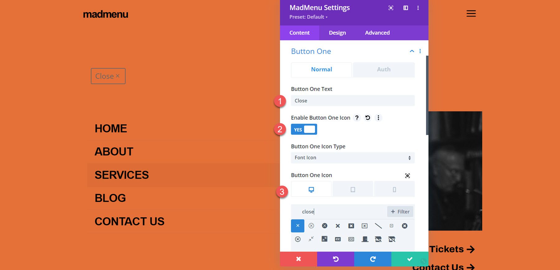
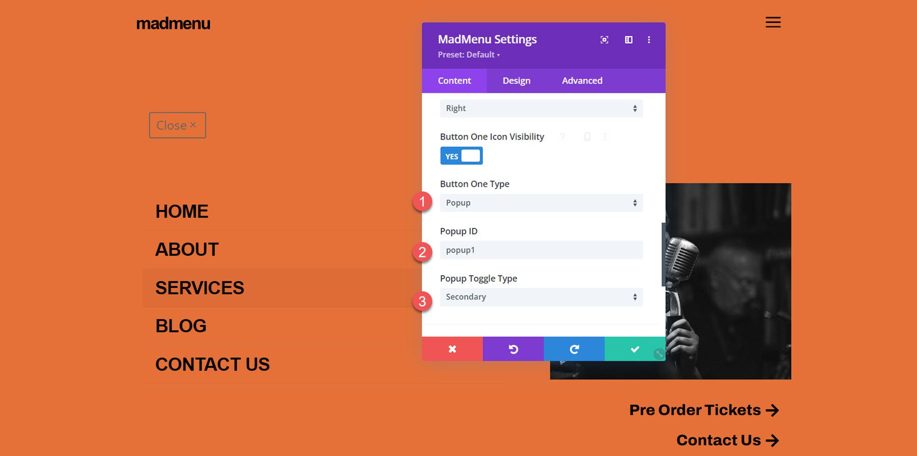
Set the button one type to popup, then enter the popup ID you used for the popup section – in my case, it’s ‘popup1’. Set the popup toggle type to secondary, which enables the closing function.
Next, set the menu background to transparent.
Now move over to the design tab. In the general layout settings, set the element’s alignment to right.
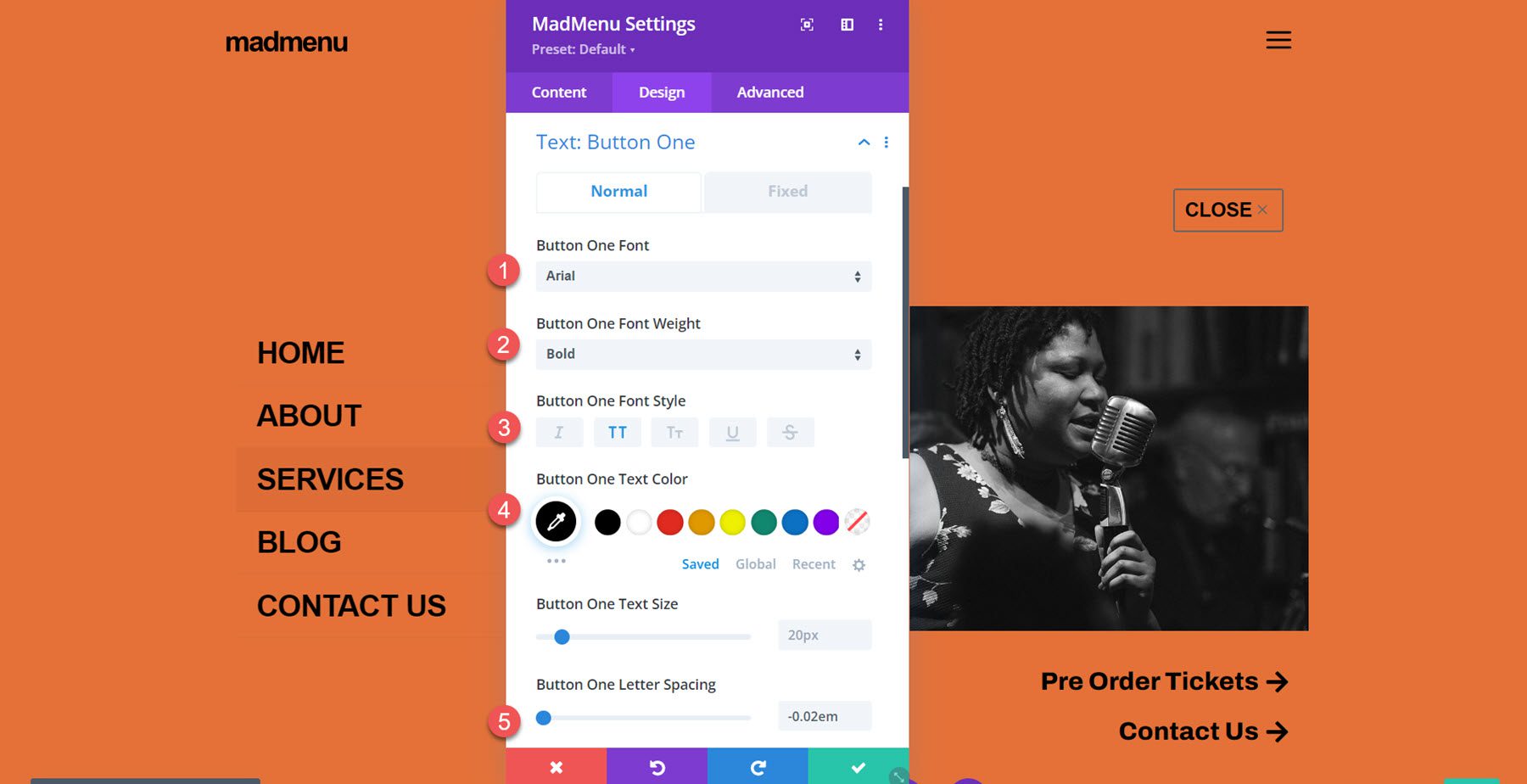
In the button one text settings, customize the button styling:
- Button One Font: Arial
- Button One Font Weight: Bold
- Button One Font Style: TT (Capitalized)
- Button One Text Color: #000000
- Button One Letter Spacing: -0.02em
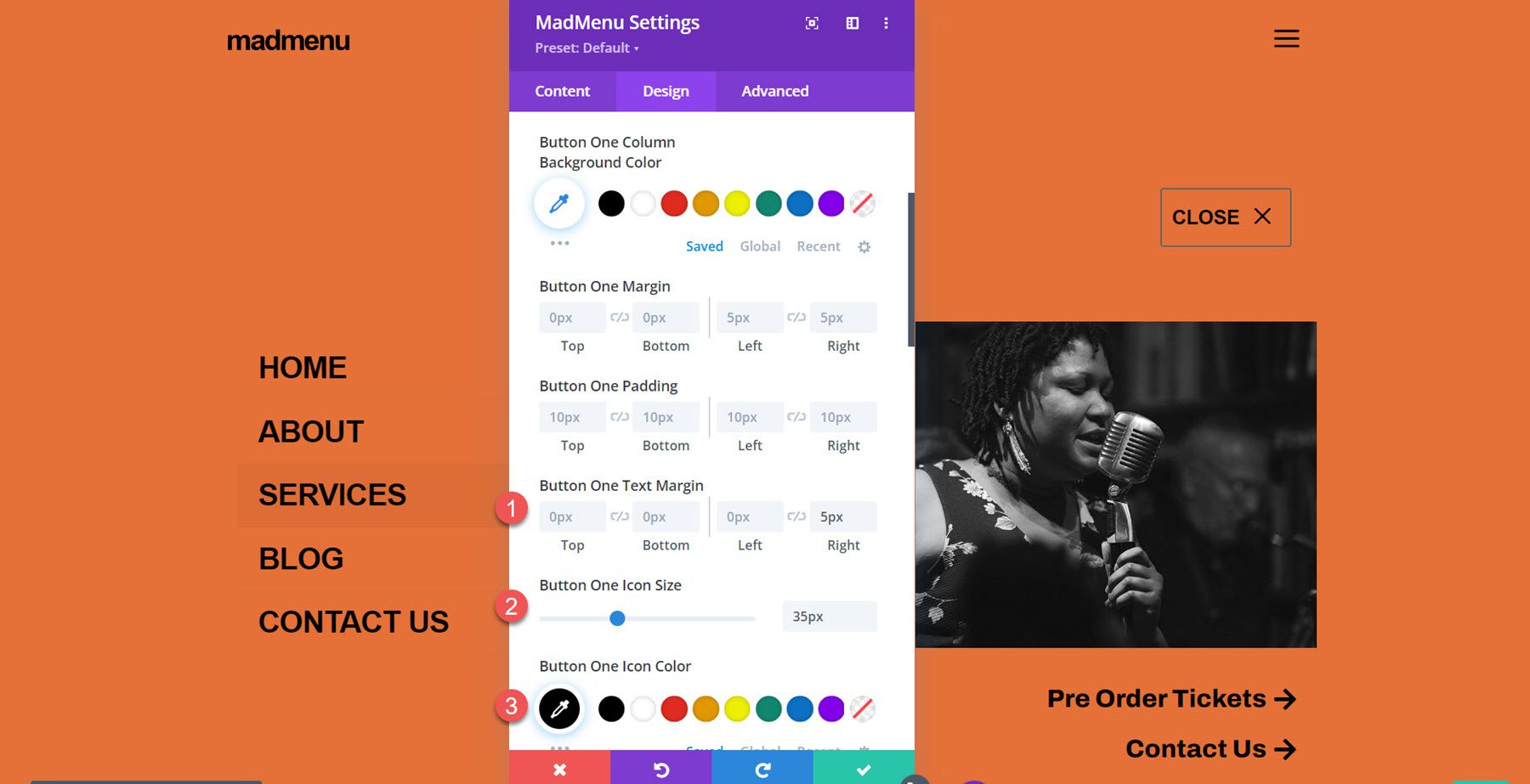
In the button one settings, customize the spacing and icon styling.
- Button One Text Margin: 5px
- Button One Icon Size: 35px
- Button One Icon Color: #000000
- Button One Border Width: 0px
Finally, set the menu top and bottom padding to 10px.
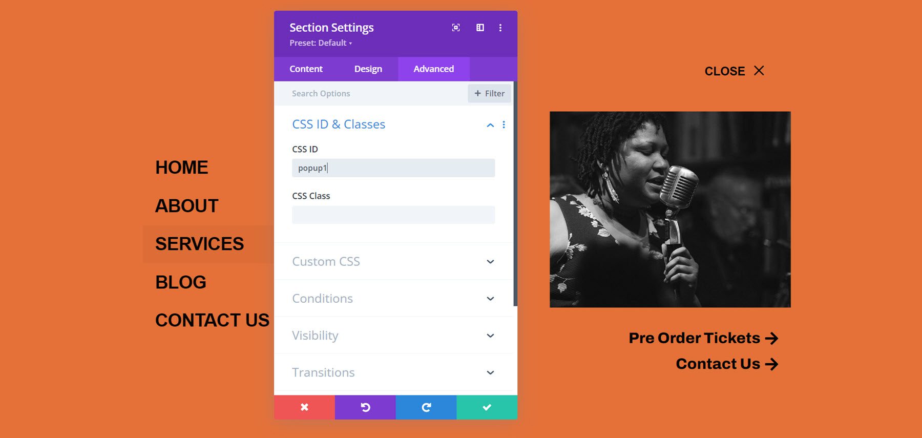
Enable Popup Function
The last thing we need to do is to enable the popup functionality. Open the popup section settings and navigate to the advanced tab, then add the CSS ID popup1. This will activate the popup functionality and you can reveal the popup section by clicking the hamburger menu icon in the header. Now the design is complete!
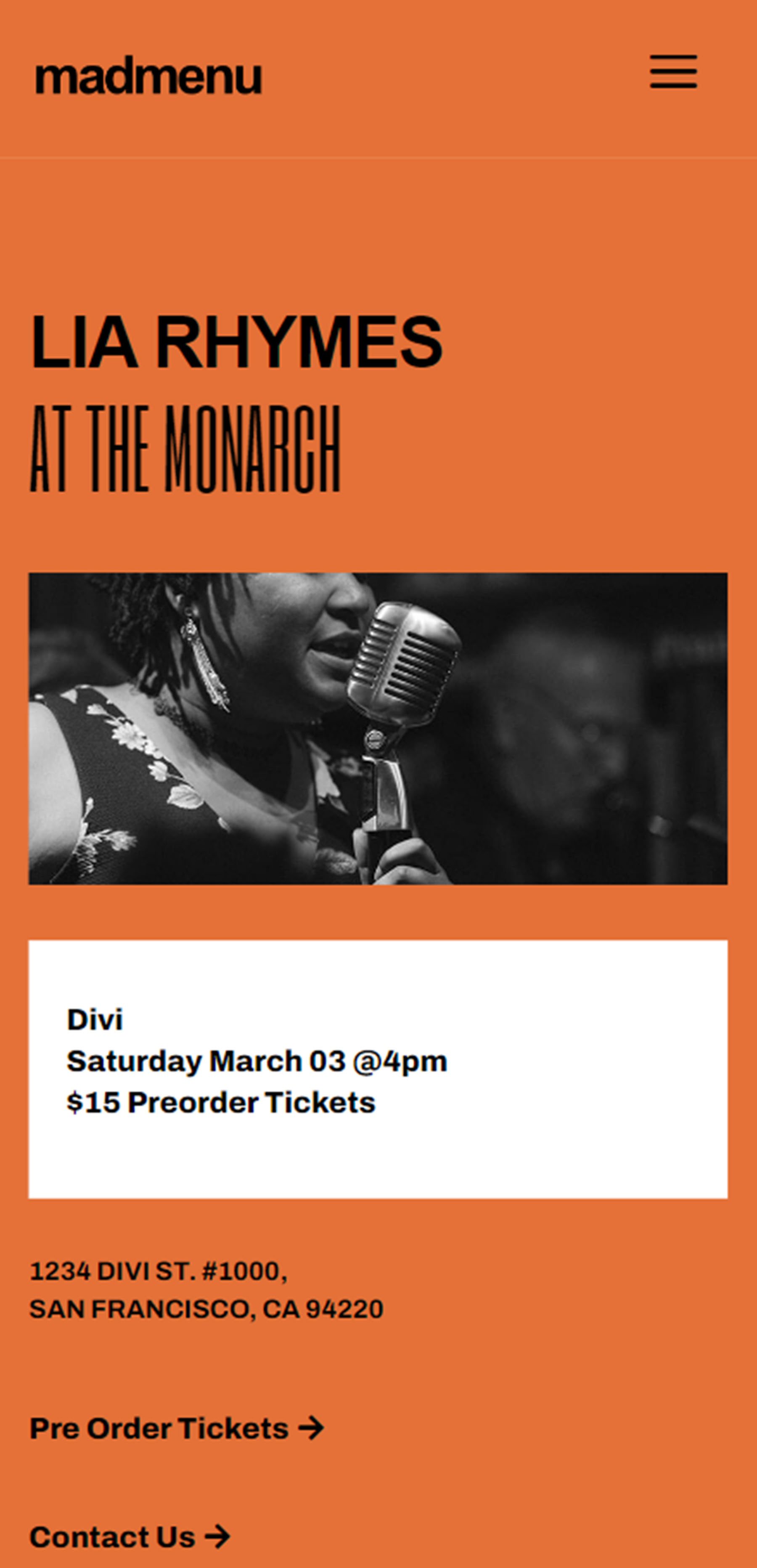
Final Result
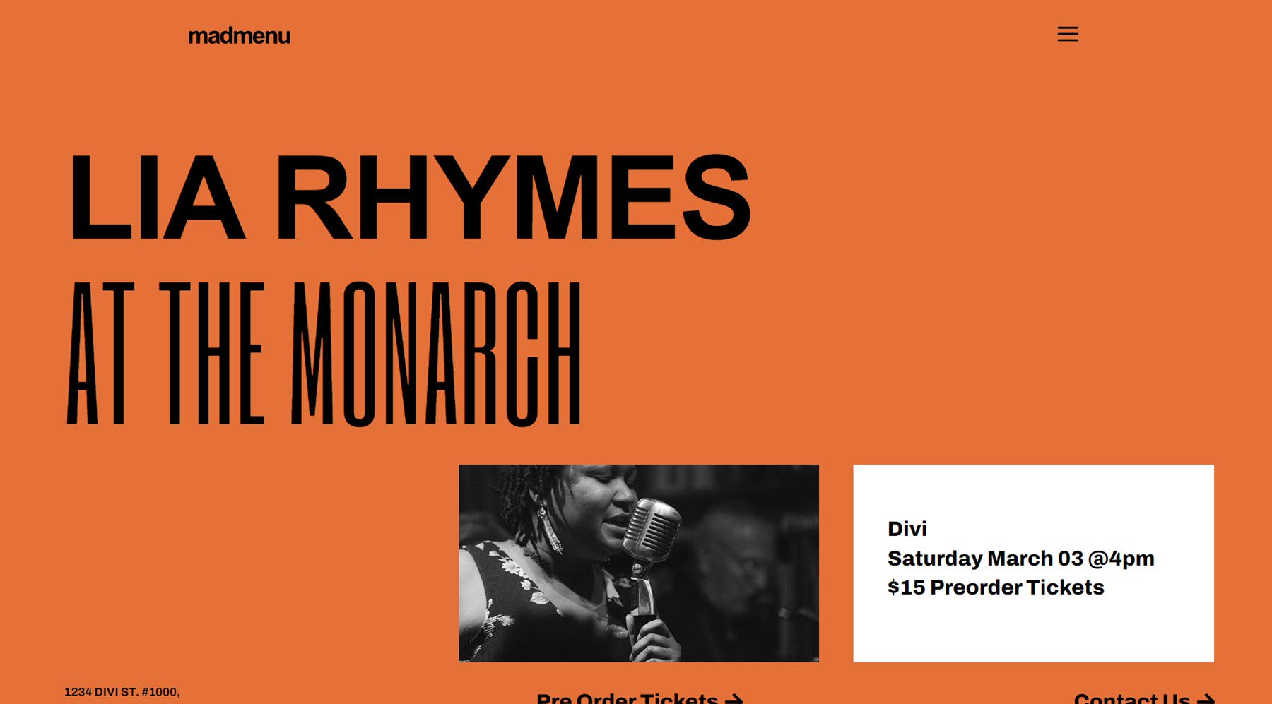
Here is the final design displayed with Divi’s Music Venue landing page layout.
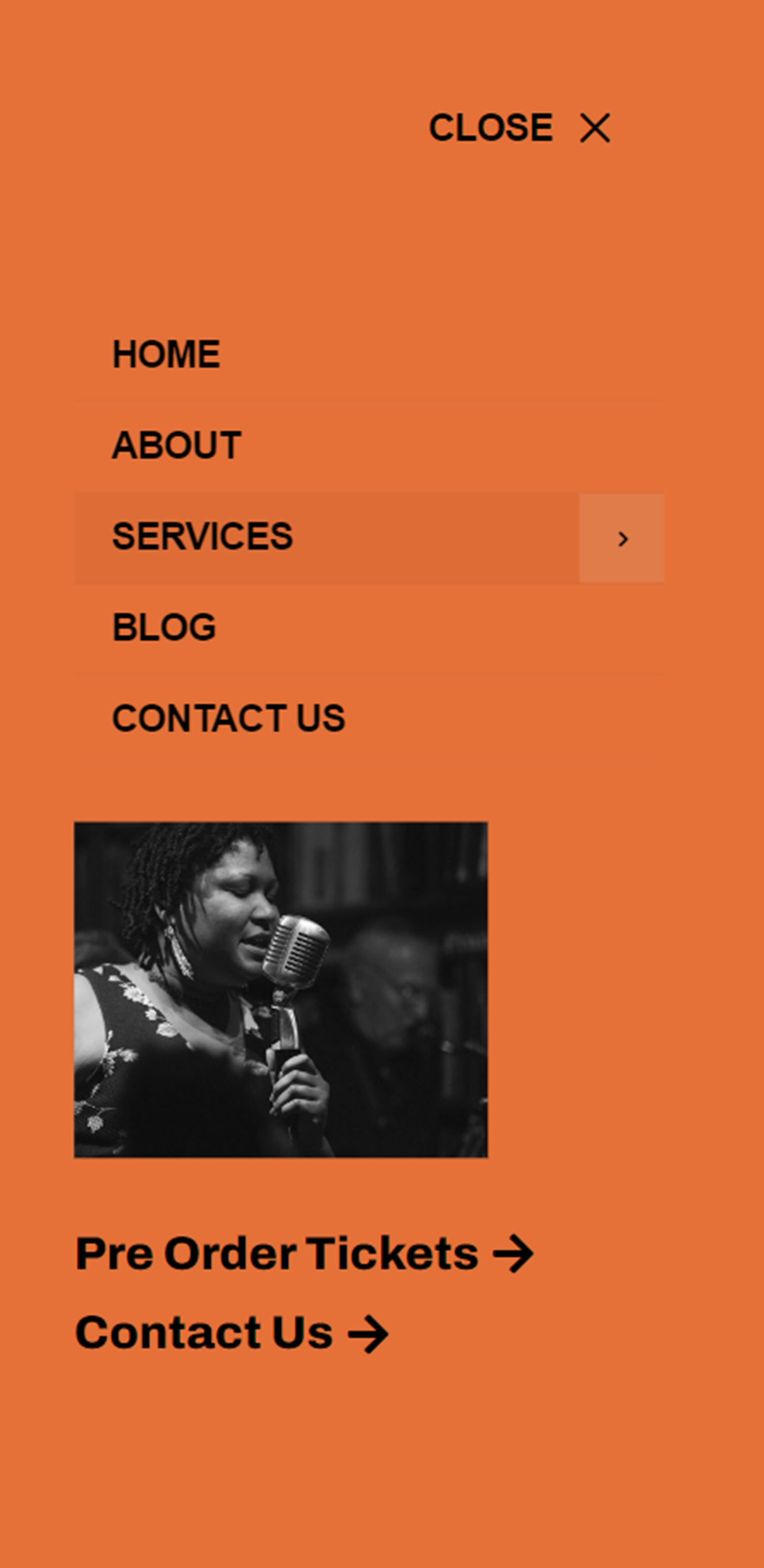
The fullscreen popup menu section is revealed when the menu icon is clicked.
Here is the mobile version of the layout.
And this is what the fullscreen popup section looks like on mobile.
Divi MadMenu also comes with 19 demo layouts that you can use to jumpstart your design. Let’s take a look at some.
Demo Layout 4
Demo layout 4 features a left-aligned logo and menu section. On the right side, you have a search icon, a sign in/out button, and a profile button.
The search bar replaces the menu when selected.
Here is how layout 4 looks on mobile. The menu slides in when selected.
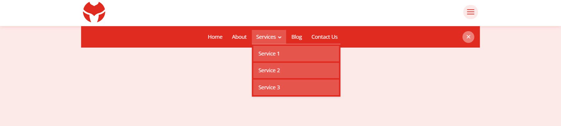
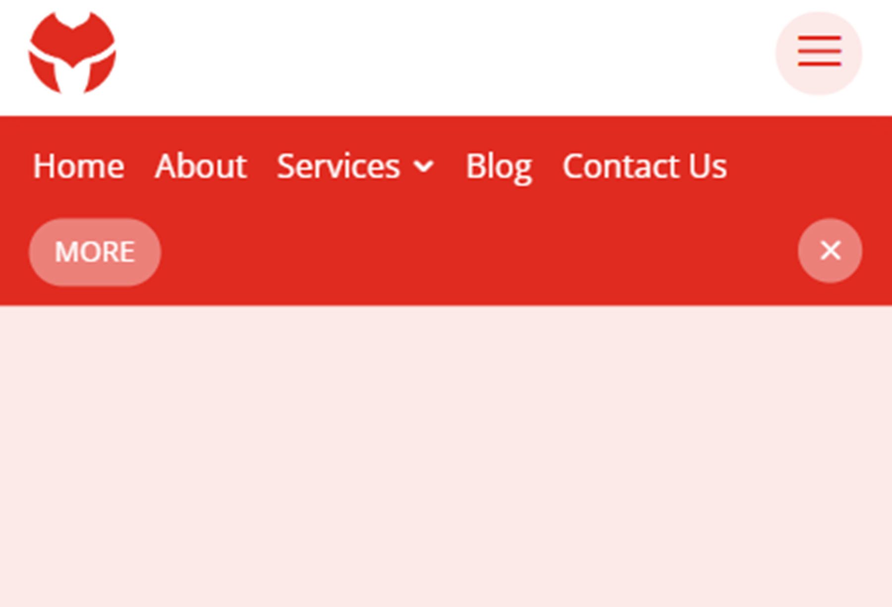
Demo Layout 11
Demo layout 11 is a simple layout with the logo on the left and a menu icon on the right. When the menu icon is clicked, the menu section is revealed on a red background.
On mobile, layout 11 has a similar layout with the logo and menu icon. When the menu is opened it reveals below.
Demo Layout 13
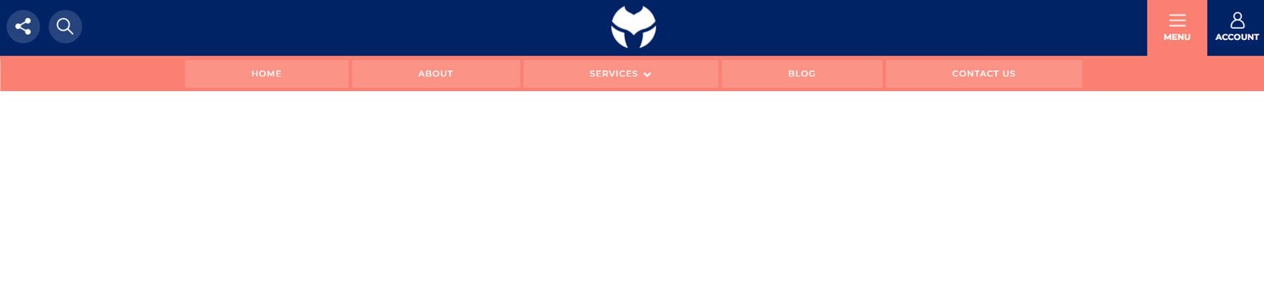
Demo layout 13 is an interesting menu with lots of interactive elements. The menu icon to the right of the logo opens up a menu bar right below the primary menu bar.
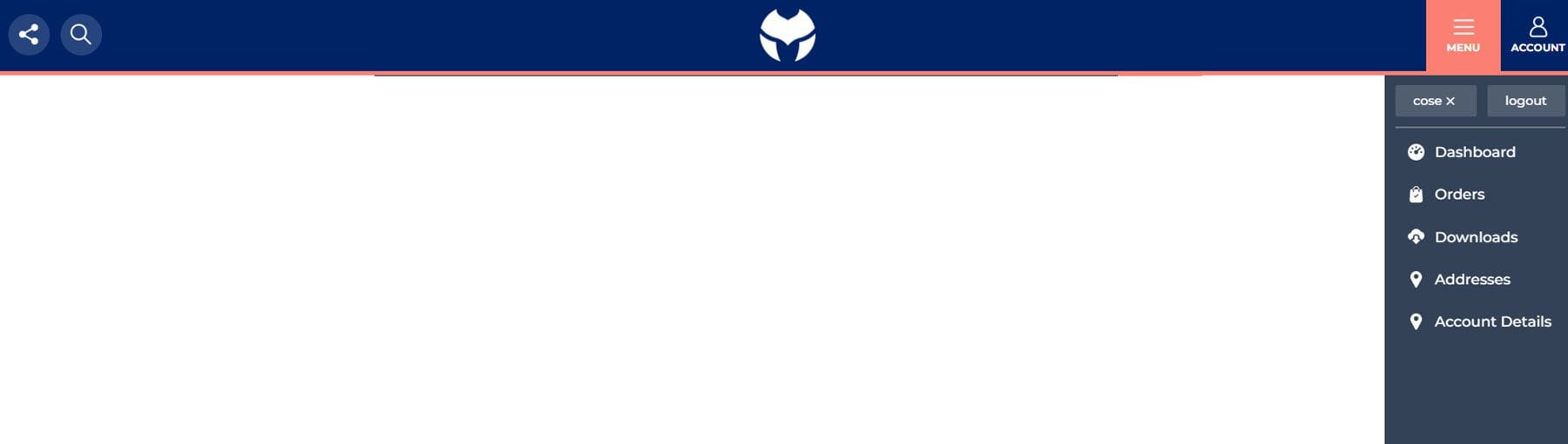
The account button in the menu also opens up a slide-in menu with a login/out button and several other navigation items.
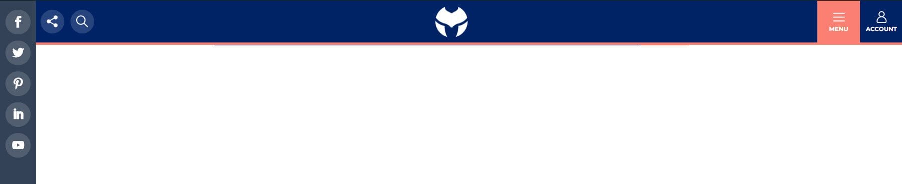
The social menu button on the left opens on the side to reveal social media icons.
And the search icon opens a search bar that appears below the menu.
Finally, here is how the menu looks on mobile with the menu selected.
Divi MadMenu is available to purchase in the Divi Marketplace. It costs $39 for unlimited website usage and one-year support and updates. The price also includes a 30-day money-back guarantee.
Final Thoughts
Divi MadMenu adds some great customization options and flexibility to the headers and menus you can create with Divi. I particularly love the ability to create your own popup sections using Divi sections, allowing you to add any modules you would like. If you’re looking for a plugin to expand the possibilities of the header and menu sections you can build, Divi MadMenu is a great option.
We would love to hear from you! Have you tried Divi MadMenu? Let us know what you think about it in the comments!


lifetime support and updates?
You can use it forever and on as many websites as you like. However, you will only receive support and updates from the seller for 1 year. After your license expires, you will need to renew and purchase at the normal pricing to receive updates and support again.
Nice plugin. Do you know if the plugin authors will be making this ADA-compliant? Right now, the dropdowns are invisible to screenreaders. I also assume the menu structure is unavailable to Google because it’s rendered in JavaScript.
Thanks for your comment, Rebekah. Divi MadMenu uses the WordPress menus that you create in Appearance -> Menus, so, the menu structure is not rendered using JS. If you have any suggestions for further improvement of the plugin (eg. accessibility, etc.) please feel free to get in touch with me on the plugin’s page on Divi Marketplace, or directly using the “Contact The Author” button, and I’ll be happy to discuss that (I’m the developer of Divi MadMenu). Thank you.
I purchased a lifetime licence to divicio.us and the first-time use of MadMenu paid for itself with the time I saved in not trying to figure out how to do this programmatically. It is great!
The developer is very helpful and I am happy to see this addition to the Divi Plugin family.
Highly recommend.
Hi! Is it possible to create a fullscreen menu with this plugin?
Yes, you can create fullscreen menus using Divi MadMenu. To get a better idea about the types of headers you can create using Divi MadMenu check out the live demos, the demo headers #12, #14 and #17 are fullscreen header templates.