
The Divi Builder includes a blog module to display posts based on categories in either fullwidth or grid layout. Have you ever wanted more control over your blog layout? You might be interested in a third-party plugin called Content Intense.
Content Intense is a plugin from BeSuperfly that adds new layouts and styling features to give your blog module a new look. It’s based on the standard blog module, so it includes all the familiar features.
(The plugin is available from the developer’s website.)
In this plugin highlight we’ll take a look at the features and see how it looks on the page. I’ll also load it up in Extra (but of course it’s also compatible with Divi).
Installing Content Intense
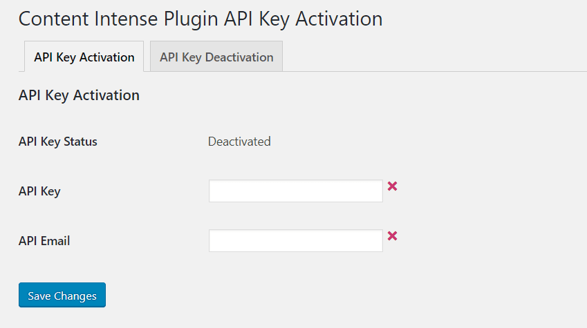
Upload and active Content Intense just like any plugin. Once the plugin has been activated you’ll see a new menu item within Settings in the dashboard called Content Intense Plugin Activation. Click this and enter your API Key and email, and save changes.
Content Intense Module
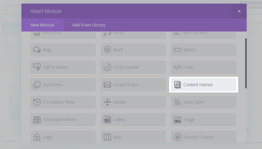
A new module is added to the Divi Builder called Content Intense.
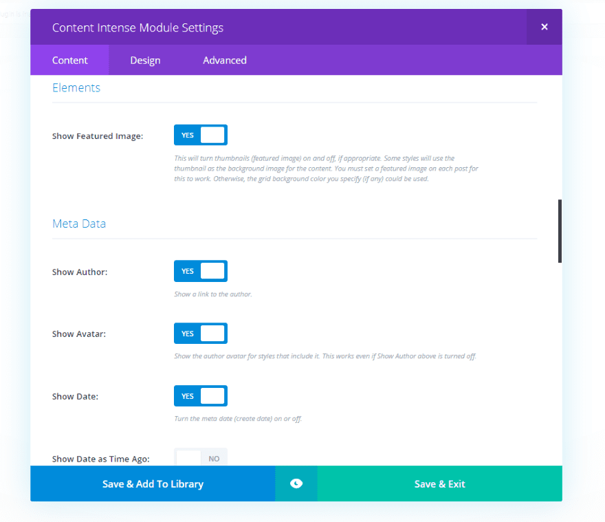
The Content tab allows you to display posts only, pages only, or pages and posts, the number to display, the categories, and offset number. Show the featured image, meta (which allows you to choose a separator), excerpt, navigation, and background. As you’ll see, I am seriously oversimplifying the number of options in the settings.
One of the most unique features is that WordPress categories are added to pages. If you choose to display pages, they are selected when you choose their categories.
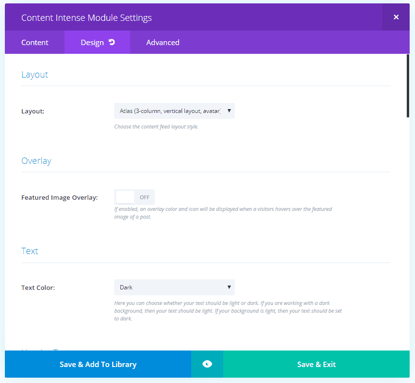
The Design tab lets you select one of 5 layouts, enable the overlay, adjust the header text, body text, and meta text. Also adjust the border, button, spacing, and animation.
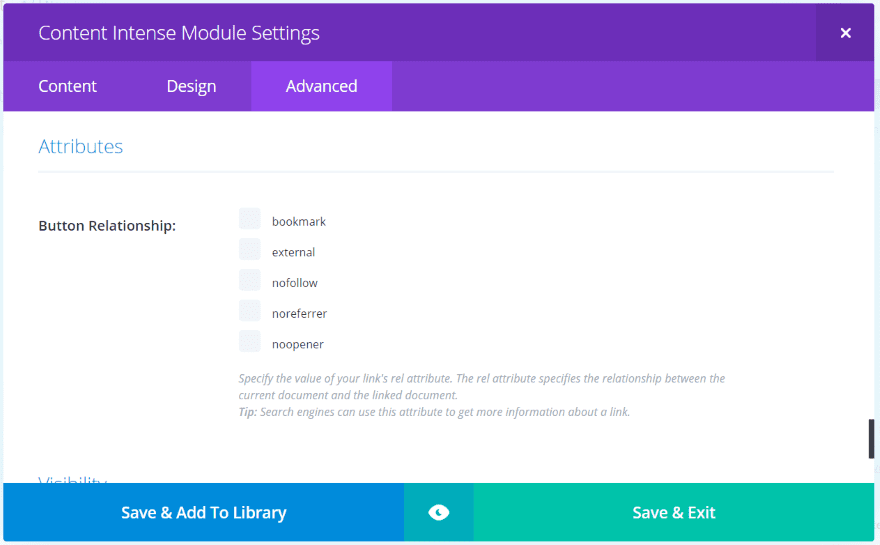
The Advanced than includes button relationship features so you can specify the value of the link’s rel attribute. This is great for creating bookmarks, setting a link to nofollow, etc.
Content Intense Default Settings
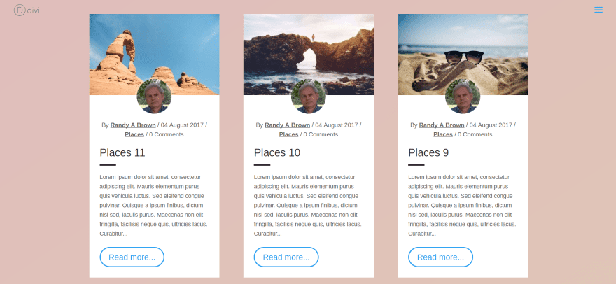
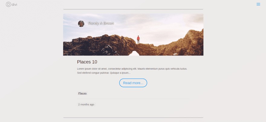
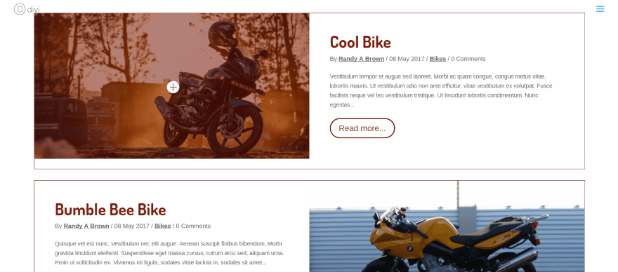
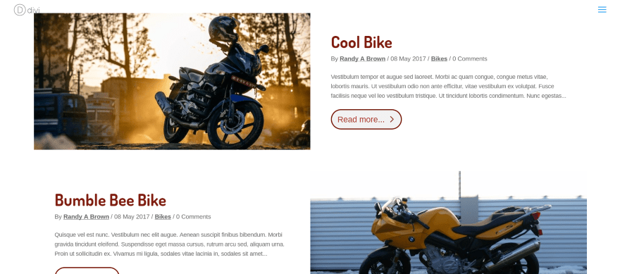
The default settings displays the featured image with the author’s Gravatar overlapping the bottom of the image. This is followed by the post meta, title, a line, post excerpt, and read more button with hover animation. I’ve added a background in the section to help it stand out.
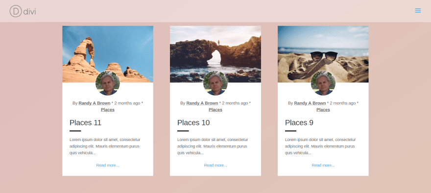
In this example I’ve added an asterisk for the meta separator, changed the excerpt count from 270 to 100, and replaced the read more button with centered text. Instead of the date, it shows how long ago the post was published. I’ve disabled the comment count.
This one adds some color to the background behind the text. I’ve also moved the button to the right and set the excerpt to 150.
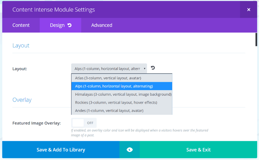
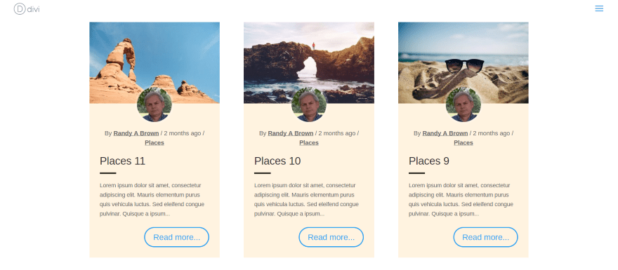
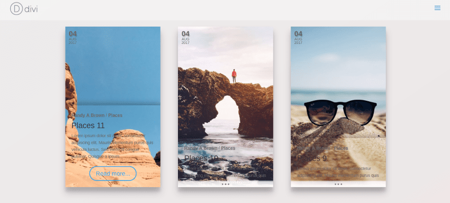
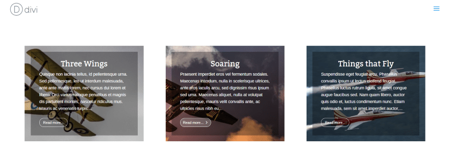
There are five different layouts. The examples we’ve seen so far use Atlas – 3-column, vertical layout, with avatar. Let’s look at each layout. I’m using the default settings.
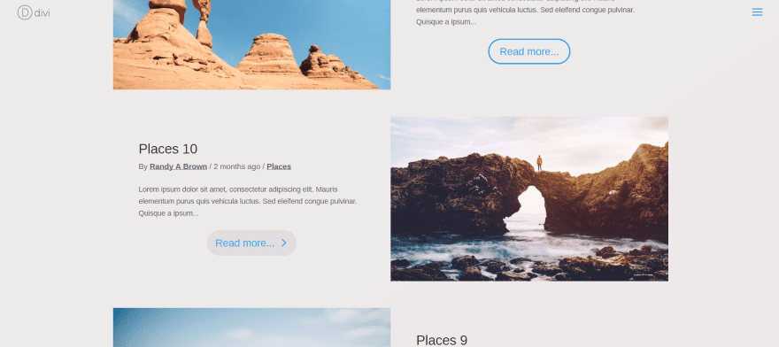
This one is Alps. It’s a one-column, horizontal alternating layout. The text background matches the background color I’ve chosen in the section. These are flat cards with hover effects for the button.
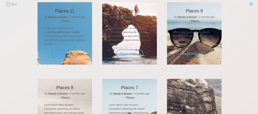
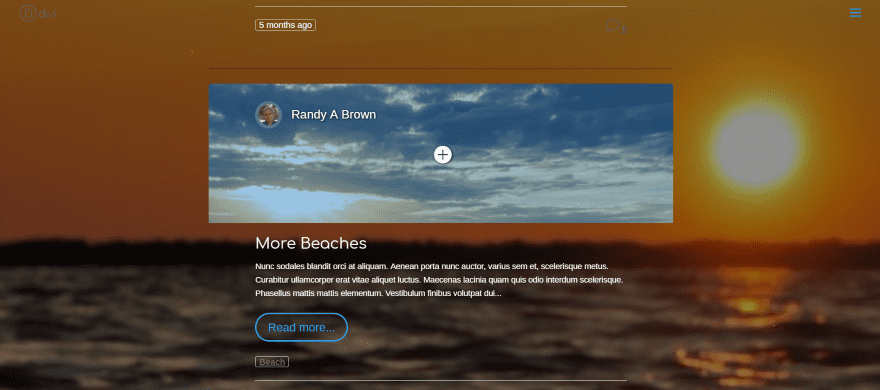
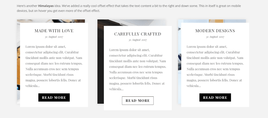
This is Himalayas, a 3-column, vertical layout that uses the post’s featured image as the background. It also uses button animation. This text is more difficult to see without adjustments. We’ll fix this later with an overlay.
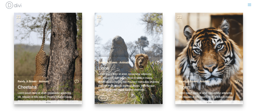
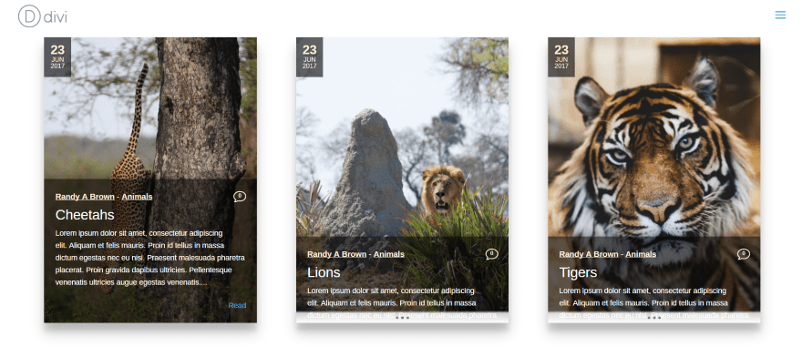
This is Rockies – a 3-column vertical layout with hover effects. It also places the featured image as the background. The hover effects reveals the full excerpt and read more button. We’ll make some adjustments to make the text more readable.
This one is Andes – a 1-column, vertical layout with avatar. It uses a cropped version of the featured image and uses small lines to separate meta and larger lines to separate posts.
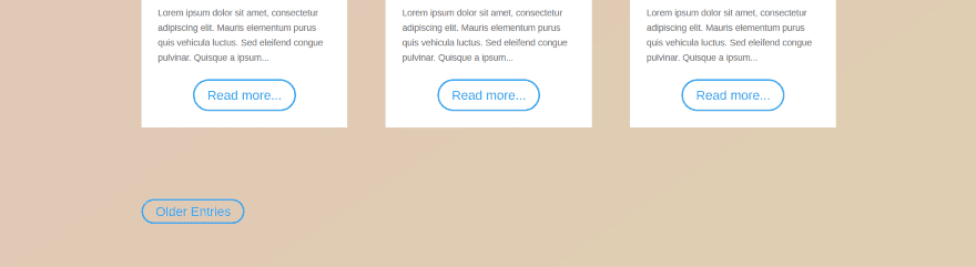
At the bottom of the page you’ll see navigation buttons. You can disable them or add your own text. They take the styling of the other buttons, so when you’ve style the read more buttons you’ve styled these too. You can also use text instead of a button.
Example – Alps with Atlas
I created this blog layout using 2 Content Intense modules. The first one uses the Alps layout without navigation. The second module uses Atlas. I’ve set its offset to 1 so it doesn’t show the same image as the first module. I’ve adjusted the font color to Arimo (a favorite of mine). The buttons use a gradient. On hover they go to a solid color and increase the letter spacing. The navigation button matches.
Example – Alps
I’m a sucker for alternating layouts. I love the look of Alps without any changes, so I just made a few small adjustments. I added a red border, red overlay, and changed the button and header colors. I also changed the font to Dosis and made it bold. This shows the overlay on hover.
I actually like it better without the border. This one shows the button on hover.
Example – Andes
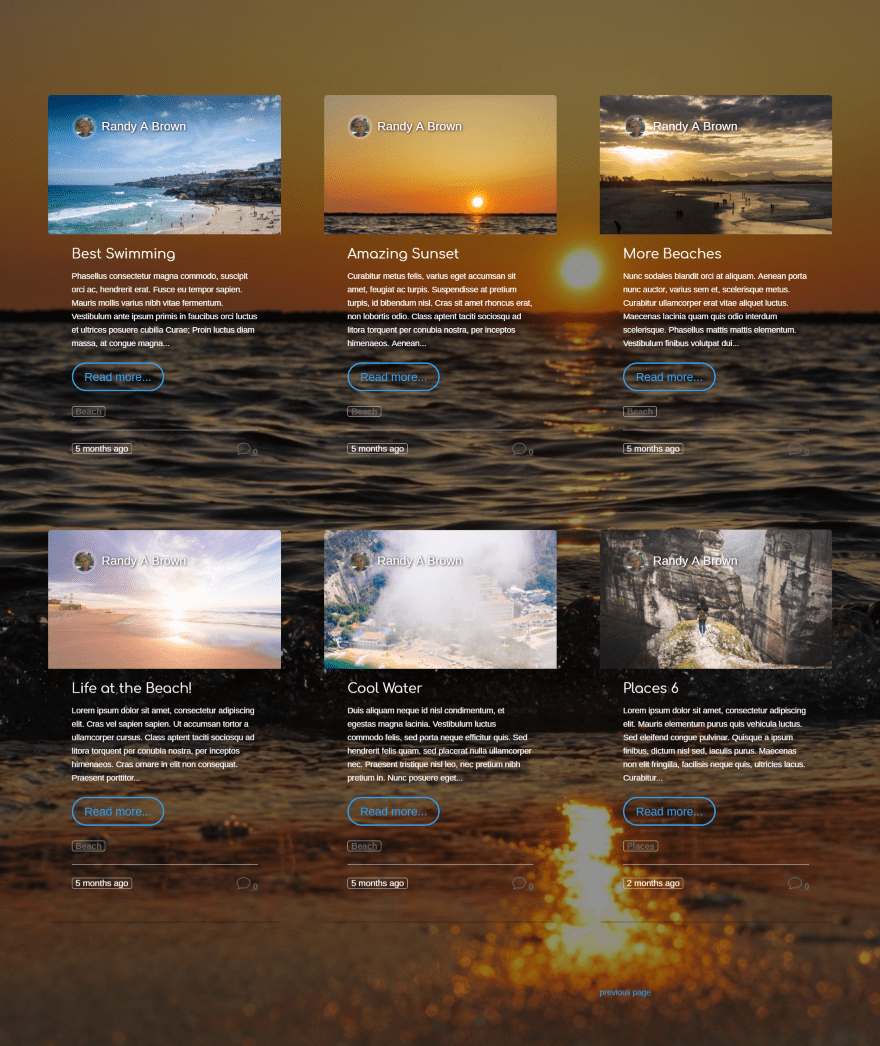
This example uses 6 different Content Intense modules – all of them using Andes and each is offset by 1 more than the previous module. I’ve added a background to the section with an overlay. The header font is Comfortaa. The last module uses navigation. I’ve changed the buttons to text.
Here’s a look at the normal single column design. I’ve also added a hover overlay. Everything else is default.
Example – Himalayas
This one uses Himalayas with an overlay behind the text. I’ve disabled meta, changed the text to light, changed the button styling to white and reduced the button font to 12 point. The header text is Bitter. The only animation I’ve included is for the button hover. This would make a great CTA or links to pages that describe your services.
Example – Rockies
I love the look of Rockies. It has a nice shadow effect with hover animation that brings up the text and read more button. I could have placed a text overlay but I didn’t want to cover the image. Instead, I changed the text to light. I also changed the colors of meta and the button, and changed the separator to a dash.
Of course an overlay does look good. I’ve added a black overlay and changed the opacity so a little bit of the image shows through. The date in the upper left corner also uses the overlay. I changed the button to text and moved it to the right. I like those three dots and line at the bottom of the cards. It’s a small detail that adds a touch of visual flare.
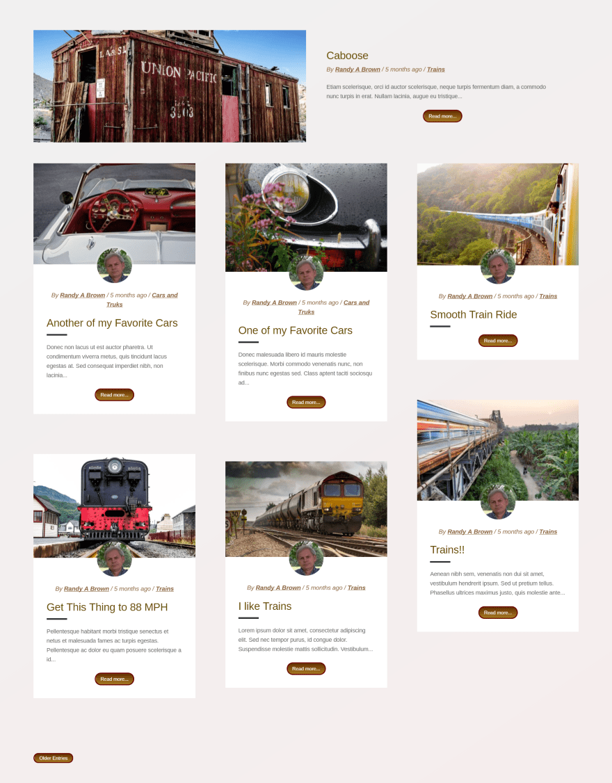
Example – Extra
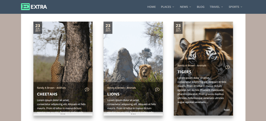
Content Intense works great with Extra. I only had to make some minor adjustments where I used Andes. In my example I had placed a white background for the text area. Since I used white text I simply changed it to dark. The example above is Rockies. The only difference was the text color for the read more link.
Downloadable Styles
Animations can be added through CSS. The developer’s website shows several animations that they’ve created such as the one above that moves the text on hover. This and other styles can be downloaded from them in a JSON file.
License and Documentation
Choose from two licenses (neither allows for resale):
- Standard License: for use on a single website. It includes 1 for the Development Project and 1 for the Live Project.
- Unlimited License: can be used in unlimited websites for both personal and client use.
Updates are automatic. Content Intense is available from the developer’s website.
Documentation is proved at the developer’s website. It takes you through the adjustments and provides demos along the way.
Final Thoughts
Content Intense has some nice layout features, and even more layouts will be added in the future so this is just the beginning. Each of the layouts can be styled with the module’s adjustments and customized even further with CSS. It’s intuitive to use. If you’re interested in giving your blog a different look, Content Intense might be the plugin you’re looking for.
We want to hear from you. Have you tried Content Intense? Let us know about your experience with it in the comments below.
Featured Image via LanKoga / shutterstock.com


Seems very expensive, $25 a month for just a blog module…Even if it doe look good. 1 site $25 a year is more realistic
Sorry I misread the pricing
Timely. Thank you. I’ll be sharing this post with a client or two.
Too expensive for a stand alone module for 1 site.. Its not that good.. Should be similar functionality in Divi Builder anyways..
Really nice but the problem with plugins is the up to date
If your blog headings are different line lengths would it cause your boxes to be different heights?
The product does not appear on the module. There is no way it works. I paid for something that did not work.
That’s lovely. But as always there’s NO mention of category and archive layouts. They are part of blogs, whether ET likes it or not.
Big pain point, especially for styling :/
Thanks for featuring Content Intense, Randy! We’re super excited about the plugin and all the fun features we have in store for it in the near future as well.
That should be native to the theme, do not you think?