
It’s that time again for our monthly Divi Showcase where we take a look at 10 awesome Divi websites made by our community members. Every month we showcase the best Divi websites that were submitted from our community and today we want to share with you the top ten websites for the month of January. This time we’ve included a few websites made with Extra. Throughout the post I’ll point out some of my favorite design features from each of the websites.
I hope you like them!
The Best Community Divi Site Submissions from January 2018
1. Dollar Fund
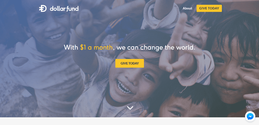
This website was submitted by Kevin Gilbert. The website was designed for giving donations and includes several donation CTA’s throughout the site. A section showing how it works provides a list of dollar amounts with information about each and an embedded video, and an image and information on the other side (taking 2/3 of the row). A form provides a bar counter to show the goal for the month and the amount received. It includes a box to enter an amount and the fields to enter your information. The CTA’s in the header and menu link to this section. This site has one of the most elegant blog designs I’ve seen. The blog page is a slider showing a single post with a link to read more. The post itself displays the featured image in parallax and includes elegant sharing buttons and post navigation.
2. One Fire
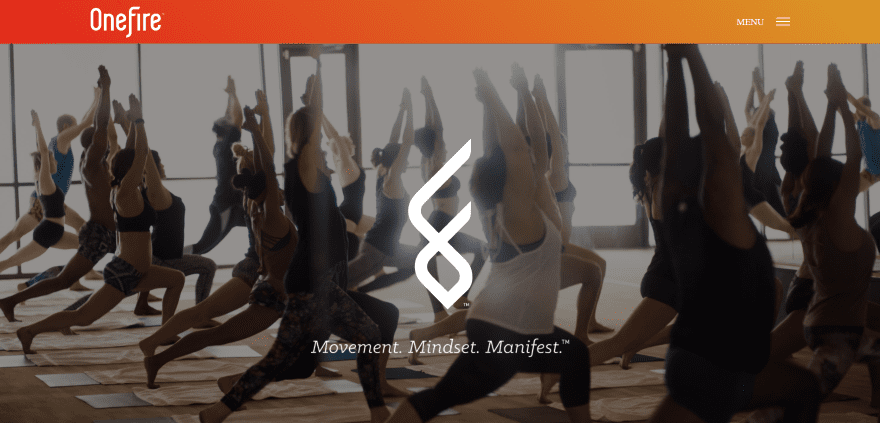
This website was submitted by Robby Doyle. The site uses a nice gradient for both the header, slide-in menu, and the entire footer complete with menu, CTA’s, and email optin. The large red title text introduces each section with elegance and stands apart with the right amount of white space. The first section uses a background pattern with yoga line art and the last section goes to a dark background to ground the design. The red buttons turn solid on hover and help bring the design together. The site makes excellent use of photography and showcases the photos with border shadows. Classes are scheduled through an embedded calendar.
3. 320 Maverick
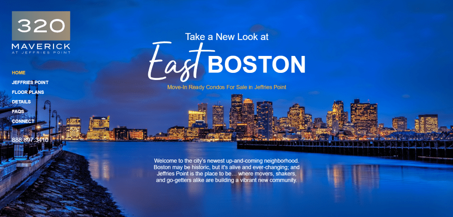
This website was submitted by Claude Kallanian. The header image loads as black and white and then colorizes after the title and tagline loads. The site uses a unique navigation menu, placing the links vertically over the background image on the left side. The blue and yellow color scheme is used throughout the design in both background overlays and text. The page for Jeffries Point shows images in alternating sections with links to locations. Even though it has lots of links they’re listed in a way that makes them easy to understand and use. The floorplans page shows the interactive floorplans for each floor within a separate section with the same yellow and blue color scheme.
4. InvestNest
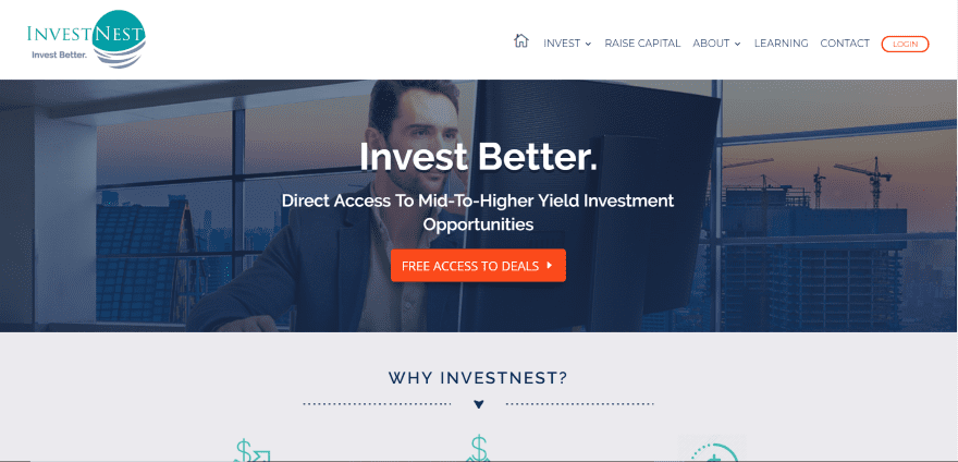
This website was submitted by Karen Sielski. The site uses colors that match the genre perfectly and makes excellent use of large text and white space. Sample marketplace investments are shown as cards within a slider. The Investments and Learning pages use blog posts with hover animation. The Jobs page lists jobs with links to Indeed. It uses a red CTA in the menu. I especially like the design of the Raise Capital page which uses blurbs with large icons over a background pattern, and large icons to create a circle around a company statement in large text.
5. Crunch
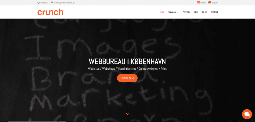
This website was submitted by Adam Kischinovsky. This is a multi-lingual site with a full-screen video background. Services are shown using blurbs with large icons using branded colors. This same color branding is used throughout the site and looks great against both light and dark backgrounds. I especially like the full-width testimonial slider with its bold orange background and white text (but I’m from TN, so…). The portfolio page alternates between light and dark sections with images and links using the orange colors. The site makes great use of color.
6. 30 Things to Think About
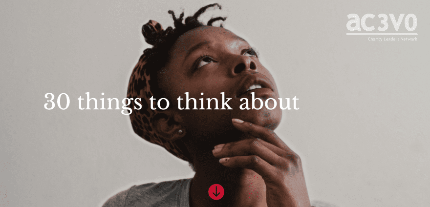
This website was submitted by Julius Honnor. This website has an interesting premise. The point of the site is to provide 30 articles from thought-leaders within the Charity Leaders Network. The 30 articles are presented with a filterable blog module that displays the person’s photo, title of the article, and author’s name. The articles use full-screen header backgrounds with the title in an overlay and down arrow. Some of the articles are embedded video while others are full-text with headers to make the articles scannable. Some of the videos include transcripts. The author box shows a large circled image with large text and social buttons. The article design is clean. I like the way the articles use quotes within the text.
7. Andrew Uncharted
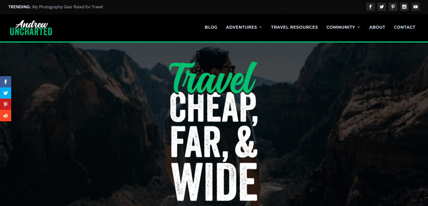
This website was submitted by Andrew Uncharted. This site uses Extra in a unique way. Rather than the typical Extra magazine style layout it uses a full-screen header, about section, newsletter opt-in section, recent posts to show the three latest articles, popular travel tips to three articles with link to more, etc. It uses a green highlight throughout the website within headers, buttons, and even the logo. It has an interesting book club feature that highlights a book of the month and provides images as links to purchase recommended books. All categories are presented with their own blog layout.
8. Athens Running Company
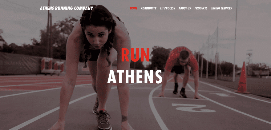
This website was submitted by Andrew Nolan. This is the website of a local running store with the purpose of developing the local running community. The Community page displays local events with sharing buttons and a section with social media cards for Facebook, Twitter, and Instagram feeds. A page called Fit Process steps you through a running track graphic and shows video through the steps in the process. The Products page (with an image of a Nick Roach doppelganger) shows logos of brands. The pages include lots of CTA’s with the purpose of helping you in person. This site makes great use of images and red highlights.
9. Genesis Cosmetics
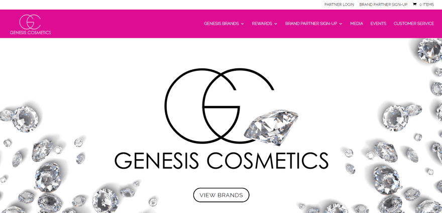
This website was submitted by Alexis Frazier. The site uses vivid magenta pink for its color branding within the header, quote bars, title text, and icons. The color branding is also used within items in the photos such as a background image of a ribbon in parallax, within a chart, or even as a magazine cover. The Contact page displays the contact information using large text and a styled image of a phone to match the branding. The Events page is powered by EventOn and shows events by month. Clicking on any event opens its details complete with image and information. Even the titles of the events use the same color branding as the rest of the site. I also like the photography.
10. Valley of Luxe
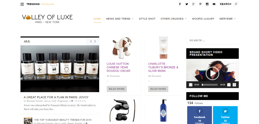
This website was submitted by Maryeme Tricoire. Here’s another website powered by Extra. It creates a unique magazine layout using Extra’s specialized blog modules including tabbed posts, slider, and more. It has an integrated MediaElement audio player within the homepage layout. This one uses the mega-menu to show recent and featured posts. Blog posts use interesting layouts with multi-column text, quotes, parallax, numbered elements, integrated recipe cards, number counters, and more. I like the use of multi-column layouts in the blog posts and the gold highlights.
In Closing
That’s our 10 best community Divi (and Extra) website submissions for January. These sites look amazing and as always we want to thank everyone for your submissions!
If you’d like your own design considered please feel free to email our editor at nathan at elegant themes dot com. Be sure to make the subject of the email “DIVI SITE SUBMISSION”.
We’d also like to hear from you in the comments! Tell us what you like about these websites and if there is anything they’ve done you want us to teach on the blog.
Featured image via Ysami / shutterstock.com


I am always interested in how the mobile version of a Divi website is created, especially 320Maverick.com
Webmaster, I think many are craving some tutorials from your design. 🙂
Thanks!
Thank you for the feature (Andrew Uncharted)! Congrats to the other features as well, it’s always awesome seeing everyone else’s creativity at work.
Thanks so much for the feature! Glad we impressed ya’ll! Love the other features this month too!
320 Maveric is very Cool!
How was this effect on start page made?
Need tutorial!
Always enjoy seeing what people are doing creatively with Divi. Also found the culprit that was preventing Visual Builder from loading properly on one of my sites. So I feel good!
That Maverick side menu should be an option in Divi. I want that on my site so much!
Valley of Luxe is my favorite out of this group! Yay, Extra Theme!!
Yay! Thanks Tanisia! You made my day 🙂
Andrew uncharted was my fave! I love the green!
Thanks so much!
Great submissions! Love the work on 320maverick.com!
320 Maverick – perfect! But, how??
Looks great up top with the vertical menu and top images. Looses a bit down below with the stock images.
These site all look fantastic. Thank you all for sharing your creativity and ideas for websites!
Love those great photography for 320 Maverick