
We’ve been getting a lot of new Divi design site submissions recently and it’s looking possible that we could do a post like this one rounding up our favorites every month. So here is the first monthly installment of our (now) ongoing Divi Design Showcase series showcasing the design work of our community here on the Elegant Themes blog.
The Best Community Divi Site Submissions for June 2017
There is a lot to like about these websites and there are a lot of great design ideas here to spark your imagination. Rather than going through all of the details I’m pointing out the things that I find the most interesting or unique.
1. MinLoveCat
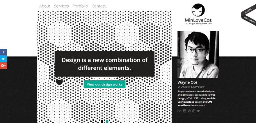
This website was submitted by Wayne Ooi. I like the image in the right sidebar with the logo overlapping the header. The header is simple but it isn’t an out-of-the-box header. It makes interesting use of black and white and contrast, and with backgrounds that have just enough texture to make them unique.
2. Christopher Munoz
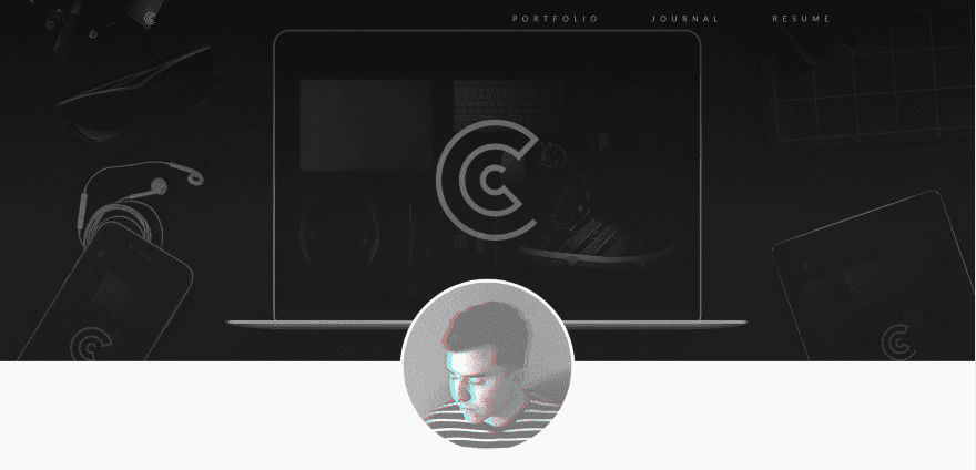
This website was submitted by Christopher Munoz. It has a one-page design that uses one, two, and three columns together to create a clean and colorful layout. The sections use large elements with lots of white-space. The menu is both simple and elegant without taking up much space.
3. 5 Style
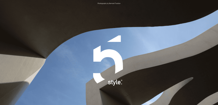
This website was submitted by Alberto Negro. The logo, a stylized 5 with cutaways, over the curved architecture of the background image is attention-getting as soon as the site loads. Articles are presented in a multi-column grid with a hover effect that reveals the article’s title. “Style” is the best word to describe this website.
4. Wellthie
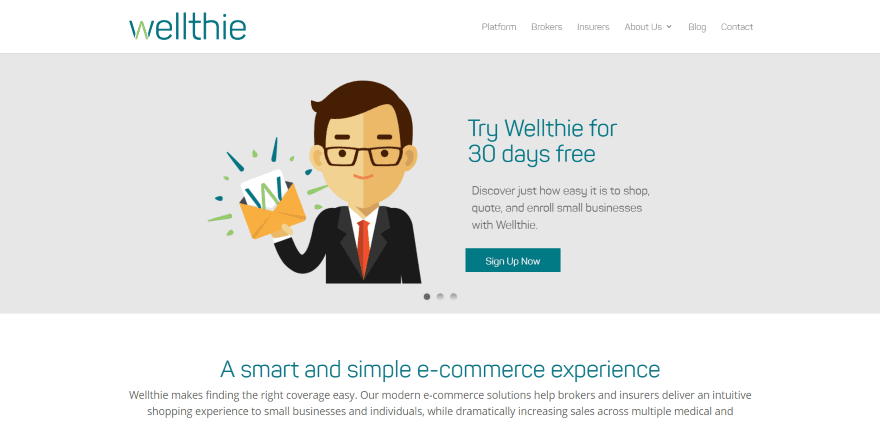
This website was submitted by Shanthony Exum. This is a clean site that uses an interesting typeface, both with shape-design and color, and cartoon drawings in its branding. Even the large icons follow the color branding and help set the mood of the site.
5. Nazareth Orphanage
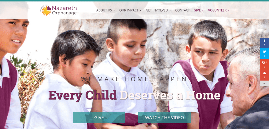
This website was submitted by Nicolle Principe. It uses branded colors throughout the site including backgrounds, overlays, borders, fonts, and icons. It has lots of elegant touches that include transparent section separations, overlapping icons, hover effects, and textured backgrounds – all adding to the already interesting layout.
6. SJ&Co Creative
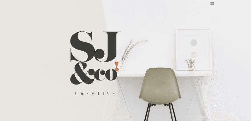
This website was submitted by Stacie Jones. The font-pairing in this site is phenomenal. The headers alone draw attention and make me want to read the information. The white and tan backgrounds and the gray menu and buttons help set the mood. The use of white space, especially in the two-column sections, help draw attention to the services provided.
7. Cura Brazil
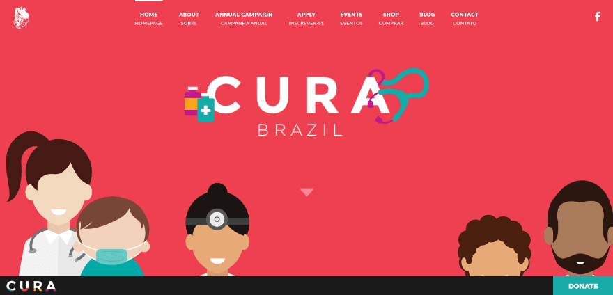
This website was submitted by Taylor Dunham. It uses some seriously pretty colors and nicely drawn flat design artwork. I like the curved section separations with a video peeking through, and the cartoonish parallax is one of the best uses of true parallax that I’ve seen. It’s hard to make colors like this work, but this site does it beautifully while making it look artistic and serious at the same time.
8. ehubHealth
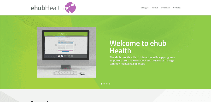
This website was submitted by Mickey Carney. The site uses lots of interesting backgrounds. Most use two, three, or four colors with overlapping designs to add texture and make the foreground elements stand out. It uses branded colors for highlights and icons.
9. Kipo
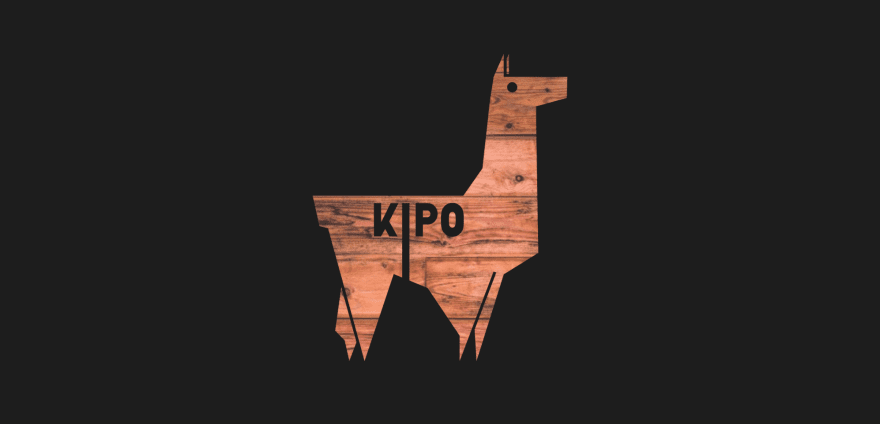
This website was submitted by Federico Fornaciari. It uses a cool cutout for the logo with the background showing through in parallax. I like the green artwork that appears over the image of the team members. The green is carried through the rest of the layout in fonts, backgrounds, and icons. I like the way the full width menu appears as a regular menu after scrolling.
10. Livuz
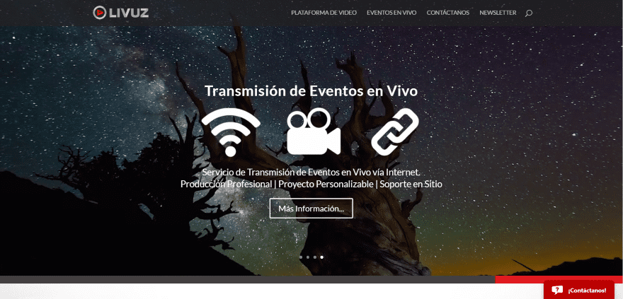
This website was submitted by Sandra Moreno. It uses a background video that plays behind the slider. I love rich and dark colors and this site provides that with its use of red and dark gray highlights. The site also makes great use of images in full screen and parallax. The graphics really make this site stand out.
In Closing
Well that’s all for this roundup of Divi Design Submissions. We still have a lot more to look over for future posts. If you’d like your own design considered please feel free to email it to our editor at nathan at elegant themes dot com. Be sure to make the subject of the email “DIVI SITE SUBMISSION”.
We’d also like to hear from you in the comments! Tell us what you like about these websites and if there is anything they’ve done you want us to teach on the blog.
Featured image via Makkuro GL / shutterstock.com


Where can I post my marvels 😀 I have two amazing online stores with nothing other than Divi.
Nice & different designs! Good work. How I can feature my design also?..
Thanks for reply.
good blog thank you. Designs are looking awesome. i can feel their freshness.
Looking at all these website, make me feel that I will be able to achieve all this because we are all using the same all mighty Divi.
So inspirational, thank you!
Competent work throughout but Taylor Dunham’s work on CURA and especially on her own site simply sings of style, understanding, design, and good writing. Plus, Taylor apparently knows that centered type is not very legible. Hooray!
A good point for all!
I always look forward to these type of posts!
It keeps my ideas flowing for that next project.
I want more! There’s no limit to what you can do with Divi.
Wow! 1 and 3 are very professional! Compliments.
…but Kipo have the perfect balance Perfect balance between technique and web communication
very inspiring .. i hope much more website examples could be published…
+1 on http://curabrazil.org Nicely done! =)
Thanks for posting these creative sites. Nothing is better than examples like this, to stimulate my thinking and stretch my limits.