
The way you design your product page has an immediate impact on your visitors’ behavior. A well-designed and customized product page design can make it easier for visitors to decide if they want to purchase your product. If you’re looking for a way to make your product page more appealing, you’ll love this post. We’ll show you how to include a dynamic product benefit grid in your design using Divi and the Advanced Custom Fields plugin. We’ll start by creating a field group for the benefits. We will, then, fill out the custom fields on our product page and include the dynamic content in our product page template. You’ll be able to download the product page template for free as well!
Let’s get to it.
- 1 Preview
- 2 Download The Product Page Template for FREE
- 3 Download For Free
- 4 1. Install The ACF Plugin & Add Product Benefit Field Group
- 5 2. Add Product Benefits to Products
-
6
3. Build Product Page Template Inside Divi Theme Builder
- 6.1 Go to Divi Theme Builder & Add New Template
- 6.2 Use Template on All Products
- 6.3 Enter Template’s Body Template Editor
- 6.4 Modify Section #1
- 6.5 Add New Row
- 6.6 Add Woo Cart Notice Module to Column
- 6.7 Add Section #2
- 6.8 Add New Row
- 6.9 Add Woo Images Module to Column 1
- 6.10 Add Woo Title Module to Column 2
- 6.11 Add Woo Description Module to Column 2
- 6.12 Add Blurb Module to Column 2
- 6.13 Clone Blurb Module Three Times
- 6.14 Add Woo Add to Cart Module to Column 2
- 7 3. Save Theme Builder Changes & Preview Outcome
- 8 Preview
- 9 Final Thoughts
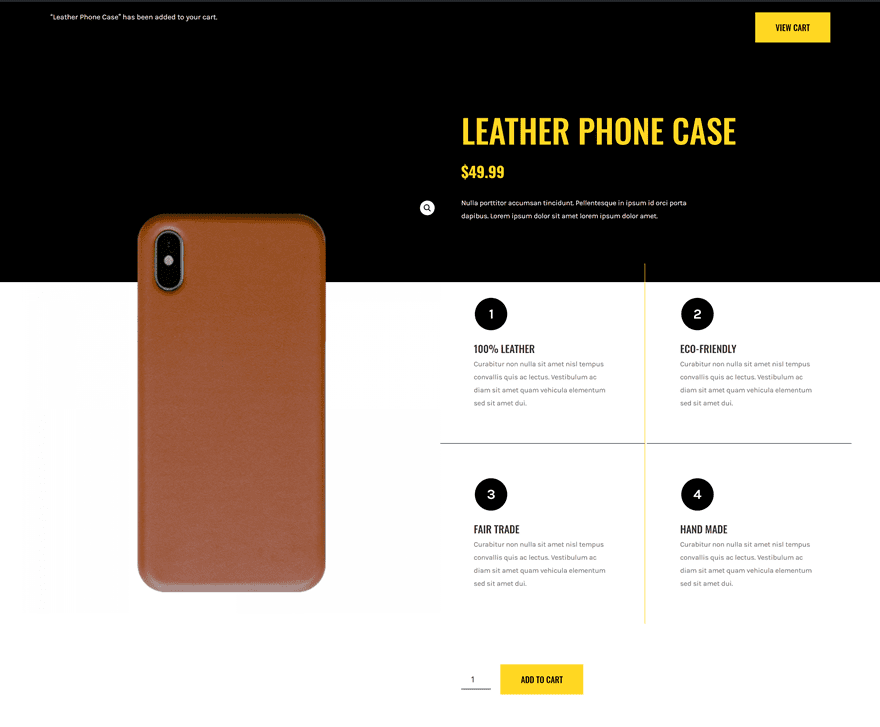
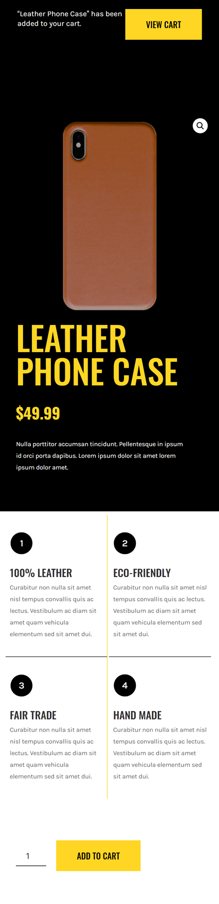
Preview
Before we dive into the tutorial, let’s take a quick look at the outcome across different screen sizes.
Desktop
Mobile
Download The Product Page Template for FREE
To lay your hands on the free product page template, you will first need to download it using the button below. To gain access to the download you will need to subscribe to our newsletter by using the form below. As a new subscriber, you will receive even more Divi goodness and a free Divi Layout pack every Monday! If you’re already on the list, simply enter your email address below and click download. You will not be “resubscribed” or receive extra emails.

1. Install The ACF Plugin & Add Product Benefit Field Group
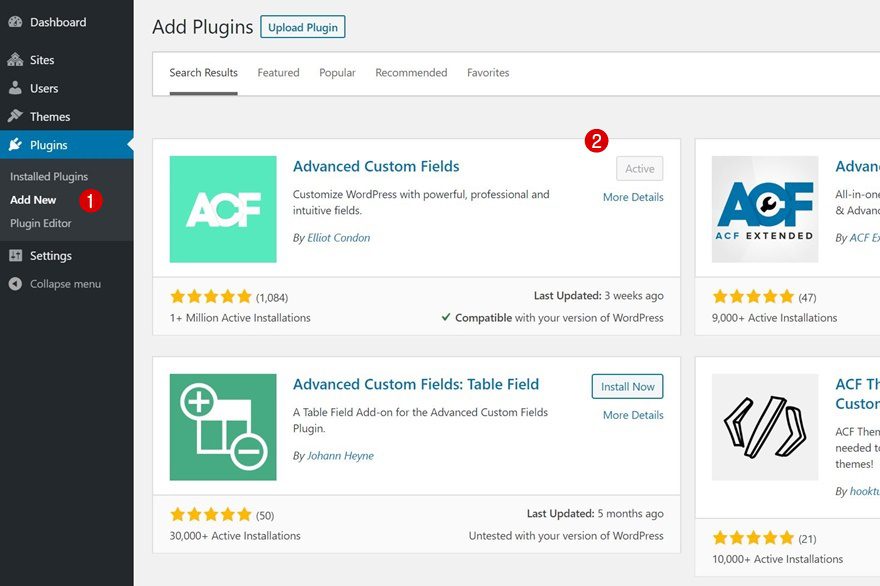
Install Advanced Custom Fields Plugin
To display the different product benefits within the backend of our products, we’ll use the free Advanced Custom Fields plugin. Go to your WordPress backend > Plugins > Add New > Search for the ACF plugin > Install > Activate.
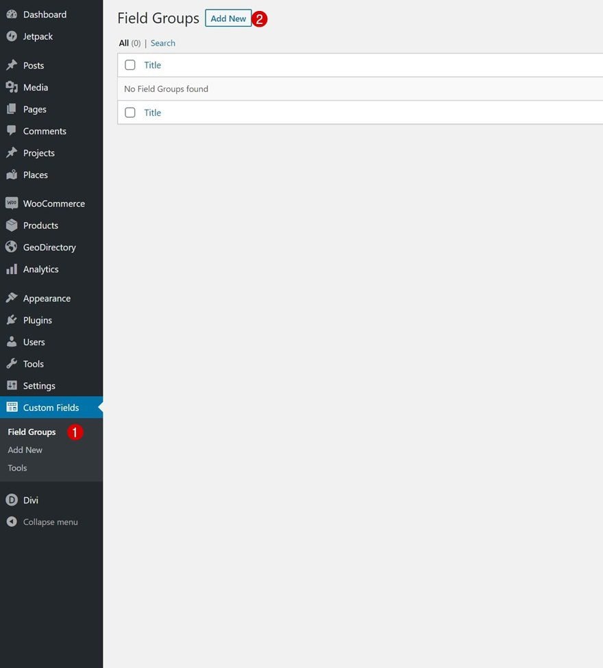
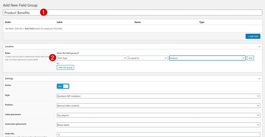
Go to Custom Fields & Add New Field Group
Once you’ve installed and activated the ACF plugin, you’ll be able to navigate to your Custom Fields and add a new field group.
Field Group Settings
Give your new field group a title and allow it to show up on product pages only.
- ‘Post Type’ is equal to ‘Product’
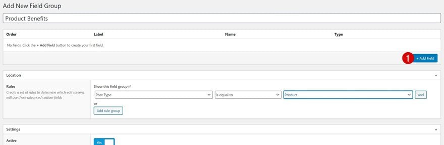
Add First Field
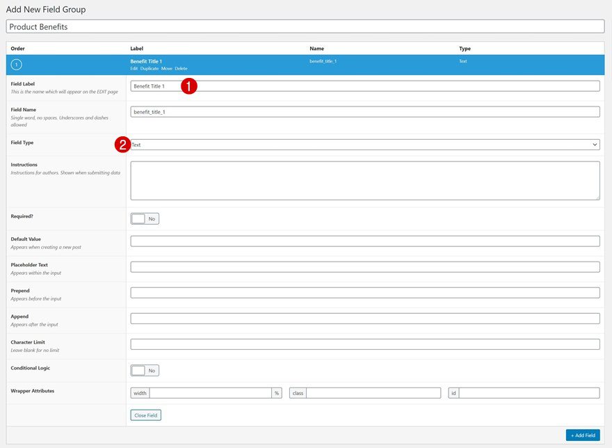
Continue by adding a new field for your first product benefit’s title.
- Field Label: Benefit Title 1
- Field Type: Text
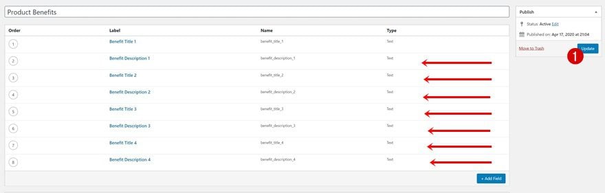
Repeat Step for Remaining Fields
Do the same thing for the remaining product benefits and their descriptions. All of these fields need the ‘Text’ field type assigned to them.
- Benefit Title 1
- Benefit Description 1
- Benefit Title 2
- Benefit Description 2
- Benefit Title 3
- Benefit Description 3
- Benefit Title 4
- Benefit Description 4
2. Add Product Benefits to Products
Open or Add New Product
Once your field group and fields have been created, you can add the product benefits to your products on an individual level. Open a product of your choice or create a new one.
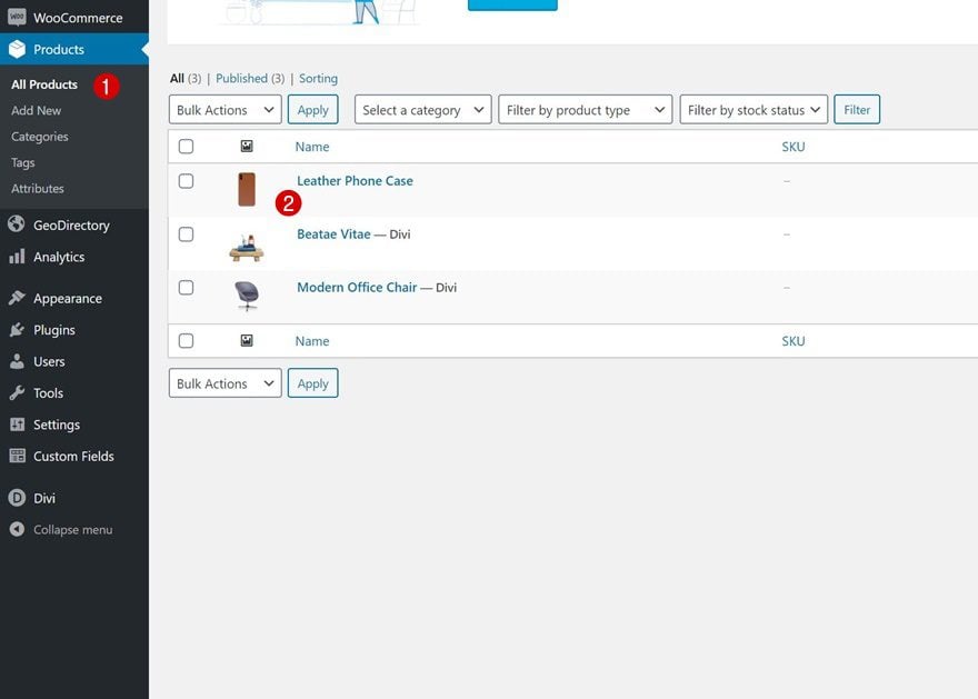
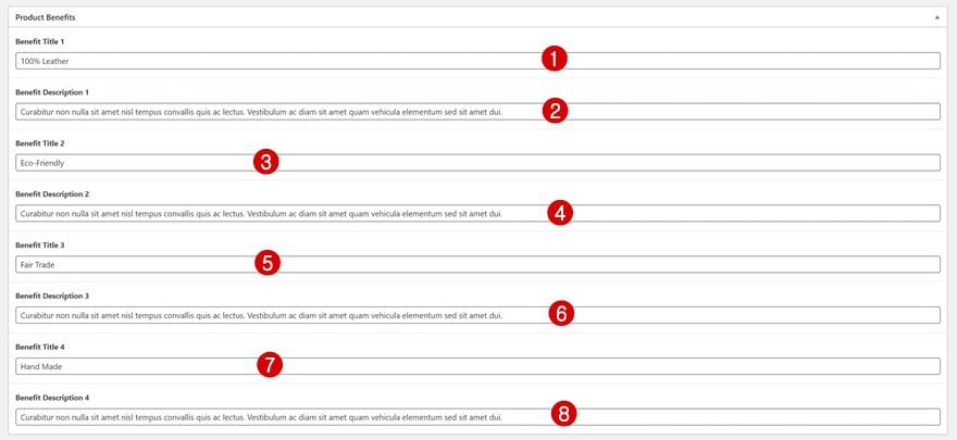
Fill in Product Benefits Fields
And fill out the product benefits.
3. Build Product Page Template Inside Divi Theme Builder
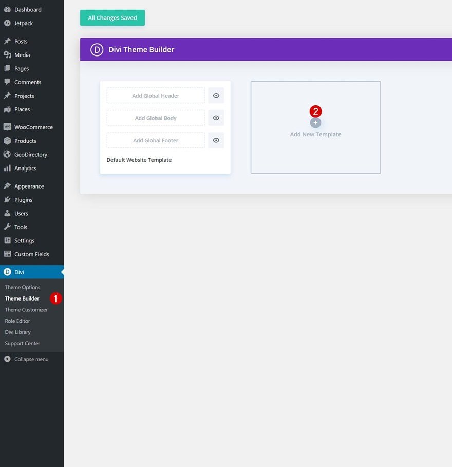
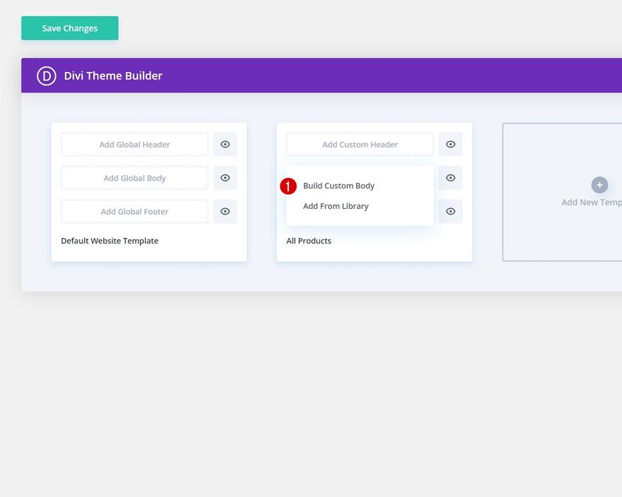
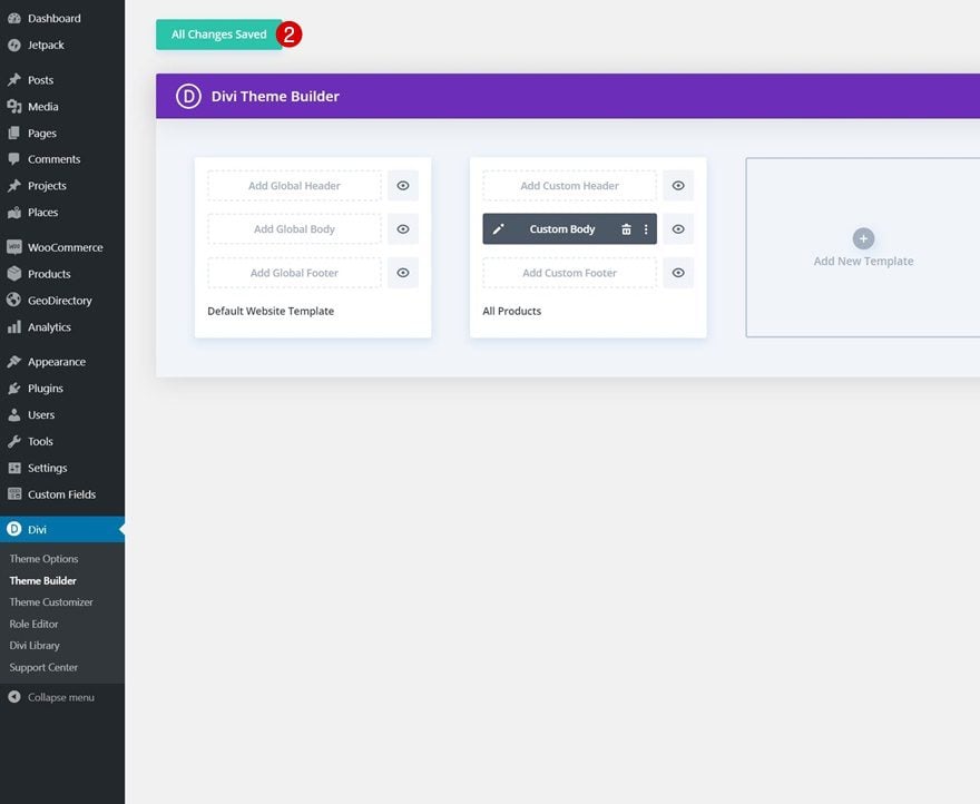
Go to Divi Theme Builder & Add New Template
Time to get started with Divi! To create a new template, navigate to the Divi Theme Builder and click on ‘Add New Template’.
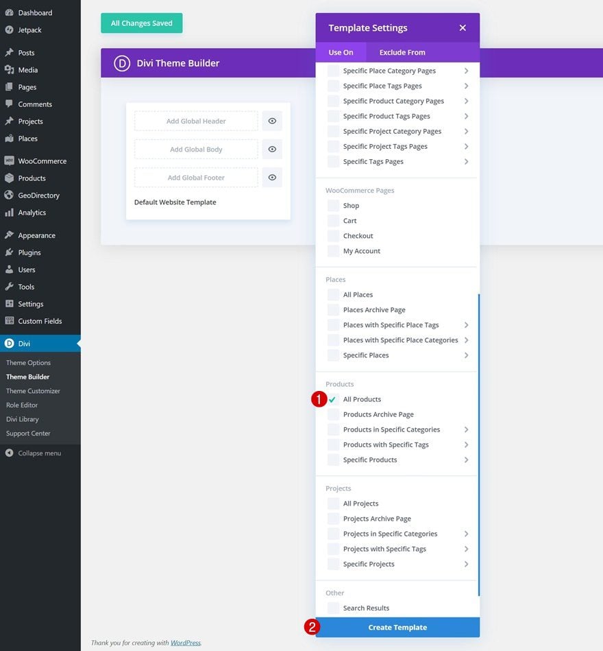
Use Template on All Products
We’re using this template on all products but feel free to select products with a specific category or tag instead.
Enter Template’s Body Template Editor
Then, enter the template’s body by clicking on ‘Add Custom Body’ and selecting ‘Build Custom Body’.
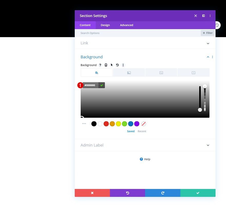
Modify Section #1
Background Color
Once inside the template editor, you’ll notice a section. Open that section and change the background color to black.
- Background Color: #000000
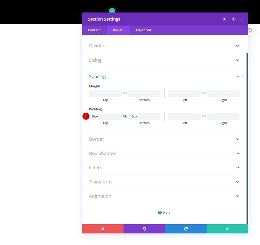
Spacing
Move on to the section’s design tab and add some custom top and bottom padding.
- Top Padding: 10px
- Bottom Padding: 10px
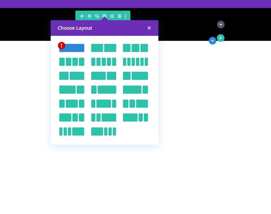
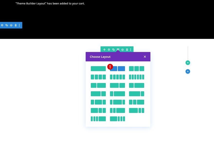
Add New Row
Column Structure
Continue by adding a new row to the section using the following column structure:
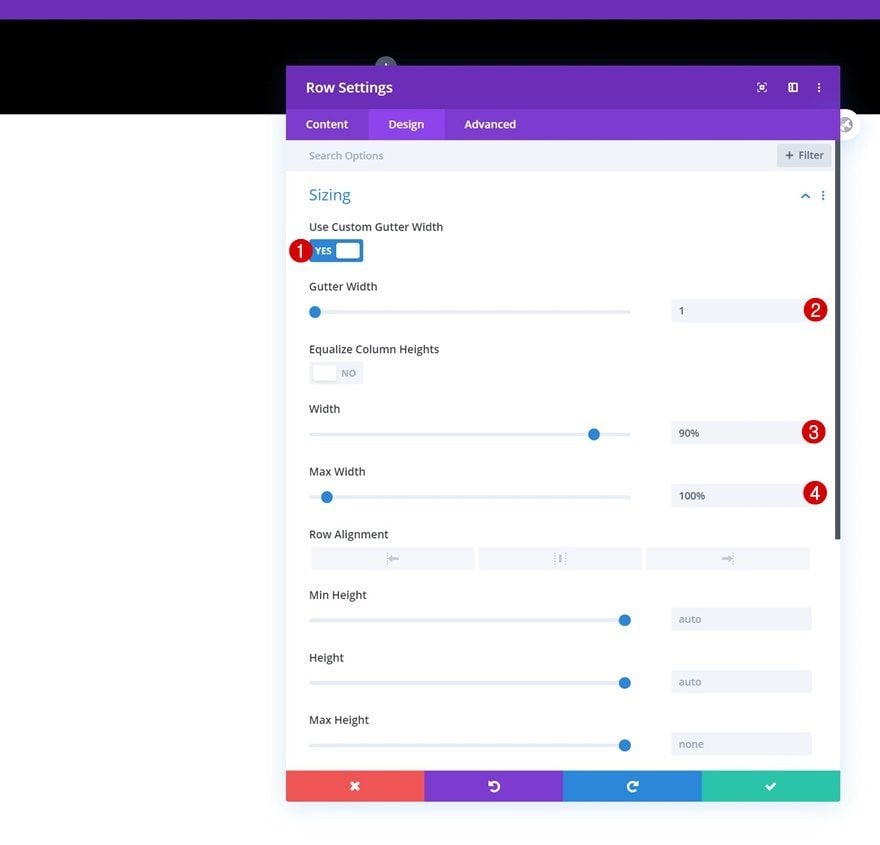
Sizing
Without adding modules yet, open the row settings and make some changes to the sizing settings.
- Use Custom Gutter Width: Yes
- Gutter Width: 1
- Width: 90%
- Max Width: 100%
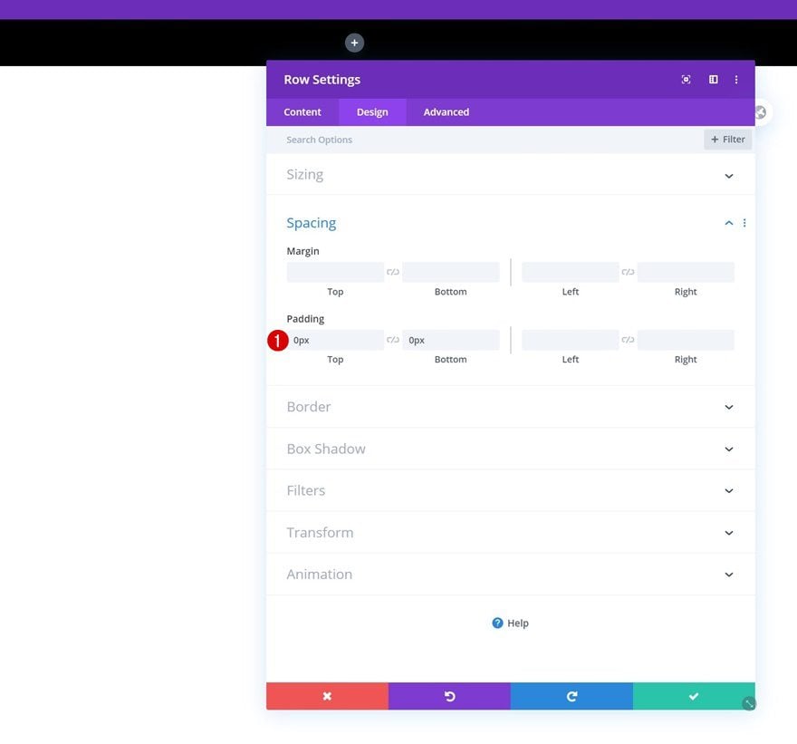
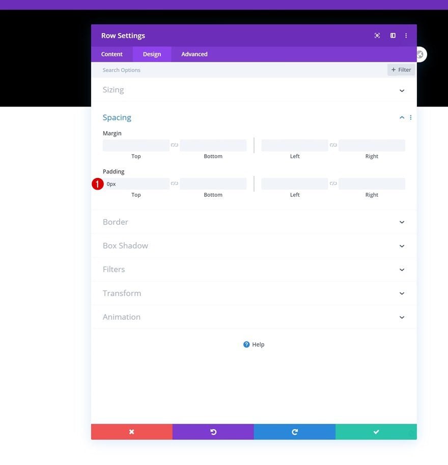
Spacing
Remove all default top and bottom padding next.
- Top Padding: 0px
- Bottom Padding: 0px
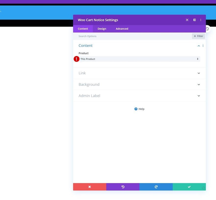
Add Woo Cart Notice Module to Column
Dynamic Content
The only module we need in this row and section is a Woo Cart Notice Module. Make sure ‘This Product’ is selected in the dynamic content area.
- Product: This Product
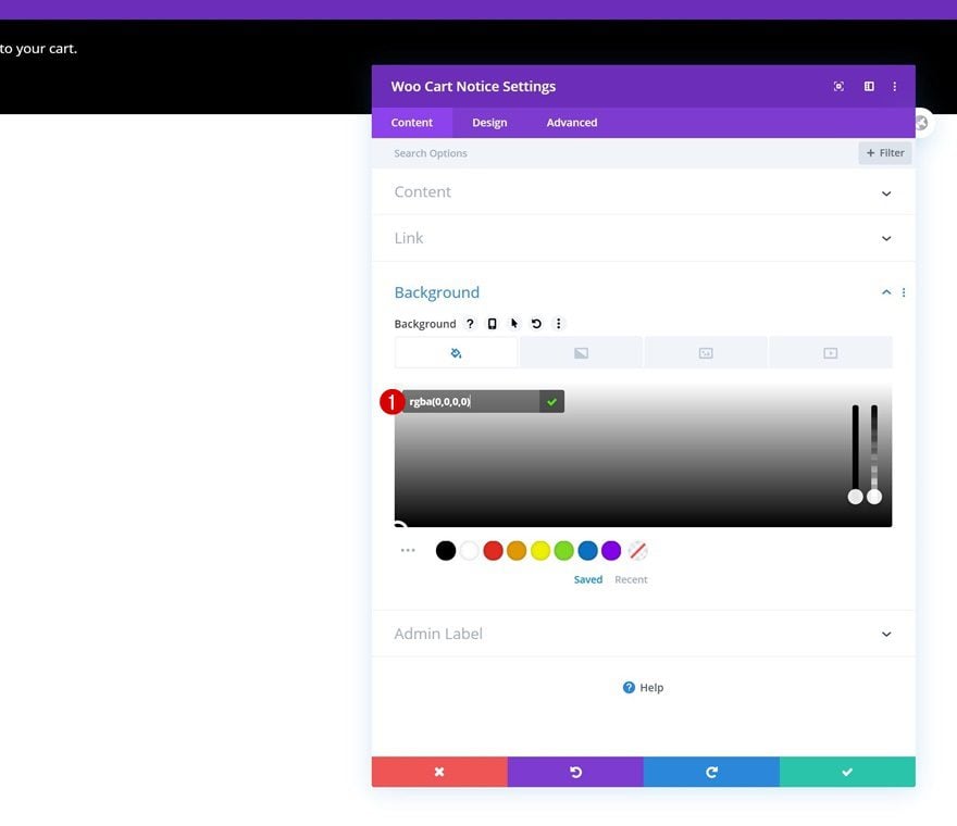
Background Color
Then, open the module’s settings and use a completely transparent background color.
- Background Color: rgba(0,0,0,0)
Text Settings
Move on to the design tab and change the text font in the text settings next.
- Text Font: Karla
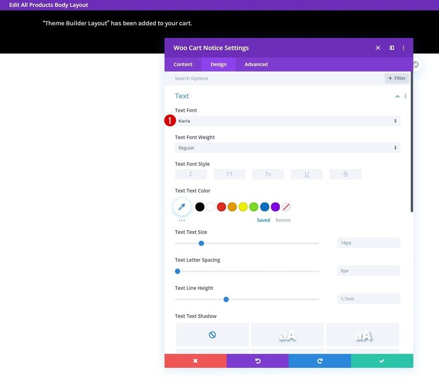
Button Settings
Complete the module settings by styling the button accordingly:
- Use Custom Styles For Button: Yes
- Button Text Size: 20px
- Button Text Color: #000000
- Button Background Color: #ffd623
- Button Border Width: 0px
- Button Border Radius: 0px
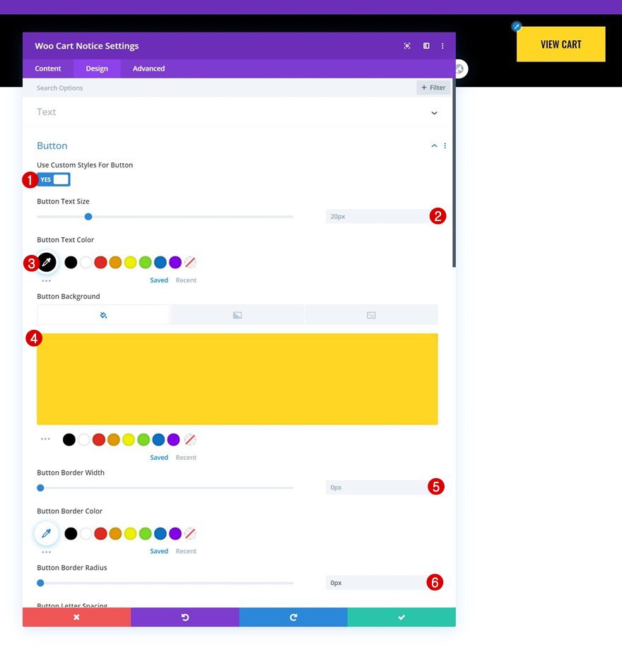
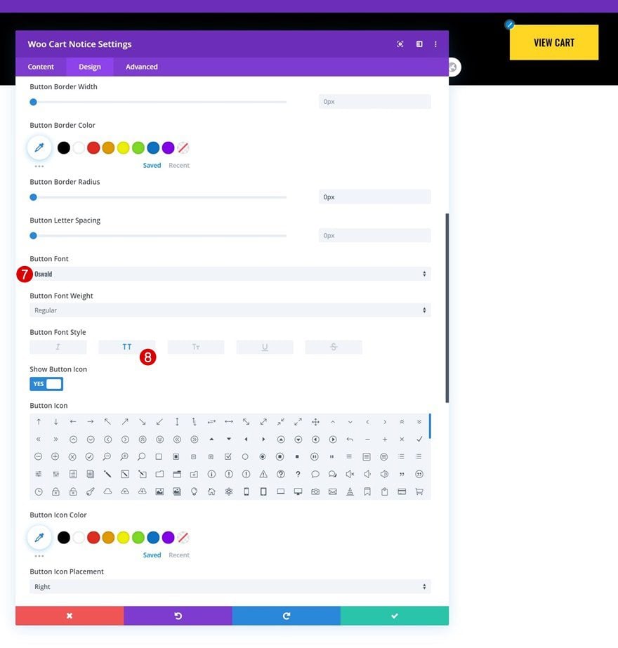
- Button Font: Oswald
- Button Font Style: Uppercase
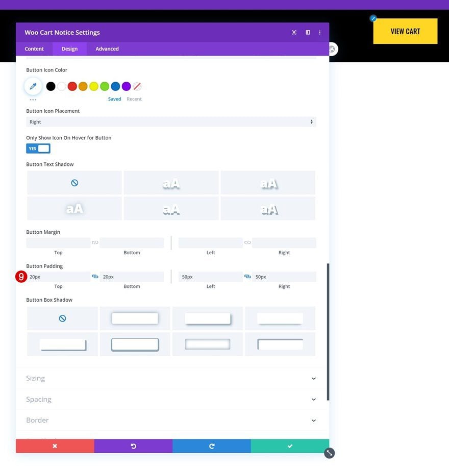
- Top Padding: 20px
- Bottom Padding: 20px
- Left Padding: 50px
- Right Padding: 50px
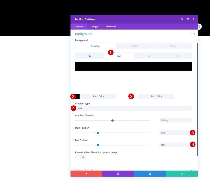
Add Section #2
Gradient Background
Add another regular section right below the previous one, open the section settings and use a responsive gradient background.
- Color 1: #000000
- Color 2: #ffffff
- Start Position:
- Desktop: 30%
- Tablet: 57%
- Phone: 54%
- End Position:
- Desktop: 30%
- Tablet: 57%
- Phone: 54%
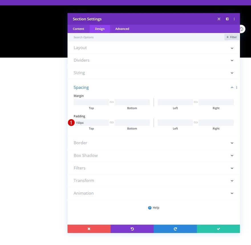
Spacing
Move on to the section’s design tab and add some top padding.
- Top Padding: 150px
Add New Row
Column Structure
Continue by adding a new row using the following column structure:
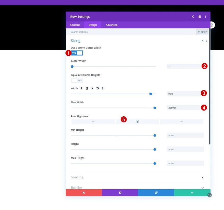
Sizing
Without adding any modules yet, open the row settings and modify the sizing settings as follows:
- Use Custom Gutter Width: Yes
- Gutter Width: 1
- Width: 95%
- Max Width: 2560px
- Row Alignment: Center
Spacing
We’re removing the row’s default top padding too.
- Top Padding: 0px
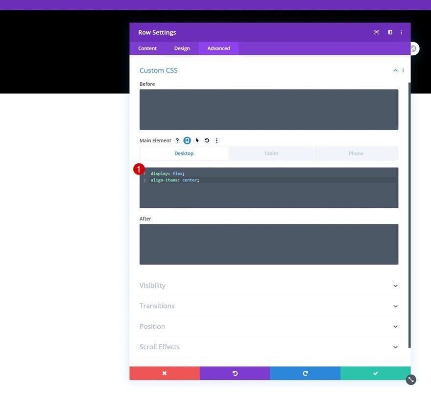
Main Element
And to center the column content on desktop, we’ll use two lines of CSS code in the row’s main element.
Desktop:
display: flex;
align-items: center;
Tablet & Phone:
display: block;
Add Woo Images Module to Column 1
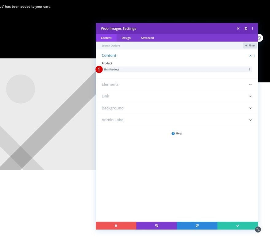
Dynamic Content
Time to add modules, starting with a Woo Images Module in column 1. Make sure ‘This Product’ is selected in the dynamic content area.
- Product: This Product
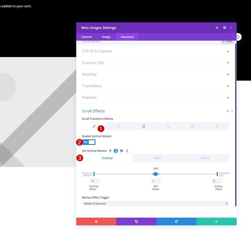
Vertical Motion Scroll Effect
We’re adding some subtle motion to the image using the horizontal motion scroll effect in the advanced tab.
- Enable Vertical Motion: Yes
- Starting Offset:
- Desktop: -4
- Tablet & Phone: 0
- Mid Offset: 0
- Ending Offset: 0
- Motion Effect Trigger: Middle of Element
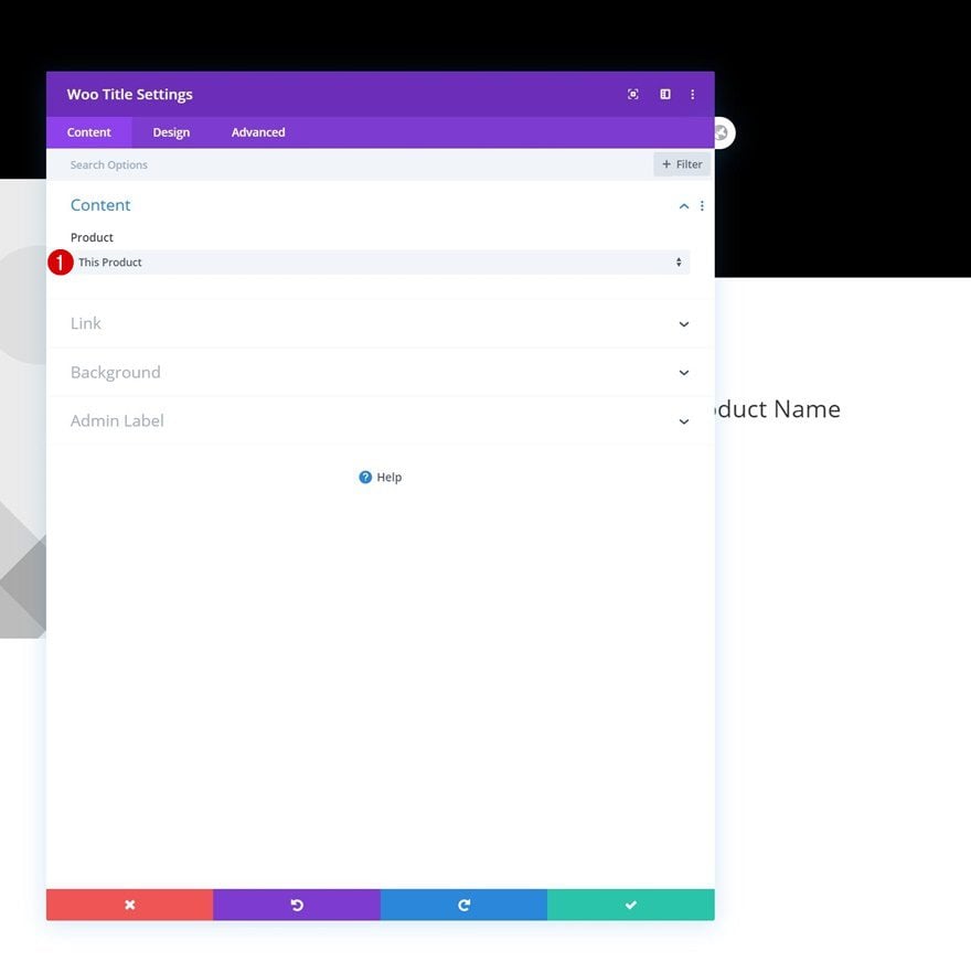
Add Woo Title Module to Column 2
Dynamic Content
In column 2, the first module we need is a Woo Title Module. Make sure ‘This Product’ is selected in the dynamic content area.
- Product: This Product
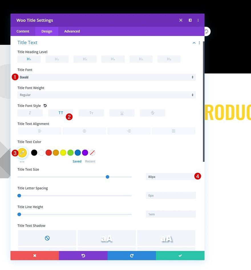
Title Text Settings
Then, go to the design tab and style the title text as follows:
- Title Font: Oswald
- Title Font Style: Uppercase
- Title Text Color: #ffd623
- Title Text Size: 80px
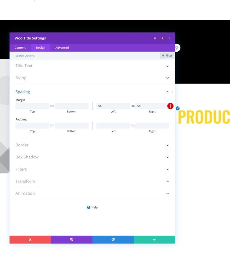
Spacing
Complete the Woo Title Module by adding some left and right margin.
- Left Margin: 5%
- Right Margin: 5%
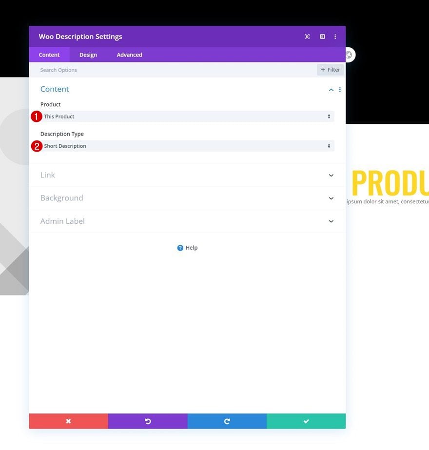
Add Woo Description Module to Column 2
Dynamic Content
On to the next module, which is a Woo Description Module. We’re using the following dynamic content for it:
- Product: This Product
- Description Type: Short Description
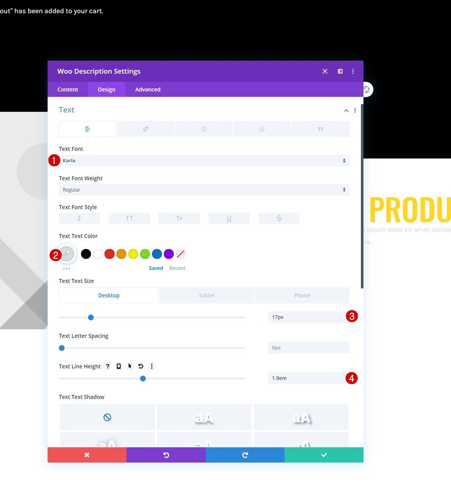
Text Settings
Move on to the module’s design tab and change the text settings accordingly:
- Text Font: Karla
- Text Color: #dbdbdb
- Text Size: 17px (Desktop & Tablet), 15px (Phone)
- Text Line Height: 1.9em
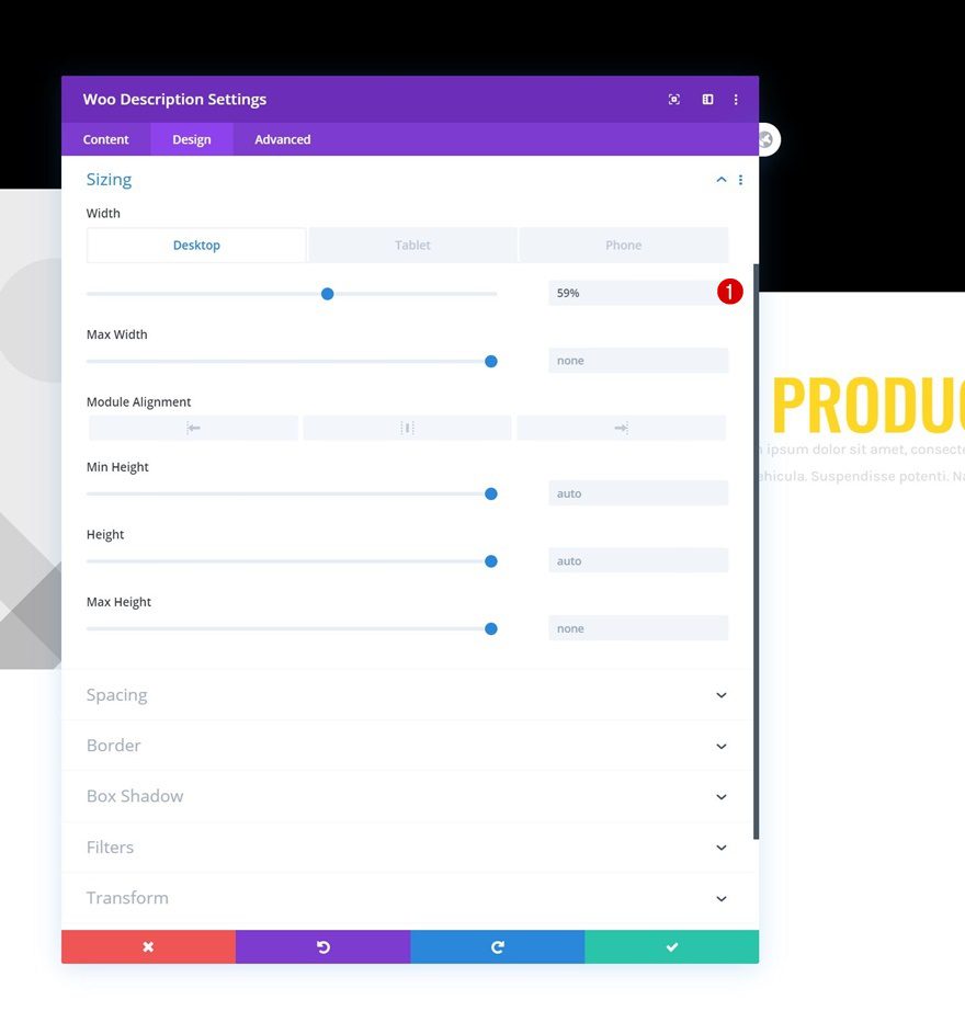
Sizing
Then, modify the width across different screen sizes.
- Width: 59% (Desktop), 82% (Tablet & Phone)
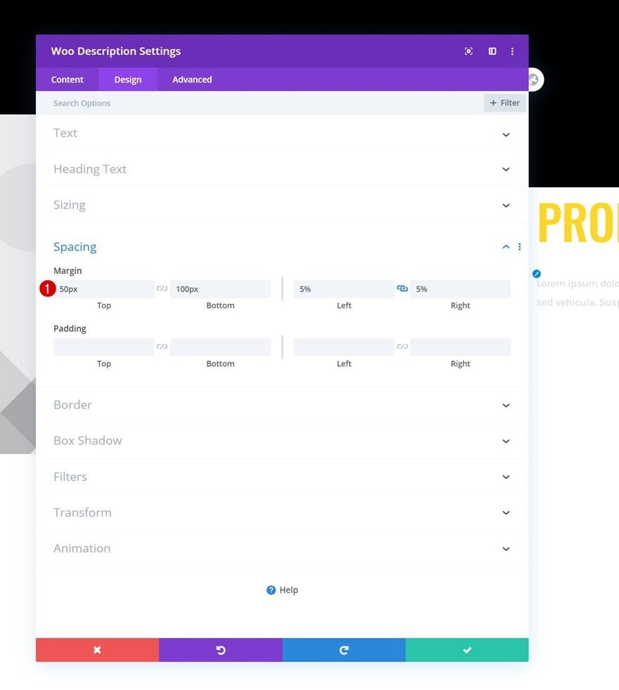
Spacing
Complete the Woo Description Module by adding some custom margin values in the spacing settings.
- Top Margin: 50px
- Bottom Margin: 100px
- Left Margin: 5%
- Right Margin: 5%
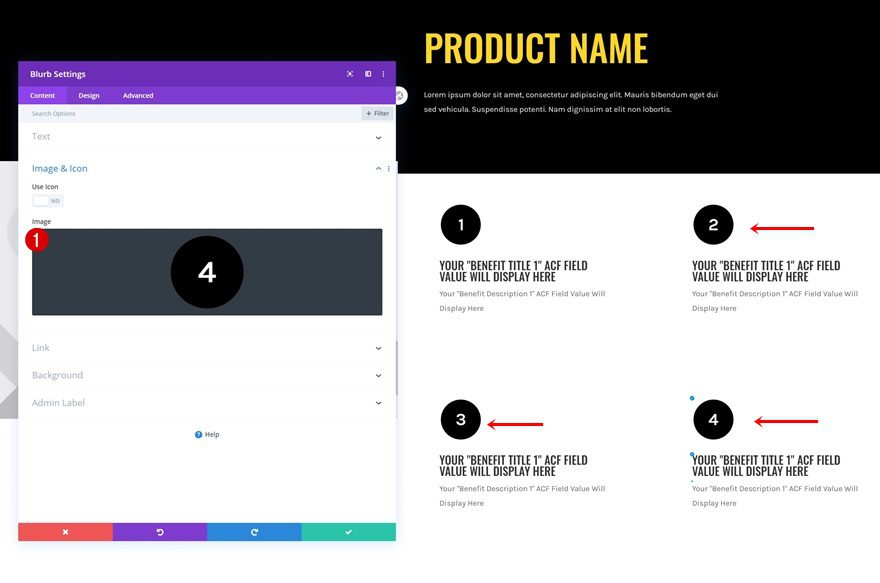
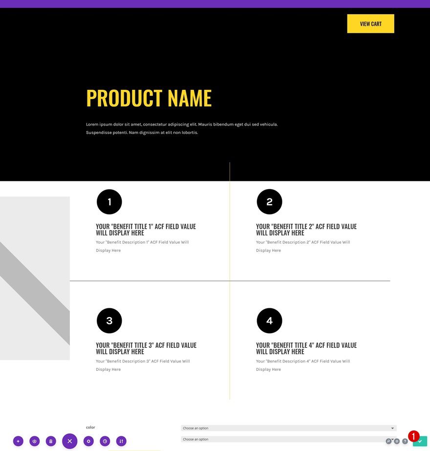
Add Blurb Module to Column 2
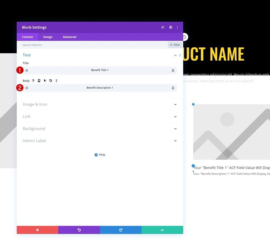
Dynamic Content
To display the product benefits we’ve added in the first part of this tutorial, we’ll use Blurb Modules. Add a first Blurb Module and use the first product benefit’s dynamic content for the title and body.
- Title: Benefit Title 1
- Body: Benefit Description 1
Upload Image
Upload an image or use an icon of your choice next. You can find the ones we’ve used throughout this tutorial in the download folder you were able to download at the beginning of this tutorial.
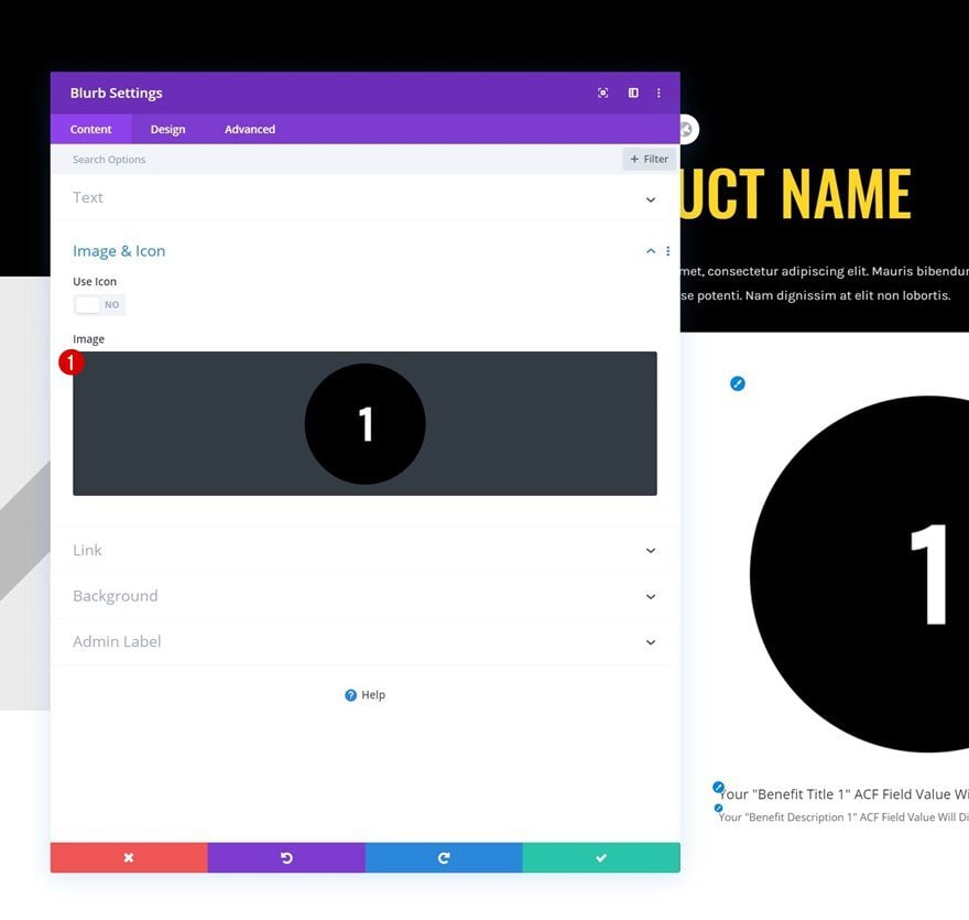
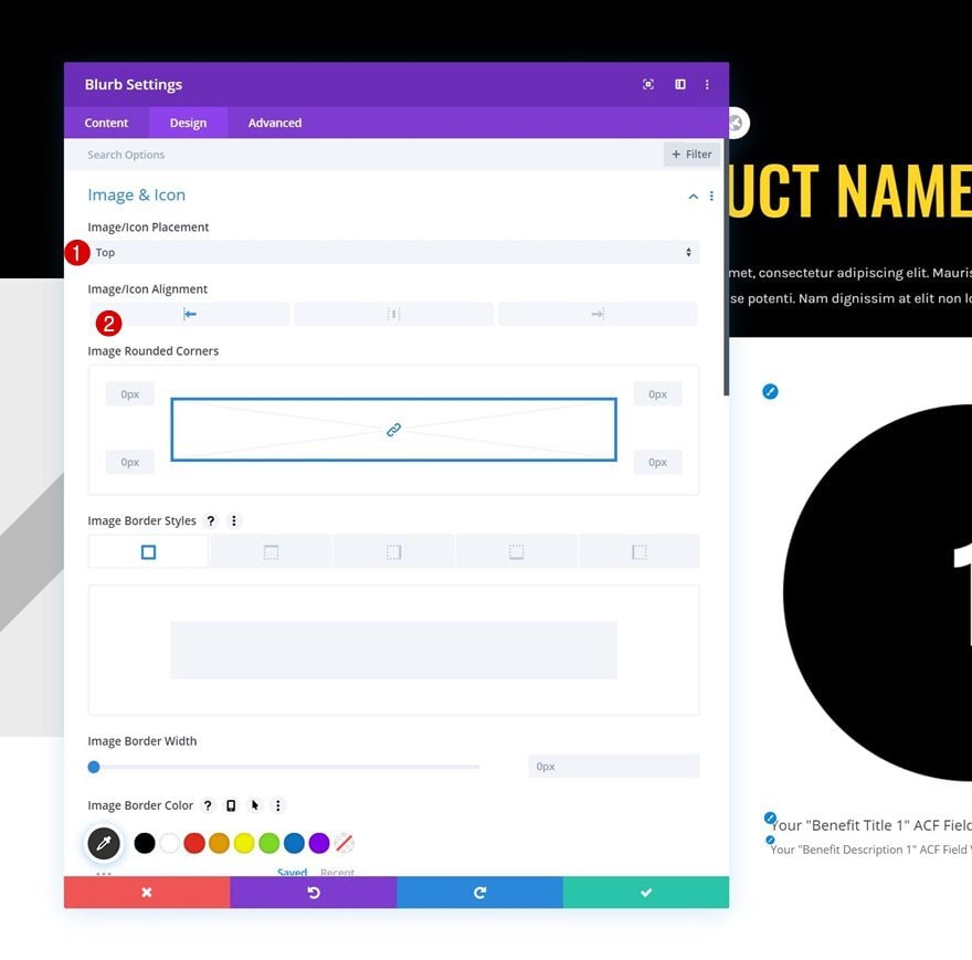
Image/Icon Settings
Move on to the module’s design tab and change the image/icon settings as follows:
- Image/Icon Placement: Top
- Image/Icon Alignment: Left
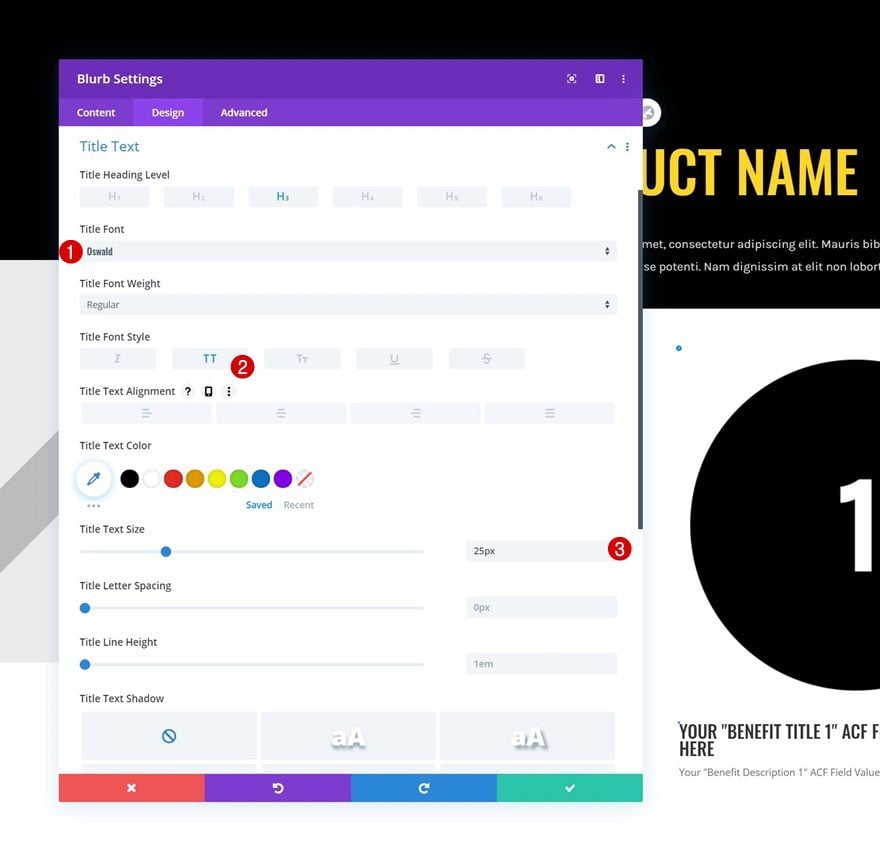
Title Text Settings
We’re modifying the title text settings next.
- Title Font: Oswald
- Title Font Style: Uppercase
- Title Text Size: 25px
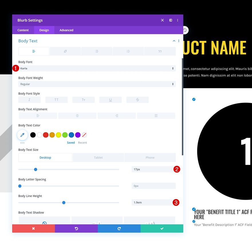
Body Text Settings
Along with the body text settings.
- Body Font: Karla
- Body Text Size: 17px (Desktop & Tablet), 15px (Phone)
- Body Line Height: 1.9em
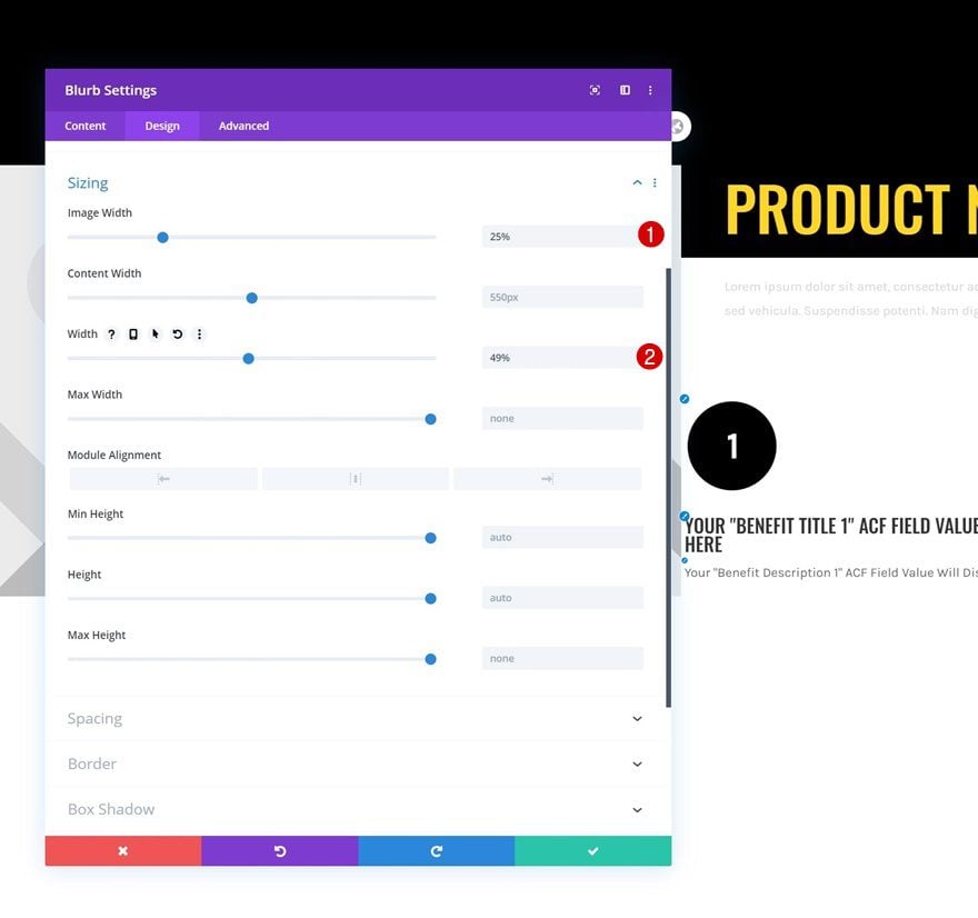
Sizing
Then, go to the sizing settings and modify the widths. It’s important to use a main width of less than 50%, this will allow us to show two Blurb Modules next to each other in the upcoming steps.
- Image Width: 25%
- Width: 49%
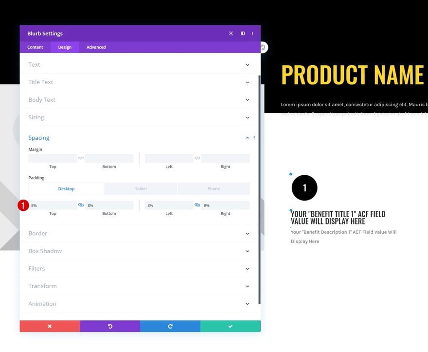
Spacing
We’ll also add some whitespace around the Blurb Module by using custom padding values across different screen sizes.
- Top Padding: 8%
- Bottom Padding: 8%
- Left Padding: 8% (Desktop & Tablet), 2% (Phone)
- Right Padding: 8% (Desktop & Tablet) 2% (Phone)
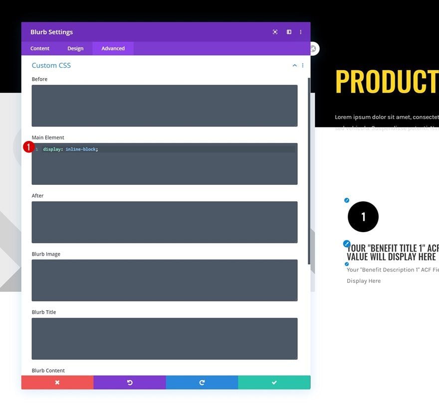
Main Element
Now, to make sure two Blurb Modules show up next to each other, there are two important steps. The first one is making sure the module’s width is less than 50% (as we did in one of the previous steps). The second one is using an inline display property. We’ll add this CSS property to the Blurb Module’s main element in the advanced tab.
display: inline-block;
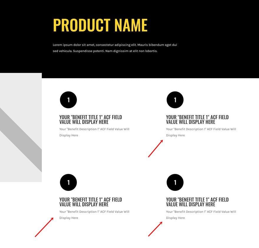
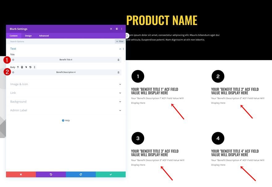
Clone Blurb Module Three Times
Once you’ve completed the first Blurb Module, you can clone it three times. You’ll automatically notice the Blurb Modules appear in a grid.
Modify Blurb Module Images
Change the image in each duplicate Blurb Module. You can find these in the download folder you were able to download at the beginning of this post.
Modify Blurb Module Dynamic Content
Change the dynamic content for each duplicate Blurb Module as well.
- Title: Benefit Title (2,3 or 4)
- Body: Benefit Description (2,3 or 4)
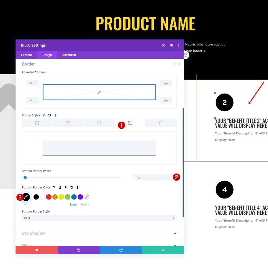
Add Borders to Blurb Modules Individually
Blurb Module 1 Border Settings
Now, to complete our grid design, we’ll add some borders to the Blurb Modules on an individual level. Open the first Blurb Module and use a right border.
- Right Border Width: 1px
- Right Border Color: #ffd623
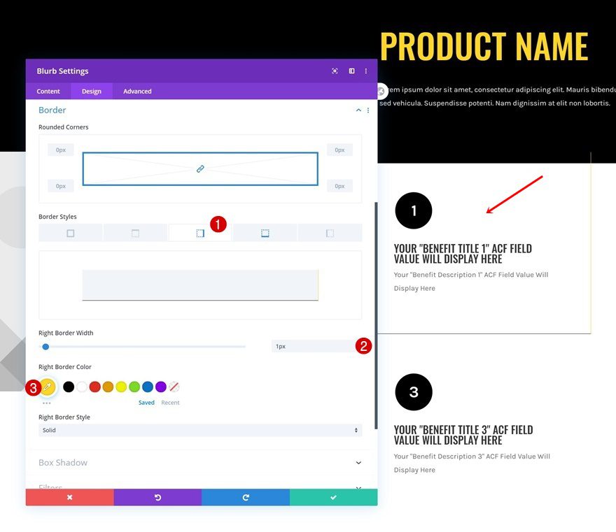
Add a bottom border to the first Blurb Module as well.
- Bottom Border Width: 1px
- Bottom Border Color: #000000
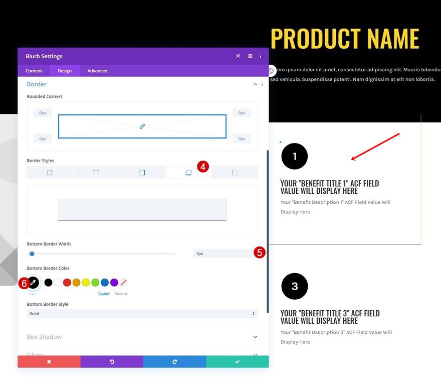
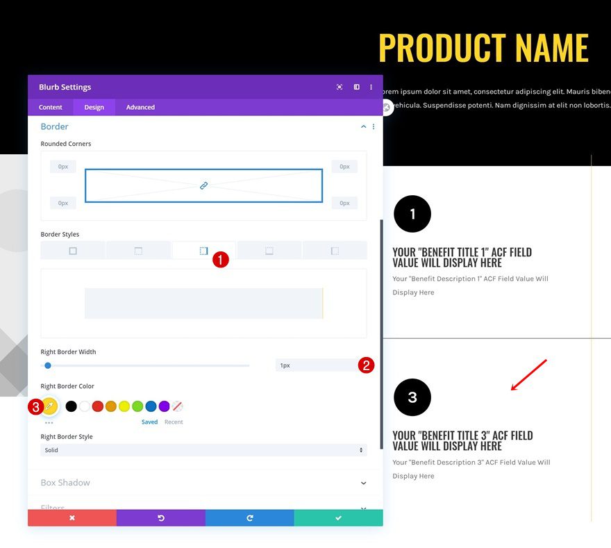
Blurb Module 2 Border Settings
Then, open the second Blurb Module and use a bottom border.
- Bottom Border Width: 1px
- Bottom Border Color: #000000
Blurb Module 3 Border Settings
Complete the grid design by adding a right border to the third Blurb Module.
- Right Border Width: 1px
- Right Border Color: #ffd623
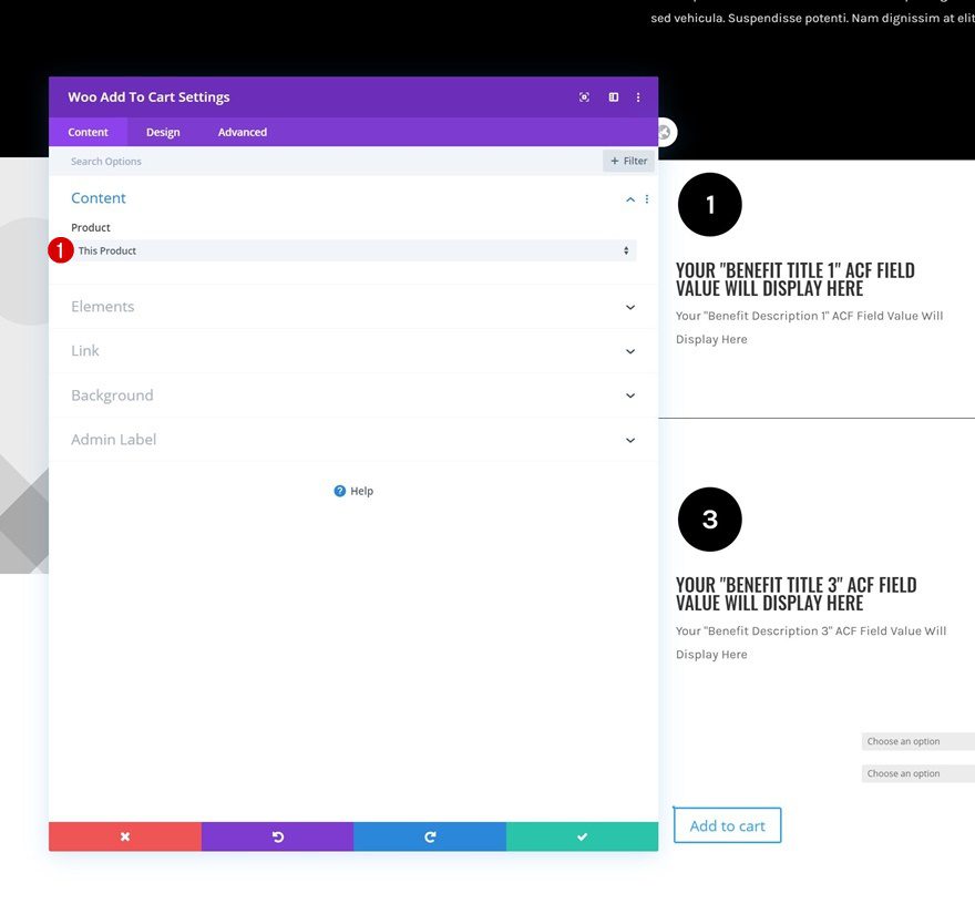
Add Woo Add to Cart Module to Column 2
Dynamic Content
The last module we need in our design is a Woo Add to Cart Module. Make sure ‘This Product’ is selected in the dynamic content area.
- Product: This Product
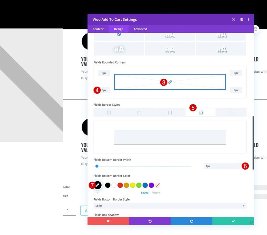
Fields Settings
Move on to the design tab next and change the fields settings.
- Fields Background Color: #ffffff
- Field Text Color: #000000
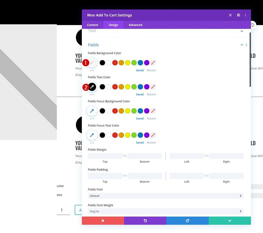
- Fields Rounded Corners: 0px (All Corners)
- Fields Bottom Border Width: 1px
- Fields Bottom Border Color: #000000
Button Settings
Then, style the button accordingly:
- Use Custom Styles For Button: Yes
- Button Text Size: 20px
- Button Text Color: #000000
- Button Background Color: #ffd623
- Button Border Width: 0px
- Button Border Radius: 0px
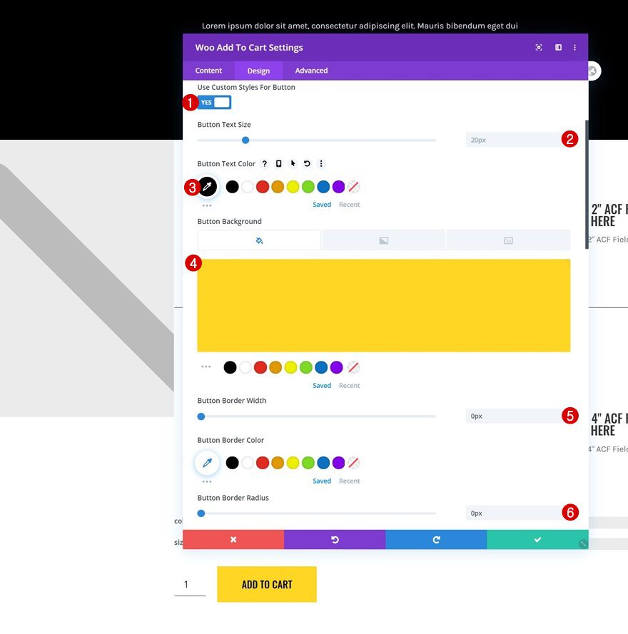
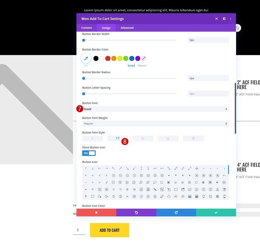
- Button Font: Oswald
- Button Font Style: Uppercase
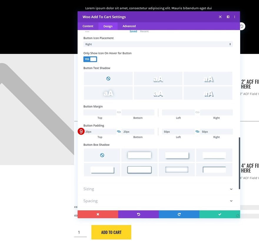
- Top Padding: 20px
- Bottom Padding: 20px
- Left Padding: 50px
- Right Padding: 50px
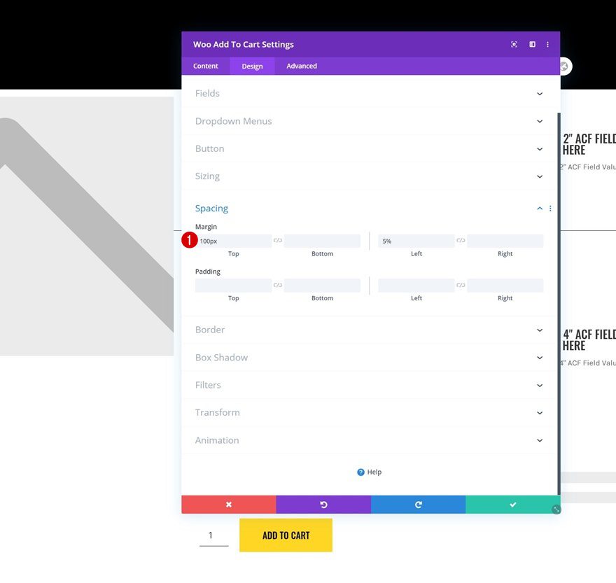
Spacing
And complete the module settings by adding custom margin values.
- Top Margin: 100px
- Left Margin: 5%
3. Save Theme Builder Changes & Preview Outcome
Once you’ve completed the product page template design, you can save all your Theme Builder changes and view the outcome on your products!
Preview
Now that we’ve gone through all the steps, let’s take a final look at the outcome across different screen sizes.
Desktop
Mobile
Final Thoughts
In this post, we’ve shown you how to get creative with your next Divi product page template. More specifically, we’ve shown you how to include a dynamic product benefit grid to add extra incentive to your product page. We’ve created this tutorial using Divi in combination with the Advanced Custom Fields plugin. You were able to download the JSON file for free as well! If you have any questions or suggestions, feel free to leave a comment in the comment section below.
If you’re eager to learn more about Divi and get more Divi freebies, make sure you subscribe to our email newsletter and YouTube channel so you’ll always be one of the first people to know and get benefits from this free content.


How do I hide an empty ACF field to appear at frontend?
Like I have 5 ACF field at Admin backend and I filled 4 of them with text, so only those 4 will show at front end and the empty one will be hidden.
Note I am using a blurb icon in the module and the whole block (includes blurb icon) needs to be hidden if that specific ACF field is empty.
Thank you for this tutorial, it is really great and will be very useful.
thanks for the file.