

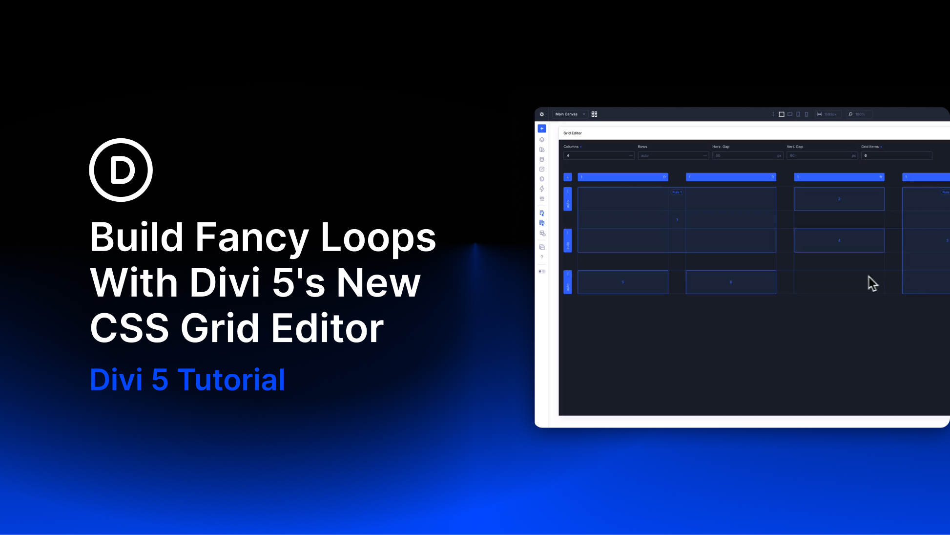
A dynamic blog grid needs two things to work well together: content that can change and a layout that can keep up with it. New posts get published, categories grow, and the number of items returned by a query changes over time. The goal is to build the card and the surrounding structure once, then let the system handle what comes next.
That’s where three Divi 5 features work especially well together. The Loop Builder supplies and repeats the content. CSS Grid controls how those repeated items are arranged. And the new Grid Editor gives you a visual way to shape that Grid, including more advanced repeating patterns with Grid Offset Rules.
In this tutorial, we’ll build one dynamic blog card, turn it into a Loop, place those repeated cards inside a CSS Grid, and then use the Grid Editor to create four more creative Loop layouts.
What Are Loops?
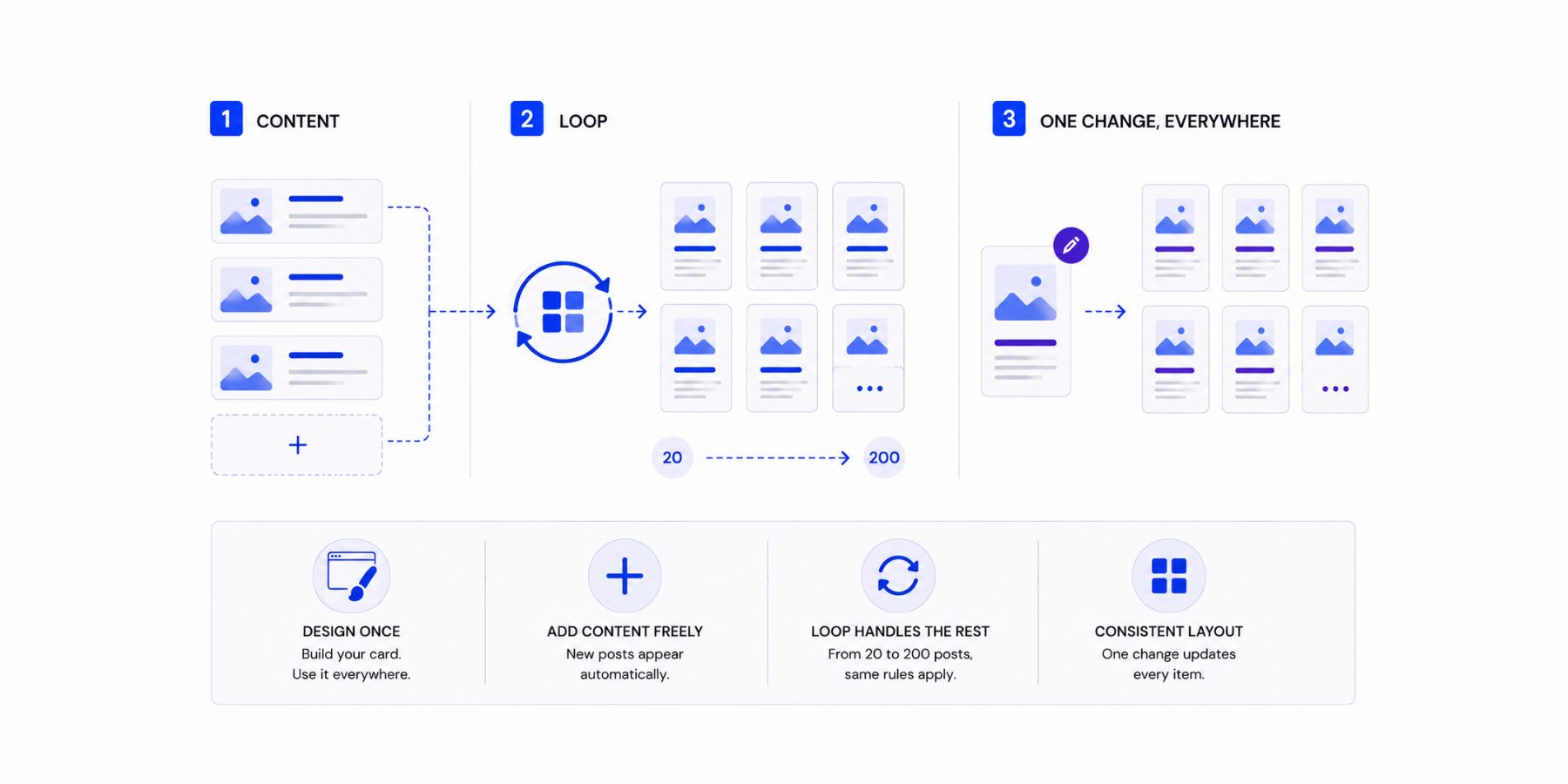
A Loop displays a changing collection of content using one repeated design. Instead of manually creating a card for every blog post, product, Project, author, or other entry, you design one item and let WordPress supply the content that belongs in each repetition.
Divi 5’s Loop Builder brings that workflow into the Visual Builder. You choose the element you want to repeat, configure the query that determines what content should appear, and then connect modules inside the repeated structure to Loop Dynamic Content.
That changes how you maintain a dynamic page. Instead of editing individual cards whenever content changes, you manage the repeated design and query. Publish another matching post and the Loop can include it automatically. Update the card template and the repeated items follow the same design.
Loop Builder supports much more than standard blog posts. Depending on the Query Type, Divi can loop through posts and custom post types, terms, users, and supported custom-field data. For this tutorial, we’ll keep things simple and build a post-based blog Loop.
What Is CSS Grid?
CSS Grid is a two-dimensional layout system built around rows and columns. You define the Grid on a parent container, then the child items flow into the tracks created inside it.
That container-based structure is especially useful when the children are dynamic. The Grid doesn’t need to know the title or image inside each post card. It only needs to know how many columns the layout uses, how tracks should size, how much space sits between them, and whether certain positions should span or move differently.
As Loop items are generated, CSS Grid places them into the available structure. If another item is added, it continues into the next available Grid position according to the layout rules you created.
Why Use CSS Grid For Loops?
Loops and CSS Grid solve different parts of the same problem. The Loop determines which content is returned and repeats your item template. Grid determines how those repeated items are arranged.
That separation is useful because the Grid logic lives on the parent container rather than on each individual Loop item. The content inside the cards can change while the surrounding structure stays consistent.
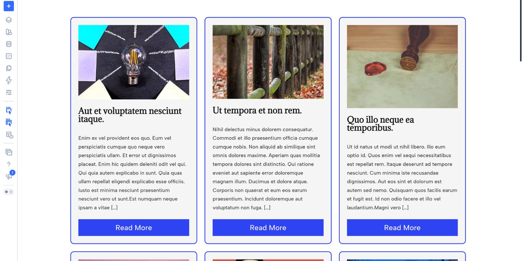
A three-column blog Grid, for example, does not need three manually created post cards. One looped card can generate all of the results, while the parent Grid places those repetitions into three columns and continues creating rows as necessary.
The combination gets even more interesting when Grid Offset Rules enter the picture. Instead of requiring every Loop item to occupy the same shape, you can target positions such as the first item, even or odd items, every third through every tenth item, or a custom nth-child pattern and give those positions different spans or placements.
CSS Grid And The Grid Editor In Divi 5
Divi 5 brings CSS Grid into the Visual Builder. A Section, Row, Column, or Group can use Grid as its Layout Style, giving you controls for columns, rows, track sizing, gaps, direction, density, alignment, justification, and more without needing to write the Grid CSS yourself.
This container-based approach pairs naturally with Loop Builder. Enable a Loop on a child element and each repeated instance flows into the Grid defined by its parent.
What Is The Grid Editor?
The Grid Editor is the visual interface for Divi 5’s Grid system. Once an element uses Grid as its Layout Style, you can open the Editor as a floating canvas and see the rows, columns, gaps, items, and Offset Rules you’re working with.
Instead of relying only on numerical settings, you can drag Grid lines to resize tracks, drag the spaces between tracks to change gaps, move items between cells, and pull an item’s corner handles to make it span additional rows or columns.
The Grid Editor is also a visual front end for Grid Offset Rules. When you move or resize an item on the canvas, Divi creates the corresponding placement rule for that position. You can then open the rule and change its Target Offset if you want that same behavior to repeat across the Loop.
That distinction is important for the layouts we’ll build later. Dragging one card gives you a quick visual starting point. Editing the resulting rule lets you turn that one-off placement into a pattern such as Even Items, Every Third Item, Every Sixth Item, or a custom nth-child sequence.
How To Build A Grid Loop
A Grid Loop comes together in three connected layers. The repeated card determines what each result looks like. The Loop Query determines which content fills those cards. The parent Grid determines how the repeated items are arranged.
We’ll build them in that order, then use the Grid Editor to turn the basic feed into something more creative.
1. Build A Sample Card
Start by designing one complete post card with placeholder content. Building the item before enabling the Loop gives you a clear view of its spacing, typography, image treatment, and overall proportions.
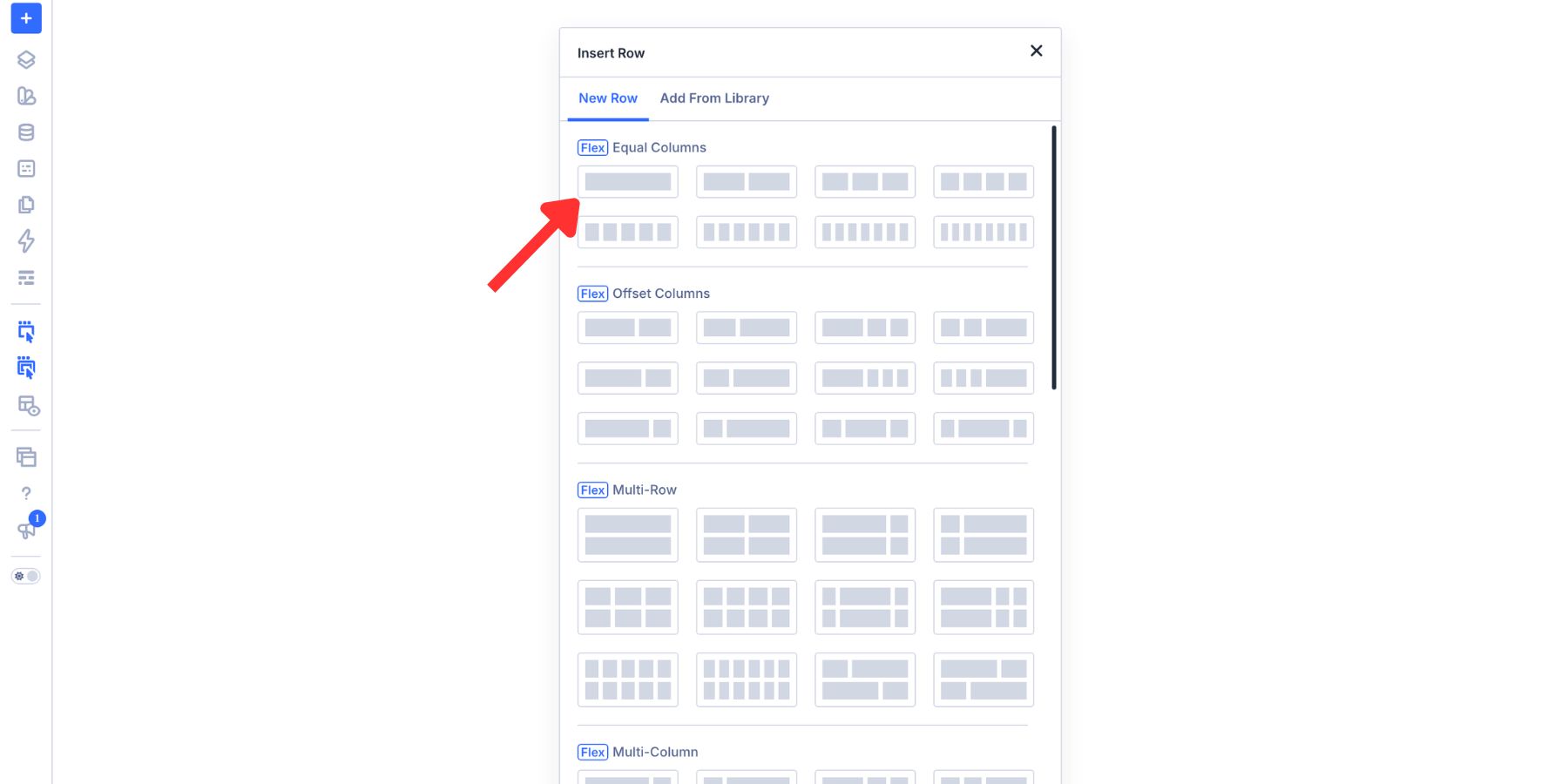
Add a Row to the page and use a single Column for the card.
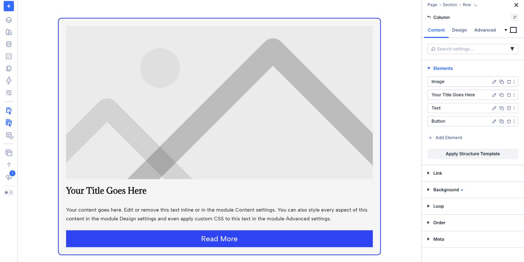
Inside the Column, add an Image Module, a Heading Module, two Text Modules, and a Button Module. Style the card now, including its typography, colors, spacing, borders, and button treatment. You can also connect frequently reused values to Design Variables so the card stays connected to the wider site design system.
If the Loop will use Featured Images from different sources, give the Image Module a consistent frame. Open Design > Sizing and set an Aspect Ratio.
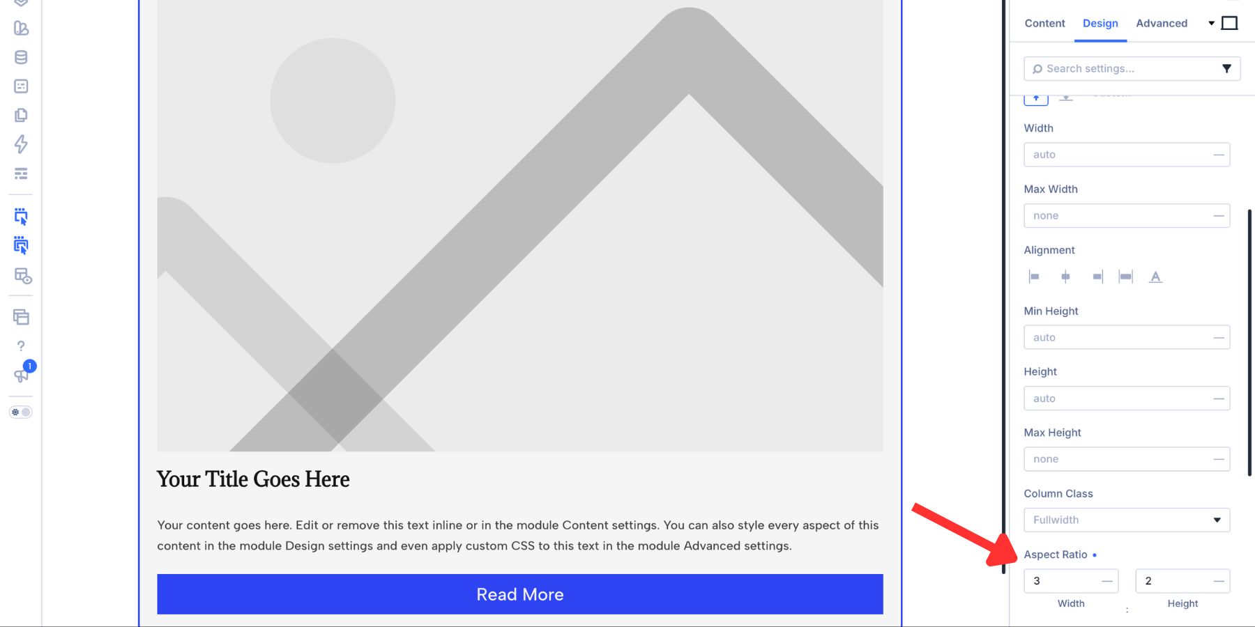
We’re using 3:2 for this blog card because it provides a moderately wide image area without making the cards excessively tall. If the source images use different proportions, open Design > Framing and set Object Fit to Cover so each image fills the frame without being stretched.
2. Enable The Loop Builder
With the sample card designed, select the Column that contains it and open its settings. Go to Content > Loop and enable Loop Element. The query controls appear underneath.
Set Query Type to Post Types, choose Posts as the Post Type, and configure the remaining query settings according to the feed you want to build.
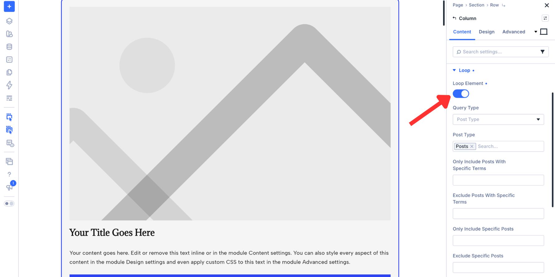
Now replace the placeholder content with Loop Dynamic Content. Open the Image Module, hover over the Image field, click the Dynamic Content icon, and select Loop Featured Image.
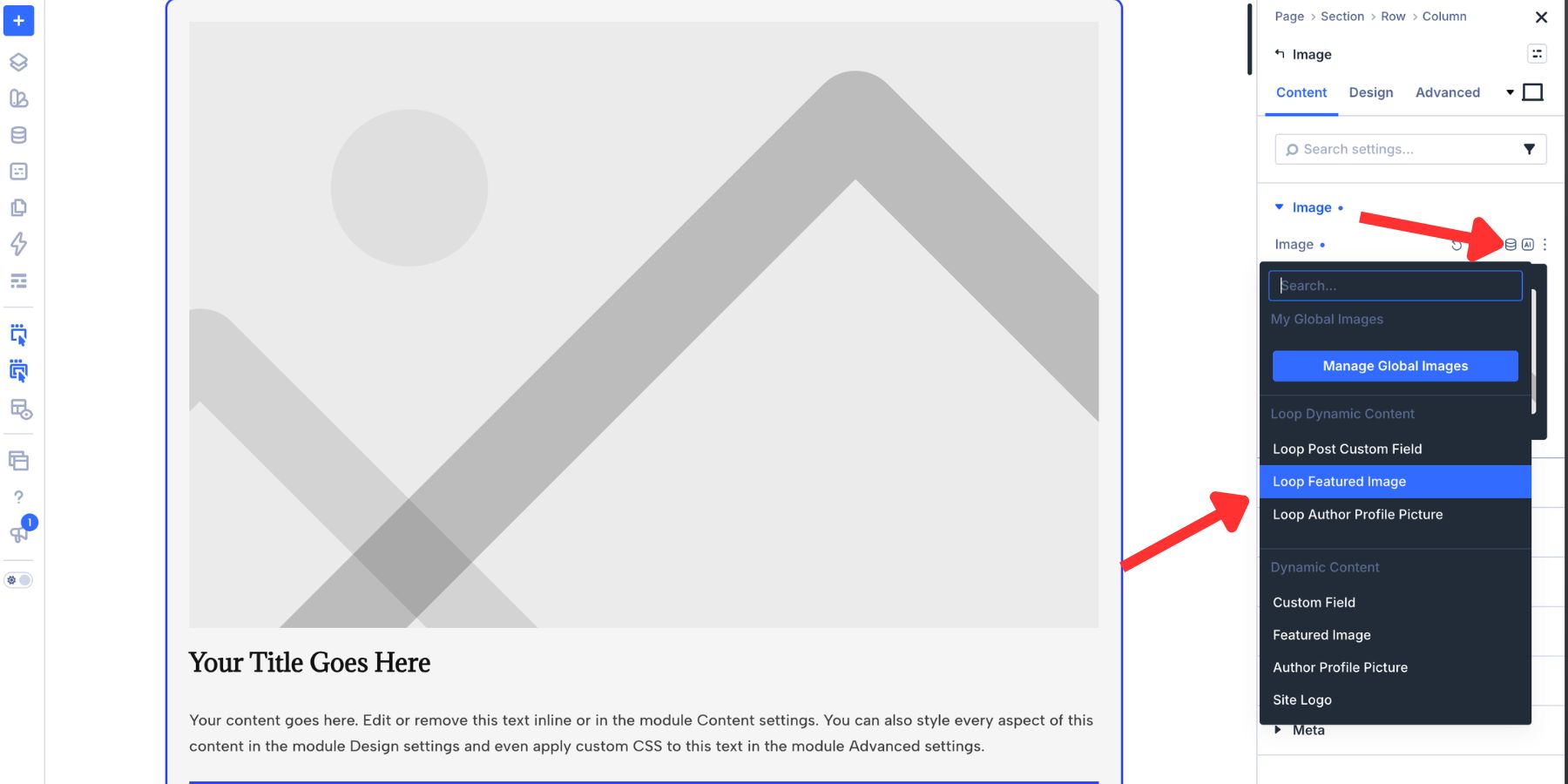
Connect the remaining modules in the same way:
- Image Module: Loop Featured Image
- Heading Module: Loop Post Title
- First Text Module: Loop Publish Date or another piece of post metadata used by your card
- Second Text Module: Loop Excerpt
- Button Link: Loop Link
You can also assign Loop Link to the complete Loop container when you want the entire card to be clickable.
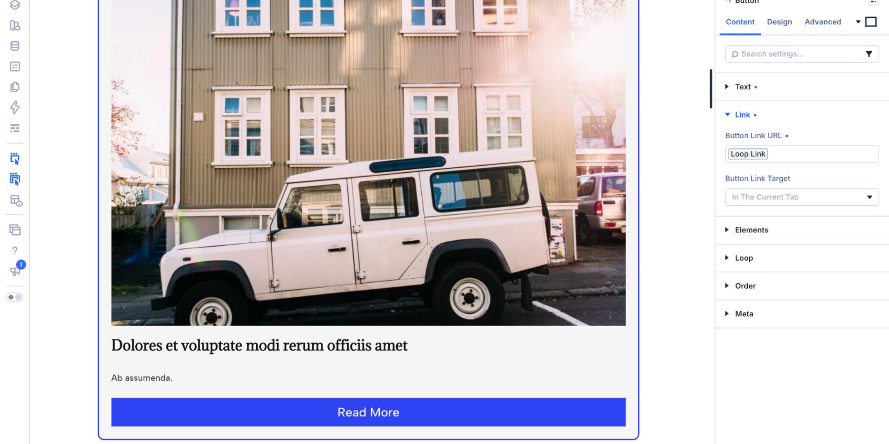
Once everything is connected, preview the page. Divi repeats the Column for the posts returned by the query, with each instance receiving its own image, title, metadata, excerpt, and link.
3. Turn The Parent Row Into A Grid
Now we’ll control how those repeated Columns are arranged. Open the parent Row settings, go to Design > Layout, and set Layout Style to Grid.
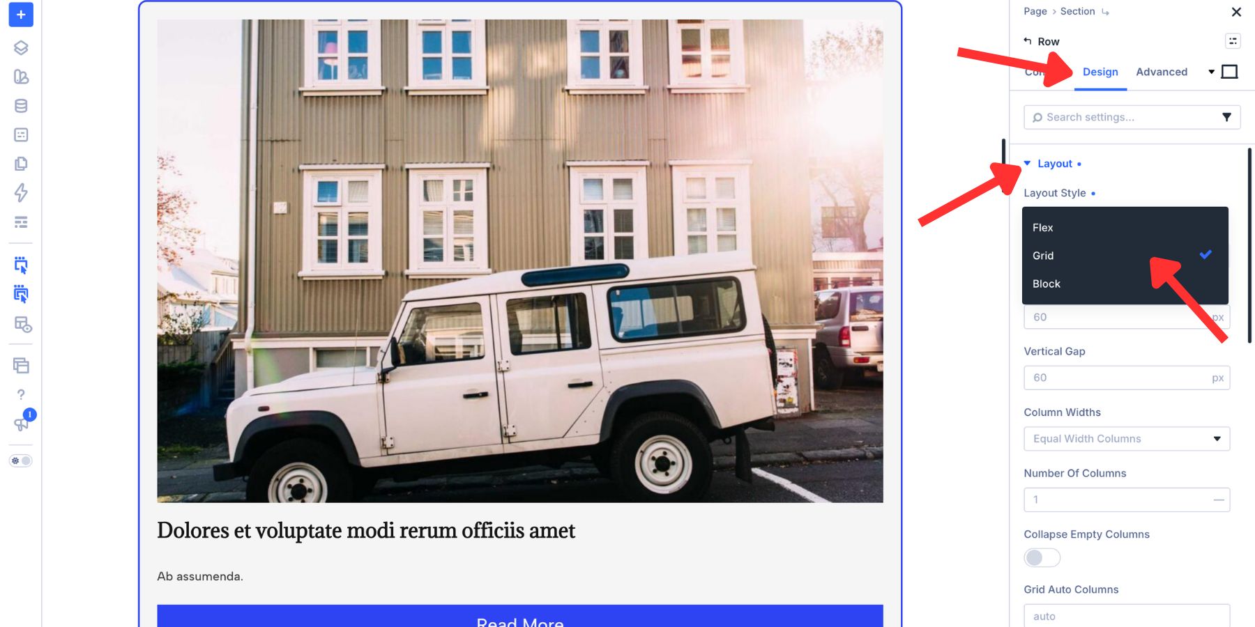
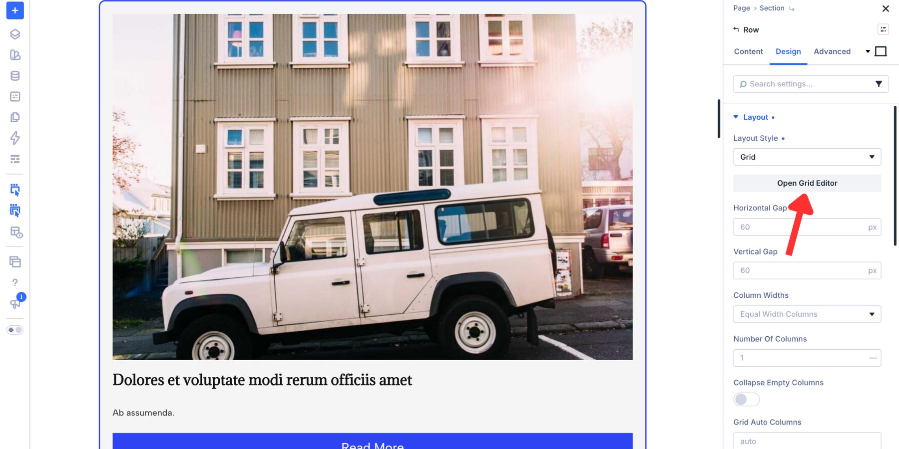
Once Grid is active, click Open Grid Editor. The Editor opens as a floating panel that can stay visible while you continue working in the Visual Builder.
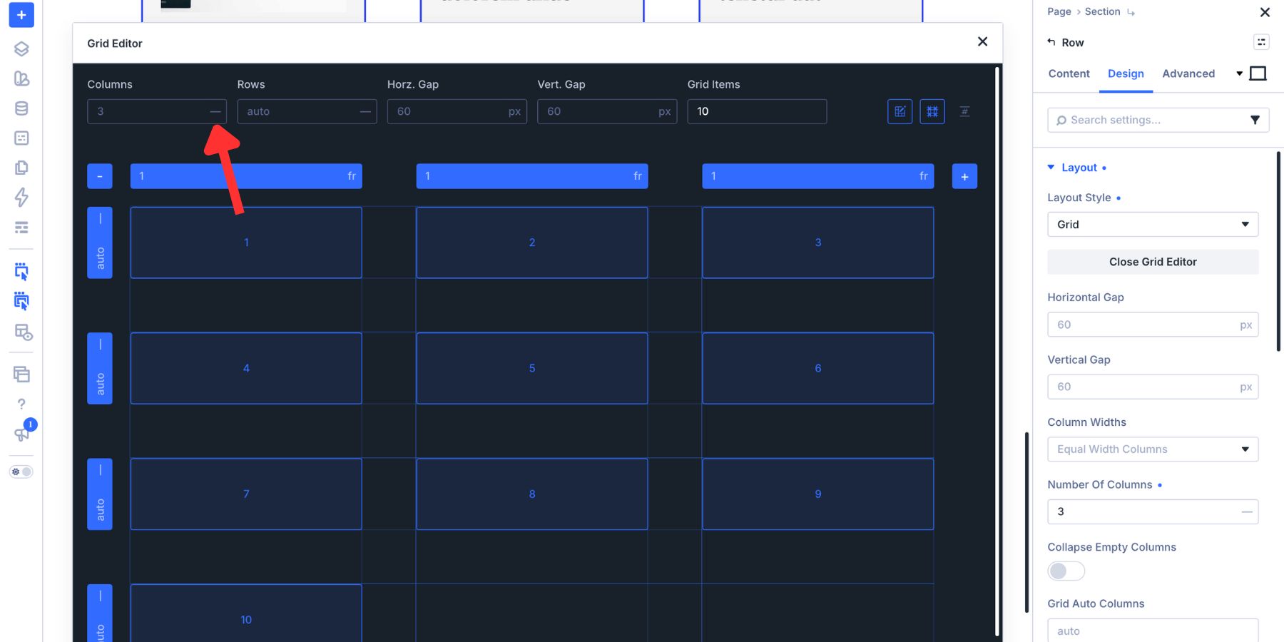
Set the Grid to 3 columns. Let the repeated items generate the additional rows they need, and keep the Row Heights on Auto unless the design calls for a different track-sizing strategy.
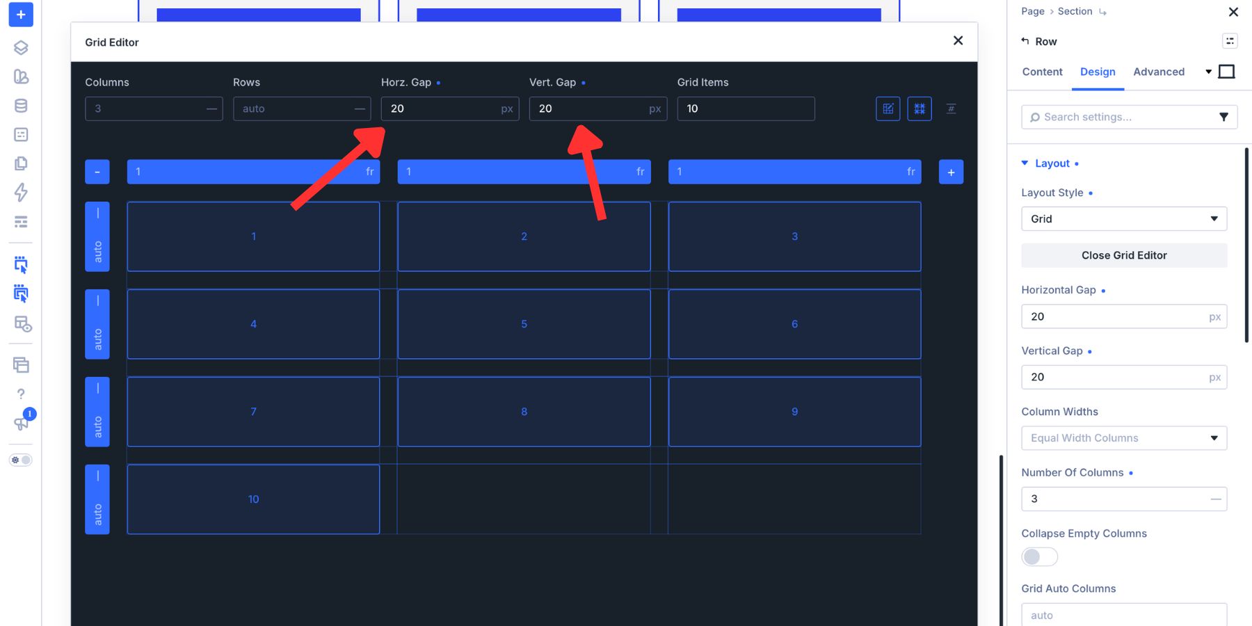
Next, adjust the horizontal and vertical gaps. Somewhere around 20px to 30px works well as a starting point for many card layouts, but use the value that fits your design system.
Close the Grid Editor and preview the page. The single Loop card is now being repeated into a three-column Grid.
Build Fancy Loop Grids With The Grid Editor
The basic Grid gives every Loop item the same amount of space. Grid Offset Rules let you break that uniformity intentionally by targeting particular positions and changing their Column Span, Row Span, starting position, or other Grid properties.
The easiest workflow is to create the initial variation visually. Drag a card in the Grid Editor until it has the shape you want, then open the rule Divi creates and change its Target Offset when the treatment should repeat.
The four examples below use that approach to create different kinds of visual rhythm.
1. The Bento Box
A Bento Grid mixes differently sized cards inside one structured layout. A larger anchor card creates the initial focal point, while smaller and taller cards around it prevent the feed from feeling like a standard uniform archive.
This works particularly well for editorial pages, portfolios, and blog feeds where some positions should carry more visual weight than others.
Start with 3 columns. In the Grid Editor, drag the first Loop item until it spans 2 columns and 2 rows. Because the Grid Editor stores this placement at the container level, Divi creates the corresponding Offset Rule without changing the actual Loop card itself.
Next, give the sixth item more vertical weight by dragging it across 2 rows.
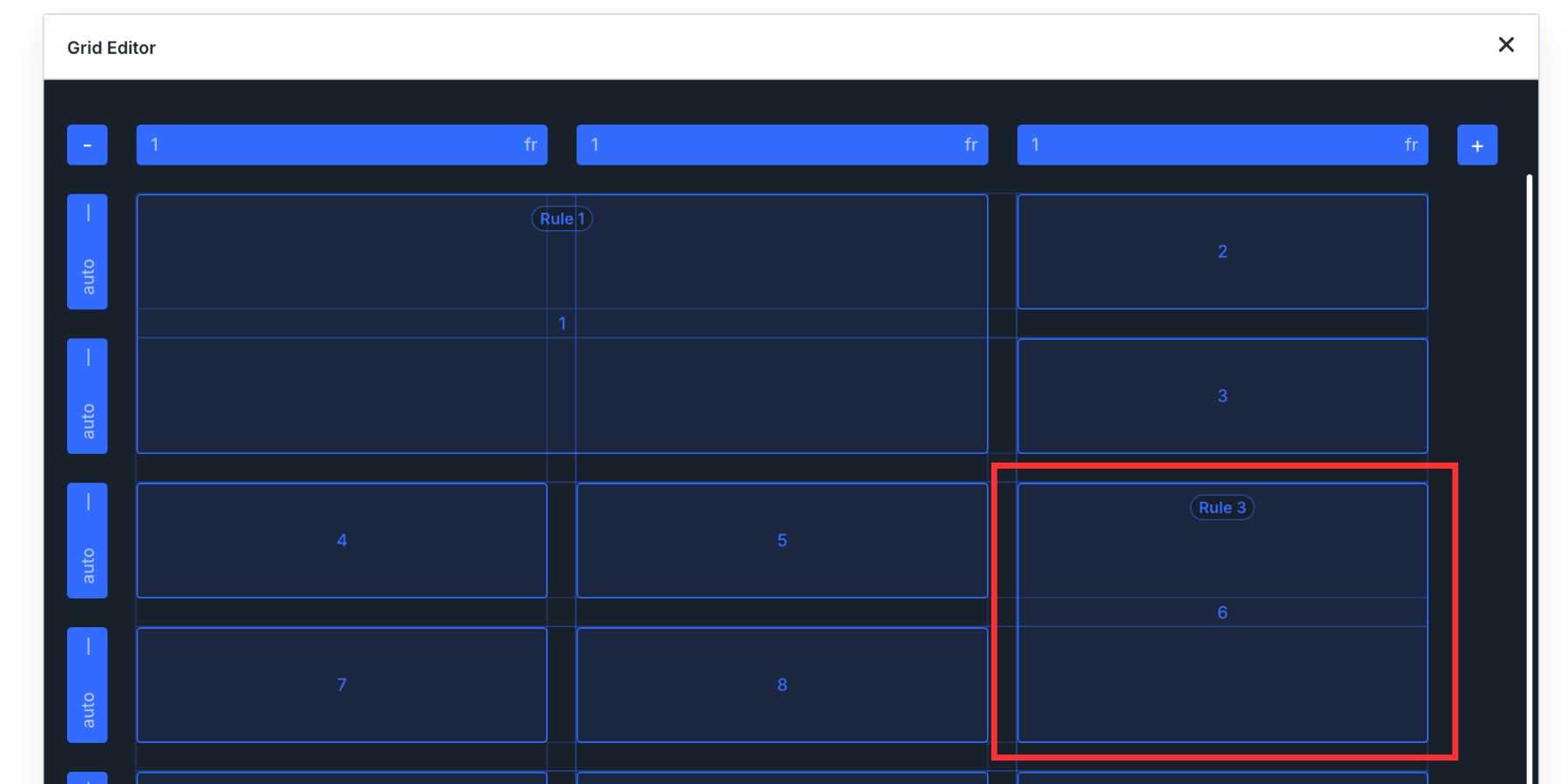
Hover over the rule indicator and open its settings. Change Target Offset from that individual position to Every Sixth Item. The same Row Span now applies to items 6, 12, 18, and so on as the Loop grows.
The opening card remains the strongest anchor, while the repeating sixth-item rule introduces another larger shape at predictable intervals.
If you want the opening two-by-two anchor itself to repeat in six-item blocks, use a Custom nth-child Rule such as 6n+1, which targets items 1, 7, 13, and so on.
2. The Alternating Wide Card Layout
Not every Grid needs one dominant feature card. Another option is to build rhythm by alternating narrow and wide cards throughout the feed.
This pattern works well for news archives, resource libraries, category pages, and other Loops where the content carries relatively equal importance but the layout should still feel varied.
Keep the parent Grid at 3 columns. Drag the second item so it spans 2 columns.
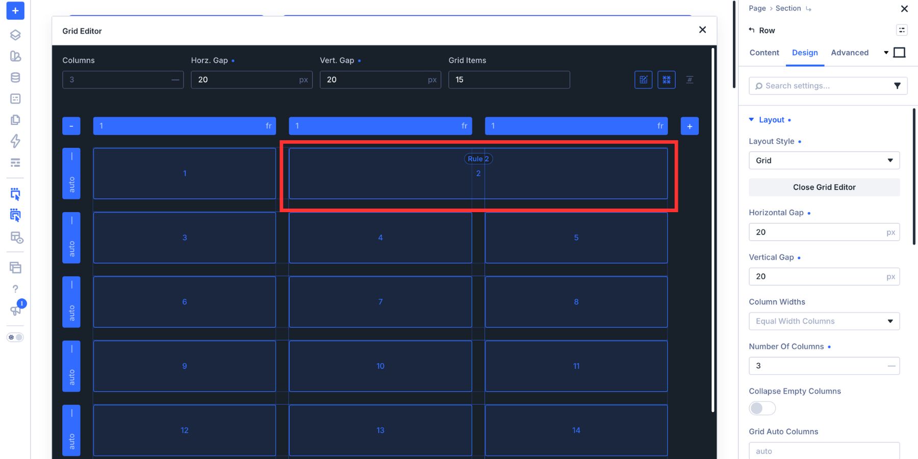
Open the generated rule and change its Target Offset to Even Items.
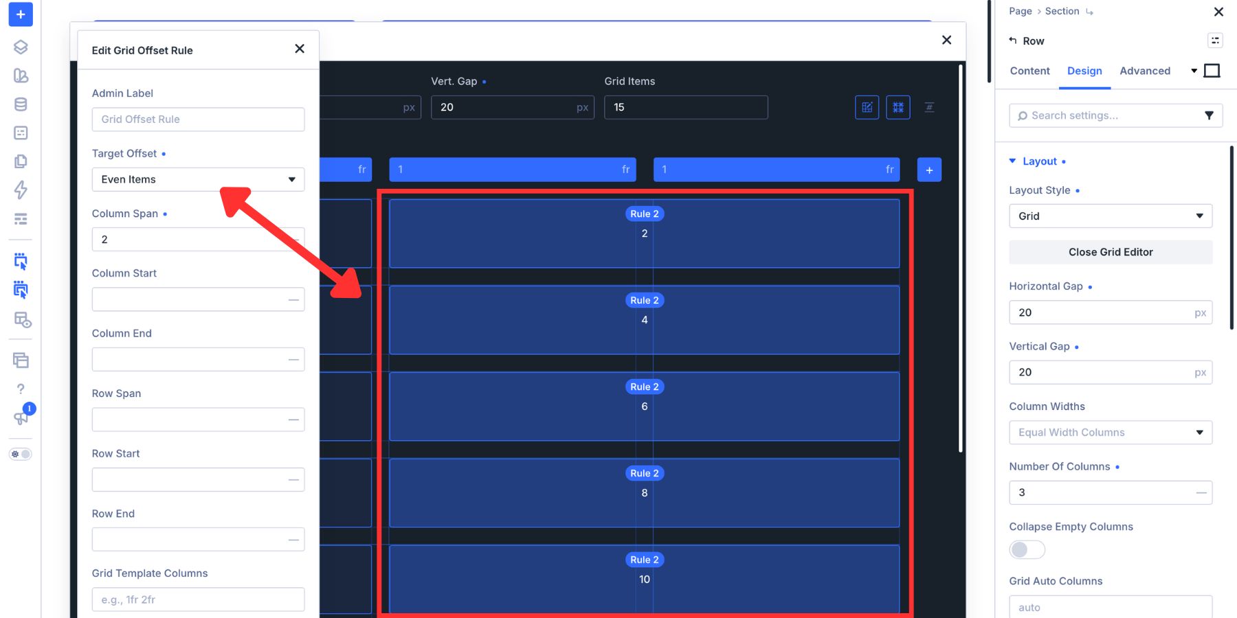
Now items 2, 4, 6, and the other even positions span two columns, while the remaining items keep the default single-column width. The result is a repeating narrow-and-wide rhythm created from one Loop card and one targeted container rule.
3. The Staggered Column Grid
The next layout adds variation in two dimensions. Instead of changing only the width of selected cards, we’ll let recurring items occupy additional rows and columns.
This treatment works particularly well for image-forward blogs, portfolios, and visual archives where larger cards can interrupt the regular Grid without requiring a separate featured-content section.
Set the Grid to 4 columns. Drag the third Loop item until it spans 2 columns and 2 rows.
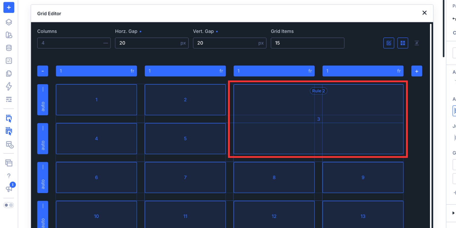
Open the resulting rule and change the Target Offset to Every Third Item. The larger two-by-two treatment now repeats at positions 3, 6, 9, 12, and so on.
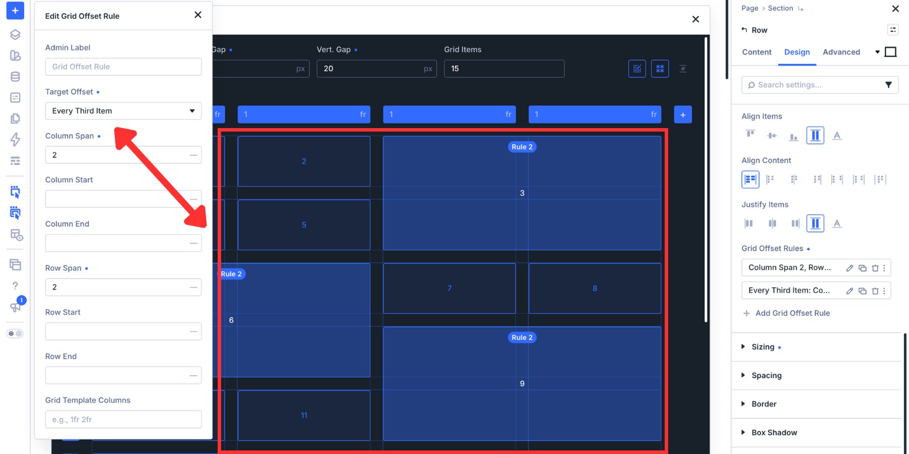
The regular one-cell cards and repeating larger cards create a stepped visual rhythm as the Loop continues.
If the larger spans leave unused cells that you want later items to fill, review Grid Density in the parent Layout settings. Dense allows later items to backfill gaps, while Auto preserves normal placement order. Use Dense when the visual pattern benefits from tighter packing and the resulting visual order still makes sense for the content.
4. The Asymmetric Duo
The Asymmetric Duo uses recurring vertical spans to break up the standard Grid and create pairs with different visual weight. Instead of introducing one oversized hero and returning immediately to uniform cards, larger positions reappear throughout the feed.
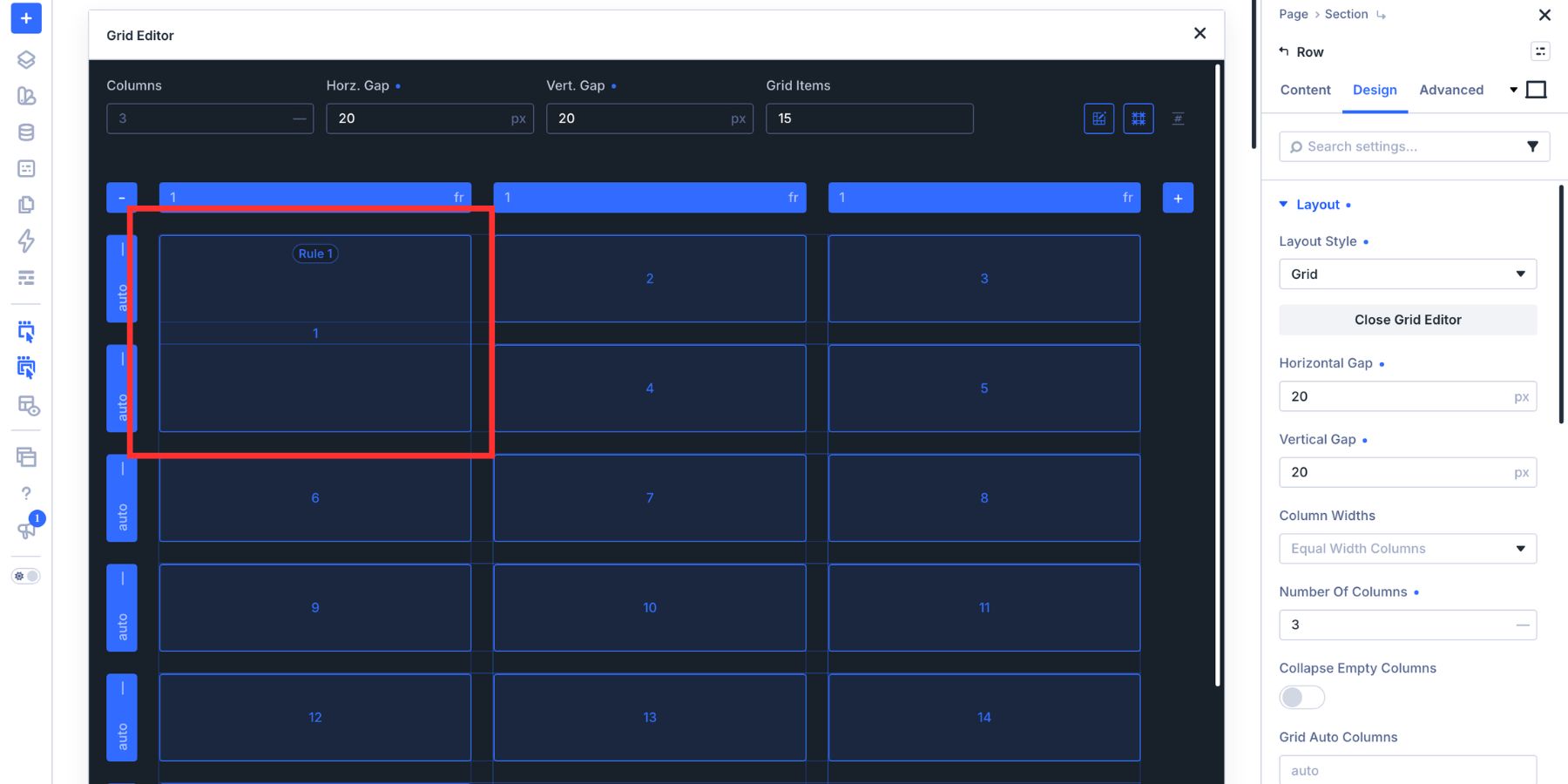
Start with a 3-column Grid. Drag the first item so it spans 2 rows. Leave this as a targeted first-item treatment so the opening card creates the initial break in the pattern.
Next, drag the fourth item to span 2 rows as well. Open that rule and change its Target Offset to Every Fourth Item.
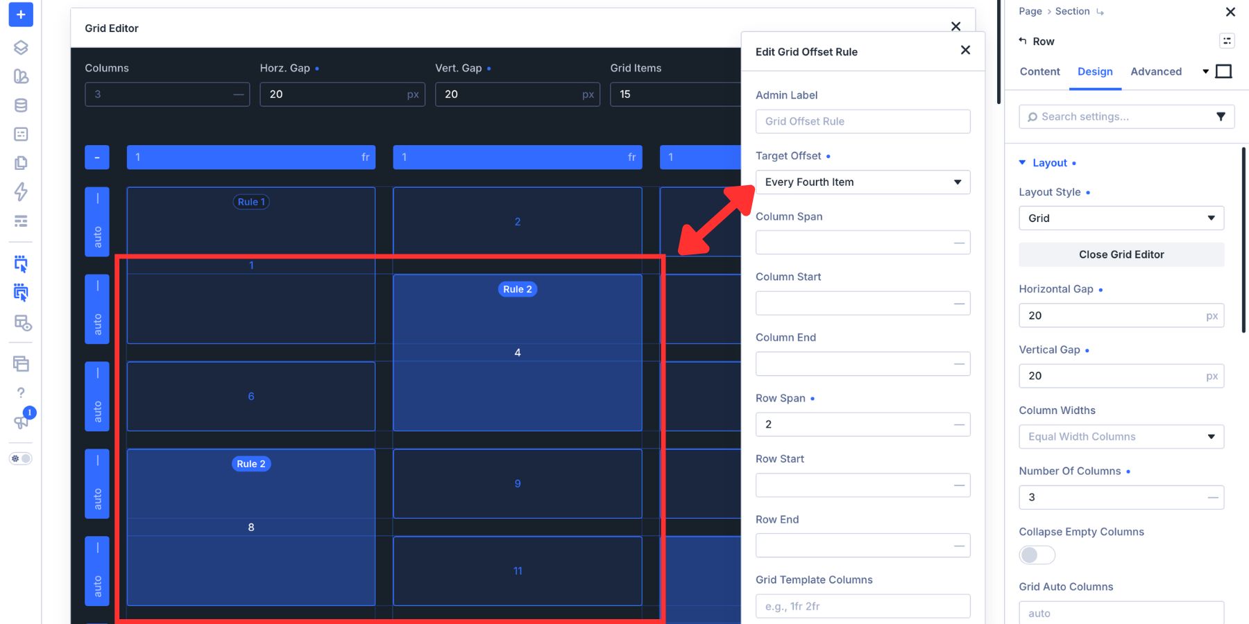
The first card receives its own vertical emphasis, while items 4, 8, 12, and later matching positions repeat another tall treatment through the Loop. The standard cards continue flowing around those larger anchors according to the Grid’s placement rules.
This kind of pattern works well for case studies, tutorials, portfolio entries, or image-heavy feeds where recurring visual emphasis keeps a longer archive from becoming too uniform.
Make Fancy Loop Grids Responsive
The desktop Grid can be as elaborate as the design calls for, but the same Offset Rules inherit into smaller breakpoints unless you override them. That makes Tablet and Phone an important final step whenever cards span multiple rows or columns.
Switch to the Tablet breakpoint and review the parent Grid. A four-column desktop layout might become two columns, while a three-column layout may also work better as two. Then inspect each Grid Offset Rule and adjust any Column Span, Row Span, Column Start, or Row Start values that no longer make sense with the smaller structure.
On Phone, a single-column Grid is often the cleanest choice for content-heavy cards. A desktop rule that tells an item to span two columns has no useful job in a one-column layout, so override or neutralize that value at the Phone breakpoint while keeping the desktop pattern intact.
Also check the image treatment after the cards change width. Aspect Ratio, Framing, spacing, typography, and button placement can all receive responsive values if the wider mobile cards need a different treatment.
The goal isn’t to force the desktop pattern onto every screen. Keep the hierarchy and rhythm where they help, then simplify the structure where readability matters more.
Build More Creative Loop Layouts With Divi 5
The Loop Builder, CSS Grid, and Grid Editor in Divi 5 each handle a different layer of the final layout.
The Loop Builder determines what content repeats. CSS Grid gives those repeated items a container-based structure. The Grid Editor gives you a visual way to shape that structure and turn individual placements into repeating Grid Offset Rules.
That means the creative part of the layout doesn’t need to disappear just because the content is dynamic. Build one card, connect it to the Loop, define the Grid on its parent, and then decide where the pattern should break: the first item, every even item, every third item, every sixth item, or a custom nth-child sequence.
The content can keep changing while the design system stays in control.










Leave A Reply