
The divider line in Divi’s Divider Module is a great way to separate elements or add some visual flair to your Divi layouts. The module is easy to use and surprisingly versatile. In this post, we’ll see an overview of the line styles in Divi’s Divider Module and see how to style them. We’ll create six examples to help spark your imagination to style your Divi Divider Module.
Let’s get started.
Preview
Desktop Divider Module Line Style Example One

Phone Divider Module Line Style Example One
Desktop Divider Module Line Example Two
Phone Divider Module Line Example Two
Desktop Divider Module Line Example Three
Phone Divider Module Line Example Three
Desktop Divider Module Line Example Four
Phone Divider Module Line Example Four
Desktop Divider Module Line Example Five
Phone Divider Module Line Example Five
Desktop Divider Module Line Example Six
Phone Divider Module Line Example Six
Divider Module Features
To give the screenshots some color and reference, I’ve added the Text Modules and a colored background from the Portfolio page of the free Photography Studio Layout Pack that’s available within Divi.
Divi Module Content Tab
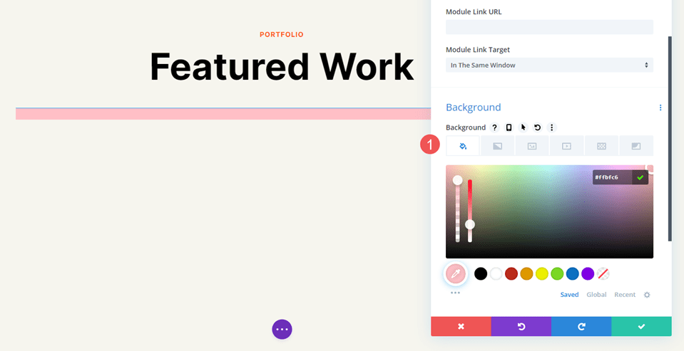
The Divider Module’s Content tab includes the option to display the divider line or not and to give the divider a background color.
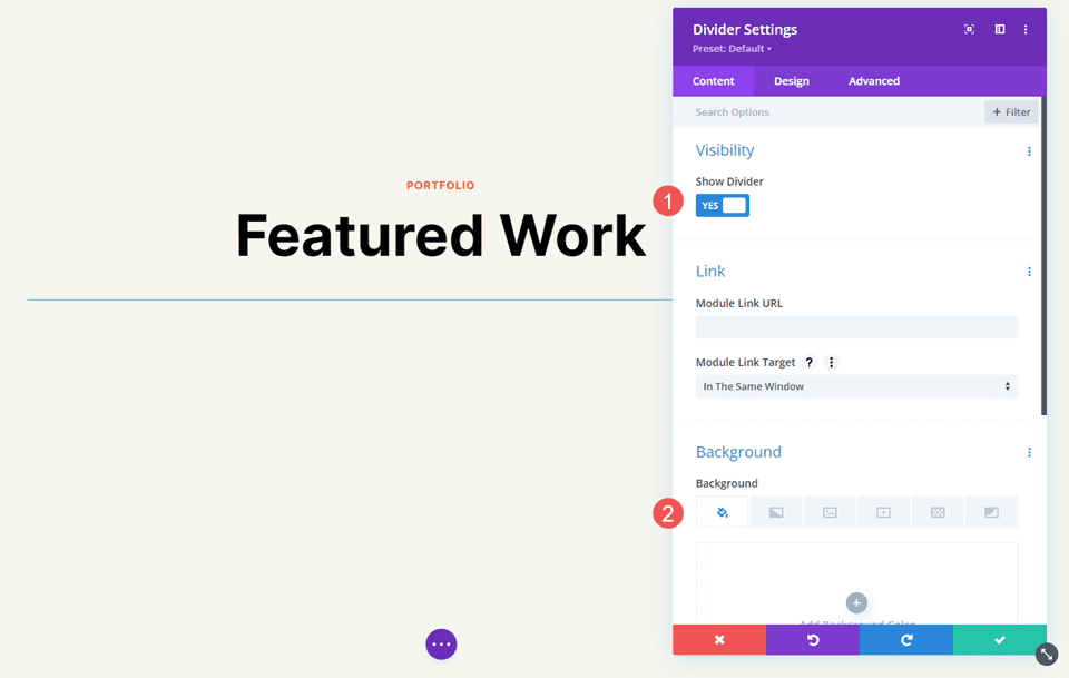
The Background options are the standard options for other Divi modules. It includes a background color, gradient, image, video, pattern, or mask. For this example, I’ve added a pink background color to make it easy to see the space the divider uses. The divider is placed at the top of this space by default.
Divider Module Design Tab
The Divider Module Design tab options include Line Color which also includes the Line Style options. Other options include Sizing, Spacing, Border, Box Shadow, Filters, Transform, and Animation.
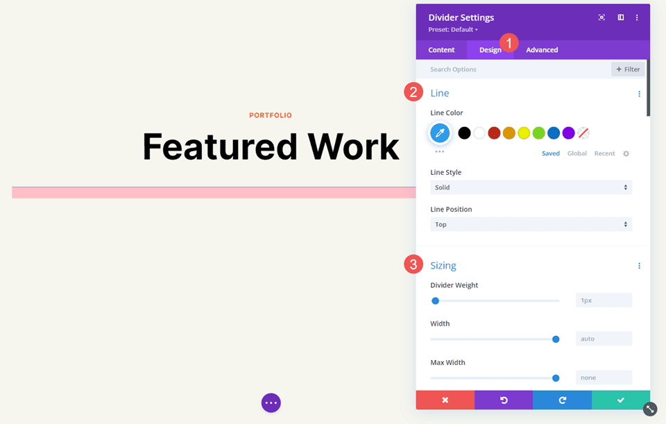
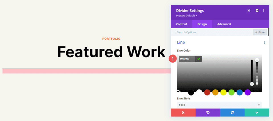
Line Color
The Line Color setting includes the standard color picker, allowing Divi users to fully customize the color of the divider line.
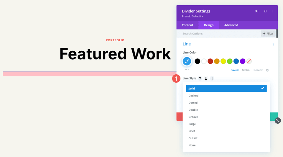
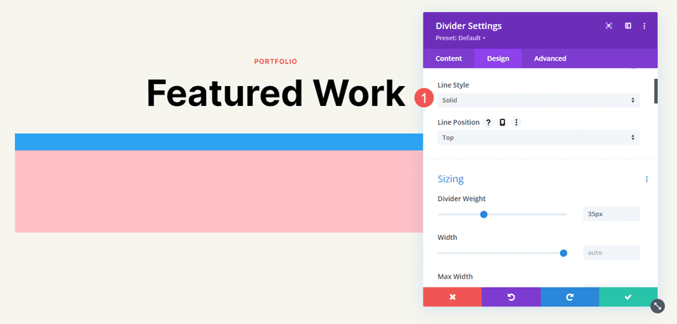
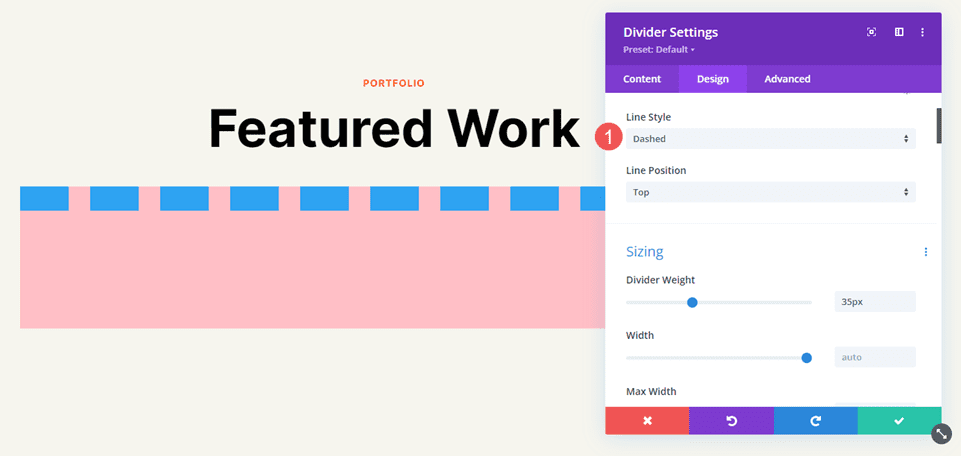
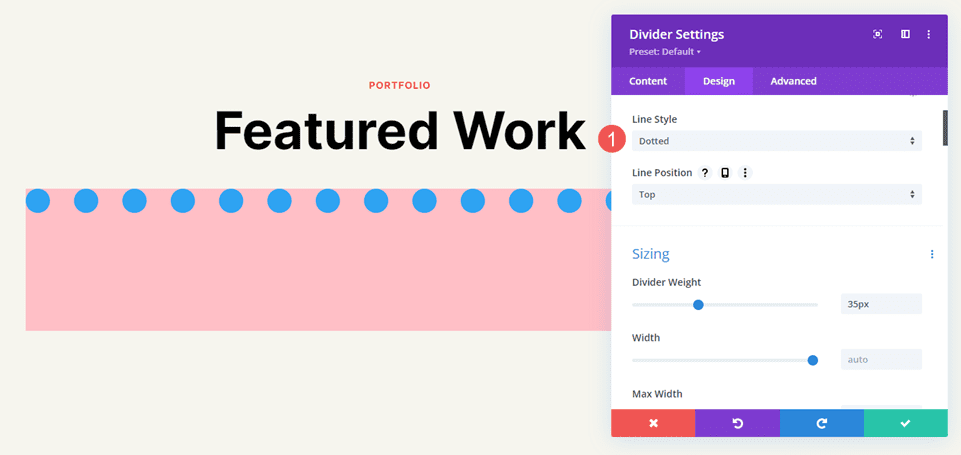
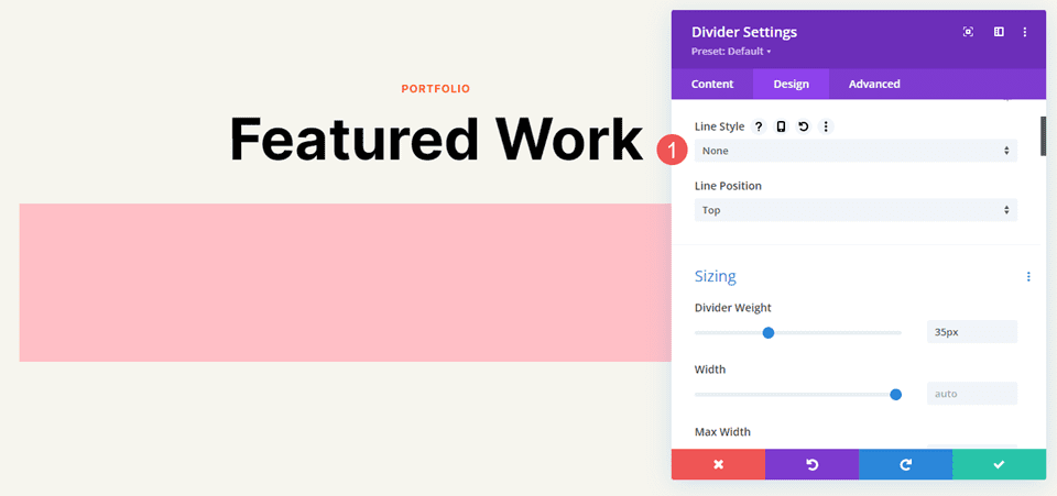
Line Style
The Line Style setting determines the shape of the line. It has 9 options.
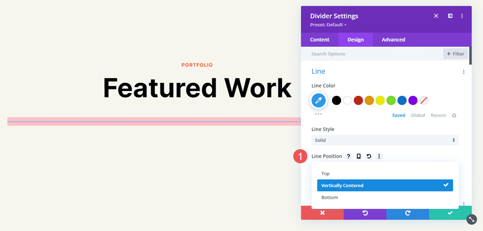
Line Position
Line Position places the line at the top, middle, or bottom of the divider’s space.
Divider Module Line Style Options
The Line Style options work with Sizing (Weight, Width, etc.) to create some interesting dividers. Here’s a look at each Style with a Weight of 20px so they stand out in my images. After this, we’ll style the divider with various Color, Style, and Size combinations.
Solid
Solid displays the divider as a solid line.
Dashed
Dashed cuts the divider line into small dashes.
Dotted
Dotted displays the divider line as dots.
Double
Double displays two divider lines in parallel.

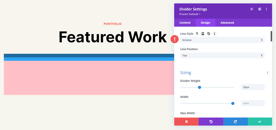
Groove
Groove cuts into the top of the line and makes the top a darker shade of the color we selected.
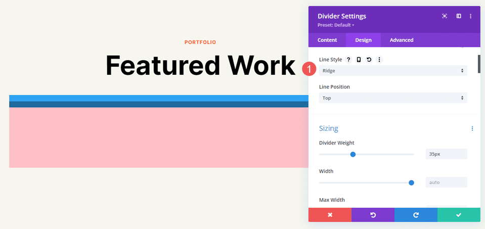
Ridge
Ridge cuts into the bottom of the line and makes the bottom a darker shade of the color we selected.
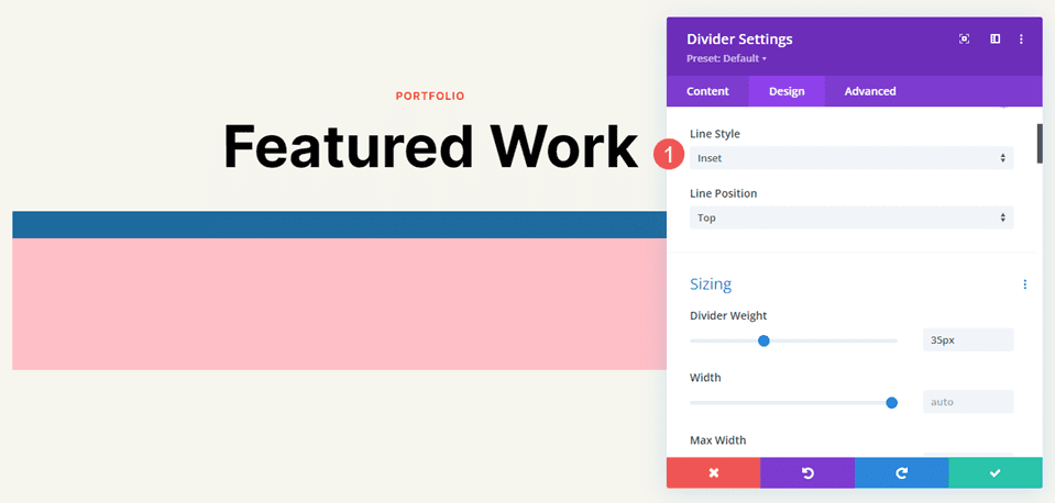
Inset
Inset cuts into the top and bottom of the line, making the entire line a darker shade of the color we selected.
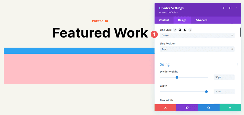
Outset
Outset doesn’t cut into the line, essentially giving the same look as Solid.
None
None makes the divider line invisible, showing only its background color.
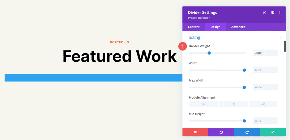
Divider Module Line Sizing Settings
The Sizing options determine the divider’s weight, height, width, and alignment. Here’s a look at the main settings.
Divider Weight
Divider Weight specifies the thickness of the divider line.
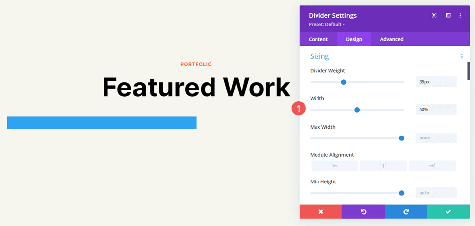
Width
Width specifies the width of the divider line. It can be used in combination with Module Alignment to place the line on the left, center, or right of its area.
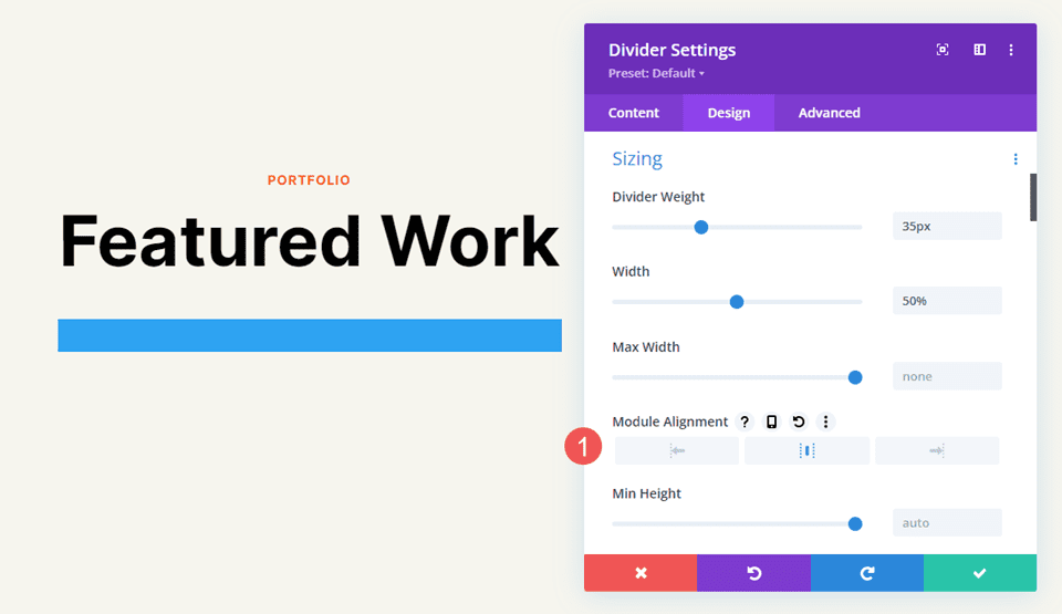
Module Alignment
Module Alignment places the line on the left, in the center, or on the right of the module’s area.
Height
Height determines the height of the module’s area. The line remains the same size, but the background fills in to take up the space.
Divider Module Line Style Examples
Now, let’s see some examples of these settings working together. For our examples, I’ve added the Divider Module to various locations within the Portfolio page and the Landing page of the free Photography Studio Layout Pack. I’ll use the colors from the layout pack and style the module to fit the area.
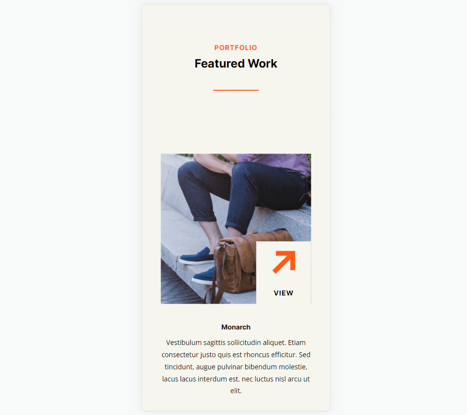
Divider Module Line Style Example One
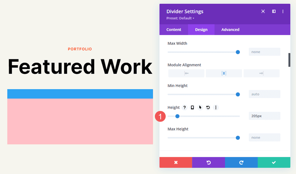
For our first example, we’ll place a solid divider line under the page title of the portfolio page. Add the Divider Module under the Text Module.
Change the Line Color to #ff5a17 and leave the Line Style at the default setting (Solid). Set the Divider Weight to 4px for desktops and tablets and change it to 2px for phones. Set the Width to 30% and the Module Alignment to Center.
- Line Color: #ff5a17
- Line Style: Solid
- Divider Weight: 4px desktop, 2px phone
- Width: 30%
- Module Alignment: Center
Divider Module Line Style Example Two
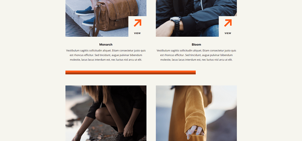
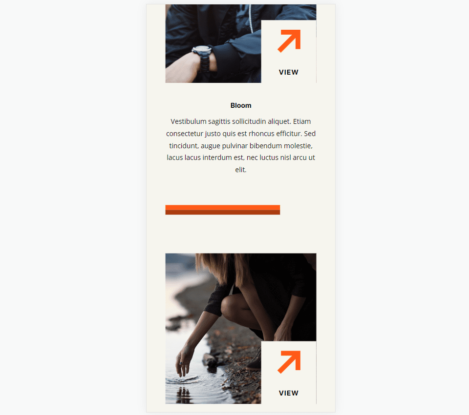
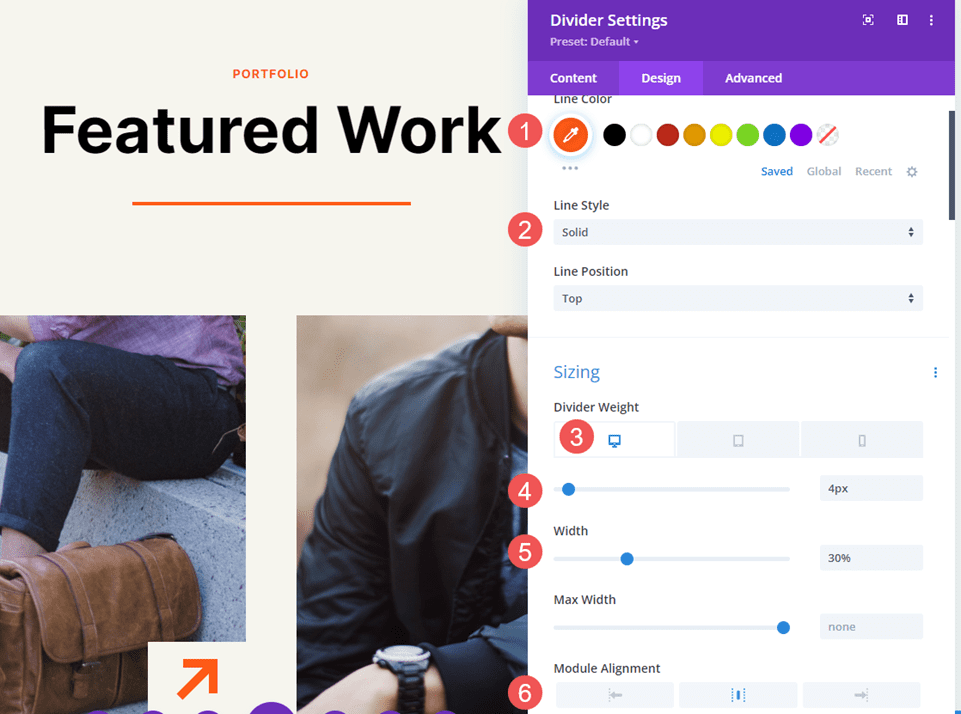
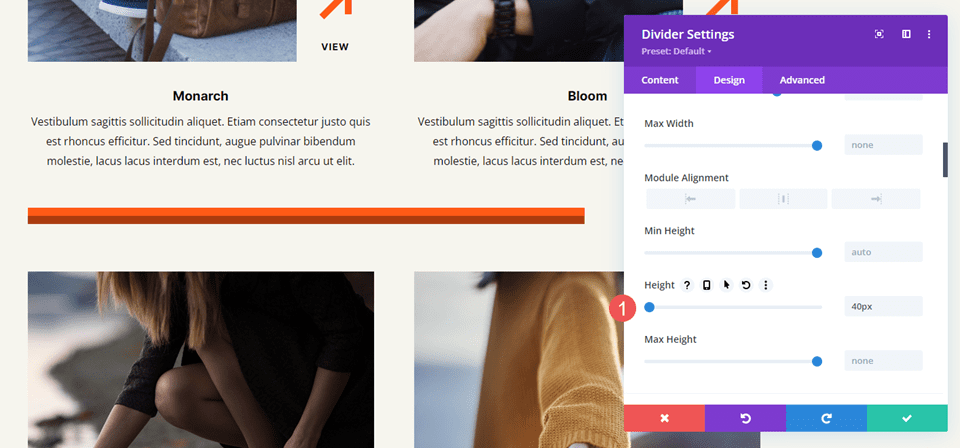
We’ll place the second divider between portfolio projects under Featured Work. This requires adding a new Row for the Divider Module. The divider will be offset, just to make it look different.
Change the Line Color to #ff5a17 and the Line Style to Ridge. Set the Divider Weight to 24px for desktops and tablets and to 20px for phones. Change the Width to 76%.
- Line Color: #ff5a17
- Line Style: Ridge
- Divider Weight: 24px desktop and tablet, 20px phone
- Width: 76%
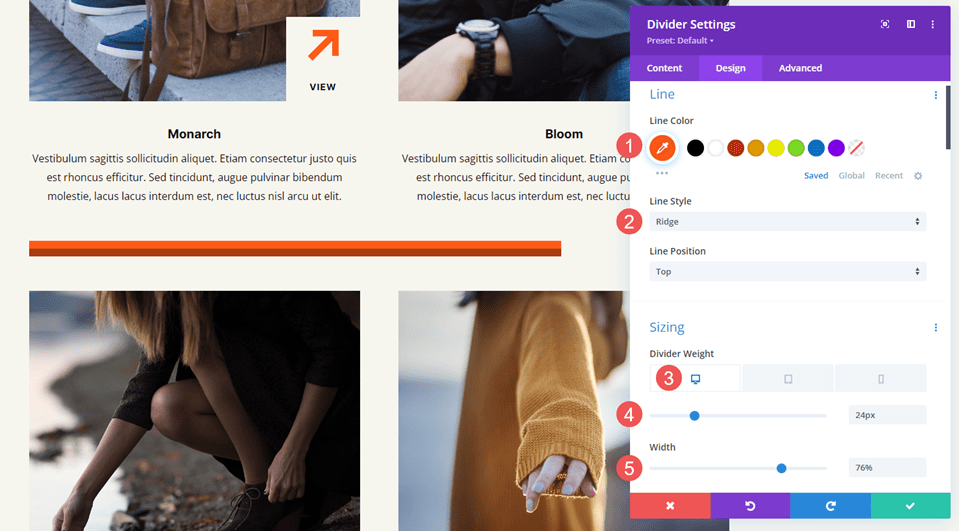
Set the Height to 40px to add more space between the next Row.
- Height: 40px
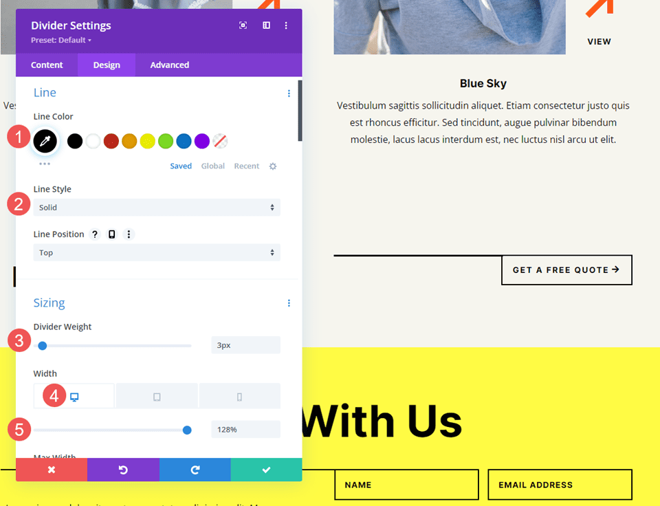
Divider Module Line Style Example Three
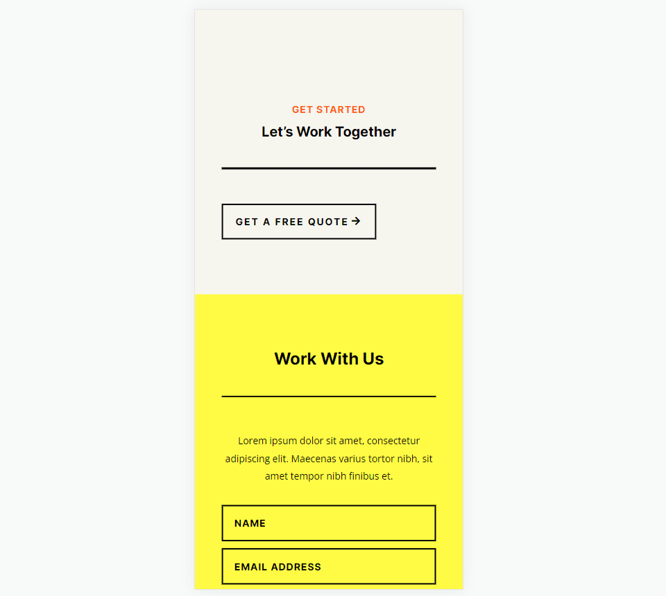
We’ll place the third divider line next to the Call-to-Action button for a section labeled Let’s Work Together. This one changes the Row to three columns with a ½ column on the left and two ¼ columns on the right. The Divider Module is placed between the Text Modules and the Button Module. The divider line connects to the button, following design cues from other sections of this layout.
This one uses the Solid Line Style. Change the Line Color to black and set the Divider Weight to 2px. Set the Width to 128% for desktops, 112% for tablets, and Auto for phones.
- Line Color: #000000
- Line Style: Solid
- Divider Weight: 2px
- Width: 128% desktop, 112% tablet, Auto phone
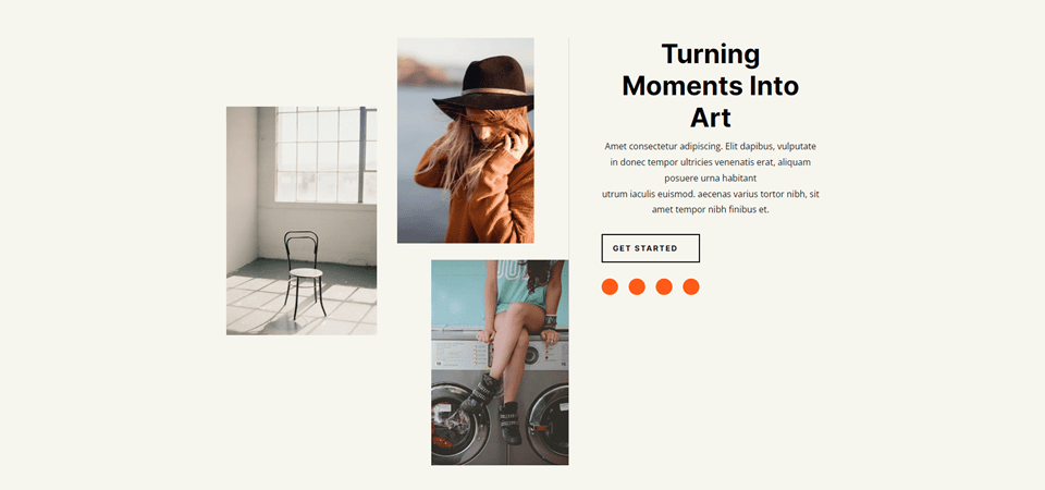
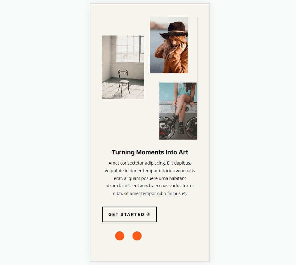
Divider Module Line Style Example Four
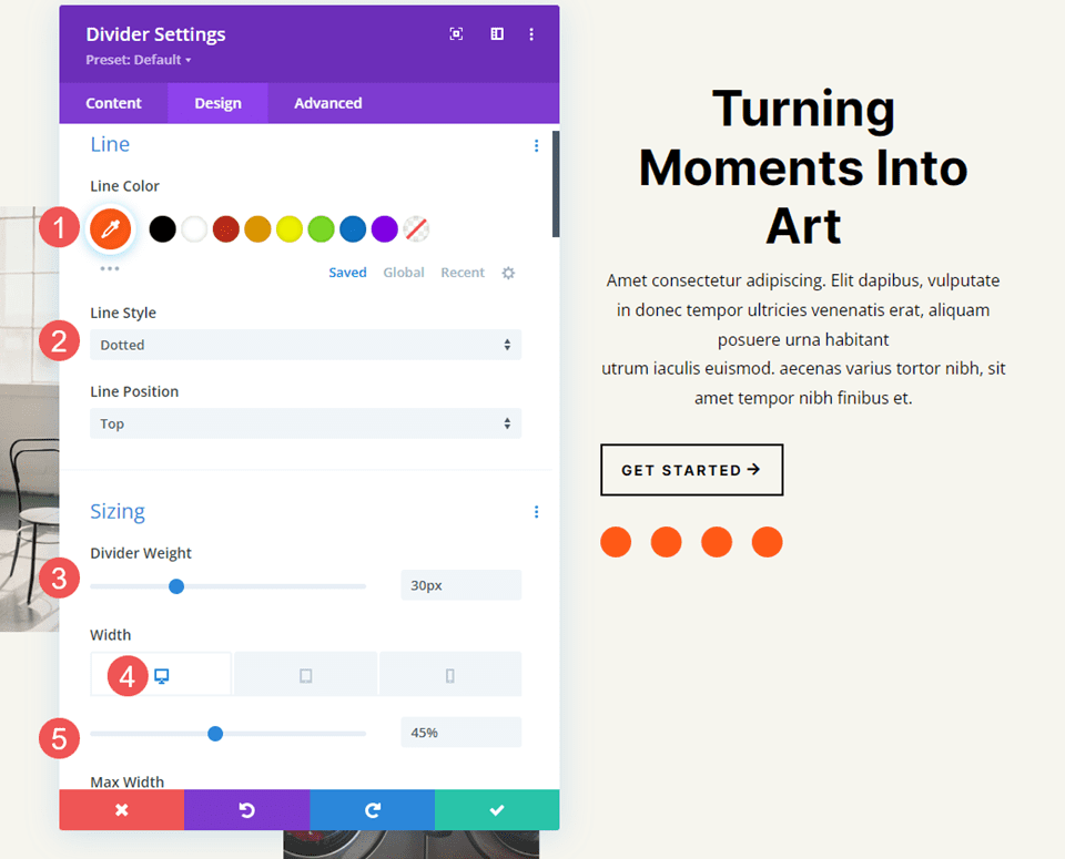
The next three examples use the Photography Studio Landing Page. Our fourth example places a Divider Module under the Button Module in a CTA called Turning Moments Into Art. This one will use the module’s settings to add dots to the area to draw attention.
Change the Line Color to #ff5a17 and choose Dotted for the Line Style. Set the Divider Weight to 30px. Change the Width to 45% for desktops, 30% for tablets, and 28% for phones.
- Line Color: #ff5a17
- Line Style: Dotted
- Divider Weight: 30px
- Width: 45% desktop, 30% tablet, 28% phone
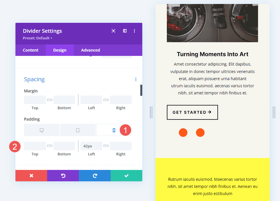
Scroll down to Spacing and add 42px of Left Padding for phones. Leave the Padding for desktops and tablets at the default.
- Left Padding: 42px phone
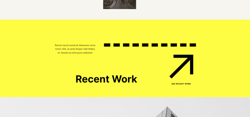
Divider Module Line Style Example Five
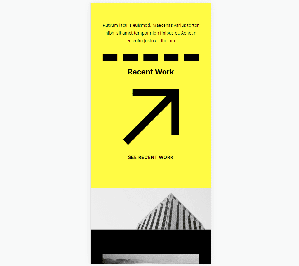
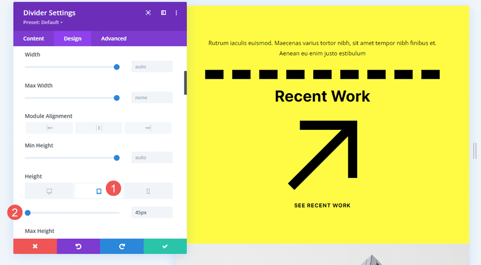
Our fifth example will add a dashed line to a section called Recent Work. Add the Divider Module to the empty column in the top Row.
Change the Line Color to black and the Line Style to Dashed. Set the Divider Weight to 24px.
- Line Color: #000000
- Line Style: Dashed
- Divider Weight: 24px
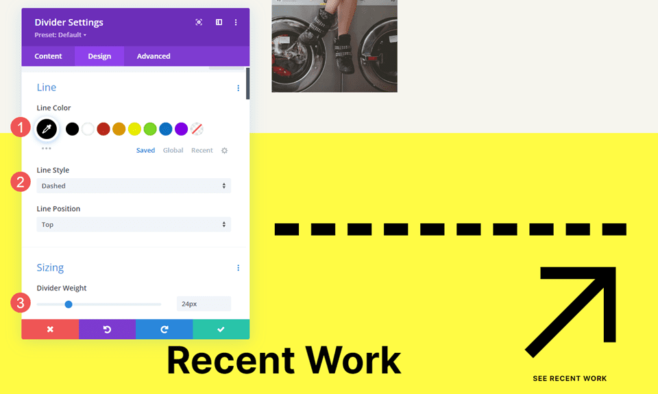
Change the Height to 45px for tablets and phones. Alternatively, you can set the Height to 45px for all devices. Desktops will look the same either way.
- Height: 45px
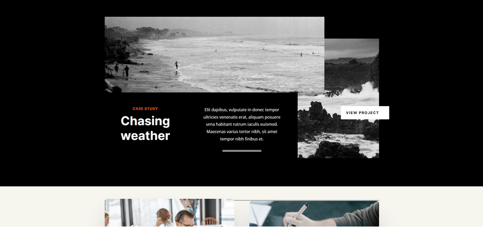
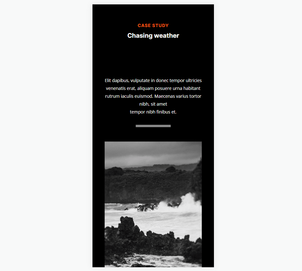
Divider Module Line Style Example Six
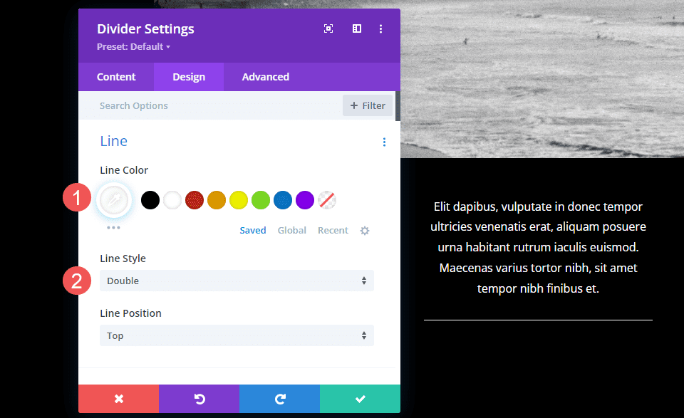
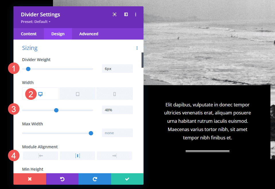
For our last example, we’ll add a Divider Module with a double line under the description in a section called Case Study.
Change the Line Color to white and the Line Style to Double.
- Line Color: #ffffff
- Line Style: Double
Set the Divider Weight to 6px. Change the Width to 48% for desktops, 22% for tablets, and 36% for phones. Change the Module Alignment to Center.
- Divider Weight: 6px
- Width: 48% desktop, 22% tablet, 36% phone
- Module Alignment: Center
Results
Desktop Divider Module Line Style Example One
Phone Divider Module Line Style Example One
Desktop Divider Module Line Example Two
Phone Divider Module Line Example Two
Desktop Divider Module Line Example Three
Phone Divider Module Line Example Three
Desktop Divider Module Line Example Four
Phone Divider Module Line Example Four
Desktop Divider Module Line Example Five
Phone Divider Module Line Example Five
Desktop Divider Module Line Example Six
Phone Divider Module Line Example Six
Ending Thoughts
That’s our overview of line styles in Divi’s Divider Module and how to style them. The various line styles and options provide lots of design possibilities. With just a few settings, Divi users can create small or large dividing lines, add shapes, and lots more. Divi’s Divider Module is a great way to add some visual flair to any Divi website.
We want to hear from you. Do you style the divider line in your Divi Divider Module? Let us know in the comments.


Leave A Reply