

In this post, we’ll look at how to use Paletton to choose your WordPress website’s color palette. Paletton is an easy-to-use online color palette generator that’ll save you lots of time. Not every web design client will have a brand color scheme and it will fall on you to pick the colors for their website. That’s where Paletton comes in handy.
Between all the available options online, Paletton is one of the favorites due to the live example feature. The app hasn’t been updated in a few years but thankfully still works perfectly well for what you need. You’ll find the app at Paletton.com. Ignore the Google ads all around it and you’re good to go.
Why Is It Important To Choose The Right Colors For Your Website
Before we look in-depth at how to use the Paletton app, let’s do a quick review of why it’s important to have the right color palette on a website. As you know, colors carry subliminal messages that affect the viewer’s emotions and ultimately their decisions. The colors must also represent the website’s company brand.
The best way to choose a color palette for a website is to consider the mood you want it to portray. In the same way that interior designers choose the colors to give a space a specific mood, you can do the same for a website. Think of first impressions; when someone lands on a website with bright, vibrant colors they will feel content and might even smile. A website with a neutral subdued palette can calm a person down and instill a sense of comfort.
Of course, the colors you choose must also match the brand. It’s in the combination and tonality where you as the web designer take center stage. Choosing the best use of the colors in a palette is also important for the mood of a site.
That’s why Paletton is one of the favorite color palette generators. You can preview how a color palette is applied in different combinations on a website. This helps you make better decisions about the colors you choose. Putting the dark color as the background as opposed to the light color will make a big difference in the final design.
All Color Palettes Start With A Base Color
For every color palette you create on Paletton, you’ll need a base color to work with. But how do you know what base color to use?
Take a look at the content the client has given you, their branding, and any images you were provided.
- If your client has a color logo, use that as your base color.
- Use an eyedropper tool to extract a color or two from one of the images the client gave you.
- Ask your client about the mood and brand story of their company.
- If you’re creating web designs to sell as templates or child themes, or for your portfolio, choose a color according to the mood you want to with your design.
When you create a palette on Paletton, you can either chose a base color visually or a hex code into the base color hex tab.
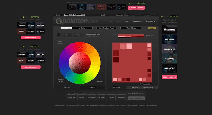
Getting To Know The Paletton App UI
Now it’s time to start creating palettes. Let’s take a look at how it’s all set up. The app has two main sections; the left side is all about selecting colors and the right side is all about viewing the previews.
Let’s take a look at the color selection tool on the left first. Whatever you change on this side changes the outcomes of the right side, but it’s best to understand what each side is capable of first.
Left Side – The Color Selectors
The first thing you notice when you enter the Paletton App is the color wheel. The default view has the base color as a neutral red in a monochromatic (1-color) palette.
You’ll see a set of 5 dots in a line inside the color circle. The dot in the center is the base color, two dots add brightness and desaturation while the other two add contrast and saturation.
Color Combinations
Above the color circle are five combination buttons. The options are from left to right:
- Monochromatic – 1 color + optional complementary
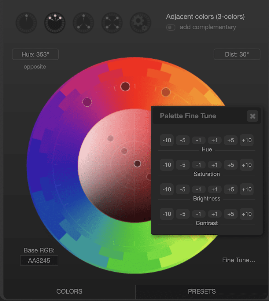
- Adjacent – 3 colors + optional complementary
- Triadic – 3 colors + optional complementary
- Tetrad – 4 colors
- Free style – 4 colors
Base Color
To change the base color, you can do either of the following:
- Drag the main color dot anywhere in the outer circle.
- Drag the middle dot inside the circle to choose a different hue of the main color chosen in the outer circle
- Input a hex code on the bottom left tab.
- To turn a secondary color into the base color, you’ll have to do that on the preview side of the screen. More on that later.
When you drag the base color dot inside the circle, all the other dots move along with it showing the hue variants.
You can also select individual colors by clicking shift before dragging.
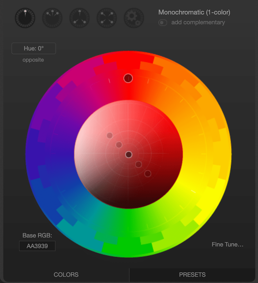
Fine-Tuning
The button on the top left of the circle lets you enter the hue degrees by hand for fine-tuning. There are more fine-tuning capabilities with the button on the bottom right. Here you can fine-tune everything about the colors you’ve chosen:
- Hue
- Saturation
- Brightness
- Contrast
Simply click on the buttons to add or decrease each effect by 1, 5, or 10 degrees.
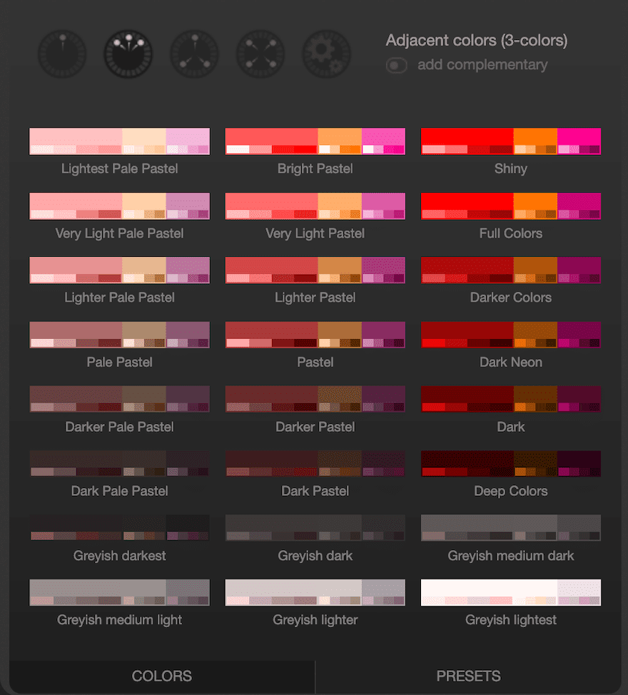
Presets According To Base Color
The color selection area has two main selection options; Colors and Presets. We looked at the colors section above. Now, let’s visit the presets tab. According to the base color and combination you’ve selected, the presets will show a variety of variables. These are helpful if you don’t want to be messing with the hue, saturation, brightness, and contrast on your own.
These presets can give you a good idea of what’s possible with the colors you’ve chosen and if there are possible secondary palettes to complement the first.
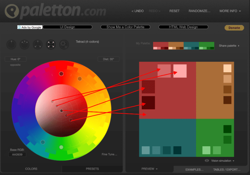
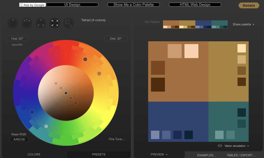
Right Side – The Palette Previews
On the right side of the Paletton is where you see all the live previews. The main area is separated into four sections to be able to visualize monochromatic palettes or others with two, three, or four colors. Each color section shows the base color in the larger area and four variations around it.
In the image below you’ll see how the color picker and preview work together.
Below the preview square is a tab where you can change the way the previews look. The default view is definitely the best, but just in case you want to change the way things look, that button is there for you.
Switching The Base Color
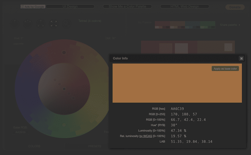
Inside the preview section, you can click one of the secondary or complementary colors and turn them into the base color. Hover over any color and click on ‘more info’. Apart from seeing all the info for that color, you’ll see a button that says ‘Apply as base color.’ When you click on this, all the colors in the palette will change.
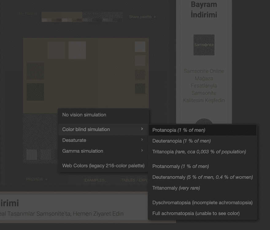
Using Paletton’s Vision Simulation Feature
One of the greatest features of Paletton is the ability to assess how your colors will look in unexpected instances. The feature is called ‘Vision simulation’ and you’ll find it underneath the preview square. These are the simulations available:
- Color Blind Simulation
- Desaturate
- Gamma Simulation
- Web colors (legacy 216-color palette)
This is a great tool if you’re creating a palette for a website. You can see if your palette will look ok in all those instances. The most useful is the color blindness simulation. It’s good to make sure all colors are differentiated from each other!
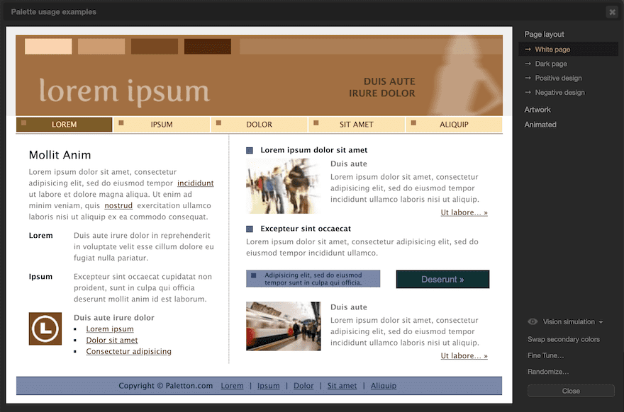
Seeing Live Examples Of Your Color Palette
Another practical tool in Paletton is the tab that shows you how the palette will look on a sample website and other design styles. Youll find these simulations in the ‘EXAMPLES…’ tab. The first choice is a page layout and this has a few options:
- White page
- Dark page
- Positive design
- Negative design
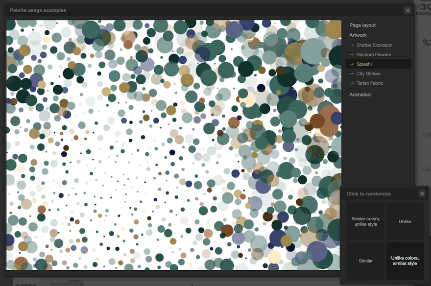
The app can show you other simulations of artistic designs with your chosen color palette. There are some static and animated examples. These are practical to get a good idea of just how much potential your color palette has.
Furthermore, in this stage, you can randomize your palette a few different ways:
- Similar colors, unlike style
- Unlike
- Similar
- Unlike colors, similar style
Make sure to get a copy of your palette before you randomize it! There’s no going back.
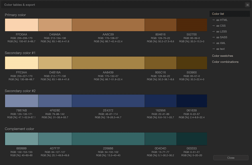
Exporting And Copying A Color Palette
Now that you’ve adjusted and previewed your color palette, it’s time to export it from Paletton and get it ready for your website.
There are a few different ways to copy or export your palette. On the top right of the window is a button that says ‘share palette’ but seems to have broken a while back. Just ignore that button since it does nothing.
Copy your palette any of these other ways:
- Copy the hex codes for individual colors by hovering to see it and clicking to open the info window.
- Click on ‘TABLES/EXPORT’ to see the palettes in different formats.
- Inside the TABLES/EXPORT’ tab, export in any of these formats:
- Color Lists
- HTML
- LESS
- CSS
- SASS
- XML
- text
- Color Swatches
- PNG Image
- ACO (Photoshop)
- GPL (Gimp)
- Color Lists
- You can also view combinations of the colors in the chosen palette.
Adding The Colors to Your WordPress Website
Now it’s time to actually add the colors to your site!
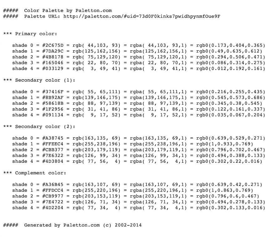
Since the Paletton app hasn’t been updated in 6+ years, you’re better off downloading the simple text version and inputting the colors in your style sheet manually. The export features might not work with your website’s HTML or CSS style sheet.
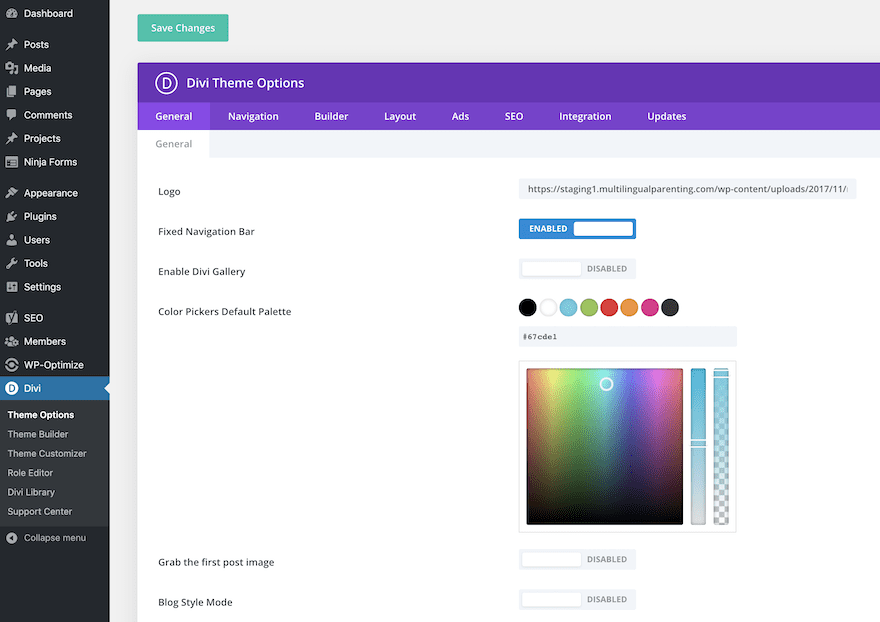
To add colors to your Divi theme, navigate to your Theme Options, and input each color with its corresponding hex code.
That’s a Color Wrap!
We’re done reviewing the steps to create a color palette with Paletton. The app’s basic features are similar to other color palette apps but what makes it stand out from the rest is the ability to see the colors on live examples for both web design and other artistic designs. It’s a pity that the app hasn’t been updated in 6+ years. Thankfully, it seems to stay alive through those Google ads!.
What’s your favorite color palette generator app? Have you tried Paletton yet? Let us know in the comments!
Featured Image via DaGaAl / shutterstock.com


Great post. I haven’t tried Paletton yet, but I definitely will now!
Thanks for the post, it’s very useful. Picking right colors is crucial and allows to differentiate from others.
Thanks for this. I think I might have to try this out.