Column Design Options:
A New Column Experience is
Coming to Divi!
We’re happy to announce that, soon, the experience you have with columns in Divi will take a new turn. The column structures will become part of the main row modal and you’ll also be able to change the appearance of columns using all the built-in design options you’re already used to!
You can already do quite a lot with columns, however, you currently don’t have the same creative freedom (design-wise) as you do with rows or sections. Luckily, that’s about to change! Soon, you can expect Divi’s new column design options and the same creative freedom for columns as you have for sections, rows and modules.
What to Expect
All the design options you’re used to will be part of columns as well.
The new column design options feature will empower you to create intuitive designs. Let’s take a look at what you can expect.
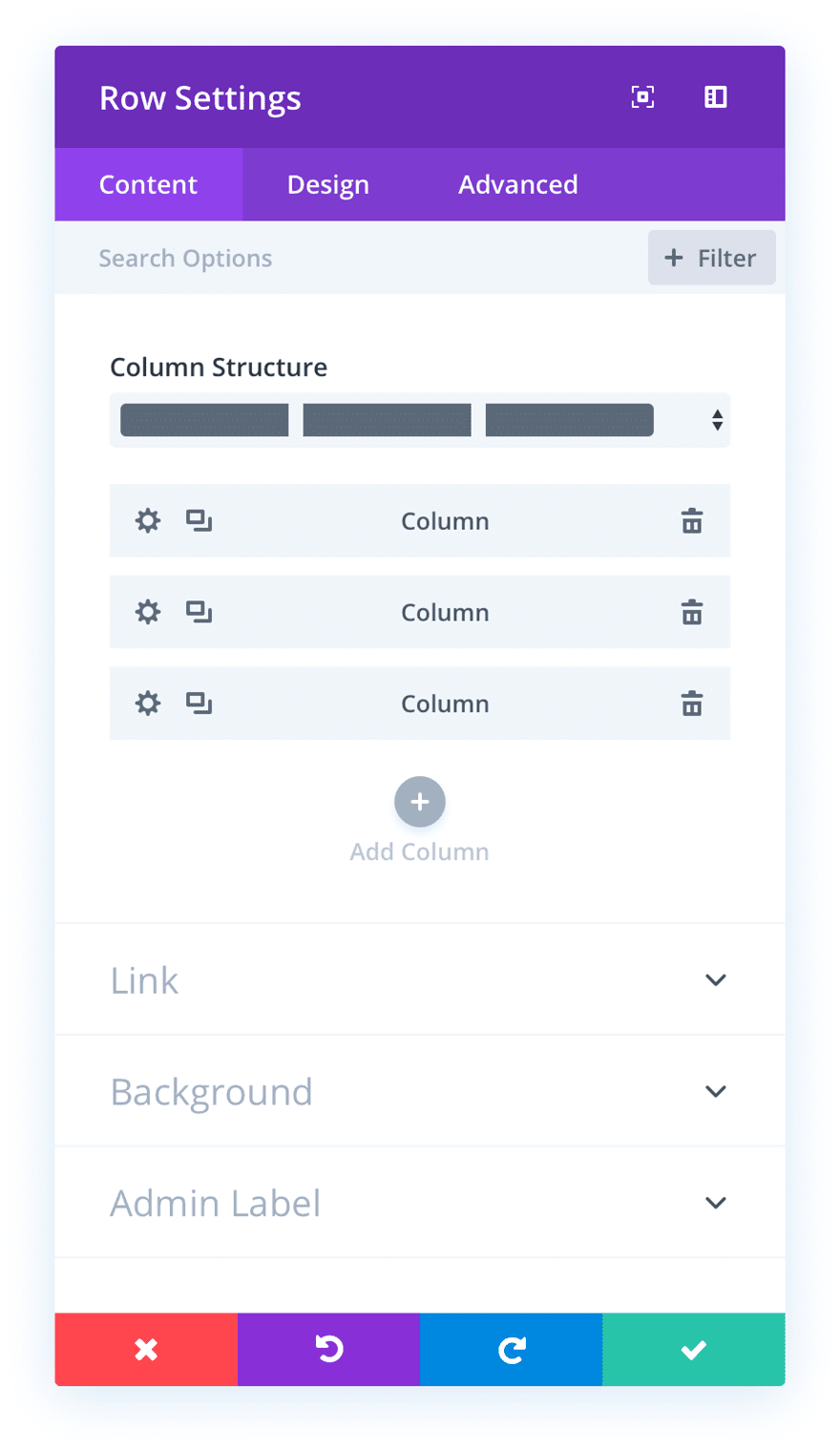
Column Structures & Columns in Row Modal
The new column design options come with an entirely different approach. You’ve seen the approach before, though. It’s already used for the Slider Module, for instance. Once you open the row settings, you’ll be able to choose your preferred column structure. You can then add the various columns as child elements of the row.
All the Design & Efficiency Options You Need
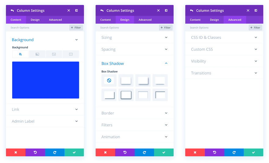
This new approach brings a ton of design options which you can apply to each and every column you add. You get the same design possibilities and interface that you already use for other elements (such as modules). The design efficiency features, such as extend styles, will also apply. This will make it easy to create intuitive and customized column designs in no time.
A New Way of Adding Columns
To keep the Visual Builder’s real-time drag and drop experience ahead of the game, you’ll also be able to horizontally add new columns as you go along.

You Ask, Divi Delivers
We’re making sure your requests are heard and turned into reality in just a matter of time.
We’re looking forward to seeing all the beautiful column designs when this update comes out. Make sure you check back with us next week for more Divi awesomeness. Be sure to let us know what you think of this upcoming feature in the comment section!




It’s also important to put option to sort columns differently for mobile. That is, change the order of the columns in the mobile view. Elementor already has this feature and it is very good …
hi Sir, i hope this time , there will be an option to make side by side ( 2 column ) for mobile view.
Hi team,
I want to create a 2 different block color like this sample post (the box below 4 vegetables)
https://www.elegantthemes.com/preview/Extra/nulla-quis-lacus-turpis/
How could I edit like that in Visual Builder?
Cool feature, what about responsiveness of the row, how will we set the number of columns in each viewport.
Thank you so much for the update!
Great !!!!
Impressive! Nice feature!
Good work guys!
I love it!
This is going to be amazing, cannot wait. As the above comment from Christian, I would also like to know what is the maximum number of columns possible in a fullwidth row?
This sounds great. But what is the maximum number of columns possible in a fullwith row?
I’d really love to see some focus on the Navigation options provided in Divi to include features such as mega menus.
We really need a DIVI builder for the menu.
Sounds groovy! Keep the updates flowing.
Will this allow custom columns they we want and not just the pre-set one’s?
What about custom rows?
Thanks for the update…
Great. Looking forward to it.
And please don’t forget to think about nested columns/rows too. 🙂
I wish DIVI output the Alt attribute mod the images automatically. This will help a lot with SEO.
would be handy for sure, but until its updated google “pull image alt into divi”
Finally! I’m very excited about this feature! Thanks a lot! 😀
I hope we can also fluidly resize each column as well.
PLEASE make it possible to make the blog module work better. Cmon guys, it’s not hard to make it line up top and bottom, to cut off text on a certain line or something so the blog doesn’t become a bunch of mismatched squares if you didn’t write the exact same number of words in each excerpt. Really, I can’t believe this is still a problem in 2018…
Here here, and while we are at it can we have the blog features of extra brought into Divi, the additional blog modules, please ?
Seriously if I can buy a third party plugin, at the moment to do the job surely then surely it’s not a difficult thing to achieve and should require little development time from ET,
I still fail to see any reason why the two were ever created separately in the first place and as a blogger/ news site who also likes the aesthetic appearance of their site it annoys the heck out of me that iI have to resort to other means to get the look I require
In a row, I can put multiple columns, can you add a feature where in a row, I add columns, and then add rows inside these columns?
Please add more css features in Menu Module. Also add Menu module for non full width sections.
I say the add Menu module for non full width sections is a must for the Theme Builder update.
Cool! I’m ready Now!!! Can’t wait! =)
This is a great post Donjete!! Also thank you Elegant Themes for all your hard work and great ideas Divi is amazing!
i wish i can add 12 Columns in 1 row)
LOL. How about 24?
You can, 2 columns with 6 col each 😉 😉
That’s the thing though. I don’t think they mention nested elements in the sneak peak.
You have no idea how many times I make this as a feature request!
It’ll be great to see this feature alive!!
And I wish column design will come with hover effects too, right?
Great.
How about flexible column width ability?
Not yet?
The teaser video does not give us enough info here on that or the ability or the ability on Mobile to change what column comes first.
That would be outstanding. Ordering on responsive would be a great benefit.
This is a great idea!
Overall I do like how setting up columns is much neater. Easier to see the wood from the trees.
On column order, This can be done by applying flex and then changing order at different breakpoints with css. Again, would be handy to have it built into the interface.
What does that mean “applying flex”?
It would be nice to have a the handle option to dynamically drag the columns to different sizes like you see in other builders. Then again because it is easy to do with % width values in the settings anyway and something I do so infrequently, it is not too bothersome that it is not a feature yet.
Agree with that !
Richard is right regarding having more column choices for specialty sections. This is a much needed improvement.
Very nice, ET! We can create any number of columns we want? How do breakpoints work with this?
Also, I keep hoping to see signs of conditional display options in these sneak peeks… 😀 Hopefully when the theme builder arrives.
With this update will be able to go beyond 6 columns?
I hope this means even more column options here as even column update 1.0 was lacking in new column options for the specialty section.