
Trailed as everything from a Facebook-killer to a fundamental shift in company-wide strategy upon its arrival, Google+ has failed to really catch fire with users worldwide and has acquired a reputation as something of a digital ghost town in certain quarters.
Google are a long way from pulling the plug on this project, however. A major relaunch of Google+ has just been announced, promising enhanced ease of use and a much tighter focus on its core competencies.
In this article, we’ll cover the background to this revamp and dig into the all the major details of the newly-landed redesign. By the time we’re finished, you’ll have a clear picture of where Google+ is heading and why.
Let’s start with a trip down memory lane.
The Turbulent Early Times of Google+
Launched in June 2011, Google+ was far from the search giant’s first bite at the social cherry. Previous efforts included Google Buzz, Google Friend Connect, and Orkut but none – Orkut’s mysterious popularity in Brazil aside – ever really managed to gain widespread traction with social users. The hope with Google+ was to finally square up to the challenge of Facebook and get Google back in the social game.
It was an initiative with roots right at the top of the organization – spearheaded by Vic Gundotra who managed to persuade Larry Page to make the launch of Google+ a key plank in his overall strategy in his new role as CEO in early 2011.
As a recent in-depth piece from Mashable makes clear, the feeling inside the company at the time was very much that Google had dropped the ball by allowing Facebook to build up such a head of steam in the social space, and that it faced a very real threat to its overall future from that direction.
There was certainly no shortage of muscle behind the initial rollouts of Google+. As early reporting on the platform’s launch made clear, it was given enormous priority internally in Google with an incredibly aggressive initial development and launch schedule.
The company also took the controversial step of trying to force registrations as part of signing up for other Google services. That was an approach that angered many at the time, and has cast doubt on reported numbers of users ever since.
Hints of a Change of Direction for Google+
As Facebook’s dominance of the social realm continued more or less uninterrupted over the last five years, hints of a change of direction for Google+ started to appear and there were even rumors of its imminent demise.
The platform’s internal photo app was one of the few standout successes of Google+ so the news that it was to be spun off into a separate service called Google Photos was seen by some as a sign that things may have been winding down.
Google Hangouts was another of the technical aspects of Google+ that had attracted praise since its launch and it too was given its own separate online home in 2015.
The rationale behind these decisions (along with the dropping of enforced Google+ profiles as part of overall usage of services) was eventually explained by Google as part of creating a “more focused Google+ experience” – a foreshadowing of the redesign that has now finally landed.
The Arrival of a New Google+
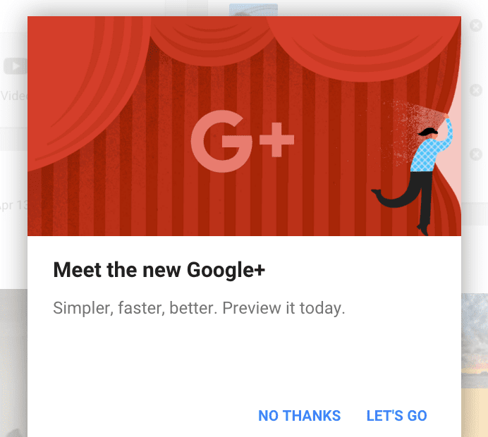
The various hints and rumors of a change of direction for the platform were finally confirmed in November, 2015 with the announcement of an entirely new version of Google+.
Rather than spring the new look on users all in one go, Google are taking a staged approach to the redesign and offering users the ability to switch between old and new versions in their accounts.
If you’re logged into your Google+ account and hit the homepage, you’ll currently be greeted by a pop-up inviting you to take the new-look version for a spin.
The new version of Google+ is opt-in.
If, for some reason, you’re horrified at the changes that await you, you have the option of reverting to the previous interface of Google+ at any time by clicking the Back to classic G+ link that’s anchored to the bottom left of your screen.
Be aware, though, that this option to switch between versions is sure to eventually go away as the full rollout of the new version gathers pace.
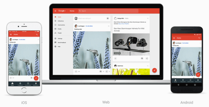
Google have stressed that one of the main features of the new-look version is an overall tightening of focus and emphasis on mobile-first design. One of the first places you’ll see this is in the revamped home stream which is a substantially cleaner affair than previous versions.
Early reports saw some users being pleasantly surprised by an overall increase in speed and responsiveness. Google have gone into some detail on the technical underpinnings of that feat with a deep dive on the redesign over at Google Developers.
The new version is completely responsive across the board and considerably more lightweight. To take just one of the examples highlighted by the development team, the home page weight has been stripped down from a previous total of 22,600 KB to just 327 KB – a pretty impressive technical achievement!
You’ll also see that Google+ is now fully ported over to Material Design with a whole slew of resulting small changes throughout the interface to bring it in line with other offerings that have already made the transition.
Revamped Android and iOS apps are also part of the new approach but have attracted some less than stellar reviews so far.
The heart of the redesign, however, centers around two aspects of functionality in particular and that’s where we’ll turn our attention to next.
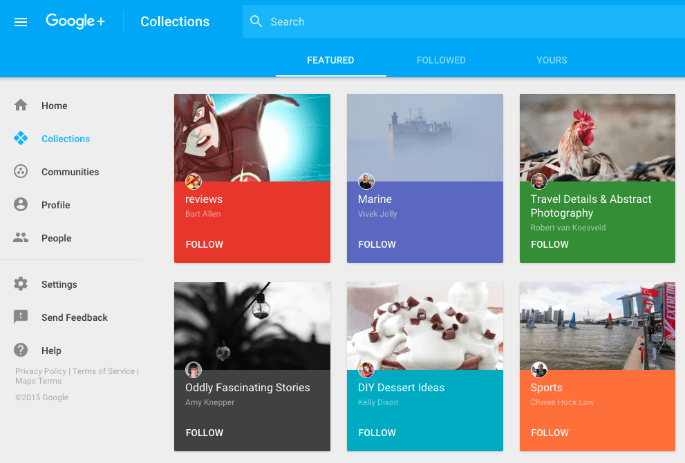
Collections and Communities at the Heart of Google+
Next to the revamped home stream, the major focus of this latest version of Google+ is its emphasis on Collections and Communities. As a recent Techcrunch interview with Google+ Product Director Bradley Horowitz makes clear, this is largely a result of Google trying to double down on aspects of the service that have had the most success with users to date.
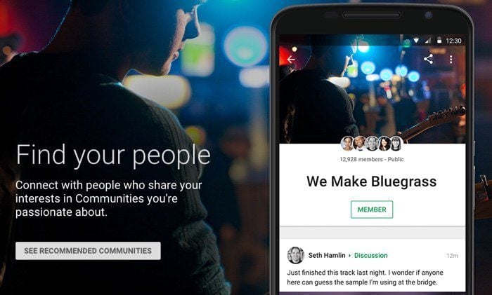
Communities have been a part of Google+ since way back in 2012 as Google’s take on the forum and message board concept. We’ve covered them in depth here on the blog before and, with over 1.2 million new community joins per day, they’re definitely one of the platform’s unqualified successes.

The concept of Collections were introduced earlier in 2015 and have been seen in some quarters as an attempt to capture some of the market share Pinterest has carved out for itself of late.
Taken together, the highlighting of these two pieces of functionality shows a strong move towards interest-based communities for the platform, in contrast to its previous poorly defined mission of being a “social layer” on top of Google services generally.
You’ll see this reflected in the navigation options highlighted in the new version of Google+ with Collections and Communities front and center throughout.
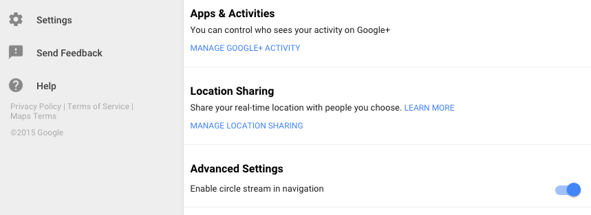
Many people will be wondering what’s happened to Circles in the new version of the software. They’re still there, but you’ll have to do some digging to make them as prominent as in previous versions. Go to Settings > Advanced Settings and then flick the Enable circle stream in navigation option to resurface them.
Further Changes in the New Google+
Communities and Collections are at the core of the new Google+, but there have been some other changes behind the scenes that are also worth mentioning. Let’s step through the main ones:
- The status of Events is unclear: Though Google have stressed that the overall redesign will be rolled out in stages, Events don’t seem to have made the cut so far and are nowhere to be seen in the new web design (though they can be added via the Android app). There could be an announcement yet to come but for now it looks as if Events may be on the way out.
- Local business reviews are gone: As Marketing Land have a done a great job of summarizing, local business reviews are no longer shown on Google+ Pages. Other previously displayed information such as addresses, phone numbers and opening hours have also bit the dust suggesting a move away from encouraging businesses to maintain a presence on Google+.
- Comment flagging automation seems to be stepped up: This is another one to be filed under “provisional results” for now. As Mike Elgan points out over at Computer World, potentially dodgy comments used to be flagged and made available for review, whereas they now seem to be automatically marked as spam with no option to override.
- Streamlined profiles are in: Google+ profile pages have been simplified to put the emphasis squarely on Collections, Communities, and posts, with Photos disappearing entirely.
As we mentioned previously, the staged rollout of the new Google+ means that we still don’t have a complete picture of all aspects of the overall redesign so there’s undoubtedly more to come.
The main thrust of the changes is clear, though. If it’s a feature not related to Communities and Collections in a core way, you can expect it to be a candidate for the chop.
Conclusion
Google+ has had a rocky ride over the years. If you had to put the blame for its woes on one underlying cause, lack of focus would be very near the top of the list.
The recent relaunch shows a refreshing clarity of purpose in stripping the interface down to its essentials and centering the overall user experience around two clearly defined pieces of functionality – Collections and Communities.
The overall concept of being “focused around interests” is a strong one and gives Google+ a solid central idea to build out from while finally clearly differentiating itself from Facebook.
We’re curious to hear your thoughts on the platform’s new direction. Are you already testing the new look and feel or sticking to classic Google+ for now? Get in touch via the comments and let us know!
Article thumbnail image by GongTo / Shutterstock.com.


I used to love Google+, it was an awesome social network. But now it is a waste of time, I mean, really who likes the new design? Where’s Hangouts? Where’s Photos? Where’s all the good stuff that made users love Google+?
I’m not using Facebook personally for few years, only when I need it for business. But Google+ … I’m a long time user, from an early invite system and I can say that it’s far from ghost town. It’s just not what people think and expect it to be. Everything is happening in communities and around pages and that’s a good thing if you ask me. As this is great way to promote business. It’s much easier to reach customers on G+ than on any other social network without a single dime.
I’m always amused at all these people saying Google+ is a ghost town. But when I look at their profile they have little to no posts, barely anyone circled and zero engagement. Well duh it’s a ghost town to you. I’ve found it anything but a ghost town.
And I’m hardly the only one. I understand why Google made some of the changes it did, but others are just awful to the point of me wondering why they didn’t just bring back Reader. G+ got Social soooo right that most people didn’t know what to do with it. They couldn’t hide behind fake names, or other facades. They didn’t have the instant followers of school mates like Facebook. Or work colleagues like LinkedIn. You actually have to go out and meet folks, just like when you moved to a new town or school as a kid.
I have been sending lots of feedback to get rid of the horrible horrible horrible design changes, as well as missing features. And the best part about Google? I’ve gotten responses to my posts about it. From actual people who work on the project. Will they bring back everything? I doubt it. But I certainly hope they get rid of the unnecessary additional clicks to do everything, on top of the missing Social features and about me sections.
I think Google+ has (had) things about it that were unique, but – for whatever reason – it never caught on.
Facebook excels at being Facebook because Facebook is Facebook.
Google excels at being Google, Google+, Google Drive, Google Photos, Hangouts, Android, Wave (no longer), Reader (no longer), etc etc.
(You get my point.)
I am curious to see how this new UI impacts Google+, but I do not like it so far.
Everything about Google, including + obviously, is that it is as far from intuitive in operation as the edge of the universe is from earth. This is compounded with a near total lack of well-written documentation or videos. That simple. It is obvious that their “focus” is on writing interfaces for themselves, their coders to use, not the public. We just don’t need that attitude and therefore, google.
It’s just not worth the time to go back and try once again.
I’m with Brian.
Nothing beneficial to the small business community in these changes. to G+.
In fact, I’d go so far as to say that, it’s a backward step for promoting a business on G+.
My ‘cynical’ mind tells me that Google and steering business users towards having to pay to use business pages.
So pleased to read that I am not the only one battling with Google+, especially the business pages which now seem to be google my business and even more confusing than before or going back to google for business idea? And very glad may now be faster. On 1mb broadband frequently can’t even get Google+ to load!
I second the mention about USER HELP. IF those of us who actually make websites, who actually read about and use the net extensively cannot figure out how best to use Google+, what about everyone else? I started w/Google+ from the beginning and checked it out again and meh. How I hate FB. But unless something is REALLY easy to use, good luck with that.
IF you need to sit thu a TOUR to figure it out, you’ve lost a HUGE audience already.
“I sure wish Google would come up with (a) a set of instructions on how best to use their services (they need to get a trained educator to develop these – they obviously cannot do it themselves), and (b) A way to manage distinct profiles for different purposes.”
What a lot of fluff about Google+ changes. It’s easy to follow and simple to use. Amazing how much griping goes on about something that is improved. If you take the time to find out, and look at the help menu, you’ll figure out the improvement actually benefits you.
It’s easier to blame the tools than it is to figure out how they work and work them. The pianist that plays a piano that is tuned says the piano isn’t any good and that’s why they play badly. It’s the piano’s fault. So it’s Google, Microsoft, Macintosh, Facebook, Twitter, LinkedIn… it’s all their fault.
How fortunate we are to have systems we can use in the first place.
So far, I like the changes and the streamlined, mobile-first design. I have always felt more comfortable in G+ than Facebook. The clean design, white space, and lack of ads everywhere makes it much more user-friendly.
Thanks, Tom, for such a great article including all the links that provide even more content and context. Most people would have been hard pressed to find all this information in one place should they have needed it.
Much appreciated!
The new google+ seems to be an amalgamation of elements from fb and pinterest into the old google+, but its definitely better than before
The indication of reviews being eliminated is very shocking because Google has so much online authority and Yelp! is just gaining ground. To give up so early is not wise in my opinion. The market is still so open as there is only really 19 important review sites available according to Hobspot.
Also, is the status and direction of small business pages is critical as Google Maps integrates business pages, with all of the profile details…Maybe business pages and listings will be completely removed from Google+ and we will have yet another separate system to learn…
Reviews aren’t being removed, just being made independent of G+ and made more of function of Maps.
Have you looked at Google My Business?
Regarding reviews I believe that Google is simplifying the process on where reviews are sent to. We used to have a Google+ and a Google places for our business and the reviews were cumbersome to create for users.
I think Google made it simple and detached reviews from Google+ business page and placed them onto the Google maps listings instead.
Thats just my guess and I hope that I’m right. It took me ages to build a system doing reviews for my business clients and finding a system that worked well in getting real reviews. Now if Google takes that away I know my clients are going to be very pissed and will look for other alternatives rather than just Google.
It is more important than linkedin and twitter…but it is not so intuitive to use.
One of Google’s (including Google+) biggest failings to date is the inability to manage multiple profiles.
I have a personal profile, a profile with my music group, a profile with my web design business, and two other profiles, and it’s always a mess to try to keep them straight inside a Google login.
I sure wish Google would come up with (a) a set of instructions on how best to use their services (they need to get a trained educator to develop these – they obviously cannot do it themselves), and (b) A way to manage distinct profiles for different purposes.
ET (and Divi) rightfully focuses on developers, and I’m sure I’m not the only developer reading this who has had clients wail, “How can I rank my business higher on Google????” I know, this is SEO stuff, but until this change, Google+ (then something about small business Google?) was something we had to tell them to pay close attention to. But now? Who knows!?
Google, PLEASE get a focus, then tell us how to use it!
IMHO, Google should keep its interface simple and intuitive, and place the focus of Google+ on …
… business listings and consumer reviews (to compete with Yelp)
… personal and business pages (to compete with Facebook & Twitter)
Yelp (by far the leading consumer review site) and Facebook & Twitter (by far the leading social media sites) have no real competition … Google+ could provide a better alternative by combining the functionality of all three into one clean, easy-to-use product.
I agree and if they did I would probably go with them and delete my other social media accounts. I want an all in one, but nobody offers it and Google’s attempt at reinventing the wheel is getting old.
Wow, had to check there… yup using the new G+. I switched back for a sec to compare, and I have to say I like the new much better. I am reminded during my little test, just how much EVERYTHING in the digital world right now from Microsoft programs, to Quickbooks, Simply Accounting, etc. from Paypal to generic Apps of all shapes and sizes are moving to this modern look that has evolved from cloud based offerings, so why should Google be any different? Nope, I like the new + it’s modern looking and better laid out. imho.
Great article – although I am curious on how these changes coincide with recent changes to the Google Business View program. Will virtual tours still be featured on Google + business profiles?
Don’t really care what Google does with the G+ personal profile but the new design is a disaster for small business. Absolutely nothing good about it.
I totally agree! Google is just fishing (throwing darts in the dark) for the one feature that goes viral while using it’s users as beta testers. It appears they really don’t know what they are doing.
You’re right Brian. Another pointless attempt at something that has totally screwed businesses. Just like Facebook did. Eventually Google+ will follow the leader and start charging for ads services like Facebook, even with Adwords still going. I’m really sick of all the social sites. Tired of keeping them up and always being at the throws of big corp. decisions.
Absolutely agree with Brian. What a complete waste of time, thinking that Google+ was going to come through for small business. I’ve just had a look at all my clients’ business pages in the new format. Absolutely no value plus now. Goodbye Google+.
Looks like Facebook, Instagram and Pinterest will be the big winners here.