Design trends spread like wildfire over the internet. Even if you haven’t been actively looking out for them, we bet that you’ve seen hundreds of hamburger menus and parallax backgrounds in the wild during the past couple of years. This effect is somewhat compounded in WordPress-based websites, since a large share of them use premium themes that incorporate these trends in order to leverage them as selling points.
That said, there’s nothing ‘wrong’ with staying up to date with the latest developments in web design. The real problem arises when your designs start sacrificing best practices in order to needlessly incorporate the latest trends, resulting in a worse experience for your users.
Compiling a list of web design best practices is a pretty daunting task, but we’re willing to give it a shot with a concise list of six factors you shouldn’t (ever) sacrifice in favor of trendiness.
1. Designing With Conversions in Mind
One of the easiest traps to fall into as far as sacrificing best practices for trendiness go is not to design with conversions in mind. To put it in different words, pretty much every WordPress project shares one goal, which is to put itself before as many sets of eyes as possible and get them hooked, whether that be as returning visitors or customers. In order to achieve this, web designers should use every tool at their disposal to optimize conversions. Even if you’re enamored with a new design, you should still run tests to see how it performs when pitted against alternative options.
A/B testing is a crucial tool to determine which of your designs perform better, and there are plenty of tools available to help you pull off these tests on WordPress. Divi, for example, includes a thorough A/B testing tool called Divi Leads, and there are other powerful alternatives out there, such as the ever popular Google Analytics Experiments and Optimizely.
This simple piece of advice is applicable not only to big design overhauls, but also to the small bits and pieces which make up the entire look and feel of your WordPress site – which images to use, which color palette to apply, which fonts to use throughout your pages, the navigational layout of your site, etc. It may seem rather joyless to mold your designs around numbers and statistics, but rest assured that visitors will (usually) reward great design with higher rates of engagement.
If you’re interested in taking an in-depth look into the nuts and bolts of conversion-centered design, check out Unbounce’s The Ultimate Guide to Conversion Centered Design.
2. Clear Calls to Action
Using clear and concise Calls to Action (CTAs) is one of the simplest, yet most effective ways to maximize the returns on your WordPress website. Whether you’re after more emails for your newsletter, extra sales, or just plain old signups, sometimes the answer to your problems is as simple as outright asking people to give these things to you.
As far as calls to action go, you should steer away from any design changes which make yours less visible. After all, in order to be effective, your CTAs need to be seen, and in order to be seen, they should be placed in key spots around your site. Consider where your eyes usually go when you’re analyzing a new website – you’ve got the navigation bar (which is usually located at the top or side), the top of the screen (where you’re likely to see a scrolling gallery nowadays, or a full-width header), etc. All of these are terrific spots to place a CTA, and as such, you should be wary of trends which require you to sacrifice prime-website real estate.
Aside from location-based concerns, you should also take into consideration the color, size, and shape of your CTAs, and how the implementation of a new design trend could require you to modify these key factors, which ideally would have undergone intensive split testing in order to find the most effective combinations. For example, an animated background could create an unattractive contrast with one of your CTAs and reduce its click-through rate.
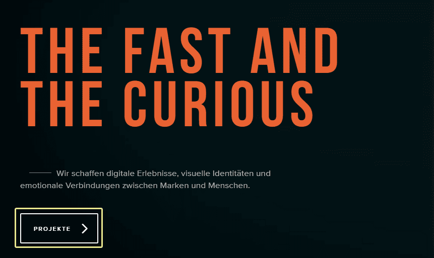
The above website tackles this problem elegantly by using a dark video background with a transparent CTA on top (you’ll have to click on the above screenshot in order to see it in action), with contrasting white lines. Also, note how strongly its headline contrasts against the background, which is necessary in order to pull the eye towards it, considering how distracting animating backgrounds can be.
3. Usable Search Boxes
At some point, your site will grow large enough that a simple navigational menu won’t be enough for users to make their way around and find past content with ease, and that’s where search boxes come in. Regardless of how you’ve chosen to implement this function into your WordPress website, be it via one of the top WordPress search plugins, Google Search, etc., these boxes need to remain visible, easily identifiable, and usable.
Before we dive into the details of what exactly makes for a ‘good’ search box, let’s kick things off with a somewhat unpopular statement: not all websites require one. Nowadays it’s become one of those functions that are pretty much expected regardless of the scope or function of any web project, but in certain cases, it’s superfluous. For example, if you’re designing a simple brochure website which won’t be regularly updated and whose owners primarily communicate through social media, what’s the point? That said, if you expect your site to grow over time, the function will certainly come in handy at some point.
Now, a simple search box encompasses two simple components: an input field and a submit function. It doesn’t need to be splashy or unique, because it should be considered as one of your site’s core functions. So, if you find yourself evaluating whether to modify its design, you should consider the following questions:
- Will it change how the search box fits into your overall design?
- Will it impact its ease of use?
- Will it affect its placement, making it difficult to find?
Let’s take a moment to examine an example of what we consider a bad implementation of a search box, due to how it interacts poorly with the rest of the website, as well as its difficulty of use.
Above you’ll see an example of a search box function which takes over the entire page when selected, and which cannot be closed, therefore requiring users to return to the last page manually if they decide they don’t need to perform a search. If considered alone, the full width search bar looks pretty sleek, but when you consider that previously mentioned flaw, as well as the fact that a submit button is nowhere to be seen, you get a terrible implementation of the search function.
4. User-Friendly Shopping Carts
Much like search boxes, shopping carts are often overlooked from a design standpoint, since they’re seen as purely functional. However, if you’re working on the design of an e-commerce site you should pay special attention to these, since they’re one of the main ways through which customers will interact with your project.
The best kinds of shopping carts will serve as a constant friendly reminder to users that they haven’t checked out yet, or how many items they’ve added in total, so they can keep track of their purchases while browsing your wares. Additionally, once opened, they should provide a succinct summary of which items have been added (along with photos of said items) and show an estimated total.
From a design standpoint, your shopping carts should fit into the overall look of your site and be easily identifiable. Shopping giant Walmart tackles this problem in a simple way which we quite like – their shopping cart is identified with a recognizable icon, and once you’ve added an item to it, a bright orange circle will appear, showing how many products there are in your cart.
This renders the shopping cart unobtrusive while shopping, and recognizable once you’re ready to go through checkout. Additionally, we’re also fans of their no-nonsense search box, which fulfills the criteria we covered in point number three.
5. Informative Maintenance and Error Pages
A lot of designers choose to have fun with their maintenance and error pages, which is pretty understandable considering that if everything goes well, they should be seen as little as possible. The problem here arises when you forget to incorporate information into these pages as part of your designs.
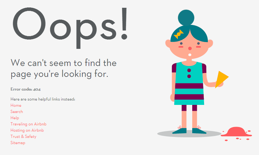
Take Airbnb’s 404 error page, for example.
It’s a pretty simple design with a headline that says it all; however, it also takes the time to inform you exactly what happened and provide you with a little extra guidance to get you back to the main site. Not only is it pretty informative, it also looks good, even though there isn’t a lot going on there.
Now, let’s compare it to the 404 page found on another site.
That’s pretty much it – an animation displaying a huge 404. While the animation itself looks great and showcases the teams design skills, it serves as a good example of trendiness over best practices.
6. Readable Typography
Typography is an area of design that often gets overlooked to the detriment of many a WordPress website, since the right font (or rug) can really tie a design together.
When it comes to picking the right candidate for your designs, there’s a single factor which should overshadow all others: is it readable? If you’re designing a logo or a headline then you might get away with a flashier font, but that won’t fly when it comes to anything that requires readers to pay attention for a while.
There are a couple of simple tricks you can add to your arsenal when it comes to picking the right font – for example, keeping lines at a consistent length enables readers to make their way down a text with less effort. You can also keep in mind that sans-serif fonts tend to perform better as headings, while serif fonts are said to increase readability.
Conclusion
It’s often easy to fall into the trap of weighing visual appeal over substance, which is especially harmful when it comes to websites (as the veterans of the Flash website generation may attest to) considering they should be designed with usability in mind.
So, should you ever find yourself being seduced by the latest trend in web design, go through the following checklist in order to determine whether it’s a fad or a winner:
- Does it negatively impact my conversions?
- Does it make my calls to action less clear?
- Does it render my search function unusable?
- Does it impact the functionality of my shopping carts?
- Does it make my error pages less informative?
- Does it make my site less readable?
What’s your personal golden rule as far as web design projects go? Subscribe and share it with us in the comments section below!
Article thumbnail image by Toni Art / shutterstock.com


I was searching over search engines about website design and found your blog site. Well I like your high quality posting abilities. You’re doing a great job. Keep it up
Thank, John! Welcome aboard. 🙂
Very innovative web design ideas that must be followed to design a great website. When designing a new website, we must know the current web design trends.
Nice Blog for themes…I have tried few of your themes. They respond very well.
Great tips for Complete web design project. CTA and 404 is the main requirement that can easily be left by any common user if he unaware of these things.
so nice point! tanks alot:)
It is somewhat confusing when you mention fonts. Quote: “You can also keep in mind that sans-serif fonts tend to perform better as headings, while serif fonts are said to increase readability.”
This blog and none of the post follow that.Why?
Thanks for your comment, Brad! Font choices are always subjective, and it’s really about how your choices fit your design. Over the past few years we’ve seen a change in balance to where pairing fonts is arguably more important than whether you use a serif or sans serif. Our advice is don’t sweat it too much, and appreciate a well matched pair than their style!
wall-to-wall overplayed glamour shots or solid colors with enormous headings and small amounts of tiny font size content, then enormous CTAs. (I’m looking at you, Divi bread shop demo site!
“While designing think like a buyer” & Spy your competitors and make better than them – helped me most of time for good conversion.
Glad you found the article useful, Jai!
I’ve found for years that some design agencies focus on winning awards rather than business. I think all your points are great, and lead back to #1 – Designing with conversions in mind.
Thank you.
Exactly, Carolyn. It’s all about the user’s experience, first and foremost. Thanks for your comment!
I think it’s such a concern that websites are starting to all look similar because of their themed approach.
I’m all for going against the grain and try new designs, but most occasions clients want what they see online, which is the parallax, burger menu styling anyway.
I can see a new animation craze appearing across the web soon! (You heard it here first) 🙂
Going against the grain, I totally agree! For instance, I go for cloudy or airy, adjustable backgrounds that match the “mission” of the webpage, and newpaper-column width text frames, menu managed and easily repositioned, opacity-adjusted, and closed -> arphosis.com
There are always design trends that rise up, then fade away – look at the use of frames back in the day, or Flash.
While I don’t think consistency is a problem, I think you do see similar looking websites, mainly due to theme’s default designs being suitable for many. I always think of websites like cars – they all can look different on the outside, but the inside still has the seats, steering wheel, gears, and pedals in the same place – and that’s very important for the end user.
SVG is incoming, by the way!
Good post. I absolutely agree with not following every here today gone tomorrow design trend. I try to keep my designs timeless, easy to navigate, and simple. Call me old school but I don’t like visiting websites that have enormous, wall-to-wall overplayed glamour shots or solid colors with enormous headings and small amounts of tiny font size content, then enormous CTAs. (I’m looking at you, Divi bread shop demo site!)
I found the font choices in this article very legible, even though the headings where serif and the body was sans serif lol 😉
Thanks for your insights, Ethan!
My message in ALL my design is this:
“Don’t let them think about anything you don’t want them to think about.”
That’s some ideal advice, Randy!
Nice point, Randy!
Thanks Tom
Really like the post and totally agree that form needs to follow function. It still surprises me how many big sites still get this wrong!
Thanks for framing up your top six ‘don’t sacrifice’. I would also add poor menu animations that don’t work on mobile devices…menu design/function is so important for getting people to the right place in a website but is often overlooked or over complicated.
Thanks again,
Chris
I would say that incompatible menu animations are a poor development choice more than anything. I think lots of developers are adopting a mobile-first approach, so would consider their animations up front.
Thanks for your comment, Chris!