Last week we introduced Divi 2.4, the biggest upgrade in Divi history and a giant leap forward for our most popular WordPress theme. There are so many great features to explore in this update that it was hard to describe them all on the release post, which is why we have decided to do a 2-week series of informational blog posts that will aim to teach you how to take full advantage of Divi 2.4 and its new options. In part seven of this series, we explore Divi’s new Row and Sections options, and I show you why Rows are now more versatile than ever.
A New Generation Of Divi Layouts
If you are a Divi user, you know that the layouts built with the Divi Builder are broken up into three elements: Sections, Rows and Modules. Sections are your largest organizational element, used to separate big blocks of content on the page. Inside of each section are placed Rows of columns, and inside each column can be any number of Modules. These are the building blocks of your page. Modules are the content, but Rows control how that content is arranged. Using different combinations of column layouts, you can create a vast array of layouts.
That has always been the case in Divi. In Divi 2.4, however, we have introduced a ton of new options to Rows which greatly increase the range of layouts that can be created. Rows and their new layout options are the key to unlocking dynamic and unique looking pages. In this article, we will be exploring the new Row options added in Divi 2.4, as well as discussing how these new options can be used together to create some really cool designs. Let’s get started!
A Look At The New Options
In previous versions of Divi, rows didn’t have any settings. What made each row unique was merely the column structure you chose for it. Divi 2.4 introduces Row Options, which you can now access by clicking the settings icon to the top left of any row on your page.
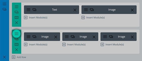
There are dozens of new settings, broken up into different categories:
New General Settings
Here you will find general layout settings that affect the overall row structure. We tend to place settings into the General Settings tab when we think they will be used often and can be easily understood by new customers.
Fullwidth Rows – The fullwidth row options is incredibly powerful. In the past, the only way to extend an element across the entire width of the browser was to use a Fullwidth Row. That meant that you were limited to our smaller collection of Fullwidth Modules. That is not longer the case in Divi 2.4. Now any row can be made fullwidth, and any module can be used inside of these new fullwidth rows.
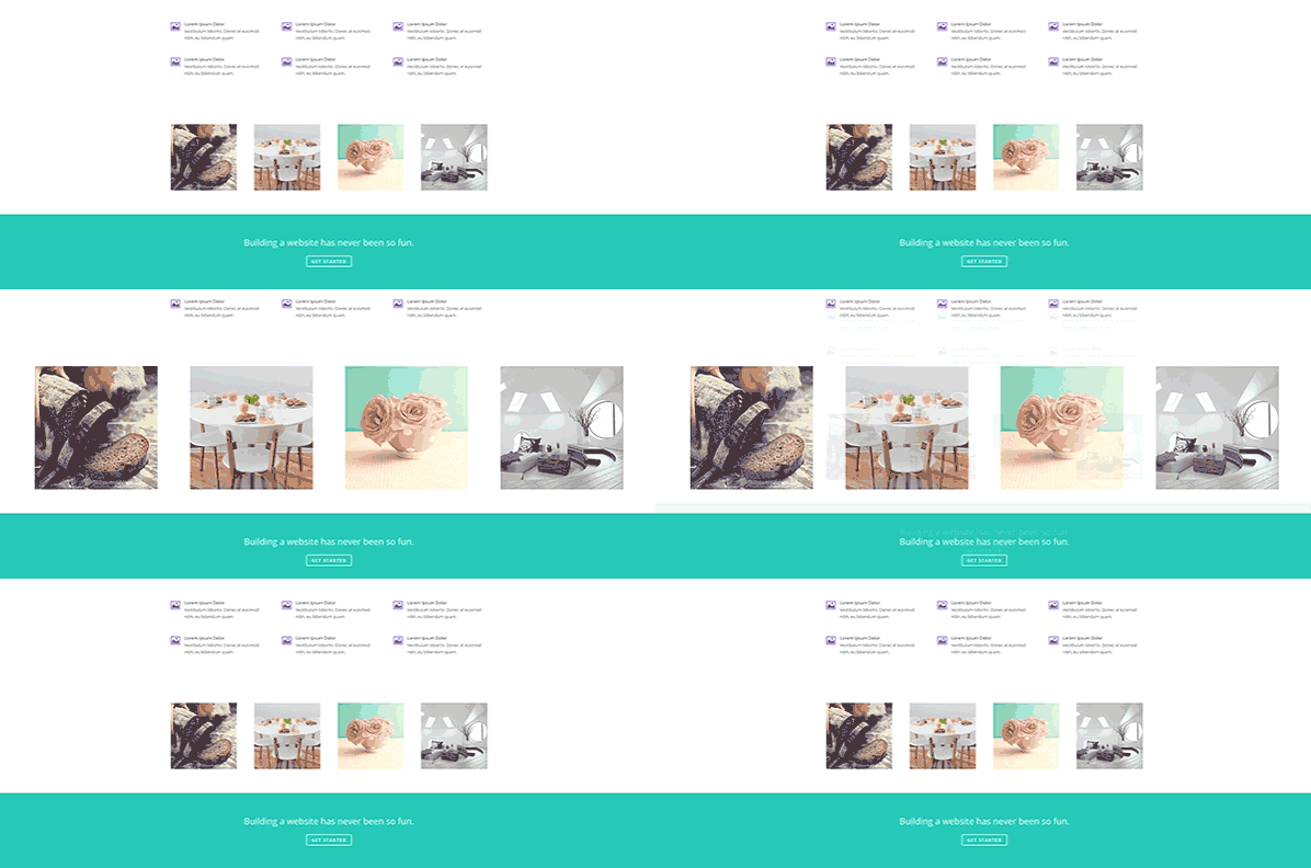
Adjustable Gutter Width – This new option lets you adjust the spacing that exists between each column in your row. This spacing can either be increase or decreased, and it can even be decreased down to nothing (allowing your modules to touch edge-to-edge). This works great with image modules, or modules that have background colors/images.
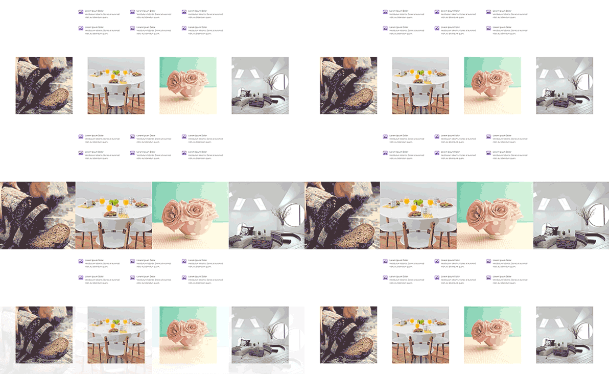
Custom Row Widths – In addition to extending a row the fullwidth of the screen, you can also define a custom width. For example, you could make a single row bigger or smaller than the rows around it, depending on the content you are trying to display. This is a great way to add variation to your page, creating a better rhythm for your content.
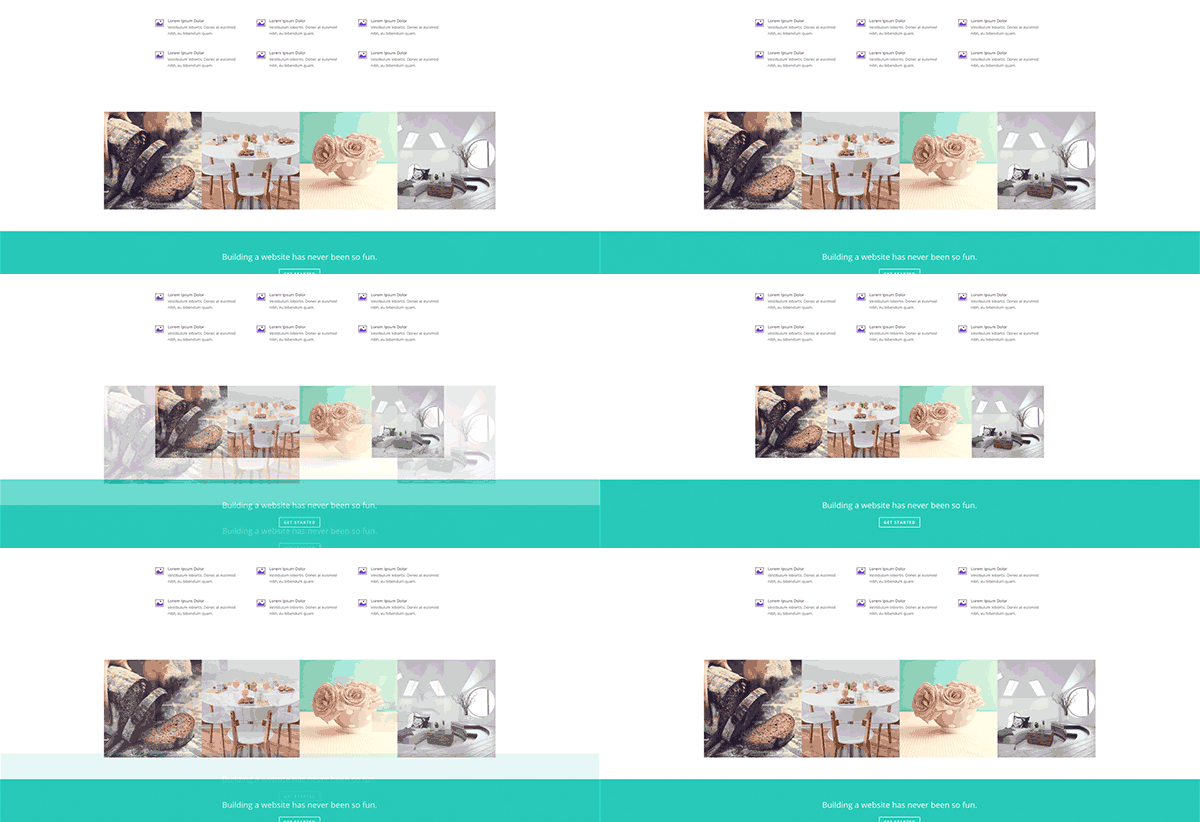
Custom Padding – Every row has padding above and below it. This is part of Divi’s natural structure, separating elements to improve hierarch and readability. This spacing can be adjusted to fit your content when needed.
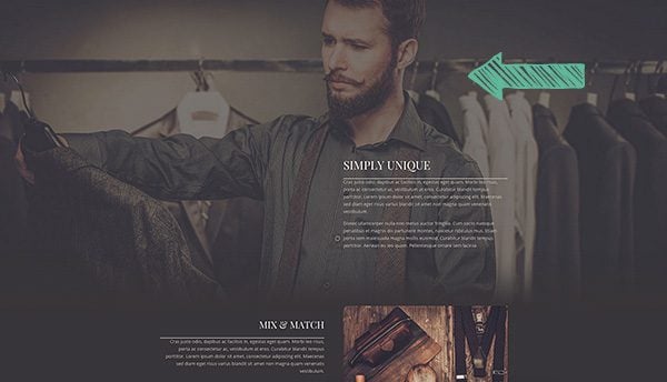
Mobile Padding Adjustment – By default, custom Row padding will not be applied to mobile devices. Large padding values that look good on Desktop often wont look great on a smartphone, but you can choose to apply these padding values if desired.
CSS ID – Much like all Divi Modules, Rows now allow you to assign custom CSS ID’s, which can be targeted using anchor links or styled in your Child Theme or ePanel CSS.
CSS Class – Rows can also have custom CSS Classes applied to them, which can be used to add custom styling in your stylesheet.
All New Column Settings
Depending on the type of row you add, and how many columns the row contains, you will find a range of new column settings within the Advanced Design Settings tab. Here you can adjust styling for each individual column within the row.
Column Background Color – Individual columns within each now can now have their own background color applied to them. When you open up the row settings popup, you will see options for each column depending on how many columns are in the row you are editing.
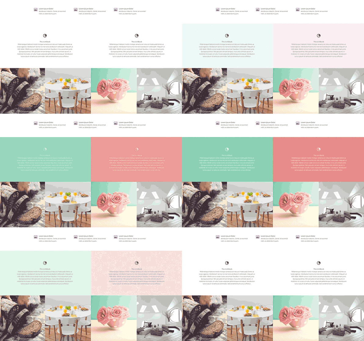
Column Background Image – Much like background colors, each column can also have a background image.
Column Padding – Adjusting the padding for columns is especially useful for rows that are full width. Adding additional padding around the columns can give the content within each column more room to breathe as their sizes are increased with the width of the browser.
Advanced Design Settings
Inside the Advanced Design Settings you will find a ton of new options that allow you to adjust every aspect of your row’s appearance. We separate these into their own tab to ensure that the General Settings are not too crowded. If you want extra control over your row’s design, you can venture into this new tab.
Background Image – Much like Sections, rows can now have a background image. This will place an image behind the modules in your row.
Background Color – Background colors can also be applied to rows.
Background Video – Finally, video backgrounds (previously only available to Sections) can now be used for individual rows within a section.
Parallax Mode – If you apply a background image using the setting above, you can apply a parallax affect to this image. Parallax mode creates an illusion of depth by moving background image at a slightly slower speed than the speed at which you are scrolling (much like an object behind another object would move, if you pivoted around it).
Equalize Column Heights – This is a wonderful new option that will make your designs look balanced without having to worry about to amount of content in each of your columns in any row. Once this option is enabled, all rows will be “equalized” and their heights will all be made the same. Each column takes on the height of the tallest column in the row. This is especially useful when you have applied a background color to each of your columns.
Custom CSS
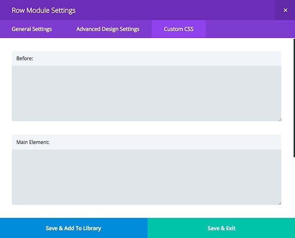
Much like Sections and Modules, Rows now have Custom CSS options available under the Custom CSS tab. Here, CSS-savvy developers can can do absolutely anything that is not already possible using the row design options. Using Custom CSS within a row will never be lost when you update your theme, and therefore it is a great alternatively to using a Child Theme.
Combine These Options For Some Amazing Results
When combined, all of these new row options open up some very interesting design possibilities. Let me go over just a few examples of how to apply these new settings in your new website design.
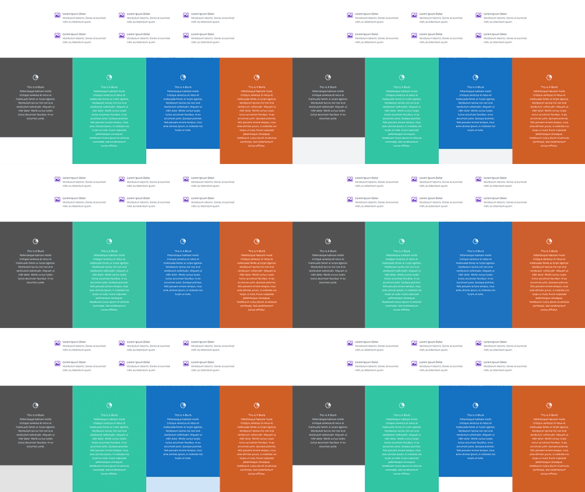
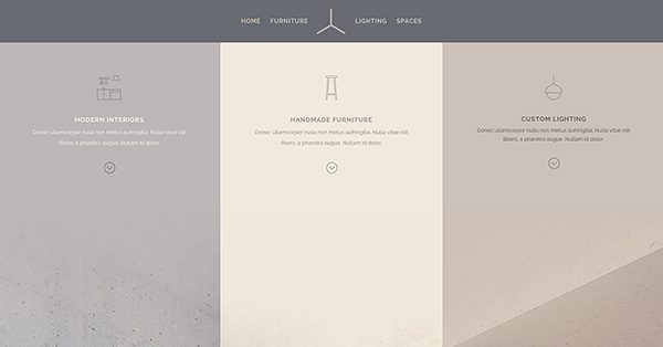
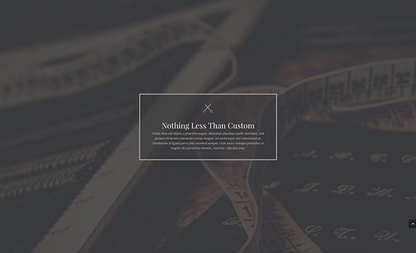
In this example above, 3 blurbs have been placed inside of a 3 column row. We have enabled to “Make Fullwidth” option to extend the row the entire width of the browser. Next we have removed the spacing between each column by setting the “gutter spacing” option to the lowest setting. Next we applied a custom background color to each column, which has been matched to the fullwidth image below it to create a beautifully seamless transition. Finally, we have enabled the “equalize column heights” option to ensure that each of our columns and their custom background colors fit together perfectly. The end result is something entirely new and refreshing.
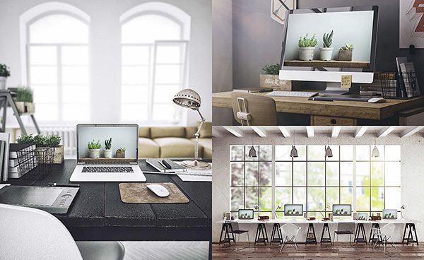
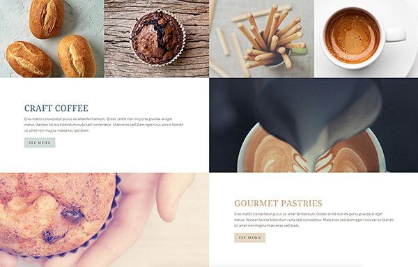
Rows can now be used to create your own fullwidth image gallery! In this above example, we have placed 3 image modules into 2 different rows with the “fullwidth” setting enabled. Next we removed the padding from each row by setting the “padding” options to “0.” Finally, we removed the spacing between each column entirely by lowering our row’s gutter spacing setting to the lowest value. This causes the edges of each image to touch and the width of the row to extend the entire width of the screen.
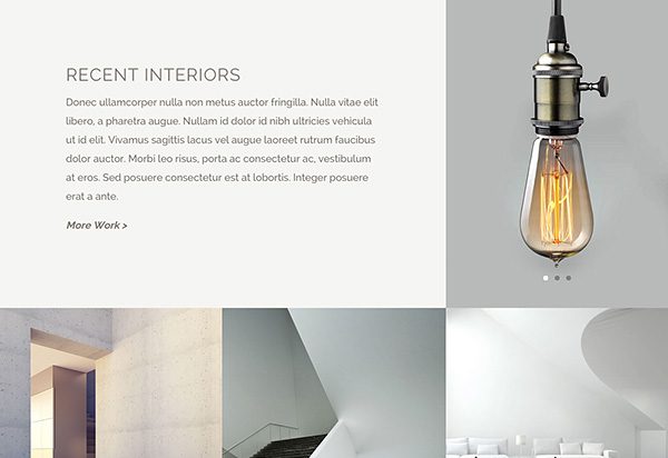
The same gallery grid effect can be combined with text and image sliders as well. In the above example, we created a mix and match of image modules, image gallery modules and text modules to create gutter-less and fullwidth media display.
Sometimes your design just needs a little more room to breath. In this example, we have used the row’s padding options to increase the padding on the top and bottom of the row. This places a great deal of space above and below the blurb module, which has been centered inside of a single column.
When you add column background images into the mix, even more possibilities become available. In the example above, an empty column has been utilized with a custom background image. When made fullwidth and paired with a CTA module on either side, we are able to achieve a checkered effect that responds beautifully on mobile.
The Possibilities Are Endless
When I say that Rows have become the most versatile part of the Divi Builder, I mean it! As you begin to experiment with Divi 2.4’s new row options and expand your layout vocabulary, you will also start to unlock new and creative uses for each module. When placed inside of rows of different widths and padding, each module can take on a different personality. Together, you can begin to build a variety of layouts that are vastly superior to anything you have been able to build in the past. I hope this gives you some inspiration for your next website, and I hope you enjoy playing with Divi’s new row options! Have fun 🙂




This is fucking fantastic.
Yes, please consider adding more rows in the builder. I really want Divi to be my most beloved and most used theme but I still have to find awkward workarounds for things like 5 and 6 column layouts. For example, creating a grid of affiliated companies using small, hyperlinked logos.
Hi all.
Davidson how could you increase default 4 rows on divi constructor to 5?
Did you add some own css?
I need to get 8 rows instead 4 by default in constructor.
Thanks Rick, divi rocks!
Here is what I did with DIVI – check this out http://www.davidsonospina.com
Not sure if you mention this in the Divi 2.4 blogs, but wanted to make sure I let you know to do so or fix this please……Here is the issue:
When you need to add custom margins to sections in Divi, sometimes it does not pick it up until you add a !important next to your settings – perhaps I’m doing something wrong or there is a conflict on my end, but it has happen a few times during development.
I LOVE DIVI !!!!
I would love to be able to equalize column heights on blog posts grid style on the home page. Is that possible or will be in the future?
Thumbs up divi 2.4 with ‘tons’ of great news stuff however for us who have a child theme with lots of css styling it’s taking a while to get my head round what I have to fix to make the site look as it did before.
I guess it’ll be worth the work to then start making design changes to fully appreciate the new functions.
Great stuff all round.
In the image (where you show text “Recent Interiors” on the top left quadrangle, a light bulb slider on the top right quadrangle), how did you get the bottom row to have a smaller height than row above? Was that based on your image height or can you specify row height?
Hi there, just wanted to say thanks for this update, it looks awesome and I am excited to try it out.
Also, the spelling of ‘breathe’ is wrong in this post, if you’re talking about breathing it should have the e on the end, otherwise it’s just breath.
Great work, though, I love the tutorials!
I am big fan of Live Composer and I mostly use it for all my sites. Seems Divi 2.4 will replace soon in my desk. Loving New Rows coming with 2.4.
Great tutorial. Totally satisfied. Thumbs up divi 2.4
Nick, what would be very useful is a downloadable pdf of each of these posts – there is so much good info – or maybe a book 😉
thanks for a great theme!!
Thanks so much Nick,
For a WordPress newbie like me, DIvi 2.4 is the Toy’s’rUs of WordPress.
Hats off for such gift.
If this was the only change that had been made to Divi, I would have been incredibly happy (of course I love the other updates too, but this is a game changer!). Great work work Nick and the ET Team.
Thanks again!
It’s really nice working with all the new features.
But….. 😉 I miss some explanation about the before, main en after-css too.
And maybe, when there is some spare time, it would be very nice expanding the contact-options in a way contactform7 does.
Why, in god’s name, am I able to enter 100px LETTER spacing (!), yet cannot specify 1.2em (aka, non-integer) values for LINE spacing? SMfreakingH…
Latest Divi is just Awesome! Need some time to combine all the features to create most flexible designs!
2.4 is the Great Version! 🙂
Great Stuff.!!!
OKAY So you want to hack in a fifth column or even a sixth column in DIVI.. Well this hack I say will do it….
Now I am only going through two simple examples out of the many that need to be created here and SUPER LITTLE CSS has been added, BUTT LOTS WILL NEED to be added to get each module to show up right.
http://s91585912.onlinehome.us/howididit/whatidid5.html
It seems that Divi is getting more and more powerfull in a way that is fully customisable. I have a project that would be wonderful to be done with Divi but there is a question that needs an answer. Can Divi make pages with horizontal scroll??
My Guess is you would need a new module for it.
You could do a portfolio like that.
Thanks again, Nick and Co.!
=D
All I can say is thank youuuuuuuu!!!!!!!!!
Divi 2.4 it’s just too amazing! all the features that I always wanted are there now. I loved the theme since I started using it a year a go, but now it just blowing my mind!
Congratulations for this wonderful job and thanks guys!
I’d love to see a video on this Nick with changing the option parameters shown for each example … great working …. lovin the Divi
I would like to know how to make Divi multilingual :/
I have a multilingual Divi website here: http://www.mirtoscrete.gr
The thing I’ve been waiting for was the Global Setting, and it’s here now! Now I can update my galleries in five languages at once!
Use the plugin polylang, it causes the least conflicts and it’s free. I’ve used it on a large number of sites and it hasn’t disappointed me yet (unlike qtranslate). 🙂
I also used Polylang on a Divi website and all worked just fine!
Here it is: http://cocobeach.ch/
Jurrie i am impress by your multilanguagr website. Witch plugin do you use xith divi ?
All sound amazing + thank you!
I was very excited about the Adjustable Gutter Width feature but I can’t make it work.
Is there a tutorial anywhere? Video?
Please, share 🙂
you guys are amazing, i think you have created a perfect theme that gives more control over the modules. Thank you again.
Good Lord, if I read another comment here or in the Divi FB group about how 2.4 is so great “BUT it’s missing this, and it’s missing that, and why aren’t my 30 plugins working perfectly with it??, waaaahhh waaaahh, my footer text… and why can’t Kenny Sing post his demos so I don’t have to learn CSS??!! waaaahhh!!!”
….I’m going to pull my f-ing hair out!! >.<
Divi is a tool people. It's only as good as YOU ARE. It is not able to do your work FOR you.
And thanks ET. Nice work 😀
I’m not sure this is a completely fair comment.
I think web designers need to understand the fundamentals of CSS (and PHP) in order to use their WordPress themes to the fullest. I don’t disagree that we should have some knowledge and do the work.
However… Divi 2.4 (and every other version that came before it) is a tool, and we want to know how to USE that tool. So if Kenny’s got a cool demo and the Divi blog talks about how Kenny used only the standard settings of Divi 2.4 in order to create those beautiful demos, then that’s information we should have access to so that we can LEARN. We can’t learn if we have no idea how he did or what functions of Divi 2.4 he used in order to create his gorgeous pages. Guessing and trying and testing things yourself can get you to a certain point, but when you get stuck, it’s good to have a reference. That’s what learning is all about.
(Yes, to the too many messages about footer text, though. It’s not in this version of Divi. Move on, people! *GRIN* Follow the instructions in the support forum and add extra functions to your php file, or wait until they offer it in another update.)
I’m with both Leslie and Ryan on this one.
Leslie is obviously talking to those who know how to do it, but would rather not or don’t fundamentally know html. Ryan believes in feedback for the betterment of something and is not just a troll.
Let’s face it (and pardon the cliche): you can’t please everyone. Take a moment and think about how complicated this stuff really is.
Yeah, we shouldn’t get annoyed by such things; I do too . My Waaaaaa! – There are so many tools and controls now that my puny brain is running out of storage to keep them cataloged and organized. Waaaaa!
There is going to be a time when year later I go back to edit a Divi 2.4 site and will be hunting for those css edits. Are they in the child theme, the advanced module settings, the custom css settings, or are they the default css?
THANK YOU! Best comment yet.
Divi 2 was also a tool. A tool that had it’s limits. Not the people using it, but the tool itself.
From the feedback Elegant Themes got from the version 2 tool, they made a better tool, or 2.4.
All tools have their limits and it’s not just the person using it. But we can make those tools better. So that next version will be even better.
I don’t see why feedback would be such a source of frustration for you!
I have checked your blog post and really it will help any developer. But today i visited one more website which is helping people by giving information like how to clone a website. I really want you to help me here like how it work. I had added that website link in anchor you can check it.
Thanks,
Wow, I am sure you do not mind hearing this as much as possible but thank you for the amazing job that your team has done Nick. From the updates and support all they way to the blog and documentation. I very well may never use another WordPress theme. I don’t see the need for it.
Cheers
I don’t have a lot to say. Only this: Divi 2.4 is so good that there ought to be some law against it! Loving it so much that i upgraded to the lifetime package!
I’m working with Divi 2.3.1 on a site right now and have a number of theme customizations to a child theme. Can I make the update to 2.4 without too much hassle?
Hi,
Go to section design – themes and choose the DIVI theme and click on live preview – so i think you can see what will be wrong or not after switching.
Thank you, thank you, thank you — for someone who struggles with CSS, the new DIVI is so easy to use. I’ve always hated the claim by theme designers that “anyone can design a website” — it is just not true. You had to know some CSS to get pages to display the way you wanted them, but not now. DIVI makes it so easy to control sections, rows and columns — it is a theme will allow just about anybody to create beautiful page layouts.
Like another reviewer, I also appreciate the bite-sized tutorials — they make it quick and easy to learn.
I love all these possibilities and have enjoyed playing with them these past few days.
But there’s one part I had trouble understanding: the Custom CSS tab with its Before, Main Element and After fields.
If it was just one field box for Custom CSS, I would understand it. But I don’t understand the Before or After field boxes. And when I tried to add a CSS style to the Main Element box, it didn’t seem to apply anywhere within my modules in that row. So I know I’m doing it wrong but I don’t quite get how they’re supposed to be used. Could you explain that a little bit more?
Thanks!
+1 on Details about Custom CSS Options tab and how to use it effectively. I’ve also tried playing around with different styles in each of the 2 sections but nothing different shows up.
I believe they refer to adding styling to the modules/sections right above and right below the module you are modifying. This way if you make this section a global section the styling would apply everywhere it shows up without having to make the changes in multiple spots.
Hi Sherry, I am in the same boat. I think a separate walk-through post on how to properly use Custom CSS tabs within modules would definitely clear some ground.
+1 on the CSS module information.
Adding my +1 on the CSS module information.
Absolutely!
Guide Customize CSS needs more details of use.
Divi 2.4 is simply awesome! Like Noz said, I think this was the post I was waiting for to truly grasp some of it’s power.
One thing, mobile padding adjustment, I feel like this would be so much better if we would have more control/options for what we want to set with mobile designs, especially giving how important mobile design is.
Something like you can get with CSS hero – http://www.csshero.org/features/#fw-device-mode
Or with live composer, http://codecanyon.net/item/live-composer-frontend-wordpress-page-builder/6594028
Very nice. Thanks keep up the good work. I’m confused on what an empty column is. I tried a row with columns and filled in modules without any content and then set column background images in the row but nothing appears.
I have been scratching my head about this also but managed to work it out after much frustration. Don’t put anything in the column. Instead in the row’s options go to “Advanced Design Settings” and add a background image in the column with no module.
I’ve created 5 client sites using DIVI. They love it. I can’t wait to break out the new 2.4 version.
I love the new options provided with the 2.4 update, and the new options with the rows are fantastic, but what about columns?
Is there a way to create a layout with more than 4 columns without hand coding the html and CSS?
Hi there,
I’ve just stumbled across your post and so pleased to see I’m not the only one who would love to see options to increase columns to 5 or 6 (my clientb is asking for 6!).
Is there an easy way to get the six columns in a row that you talk about?
Thanks
Tony
NOT unless you hack the THEME…..
First you goto the includes/builder/functions.php file..
That includes code for the different layouts.
I say some more code in certain areas of other files in the builder directory need fixes as well to get 5 and 6 columns as well.
I am not a PHP expert so I do not what is fully going on.
AND you will have LOADS AND LOADS AND LOADS of CSS to edit as well.
I say for fullwidth mode 5 and 6 column items need to take place
Well Michael I added in a new post below with this link
http://s91585912.onlinehome.us/howididit/whatidid5.html
have some fun hacking the theme…
Hi Richard,
Thanks for your link because I was looking for that for many days.
All was OK until you speak about a style.php file… I don’t have this file, only a Style.css… (perhaps the last download versionof Divi ??)
I am not very competent with CSS/html code, so I don’t know how to do with that..
Can you help me ?
Thanks !
Well. that answers that…
Its unfortunate that additional column options are not built in. Thanks for taking the time to figure out the hack but for now i will probably keep hand coding the custom layouts.
I do not think it would take long to do that as an official update. Sure would make the 349K style.css file in the DIVI directory.
A small typo…
Sure would make the 349K style.css file in the DIVI directory a whole lot larger though…
Sure would make the 349K style.css file in the DIVI directory a whole lot larger though…
Great job! I appreciate these tutorials. These bite-sized pieces make it a lot easier to understand.
Hello Nick!
I like very Divi, I use all my work. Divi 2.4 awesome!
It would be very good multiple columns 5/5, 6/6 layouts. Especially now that we have the full width row.
And more animation for each module, for example, text module, CTA, etc.
Divi 2.4 is already the best and easiest to use site builder, but I think it’s still missing …
What do you think?
Oh my gosh Yes!! more than 4 columns please. Six would be brilliant!
That would be very helpful!
I would also like to see different logo on my fixed and mobile …
multiple columns and animations will be great..
i’d like to add two logos to the header as well in some cases
yep. i need two logos, too. one logo has to move out of the header menu – we are working on this atm but its really hard to get it >.<
I would love to see the option to add more than four columns to a row in the Divi Builder. I cant figure out how to make this work right now.
Try this: http://www.divithemeexamples.com/tag/6-columns/
This would be nice if it would respond better on mobile devices by stacking the modules/blurbs on top of each other, instead of stacking 2 side-by side blurbs… which often look off-center.
I found the link to the excerpt without a read more button or hover link animation a bit jarring.
The full article can be found here:
http://www.divithemeexamples.com/create-an-5678-column-rows-in-divi/
Noz, Why don’t you just put the two logos side by side and save them as one image, and then upload them into your design.
that’s what i do now.. but it’s not the best practice
Divi 2.4 is rocking my face off! Hat tip to you and your team. #diviForPresident
i think this was the post i’ve been waiting for..
also if possible some documentation (for better understanding/fixing current css customization) on what has changed in terms of Styling – especially the screen sizes , i think there are more width break now than before ?