
Welcome to part 6 of this 6 part series that will teach you how use Divi and its new Animation options to design awesome page sections. I’m going to be walking you through how to build the different sections of our live demo page in order to show you techniques for adding animations to your website. The Animation features truly are fun and easy to use. And with the Visual Builder, you can see your creation come to life every stage of the way. Come and join me as we explore the power of Divi animations.
In the last post we built section 7 of our animation demo page where I showed you how to animate images using the roll animation style to add life-like movement to your content.
Today, we are going to be tackling Section 8 and 9 of our animation demo page. Section 8 is a great example of how to make a featured item stand out using a combination of the slide animation and blur effects. Section 9 is a simple and elegant way to add animation to a team section that showcases photos of your team.
Let’s get started.
Here is a Sneak Peek of What We Will Be Building in Today’s Post

Preparing the Design Elements
You will need four images for this tutorial. You will need a custom background image and three recipe card images. The background image is 1280×936 and has a yellow background with 6 semi transparent white rectangles with added shadowing for depth. Once the background is used in the section with parallax, it will give the impression of recipe cards floating in the background. The recipe card images are each 375×667. Here are the images used in this tutorial.
Background Image

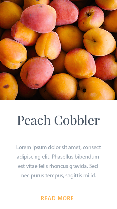
Recipe Card Image #1
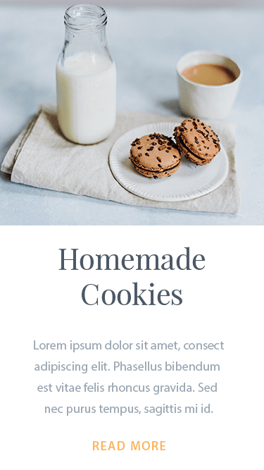
Recipe Card Image #2
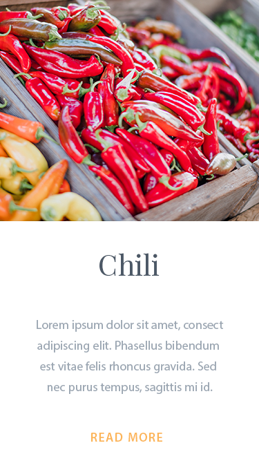
Recipe Card Image #3
Using Divi’s Animations to Float and Bounce Image
Subscribe To Our Youtube Channel
Building Section 8
Before we start the building process, here is a glimpse at the wireframe view of the section layout we will be creating using the visual builder.
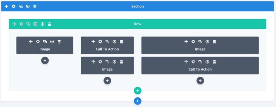
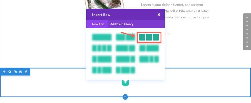
Using the Visual Builder, Let’s start by adding another regular section to our layout. Then add a three column (one-third one-third one-third) row to your section.
Update Row Settings
Before we add our first module, go to the row settings and update the following:
Under the Design tab…
Use Custom Width: YES
Custom Width: 1366px
Use Custom Gutter Width: YES
Gutter Width: 1
Column 1 Custom Padding: 6% Right
Column 3 Custom Padding: 8% Left
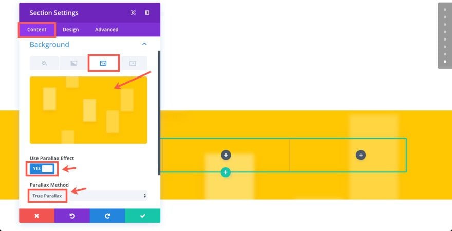
Add Background to your Section
Next let’s put the main background image in our section. Go to section settings and update the following:
Under the Content tab…
Background Image: [insert 1280×936 image]
Use Parallax Method: YES
Parallax Method: True Parallax
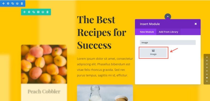
Add Image #1
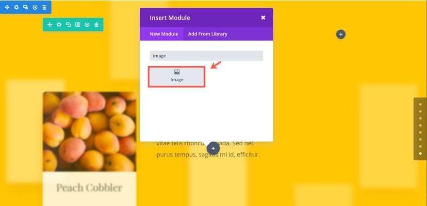
Now we are read to add our modules to our row. In the first (left) column, add an image module.
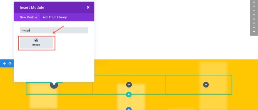
Then update the settings as follows:
Under the Content tab…
Image URL: [enter recipe card image #1]
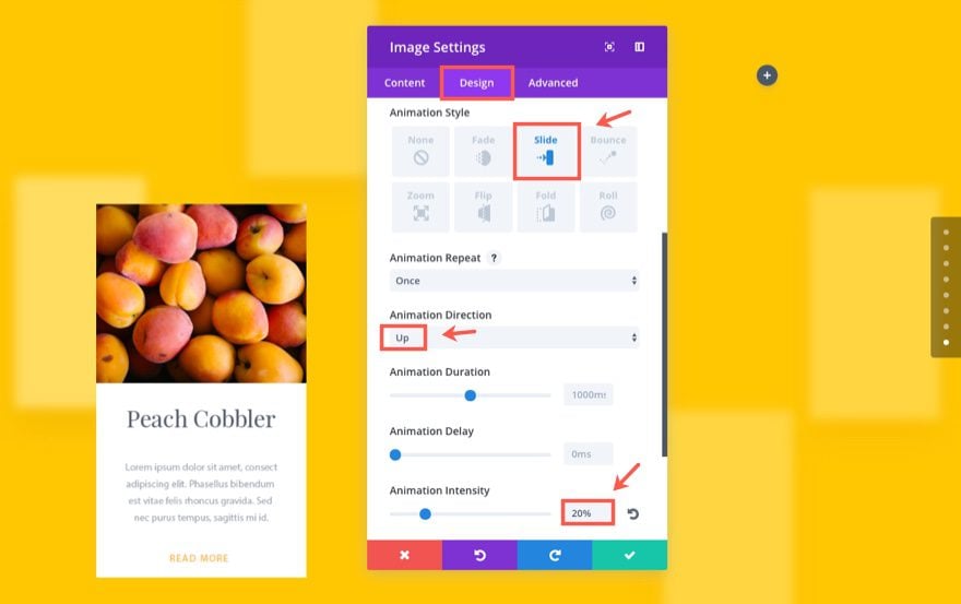
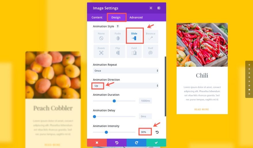
Under the Design tab…
Force Fullwidth: YES
Animation Style: Slide
Animation Direction: Up
Animation Intensity: 20%
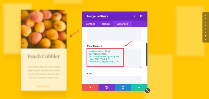
Under the Advanced tab…
Here we are going to add some custom CSS to give the card image a rounded edge, a box shadow, and a blur filter. Enter the following CSS in the Main Elements box:
border-radius: 10px;
overflow: hidden;
box-shadow: 0 40px 40px 0 rgba(232,170,0,0.7);
filter: blur(2px) opacity(.75);
Save Settings
Add two Text Modules in the Middle Column
Next, add a text module in the second (or middle) column and update the settings as follows:
Under the Content tab…
Enter the following h1 header in the text tab of the content box:
<h1>The Best Recipes for Success</h1>
Under the Design tab…
Header Font: Playfair Display, Bold (B)
Header Font Size: 60px
Header Line Height: 1.3em
Custom Margin: 20px Bottom
Animation Style: Fold
Animation Direction: Up
Save Settings
Add another Text Module under the one your just created and update the settings as follows:
Under the Content tab…
Content: Lorem ipsum dolor sit amet, consectetur adipiscing elit. Phasellus bibendum est vitae felis rhoncus gravida. Sed nec purus tempus, sagittis mi id, efficitur.
Under the Design tab…
Text Font Size: 18px
Text Text Color: rgba(0,0,0,0.56)
Text Line Height: 1.9em
Custom Margin: 40px
Animation Style: Fold
Animation Direction: Down
Animation Delay: 150ms
Save Settings
Add Image #2
Add an image module under the two text modules you just created.
Then update the settings as follows:
Under the Content tab…
Image URL: [enter card image #2]
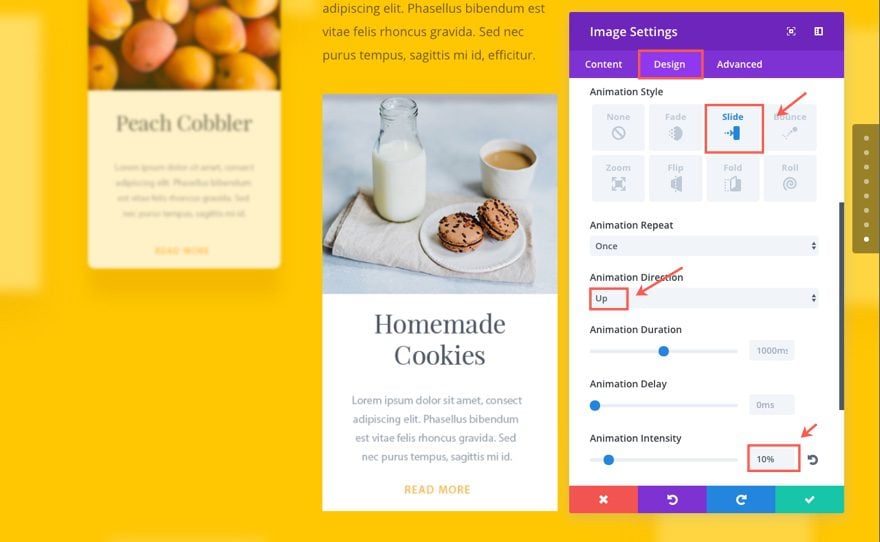
Under the Design tab…
Force Fullwidth: YES
Animation Style: Slide
Animation Direction: Up
Animation Intensity: 10%
Under the Advanced tab…
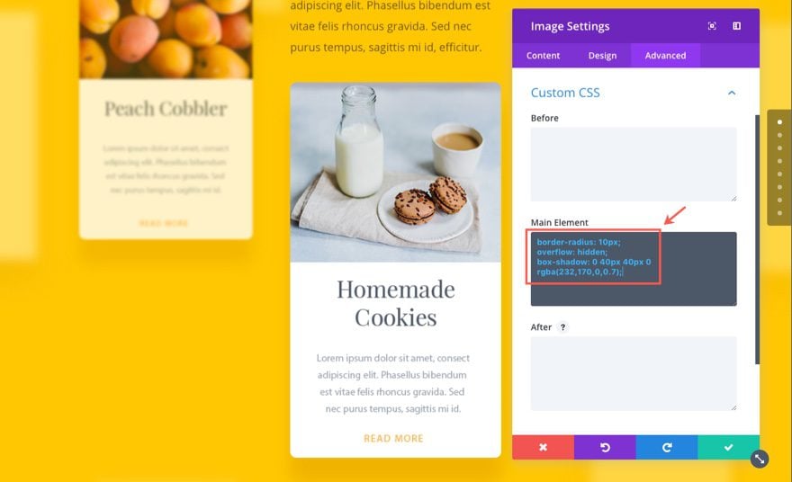
Here we are going to add custom CSS (similiar to the first card image except without the blur effect) to give the card image a rounded edge and a box shadow. Enter the following CSS in the Main Elements box:
border-radius: 10px;
overflow: hidden;
box-shadow: 0 40px 40px 0 rgba(232,170,0,0.7);
Save Settings
Add Image #3
Let’s add our third and final card image to the third (or right) column by inserting an image module:
Then update the settings as follows:
Under the Content tab…
Image URL: [enter card image #3]
Under the Design tab…
Force Fullwidth: YES
Custom Margin: 20% Top
Animation Style: Slide
Animation Direction: Up
Animation Intensity: 30%
Save Settings
Under the Advanced tab…
Add this custom CSS in the Main Element box:
border-radius: 10px;
overflow: hidden;
box-shadow: 0 40px 40px 0 rgba(232,170,0,0.7);
filter: blur(8px) opacity(.4);
Save Settings
Great! That concludes section 8 of our demo page. Check out the final result.
The animation is surprisingly life-like and makes great use of the parallax feature which moves the background downward at a different speed than the modules sitting on top when scrolling. The fact that the cards are animated upward with the background going down gives the impression of the cards floating. I must say, the content really pops on this section.
Building Section 9 of The Demo
In our final section, we are going to build a simple “Our Team” section with a little animation that literally “pops”. Here is what we are going to build:
Here is a glimpse of layout from the wireframe view.
Add a the Section Header
First, add a regular section with a one-column row. then add a text module to the column.
Update the text settings as follows:
Under the Content tab…
Content: Our Team
Under the Design tab…
Text Font: Raleway, Bold (B), Uppercase (TT)
Text Font Size: 15px
Text Text Color: rgba(0,0,0,0.32)
Text Letter Spacing: 5px
Text Line Height: 1.9em
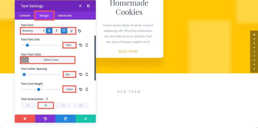
Custom Margin: 20px
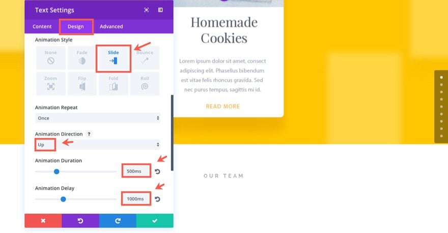
Animation Style: Slide
Animation Direction: Up
Animation Duration: 500ms
Animation Delay: 1000ms
Under the Advanced tab…
Save Settings
Add another text module under the one you just created and update the settings as follows:
Under the Content tab…
Enter the following h1 tag in the text tab of the content box:
<h1>Highly Skilled Ninjas</h1>
Under the Design tab…
Header Font: Raleway Light
Header Text Alignment: Center
Header Font Size: 48px
Header Text Color: #3a3830
Header Line Height: 1.3em
Custom Margin: 20px Bottom
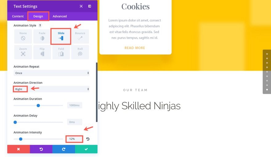
Animation Style: Slide
Animation Direction: Right
Animation Intensity: 12%
Save Settings
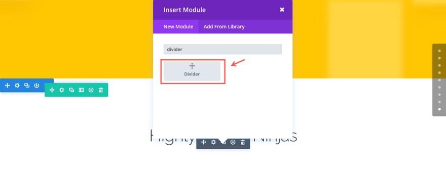
Now to add the small green divider line, add a Divider Module under the text module.
Then update the divider settings as follows:
Under the Content tab…
Show Divider: YES
Under the Design tab…
Color: #7cda24
Divider Weight: 3px
Height: 3px
Width: 60px (type this in)
Module Alignment: Center
Animation Style: Slide
Animation Direction: Down
Animation Duration: 500ms
Animation Delay: 1000ms
Animation Intensity: 200%
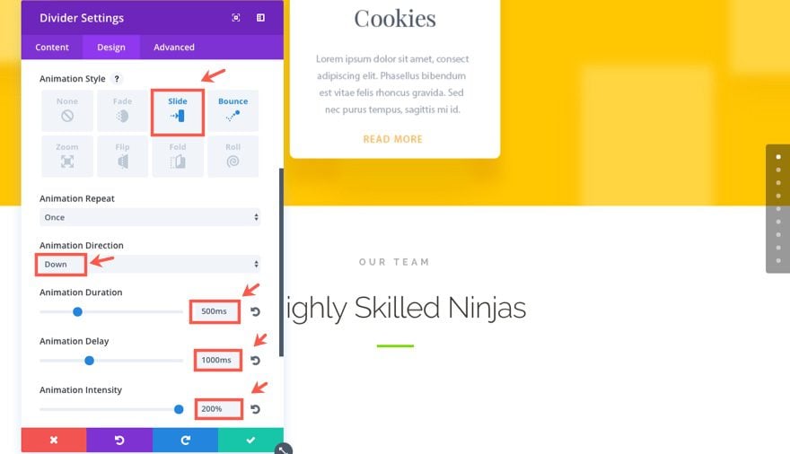
Save Settings
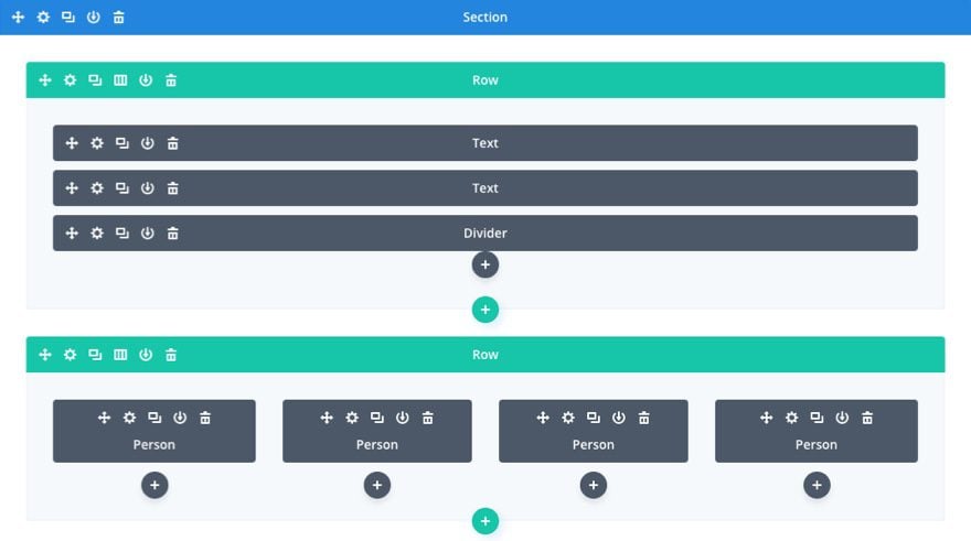
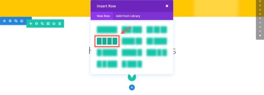
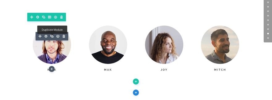
Adding the four team images
To add our team member images, add a four column row under the row containing the header we just created.
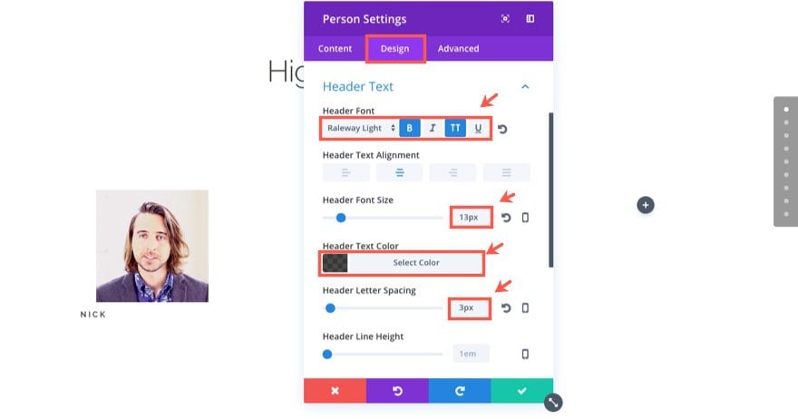
Add a Person Module in the first column and update the settings as follows:
Under the Content tab…
Name: Nick
Image URL: [enter your 150×150 photo]
Under the Design tab…
Header Font: Raleway Light, Bold (B), Uppercase (TT)
Header Font Size: 13px
Header Text Color: rgba(0,0,0,0.71)
Header Letter Spacing: 3px
Under the Advanced tab…
Add the following CSS in the Member Image box:
border-radius: 100%;
overflow: hidden;
width: 180px;
margin: auto auto 20px auto;
This will give our image a nice circle border.
Add the following custom CSS to the Member Description:
text-align: center;
display: block;
This centers the Name.
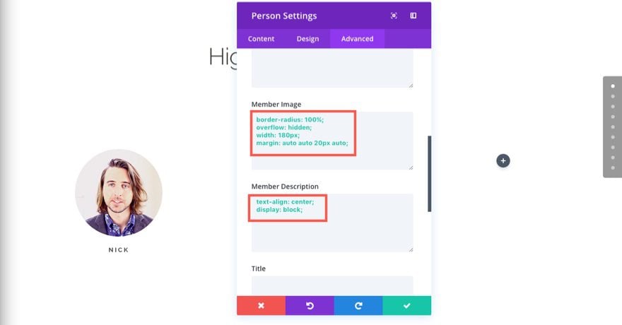
Save Settings
Now you can duplicate the Person Module you just created to add the next three to fill the next three columns. All you need to do is update the image and the name for each of the modules you duplicate.
Once you have added all four of your person modules, you are ready for the final step in this section which is to style and animate the row. To do that, update the row settings as follows:
Under the Design tab…
Use Custom Gutter Width: YES
Gutter Width: 2
Custom Padding: 60px Top
Animation Style: Bounce
Animation Duration: 700ms
Animation Delay: 1000ms
Well that concludes section 9 of our animation demo page. And it also concludes the 6 part series on using animation with Divi.
Wrapping Up The Series
I hope you have enjoyed building our Animation Demo page. The design alone is a great inspiration. And the use of animation throughout will no doubt serve as reference guide for future page builds. Special thanks to Kenny Sing, our Director, for creating this layout. We are so proud of it, we want to offer this layout to you for free to help you jumpstart your next project.
Bonus: Download These Sections for Easy Import
As a bonus perk we’ve packaged the sections built in today’s tutorial into a free download that you can get using the email opt-in form below. Simply enter your email and the download button will appear. Don’t worry about “re-subscribing” if you’re already part of our Divi Newsletter. Re-enter your email will not result in more emails or duplicates. It will simply reveal the download.
Enjoy!

To use these downloads, start by locating the zipped file called All_Animation_Effects_1.zip in our downloads folder. Unzip it to reveal all of the imports from this series–including the final two for this post.
Navigate in your WordPress Admin to Divi > Divi Library > Import & Export. When the portability modal pops up, click the import tab and the button labeled choose file.
Select the json file you prefer and click “Import Divi Builder Layouts”. Once the import is complete navigate to the post or page you would like to add one of the above sections to.
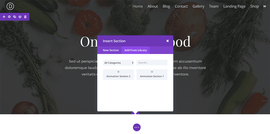
Activate the visual builder. Navigate to the part of the page you would like to add one of the above sections to. When you click the add new section icon, you will be presented with the option to “Add From Library”. Choose this option and select the layout you want.
I look forward to hearing from you in the comments below.
Cheers!


Hey, looks like these animations won’t work if you use a child theme. I tried creating a completely blank child theme, to make sure it wasn’t any of my own css etc messing stuff up, but nope. Any ideas? 🙂
Just FYI, the wireframe at the beginning of the lesson is not correct. It shows a different row format and also CTA’s which were not used in this section. Thought you might want to correct that! 🙂
Elegant peeps, I really miss the sidebar on your blog. I rarely have time to catch up on my non-client emails and am searching through all of the posts trying to find the 1st day of this series. It used to be that I could click on a topic in the sidebar and find DIVI 100, etc … am I the only one who doesn’t have time every single day to keep up with DIVI emails?
I would love to see the sidebar come back so that it would be easier to find what I have missed while developing sites.
Thanks for hearing me out
Very good news. I will use on my web site..
This is a nice effect but it would be much more effective if it weren’t just images for visuals sake.
It would be more useful if those panels were posts using the excerpt and the featured image.
Download link page is off
“This Page Does Not Exist
We’re sorry, but it appears the website address you entered was incorrect.”
Hi.
Thanx for your awesome job.
It looks like the “Download The Layout Pack” link does not work. It leads to a 404 page.
Thanx again.
Download link not working.
Looking good Jason.
I’m inspired to go out and get creative with these super cool animation features 🙂