
Every week, we provide you with new and free Divi layout packs which you can use for your next project. For one of the layout packs, we also share a use case that’ll help you take your website to the next level.
This week, as part of our ongoing Divi design initiative, we’re going to show you how to use Divider Modules to create background shapes with Divi’s transform options and the Paralegal Layout Pack. Divider Modules are very versatile and can really uplift the overall design of your pages. Although we’ll be recreating some examples that match the Paralegal Layout Pack specifically, you can use this technique for any kind of website you build with Divi.
Let’s get to it!
Preview
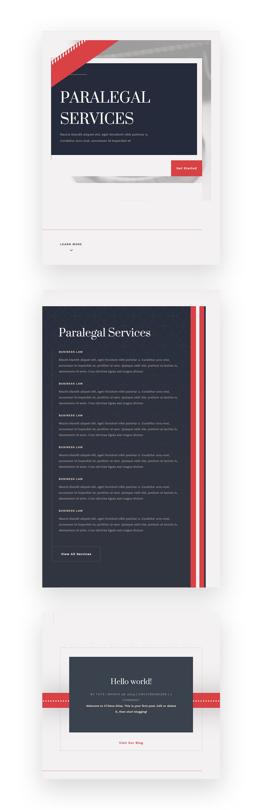
Before we dive into the tutorial, let’s take a quick look at the outcome across different screen sizes.
Desktop
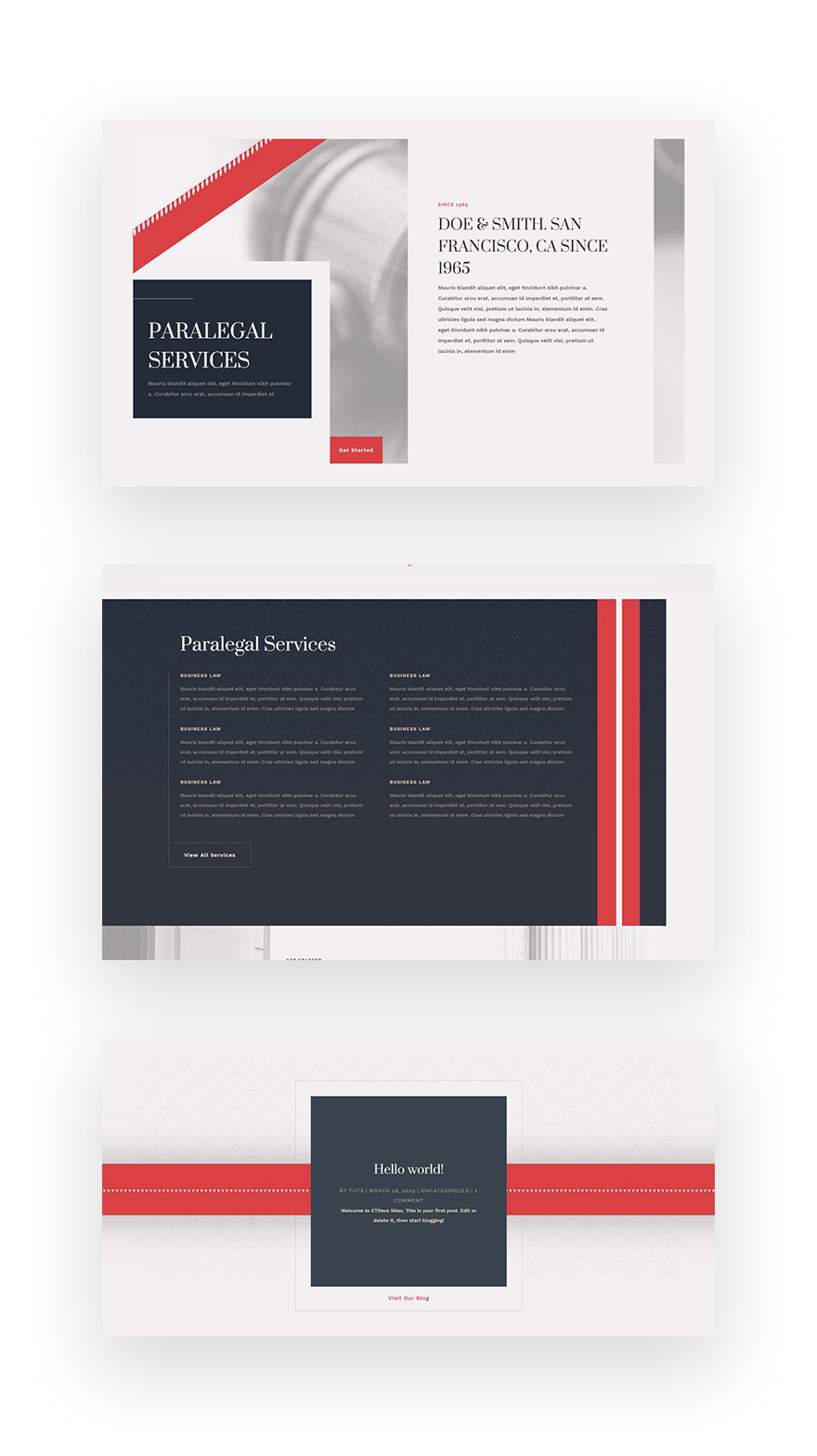
Mobile
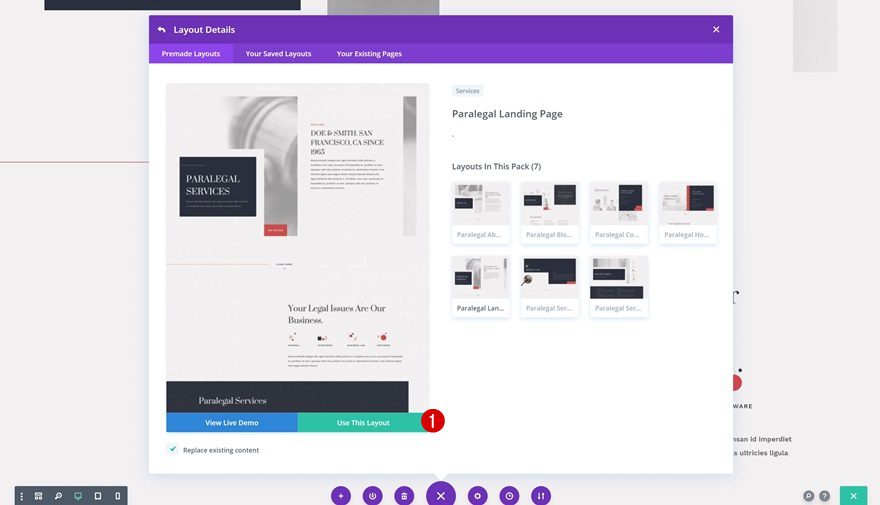
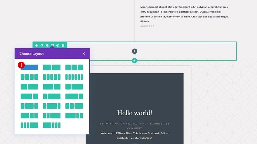
Create New Page Using Paralegal Layout Pack’s Landing Page
Create a new page and upload the Paralegal Layout Pack‘s landing page to it.
Recreate Example #1
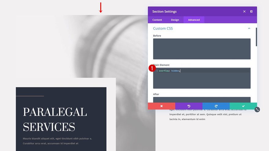
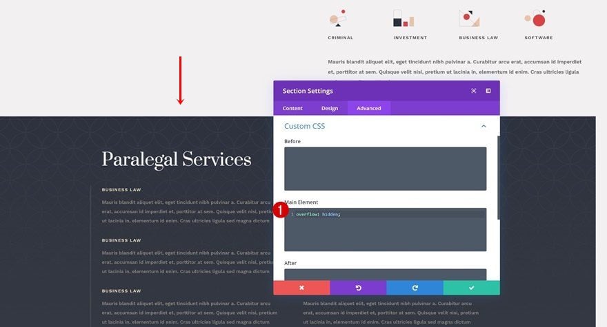
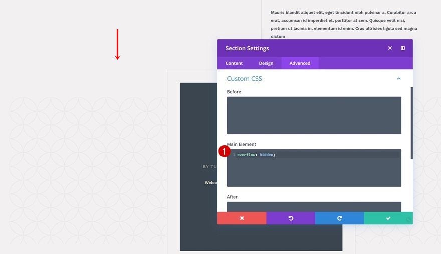
Section Overflow
Let’s start creating the first example! Go ahead and open the hero section settings and go to the design tab. Here, we want to make sure that nothing surpasses the section container. To do that, we’ll add one single line of CSS code to the main element.
overflow: hidden;
Add Divider Module to Column 2
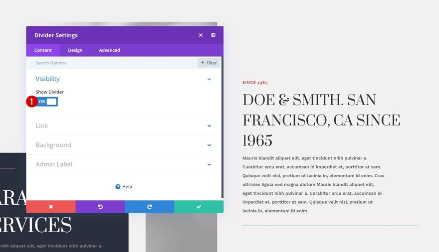
Visibility
Then, go ahead and add a Divider Module to the second column of the specialty section. Make sure the ‘Show Divider’ option is enabled.
- Show Divider: Yes
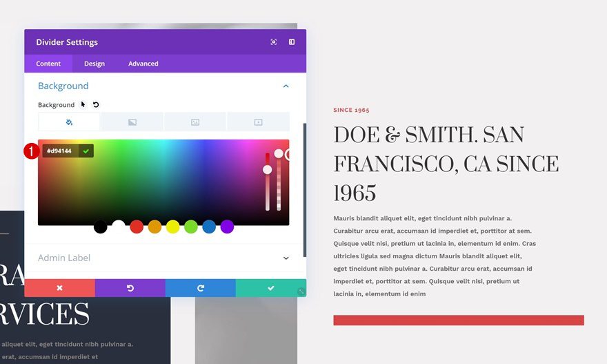
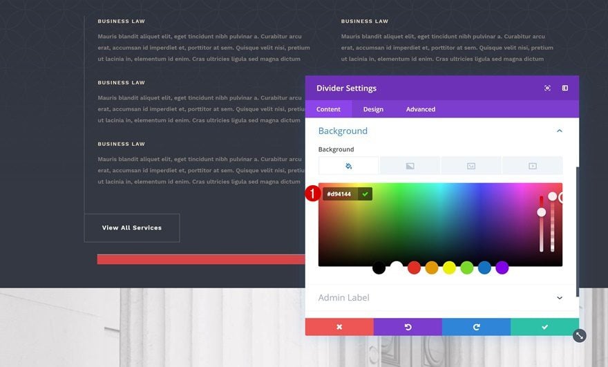
Background Color
We’re going to use a color from the layout pack’s color palette as the background color for the divider.
- Background Color: #d94144
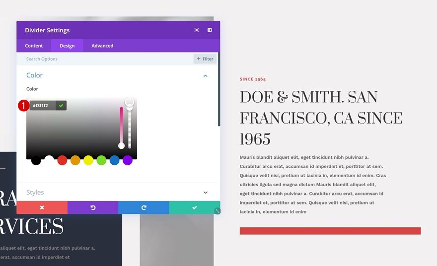
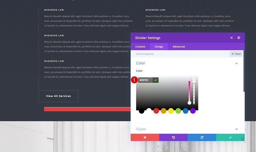
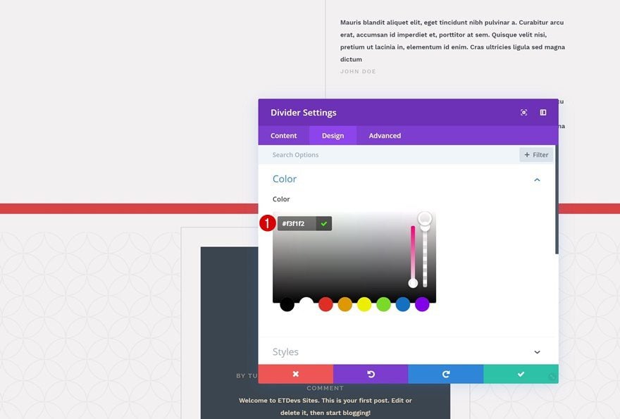
Color
Then, we’ll go to the design tab and change the color of the divider as well.
- Color: #f3f1f2
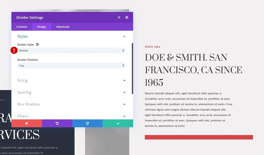
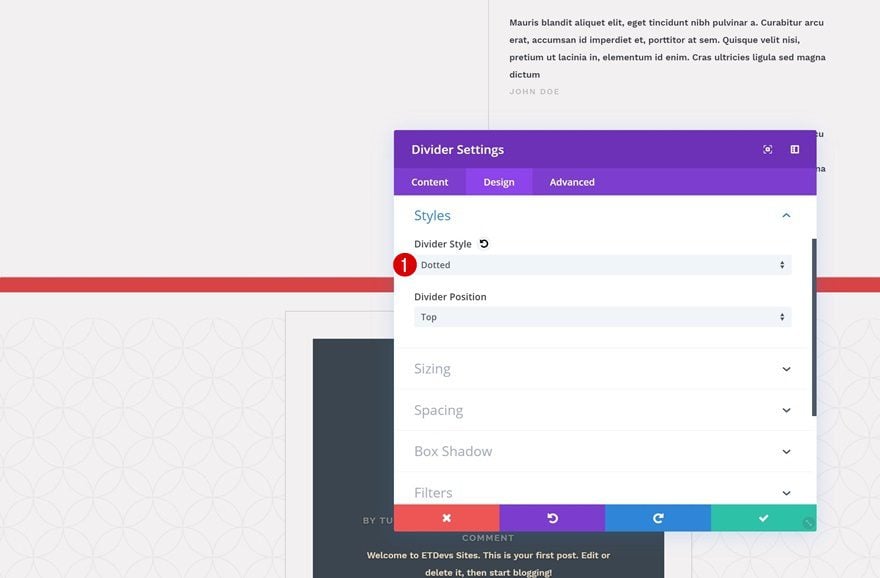
Styles
Move on to the styles settings and modify the divider style.
- Divider Style: Dotted
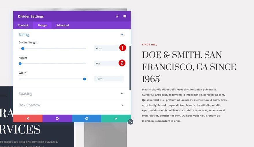
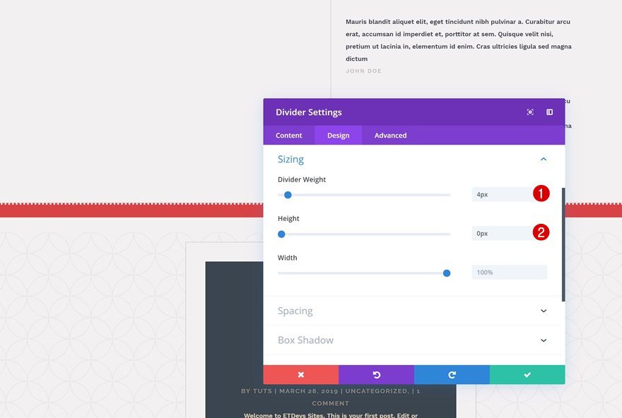
Sizing
Play around with the sizing settings as well. You can make this Divider Module look however you want to, but if you want it to look exactly the way it was shown in the preview of this post, use the following settings:
- Divider Weight: 4px
- Height: 0px
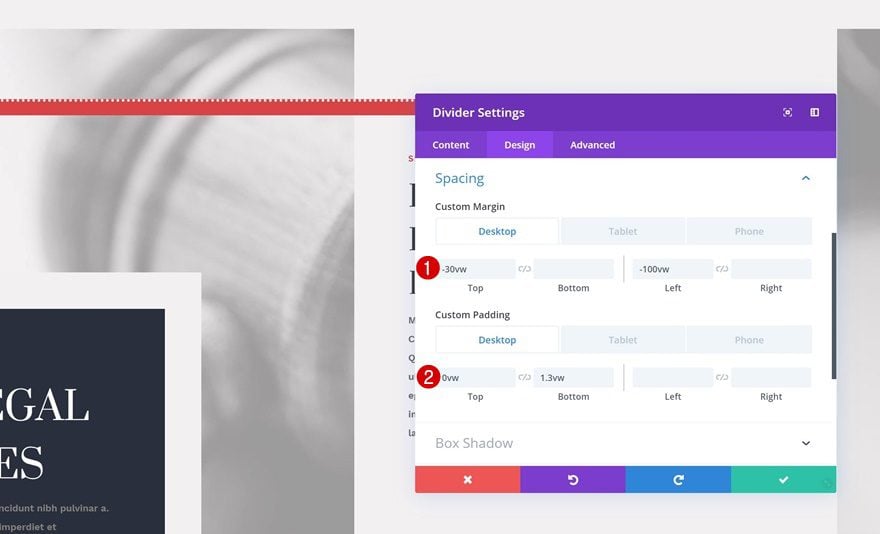
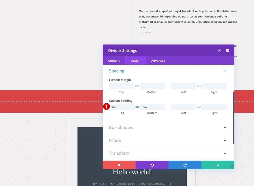
Spacing
Now, we’re going to change the position and size of the Divider Module using some custom margin and padding values. Make sure you modify the values according to the different screen sizes so everything remains responsive.
- Top Margin: -30vw (Desktop), -100vw (Tablet & Phone)
- Left Margin: -100vw (Desktop), -138vw (Tablet), -300vw (Phone)
- Top Padding: 0px
- Bottom Padding: 1.3vw (Desktop), 2.2vw (Tablet), 3vw (Phone)
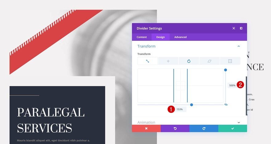
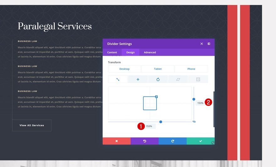
Transform
Transform Scale
Time to transform the module! The first thing we’ll do in the transform settings is increase the divider size by adding the following transform scale values:
- Bottom: 153%
- Right: 500%
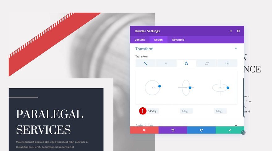
Transform Rotate
We’ll also rotate the Divider Module in the transform rotate settings. As you can notice, the Divider Module doesn’t surpass the section thanks to that one line of CSS code we’ve added at the beginning of this tutorial.
- Left: 348deg
Recreate Example #2
Section Overflow
On to the next example! Again, we want to make sure nothing surpasses the section container by adding one single line of CSS code to the main element of the section.
overflow: hidden;
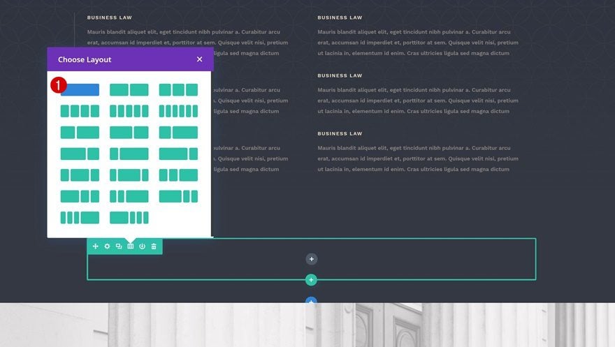
Add New Row to End of Section
Column Structure
Continue by adding a new row at the end of the section using the following column structure:
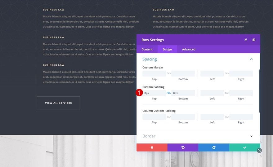
Spacing
To decrease the size that is taken up by the row, we’re going to remove the default top and bottom padding in the spacing settings.
- Top Padding: 0px
- Bottom Padding: 0px
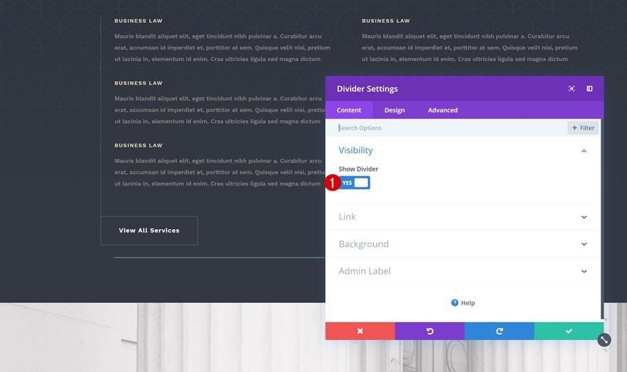
Add Divider Module
Visibility
Time to add and style the Divider Module! Make sure the ‘Show Divider’ option is enabled.
- Show Divider: Yes
Background Color
We’re, again, using one of the colors in the layout pack’s color palette as the background color.
- Background Color: #d94144
Color
Move on to the design tab and change the divider color too.
- Color: #f3f1f2
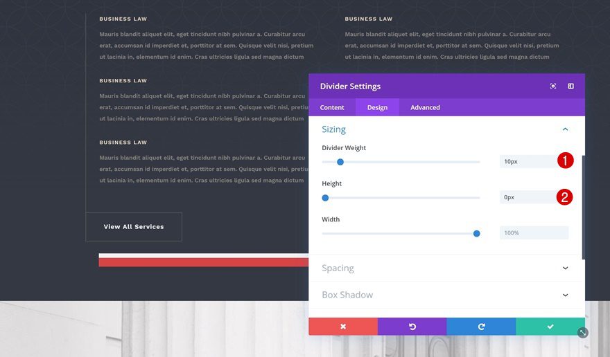
Sizing
We’re playing around with the sizing settings as well.
- Divider Weight: 10px
- Height: 0px
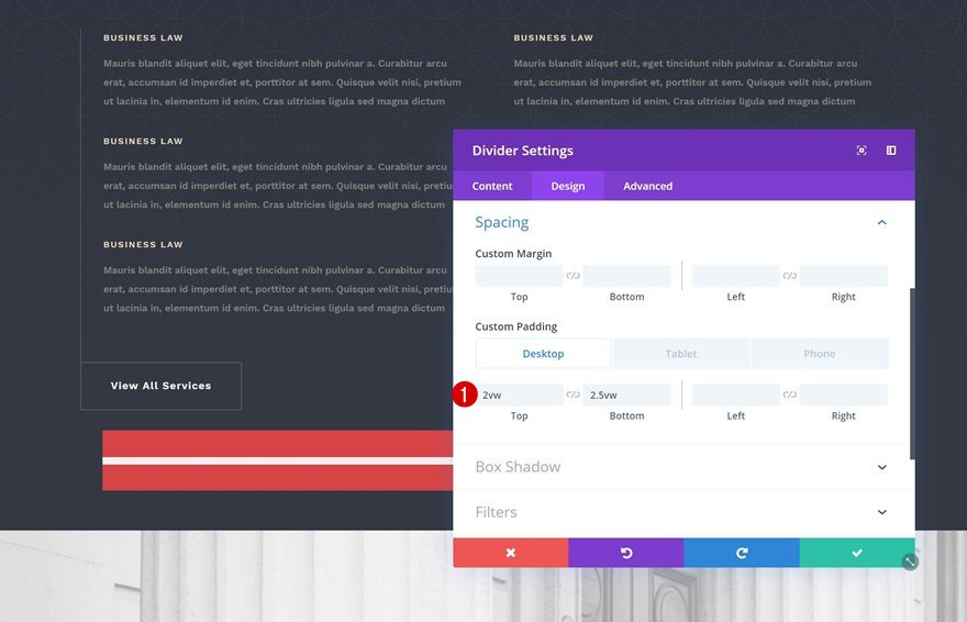
Spacing
And we’ll create the exact shape we want using some custom padding that we’ll modify across different screen sizes.
- Top Padding: 2vw
- Bottom Padding: 2.5vw (Desktop), 3vw (Tablet), 3.9vw (Phone)
Transform
Transform Scale
Time to transform! The first thing we’ll do is scale the Divider Module. We’re doing this to make sure that there’s no gap at the beginning or the end of the section. Don’t worry about scaling your Divider Module too much, everything that exceeds the section will not show up in your design.
- Bottom: 153%
- Right: 153% (Desktop), 250% (Tablet), 500% (Phone)
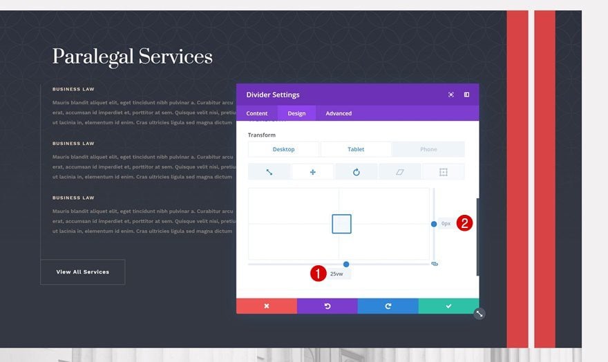
Transform Translate
Then, we’re also going to change the position of the Divider Module to make it show up on the right side. Make sure you match these values to the different screen sizes.
- Bottom: 25vw (Desktop), 27vw (Tablet & Phone)
- Right: 0px (Desktop), -32vw (Tablet & Phone)
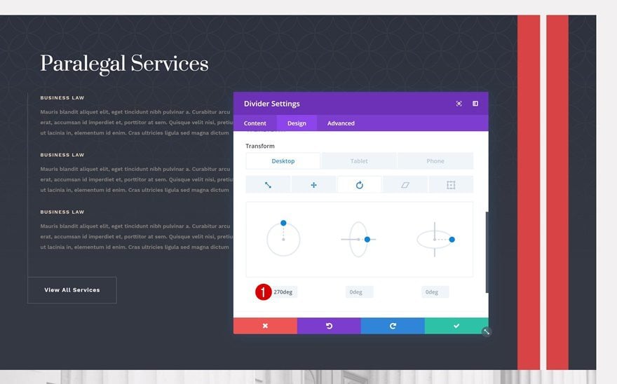
Transform Rotate
Last but not least, we’re going to turn the horizontal divider into a vertical one by playing around with the transform rotate settings.
- Left: 270deg
Recreate Example #3
Section Overflow
On to the next and last example! Again, make sure nothing surpasses the section container by adding one single line of CSS code to the main element of the section.
overflow: hidden;
Add New Row to Beginning of Section
Column Structure
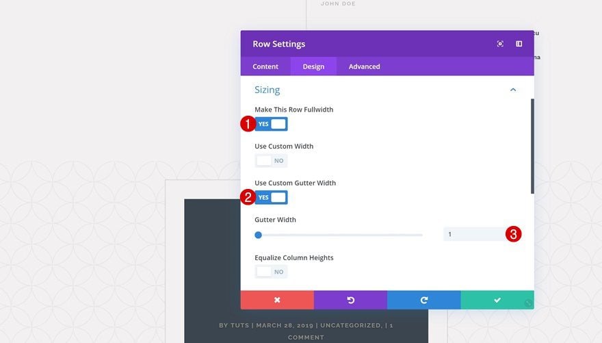
Continue by adding a new row at the top of the section. It’s important that the row is placed at the top so it won’t overlap the content below it later on the tutorial.
Sizing
Without adding any modules yet, open the row settings and allow the column to take up the entire width of the screen.
- Make This Row Fullwidth: Yes
- Use Custom Gutter Width: Yes
- Gutter Width: 1
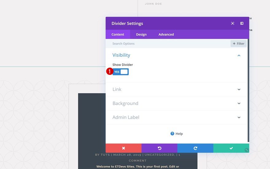
Add Divider Module
Visibility
Add your Divider Module next. Make sure the ‘Show Divider’ option is enabled.
- Show Divider: Yes
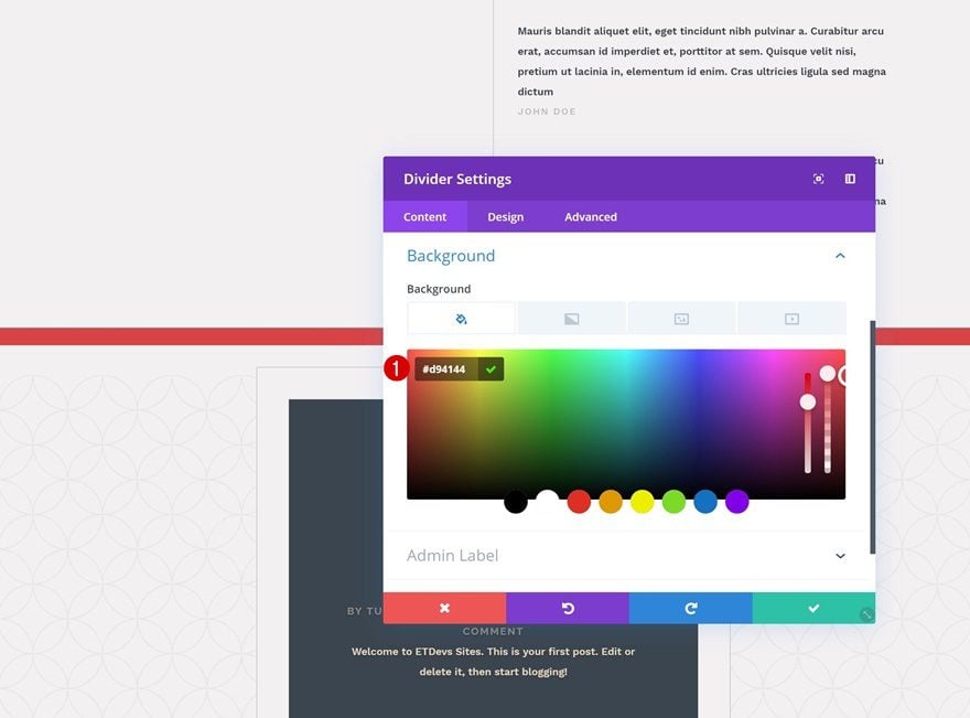
Background Color
Move on to the background settings and add a background color of your choice.
- Background Color: #d94144
Color
Modify the divider color as well.
- Color: #f3f1f2
Styles
And change the divider style in the styles settings.
- Divider Style: Dotted
Sizing
Then, go to the sizing settings and make some changes.
- Divider Weight: 4px
- Height: 0px
Spacing
And create the shape you want using some top and bottom padding in the spacing settings.
- Top Padding: 3vw
- Bottom Padding: 3vw
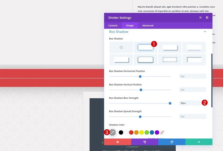
Box Shadow
We’ll also add some depth to our page by giving the divider a subtle box shadow.
- Box Shadow Blur Strength: 80px
- Shadow Color: rgba(0,0,0,0.3)
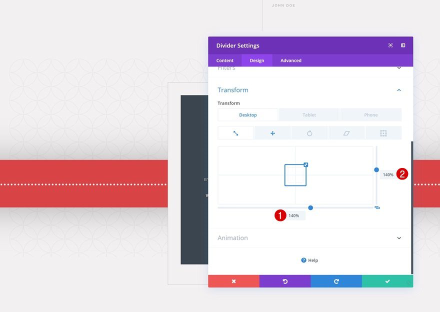
Transform
Transform Scale
Now that we’ve styled the divider, we can start transforming it. The first thing we’ll do is increase the size of the Divider Module in the transform scale settings.
- Bottom: 140%
- Right: 140%
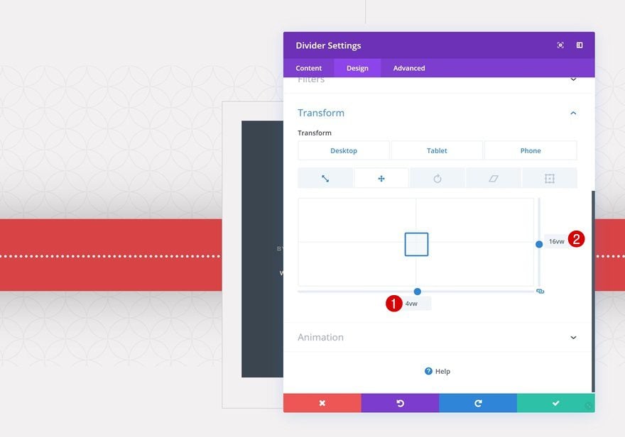
Transform Translate
Then, we’ll go to the transform translate settings and change the position of the Divider Module. Placing the row at the top of the section helps us maintain a lower z-index than the row that comes below it, which creates this beautiful overlap!
- Bottom: 4vw
- Right: 16vw (Desktop), 26vw (Tablet), 35vw (Phone)
Preview
Now that we’ve gone through all the steps, let’s take a final look at the outcome across different screen sizes.
Desktop
Mobile
Final Thoughts
In this post, we’ve shown you how to use the Divider Module and Divi’s new transform options to create background shapes and enhance the overall look and feel of your pages. This tutorial is part of our ongoing Divi design initiative, where we try to put something extra into your design toolbox each and every week. If you have any questions or suggestions, make sure you leave a comment in the comment section below!


Where’s the live action…?