

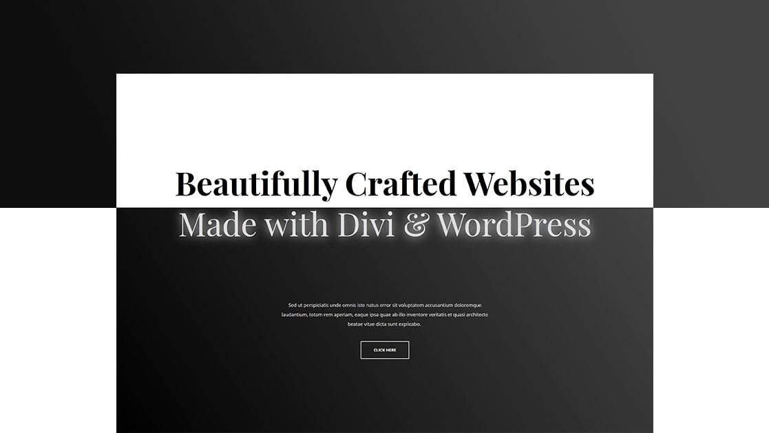
Divi and its new scroll effects bring tons of new design possibilities to the pages you build. You can add a customized scroll effect to each container and synchronize the effects accordingly. This design freedom easily helps you highlight certain content in an elegant way. In this tutorial, we’ll show you how to add scroll motion effects to your headlines. That way, you can put an extra emphasis on your headlines and keep your visitors involved. You’ll be able to download the JSON files for free as well!
Let’s get to it.
Preview
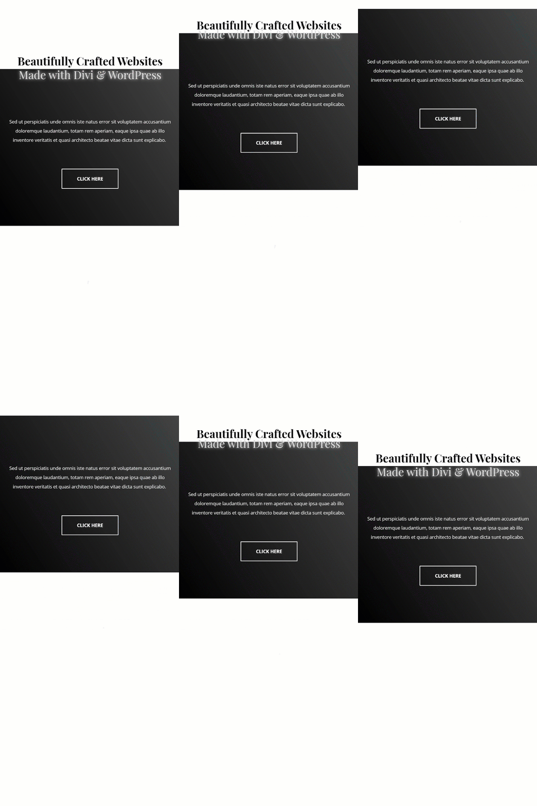
Before we dive into the tutorial, let’s take a quick look at the outcome across different screen sizes.
Example #1
Desktop
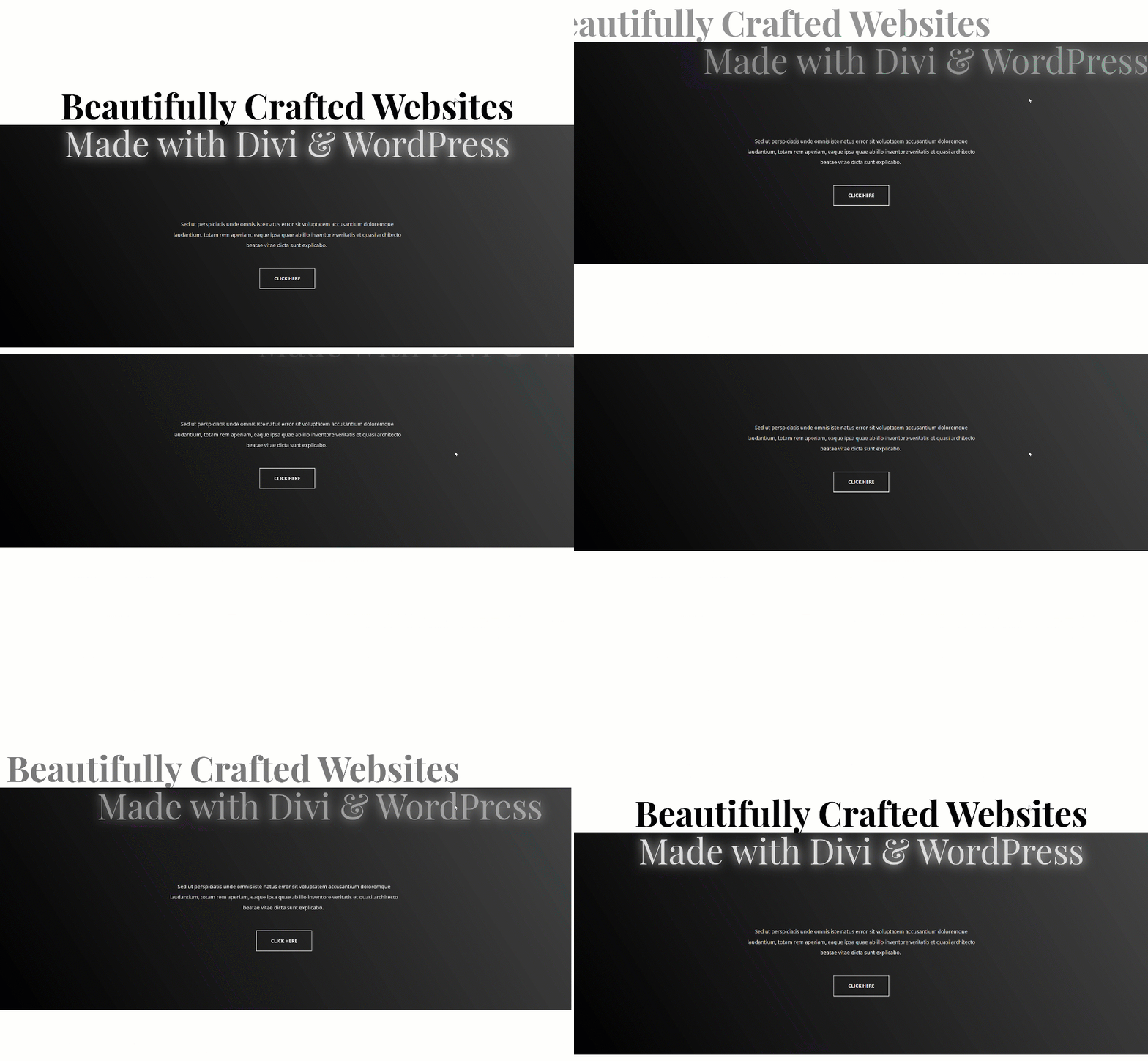
Mobile
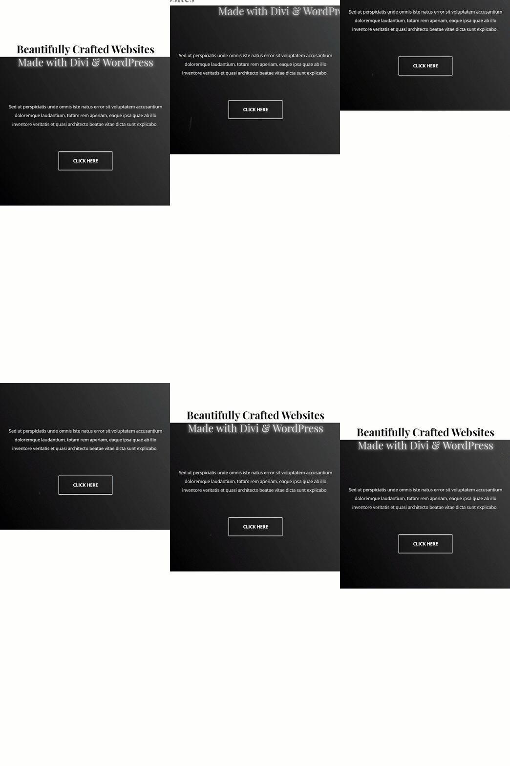
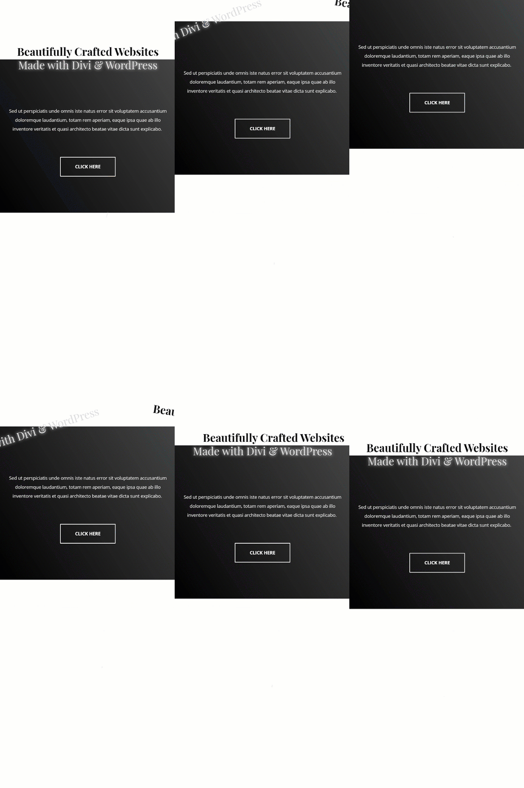
Example #2
Desktop
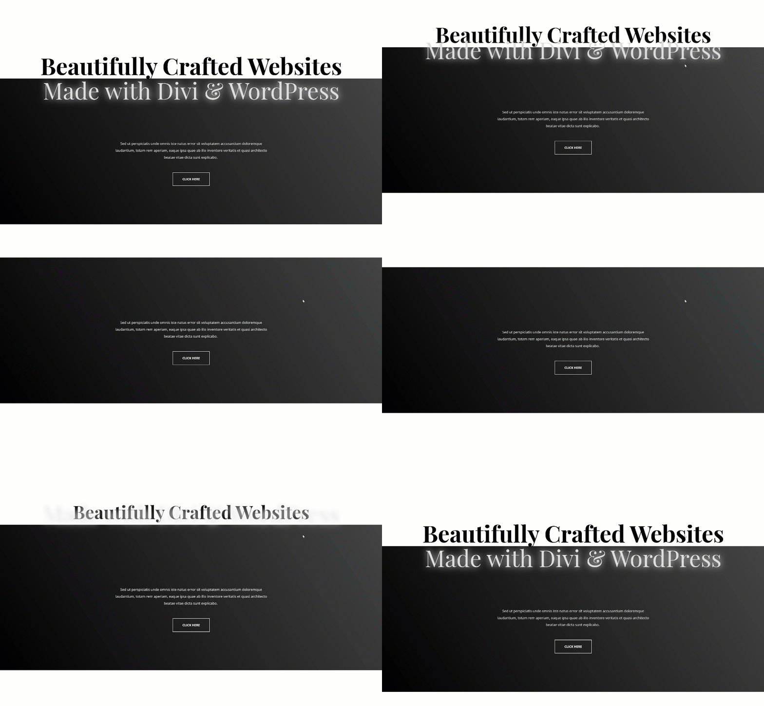
Mobile
Example #3
Desktop
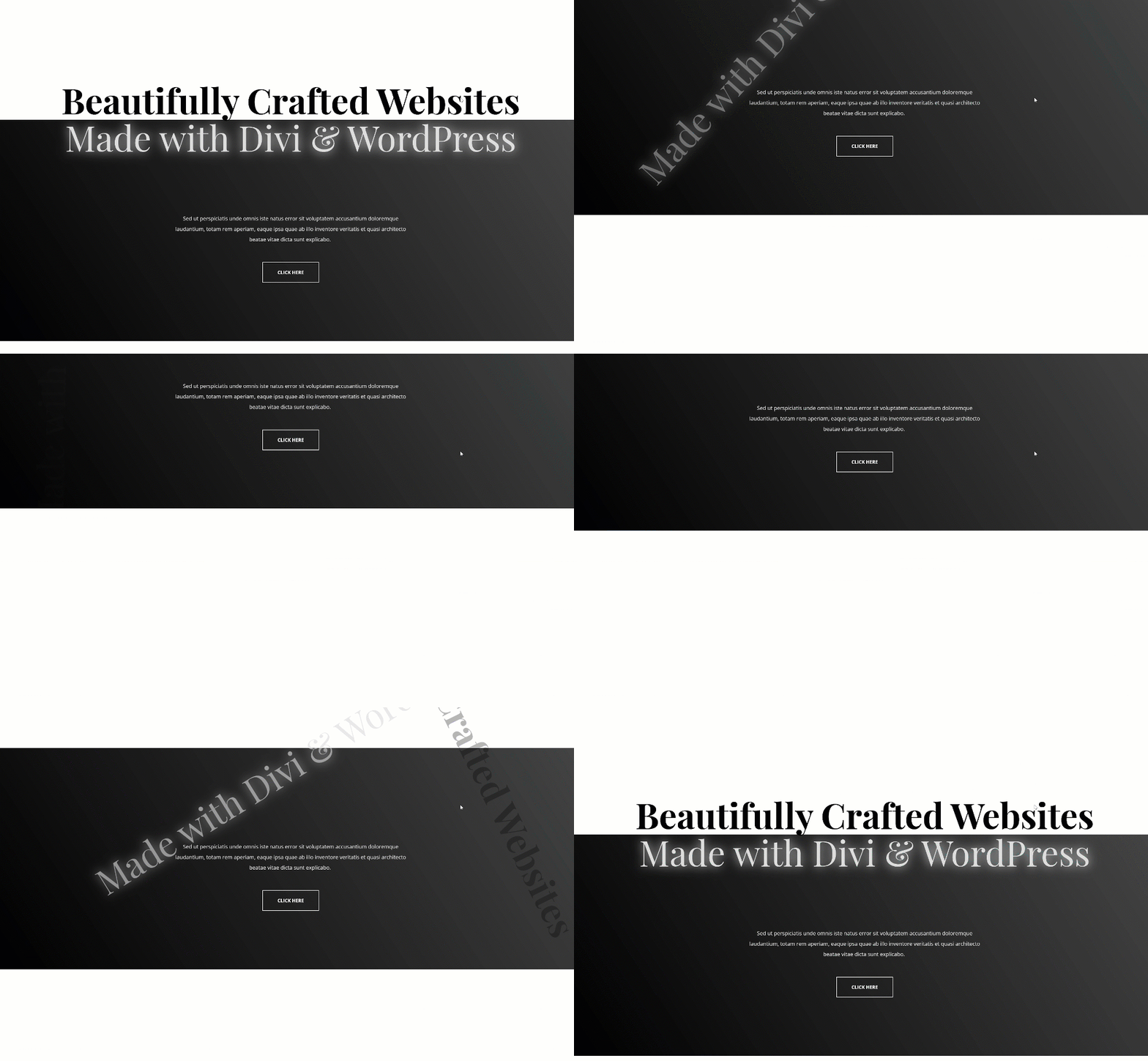
Mobile
Download The Scroll Motion Effects Section Layouts for FREE
To lay your hands on the free section layouts, you will first need to download them using the button below. To gain access to the download you will need to subscribe to our newsletter by using the form below. As a new subscriber, you will receive even more Divi goodness and a free Divi Layout pack every Monday! If you’re already on the list, simply enter your email address below and click download. You will not be “resubscribed” or receive extra emails.

1. Build Your Hero Section Design on a New or Existing Page
Add New Section
Background Color
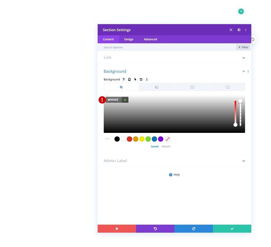
Start by adding a new section to the page you’re working on. Open the section settings and change the background color into white.
- Background Color: #FFFFFF
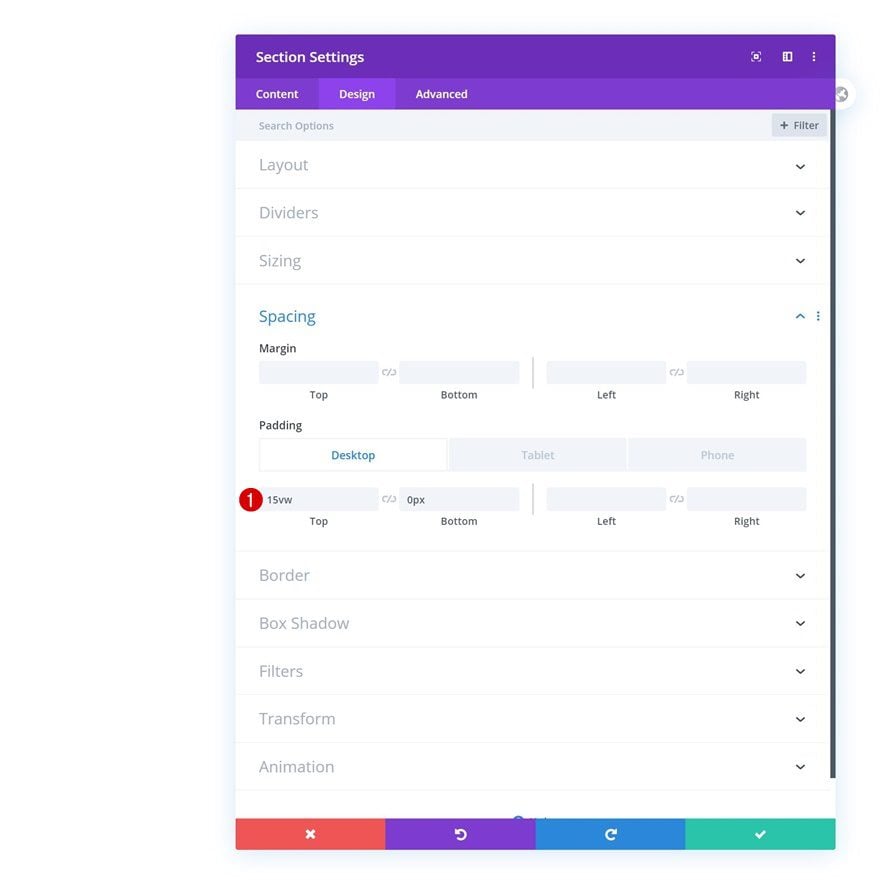
Spacing
Move on to the design tab and modify the spacing values too.
- Top Padding: 15vw (Desktop), 20vw (Tablet), 25vw (Phone)
- Bottom Padding: 0vw
Overflows
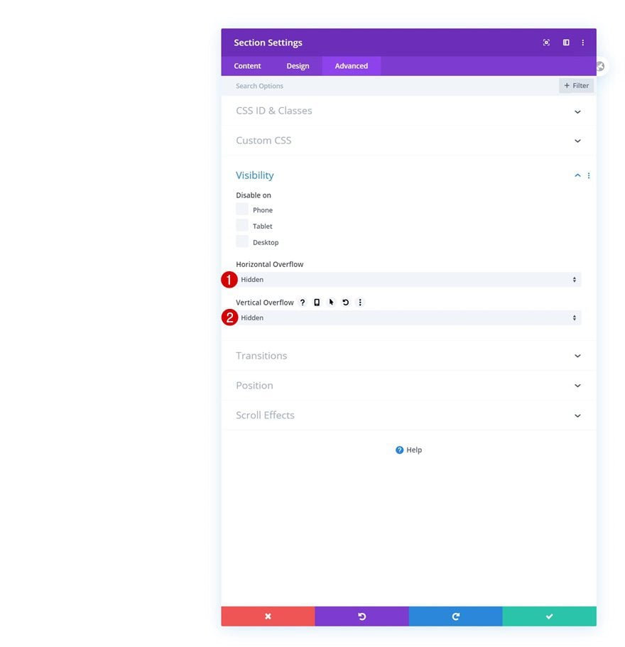
And to make sure the scroll effects don’t cause any horizontal scrollbars to show up, we’ll also hide the section’s overflows.
- Horizontal Overflow: Hidden
- Vertical Overflow: Hidden
Add Row #1
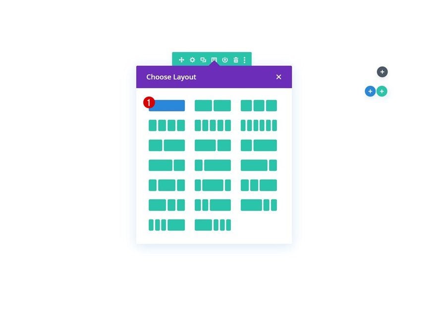
Column Structure
Continue by adding a new row to the section using the following column structure:
Sizing
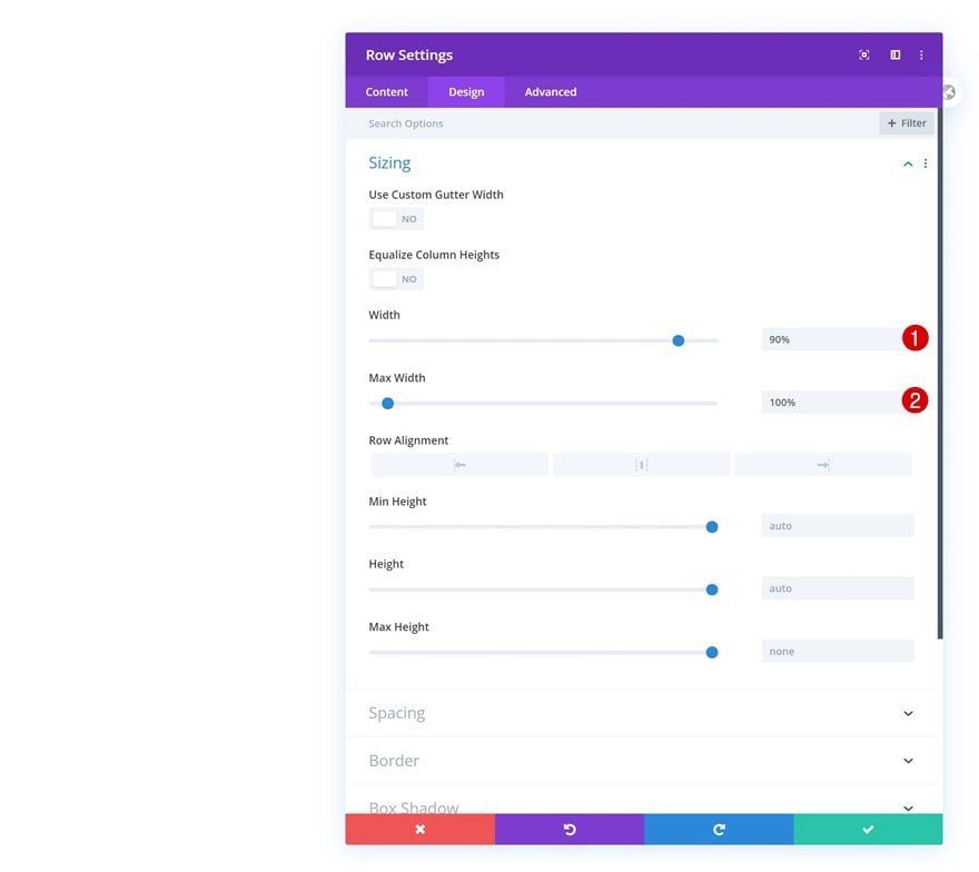
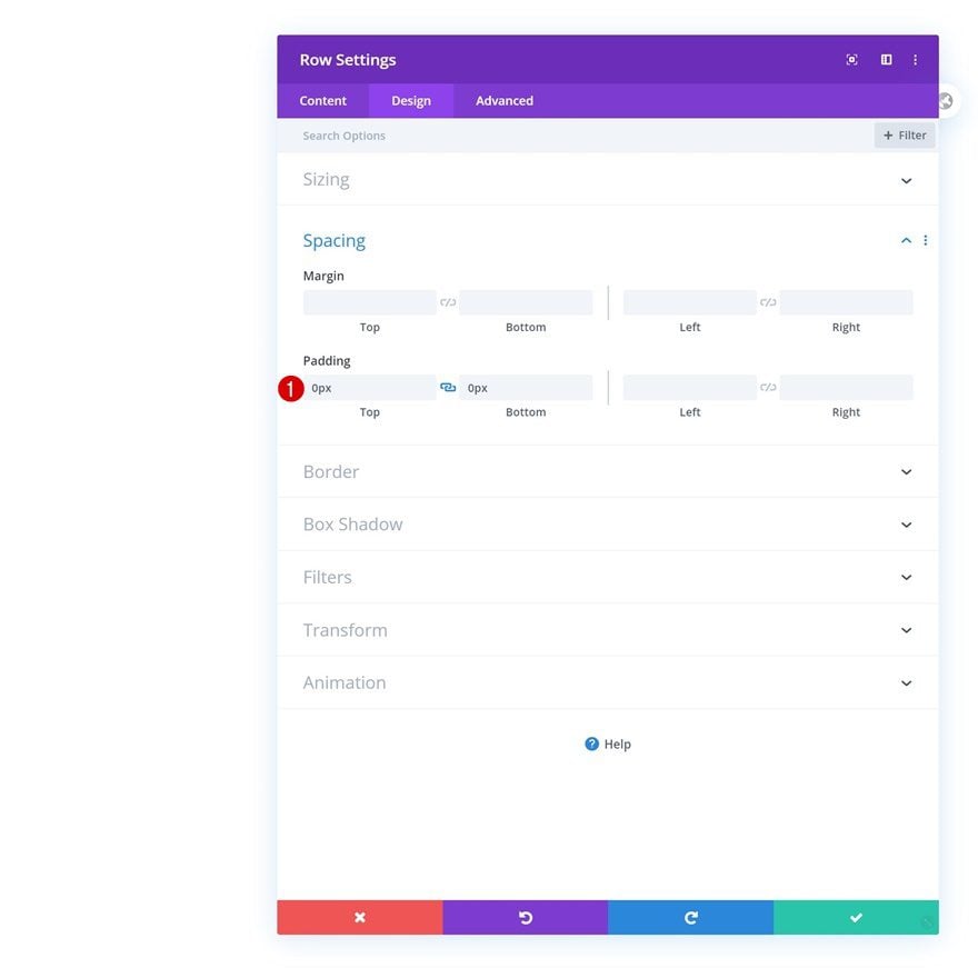
Without adding any modules yet, open the row settings and modify the width and max width in the sizing settings.
- Width: 90%
- Max Width: 100%
Spacing
Remove all default top and bottom padding too.
- Top Padding: 0px
- Bottom Padding: 0px
Add Text Module #1 to Column
Add H1 Content
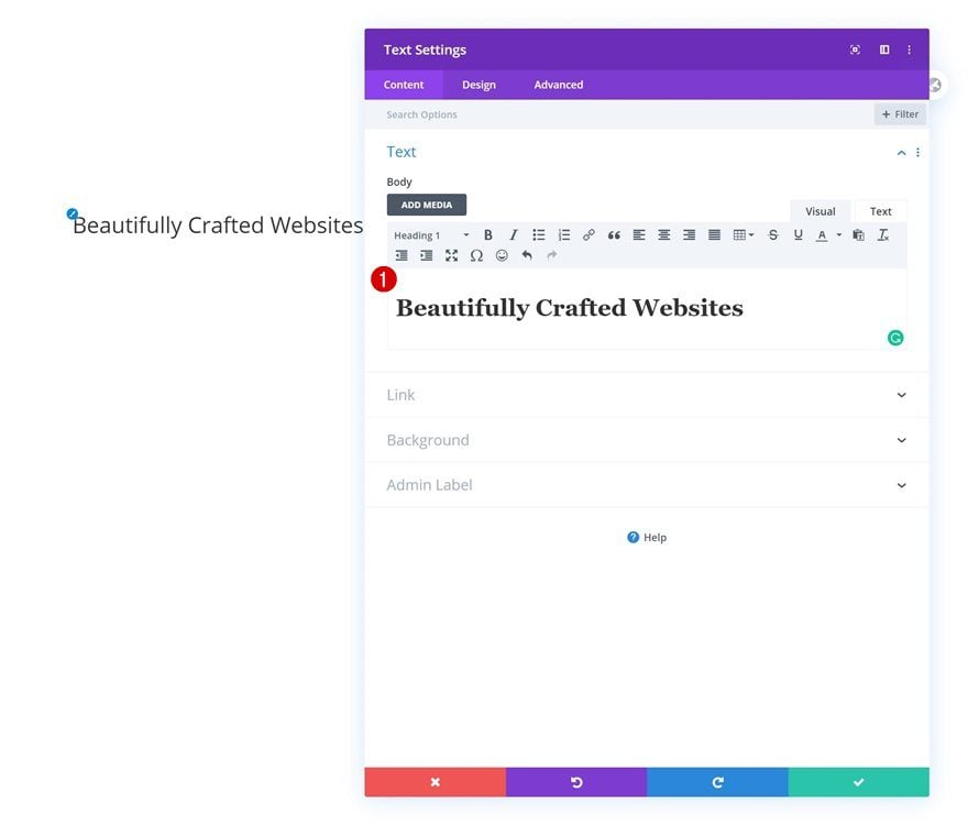
The only module we need in this row is a Text Module with some H1 content.
H1 Text Settings
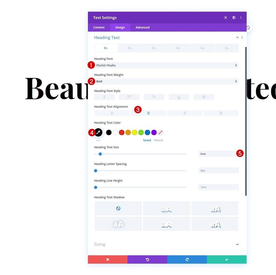
Change the module’s H1 text settings accordingly:
- Heading Font: Playfair Display
- Heading Font Weight: Bold
- Heading Text Alignment: Center
- Heading Text Color: #000000
- Heading Text Size: 6vw
Add Row #2
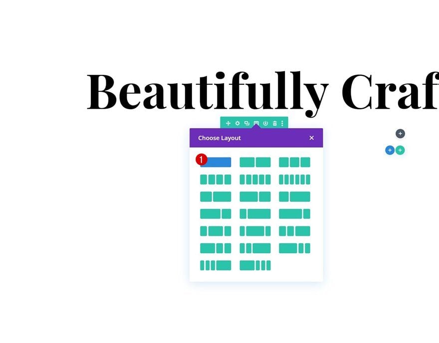
Column Structure
Then, add another row using the following column structure:
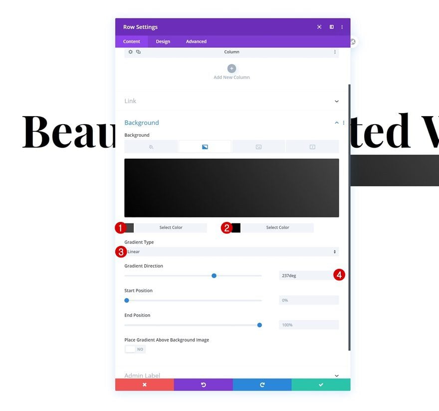
Gradient Background
Without adding any modules yet, open the row settings and use a gradient background.
- Color 1: #444444
- Color 2: #000000
- Gradient Type: Linear
- Gradient Direction: 237deg
Sizing
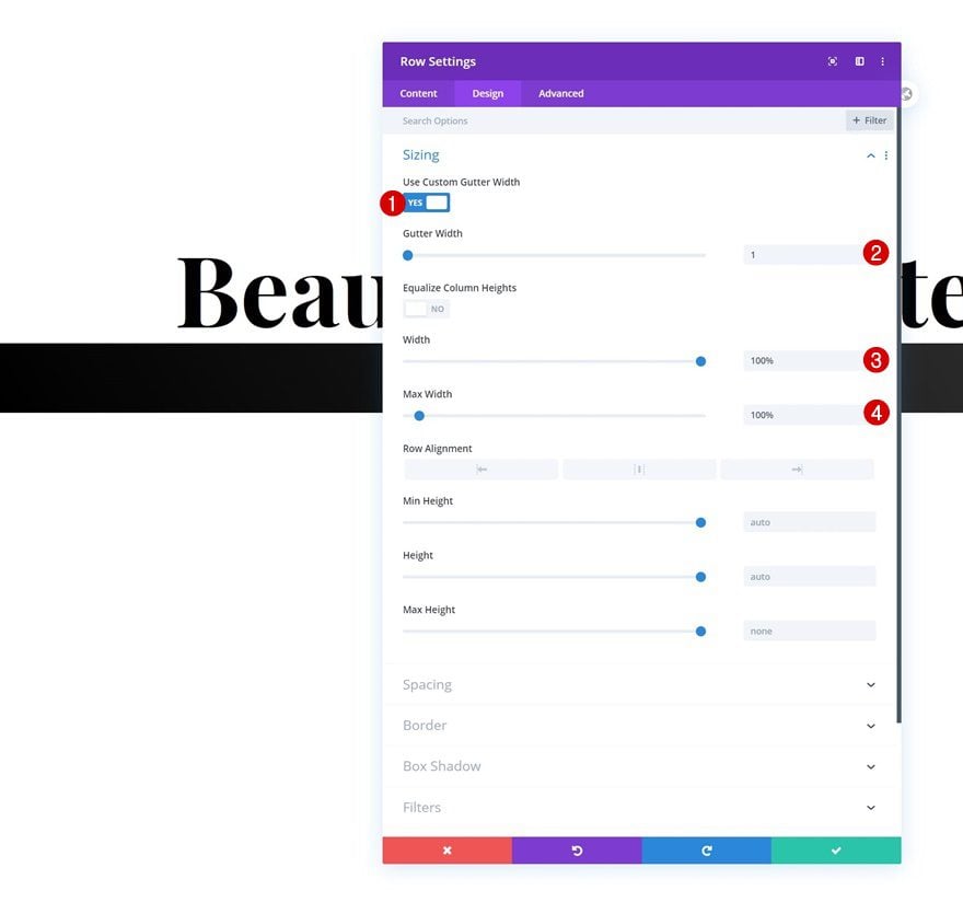
Modify the row’s sizing settings too.
- Use Custom Gutter Width: Yes
- Gutter Width: 1
- Width: 100%
- Max Width: 100%
Spacing
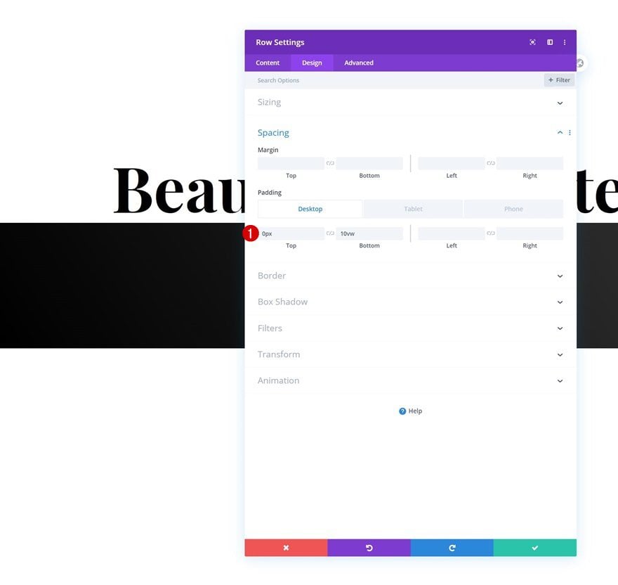
Then, add some custom top and bottom padding.
- Top Padding: 0vw
- Bottom Padding: 10vw (Desktop), 15vw (Tablet), 20vw (Phone)
Add Text Module #2 to Column
Add Content
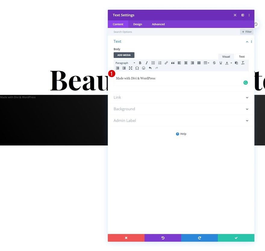
The first module we need in this row is a Text Module with some content.
Text Settings
Move on to the module’s design tab and change the text settings as follows:
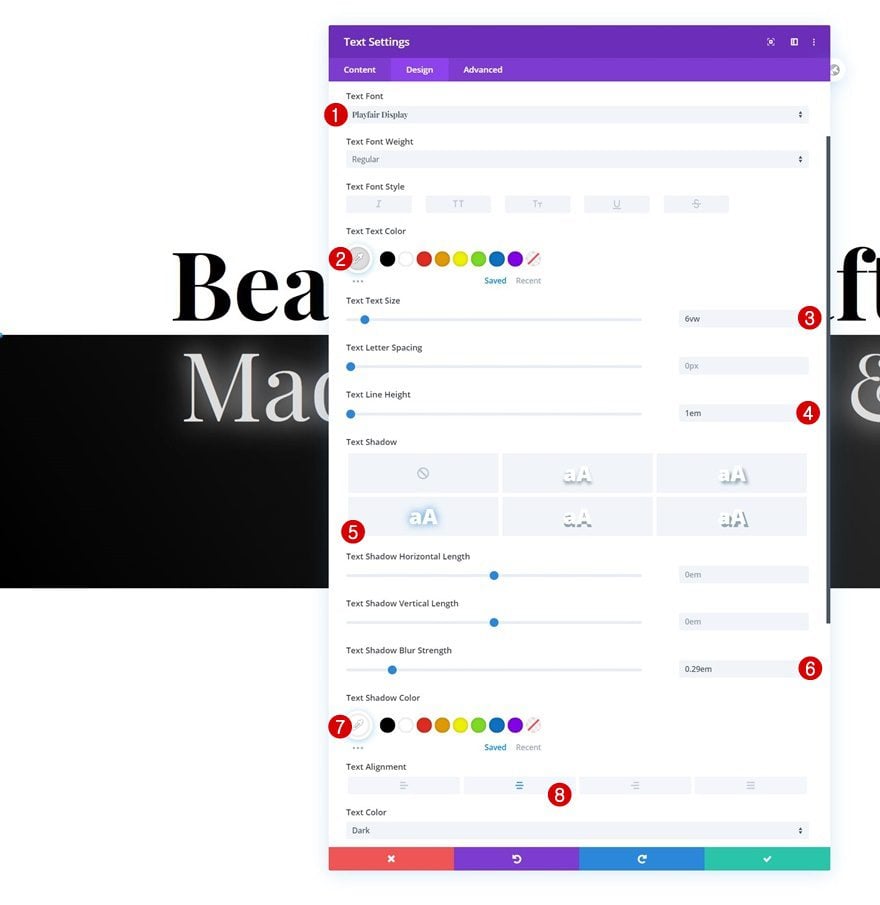
- Text Font: Playfair Display
- Text Color: #dddddd
- Text Size: 6vw
- Text Line Height: 1em
- Text Shadow Blur Strength: 0.29em
- Text Shadow Color: #ffffff
- Text Alignment: Center
Add Text Module #3 to Column
Add Content
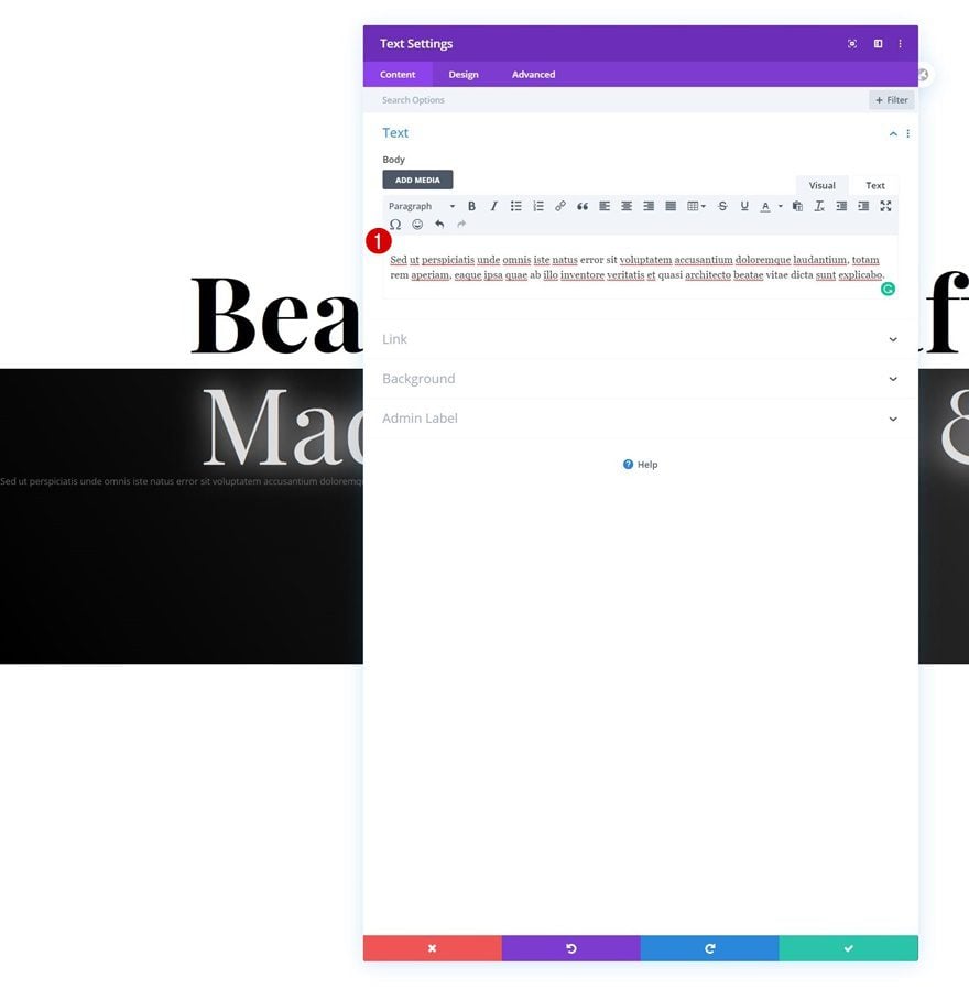
Then, add another Text Module with some description content of your choice.
Text Settings
Change the module’s text settings as follows:
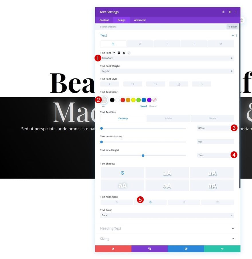
- Text Font: Open Sans
- Text Color: #e8e8e8
- Text Size: 0.9vw (Desktop), 2vw (Tablet), 2.5vw (Phone)
- Text Line Height: 2em
- Text Alignment: Center
Sizing
Modify the sizing settings too.
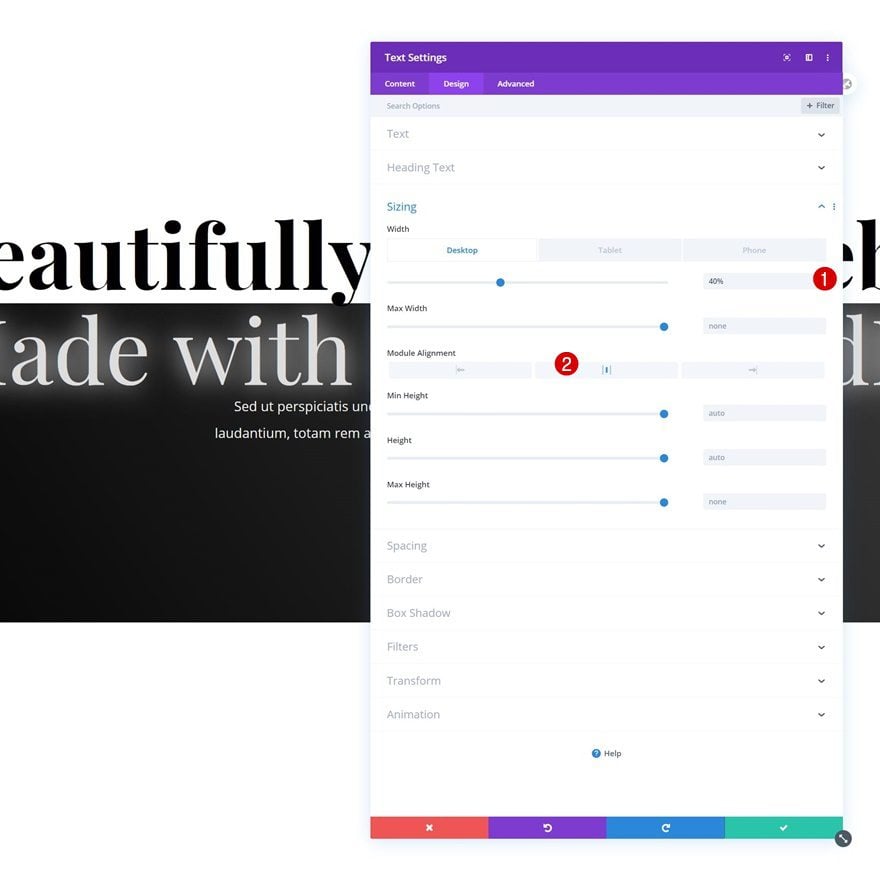
- Width: 40% (Desktop), 90% (Tablet & Phone)
- Module Alignment: Center
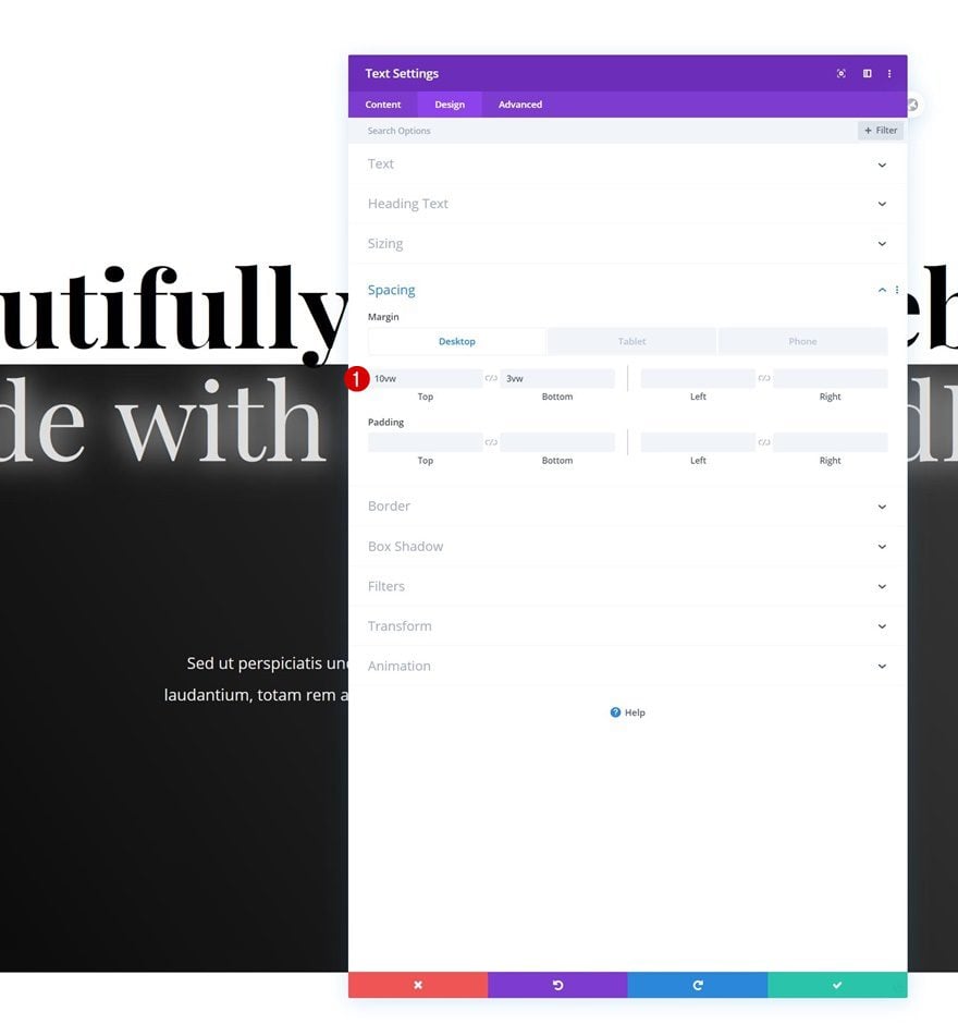
Spacing
And include some top and bottom margin across different screen sizes.
- Top Margin: 10vw (Desktop), 15vw (Tablet), 20vw (Phone)
- Bottom Margin: 3vw (Desktop), 8vw (Tablet), 13vw (Phone)
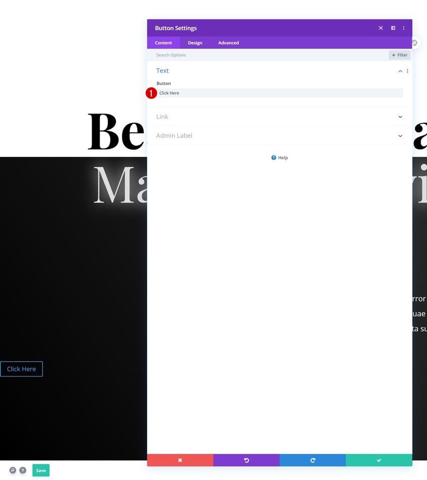
Add Copy
The next and last module we need is a Button Module. Add some copy of your choice.
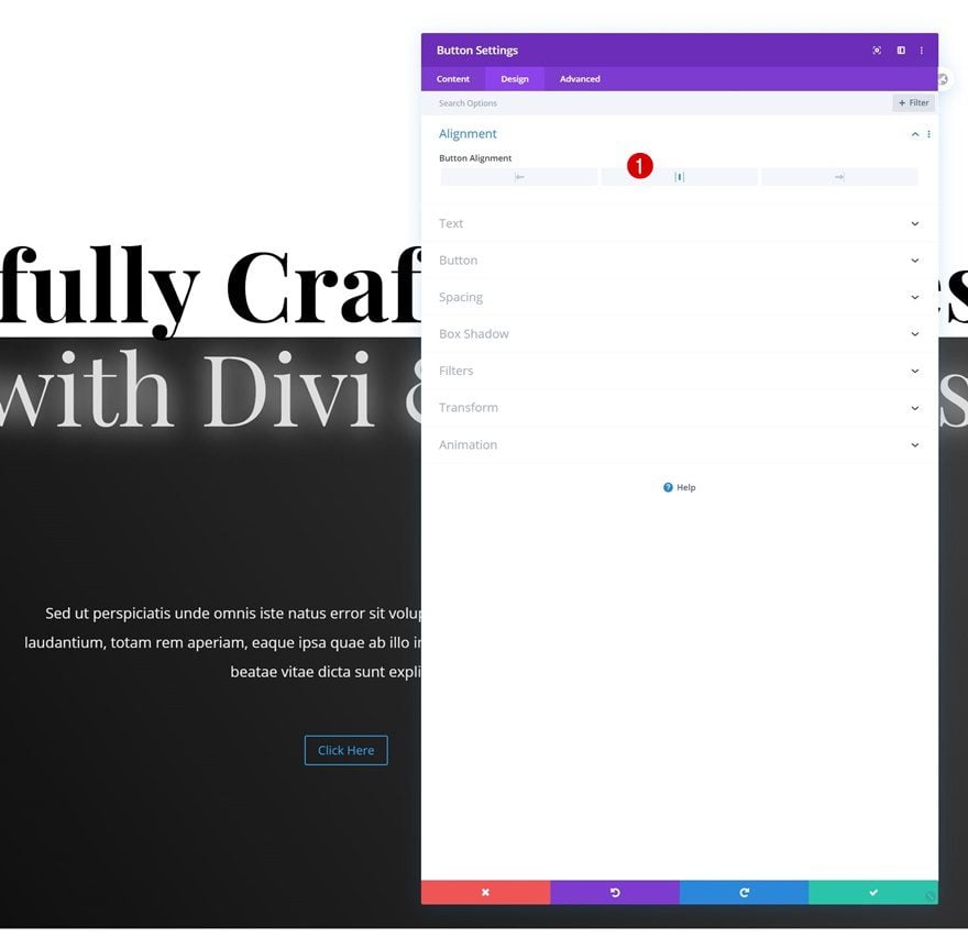
Alignment
Continue by changing the button alignment in the design tab.
- Button Alignment: Center
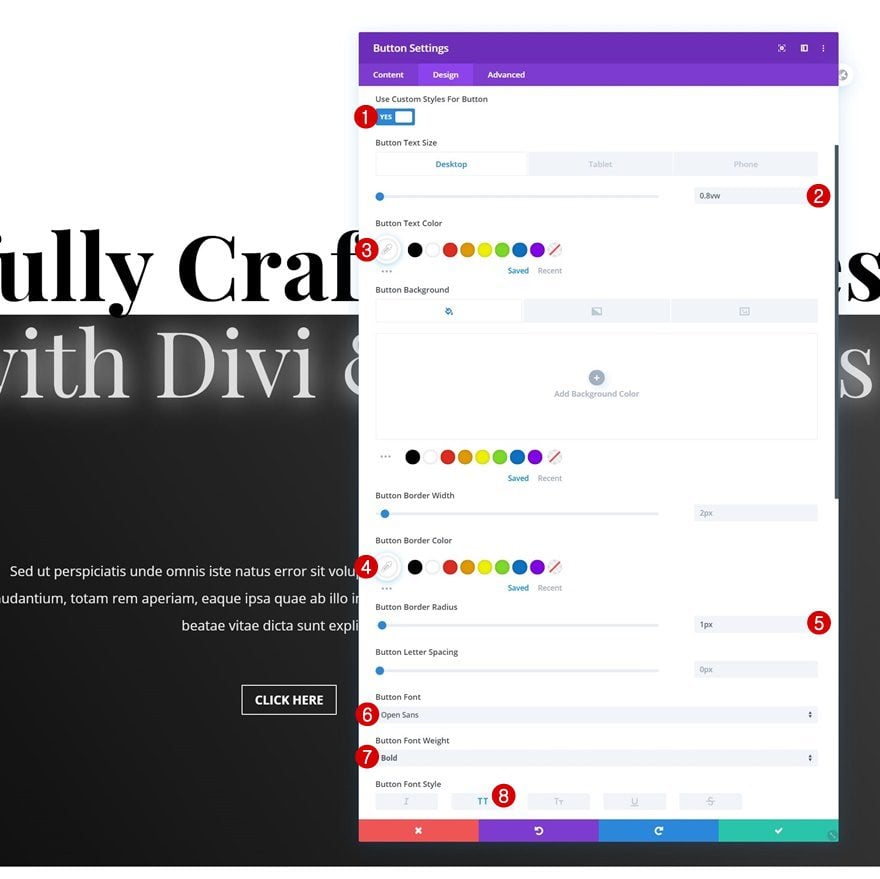
Button Settings
Then, style the button as follows:
- Use Custom Styles For Button: Yes
- Button Text Size: 0.8vw (Desktop), 1.5vw (Tablet), 2.5vw (Phone)
- Button Text Color: #ffffff
- Button Border Color: #ffffff
- Button Border Radius: 1px
- Button Font: Open Sans
- Button Font Weight: Bold
- Button Font Style: Uppercase
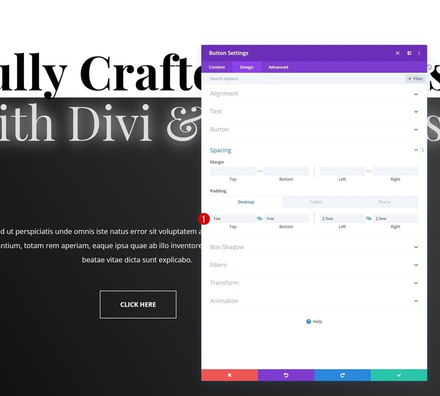
Spacing
And include some custom padding values across different screen sizes.
- Top Padding: 1vw (Desktop), 2vw (Tablet), 3vw (Phone)
- Bottom Padding: 1vw (Desktop), 2vw (Tablet), 3vw (Phone)
- Left Padding: 2.5vw (Desktop), 5vw (Tablet), 8vw (Phone)
- Right Padding: 2.5vw (Desktop), 5vw (Tablet), 8vw (Phone)
2. Apply Scroll Effects
Example #1
Text Module #1
Horizontal Motion
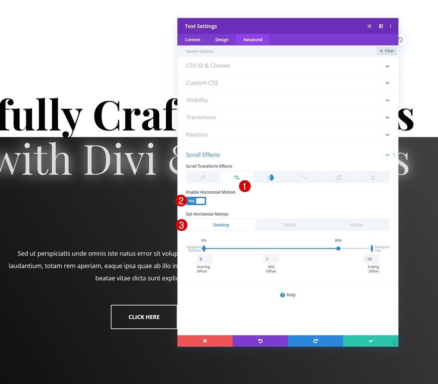
Now that we’ve designed the overall look and feel of our hero section, it’s time to apply the different scroll motion effects to our copy. To recreate the first example, open the first Text Module and use the following horizontal motion:
- Enable Horizontal Motion: Yes
- Starting Offset: 0
- Mid Offset: 0
- 0% – 80% (Desktop)
- 0% – 95% (Tablet & Phone)
- Ending Offset: -10
Fade In and Out
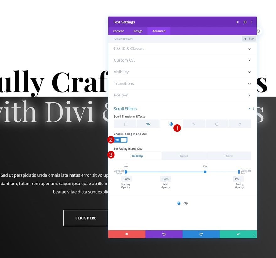
We’ll add a fade in and out effect too.
- Enable Fading In and Out: Yes
- Starting Opacity: 100%
- Mid Opacity: 100%
- 0% – 70% (Desktop)
- 0% – 95% (Tablet & Phone)
- Ending Opacity: 0%
Text Module #2
Horizontal Motion
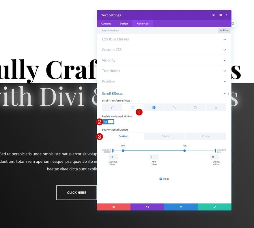
Then, open the second Text Module in your section and apply the following horizontal motion:
- Enable Horizontal Motion: Yes
- Starting Offset: 10
- Mid Offset: 0
- 10% – 70% (Desktop)
- 10% – 95% (Tablet & Phone)
- Ending Offset: 10
Fade In and Out
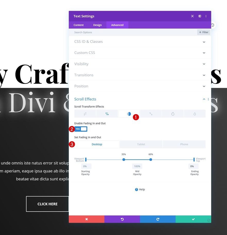
Along with a matching fade in and out effect:
- Enable Fading In and Out: Yes
- Starting Opacity: 0%
- Mid Opacity: 100%
- 35% – 60% (Desktop)
- 35% – 95% (Tablet & Phone)
- Ending Opacity: 0%
Example #2
Text Module #1
Vertical Motion
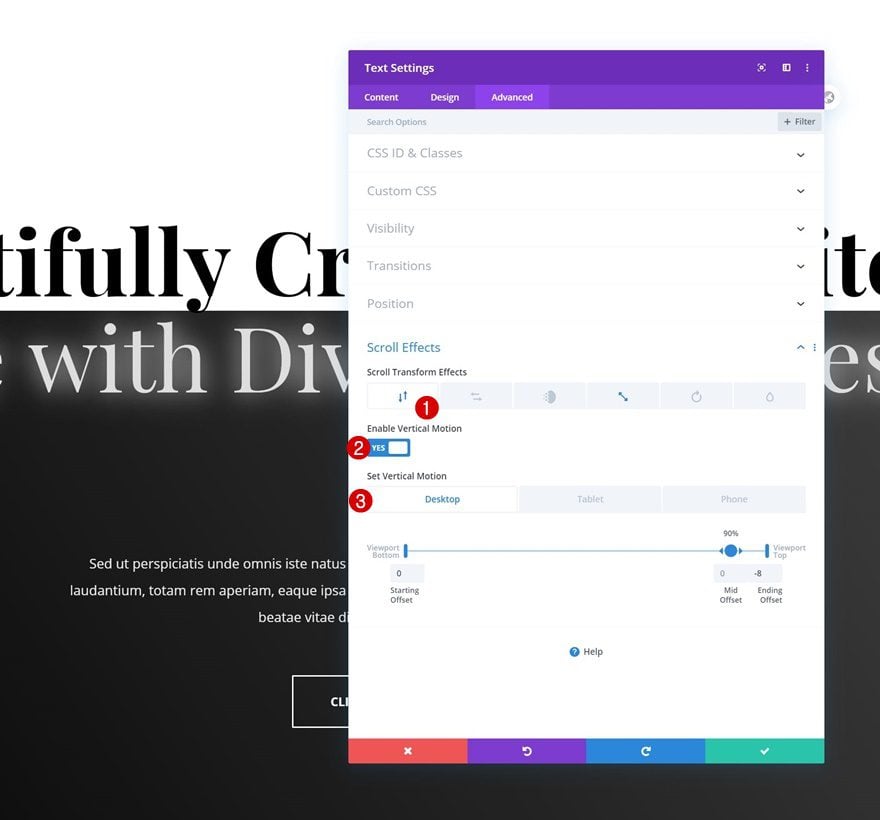
Want to recreate the second scroll motion effect instead? Open the first Text Module in your section and add the following vertical motion:
- Enable Vertical Motion: Yes
- Starting Offset: 0
- Mid Offset: 0
- 90% (Desktop)
- 95% (Tablet & Phone)
- Ending Offset: -8
Scaling Up and Down
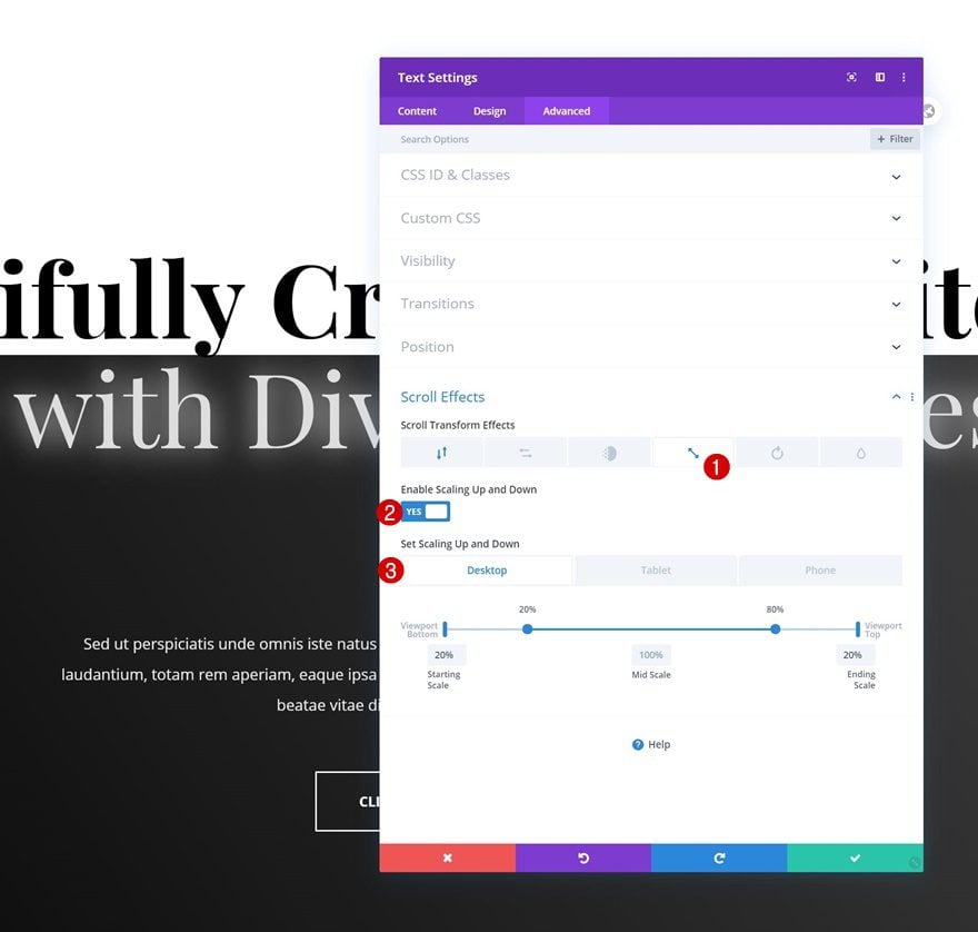
Add a scaling up and down effect too.
- Enable Scaling Up and Down: Yes
- Starting Scale: 20%
- Mid Scale: 100%
- 20% – 80% (Desktop)
- 20% – 95% (Tablet & Phone)
- Ending Scale: 20%
Text Module #2
Vertical Motion
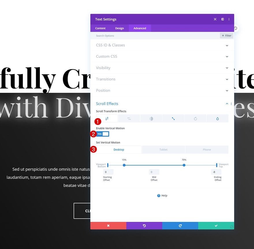
Then, open the second Text Module and use the following vertical motion settings:
- Enable Vertical Motion: Yes
- Starting Offset: 0
- Mid Offset: 0
- 15% – 70% (Desktop)
- 15% – 90% (Tablet & Phone)
- Ending Offset: -8
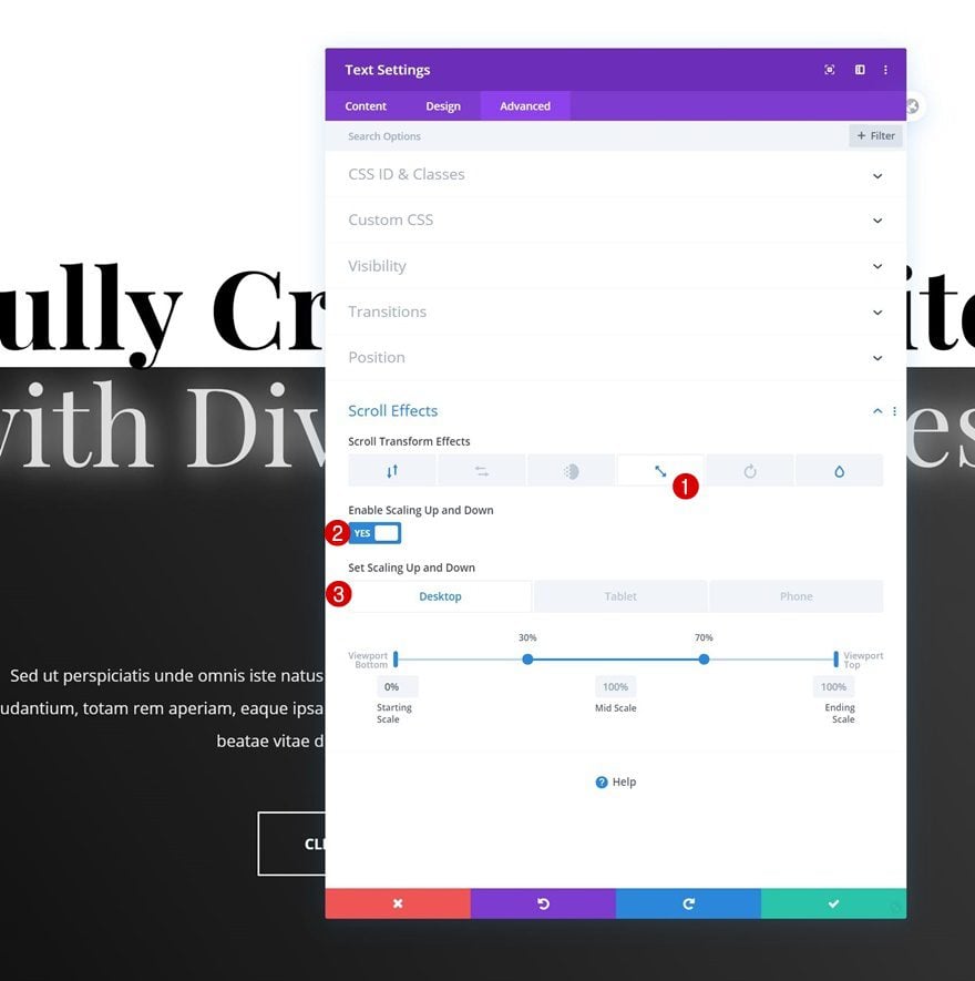
Scaling Up and Down
Add a scaling up and down effect next.
- Enable Scaling Up and Down: Yes
- Starting Scale: 0%
- Mid Scale: 100%
- 30% – 70% (Desktop)
- 30% – 90% (Tablet & Phone)
- Ending Scale: 100%
Blur
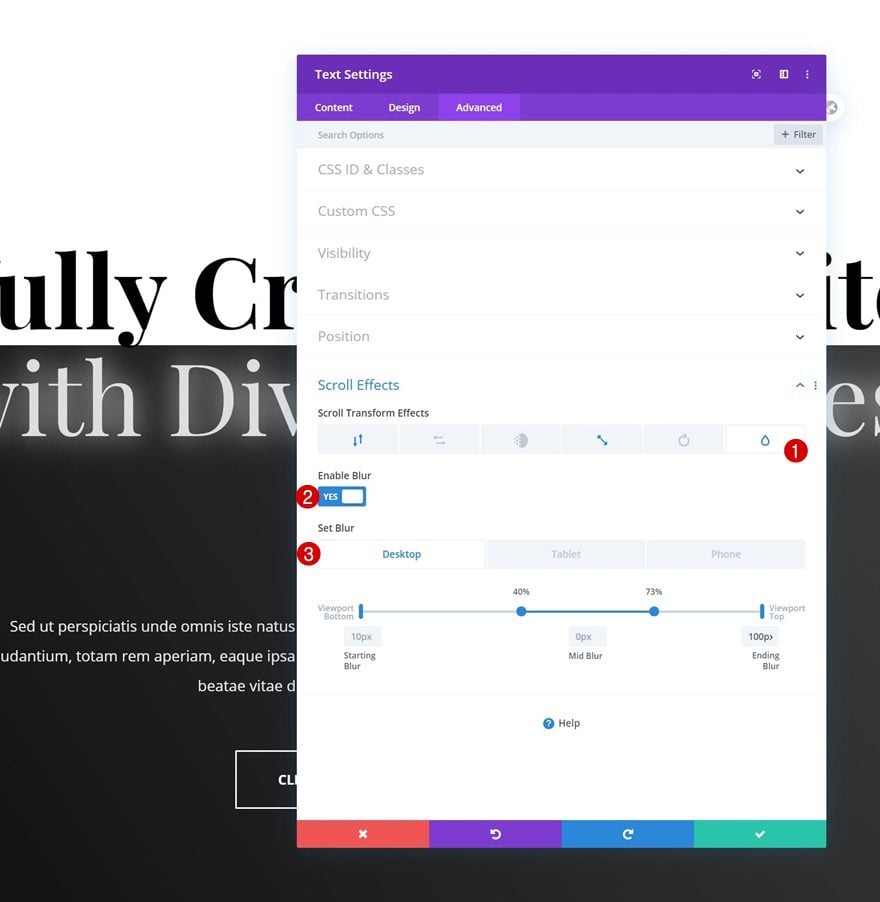
And complete the scroll effect by adding a blur effect to your section’s second Text Module.
- Enable Blur: Yes
- Starting Blur: 10px
- Mid Blur: 0px
- 40% – 73% (Desktop)
- 40% – 95% (Tablet & Phone)
- Ending Blur: 100px
Example #3
Text Module #1
Horizontal Motion
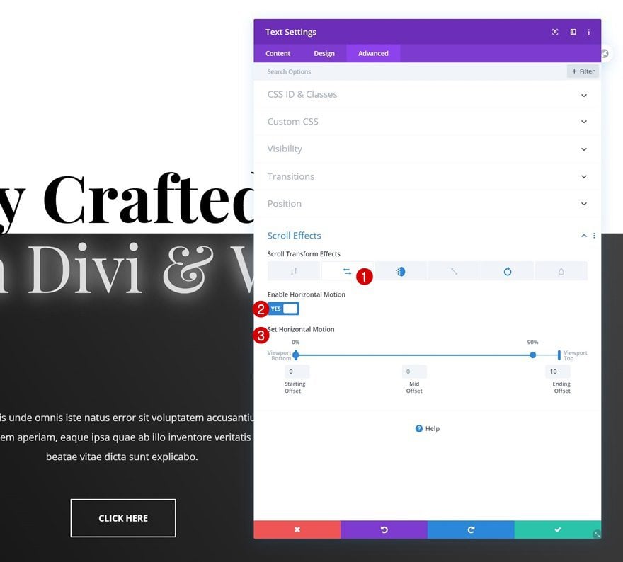
Last but not least, we’ll show you how to recreate the third scroll motion effect. Open the section’s first Text Module and add a horizontal motion effect.
- Enable Horizontal Motion: Yes
- Starting Offset: 0
- Mid Offset: 0
- 0% – 90%
- Ending Offset: 10
Fade In and Out
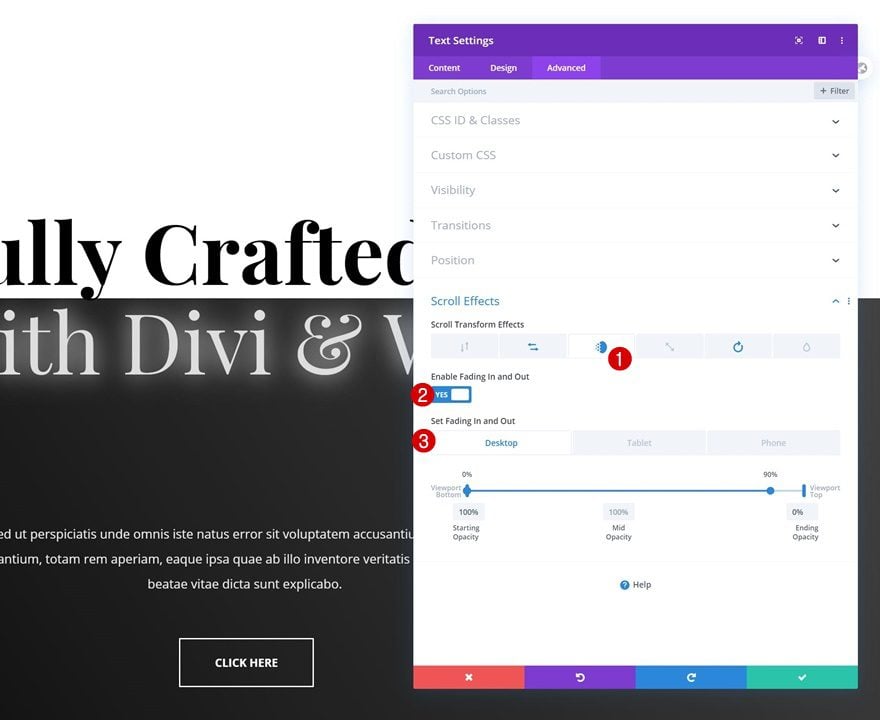
Use a fade in and out effect for this module too.
- Enable Fading In and Out: Yes
- Starting Opacity: 100%
- Mid Opacity: 100%
- 0% – 90% (Desktop)
- 0% – 95% (Tablet & Phone)
- Ending Opacity: 0%
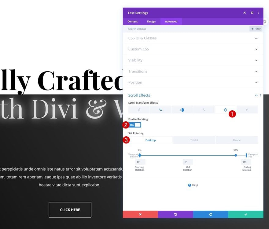
Rotating
And we’ll also apply a rotating effect.
- Enable Rotating: Yes
- Starting Rotation: 0°
- Mid Rotation: 0°
- 0% – 90% (Desktop)
- 0% – 95% (Tablet & Phone)
- Ending Rotation: 90°
Text Module #2
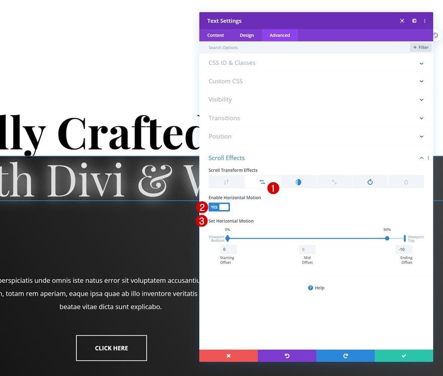
Horizontal Motion
Then, open the second Text Module in your section and apply the following horizontal motion settings:
- Enable Horizontal Motion: Yes
- Starting Offset: 0
- Mid Offset: 0
- 0% – 90%
- Ending Offset: -10
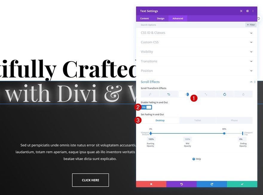
Fade In and Out
Continue by using a fade in and out scroll motion effect.
- Enable Fading In and Out: Yes
- Starting Opacity: 100%
- Mid Opacity: 100%
- 0% – 80% (Desktop)
- 0% – 95% (Tablet & Phone)
- Ending Opacity: 0%
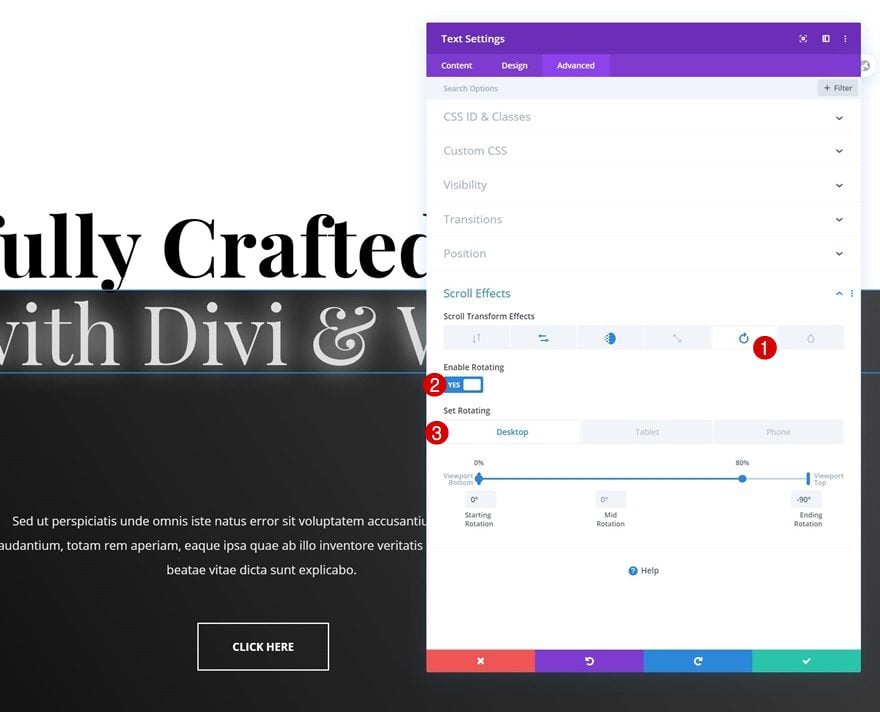
Rotating
And complete the module’s settings by adding a rotating scroll effect too.
- Enable Rotating: Yes
- Starting Rotation: 0°
- Mid Rotation: 0°
- 0% – 80% (Desktop)
- 0% – 90% (Tablet & Phone)
- Ending Rotation: -90°
Preview
Now that we’ve gone through all the steps, let’s take a final look at the outcome across different screen sizes.
Example #1
Desktop
Mobile
Example #2
Desktop
Mobile
Example #3
Desktop
Mobile
Final Thoughts
In this post, we’ve shown you how to use Divi’s new scroll effects to add scroll motion effects to your headline. We’ve handled three different examples but the possibilities are truly endless. You were able to download the JSON files for free as well! If you have any questions or suggestions, feel free to leave a comment in the comment section below.
If you’re eager to learn more about Divi and get more Divi freebies, make sure you subscribe to our email newsletter and YouTube channel so you’ll always be one of the first people to know and get benefits from this free content.











hi, I’ve tried the first one and the result is beautiful. However, the contrast of the white text on the dark background on mobile is extremely low for some reason. I’ve set color: #ffffff and opacity 100% but nothing changes, what could be the issue?
Hi Yaz,
Thanks for trying the tutorial. Since the text is already set to `#ffffff` with 100% opacity, there may be another responsive setting, blend mode, filter, overlay, or animation value affecting the mobile appearance.
Please contact our support team through web chat and share the page URL where this is happening. Also enable Remote Access so the team can inspect the element settings and frontend CSS directly. That will allow us to identify what is reducing the contrast on mobile and provide the correct fix. 👍
hi Donjete, that’s simple & creative! appreciate your quality writeups! which is consistently coming in ! amazing strenght! great web platform put my web page on first page of google search – ! thank you.. greeting from MY
This is great, but we really need a tutorial on how to use this new option on menu. For example for a new menu to roll on scroll and then fix itself to the top of the page. Is this something that can be achieved with new scroll effects and position options or do we still need to use custom CSS? Thanks 🙂