")
The Divi Blog Module has a useful grid layout option for your blog posts. The grid template organizes your blog posts into boxes or cards that make it easier to view more posts on your screen than a standard fullwidth blog layout.
The Blog Module Settings allow you to customize the overall design of your grid. You can easily make all of your cards the same background color, font, margins, etc… However, the styling options are limited to the design of the grid as a whole, making it difficult to apply multiple or different designs to the cards within the grid.
Today I’m going to show you how to target and apply more than one style to the cards that make up your blog grid using custom CSS. I’ll show you how to apply a different style to every other card, creating a checkered effect. I’ll also show you how to style your cards differently by row and how to target and style any individual card by itself.
I’m including 4 examples of how to style your grid cards including a few hover effects you can use. By the end of this tutorial, you will be setup to create amazing blog grid designs for your next project.
Let’s get started.
How to Style Your Divi Blog Module Grid Cards (With 4 Examples)
Subscribe To Our Youtube Channel
Setting Up The Blog Module Grid Layout
Before we get started with designing the Blog Module cards, make sure you have at least 12 posts created with a featured image. I’m using “lorem ipsum” text for my post content and mock images from unsplash.com for my featured images.
Once your posts have been created, create a new page. On your new page, deploy the Blog Module on a fullwidth column within a standard section:
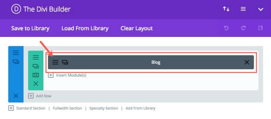
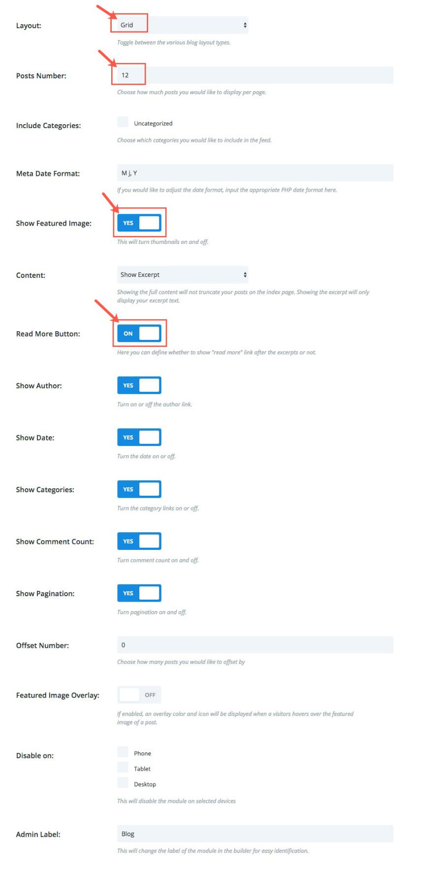
Click to edit the Blog Module Settings. Under General Settings change the following settings:
Layout: Grid
Post Number: 12
Show Featured Image: YES
Read More Button: ON
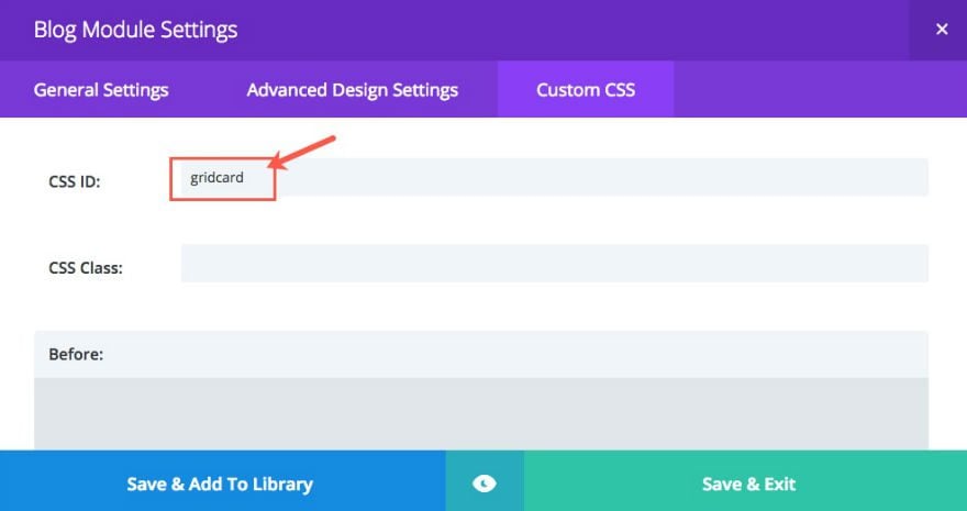
Under Custom CSS, enter “gridcard” in the CSS ID text box. This will be a way for us to customize only this blog module.
Save & Exit
Understanding The Blog Module Grid Layout
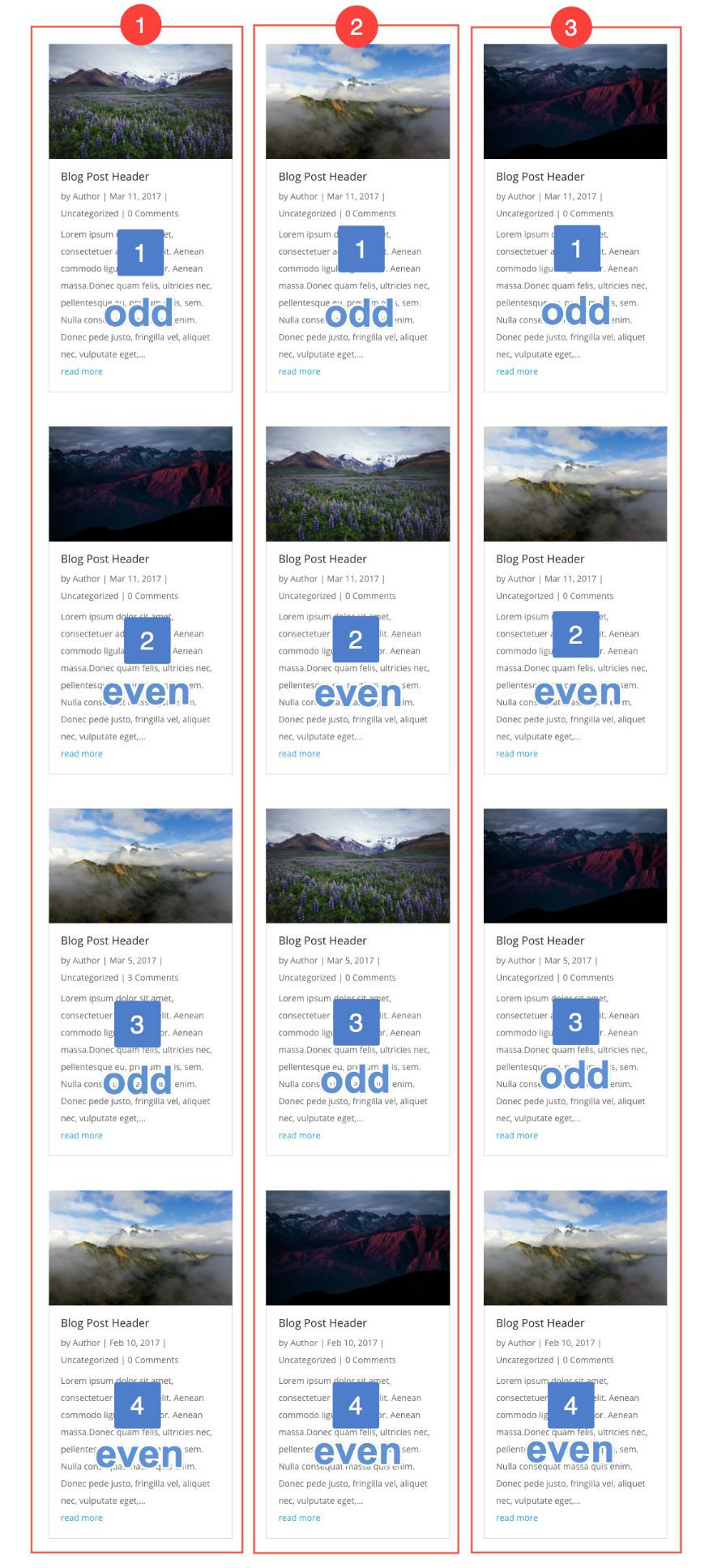
Now that you have your blog grid in place, it is important to understand the structure of the grid layout so that you can locate the blog module cards you want to edit.
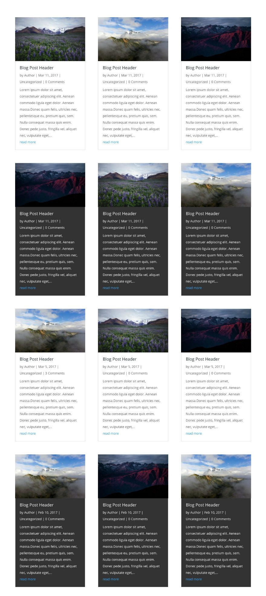
The blog grid is setup with a three column layout. The following is an illustration of the blog grid with 12 blog posts divided into the three columns:
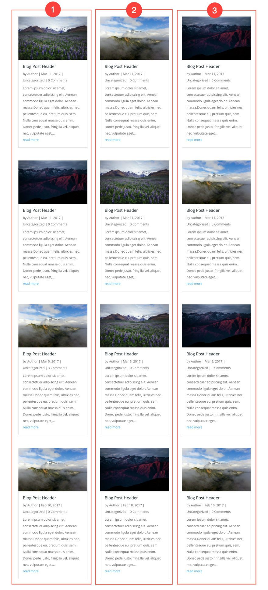
The blog post cards are ordered from top to bottom in each of the columns. So, if you were to give them each a number, you would number them 1 through 4 from top to bottom in each column:

Since you know the numerical order of each blog post card under each column, you can also identified each card as an odd or an even number as follows:
Example Grid Designs
Example #1: Designing a Checkered Blog Grid
For this first example, I’m going to target all of the odd numbered blog module cards (cards 1 and 3) under the first column by giving them a dark gray background color. In order to do that, go to Divi → Theme Options and add the following CSS in the Custom CSS text box:
#gridcard .column:first-child article:nth-child(odd){
background: #333;
}
Here is a breakdown of what this code is doing:
#gridcard = the ID for the entire blog module
.column:first-child = selects the first column in the blog module
article:nth-child(odd) = selects all of the odd numbered articles (or cards) in the the column
Putting it all together, this selects the odd numbered cards in the first column of the blog module with the ID “gridcard”.
Next, add your white text to go over the dark background by adding the following CSS:
#gridcard .column:first-child article:nth-child(odd) .entry-title,
#gridcard .column:first-child article:nth-child(odd) .post-meta,
#gridcard .column:first-child article:nth-child(odd) .post-meta a,
#gridcard .column:first-child article:nth-child(odd) .post-content p {
color: #ffffff;
}
This code targets all of the text elements in the blog module cards (including the title, the post meta, the post meta links, and the post content) and assigns them the color white.
Here is the result:
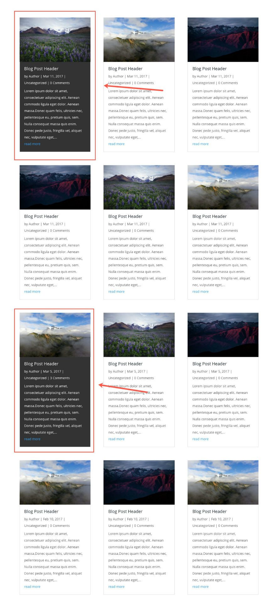
The next step in creating our checkered layout is to target the odd numbered cards on the third column and apply the dark gray background and white text just like you did in the first column. Add the following CSS in the Custom CSS text box:
#gridcard .column:last-child article:nth-child(odd){
background: #333;
}

#gridcard .column:last-child article:nth-child(odd) .entry-title,
#gridcard .column:last-child article:nth-child(odd) .post-meta,
#gridcard .column:last-child article:nth-child(odd) .post-meta a,
#gridcard .column:last-child article:nth-child(odd) .post-content p {
color: #ffffff;
}
This code targets the “last” column (in this case the third column is the last column) with the pseudo element “last-child”.
For the second (or middle) column, target the even numbered cards in order to complete the checkered effect. To do this we need to add the following CSS:
#gridcard .column:nth-child(2) article:nth-child(even) {
background: #333;
}

#gridcard .column:nth-child(2) article:nth-child(even) .entry-title,
#gridcard .column:nth-child(2) article:nth-child(even) .post-meta,
#gridcard .column:nth-child(2) article:nth-child(even) .post-meta a,
#gridcard .column:nth-child(2) article:nth-child(even) .post-content p  {
color: #fff;
}
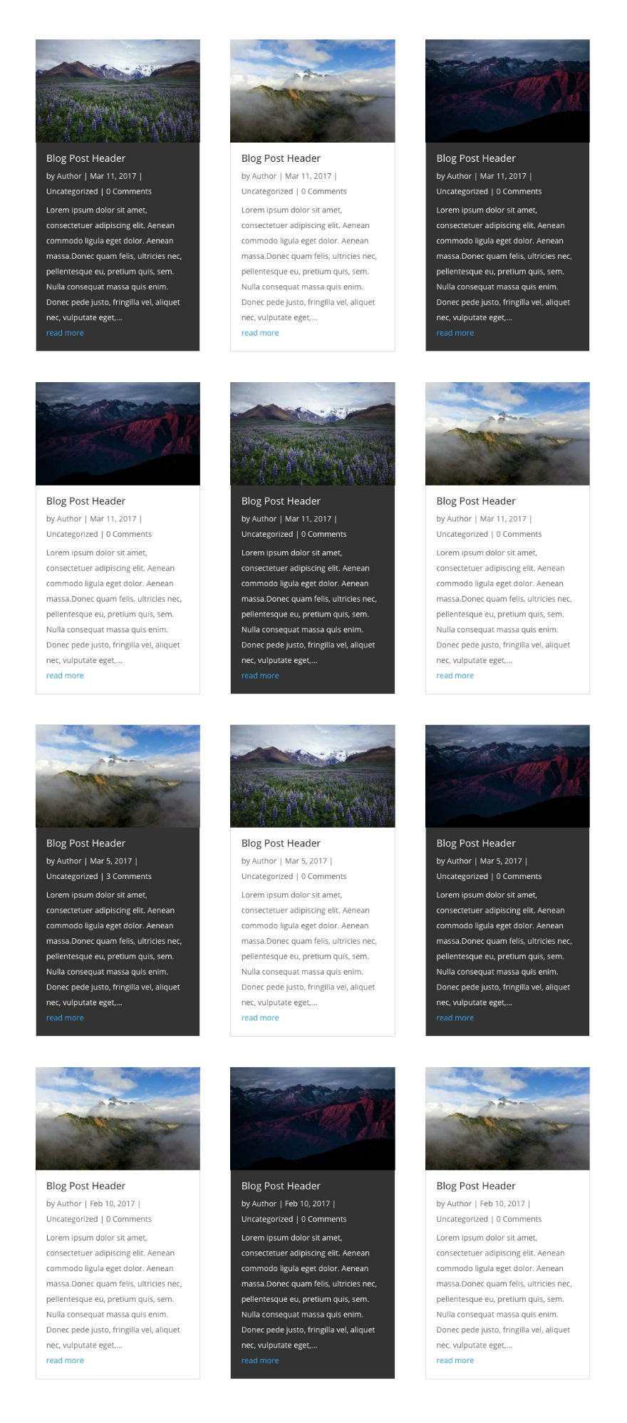
Now go and check out the blog page to see the checkered layout of the Blog Module cards.
Example #2: Adding Hover Effects with the Checkered Layout
Once you know how to target your blog module cards, you can edit any of the elements inside the card in creative ways.
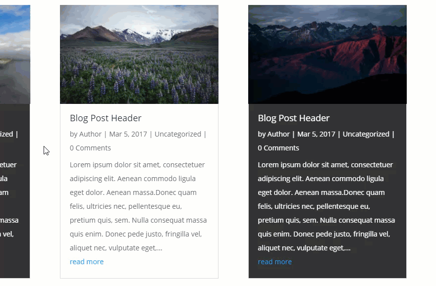
For this example, I’m using the checkered layout and this time I’m going to change the dark gray card featured images to black and white when hovering over the card. And, I’m going to make the white card featured images brighter when hovering over the card. To do this, add the following CSS in the Custom CSS box (make sure you disable or cut out the other code so that it doesn’t conflict with the new):
#gridcard .column:first-child article:nth-child(odd),
#gridcard .column:last-child article:nth-child(odd),
#gridcard .column:nth-child(2) article:nth-child(even)  {
background: #333;
}

#gridcard .column:first-child article:nth-child(odd) .entry-title,
#gridcard .column:first-child article:nth-child(odd) .post-meta,
#gridcard .column:first-child article:nth-child(odd) .post-meta a,
#gridcard .column:first-child article:nth-child(odd) .post-content p,
#gridcard .column:last-child article:nth-child(odd) .entry-title,
#gridcard .column:last-child article:nth-child(odd) .post-meta,
#gridcard .column:last-child article:nth-child(odd) .post-meta a,
#gridcard .column:last-child article:nth-child(odd) .post-content p,
#gridcard .column:nth-child(2) article:nth-child(even) .entry-title,
#gridcard .column:nth-child(2) article:nth-child(even) .post-meta,
#gridcard .column:nth-child(2) article:nth-child(even) .post-meta a,
#gridcard .column:nth-child(2) article:nth-child(even) .post-content p  {
color: #fff;
}

#gridcard .column:nth-child(2) article:nth-child(even):hover img,
#gridcard .column:first-child article:nth-child(odd):hover img,
#gridcard .column:last-child article:nth-child(odd):hover img {
  -webkit-filter: grayscale(1);
  filter: grayscale(1);
}

#gridcard .column:nth-child(2) article:nth-child(odd):hover img,
#gridcard .column:first-child article:nth-child(even):hover img,
#gridcard .column:last-child article:nth-child(even):hover img {
  -webkit-filter: brightness(1.5);
  filter: brightness(1.5);
}
You can also add an inverting effect on the cards so that when you hover over the white cards, they turn dark gray, and when you hover over the dark gray cards, they turn white.
Add the following CSS in addition to the CSS above:
#gridcard .column article, #gridcard .column article img {
    -webkit-transition: all 0.8s;
    -moz-transition: all 0.8s;
    transition: all 0.8s;
}

#gridcard .column:first-child article:nth-child(odd):hover,
#gridcard .column:last-child article:nth-child(odd):hover,
#gridcard .column:nth-child(2) article:nth-child(even):hover {
background: #fff;
}

#gridcard .column:first-child article:nth-child(odd):hover .entry-title,
#gridcard .column:first-child article:nth-child(odd):hover .post-meta,
#gridcard .column:first-child article:nth-child(odd):hover .post-meta a,
#gridcard .column:first-child article:nth-child(odd):hover .post-content p,
#gridcard .column:last-child article:nth-child(odd):hover .entry-title,
#gridcard .column:last-child article:nth-child(odd):hover .post-meta,
#gridcard .column:last-child article:nth-child(odd):hover .post-meta a,
#gridcard .column:last-child article:nth-child(odd):hover .post-content p,
#gridcard .column:nth-child(2) article:nth-child(even):hover .entry-title,
#gridcard .column:nth-child(2) article:nth-child(even):hover .post-meta,
#gridcard .column:nth-child(2) article:nth-child(even):hover .post-meta a,
#gridcard .column:nth-child(2) article:nth-child(even):hover .post-content p  {
color: #333;
}

#gridcard .column:first-child article:nth-child(even):hover,
#gridcard .column:last-child article:nth-child(even):hover,
#gridcard .column:nth-child(2) article:nth-child(odd):hover {
background: #333;
}

#gridcard .column:first-child article:nth-child(even):hover .entry-title,
#gridcard .column:first-child article:nth-child(even):hover .post-meta,
#gridcard .column:first-child article:nth-child(even):hover .post-meta a,
#gridcard .column:first-child article:nth-child(even):hover .post-content p,
#gridcard .column:last-child article:nth-child(even):hover .entry-title,
#gridcard .column:last-child article:nth-child(even):hover .post-meta,
#gridcard .column:last-child article:nth-child(even):hover .post-meta a,
#gridcard .column:last-child article:nth-child(even):hover .post-content p,
#gridcard .column:nth-child(2) article:nth-child(odd):hover .entry-title,
#gridcard .column:nth-child(2) article:nth-child(odd):hover .post-meta,
#gridcard .column:nth-child(2) article:nth-child(odd):hover .post-meta a,
#gridcard .column:nth-child(2) article:nth-child(odd):hover .post-content p  {
color: #fff;
}
Now go check out the effect on your blog.
Example #3: Customizing The Blog Module Cards By Row
For the second example, I’m going to apply the same dark background and white text for the cards in every other row (not column). To do this you need to target all of the even numbered cards in each of the columns. Go to Divi → Theme Options and make sure you either disable or cut out any previous CSS you may have in the Custom CSS box from this tutorial. Then add the following CSS:
#gridcard article:nth-child(even) {
    background-color: #333;
}

#gridcard article:nth-child(even) .entry-title,
#gridcard article:nth-child(even) .post-meta,
#gridcard article:nth-child(even) .post-meta a,
#gridcard article:nth-child(even) .post-content p  {
color: #fff;
}
Here is what the result looks like:
Example #4: Designing A Specific Blog Module Card
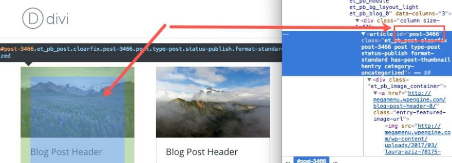
Some of you may want to select one specific module card. To do this, you must find the unique post ID that is automatically assigned to each of your cards. For this example, I’m using the Chrome browser.
Go to the page displaying your blog module and right click on one of your cards. In the box of options that pops up, select “Inspect” (some browsers may have “Inspect Element” or something similar. This will deploy the developer tools window which displays both the html and css of your webpage. Find the article tag that wraps your module card/post and notice the post ID assigned to it. That is the selector you want to use for targeting your individual card. For my example, I hovered over, right-clicked, and inspected the card with the ID “post-3466”.
See here:
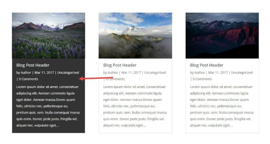
To target this card in CSS and give only this card white font over a dark gray background, you would use the following CSS:
#post-3466 {
background: #333333;
}
#post-3466 .entry-title,
#post-3466 .post-meta,
#post-3466 .post-meta a,
#post-3466 .post-content p  {
color: #fff;
}
Now the card has that specific style applied to it.
That’s it!
Final Thoughts
These are just a few examples of the many different styles you can accomplish using this kind of CSS targeting of the Blog Module cards. You are no longer bound to keep the same style for each card. You can design them any way you like.
Enjoy! I look forward to hearing some great suggestions and ideas from you in the comments.


not working in the last version.
To clarify, are you referring to the CSS code in the example #4? If that’s the case, can you try adding !important attribute to the CSS properties like this?
#post-3466 {background: #333333 !important;
}
#post-3466 .entry-title,
#post-3466 .post-meta,
#post-3466 .post-meta a,
#post-3466 .post-content p {
color: #fff !important;
}
If it doesn’t help, feel free to reach out to the Support Team by creating a conversation from our website.
Nice tutorial, thanks!
I tried to replicate this chequered effect, but my cards are not the same height. This gives the blog page a messy look.
Any ideas how to resolve this? 🙂
What about category, achieve, search page ?????? We can’t use divi builder for these standard pages.
Hi,
there was an other Tutorial a long time ago….
From there i got this peace aof CSS:
/*
* Create Mansonory styles for archive pages
*/
.search #left-area,
.archive #left-area {
-moz-column-count: 3;
column-count: 3;
-moz-column-gap: 60px;
column-gap: 60px;
}
.archive .et_pb_post > a,
.search .et_pb_post > a {
margin: -20px -20px 10px;
display: block;
}
.search #left-area .et_pb_post,
.archive #left-area .et_pb_post {
overflow: hidden; /* fix for Firefox */
page-break-inside: avoid;
break-inside: avoid-column;
width: 100%;
padding: 19px;
border: 1px solid #d8d8d8;
background-color: #fff;
word-wrap: break-word;
display: inline-block;
}
.search #left-area .et_pb_post h2,
.archive #left-area .et_pb_post h2 {
font-size: 18px;
}
.search #left-area .et_pb_post.format-link,
.search #left-area .et_pb_post.format-quote,
.search #left-area .et_pb_post.format-audio,
.archive #left-area .et_pb_post.format-link,
.archive #left-area .et_pb_post.format-quote,
.archive #left-area .et_pb_post.format-audio{
padding: 0;
}
.archive .et_pb_post .et_pb_image_container,
.archive .et_pb_post .et_main_video_container,
.archive .et_pb_post .et_audio_content,
.archive .et_pb_post .et_pb_slider,
.search .et_pb_post .et_pb_image_container,
.search .et_pb_post .et_main_video_container,
.search .et_pb_post .et_audio_content,
.search .et_pb_post .et_pb_slider {
margin: -20px -20px 10px;
}
.archive .et_pb_post.format-audio .et_audio_content{
margin: 0px -38px 0px;
}
.archive .et_pb_post .et_pb_slider .et_pb_slide,
.search .et_pb_post .et_pb_slider .et_pb_slide {
min-height: 180px;
}
.archive .pagination,
.search .pagination {
padding: 20px 0;
}
/*
* Media Queries
*/
@media screen and (max-width: 980px) {
.search #left-area,
.archive #left-area {
-moz-column-count: 2;
column-count: 2;
-moz-column-gap: 60px;
column-gap: 60px;
}
}
@media screen and (max-width: 767px) {
.search #left-area,
.archive #left-area {
-moz-column-count: 1;
column-count: 1;
}
.search .et_pb_post.format-audio .et_audio_content,
.archive .et_pb_post.format-audio .et_audio_content{
margin: 0;
}
.search #left-area .et_pb_post.format-audio .et_audio_container .mejs-controls div.mejs-time-rail,
.archive #left-area .et_pb_post.format-audio .et_audio_container .mejs-controls div.mejs-time-rail,
.search #left-area .et_pb_post.format-audio .et_audio_container .mejs-controls .mejs-time-rail .mejs-time-total,
.archive #left-area .et_pb_post.format-audio .et_audio_container .mejs-controls .mejs-time-rail .mejs-time-total{
min-width: 300px!important;
width: 300px!important;
}
}
/*
* END Create Mansonory styles for archive pages
*/
So you got the a Mansory (card) Style for the category, achieve, search pages.
If anyone get the Style from this Tutorial to the CSS above….
Thanks
Hi,
Nice post as always, but i am wondering how can i have a default sidebar as well on the right side of my grid style blog page?
Look forward to hearing from you soon!
I LOVED IT THANKS MAN
This is a cool trick, so glad to have found this article and I was easily able to apply it to my home page blog layout! Thanks Divi Team!
Hello,
This is my first time I’m doing a my web page.
I can’t do it on a grid, for some strange reason.
And how can I assignatea principal image without duplicate it ?
I’m building it on local host.
Thank you
Thank you for this demonstration well explained, which allows to be adapted … For the 4th example I have already used the following code to highlight a category …
article.category-favorites { box-shadow: inset 0 0 10px red;}
Very nice!
Thank you! Great article. Your cards looks great because you are using lorem ipsum text, but in reality posts are different lengths which in turn create different card heights. Do you have a way to keep the excerpt length the same so that the cards are uniformly the same height? Thank you.
Unfortunately the title length and featured images size does throw off the height of your cards. There is no easy way around this.
How is it done in the ET Blog so each Row starts fresh from the same line height?
Ok thanks a big job
I use blog module, it always show the latest blog first. How can I show the oldest first? I would like to do this in only particular pages
I would suggest submitting a support ticket for this.
Thanks
What a brilliant walk-through. Thanks!
Oh, Thank you! This is so useful! Great one!
You have written well detailed post, brought out very useful css tips and snippets.
Card layout design is very nice technique. In 2006 Microsoft used Metro Typography design, which is a type of card style.
Other benefit of card design is, it can become fit in responsive design very effectively.
I loved! However I would like you to explain how to do 4 rows, and how to make the images appear to one side of the information and not above it … something else as Extra theme … would be fantastic
Thanks for the suggestion Sandy.
Great tutorial. This styling of this grid blog is beautiful. Thanks for sharing!
Great tutorial
Very timely tutorial and extremely valuable, will def be using these techniques!
Thanks,
You guys always do an amazing job (also) when it comes to custom styles.