
When you’re designing the frequently asked questions page for your website, keeping user experience at the top of your mind is essential. Visitors are looking for answers as quickly as possible, and the way you design your page has a big influence on it. If the frequently asked questions are limited in amount, you can easily showcase them below each other. But, if you have many questions that need answering, grouping them might be more beneficial. In today’s Divi tutorial, we’ll show you how to structure them in custom clickable tabs without needing to rely on a separate FAQ plugin. You’ll be able to download the JSON file for free as well!
Let’s get to it.
- 1 Preview
- 2 Download The Layout for FREE
- 3 Download For Free
-
4
1. Build the Element Structure
- 4.1 Add Section #1
- 4.2 Add Row #1
- 4.3 Add Text Module to Column
- 4.4 Add Divider Module to Column
- 4.5 Add Row #2
- 4.6 Add Text Module #1 to Column
- 4.7 Clone Text Module 3x
- 4.8 Add Section #2
- 4.9 Add Row #1
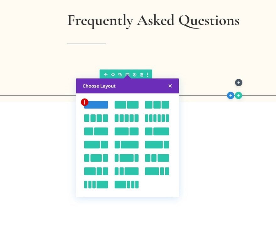
- 4.10 Add Toggle Module #1 to Column
- 4.11 Clone Toggle Module as Many Times as Wanted
- 4.12 Change State of Toggle Module #1
- 4.13 Clone Entire Row 3x
- 5 Add Functionality
- 6 Preview
- 7 Final Thoughts
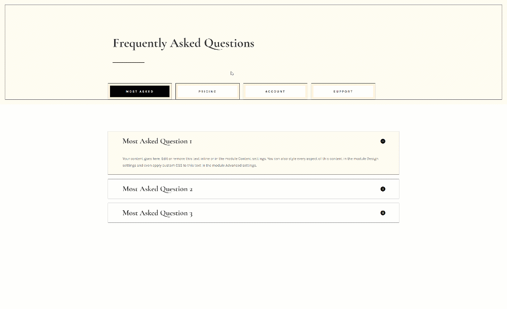
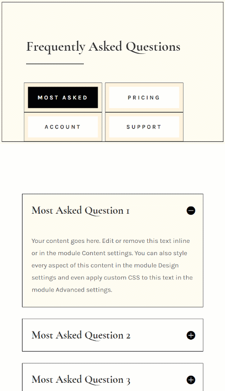
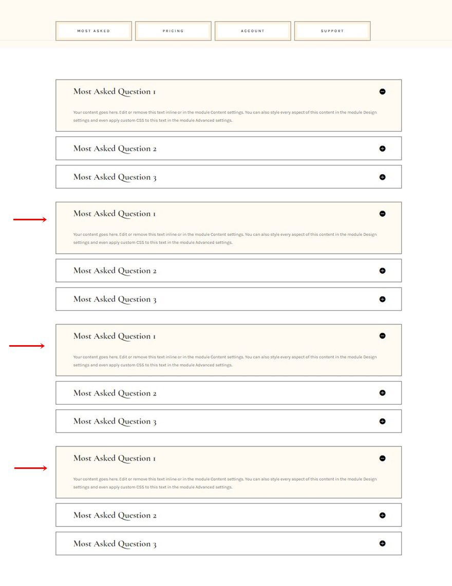
Preview
Before we dive into the tutorial, let’s take a quick look at the outcome across different screen sizes.
Desktop
Mobile
Download The Layout for FREE
To lay your hands on the free layout, you will first need to download them using the button below. To gain access to the download you will need to subscribe to our newsletter by using the form below. As a new subscriber, you will receive even more Divi goodness and a free Divi Layout pack every Monday! If you’re already on the list, simply enter your email address below and click download. You will not be “resubscribed” or receive extra emails.

1. Build the Element Structure
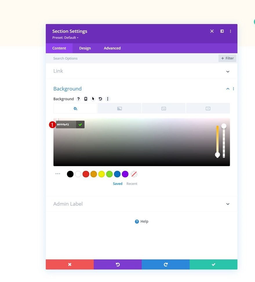
Add Section #1
Background Color
Start by adding a new section to the page you’re working on. Open the section settings and apply a background color.
- Background Color: #fffbf2
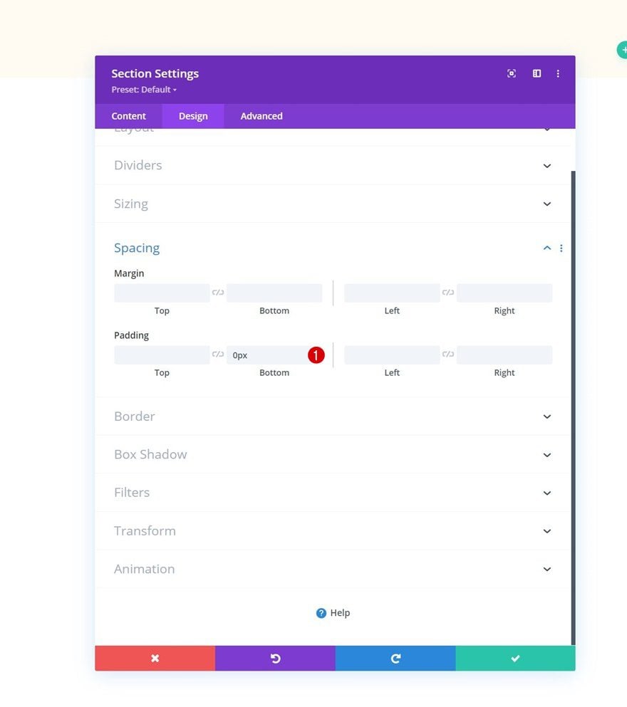
Spacing
Move on to the section’s design tab and remove all default bottom padding.
- Bottom Padding: 0px
Border
Next, apply a custom border.
- Border Width: 1vw
- Border Color: #fffbf2
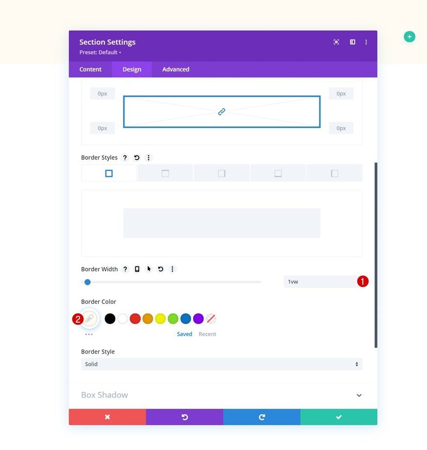
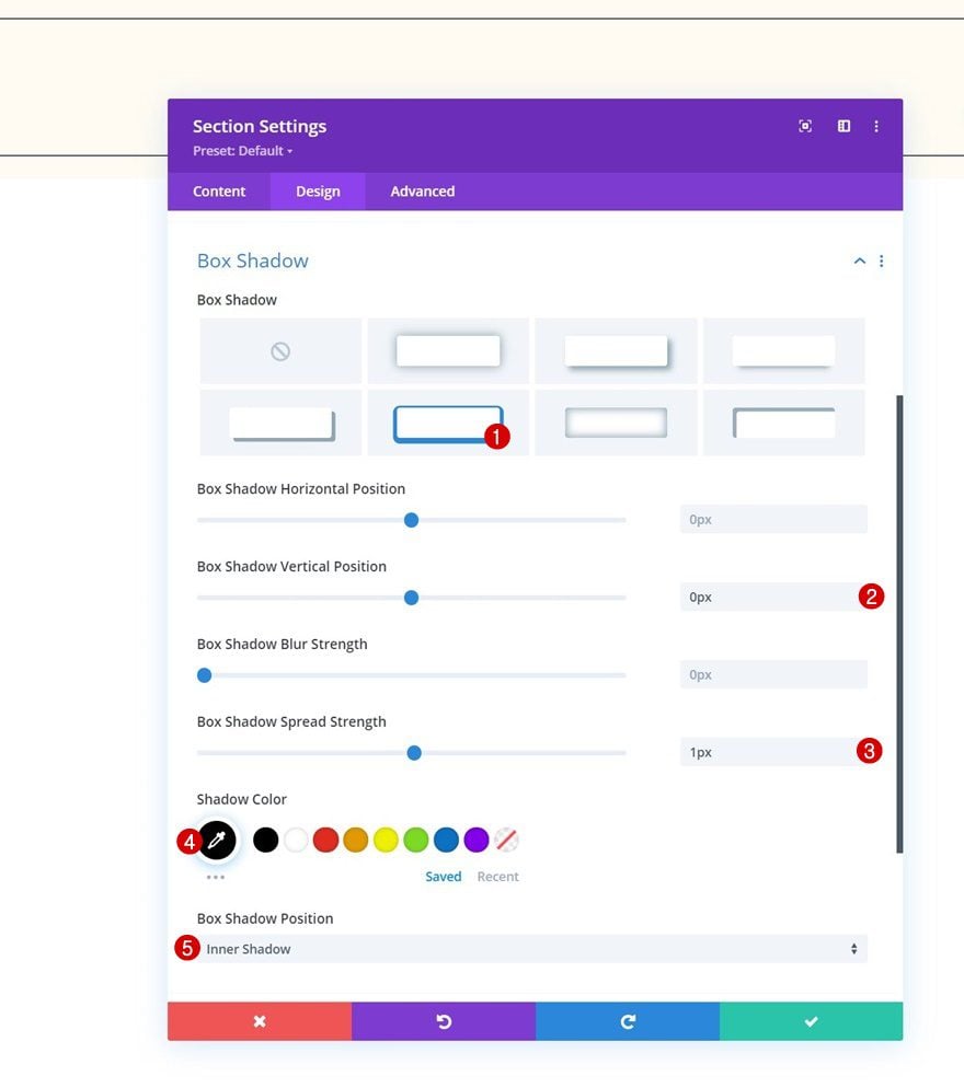
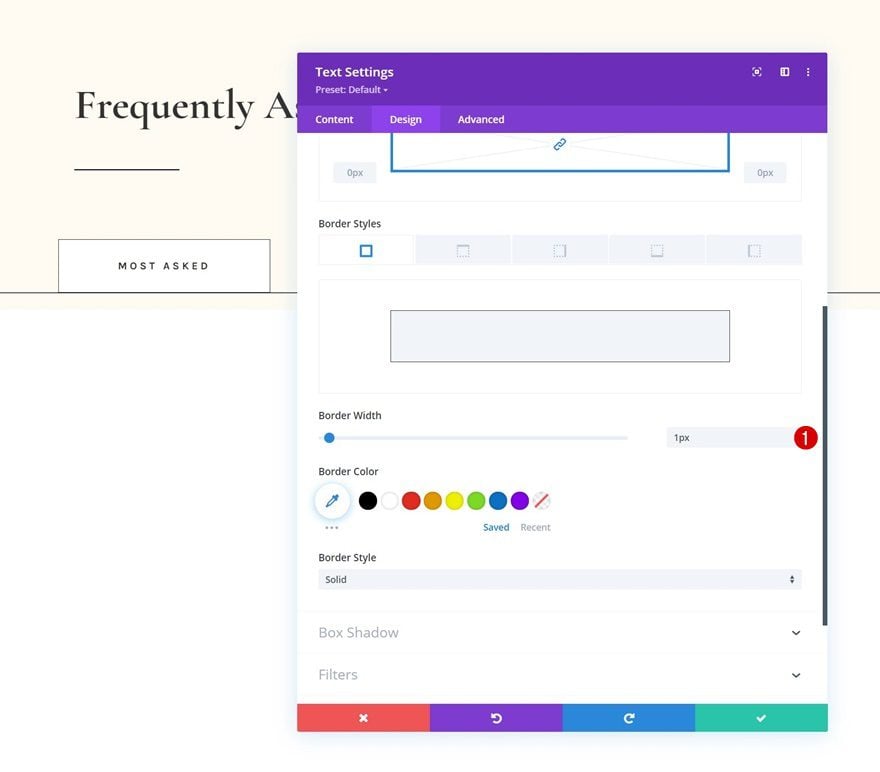
Box Shadow
Include a box shadow as well.
- Box Shadow Vertical Position: 0px
- Box Shadow Spread Strength: 1px
- Shadow Color: #000000
- Box Shadow Position: Inner Shadow
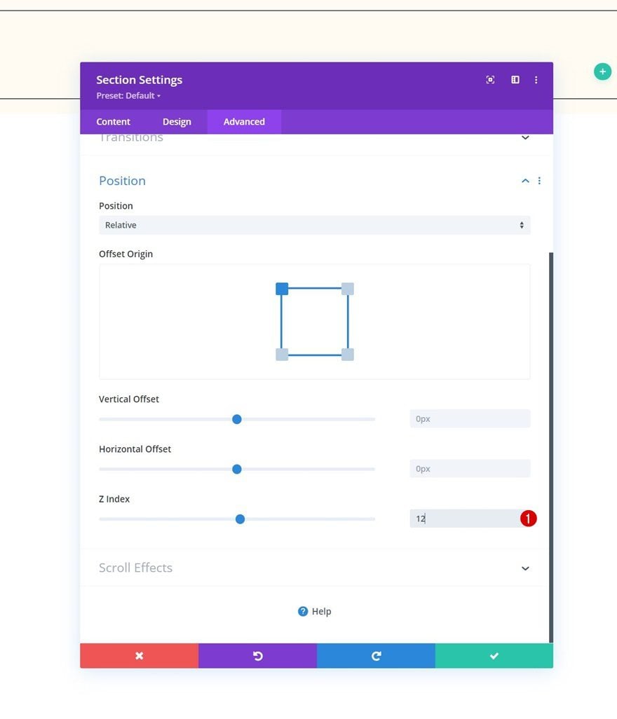
Z Index
And complete the section settings by increasing the z index in the advanced tab.
- Z Index: 12
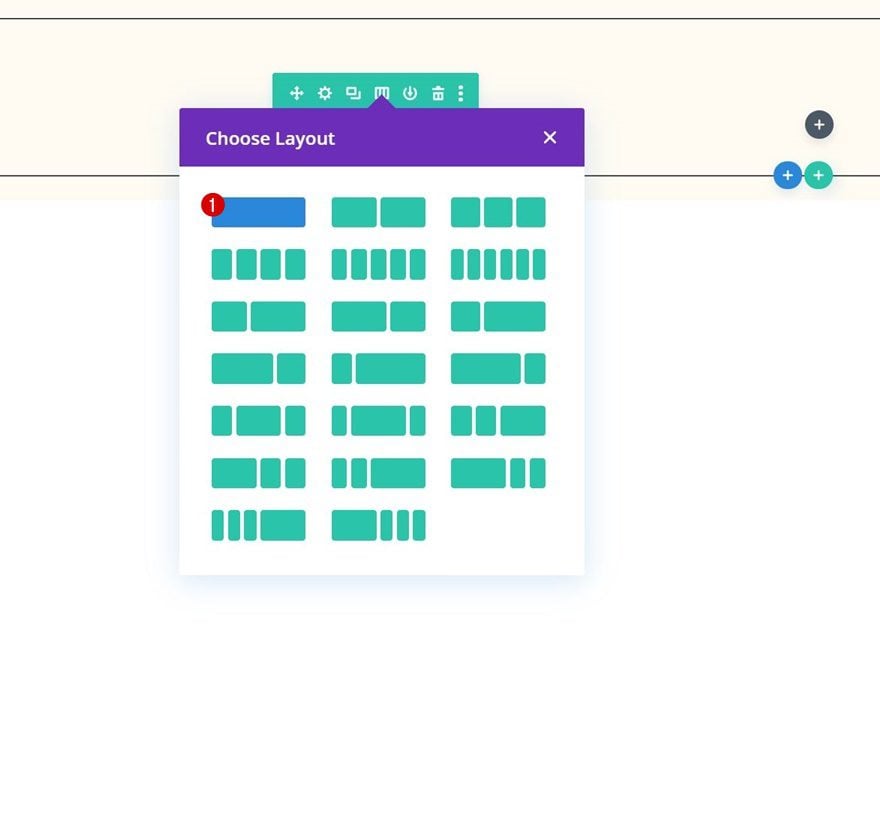
Add Row #1
Column Structure
Continue by adding a new row to the section using the following column structure:
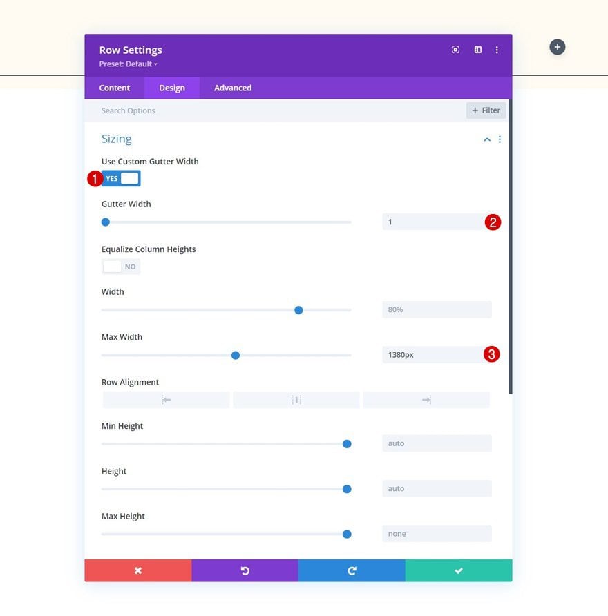
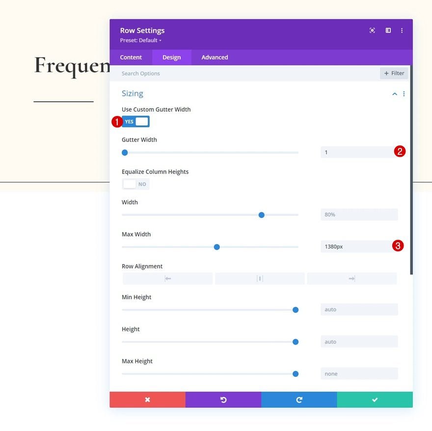
Sizing
Without adding modules yet, open the row settings and change the sizing settings as follows:
- Use Custom Gutter Width: Yes
- Gutter Width: 1
- Max Width: 1380px
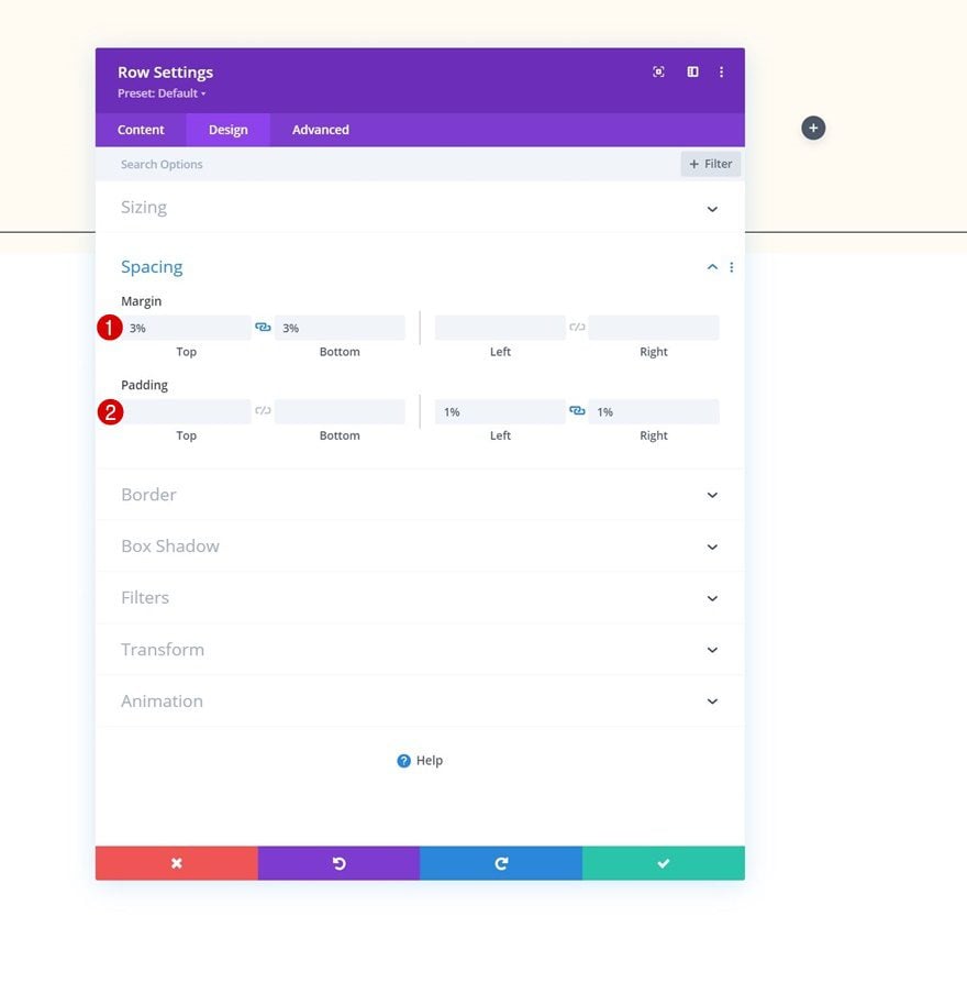
Spacing
Add some custom spacing values next.
- Top Margin: 3%
- Bottom Margin: 3%
- Left Padding: 1%
- Right Padding: 1%
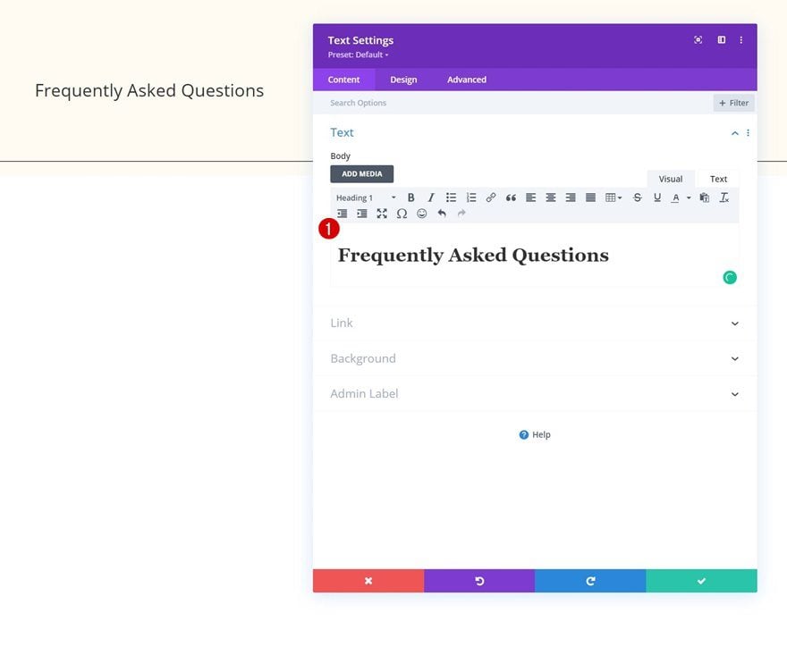
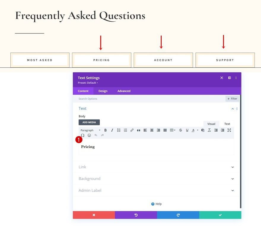
Add Text Module to Column
Add H1 Content
Time to add modules, starting with a Text Module containing some H1 content of your choice.
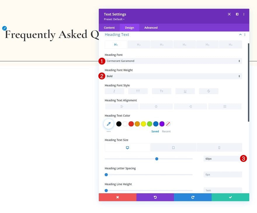
H1 Text Settings
Change the module’s H1 text settings accordingly:
- Heading Font: Cormorant Garamond
- Heading Font Weight: Bold
- Heading Text Size:
- Desktop: 60px
- Tablet: 42px
- Phone: 36px
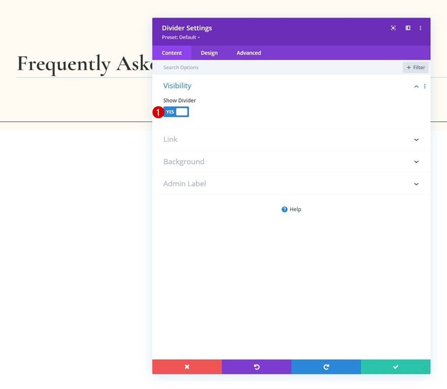
Add Divider Module to Column
Visibility
The next module we’ll add is a Divider Module. Make sure the “Show Divider” option is enabled.
- Show Divider: Yes
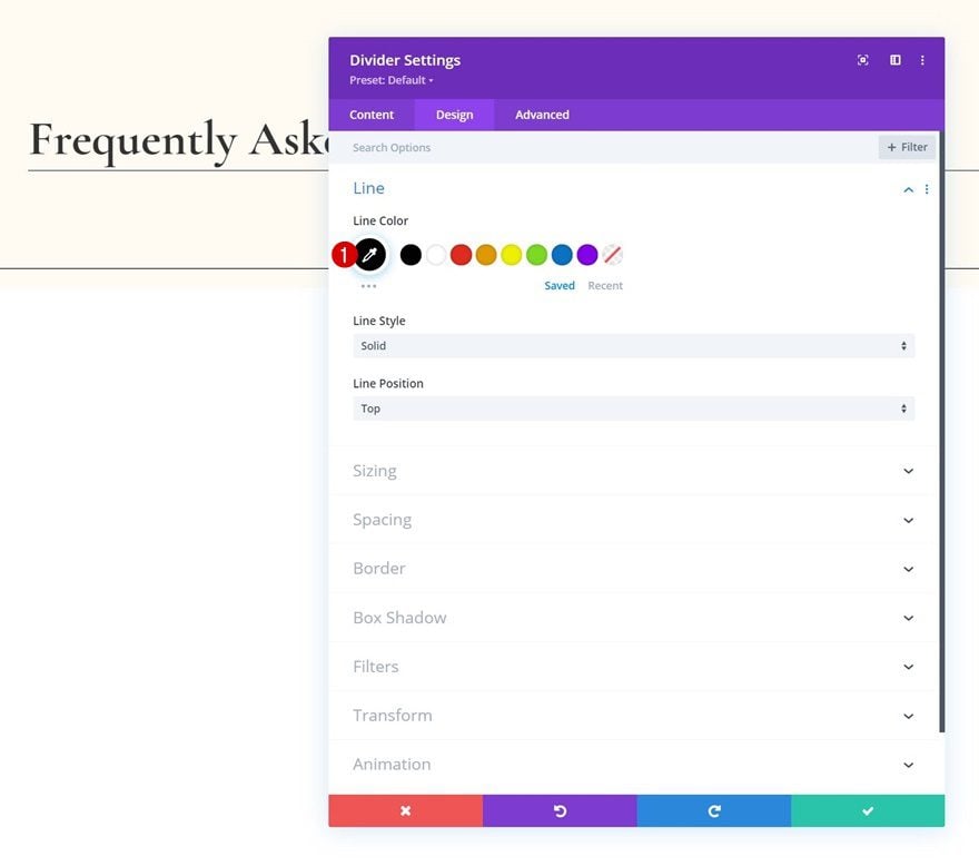
Line
Move on to the module’s design tab and change the line color.
- Line Color: #000000
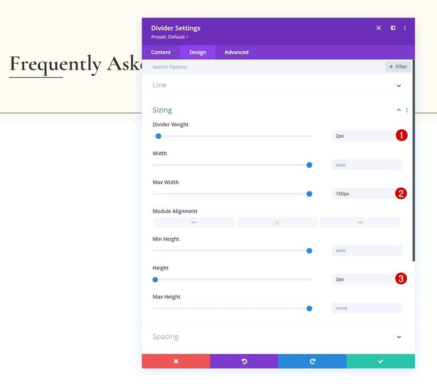
Sizing
Modify the sizing settings too.
- Divider Weight: 2px
- Max Width: 150px
- Height: 2px
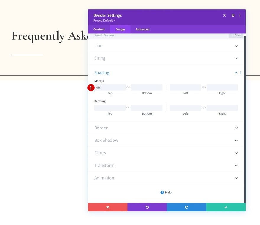
Spacing
And complete the module settings by adding some top margin to the spacing settings.
- Top Margin: 4%
Add Row #2
Column Structure
On to the next row. Use the following column structure:
Sizing
Without adding modules yet, open the row settings and change the sizing settings as follows:
- Use Custom Gutter Width: Yes
- Gutter Width: 1
- Max Width: 1380px
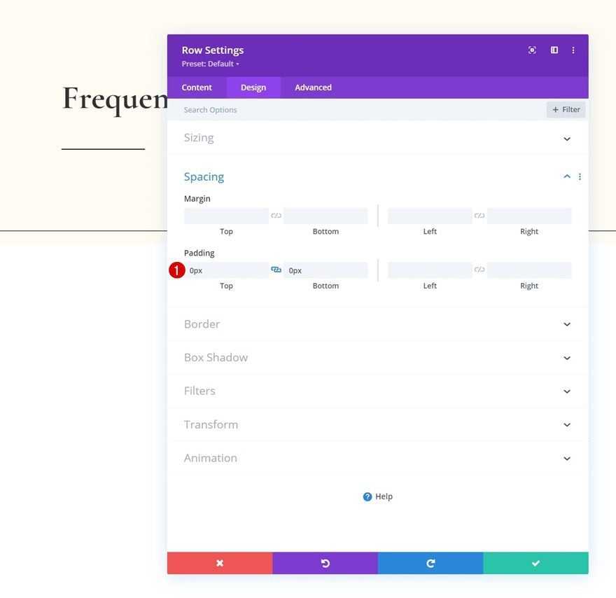
Spacing
Remove all default top and bottom padding too.
- Top Padding: 0px
- Bottom Padding: 0px
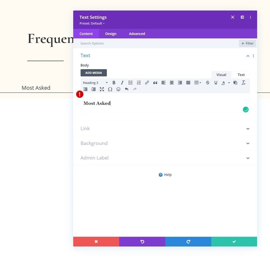
Add Text Module #1 to Column
Add H3 Content
Add a first Text Module to the row with some H3 content of your choice.
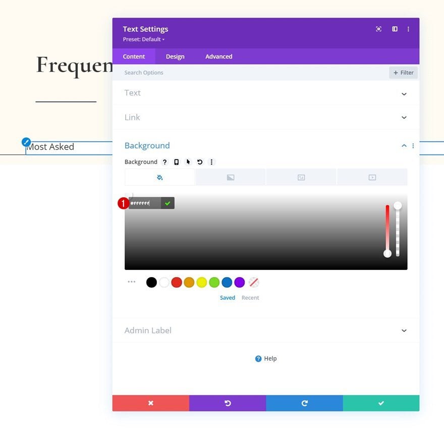
Background Color
Add a white background color.
- Background Color: #ffffff
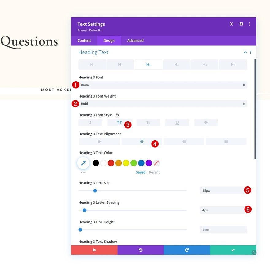
H3 Text Settings
Then, modify the H3 text settings accordingly:
- Heading 3 Font: Karla
- Heading 3 Font Weight: Bold
- Heading 3 Font Style: Uppercase
- Heading 3 Text Alignment: Center
- Heading 3 Text Size: 15px
- Heading 3 Letter Spacing: 4px
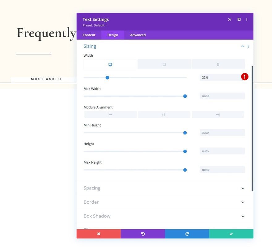
Sizing
Change the width across different screen sizes too.
- Width:
- Desktop: 22%
- Tablet & Phone: 44%
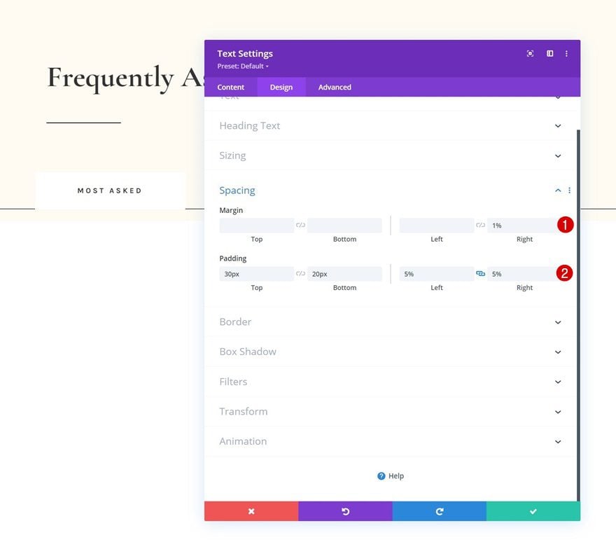
Spacing
Next, add some custom spacing values.
- Right Margin: 1%
- Top Padding: 30px
- Bottom Padding: 20px
- Left Padding: 5%
- Right Padding: 5%
Border
Add a border.
- Border Width: 1px
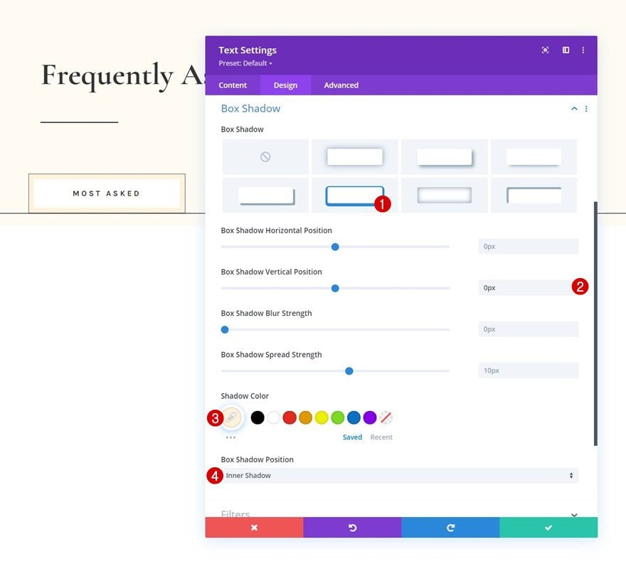
Box Shadow
Include a box shadow as well.
- Box Shadow Vertical Position: 0px
- Shadow Color: #fff3dd
- Box Shadow Position: Inner Shadow
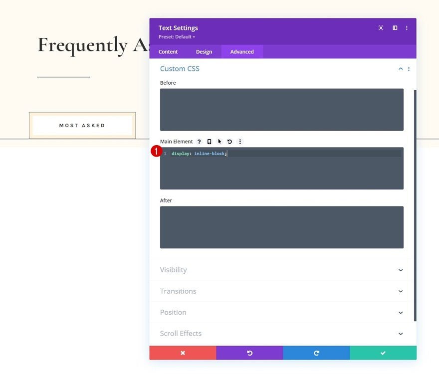
Main Element CSS
And complete the module settings by assigning a custom display property to the module’s main element in the advanced tab. This, in combination with the adjusted width, will allow several modules to show up next to each other.
display: inline-block;
Clone Text Module 3x
Once you’ve completed the first Text Module, you can clone it three times.
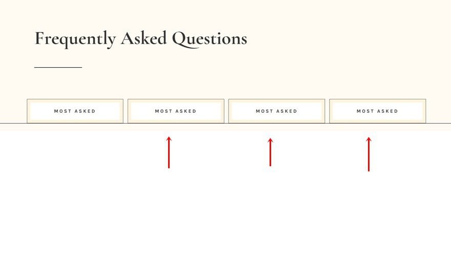
Change Content
Make sure you change the content in each one of the duplicates.
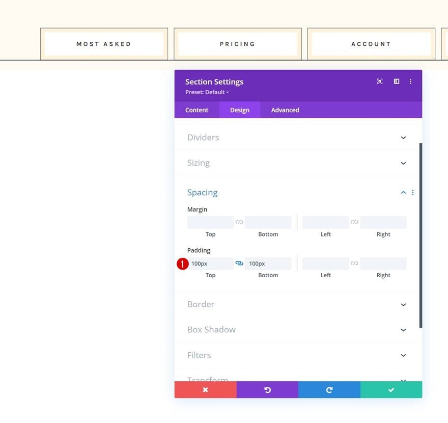
Add Section #2
Spacing
Add another section right below the previous one, open the section settings and apply some top and bottom padding.
- Top Padding: 100px
- Bottom Padding: 100px
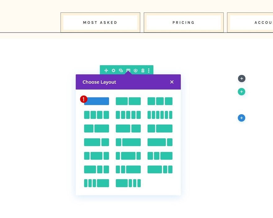
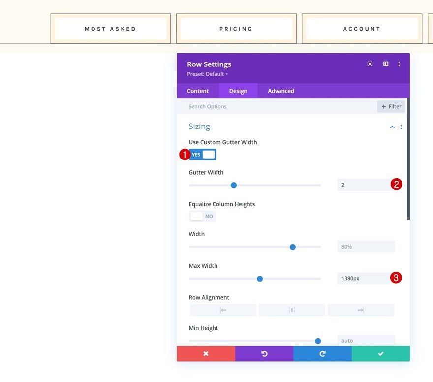
Add Row #1
Column Structure
Continue by adding a new row using the following column structure:
Sizing
Open the row settings, go to the design tab and change the sizing settings as follows:
- Use Custom Gutter Width: Yes
- Gutter Width: 2
- Max Width: 1380px
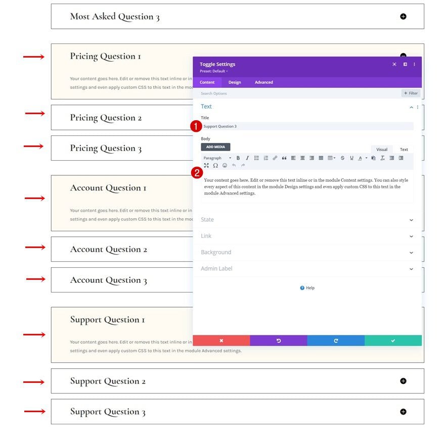
Add Toggle Module #1 to Column
Add Content
Then, add a first Toggle Module to the row and use some content of your choice.
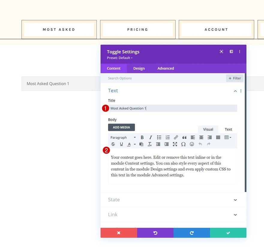
Icon Settings
Move on to the module’s design tab and change the icon settings.
- Icon Color: #000000
- Use Custom Icon Size: Yes
- Icon Font Size: 24px
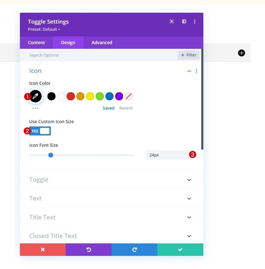
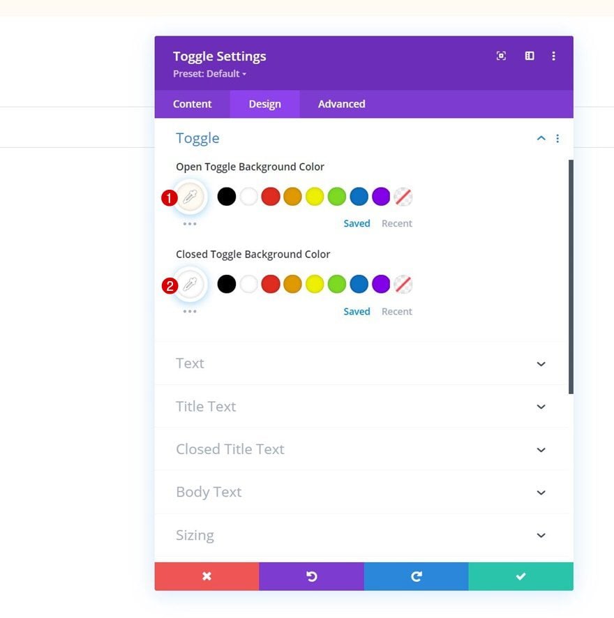
Toggle Settings
Modify the toggle settings too.
- Open Toggle Background Color: #fffbf2
- Closed Toggle Background Color: #ffffff
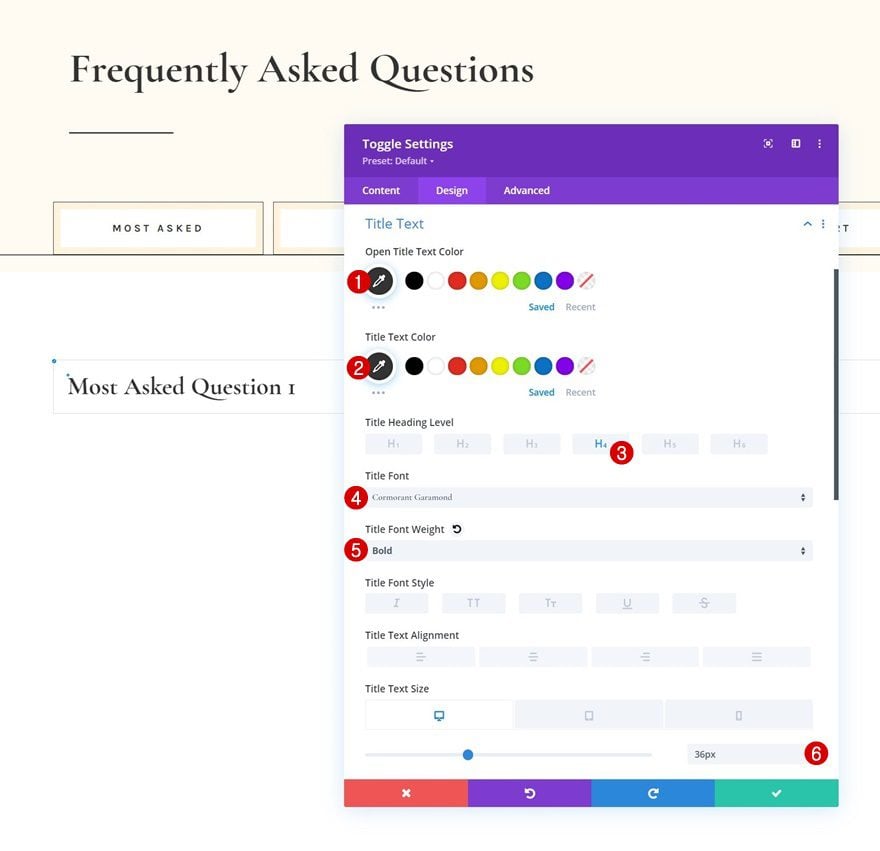
Title Text Settings
Then, apply some custom styles to the title.
- Open Title Text Color: #333333
- Title Text Color: #333333
- Title Heading Level: H4
- Title Font: Cormorant Garamond
- Title Font Weight: Bold
- Title Text Size:
- Desktop: 36px
- Tablet: 34px
- Phone: 28px
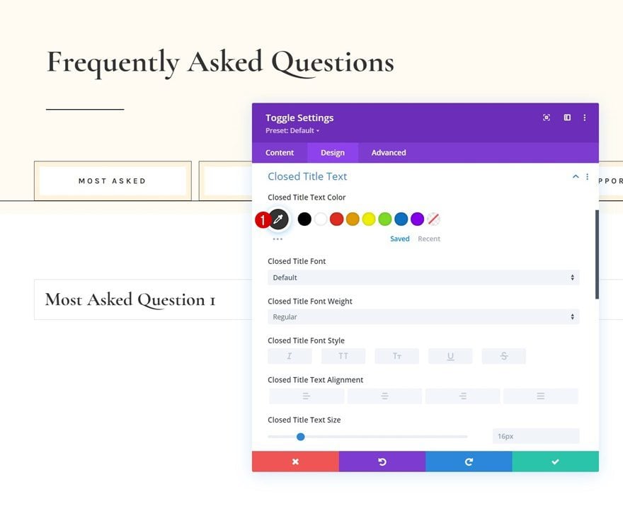
Closed Title Text Settings
We’re changing the closed title text color too.
- Closed Title Text Color: #333333
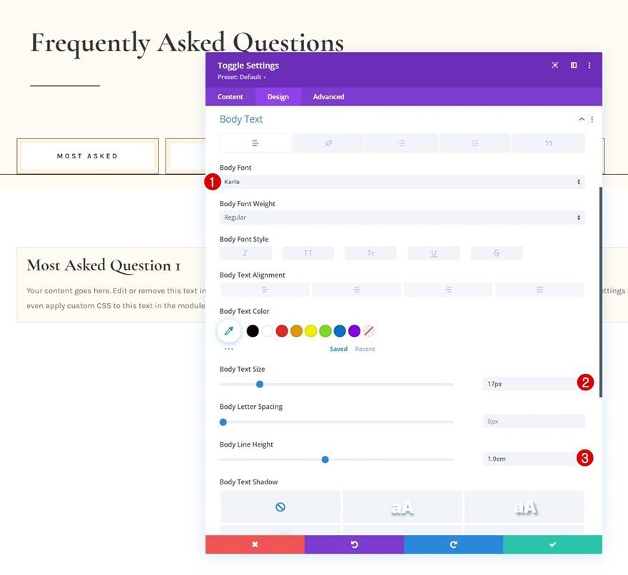
Body Text Settings
Then, we’ll style the body text.
- Body Font: Karla
- Body Text Size: 17px
- Body Line Height: 1.9em
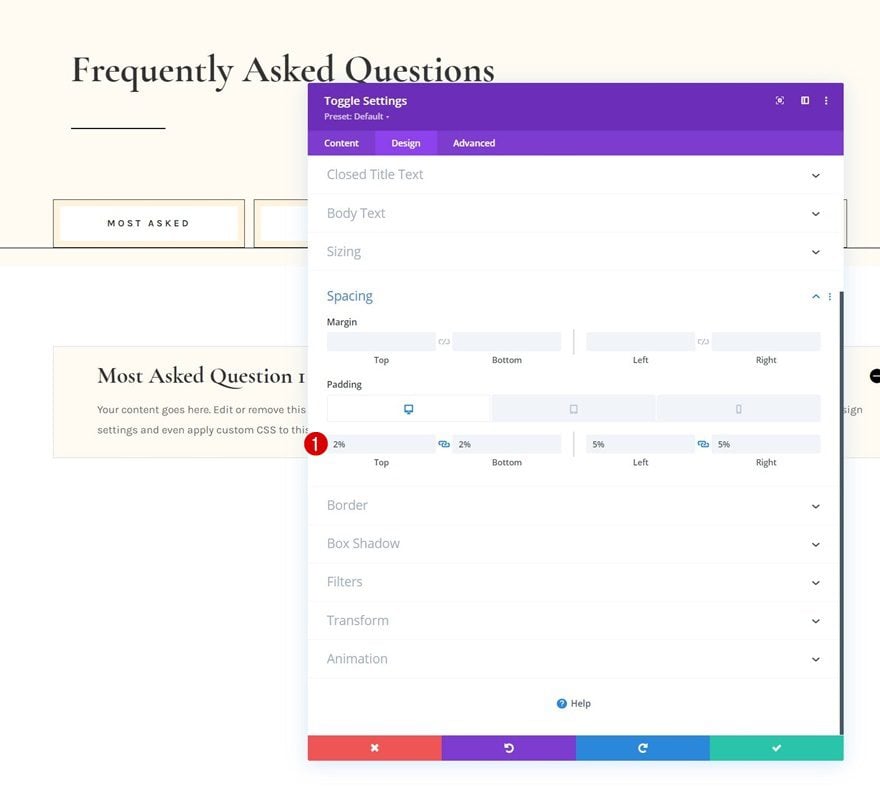
Spacing
We’ll add some responsive spacing values as well.
- Top Padding:
- Desktop: 2%
- Tablet: 4%
- Phone: 6%
- Bottom Padding:
- Desktop: 2%
- Tablet: 4%
- Phone: 6%
- Left Padding: 5%
- Right Padding: 5%
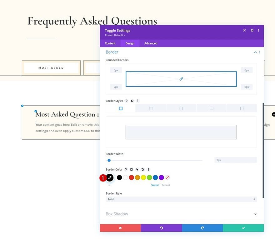
Border
Next, we’ll change the border color.
- Border Color: #000000
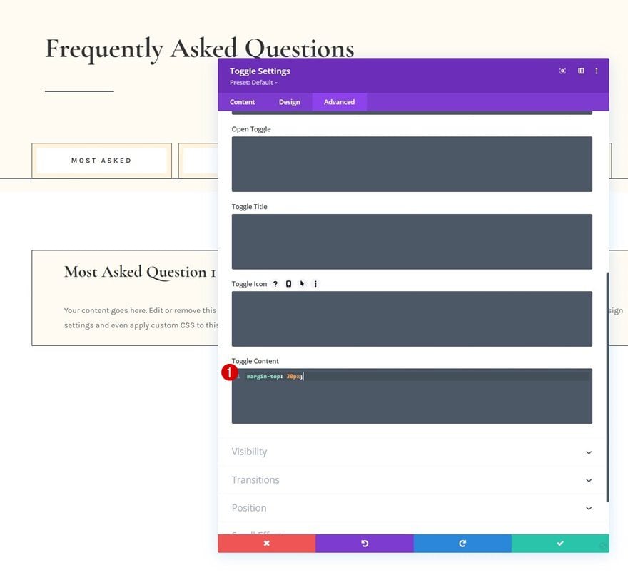
Toggle Content CSS
And we’ll complete the module settings by adding one line of CSS code to the toggle content area in the advanced tab.
margin-top: 30px;
Clone Toggle Module as Many Times as Wanted
Once you’ve completed the first Toggle Module, you can clone it as many times as you want.
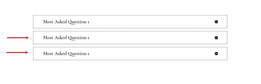
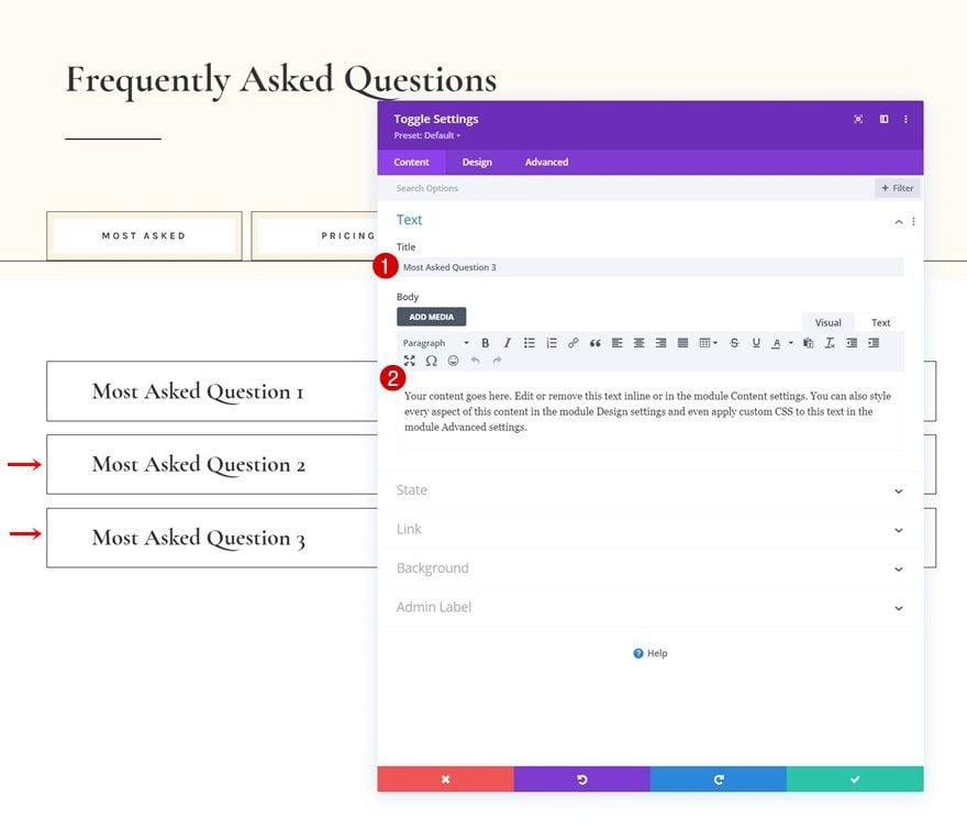
Change Content
Make sure you change all duplicate content.
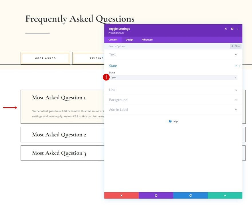
Change State of Toggle Module #1
Then, open the first Toggle Module again and change the state to “Open”.
- State: Open
Clone Entire Row 3x
Now that we have our first set of Toggle Modules, we can clone the entire row three times. In total, we’ll now have 4 rows containing Toggle Modules. This matches the number of Text Modules in the second row of section #1.
Change Content
Make sure you change the content in each duplicate row.
Add Functionality
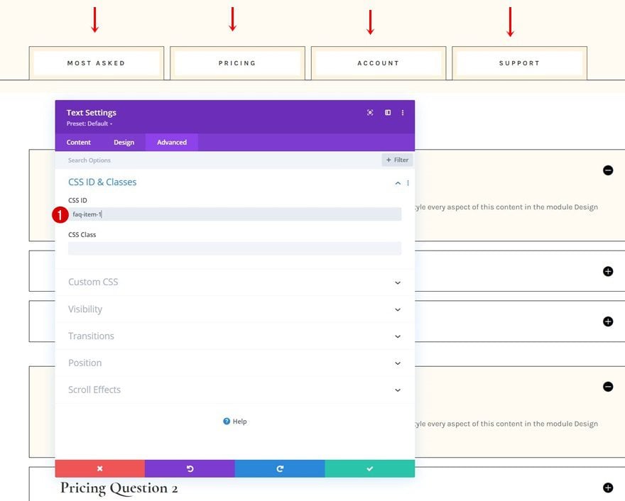
Add Consecutive CSS IDs to Text Modules in Row #2 of Section #1
Now that we have all elements in place, it’s time to apply the functionality. We’re going to make sure that once a Text Module in row #2 of section #1 is clicked, the corresponding FAQ toggles are shown. Open each one of the Text Modules individually and use the following consecutive CSS IDs:
- Text Module #1: faq-item-1
- Text Module #2: faq-item-2
- Text Module #3: faq-item-3
- Text Module #4: faq-item-4
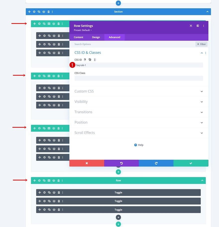
Add Consecutive CSS IDs to Rows in Section #2
Next, we’ll apply CSS IDs to each row containing Toggle Modules. We’re following the same consecutive order.
- First Row: faq-tab-1
- Second Row: faq-tab-2
- Third Row: faq-tab-3
- Fourth Row: faq-tab-4
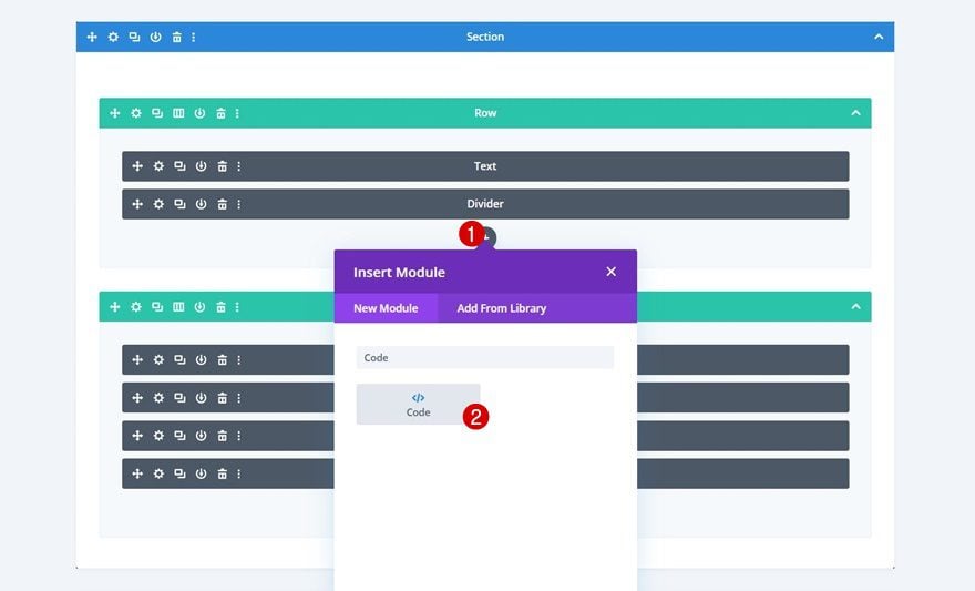
Add Code Module to Row #1 of Section #1
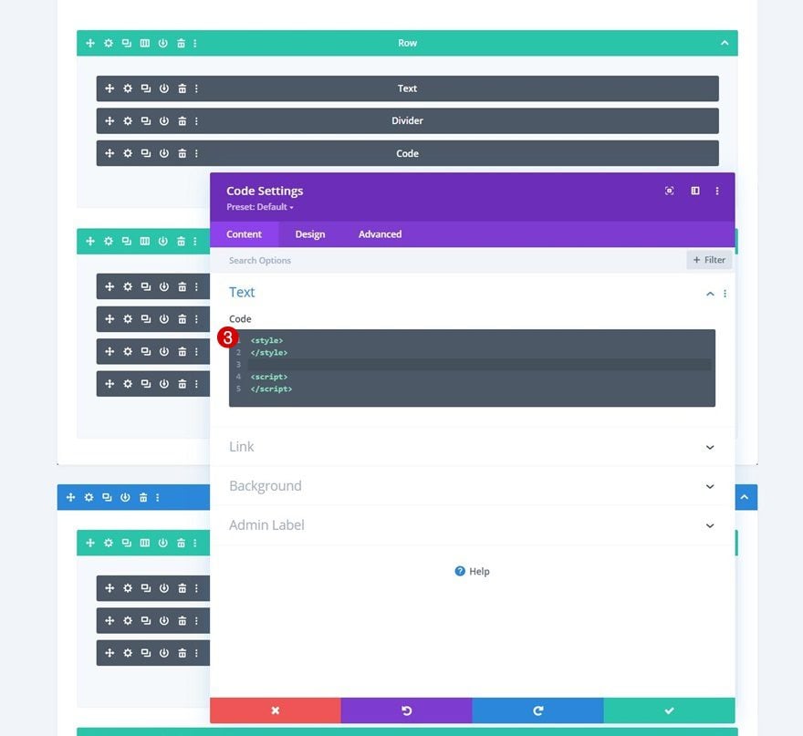
To make the functionality works, we’ll use some custom CSS and JQuery code. To add the code to our page, we’ll insert a new Code Module in row #1 of section #1, right below the Divider Module. Make sure you add style and script tags in advance.
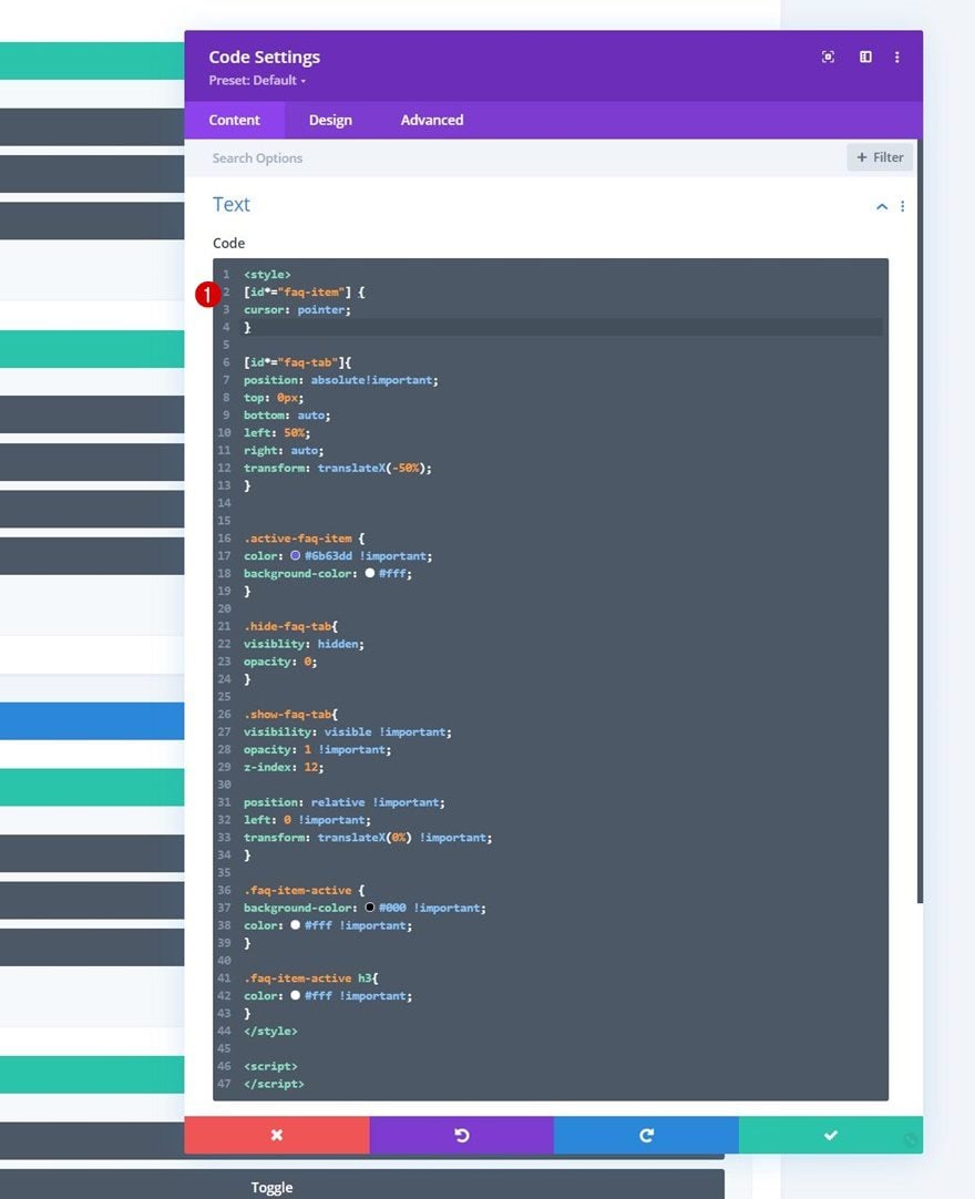
Add CSS Code
Then, copy paste the following CSS code between the style tags:
[id*="faq-item"] {
cursor: pointer;
}

[id*="faq-tab"]{
position: absolute!important;
top: 0px;
bottom: auto;
left: 50%;
right: auto;
transform: translateX(-50%);
}


.active-faq-item {
color: #6b63dd !important;
background-color: #fff;
}

.hide-faq-tab{
visibility: hidden;
opacity: 0;
}

.show-faq-tab{
visibility: visible !important;
opacity: 1 !important;
z-index: 12;

position: relative !important;
left: 0 !important;
transform: translateX(0%) !important;
}

.faq-item-active {
background-color: #000 !important;
color: #fff !important;
}

.faq-item-active h3{
color: #fff !important;
}
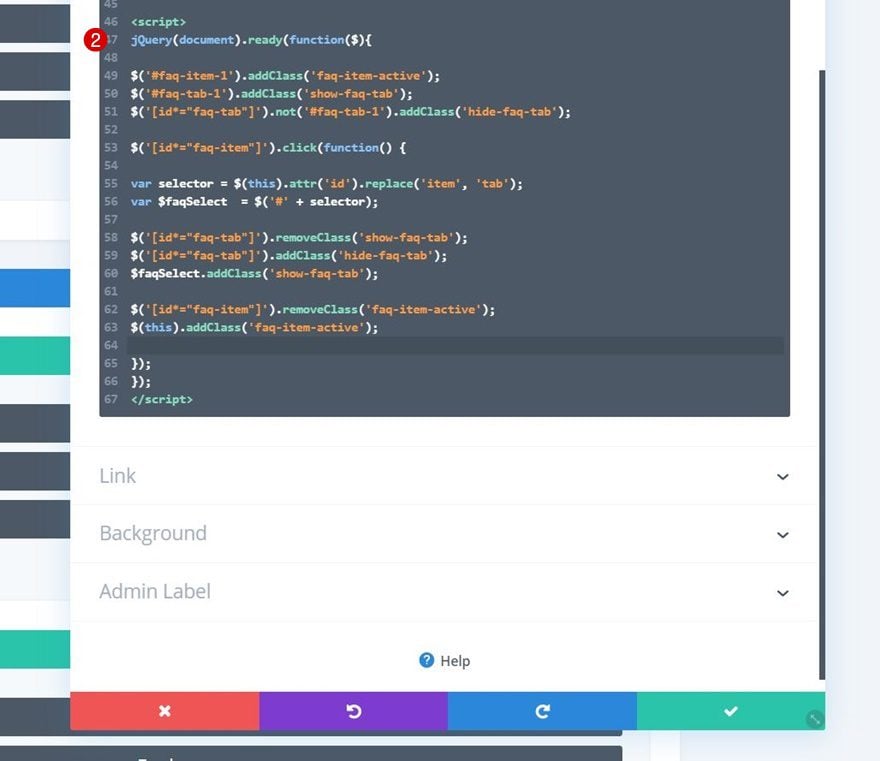
Add JQuery Code
And complete the tutorial by using the following lines of JQuery code between the script tags:
jQuery(document).ready(function($){

$('#faq-item-1').addClass('faq-item-active');
$('#faq-tab-1').addClass('show-faq-tab');
$('[id*="faq-tab"]').not('#faq-tab-1').addClass('hide-faq-tab');

$('[id*="faq-item"]').click(function() {

var selector = $(this).attr('id').replace('item', 'tab');
var $faqSelect  = $('#' + selector);

$('[id*="faq-tab"]').removeClass('show-faq-tab');
$('[id*="faq-tab"]').addClass('hide-faq-tab');
$faqSelect.addClass('show-faq-tab');

$('[id*="faq-item"]').removeClass('faq-item-active');
$(this).addClass('faq-item-active');

});
});
Preview
Now that we’ve gone through all the steps, let’s take a final look at the outcome across different screen sizes.
Desktop
Mobile
Final Thoughts
In this post, we’ve shown you how to improve your frequently asked questions page’s user experience. More specifically, we’ve shown you how to structure the questions in different tabs per type. This approach will help you organize your frequently asked questions, which in turn will help your visitors find answers to their questions quicker. You were able to download the JSON file for free as well! If you have any questions, feel free to leave a comment in the comment section below.
If you’re eager to learn more about Divi and get more Divi freebies, make sure you subscribe to our email newsletter and YouTube channel so you’ll always be one of the first people to know and get benefits from this free content.


Hi there, I have just come across it and it’s brilliant! I wonder if it is possible to find out a URL directly to a tab? I.e. a URL link directly to an active tab/Row? Many thanks, Annika
I’m looking for this feature as well. When I try to link to a tab directly, the link just sends people to the first tab.
Make sure you’ve added the IDs of the Tabs by going to the Text Module Settings > Advanced > Classes and ID > CSS ID: https://prnt.sc/byA1KSWXwVXp
After that, make sure that the IDs you added to the Text Modules are also added to the respective Rows in the Row Settings > Advanced > Classes and ID > CSS ID: https://prnt.sc/c6awXj80LTUB
I am having the same problem where it’s broken and all goes to the left side.
Hello, it will appear that way inside the builder, but it will display correctly on the front end. Check this page: https://charry.divi.support/how-to-structure-your-faq-with-custom-tabs-in-divi/
Hi! I think something is not working, when applying the code the toggles move to the left. I’ve tried with the .json file as well, but it has the same issue.
The code is not working, the footer is not fixed clearly… You need to fix that !
I think that these days, this should have been implemented with vanilla JS instead of jQuery. I’m not great with Javascript myself, but whenever I use jQuery for something, my chat (I’m livestreaming most of my work on Twitch) is telling me that I shouldn’t use it as it’s possible to accomplish the same thing with just JavaScript.
Considering that jQuery is seeing less and less support in WordPress in general, which had already caused issues with a lot of plugins / websites, I don’t think it’s best practice to use it in this example.
Hello,
Really good !
Thank you
Nice layout. Having a FAQ page is an important element for any website. The enhanced user experience is more important than ever with the pending Google Core Web Vitals implementation. Good explanation of how to implement as well. We already had a FAQ page but plan to adapt to this layout. Thanks!
Schema.org tags? Please Reply to the previous comment.
Thanks, very interesting to use with many types of contents.
Thanks for that! Really nice regarding UX! One question though: is this FAQ compliant with schema.org tags (faq tags)?
No, it is not. I’ve implemented this for a website and ended up using a code module to mirror the source code that Divi generated and manually added the schema.org specs to make sure it qualifies. 🙂
Hi Oliver,
Yeah, figures ; that’s a nice trick that you used, and maybe even faster than the original ; unfortunately, there’s no way to automatize this at a large scale (I’m actually thinking about clients who add their content themselves, no way they will put their hands into code modules). Still worth doing though on my own websites!