The way you design your header sets the tone for the rest of your website. That’s why it’s important to think of the way you add elements and interactions. Of course, you’ll want to include the basics like a logo and menu items, but chances are high you’ll want to include some other calls to action as well. However, the more items you add to your header, the more overwhelming the header can become. If you’re looking for a clean and interactive way to showcase different calls to action in your header, you’ll love this tutorial. Today, we’re showing you how to save space in your header using toggle icons. You’ll be able to download the JSON file for free as well!
Let’s get to it.
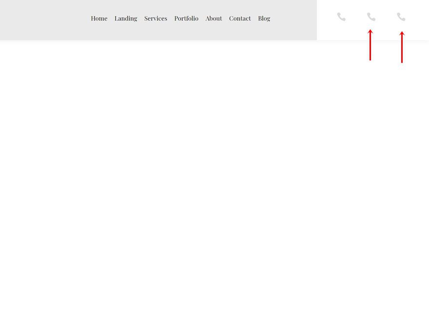
Preview
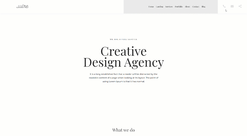
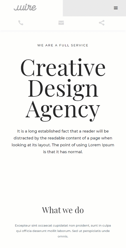
Before we dive into the tutorial, let’s take a quick look at the outcome across different screen sizes.
Desktop
Mobile
Download The Global Header Template for FREE
To lay your hands on the free global header template, you will first need to download it using the button below. To gain access to the download you will need to subscribe to our newsletter by using the form below. As a new subscriber, you will receive even more Divi goodness and a free Divi Layout pack every Monday! If you’re already on the list, simply enter your email address below and click download. You will not be “resubscribed” or receive extra emails.

1. Build Header Structure
Create New Global Header Template
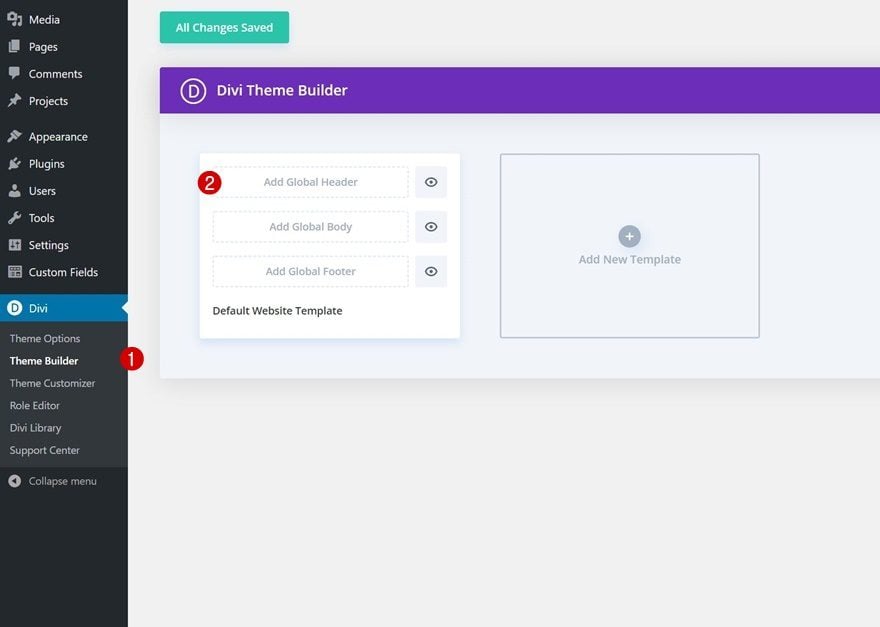
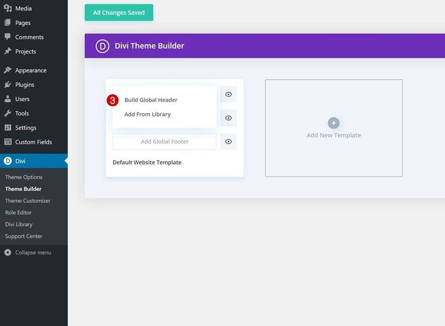
Start by going to the Divi Theme Builder and start building a new global or custom header.
Add Section #1
Gradient Background
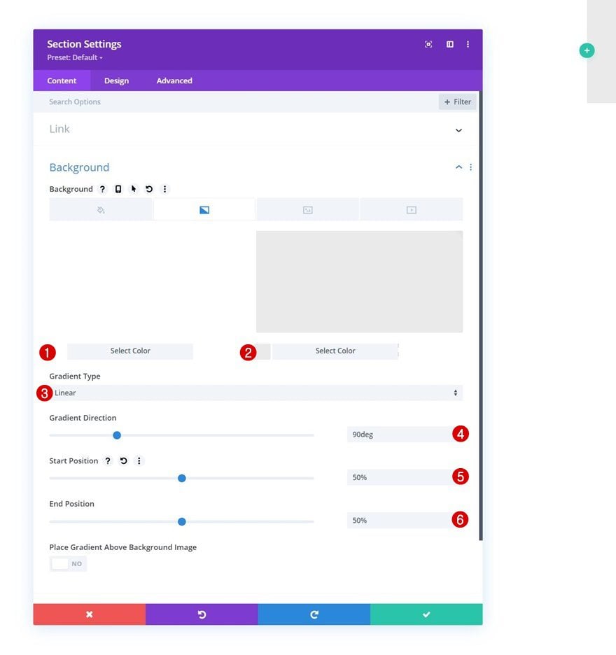
Once inside the template editor, you’ll notice a section. Open that section’s settings and apply a gradient background.
- Color 1: #ffffff
- Color 2: #eaeaea
- Gradient Type: Linear
- Gradient Direction: 90deg
- Start Position: 50%
- End Position: 50%
Spacing
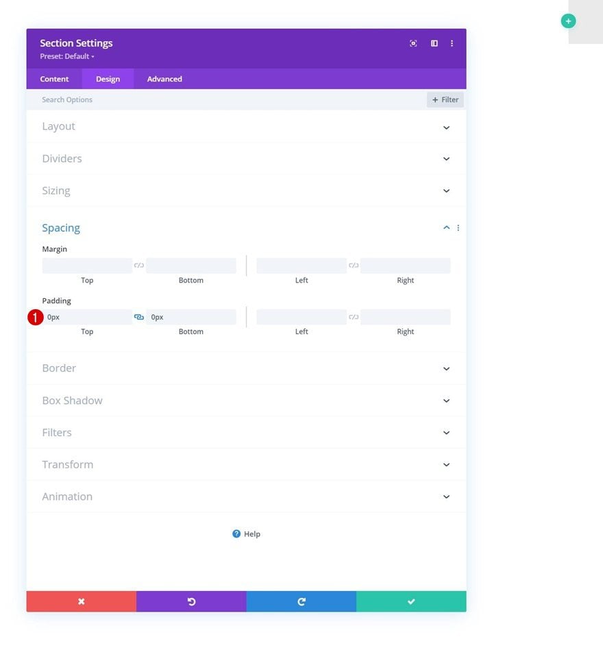
Move on to the section’s design tab and remove all default top and bottom padding.
- Top Padding: 0px
- Bottom Padding: 0px
Box Shadow
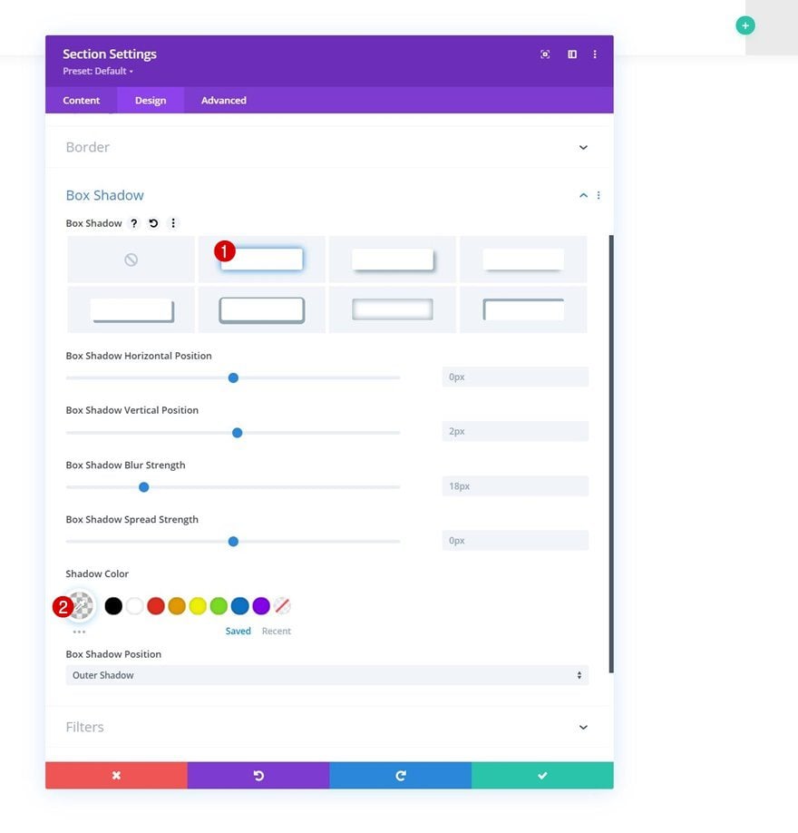
Add a box shadow as well.
- Shadow Color: rgba(0,0,0,0.06)
Add New Row
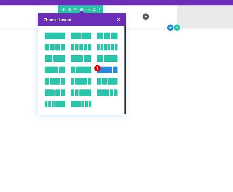
Column Structure
Continue by adding a new row using the following column structure:
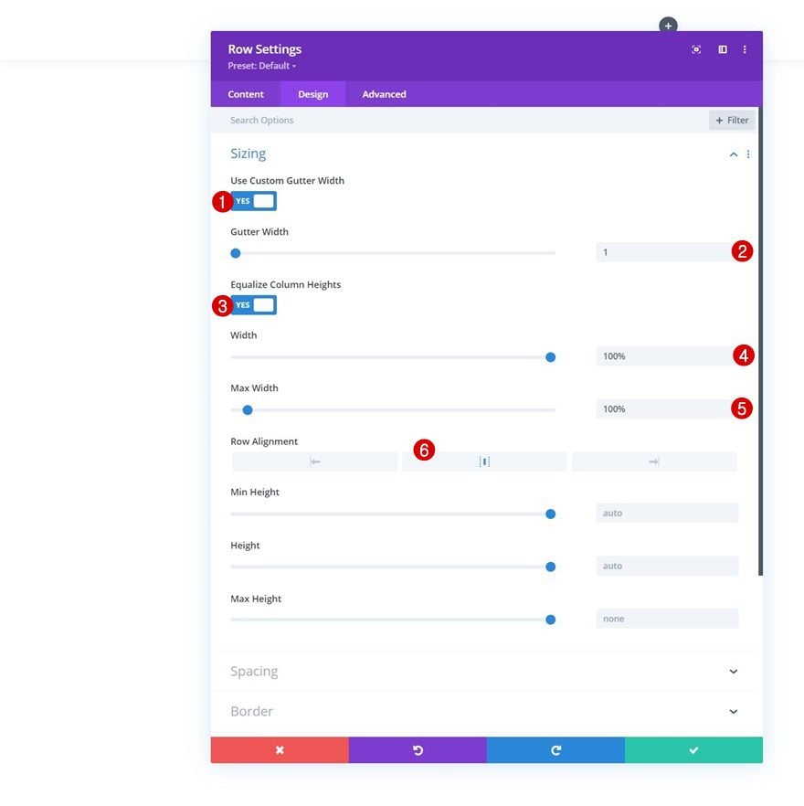
Sizing
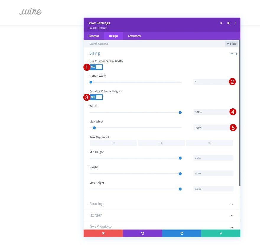
Without adding any modules yet, open the row settings, move on to the design tab and change the sizing settings as follows:
- Use Custom Gutter Width: Yes
- Gutter Width: 1
- Equalize Column Heights: Yes
- Width: 100%
- Max Width: 100%
- Row Alignment: Center
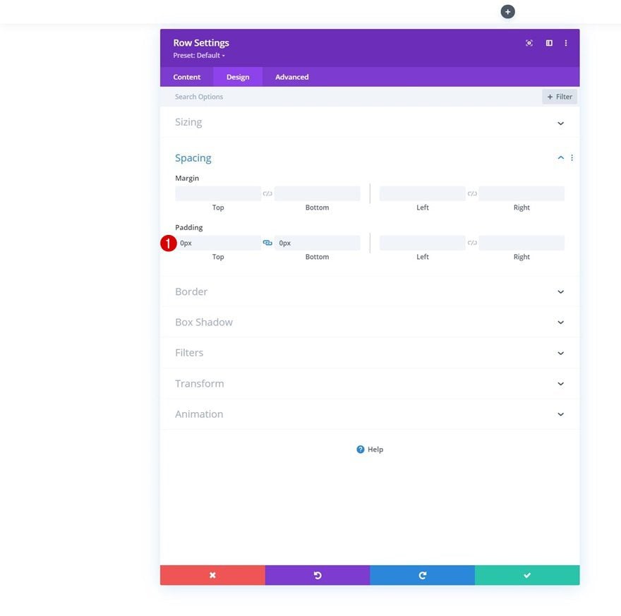
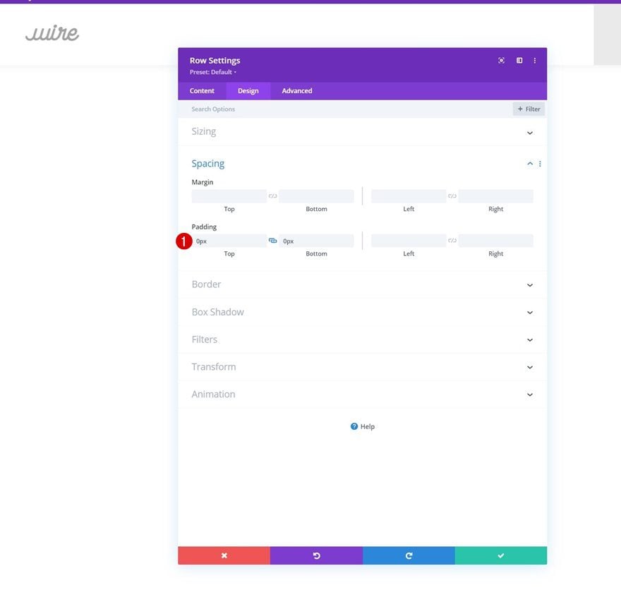
Spacing
Remove all default top and bottom padding next.
- Top Padding: 0px
- Bottom Padding: 0px
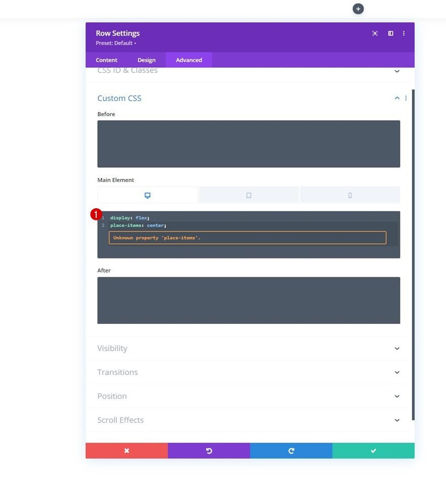
Main Element CSS
Then, go to the advanced tab and apply some main element custom CSS code lines across different screen sizes. This code will help us vertically center the items on desktop.
Desktop:
display: flex;
place-items: center;
Tablet & Phone:
display: block;
Column 1 Settings
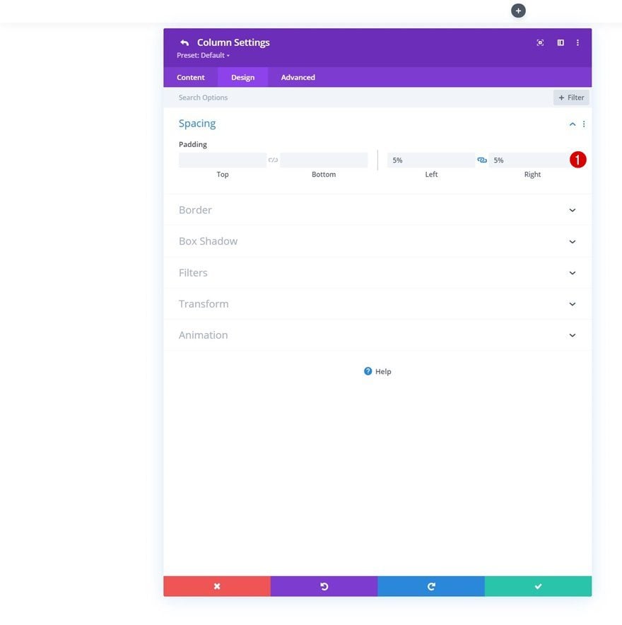
Spacing
Then, open the column 1 settings and apply some left and right padding.
- Left Padding: 5%
- Right Padding: 5%
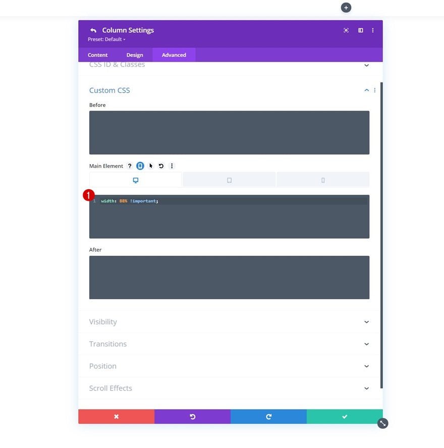
Main Element
We’re changing the size of our column on desktop and bringing it back to “100%” on tablet and phone by applying some custom CSS to the column’s main element.
Desktop:
width: 88% !important
Tablet & Phone:
width: 100% !important;
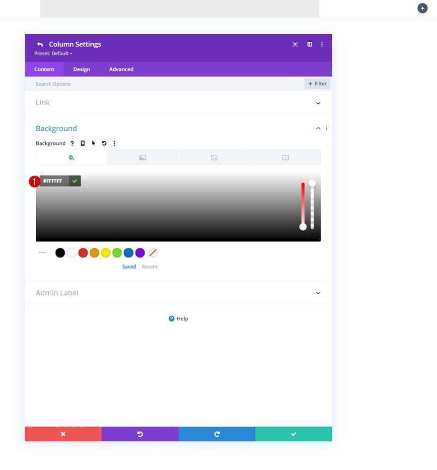
Column 2 Settings
Background Color
Next, we’ll open the column 2 settings and change the background color to white.
- Background Color: #FFFFFF
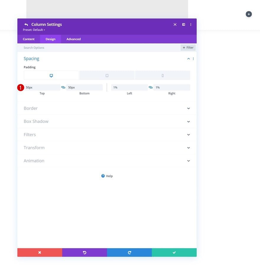
Spacing
We’ll add some responsive padding values to the spacing settings of this column too.
- Top Padding:
- Desktop: 50px
- Tablet & Phone: 20px
- Bottom Padding
- Desktop: 50px
- Tablet & Phone: 20px
- Left Padding: 1%
- Right Padding: 1%
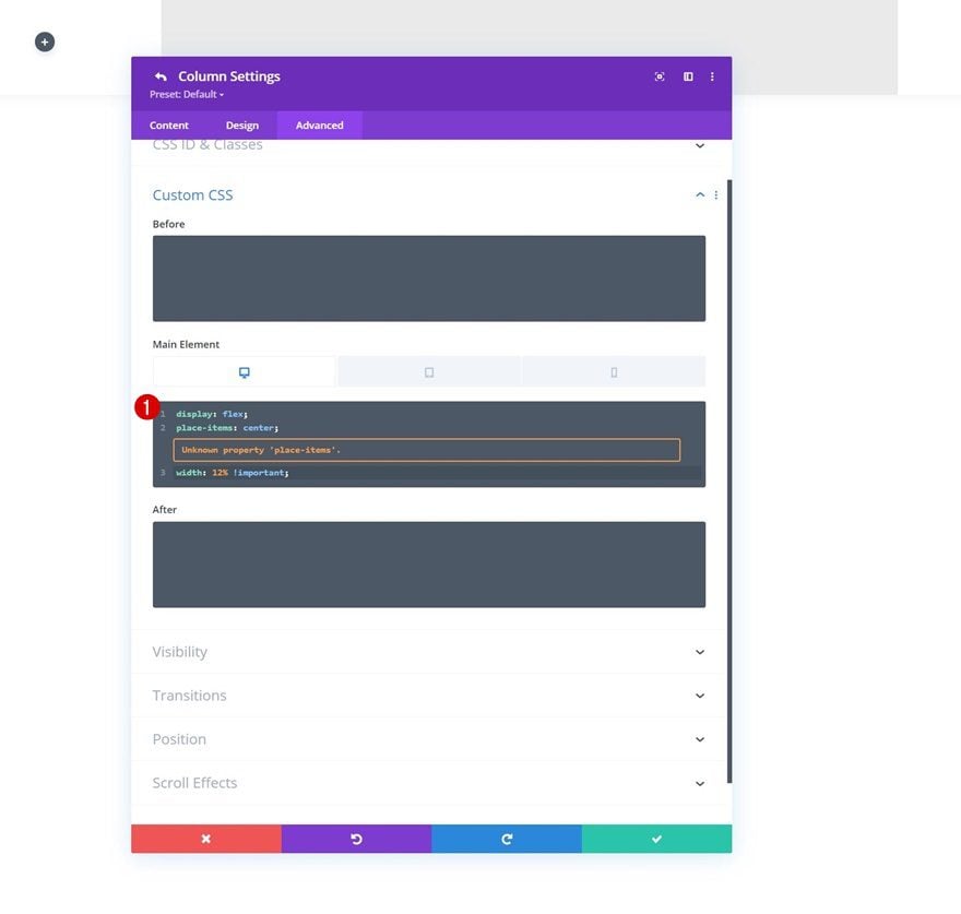
Main Element CSS
We’ll modify the second column’s size on desktop too. We’re bringing this back to “100%” on smaller screen sizes.
Desktop:
display: flex;
place-items: center;
width: 12% !important;
Tablet & Phone:
width: 100% !important;
Select Menu
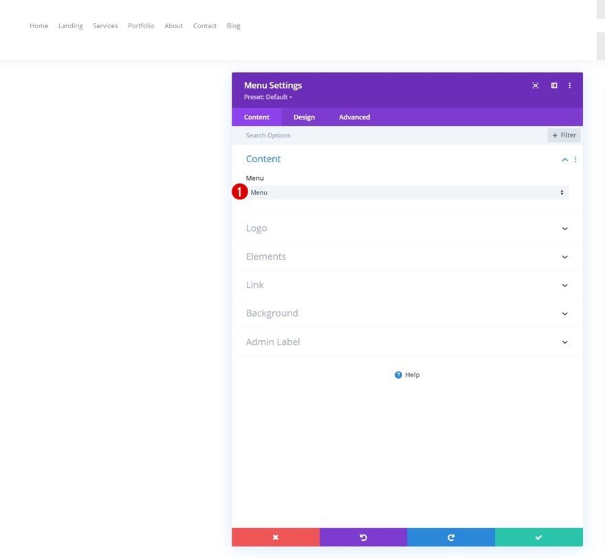
Time to add modules, starting with a Menu Module in column 1. Select a menu of your choice.
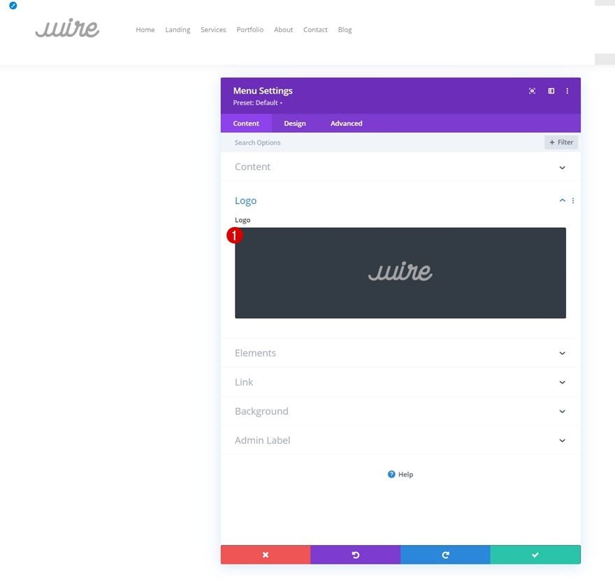
Upload Logo
Upload a logo next.
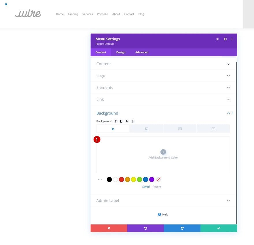
Remove Background Color
Then, remove the default background color.
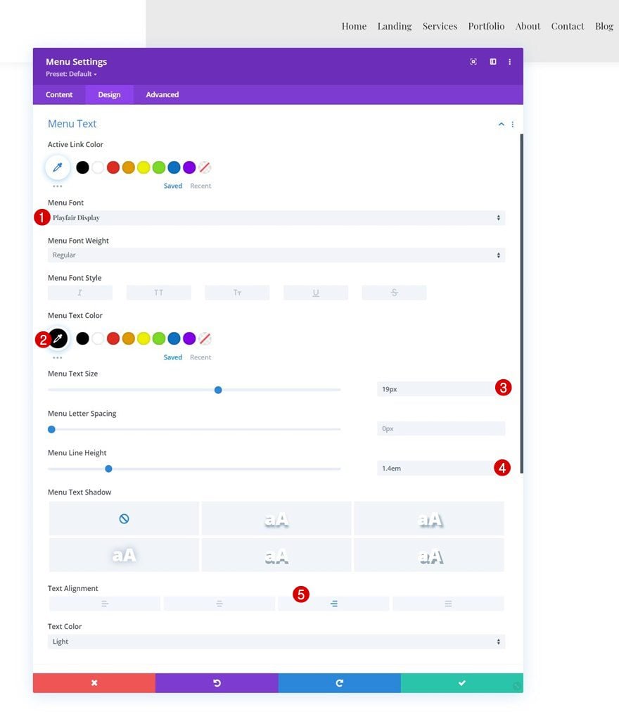
Menu Text Settings
Move on to the module’s design tab and change the menu text settings accordingly:
- Menu Font: Playfair Display
- Menu Text Font: Playfair Display
- Menu Text Color: #000000
- Menu Text Size: 19px
- Menu Line Height: 1.4em
- Text Alignment: Right
Dropdown Menu Settings
Then, change the dropdown menu line color.
- Dropdown Menu Line Color: #ffffff
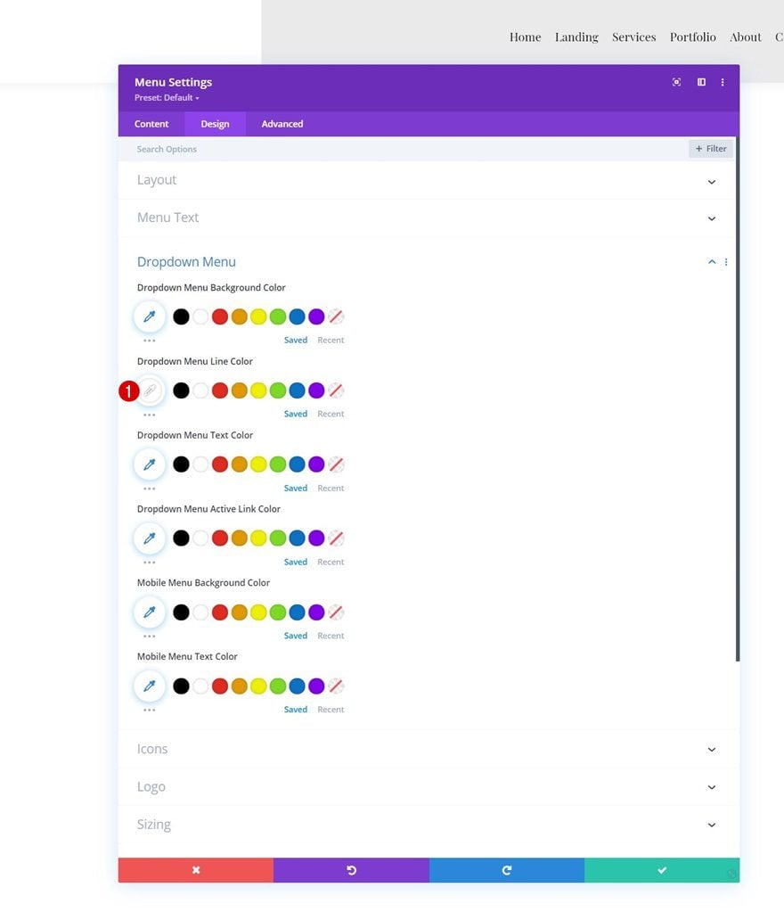
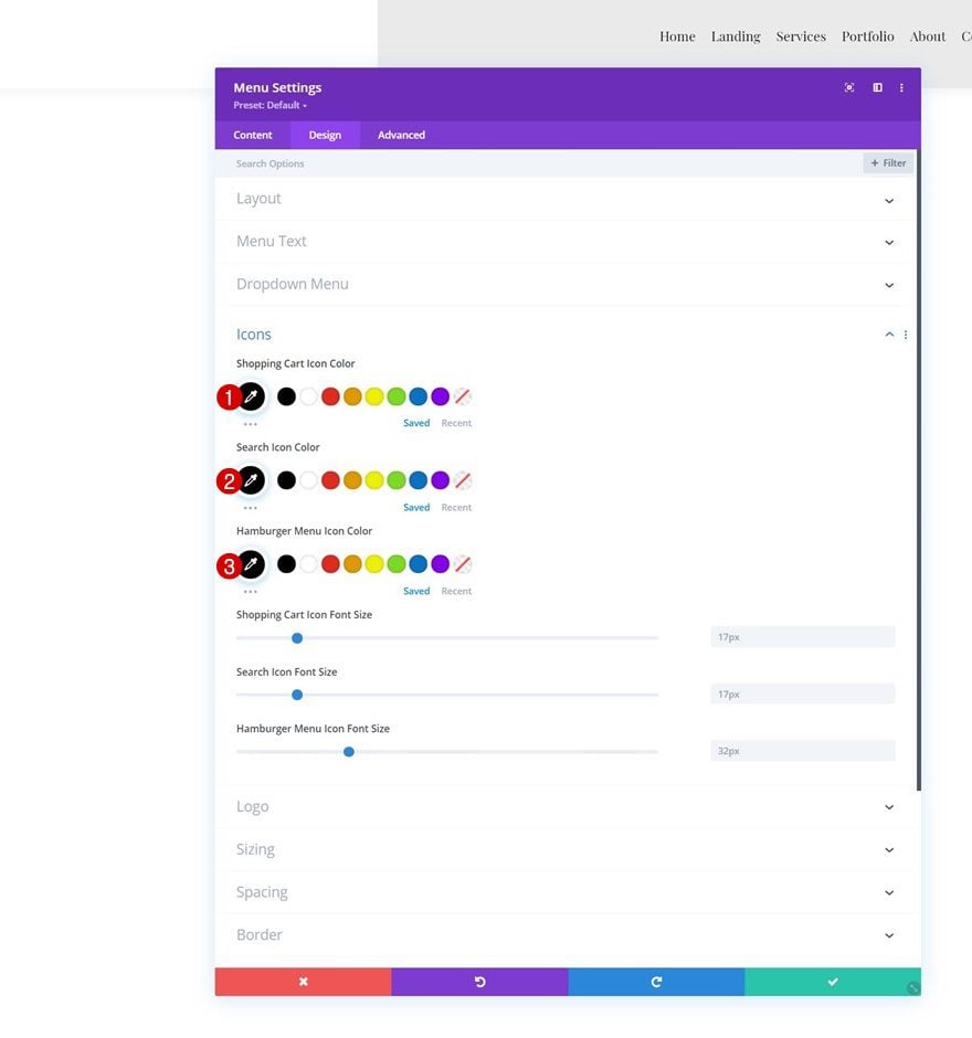
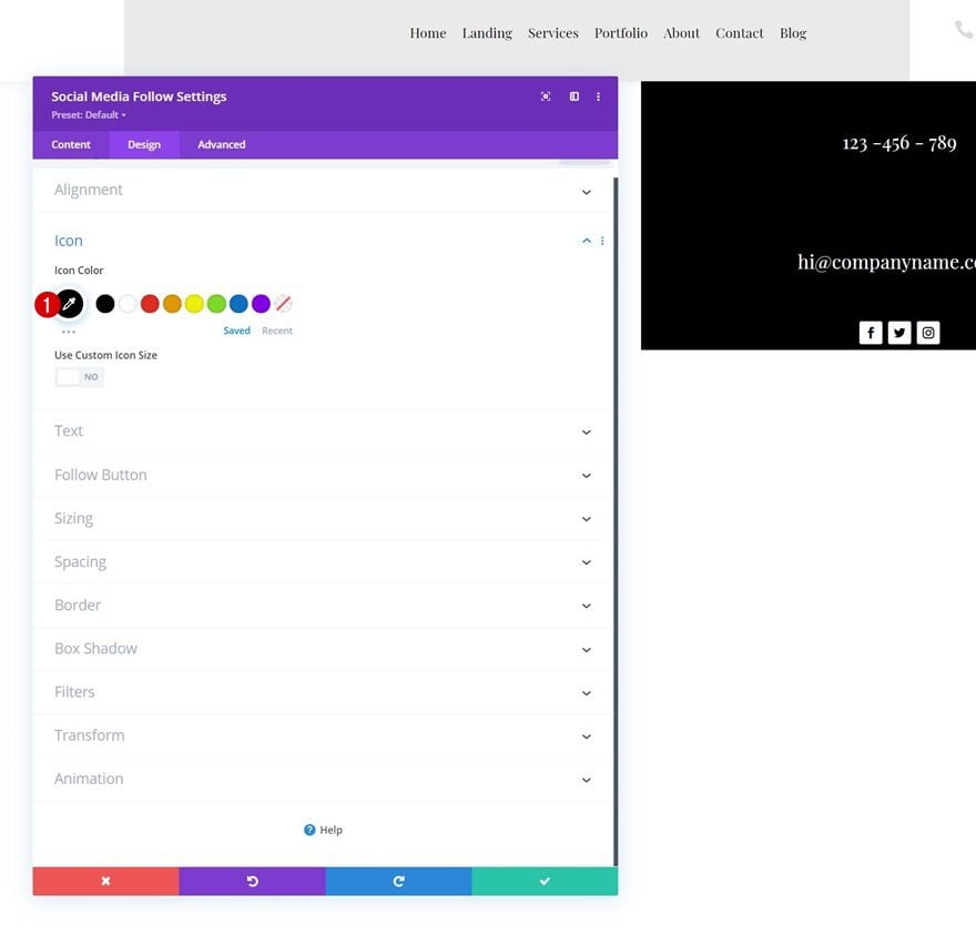
Icons Settings
Change the icon colors in the icons settings too.
- Shopping Cart Icon Color: #000000
- Search Icon Color: #000000
- Hamburger Menu Icon Color: #000000
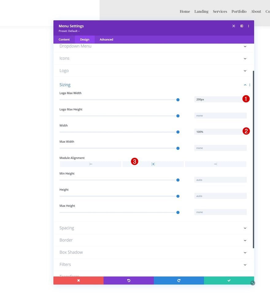
Sizing
And complete the module settings by changing the sizing settings as follows:
- Logo Max Width: 200px
- Width: 100%
- Module Alignment: Center
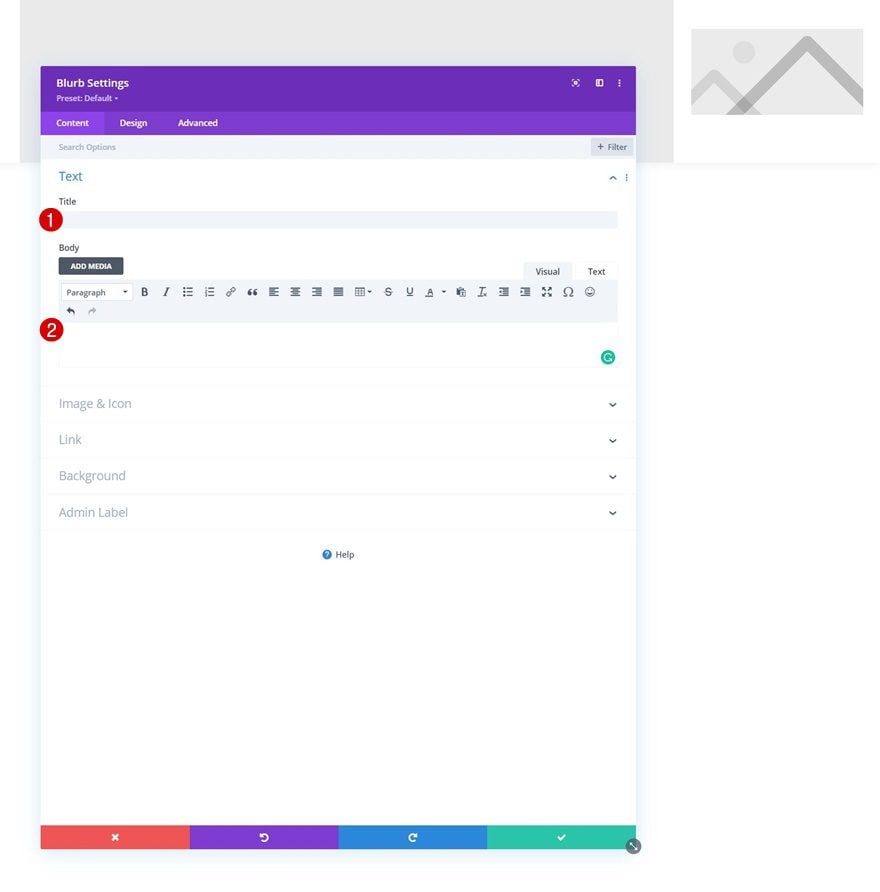
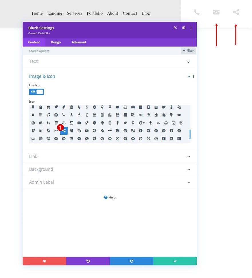
Add Blurb Module #1 to Column 2
Leave Content Box Empty
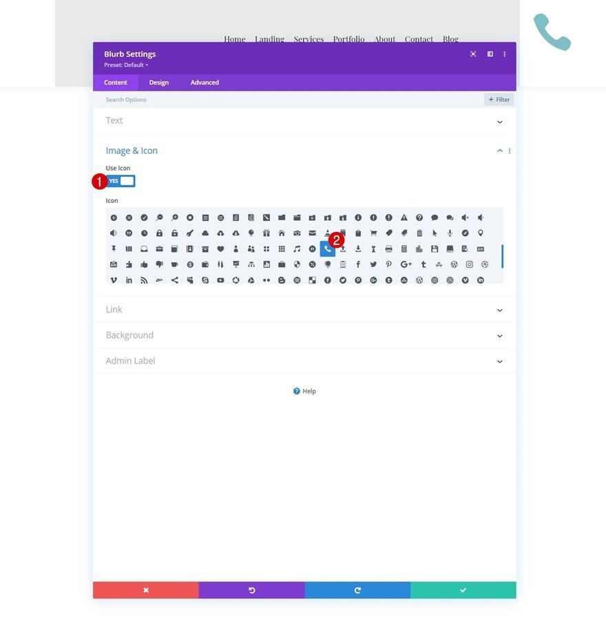
On to the second column. To create the toggle icons, we’ll use Blurb Modules without the title and content. We’ll start by creating the first toggle icon and then reuse the module to add the other two toggle icons. Once you’ve added the Blurb Module, make sure the title and content box are empty.
Select Icon
Next, select an icon of your choice.
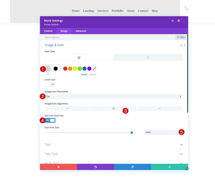
Icon Settings
Move on to the module’s design tab and change the icon settings as follows:
- Icon Color
- Default: #dbdbdb
- Hover: #000000
- Icon Placement: Top
- Icon Alignment: Center
- Use Icon Font Size: Yes
- Icon Font Size: 200%
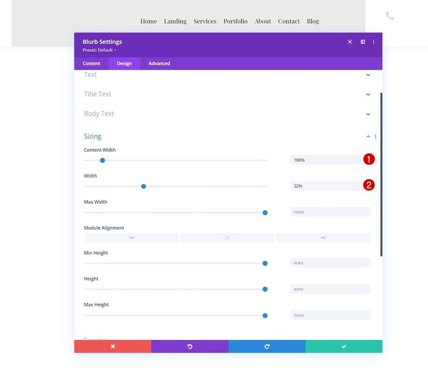
Sizing
Modify the sizing settings too.
- Content Width: 100%
- Width: 32%
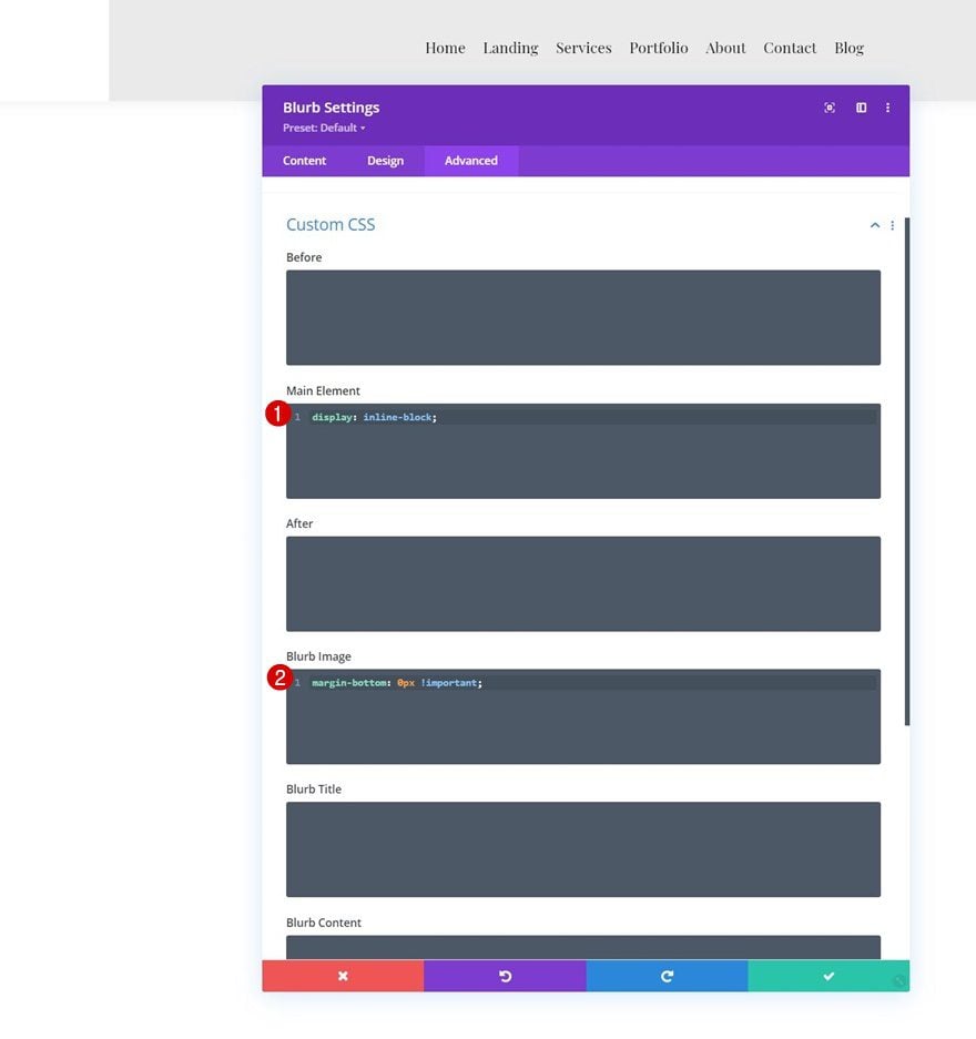
Main Element & Blurb Image CSS
And complete the module settings by adding two CSS code lines to the custom CSS options in the Blurb Module’s advanced tab.
Main Element:
display: inline-block;
Blurb Image:
margin-bottom: 0px !important
Clone Blurb Module Twice
Once you’ve completed the first toggle icon Blurb Module, you can clone it twice.
Change Icon
Make sure you change the icon in each duplicate.
2. Add Toggle Items
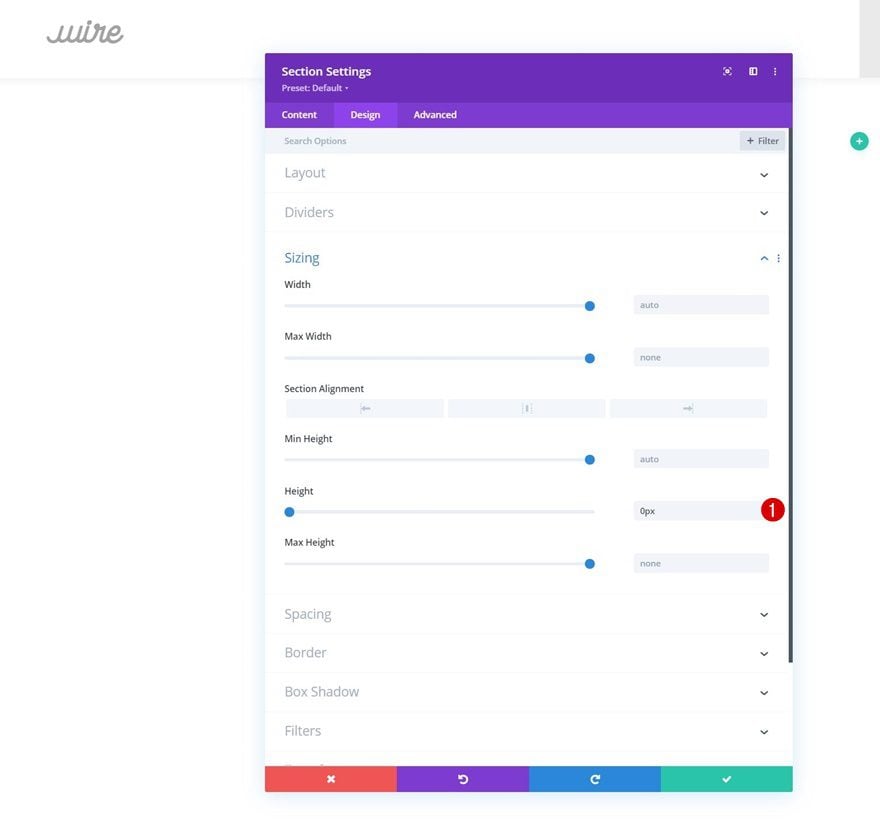
Add Section #2
Sizing
Now that we’ve set the foundation of our header, we still need to include the toggle items. To do that, we’ll add a new section right below the previous one. Open the section settings and make sure the height of this section is “0px”. This will help us prevent the section from taking up any space in our header design. The only reason we need this section is to show our toggle items.
- Height: 0px
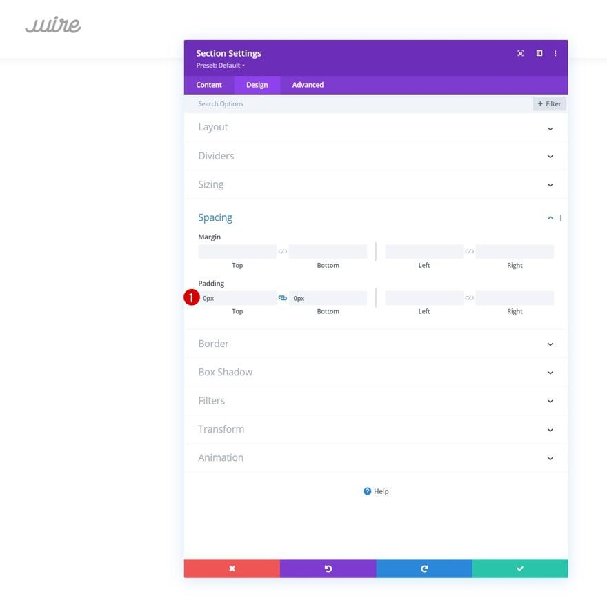
Spacing
Move on to the section’s design tab and remove all default top and bottom padding.
- Top Padding: 0px
- Bottom Padding: 0px
Add New Row
Column Structure
Continue by adding a new row using the following column structure:
Sizing
Without adding any modules yet, open the row settings and modify the sizing settings as follows:
- Use Custom Gutter Width: Yes
- Gutter Width: 1
- Equalize Column Heights
- Width: 100%
- Max Width: 100%
Spacing
Remove all default top and bottom padding next.
- Top Padding: 0px
- Bottom Padding: 0px
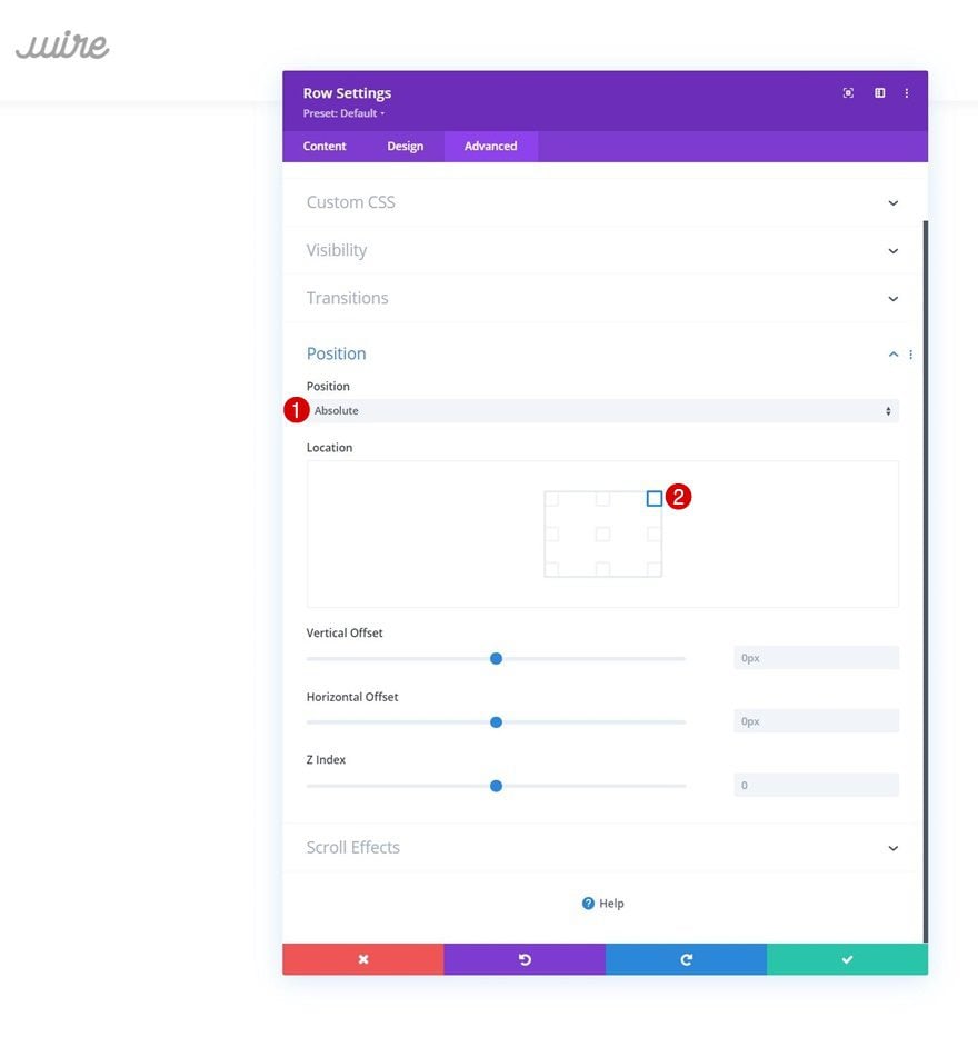
Position
And reposition the entire row. Turning this row absolute will help us prevent the row from taking up any space in the design.
- Position: Absolute
- Location: Top Right Corner
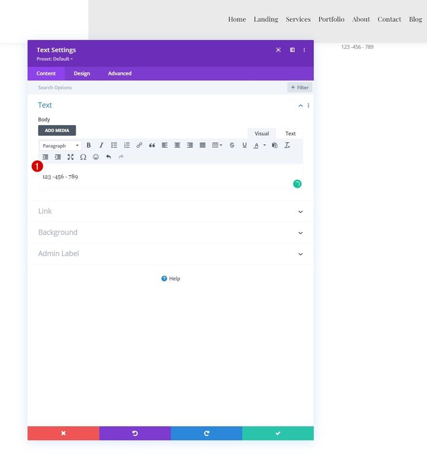
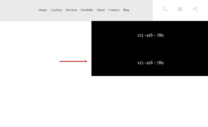
Add Text Module #1 to Column 2
Add Phone Number to Content Box
Time to add the toggle items! First, we’ll add the phone number. Add a new Text Module to column 2 and insert the phone number in the content box.
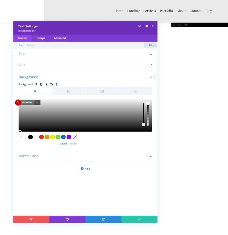
Background Color
Add a black background color next.
- Background Color: #000000
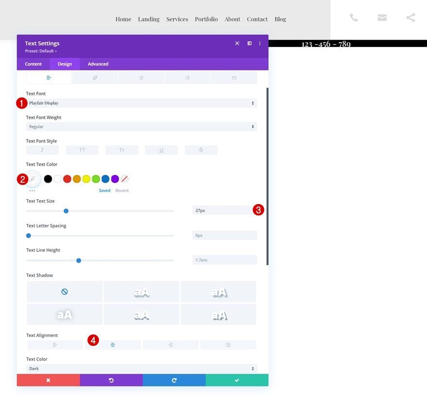
Text Settings
Move on to the module’s design tab and change the text settings accordingly:
- Text Font: Playfair Display
- Text Color: #ffffff
- Text Size: 27px
- Text Alignment: Center
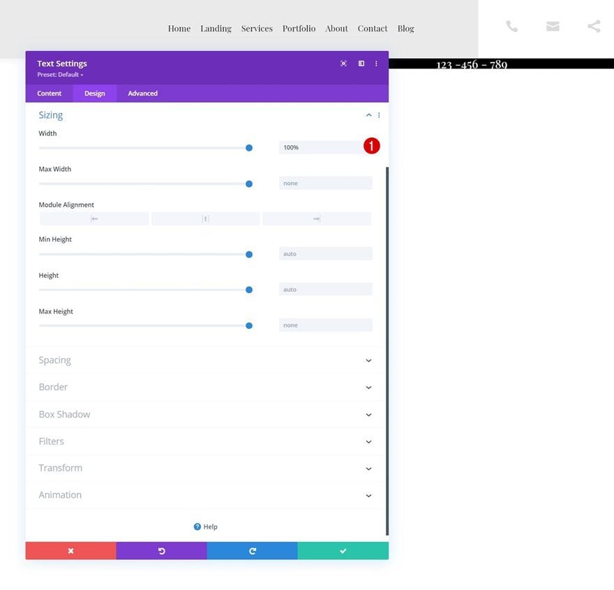
Sizing
Make sure the width is 100% too.
- Width: 100%
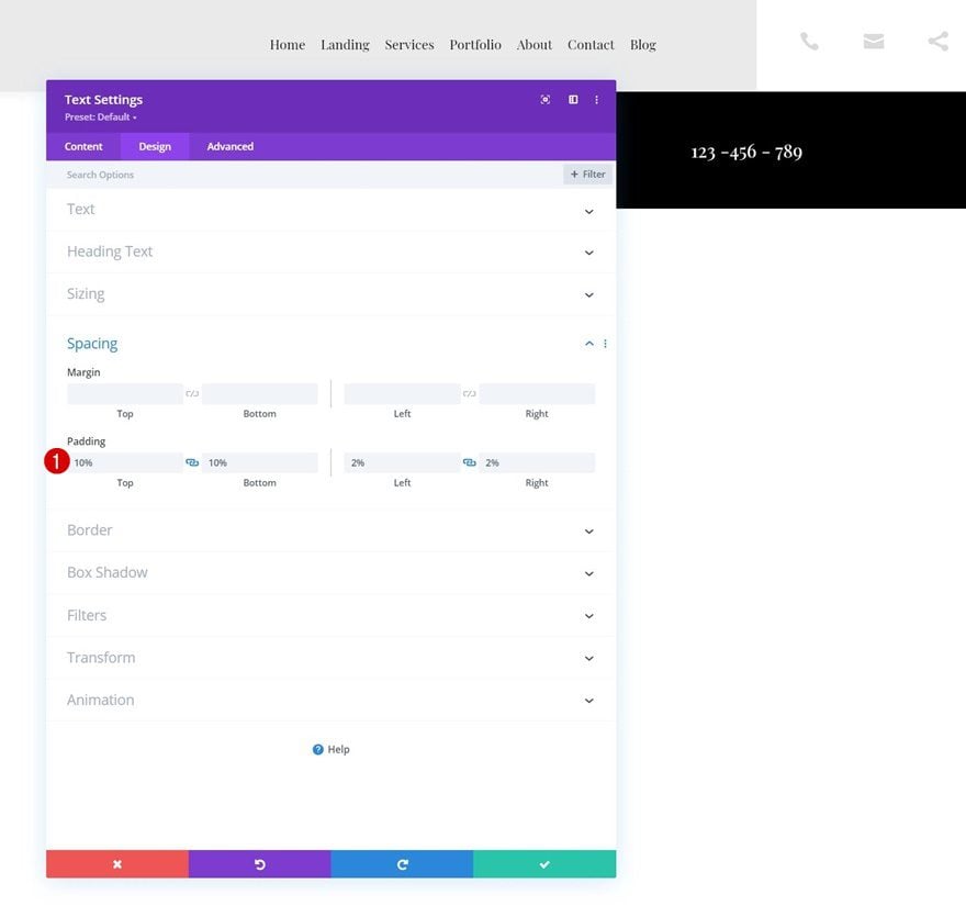
Spacing
Then, add some custom padding values to the spacing settings.
- Top Padding: 10%
- Bottom Padding: 10%
- Left Padding: 2%
- Right Padding: 2%
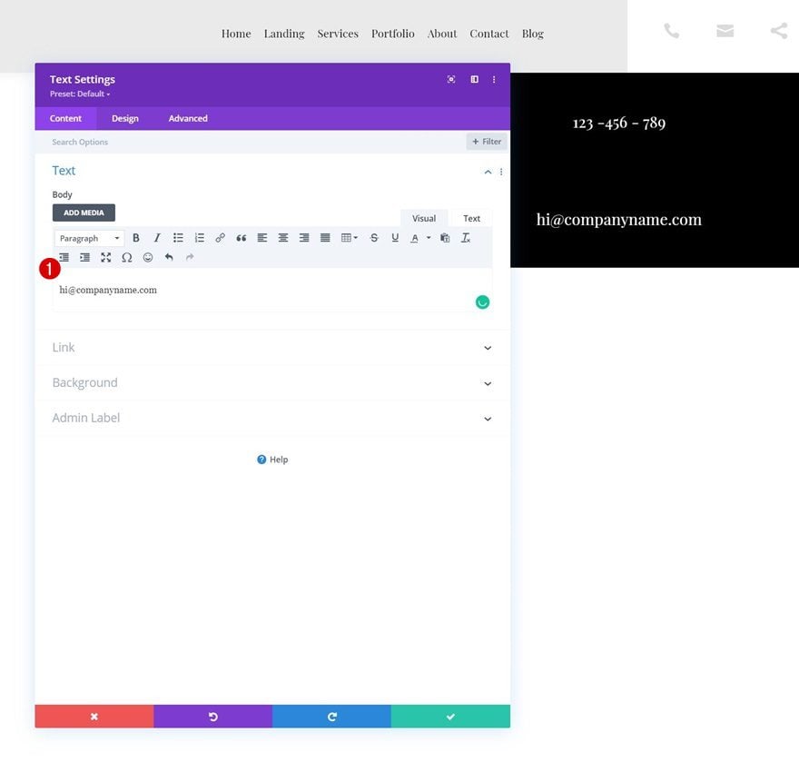
Clone Text Module
Once you’ve completed the first toggle item Text Module, clone it once.
Change Content to Email Address
Change the content in the content box.
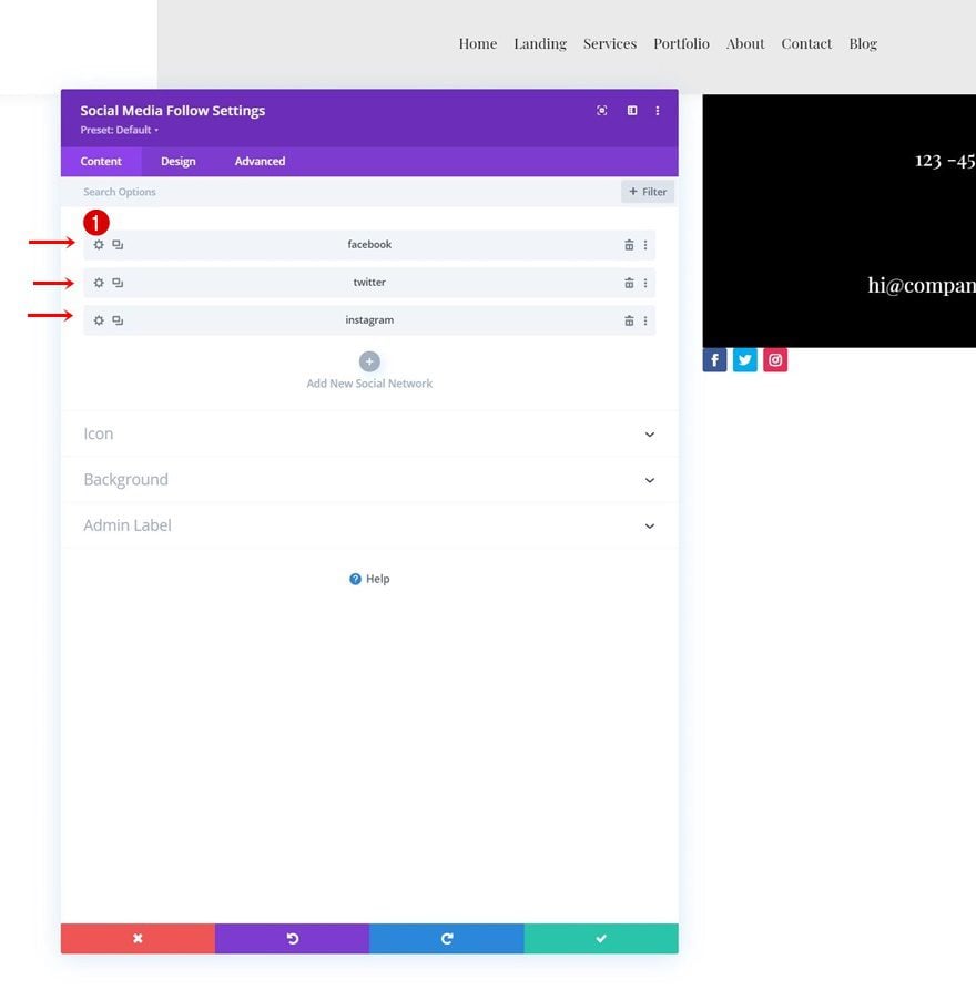
Add Social Networks of Choice
Then, add a Social Media Follow Module to column 2. Add as many social networks as you want.
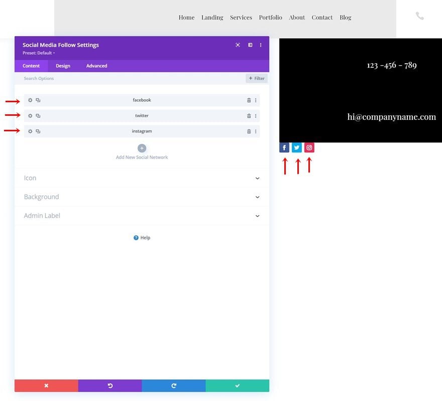
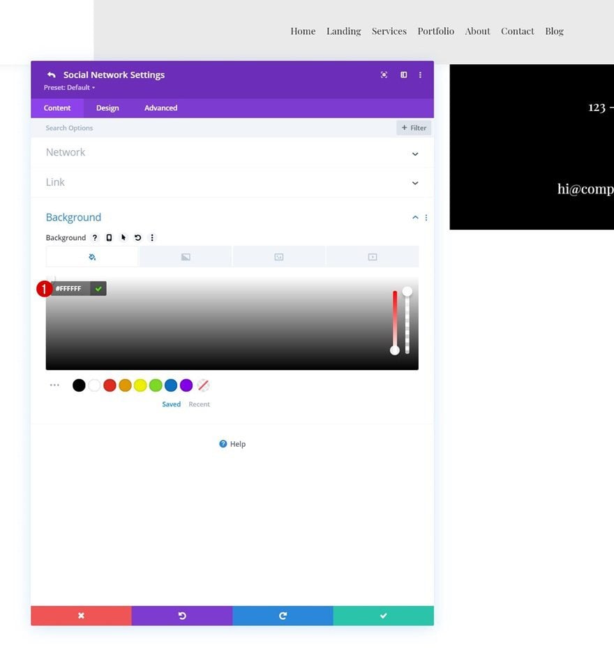
Change Each Social Network’s Background Color to White
Then, change the background color to white for each social network individually.
- Background Color: #FFFFFF
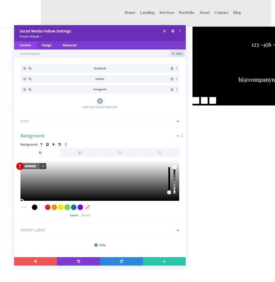
Background Color
Then, come back to the general module settings and use a black background color.
- Background Color: #000000
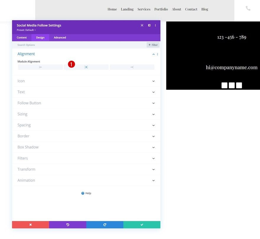
Alignment
Move on to the module’s design tab and change the module alignment.
- Module Alignment: Center
Icon Settings
Change the icon color in the icons settings too.
- Icon Color: #000000
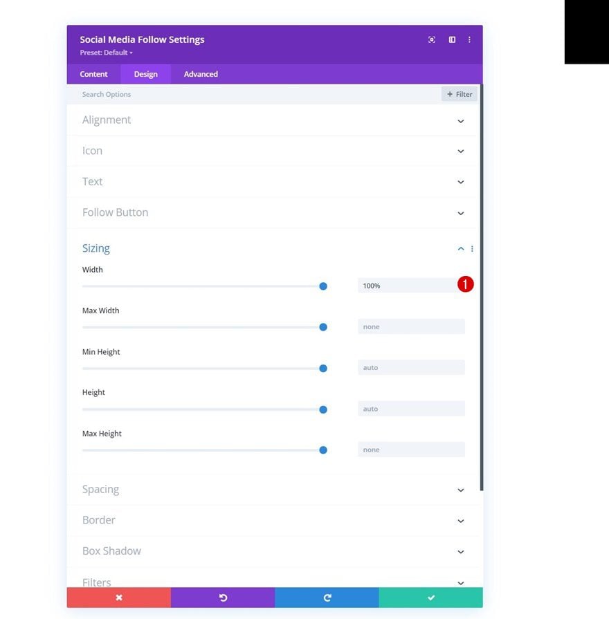
Sizing
Then, apply a “100%” width to the sizing settings.
- Width: 100%
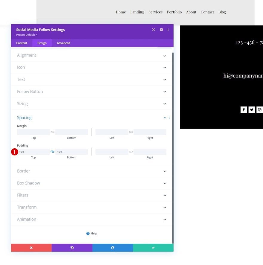
Spacing
Apply some custom top and bottom padding too.
- Top Padding: 10%
- Bottom Padding: 10%
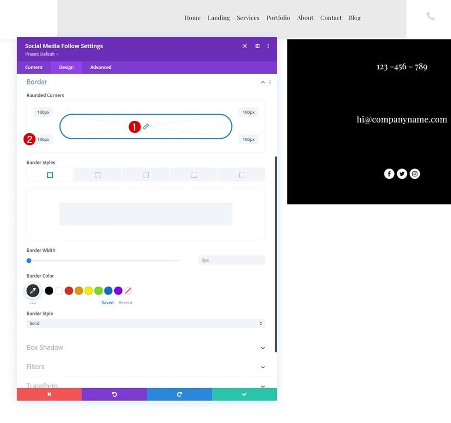
Border
And complete the module settings by adding some rounded corners to the border settings.
- All Corners: 100px
3. Add Functionality
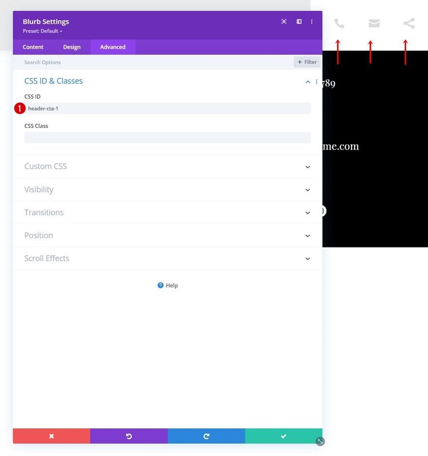
Add Consecutive CSS IDs to Blurb Modules First Section
Now that all the elements are in place, we can start adding the toggle effect. The first thing you’ll need to do is open each Blurb Module individually and add a consecutive CSS ID.
- Blurb 1: header-cta-1
- Blurb 2: header-cta-2
- Blurb 3: header-cta-3
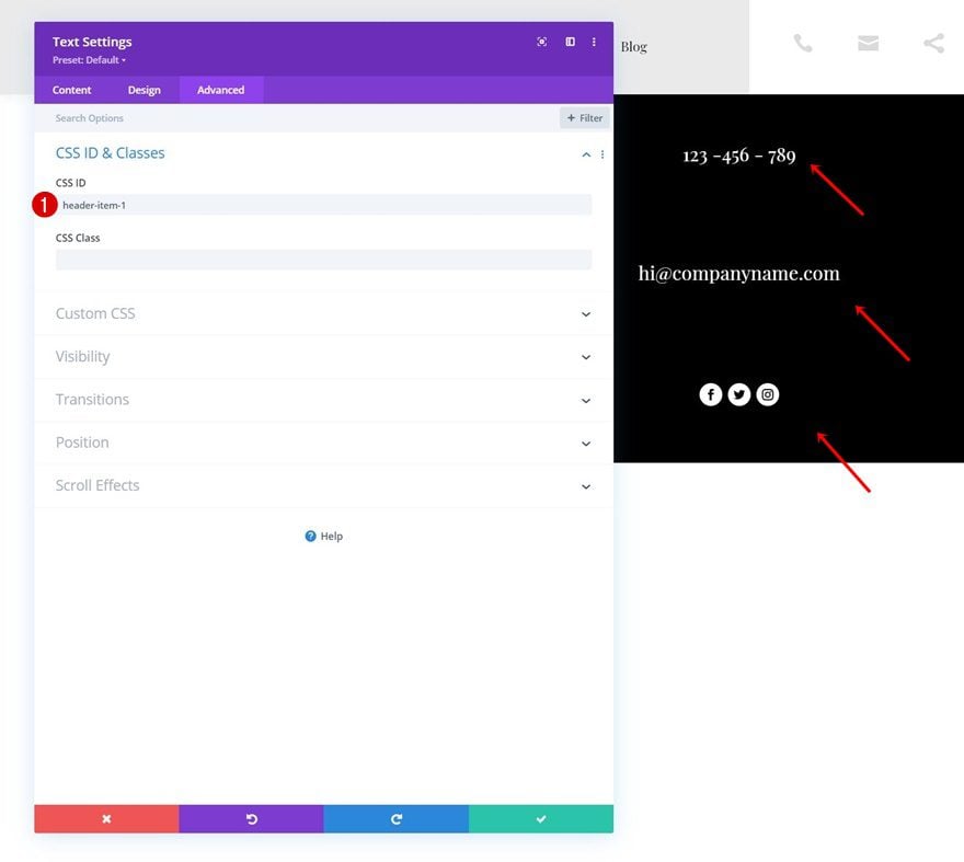
Add Consecutive CSS IDs to Toggle Items
Do the same thing for the toggle item modules. The number at the end of the CSS ID should match the CSS ID you used for the icons in the previous step.
- Text Module 1: header-item-1
- Text Module 2: header-item-2
- Social Media Follow Module: header-item-3
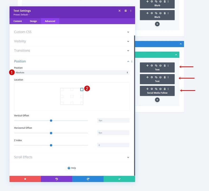
Add Absolute Position to All Toggle Items
And turn each one of the toggle items absolute one by one. We recommend you go to wireframe mode to do this.
- Position: Absolute
- Location: Top Right
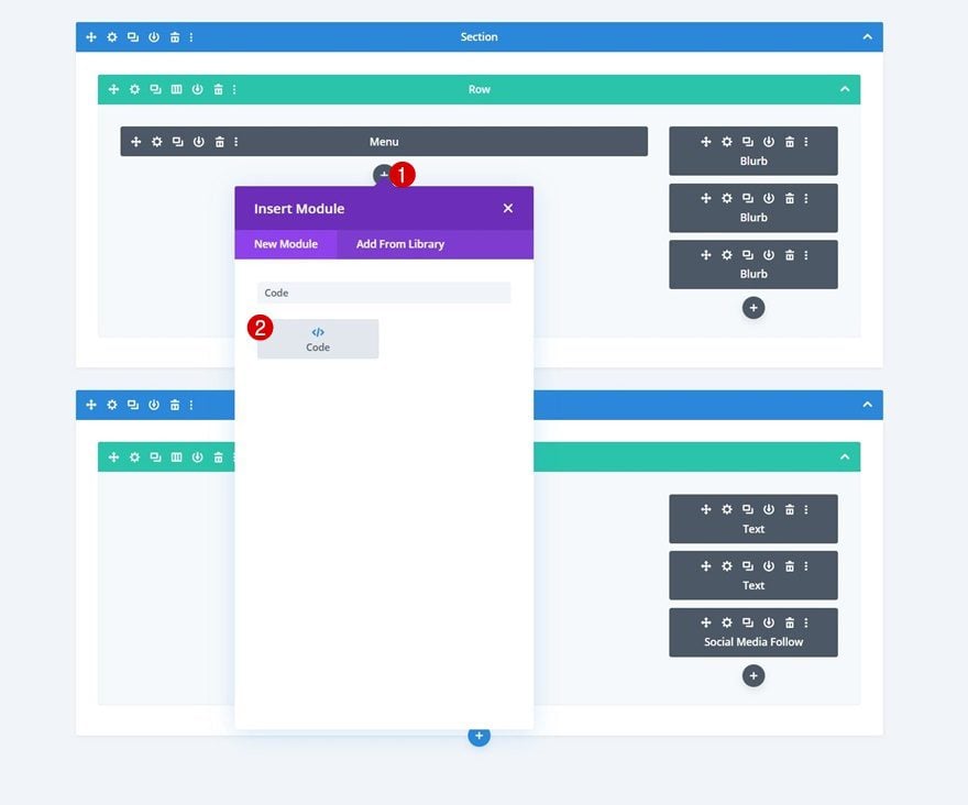
Add Code Module to First Column of Section #1
Now that all CSS IDs are in place, we can add the code to make the click function work. Add a new Code Module right below the Menu Module in column 1.
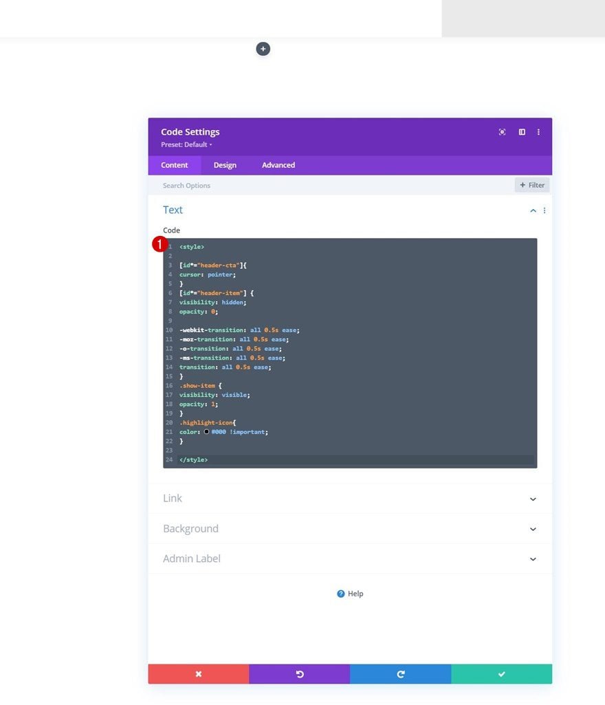
Insert CSS Code
Add the following lines of CSS code between style tags as you can notice in the print screen below:
[id*="header-cta"]{
cursor: pointer;
}
[id*="header-item"] {
visibility: hidden;
opacity: 0;

-webkit-transition: all 0.5s ease;
-moz-transition: all 0.5s ease;
-o-transition: all 0.5s ease;
-ms-transition: all 0.5s ease;
transition: all 0.5s ease;
}
.show-item {
visibility: visible;
opacity: 1;
}
.highlight-icon{
color: #000 !important;
}
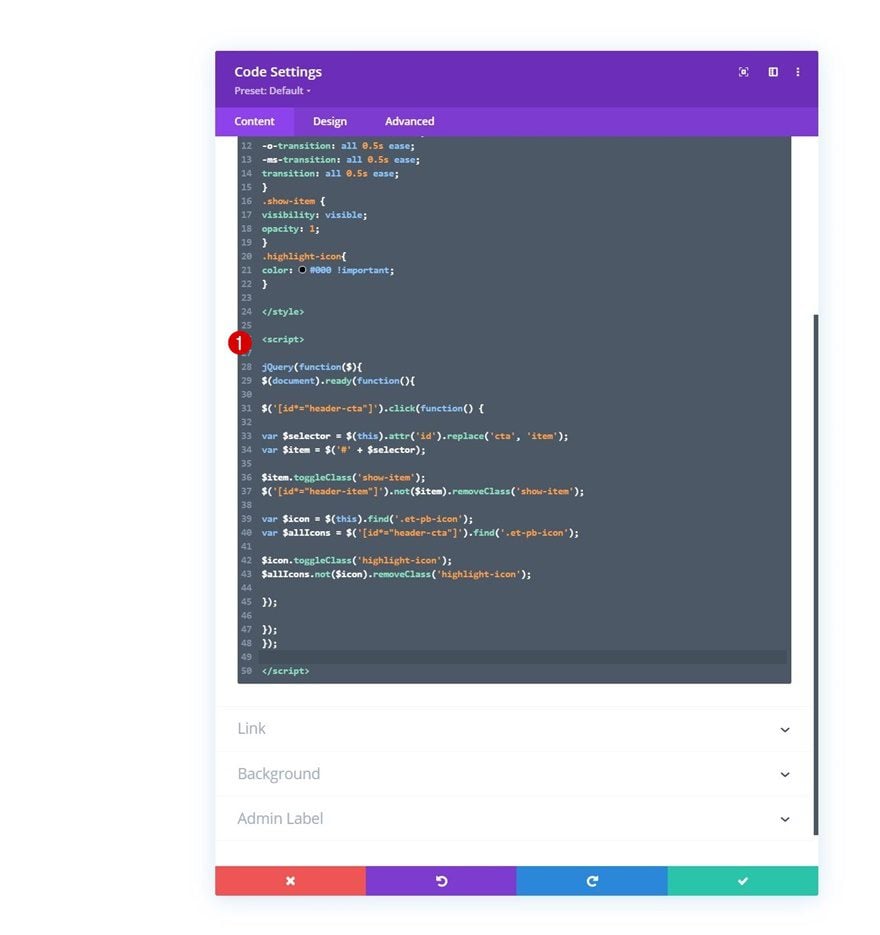
Insert JQuery Code
We’re adding some custom JQuery code too. Add the code between script tags as you can notice in the print screen below.
jQuery(function($){
$(document).ready(function(){

$('[id*="header-cta"]').click(function() {

var $selector = $(this).attr('id').replace('cta', 'item');
var $item = $('#' + $selector);

$item.toggleClass('show-item');
$('[id*="header-item"]').not($item).removeClass('show-item');

var $icon = $(this).find('.et-pb-icon');
var $allIcons = $('[id*="header-cta"]').find('.et-pb-icon');

$icon.toggleClass('highlight-icon');
$allIcons.not($icon).removeClass('highlight-icon');

});

});
});
4. Make Header + Toggle Items Sticky
Make Section #1 Sticky
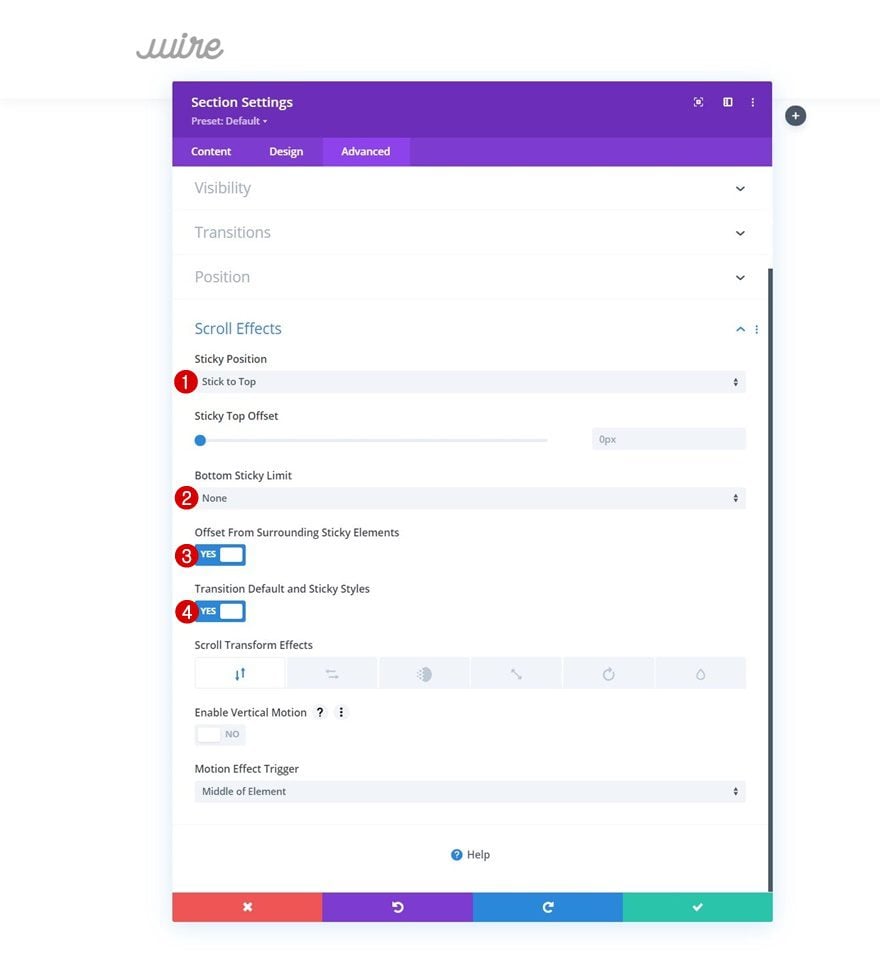
Last but not least, you can also turn the header and toggle items sticky. To create the desired outcome, you’ll need to make sure both sections are sticky and the “Offset From Surrounding Sticky Elements” option is enabled. Make the first section sticky.
- Sticky Position: Stick to Top
- Bottom Sticky Limit: None
- Offset From Surrounding Sticky Elements: Yes
- Transition Default and Sticky Styles: Yes
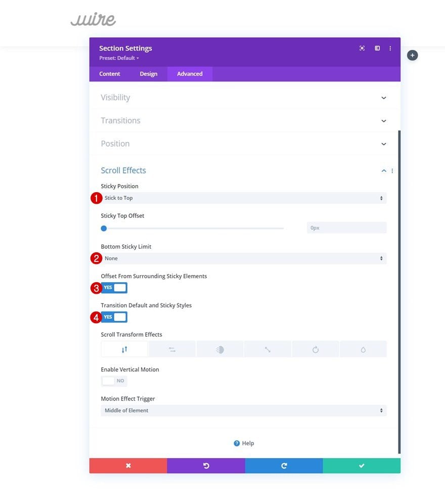
Make Section #2 Sticky
And do the same for section 2. That’s it!
- Sticky Position: Stick to Top
- Bottom Sticky Limit: None
- Offset From Surrounding Sticky Elements: Yes
- Transition Default and Sticky Styles: Yes
Preview
Now that we’ve gone through all the steps, let’s take a final look at the outcome across different screen sizes.
Desktop
Mobile
Final Thoughts
In this post, we’ve shown you how to use toggle icons inside your header. As soon as someone clicks on an icon, a toggle item appears, which helps you save a lot of space in your header design. This approach focuses on user behavior and helps you prevent having to design an overwhelming header design. You were able to download the JSON file for free as well! If you have any questions, feel free to leave a comment in the comment section below.
If you’re eager to learn more about Divi and get more Divi freebies, make sure you subscribe to our email newsletter and YouTube channel so you’ll always be one of the first people to know and get benefits from this free content.


Hi – I was just wondering if there is an easy way to change this from having the icons be an on click to a mouse over? Thanks!
Have been using elegant themes for past few years.. Looking for a perfect guide to customize the header section and saving space on one of my blog. In this guide you have explained in an understanding and easier way on how to save space in a header…
Kudos..
Thanks, this was a lot of fun to work through. Thank you for your efforts Donjete.
Nice idea to save space in your header!
Hey this is great stuff Donjete, I just went through it and I had to adjust some of the text sizes to get them to fit alright on my new header, thank you for the tutorial, lots of cool help!
This template looks boss! I want it all. Great design and love the customization. When can we get access to this layout?
Nice and elegant links for mobile!
Thanks for all your work.
Very nice and helpful content. My friends on social media need to see this and also I will bookmark this website for faster access.