
When you’re creating your global header, there are many things you need to take into account. The elements you place in your header need to help your visitors navigate easily. To reduce the time people spend navigating, many web designers opt for a fixed top header, allowing visitors to go to other pages or posts right away. That’s really convenient, but when creating a fixed header, a big part of your visitors’ viewport height is taken up, allowing less content to show up at once. If you’re not willing to make that sacrifice, know that you don’t have to. You can have the benefits of a fixed header by allowing your global header to reveal when your visitors are scrolling up, and hide it when they’re scrolling down. Today, we’ll guide you through hiding and revealing your global header using Divi’s Theme Builder. You’ll be able to download the JSON file for free as well!
Let’s get to it.
Preview
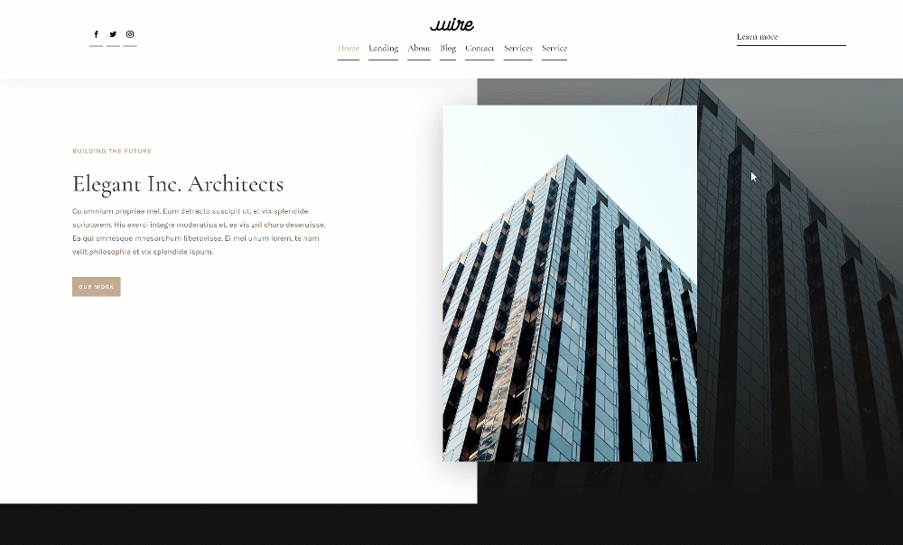
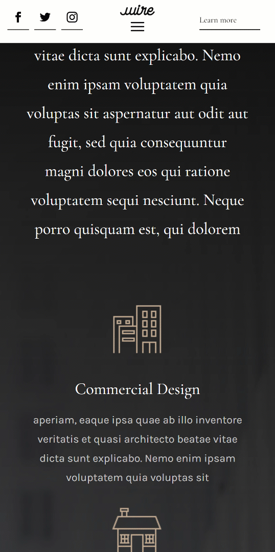
Before we dive into the tutorial, let’s take a quick look at the outcome across different screen sizes.
Desktop
Mobile
Download The Global Header Template for FREE
To lay your hands on the free global header template, you will first need to download it using the button below. To gain access to the download you will need to subscribe to our newsletter by using the form below. As a new subscriber, you will receive even more Divi goodness and a free Divi Layout pack every Monday! If you’re already on the list, simply enter your email address below and click download. You will not be “resubscribed” or receive extra emails.

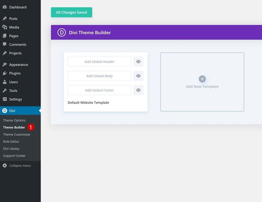
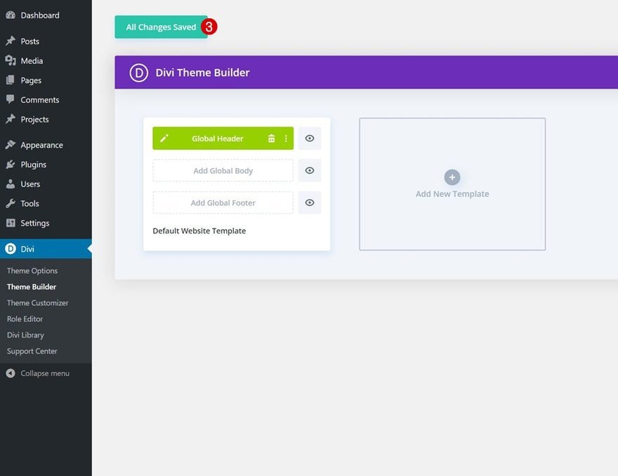
1. Go to Divi Theme Builder & Add New Template
Go to Divi Theme Builder
Start by going to the Divi Theme Builder.
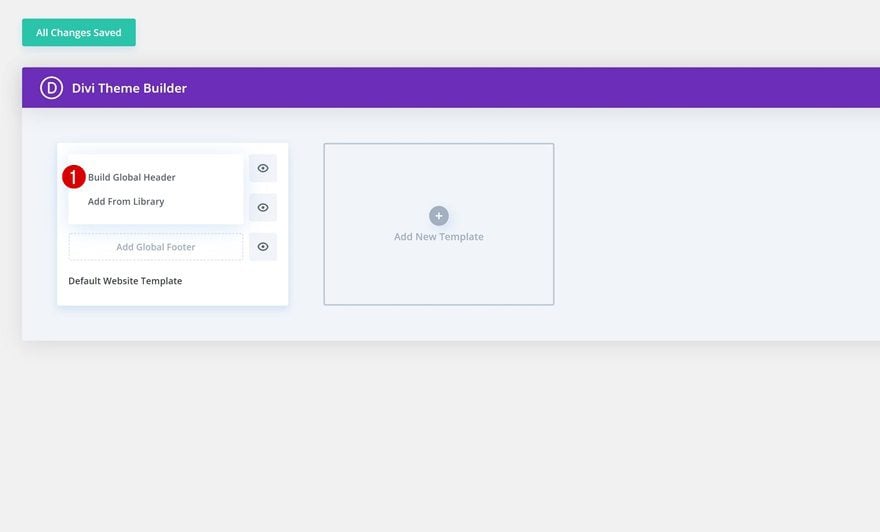
Start Building Global Header
There, click on ‘Add Global Header’ and select ‘Build Global Header’.
2. Start Building Global Header
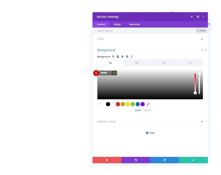
Section Settings
Background Color
Inside the template editor, you’ll notice a section. Open that section and change its background color.
- Background Color: #ffffff
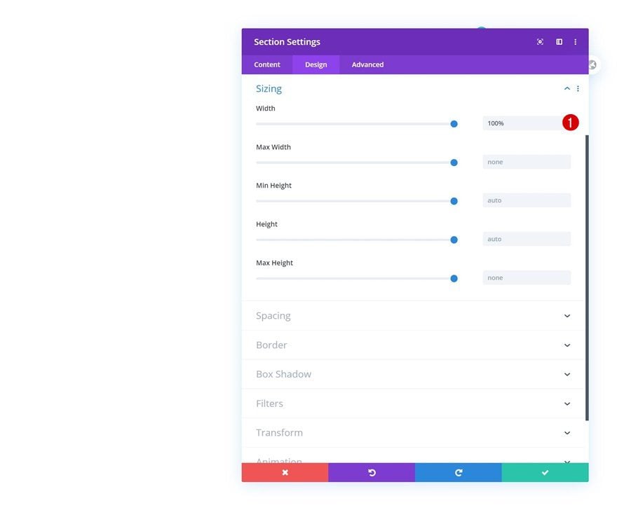
Sizing
Move on to the design tab and assign a 100% width to your section next.
- Width: 100%
Spacing
Add some custom top and bottom padding too.
- Top Padding: 2vw
- Bottom Padding: 2vw

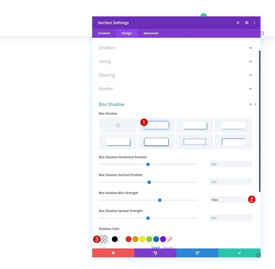
Box Shadow
We’ll apply a subtle box shadow to our section as well.
- Box Shadow Blur Strength: 50px
- Shadow Color: rgba(0,0,0,0.08)
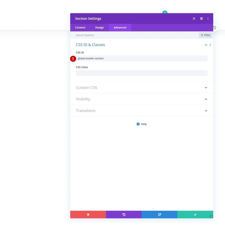
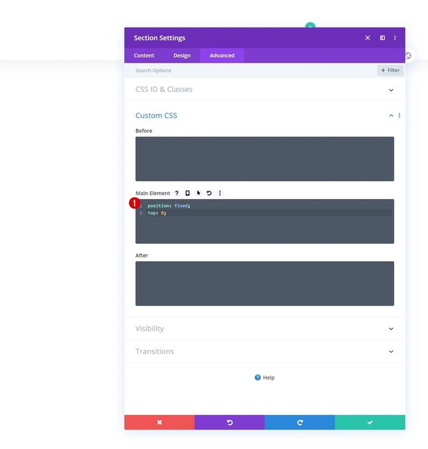
CSS ID
Later on this tutorial, we’ll need some custom code to make the scrolling effect happen. To prepare for that, we’re adding a CSS ID to the section.
- CSS ID: global-header-section
Main Element
We’ll also turn the section into a fixed head by adding two lines of CSS code to the section’s main element.
position: fixed;
top: 0;
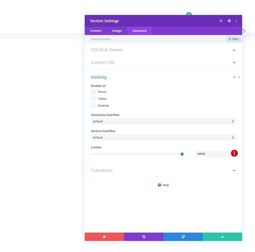
Z Index
Now, to make sure our section appears on top of all page or post content, we’ll increase the z index in the visibility settings as well.
- Z Index: 99999
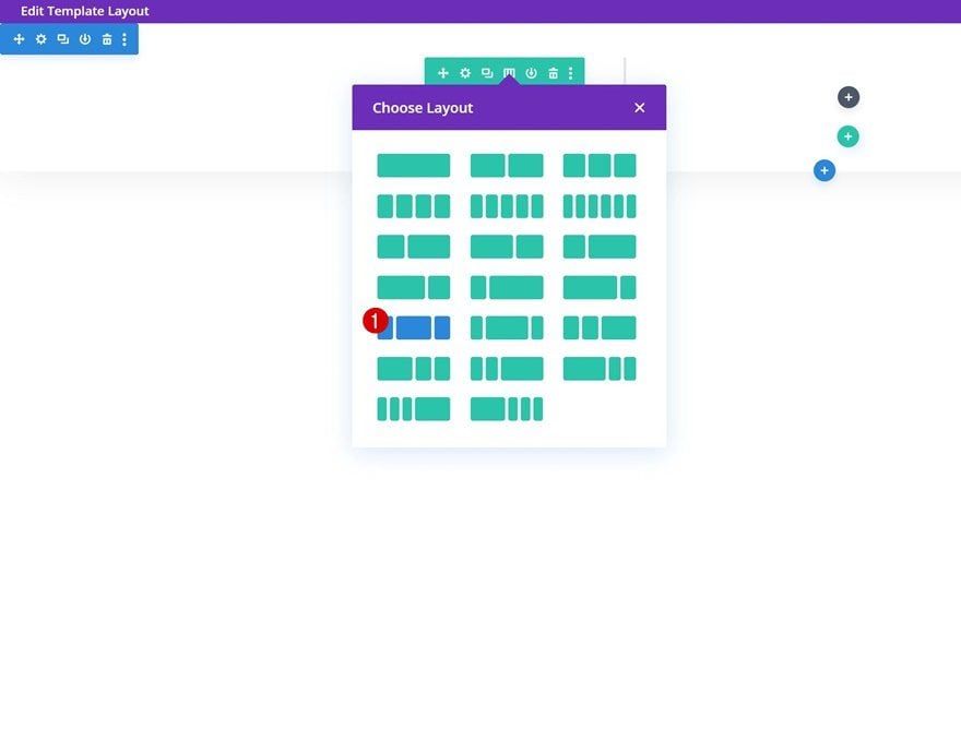
Add New Row
Column Structure
Once you’ve completed all section settings, continue by adding a new row to the section using the following column structure:
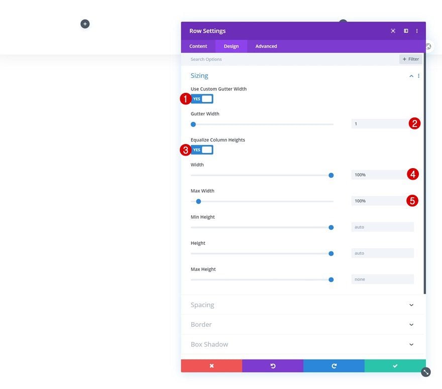
Sizing
Without adding any modules yet, open the row settings and allow the row to take up the entire width of the screen.
- Use Custom Gutter Width: Yes
- Gutter Width: 1
- Equalize Column Heights: Yes
- Width: 100%
- Max Width: 100%
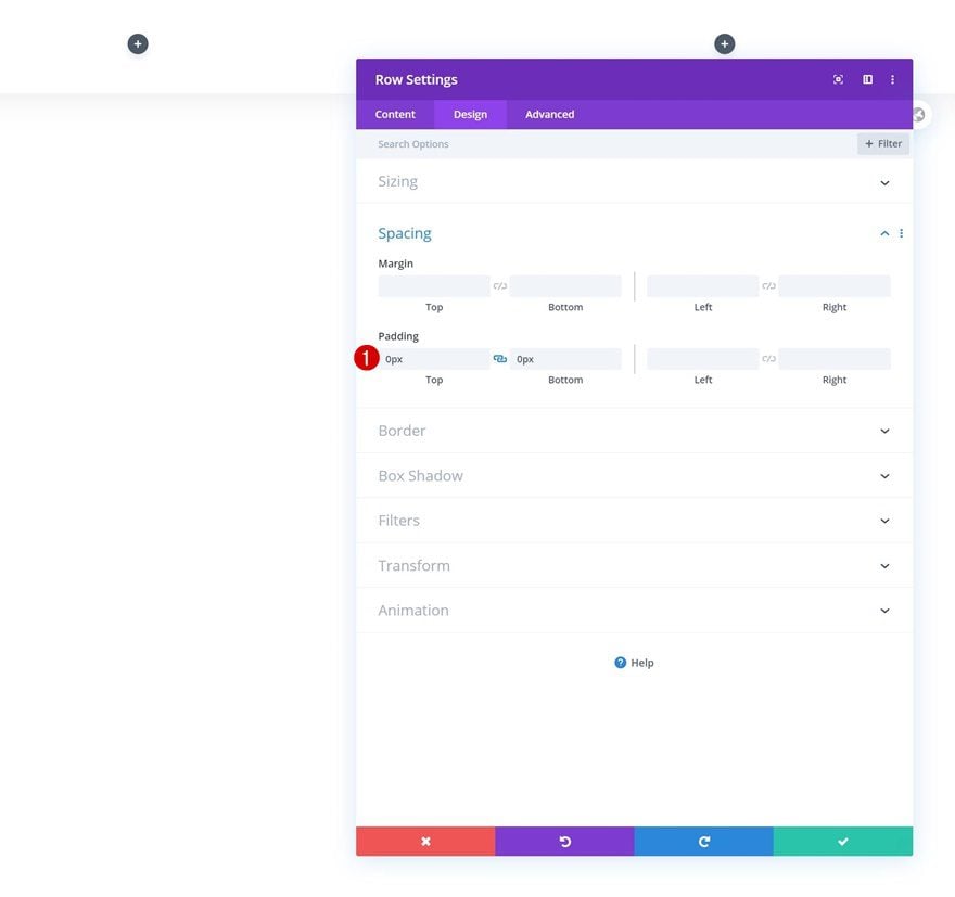
Spacing
Remove all default top and bottom padding too.
- Top Padding: 0px
- Bottom Padding: 0px
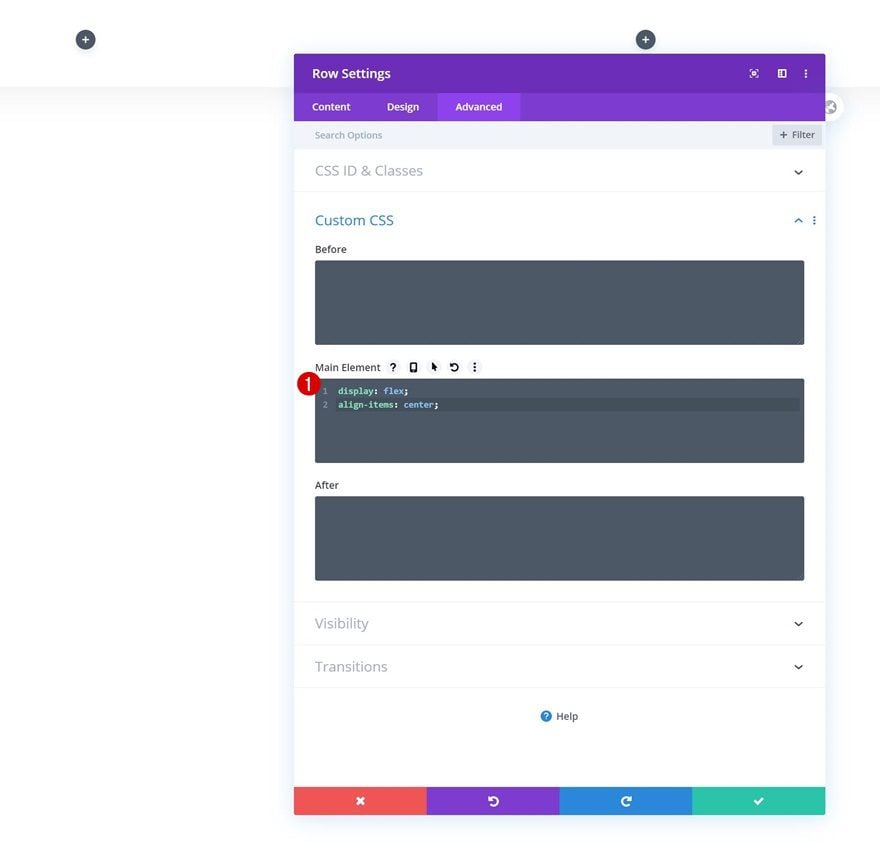
Main Element
Center the column content and allow columns to remain next to each other on smaller screen sizes by adding two lines of CSS code to the row’s main element.
display: flex;
align-items: center;
Add Social Networks
Time to add modules, starting with a Social Media Follow Module in column 1. Add the social networks you want to show up.
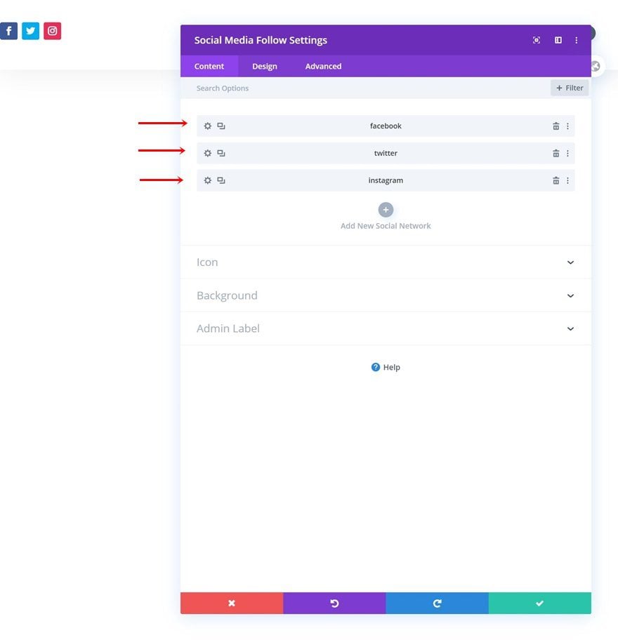
Reset Individual Social Network Styles
Continue by resettings the styles of each social network on an individual level.
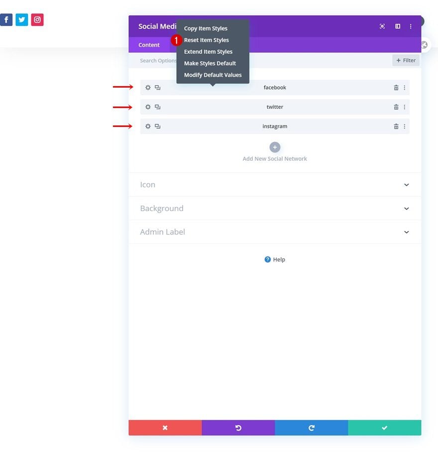
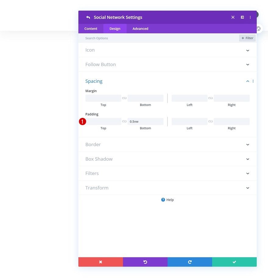
Add Individual Social Network Spacing
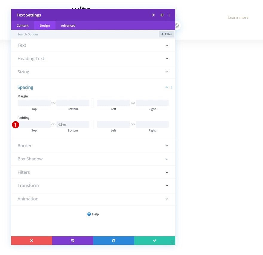
You’ll need to open the settings of each social network individually as well and add a bottom padding in the spacing settings.
- Bottom Padding: 0.5vw
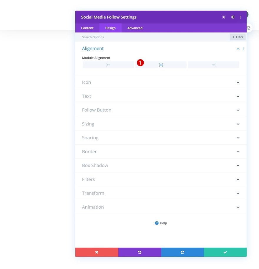
Alignment
Once you’ve added the bottom padding to each social network individually, go back to your general module settings. Move on to the design tab and change the module alignment.
- Module Alignment: Center
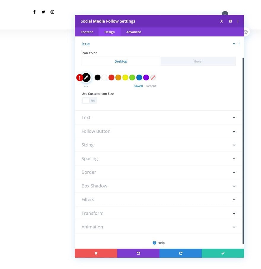
Default Icon Settings
Change the icon color in the icon settings too.
- Icon Color: #000000
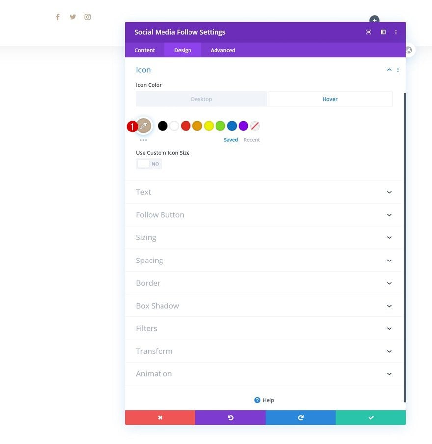
Hover Icon Settings
And modify the icon color on hover.
- Icon Color: #c2ab92
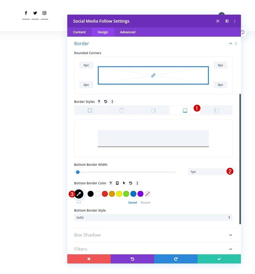
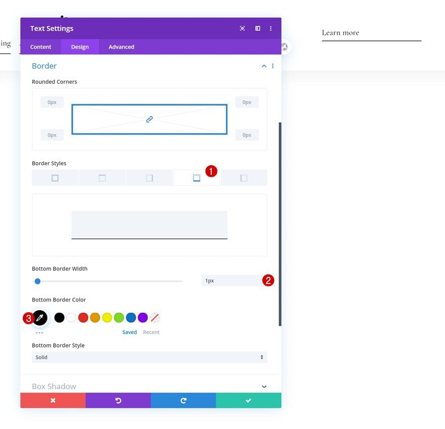
Border
Complete the module’s settings by adding a bottom border in the border settings.
- Bottom Border Width: 1px
- Bottom Border Color: #000000
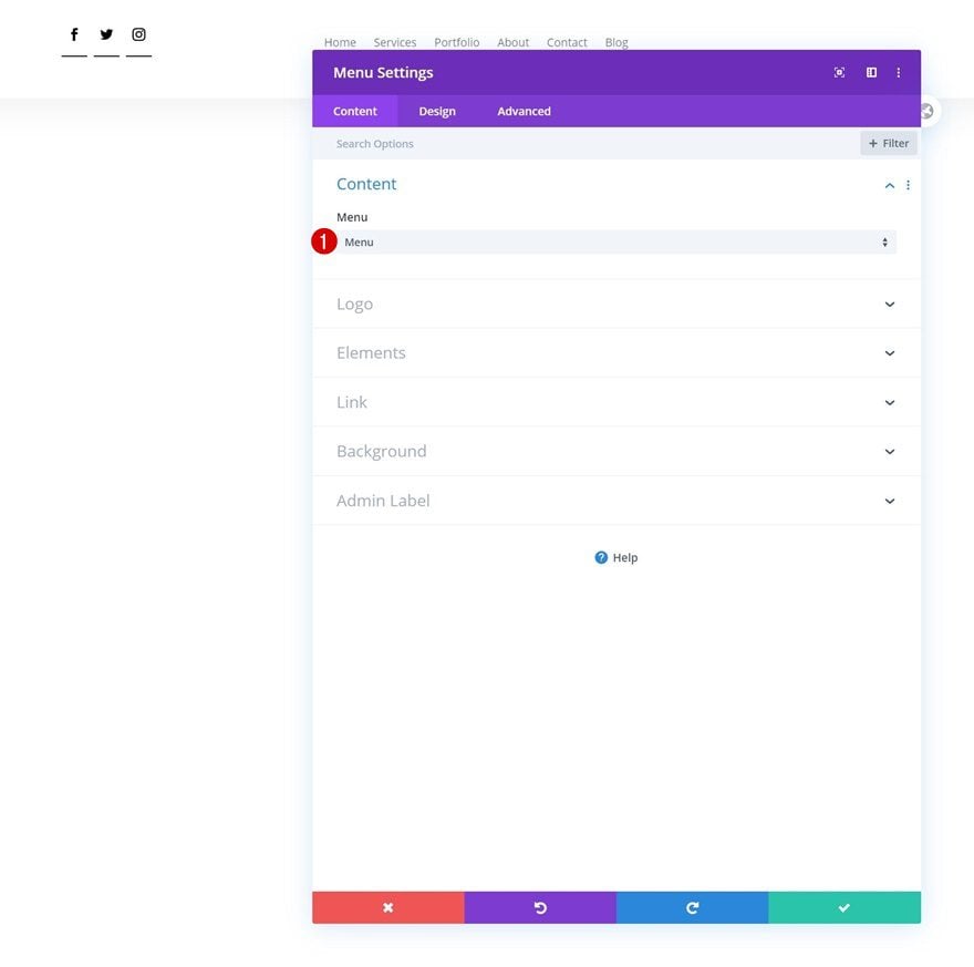
Select Menu
On to the next column! Add a Menu Module and select a menu of your choice.
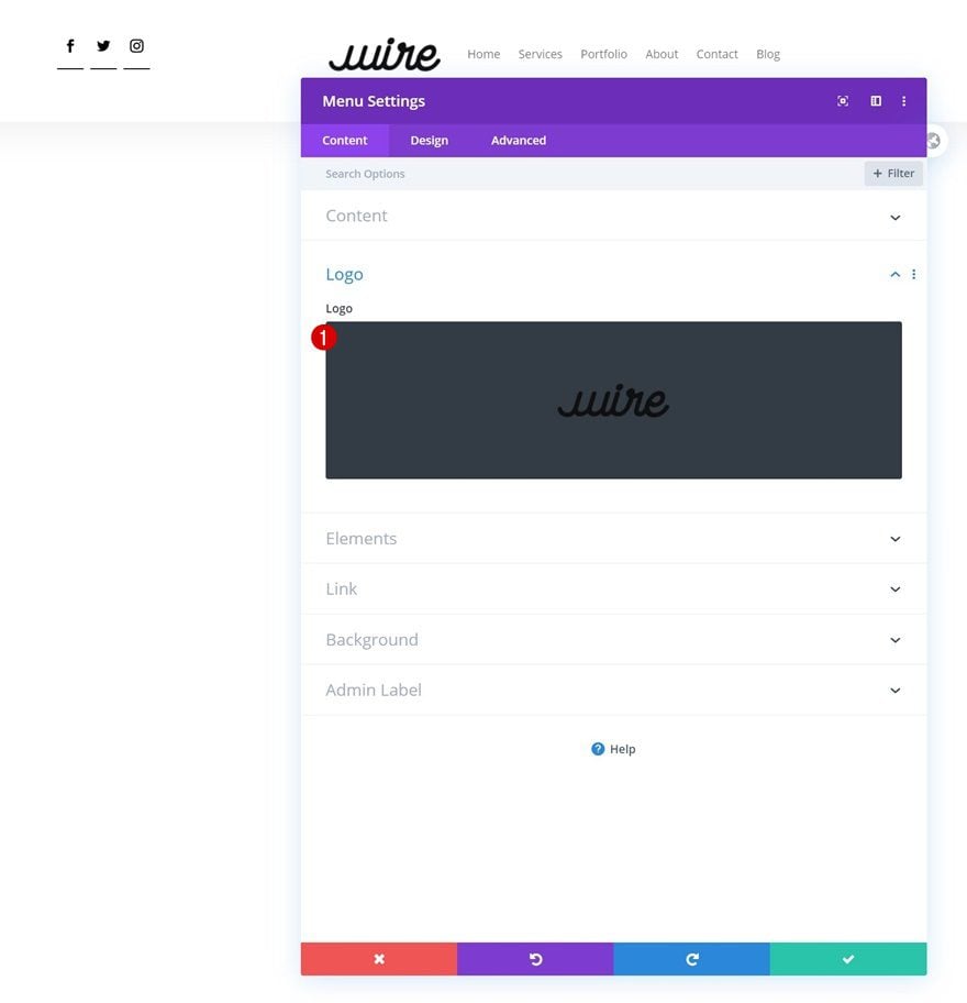
Upload Logo
Upload a logo to the module next.
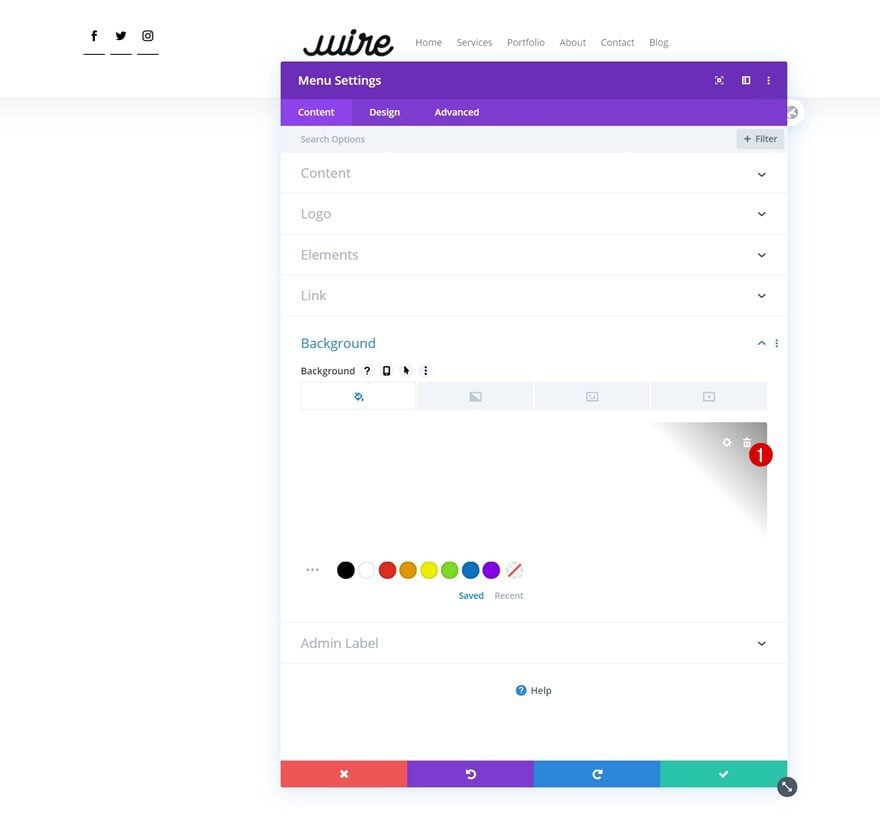
Remove Background Color
And remove the background color.
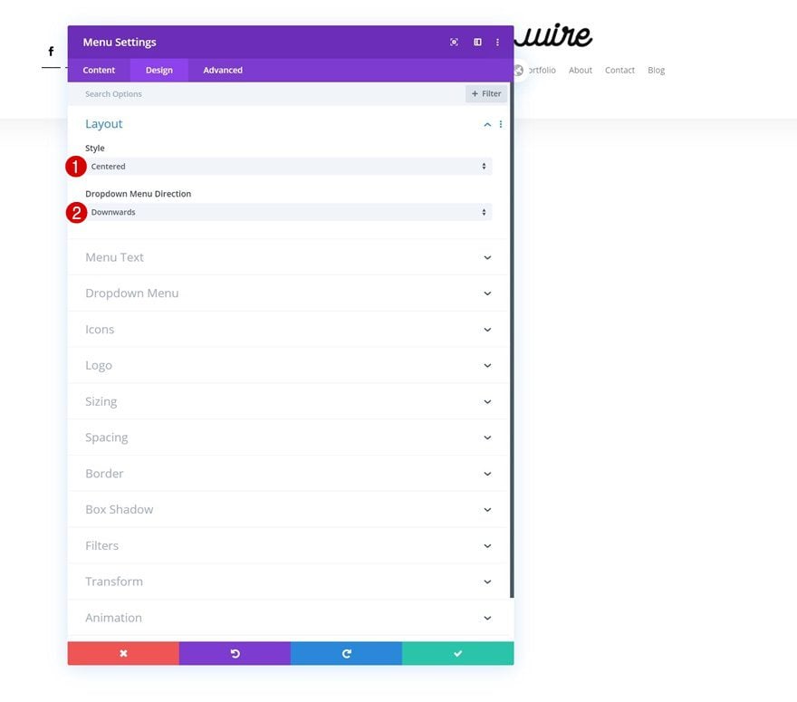
Layout
Then, move on to the design tab and make sure the following settings apply to the layout:
- Style: Centered
- Dropdown Menu Direction: Downwards
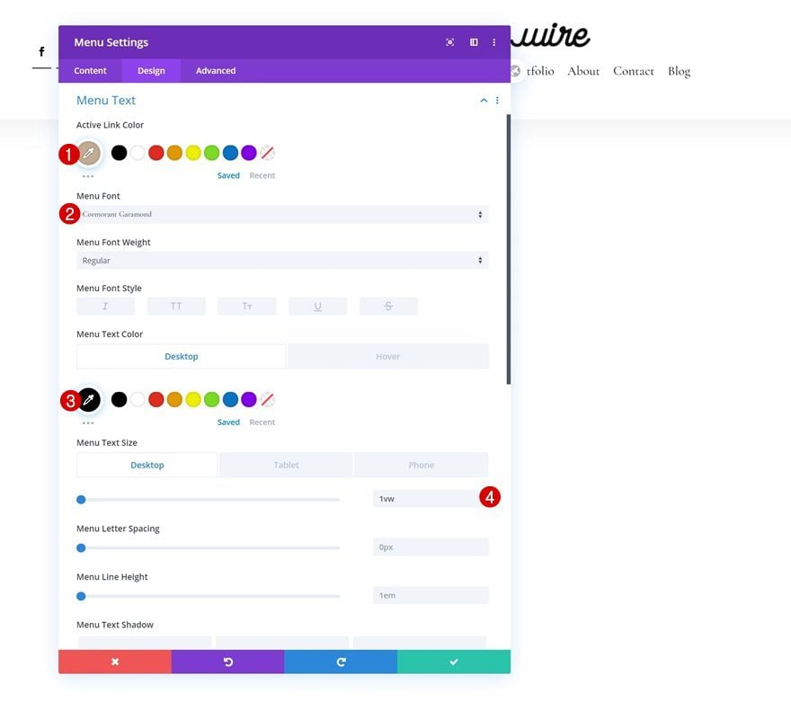
Default Menu Text
Continue by changing the menu text settings as follows:
- Active Link Color: #c2ab92
- Menu Font: Cormorant Garamond
- Text Color: #000000
- Menu Text Size: 1vw (Desktop), 2vw (Tablet), 3vw (Phone)
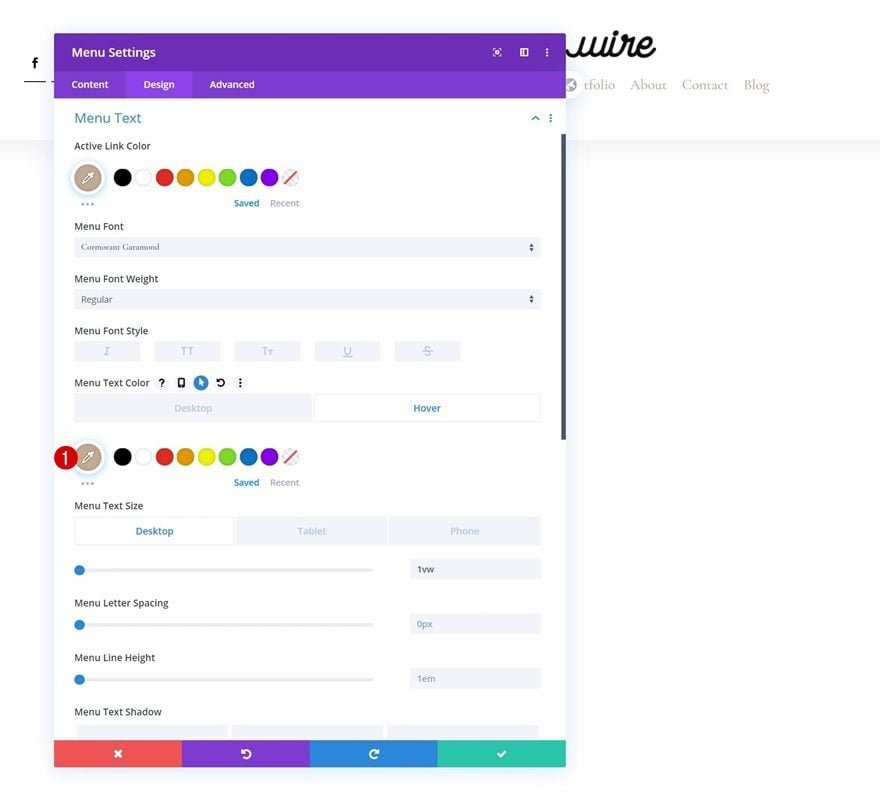
Hover Menu Text
Modify the menu text on hover.
- Menu Text Color: #c2ab92
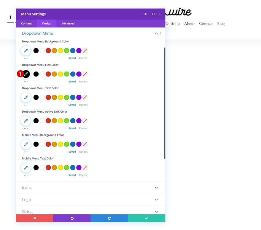
Dropdown Menu
Next, change the dropdown menu line color in the dropdown menu settings.
- Dropdown Menu Line Color: #000000
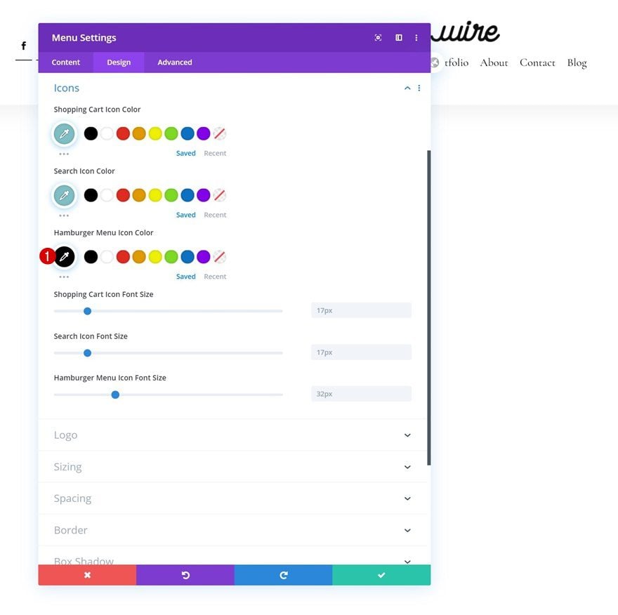
Icons
We’re changing the hamburger menu icon color in the icons settings too.
- Hamburger Menu Icon Color: #000000
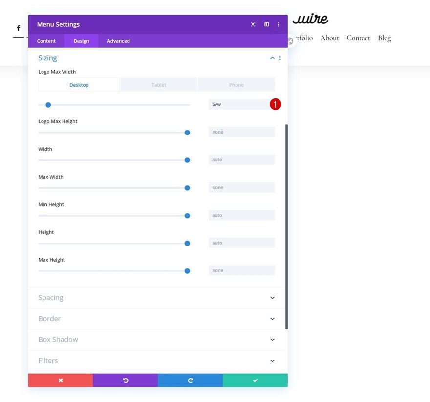
Sizing
Continue by changing the logo max width across different screen sizes in the sizing settings.
- Logo Max Width: 5vw (Desktop), 10vw (Tablet), 13vw (Phone)
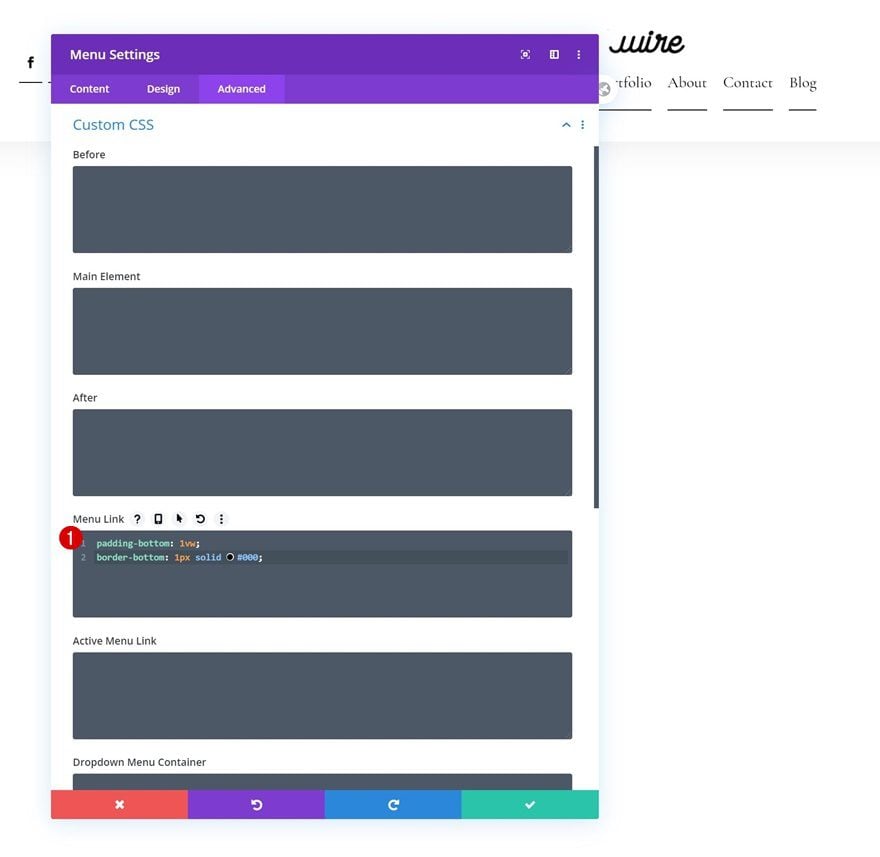
Menu Link CSS
And complete the module’s settings by adding two lines of CSS code to the module’s menu link in the advanced tab.
padding-bottom: 1vw;
border-bottom: 1px solid #000;
Add Text Module to Column 3
Add Copy
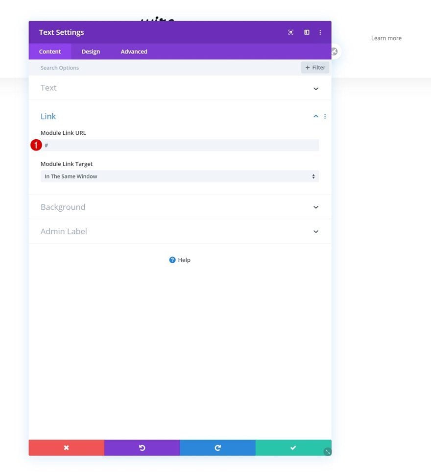
On to the last module! There, the only module we need is a Text Module.
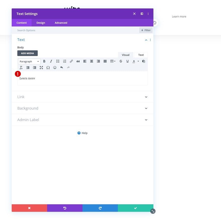
Add Link
This module will serve as a CTA. Add a link of your choice.
- Module Link URL: #
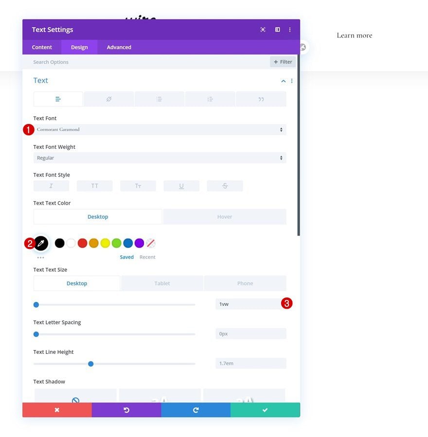
Default Text Settings
Move on to the module’s design tab and change the text settings accordingly:
- Text Font: Cormorant Garamond
- Text Color: #000000
- Text Size: 1vw (Desktop), 2vw (Tablet), 3vw (Phone)
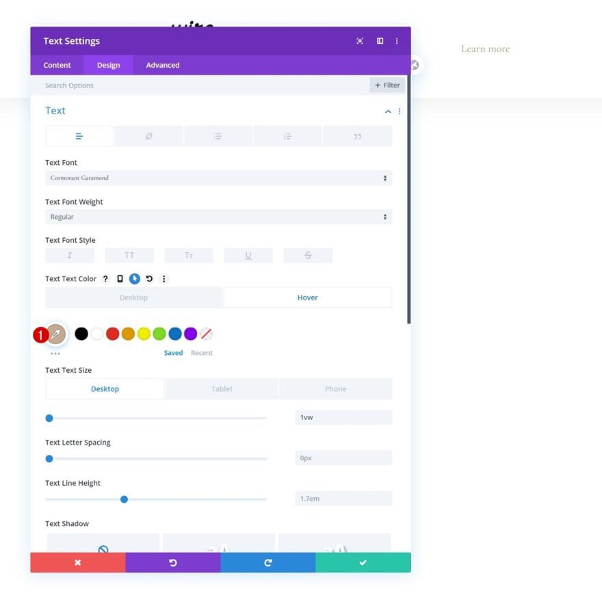
Hover Text Settings
Change the text color on hover.
- Text Color: #c2ab92
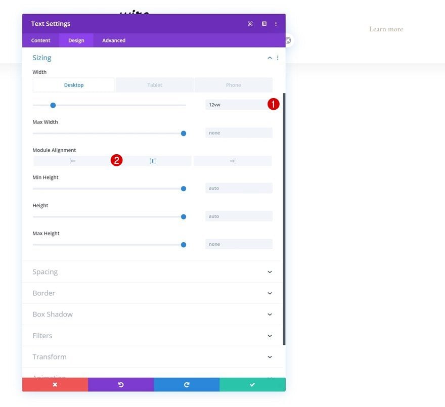
Sizing
Continue by changing the module’s sizing settings across different screen sizes.
- Width: 12vw (Desktop), 18vw (Tablet), 22vw (Phone)
- Module Alignment: Center
Spacing
And add some bottom padding in the spacing settings.
- Bottom Padding: 0.5vw
Border
Complete the module’s settings by adding a bottom border.
- Bottom Border Width: 1px
- Bottom Border Color: #000000
Add Code Module to Column 2
Insert JQuery & CSS Code
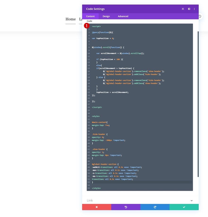
Once you’ve styled all modules in the row, it’s time to make the reveal/hide effect happen. To do that, we’ll need to add some custom code to a Code Module which we’ll place in column 2. This code will work on any section you add, no matter how you design your header or what modules you use, just make sure you’ve added the CSS ID to your section. Place the JQuery code in between script tags and the CSS code in between style tags as shown in the print screen below.
jQuery(function($){

var topPosition = 0;


$(window).scroll(function() {

    var scrollMovement = $(window).scrollTop();

    if (topPosition < 200 ){
    }
    else{
    if(scrollMovement > topPosition) {
          $('#global-header-section').removeClass('show-header');
          $('#global-header-section').addClass('hide-header');
    } else {
          $('#global-header-section').removeClass('hide-header');
          $('#global-header-section').addClass('show-header');
    }
    }
    topPosition = scrollMovement;
});

});
#main-content{
margin-top: 7vw;
}

.hide-header {
opacity: 0;
margin-top: -200px !important;
}

.show-header {
opacity: 1;
margin-top: 0px !important;
}

#global-header-section {
-webkit-transition: all 0.5s ease !important;
-moz-transition: all 0.5s ease !important;
-o-transition: all 0.5s ease !important;
-ms-transition: all 0.5s ease !important;
transition: all 0.5s ease !important;
}
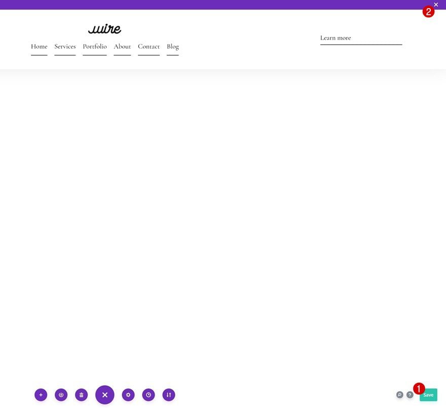
3. Save Builder Changes & View Result
Once you’ve completed the global header, save all changes and view the result on your website!
Preview
Now that we’ve gone through all the steps, let’s take a final look at the outcome across different screen sizes.
Desktop
Mobile
Final Thoughts
In this post, we’ve shown you how to make your global header appear while scrolling up and hide while scrolling down. This is a popular and effective way to help your visitors navigate easily without taking up a part of their viewport height. You were able to download the JSON file for free as well! If you have any questions or suggestions, feel free to leave a comment in the comment section below.
If you’re eager to learn more about Divi and get more Divi freebies, make sure you subscribe to our email newsletter and YouTube channel so you’ll always be one of the first people to know and get benefits from this free content.


Thank you and I got this mostly working, but it doesn’t seem to “push down” any page’s content, so my top headings are all covered.
What would be the best way to deactivate transition css on page load with this script?
Love this tutorial. Is there a way to fix the position when logged in to WordPress? The wordpressadmin bar is hiding my menu.
tks!!
Thank you for your perfect tutorial
Hello, I would like to know how to increase the width of the mobile dropdown menu. Actually it’s a 3 column layout and my mobile menu items are shown in 2 lines and I want to show them in 1 line = need more width. Thank you.
Thanks for this tutorial
It works very well, except on safari,
but safari is still behind on many subjects.
Hi There,
Awesome tutorial. I would like to add it to my global menu, but we also have a top banner on top of the header. When I use the script there is some open space between the the header and the top of the page after I scroll. Any ideas how to put the header to top after scrolling the height of the top banner section?
Best regards,
Ward
I can’t seem to get Divi to save after I insert the code in the module.
Hey, I have a question. Is it possible to insert some kind of a player to my wordpress site? I mean maybe there are any kind of soundcloud plugins or spotify?
I hope that all these global header tutorials will be added to the menu core features one day, so we can just select and switch between them as we wish
Are you able to just add the code to an existing header or does it have to be set up exactly like this in this tutorial?
Hello,
On Safari, when you come to the top of the page after scrolling, the menu disappears.
I´ve just recorded a few Clips of this Safari Bug and send it to the chat. After they checked my site, they were able to replicate it, even with the original blog-post json. Now the tec-team is in to this. Hope to hear a solution soon, if so, i´ll comment it here!
I’m seeing some funkiness in safari too. As I scroll, the menu blinks on and off until I stop scrolling. When stopped it blinks for additional 5 sec’s then disappears. It does not happen on Firefox or Chrome on mac. Wierd – seems like the jQuery needs some tweaking.
I find when I scroll down the page begins to jump up and down like it got the shakes.. It stops when I scroll to the top again.
Having same issue here
I am having the same issue where the mobile header shows and hides repeatedly without scrolling. Working great on desktop.
How can i import the .json file? It always sais: “This file should not be imported in this context.”
I tried it in the Divi library and in the Theme Builder “Create Header” site.
Best Regards
Tom
thanks a lot for this tutorial
1. Can I use it for any section, say a 2nd kind of header and not only for the main header?
2. How do I use this solution for only certain pages or posts and not use it globally?
Thanks
This is amazing, thanks!